Number design

This week, I am re-visiting the ‘Number’ brief. Since I struggled with this task last week, I decided to give it another go and try to understand Adobe Illustrator a bit better, as well as how I could go about designing numbers.

Figure and ground

‘Look at the Rubin vase (example 1) where the figure– ground relationship relies upon a visual confusion so that the eye sees either faces or a vase.’

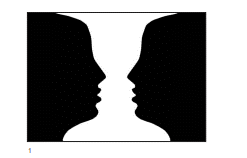
In this image, we can view the white area as negative space, therefore seeing the 2 faces. Or we can choose to read the image as a white vase, where the black area becomes the negative space. The figure is the object in a given space, and the ground is the background space around the object.

Numbers are everywhere in the world around us and they are instantly recognisable to us. Since they are so easily recognised, we can playfully customise them away from a basic number form, and they will still be readable- we have a lot of room to experiment. This is what we did in the Number workshop.

Number Designs

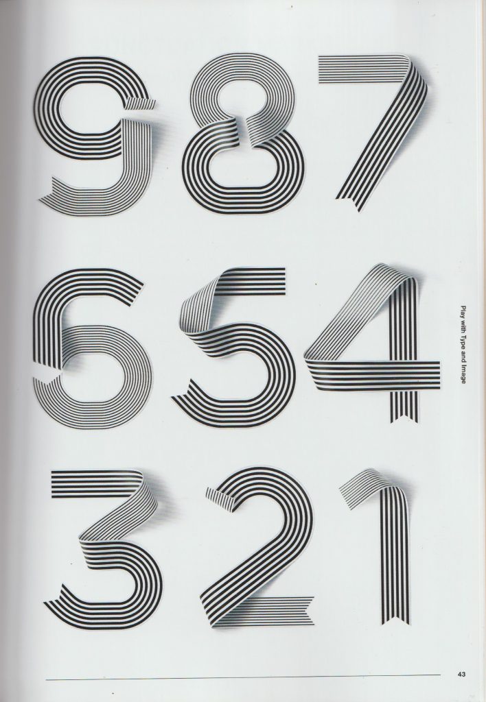
I looked at the way designers have approached numbers. These designs are suitable for use in posters, as the numbers have eye catching styles, shape and composition. They are functional, as they can convey information, and also are interesting designs.

From The graphic design idea book by Steven Heller & Gail Anderson:

Non-Format

Non-Format are a pair of designers who are known for bespoke typography and interesting image making.

The designers were asked to create their version of the number 25. The colours they were given for this task were red and grey. I like the way they have played with the rotation, it reminds me of the staircase images by MC Escher. I like the 3D effect because the number looks tactile and I can envision it as an object in the room.

Image from: non-format.com/slanted-25

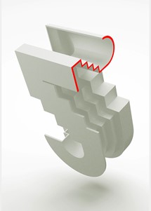
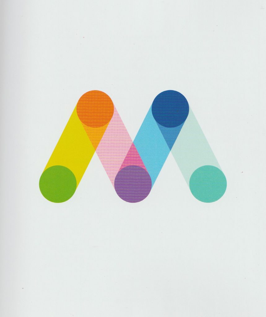
I also came across this design by Non-Format, which is styled quite differently to the 3D number. This figure is two-dimensional, but this does not make it flat looking. It looks as though they’ve designed this number using a grid. They have sometimes chosen to group the squares of the grid together and in other places, it’s easier to see the individual squares of the grid. The Zigzag lines that form the edge of the 2, add a sense of movement, it is as if we can see the shape vibrating. They have used smaller chequered patterns within a single grid square, they have used stripes, circles, triangles and dots. The figure itself is cohesive as one piece, because all the smaller elements within the 2, such as the different patterns and different colours, are presented in similar sizes to each other.

Leonardo Sonnoli

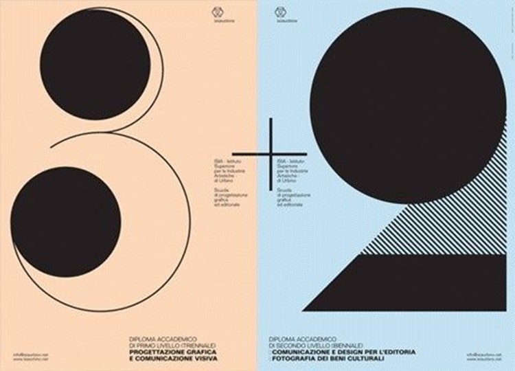
This looks to be a poster design, using the numbers three and two. I like the boldness and simplicity. The thin lines are important, as they balance out the boldness and add a sense of delicacy. The designs are quite elegant, and I would expect this to be a poster for an art event or for a sophisticated audience. I associate these numbers with the Art Deco style. The numbers themselves are black and white but the colour comes from the background. The number 2 is not joined up in a way we would expect, but instead it’s our eyes that join the top and bottom half to form one object because we are familiar with the figure of the two.

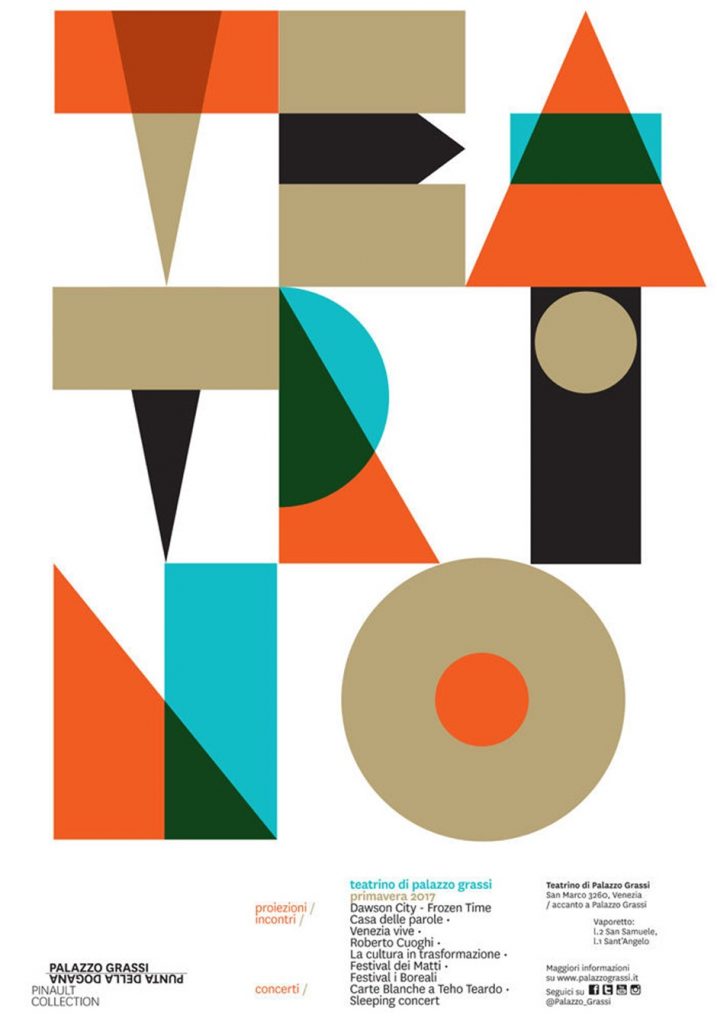
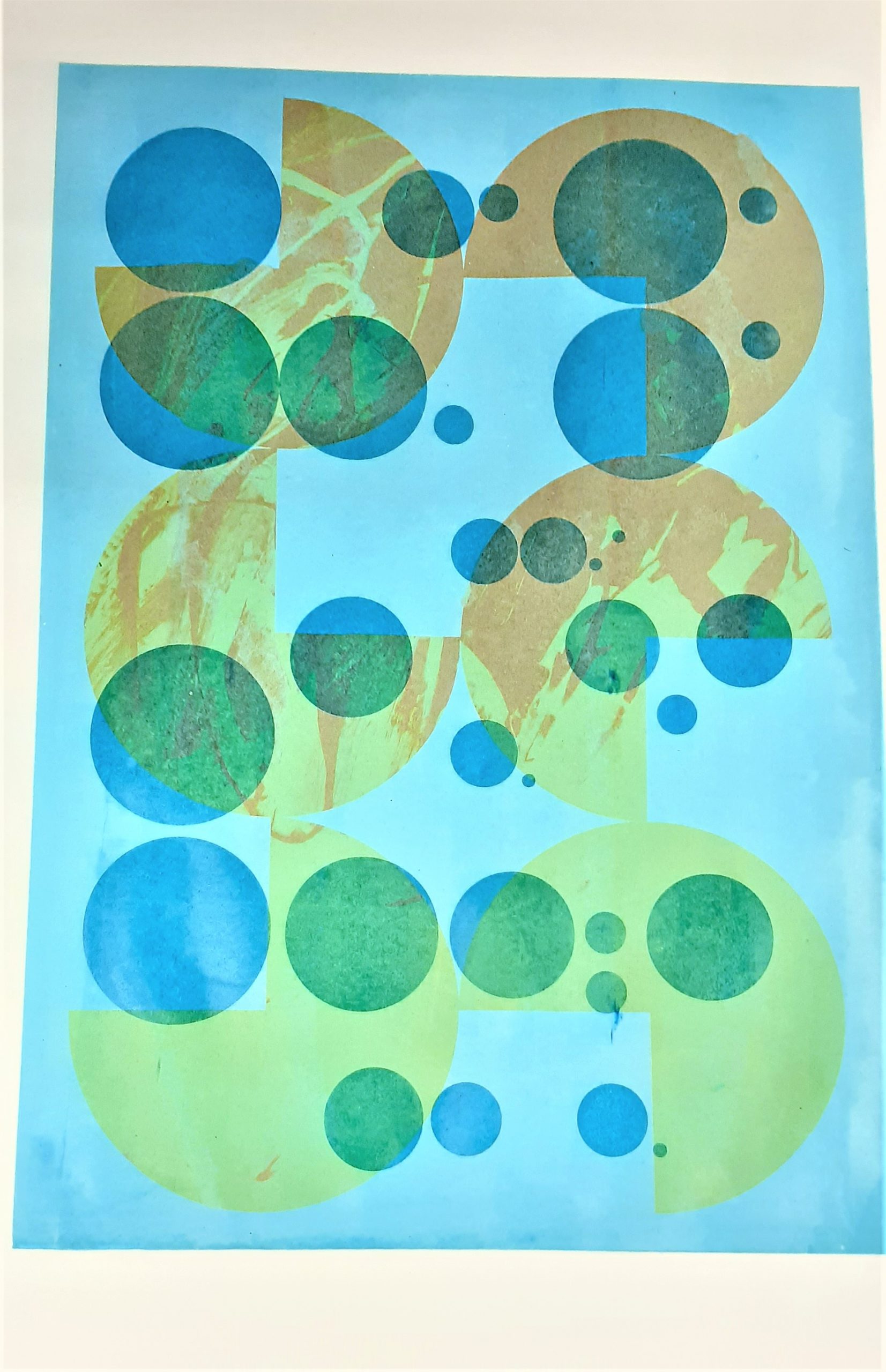
This poster does not contain numbers, but it interested me when I was thinking about number design. I like the overlapping of colours, particularly in the top third of the image where it looks as though the colours are mixing in layers before our eyes. Because these figures are chunky, and they are placed so closely together, my eyes naturally wanted to read the negative space as part of the design.

Dan Chamberlain

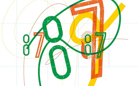
I was immediately drawn to the refreshing colour palette. This design looks fun and energetic. The two links that make up the eight do not need to be connected for us to read the pattern as an eight. This is helped by the fact that the figure of eight appears next to a seven. (Our mind makes the association that we are looking at numbers.) I like the outline of the 7 and I was inspired by the fact that I do not need to fill the figure with a colour.

Here I liked the use of half tones with negative shapes. It is interesting to see where they intersect at the centre stop. Using yellow and blue was a good choice because it helps the outline to stand out.

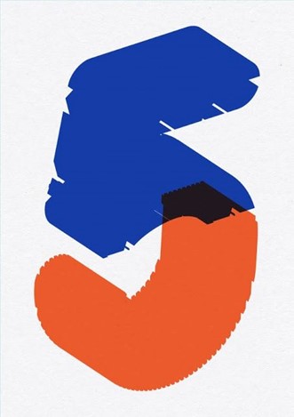
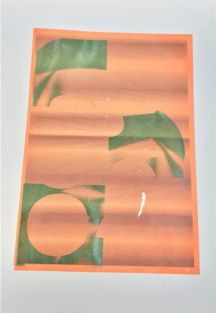
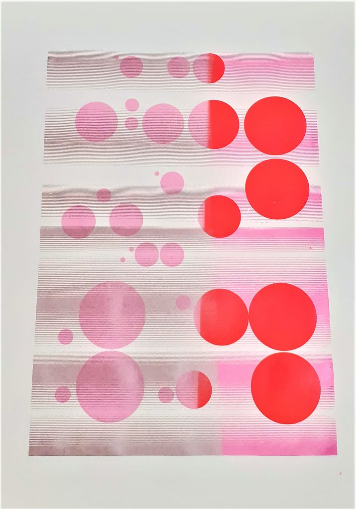
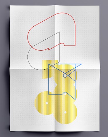
I was drawn to the boldness of this figure of 5. I like the way that certain areas are cutaway around the outside of the shape. It makes it look imperfect and accidental. This helps to include some negative space in what would otherwise be a bulky shape. The bottom half of the 5, to me resembles the bottom of the J. There may be some significance in this or not. Where the colours intersect at the centre, there is the murky dark colour. This shows that the blue and orange are transparent, and resembles the effects created by screen printing for example.

Because of this transparency, the 5 appears airy and light if it was to be physically lifted. It makes me think of jelly, this makes it a fun design to look at. I like the way the angles are not visible, but we can still see the shape is 3D because of the angle the designer has drawn it at. The use of orange and blue is very strong and works well because they are opposite to each other on the colour wheel.

From The graphic design idea book by Steven Heller & Gail Anderson:

Studio Myerscough
from the book: The Fundamentals of Typography (3rd edition) by Gavin Ambrose, Paul Harris and Sallyanne Theodosiou

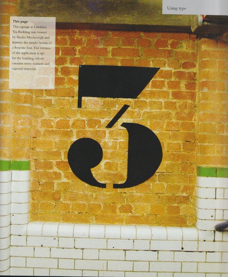
This number 3 has been applied to the side of a building, it may have been painted on. I like the disjointed quality of the figure. It helps to break up the chunky parts of the design. She has used curved and angled shapes and the results is bold yet stylish. I like how the end of the three looks like a quotation mark or, or a backwards comma. This might suggest a relationship to a literary theme.

Adolphe Mouron Cassandre

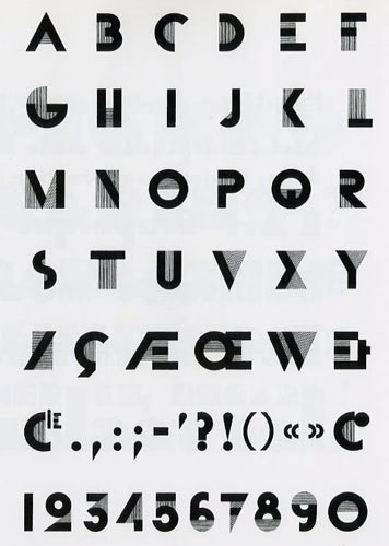
This is a typeface for numbers and letters from 1929 (the Art Deco period). I like the combination of block shapes and half tones to make up each figure. Each number is unique and yet clearly belongs to the same family of numbers. The half tone, or stripy areas sometimes stand in for positive space, sometimes stand in for negative space, and other times are connecting and representing both.

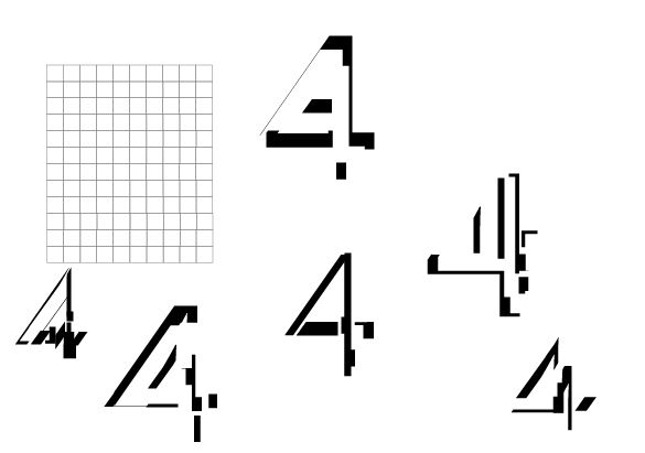
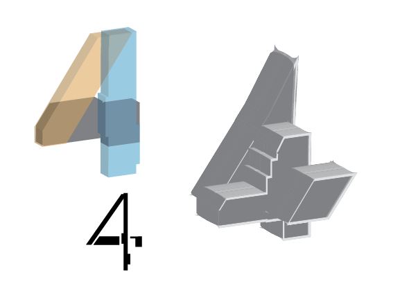
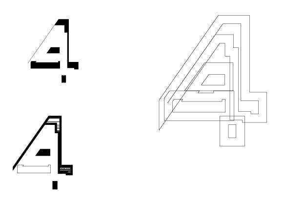
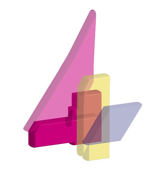
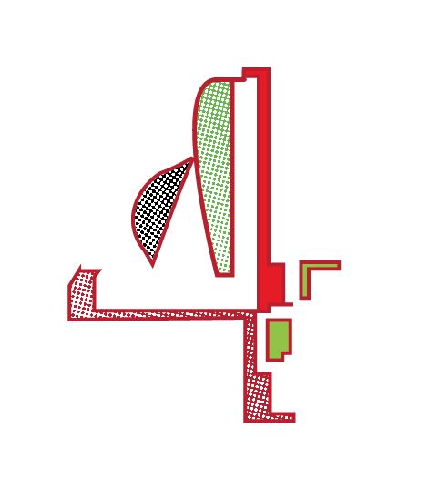
My designs- using Adobe Illustrator

After experimenting with the numbers 2 and 5, I moved on to see what potential there was in a 4. I pushed myself to learn new skills on Illustrator and to practice the skills I have recently learnt.

From my second time on Illustrator, I learnt a few basic principles:

  • The white arrow is the Direct Selection Tool. It can be used to round the corners of a rectangle and to stretch the rectangle.
  • Add Anchor points just adds anchor points.
  • Anchor Point tool just moves anchor points that are already there.
  • The Pen Tool draws lines.
  • Shift+command+[] to move an object in front or behind
Drawing several 4’s on top of each other, then dividing them. I made these fours from the resulting pieces.
Here I played with the opacity/transparency option to have the different colours showing through. For the 4 on the right, I used the bevel tool to round the shape and add a 3D effect to it. I liked the chunky appearance that I created by increasing the stroke of the shape. Both of the larger 4s were made from the starting point of the small 4 on the bottom left.
The bottom left and right 4 were both made from the top left 4. I really like this outlined pattern on the right but found it difficult to achieve. I used the pathfinder tool to divide and ungroup. I expanded the outline and played with removing the fills until I had the outline effect I was aiming for. The bottom left 4 was fun to make. I was inspired by Mouron Cassandre’s Art Deco typeface. I removed the fill in some areas and added my bitmap image to some spaces to create the striped effect. To do this I needed to select the shape, select draw inside and then file> place, to place my bitmap image into the space.
This fun jelly-like 4 was inspired by Dan Chamberlain’s 5. I selected different colours for each piece to help each section stand out. The darker pink piece had a higher opacity, because I wanted to see some variation.
Here I layered block colours with a dotted bitmap image.
I was inspired by the fun feeling of Dan Chamberlain’s design. I rounded the shapes using the direct selection tool. I then changed the colour of the bitmap image by selecting the bitmap and choosing from the colour swatches. I increased the stroke so that the outline of each shape would stand out.

Screen-printing – week 5

In A Primer of Visual Literacy by Donis A. Dondis, I was interested in the section about visual communication. The author explains that these visual techniques can be used to convey different messages. For instance, ‘fragmentation’ can be used to express excitement in a design. I found that I used more than 1 of these techniques within the same print. I considered these principles when composing my screen-prints in terms of how I can create a design that makes sense when the elements, or layers, are seen together.

A Primer of Visual Literacy by Donis A. Dondis

I chose to use blue for the third layer, as I used it for the first layer. I like the way this helps the top layer to tie in with the background.

I used transparency within this print, as I wanted the effect of the first print to show through the third layer. I mixed in binder with the blue paint to make it transparent.

I have combined circles set in a random formation, with the pattern of ¾ circles which are organised sequentially.

Repetition is the cohesive force that holds a diverse composition together

Donis A. Dondis

I feel there is enough going on within this print for it to be interesting to the viewer: The orange splatters, the way the colours combine through the layers and the variety of shapes. I therefore decided this print is finished.

I have created balance in this print using asymmetry. The design is asymmetrical because there are 2 areas of blue on the left hand side of the page, balanced out by the blue shape on the right-side. There is a sense of regularity in the way the grey shapes form a predictable pattern that we can follow.

The way the layers overlap and the halftone in blue, make the design slightly more complex.

There is some flatness in this print because of the similar values used for layers 2 and 3. This is easier to see in the photo I have converted into greyscale.

Greyscale copy of my print.

The opacity of the grey shapes gives the design a sharpness that was not intentional. This makes the shapes distinct and easy to interpret but means there is overall less warmth and atmosphere to the image. For this reason I would like to add a fourth layer to see how I can soften this design, or perhaps add some finer detail.

This print was stuck to another piece of paper in the drying rack. This meant that when I lifted the paper off, a small area was torn away. My plan is to cover this area.

I used a green as I felt this may cool down the orange of the second layer. This green came out brighter than I expected. For the 4th layer, I want to repeat the pattern used in the 3rd layer but rotate it in some way. I think a darker colour will work well.

The second layer creates a sense of distortion. This was accidental but was improved by the third layer where I used a deep blue to anchor the grid in place. Placing the grid lines off the side of the first print, creates an illusion of depth. The colours all work harmoniously, as I have chosen that are close to each other in the colour wheel.

I have suggested motion in this image using close lines and using the change of colour halfway through the print on both layers. This activeness is also created by the asymmetrical pattern of circles in the design.

The variation of hue, transparency, and value, gives the print a sense of depth.

I found it interesting how the second layer is visible against the pink circles and is not visible on the red circles. This gave the print an implied texture on the left side.

The right side is bright, and this shows a juxtaposition against the calmer colour combination on the left.

I decided this print was finished, as it does not look to be lacking in any element.

Museum of the Ordinary

The study of Semiotics suggests that who is reading the image, is important in determining the message. Semiosis is the process of How we take meaning from a sign. Roland Barthes was a French literary critic and philosopher. He felt that the meaning of words as well as images are dependent on the viewer.

Denotation= The literal or primary meaning of an image.

Connotation= This is the meaning of a sign depending on our interpretations. This means the connotation is something that always changes.

Ways of Seeing- John Berger

As mentioned in a previous blog post, Writing & Research Skills. John Berger wrote a book and BBC documentary entitled Ways of Seeing, in which he discusses semiotics:

‘We never look at just one thing; we are always looking at the relation between things and ourselves.’

‘The way we see things is affected by what we know or what we believe.’

John Berger, Ways of Seeing

‘The photographer’s way of seeing is reflected in his choice of subject. The painter’s way of seeing is reconstituted by the marks he makes on the canvas or paper.’

In this quote, he is saying that a photographer is selecting and bringing attention to an element. He/she is showing something about their perception within this photo. A photo cannot be objective if a person is behind the lens.

An example Berger gives in his book is the painting Venus and Mars by Boticelli.


Sandro Botticelli | Venus and Mars | NG915 | National Gallery, London

Isolating a part of the image means you see something differently by the way it is framed.

If we frame just Venus’ face, the image looks like a portrait painting of a young lady. We need to see the painting as a whole to understand the context.

Open work- Umberto Eco

Umberto Eco Was an Italian philosopher, social commentator, and novelist. In his work, he speaks about the Ideal reader. This is someone who is aware of the possibilities of interpretation in a work.

From Visual Signs by David Crow:

  • ‘Eco prefers the term “encyclopedia,” rather than the more common term “code,” to describe the transfer of meaning through the use of signs. For Eco, a code implies a one-to-one transfer of meaning like a dictionary definition, whereas encyclopedia suggests that there are a number of interrelated interpretations and readers must negotiate their own path through the network of possibilities.’
  • ‘It is important to note that he sees information as something different from meaning or message. He suggests that the amount of information contained in a message depends on the probability of the reader’s already knowing the content of the message before it is received.’
  • ‘Eco argues that contemporary art contains much higher amounts of information, though not necessarily more meaning, by virtue of its radical nature. More conventional forms of communication—such as the road sign, for example, or figurative painting— may carry more distinct meaning but much less information.’
  • ‘If a newsflash tells me that tomorrow the sun will rise, I have been given very little information as I could have worked this out for myself. If, however, the newsflash tells me that the sun will not rise, then I have a lot of information as this is a highly improbable event.’
  • ‘Eco also points out that the amount of information contained in a message is affected by another factor: our confidence in the source of the message.’
  • ‘If a landlord were to tell me an apartment had damp problems before I rented it, I would be more inclined to believe him because he has nothing to gain by fabricating this message.’
  • ‘The amount of information is greater when the content or the source is improbable.’
  • ‘”Christmas is an annual festival.” This has a very clear and direct meaning with no ambiguity, yet it doesn’t add to our existing knowledge. In other words, although the communicative value is high, the amount of information is low.’

A piece of discarded material can become an artifact once it has been framed.

Umberto Eco

Framing brings attention to something e.g. cracks in the road spray painted to mark for repair. At this location, they have marked areas for drilling into, on the asphalt. This makes us aware of areas and focus on areas we otherwise would not notice.


Ground Penetrating Radar Utility Scanning – East Handover, NJ (gp-radar.com)
Frames within frames

In this week’s workshop, we were taking photographs around campus. I experimented with using a photo frame to draw attention to certain areas and then taking a picture of the same area without the use of a frame. I wanted to see what difference the frame would make.

Before the workshop, I wrote down a collection of words that related to my object, The Raincoat Girl. I then wrote words that did not describe the object.

I used these words as inspiration when taking photos around campus. It was challenging to find subjects and locations in a short space of time. (We had around 40 minutes for this task.) It was harder than I thought to find objects I was happy with.

I used the frame to draw the focus to the entrance of the building.

I placed the frame in a place that highlighted the fragmentation of the pieces of glass. I was relating this subject to the word ‘fragile’, since my object is fragile. I chose the blue and green area because my object is blue and green was one of the words I wrote to describe what my object was not.

I took this photo in the Richard Hamilton Building on campus. Two objects here are used for communication: a telephone and a fire alarm. Both objects are useful and even essential. I found that this contrasted with my object which is purely decorative and does not serve any vital or important purpose.

I chose to focus in on one object. I found it interesting that the phone looks old fashioned and would look at home beside my object. even though their functions are very different.

There is a lot going on in the design of this post at the exterior of Headington Hill Hall. It is old fashioned and decorative, like my object.

Framing one area of the pillar helps to focus in one one element of the design.

After taking the photos, we needed to place the photos in an InDesign document. InDesign was suitable because we needed to then add labels next to each photo. The label resembled the caption placed next to an artwork in a museum or gallery. It was fun to see the photos presented in this way. I liked the addition of the word next to the image as a title because it added more meaning to the image and helped present the message I had in mind when taking the photo.

InDesign process

I selected File>document set up. This gave me the option of choosing the number of pages in the document. In the same window, I could also unselect facing pages. This meant that I could view one page at a time.

I could use the page tool to change the page’s orientation, if one of my photos happened to be in a landscape orientation for example. This option is located at top of the page.

(The document needs to be on essentials classics for me to complete these steps.)

If this is not switched on, I can change this by selecting Window>workspace>essentials classic.

File> place to place an image in InDesign.