Critical Thinking: Theory & Practice Part 2

https://viewing.nyc/vintage-photograph-of-broadway-advertising-in-times-square-circa-1909/

In today’s lecture, we began by considering the themes for this new module.

  1. The history and theory of visual culture. How are images produced? How are images consumed? Visual artifacts: graphic design, poster, film, advertising.

2. Reflect on ethical & political implications of graphic design. What does graphic design have to say about race, gender and ecology? How does graphic design make these matters visible?

Blockbuster culture delivers mainstream ideas to the masses. This is found in the free press you find on the train. It is easily accessed everywhere. How can graphic design counter mainstream culture?

Novara Media are an organisation who challenge the mainstream media.

Ash Sarkar uses humour as a way of presenting the topic. She delivers the message with energy and the fast pace keeps the audience engaged. I like the way she uses rhetorical questions to include the audience and place them in a hypothetical experience.

‘The Most Popular Map Of The World Is Highly Misleading’

The Mercator Projection, created by Flemish cartographer Gerardus Mercator in 1569, shows the northern hemisphere enlarged in size with North America and Europe larger than South America and Africa.

https://metro.co.uk/2017/03/21/heres-what-the-map-of-the-world-actually-looks-like-6523105/

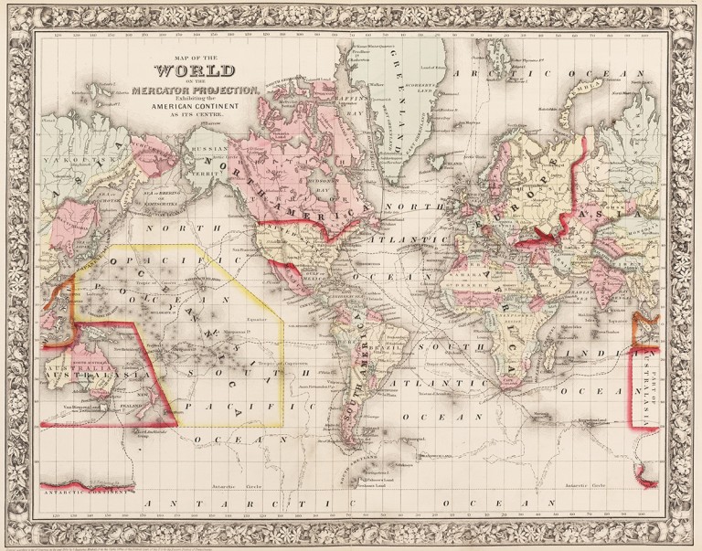
Maps were designed from the point of view of the coloniser, according to their own parameters. They placed themselves at the centre of the world according to how they saw themselves (powerful). The global south became independent of the colonies.

Gall Peters projection, 1970 (How the world really is)

Are maps really objective?

They can be designed to deliberately mislead us. We need to look with a critical eye: Who made it? Why? What does it actually tell us?
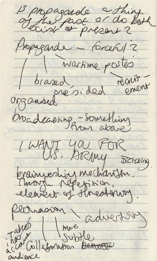
Design & Politics

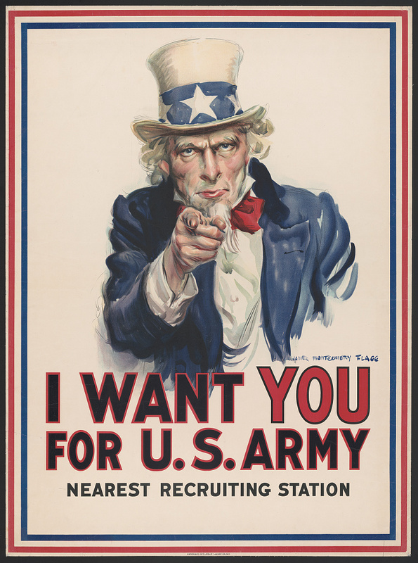
Propaganda such as this poster was produced during the 20th century. It was often used to recruit people in the army using bold and forceful language and imagery.

(image from:

https://library.ccsu.edu/dighistFall16/exhibits/show/music-as-propaganda-in-world-w/music-as-propaganda)

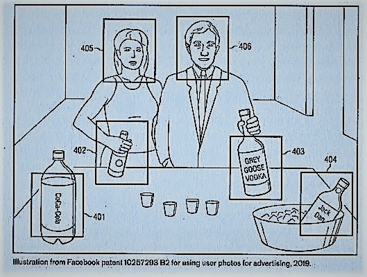
Politics in design can be subtle, not just propaganda. And persuasion can be sinister, even if it’s subtle. For example, surveillance advertising and micro targeting occur today. Companies collect data on us without our knowledge. By collecting this knowledge, they are able to profile and target ads to certain audiences. This can be subliminal and sent through social media.

my lecture notes.

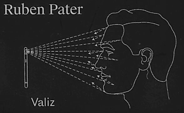
Caps Lock – Ruben Pater

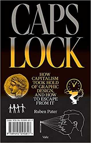
The cover of this book is contemporary, by the images are historical. They are from several decades but no image newer than 5 years.

On skimming through the pages, the pull out quotations stand out to me. They do not look too different to the rest of the text, but are in a serif typeface and slightly larger. From reading them, I am given the basic theme of the book. There is a negative view of materialistic culture and the images support this view:

https://www.saatchiart.com/print/Photography-Zara-s-home/277628/1885457/view

Not all graphic designers are against advertising.
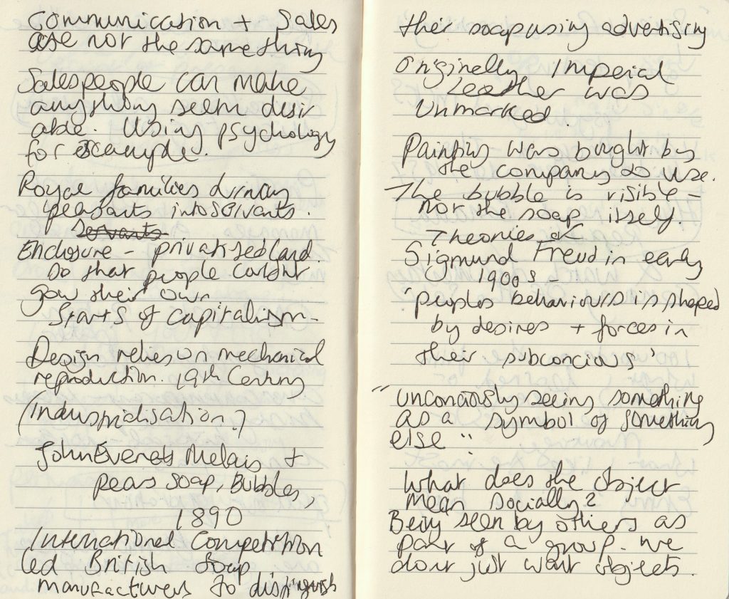
Banana Republic‘ from Caps Lock

Chiquita Banana The Original Commercial

The example of United Fruit illustrates that cheap products cannot be produced ethically under capitalism, but require aggressive advertising, political meddling, dispossession of common lands, exploitation and violence.

Ruben Pater

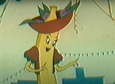
This chapter of Caps Lock, explains how advertising can be used to ‘hide violence and exploitation in pursuit of profit.’ The Chiquita Banana advert was made to educate and persuade people to start buying bananas from the United Fruits company. At the time, in the 1940’s, bananas were a fruit growing in New Guinea and Malaysia and no one had heard of them. The company therefore needed to convince people to make bananas a new part of their diet.

They did this by using the symbol Chiquita Banana, a sexualised cartoon banana based on the Latino actress Carmen Miranda.

Land was stolen from indigenous people to grow bananas in Honduras, South America. The workers were exploited, paid in vouchers instead of money and killed when they demanded fair pay and working hours. (Which is the short version of events).

“If advertising would be banned from public space everywhere, it would certainly be a blow to a system of consumption that relies on constant seduction.”

“In a timespan of two centuries, society has been commodified bit by bit through enclosure of free and public spaces.”

Century of the Self

The words of Paul Mazur, a leading Wall Street banker working for Lehman Brothers in 1927, are cited: “We must shift America from a needs- to a desires-culture. People must be trained to desire, to want new things, even before the old have been entirely consumed. Man’s desires must overshadow his needs.”

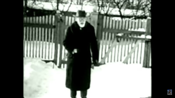
The film starts with a black and white image of Sigmund Freud. We hear playful and nostalgic music from a past era as the narrator talks about Freud’s theory of ‘primitive forces’ within humans. There is a sudden change to the red image of a woman screaming. The words ‘chaos and destruction’. There is horror-film organ music, all feels frantic. Then suddenly the footage returns to black and white with nostalgic old-fashioned singing, while we see footage of a man on a staircase, perhaps Freud’s nephew ‘Edward Bernays’ who we are introduced to.

The organ music again strikes us as the titles appear.

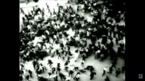
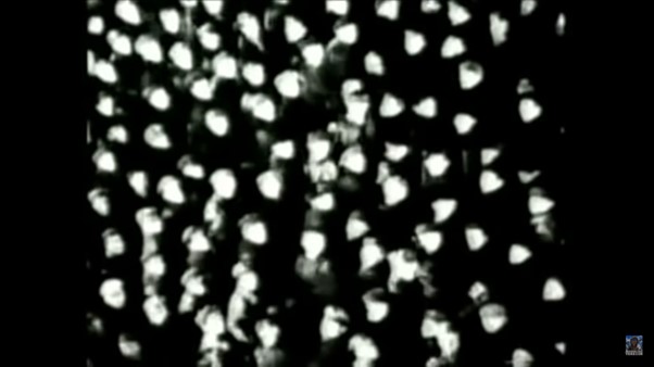
Images of advertisements appear dreamlike, between black and white images from real scenes of crowds, possibly from news footage- a harsh reality. Crowd footage appears throughout the film, possibly to signify the masses who were the focus of the advertising campaigns.

This introduction sets us up, much like a warning as to what is to come later. We may not know who Freud or Bernays is, but we have no doubt there is something sinister about to be revealed.

The pace and unexpected change in tone, keeps us on our toes. The theatrical pairing of images and music contribute to an atmosphere of dread.  Moments of quiet suspense are sandwiched between images of chaos. This expresses the emergence of Bernays and his work in mass manipulation. The change from buying to meet our needs and buying to fulfil endless desires.

Classical music is playing as we are shown footage of higher-class events. This sets up the world Bernays was a part of. Music plays with our emotions throughout the film, giving us an idea of how it is to be easily manipulated.

We are shown images of chandeliers whilst hearing about the necessity of civilisation and inevitability of dissatisfaction. This creates a contrast and makes us questions the worth of the finer things.

“Bernays was the first person to take Freud’s ideas about human beings and use them to manipulate the masses.”

Century of the Self

Today’s lecture introduced me to the sinister truth hidden beneath the shiny surface of everything we know.

Century of the self discussed the shift from smoking being unfashionable for women, to the way women were persuaded to smoke. This was a carefully calculated shift. Actresses were hired to pose with cigarettes. The companies knew they could double their customers by setting up this marketing strategy. That is something I had never considered before.

In the Banana Republic article, the way people have been treated to allow companies to increased profits, is shocking and appalling. The only thing worse is the way it has been covered up for decades.

This discussion has lead me to wonder, what else will I be discovering next?

Woodblock letterpress workshop

Page from a book by Theodore Low De Vinne, describing the physical nature of typography, circa 1900.

(below) ‘Nineteenth-century advertising typography, in stark contrast to book design, featured all the display types at a printer’s disposal.’ Type & Typography by Phil Baines & Andrew Haslam

Hereford printer’s work from 1831.
Apples to Zebras is a shop that sell a variety of items. The Design Shop added texture by choosing the right words. The selective choice of red ink acts as bookmarks at the start and finish of the text. The impression given is that the items are held within the ‘apples’ and ‘zebras’.
Monotype’s hot metal Baskerville in a design by Catherine Dixon.
‘Yearling Jazz & Classics direct mailer created for Arjo Wiggins by Thomas Manss & Co. design studio. The qualities of the paper are articulated through a series of specialist printing techniques. Here they have used letterpress and a bronze foil. Typographical elements are used in images to mimic details of musical instruments.’ The Fundamentals of Typography 3rd edition, Bloomsbury

‘In this poster by English designer Phil Baines, printed using letterpress type, the relationships and patterns that typography creates are laid bare. It is easy to see how the grid- central to most graphic design- is a natural outcome of modular typography.’ What is Graphic Design? RotoVision

Cards to promote an art club, Rabia Gupta

By placing the text in a chaotic way, the designer is able to express the company’s taste in art.

Prospectus for the Typography Workshop, Alan Kitching, printed letterpress, London, 1992. ‘Vibrant information that describes not only the location of the studio, but also the reason for going there in the first place.’ What is Typography?, David Jury

The letterpress workshop in week 1 introduced us to the printing press.

The aim of the workshop was to work with woodblock type to explore composition and the potential of uncreative writing. We were instructed to reflect the meanings of the phrases in these prints.

I loaded the tray with the wooden letter blocks and filled them with the metal furniture to secure the pieces.

I selected the phrase ‘How to Make a List’ from the workshop brief. This first made me think of the typical list format that you might use for a shopping list. Vertically aligned left down the page. I selected the letter blocks from a sans-serif font. I chose the ‘How to’ in larger, capital letters to suggest an instructing voice.

I placed the metal furniture to place gaps between the words. The spacing highlights the separate words. I used magnets to hold the metal in place so that it would not slip when printing.

I then applied the ink onto edges of the metal. I placed the paper onto the letters and press the paper down to transfer the ink. I paid attention to the individual letters and to the horizontal lines. When I lifted the paper off, I had created parallel lines. These lines suggest to me, the lines found on note paper.

I used the roller to evenly spread the printing ink on the flat surface. Since the ink is oil based, I needed to use white spirit to remove the ink when cleaning up the roller. Applying ink too thickly onto the letters could result in imperfect edges.

applying ink to the woodblock letters
The letterpress. Using the foot pedal lifts up the 4 metal points. I placed the paper under these points to hold it into place, releasing the pedal.

I printed the first print by hand (without using the press).

I used repetition with the left alignment to exaggerate the classic list format. There is also a hint of sarcasm to the message by repeating the words. ‘How to make a list: make a list.’ I accidently printed the extra letters at the top of the page. They look faded and although this was accidental, I like the effect. The letters spell ‘WOT’, which when sounded out, sounds like ‘What?’ The paler markings appear to be from a second voice.

I used the lines of the metal furniture. The square was accidental and I don’t think it adds anything to the composition.

I used the printing press to print these letters:

On my first attempt with these letters, I accidently placed 2 of the letters backwards.

I broke the words into 2’s, as I noticed the words are similar in length. I wanted to highlight the fact that some words are made up of smaller words. For example in this print, ‘(Lay)er’, ‘(Win)dow’, ‘Da(ta)’. I used the same typeface across the print to make the words blend visually and therefore layer effectively.

Because of the word ‘layer’, I chose to layer the text.

By making several prints from one ink application, I was able to achieve different weights, some more transparent than others. This gives the letters shadow and depth across the print.

I printed these letters onto A4 paper. I placed the text so the words are running off the edge of the page. This creates a disorientating effect.
I experimented on sugar paper and used repetition to create texture, using the letter ‘A’.

I noticed the ‘A’ in ‘Layer’ and ‘Data’ and connected them visually across the page. The words become slightly hidden, particularly ‘Layer’ which helps to illustrate the meaning of the word ‘layer’.

Visualising Sustainability

Design plays a fundamental role in sustainability because it is the design that determines which resources are employed and how they are used.

Sustain: an ability to sustain over time, endure. for example, over a number of years. Sustainable development: without impacting too much on future generations. For example, preserving the environment.

In business, a sustainable business plan is (not just about the environment) but can be about making sure the business is using their resources economically.

What Is Sustainability?
The most common definition of sustainability comes from the 1987 Brundtland Commission report for the United Nations. It defines the concept as “meeting the needs of the present without compromising the ability of future generations to meet their own needs.”

https://www.investopedia.com/terms/s/sustainability.asp

How are human rights sustainable?

Human rights create conditions essential for sustainable development. The 2030 Agenda recognizes that inclusive and participative economies, and societies in which government is accountable, achieve better outcomes for all people, leaving no one behind. 

Civil, cultural, economic, political and social rights and the right to development build on each other and advance together. 

https://www.ohchr.org/EN/AboutUs/ManagementPlan/Pages/sustainable-development.aspx

https://scadmanor.com/greenwashing-the-brain/

“Don’t be misled by pretty pictures or use of earth-friendly colors on product labels. MacDonalds or Coca-Cola might have green color on their logo, that doesn’t make them eco-friendly!” https://easyecotips.com/learn-how-to-avoid-greenwashing/

https://cuesonline.org/2021/10/28/green-or-greenwashing/

In everyday life there is an element of greenwashing. There is a gap between the things we know and what we do. For example, we know that reusable alternatives are the greener option but need to put the knowledge into action.

Campaigns & Case Studies

Turn it off!

Campaign supporting Ubiquity, documentary by Bregtje van der Haak

Using the language of the online world – emoticons – we designed a simple, but bold visual language, which draws attention to the downside of staying connected all the time.

De Designpolitie
https://www.designpolitie.nl/projects/turn-it-off/

The use of green and red immediately suggest traffic lights and the action of stop and go/ on and off. The strength of the colour carries the message, so the designer is able to use black lights and keep the design simple. The emoticon graphics suggest the original faces made from type.

These will be familiar to people from a certain generation, which suggests to be that this could be the target audience. The bold typeface presents a clear message to the viewer. ‘Schakel Uit’ being Dutch for ‘Turn Off’ in the above designs, is paired with the green. Off which is often a negative word, is contrasted with the positive green.

The banner below is hard to miss due to its clarity and bold simplicity:

LEVI’S WATER> LESS

MY00 Agency, Johnny Lighthands, USA & U.K.

Levi’s developed a sustainable range of jeans to decrease their huge carbon footprint. They wanted to bring their message to people through educational posters and comic strips. They achieved this by using illustrations of water-conserving creatures drawn by Illustrator Johnny Lighthands.

Lighthands’ hand-drawn style gives the campaign a light-hearted touch while getting the message across. The style is rememberable and the characters are lovable. Levi jeans have a reputation for being traditionally well-made and ‘cool’. These drawings challenge the serious reputation of Levi’s. The off-white colour of the ground in these posters suggest natural materials.

Zara- Join Life

I really like the lack of colour in Zara’s graphic design for their Join Life campaign. It looks neat and stylish while also giving the impression of minimal wastage.

https://www.zara.com/uk/en/sustainability-innovation-mkt4823.html?v1=1965796
An image from the campaign for Zara’s eco-conscious Join Life collection.
https://www.carmenbusquets.com/journal/post/fast-fashion-amp-sustainability-will-zara-owners-pledges-mean-real-action
https://www.forbes.com/sites/patrickmoorhead/2021/04/21/amazon-delivers-on-its-sustainability-commitments-and-then-some/?sh=12d5229a299d

The cheerful animations on Amazon’s website are light and joyful. The illustration encapsulates the entire process of the items shifting through Amazon’s process. It is interesting as an animation because of the moving parts featured in the image.

Greenpeace –Protect the Antarctic, The Lovers

‘A global movement to protect the Antarctic’

The agency, The Lovers, decided on colours and simple graphic design, inspired by the landscape and light of the Antarctic. They chose the penguin symbol to represent the wildlife affected by climate change. Their message was translated into many languages to reach a wider audience. This is important because the issue affects every person on the planet and is affected by every country.

The chosen typeface was inspired by naval/maritime fonts.