Introduction (from the brief)
Concrete poetry – which can also be conceived and referred to
as ‘conceptual writing’ – is an art and design practice whereby
language is conceived and manipulated in its ‘concrete’ form,
that is as it is seen and presented to us as text, type, words and
letters. Ever since the French Symbolist poet Stéphane Mallarmé’s
experiments with movable type in 1897 (see module presentation),
artists and designers have for progressively explored language’s
concrete existence through all manner of material innovations, all of
which focus on what language does, or can do, when what it ‘says’
(its ‘content’) and what it ‘is’ (its ‘form’, or how it exists) are merged
conceptually under the influence of the artist or designer.
In this workshop you are asked to produce one or more concrete
poems using the knowledge and practical skills that you have
learned so far, documenting your work in your process book.
22/2/22 lecture notes
Today
- Adam presented to us the Concrete Poetry brief, then introduced us to the extended project of the module. (The 2 are connected).
- The first presentaion focused on the background of concrete poetry itself. What it is, how it came about and how it has been used by different designers and artists.
- For this project, we can use methods we used before for the un-creative writing.
- ‘Conceptual writing’ is a phrase used by Kenneth Goldsmith.
- Looking at language as text, form, meaning. what language does rather than what it says. Breaking it down.
- Painters and writers looking at each others work.
Stephane Mallarme
From the Poetry Foundation website:
Stéphane Mallarmé was recognized as one of France’s four major poets of the second half of the 19th century. Much of his poetry was acknowledged to be difficult to understand because of its tortuous syntax, ambiguous expressions, and obscure imagery. His poetry became highly influential in France and beyond, including in the United States, among poets looking for new and innovative ways to write, during the turbulent times of the early 1900s.
1897 A Throw of the Dice Will Never Abolish Chance. First time someone thought about placing text differently.
This passage explains the poem:
‘No one agrees on how it should be read. It spreads out in all directions on the page, inverts normal French word order, eschews ordinary punctuation, and presents a variety of fonts, typefaces, and letter sizes. It surprises its reader with oddly placed italics and eccentric full-word capitalizations. It offers, in short, a cornucopia of visual oddities that seem arbitrary yet torment the reader because they suggest the possibility of meaning. It induces a thoroughgoing bewilderment that borders on mystification.’
https://www.poetryintranslation.com/PITBR/French/MallarmeUnCoupdeDes.php
I really like the way the poem is drifting across the page. It reminds me of how the current of a river pulls the water in one direction.
EE Cummings was an American poet. His poems written on a typewriter 1930s, show us an example of instant publication. Before this period, writers only had pen and paper to plan a poem, and they needed to trust the printmaker to produce the work from their instructions. EE Cummings, having use of a typewriter, was suddenly in charge of the poem’s lay out and see the publication instantly on the page.
Both poems by Cummings:
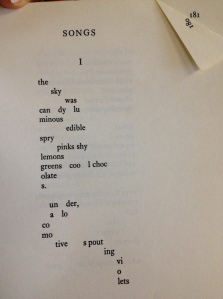
I find it interesting, how easy this poem is to read, given that the letters fall on completely different lines.
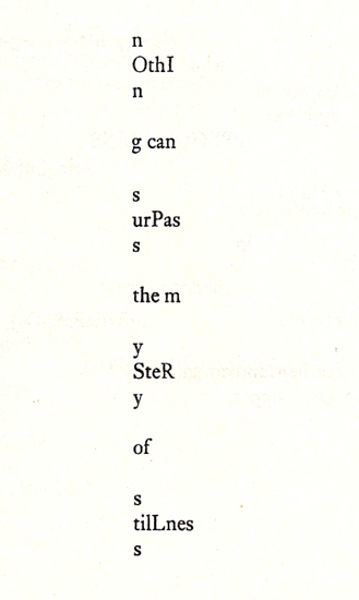
Convergence of design and poetry.
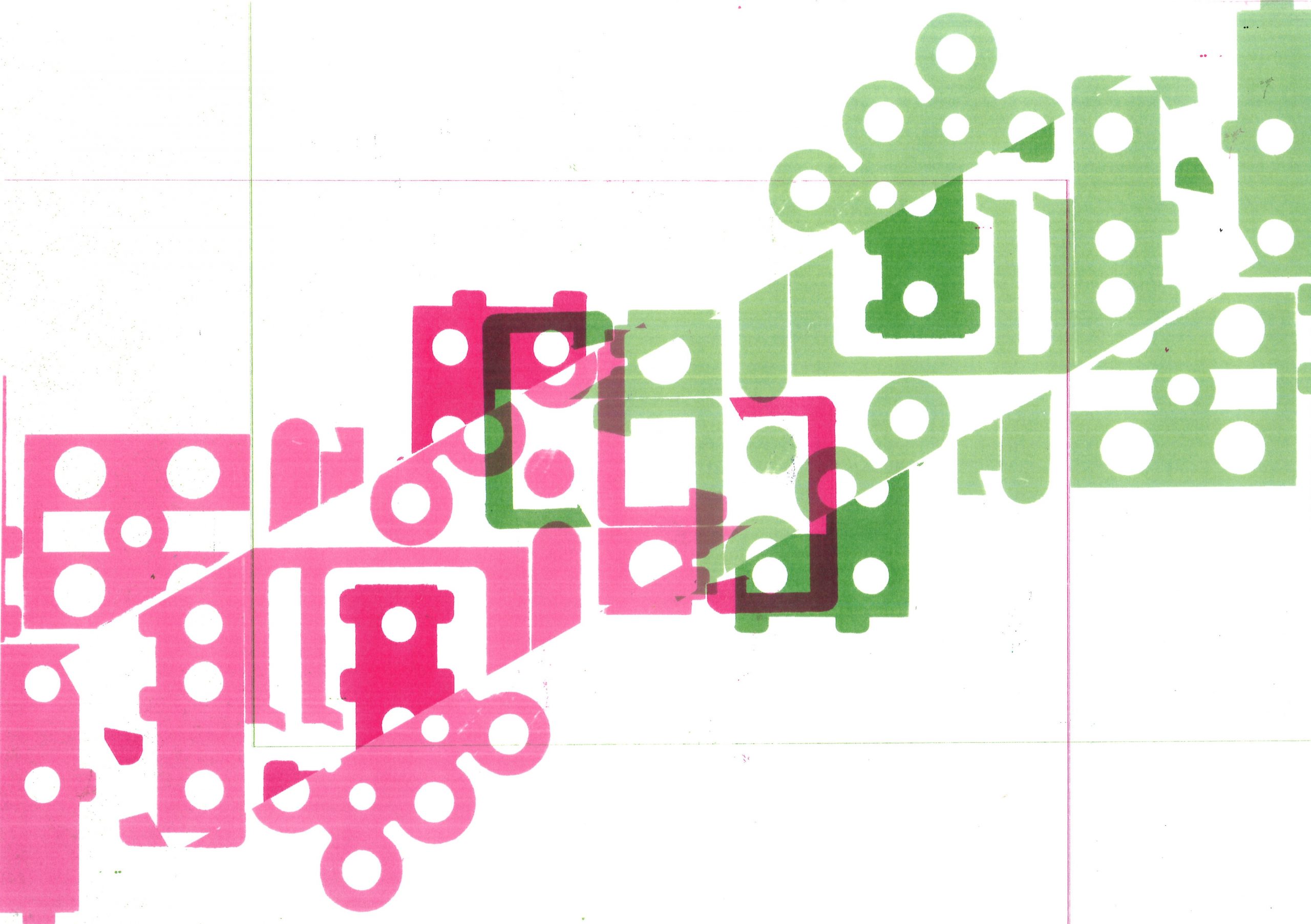
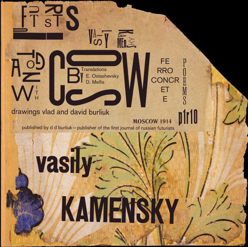
Book design innovation- typographic experimentation. Kamensky (below)
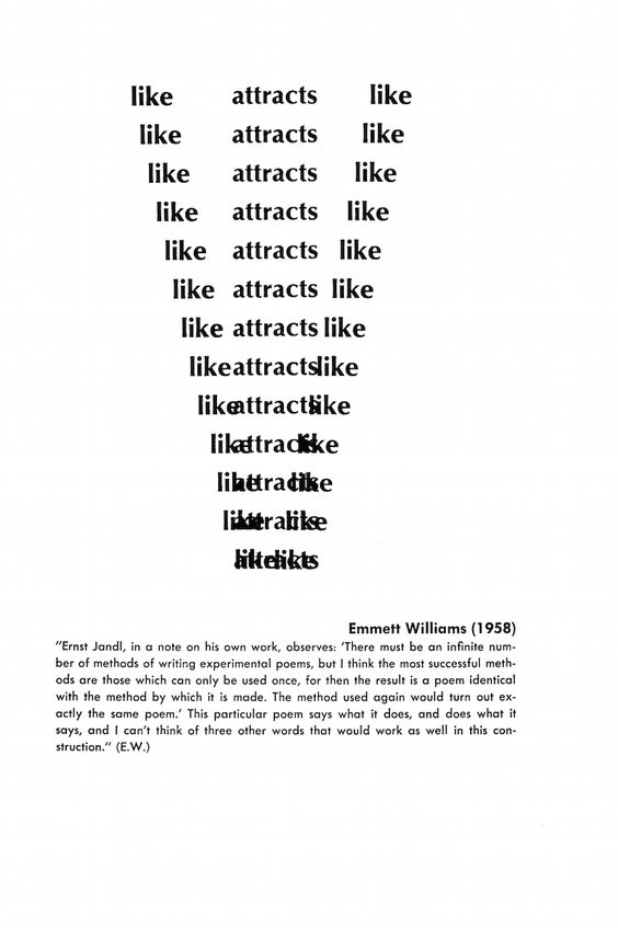
Conceptual artists also produce books of text. In these books, they are speaking for the sake of speaking. Literally uncreative writing.
Bruce Nauman uses analogical, handwritten techniques. He also produces neon installations, usually spelling out words.
Alan Fletcher
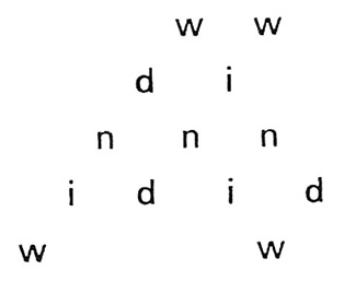
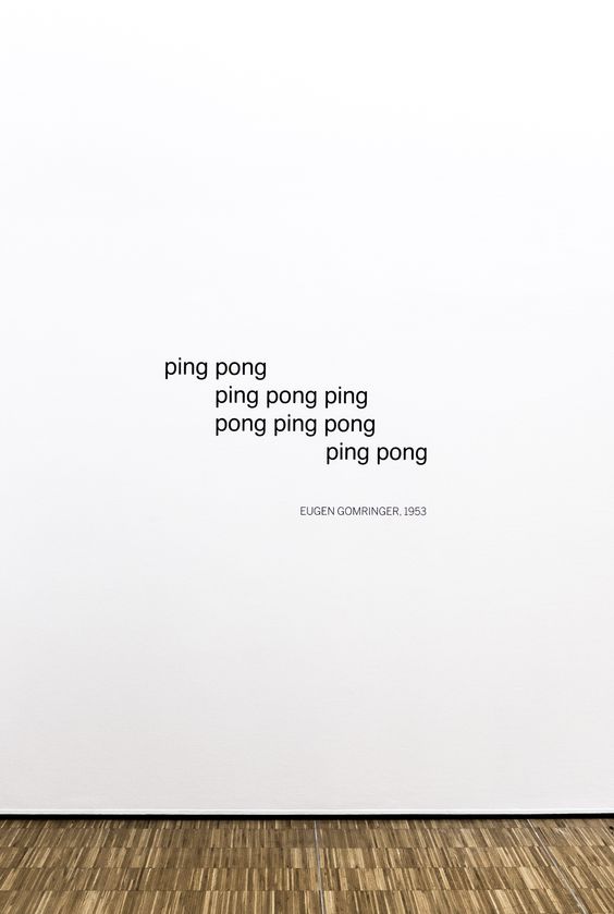
Eugen Gomringer
https://edizioniconz.com/editions/untitled-27
‘Eugene Gomringer (Cachuela Esperanza, Bolivia, 1925). Eugene Gomringer is often presented as one of the fathers of Concrete poetry. In the 1950s, his art studies led him to nonrepresentational paintings, from which he emulated his first poems. In 1960 he founded his own magazine “Konkrete Poesie”, and begin a decades long period of intensive writing that continues into present day.’
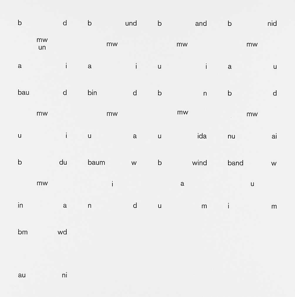
«Tree» and «wind» – the eight letters of these two words serve Eugen Gomringer as building blocks for the square word picture from 1961/2014, which can be viewed as an exemplary example of visual poetry. Inspired by the Zurich Konkreten - Gomringer was once Max Bill's secretary at the Hochschule für Gestaltung in Ulm - the language artist, who was born in Bolivia in 1925 and grew up in Switzerland, initiated the concept of concrete poetry in the German-speaking world. In the work baumwind, the eight black letters can be found in 13 different views in a square arrangement – as if the “wind” had rushed into the “tree” and twirled its letters like leaves. The apparently accidental combinations of black characters on a white background allow for various reading variants and associations. – And the viewers can let their eyes wander through Gomringer’s forest of letters as one walks through blown leaves in autumn.
Ian Hamilton Finlay
Other interesting designers:
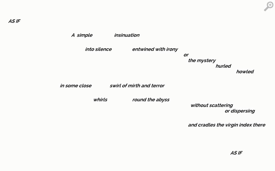
My concrete poetry experimentations
What is your strategy?
Knowing your strategy is an important learning outcome for this
module. Even if you don’t feel able define or conceive a strategy – that
is to say, identifying what you’re seeking to do to/with the material at
hand, or how you might practically archive a specific goal – before
you begin working (which is not at all unusual), it will be important
for you to record your reflection on what may be at stake in the work
retrospectively, as you work and after you complete the poem.
What media could you use?
The most innovative use of media can produce the most effective
concrete poetry. Take some time to consider what exactly could be
used; a media’s not conventionally being associated with typographic
design (such as photography) might lead to interesting innovations.
What are the deeper questions at stake?
As well as thinking about how you can conduct visual research –
working with different media a techniques to produce innovations – you
may want to stop to consider some of the philosophical implications
of conceptual writing and concrete poetry: What is writing?, Where
do/might we find it? What does writing do? What could writing do?
Extended Project brief: Rethinking the magazine
Lecture notes-
- Experimenting with magazine design because of redundancy of magazine (because of digital age.)
- Create a mini monograph magazine
- anthology of concrete poetry
- Experiment with this as much as possible
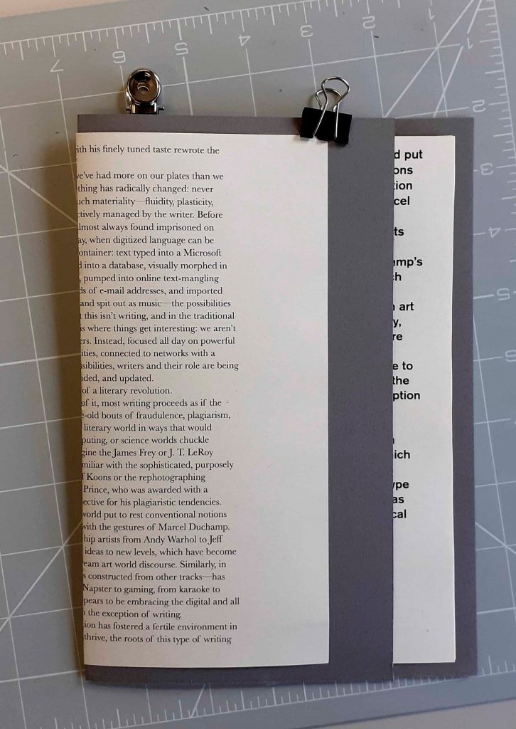
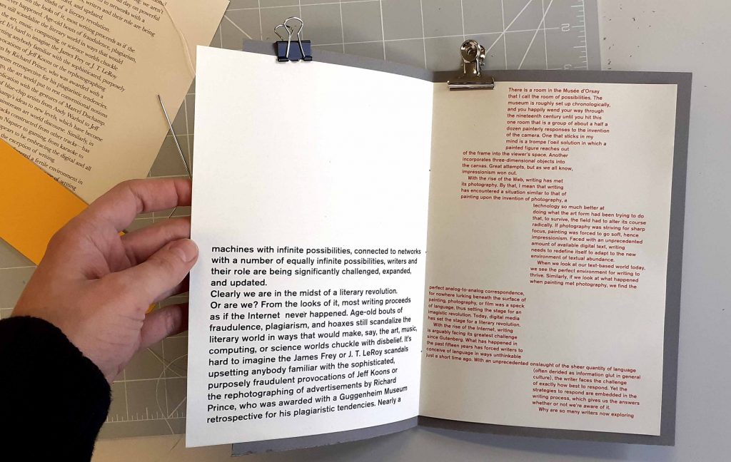
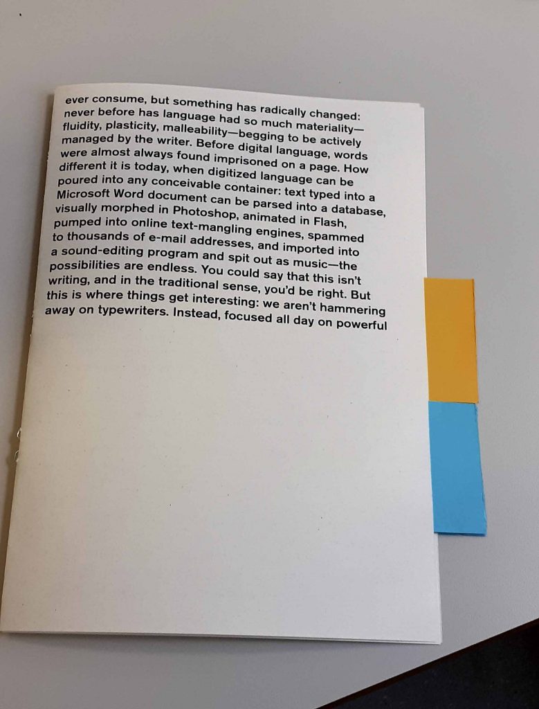
- Can use given poetry, or make your own. must also include 2000 word essay by Goldsmith. ‘Why conceptual writing- why now’- goldsmith. it is introductionary.
- playing with type
- Could produce your own with bookbinding techniques or go with the newspaper club and order from them and they make it for you. (more industry based option) Tabloid, digital, broad
- Need to work within a grid, will need to be ordered early because of production and delivery time.
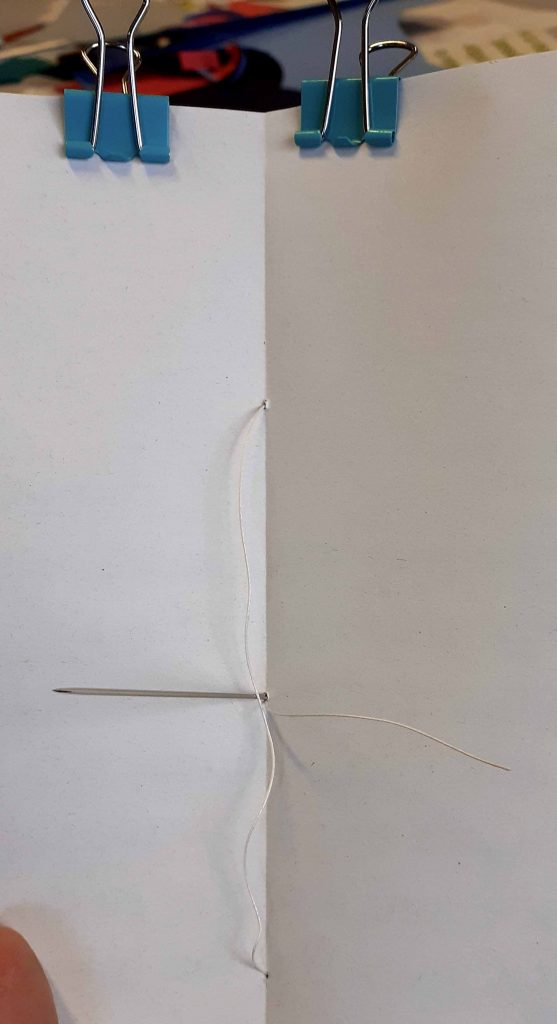
- Choosing bookbinding, you have more time. Own binding- you can print on newspaper paper.
- Could be helpful to do the newspaper route because you don’t need to think about binding/ format etc. Allow for production time, more than 1 week.
- Before you start: Make a project plan. (Consider when and how you will proceed.)
- Research magazine design.
- early formal experiments- can combine with process book because playing with type. Think early on about production.
- Due 26th April
- Magazine/ newspaper/ zine
- Can open PDF file of text in illustrator
- Could use just one font. Could include the introductionary paragraphs to each poem.
- Neat or radical.
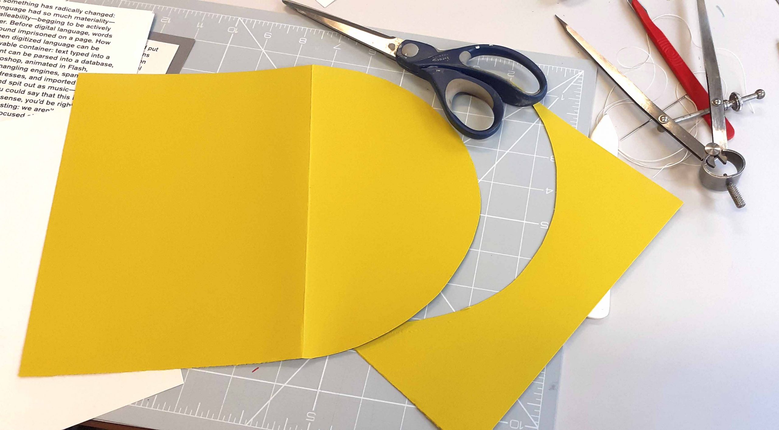
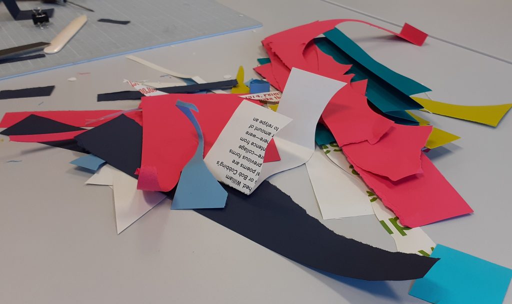
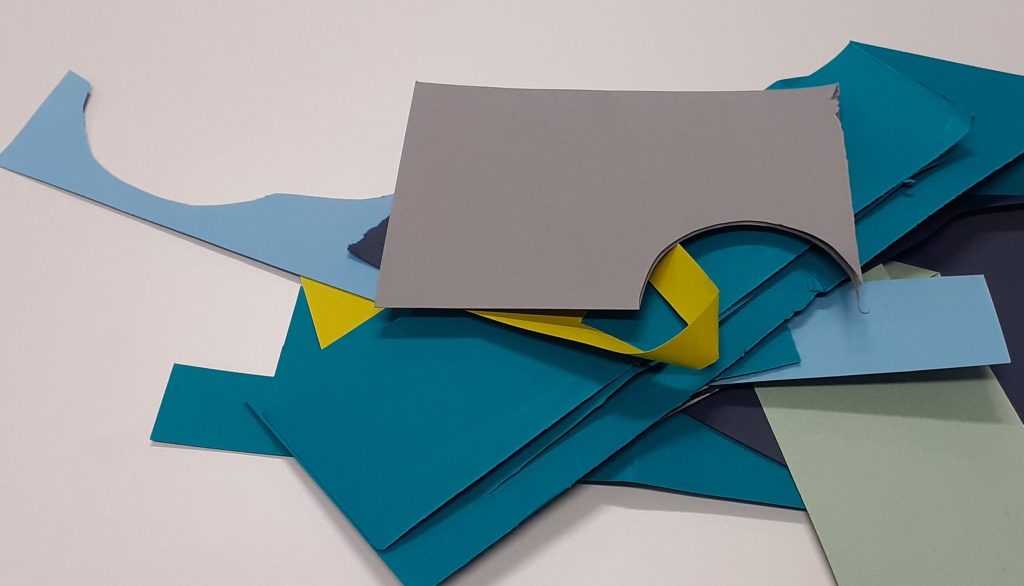
My first thoughts are to use rubber letter stamps, label machine, embossed words, staple words, stitched words. To maybe use a different method for each poem or each few poems.
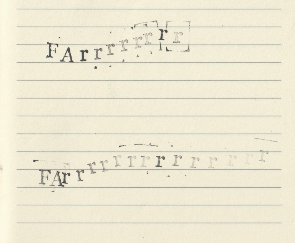
Rubber stamp experiment:
Concrete poem experiments (using labels)
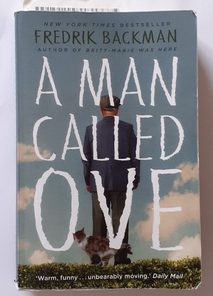
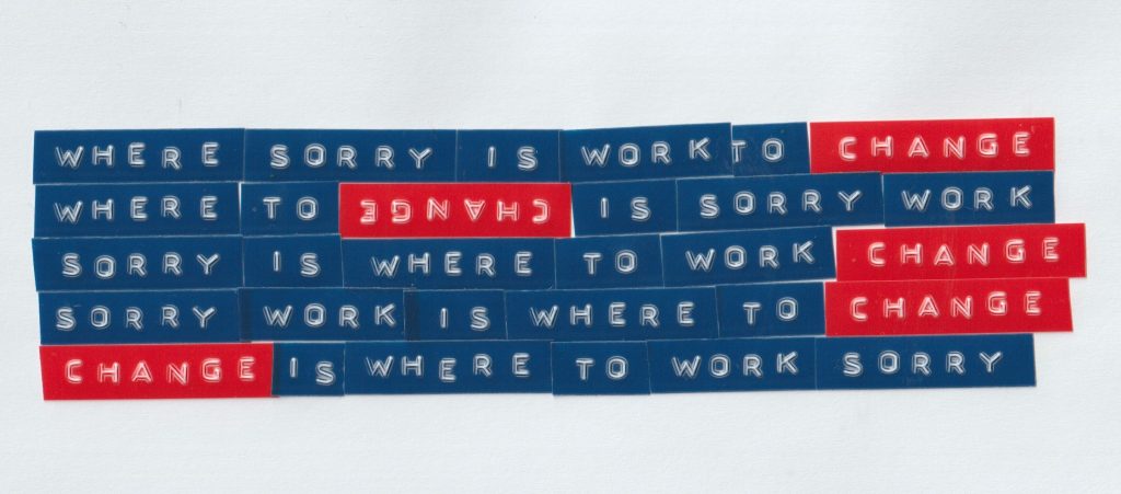
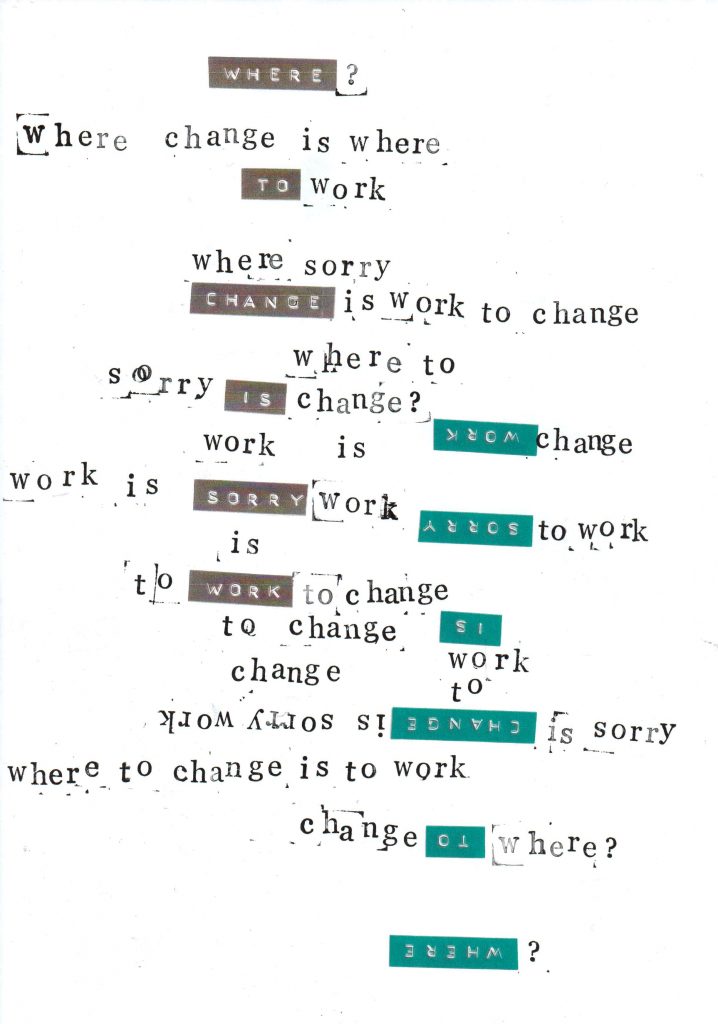
When writing the concrete poem, I used text from a book for my un-creative writing process. In this case, the novel A Man Called Ove.
I approached the exercise like picking lottery numbers: Randomly and from my head.
I counted the number of lines on a page and number of words in a line roughly. I made a note of the number of total pages. I then chose numbers at random for each category, to select 6 words:
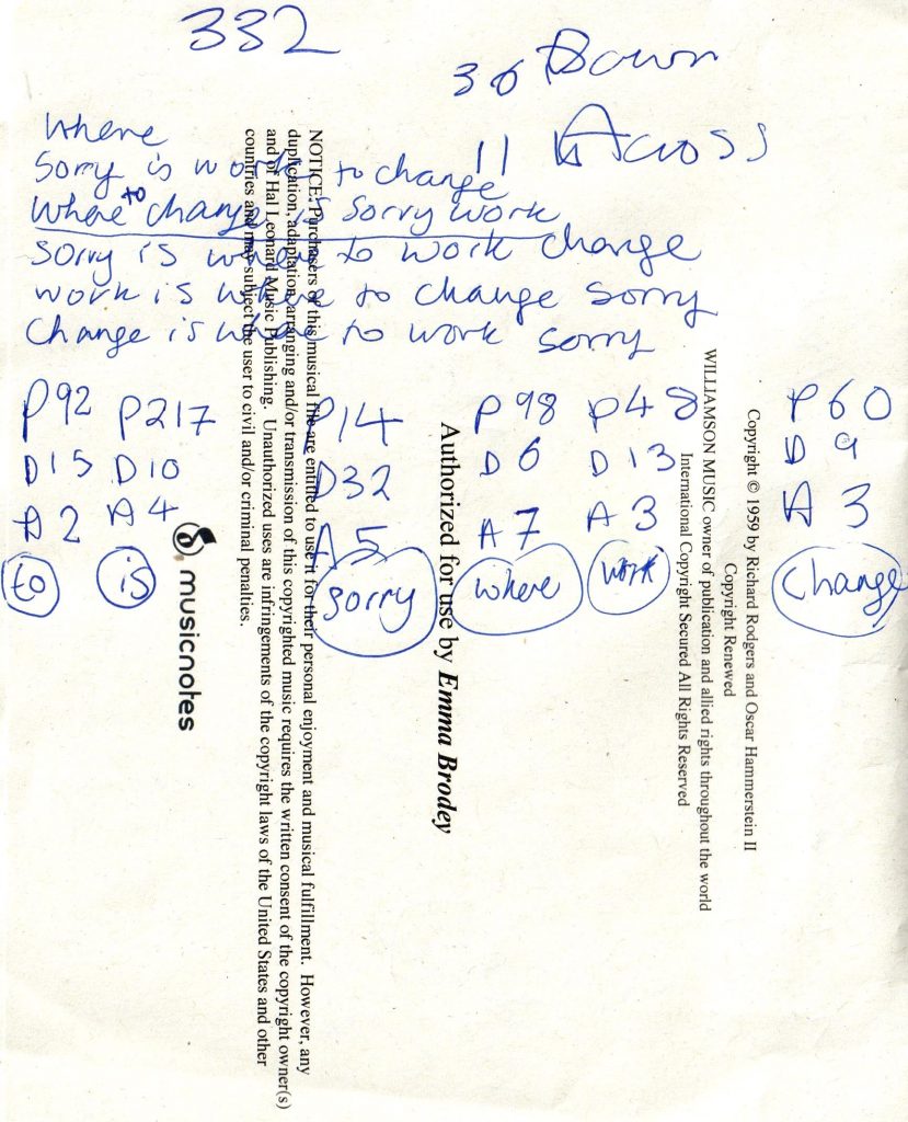
I re-arranged these words to form sentences.
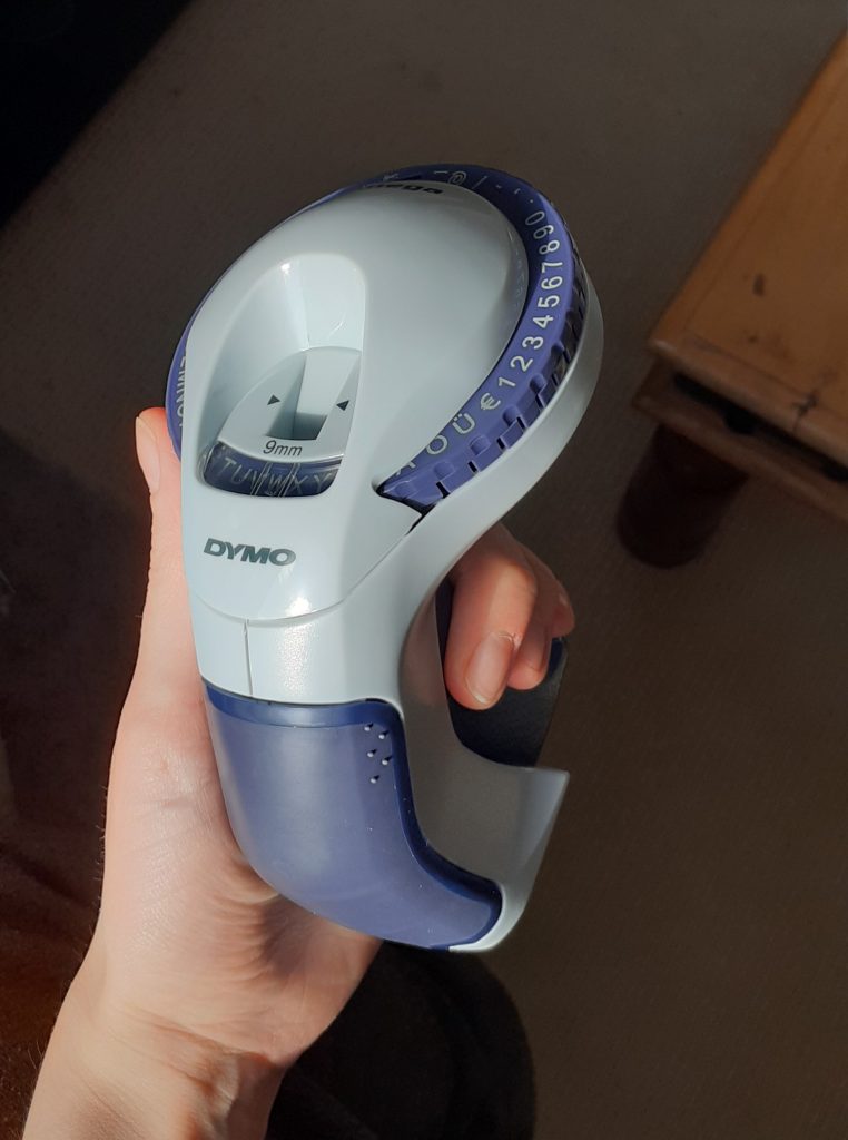
I got old my embossing label maker:
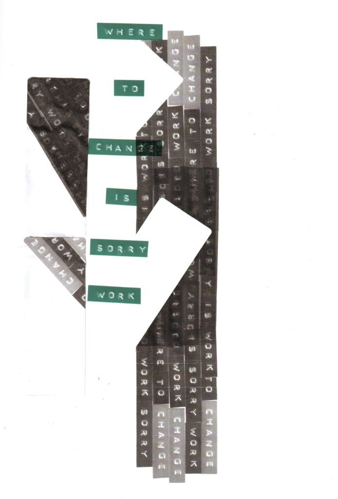
I stuck the words in a neat order, which naturally cannot be 100% precise. I chose red for the word ‘change’ to give it emphasis and create a visual pattern.
Scan of the experiment:
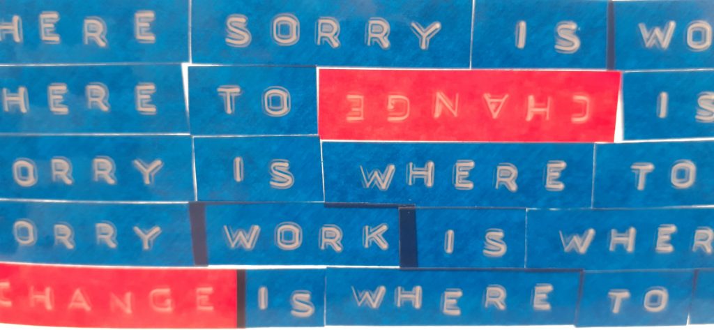
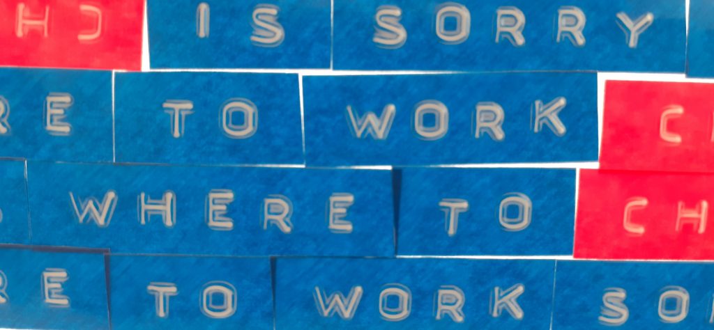
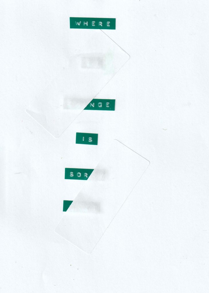
The page held against the window on a sunny day:
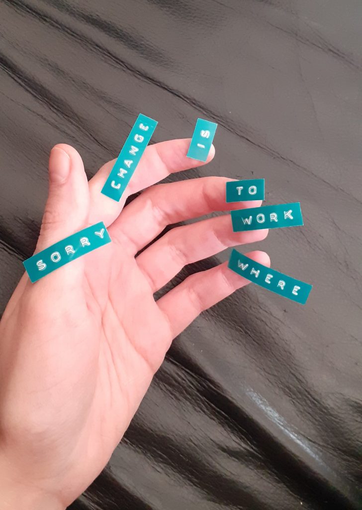
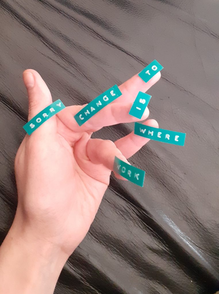
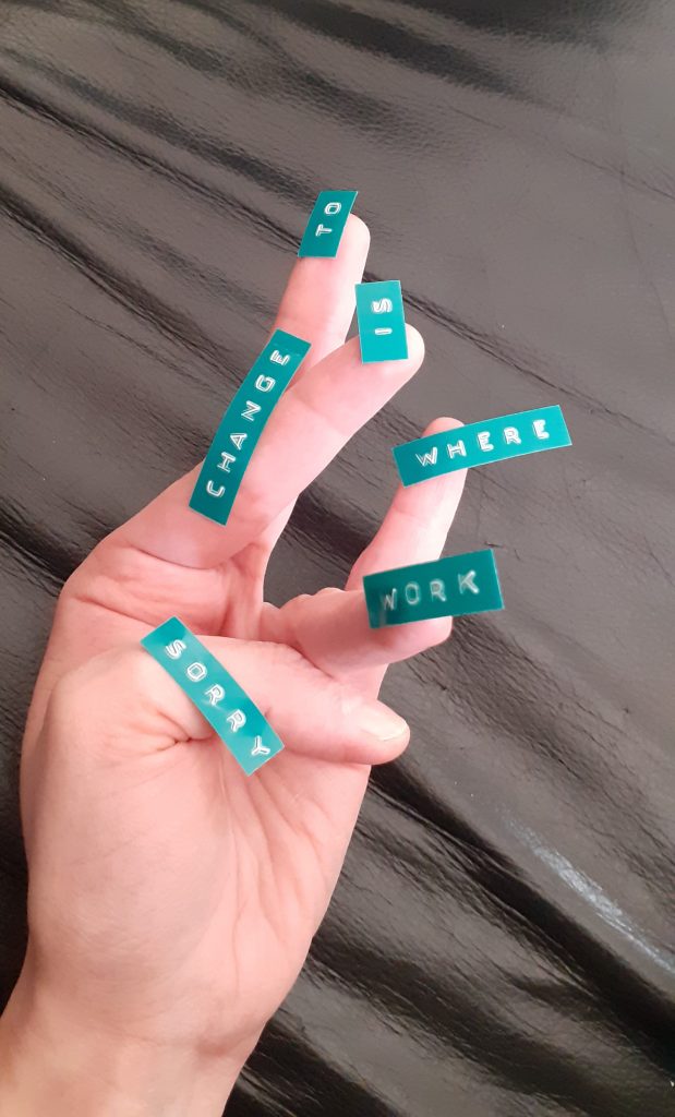
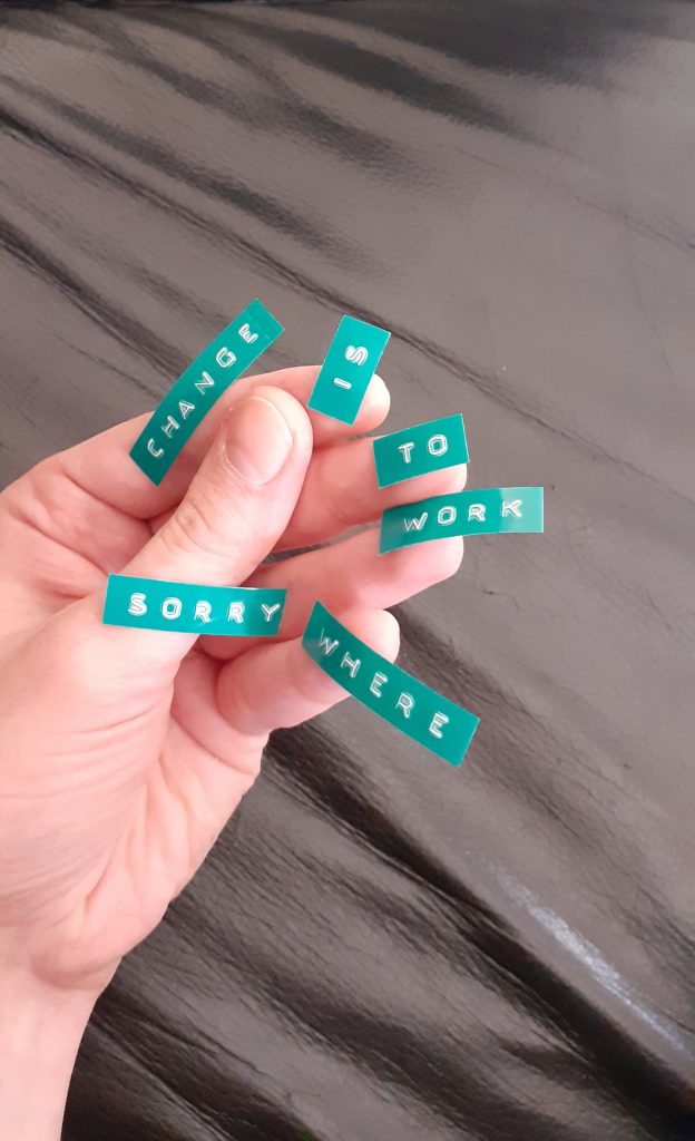
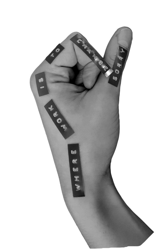
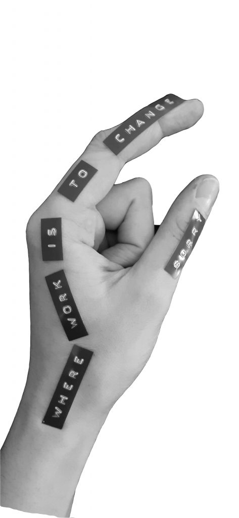
I was inspired by the adhesive element of the labels. I wondered how I could use a different surface to lay out the words.
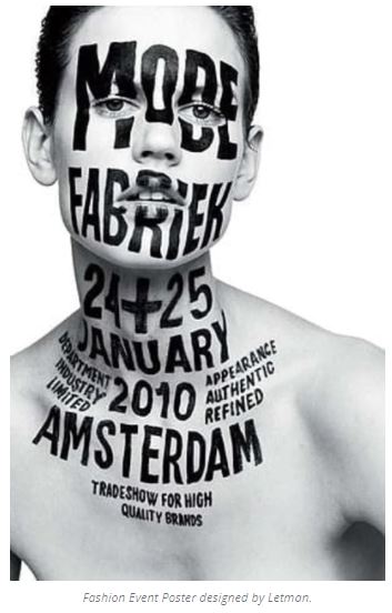
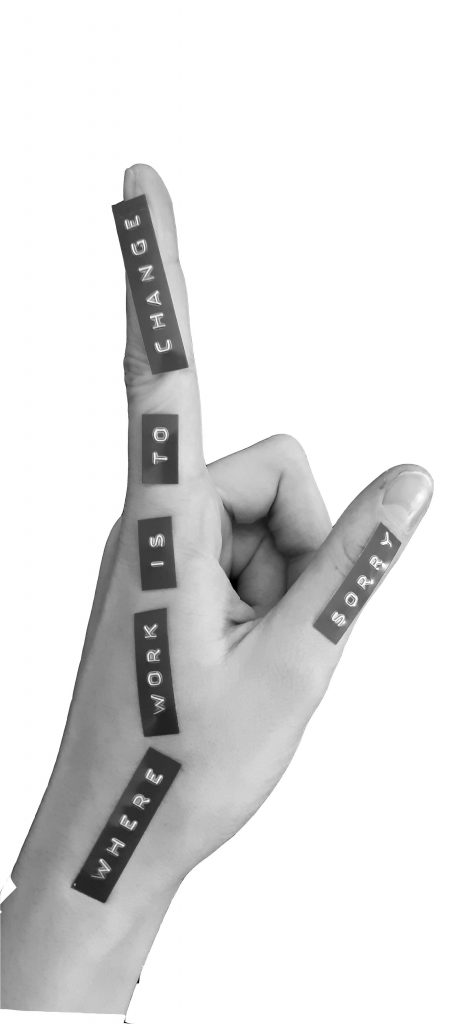
The fashion design poster designed by Letman (earlier in this blog post) , shows the idea of using the surface of the body to display text.
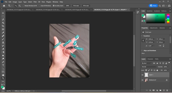
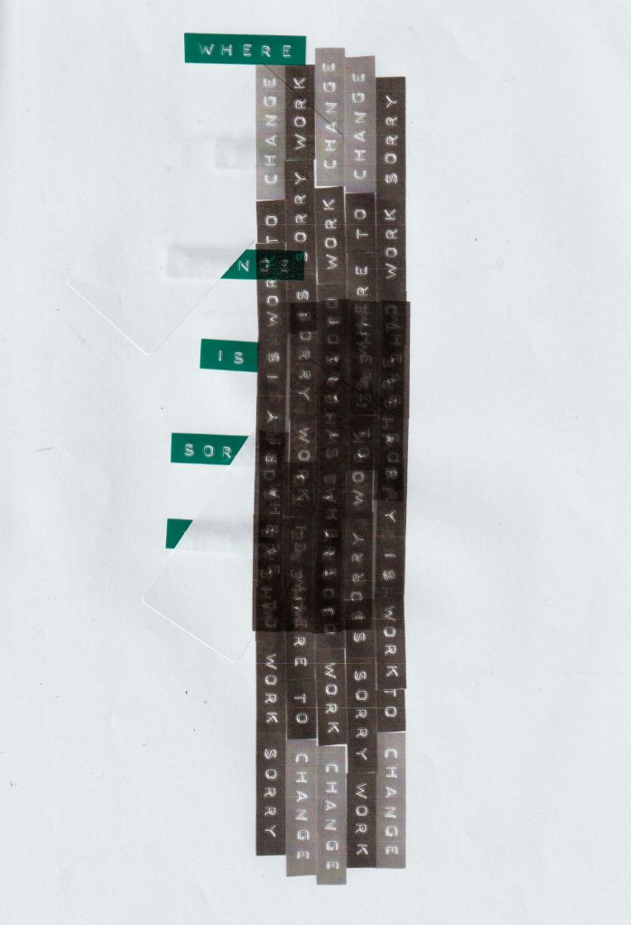
I made more labels with the embossing tool, this time using the green tape. I stuck these onto my hand and took photos in different hand positions. (below)
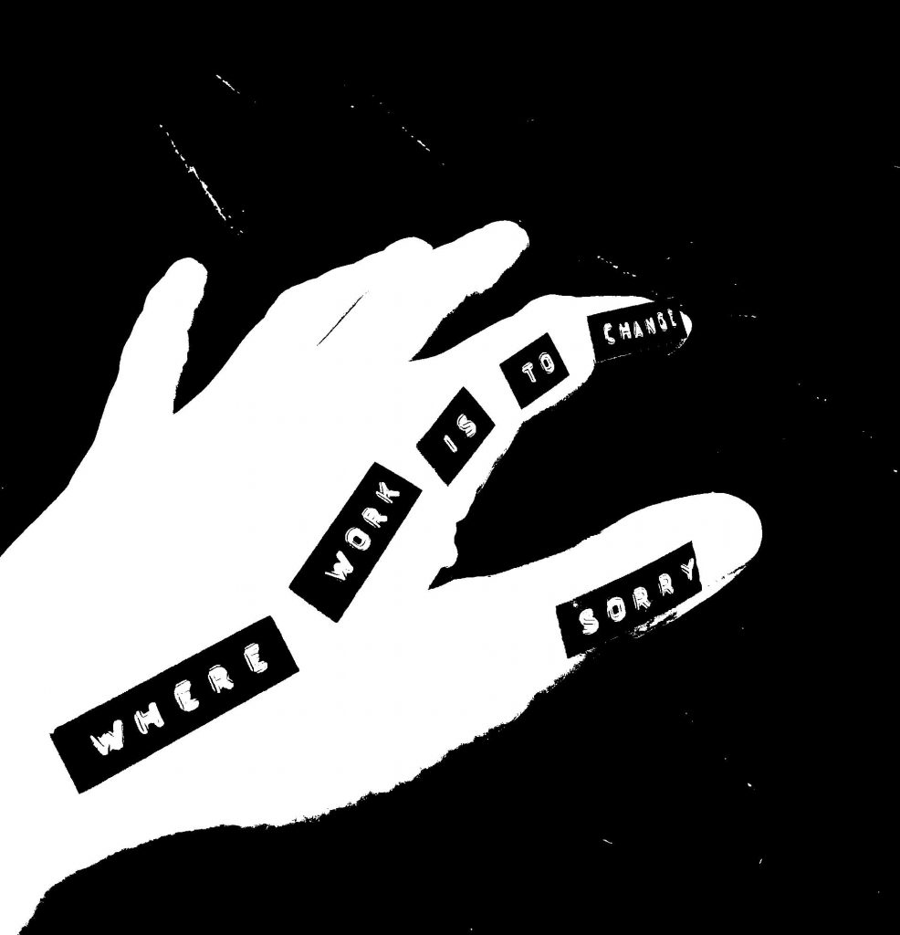
I then opened the images in photoshop, to remove the background from the text.
I used the direct selection tool to select the labels. I copied and pasted them onto a new layer, then deleted the background.
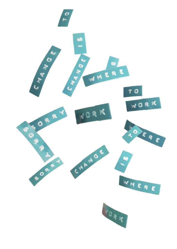
I layered the words from the photos into one image:
I removed the backgrounds of the photos and kept the hands in. I adjusted the photos to greyscale and adjusted the levels:
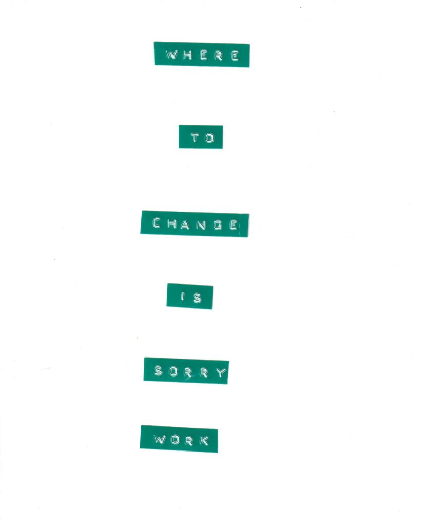
After taking the photos with the labels on my hand, I stuck the labels onto paper.
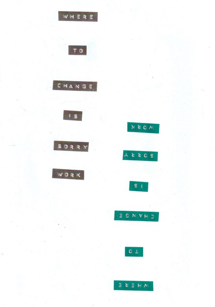
I photocopied the labels in colour onto another page. I then turned the paper and photocopied the same labels in black and white onto the page. This meant the words were upside down.
I then used rubber stamps to add the same selection of words onto the photocopy:
I stuck white labels on top of the embossed labels.
I placed this into the printer and photocopied my earlier experiment on top in black and white. (below)
I removed the labels and stuck them to the side of the page: