Final zine evaluation

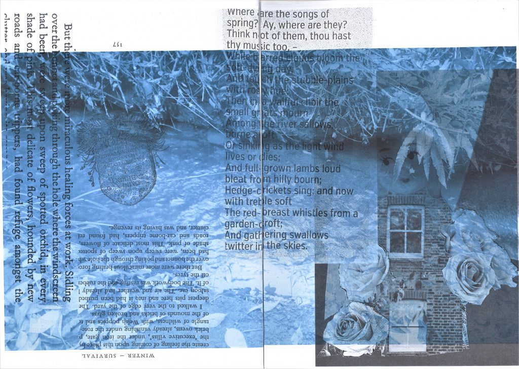
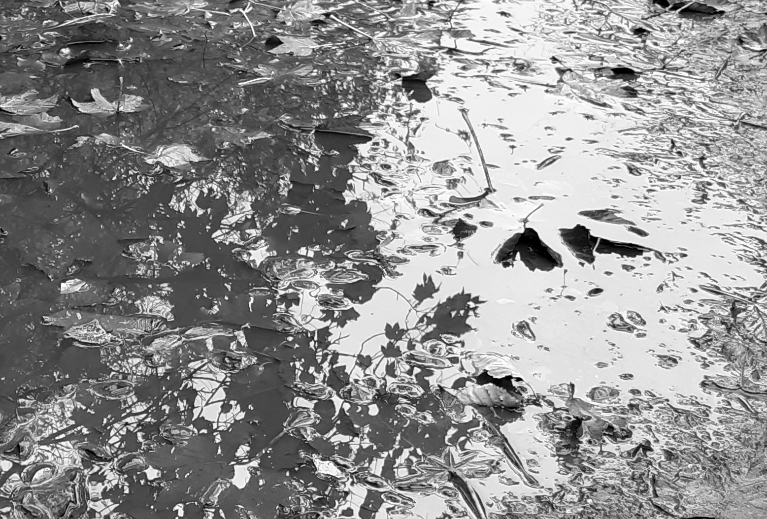
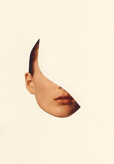
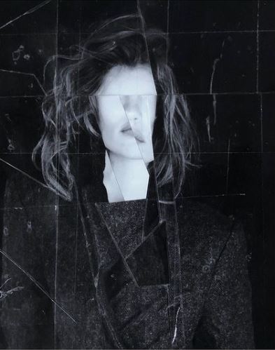
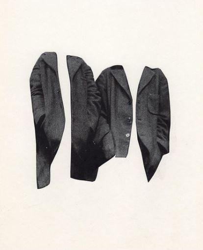
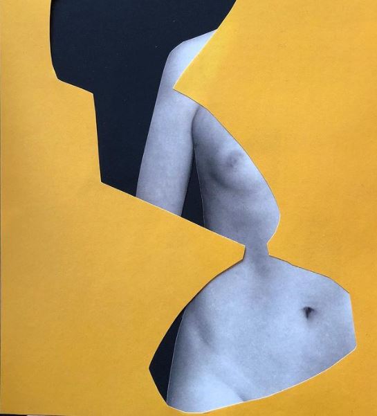
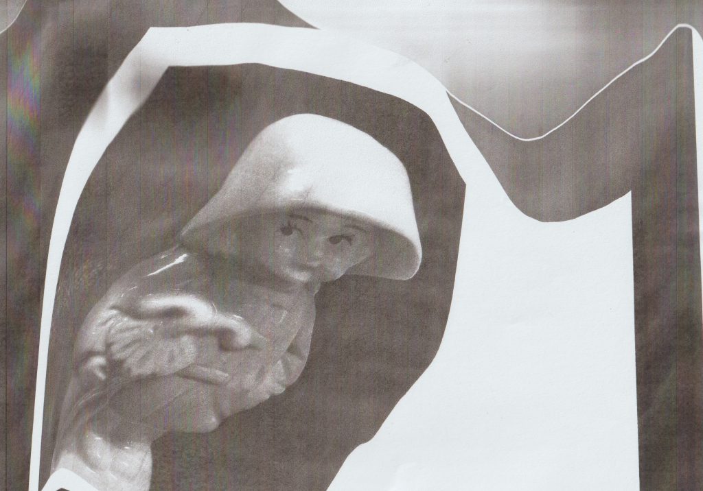
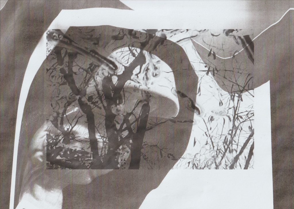
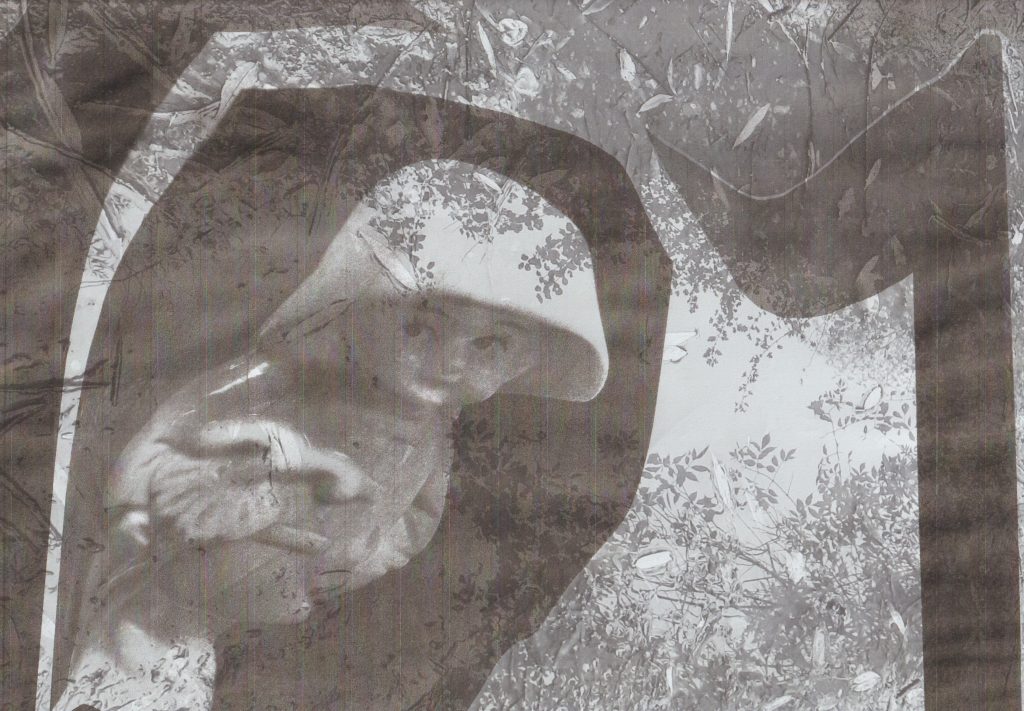
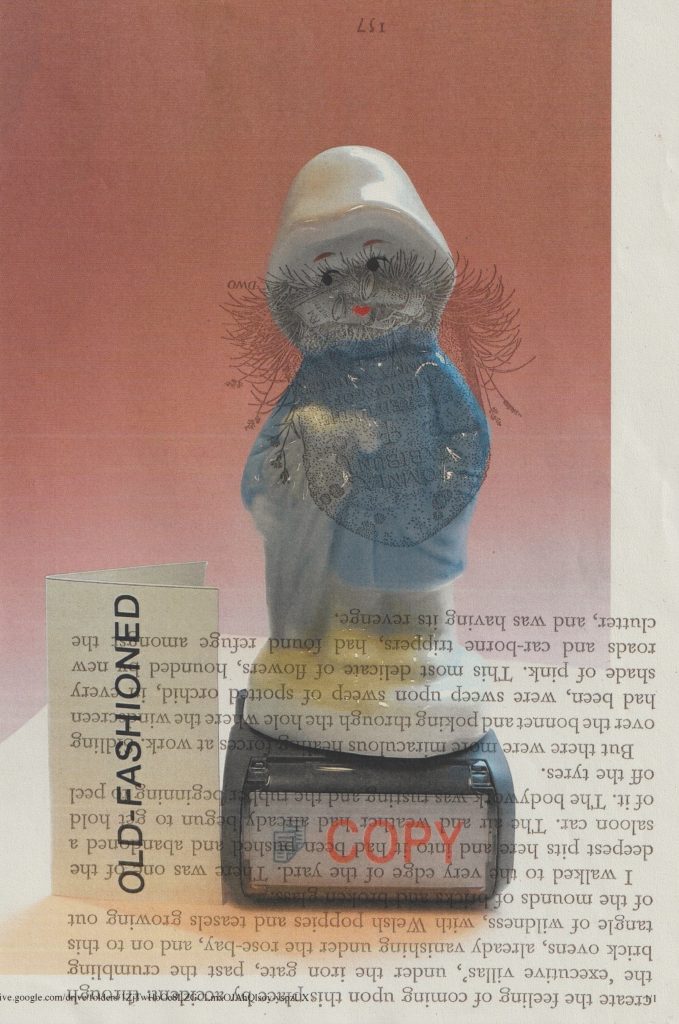
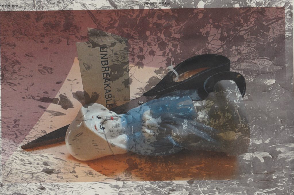
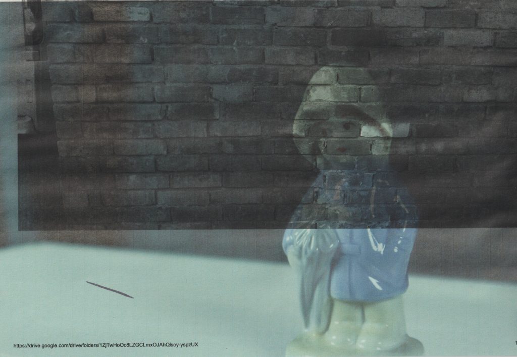
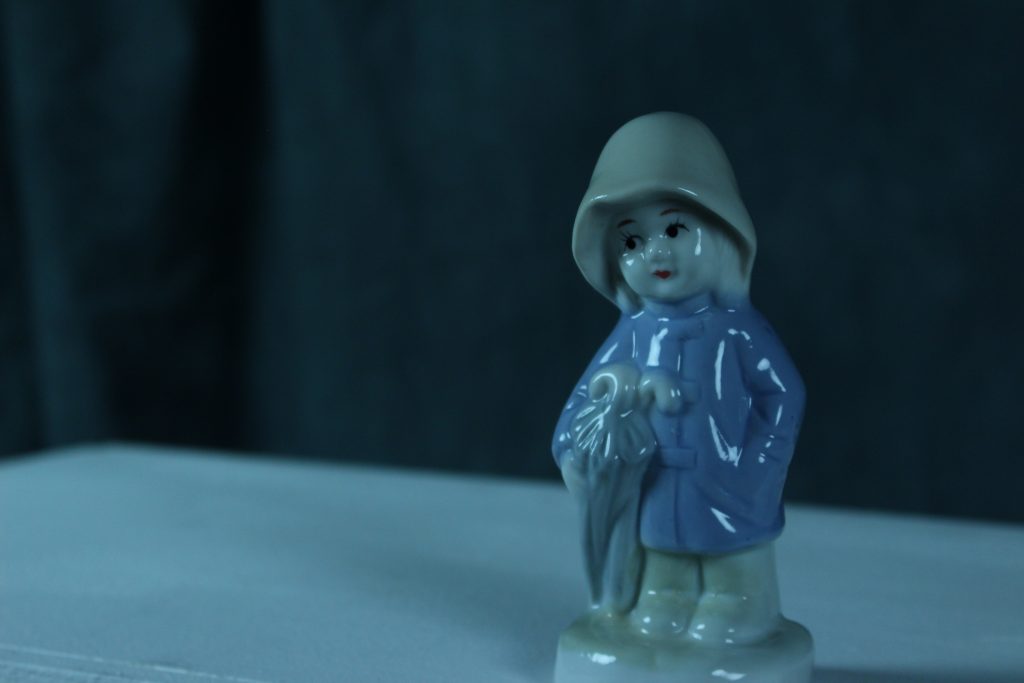
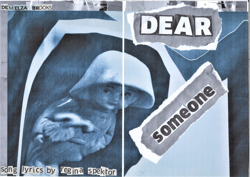
I used different images, combining photos of my figure with photos I had taken around Oxford. This allowed me to express different elements of the narrative. For example, printing the brick wall image over the image of the figure’s face expresses a stubborn or trapped state.

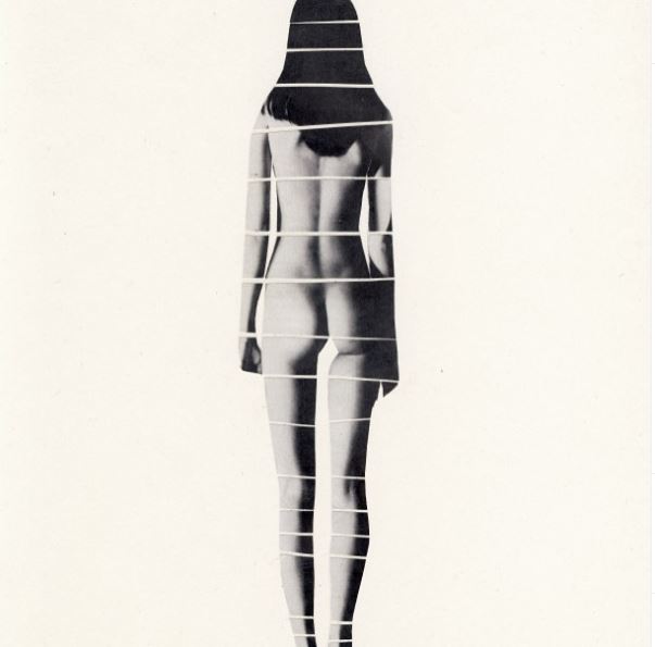
Black and white is suitable for a zine generally because it cuts down printing costs, but I also feel it helped to create the mood I wanted in this story. The zine begins sad and the greyscale helped me to show this.

I pulled inspiration from a variety of sources, such as the song lyrics, personal experience and zines I have seen in the past.

Looking at graphic design books was also helpful in informing my ideas. Books such as The graphic design idea book : inspiration from 50 masters, Fanzines by Teal Triggs, The fundamentals of creative design by Ambrose/Harris, Behind the zines self publishing culture, and Visible Signs : an introduction to semiotics in the visual arts . Buying 2 zines from etsy.com was useful because I could see how another artist would approach zine-making.

Looking at photos of zines on the internet was important because it allowed me to see how a physical zine can be constructed. I didn’t take every idea on board but absorbing these ideas allowed me to be creative and apply my own methods to zine making. For example, I looked at the posterzines by people of print and although I liked the way all the information is compact on the one sheet of paper, I did not want to go down this route with my zine. Since my zine is about a story of change, I wanted it to physically read like a book, with pages that could be turned and a narrative that could be slowly revealed to the audience.

I considered the bookbinding methods we were introduced to in Ruth’s workshops for module 002. These methods informed the direction of the physical format of the zine.

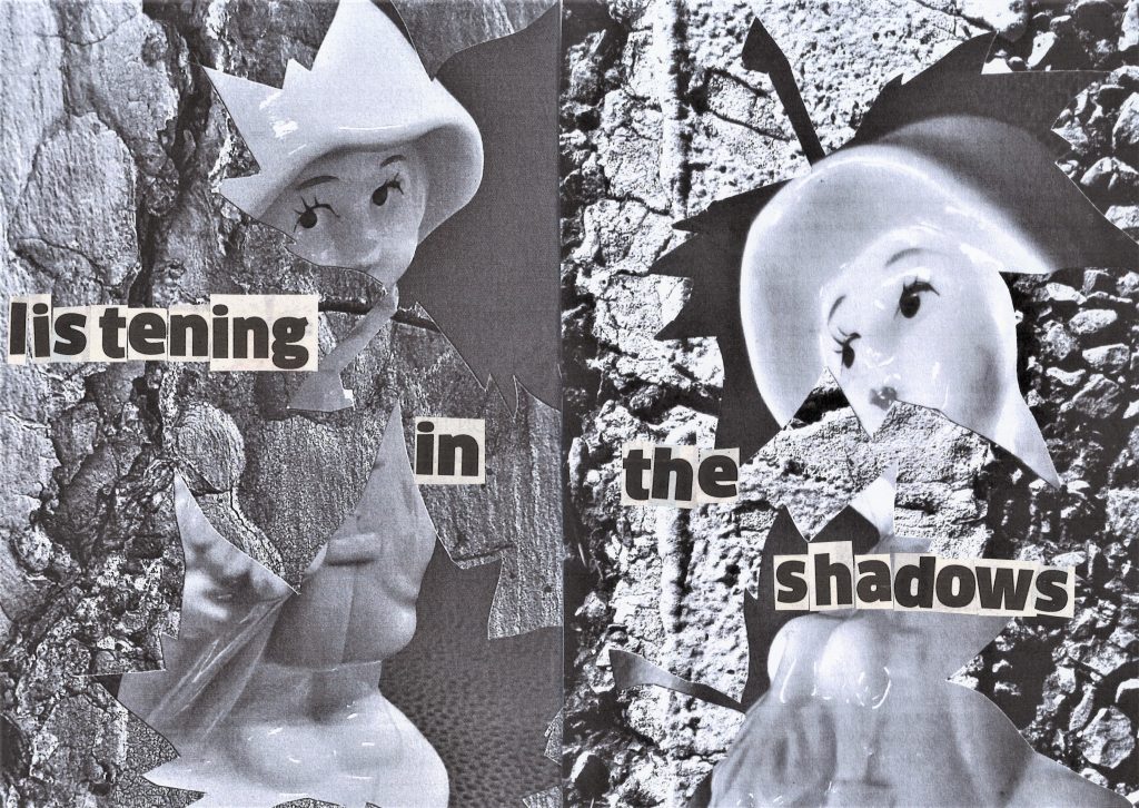
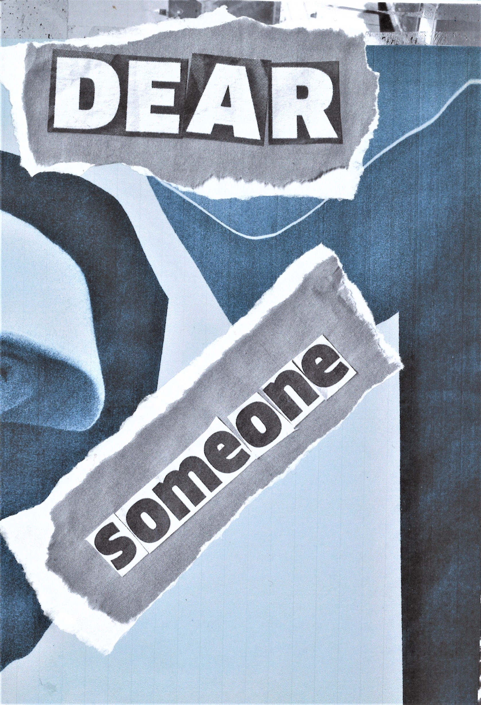
The use of cut-out text reflected the theme of the zine. My zine is about breaking and fixing. Both emotionally, physically, and metaphorically. The way I glued the words together, forming them from separate found letters, helps to represent this narrative.

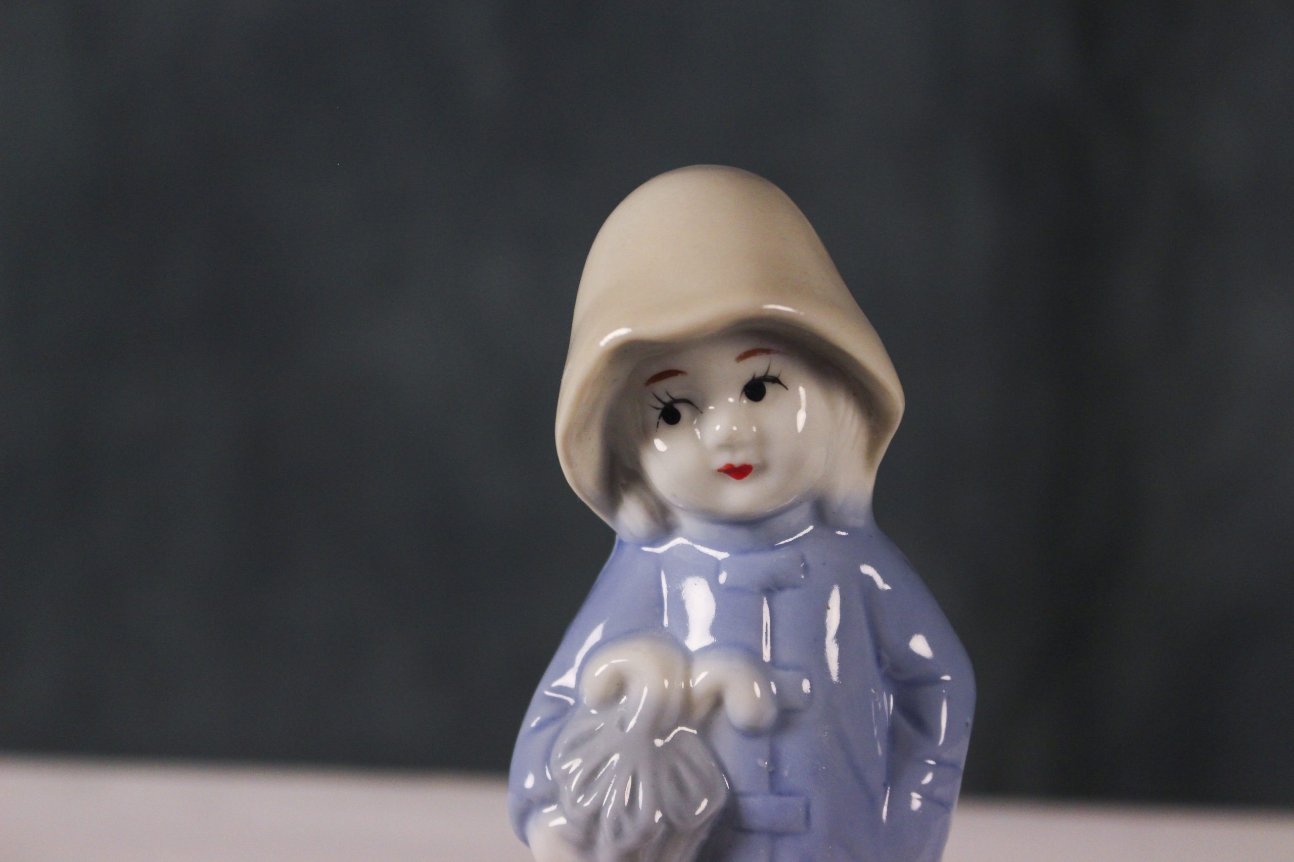
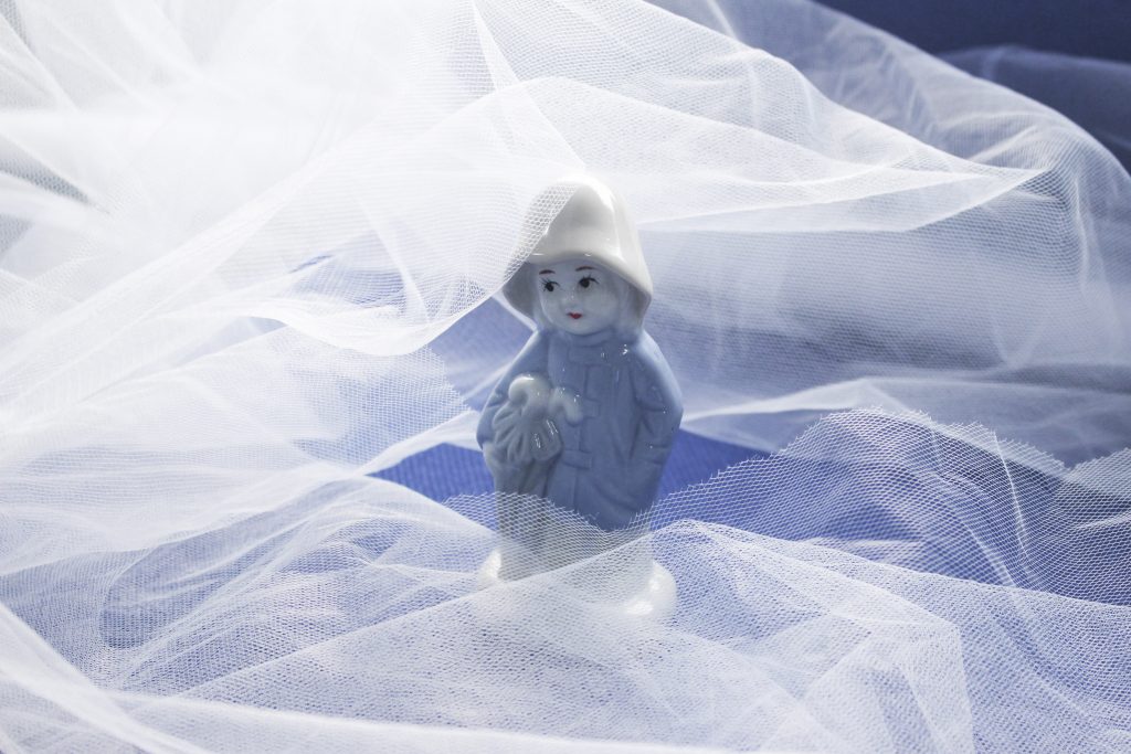
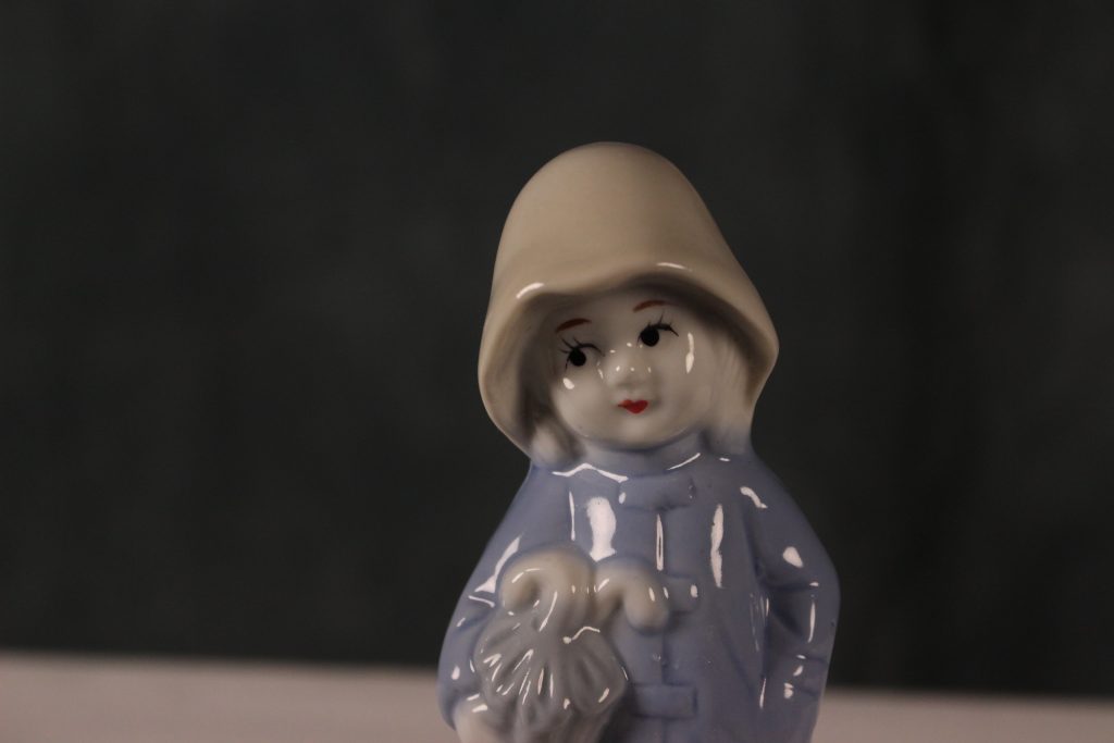
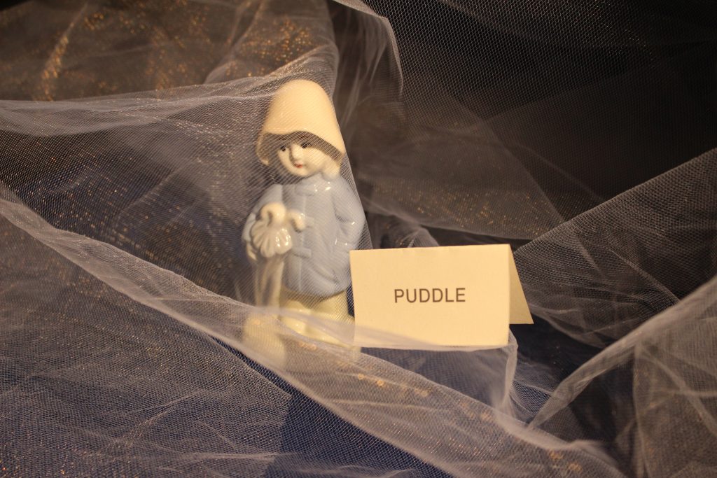
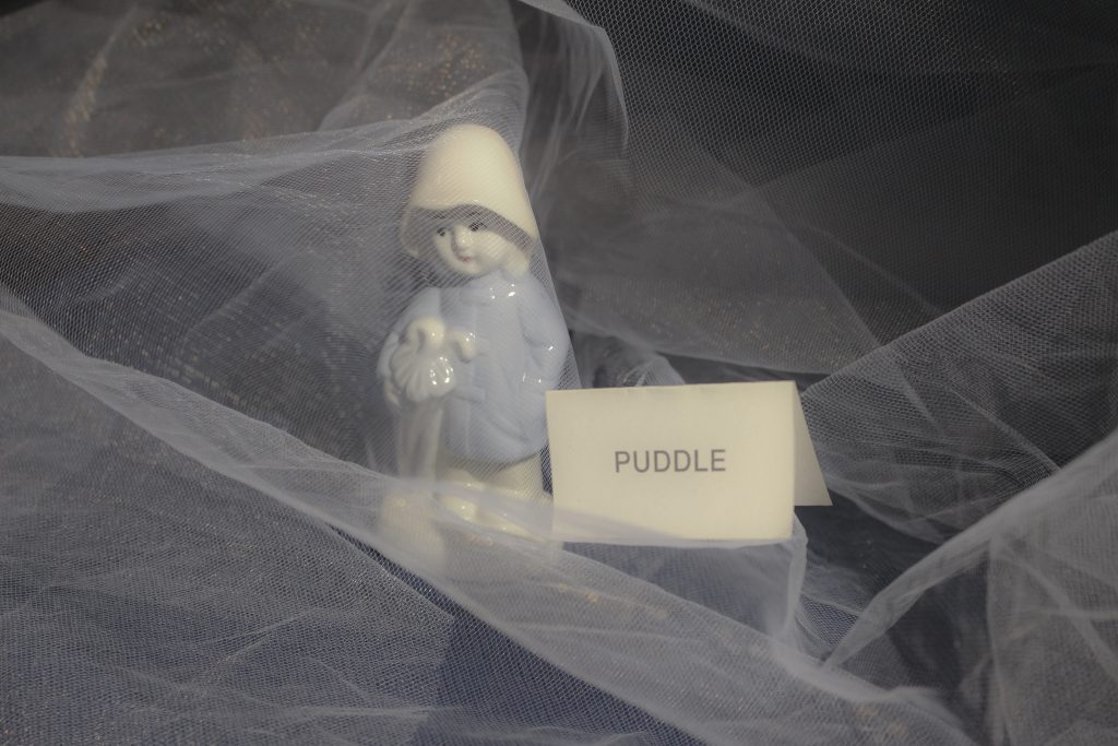
I used exclusively collage for my zine. (I did not use drawing or digitally produced images). I stuck with analogue methods for this extended project as I wanted the zine to feel handmade and personal. The cut and paste method I used for the images gives the same impression as the repairing theme mentioned above.

Once I got into the making of the zine, I took it in my own direction. I was still reading and looking at research material throughout but I felt like I needed to tell my story in my own way. There was a point in the process where I did not feel the need for outside input anymore. This was after I made the draft zine. My research period was more near the beginning of the project.

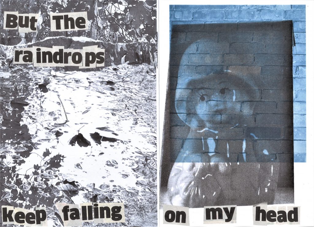
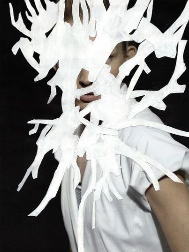
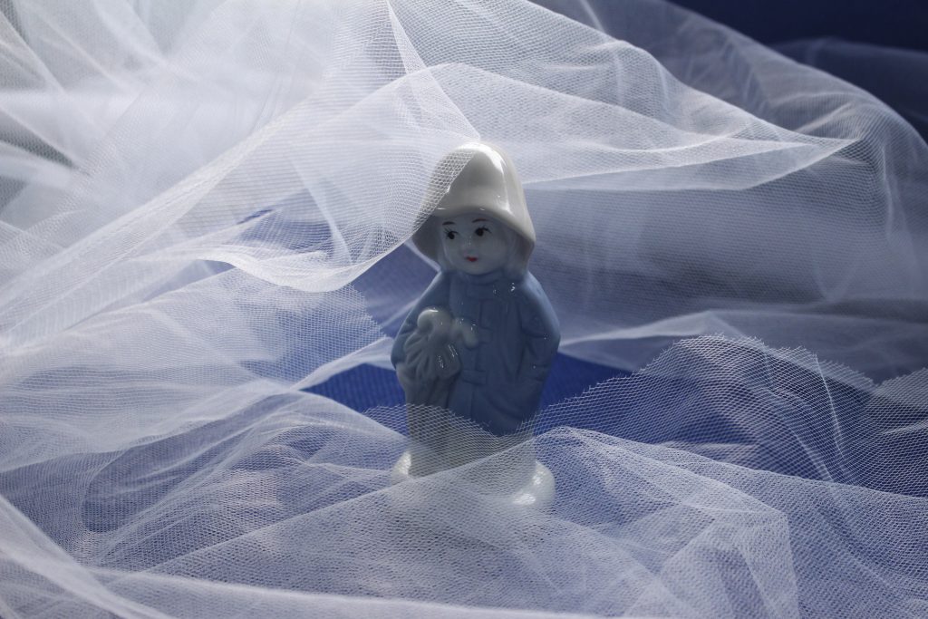
I have avoided copying any one design, but have been influenced by elements such as the distortion used by Sofia Clausse in her zine about ‘the windy city’. The distortion in her zine was a reference to the windy weather. In my zine, the distortion represents change and mental health.

I struggled with knowing how long to spend on each area. For example, I did a lot of experimentation because I felt I needed to explore my object and how to present it on paper. This was not much of a problem in this semester but did lead me to feeling overwhelmed. If I had set time limits for each task, it might have helped me keep on top of the module overall.

Collage experimentation

Isabel Reitemeyer

Collage artist based in Berlin. What I find interesting about her work is the variety of techniques she uses in her collages. Each collage is different and surprising. She experiments with the physical quality of the paper. Sometimes folding it like a fabric and other times cutting the paper with a scalpel.

Images from isabel reitemeyer (@isabelreitemeyer) • Instagram photos and videos

In this image, she has cut the paper carefully into a smooth curved line. The area of the face stands alone on the page. Cutting an area out is an other way of concealing an area, this adds mystery.

I like the choppy style of cutting within this collage. It reminds me of a smashed window. Some lines are parallel but the piece is asymmetrical.

The white area hides the image behind. Because of its shape, we see glimpses of the figure between the branch-like shapes. The flat quality of the white area balances out the depth and blackness of the photograph.

Cutting out sections of an image means you can re-arrange them on the page to your liking. The medium of collage means you can be selective with what to include. In this image, I am drawn to the shape of the negative/white space.

I like the way Reitemeyer plays with layers in this piece. The shape she has cut from the yellow paper acts as a frame for the image behind. The choice of plain yellow draws the focus to the figure. If she had used another image for this top layer, it might look confusing or flat.

I like the way she has broken the image into sections. To me, this symbolises something broken or unsettled about the character or narrative.

When starting the project of making my final zine, I wasn’t quite sure where to start. I needed to generate more ideas about the context, layout and visual elements. Having experimented with format, I was happy I had 3 possible formats to work with.

I began to take photos with my phone camera. I focused loosely on the themes of water, home, fragments and seasons. I took the following photos:

I converted some of the images into black and white before printing them. I used these photos as collage pieces to incorporate into my sketchbook along with the image of my chosen object, the raincoat girl.

Before & after photoshop/ camera RAW

Softening this image make the photo look smokey and dream-like.
Collage experimentation

Within my sketchbook, I began experimenting with collage as a way to play with ideas for the zine.

I printed the photo of the raincoat girl figure in black and white. I photocopied the photo while moving it around on the scanner. I liked the effect because it gave a wavy underwater feeling.

I placed the photo back into the paper compartment of the printer. I then printed the image of the puddle on top. I found that the combination of the dark areas and lighter image underneath worked well.

This experiment wasn’t as effective because the background is darker than the photo I printed on top of the background.

I printed this page from the book The Unofficial Countryside by Richard Mabey. I chose this text because of its reference to seasons and the idea of rebirth. I like the combination of colour with black and white.

Before & After Photoshop

This week, I had a go at editing my photos on Adobe Photoshop. Being new to the program, this was a case of experimenting with the tools. My focus was on improving the images as best as I could.

Unfortunately, I did not use the layers tool within Photoshop. This meant that the changes I was making were being made to the photo itself. After saving the document, I was unable to see my previous steps in the history toolbar.

I opened the photos in camera RAW. This allowed me to make changes to the photo before making further adjustments in Photoshop. By then opening the final image in Adobe Bridge, I was able to see the adjustments I made in camera RAW.

Before
After

I lowered the contrast to give a softer feel and made the over all image brighter. I wanted to create a dream-like image, like the figure is in the clouds.

Before
After

I found the original image too dark. I didn’t like how the background was contrasted against the figurine. After adjusting the image in photoshop, the background had more texture and the colours of the Raincoat Girl popped.

Before
After

I used the quick selection tool to select the figurine in this photo. I then added contrast so that the boots were more defined. Brightening the wall in the foreground, shows more texture and made the image more interesting.

Before
After

I liked the way I composed this photo and how the figure gazes into the distance. I felt it looked too dark and gloomy. I lifted the brightness in the image. However, I would like to add more saturation to lift the colour in this image.

Before
After

I added more contrast/ shadows to define the figure’s face. I toned down the colours and softened the sharpness of the sunflower.

Before
After

The original photo contained a lot of yellow. This is due to the warm toned lights reflecting off of the material. I could turn the colour temperature down using the camera RAW program.

Before
After

This image is not in focus, so the end result is not perfect, but I wanted to try editing a coloured image like this. I increased the depth of the shadows and improved the overall colour.

Before
After

Increasing the exposure greatly improved this image, as the face became more visible. There is now more balance across the picture.