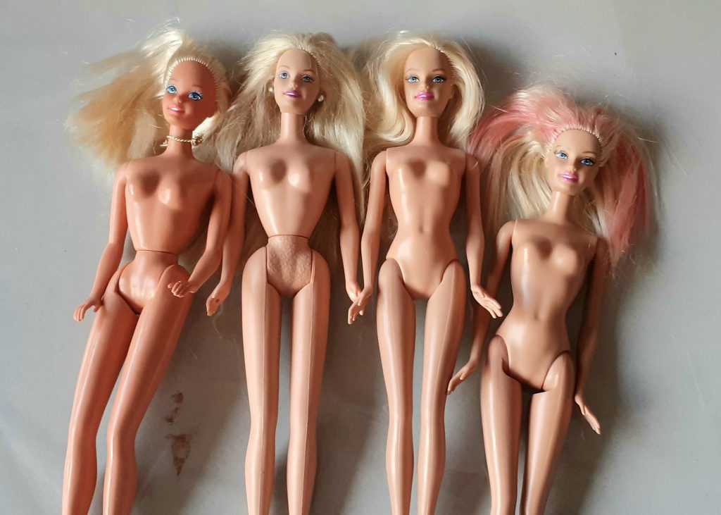
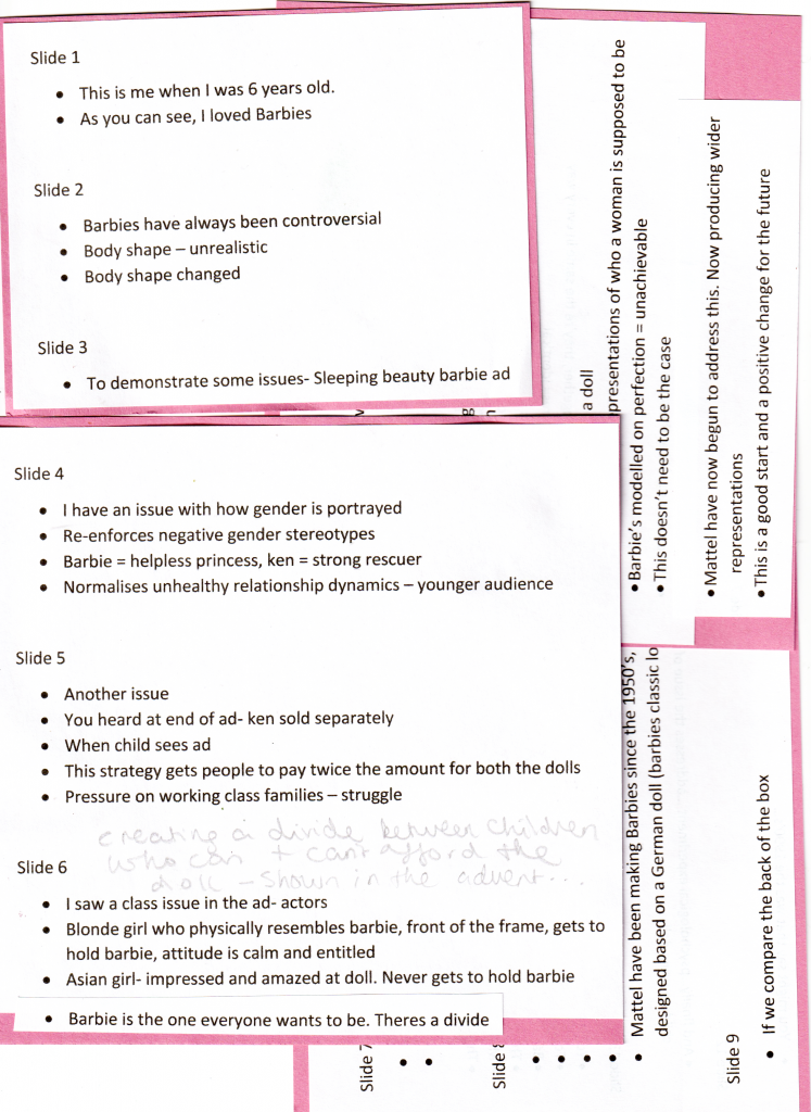
I read a section of the book Left to Right by David Crow. This is a book about visual culture. David Crow was a graphic designer and Pro Vice chancellor of UAL, up until his death in June this year.
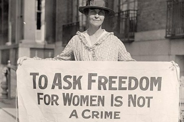
The book looks at the shift from the written word to image in our everyday experience/ mass media. It also introduces us to the politics of language, for example how the rise of literacy played a part in the subjugation of women and feminine thinking.
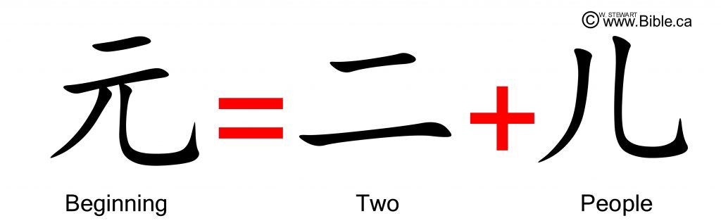
- Language has evolved from culturally specific roots i.e. the Japanese character for picture, combines the symbol for ‘threads’ and ‘to draw together’ > this is a reference to textile production. This demonstrates the relationship between language and technology.
- In Chinese script, this is still the case, for e.g. Male = Strength + Paddyfield. This reflects the history of the culture which the script originates from.
- Television= ‘The single most potent technological innovation since the printing press’. Television changed the way we generate language and consume information. Reading was a more solitary activity- the television allows us to receive information in groups, e.g. a family gathered around a TV. This invention produces a way of reading images unlike what books could provide.
Shifting from Left to Right side of the brain
When we read, our brains have to translate the words from symbols into an image, this is a longer process than seeing the image immediately on a screen for example.
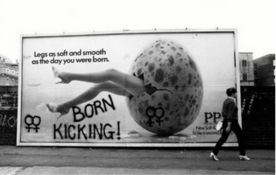
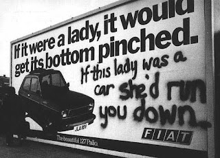
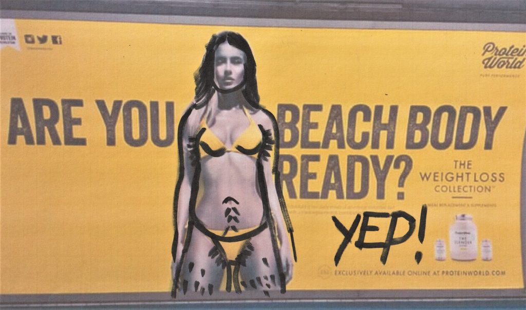
The development of screen-based media has increased image-based use of language. The shift away from the alphabet-based language has left language makers, such as designers, artists, authors and schools, needing to re-assess how they communicate to a new generation who are used to this new way of reading/ taking in information.
The written word has been the primary tool in communication for a long time. It has the advantage of being able to get across specific details in an unrivalled way.
…However, pictorial communication has other advantages.
- To speak across language barriers
- It’s cheaper to share across the world
- It’s quicker to share across the world
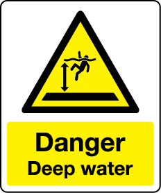
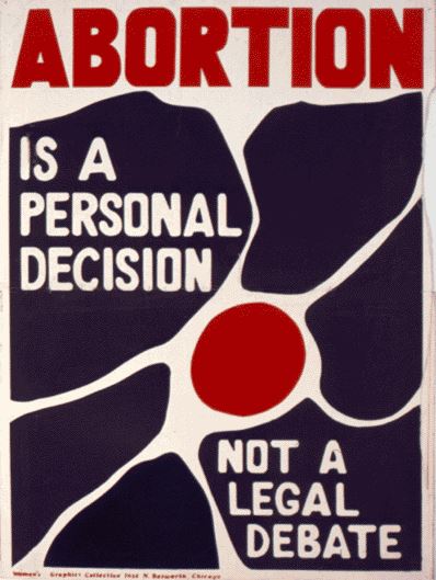
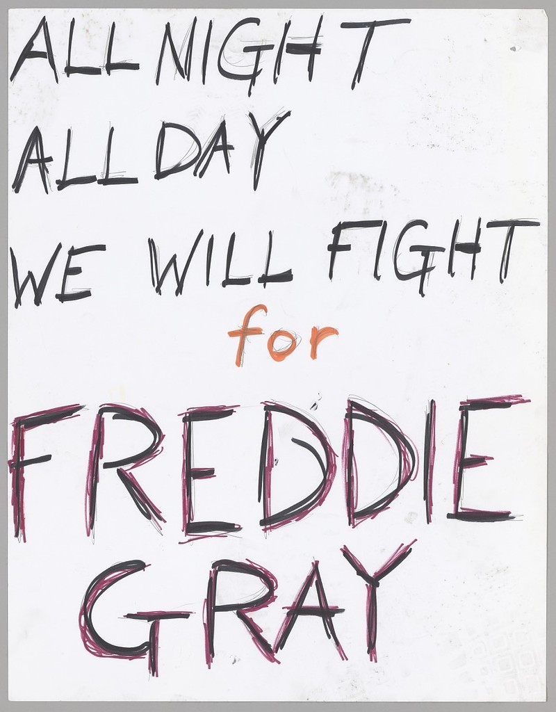
e.g. images on warning signs can be affective where language might fail to keep people safe.
1990’s
Technology in the early 1990’s allowed designers to design typefaces digitally and this meant a boom in design houses whose main focus was on designing and distributing typefaces- increasing the interest in post-modern theory.
These designers were experimental with the software, coming up with a new conceptual framework. Art schools and graphic design courses were beginning to look at semiotics and linguistics. The designer was looking to create a new relationship with the keyboard. This was a turning point. From this period, it seems that our visual landscape is being pushed towards the image.
Glossary of terms
The Origins of Writing
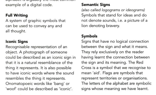
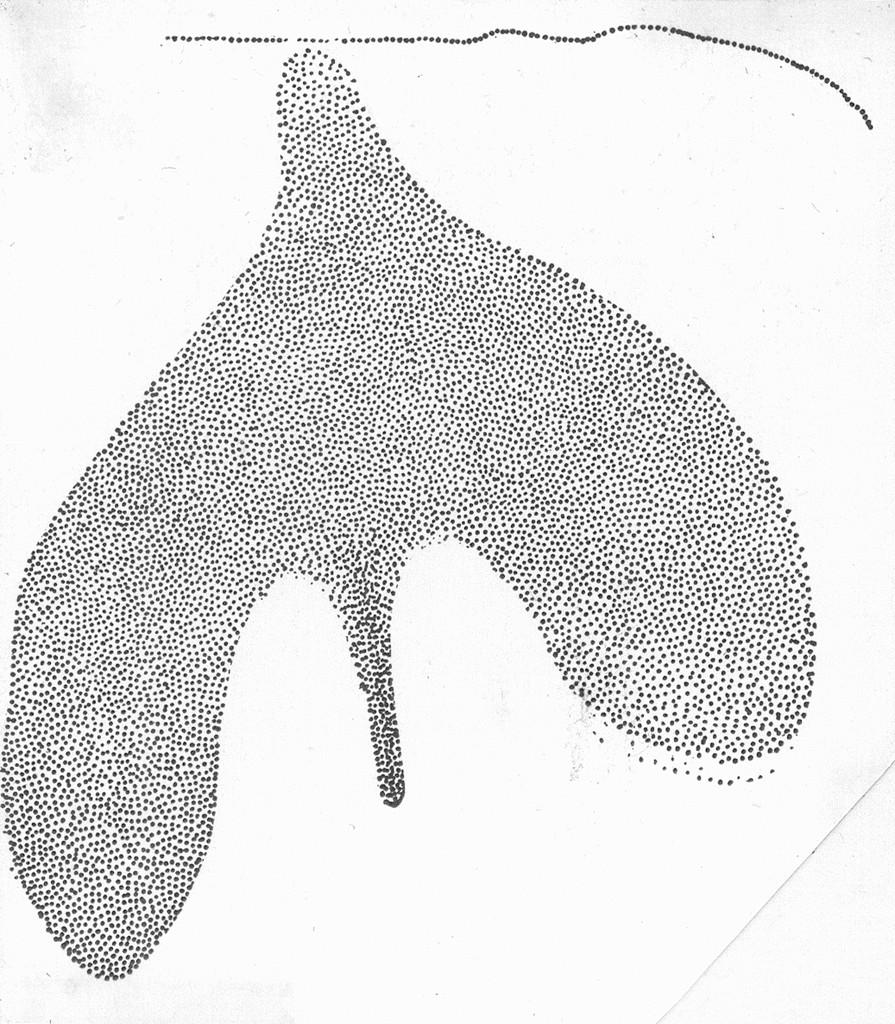
Ice age wall drawings are described by Adrian Frutiger as ‘an early attempt to visualise language’. It is thought that these drawings were only a part of the communication between people. They are the part that remain as a record of these ancient peoples. The body was used as a reference very often. These pictorial signs can be described as ‘protowriting’.
Writing originally was needed to make a record of the exchange of goods.
Connecting writing with sound
A rebus communicates more detail than simply pictographic script. It represents sound associated with an icon. E.g. the image of a bee to indicate the Roman letter ‘B’.
James Francois Champollion discovered hieroglyphics were a mixture of semantic and phonetic signs.
Utopian Ideals
17th century philosopher Gottfried Wilhelm Von Leibruz imagined a writing system using images to describe human communication. The idea was that it would avoid the use of the alphabet and therefore, would be able to span across all languages. (Similar to how music is understood universally).
Sound and thought cannot be divided.
Saussure & Andrew Robinson, The Story of Writing
The meaning of a pictogram is likely to change from reader to reader, due to the individual’s cultural background. Pictograms are too open to interpret specific details. They lack sound and therefore, precision.
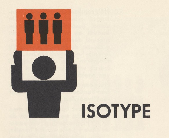
Isotype Institute
Otto Neurath was a Viennese philosopher and sound scientist. He came up with another pictorial writing system. His intention was that it would be:
- visually appealing and
- easily accessible.
This is because he needed it to be understood by a wide range of people across Austrian society. It became popular and was used to present public information.
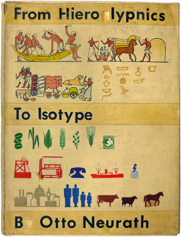
- In 1936, this language was renamed ‘International System of Typographic Picture Education’ or ISOTYPE.
- In Oxford, Otto and Marie Neurath founded the Isotype Institute. The aim: ‘International promotion of visual education.’
- Symbols of people, places, objects and actions were used in educational material.
- They produced films, leaflets, posters etc for the Ministry of Information during the Second World War.
- This pictorial language was intended to remove hierarchies and create ‘greater human happiness.’
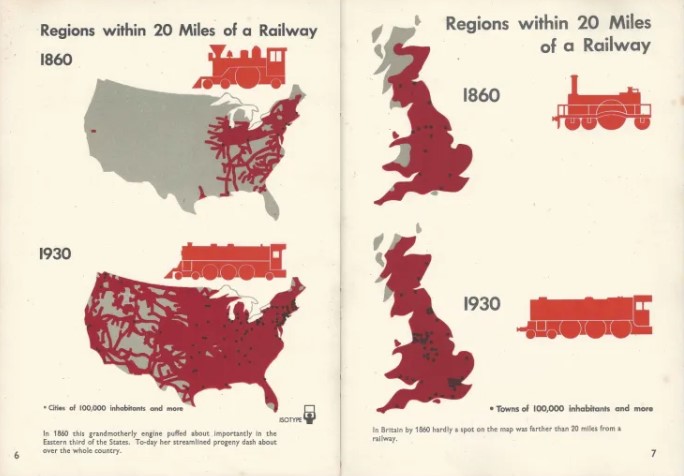
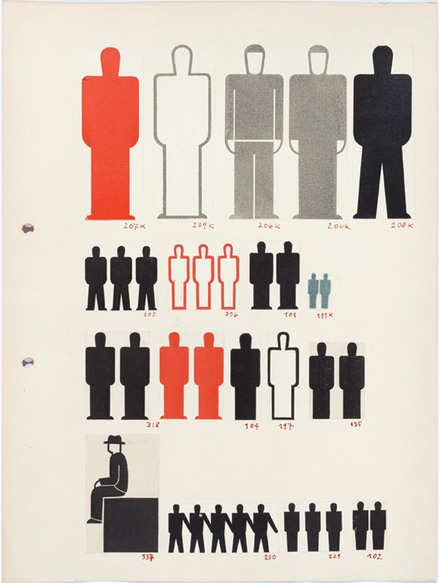
Personally, I find that these charts make the statistics easier to understand. One example is the charts made on the structure of the British government. They are able to simplify a system I find too complicated to understand when someone explains it verbally to me. (example below)
- Isotype= alternative to written and verbal communication. It focused on out commonality rather than our differences, being an international language.
- The First World War highlighted the political nature of language.
- Neurath was inspired by ancient picture writing systems, this inspired him to use few words in his system. He found words to be more immediate and forceful than words.
- Their work grew from what they saw as a genuine social need to reconstruct Vienna after the war’s destruction of the city.
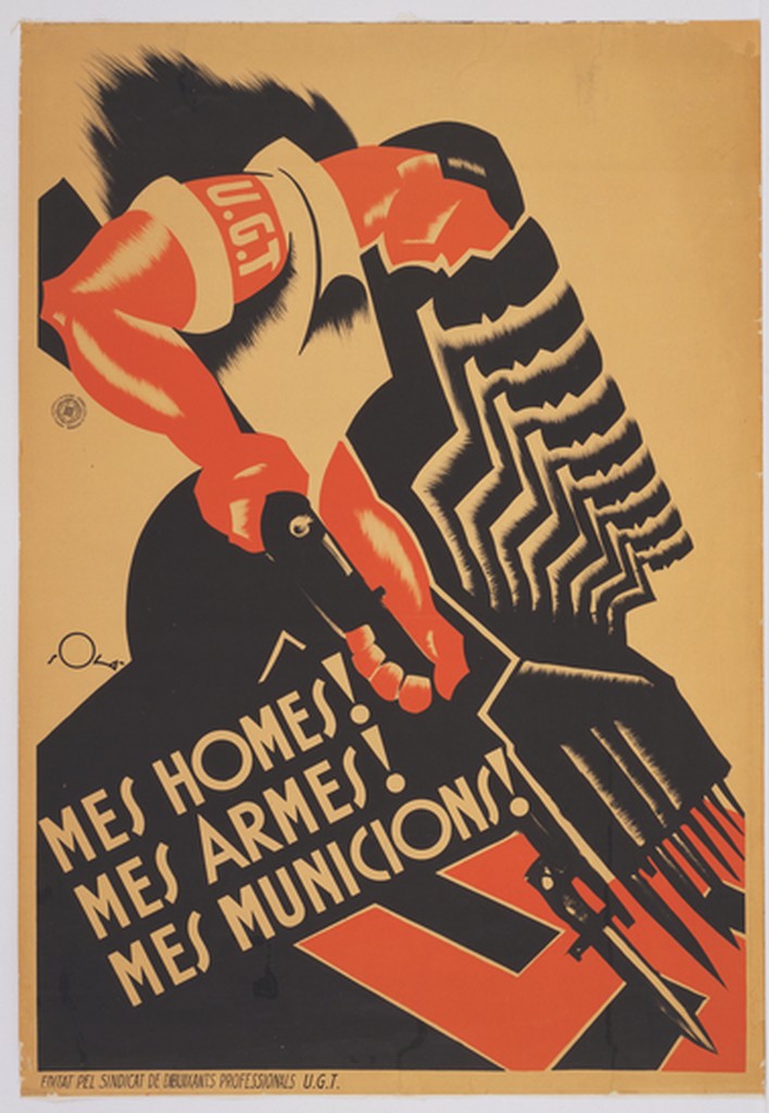
(More Men! More Weapons! More Munitions!)
The Politics of Writing
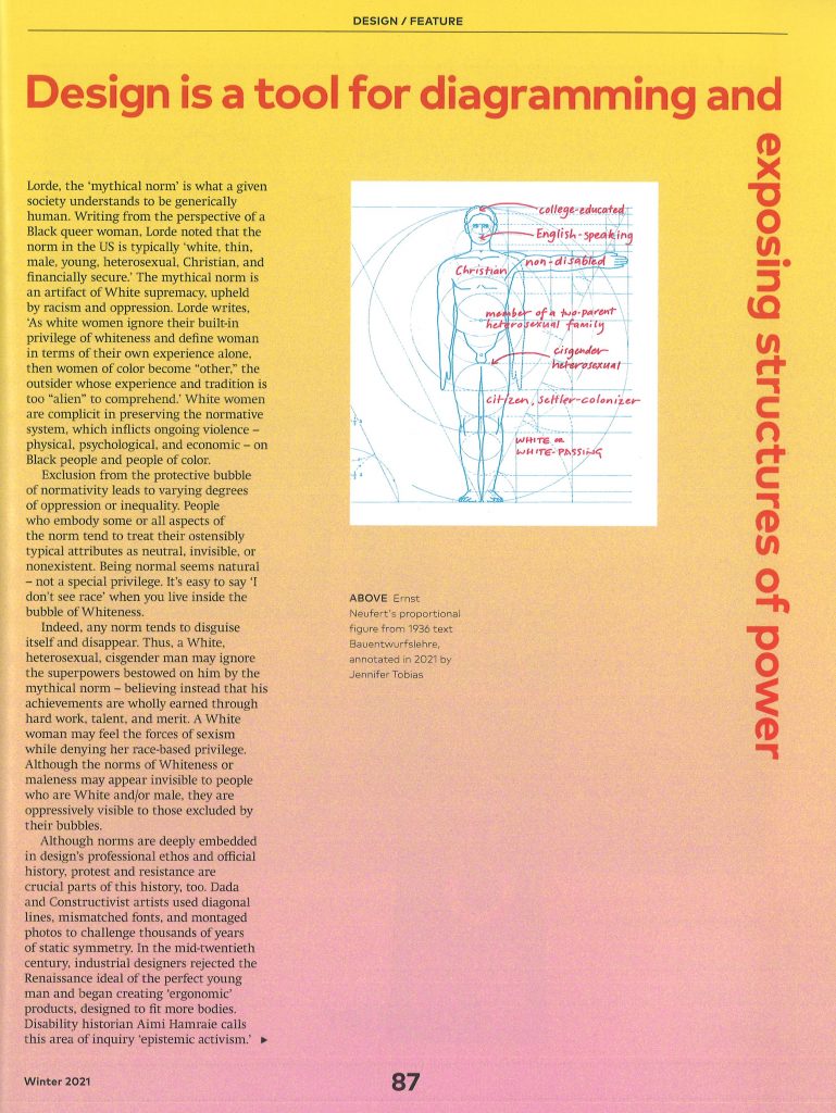
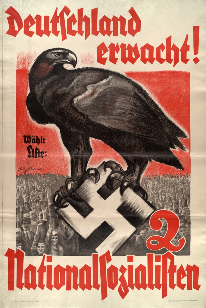
The appearance of writing is linked with the appearance of hierarchical societies- even ancient scripts were used for propaganda. (Having authority over a group of people).
The Principles of Isotype Symbols
- Neurath’s communication system was rooted in linguistics.
- Images were intentionally mechanical for easy and quick reproduction.
- The symbols were created by cutting the shapes from coloured paper.
- They were then developed into letterpress blocks. This allowed them to be printed in different colours and sizes.
- Isotype symbols are simple, geometric, with a machine aesthetic, echoing the industrial design/ architecture of the time.
- He was in contact with the Bauhaus and friends with graphic design’s leading figures of the time- El Lissitzky and Jan Tschichold.
- He was focusing on designing for the future.
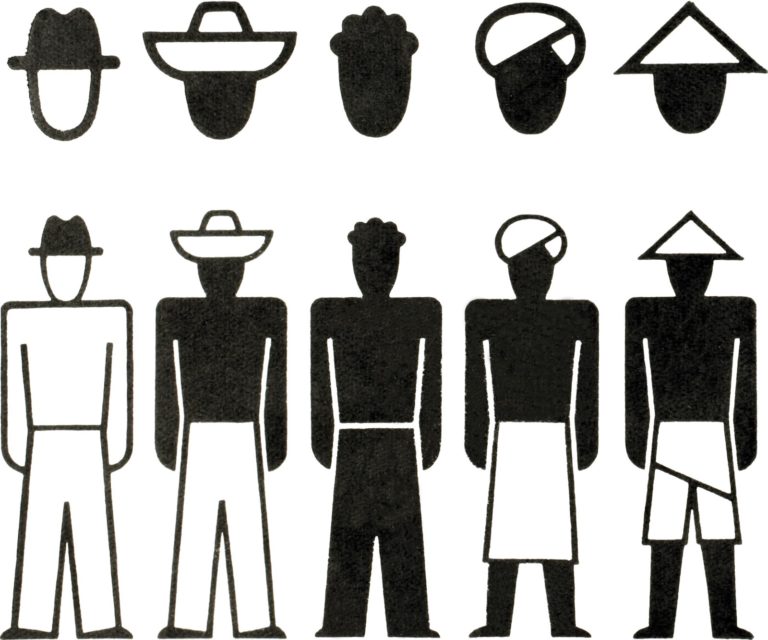
Neurath had the intention of timeless design, but some have dated. For example, his symbol of a car is old-fashioned now (below). He knew they might date and acknowledged this. They have mostly stood up well against the test of time.
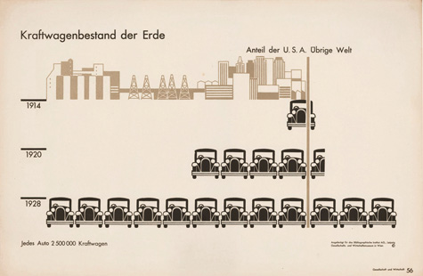
‘Numbers of motor vehicles in the world’ (USA and rest of the world). Even if one cannot read German, the subject reveals itself through the ‘speaking signs’ of the automobiles, each of which represents 2.5 million vehicles.
Neurath found that a sense of perspective in these images was unimportant. He instead decided on silhouette drawings.
Isometric projection= objects in foreground and background appear to be the same size.
Isotype & Colour
Specific colours were assigned to specific objects, for example men painted darker than women. The colour and tone are applied strategically, similar to Egyptian wall paintings.
Isotype used 7 colours: white, blue, green, yellow, red, brown & black.
Some colours were also sometimes mixed e.g. the red and yellow to create orange.
Assigned meanings:
Red > metal industries
Blue > textiles
Green > wood
(The system could be adapted for situations where only 2 colours are available.)
Isotype & Linguistics
Isotype is designed as a ‘digital language’, as in the alphabet we use. This means there is a fixed number of signs in the Isotype language system.
It is designed to be read from right to left and top to bottom. For example, the symbol that has a bell on the left and symbol for porter on the right, indicates the bell is used to call for a waiter. Changing the right-hand symbol would change the message to bell to call for ________.
Neurath acknowledged the value of using age-old symbols, such as the sickle to represent agriculture, since even though not used as an instrument today, these symbols are deep in the collective consciousness.
The arbitrary nature of language can sometimes fail in helping people comprehend a meaning, for example, the word ‘man’ bears no resemblance to a man. The Isotype symbol of a man however, resembles a man visually, making it practical/ successful as a symbol.
The picture language was not intended to replace written language, since symbols aren’t the most effective way of expressing emotions, feelings, giving orders etc.
Blissymbolics/ Semantography/ The Visual Language of C.K.Bliss
https://www.blissymbolics.org/
Also beginning in Vienna, Karl Kasiel Blitz (Bliss) was dissatisfied with the language used for science- he felt the language was a barrier for understanding. He experienced the problem of language during his childhood on the Russian border.
He was more drawn to/ comfortable with the blueprint images found in his father’s work as an electrician, e.g. symbols for bulbs, batteries, switches etc. He felt these were more logical compared to the alphabet.
Bliss came across Chinese script while in Shanghai- he was fascinated by its complexity. He later came up with ‘Semantography’, which was his version of an international language of symbols. This language combined 100 symbol elements.
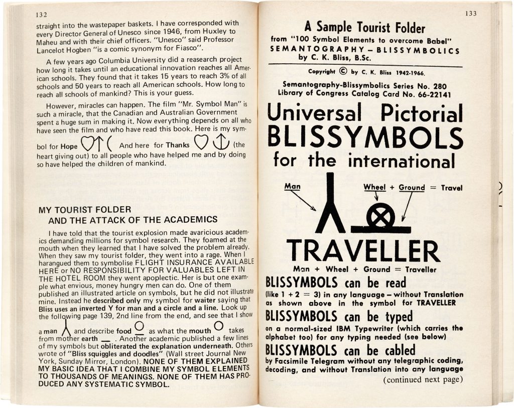
The tourist industry boom around 1965 made his work relevant. (People found blissymbols useful because it bridged language barriers). However, he was often not credited with this work when research pages were written on pictorial symbols.
The 1970’s saw his work used in communication for children with speech and physical impairment, by the Canadian teacher Shirley McNaughton. This was documented in the film Mr Symbol Man.
In 1975, Blitz was nominated for a Nobel Peace Prize as a result of his work. This work being for ‘Services to the community’ (children with learning difficulties).
Neurath and Bliss were motivated by personal experience. Bliss, by his experience of WWII. He saw language being used to control people, this is why he wanted to create an alternative.
Words serve as a useful tool for making a political statement, since they can express specific details and do not require drawing skill:
Bliss’ aim was for effective communication. He had the ‘original desire to design something that would improve people’s lives.’
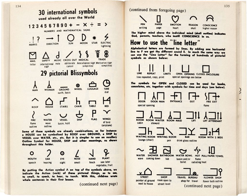
Using simple shapes makes the symbols easy and quick to draw.
Blissymbolics consist of:
- Basic geometric shapes: circle, square etc
- Additional shapes: heart, house, chair
- Arrows and pointers (in 4 directions)
- Arabic numerals
- Standard punctuation marks
Guidelines published by BCI- The Fundamental Rules of Bissymbolics: The marks are arranged on a matrix square with earthline, midline and skyline.
Blissymbolics/ Linguistics
Similarity between Isotype and Blissymbolics:
- Improving human experience and breaking down linguistic barriers.
Difference:
- Bliss claims his system as a language, whereas Neurath saw his system to work alongside text.
The mixed reaction to Blissymbolics was due to its ambitious claim to be its own language. Blissymbolics requires readers to learn the symbols prior. The system is a mixture of iconic signs, ideographic signs and arbitrary signs. The size of the sign is also significant.
Larger circle = sun
smaller circle = mouth
It is inflexible as a language. Any changes have to be approved by the BCI – not allowing the language to develop organically as would be the case with most languages. But the logic behind the symbolism has been called ‘charming’, ‘admirable’ and ‘interesting’ by critics. It is easier to appreciate this system as a set of symbols and ideographic pictures.
example:
Cool= slang + ice
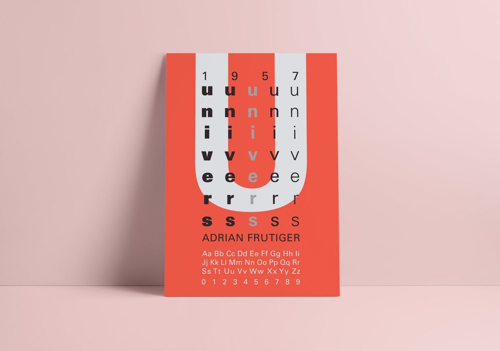
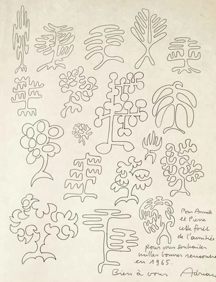
Adrian Frutiger
Typographer and designer for international corporations, Adrian Frutiger designed Univers, the widely used corporate typeface:
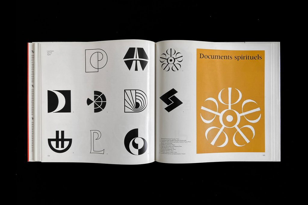
In his work, he needed to consider international communication issues. He designed pictograms to accompany his typefaces. His work with exploring the Indian script of Devanagari, allowed him to explore cultural context as well as letterforms.
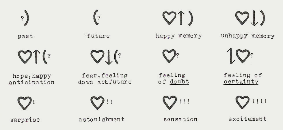
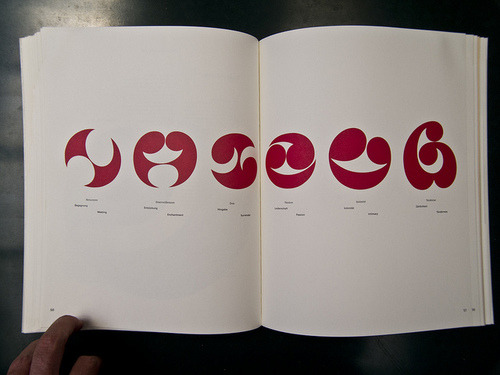
Frutiger’s pictorial script is symbolic and needs to be learnt, unlike Isotype signs, which are more intuitive since they represent the object visually. Frutiger’s symbols are more abstract and based around ‘life, love and death’.
The reader needs to understand the basic code of the symbols, so they can understand the meanings based on the sign’s scale and position. Some metaphor is also used.
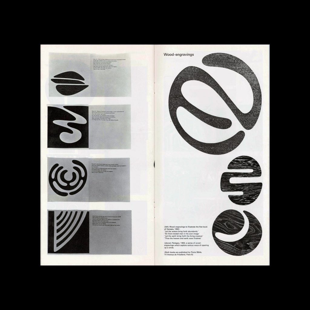
These symbols have been described as beautifully balanced symbolic marks, reminiscent of 20th century artists, the likes of Miro, Klee and Picasso. I have to agree. Using scissors and paper as tools enabled the artist to create shapes that flow, since the artist is not able to control the line very well.
These shapes are signs because each is distinct yet they are similar enough to be visibly connected. His experience in type design gave his symbols ‘economy of form’.
Frutiger also developed sequential drawings to be read as a narrative. For example, those depicting growth and birth in the natural world. These drawings reflect the way images are shown as a sequence on screen. These signs are more iconic- the scale changes to represent the growth of the plant.
Central to Frutiger’s work is technology and its relationship to human issues – the various ways we receive information. Putting people first, improving communication in a world where the expectation/ tendency is to subordinate man to technical progress.