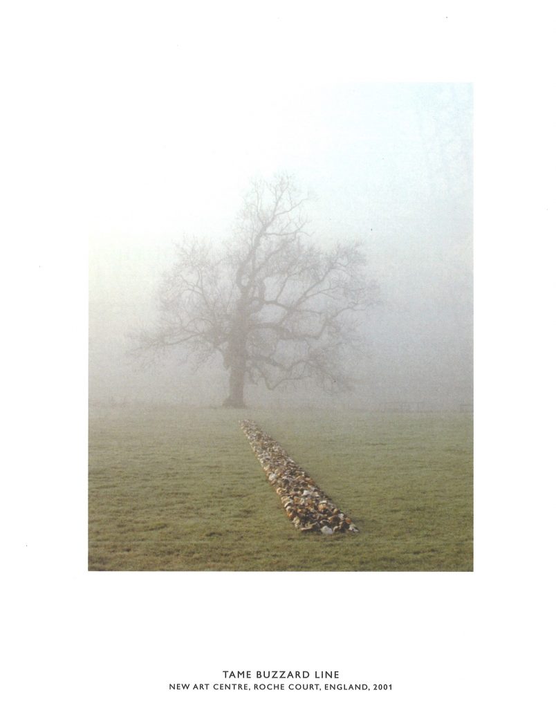
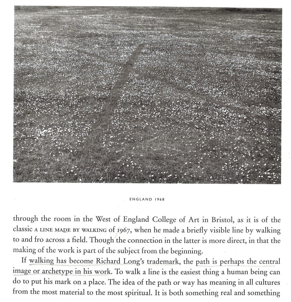
Richard Long is an artist from Bristol, UK. He creates work out in nature. His first artwork of this kind was made when he was still a student in the 1960’s. He was rolling a snowball down a hill in winter. Looking back up the hill, he saw the dark path of visible earth the snowball had created over the ground. The track left on the white landscape inspired him to continue making art in this way, to show the mark he has left across a landscape for example.
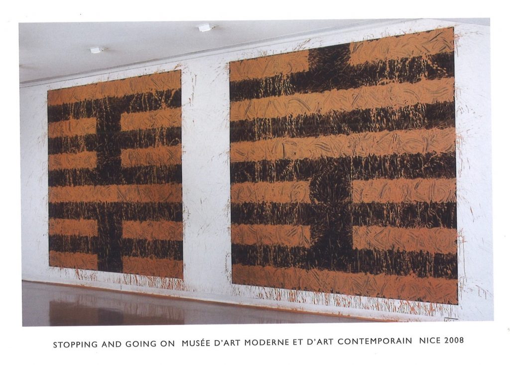
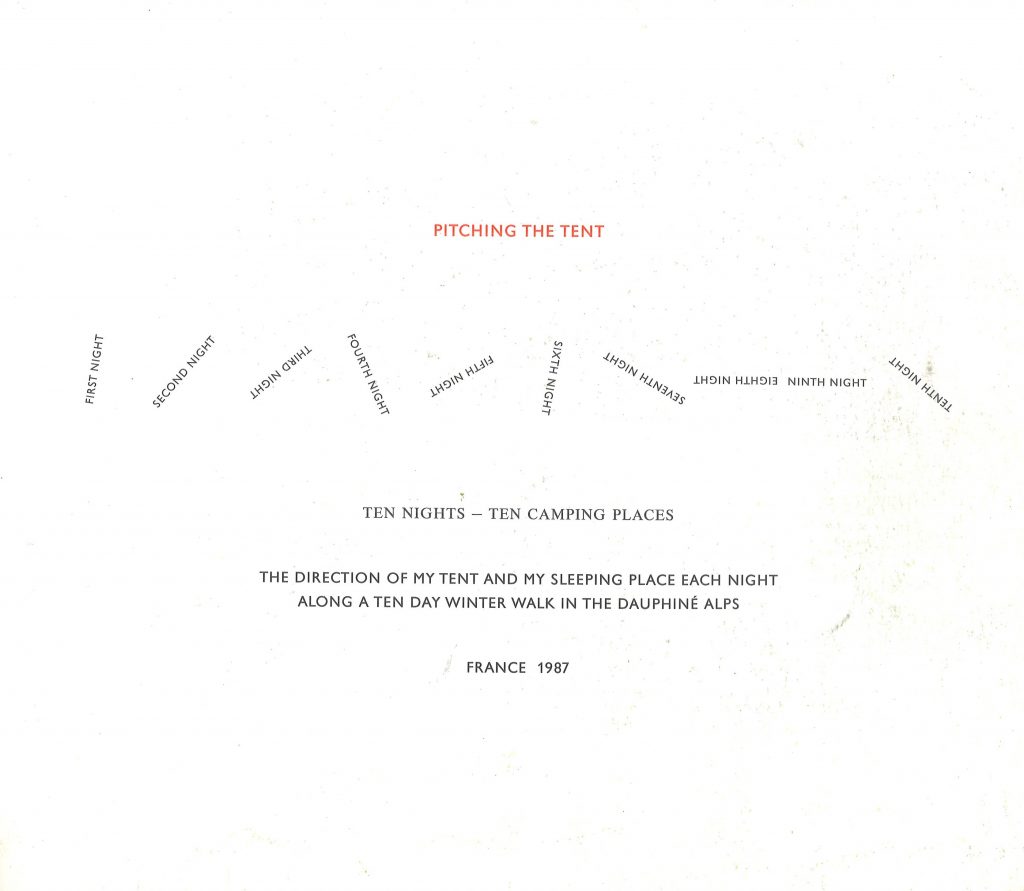
The geometric lines in this piece, signify stopping and moving. The viewer can make a comparison between the two as the two canvases are displayed side by side.
from Richard Long: Heaven and Earth from Walking in circles by Richard Long
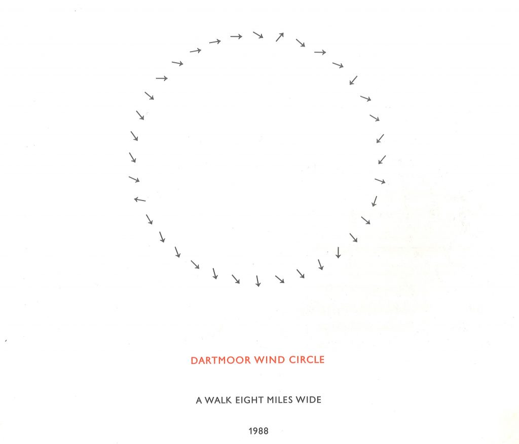
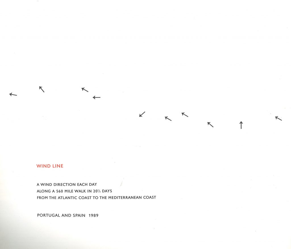
In 3 lines of text, the artist illustrates his walk. We are told where, what and when. The simplicity of the design makes the piece easy to read. He uses arrows to draw the wind direction. Although there are no natural colours in this piece, I can picture the green of nature because I know that Dartmoor is green, open and hilly because I have driven through there.
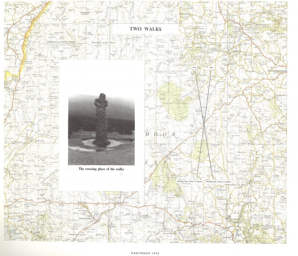
In this map, Long has used a photo of a landmark, words and lines. The combination of these elements helps us to build up a picture of the journey being mapped. He tells us about walking times and this tells us that the action was walking.
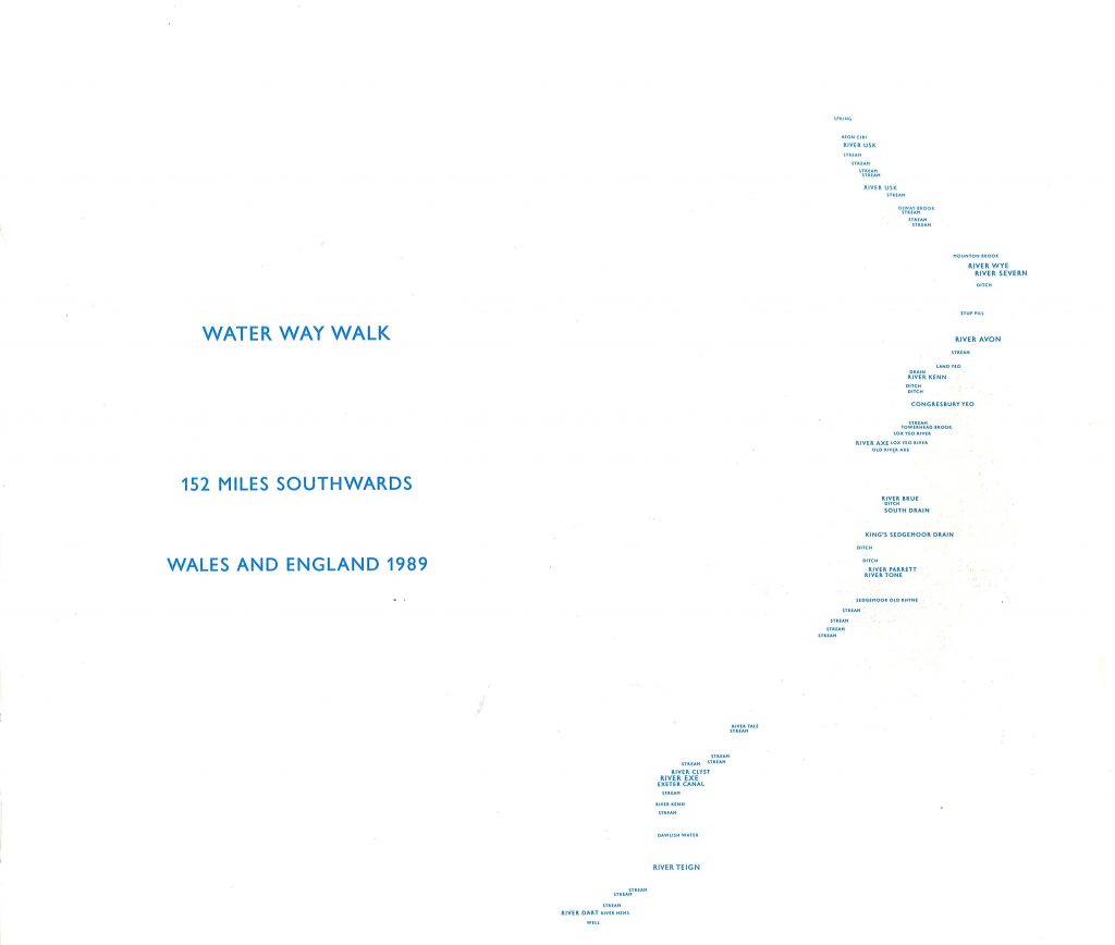
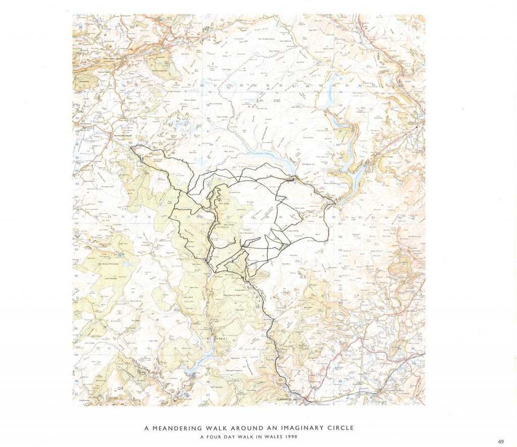
Here he has mapped the rivers across England and Wales following 1 route. The choice of blue for the text helps to signify water:
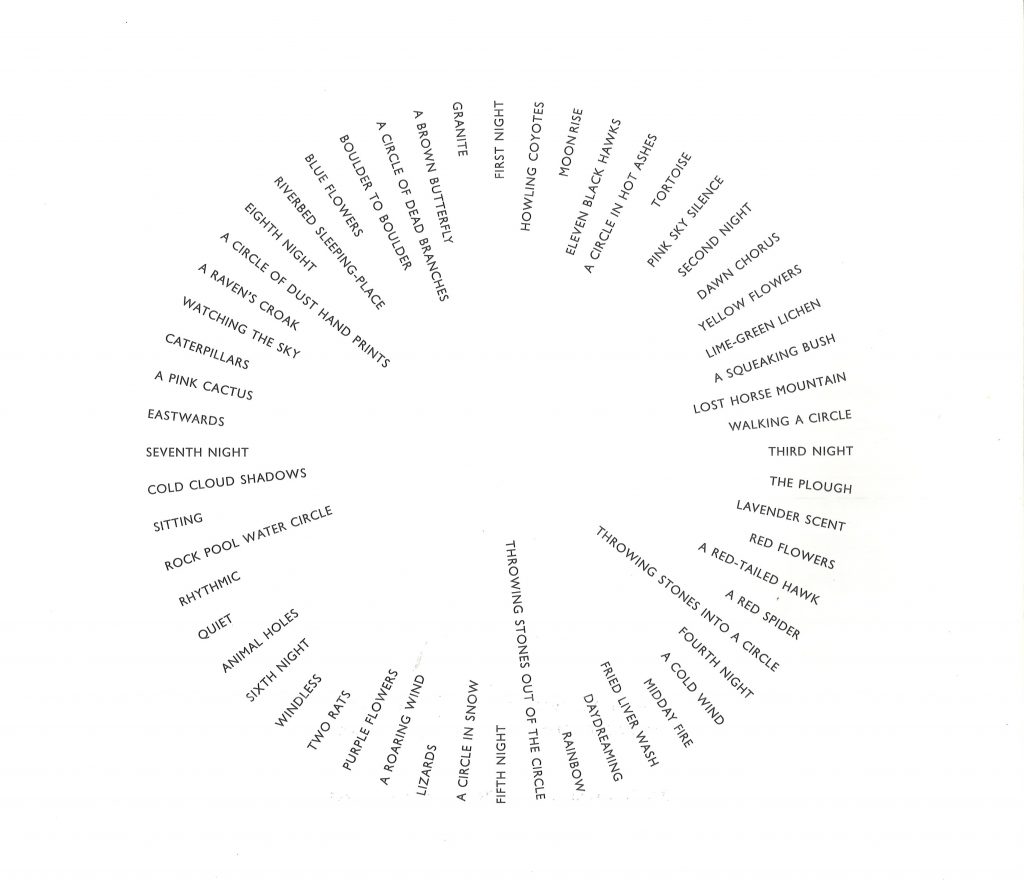
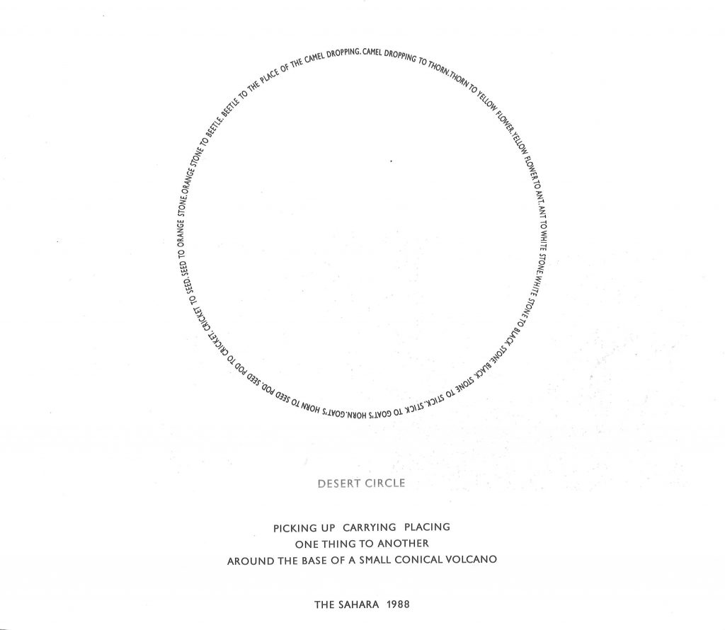
The circular formation of the words suggests the artist may have been walking in a circular route. He focuses on the things he has seen , what he has experienced and the days that have passed on the journey:
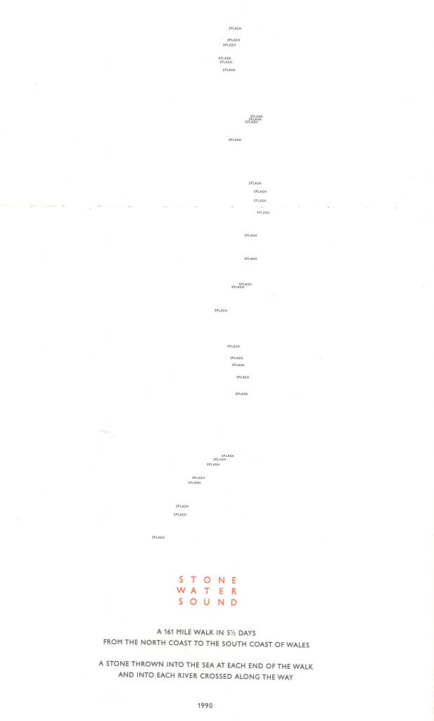
The word ‘splash’ is used to signify each time the artist has thrown a stone into the sea or river:
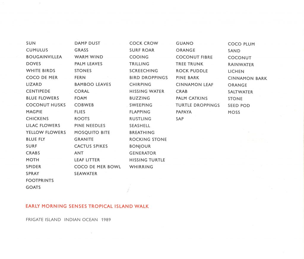
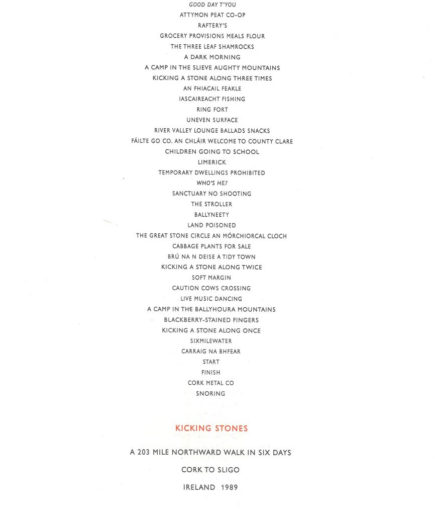
Here, Long has mapped his early morning island walk. Although the words are displayed in lists, each list gets shorter, which forms a kind of diagonal path across the page:
Workshop #4 Editor as Author- Designing with photographs
In week 4 we have been introduced to photobooks. Photobooks use mainly images and sometimes text to convey a message across the book. We discussed the importance of the editor of a newspaper and the way they shape the publication as much as an author. The way images are chosen, presented, edited and the sequence they appear in all have an effect on the overall narrative or message. The images can carry the stories.
Dieter Roth
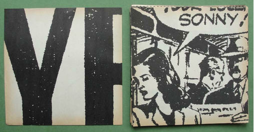
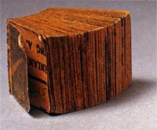
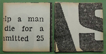
Some artists have created photobooks based on news stories. One example is Dieter Roth, who is known for making miniature books. In 1961 he made The Daily Mirror Book, using snippets from The Daily Mirror newspaper. In this way, the artist is maybe consciously or subconsciously interpreting the news and showing us the parts he is most drawn to.
By using one small area of a photo or a piece of text, we are more aware of how the image looks visually. The meaning becomes ambiguous, and this leads the viewer to guess what they are looking at. Is this snippet from a story about something positive or negative for example. By showing half of a sentence, our minds try to fill in the gaps of the area we are not seeing. The artists choice of images shows us something about his personality. For example, some of the images are quirky and humorous when taken out of context.
Daily Mirror Book
In a way, he is reconstructing the book by forming a new book made from the old book. He is giving the newspaper a new life and making it more meaningful to people. A newspaper is an object that is thrown away after use (a transient object) By constructing The Daily Mirror Book, he is creating an object that has value. If someone handed me a newspaper, I may or may not read it but it would soon go into the bin. If someone handed me a tiny book they had spent time and effort into creating, I would likely keep it.(it has become a durable object)
From Idea Generation by Neil Leonard and Gavin Ambrose
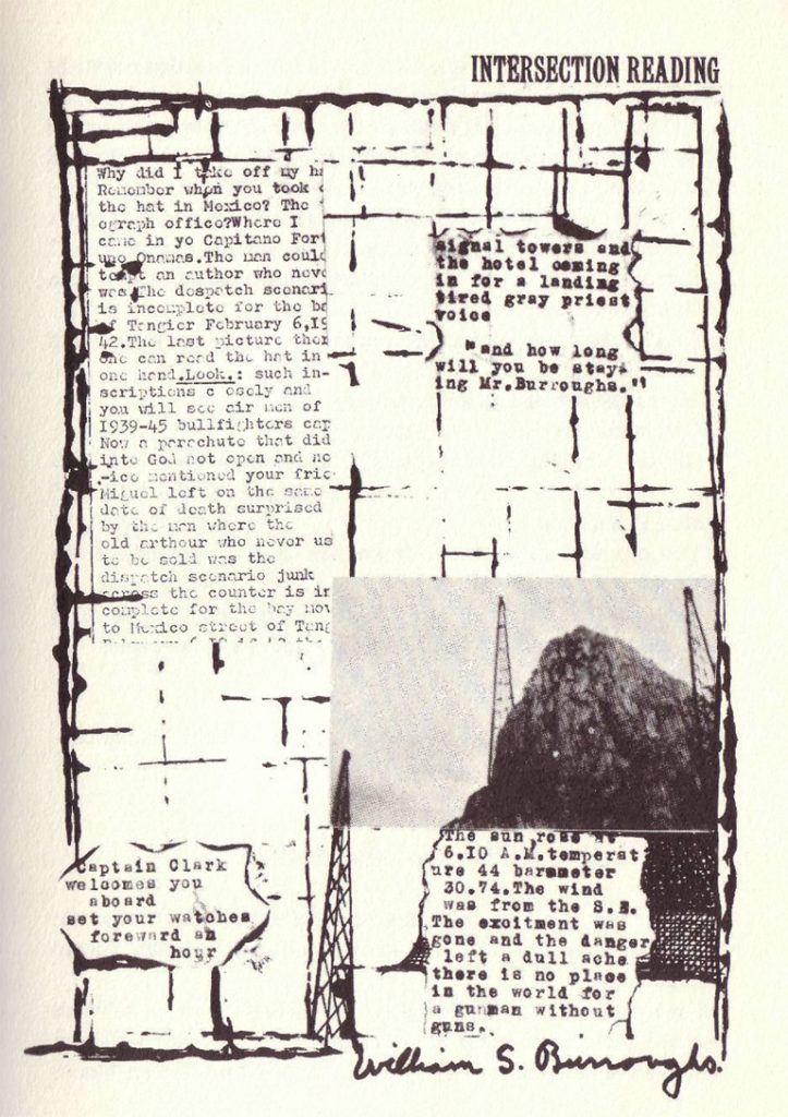
To make a Dadaist Poem is a set of instructions written by Tristan Tzara in 1920. Dadaists and other artists and writers, such as William Burroughs of the Beat Generation in the 1960s, would use similar techniques when coming up with inspiration for their work. To make a Dadaist Poem encourages spontaneity in the creative process.
By juxtaposing ideas, the artist is making something new. The unpredictability of these methods means the artist is open to inspiration and the outcome is interesting and unusual.
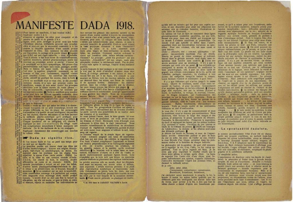
‘2-page layout of Tristan Tzara’s Dada Manifesto, printed in Dada 3 (December 1918)‘
The poet Tristan Tzara was a strong advocate of the international Dada movement, but his Dada Manifesto of 1918 appears to be complete nonsense. It is, in fact, just that — but in a really interesting way that perfectly serves the goals of the Dada movement
Tzara, gave the following instructions on how “To make a Dadaist Poem” (1920):
Take a newspaper. Take some scissors. Choose from this paper an article the length you want to make your poem. Cut out the article. Next carefully cut out each of the words that make up this article and put them all in a bag. Shake gently. Next take out each cutting one after the other. Copy conscientiously in the order in which they left the bag. The poem will resemble you. And there you are—an infinitely original author of charming sensibility, even though unappreciated by the vulgar herd.
William Burroughs would use cut up techniques for writing ideas. Several of his books were written this way. He used a similar method where he would take a page of text, draw lines on it. He would cut up and invert the sections. This would produce interesting narratives. He was also a visual artist as well as poet and novelist. He put together scrapbooks and painted.
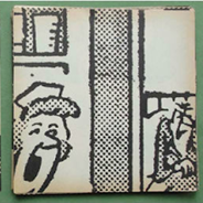
Inspired by Madeira, his birthplace, Ramos created the Black scabbard research centre. This photo book is made up of pictures from friends and pictures from the newspaper, all within Madeira. In this way, he is painting a picture of the region, made up of the many stories within it. I like that even though some pictures may not look like they have any connection to the picture on the next page, they are linked by their association with the place. Every picture seems out of context. Words are not needing because of the strength of the images.
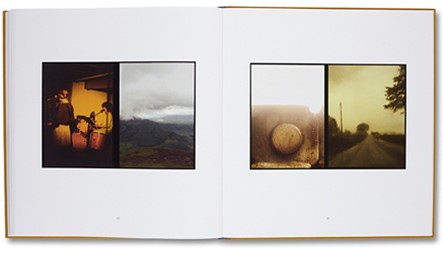
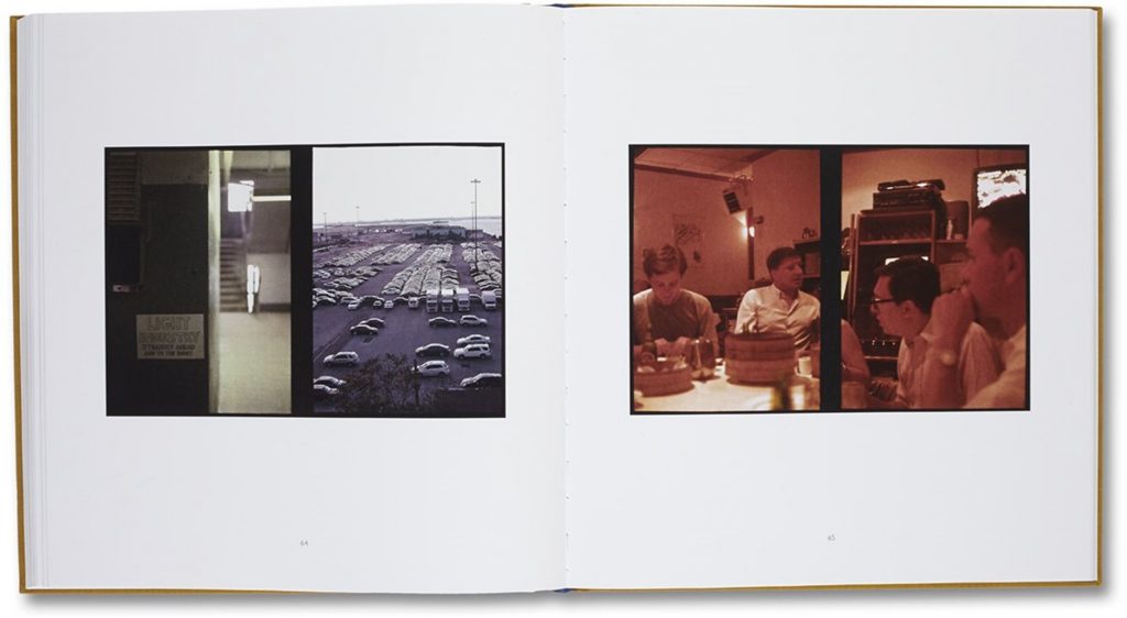
In this photo book, he is juxtaposing 2 separate images – from 2 far apart moments. By placing the images together, the viewer makes up a narrative that could be possible between the 2 or 4 images.
This week, I have been given the challenge of making a series of collages based around The Raincoat Girl. I needed to first find inspiration. I looked at collage work by both artists and designers, from past to contemporary. This opened my mind to the infinite possibilities of cutting and pasting.
I’ve been wanting to read this book for a while and now I had the perfect excuse.
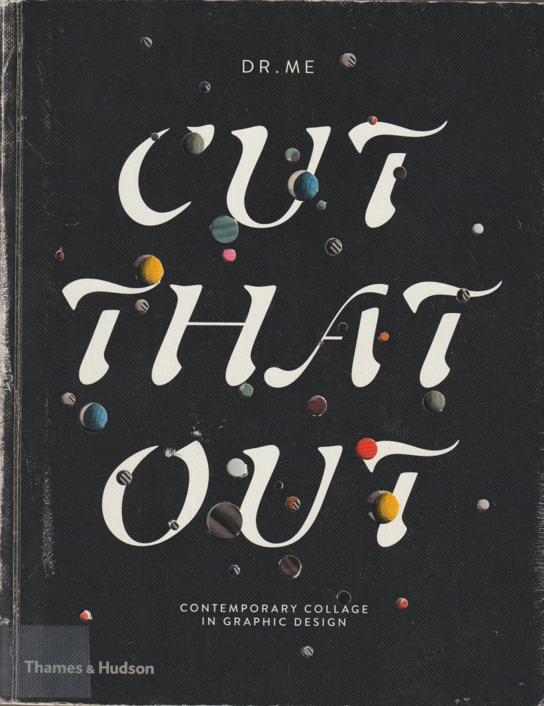
Cut That Out by Ryan Doyle
Jelle Martens
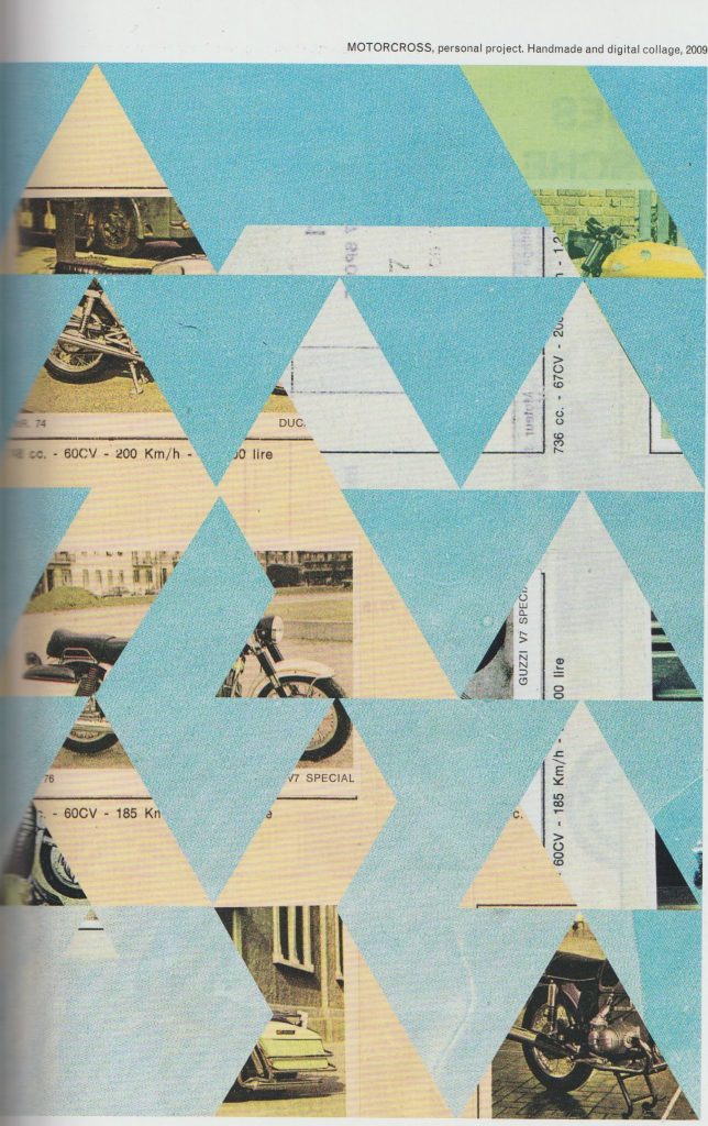
I looked at the artist Jelle Martens. He uses a mixture of traditional collage techniques and digital skills within his work. He is a fan of Collage with squares arranged according to the laws of chance, which is a series of work by Dadaist Jean Arp. In that series, Arp used cut-up pieces of paper, thrown into the air, he then glued them where they landed.
Martens takes images from a variety of sources. For instance, he used images from his father’s scrapbooks in the collage entitled Motocross.
I was drawn to the use of geometric shapes within his work. In Motocross, the background images are obscured from view. As the viewer, we see glimpses of photos and text. These act as visual clues. This ambiguity, I feel makes the work interesting. We can almost piece together our own stories of what is going on behind the triangular shapes in the foreground.
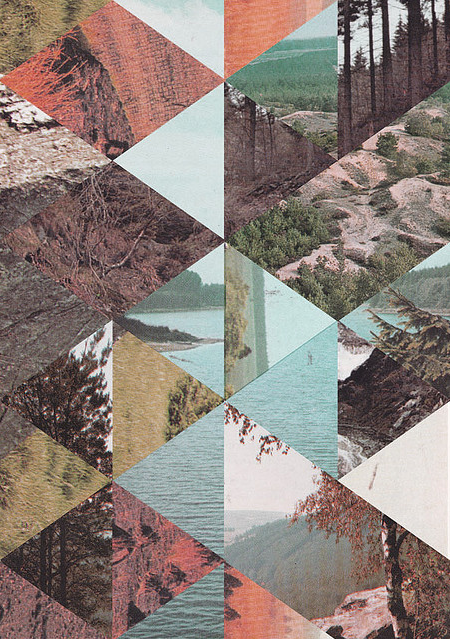
Another of Marten’s methods is to cut up several images into geometric shapes and re-arrange them into new compositions:
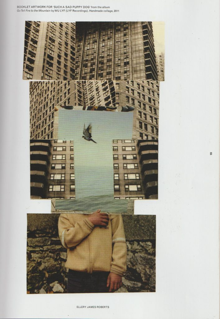
Another contemporary artist I looked at, is Ellery James Roberts. I particularly like his collage Booklet artwork for such sad puppy dog from the album go tell fire to the mountains by Wu life. I like the way he has combined three separate scenes and merged them to create one picture. The boy and the bird are surrounded by geometric, ugly looking grey skyscrapers. But within this environment, the boy finds freedom or sense of peace, symbolised by the third bird in flight at the centre of the collage.
The thing I love about collage is that artists create an image that is readable but at the same time impossible. Collage allows us to use realistic images and merge them to create something surreal. This piece is arranged into thirds foreground section, midsection, and the backgrounds. This collage looks neat and tidy but also interesting and imaginative.
Damien Tran
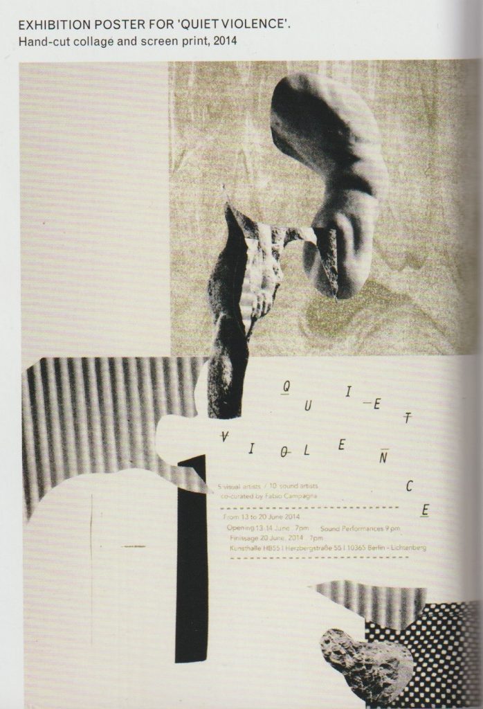
Damien Tran is a designer and printmaker based in Berlin. He combines collage with screen printing in his designs. He uses his own photographs within his work.
Images from Cut That Out by Ryan Doyle
I really like the collage pieces cut from around an image. The shapes are ambiguous and left to interpretation while creating a path for the eye to follow across the piece. I like text in the composition, used as a visual element. His limited use of colour makes his work easy to read and his use of white space is pleasing. In his Exhibition poster for Quiet Violence, there is a clear background and foreground. I like the variety of implied textures. Each collage piece is something abstract, he may have cut one piece out from a magazine, a pattern from somebody’s dress.
John Stezaker
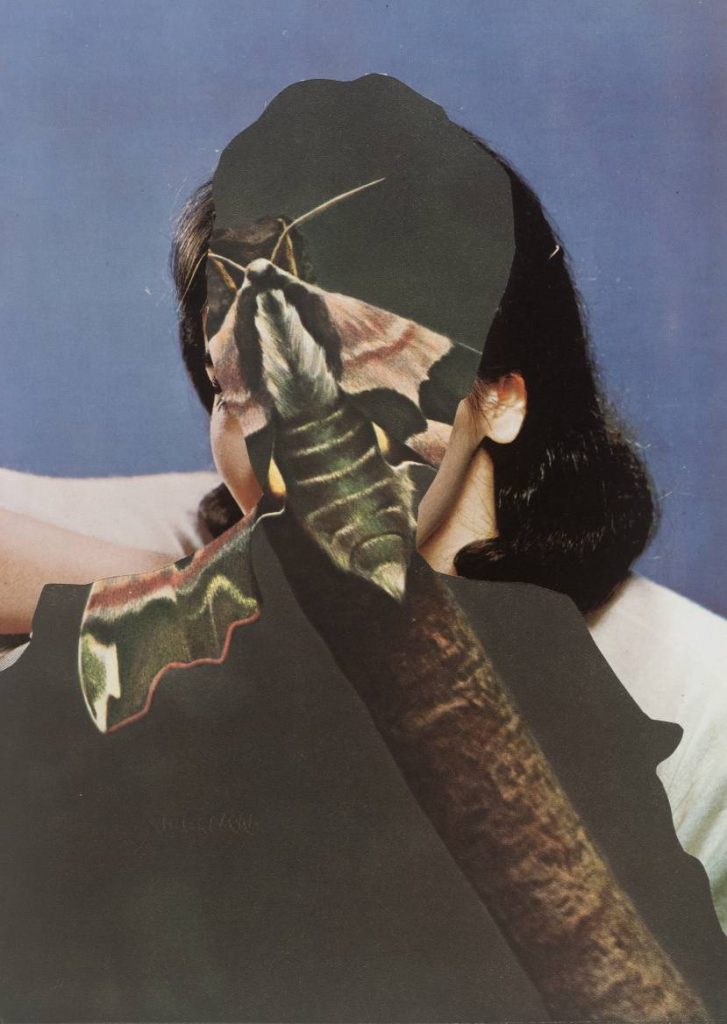
I looked at work by contemporary artist, John Stezaker. He uses old imagery in his collages, such as photos of film stars from a past era. This makes his work look like it was made in the early 20th century. He creates depth by layering collage pieces. Some pieces almost seem like optical illusions, where they can be viewed in several ways. He uses silhouettes and outlines. For example, in the piece Untitled, we see a moth, a woman, and a man simultaneously. By layering them in such a way, he creates a different meaning. Each element, being within each other, combines them together. Characteristics of a moth are within a man, characteristics of both are within a woman. Is this all taking place within the mind of the woman? These compositions lead the viewer to ask questions.
Untitled 1989 John Stezaker born 1949 Purchased 2007 http://www.tate.org.uk/art/work/T12344
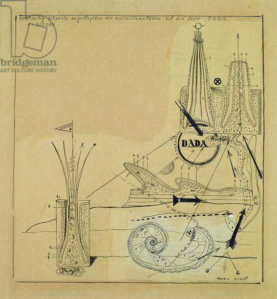
The conditions that gave rise to dadaism were a protest against the war. The Dadaists were the group of artists who revolutionised collage making in their artwork. This was in the time when photographs were just starting to be published in print. Hannah Höch worked for a newspaper company and had access to these images first hand. The movement began in 1920 in Berlin. Three artists present were Max Ernst, John Heartfield and Hannah Höch. The artists had a variety of motives. Some wanted to re-establish a sense of community in the aftermath of the war, some were activists and others wanted to develop their career. They each collaborated on exhibitions and publications. Dada was stage on the way to Surrealism.
Max Ernst combined images from medical books, catalogues for industrial equipment and botanical biological course books. His work invokes a sense of timelessness and a dreamlike quality.
This is different to the photomontage style of John heart field. John Heartfield was interested in getting across a political message within his collages. He was interested in creating a message that could communicate through mass media. His work was used to critique the abuse of power, which he felt passionate about. Both artists were not content to show images of the raw cut and paste style, for example, used by the Dadaist Kurt Schwitters. They used fragments of collage to create whole looking images, which are neat and believable. Ernst was interested in the world of the psyche, Heartfield, the political environment around him, and Hannah Höch liked to overlay elements of both within her work.
Höch used images from mass media, transforming them into images that conveyed personal meanings. She explored issues of gender roles, such as the image of the “new woman”. (This image created an expectation of women and was directly linked to consumerism and social agendas.)
I like Hannah Höch’s use of repetition and re-assemblage in this piece. By repeating elements of the baby doll face, she creates a visual rhythm across the picture that is almost pattern like. The shapes are flowing and organic each face or fragments moves into the next.
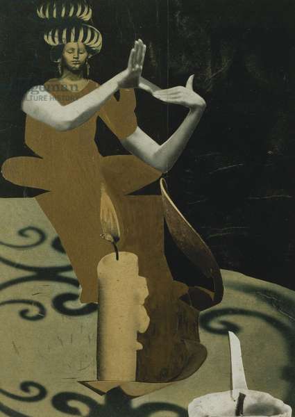
She has taken images from a variety of sources and piece them together into this figure of the priestess. She has played with scale, placing an ordinary candle side beside the figure of the women. This has dwarfed the women or enlarged the candle by its relative scale. This gives a playful feeling. The use of shadows and lights are what make this image convincing. We have a light source, and we have shadows, therefore it is believable. I like the abstract and flat form of the woman’s dress. It contrasts with the realistically formed arms.
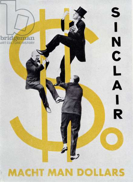
Heartfield has used something similar within his collage, where he combines a 2D dollar sign with realistically formed figures. The result is surprising and amusing.
We use cookies on our website to give you the most relevant experience by remembering your preferences and repeat visits. By clicking “Accept All”, you consent to the use of ALL the cookies. However, you may visit "Cookie Settings" to provide a controlled consent.
This website uses cookies to improve your experience while you navigate through the website. Out of these, the cookies that are categorized as necessary are stored on your browser as they are essential for the working of basic functionalities of the website. We also use third-party cookies that help us analyze and understand how you use this website. These cookies will be stored in your browser only with your consent. You also have the option to opt-out of these cookies. But opting out of some of these cookies may affect your browsing experience.
Necessary cookies are absolutely essential for the website to function properly. These cookies ensure basic functionalities and security features of the website, anonymously.
Cookie
Duration
Description
cookielawinfo-checkbox-analytics
11 months
This cookie is set by GDPR Cookie Consent plugin. The cookie is used to store the user consent for the cookies in the category "Analytics".
cookielawinfo-checkbox-functional
11 months
The cookie is set by GDPR cookie consent to record the user consent for the cookies in the category "Functional".
cookielawinfo-checkbox-necessary
11 months
This cookie is set by GDPR Cookie Consent plugin. The cookies is used to store the user consent for the cookies in the category "Necessary".
cookielawinfo-checkbox-others
11 months
This cookie is set by GDPR Cookie Consent plugin. The cookie is used to store the user consent for the cookies in the category "Other.
cookielawinfo-checkbox-performance
11 months
This cookie is set by GDPR Cookie Consent plugin. The cookie is used to store the user consent for the cookies in the category "Performance".
viewed_cookie_policy
11 months
The cookie is set by the GDPR Cookie Consent plugin and is used to store whether or not user has consented to the use of cookies. It does not store any personal data.
Functional cookies help to perform certain functionalities like sharing the content of the website on social media platforms, collect feedbacks, and other third-party features.
Performance cookies are used to understand and analyze the key performance indexes of the website which helps in delivering a better user experience for the visitors.
Analytical cookies are used to understand how visitors interact with the website. These cookies help provide information on metrics the number of visitors, bounce rate, traffic source, etc.
Advertisement cookies are used to provide visitors with relevant ads and marketing campaigns. These cookies track visitors across websites and collect information to provide customized ads.