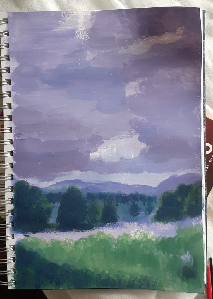
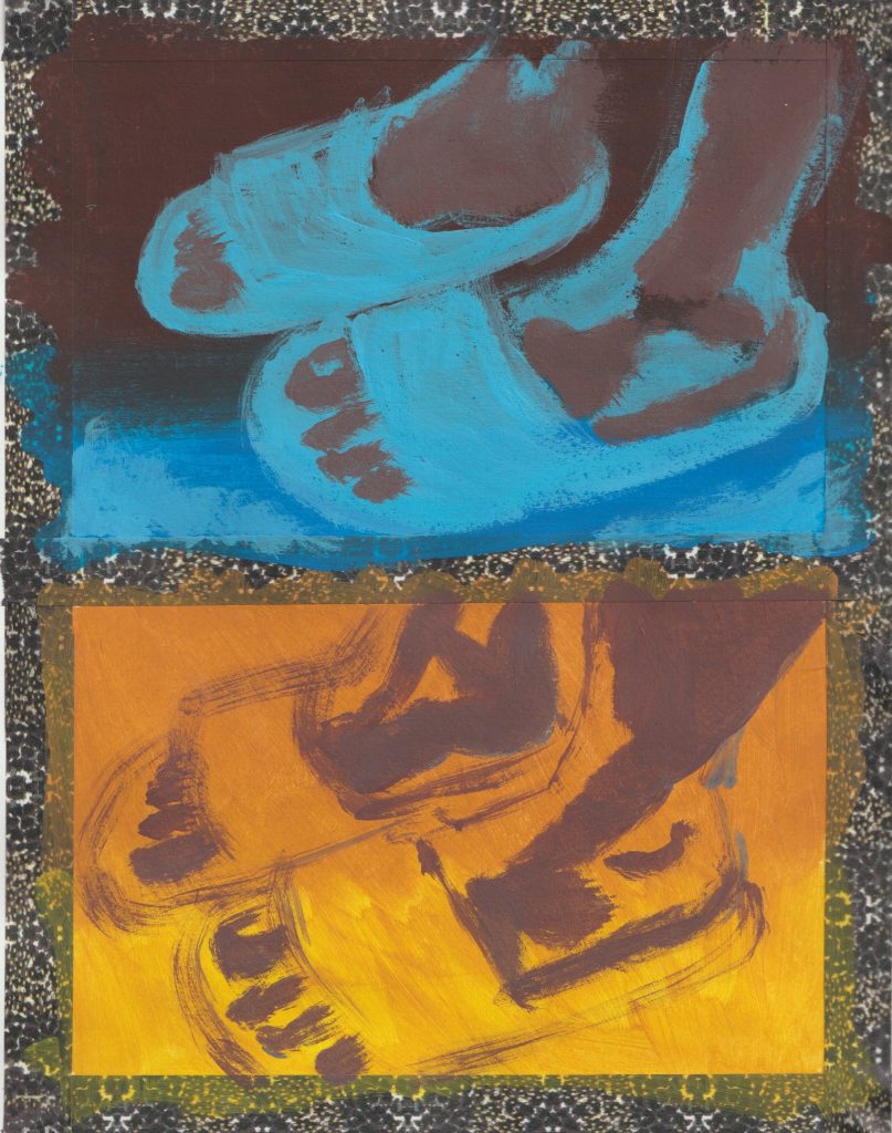
My first attempt at gouache!

Sketchbook 23/06/22

I have heard gouache described as ‘the love child of watercolour and acrylic paint.’

I had to try it out, given its rise in popularity. Its reputation is as a versatile material, used by illustrators in particular.

For my first gouache painting, I chose a scene from my recent retreat to Wales. (My first time in Wales seemed to match my first time using this medium.) The reference photo was taken by another member of the group.

I taped off a page of my sketchbook with washi tape and go to work.

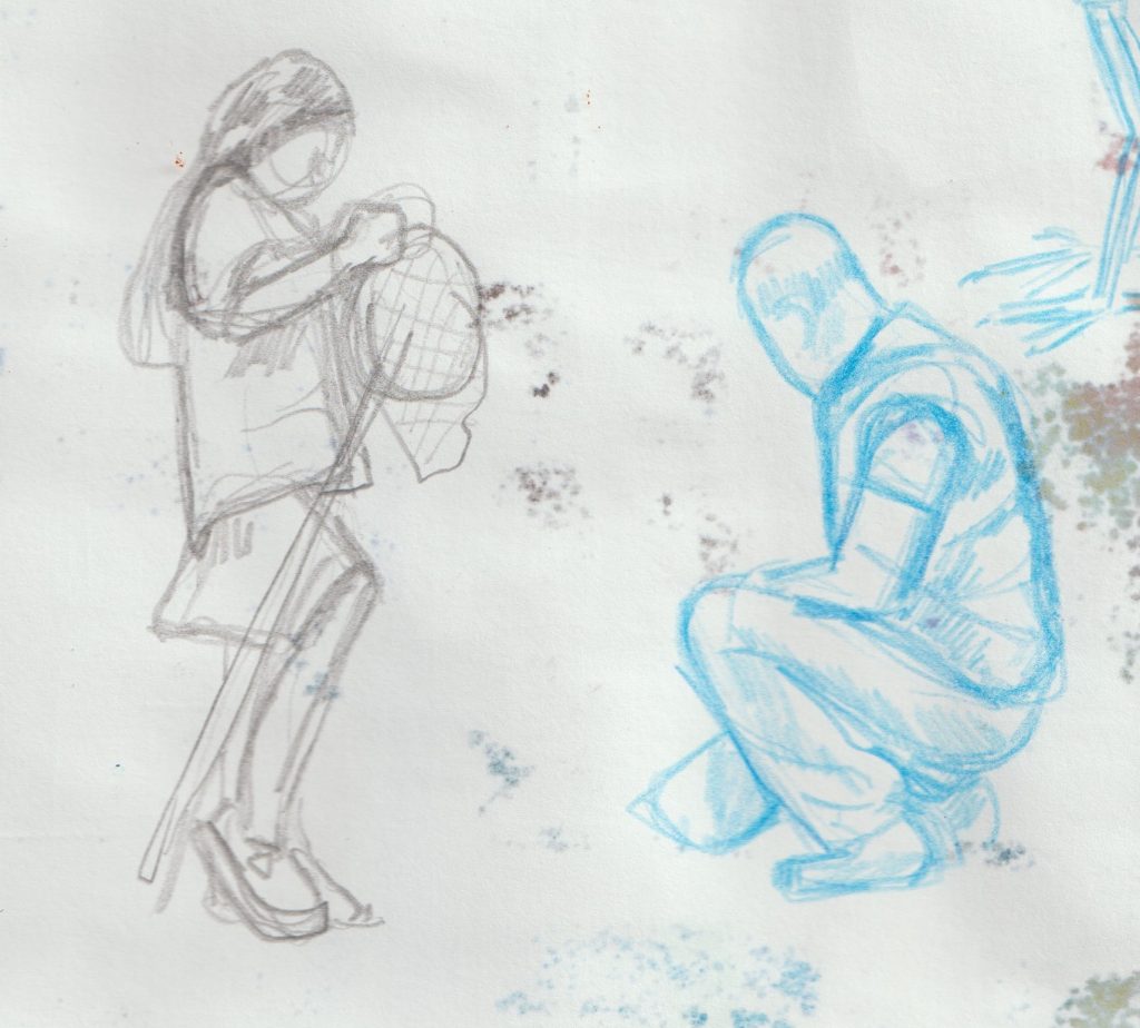
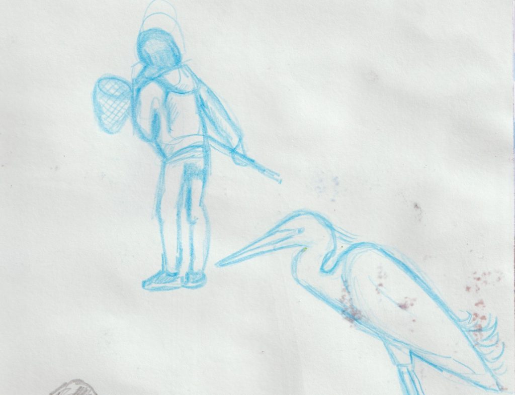
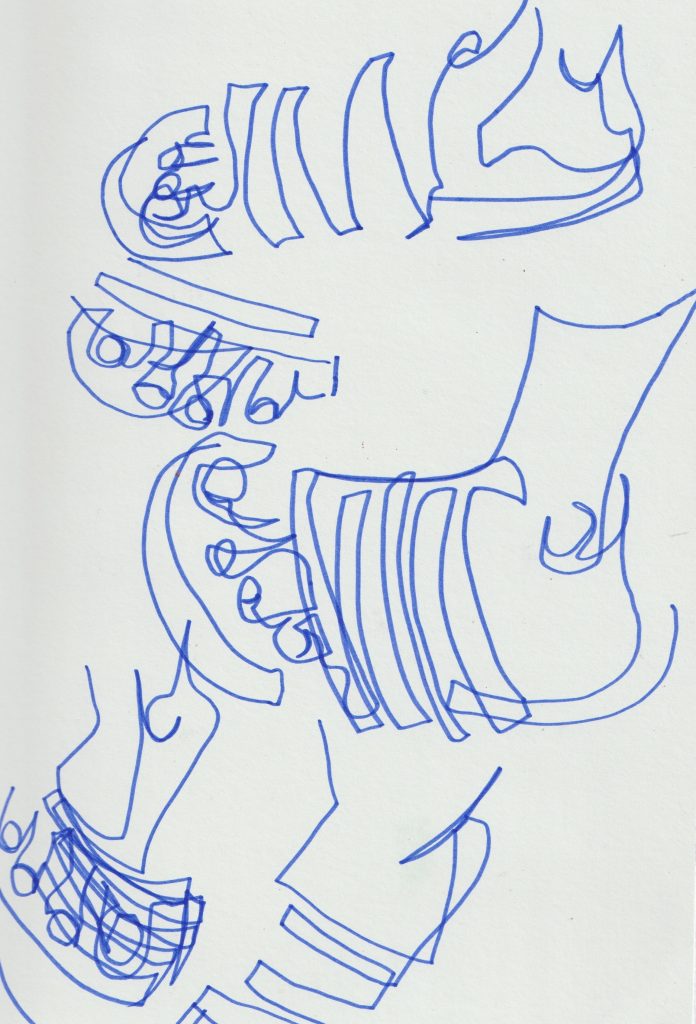
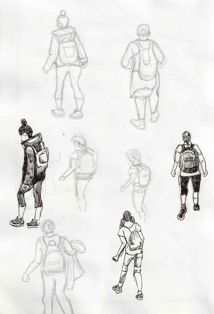
I didn’t sketch the picture first, which I regretted because of the figures. The figure on the right ended up looking quite still, if I had drawn the legs first, they may have looked more in motion.

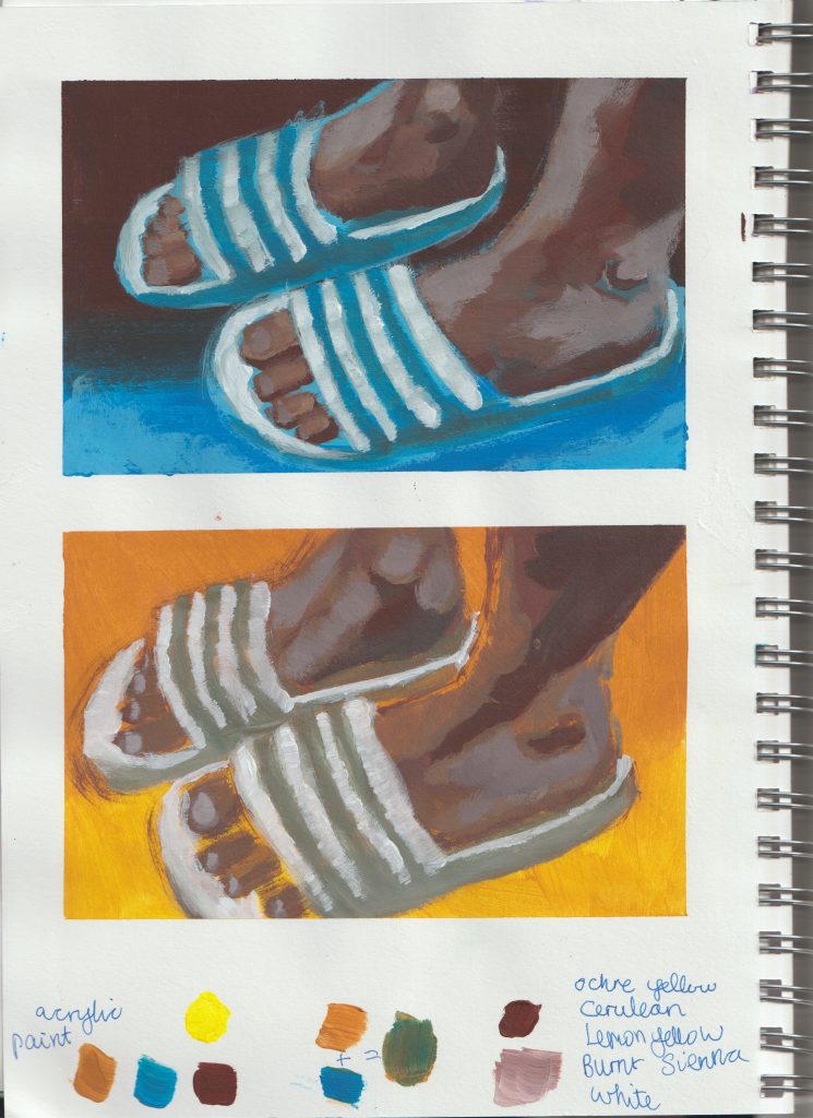
I discovered I needed to use a lot of white paint throughout. I waited for some layers to dry but didn’t do this towards the end. This could be why the final layers appear slightly muddy. Though the other property of gouache is that it comes back to life when re-wet.

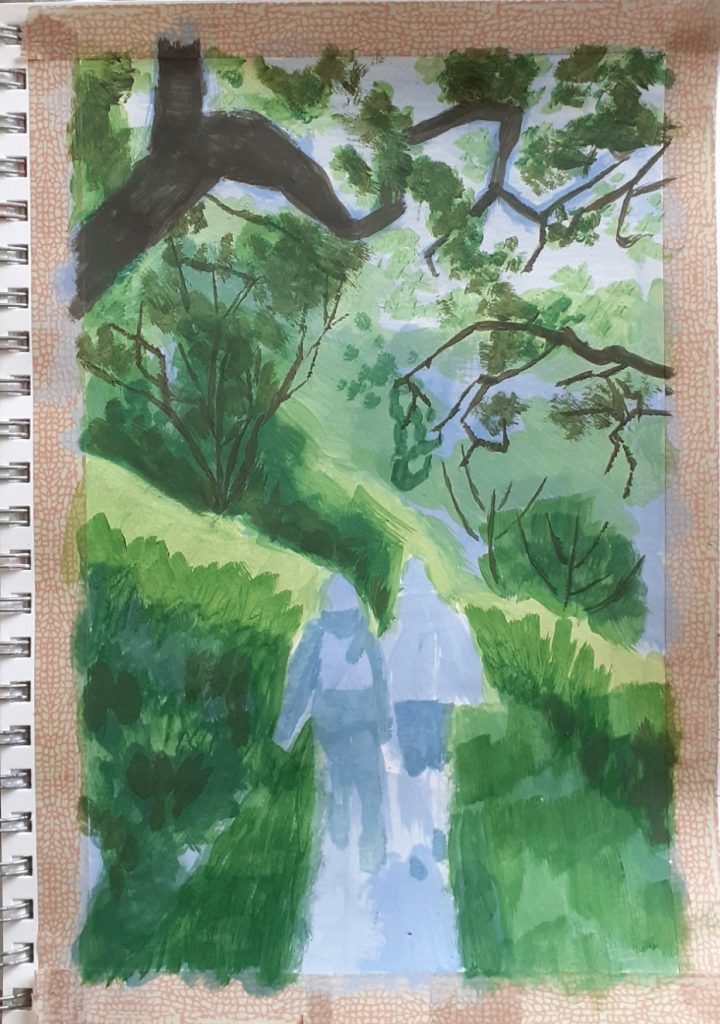
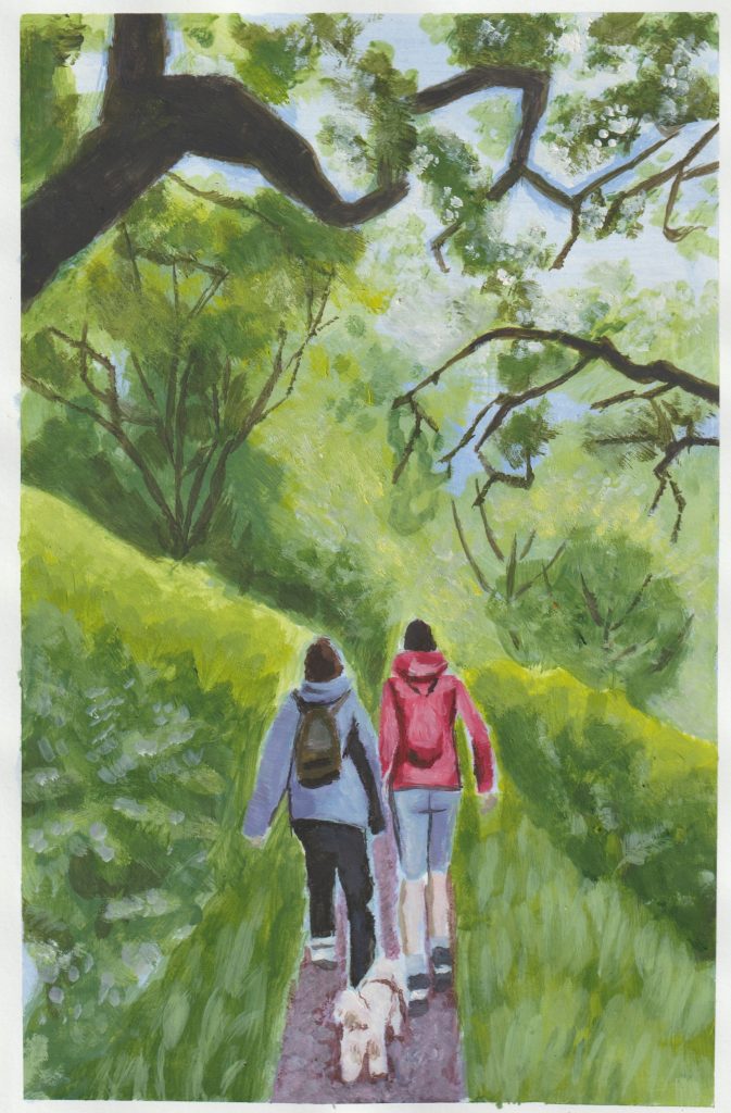
Overall, it was a good practice and I find I enjoy gouache a lot. I didn’t achieve perfect details (i.e. the grass and hedges) but this was OK for me. This way, the scene appears more windswept and in motion. The transparency of the details was due to the white paint being mixed with water at that stage.

Having not drawn the figures in this painting, I then decided to practice drawing the figures that might appear in future gouache paintings:

HB pencil and black fine liner pen
a quick pencil drawing. I was actually drawing this in bad lighting, so I know the proportions aren’t totally accurate.

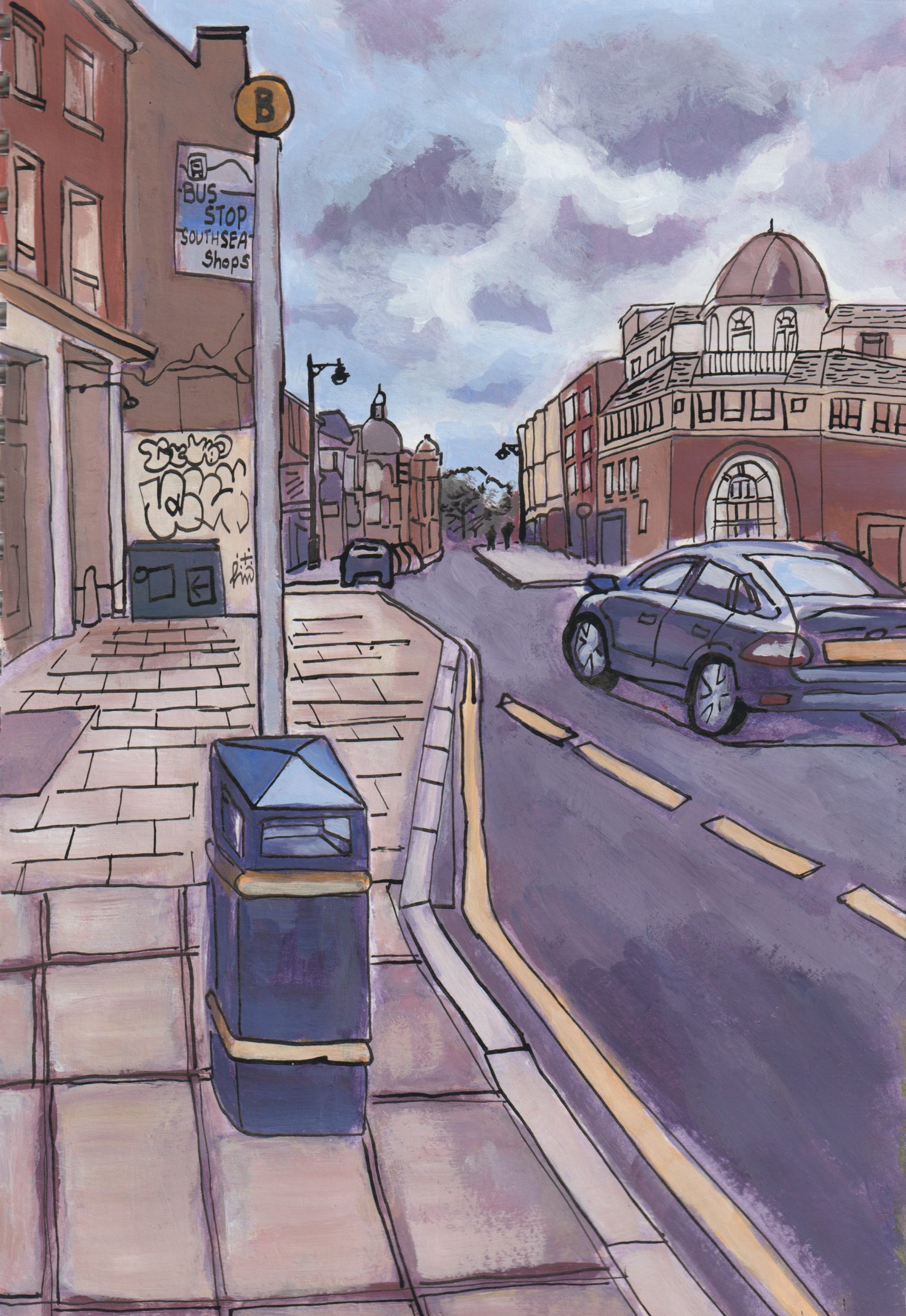
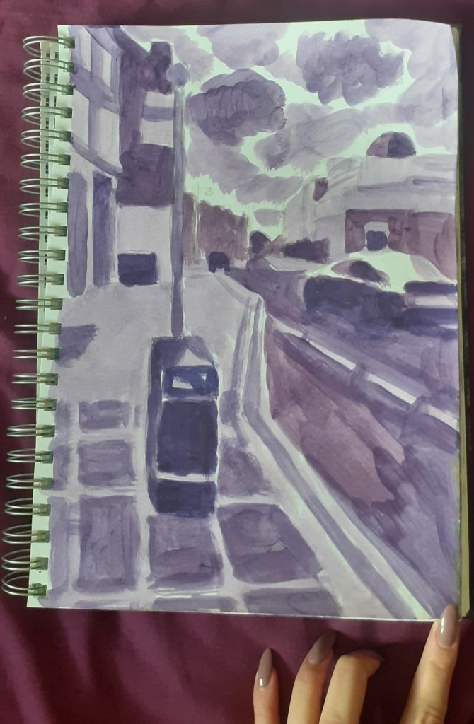
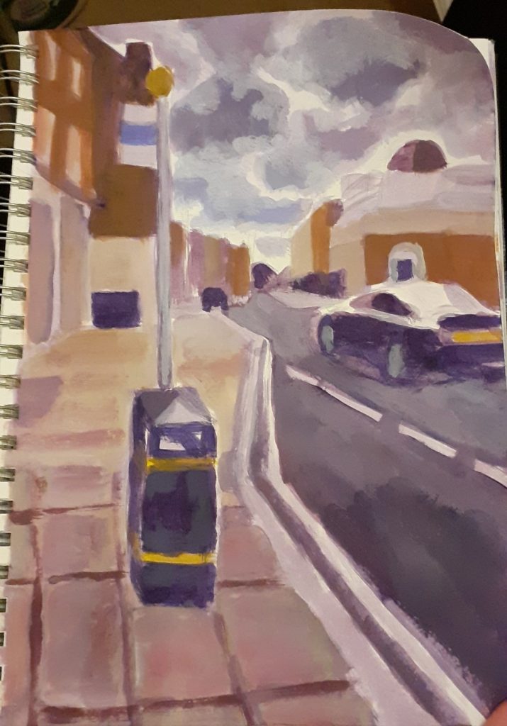
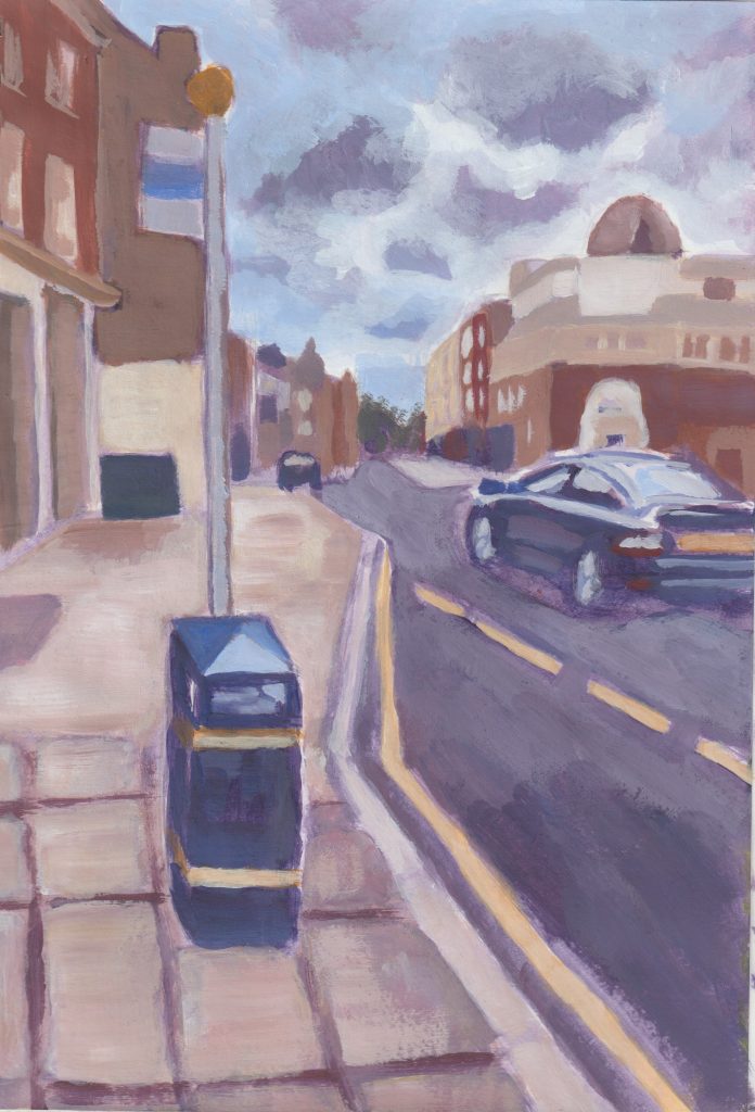
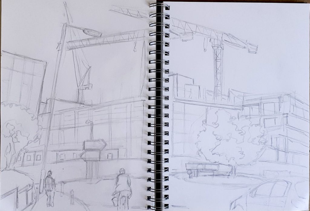
Pen & ink drawing of Reading

What drew me to paint a very ordinary scene in Reading, was the colour of the cranes. They were red, white and blue, which to me was unusual.

I took up a double-page spread in my sketchbook, to capture the scene.

I began by sketching the image with a regular HB pencil. (below)

I then wanted to flood the scene with colour. I’m not too confident with ink paintings. I tend to use India ink as a drawing material, with the pen nib and pure ink. For this study, I wanted to use ink in a similar way to watercolour, which I am far more used to.

I mixed the ink with water to add the darkest areas in purple. I chose violet because this tends to be the colour of shadows.

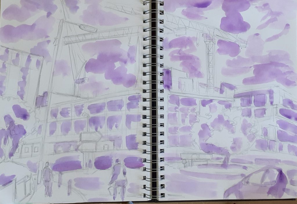
The ink was more vibrant than watercolour, and actually, didn’t behave in the same way. I found that with inks I was able to distinguish individual layers, which was a nice discovery.

next, the addition of blue.
building up darker areas with brown.
The painting before adding any outlines.

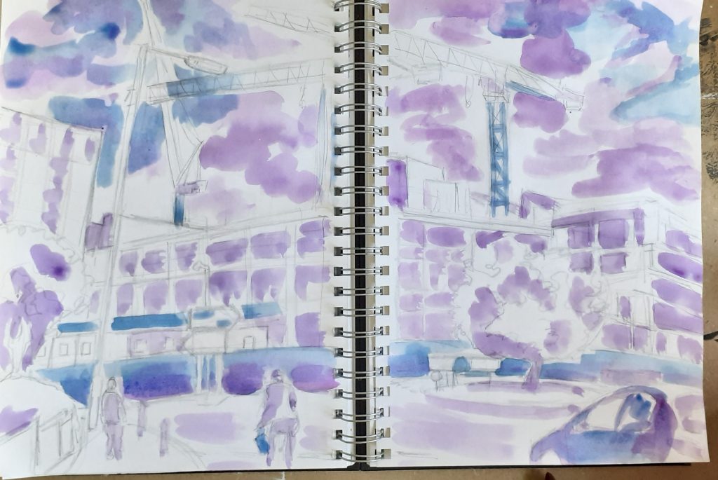
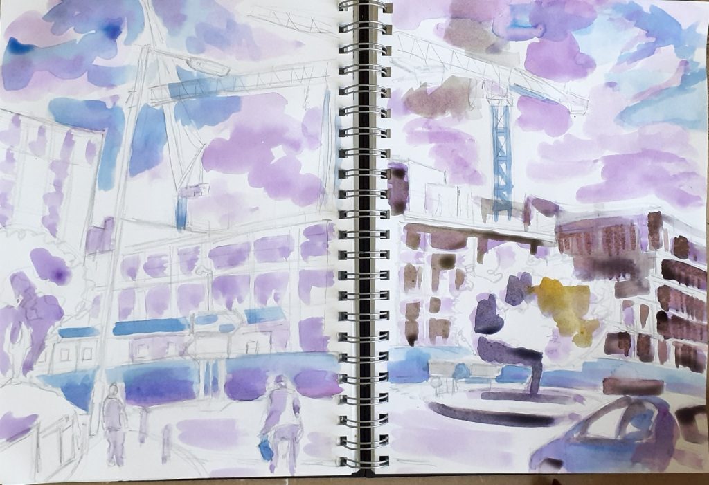
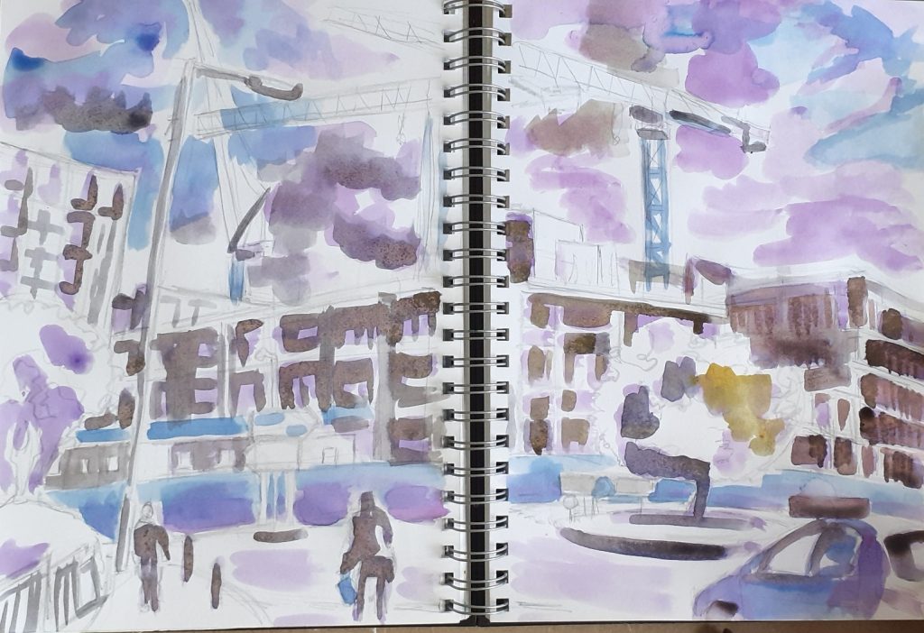
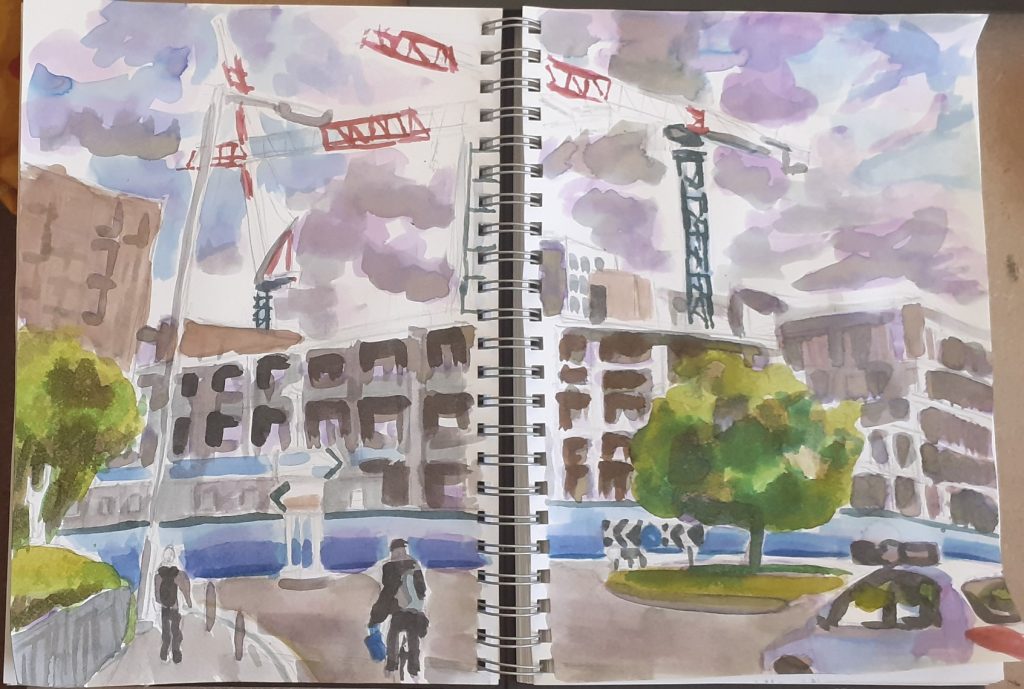
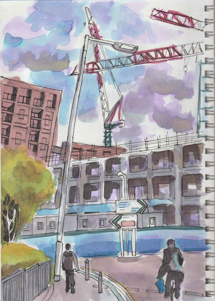
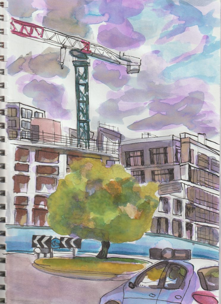
I chose to leave the trees as they were, allowing the natural ink merging to represent nature’s disorder. This makes a nice contrast with the man-made world where sharp lines mark distinction.

Crabbing in Southsea

Another trip I took this year, was to Southsea in Portsmouth. The weather wasn’t perfect, and on one of the duller days, we went to the boating lake. I was surprised to find children fishing for crabs in the lake. I assumed all lakes must be freshwater, but it turns out this one is slightly salty.

graphite pencil (left) and blue coloured pencil (right)
blue coloured pencil

Sketchbook update 14/06/22

Most days I will do something in my sketchbook. I’m using an A4 ring-bound book from Amazon and I would rate it average-good. It isn’t the best for wet/heavier work, but felt-tips won’t bleed through which is a plus. It meets my current needs but I wouldn’t stick with it forever. I used to draw solely from life, a habit I was taught at college. While I see the benefits of this, it isn’t always practical. Therefore, I’ve been trying new ways.

First of all, I will show you some sketching I did do from life. A still-life to be specific.

A broccoli.

One I had already cut-up for lunch and had parts left-over.

(An incomplete broccoli.)

Ink & drawing

(top, blue fineliner, continuous line drawing) (bottom- right, biro drawing, ink applied afterwards)
fine liner pen on green card
Layer 1:
diluted India inks (Emerald and sunshine yellow)

Using the wet-on-wet technique to achieve the splotchy effect. Being in-experienced with inks, I went in boldly!

Layer 2:

It is possible to see the separate colours I used, as I didn’t blend everywhere. This makes the painting punchy and bright, but is not how I would have approached the study, had I been using watercolours. I began to pre-mix colours in the palette wells half way through the painting.

I like the mixture of opacity throughout the layers.

Acrylic painting

Painting from photographs 1

I took this photo on my phone, while walking through South Park. On my way to yoga class, for some reason I had decided to walk instead of taking the bus. I had just walked up the hill and enjoying my favourite view in Oxford. It was the start of a warm day and the start of June. This was at about 10am, before the clouds lifted. It looks moody but didn’t feel moody to me. Of course I wanted to paint it!

I don’t remember the last time I painted with acrylics, so I wanted to get back into it. I wanted to capture the mood rather than details. I began with this purple layer to establish the tones. (deep red and ultramarine from the cheap acrylic set I found under my bed).

I honestly felt like I didn’t know what I was doing. Just making it up as I go along, I added the shady areas.

As much as I love the view of the spires in the distance, I didn’t add them to this painting. The painting became a thing of its own and not very Oxford at all! The hills became mountains instead. I dotted some flowers in the grass using the end of the paintbrush.

Painting from photographs 2

Again, I wanted to do things my way. I wouldn’t be representing the street perfectly, but I don’t feel the need to.

This time, the reference photo was one I had taken last month in Portsmouth. I again chose purple for the first layer because this colour suits the overall theme I was going for. I wouldn’t always choose purple, if I felt a different colour was more appropriate for the mood.

(check out the purple nails and bed sheet, I couldn’t help including here and no it’s not my favourite colour actually!)

A bit more progress…

The painting without any outlines.
The finished painting with the addition of fineliner pen drawing over the dried paint.

Painting from photographs 3

This time, I needed to paint my sliders. A recent purchase I don’t regret!

I worked from a reference photo of me wearing the shoes, purely because I wanted this angle.

I began by drawing them with a felt-pen and using the continuous, blind line drawing technique. If you don’t know what that is, it’s where I avoid lifting the pen off the paper and don’t look at the paper in the process of drawing. It gives the work a fun style and helps my hand/ eye to loosen up:

I used washi tape for this painting. I have never used washi tape and wanted to try it out after watching a video by Minnie Small, who swears by it. (Minnie Small is an amazing illustrator who I’ve followed on social media for years, check out her work if you’re curious)

I mainly wanted to play with colour for this study. I therefore taped off 2 small areas of my sketchbook page, so I could try 2 different ‘themes’.

cold and hot?

I used a square brush (is there a proper name for these square ended brushes?)

I worked loosely and had fun with it instead of being precise/neat.

Of course, the best bit is removing the tape, which only tore the paper a bit. (There’s a few reasons why this could be: good standard washi tape, weak paper, not sticking it to a surface before applying it to the paper, maybe I pulled it off to fast, maybe it was the weather?)