There is text that is seen and text that is read. I will be exploring what text does, rather than what is says.
Dada artists:

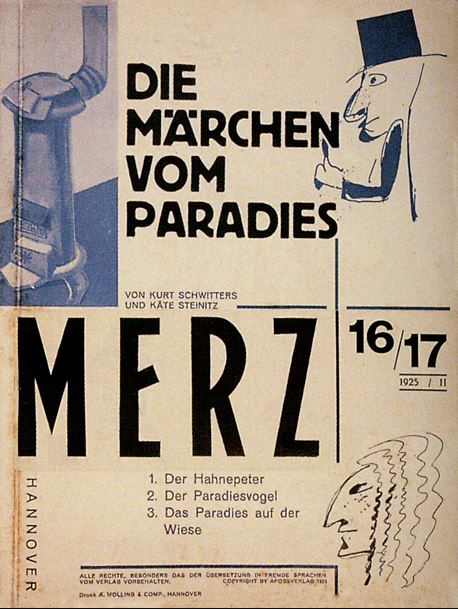
“I pasted words and sentences together into poems in such a way that their rhythmic composition created a kind of drawing. The other way around, I pasted together pictures and drawings containing sentences that demand to be read.” — Kurt Schwitters
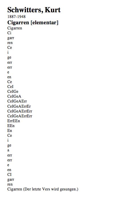
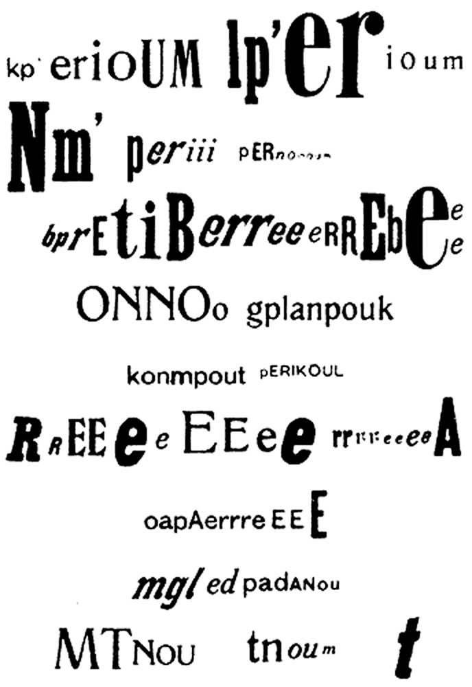
Schwitters’ also wrote sound poems. This is where phonemes are separated and recombined so they are no longer words.
Schwitters also produced drawings using letters. These cannot be read, but instead were to be viewed for their visual quality.
I really like the shapes he creates on the page, in the above poems. The ‘Cigarren’ poem has been designed to be displayed as a long thin line, imitating the cigarette shape.
Concrete poetry is poetry in which the poet’s intent is conveyed by graphic patterns of letters, words, or symbols rather than by the meaning of words in conventional arrangement.
https://www.britannica.com/art/concrete-poetry
Kenneth Goldsmith
Kenneth Goldsmith explores ‘Uncreative writing’ in his book with the same name. In this video, he is reading a newspaper article as a ‘contemporary poem’.
Lists
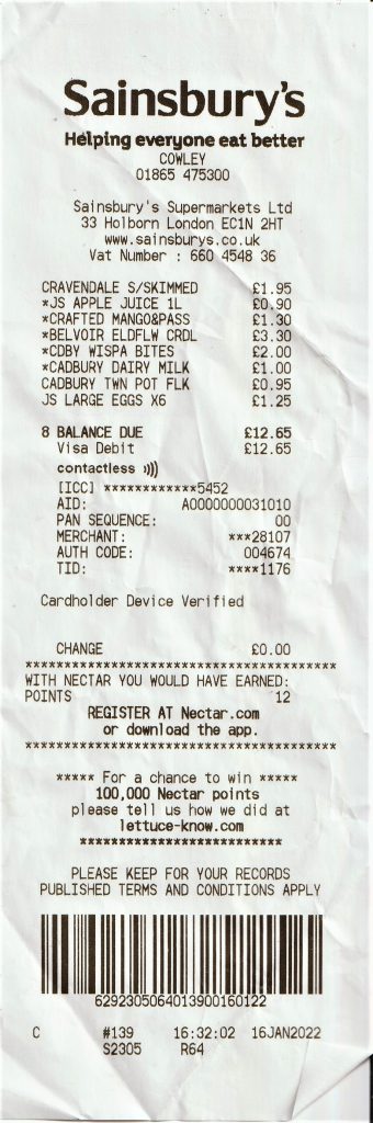
Being a reader myself, I have always been fascinated by the beauty of words. The mundane becomes interesting when frame it or combine it in new or random ways.
I particularly like a list. This is one kind of list, my housemate’s shopping receipt from the supermarket:
Sam Winston
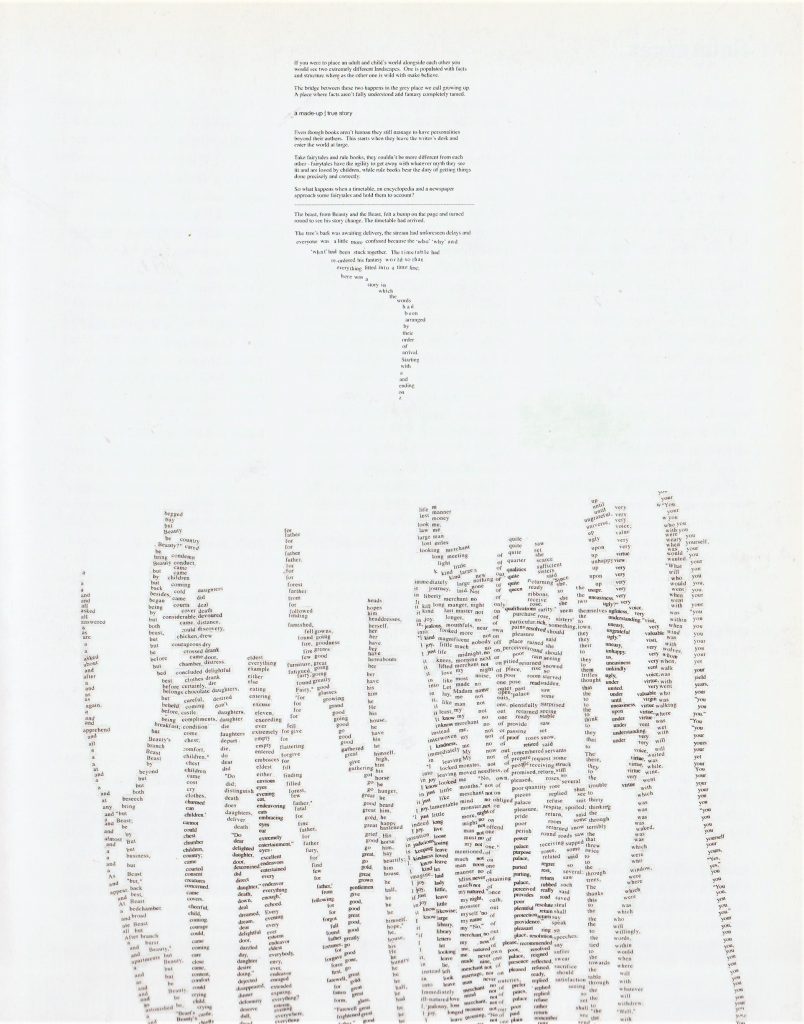
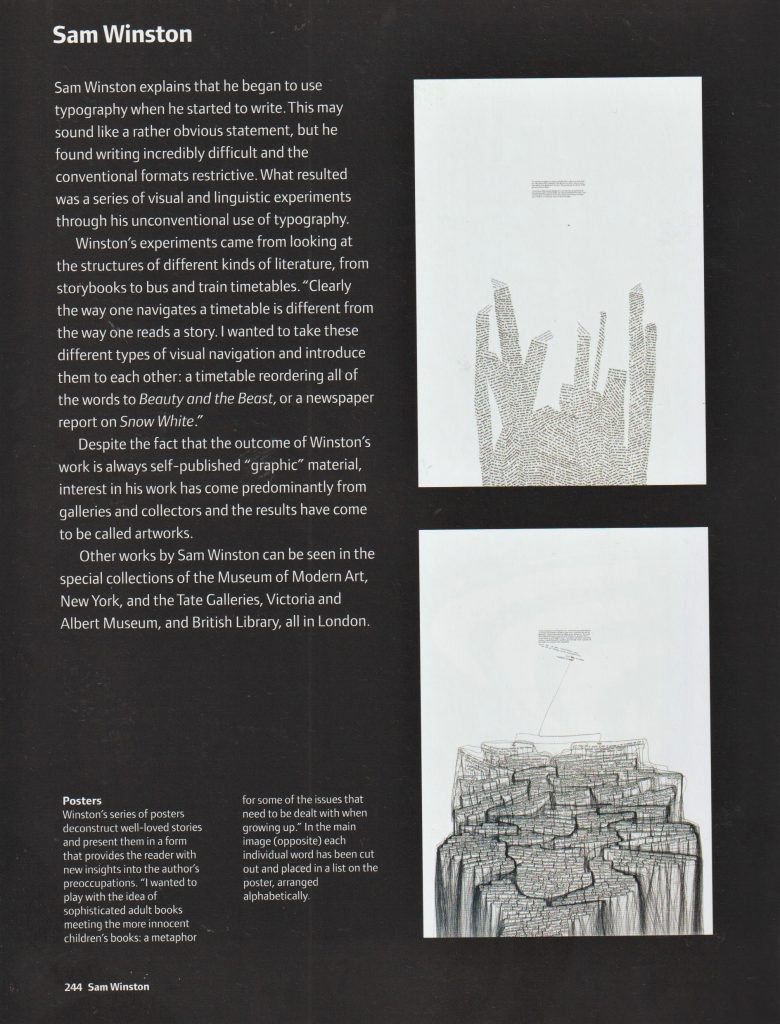
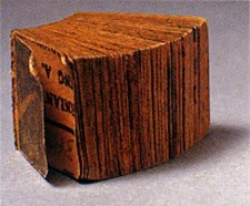
Winston creates incredibly detailed and intricate artworks using words. In the piece Stolen Dictionary, he cut the words from the dictionary and pasted them in a formation that reflected his own narrative. I like this idea of re-purposing words that have been printed for another purpose.
My Experiments with un-creative writing
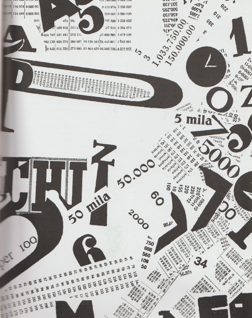
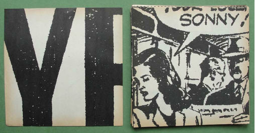
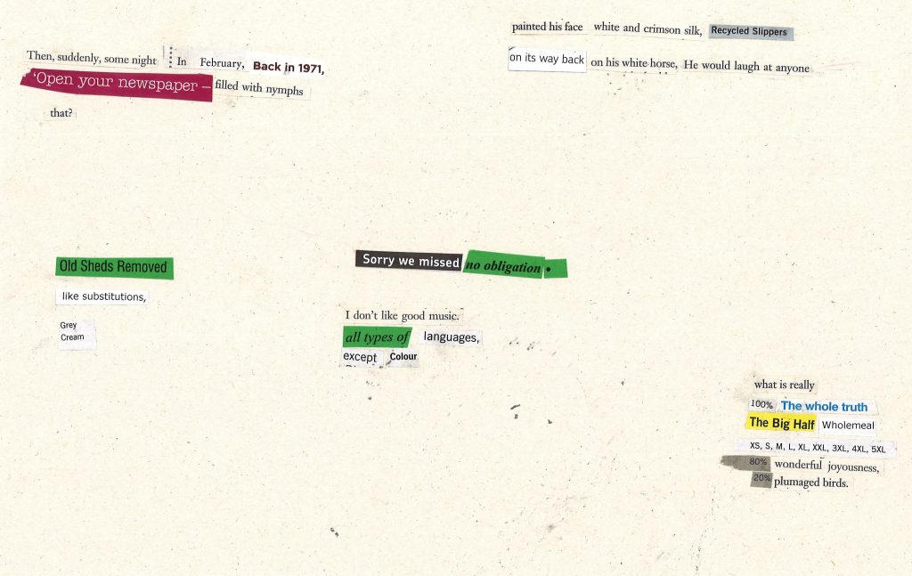
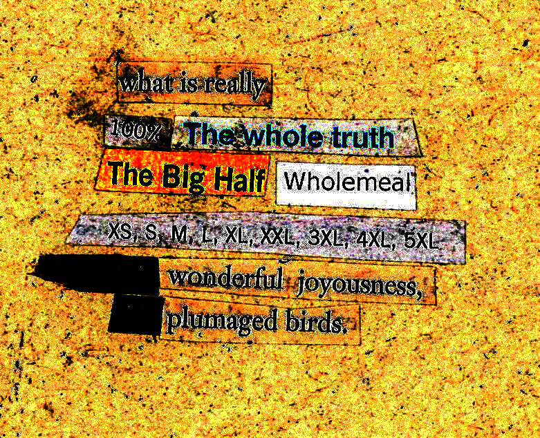
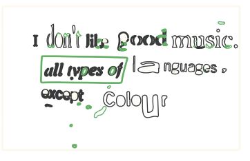
My first approach was to collect together random leaflets, flyers, catalogues and an unwanted novel. I then cut out words, but in a loose way. For example, I didn’t want to control the process too much. I wanted the sentences to be a bit random and not make sense completely.
I glued the sentences onto paper and scanned the page:
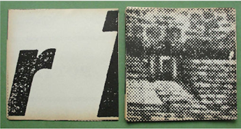
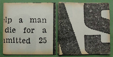
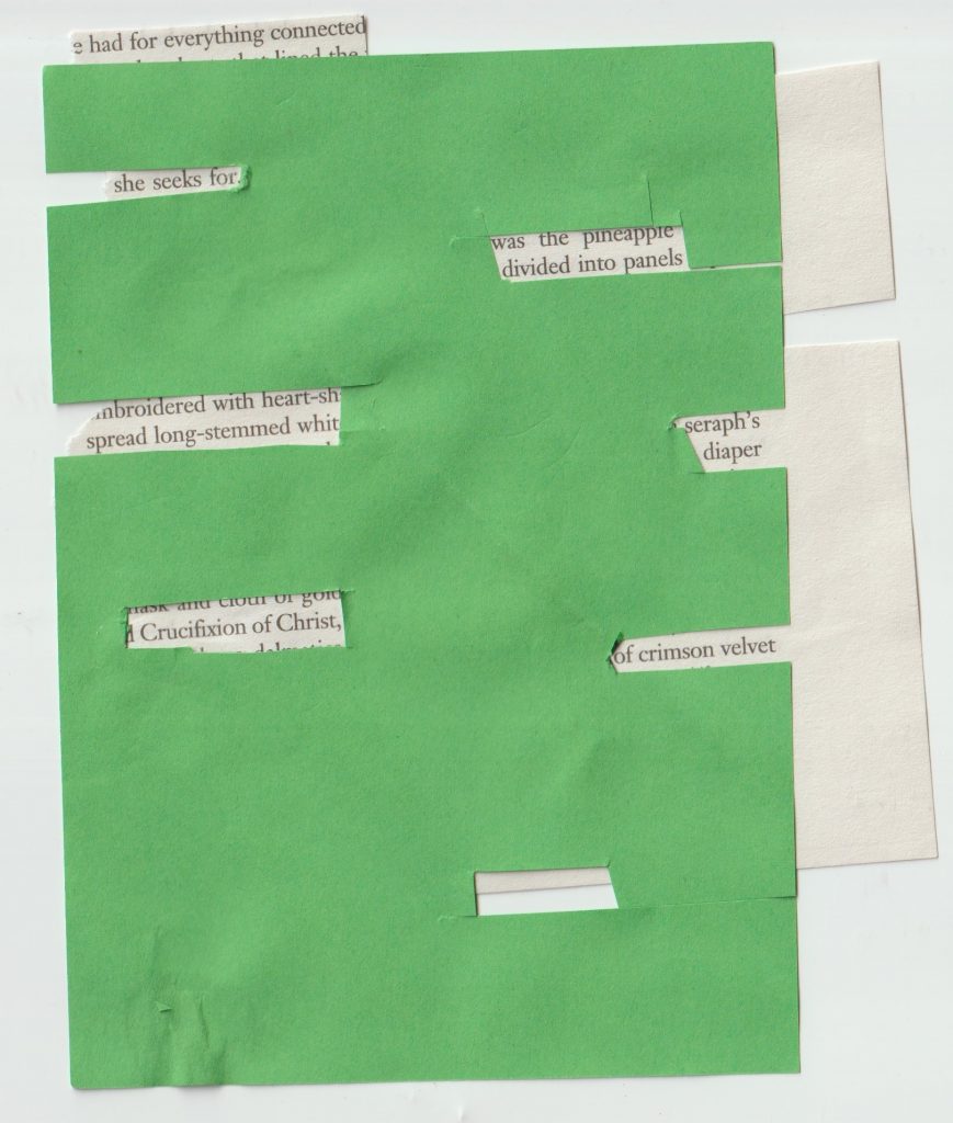
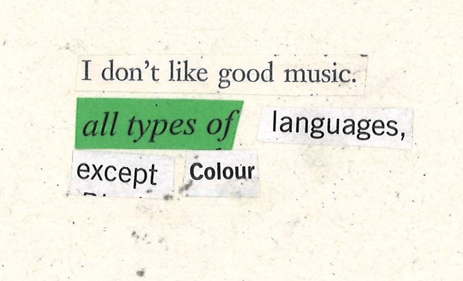
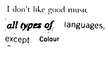
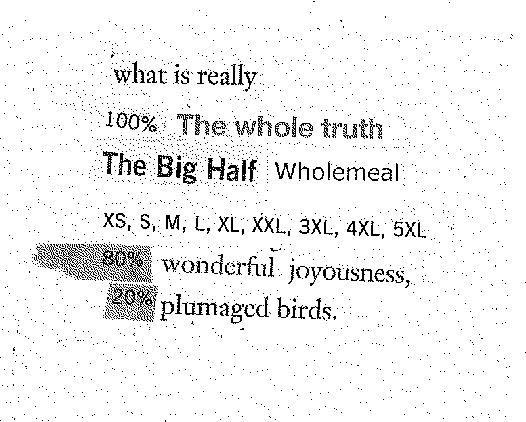
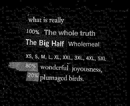
My second method came as an accident. I had earlier cut words from the green paper. This left rectangular gaps in the paper. When I laid it onto another page of text, certain words showed through. I then continued to cut into the paper, mostly at random, but I had to look at the page underneath to check the gap would show a line of text and not half a line.
I like this formation, because it is not a predictably (left-aligned) arranged text. It can be read in more than one day, decided by the viewer.
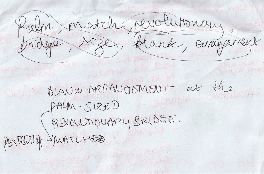
My third method was to use the random word generator.
I used it to generate singular words, writing them on paper as I went. I then re-arranged the text to an order that made sense to me/ had a better flow:
Blank arrangement
at the revolutionary bridge.
A perfectly palm-sized match.
How to place the text?
How the designer chooses to arrange the text will have an impact on the overall message.
‘Alignment refers to the way individual elements of a design are arranged. This is commonly seen in text placement- for example, most lines of text in a Microsoft Word document are left-aligned by default, where the text forms a uniform line on the left-hand side.’ (quote found here)
I looked at Modernist design to see how text could be placed within a design.
‘Kazimir Malevich, An Englishman in Moscow, 1913-14. Painted in what was known in Russia as a Cubo-Futurist style.’
The painting reflect the principles of Cubism. It has an underlying symmetry. The almost random placement of text in this piece, creates a feeling of freedom and playfulness. A more abstract alignment can add a dynamic quality.
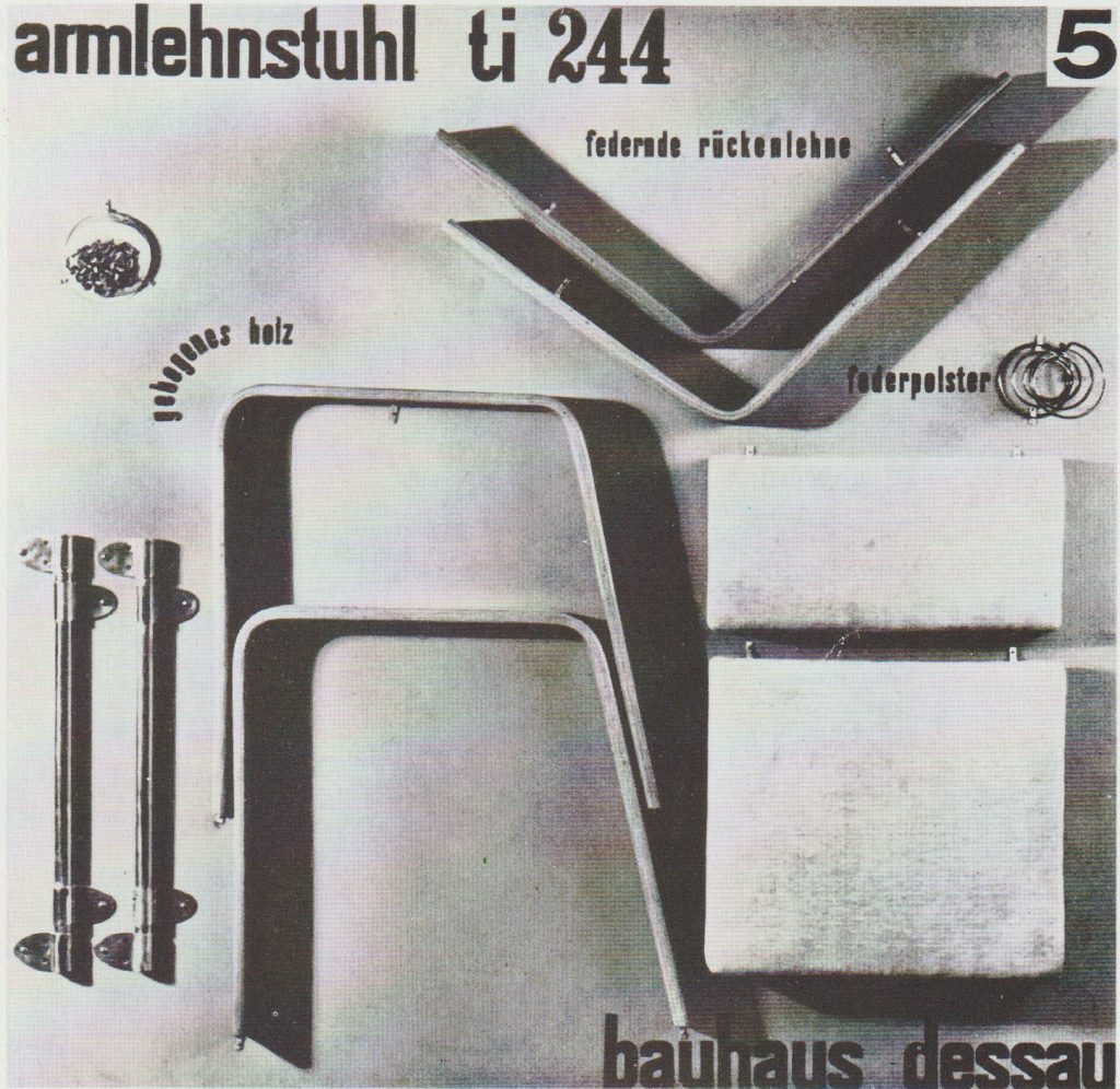
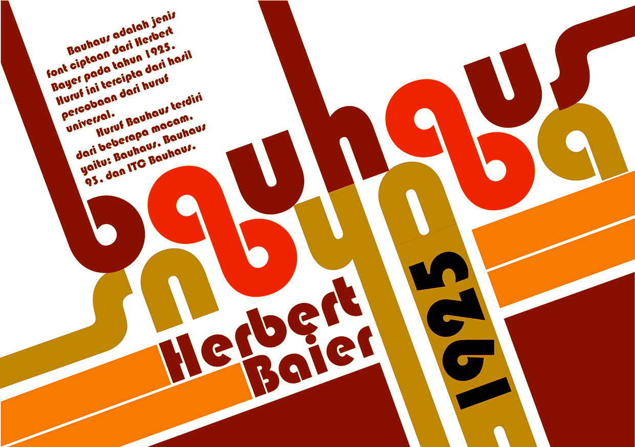
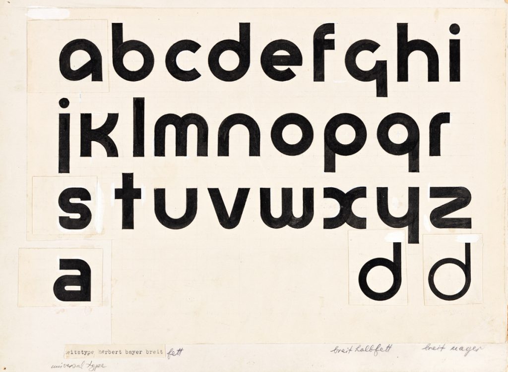
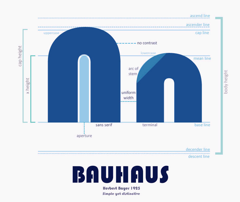
Bauhaus
A poster for Josef Albers’ Dismountable chair, 1929
The playful curving of text around the corner of the material echoes the curve of the furniture. The edge alignment of text at the top and bottom of the page act as a frame and focus the viewer’s attention to the central image.
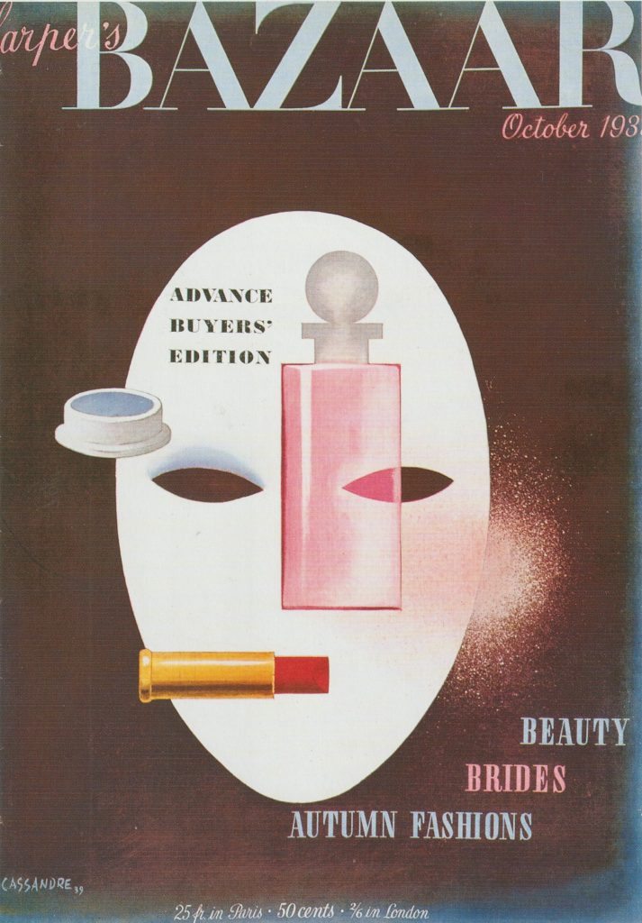
A. M. Cassandre, Harper’s Bazaar magazine cover, 1939. ‘This cover playfully exploits Cubism, Purism and Surrealism to create a memorable image of chic modernity.’
Here, the cover lines are aligned around the shape of the mask.
‘Cover Lines: These are lines of text on the front cover which allows the audience to see what sort of content is within the magazine.’ (Slideshare.net)
The way the text is tiered makes it ‘step up’ across the cover. This is more fun than if Cassandre chose a right alignment for example.
‘Cassandre’s imagery was so strange that his work looks psychedelic today (the chemical Surrealism of a later time). For an American magazine of this era, his work must have stood out like a big strange thumb.’ (quoted from here)
“During his brief tenure as cover artist for this high-end fashion publication, Cassandre both brought Surrealism into American editorial illustration and depicted the emotional and mental collapse of an entire world as it rapidly disappeared forever.” — Art Chantry
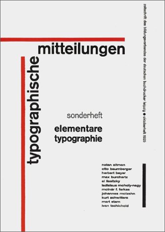
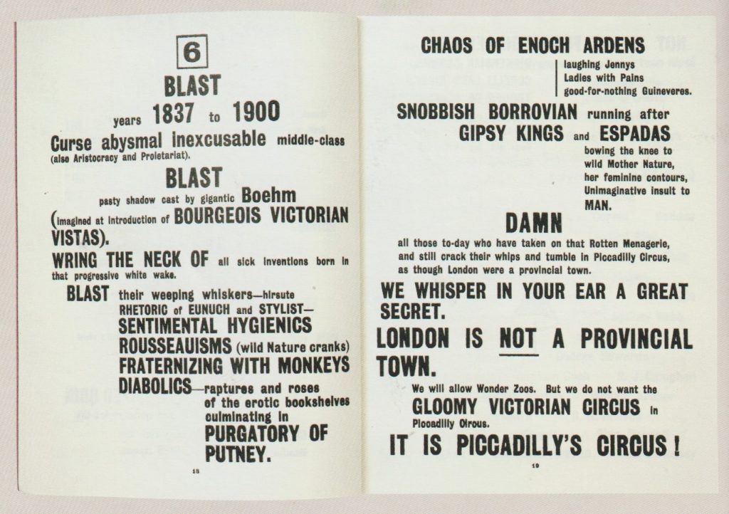
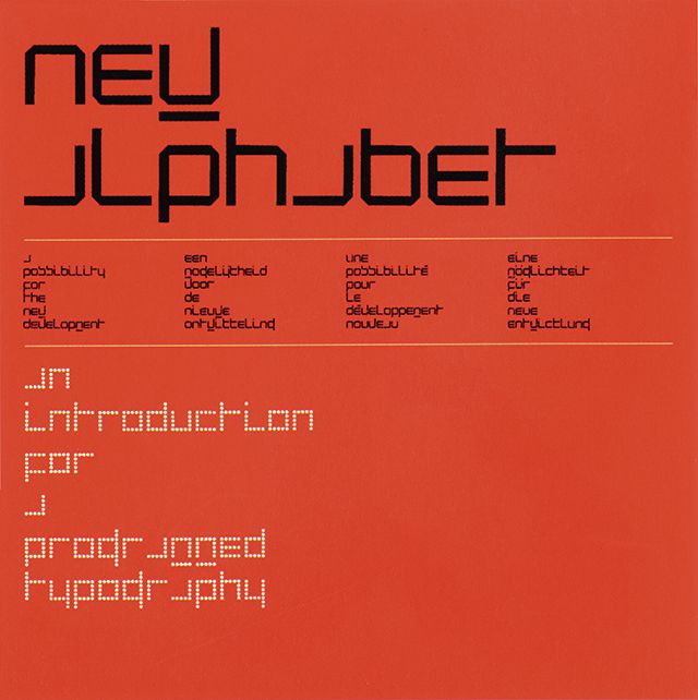
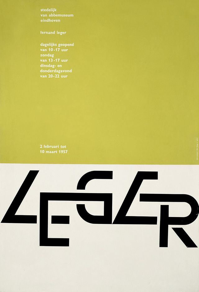
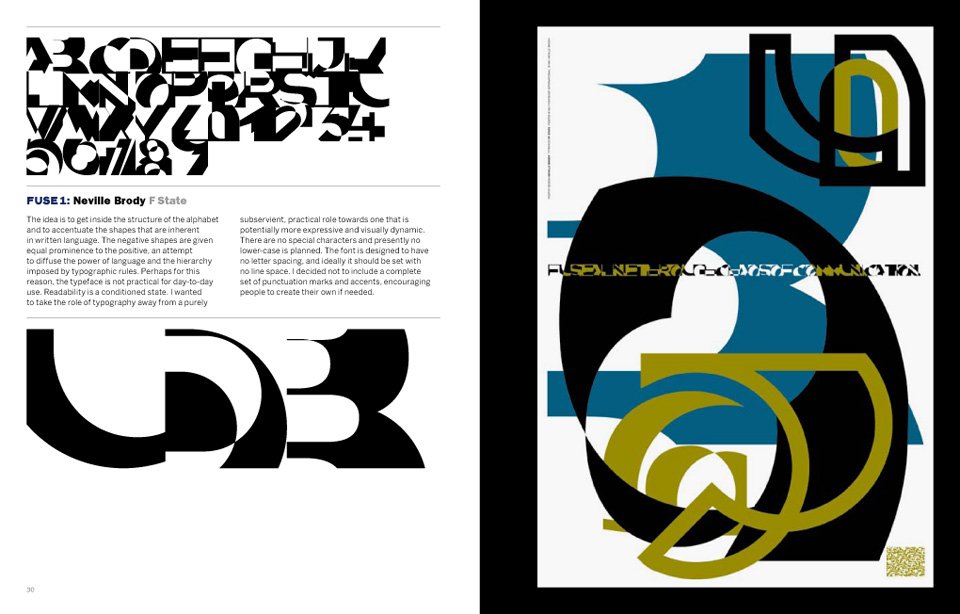
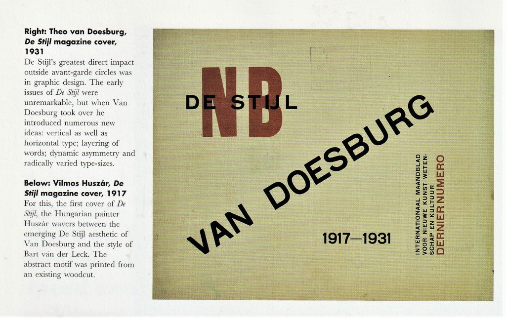
Jan Tschichold
‘In 1927, he joined a group formed by Kurt Schwitters, The Circle of New Advertising Designers. It was this group that formulated the principles of what was proclaimed The New Typography. Although the group had some dialogue with the Bauhaus they kept a distance, possibly for fear that either side might subsume the other’s identity. The New Typography was organised around these principles:
- asymmetrical balance of elements
- content designed by hierarchy
- intentional white space utilisation
- sans serif typography
(above) The cover of Typographic Mitteilungen: Elementare Typographie, 1925, a trade magazine in which Tschichold introduced the ideas of the Russian Constructivism and The New Typography to Germany’s printers. The content was met with great controversy but was widely adopted.’
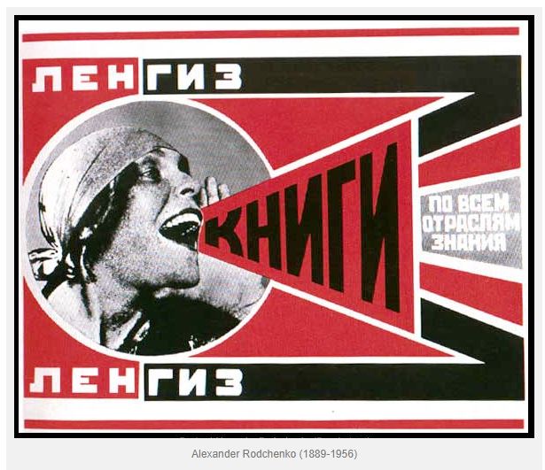
Russian Constructivism
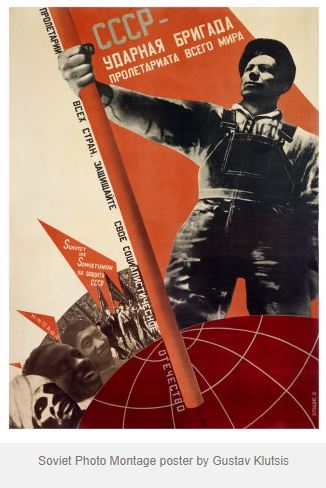
(right) Gustav Klutsis, ‘Workers, Everyone Must Vote in the Election of Soviets’ poster, 1930. For this memorable image Klutsis used his own hand, repeated many times.
The elements in this poster create diagonal movement. This gives the image a sense of instability and something in motion.
“Constructivism is early Soviet youth movement created by Vladimir Tatlin that was inspired by Cubism, Suprematism and Futurism. It flourished following the Russian Revolution of 1917 and sought to abolish the traditional artistic composition, and replace it with “construction.” Concerned with the use of “real materials in real space”, the movement sought to use art as a tool for the common good, much in line with the Communist principles of the new Russian regime.
The foundation of Constructivism was to express the experience of modern life and to develop a new form of art more appropriate to the democratic and modernizing goals of the Russian Revolution and build a new society.” (info sourced here)
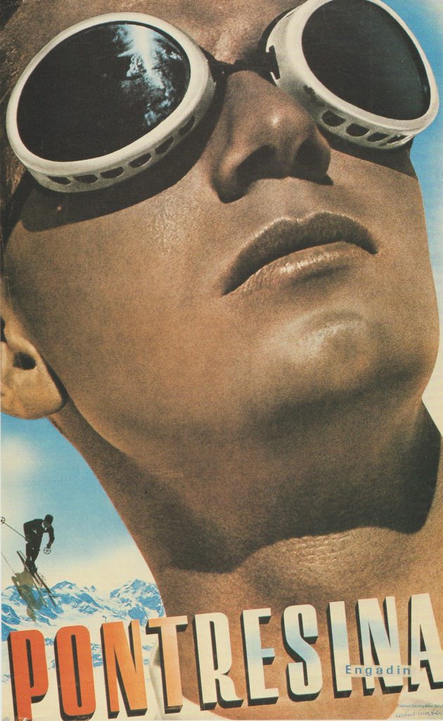
Herbert Matter, Travel poster, 1936
This poster is promoting the Swiss travel industry. Arranging the text at an angle reflects the slope of the mountains and action of the skier in the background. This text arrangement hints at the fun and adventure of the holiday.
Working with scans
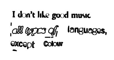
When working from the scan, I can achieve many effects. The image is restricted in that the placement will remain the same as when I manually stuck the pieces on the paper. However, I have the option of moving each piece individually by turning the image into a vector on adobe illustrator.
I can then select ‘line art’ ‘technical drawing’ and other options to change the appearance of the line.
I experimented with bitmapping the image. After opening the image in photoshop, I then converted it to greyscale >bitmap > diffusion dither. This was the result:
Some effects affect the readability of the text. I opened this scan in adobe illustrator and turned it into a vector.
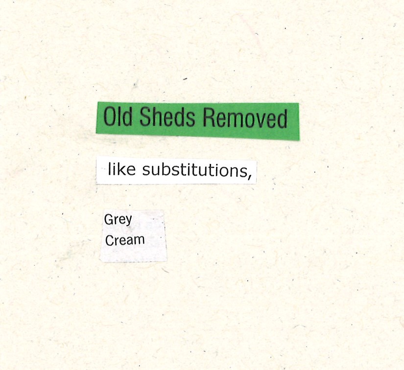
image trace > technical drawing> stroke increase> outline>
reversed the fill:
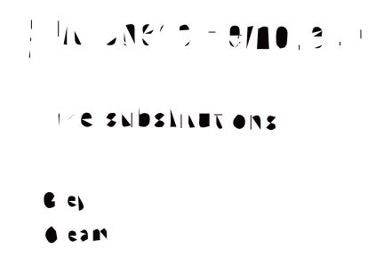
The word ‘substitutions’ reminded me of this modernist style by the design duo Sawdust:
‘Legibility and readability are not the same thing. The degree to which a typeface is legible is entirely dependent on the designer of the typeface, whereas readability is largely the province of the typographer. Legibility is the degree to which individual letters can be distinguished from each other. Generally, the most legible typefaces are those with larger, open or closed inner spaces.’
Readability refers to the ease of reading text. ‘the reader should not normally be aware of the activity of reading at all.’
‘The ability to read quickly and to be able to select in order to use time efficiently depends very much on the order and arrangement of type being normal. Surprises are disruptive to the mechanics of reading.’