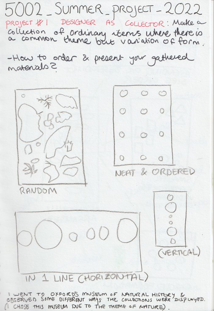
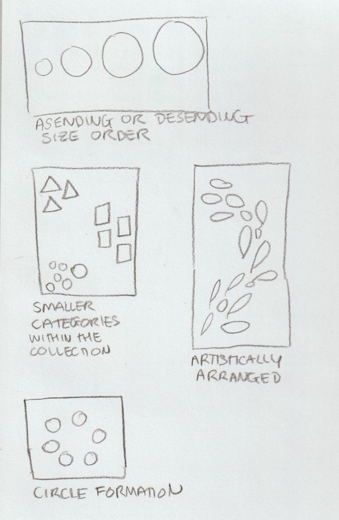
When visiting the museum of natural history (see previous post) I took notice of the different arrangements of objects. The way the objects were arranged made them easier to view and navigate around the museum.
I saw the impact different arrangements had on the objects when researching artists who work with collections.
Now it was my turn to investigate for myself…
Primary Research
Task 1: Arrange & Rearrange
Having my objects collected, I then had the job of photographing them in several arrangements.
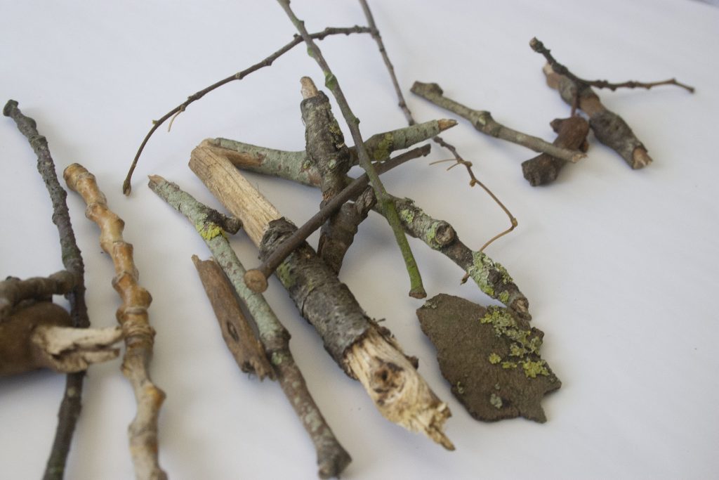
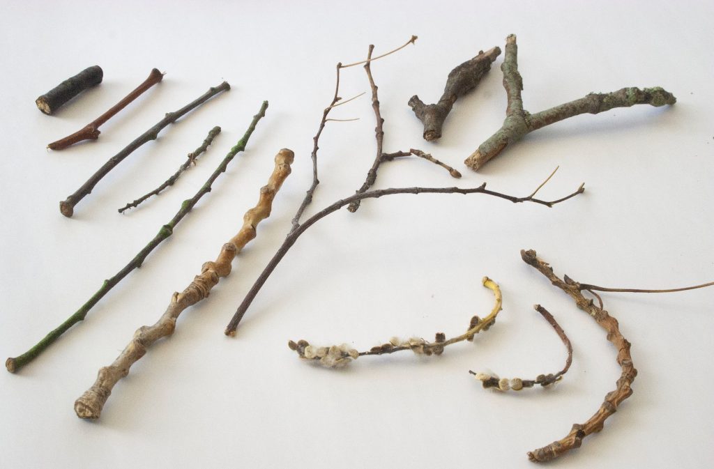
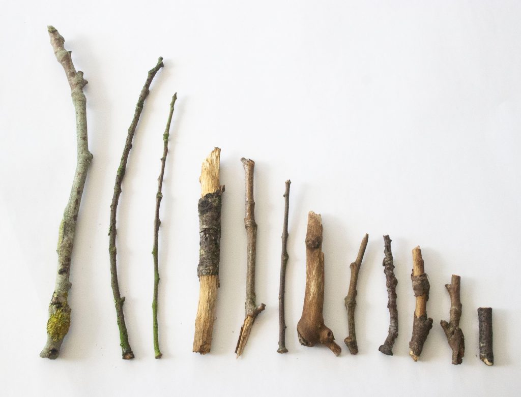
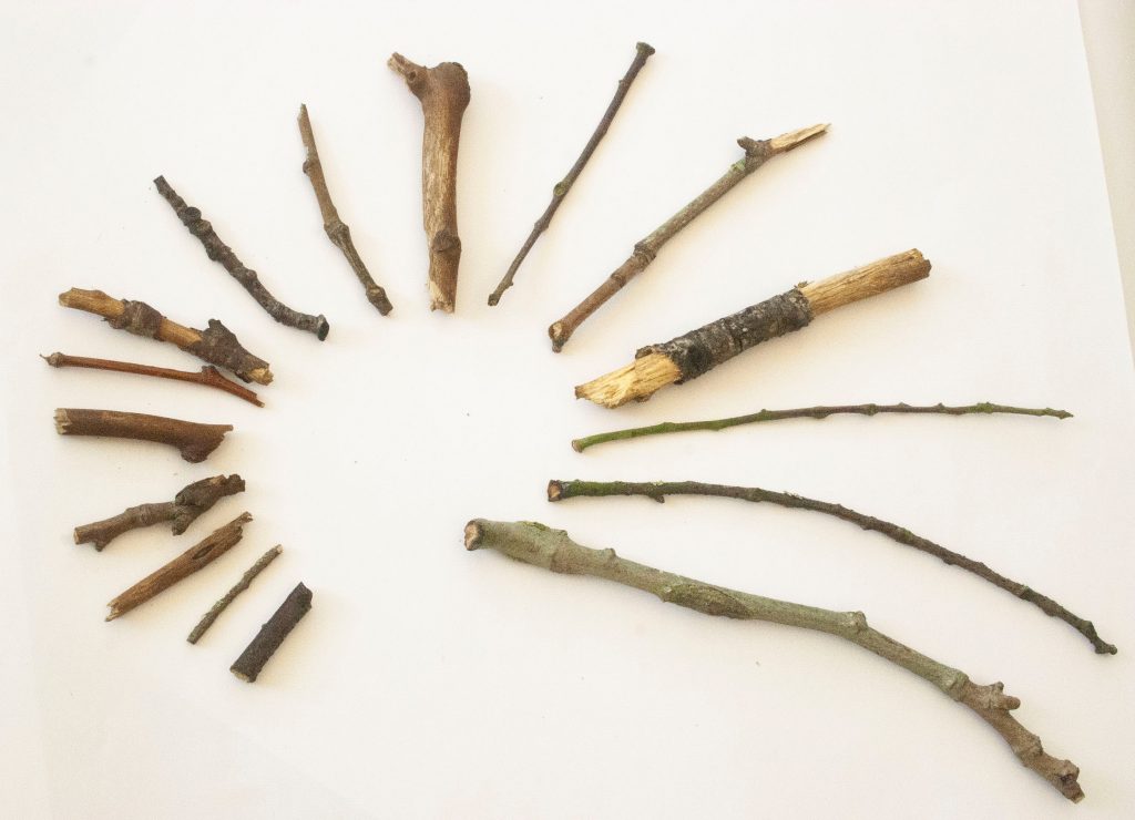
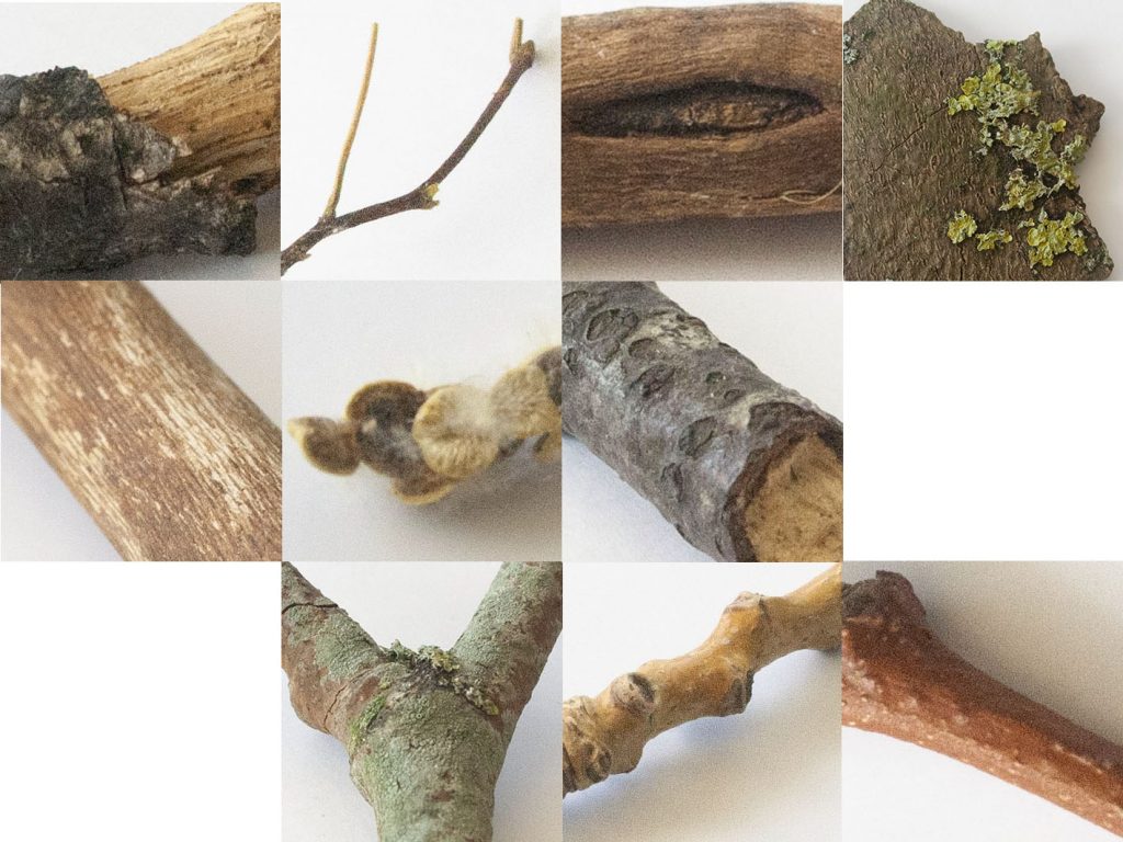
Twigs
arrangement: random, chaotic, jumbledarrangement: divided by shape type. 1) straight 2) forked 3) curved.arrangement: tall to shortarrangement: circular & in size order
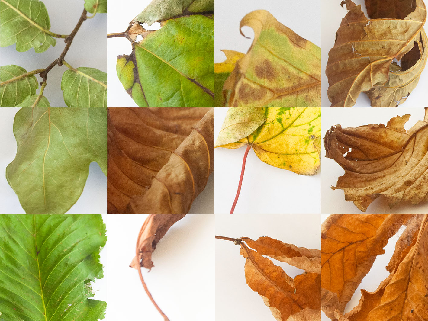
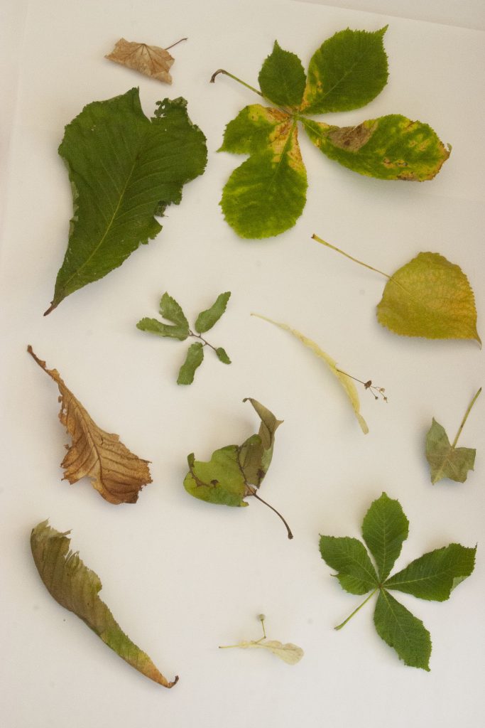
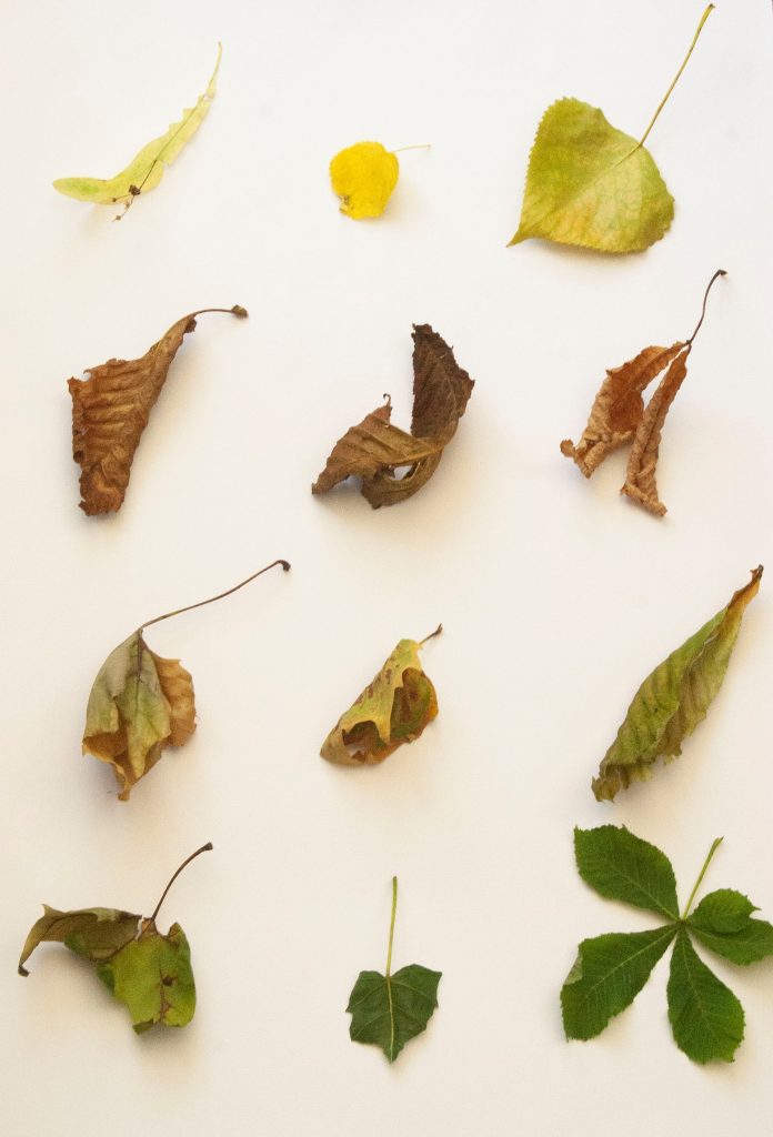
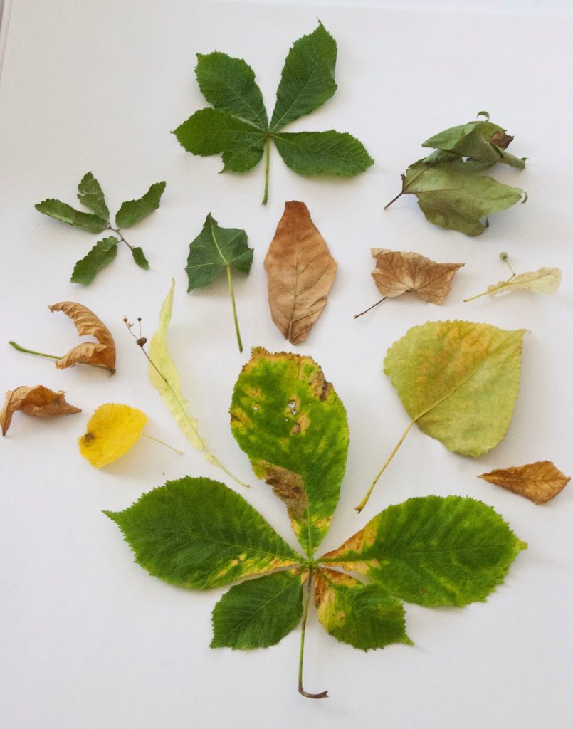
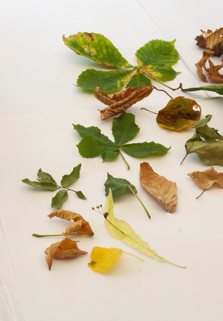
Leaves
arrangement: randomarrangement: by colour and evenly spaced into a grid formation.arrangement: artistically, centered around the largest leaf at the bottom, centre. Stems pointing towards this central leaf. Greenest leaves around the outside.
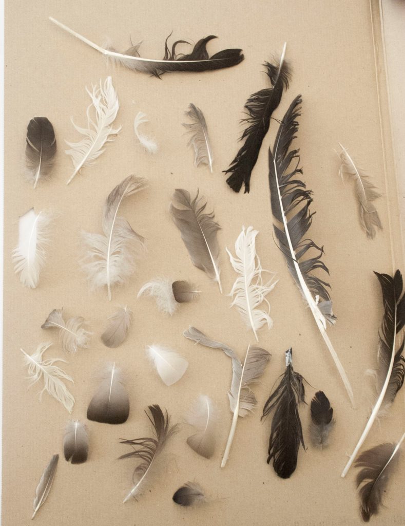
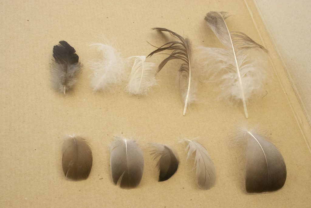
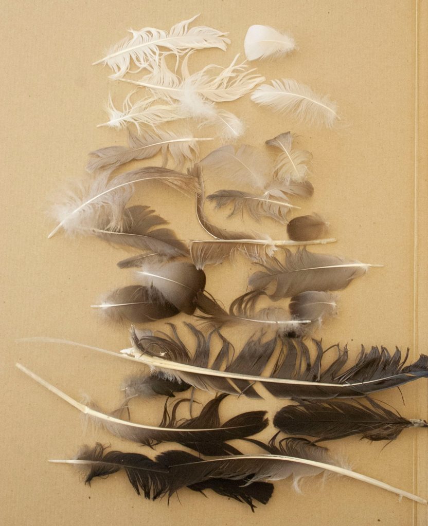
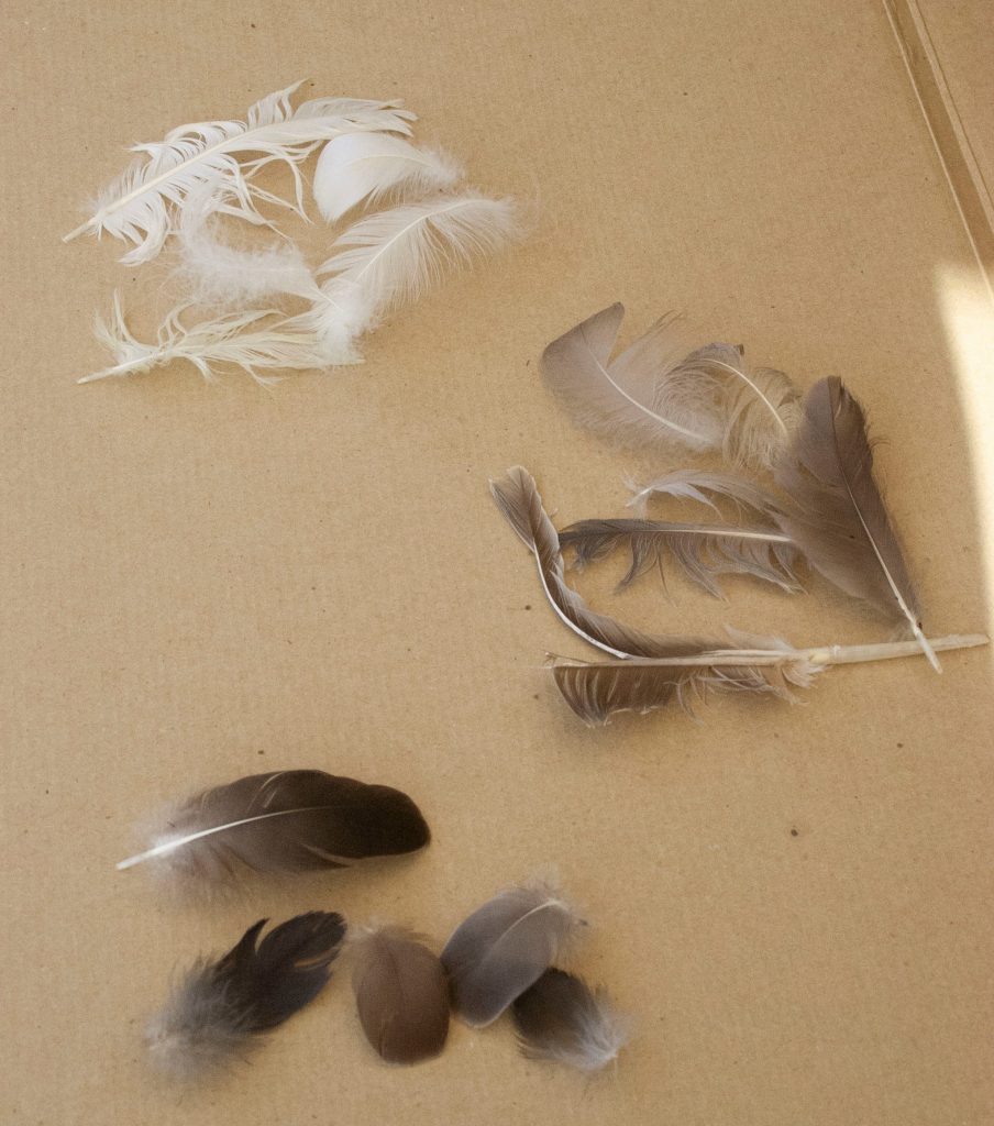
Feathers
arrangement: randomarrangement: divided by neat (bottom) and messy-shaped leaves (top) Divided by a central gap.arrangement: light to dark, horizontally placed.arrangement: grouped into smaller piles. categorised by colour (light, mid and dark).
Task 2: Re-direct the attentional focus
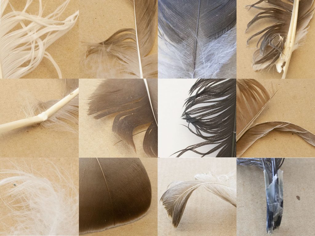
I then took separate photos of the individual objects from a group. I needed to select an interesting aspect of the object to focus on. For example, with the twigs (below), I picked out the following elements:
dark and light contrast, split at centre
fork in the twig and it is long and thin
an oval ‘mouth’
lichen growth
scratched markings on the surface
fluffy catkins
round markings
fork in the twig, colour is slightly green
kinks/ knuckles create an interesting twisty shape
smooth surface, rusty red colour
I then needed to create a grid with these photos. In the example below, I made sure to connect the lines from one photo to the next, so that the images would meld together visually.
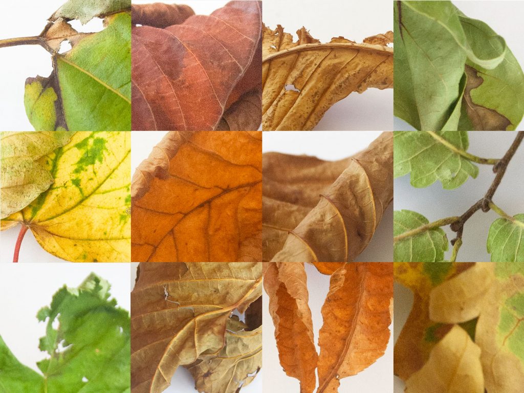
Leaves
I was more drawn to the leaves when selecting a topic to explore further. I then produced 2 grids using some of the same leaf images, and switching others.
Placing the stems in a direction that guides the eye around the grid. I used negative space to break up the composition and kept this space to the bottom right area.Placing the greener elements to the right and left, with the rusty colours in the centre.
I found this task more challenging than I was expecting. Because all the leaves are quite different, I wasn’t sure how to place them harmoniously.
typology n. typologies, pl. The study or systematic classification of types that have characteristics or traits in common.
This project requires you to explore typological classification of a collection to constructing meaning. It is designed to highlight the role of collecting, archiving and taxonomy as fundamental features of research and analysis.
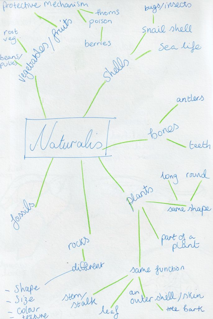
Naturalis
To kick off the summer project, we are asked to collect together a minimum of 12 objects from nature. (These objects would need to be connected by either their form or functions.)
I began to take notice of collections I could see in the visual world around me, with a theme of nature. For example, when walking around the city centre.
Secondary Research
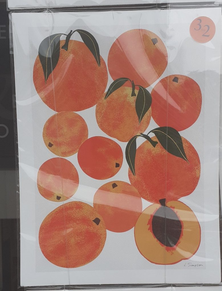
One example, is the prints I saw in the Blackwell’s shop window.
Peaches grouped organically, showing different sizes.Also following an organic composition. The subject matter matches this compositional choice.
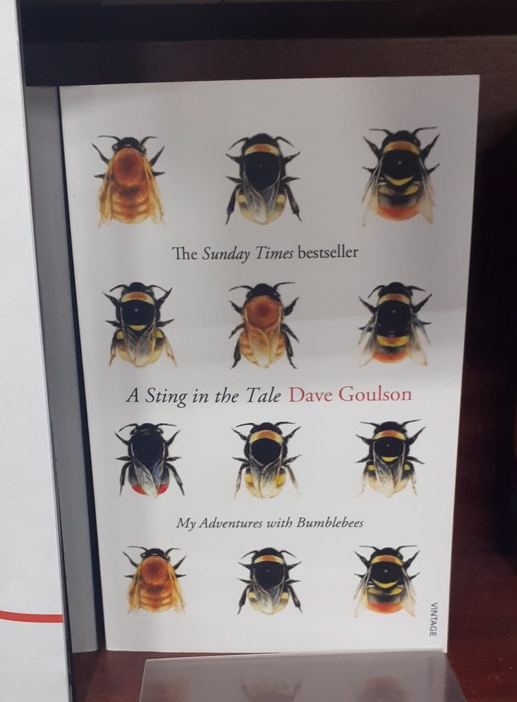
And inside the shop…
Book cover from a book in Blackwell’s book shop in Oxford. The bees are placed in an evenly spaced, straight lined grid. This gives a sense of symmetry and order. Each bee is slightly different. This variation makes the design more interesting to the viewer.
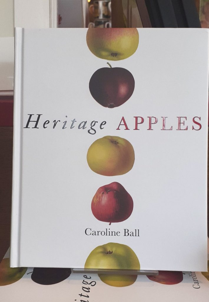
(Below) from the book display in the Bodleian Library book shop.
Vertical arrangement of apples. A collection of pressed flowers. They share the same texture and function, the form is similar to each flower but the shape and colour varies. Asymmetrical arrangement.The apples (left) are spaced apart and the flowers (right) overlap in places.
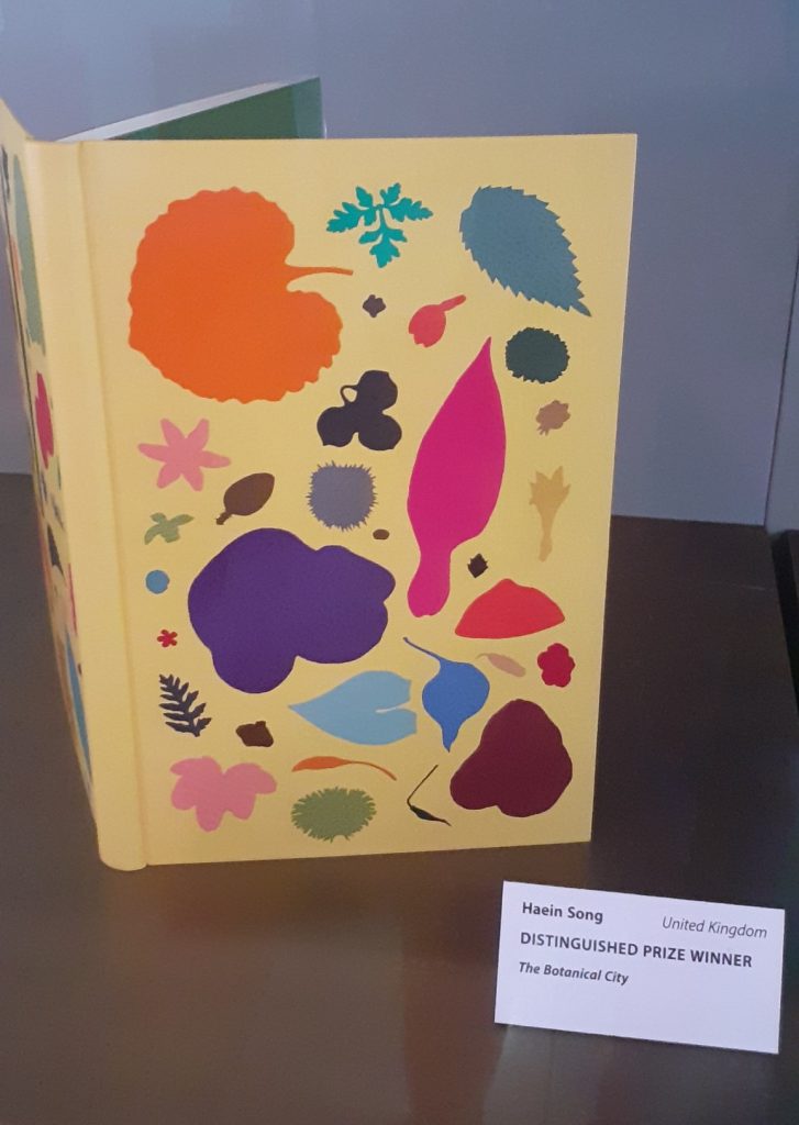
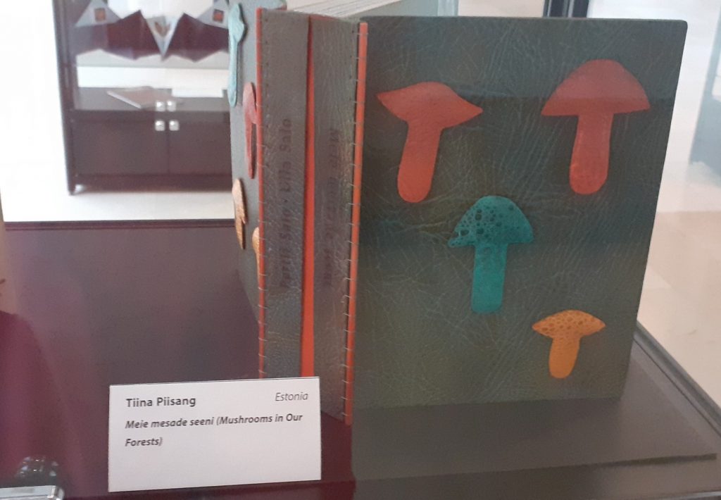
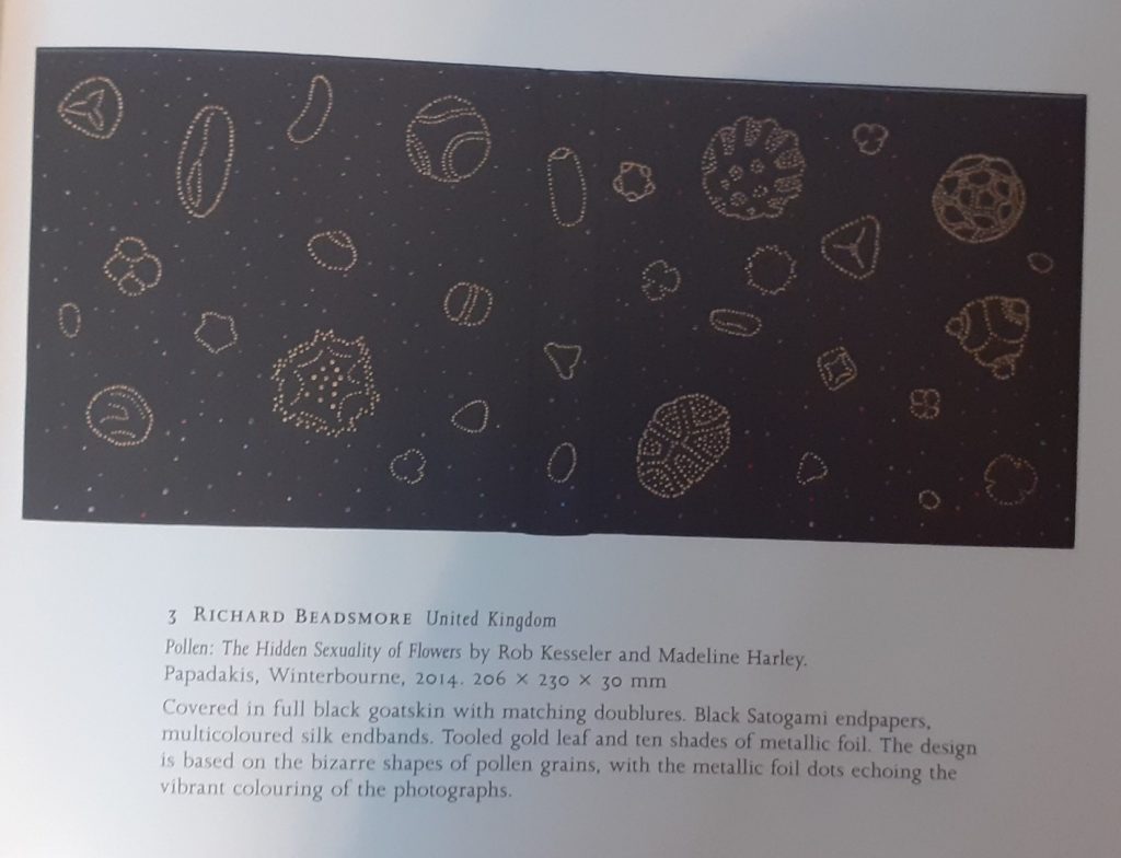
(Below) From the Designer Bookbinders International Competition 2022 exhibition at the Weston Library, Oxford.
Grouped together and overlapping leaves.Varying sizes, shapes and colours, united by the plain background and subject matter.Even numbers of objects don’t usually work well in groups, but these mushrooms work as a composition, because 2 are the same colour.Design based on pollen grains. The dark background works well to show off the details of the objects in the foreground. I am reminded of constellations.
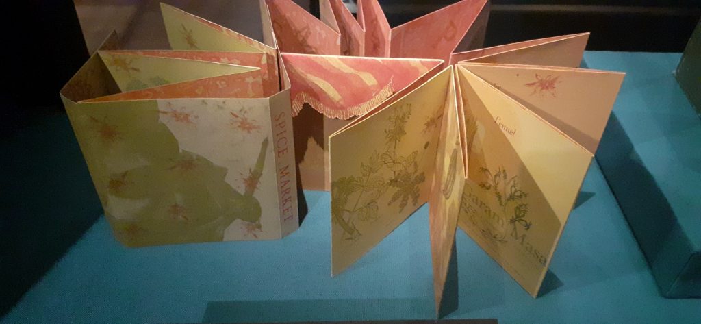
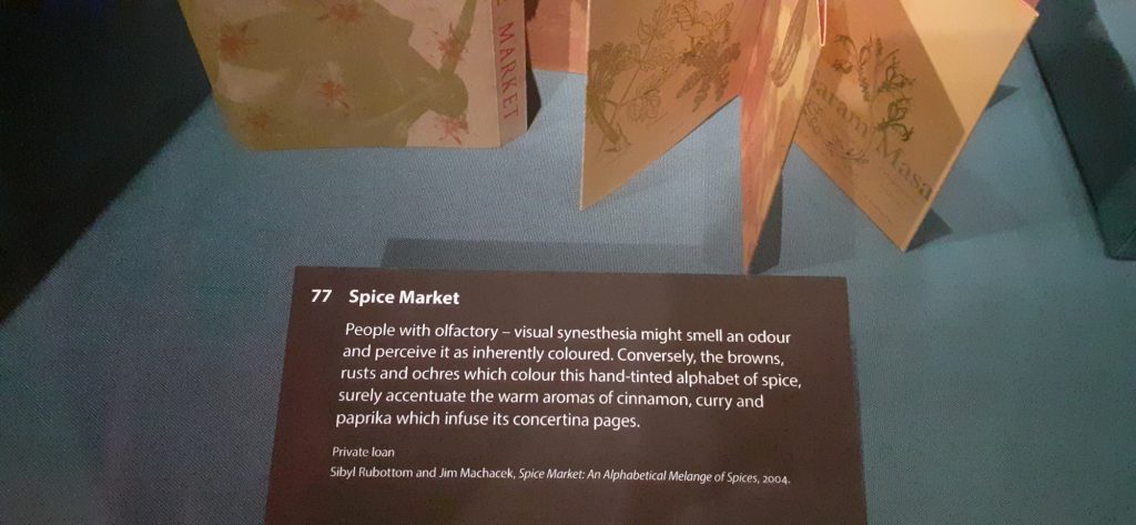
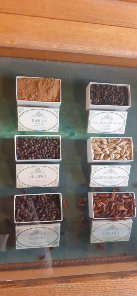
(Below) I really liked this book from the Sensational Books exhibition at the Weston Library, Oxford. The book presents different spices, each illustrated in different colours. The colour and texture of the paper chosen, reflects the warmth of the spices.
Contextual References
I looked at Artists who have explored collecting within their work.
Example 1: Susan Hiller
Susan Hiller’s Fragments
I deal with fragments of everyday life, and I’m suggesting that a fragmentary view is all we’ve got.
[b434d1] Hiller cited in Ann Gallagher (ed.), Susan Hiller, exhibition catalogue, Tate Britain, London 2011, p.87.
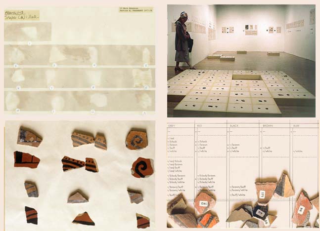
The artist Susan Hiller created her art installation Fragments in the 1970’s. The piece is made of many broken pieces of pottery. The pottery was originally made by native Americans and traditionally painted by women, as is the case in many cultures across the globe and historically.
Immediately, we can recognise a contrast between the asymmetrical and uneven pottery pieces with the tidy way they are organised. Also the contrast of the artificial white surroundings, that highlight the earthly and organic quality of these pieces that were made by human hands.
Fragments is as much about how the pieces are arranged than about the pieces themselves. It seems like a collaboration between the original crafters of the pottery and the artist who has been drawn to these pieces. Heller has approached the artwork almost in the way an archaeologist would handle fragments from an excavation site. This shows us the consideration she has for the history of the objects.
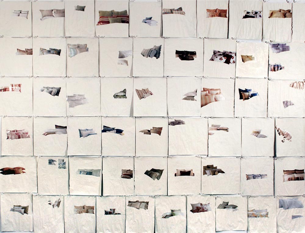
The artwork (above) has also been created by the artist going through the process of building and presenting a collection. One difference is that each object of this collection (a photograph image of pillows), appears to follow no pattern or categorisation. Each magazine page is roughly the same size, since she sourced the images from the same magazine. The difference is where the pillows appear to float on the white space. I like that this is unexpected and different on every square. It leads us to imagine what would have been on the rest of the page, now covered with white paint. Her process was more about selecting and erasing to highlight one object to the audience. The colours and sizes of the objects vary but she shows this no importance, since they are placed at random.
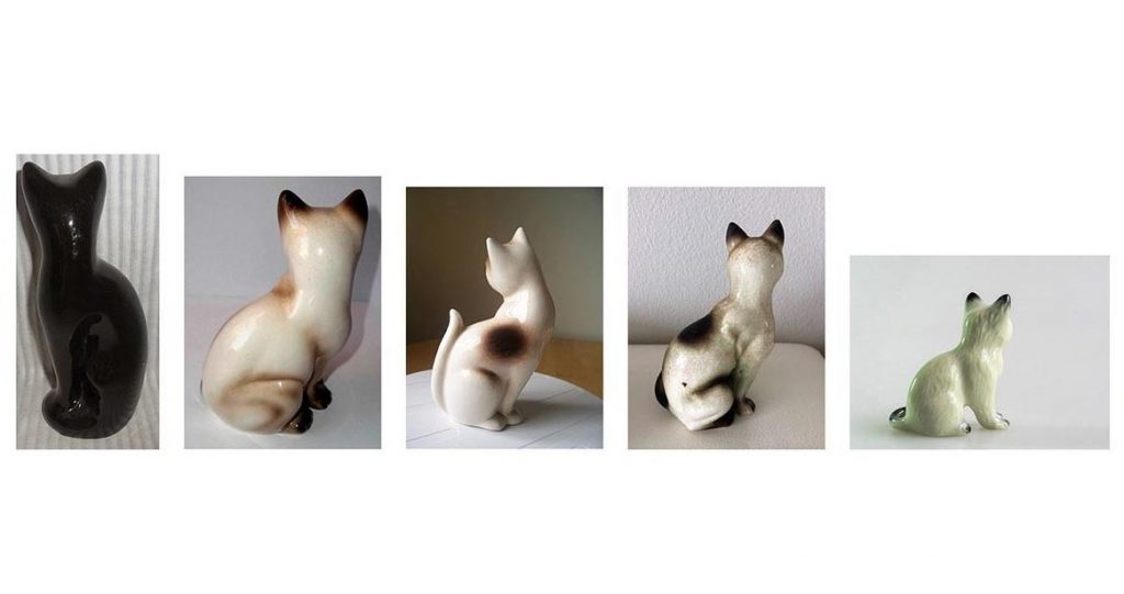
With this piece, Umbrico is again being selective with her objects. She hasn’t chosen every ceramic cat for sale on ebay, but instead is only showing us the cats that are facing away from the camera and therefore the viewer. Like with the pillows artiswork, she is also using found images, as these photos have been taken by the sellers who are selling the ornaments. She is focusing on this choice of the seller to present their object this way. SHe is making a comment on how we add life to inanimate objects with out own sentimentality/imaghination/emotions.
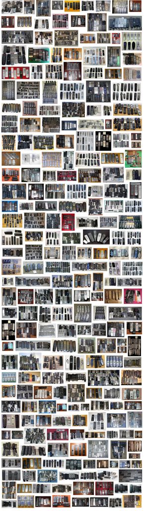
Universal Remotes is another installtion using found images from ebay. However, in this colection, the remote controls are grouped into smaller collections within the larger collection of the artwork itself. This adds another layer/dimension which for me makes it more interesting to view.
We can almost see the different personalities of the ebay sellers, because of the way they have chosen to display the same object in many ways and also the background they have chosen to use varies from square to square.
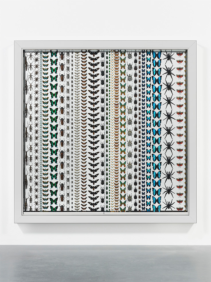
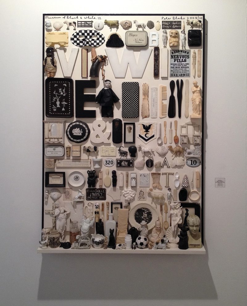
Example 3: Damien Hirst
I love how different forms of display affect what the eye sees. It’s bound up in my interest in the Victorian obsession with nature, or really the dominance of man over the natural world. Those Victorian natural history displays are so stupidly self-confident, it’s nature seen through the eyes of man, beautifully ordered according to aesthetics. They’re meant to be about the natural world but they’re more like zoos — fake places or facades of reality.
Last Kingdom is a collection of insects, like most of the work Hirst is known for, preserved in an installation. I would describe this piece as decorative, it almost reminds me of a wallpaper pattern design. Unlike the previous works we’ve looked at, these insects are divided by species and placed in an orderly way with equal spaces between the objects. He has considered colour and size in this collection.
Placing the rows in size order makes the art work pleasant to view. The neatness is museum-like, but the randomness of the objects’ function makes it different to a museum where more logic is applied to the placement.
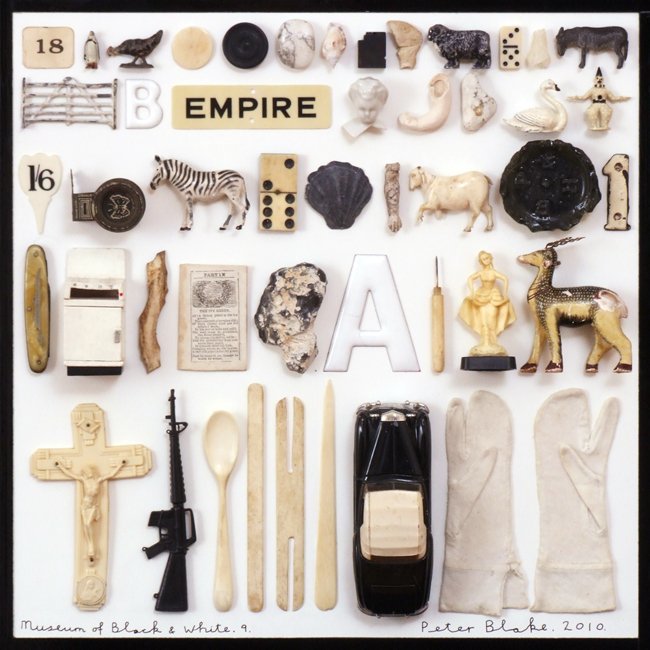
The name of the piece refers to the selection of black and white objects only in this collection. Other than colour, these objects have no other obvious theme in common collectively. The viewer would need to have previous knowledge of history to know that these objects could be from the same century, for example.
I really like this artwork, I feel that the muted colour palette helps me to focus on the shapes themselves. (Bright colours could be distracting). I also like the familiarity of the objects. They might not be an exact artifact I have owned, but they are pieces of the culture I am familiar with.
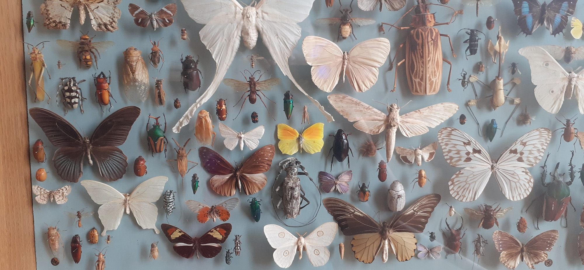
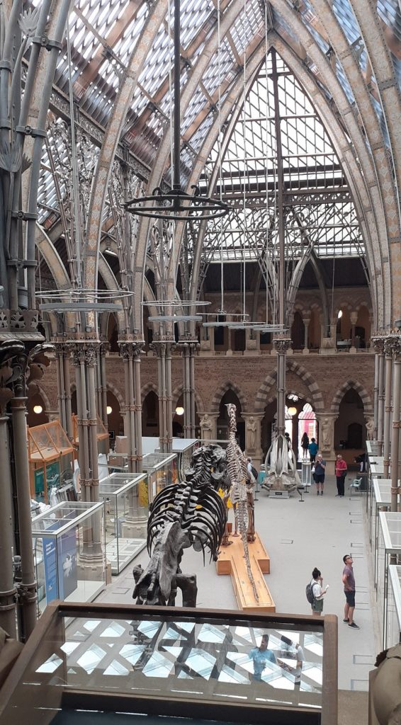
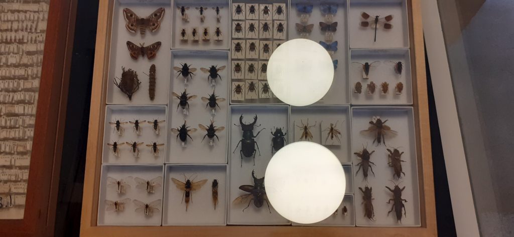
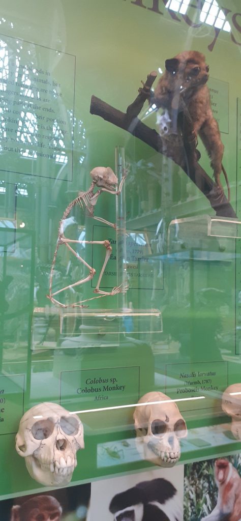
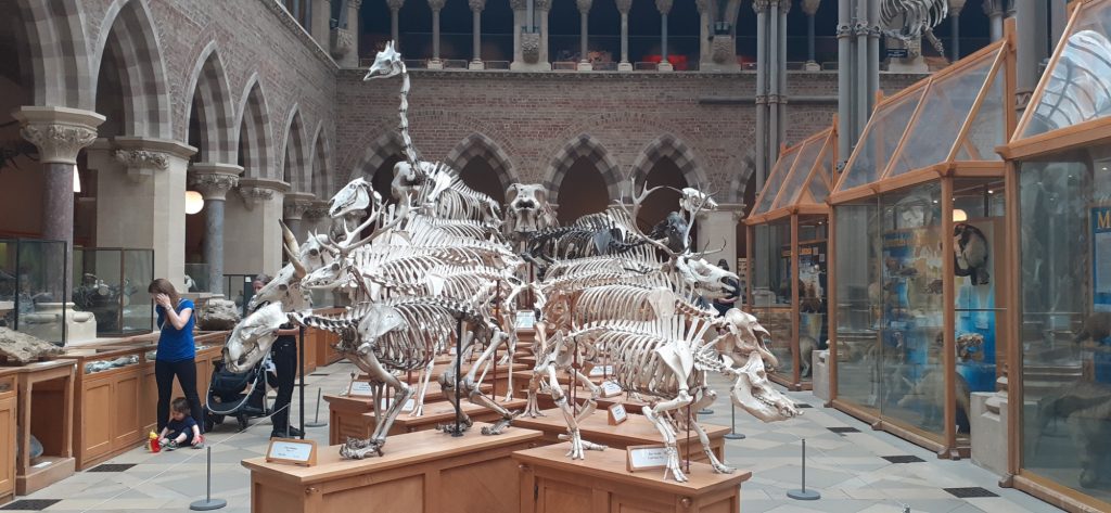
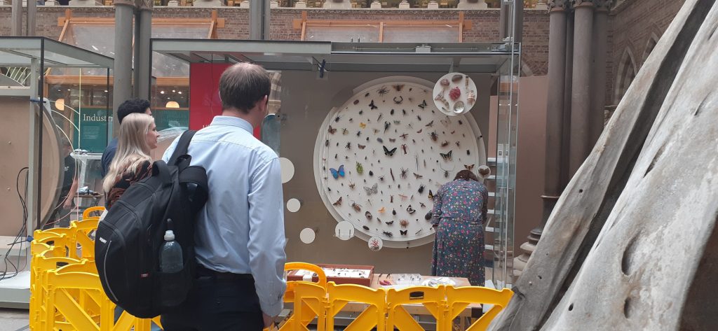
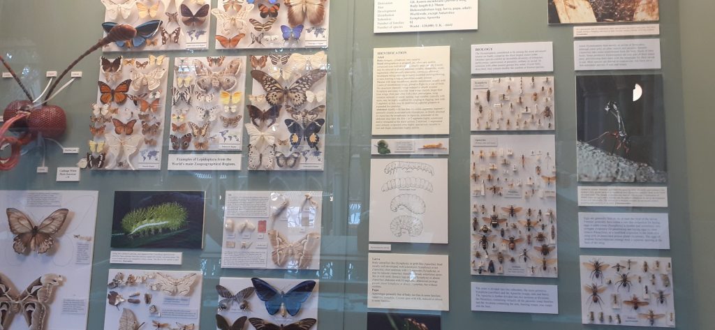
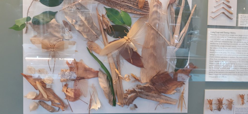
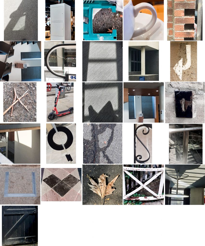
This week I returned to my favourite Oxford museum, to observe the nature of collecting and displaying artefacts. I wanted to gain some inspiration for how I could categorise objects and arrange them as a collection.
Insects grouped by insect family. Smaller boxes slot into the larger frame neatly. Shells arranged from smaller (top) to larger (bottom)Artistic arrangement of insects. The smaller bugs are used to fill in gaps. The result is beautiful and slightly chaotic.
Part of the primate display. Skulls grouped together. Head (bottom) to body (top). Diagonal arrangement leads the eye across the display.
Skeletons arranged in order of size from smaller (front) to larger (back). Symmetrical placement, creating a kind-of mirror image.The objects are placed as they would likely be found, to reflect the natural world.
Spices grouped and separated into boxes.
From the museum trip, I reflected on the arrangement of the objects and recorded these observations in my sketchbook:
Then…
To decide on the objects I wanted to collect, I drew up a mind-map to consider what would make an interesting collection:
From this list, I narrowed down my options and went to Christchurch Meadow to collect from nature. I chose this area because of the variety of trees and wildlife I knew I could find here.
It was then time to arrange and rearrange these objects…
Definitions I learnt today:
heterogeneity
/ˌhɛt(ə)rə(ʊ)dʒɪˈniːɪti/
noun
the quality or state of being diverse in character or content.”the genetic heterogeneity of human populations”
disparate
/ˈdɪsp(ə)rət/
adjective
essentially different in kind; not able to be compared.”they inhabit disparate worlds of thought”
In the art world, words are often used as image, for their visual quality. Project #5 is almost the opposite thing: taking images and using them to create letterforms. (In a way that is functional and experimental.) This sounded like a fun project. It would require me to be observant and see the world afresh. I thought I would be seeing letterforms everywhere! It wasn’t as easy as this. I discovered that some shapes are more common to find than others.
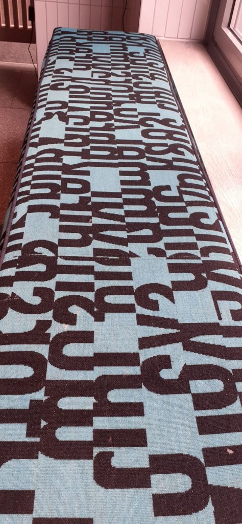
When out on my quest for letters, I took more notice of all the letterforms around me. I looked at the typography of shop signs, as well as my mission for objects that look like letters. While in the Westgate Shopping Centre, I came across this interesting fabric used for the benches. I liked that I could recognise the shapes as parts of letters, even though no letter is complete.
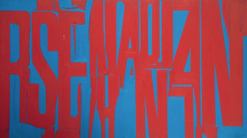
This textile design reminded me of the paintings by William Klein and prompted me to have a look at letterforms within art.
Known mainly for his street photography, William Klein also explored letterforms within his paintings. Here you can see they are purely used for their aesthetic value.
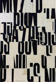
Cecil Touchon’s collages make use of letterforms. He describes his work as visual poetry. Or ‘poetry for the eyes’. This movement of visual poetry came from the concrete poetry movement. He likes to explore the boundary between art and poetry.
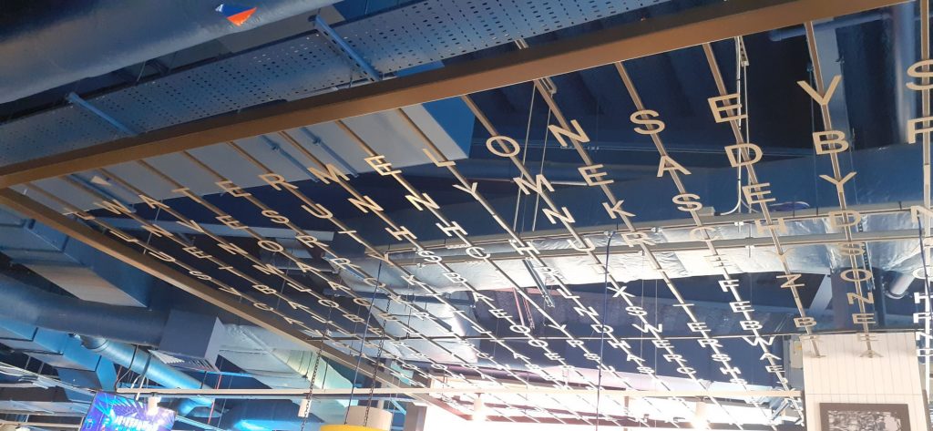
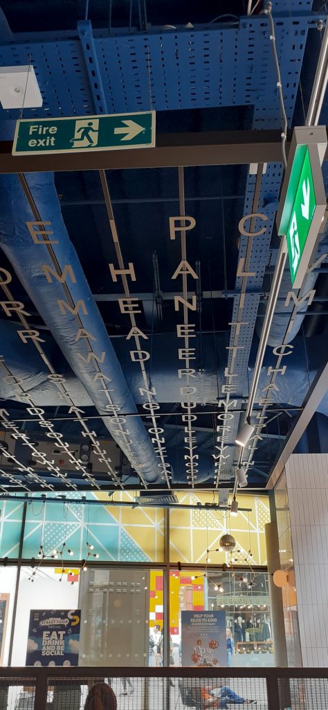
In the same location, above my head instead, I came across this installation.
When showing the photo to my housemate, he saw different words within the grid than I could see at first glance. The choice of layout invites the viewer to a kind of game of piecing words together, as in a wordsearch puzzle.
Secondary Research
The Alphabet of Found Objects
I immediately found inspiration in the title of this project, The Alphabet of Found Objects. The 2 words ‘found’ and ‘objects’. We explored objects in year 1 of our course. But I didn’t consider an object functioning as a letterform. This would mean a function that comes purely from the object’s shape. Maybe from a particular angle, since the shapes are 3-dimensional.
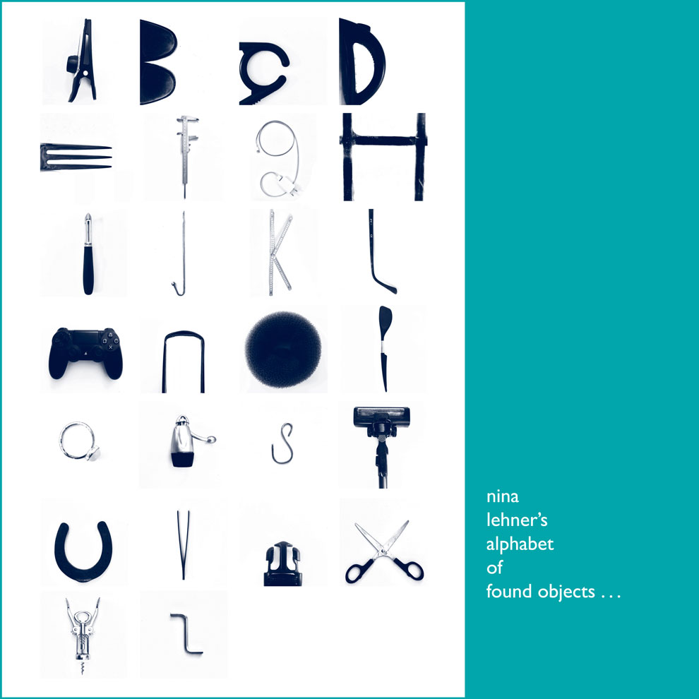
This project consists of students’ work for entry onto a design course in Germany. Nina Lehner has separately photographed the objects/letters against a white background. Keeping the same background makes the letters more uniform and look like they are part of a set. (Below)
I can see a deliberate staging of her objects. Her obvious manipulation of the objects takes away from the ‘found element’, which is my interpretation of the brief. I wanted to include objects I had really found and hadn’t touched at all – though her method does create letters which are easy to read.
Some of her obejcts are shot alone, surrounded by white space, but other letters are only a section of another object. This inconsistency is less satifying for me. I would prefer to use the same rule, or lack of rules for every letter. But this is only if I was being very critical.
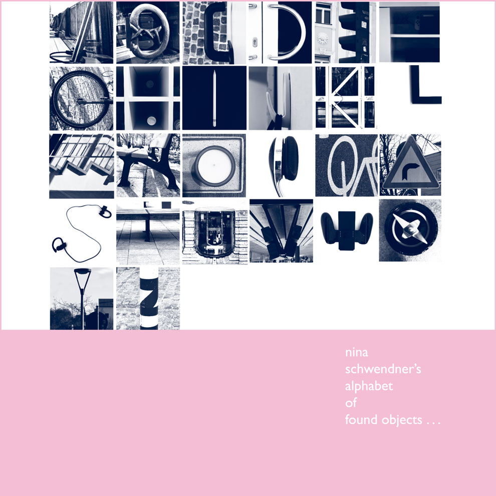
(above) I prefer the alphabet by Nina Schwendner, as it tells more of a story. We can image the artist journeying amongst these placing in her quest for letters. I find myself wondering which she came across first and last. The monochromatic filter adds more mystery, but also helps the images read better as letters.
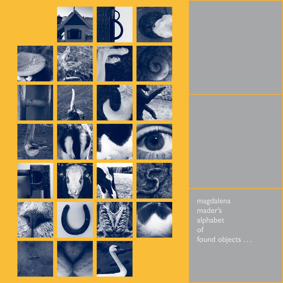
Having the letters united by a theme is satisfying to view. In this case, Mader has explored parts of animals. Flipping the image of the swan’s head works in this context, but I want to take the approach of less editing, more finding things as I find them.
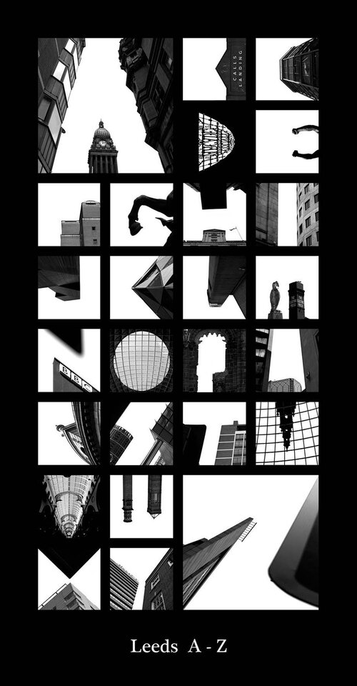
Peter Defty
Photographer Peter Defty has produced a series of photos he calls city sky alphabets/ alphatecture. Each alphabet uses photos he took in different cities across the world. If you were familiar with a city, you could probably make the connection without the caption he has placed underneath each alphabet. However, its not necessarily obvious immediately that the photos are even from the same country or city.
He carves the letters from the sky, shooting mostly upwards. The buildings and other architectural features block in the sections of pale sky. His use of negative space is imaginative and not something I would have thought of.
Jason Ramirez
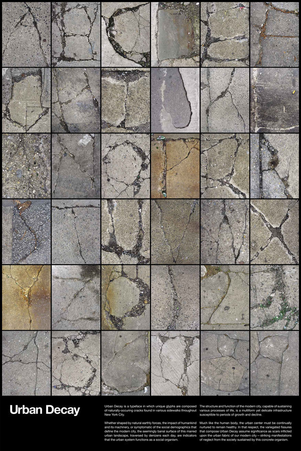
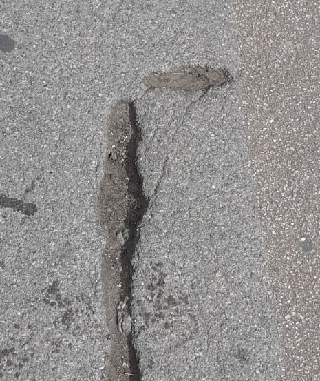
This collection contains colour, unlike the previous examples I’ve looked at. This might help with the visibility of the letters, since some of the lines are very fine and might be harder to see in a black and white image.
Ramirez has created this series of letterforms from various found cracks in the pavement. The letters looks spidery and natural, despite being found amongst the man-made world. I like their randomness, each shape is completely unique and you are unlikely to find another crack in the pavement that is identical to those he has found.
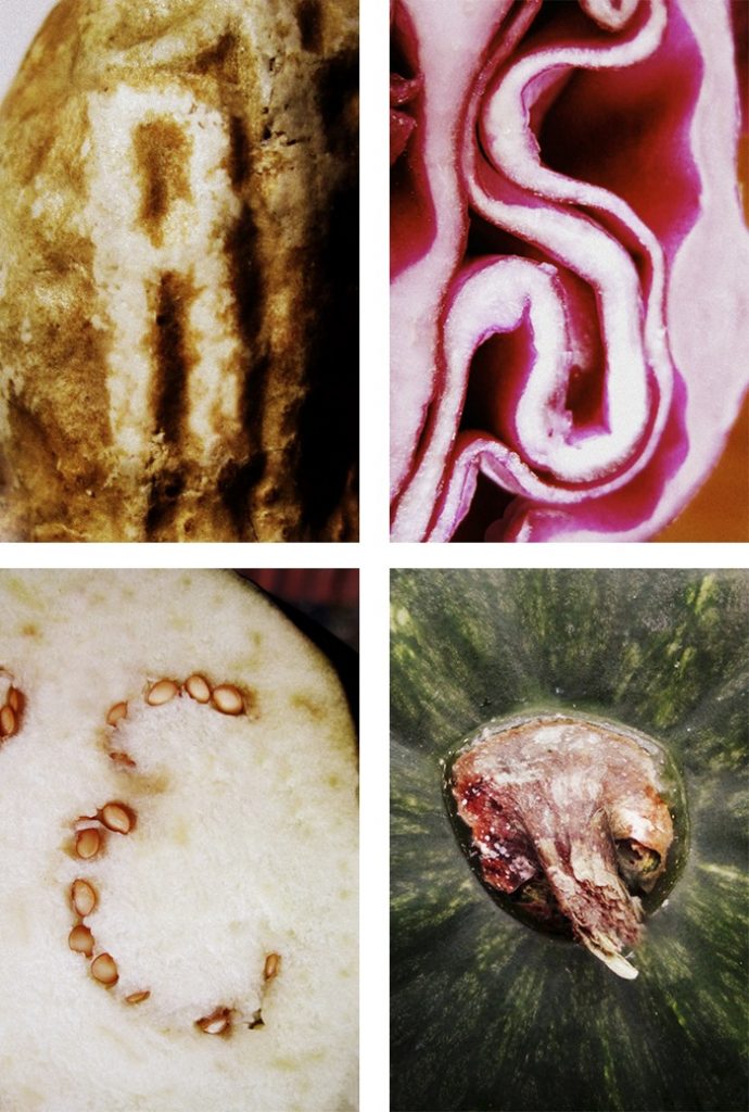
I think the reason Irina’s work is effective, is because she has been selective. She hasn’t taken photos of just any shape that might slightly resemble a letterform, these shapes all look unmistakable. These shapes look as though they were naturally occuring in vegetables and she had the luck to find them.
https://irinavw.xyz/bits
Primary Research
I started looking at type more, in general. For example, while at the museum, I noticed some handwritten type on the wall. I copied this into my sketchbook so I would focus more on the letter structure. Drawing allows me to study the letter structure more closely. I noticed double lines , almost as if the designer had written a letter, then came back and sketched over it. I found the double lines interesting.
The Task:
‘Create a found type collection by shooting objects, shapes, lighting.’
‘Each image much be unique in subject matter and framing’
From the Project #5 brief
But there could be many categories within this brief. From looking at secondary research/ contextual references, I considered the possible themes:
found objects, built environment, architecture, indoors, outdoors, pavement/road, vegetables, animals, people, natural forms, things of one material/colour
Looking at the contextual references from project #4 and project #5 gave me a basis on what to look out for when I was out and about. I thought of negative space, of shadows, of broken lines.
I like the idea of the world around me/ chance determining the type instead of me curating the letters. Giving a creative project restrictions, usually helps with creativity.
Peter Defty has consistently used this white space as the letter itself, but I feel this would not need to be the case. I wanted to experiment with creating an alphabet from both negative and positive space and seeing if it would still work as a collection.
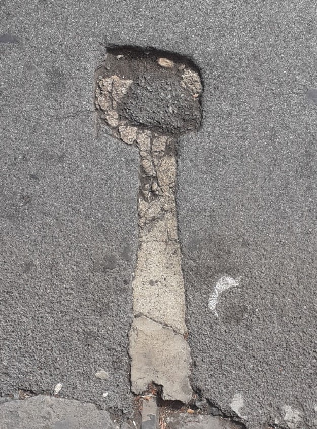
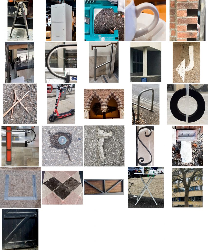
I began by focusing on letterforms I could see on the pavement and road (material: concrete), but was unable to find any more letters after the first few. (below- A, B, C, D, E, F, J, r, I) That was when I realised this task was not going to be as easy as I had anticipated. I was also surprised with the variety of markings I found when looking on one surface type.
As I began to struggle with the search, I wondered what shapes I was missing while looking down at the floor and started to look around me as well.
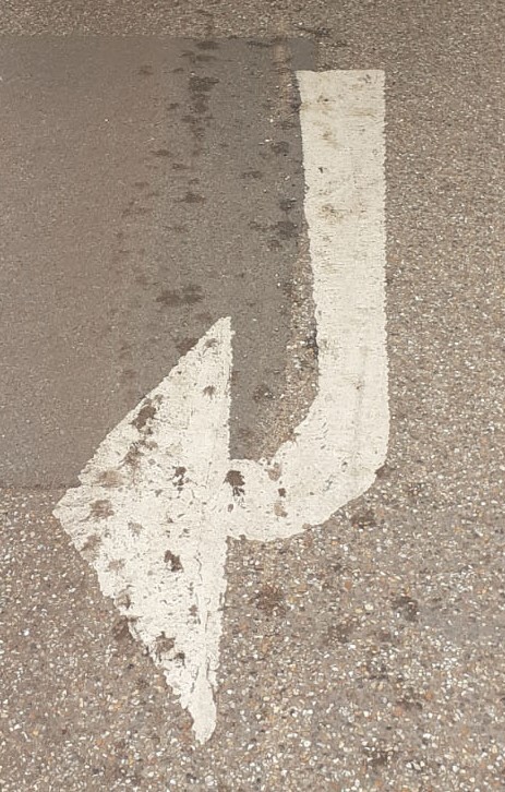
(below) The ‘J’ on the left was my original ‘J’. When looking around, I noticed a an outdoor tap in the shape of a ‘J’. Slightly rotating the image helps it read as a ‘J’.
I explored ‘2D’ & ‘3D’ letterforms.
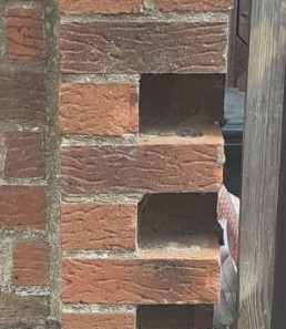
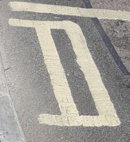
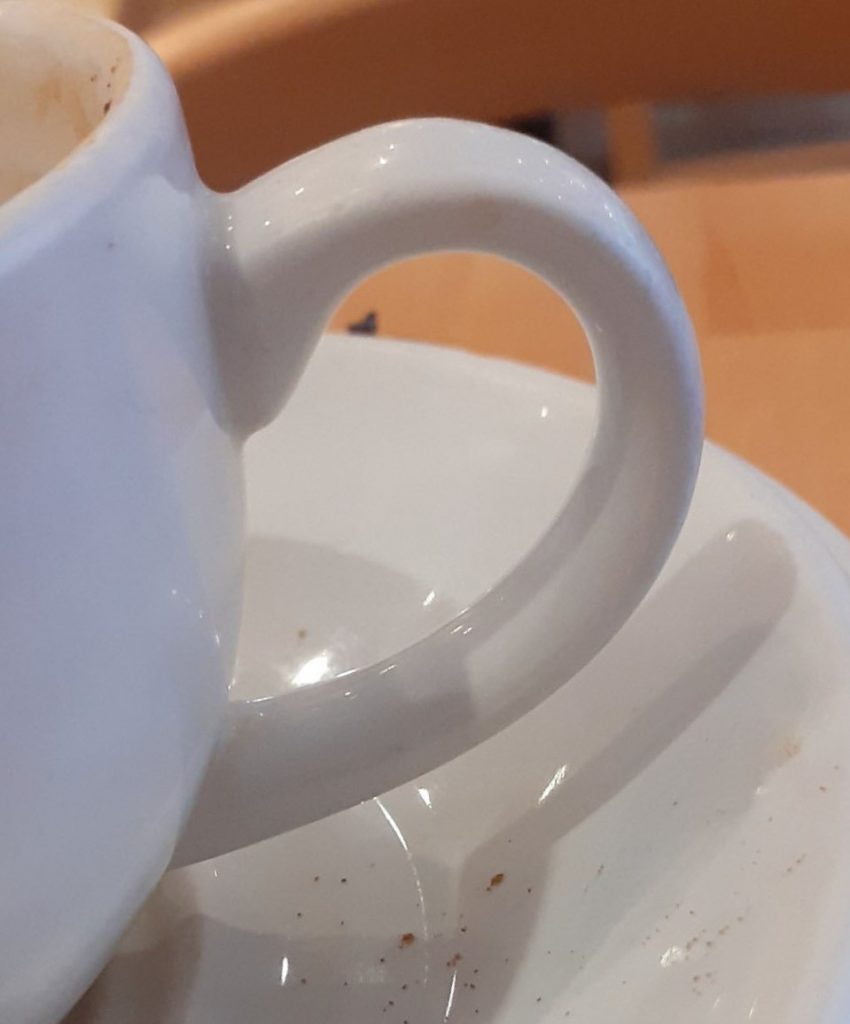
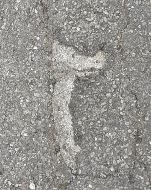
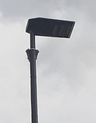
Road markingsObjectpavement ‘E’brick wall ‘E’Pavement ‘D’found object, handle of a coffee cup, making s curved ‘D’.Pavement ‘r’pavement ‘r’lampost ‘r’I was generally finding uppercase/ capital versions of each letter, but with ‘r’, it was easier to find this curved line than its uppercase version.
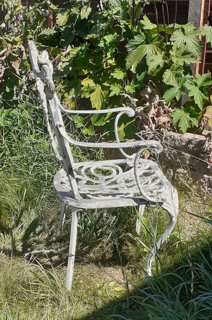
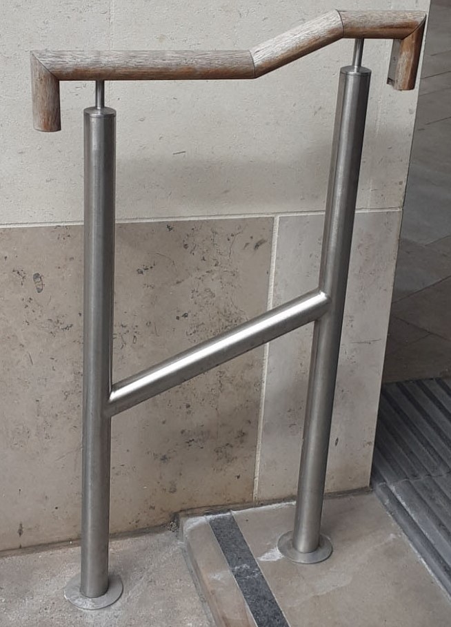
Another example of uppercase and lowercase letters is the two ‘h’s’ below. The lowercase ‘h’ (left) is the side profile of a chair in my garden, the (right) capital ‘H’ is a handrail. The ‘H’ on the right would make more sense in an alphabet of other uppercase letters. I also don’t think I chose the best angle for the chair ‘h’, since it is not an obvious ‘h’ in this photo.
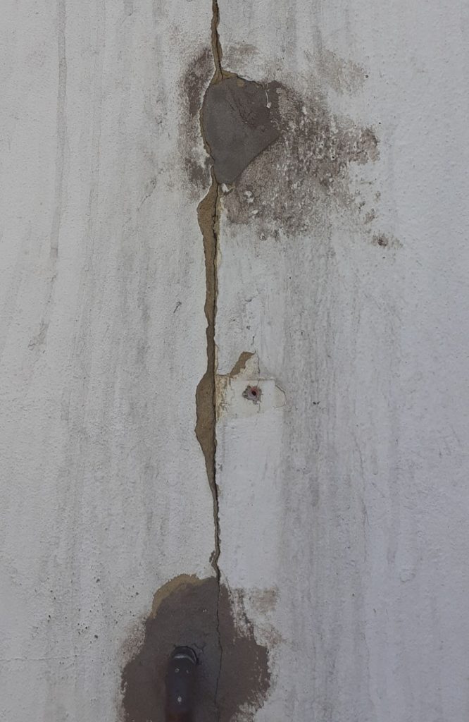
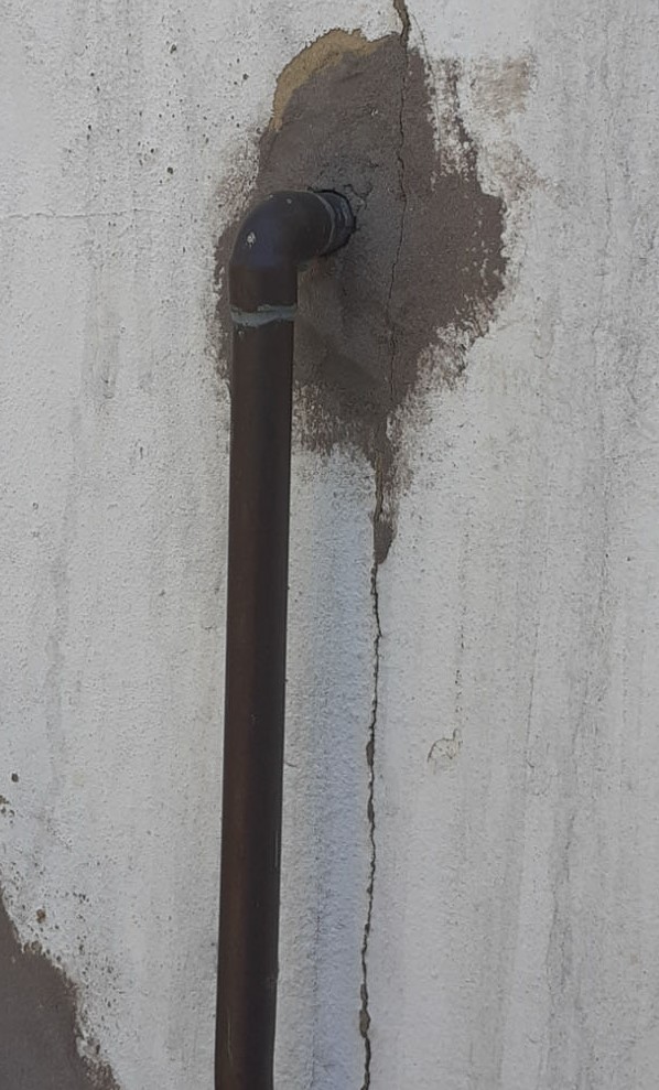
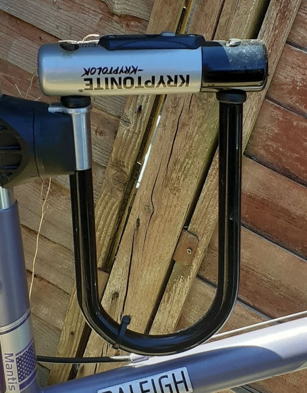
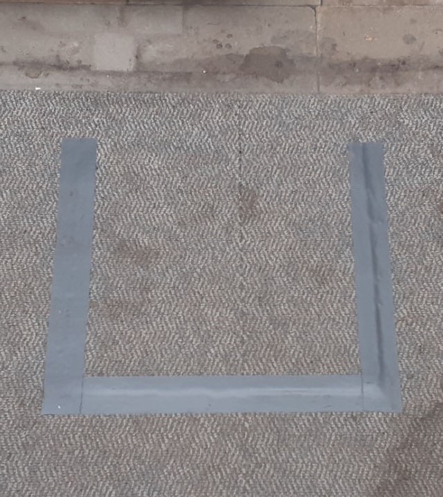
floor ‘i’wall ‘i’ from markingswall ‘i’ from markings and physical object (water pipe)‘U’ from the shape of a bike lock (left) and a ‘U’ from tape on the floor. (Right) This image would still fit within the theme of letterforms found on the floor, even if that floor is carpeted.
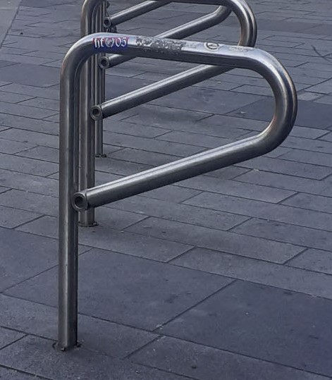
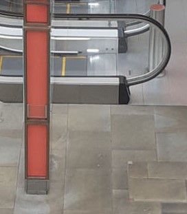
‘P’ from a bike racka shadow on the wallThe bottom of the escalator
I liked the way the pattern of light helped to form this ‘P’ in the centre. (above)
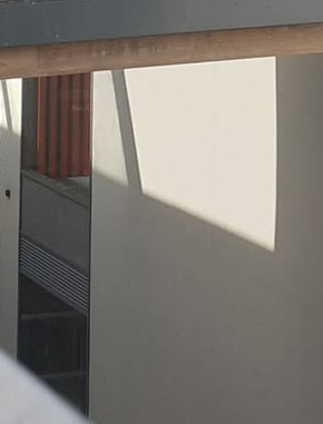
The ‘P’ on the right works because the 2 objects appear to intersect from the angle I was stood. In reality the objects were set at a distance from each other (the red navigation board and hand rail of the escalator).
A collection of A’s (below). Again, I was able to use lighting to draw the letter ‘A’. In hindsight, I would have created a shadow type collection.
I took this photo because of seeing the ‘T’ form of the metal railing. But on later inspection, I could see other letterforms within the same photo (below).
‘I’
‘V’‘X’What I first saw as an ‘S’ on the side of this building could be broken down further into…‘I’‘S’
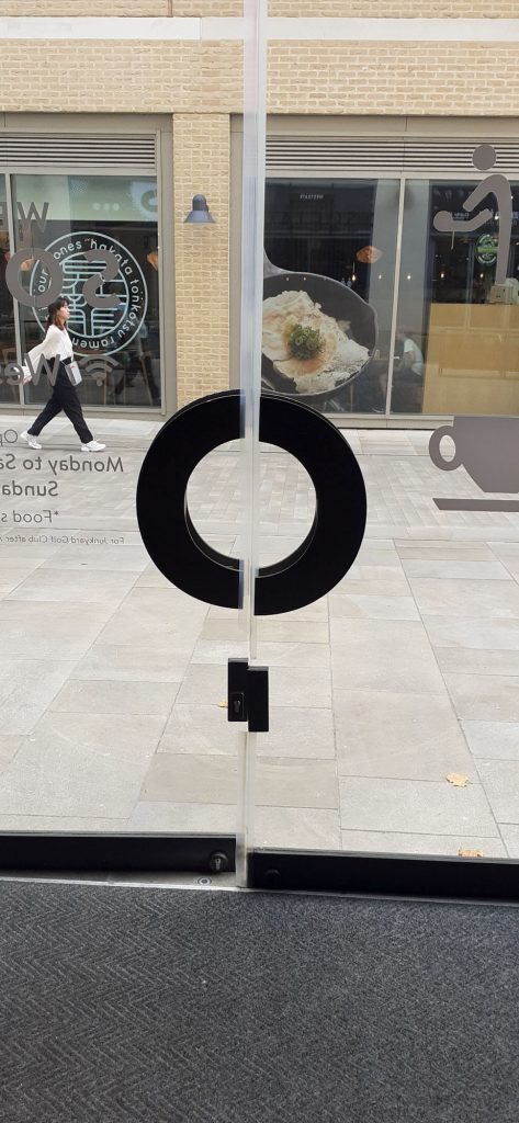
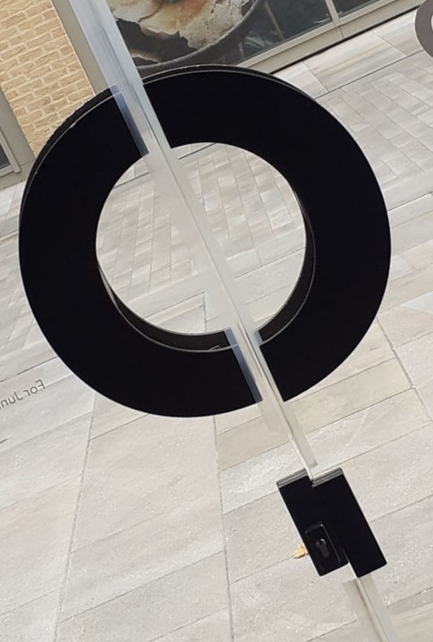
I took this photo when noticing the door handle could become a disjointed ‘O’. However, I then saw if I tilted the image slightly, it could be read as a ‘Q’ (below).
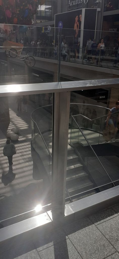
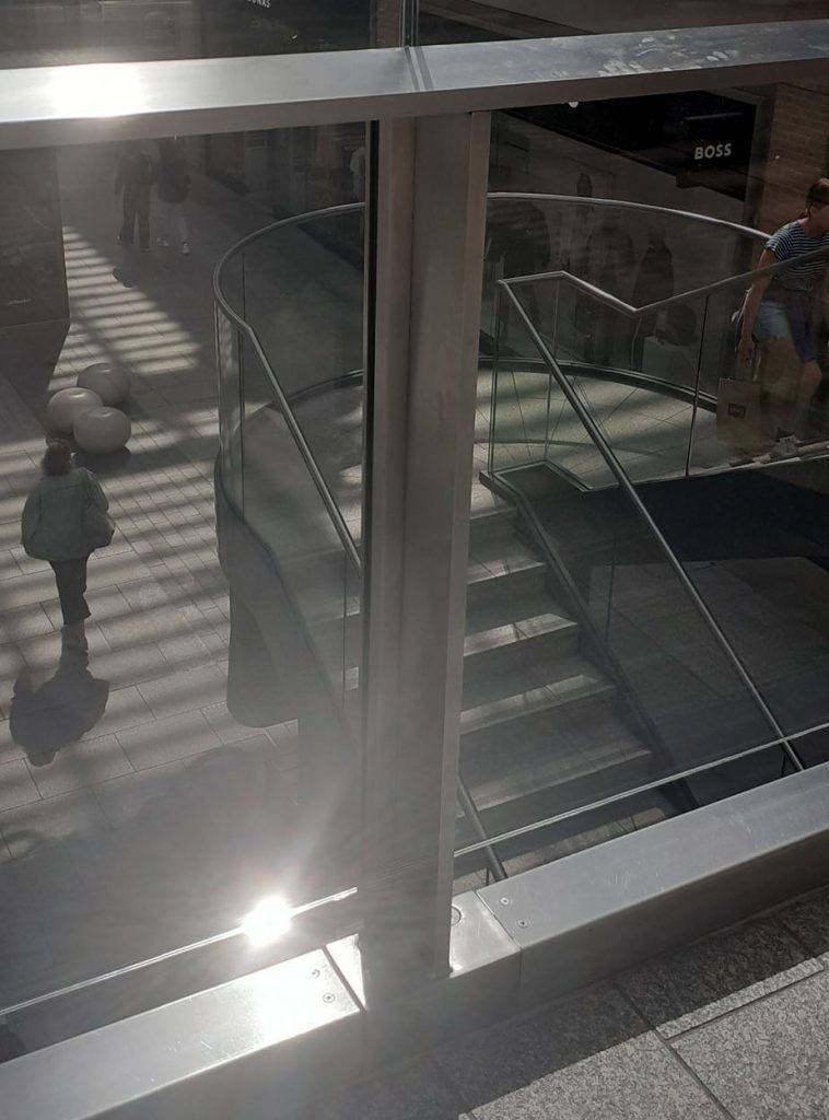
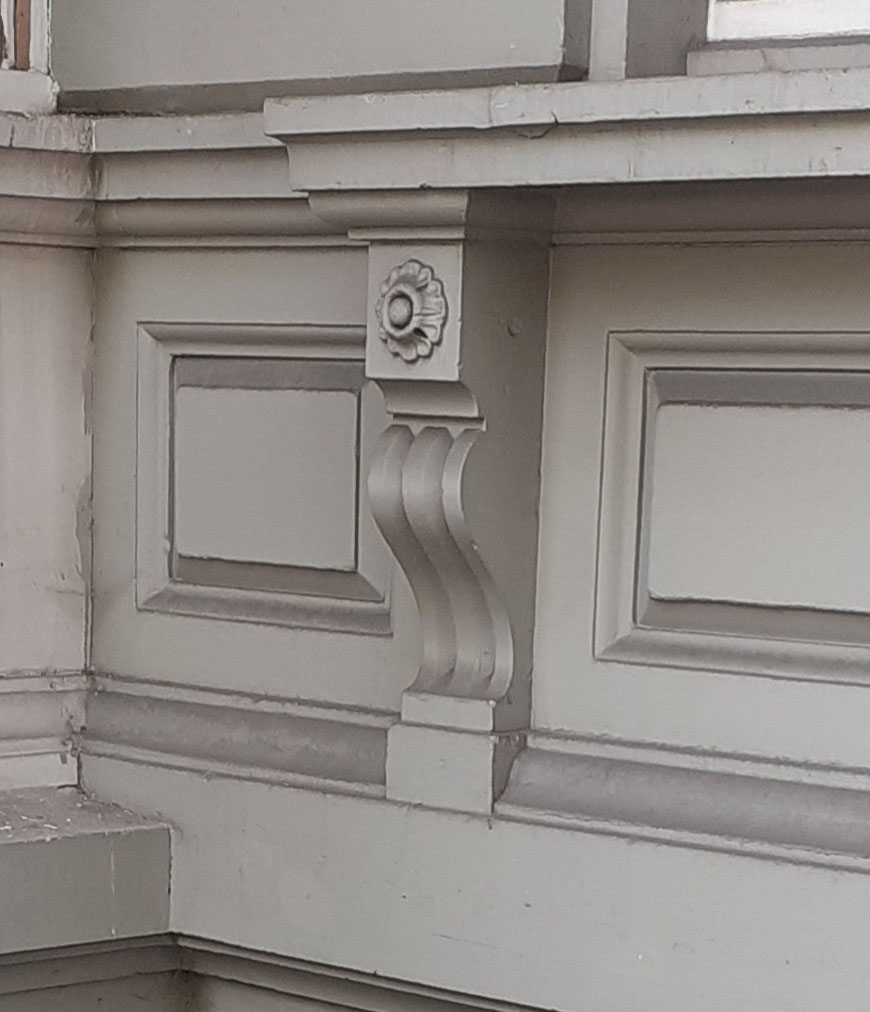
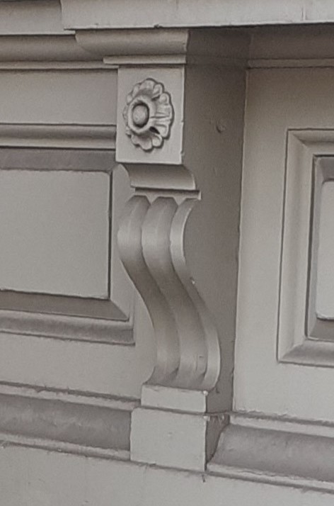
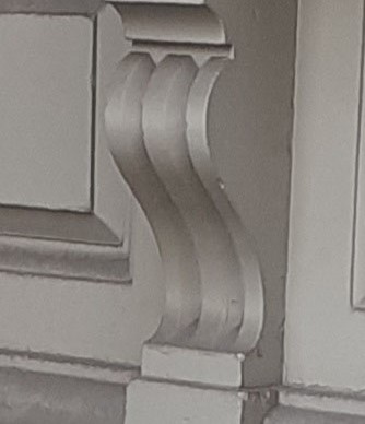
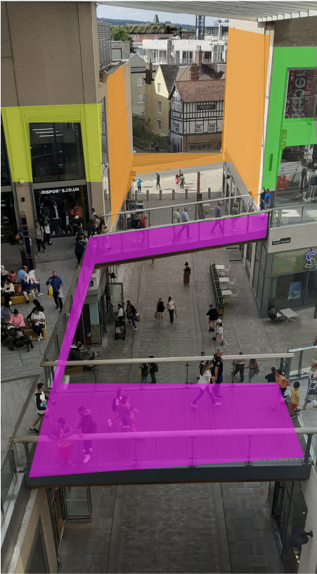
This aerial view from the upper platform of the Westgate Shopping Centre, contained several shapes within the architecture that I could pick out. Here I have highlighted them in different colours. ‘n, H, F, C’.
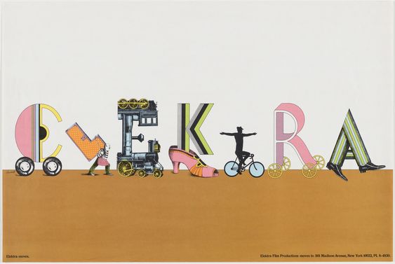
When researching type, I came across this poster design for Elektra records by Seymour Chwast. I liked the variety of unusual and playful objects featuring as letters. The designer chose objects which could express movement, since the company were moving locations. The colours are exciting and give the caption a lot of character. Within the letters, the designer has used a variety of stripes and shapes as well as angles. The angle of the ‘L’ in particular helps add movement and energy to the composition.
Having found that my found images were pretty random, I then needed to narrow down and define my collection into an alphabet that worked coherently. I then enhanced each photo so that they could be read more clearly.
This was the first collection I decided on:
2nd version of my alphabet:
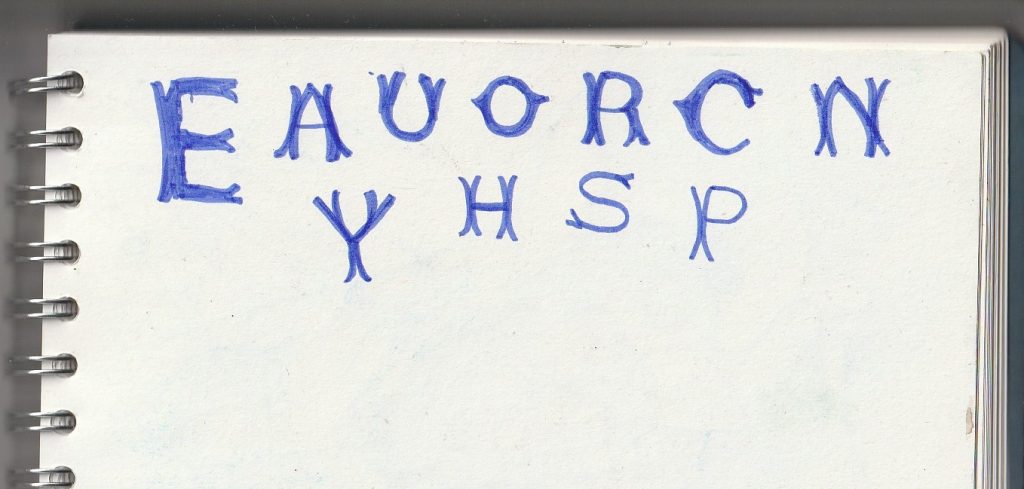
I changed some letters around to alternatives, to see how the collection worked as a whole. I prefer this 2nd version, since some of the letters look more refined and impactful. For example, this ‘Y’ fits in better because it is made from geometric shapes as well as shadows, which makes it more similar to the other letters. The ‘Y’ from the first version was a tree form and so it stood out. I have chosen to include as many shadow letters as I could.
Reflections-
How was Project #5?
More challenging than I expected. I found it difficult to mould the project around my ideas. Instead, I was having to adapt to the shapes I saw around me and therefore change from my original ideas.
I could have collected small objects together purposefully to create type from, but I wanted to be inspired by the myriad objects in the world around me. the randomness of the world felt like a more useful creative area to pull from. I’m not displeased with my collection!
What did I learn?
To create a great found type collection, it could take years to collect together the perfect letterforms. Being restricted by a time limit, I could have been bolder and more decisive with my choices. For example, focusing on more of a narrow theme/category, for example ‘natural objects’ or ‘metal objects’.
Having a deadline means I sometimes needed to select the best letter in terms of legibility, I couldn’t then afford to focus too much on the material or theme of the individual image if it compromised the object’s readability.
What did I enjoy?
I enjoyed becoming more familiar with letterforms and exploring the topic of type from a new angle. (Phyiscal objects translating into text).
What materials/ techniques did I use?
I used my phone camera to take every photo. I then used photoshop to enhance the images, crop them or rotate them. I used Illustrator to place the photos on a grid (for example the pavement letters).
We use cookies on our website to give you the most relevant experience by remembering your preferences and repeat visits. By clicking “Accept All”, you consent to the use of ALL the cookies. However, you may visit "Cookie Settings" to provide a controlled consent.
This website uses cookies to improve your experience while you navigate through the website. Out of these, the cookies that are categorized as necessary are stored on your browser as they are essential for the working of basic functionalities of the website. We also use third-party cookies that help us analyze and understand how you use this website. These cookies will be stored in your browser only with your consent. You also have the option to opt-out of these cookies. But opting out of some of these cookies may affect your browsing experience.
Necessary cookies are absolutely essential for the website to function properly. These cookies ensure basic functionalities and security features of the website, anonymously.
Cookie
Duration
Description
cookielawinfo-checkbox-analytics
11 months
This cookie is set by GDPR Cookie Consent plugin. The cookie is used to store the user consent for the cookies in the category "Analytics".
cookielawinfo-checkbox-functional
11 months
The cookie is set by GDPR cookie consent to record the user consent for the cookies in the category "Functional".
cookielawinfo-checkbox-necessary
11 months
This cookie is set by GDPR Cookie Consent plugin. The cookies is used to store the user consent for the cookies in the category "Necessary".
cookielawinfo-checkbox-others
11 months
This cookie is set by GDPR Cookie Consent plugin. The cookie is used to store the user consent for the cookies in the category "Other.
cookielawinfo-checkbox-performance
11 months
This cookie is set by GDPR Cookie Consent plugin. The cookie is used to store the user consent for the cookies in the category "Performance".
viewed_cookie_policy
11 months
The cookie is set by the GDPR Cookie Consent plugin and is used to store whether or not user has consented to the use of cookies. It does not store any personal data.
Functional cookies help to perform certain functionalities like sharing the content of the website on social media platforms, collect feedbacks, and other third-party features.
Performance cookies are used to understand and analyze the key performance indexes of the website which helps in delivering a better user experience for the visitors.
Analytical cookies are used to understand how visitors interact with the website. These cookies help provide information on metrics the number of visitors, bounce rate, traffic source, etc.
Advertisement cookies are used to provide visitors with relevant ads and marketing campaigns. These cookies track visitors across websites and collect information to provide customized ads.