Waste Age: What can design do?

Thursday 3rd Feb

Lecture notes:

We then read as a group: Waste age: What can design do? This is the catalogue for the exhibition we went to see at The Design Museum, in last October.

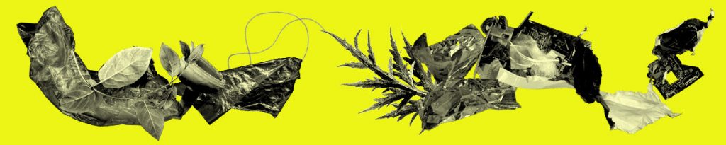
(below) Waste Age banner from the Design Museum shop webpage. The designer has interspersed images of plastic waste with leaves. The effect is subtle and elegant.

https://designmuseumshop.com/collections/waste-age-what-can-design-do

The copy of the catalogue, our lecturer brought to class.

Photos I took at the exhibition: (Read the original blog here.)

Posters outside the museum
(above) I was shocked and surprised to see this vintage bag in the exhibition. Printed on the bag is a list of the pro’s for using plastic carrier bags. ‘Great for school books’, ‘Ideal for beach parties and picnics.’ While these selling points might be true, I wonder if people at the time questioned the environmental impact of plastic.

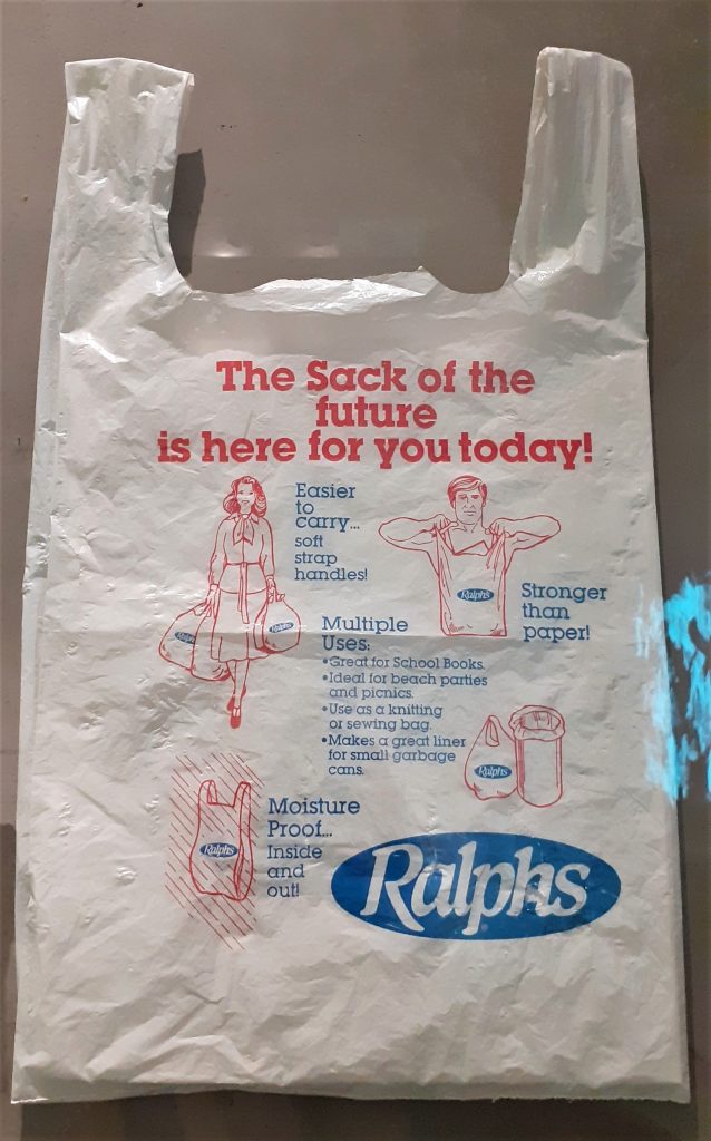
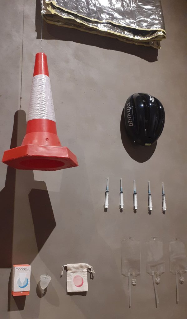
There were several displays like this one at the start of the exhibition. These displays demonstrate the multiple uses of plastic in the present day. The shocking point was that I have never been aware of the amount of everyday objects we interact with that are currently made of plastic.

Paragraph #1 Covering the problem of nature vs culture

This paragraph talks about the blurred lines between nature and culture. We are introduced to the problem of waste.

Bombs in the DMZ Vietnam War https://www.divergenttravelers.com/immersion-vietnam-war/

Paragraph #2 Dominated by waste

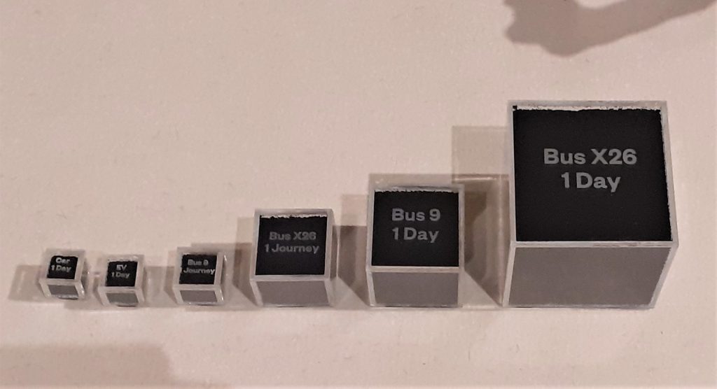
This paragraph introduces us to the idea of our current culture of waste. The fact that waste is not just around us, but in our digestive tract as well for example. This made me think of the microplastics presented at the exhibition. The display showed the particles of car/bus tyres in our atmosphere. (‘The Tyre Collective’)

photo taken at the exhibition shows us pollution from vehicle tyres being in contact with the road surface.
https://www.dawn.com/news/1505436

#3 Illusion of dematerialisation

Here we are made aware of the sheer amount of rubbish created by humans. The 500 billion tonnes of plastic bags consumed per year and how easy it is to ignore this fact.

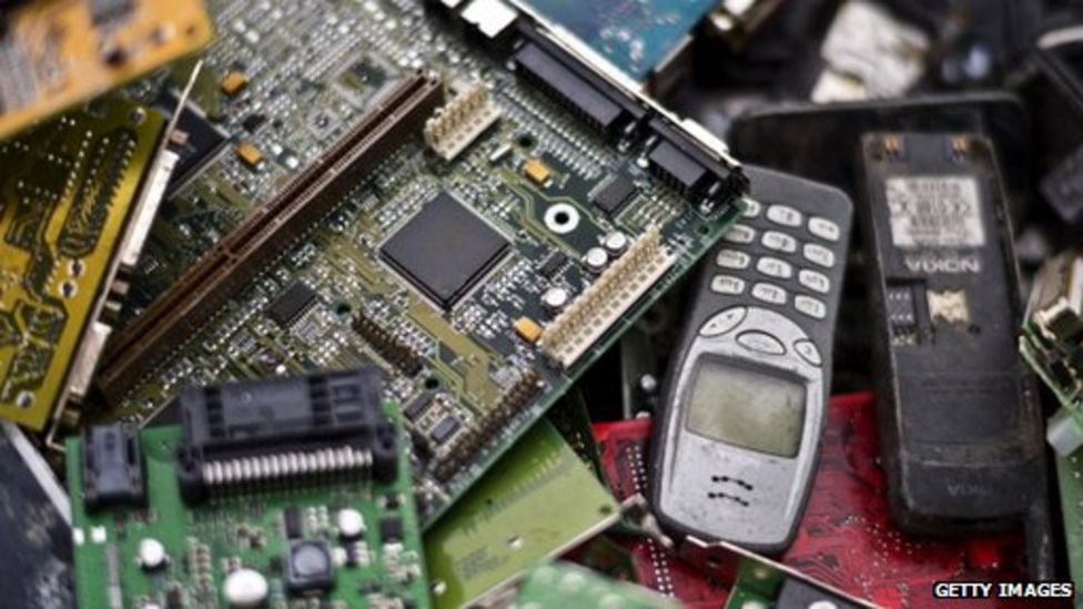
The image below illustrates the change in phone designs over the years. As technology looks lighter and more elegant we could be fooled into thinking that we are producing less waste than before. The opposite has been proven to be true.

https://www.sciencedirect.com/topics/computer-science/dematerialization

#4 Anthropocene

‘Anthropocene’ refers to the new layer of earth we are contributing to as humans.

https://www.chemistryworld.com/features/marking-the-anthropocene/4012969.article

#5 From need to desire

The capitalist culture created a shift from consumers buying just what they needed, to desire objects they have no need for. This allowed companies to make big money, but has had a detrimental effect on our Earth.

(A scene from the movie ‘Shopperholic’) http://www.koreaherald.com/view.php?ud=20140407001361

#6 Planned obsolescence

The role of the designer has been to make products look desirable to the consumer. The iPhone has been particularly criticised for its low repairability. Products that break earlier, mean more sales.

https://www.bbc.co.uk/news/technology-32353659
Three children tossing paper cups, plates, aluminum foil pans, lunch trays, straws and napkins through the air illustrating the usefulness of disposable dishes. https://thedieline.com/blog/2020/3/10/the-history-of-plastic-the-invention-of-throwaway-living?

#7 Design the possibility of repair

The designer has a role within the product cycle. They can focus on designing repairable products. (below) The iPhone 13 Pro is less repairable than its predecessors.

https://techunwrapped.com/why-the-iphone-13-pro-is-less-repairable-than-its-predecessors/

The article then goes on to suggest practical solutions.

  • Electronics can be designed with modular parts
  • Stop fusing plastics and metals together, this will be more can be recycled
  • adapt and re-use good buildings instead of demolishing and replacing
  • reducing carbon-heavy steel and concrete

#8 The consequences on reality

Consumers need to demand these sustainable products/ methods. The designer could blindly follow what they are told to do by their paymasters, but then nothing would change.

The metaphor of fungus is mentioned here. An organism that survives and thrives.

The article mentions Bio-design, which is a new phrase for me. We then watched a short student-made video about the possibilities of bio design in the future, including the dyeing of fabrics in a sustainable way. We have only just begun to explore the possibilities of bacteria.

https://www.dh.umu.se/en/stories/?id=45080

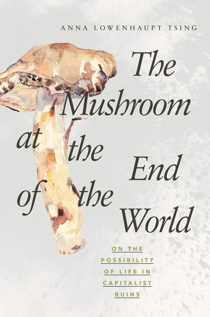
Anna Tsing is mentioned within the catalogue. Her book (left) explores the story of the Matsutake mushroom. Amazon.com says about the book- ‘In all its contradictions, matsutake offers insights into areas far beyond just mushrooms and addresses a crucial question: what manages to live in the ruins we have made?’ 

Within the article, we also see mention of the famous architect, Cedric Price.

https://drawingmatter.org/cedric-price-2/

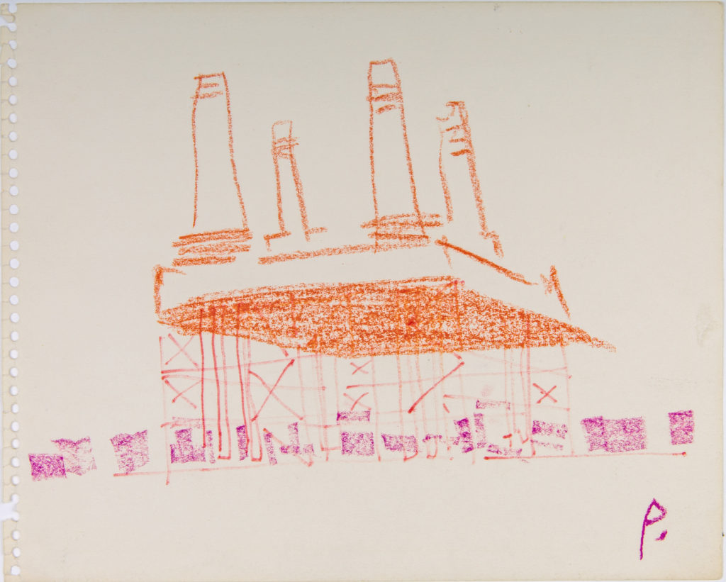
‘Price’s architectural style came from his belief that buildings should serve the needs of the people, and be radically transformed or demolished if they no longer served their purpose. A life-long socialist, Price was deeply skeptical of political institutions and their tendency to use grand, monumental buildings as a means of consolidating power. Instead, Price proposed building temporary and mutable structures which would be open and accessible to all.’

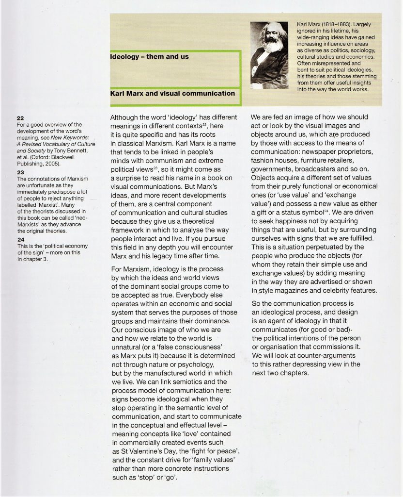
Karl Marx is also mentioned within the text.

The board from today’s lecture. We annotated the text as a group. This was particularly helpful, as it allowed us to see each other’s interpretations.

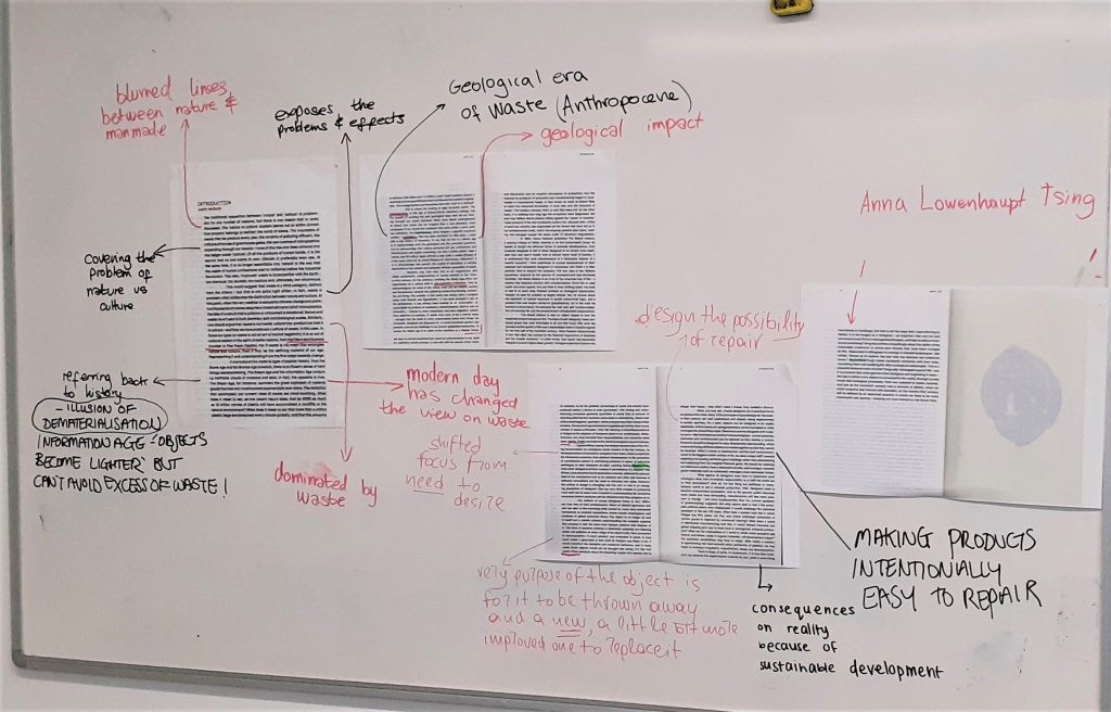
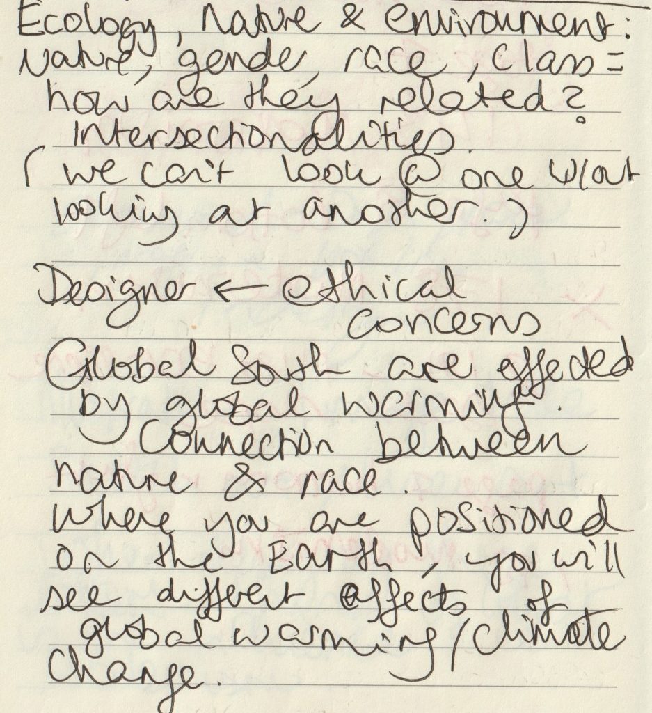
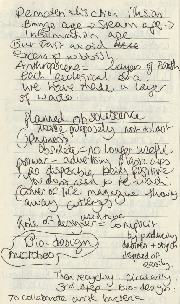
We condensed down the topics within each paragraph. It was helpful to write them as short phrases. This exercise helped me to understand what I had read, and I will be using this method when looking at articles in my future research.

Visualising Sustainability

Design plays a fundamental role in sustainability because it is the design that determines which resources are employed and how they are used.

Sustain: an ability to sustain over time, endure. for example, over a number of years. Sustainable development: without impacting too much on future generations. For example, preserving the environment.

In business, a sustainable business plan is (not just about the environment) but can be about making sure the business is using their resources economically.

What Is Sustainability?
The most common definition of sustainability comes from the 1987 Brundtland Commission report for the United Nations. It defines the concept as “meeting the needs of the present without compromising the ability of future generations to meet their own needs.”

https://www.investopedia.com/terms/s/sustainability.asp

How are human rights sustainable?

Human rights create conditions essential for sustainable development. The 2030 Agenda recognizes that inclusive and participative economies, and societies in which government is accountable, achieve better outcomes for all people, leaving no one behind. 

Civil, cultural, economic, political and social rights and the right to development build on each other and advance together. 

https://www.ohchr.org/EN/AboutUs/ManagementPlan/Pages/sustainable-development.aspx

https://scadmanor.com/greenwashing-the-brain/

“Don’t be misled by pretty pictures or use of earth-friendly colors on product labels. MacDonalds or Coca-Cola might have green color on their logo, that doesn’t make them eco-friendly!” https://easyecotips.com/learn-how-to-avoid-greenwashing/

https://cuesonline.org/2021/10/28/green-or-greenwashing/

In everyday life there is an element of greenwashing. There is a gap between the things we know and what we do. For example, we know that reusable alternatives are the greener option but need to put the knowledge into action.

Campaigns & Case Studies

Turn it off!

Campaign supporting Ubiquity, documentary by Bregtje van der Haak

Using the language of the online world – emoticons – we designed a simple, but bold visual language, which draws attention to the downside of staying connected all the time.

De Designpolitie
https://www.designpolitie.nl/projects/turn-it-off/

The use of green and red immediately suggest traffic lights and the action of stop and go/ on and off. The strength of the colour carries the message, so the designer is able to use black lights and keep the design simple. The emoticon graphics suggest the original faces made from type.

These will be familiar to people from a certain generation, which suggests to be that this could be the target audience. The bold typeface presents a clear message to the viewer. ‘Schakel Uit’ being Dutch for ‘Turn Off’ in the above designs, is paired with the green. Off which is often a negative word, is contrasted with the positive green.

The banner below is hard to miss due to its clarity and bold simplicity:

LEVI’S WATER> LESS

MY00 Agency, Johnny Lighthands, USA & U.K.

Levi’s developed a sustainable range of jeans to decrease their huge carbon footprint. They wanted to bring their message to people through educational posters and comic strips. They achieved this by using illustrations of water-conserving creatures drawn by Illustrator Johnny Lighthands.

Lighthands’ hand-drawn style gives the campaign a light-hearted touch while getting the message across. The style is rememberable and the characters are lovable. Levi jeans have a reputation for being traditionally well-made and ‘cool’. These drawings challenge the serious reputation of Levi’s. The off-white colour of the ground in these posters suggest natural materials.

Zara- Join Life

I really like the lack of colour in Zara’s graphic design for their Join Life campaign. It looks neat and stylish while also giving the impression of minimal wastage.

https://www.zara.com/uk/en/sustainability-innovation-mkt4823.html?v1=1965796
An image from the campaign for Zara’s eco-conscious Join Life collection.
https://www.carmenbusquets.com/journal/post/fast-fashion-amp-sustainability-will-zara-owners-pledges-mean-real-action
https://www.forbes.com/sites/patrickmoorhead/2021/04/21/amazon-delivers-on-its-sustainability-commitments-and-then-some/?sh=12d5229a299d

The cheerful animations on Amazon’s website are light and joyful. The illustration encapsulates the entire process of the items shifting through Amazon’s process. It is interesting as an animation because of the moving parts featured in the image.

Greenpeace –Protect the Antarctic, The Lovers

‘A global movement to protect the Antarctic’

The agency, The Lovers, decided on colours and simple graphic design, inspired by the landscape and light of the Antarctic. They chose the penguin symbol to represent the wildlife affected by climate change. Their message was translated into many languages to reach a wider audience. This is important because the issue affects every person on the planet and is affected by every country.

The chosen typeface was inspired by naval/maritime fonts.

Write for Rights Campaign

https://www.amnesty.org/en/who-we-are/

The global movement, Amnesty International have a focus on protecting human rights. UNESCO identify human rights as an important issue of sustainability. By allowing people to exist and thrive, communities can build over time.

I liked the simplicity of this message by Amnesty. The rainbow colour pattern tells us that the message relates to LGBTQ+ rights without needing to tell us with text. This relies on the audience understanding the connotations of the rainbow as used in recent times to symbolise the LGBTQ+ community by convention. This results in a simple and concise image with more impact than over-cluttering the page.


Write for Rights is a yearly campaign and because of this, I found a variety of designs relating to this cause. I chose this campaign because it represents taking action for people who cannot take action for themselves. It is about achieving justice for people who have been wronged in a variety of ways. If I am fortunate enough to be able to read and write, I can use that skill for good.

Writing has the power to change the world – and Amnesty International is proud to include all in their efforts to do so. For the past 15 years, the organization’s global letter writing campaign has inspired millions of written letters to support those whose basic human rights are being attacked. 

http://deweydivas.blogspot.com/2017/11/write-for-rights.html

The simplicity is effective in this image , the contrast between dark and light, to me, signifies hope. The hands are reaching up as in prayer, asking for help. The dark background helps to highlight the hands and adds to the strength of the message. The size of the text is small, suggesting a whisper. The campaign is talking about people who cannot speak up for themselves. This makes the small text relevant and symbolic.

“The stark image shows a pair of bound hands that is meant to mimic the shape of a pen or pencil, and the ads read: “Write for Rights. Write a letter. Change a life.” in English and “Écrire, ça libère. Participer au marathon d’écriture.” in French.

The print campaign ran in top Quebec news publications, including: Le DevoirJournal de Montréal and Journal de Québec. A web banner version was deployed on LaPresse.ca, in addition to wild postings in Montréal. And a 30-second French radio spot aired in the regions of Montréal, Québec City, Ottawa, Sherbrooke and Trois-Rivières in early December.”

(below) The spacing of the text expresses the message clearly, to an audience who would be walking or driving past. The full-stop punctuation mark suggests a finality and an answer to the problem presented. The CTA here is the word ‘write’.

The image surprises the viewer. At a glance, it appears to be a fountain pen. When doing a double-take, the viewer sees that the photo is of a pair of hands. This element of surprise makes the poster memorable.

https://strategyonline.ca/2018/12/17/amnesty-international-asks-quebecers-to-write-for-rights/

“This education pack contains five activities on human rights for young people. It can be used as an introduction to human rights, to global solidarity, to campaigning and activism, and to the wider work of Amnesty International. The activities provide a broad perspective on these issues and others.


They are useful in opening young people’s minds to global concerns and involving them in actions which can have a real impact on people’s lives.”

This design from 2015, has been designed with young students in mind. The doodle-style illustrations reflect the imagination of the target audience. This design focuses on the positive impact of letter-writing, compared to the Canadian poster which emphasizes the suffering.

The Amnesty logo and name of the campaign are presented within a yellow box with edges that resemble a postage stamp. The above poster has been cropped for the cover of the ‘education guide’ booklet.

“Dear Educators,

Amnesty International USA invites you and your students to join Write for Rights, our global human rights letter-writing project focusing on 12 specific cases of human rights abuses around the world. Write for Rights frees prisoners of conscience, protects human rights defenders, and spreads hope.

Amnesty International USA has created an Educator’s Guide, focusing on 5 cases including girls forced into marriage in Burkina Faso; a journalist imprisoned in Uzbekistan; and Albert Woodfox, subjected to over 40 years of solitary confinement in Louisiana. By learning about these 5 cases and writing letters to help end these abuses, students will gain an introduction to human rights and effective letter-writing skills, and the knowledge that their words have the power to make a difference around the world. We invite you and your students to participate from now through December.”

https://www.adsoftheworld.com/media/integrated/amnesty_international_write_for_rights

“This vision was made possible by the valuable collaboration between Cossette and Owen Gent, a world-renowned illustrator based in the UK whose aesthetic is similar to painting. His drawings are luminous, vibrant and emotionally charged.

Integrated advertisement created by Cossette, Canada for Amnesty International, within the category: Public Interest, NGO.”