Grid Systems

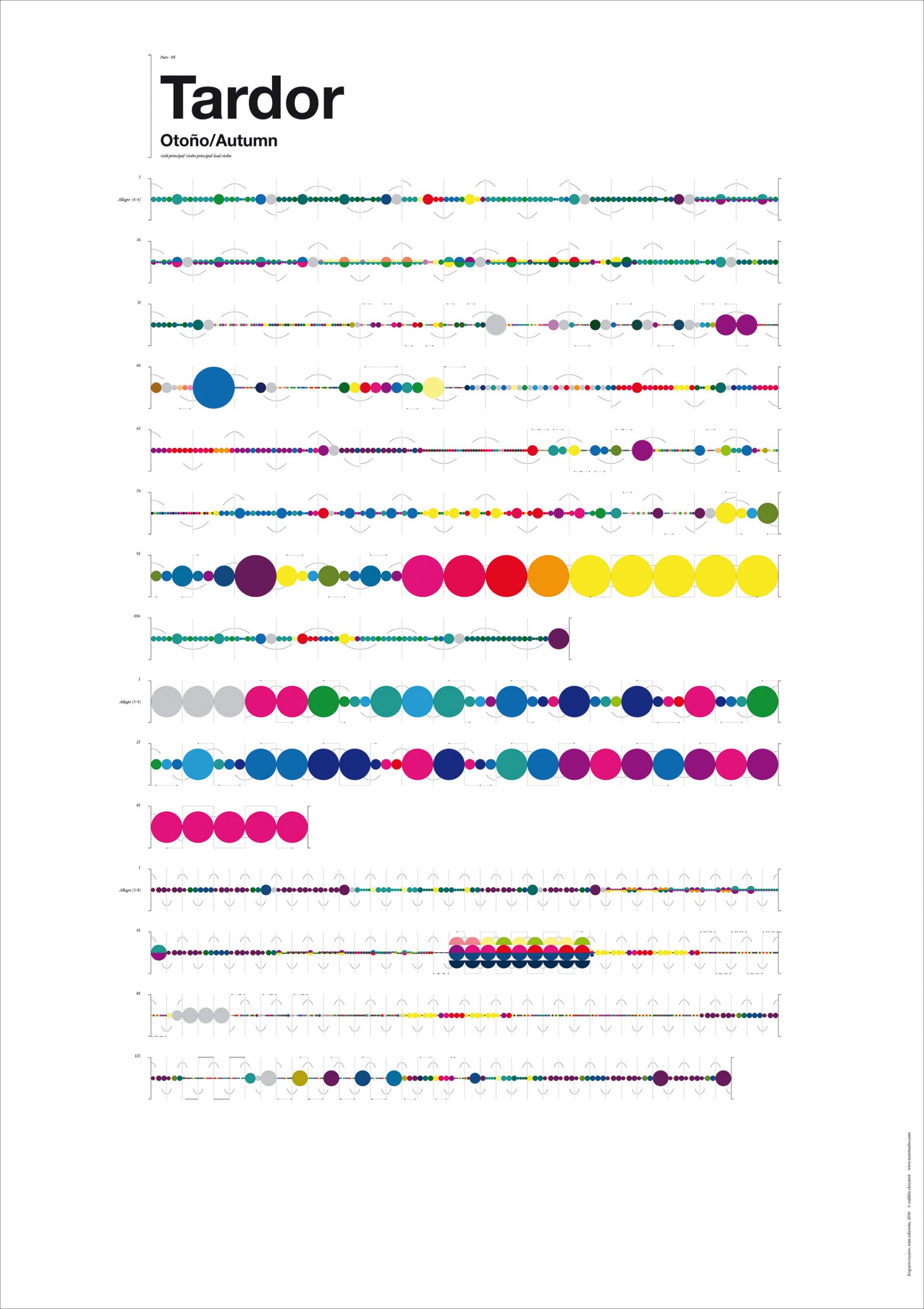
Grids help us shape systems, by giving us a structure. They help to manage content. When information is complex, a hierarchy puts the information in order and makes the data comprehensive.

The grid system is used for advertising and editorial design, where we can see typography, shapes and photography placed in a systematic way. Designers build this visual system using grids.

What are the advantages?

  • helps with reading the content
  • creates harmony across a publication for example, adding aesthetic value
  • adding breathing space between content makes it less condensed.
  • creating rational organisation is useful in brochure and magazine design. Planning a space for images and a space for content makes the reader’s work easier and the designer’s work easier.
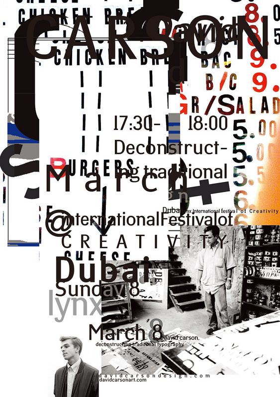
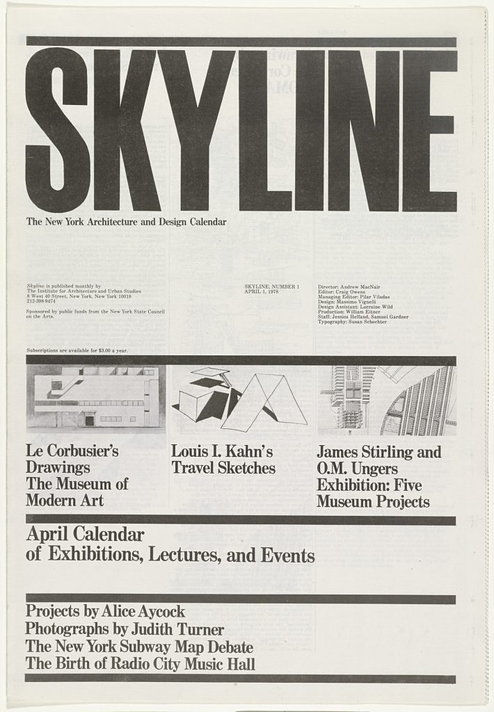
Massimo Vignelli

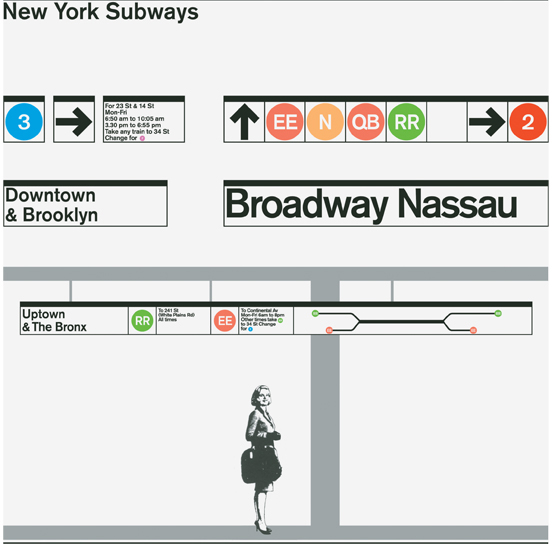
I looked at his work briefly last week, when talking about the design of the New York subway system. Below is the front cover of thr tabloid, designed by Vigneilli in 1978.

In this example, the grid is made obvious by the thick dividing lines across the page. These are known as flowlines (rules separating the page). These work as boundaries that divide the spread. We can clearly pick out the spatial zones in this layout. Spacial zones divide the information into separate zones, for example we can clearly see one area used for the heading, one section for images and so on.

Skyline, No. 1, April 1, 1978 Massimo Vignelli, Lella Vignelli

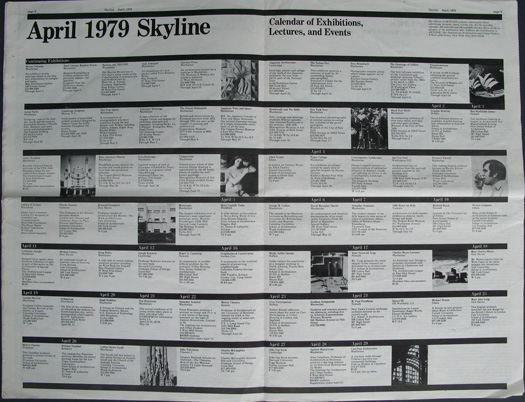
The calander uses the grid in an obvious way. The flowlines are placed evenly across the spread. This creates a sense of order. Placing the images randomly amongst the text helps keep the page intereseting to look at. This assymetry is important to balance out the evenly spaced rows of information.

Skyline, April 1979: calendar

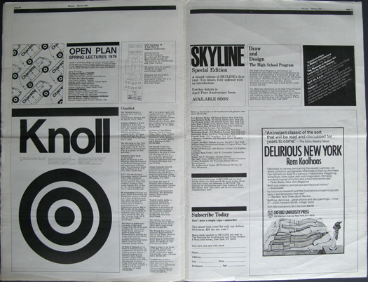
In the below spread, the grid is used to structure the information. I can see an underlying grid where the page is divided into thirds. The white space on the bottom right allows the eye to rest and prevents the spread looking crowded.

Grids are a loose set of rules. They are not an absolute rigid guide. If a layout is too structural, people get tired/bored.

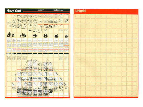
Vignelli’s Unigrid for America’s National Park system, gave him more flexibility.

Vignelli’s Unigrid

Josef Muller-Brockmann

Muller Brockmann was a big fan of using the grid system.

The designer’s work should have the clearly intelligable objective, functional and aesthetic quality of mathmatical thinking.

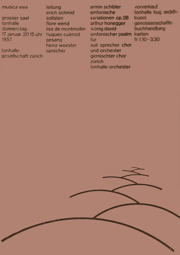
The Typographic Grid, Josef Muller Brockmann

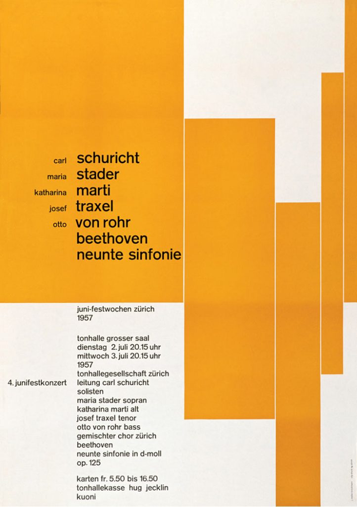
Muller Brockmann has carefully balanced the elements in this poster. The shapes on the right make the right side busy, but the text on the left means that both the left and right sides are balanced.

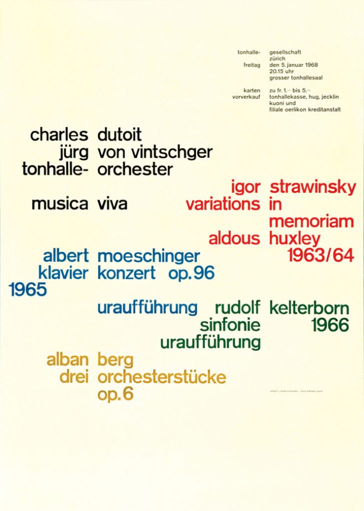
The gaps between the words align to show an underlying grid. This grid helps to unify the information, considering 5 different colours have been used.

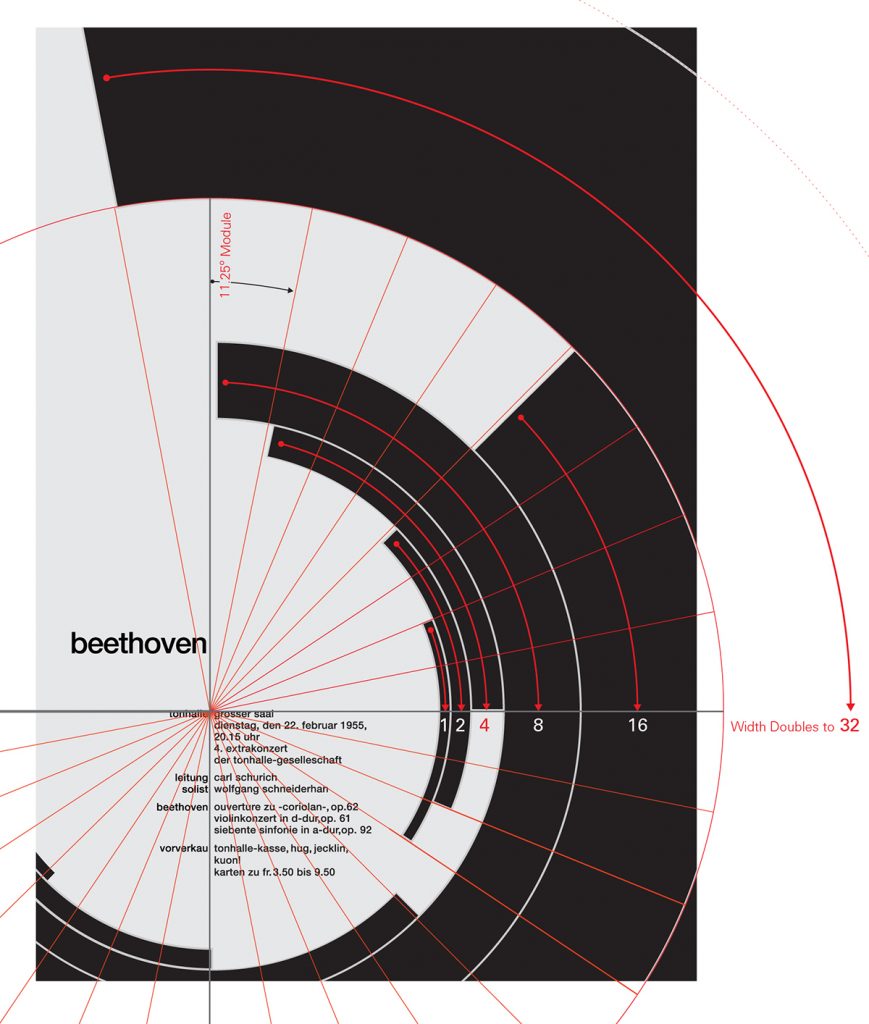
Muller Brockmann’s Beethoven poster uses a more unusual grid. The edges of the shapes line up with the edges of text to draw the eye to one point of the poster.

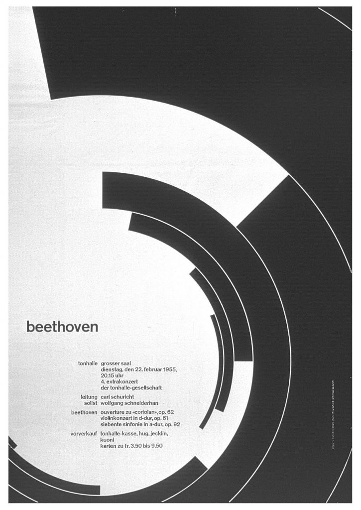
This centre point is shown in the image below:

Müller-Brockmann’s Beethoven Poster Geometric Analysis by Kimberly Elam

Efficiency-

Grids reduce a designer’s options, which saves time. You don’t need to make decisions at the start of every project if you use the grid system as guidance.

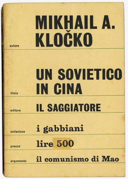
Mikhail A. Kločko, “Un Sovietico in Cina” I Gabbiani 9, July 1964 (1a edizione)

‘The whole dust jacket, in a light gray, is divided into bands of 6 silver colored rulers. Each band contains information about the book: on the cover author, title, publisher, collection (name of the series), price and “topic”; on the back a biographical note on the author, a summary of the book and a description of the I Gabbiani series in addition to the repetition of price and topic.’

Modulor Man by Le Corbusier

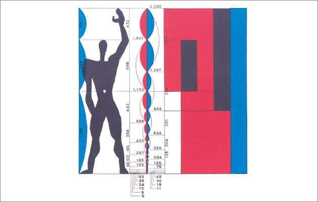
‘The Modulor was meant as a universal system of proportions. The ambition was vast: it was devised to reconcile maths, the human form, architecture and beauty into a single system.’

Le Corbusier used these proportions within his architecture. It is based on the golden ratio.
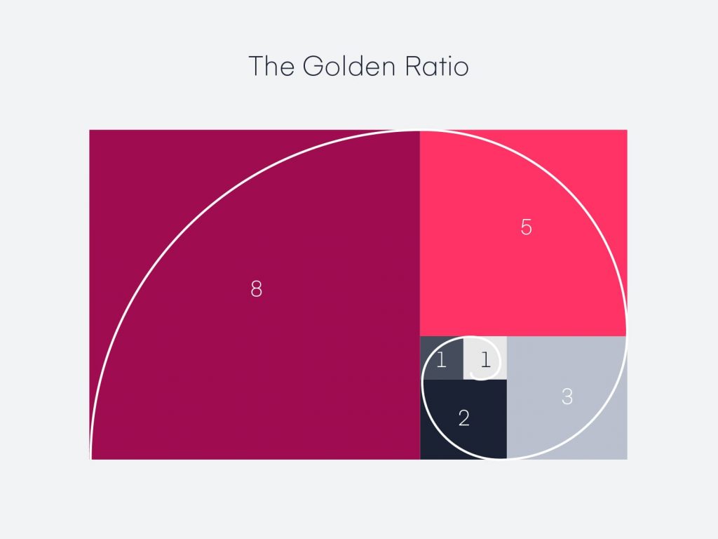
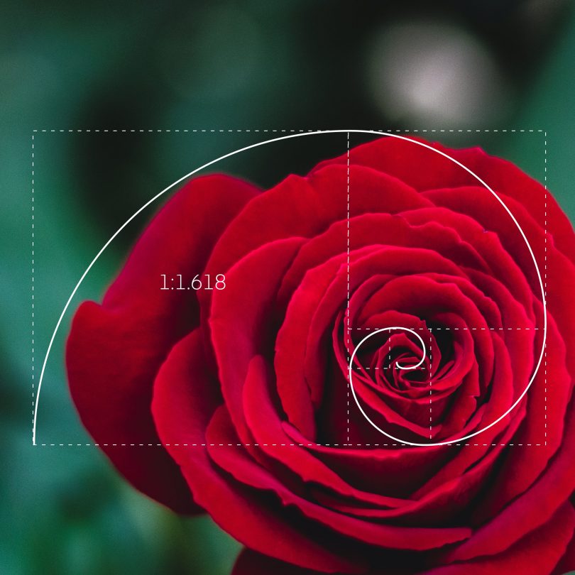
Golden ratio

The grid is one of the most helpful inventions in graphic design.

It follows universal law – since grids can be found all around us. One example is in honeycomb.

The golden ratio has been described as an equation that produces beauty in a design. It is found in famous artworks and in nature. The same principle can be applied in graphic design.

https://www.invisionapp.com/inside-design/golden-ratio-designers/

Rule of thirds

I know this grid from learning photography at college. By dividing the space into thirds, we are left with 9 equal sized areas. In photography, it is recommended to place the main subject at an intersection beteen 4 of the lines.

Design by Sam Cooper

In graphic design, using the rule of thirds means directing the focus to a spot that would lie at an intersection on a rule of thirds grid. For example, the corner of the black rectangle on this poster leading to the text on a third.

Musica viva, 1957, poster by Josef Muller Brockmann

In this poster, Muller Brockmann has counter-balanced the position of the main content with the simple line drawing at the bottom of the poster.

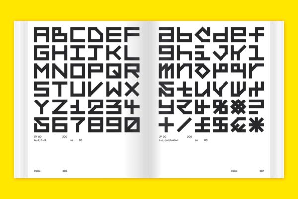
Grid systems in typography

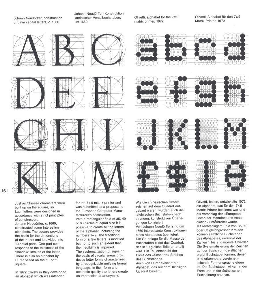
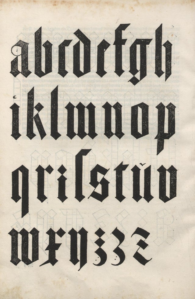
These letterforms designed by Albrecht Durer in 1525, were based on human proportions.

https://www.reddit.com/r/typography/comments/f87svl/albrecht_durer_design_for_blackletter_typeface/
Olivetti, alphabet for the 7×9 matrix printer, 1972

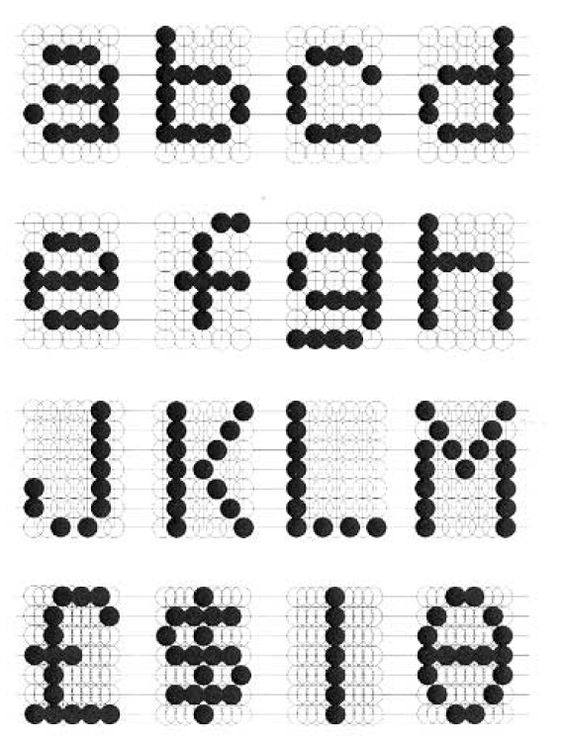
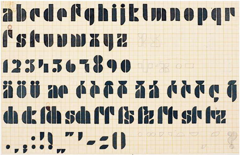
Olivetti took the structure of the grid and used it to create type, in a similar way that latin letters have been designed. Instead of straight lines and angles, Olivetti constructed his letterforms from a grid of circles. He was able to form each letter from the choice of circles he has included. The use of circles doesn’t interfere with our ability to understand the type. This may be due to the number and size of the circles.

Josef Albers type design, 1926

(Above) Josef Albers’ design for the Universal Typeface, known in the Bauhaus movement. As you can see from the grid paper he has used for the design, there is a system to this typeface. This alphabet has been constructed from rectangles, circles, semi-circles and quarter-circles. The same pieces have been used across the different letters.

Piet Mondrian, Broadway Boogie-Woogie

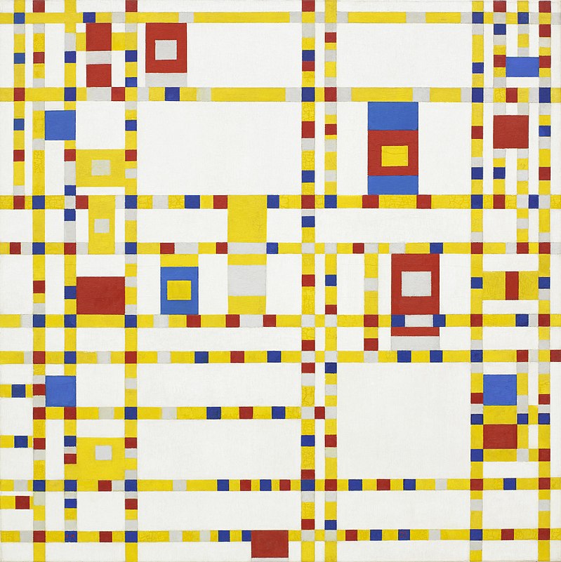
Mondrian used mathmatical structure within his paintings. The colour of the above painting makes the work fun and playful, which is enhanced by the contrast with this grid structure.

Workshop 2: Systems of Order

This afternoon’s digital workshop required us to use adobe Illustrator and we were invited to think outside the box. The task was to design a grid, using a given image.

Aim and brief-

‘The aim of this workshop is to familiarize yourself with
the idea of finding systems of order within different
subjects, not concerning communication design.
Nature as well as artificial structures could function as
an inspiration for the construction of layout systems.’

These examples demonstrated the way we could use the rule of thirds within our designs.

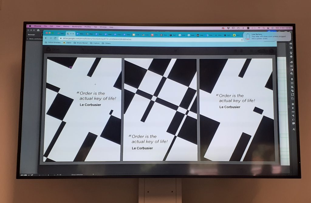
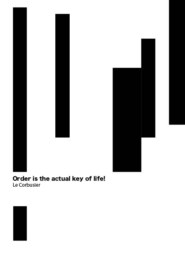
I chose the below image to base my grid on:

Marcel Breuer- Pirelli Building

We based these designs around a given quote:

Order is the actual key of life!

Le Corbusier

Workshop steps:

  1. Smart guides on
  2. Import the photo (can use a section of the image) make image larger than the page.
  3. Select both shape and image – Command + 7 or Object > Clipping mask > make
  4. Layers. Bottom layer for the photo (layer 1), double click to rename. Press plus to add layers (layer 2 for guide/grid)
  5. Lock photo layer so its not in the way
  6. On the grid layer, draw over the picture – following the lines on the photo
  7. Option & Shift to duplicate lines
  8. Select lines > view guides > make guides
  9. Can change colour of guides, Illustrator preference > guide & grids
  10. Make sure guides are locked, View > guides > lock guides or right-click and lock guides
  11. Duplicate artboard- select it > artboard tool > press option + shift to the side (when guides are unlocked, otherwise the guides won’t transfer onto the duplicated artboard).

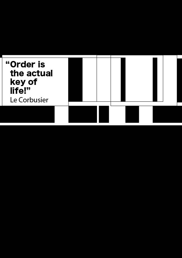
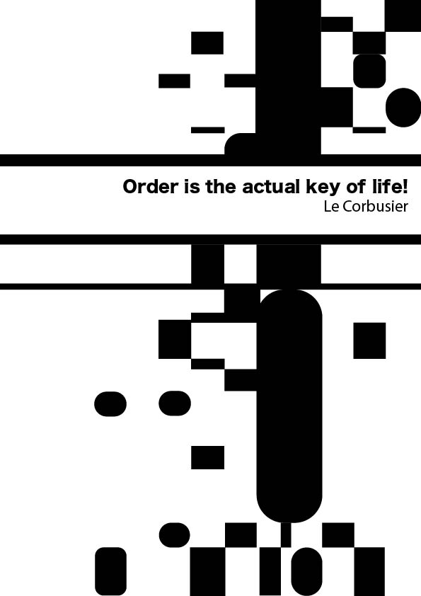
I made variations of this grid.

Visual Systems – Week 1

Year 2 – Semester 1 – Week 1

Finally, summer 2022 is over and we are back to university. To kick off year 2 on this Monday morning, Noemi has introduced us to visual systems.

During her presentation, I was reminded of the module from 1 year ago where we explored mapping. In that module I produced a map of my journey through the town. I represented this data with a series of photographs, arrows and a list of sounds, sights and smells I came across in written form. However, the two pieces didn’t work well together. Instead of being 2 halves of one map, they came across as 2 separate maps of the same data. I will be bearing this in mind when producing work for this module.

In this module, the deliverables will be a process book documenting the workshops and a set of A3 posters which explain a visual system.

In this blog, as with last year, I will be going into more depth as well as reflecting on my experience. Let’s do year 2!

An Introduction to visual systems

Today we began to think about data-capture methods. As a group we discussed visual systems as being:

  • Standardised
  • (an example being the alphabet)
  • sign system- part of a language that everyone can understand and find the meaning
  • a set of rules to guide people – this avoids wrong interpretations
  • Systems are a big part of graphic design, they communicate a set of information. They need to be comprehensive so people can understand them.
  • Efficiency. A set of rules makes the work more efficient. Using a common style makes sense because different people will be working with the grid system/ information.

An example of this is cattle branding. Cowboys would mark their livestock (cows or horses usually) with a brand. Each owner would have his own unique marking to indicate that the animal belonged to him. An unmarked animal would appear to belong to nobody. (Fun fact: Mavericks were people who refused to brand their animals).

“As with consumer brands, cattle brands must be simple enough to be recognized, but complex enough not to be changed – a P into a B for example, which was very common. Counterfeiting and theft are still happening and farmers need to increase their efforts to brand their cattle.” “Drawing a parallel today, wearing brands on our clothes or on everyday objects, we may wonder if we have not become the herd of modern cowboys

https://www.grapheine.com/en/graphic-design-en/hot-iron-cattle-branding-brand-on-the-skin
Typographic grid

A typographic grid is something I have explored in Project #4 of the summer project. This is a system because each different letter is created using the same grid. (see below example)

Nigel Cottier- Letterform Variations

A system helps you manage a collection of information and unifies the different components. This makes it easier when needing to communicate information to an audience.

2000 en France

For the millenial celebrations, a programme of events titled ‘2000 en France’ was organised. A visual identity was designed for the programme by Integral Ruedi Baur et associes.

This visual system is based around a swirling shape surrounding a circular image at the centre. The designers were able to keep this structure and font the same, whilst changing details such as colour, image and the words themselves. This allows flexibility. Flexibility means lots of layouts can be created from the same elements.

There needs to be common elements across the system to keep consistency.

Visual identity for 2000 en France, the design allows flexibility by keeping some elements the same.

Isotype system

I have spoken about the Isotype system in my previous post here.(insert left to right post)

This system functions like a language/ an alphabet that everyone can understand. Just by looking at an Isotype image, they can see the data through the pictograms. This is what makes it effective, as it can function across language barriers and levels of cognitive ability.

https://eagereyes.org/techniques/isotype

Visual systems require people to share them and they need to be able to be accessible so everyone can understand them, otherwise misunderstandings happen.

Transport systems

Visual systems help to navigate complicated or chaotic information, for example transport systems, which can be hard to understand because of the number of routes and destinations in a sometimes small area. The London Underground map as we know it today was designed in 1931 by Henry Beck. Geographically it is less precise than previous versions, but it is more effective as a visual system because it is laid out like an electrical system, with right-angles. The stations are not the correct distance apart, they are spaced further in order to be easier to read. This design solves a problem.

1933 pocket map of the London Underground

The new map was colour coded and used verticle and horizontal lines. The use of spacing made the map clearer.

As a designer, your job when applying a system is to decide whether to be selective with the information and possibly simplify things. We need to consider our responsibility– the system is to be used by many different people to help them get to where they need to be, for example.

A visual system can allow durability– it can last many years- optimising a few elements, for example the New York subway system hasn’t changed much from 1960’s – now. Massimo Vignelli and Bob Noorda took inspiration from the London Underground system when they designed the New York subway map.

Before it had been chaotic to navigate the subway. When setting up the graphic language, Vignelli and Noorda spent time analysing the underground system. This analysis informed the design.

From A Century of Graphic Design by Jeremy Aynsley

The UK transport sign system was designed by Jock Kinneir and Margaret Calvert in the 1960’s.(Some examples of which are displayed at the Design Museum in London.)

Before this system, there was no standardised style, it was messy and confusing for road users. Many colours and proportions were used but now the sign system is still in use because of its effectiveness.

When Kinneir and Calvert were coming up with this system, they devised a new font specifically for use on road signs. They tested this font extensively to ensure it could be read from afar.

From A Century of Graphic Design by Jeremy Aynsley
Modernism

Lester Beall Rural Electrification Administration poster

Paul Rand film poster

Human Rights Week by Saul Bass (UNESCO, 1965). Poster

The Modernist style came about after the 2nd world war. Visual work such as poster designs from this era optimised the grid. They were easy to digest because the eye is directed around the page to the important information. The posters contained simplified graphic elements which are visually appealing and fun, in my opinion. The designers used minimal colours.

Post-modernism

When entering the Postmodern age, designers felt that the grid was constraining and they rejected the ordered layout of Modernism. Instead, their work expressed freedom and joy. One example is David Carson-

David Carson’s work is its own system because it’s in his own style of graphic design. You can see it is his work because the same elements are featured, for example layering, rough edges, repetition and the rejection of the grid.

Designers then began to move away from Postmodern approach, around 1995. They felt the style was too chaotic and lacked control.

We can see a kind of circular movement in graphic design, where designers went backwards to take some inspiration from the designs that started graphic design in the first place- the Modernists.

Andrew Blavelt is a designer, educator and writer. In this time period, he began to ask the question, is there a way forward? It became apparent that systems are applied to give control and that there was a necessity to apply rules. Modernist posters are similar to sign systems this way, since they follow certain rules.

To summarise, we came up with a list of variables that are important to consider when designing a visual system:

Workshop: Data Visual vocabulary

The group took part in a workshop focused on 8 emotions. The purpose of this workshop was to get used to the idea of visually representing something that doesn’t exist physically. We used pencils/pen on paper. This was the perfect exercise to kick off the new semester and get us thinking creatively.

For the 1st sheet, the focus was on shape. I needed to think about how I could optimise the same shape in 8 different ways to express the emotions. In some ways, the restrictions made this exercise easier. I found it more challenging to consider colour as well as texture and shape all at the same time.

Using a square, I aimed to express the 8 emotions.

Anger – repeated squares expressing the way your thoughts race when you feel anger. Many thoughts layering up.

Fear – A small square that has sunk to the bottom of the page in an attempt to hide.

Happiness – Bigger and bolder, taking up space, drawn with a confident line.

Sadness – The sad square has also sunk to the bottom, but unlike fear, it is heavy and therefore has a thicker line.

Love – Love is a feeling of connection to other people, in my opinion. Therefore I drew 3 square in a row, they’re on the same level and they’re connected.

Confusion – Confusion is several floating squares that have no direction. They’re moving and lost.

Calm – Calm is an openness and also light which is why I used a lighter line.

Embarrassed – I repeated 3 squares to represent the shifting and stumbling around of a person who is embarrassed and doesn’t know where to look or what to say.

The 2nd exercise focused on texture and how different textures could express different emotions. I used line to express the emotions and varied how the line was used. A thicker and zig zagged line expresses anger because of the boldness anger brings you. The curved and soft line represents a calm breeze perhaps.
  • I chose to use the triangle as the basic shape to work with, manipulating it so that it fits each emotion.
  • I used grey for ’embarrassed’ and ‘sadness’ because both of these emotions resemble emptiness or a hopelessness, in my opinion. I rotated the triangle for ‘sadness’ because when I’m sad I feel as though ‘something isn’t right’ or is ‘off centre’. When I feel embarrassed, I want to make myself as small as possible, so I drew a very small triangle for this emotion. I accidentally drew ‘sadness’ twice, for the other version of ‘sadness’, I used blue to represent ‘feeling blue’ as the common phrase goes, and warped the triangles so that they are softened and represent tear drops. I think I should have also drew them pointing inwards to express the way we feel like hiding away when we are sad.
  • ‘Anger’ and ‘fear’ are both panicky emotions in my view. Therefore I used the colour red to represent the quality they have in common. I used the triangles to be small and spikey for ‘fear’ to represent how the heart rate quickly rises and falls. The triangles point outwards for ‘anger’ because of the sense you are ready to ‘attack’.
  • I repeated the triangles for ‘confusion’ and had them pointing randomly. This is to express your thoughts when you are confused and don’t know what direction to focus on. I coloured them black because of when you are ‘in the dark’ about something, it means you are lacking information. This could make someone confused.
  • I widened the triangle for ‘calm’ to express that melting feeling you have when you are relaxing. Green has been proven to be one of the most relaxing colours which is why some waiting rooms are painted green. I repeated the triangles moving outwards to create an effect like rays of sunshine or calming beta rays.
  • ‘Happiness’ is a straight-forward yellow triangle that shines brightly. It’s warm and bold with an open-ness at the centre, since people who are happy are usually generous and open to expressing themselves as well as having empathy to others.
Looking at the class’ work all together allowed me to see other ways of interpreting the same emotions visually.