I researched the physical formats for map making by looking at maps in the flesh.
I remembered the collection Ruth showed us in our bookbinding workshop about maps. I visited the collection in the Richard Hamilton Building this week and took a few photos of some interesting aspects.
I didn’t photograph one map where the designer included graffiti and dog poo on their map of an area. It is the designer’s choice what they include in the map and what they want to direct the reader to.
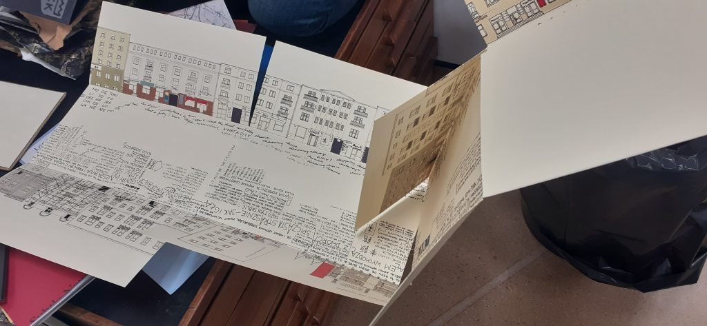
This map opens out lengthways and shows us 2 sides of a street. The centre of the map represents the road itself. They have used words to tell us information such as who lives in the building and events that have happened. The map was not in English, so I could not understand exactly what it was telling me, but even so, I could guess a lot from the way it is visually expressed. As the reader, it feels like you are walking down the road.
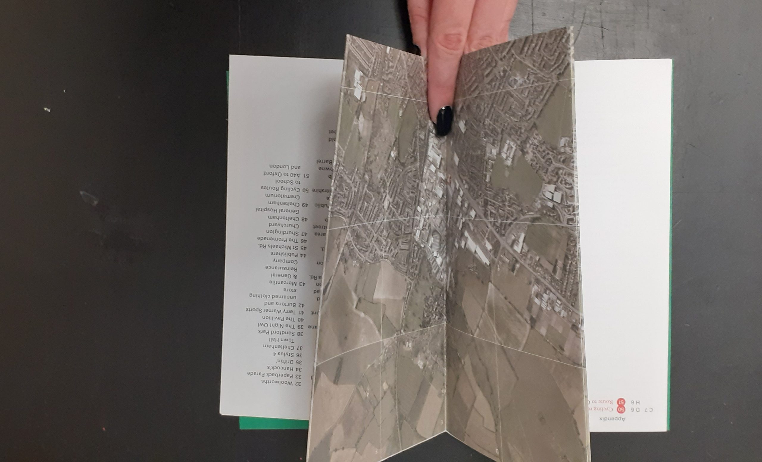
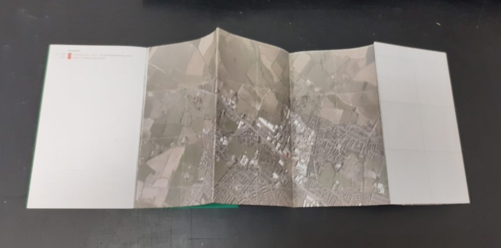
Another map that caught my attention is one made up purely of photos. The designer has taken a series of photos at one location and pieces the images together to create a picture of the place. This reminded me of David Hockney’s approach, but the photos here are made to look seamless. This technique means that we are given more information than could be captured in a single photo of a place.
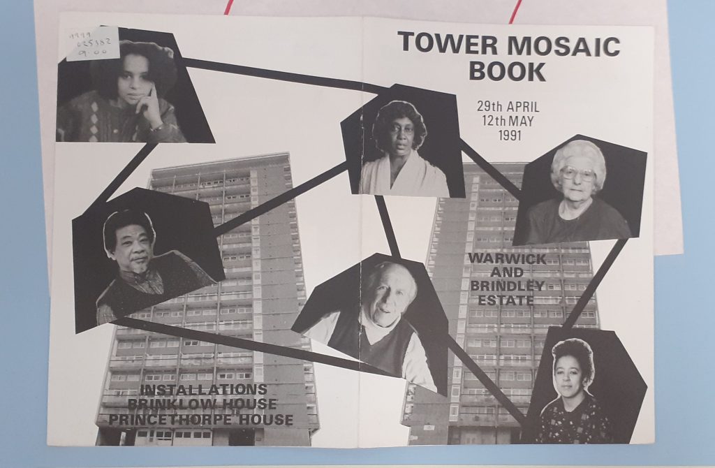
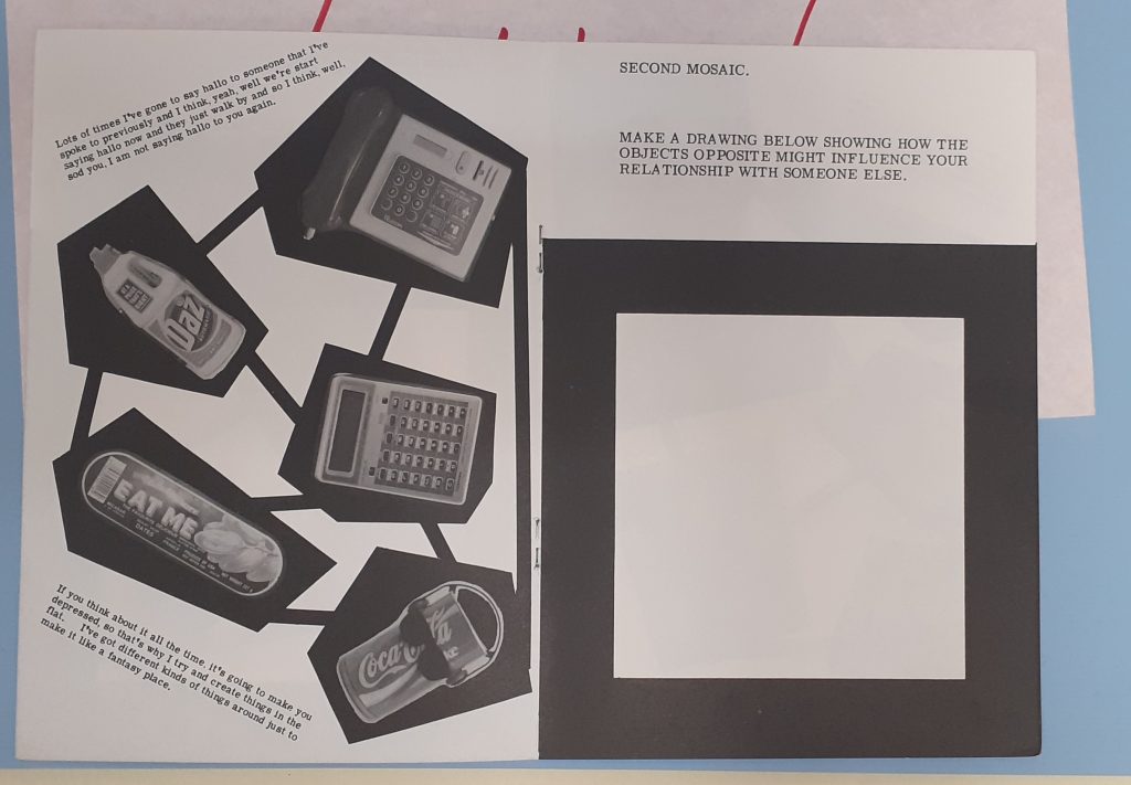
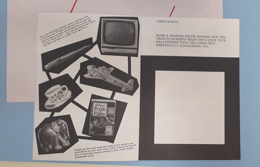
Stephen Willats
Amongst the collection of maps, I found this booklet by Stephen Willats, whose work I have looked at previously. The Tower Mosaic Book maps together the residents of the building. Because of the boldness, the map is easy to read.
The quotes on the left page above, have distinctive voices, without needing to change the typeface.He presents different objects from the building. As a viewer, I wonder about the choice of objects. I can see they are the people’s possessions because they are everyday objects.
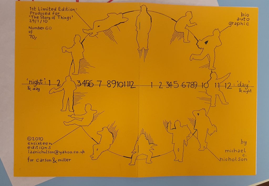
Michael C. Nicholson
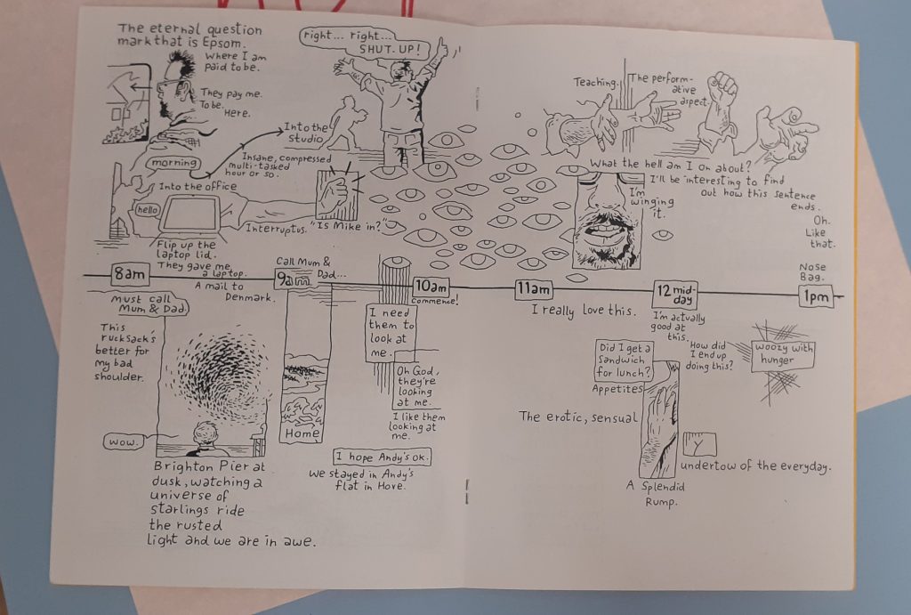
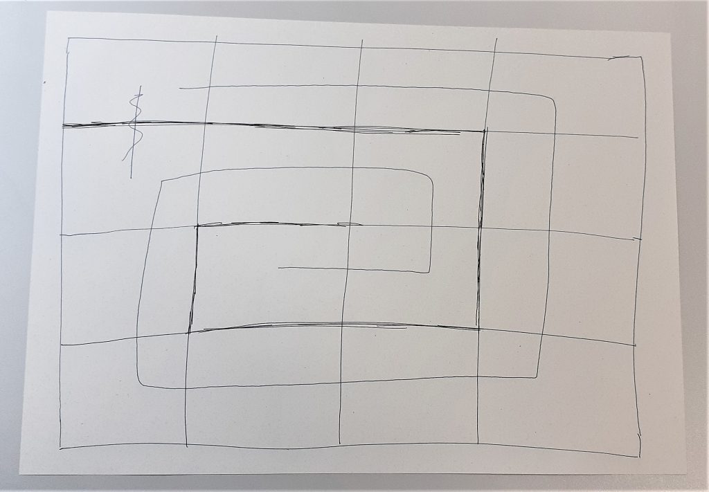
Nicholson maps his day in this booklet. The horizontal line represents the hours in the day and the silhouettes signify different activities. The way they are positioned remind me of a clock face and therefore the viewer sees a clock even before reading the text.
The horizontal line continues across the booklet. This helps the work to look cohesive and part of the same narrative.
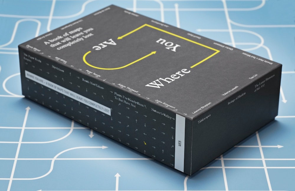
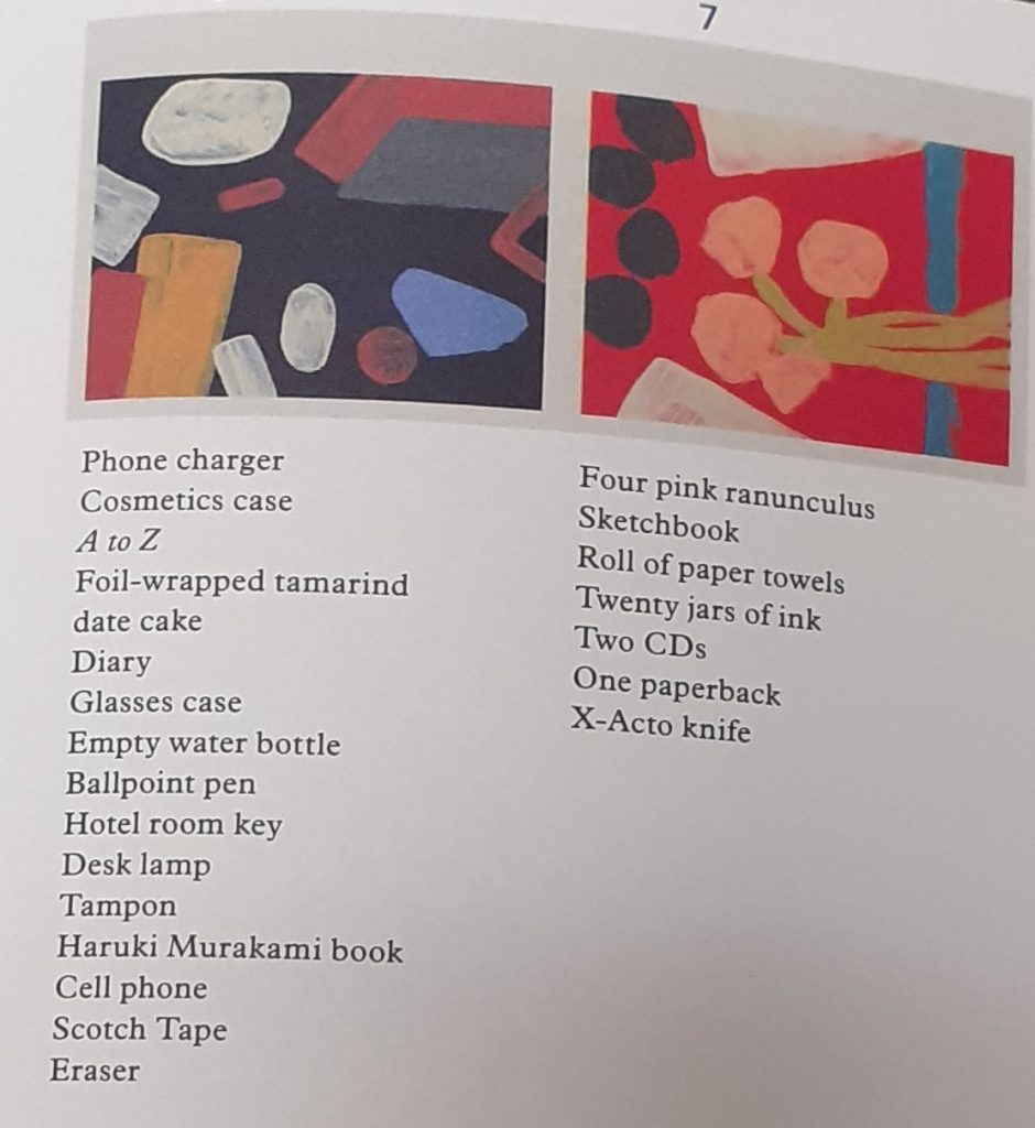
‘Where You Are is a book of 16 maps created by writers, artists and thinkers.’
‘We’re constantly mapping our lives, even if we don’t realize it. The emails we send, the restaurants we Google, the buses we take, the status updates we post —all of this is a way to track where we’ve been, what we’ve done and what’s important to us. ‘
I looked at this collection and include some of the maps here:
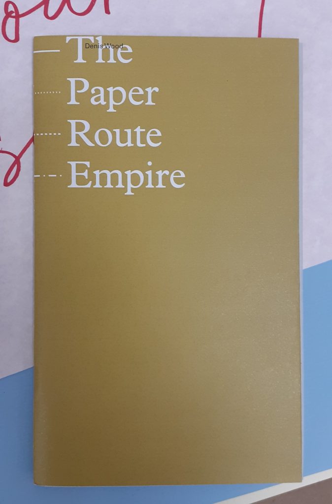
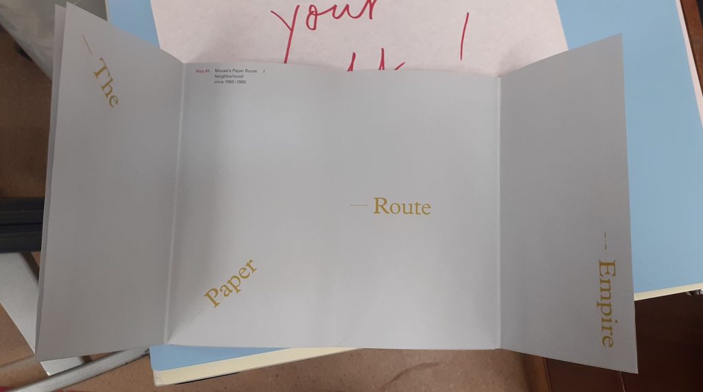
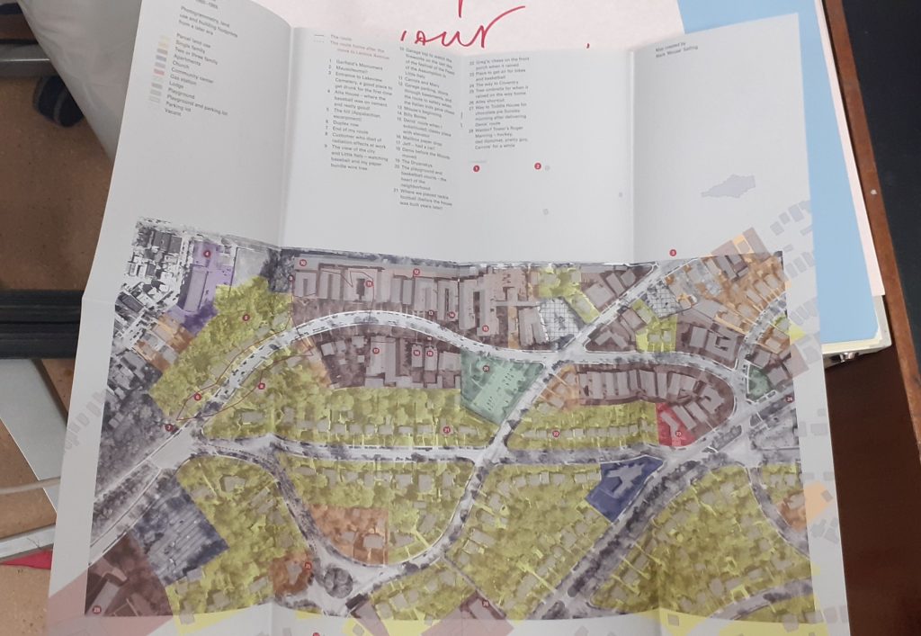
Denis Wood
front cover
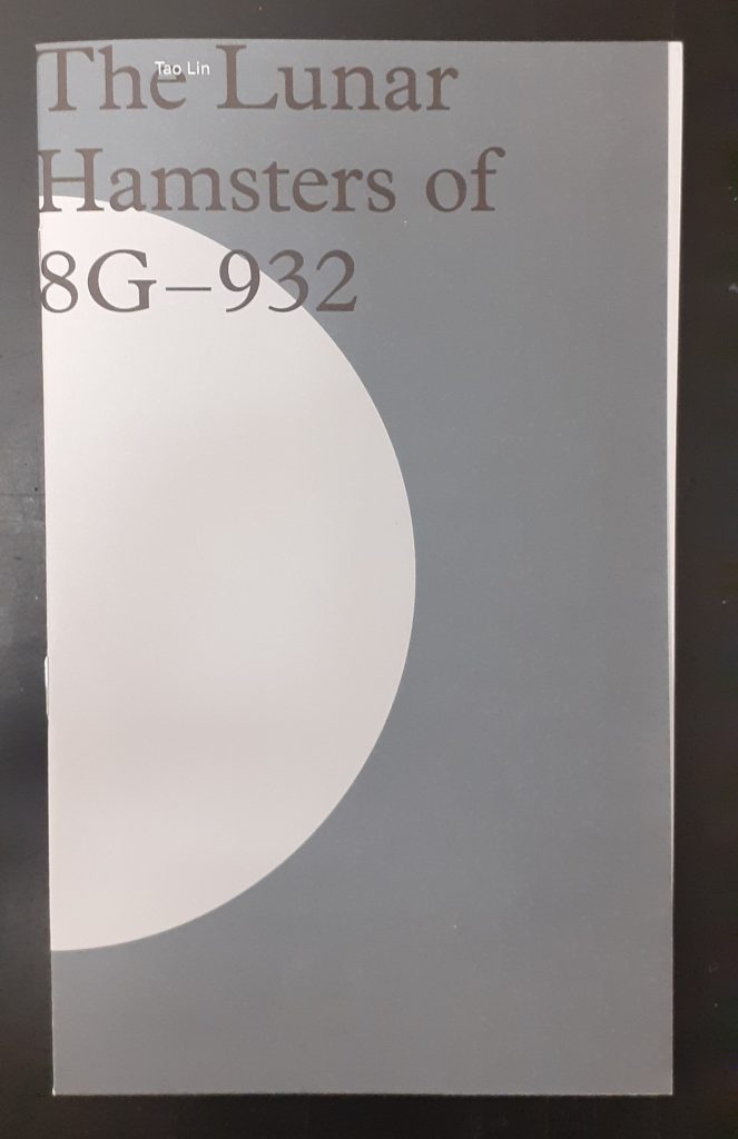
Tao Lin
front cover
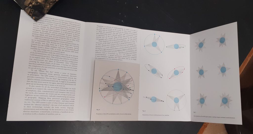
Tao Lin maps outer space in answer to the question ‘Where are you?’
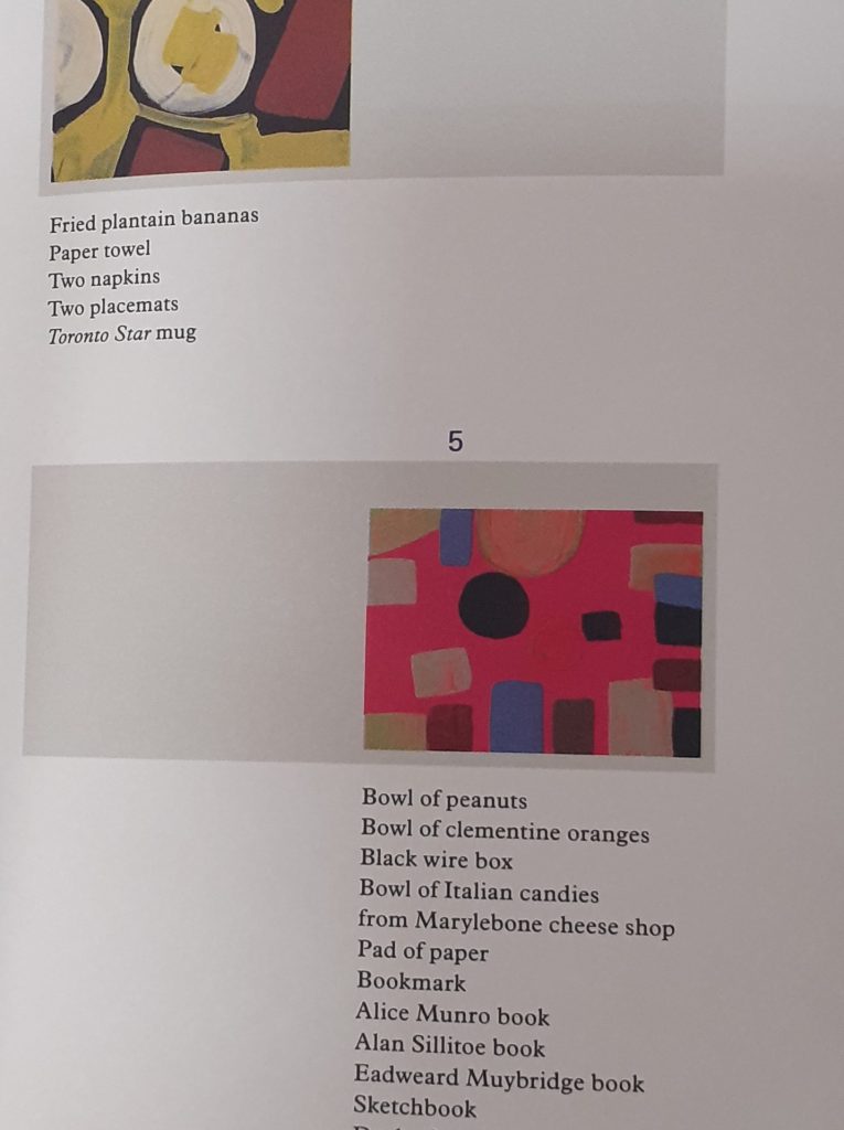
Leanne Shapton
front cover
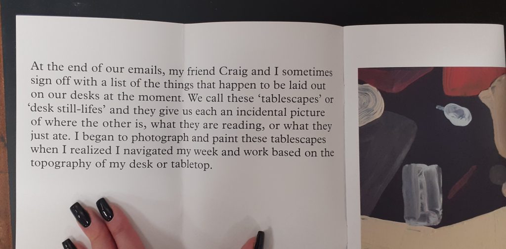
Tablescapes is about the literal space around you in your day to day living. A desk is multi-functional. It’s a table you sometimes work at, sometimes eat at and use to store objects you may need to use in the near future.
The artist has interpreted her surroundings in the medium of paint. This key translates the shapes we see in her paintings, making it a map. Without this key, they would simply be paintings.
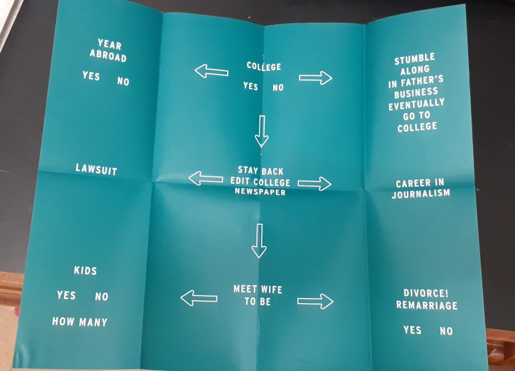
Peter Turchi
front cover
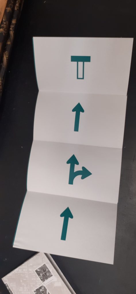
This designer thinks about different paths he could have taken in his life. The flow chart style reminds me of the quizzes found in magazines when I was a child.
He uses road signs that are recognisable to the viewer.
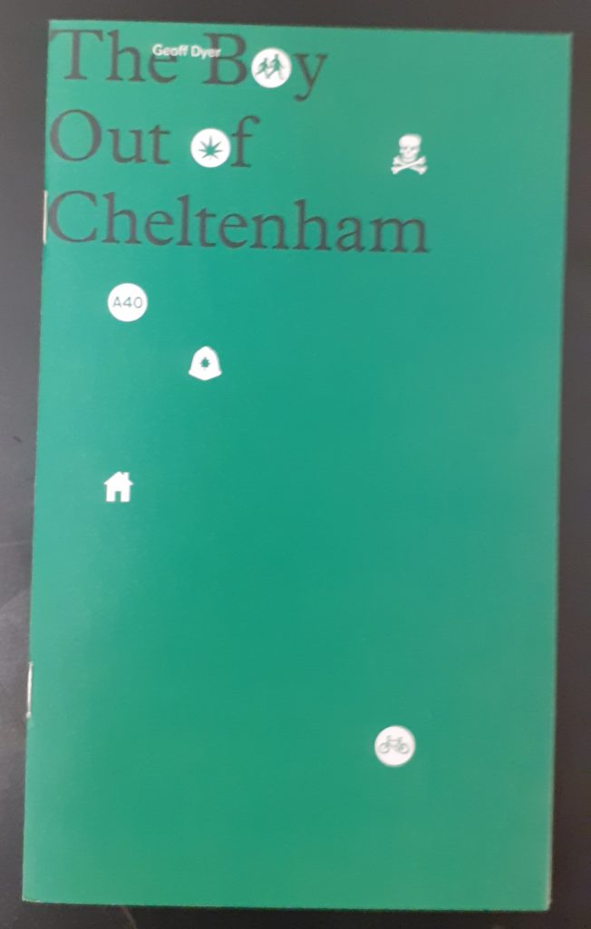
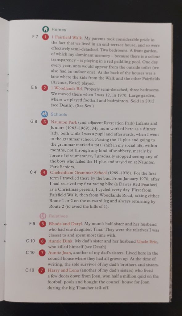
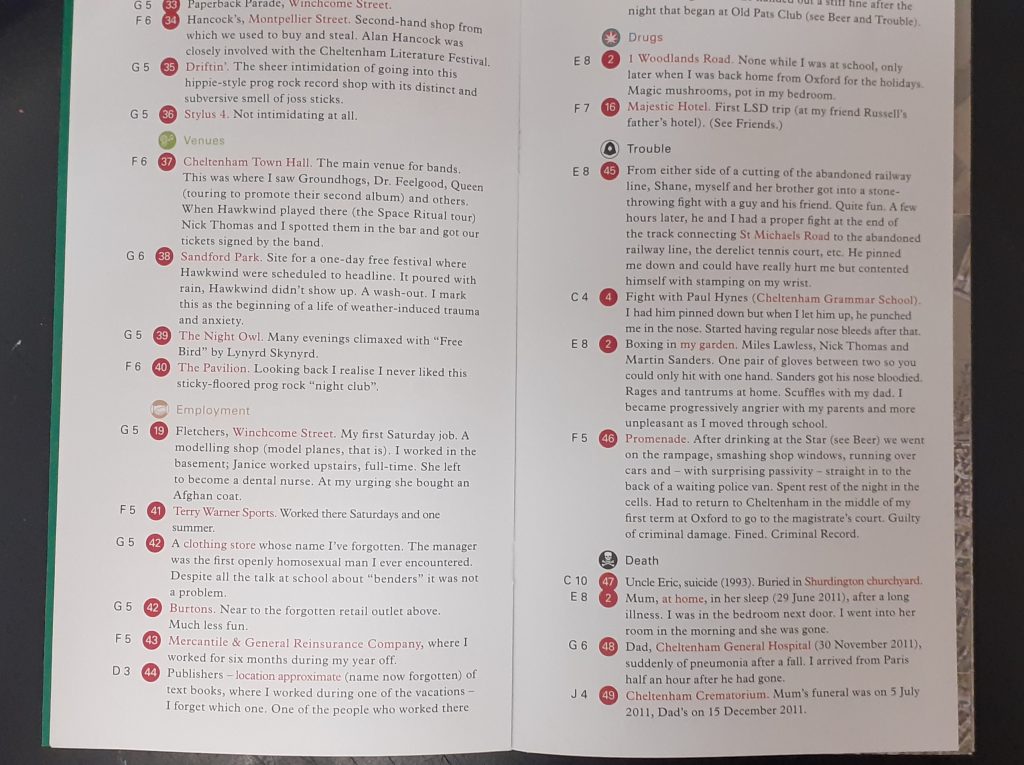
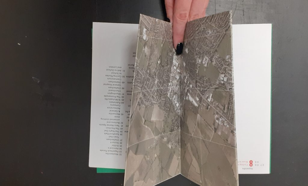
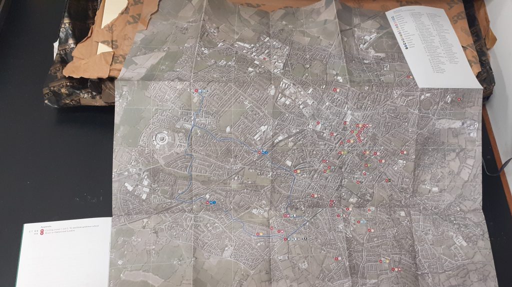
Geoff Dyer
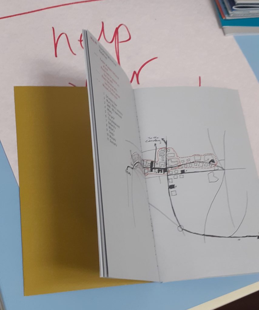
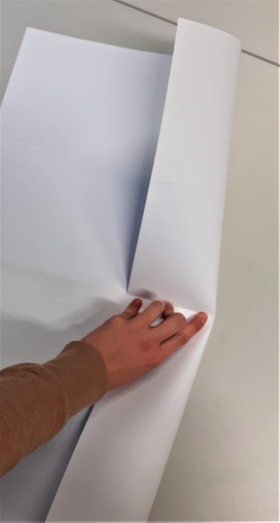
This map folds out to show the designer’s home town. He has marked areas that have personal significance to him. I like the depth of detail in this map and the way it is possible to get lost amongst it.
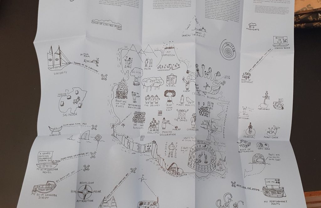
Joe Dunthorne
Ghost Pots relates to his experience as a writer.
Here, the designer uses illustrations to draw a map of an imaginary place. ‘A literary landscape.’
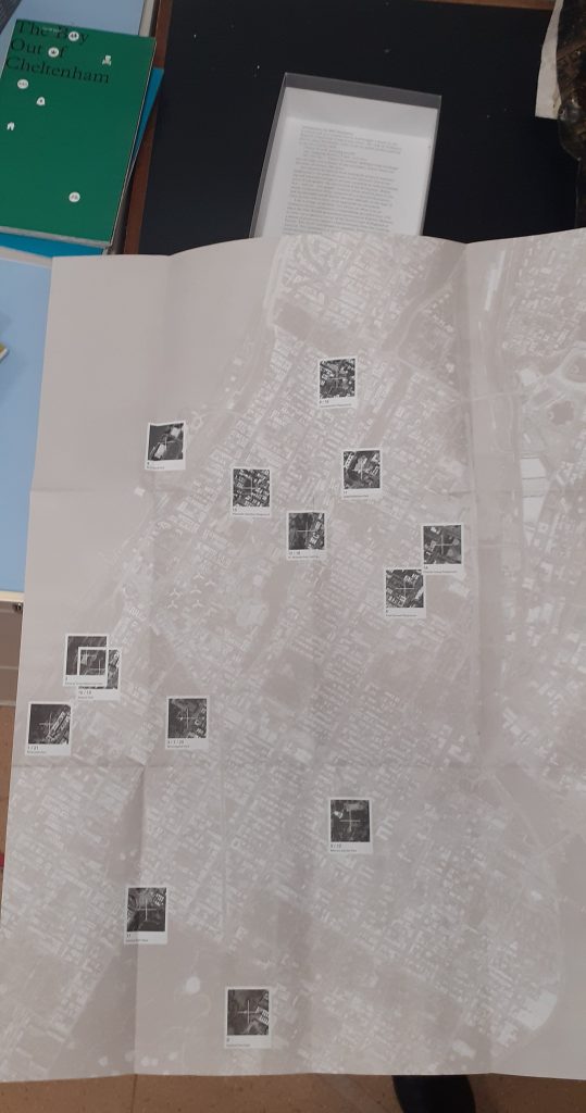
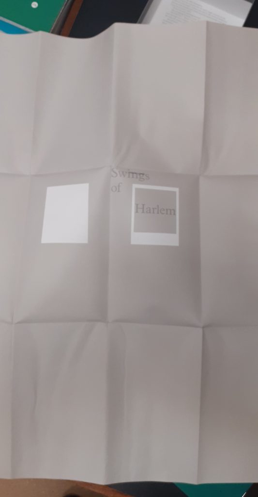
Valeria Luiselli
Swings of Harlem marks the swings the author remembers from childhood.
The map folds into the front cover. Her map was unique in the way that she made a large folded map separate to the rest of the work. There is a booklet that comes with the map to add context to the images.
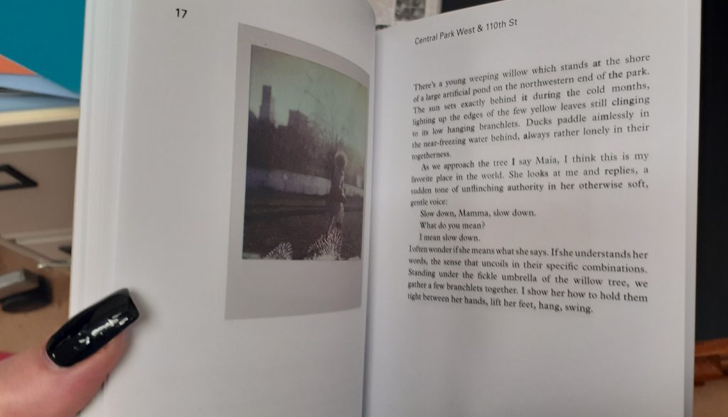
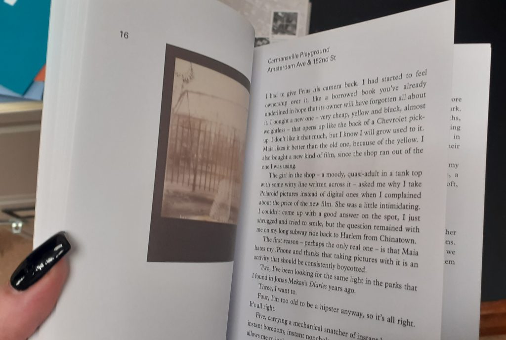
In the booklet, she shares her memories and thoughts about each swing. She includes photos from her personal collection. This gives the map an authentic feeling.
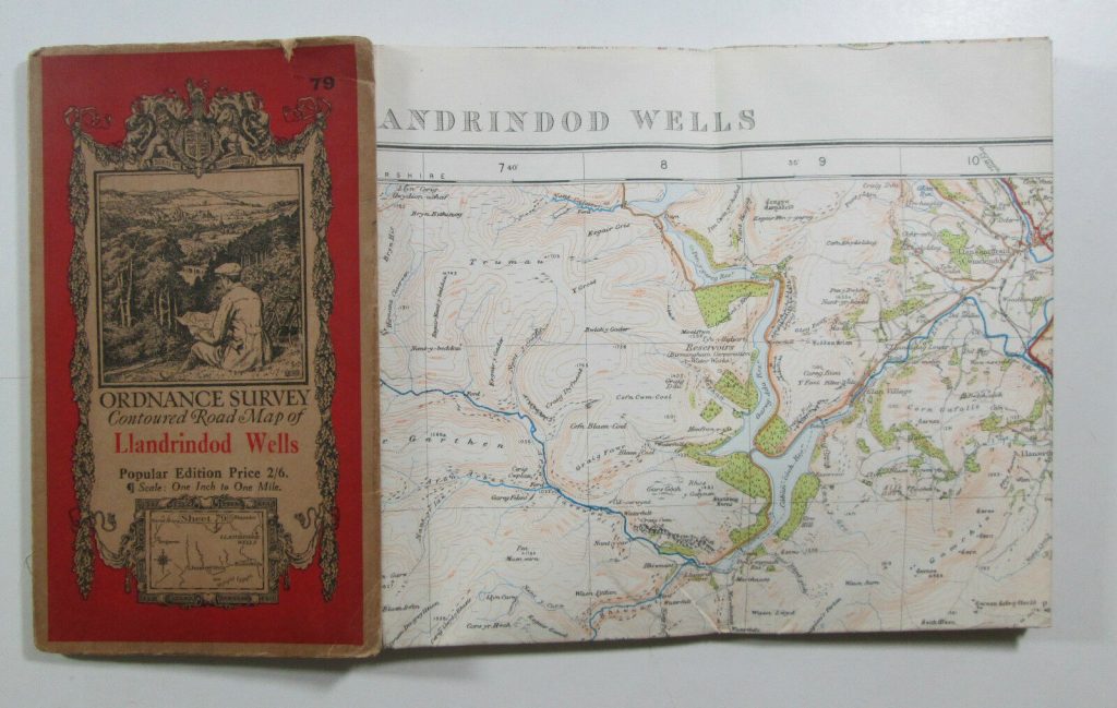
We looked at the way maps are put together. For example, Ordnance survey maps are made up of one large piece of paper, folded multiple times with a cover glued to 1 of the folded sections.
We also thought about being creative with our book designs. Our lecturer Ruth showed us examples. One collection I was really impressed by, was by a designer who had made a series of small pamphlet-like books and collected them together into a box which held them together. I like the way the designer chose a different colour for each book. The theme for the collection was around mapping. One of the books was about places he had nearly been to, one contained pixelated image of the UK, each square was a different colour and given a different name to each, which corresponded to the place on the map. I thought this was really creative and inventive.
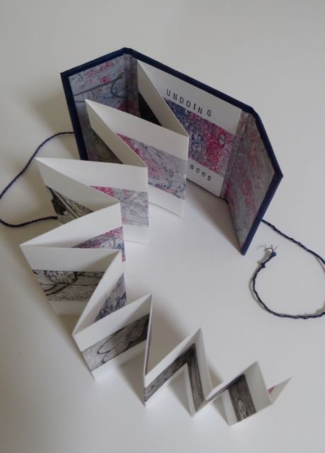
Concertina style book by Annwyn Dean. (embroiderer, book artist and printmaker based in Yorkshire).
The concertina style is appropriate for showing a series of photos, or a long print that is printed across the pages. She adds string to tie the book together.
The main method we focused on was creating a book using folds instead of stitching, gluing, or any other method of binding. The advantage of this is that you could include one large picture within smaller packaging. These large pictures when folded up into these books, could be read as a book by turning each page or could be folded out to show the full image.
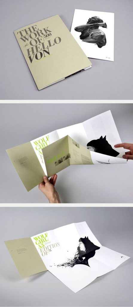
A design by Madebysix, who are a design studio based in Leicester. Image from Six (madebysix.com)
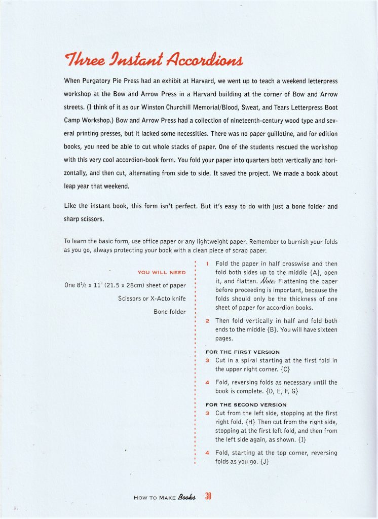
How to make books by Esther K. Smith
How to make books by Esther K. Smith
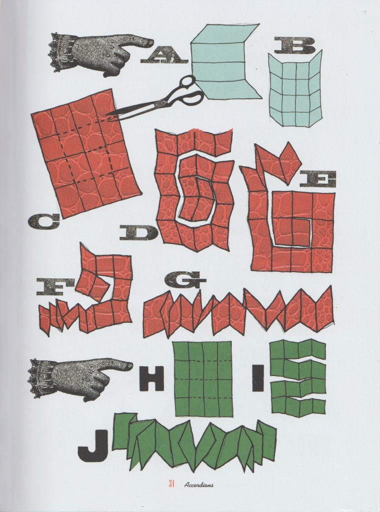
I had a go at making the ‘Three instant accordions’ style book. I first folded the paper in half.
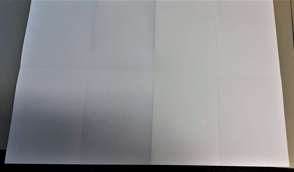
I folded it in half again. I kept folding until I had 8 equal sized rectangles.
When folding thick paper, it is sometimes necessary to re-fold back in the opposite direction. Here, I aligned the centre folds together. The centre fold acted as a marker, so I did not have to check along the edge to see if the paper was lined up.
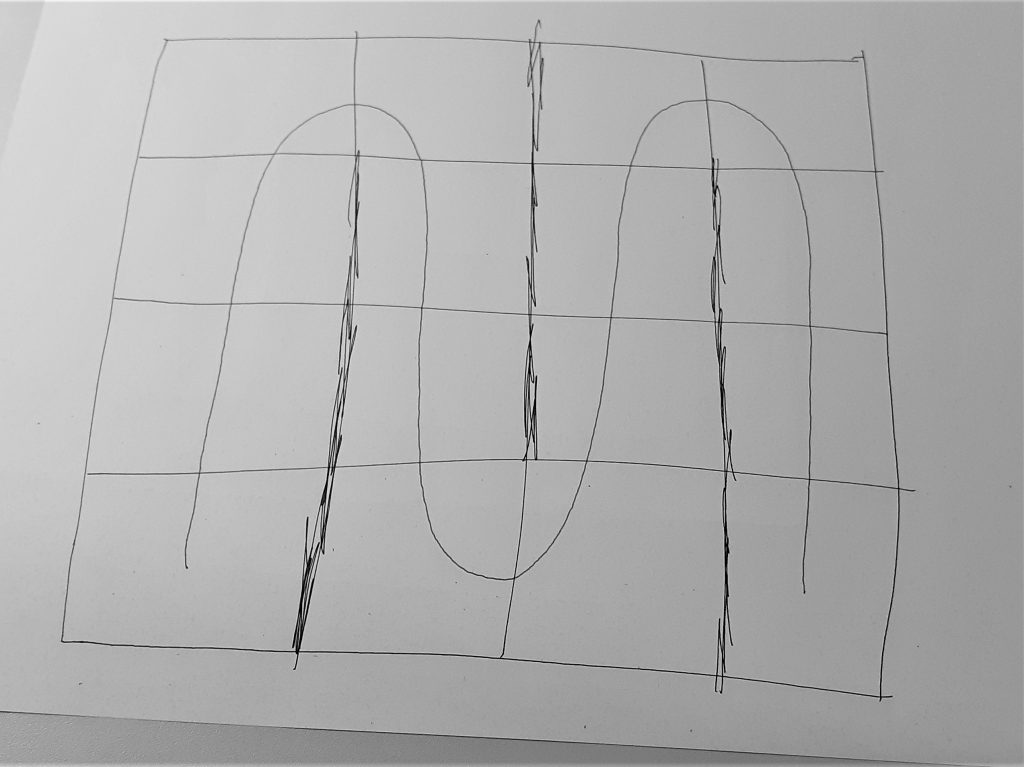
I then needed to plan out where to cut the paper. I decided on a pattern that would spiral inwards. This felt logical, but meant that I ended up with an asymmetrical piece of paper. I used scrap paper to draw the above plan for my work. The black pen indicates the cuts and the blue spiral represents the direction I wanted the pages to run in. I used the paper knife to cut the paper. The challenge was to avoid cutting off sections that need to remain intact. I found the knife was quite sharp and hard to control when to stop the cut. It was challenging to create a neat cut and avoid tearing the paper.
The second thing I needed to be mindful of is the folding after the paper had been cut. I needed to alternate between folding one way and then the other way. I thought of it as folding under then over, under then over and so on.
How to make books by Esther K. Smith
The next task was to make a cover for my book. This helps to protect the book, maybe not from water but from general use. To start, I created the spine by folding the paper twice. I looked at the thickness of my book first to see how wide I needed the spine to be.
My book ended up with a landscape page at the front and back of the book. I needed to cut off a section of the cover to make it fit best. I found this part of the workshop the most complicated and difficult part. I understood the steps when they were explained to me, but to make one myself is a different thing.
The first and last page slip into the cover without the use of glue or any binding. This means I can easily remove the cover and replace it.
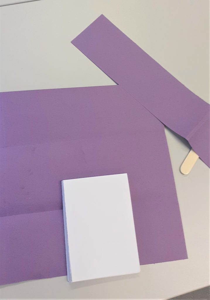
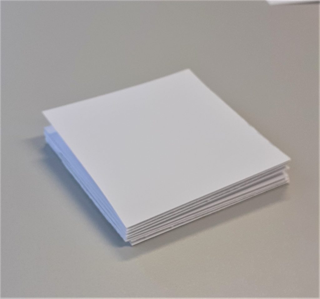
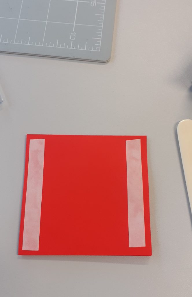
I then made a smaller book with the same kind of paper. The paper felt tougher because I was folding smaller areas. This book has square pages instead of rectangle. I made a second plan. This time. I planned a symmetrical pattern to cut.
This square book became a sampler of bookmaking techniques:
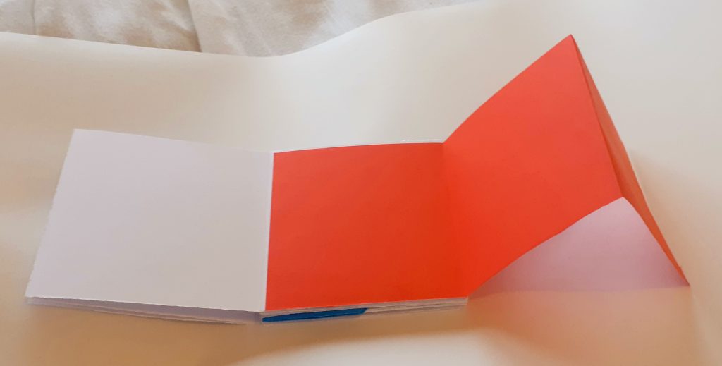
I added a section using thin red paper. I cut the paper to the same height as the page of my book. I then folded it into thirds so that it would be a concertina style pull-out piece. I used double-sided tape to attach it to the book.
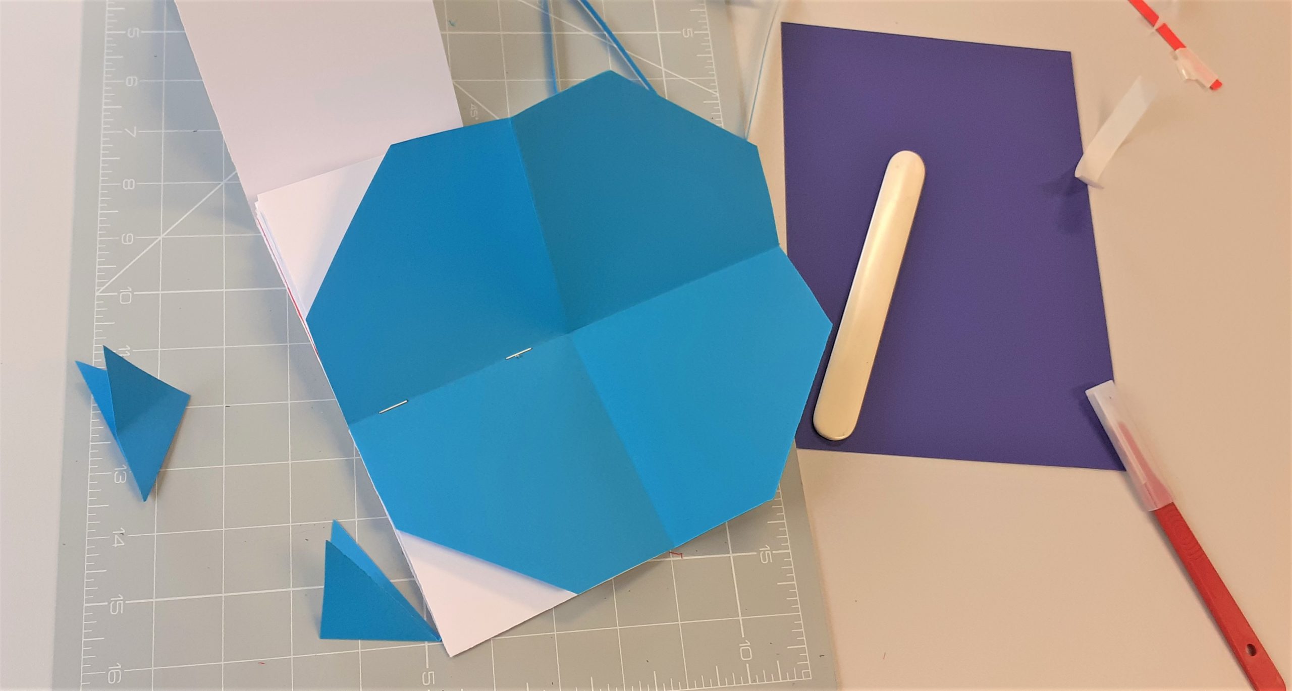
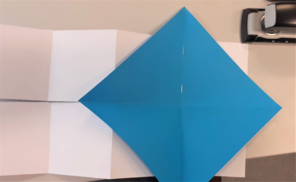
I used thin blue paper to attach a sheet that I can open out and tuck away. I cut it into a perfect square, larger than a page of the book. I folded it into triangles and stapled it to the spine of the book. Using thin paper meant that I would be able to fold it into the book without it causing the book to buckle.
When I folded the paper into the book, there were triangular corners that stuck out.
I cut the corners off with the scalpel. This created an octagon.
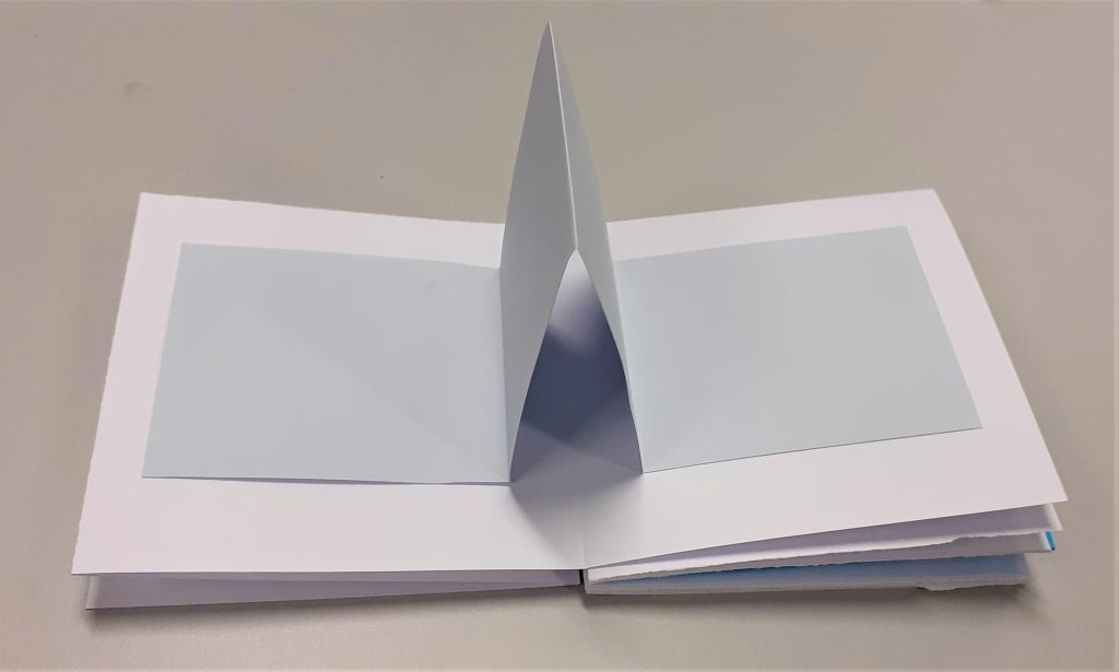
I then stuck a strip of grey paper into the book. I allowed the middle to fold inwards. This meant that the paper sticks out when the book is opened.
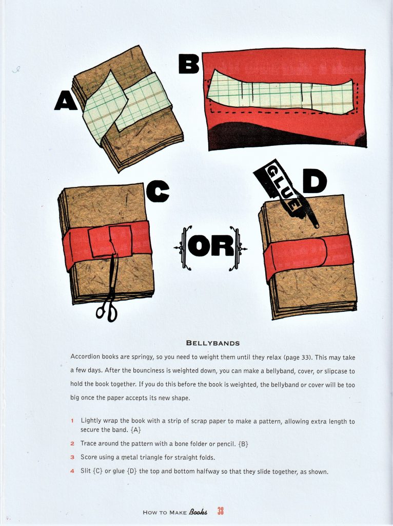
Another technique I did not have time to add is the bellyband. There are easier and more complicated ways to make a bellyband. They hold the pages closed and can be removed as a book cover can be.
How to make books by Esther K. Smith
I read this book as part of my bookbinding research.
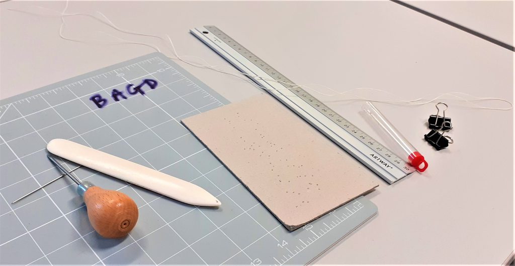
From the book: How to Use Images by Lindsay Marshall and Lester MeachemBookbinding instruments Left to right: 1. Cutting mat with grid 2. Needle 3. Awl 4. Bone folder 5. Carboard 6. Metal ruler 7. Bulldog clips 8. Upholstery thread 9. (not pictured) paper knife
Last year at college, I came across the art of zine making. I used mainly folding techniques and a stapler. Bookbinding has always been a mystery to me.
In week two at Brookes, we were introduced to bookbinding. This is what I got up to in the three-hour workshop…
We can feel the grain of paper by gently bending it and feeling the resistance.
First, we were introduced to the idea of paper grain, paper can be called short grain or long grain this refers to the direction in which the fibres run within a piece of paper.
Our lecturer Ruth gave the example of the way in which newspaper tears better one way than the other. This is because all the fibres are lying in one direction. If you try to tear the paper against the fibres, your torn edge might not be straight.
In a book, the grain should run panel parallel with the spine. Paperbacks usually have the grain going the other way, as his is a cheaper option for production. Paperbacks are not made to last, and therefore the function of the book is considered when making these decisions.
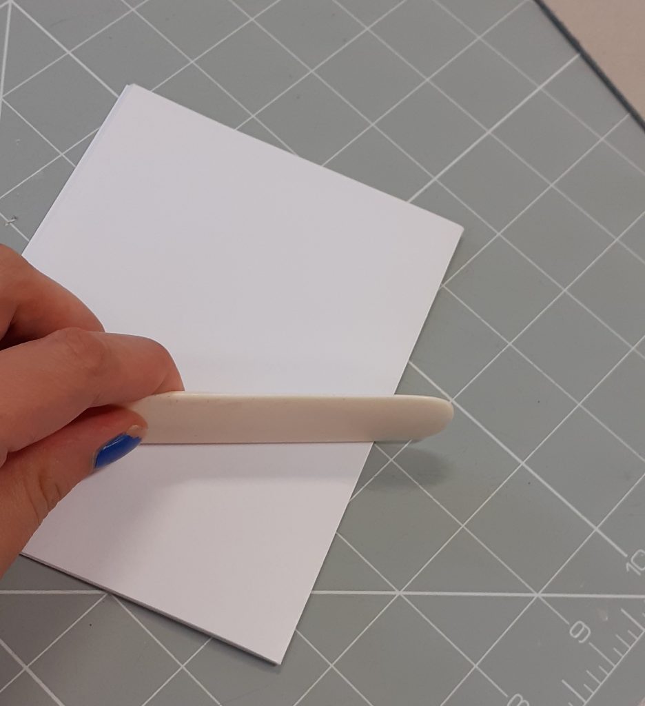
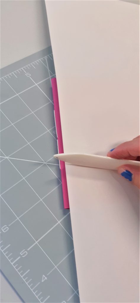
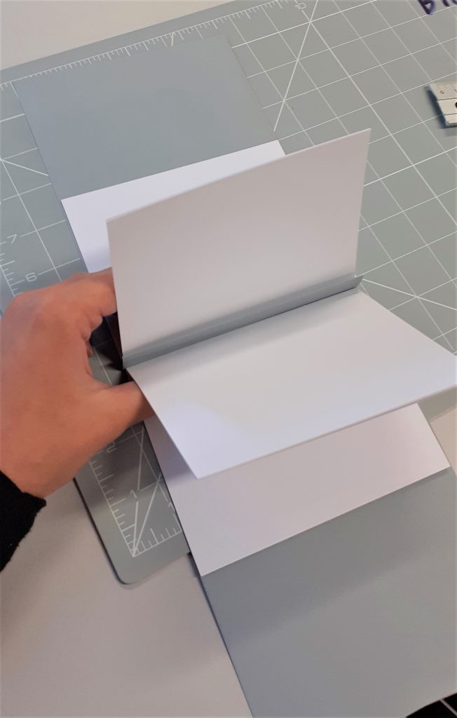
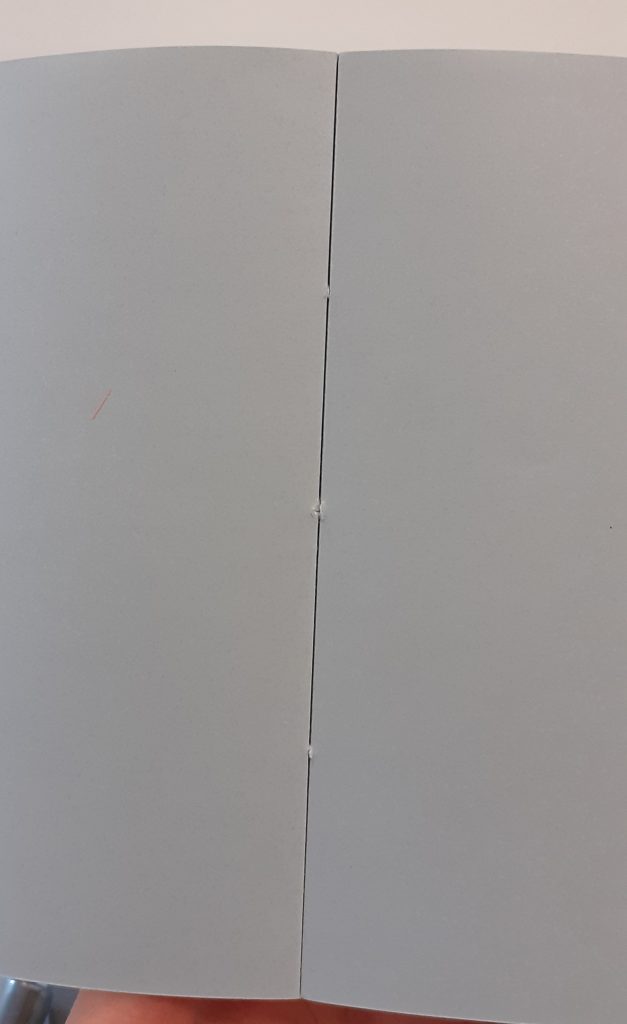
In book making, a section is where you fold a number of pages together in half. We began by using four sheets of paper to make a section. After making sure the pages are correctly aligned, I used a bone folder on the crease to create a tight fold. I found that the bone folder was a very useful tool, and I can imagine myself using it for my work generally.
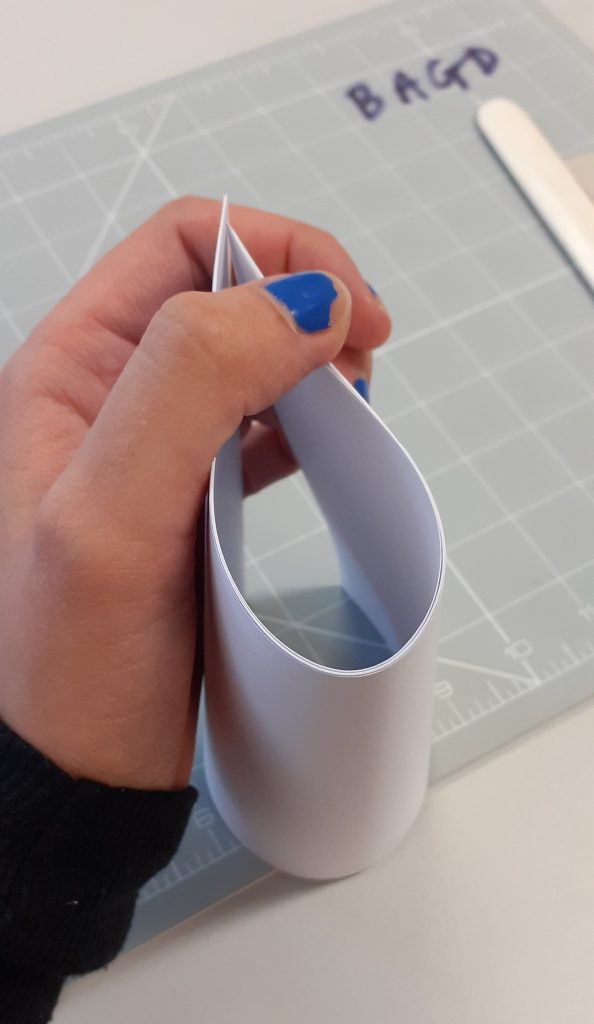
To start the first book, I folded the sheets of paper into half.
I folded the section within a piece of paper to be used for the cover.
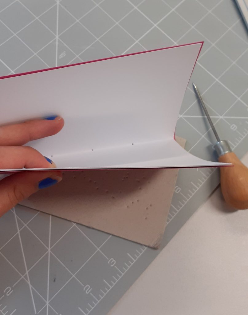
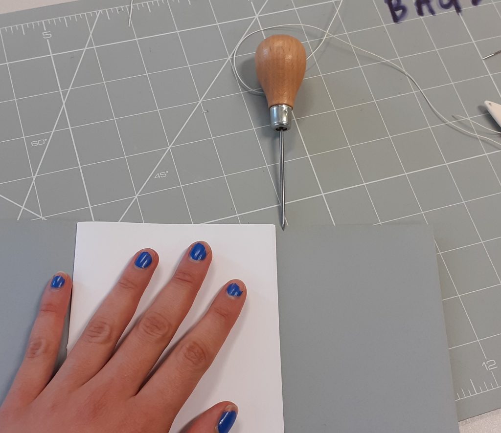
I measured quarter along the inside of the spine and made three marks one at the centre and to either side this. I used the awl to puncture holes into the fold, placing it on a piece of cardboard.
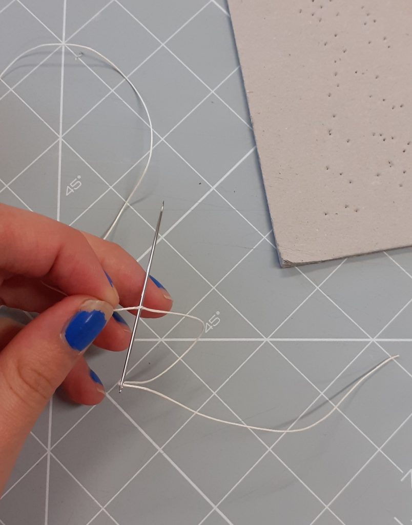
I threaded the needle, using a technique that was new to me. We used upholstery thread because it is stronger. I threaded the needle as I normally would, then used the needle to go back over myself and puncture the thread. When I pulled this through, it ensured that the thread would stay on.
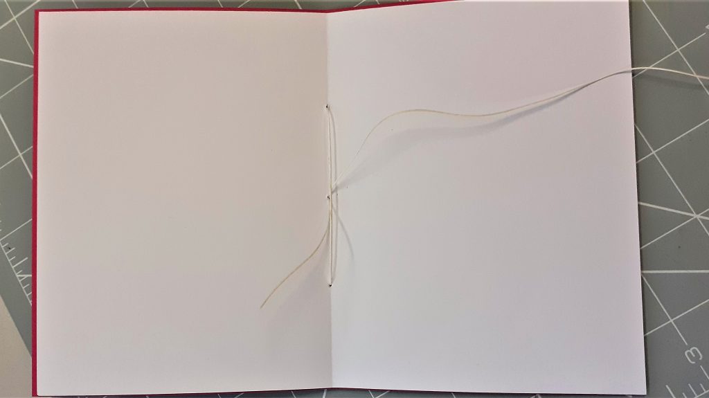
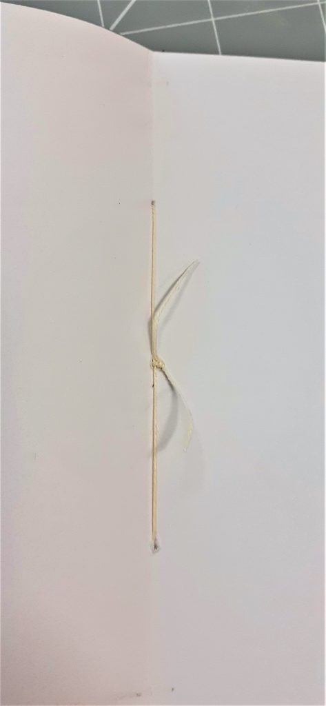
I then threaded the paper together using the holes I had created. In bookmaking, the knot can be on the outside or the inside of the spine. It depends on the look you are trying to achieve. Sometimes it is nicer to have the knot on the inside of the book, so that you can’t see it when the book is being displayed. In this case I wanted the knot to be on the inside. Therefore, I began the stitching inside the book, running the needle through the middle hole first. Then I threaded the needle back through the right-hand hole, then over to the left hole, then back through the middle hole and was then able to pull it tight. I knotted the thread twice for strength, making sure that I was creating the knots around the threads that had been pulled through, as this makes it stronger.
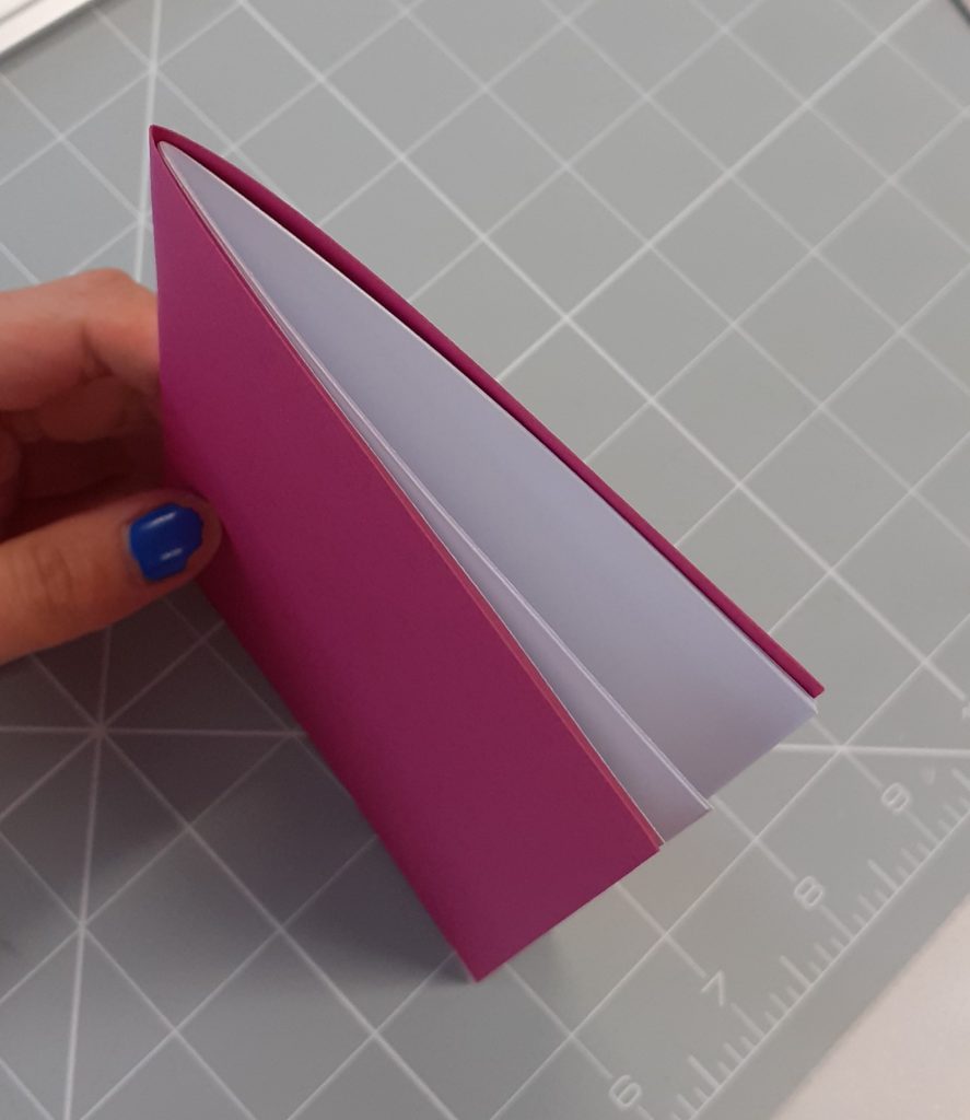
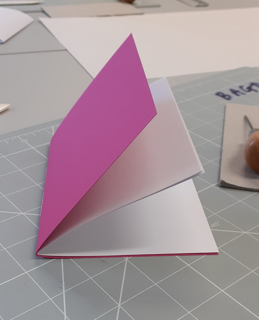
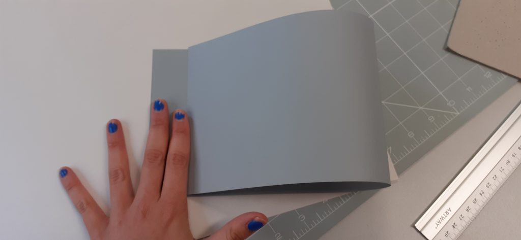
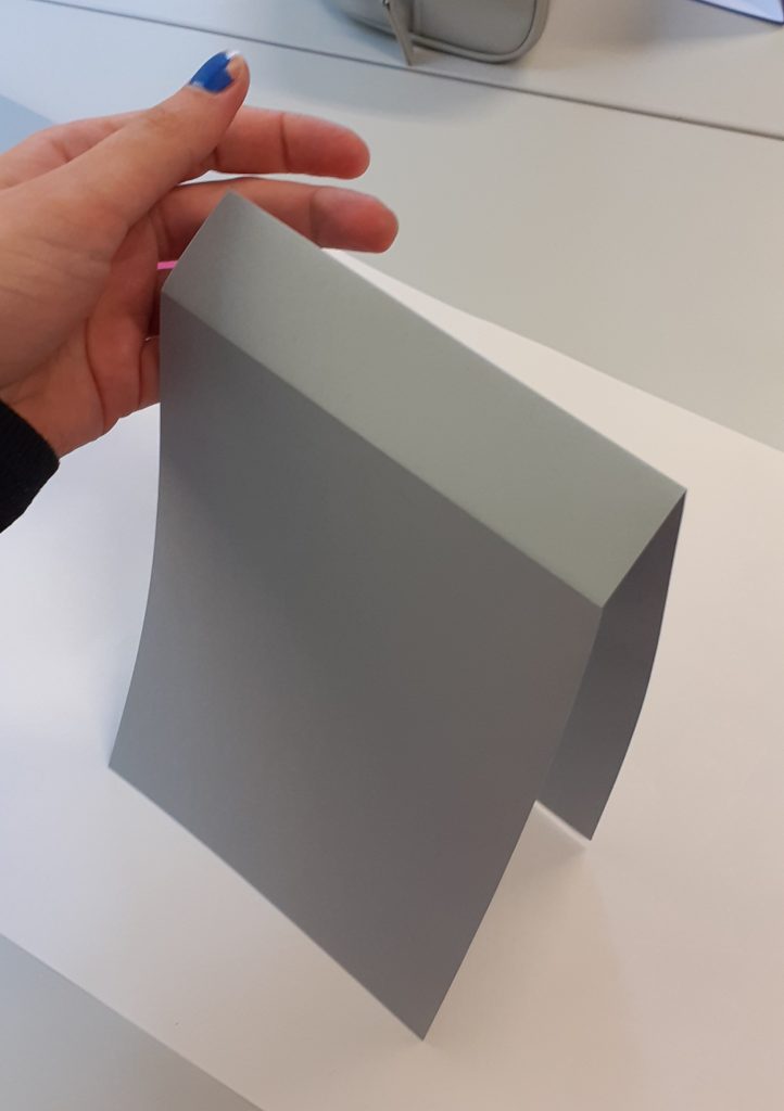
When my book was laying on its side, it naturally wanted to open out.
I could flatten it by using the bone folder. Using the bone folder directly onto the cover of the book, would create some shine. As the paper is soft, the pressure of the bone folder would polish the book. I didn’t want this, therefore I placed a piece of paper onto my book first and used the bone folder over the paper to flatten the spine of my book.
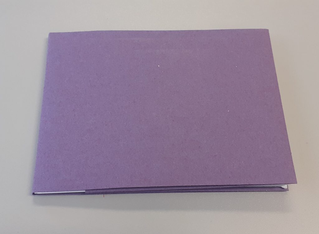
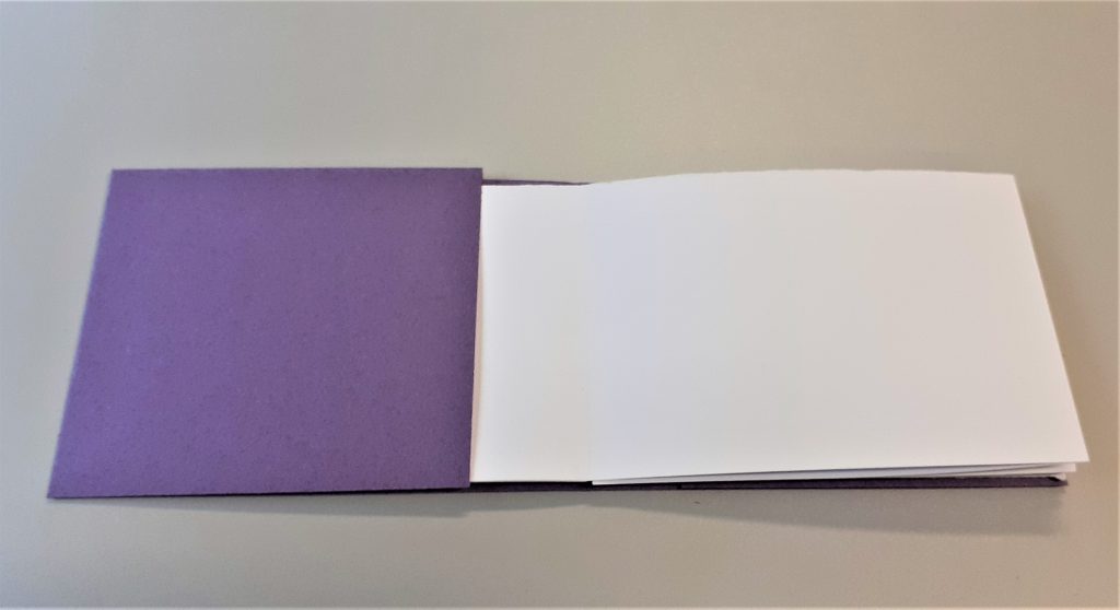
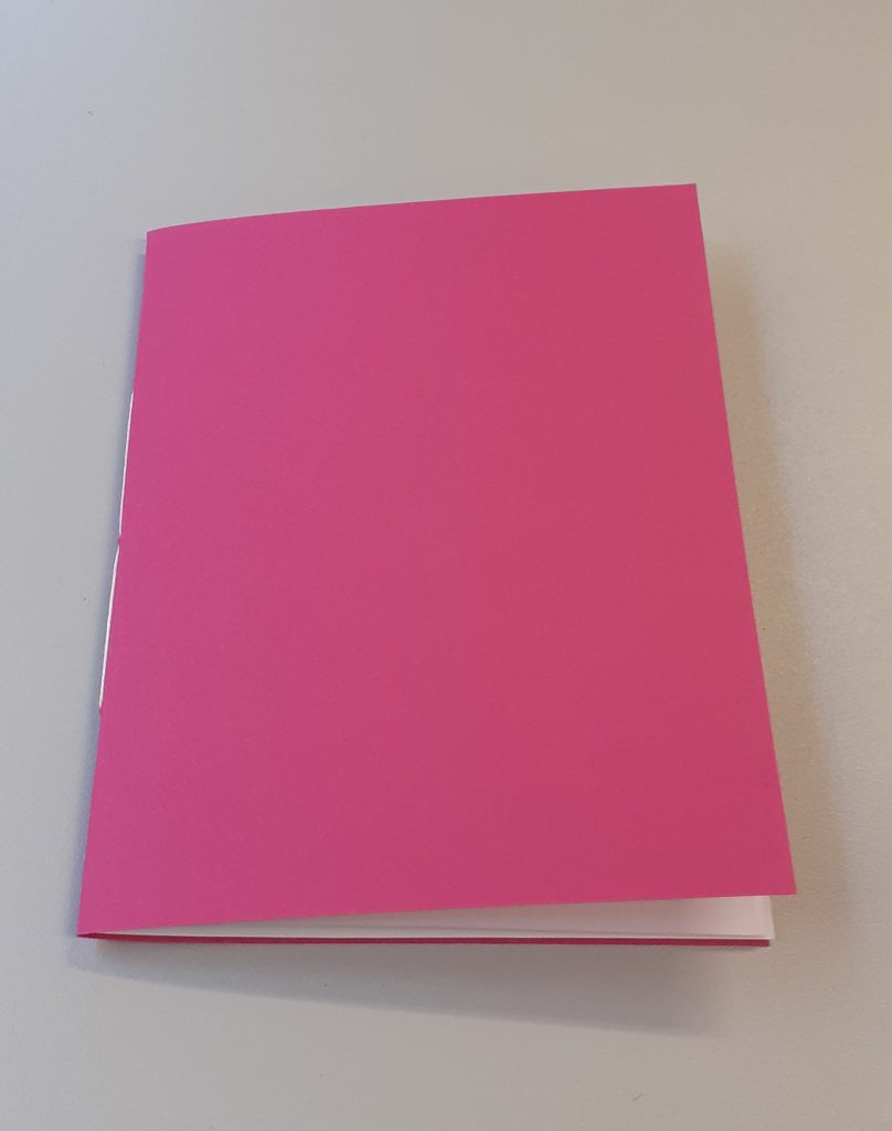
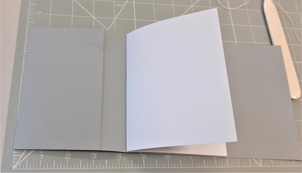
The finished book
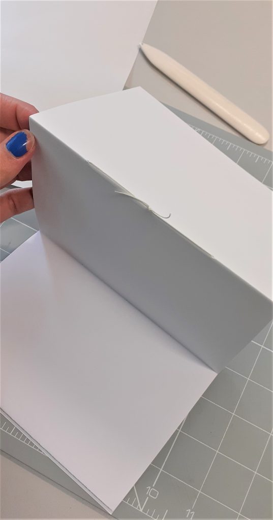
For my second book, I practiced making a hidden spine. The piece of paper I used for the cover needed to be longer than the paper I used for the cover of my standard stitching book.
For this method of bookmaking, I needed to make two folds for the cover.
These folds gave me a flat area where the spine of the book was going to be. I then needed to carefully bend this section in words to be able to create a crease at the centre.
This gave me a ‘W’ shape at the spine.
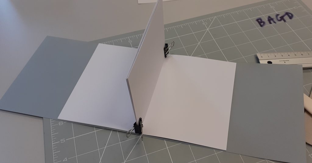
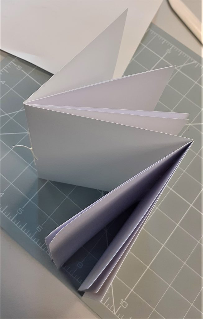
The most tricky part was then to add two sections.
I used 2 bulldog clips to hold the sections in place. I needed to repeat the stitching process that I used on my first book, but this time it was slightly more tricky because of having two sections to place around the inner fold.
The stitching is hidden!
I then needed to fold in the front and back cover. I marked where the fold would be and repeated the process for both covers. However, the two covers were not even. I had to correct this.
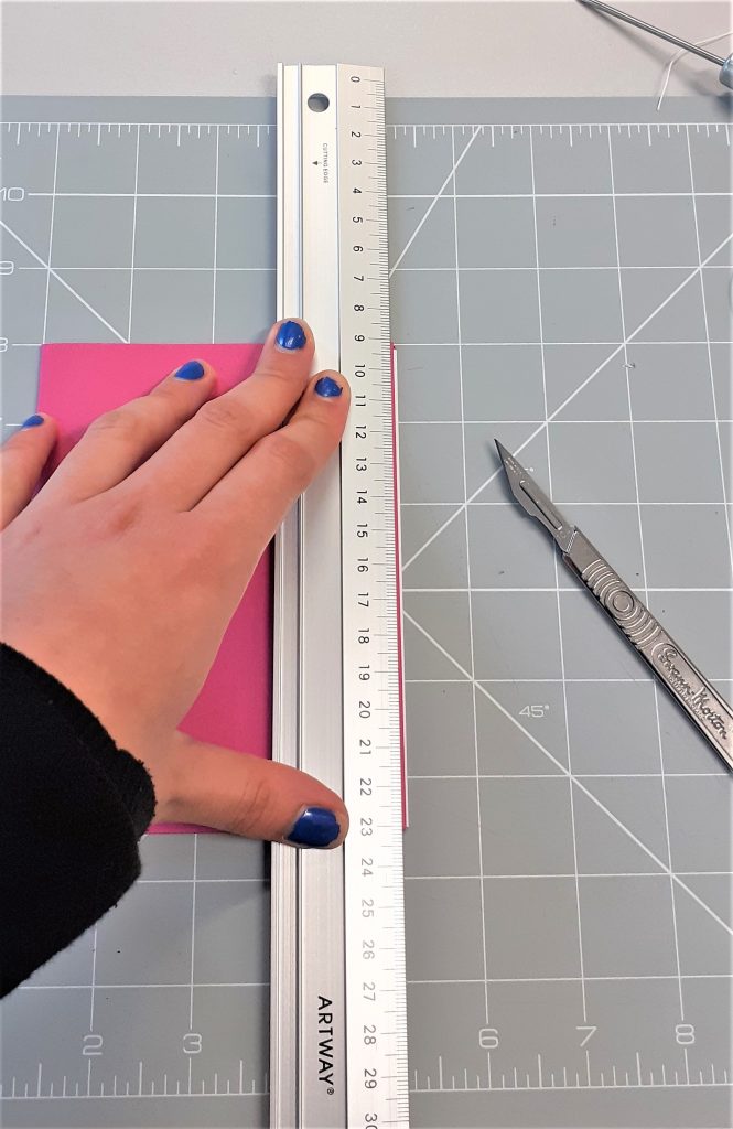
Ruth then taught us the best way to trim down the edge of the book. I use the metal ruler and my scalpel. Because of the layers of paper, it took a few attempts to cut all the way through the pages. The answer to this was using repetition and not force.
For the final book of the workshop, we made a style of book known as a Dos a Dos. (In French meaning ‘back to back’). I really liked this style of books, it’s fun and I can imagine making a zine in this style. This style of book has two covers and opens in two ways, it is almost like two books glued together. A zine could be based around this format and be used to display work of contrasting ideas.
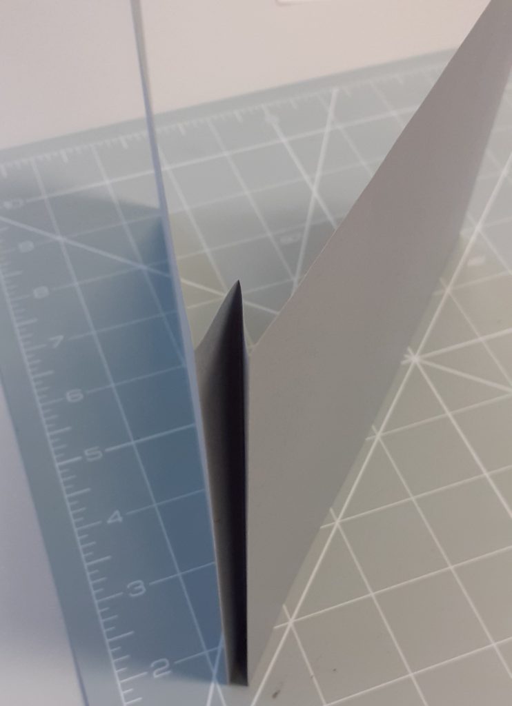
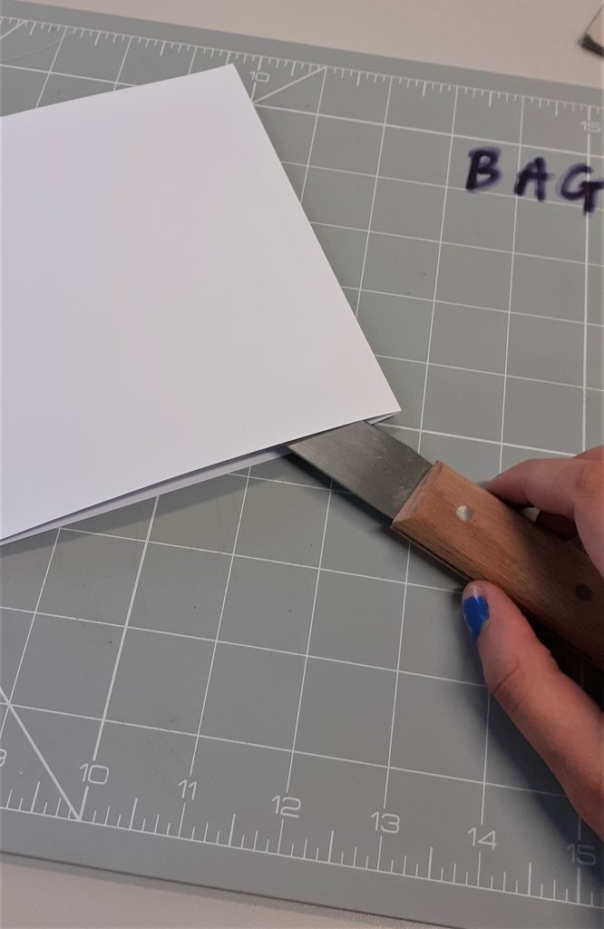
We used a paper knife, also known as a clock knife. This kind of knife is used formany different crafts. Ruth showed us the correct way to use it for cutting paper. It would be tempting to drag the knife through the paper, but this could tear the paper. Instead we folded the paper, place the knife on the inside of the crease, and pulled the knife outwards at an angle. We repeated this technique to cut the paper in half.
For the cover I used a long piece of card. First, I folded it into a zigzag format. This book needed two sections, one for each spine. I attached the sections to each side of the spine, using the same stitching technique we had been practicing. This time I left the knots on the outside of the spine, just to see the difference aesthetically.
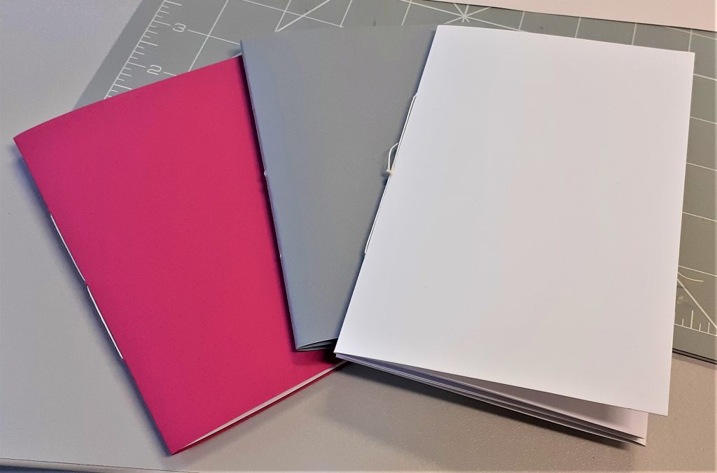
My three books together 1) standard stitching, one section 2) hidden stitching three) Dos a Dos
I really enjoyed this bookbinding session. The second book was the most difficult to make for me. Aligning the paper was also something I found tricky but I think this will improve with practice.
We use cookies on our website to give you the most relevant experience by remembering your preferences and repeat visits. By clicking “Accept All”, you consent to the use of ALL the cookies. However, you may visit "Cookie Settings" to provide a controlled consent.
This website uses cookies to improve your experience while you navigate through the website. Out of these, the cookies that are categorized as necessary are stored on your browser as they are essential for the working of basic functionalities of the website. We also use third-party cookies that help us analyze and understand how you use this website. These cookies will be stored in your browser only with your consent. You also have the option to opt-out of these cookies. But opting out of some of these cookies may affect your browsing experience.
Necessary cookies are absolutely essential for the website to function properly. These cookies ensure basic functionalities and security features of the website, anonymously.
Cookie
Duration
Description
cookielawinfo-checkbox-analytics
11 months
This cookie is set by GDPR Cookie Consent plugin. The cookie is used to store the user consent for the cookies in the category "Analytics".
cookielawinfo-checkbox-functional
11 months
The cookie is set by GDPR cookie consent to record the user consent for the cookies in the category "Functional".
cookielawinfo-checkbox-necessary
11 months
This cookie is set by GDPR Cookie Consent plugin. The cookies is used to store the user consent for the cookies in the category "Necessary".
cookielawinfo-checkbox-others
11 months
This cookie is set by GDPR Cookie Consent plugin. The cookie is used to store the user consent for the cookies in the category "Other.
cookielawinfo-checkbox-performance
11 months
This cookie is set by GDPR Cookie Consent plugin. The cookie is used to store the user consent for the cookies in the category "Performance".
viewed_cookie_policy
11 months
The cookie is set by the GDPR Cookie Consent plugin and is used to store whether or not user has consented to the use of cookies. It does not store any personal data.
Functional cookies help to perform certain functionalities like sharing the content of the website on social media platforms, collect feedbacks, and other third-party features.
Performance cookies are used to understand and analyze the key performance indexes of the website which helps in delivering a better user experience for the visitors.
Analytical cookies are used to understand how visitors interact with the website. These cookies help provide information on metrics the number of visitors, bounce rate, traffic source, etc.
Advertisement cookies are used to provide visitors with relevant ads and marketing campaigns. These cookies track visitors across websites and collect information to provide customized ads.