Identity application: business cards, CV and cover letter

20th March

The focus of today’s lecture was on stationary materials, business card and letterhead design. We thought about how to apply our identity to these pieces. These different elements can build up a picture about who I am. 

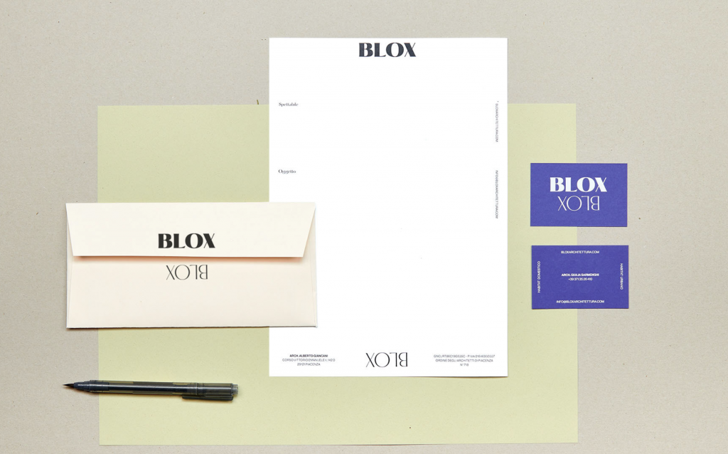
When building a professional identity, I’ve considered typography to use throughout identity application, for example, cv and website. An example is on the Blox website. We can see here that their display type face and body copy are 2 different typefaces that work nicely together and form this identity. These can be applied to the cv for use as headings to reflect your identity right from the point where you are applying for the job. Equally, 1 typeface can be used that has bold, medium and regular.

An example is the design for the architectural firm Blox. The urban landscape and architecture duality is reflected in their logo. The elements of their identity come together in their logo, typeface, colours- this can be called their identity toolkit.

from Book of Branding
Blox on Behance

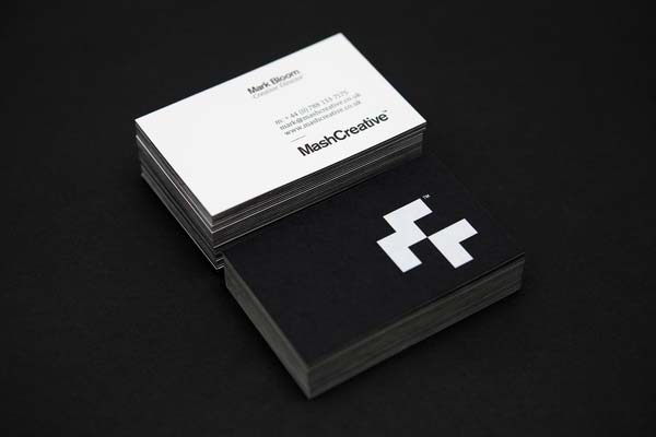
A ‘logo lock up’ is when the elements group together – the combination of the logo and company/individual’s name together in a balanced and coherent way. This might be that the name and logo are centred on a business card.

Colour
  • We could explore use of colours or using just black and white – either is fine.
  • We can look at using a main colour alongside a supporting/secondary colours.
from Book of Branding
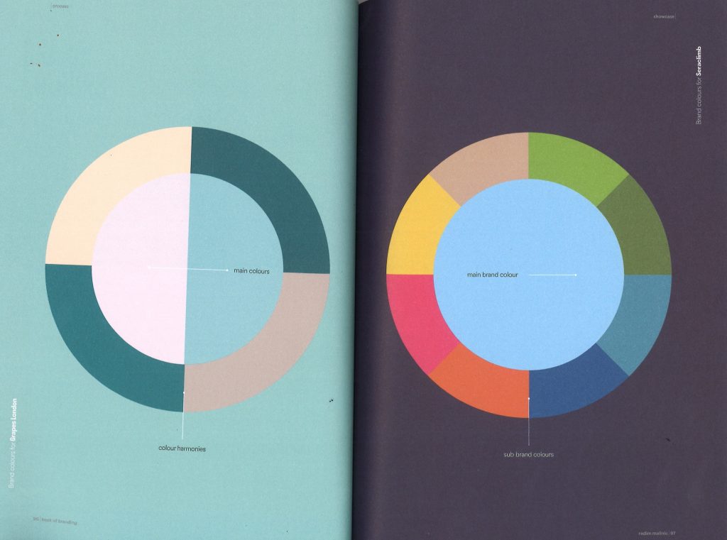
  • What you see on the screen may not be what is printed, this is important to keep in mind and means that we  need to print out and test out for this when using colour in our work.
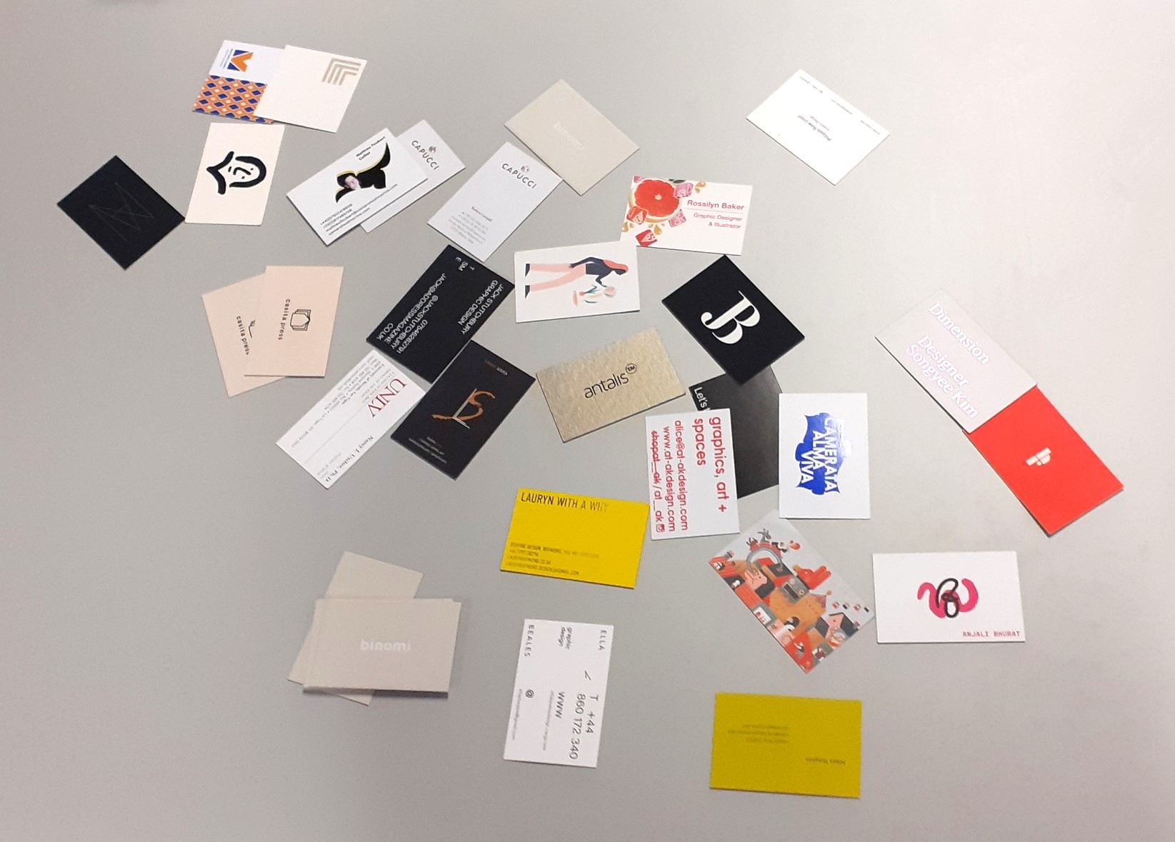
‘Are business cards dead?’

When I was at last year’s Illustrator fair in King’s Cross, I took home many business cards. What I remember from this collection was the wide variety and clear expression of the illustrator’s style and character. Being all from illustrators they did seem to have something in common, for instance their drawings displayed on the card.

It occurred to me during this lecture that the person’s occupation has the biggest impact on what the card will look like. The business card of a graphic designer is expected to show their creativity, whichever way they choose to express this. The business card of a real estate agent will be predictably more ‘conventional’ or straight-forward than someone with a creative profession.

Adding functionality to a card makes it fun and more likely that people will hold onto it, since it is useful for something.
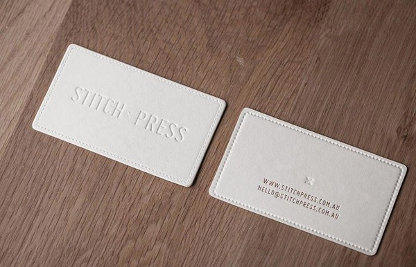
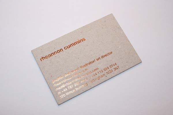
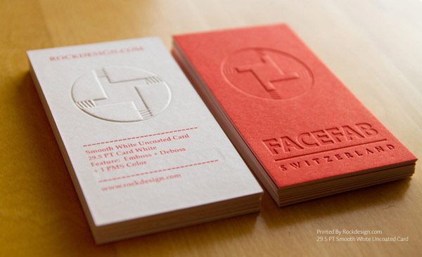
  • Exploration in terms of printing. There are many printing techniques that we might want to explore e.g. foil or  embossing. Paper from GF Smith can help me to find certain colours.
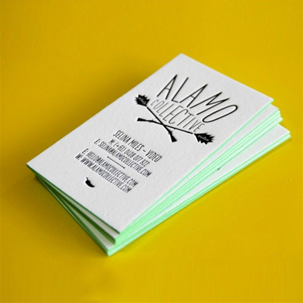
  • Business cards provide a sweet and nice application, it’s the first thing you might see of a person. The card can contain your logo, website, social media handles and email.
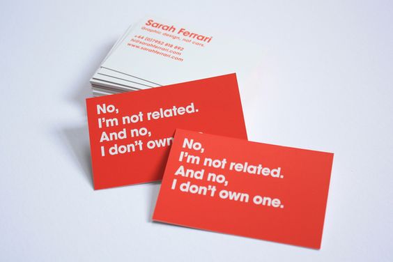
  • It can be conversational or ironic, it doesn’t need to be dull. For instance, Sarah Ferrari’s business card that plays on the awareness of her surname in connection with the popular car brand.
Sarah Ferrari’s business card
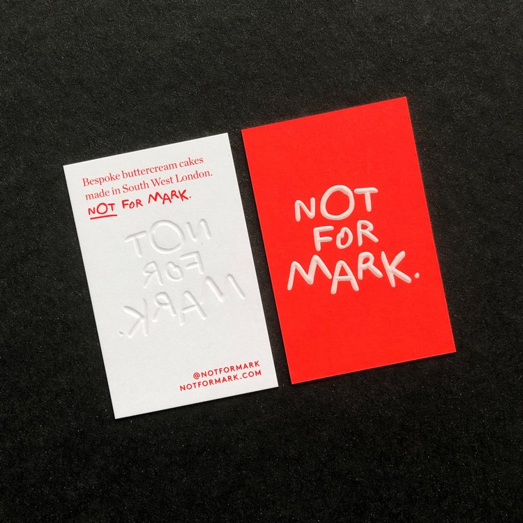
  • The card can be fun and start a conversation ‘nice to meet you’.  It Can include something that says something about you. A business card can give a strong message, making a promise to potential clients for instance.
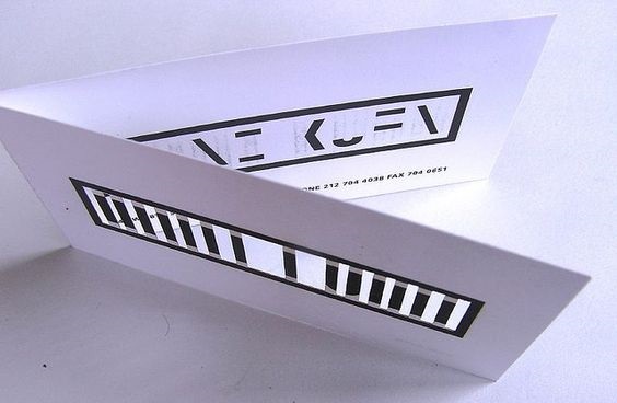
  • Anni Kuan- Sagmeister, this business card has been presented like a little leaflet. When folded, the message is completed. This concept also used on the envelope and letterhead.
Sagmeister, Anni Kuan

Printing Techniques-

Blind embossing/ debossing is an option. This involves not actually printing anything. Instead, the shapes are pressed into the material. We would need to use a thick card for this.

dot studio, white screen-printing and blind embossing
Stitch Press, blind embossing

Foil blocking – applying a hot foil onto the dye. Different colours, crafty

Foil blocked business card, Rheannon Cummins. She has use recycled grey board which was sourced locally. Sustainable options might have compromised the design. However, paired with the shiny foil type, the 2 elements balance each other out.

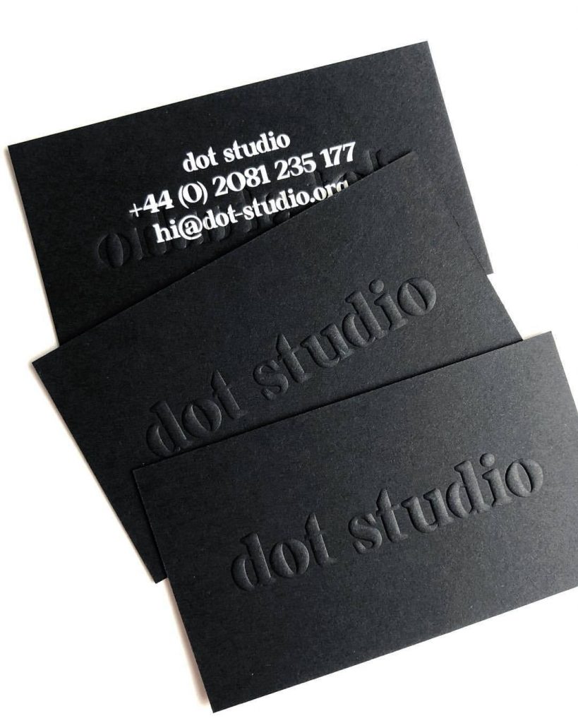
Duplexing and multiplexing sandwich business card pressing 2 cards together duotone- a dark side and a light side.

Mash Creative, foil blocked business card. ‘Duplexed business cards printed on 2 x 350gsm GF Smith Colorplan with white foil backs’
Multiplexing and duplexing from Dot Studio
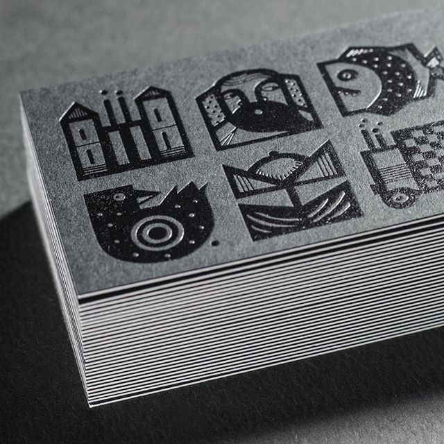
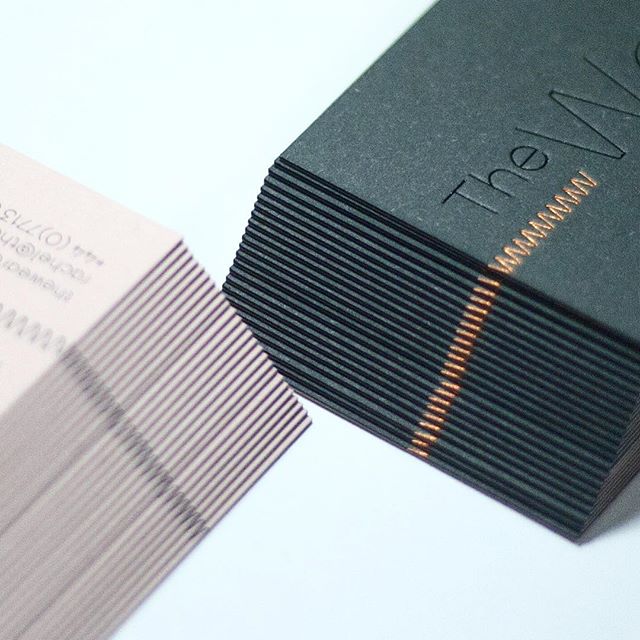
Colour edging, dye cutting

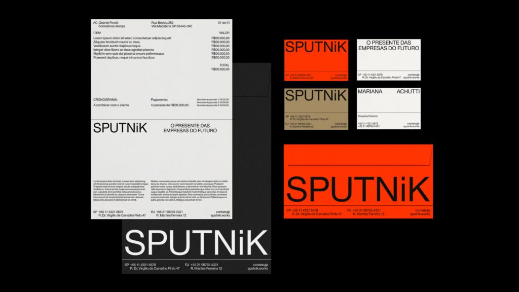
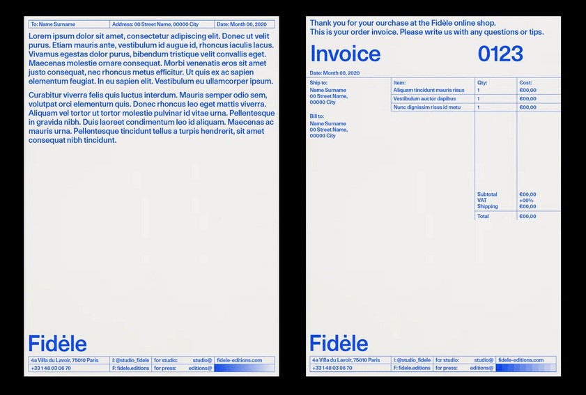
Business cards can tell a story, it’s a portable marketing tool, a glimpse into who you are. A good example of this is Sometimes Always Fidele identity. They have used a  risograph press to print this business card. The card then becomes a physical demonstration of the work they do.  

Sometimes Always, Fidele identity
Marina Cardoso, riso printed business card with a variety of designs on the back of the card. Printed in 2 colours.
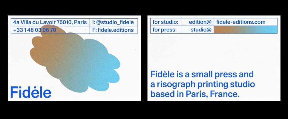
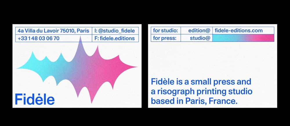
  • Another options is to design a series of cards- maybe with a logo variation, as Sometimes Always has done.  
  • It is good to be minimal with what you include. When a business card contains too much information, it looks busy and chaotic which is off-putting on such a small scale.The use of white space can help when designing a business card.
  • The standard size is 55mm x 85mm, leaving a margin
  • Use a grid, e.g. 8 x 5
  • The type needs to be legible and stand out after printing, one way to know this is test printing.
  • The information can be placed vertically or horizontally depending on your logo. Below is an example of vertical (portrait) placement:  
  • It can be fun to use elements of your logo shape throughout the design, for example using squares from your logo as bullet points to present the important information. This builds a coherent theme/style.
  • Think of hierarchy. By placing the most important information first, this makes the reader’s job easier.
Kiki Buchaniec

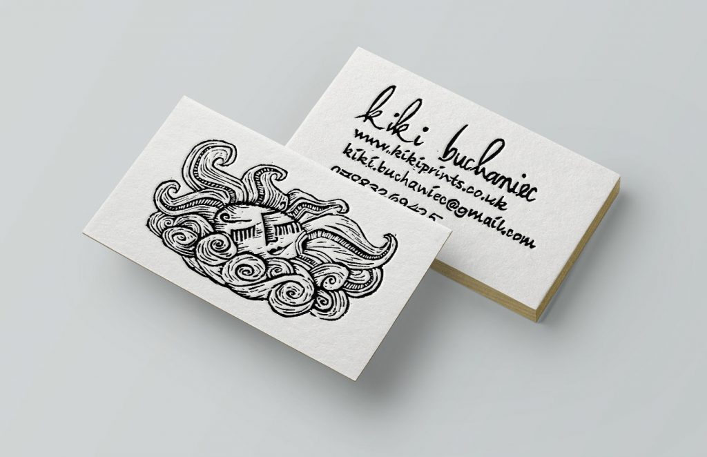
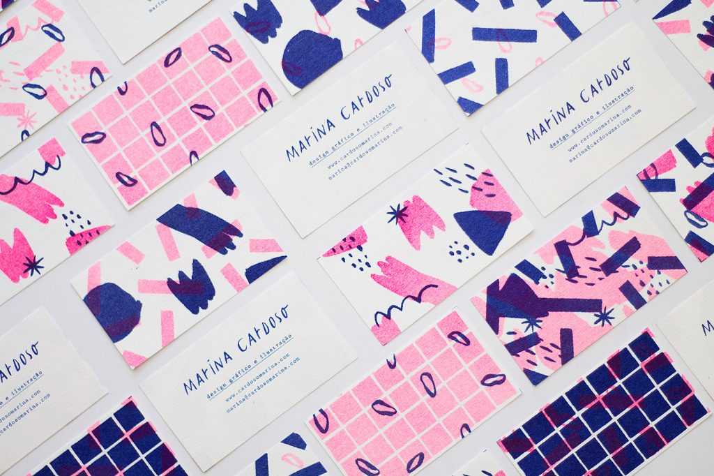
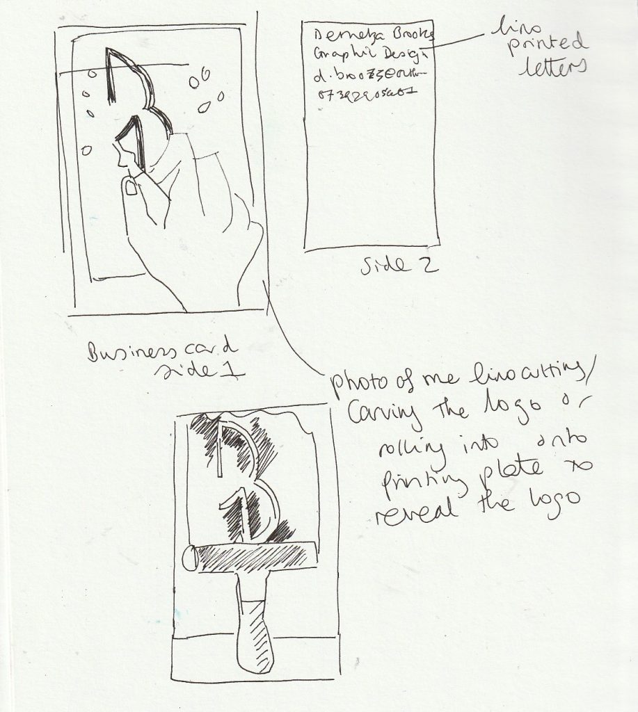
These business cards (above) were linocut. Her business is illustration, therefore making this technique appropriate.

CV/ covering letter
  • The most important information tends to be placed on header of the letter, but this isn’t always the case (See below, Sputnik identity).
  • The letterhead you design can be used on the template for the cv and covering letter.
Sometimes Always, Sputnik identity
For the Fidele identity, the contact details as well as the logotype have been placed in the footer of the company’s invoice template.

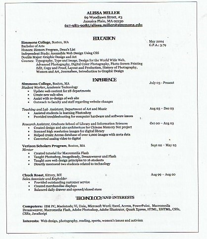
From Building Design Portfolios by Sara Eisenman:

One section of the book talks about designing a CV. In this example, the author compares a poorly deisgned CV alongside the improved version (right). I was drawn to the pop of colour and the clear sections. This makes it easier to read. As does the narrower lines of text compared to the first draft.

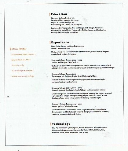
From Designers Identities‘ by Liz Farrelly:

I like the simplicity of this business card design. The designer is playful with her choice of orientation. She has placed the type at the centre on both sides of the card which makes the card uniform. I like her use of colour on just one side of the card. This makes it clear which side is the back.

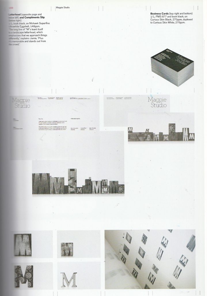
Magpie Studio have used photography in their business card to indicate the analogue technique used by the studio. This gave me an idea that I sketched in my sketchbook, where I could use photography to showcase my own printing process on a business card.

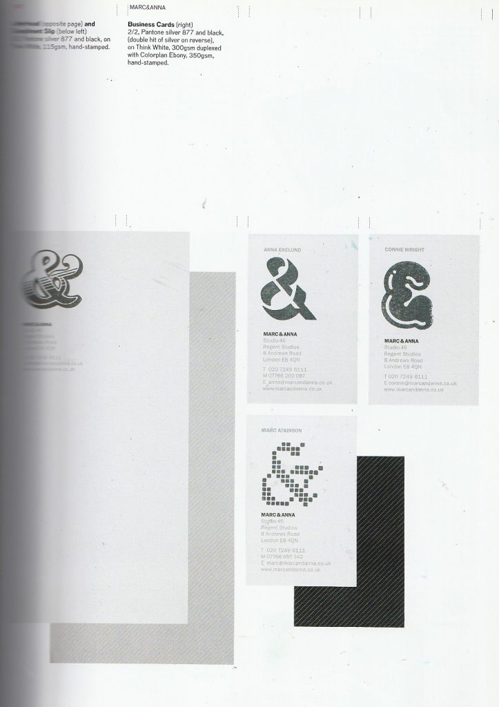
Marc & Anna. The designers have played on the ampersand in their name for the identity shown on their business cards. I like that the style of this symbol is varied but the impact is the same. This works because they have stuck with black and white for their identity; also because the rest of the design is kept the same, in terms of type and layout used.

Building a portfolio website

Week 6: Building a portfolio website using Cargo

In the past, I have experimented with several website builders as well as coding a website with HTML coding on a previous college course. In today’s workshop, we started with the platform Cargo and followed our tutor’s instructions to start to get to grips with how the builder works. This would allow me to later customise this template and build a website that is bespoke to me.

Portfolio websites

Websites that showcase creative work can all be presented differently. It’s good to have a look at these examples to see what is possible to create. I can look at designers I admire, industries and agencies.

When thinking about this website, I see the website as a frame. The focus should be on the work itself and ought to be interesting to look at overall. It needs to be functional and user-friendly. It doesn’t need to be complicated.

HTML (the Hypertext Markup Language) and CSS (Cascading Style Sheets) are two of the core technologies for building Web pages.

https://www.w3.org/standards/webdesign/htmlcss

Websites are responding to codes, HTML being the structure of the sire and CSS is the way it looks, such as image, colour etc.

HTML contains all the content: files, writings etc. In the past, this was very tiring for web designers to stylise as they had to write the code again and again. A combination of the 2 are now used: HTML & CSS.

We can view this coding on any webpage by right clicking on the page and clicking ‘Inspect’. We can then alter elements of the page to see how it would look. Below, we can see the webpage once we have selected ‘inspect’. The HTML code is shown at the top and the style sheet is under this.

Lydia Ellen Design

The structure can be simple and easy to navigate, such as Pentagram’s portfolio. Their grid shows the thumbnail images of the work.

https://www.pentagram.com/work

The website needs to say something about myself. The website’s call to action is to help people to make contact for work, Instagram, Behance, Linkdin.

Bad Studio
Cargo
Selecting the untitled, blank template.
This template works as a blank canvas for us to work on.
The design tab contains the options to set different styles for headings, body copy and smaller type.
By selecting the footer, I can choose what goes inside it. I can select a number of columns to place the text in. I can change the colour of the footer background and the text itself. I can choose for this footer to appear on every page of the website.
I can choose to fill the window with the backdrop wallpaper.
I can create separate projects and choose a thumbnail image for these separate projects. This thumbnail image will appear on the picture gallery.
I added internal links and external links within the site by selecting the text then selecting what I want the work to link to.

Photography Workshop

The purpose of today’s workshop was to explore using a DSLR camera to capture the physcial (printed) work we have made during this course. The focus was on how to be creative when taking the photos. I approached the images differently depending on the work in front of me. Working in pairs made the work easier as there was another mind to help problem solve, both with technical problems and creative ones.

  • We used an ISO of 100, as this is suitable for shooting indoors.
  • We shot in aperture priority (AV) mode, so that we could focus on the compositions rather than the technicality of a camera. This was useful to me since I have not used a DSLR camera in perhaps a year and needed to re-familiarise myself with it.
  • The aperture relates to the lens openeing being wider or smaller. A wider gap/lower aperture lets in more light, this is useful for portrait photography. It puts the focus on the foreground and gives a softer background.
  • We used a Canon 600D camera.
  • The shutter button can be used to demi-press and take full shots. The demi-press allows us to check our focus.
  • Using the screen on the camera means we can take angle shots without needing to use the view finder.
  • We need to format the card before using the camera. This ensures connection between the SD card and camera. It also empties the card before you use it.
  • The ‘Q’ button allows us to navigate the screen to change the ISO settings for example.
Working at the first set-up, I used objects to prop up my process book. This shows the spread at an interesting angle. Placing lights on one side gave the book an interesting shadow. This shows the book with a sculptural appearance.
https://support.usa.canon.com/kb/index?page=content&id=ART101719
  • We selected ‘large quality image’ (not raw). The symbol for this (shown above) looks like a ‘DL’.
  • 0 exposure compensation
  • Spinning the wheel changes the aperture
  • Shooting in raw is required when working with really big, high quality images. They are however, a slow doc to work with. The colouring is more precise than a jpeg.
  • A photo taken on a DSLR camera will always be a higher quality image than one taken on a smartphone.
  • AWB = automatic white balance. White balance helps to colour correct any temperatures you’re working with. We can change the settings to tell the camera you are working with sunlight for example. To correct yellow light tungsten for example.
  • We can create creative filters using just white balance.
  • AF = automatic focus
  • MF = manual focus
  • Live screen view mode allows you to see how your settings are applying.

Photos from the workshop:

Continuing photography at home…

I experimented with different coloured grounds
Lighting and back-drop set-up