Logotype: Modular Typography

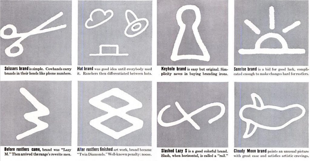
Definition of Modularity (From the Cambridge dictionary)

the quality of consisting of separate parts that, when combined, form a complete whole.

In terms of design, modularity is a principle that helps manage content- it’s repeatable because its made from 1 module.

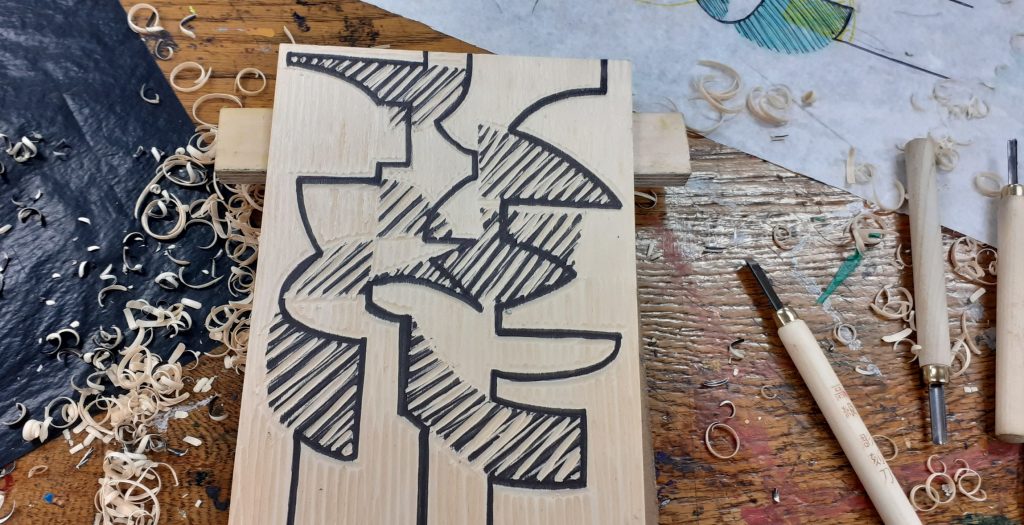
In the modular & matrix writing workshops of module 5002, I learnt to work with the restrictions of using a limited selection of shapes to compose letterforms. It was more challenging than I thought it would be. I found myself accidently breaking the rules. Because I was using paper, scissors and glue, it was possible to break rules. In today’s digital workshop, this wasn’t possible.

Other posts where I explore modularity:

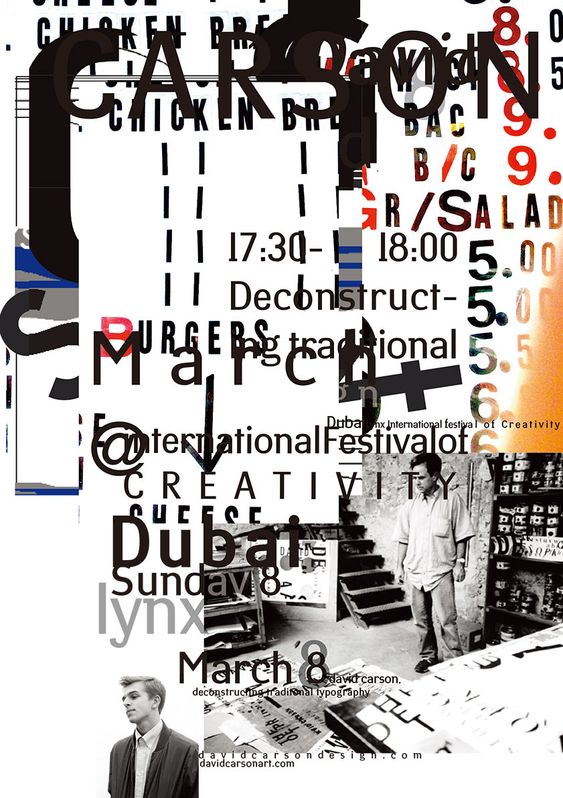
Project #4 Drawing with a Grid
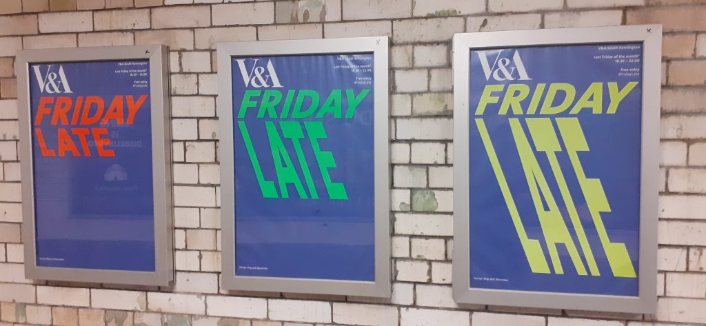
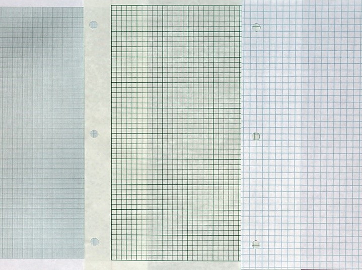
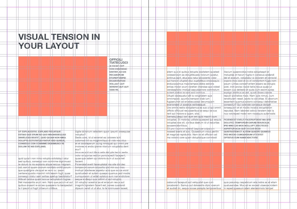
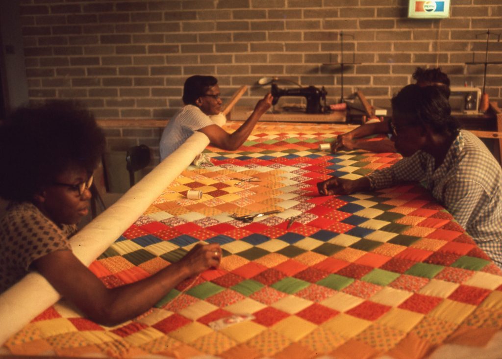
Grid Systems

Examples of modules

In today’s lecture we began by looking at examples of modules we are used to seeing in the world around us.

  • In pixellated photos, every cell is a module.
  • Graph paper consists of equally spaced lines, therefore squares.
  • In book design, the use of the grid makes an editorial layout an examples of modules.
  • Quilting Bees- popular in mid-late 19th century, mainly women, building a quilt together, creating a sense of community. Everyone expressing themselves via these individual squares. The pathwork designs are modular.
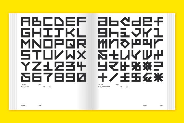
Modular Typography

Using a modular structure helps with decision making, as it gives some guidance to the designer, by providing limitations. Grids can start the creative process of the work, then you can focus on shapes, colour etc afterwards. It is 1 useful approach for designing logotype.

Arim Hofmann

Swiss designer, Arim Hofmann wrote a book about graphic design guidelines, called Graphic Design Manual, Principles and Practice. It was published in 1965 and outlined rules such as structure, form and line.

In his work, he demonstrated how many variations could be created with the single same modular, just changing positions.

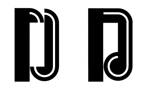
The examples below are of typography that used a modular grid to compose. This is seen in the way the letterforms ‘fit’ together in the (left) example. The letterforms on the right combine wider horizontal strokes and thinner vertical strokes. This would indicate a grid that has narrow vertical columns and wider horizontal grid lines.
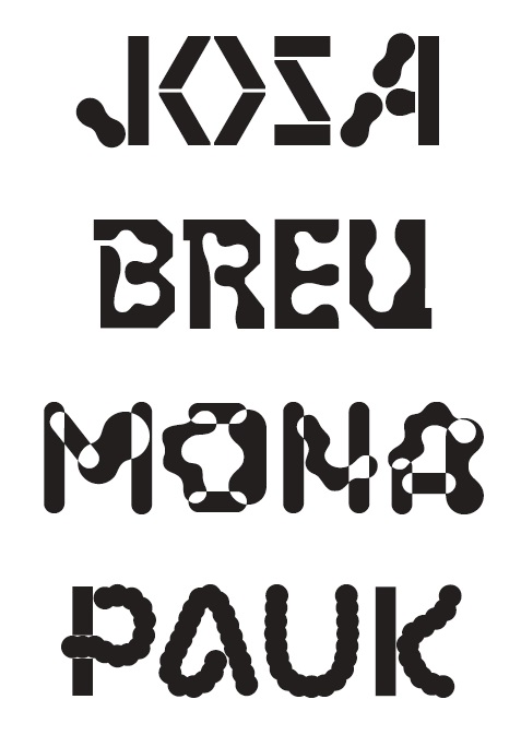
Karl Nawrot

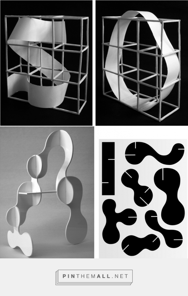
Nawrot’s type design took inspiration from architecture, including in the way he worked on the designs. This was to use physical materials to build a structure, which he then drew letterforms (below, left).

Another method of his experimental typography was to create 150 different stamps and apply these to the same grid.

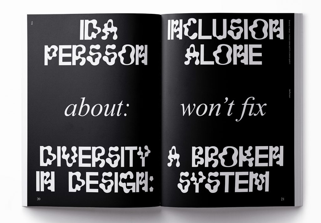
Nawrot names four of his typefaces on members of the Bauhaus school (below, right) : Josa (Josef Albers), Breu (Marcel Breuer), Mon (Lazlo Moholy-Nagy) and Pauk (Paul Klee).

Item Magazin Issue #4 ‘Strip’ Emilia Moro, Dylan Demtröder

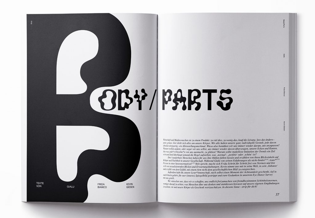
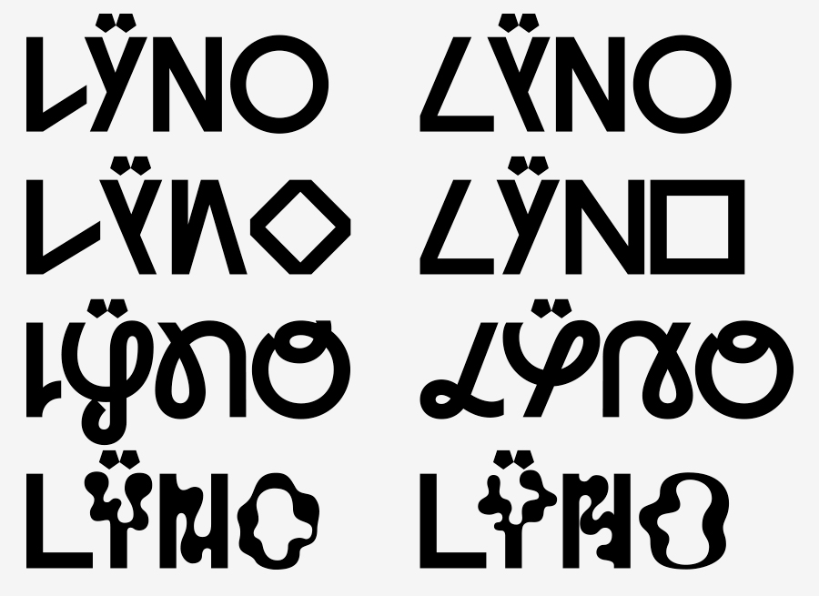
In this issue of the student magazine, Item, the students were working with the theme of ‘strip’. Here, Moro and Demtroder have used Nawrot’s typeface Lÿno (co-designed with Radim Pesko.)

Item Magazin Issue #4 ‘Strip’ Emilia Moro, Dylan Demtröder

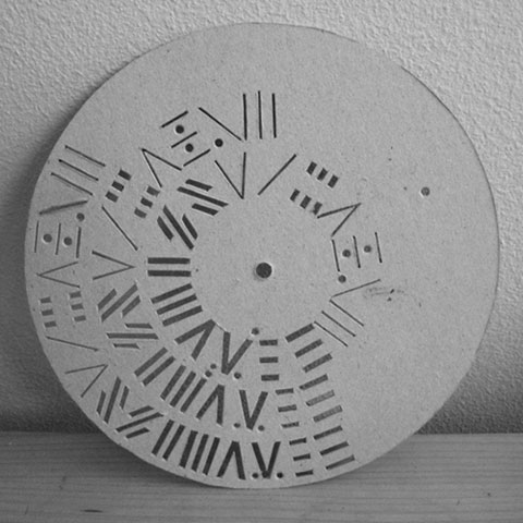
An example of a ‘stencil wheel’. Nawrot used these stencils to design letterforms, adding to them during the design process.
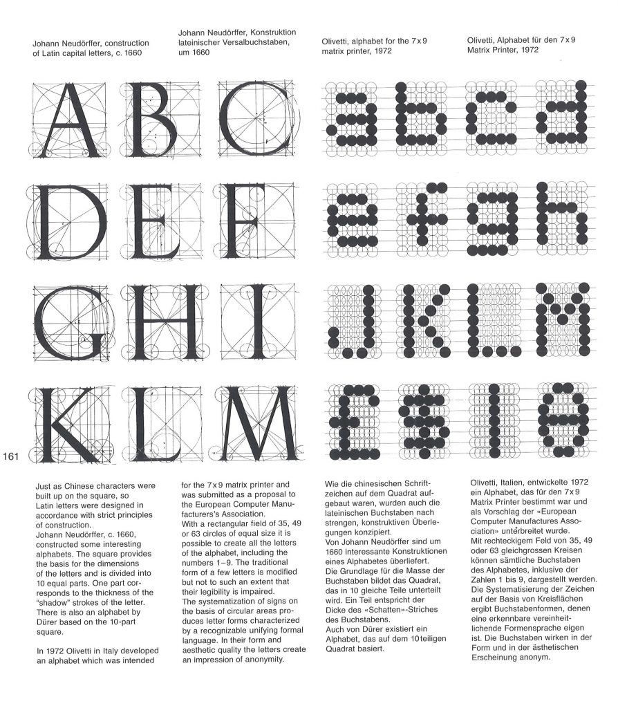
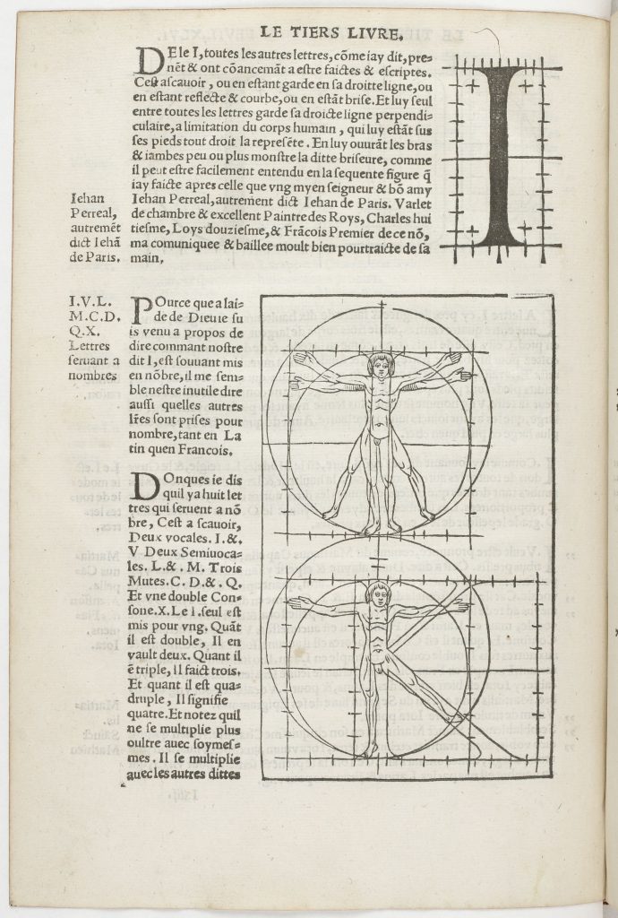
Albrecht Durer

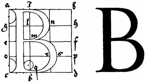
In the 16th century, Durer designed modular type based on human proportions.
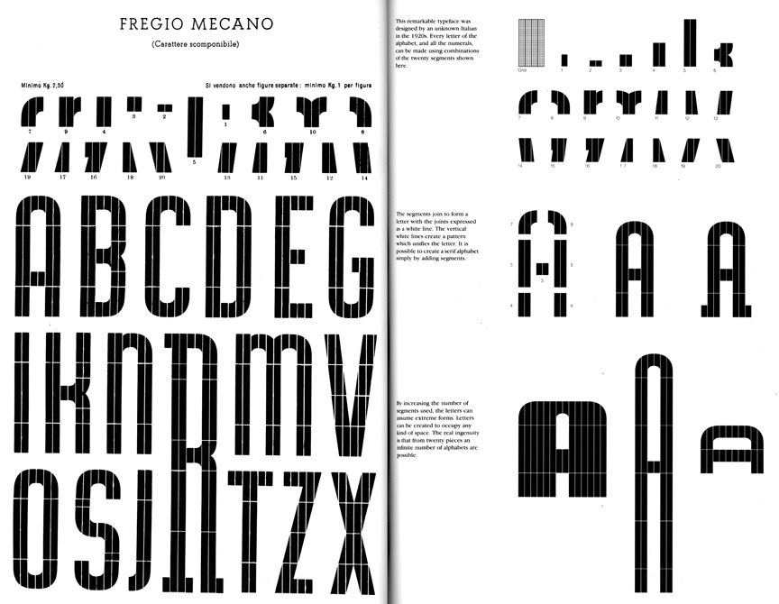
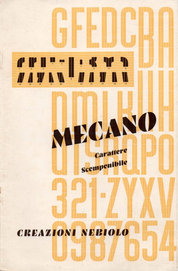
Fregio Mecano

This typeface was designed by an unknown designer in the 1930’s. It was made using the 20 components shown below, right.

These 20 pieces were found in the Nebiolo specimen from 1939.

Nebiolo Mecano 1940s
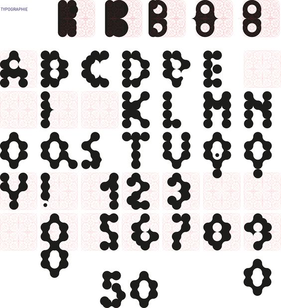
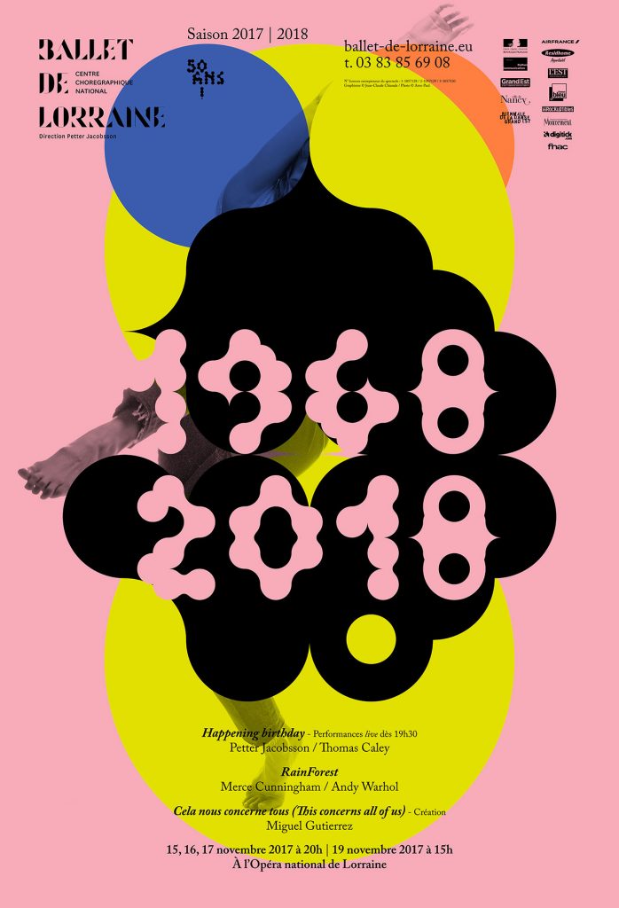
Jean-Claude Chianale

Design for a ballet identity system. Chianale has used an interesting grid when composing the letterforms:

The type applied to the poster design:

Jurriaan Schrofer

Dutch graphic designer, Schrofer’s dot matrices and sqaure grid system were progressive at the time and influence the way we approach type deisgn today.

Juriaan Schrofer (1926-90) The book, designed by Spin brings together a series of commercial and experimental projects from Schrofer

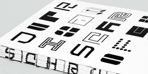
‘Writer Frederike Huygen, who provides an essay for the new book, describes Schrofer as ‘a computer-designer before the computer’.

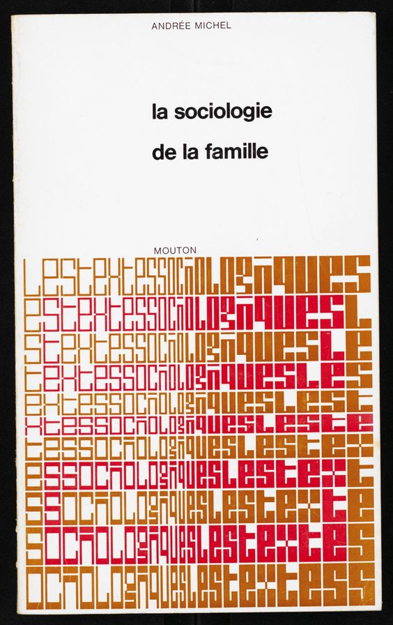
Schrofer designed the book covers for Les Textes Sociologiques in 1970. Typeforms are used in an illustrative way. The underlying grid creates a gradient pattern across the type.

Wim Crouwel

Crouwel’s typeface New Alphabet was used by Peter Saville for Joy Division’s album cover:

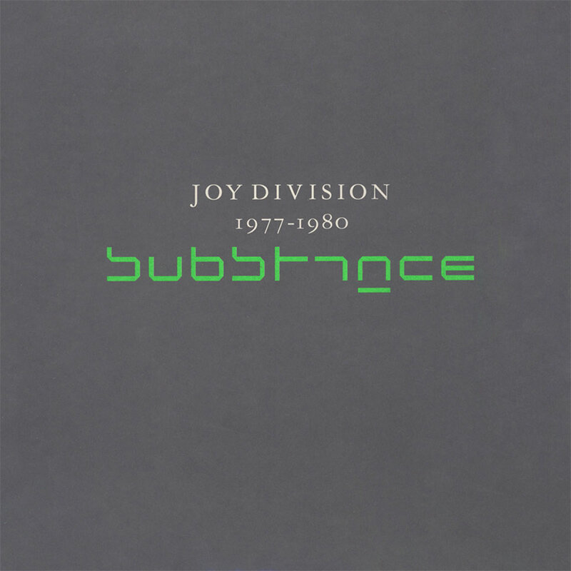
When New Alphabet was first used, it was found illegible/ inaccessible for people. This modular typeface was adapting to the first digital screens, giving it its geomtric appearance.

Architype Stedelijk was the typeface he used in his well-known poster for the Stedelijk Museum in Amsterdam. Interestingly, he kept the grid visible in the poster:

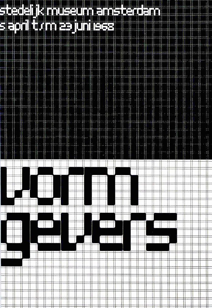
I like the Architype Stedelijk ‘a’.

Crouwel’s sketches, using grid paper to plan his letterforms.

The title for this poster has a uniform appearance, from its use of an underlying modular grid. There is a satisfaction to the neatness and logic of it.

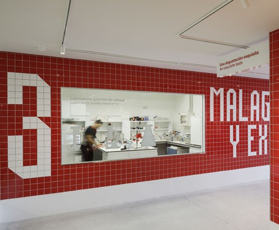
Mario Eskercezi Studio

Typeface/ identity for the Victoria Brewery in Malaga. Since there a lot of tiles in the city, the designer took the environment as inspiration when designing the modular typeface for the beer advertisement. The grid pattern is also used in the background of the poster which provides a ground for the type to sit on.

The type could then be used within the environmental design, since it could be easily made up of equally sized tiles.

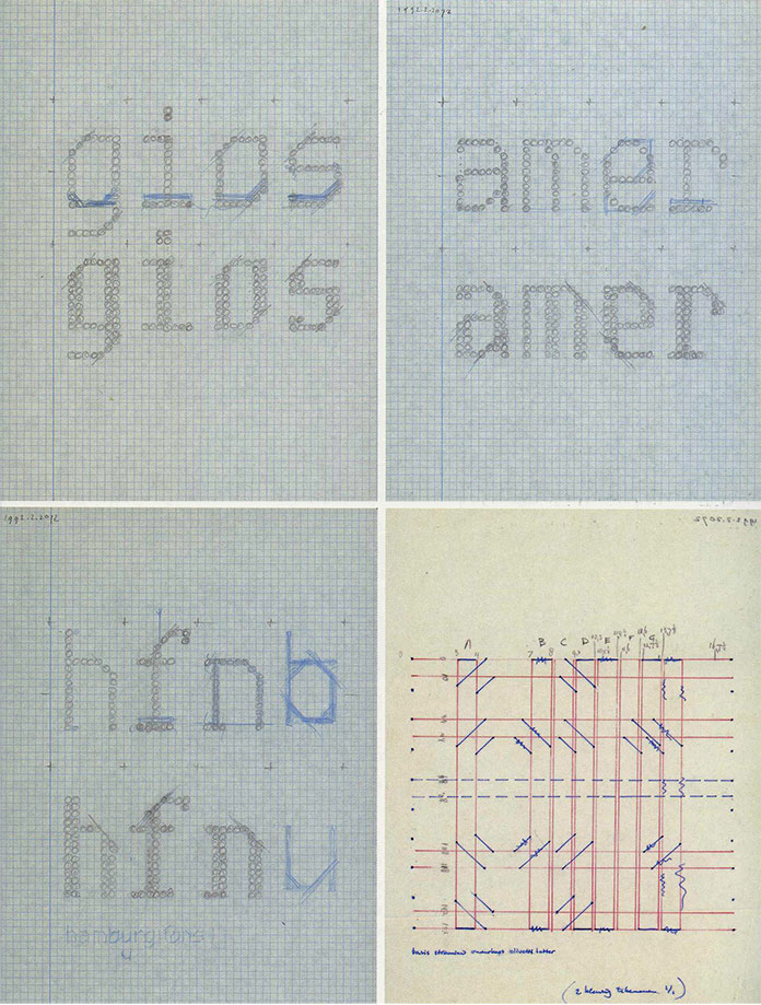
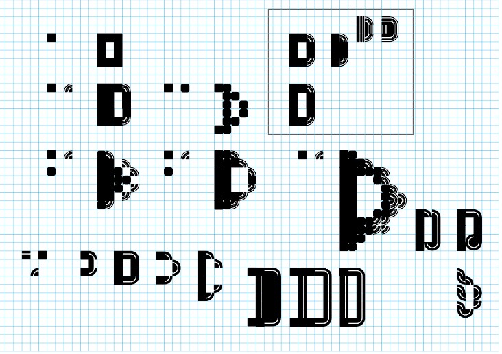
By designing our own grid, this will determine the design of a unique type. A possibility is to make our own grid- rounded. However, for today’s workshop, we were provided with a grid designed by our tutor. Below is the grid I was working with. The designs in the square were worked on by my tutor, I kept these for a reference to look at.

Illustrator Workshop

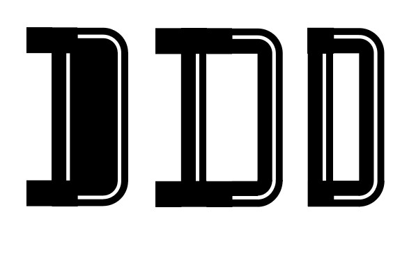
I ensured snap to point and smart guides were on. This helped when working with the grid. But even so, I still found that the shapes didn’t always fit exactly into the grid squares.

Effect> distort and transform makes shape imperfect to use in modular. (I didn’t use this effect today but I would like to try it in future practice).

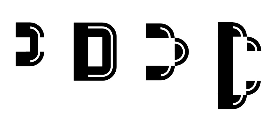
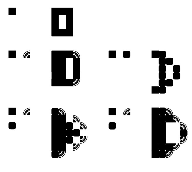
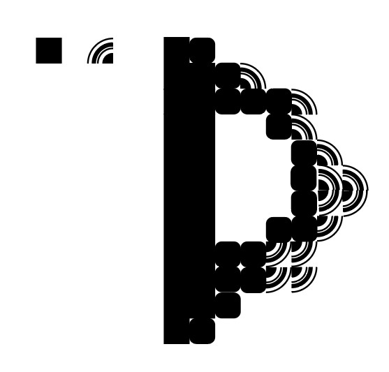
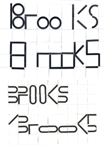
Results from this workshop:

Using 3 different shapes.

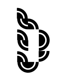
Using 1 shape to create a curvy, twisted letterform.

3 different shapes.

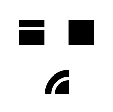
The 3 shapes I used to design the letterforms below:

Creative Journal: January 2023

You should as a creative person constantly experience as much as you can so that when a brief comes you’ve got some inspiration already. The whole world gives you stuff to call on. Immerse yourself in the world of culture- both high and low.

Liam Gibson, art director

Happy New Year blog readers!

We are now reaching the end of January and it has occured to me that I can’t not record my creative activites and inspirations from this month. I will be reflecting and collecting my ideas in this blog post.

Ideas and inspirations are likely to float away if I don’t make an effort to catch and record them. This is a lesson I learnt during semester 1 of this academic year.

I’ve began a physical folder of collected printed material. It’s being filled with anything I like the look of. This might be the technique, material, colour or typography. Why didn’t I do this before? I didn’t know I came across so much printed material in my every day life, but this has been disproven. It’s filling quickly!

Printmaking

This month, I’ve been excited to start a printmaking course at City of Oxford College. I’ve decided to create a separate blog post for the coursework progession. Expect to see this in February.

Wood carving this month at City of Oxford College
Embroidery

I’ve picked up another hobby and with some regret- it’s an all consuming activity! Hours go by in a soothing hypnotism.

In my first project, I used satin stitch on a canvas paper. This stitch is used to fill in solid areas of colour. It isn’t a stitch I was confident in beforehand. With practice, I found the number of threads used in a single stitch made the greatest difference:

Beginning satin stitch

I am experimenting with different ways to fill in the areas, between solid single colours and varying the colours in an area. Also varying the direction of the stitch shows me what difference this makes to the overall piece.

I was inspired by the hand-lettered type used for posters by Sam Piyasena. I based this embroidery piece on What the World Needs Now. I used another designer’s design because I’m only at an emboirdery level of a beginner and therefore needed to practice the stitches before working on my own designs.

Further practice, following instructions from this youtube video.

This traditional practice allowed me to explore the various types of stitch (I can’t remember their names.)

Sketchbook Update

Recently, I’ve been mainly using my sketchbook to experiment with mixed media.

1 – Mark – making from printing ink and cut – out collage pieces

Below, I used scraps of paper from a printmaking session where I had placed the inky brayer down and accidently made these markings. I liked the textures so much that I thought it a shame to throw them away. In my sketchbook, I combined these marks with images from a magazine.

2 – Acrylic paint and cut-out collage pieces from magazine

3 – Exploring the concept of home

What makes a home? Is it simply the space you occupy.

Furniture pieces dissasembled and reassembled. I used white acrylic paint to represent spaceand the newsprint transfer technique. I used thicker paint for this piece.

4 – Trying this technique again with a thinner coat of the same paint

A thinner coat of paint transferred the newsprint more effectively. The aim of this piece came from a set project in the book Approach and Language, Ambrose/ Aono-Billson. The purpose was to create an image based on a set word-pair. This pair being ‘Hair-Suite’. When considering this brief, I looked at the different definitions of ‘suite’. A musical suite is a collection of musical pieces written to be played in succession. I followed this idea.

I used stitiching, collage and paint to illustrate a woman considering different hairstyles or reflecting on the various hairstyles she has had or will have.

Life Drawing @ Thursday Night Life

It was a pleasure to join the sketchers at Magadalen rd studios for the weekly drawing session. The studio had a warm and friendly atmosphere; providing boards, easels, advice and biscuits! I would highly recommend this group to anyone. I again used a mixture of materials to depict the model (who was impressively still). This is my usual method of switching up drawing tool constantly. I now wonder if this is a way of me avoiding dedication to one tool and stitcking with the challenges of that material. I usually like to see my drawings in different colours and textures out of curiosity.

Creative Writing

Hidden Spire is a creative collective based at Arts at the Old Fire Station in Oxford. For the first writing session, we took inspiration from the poet Marechera. I prefer appreciating and analysing literature than writing itself. This is only because I don’t feel talented or confident in my own writing. I was impressed to hear the prose poetry written by my fellow group members. Their individual voices came across and each with a different message to share, despite being given the same brief. Being part of a group discussion is something I greatly enjoy.

We looked at segments of Marechera’s work (below). I noticed that he expresses a state of day-dreaming which suddenly collides with the reality around him. This conflict seems painful for him. I like the clear imagery and honesty in his writing.

70’s song lyrics (David Bowie and Prince) helped to inspire us and get our minds into the era when Marechera would have been writing.

For encouragement, we were told to ‘write anything’. This helped me let go of self-critism. (Below) pages from my sketchbook.

Human Animals

Donna Mann’s exhibition at the Old Fire Station gallery captured my attention. Can you guess why? …Mixed media.

This show expressed our interconnectedness with all of life. I liked the element of things being hidden and things being revealed across the space. I felt that I was seeing the expression of life within its smaller details, such as the moth. My eyes made connections across the various elements of life that were placed beside one another.

The carbon of the stars became life on earth. Mann’s installation traces an exploration of healing, friendship and transformation.

Carbon love.

From dark matter to light.

Arts at the Old Fire Station
Victoria & Albert Museum

I took a trip to London and headed for the V&A for the Beatrix Potter exhibition. I took photos of the posters along the walls in the tunnel betweeen the underground and the museum. These are the designs that most appealed to me:

The V&A has a photography section which I visited first. From having completed the Exhibition Visual System module last semester, I took notice of the design of the exhibition. For example, the metal type used for the title of the exhibition (below). This was a perfect choice, since the exhibition focuses on industrial photography.

Artwork by Donna Ruff

Photos from the Beatrix Potter exhibition:

Graphic Design Reading Material

Reading novels is an automatic activity for me. (If you’re wondering, I finished The Buddha of Suburbia this month and have moved on to Mary Shelley’s Frankenstein)

But this month, I have intentionally made more time to read a small selection of the many graphic design books I have laying around. Reading them carefully instead of dipping in at random allows me a greater understanding of the subject and helps me pick up ideas I would have otherwise missed. Reading about specific designers, their work and methods gave me the most satisfaction.

Wolfgang Weingart

The radical father of the New Wave movement, Weingart taught his students to move beyond the rational swiss typography of the time. ‘Weingart reacted to existing standards by pushing typography to the limits of legibility and beyond.’

Wolfgang Weingart
Crystal Goblet Analyogy

The essay The Crystal Goblet by Beatrice Warde is an articulate piece of writing describing good design. Warde illustrates this idea using the metaphor of a wine glass. She suggests that we use a wine glass to be able to see and therefore appreciate the appearance of the wine as part of its enjoyment. An opaque cup would hide the appearance. Good design highlights the message and content. A well chosen type means we wouldn’t notice the choice of type. An ill chosen type would stick out awkwardly.

Poster, Ausstellung Europäisches Kunstgewerbe (Exhibition of European Applied Arts), 1927; Herbert Bayer; Lithograph;

I really like this bold and obvious use of the modular grid.

Fabien Baron

Editorial design in different publications. I really like his use of type and the way it merges into being illustration as well as the heading. Images from this page.

Rachel Anderson

Rachel Anderson is a young designer based in Florida. I like her designs based on the work of Tibor Kalman. The design was inspired by his work.

Thirst/ Rick Valicenti

Rick Valicenti’s design combines the weapon and the effect of violence in these powerful images using skulls.

Stop the Violence (book and trailer) by Rick Valicenti

Visual Systems – Week 1

Year 2 – Semester 1 – Week 1

Finally, summer 2022 is over and we are back to university. To kick off year 2 on this Monday morning, Noemi has introduced us to visual systems.

During her presentation, I was reminded of the module from 1 year ago where we explored mapping. In that module I produced a map of my journey through the town. I represented this data with a series of photographs, arrows and a list of sounds, sights and smells I came across in written form. However, the two pieces didn’t work well together. Instead of being 2 halves of one map, they came across as 2 separate maps of the same data. I will be bearing this in mind when producing work for this module.

In this module, the deliverables will be a process book documenting the workshops and a set of A3 posters which explain a visual system.

In this blog, as with last year, I will be going into more depth as well as reflecting on my experience. Let’s do year 2!

An Introduction to visual systems

Today we began to think about data-capture methods. As a group we discussed visual systems as being:

  • Standardised
  • (an example being the alphabet)
  • sign system- part of a language that everyone can understand and find the meaning
  • a set of rules to guide people – this avoids wrong interpretations
  • Systems are a big part of graphic design, they communicate a set of information. They need to be comprehensive so people can understand them.
  • Efficiency. A set of rules makes the work more efficient. Using a common style makes sense because different people will be working with the grid system/ information.

An example of this is cattle branding. Cowboys would mark their livestock (cows or horses usually) with a brand. Each owner would have his own unique marking to indicate that the animal belonged to him. An unmarked animal would appear to belong to nobody. (Fun fact: Mavericks were people who refused to brand their animals).

“As with consumer brands, cattle brands must be simple enough to be recognized, but complex enough not to be changed – a P into a B for example, which was very common. Counterfeiting and theft are still happening and farmers need to increase their efforts to brand their cattle.” “Drawing a parallel today, wearing brands on our clothes or on everyday objects, we may wonder if we have not become the herd of modern cowboys

https://www.grapheine.com/en/graphic-design-en/hot-iron-cattle-branding-brand-on-the-skin
Typographic grid

A typographic grid is something I have explored in Project #4 of the summer project. This is a system because each different letter is created using the same grid. (see below example)

Nigel Cottier- Letterform Variations

A system helps you manage a collection of information and unifies the different components. This makes it easier when needing to communicate information to an audience.

2000 en France

For the millenial celebrations, a programme of events titled ‘2000 en France’ was organised. A visual identity was designed for the programme by Integral Ruedi Baur et associes.

This visual system is based around a swirling shape surrounding a circular image at the centre. The designers were able to keep this structure and font the same, whilst changing details such as colour, image and the words themselves. This allows flexibility. Flexibility means lots of layouts can be created from the same elements.

There needs to be common elements across the system to keep consistency.

Visual identity for 2000 en France, the design allows flexibility by keeping some elements the same.

Isotype system

I have spoken about the Isotype system in my previous post here.(insert left to right post)

This system functions like a language/ an alphabet that everyone can understand. Just by looking at an Isotype image, they can see the data through the pictograms. This is what makes it effective, as it can function across language barriers and levels of cognitive ability.

https://eagereyes.org/techniques/isotype

Visual systems require people to share them and they need to be able to be accessible so everyone can understand them, otherwise misunderstandings happen.

Transport systems

Visual systems help to navigate complicated or chaotic information, for example transport systems, which can be hard to understand because of the number of routes and destinations in a sometimes small area. The London Underground map as we know it today was designed in 1931 by Henry Beck. Geographically it is less precise than previous versions, but it is more effective as a visual system because it is laid out like an electrical system, with right-angles. The stations are not the correct distance apart, they are spaced further in order to be easier to read. This design solves a problem.

1933 pocket map of the London Underground

The new map was colour coded and used verticle and horizontal lines. The use of spacing made the map clearer.

As a designer, your job when applying a system is to decide whether to be selective with the information and possibly simplify things. We need to consider our responsibility– the system is to be used by many different people to help them get to where they need to be, for example.

A visual system can allow durability– it can last many years- optimising a few elements, for example the New York subway system hasn’t changed much from 1960’s – now. Massimo Vignelli and Bob Noorda took inspiration from the London Underground system when they designed the New York subway map.

Before it had been chaotic to navigate the subway. When setting up the graphic language, Vignelli and Noorda spent time analysing the underground system. This analysis informed the design.

From A Century of Graphic Design by Jeremy Aynsley

The UK transport sign system was designed by Jock Kinneir and Margaret Calvert in the 1960’s.(Some examples of which are displayed at the Design Museum in London.)

Before this system, there was no standardised style, it was messy and confusing for road users. Many colours and proportions were used but now the sign system is still in use because of its effectiveness.

When Kinneir and Calvert were coming up with this system, they devised a new font specifically for use on road signs. They tested this font extensively to ensure it could be read from afar.

From A Century of Graphic Design by Jeremy Aynsley
Modernism

Lester Beall Rural Electrification Administration poster

Paul Rand film poster

Human Rights Week by Saul Bass (UNESCO, 1965). Poster

The Modernist style came about after the 2nd world war. Visual work such as poster designs from this era optimised the grid. They were easy to digest because the eye is directed around the page to the important information. The posters contained simplified graphic elements which are visually appealing and fun, in my opinion. The designers used minimal colours.

Post-modernism

When entering the Postmodern age, designers felt that the grid was constraining and they rejected the ordered layout of Modernism. Instead, their work expressed freedom and joy. One example is David Carson-

David Carson’s work is its own system because it’s in his own style of graphic design. You can see it is his work because the same elements are featured, for example layering, rough edges, repetition and the rejection of the grid.

Designers then began to move away from Postmodern approach, around 1995. They felt the style was too chaotic and lacked control.

We can see a kind of circular movement in graphic design, where designers went backwards to take some inspiration from the designs that started graphic design in the first place- the Modernists.

Andrew Blavelt is a designer, educator and writer. In this time period, he began to ask the question, is there a way forward? It became apparent that systems are applied to give control and that there was a necessity to apply rules. Modernist posters are similar to sign systems this way, since they follow certain rules.

To summarise, we came up with a list of variables that are important to consider when designing a visual system:

Workshop: Data Visual vocabulary

The group took part in a workshop focused on 8 emotions. The purpose of this workshop was to get used to the idea of visually representing something that doesn’t exist physically. We used pencils/pen on paper. This was the perfect exercise to kick off the new semester and get us thinking creatively.

For the 1st sheet, the focus was on shape. I needed to think about how I could optimise the same shape in 8 different ways to express the emotions. In some ways, the restrictions made this exercise easier. I found it more challenging to consider colour as well as texture and shape all at the same time.

Using a square, I aimed to express the 8 emotions.

Anger – repeated squares expressing the way your thoughts race when you feel anger. Many thoughts layering up.

Fear – A small square that has sunk to the bottom of the page in an attempt to hide.

Happiness – Bigger and bolder, taking up space, drawn with a confident line.

Sadness – The sad square has also sunk to the bottom, but unlike fear, it is heavy and therefore has a thicker line.

Love – Love is a feeling of connection to other people, in my opinion. Therefore I drew 3 square in a row, they’re on the same level and they’re connected.

Confusion – Confusion is several floating squares that have no direction. They’re moving and lost.

Calm – Calm is an openness and also light which is why I used a lighter line.

Embarrassed – I repeated 3 squares to represent the shifting and stumbling around of a person who is embarrassed and doesn’t know where to look or what to say.

The 2nd exercise focused on texture and how different textures could express different emotions. I used line to express the emotions and varied how the line was used. A thicker and zig zagged line expresses anger because of the boldness anger brings you. The curved and soft line represents a calm breeze perhaps.
  • I chose to use the triangle as the basic shape to work with, manipulating it so that it fits each emotion.
  • I used grey for ’embarrassed’ and ‘sadness’ because both of these emotions resemble emptiness or a hopelessness, in my opinion. I rotated the triangle for ‘sadness’ because when I’m sad I feel as though ‘something isn’t right’ or is ‘off centre’. When I feel embarrassed, I want to make myself as small as possible, so I drew a very small triangle for this emotion. I accidentally drew ‘sadness’ twice, for the other version of ‘sadness’, I used blue to represent ‘feeling blue’ as the common phrase goes, and warped the triangles so that they are softened and represent tear drops. I think I should have also drew them pointing inwards to express the way we feel like hiding away when we are sad.
  • ‘Anger’ and ‘fear’ are both panicky emotions in my view. Therefore I used the colour red to represent the quality they have in common. I used the triangles to be small and spikey for ‘fear’ to represent how the heart rate quickly rises and falls. The triangles point outwards for ‘anger’ because of the sense you are ready to ‘attack’.
  • I repeated the triangles for ‘confusion’ and had them pointing randomly. This is to express your thoughts when you are confused and don’t know what direction to focus on. I coloured them black because of when you are ‘in the dark’ about something, it means you are lacking information. This could make someone confused.
  • I widened the triangle for ‘calm’ to express that melting feeling you have when you are relaxing. Green has been proven to be one of the most relaxing colours which is why some waiting rooms are painted green. I repeated the triangles moving outwards to create an effect like rays of sunshine or calming beta rays.
  • ‘Happiness’ is a straight-forward yellow triangle that shines brightly. It’s warm and bold with an open-ness at the centre, since people who are happy are usually generous and open to expressing themselves as well as having empathy to others.
Looking at the class’ work all together allowed me to see other ways of interpreting the same emotions visually.