Screen-printing & Gestalt Theory

The Gestalt Principles | Basics for Beginners – YouTube

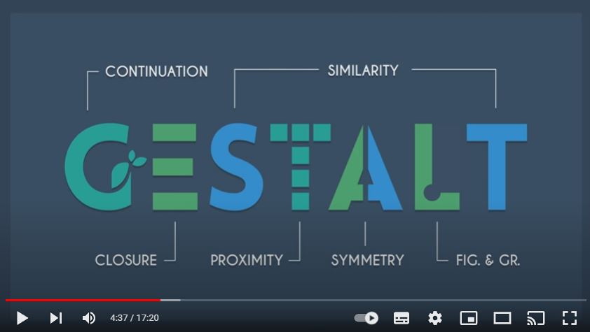
I was curious to learn about Gestalt theory, as I had heard of it but didn’t understand what it was about. This video from YouTube, was the most helpful resource I could find to explain the theory to me. In the video he explains how when we look at a picture, we perceive the elements as one image, even though a picture is made up of separate pieces.

From the book Introduction to Two-Dimensional Design by John Bowers

Some Examples:

Gestalt theory Proximity.

In this artwork by Emma Davis, the elements are placed closely together. This means they are perceived as a group:

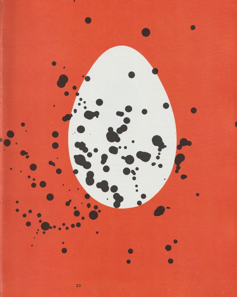
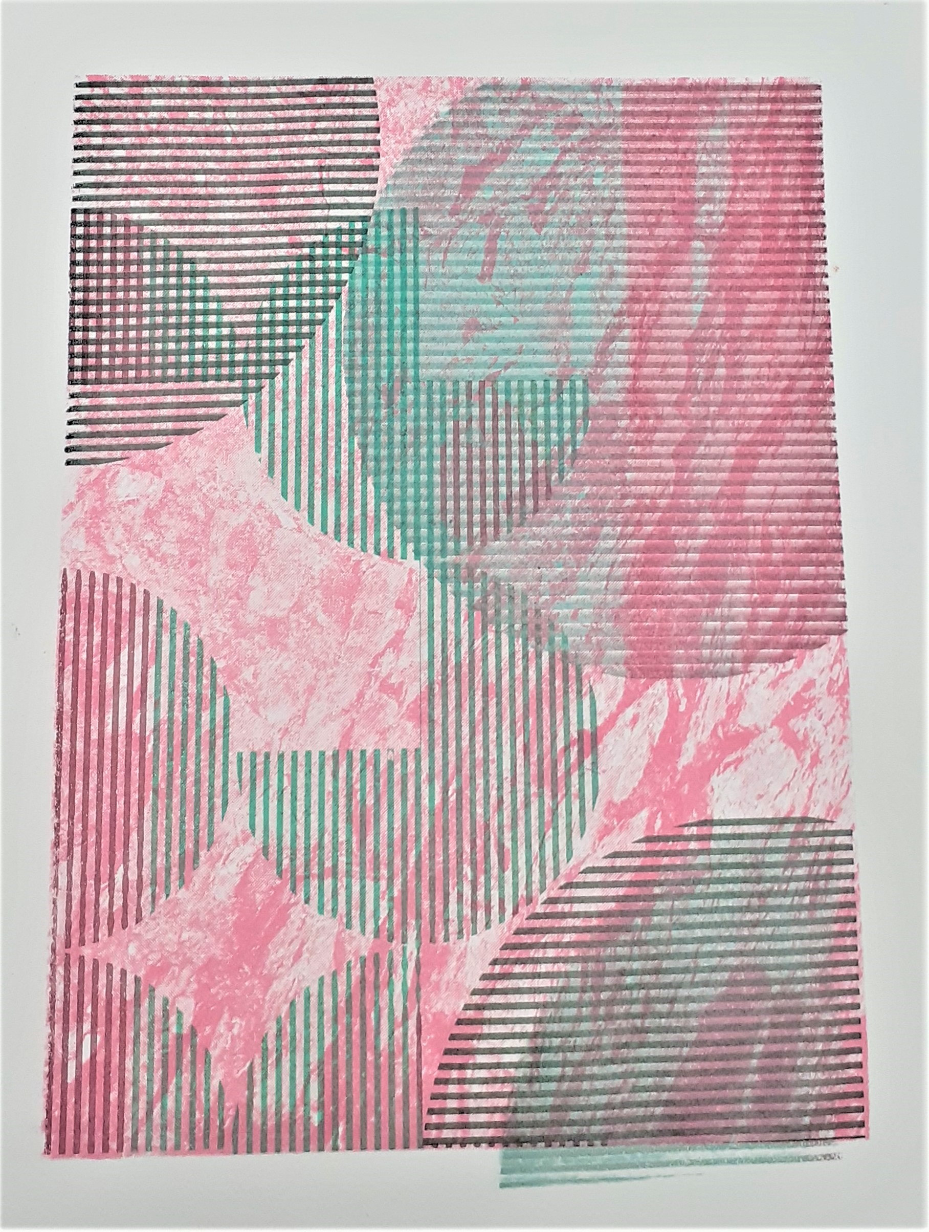
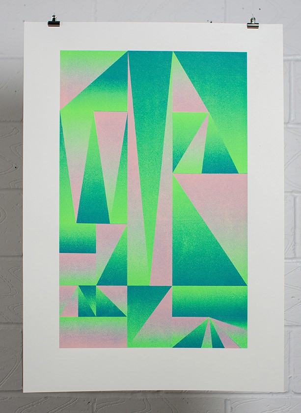
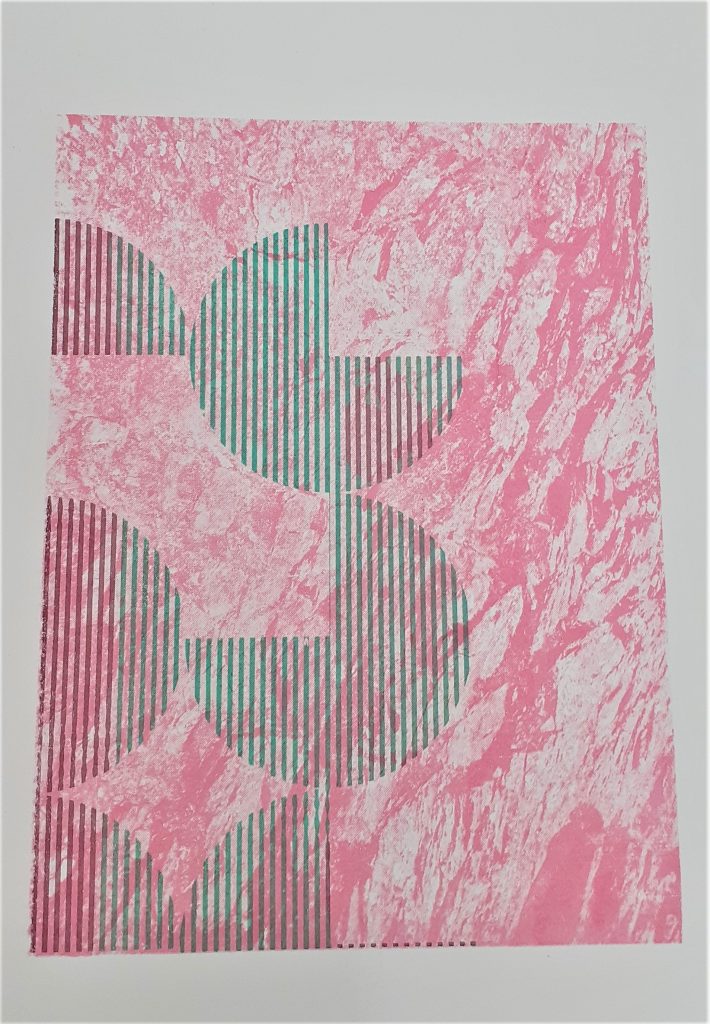
Gestalt theory Figure & Ground.

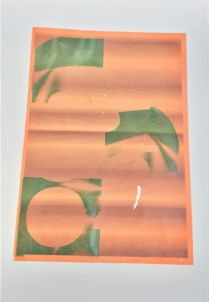
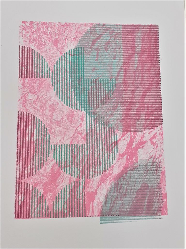
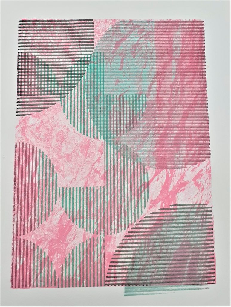
In this screen print by Heretic Spectral Nation, there is a play between the green and pink spaces. It is not obvious which is the figure and which is the ground. This is interesting because they could be interchangable.

In this book, John Bowers talks about visual language. I found this theory helpful when considering my screen-printing designs.
From the book Introduction to Two-Dimensional Design by John Bowers

In the first half of semester 1, I have been experimenting with abstract geometric shapes.

From the book Introduction to Two-Dimensional Design by John Bowers

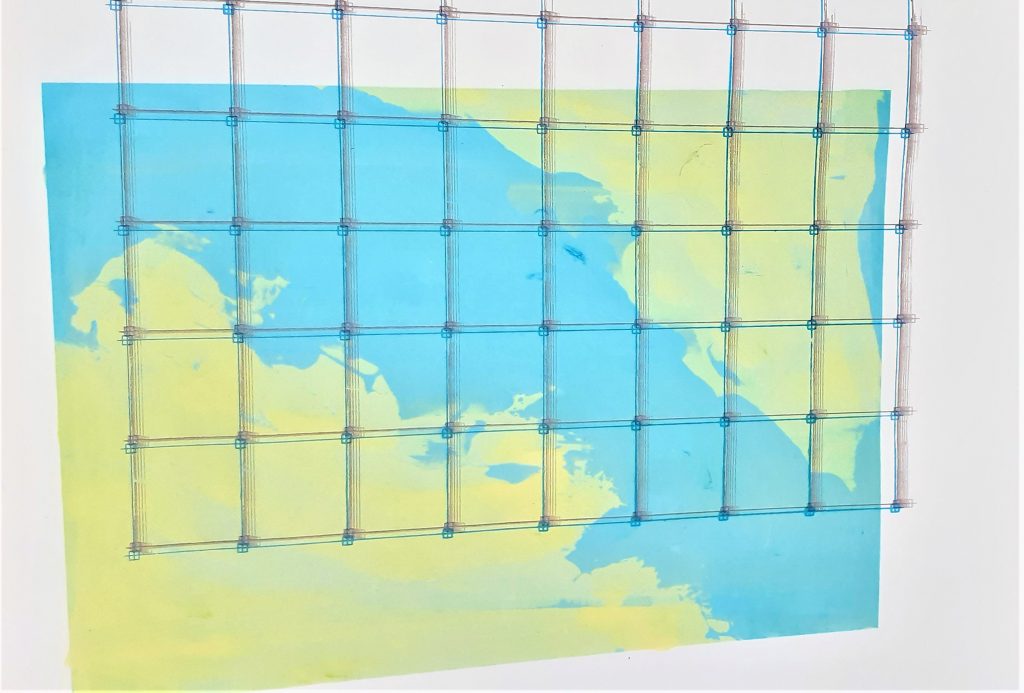
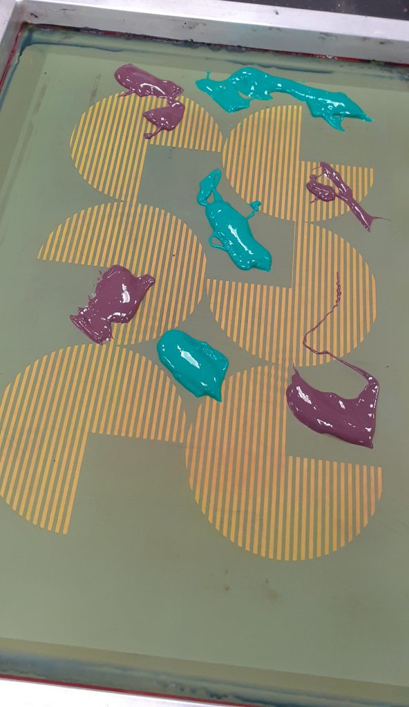
Yesterday, I spent my morning in the printing studio. (The perfect way to spend a Thursday morning). I felt a bit more comfortable with the technique and decided to take more control in this session. To take risks and try to create more of what is in my mind, onto paper. First, I wanted to cover the damage done to my print from the drying rack last week. My plan was to create a layered effect. I was happy for this design to look quite busy. In the photo below, the print has 3 layers.

I had the idea of using scrap paper to protect the border of my print. I had this idea because of my previous print where the grid design came off of the background square. This was due to poor planning.

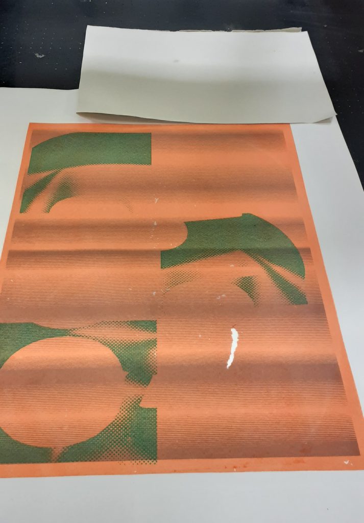
I used a rusty-brown colour to cover the tear. I was happy with the result. I also chose this colour to mix nicely with the background and unify the print as a whole. I liked the areas where the layers have some cross over.

I placed the artwork I wanted to use, over the print. This allowed me to see how best I could include the shapes into the composition.
I used a hairdryer to speed up the drying process.
From the book Introduction to Two-Dimensional Design by John Bowers

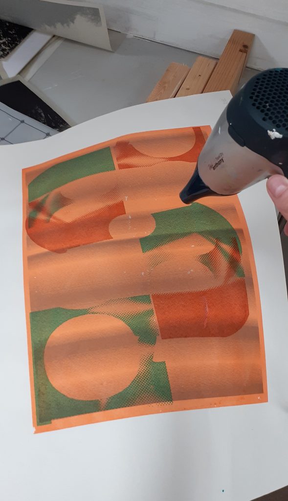
In this piece, I have used harmonious colours for each layer, apart from the green layer. This helps to add interest to the image. For the darkest brown I used a mixture of orange and green, since orange and green make brown.

I can see active space within the design, because of the irregular shapes and transparency of the layers.

The values in this image are also quite similar.

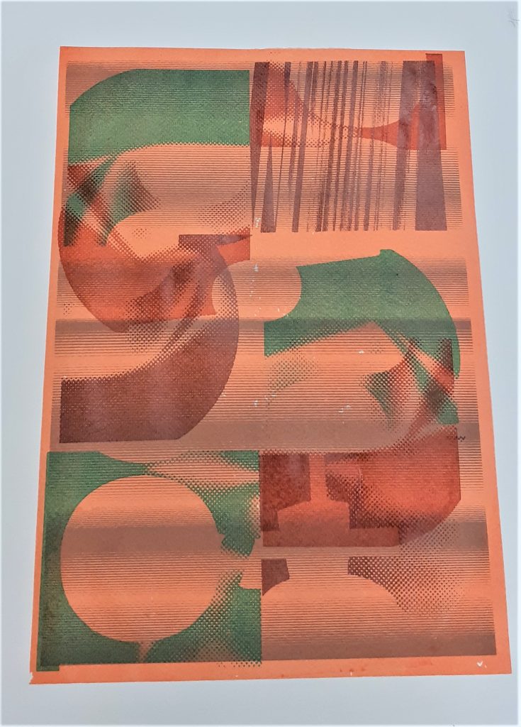
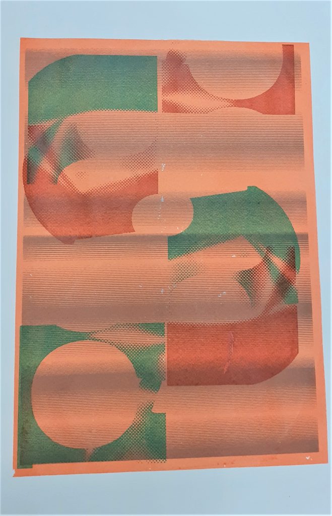
I again used masking to protect the areas of the background I want to avoid printing on.

I chose purple and green for the second layer of this print. I wanted to create some variation, while sticking to the pink area of the colour wheel.

I placed blobs of ink onto the screen quite randomly. I flooded the screen before doing my first pull.

I positioned the print at the corner of the page. This position suggests that the design carries on beyond the frame, as explained below:

From the book Introduction to Two-Dimensional Design by John Bowers

Another example of this effect:


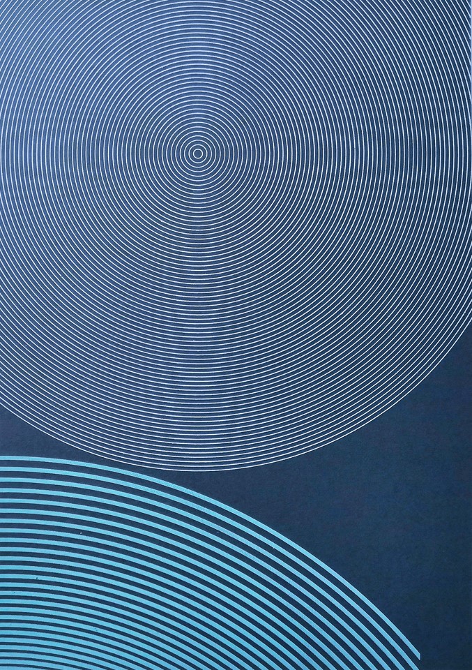
 Print Garage: Concentricity i
From the book Introduction to Two-Dimensional Design by John Bowers

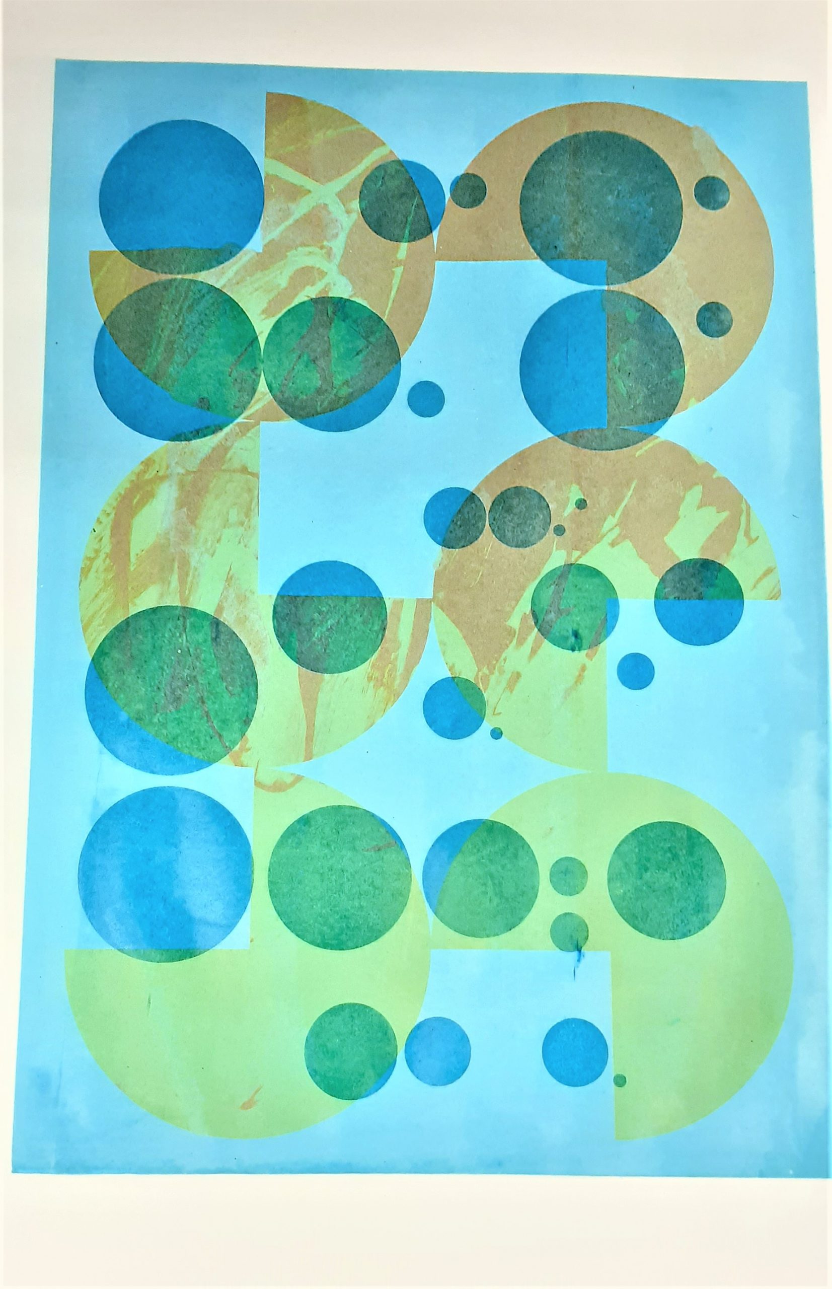
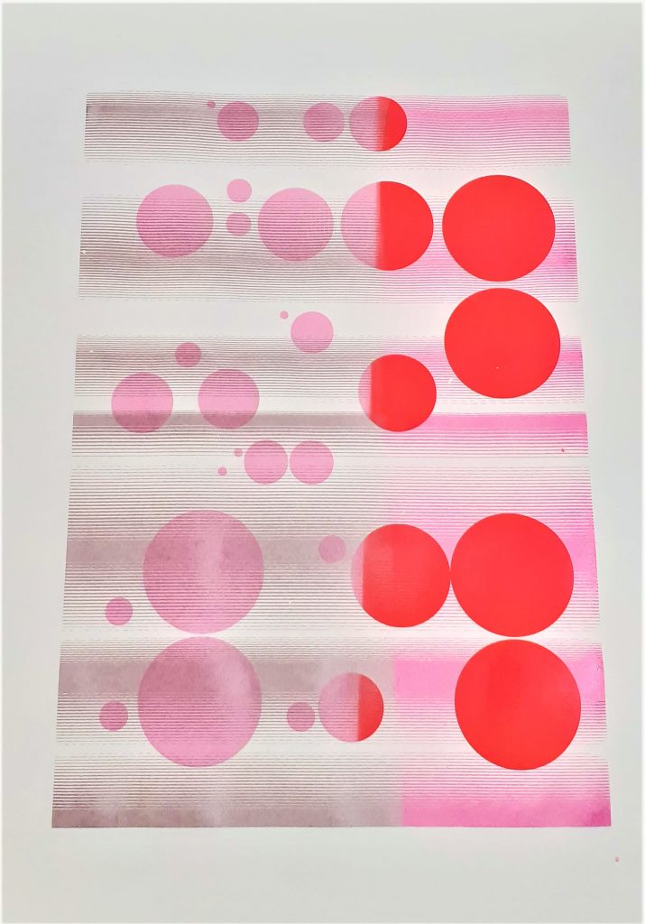
I wanted to play with scale within this design. For my third print layer, I chose the large circle design. Positioning it in the opposite corner, creates asymmetrical balance within the work.

At this stage, I made the mistake of forgetting to tighten the bolts on the printing machine/vice. This meant that the frame shifted as I was pulling the ink through. This created blurred lines on my print. It also meant that my print went off the edge of the background. Because of this mistake, I decided to print a fourth layer using a darker green.

The lines within my print run vertically and horizontally. Where they cross over, there is an interesting gridded pattern.

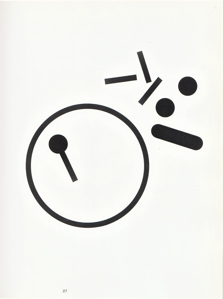
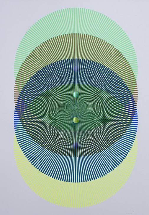
Example of playing with scale:


Print Garage: Mystic Brew

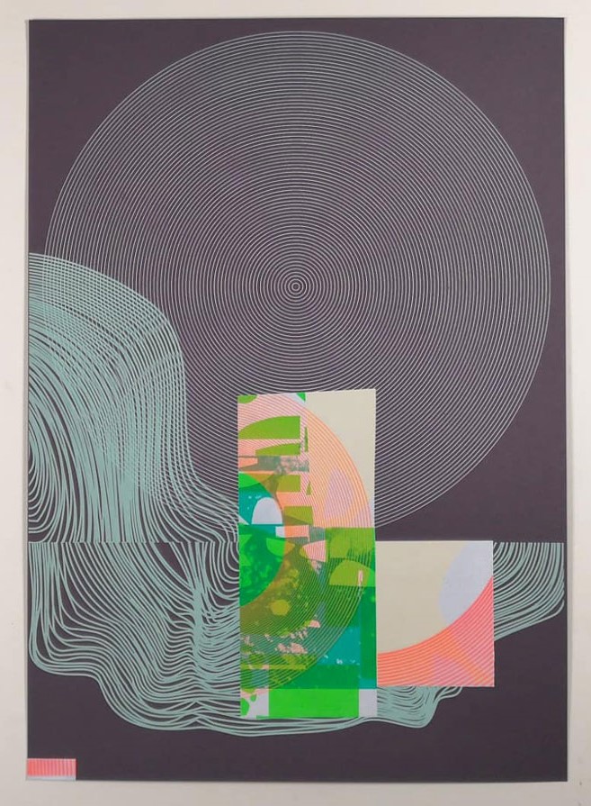
Here, the designer has placed a large circle that dominates the space. The other elements are dwarfed by it in comparison.

http://www.hereticheretic.co.uk/spectral-nation/artworks/cosmic-doughnut-2

In this artwork by Heretic Spectral Nation, we can see the crossing over of lines. This shows the interesting effects created by layering up striped prints. This gave me the idea to play with the direction of my lines when printing multiple layers.

I felt that there was something lacking in this print from last week. I thought about how I could unify the elements.

From the book Introduction to Two-Dimensional Design by John Bowers

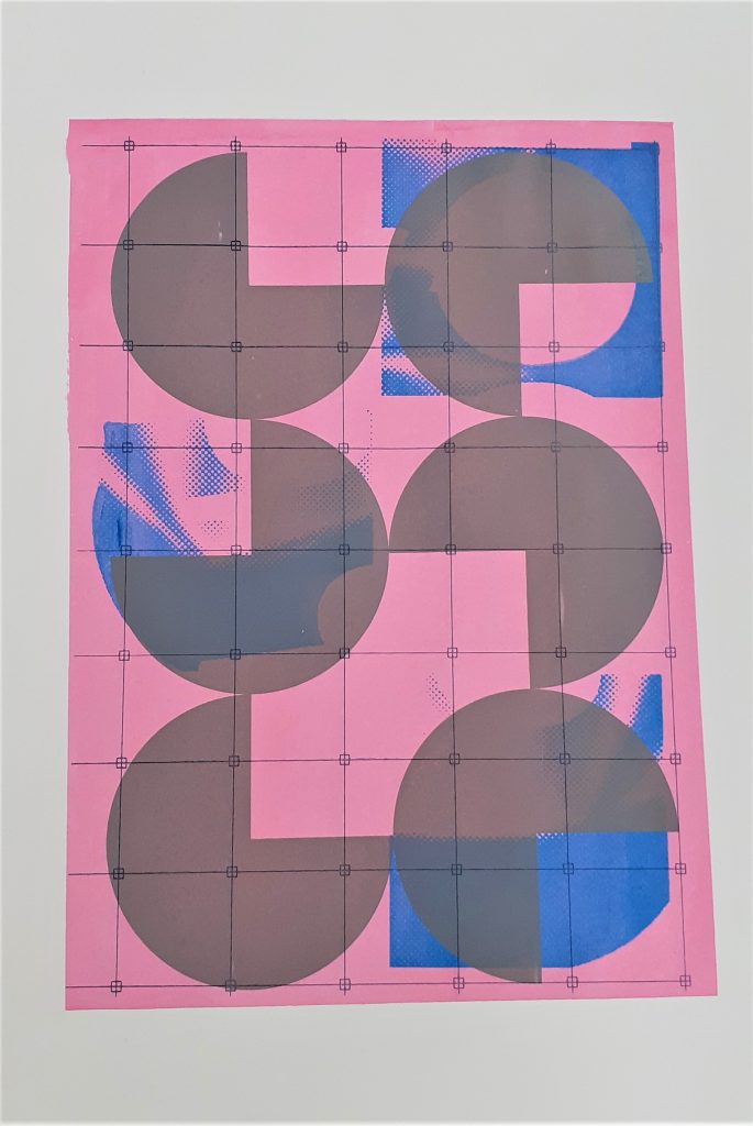
Example of a grid unifying an image:

Because of the right-angles within my design, I chose to use the grid pattern for the fourth layer:

This print would be symmetrical if it wasn’t for the blue shapes.

Because the grey shapes are similar and they are of the same colour, they look as though they belong to a group. This is the Gestalt theory known as similarity.

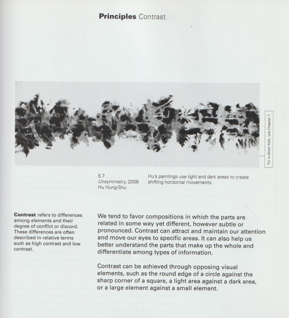
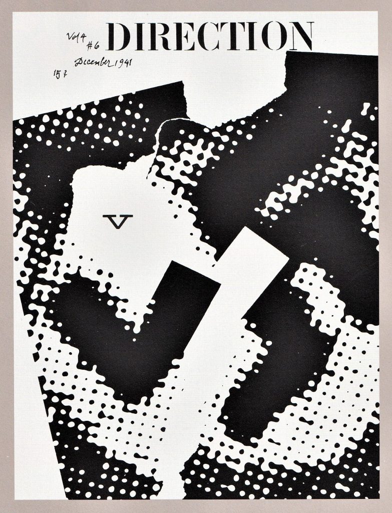
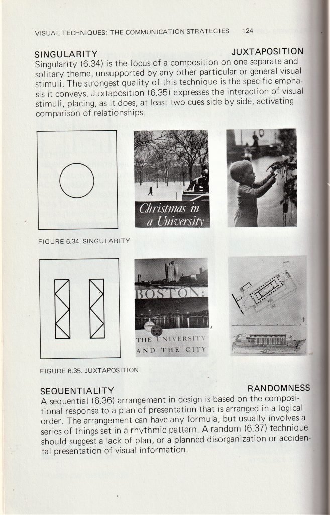
There is a contrast of sharp and round, and a contrast of light and dark within this piece.

From the book Introduction to Two-Dimensional Design by John Bowers

Form & Space

Geometric graphic design

From the brief ‘Form & Space’:

Composition refers to the visual structure and organisation of elements within a design. Designers organise images and text – each with their own shapes, sizes, colours and textures. Through the control and placement of simple geometric forms this workshop explores the dynamics of composition: the relationship between positive and negative space, variations in scale and the space between the shapes – the basics in visual language, a designer’s ‘design vocabulary’.’

Paul Rand

Exploring form & space, I looked at the designer Paul Rand. I looked at the book Paul Rand: A Designer’s Art (1985). I was surprised at the modern look of his designs, since the book spanned his career from the 1940’s to the publication of the book.

Image from Paul Rand: A Designer’s Art

Rand was known for his typography and designs for advertising. Influenced by Modern art, particularly the Bauhaus movement. He was one of the world’s leading graphic designers. He learnt design by looking at the work of others such as Cassandre. His poster designs have been called timeless. He approached ad design in a radically different way that had not been done before: Ads used to be very text heavy, and if they did include images, they all looked very cluttered. Rand minimized the text to only what was necessary to breathe space into the design. He saw image and text as a continuum to be used together. Graphics and type act as one unit to convey the message of the ad and inject some art and beauty into the design. He and his wife published children’s books and he was also an accomplished painter, painting the book covers.

Information sourced from: Celebrating The Life Of The Greatest Graphic Designer-Paul Rand – YouTube

For this announcement card, Rand has used symmetry and order by the even-sized circles he has placed across the page. This simple design is eye-catching while also portraying a sense of order and efficiency. Since the card was probably small, the design is suitable with its lack of detail. A detailed design would be difficult to see on a small scale.

This is a magazine advertisement from 1961. The page is informing the viewer about a traffic light system being set up using the new technology of the time. The black background allows the colours at the centre to stand out in comparison. This is the effect actual traffic lights have on a dark night. The central placement of the column of circles makes the composition symmetrical and therefore balanced.

For this newspaper advertisement, Rand has taken apart the logo for Westinghouse Electric Corporation, and scattered the pieces in the upper right corner of the page. The scattered pieces follow no pattern and they appear chaotic. If the logo was familiar to you, you would be piecing it together in your mind. In this way, the viewer would be engaging with the design.


In this poster, Rand again uses chaos within the design. This time he is placing identical pieces of bread at different rotations across the poster. This has created a sense of movement throughout.

For this magazine cover, the letters have been scattered and cut up. Because the alphabet is placed in order, we are able to see which letters are missing. This is a way of engaging the viewer into the design, almost like showing the viewer a puzzle. The background is quite noisy and helps the white ground behind the letters to show clearly.

Magazine cover for Direction in 1941

Here, Rand uses visual noise to distort what we are seeing. It is not possible for me to see what the image is of. This confusion makes the clear ‘v’ stand out even more clearly. There is a shape below the ‘v’, that looks like a distorted ‘v’. it emphasizes the ‘v’ above it, creating repetition. I like the areas of negative space and the clean rectangle shape that appears to be cut from the design.

Screen-printing – week 5

In A Primer of Visual Literacy by Donis A. Dondis, I was interested in the section about visual communication. The author explains that these visual techniques can be used to convey different messages. For instance, ‘fragmentation’ can be used to express excitement in a design. I found that I used more than 1 of these techniques within the same print. I considered these principles when composing my screen-prints in terms of how I can create a design that makes sense when the elements, or layers, are seen together.

A Primer of Visual Literacy by Donis A. Dondis

I chose to use blue for the third layer, as I used it for the first layer. I like the way this helps the top layer to tie in with the background.

I used transparency within this print, as I wanted the effect of the first print to show through the third layer. I mixed in binder with the blue paint to make it transparent.

I have combined circles set in a random formation, with the pattern of ¾ circles which are organised sequentially.

Repetition is the cohesive force that holds a diverse composition together

Donis A. Dondis

I feel there is enough going on within this print for it to be interesting to the viewer: The orange splatters, the way the colours combine through the layers and the variety of shapes. I therefore decided this print is finished.

I have created balance in this print using asymmetry. The design is asymmetrical because there are 2 areas of blue on the left hand side of the page, balanced out by the blue shape on the right-side. There is a sense of regularity in the way the grey shapes form a predictable pattern that we can follow.

The way the layers overlap and the halftone in blue, make the design slightly more complex.

There is some flatness in this print because of the similar values used for layers 2 and 3. This is easier to see in the photo I have converted into greyscale.

Greyscale copy of my print.

The opacity of the grey shapes gives the design a sharpness that was not intentional. This makes the shapes distinct and easy to interpret but means there is overall less warmth and atmosphere to the image. For this reason I would like to add a fourth layer to see how I can soften this design, or perhaps add some finer detail.

This print was stuck to another piece of paper in the drying rack. This meant that when I lifted the paper off, a small area was torn away. My plan is to cover this area.

I used a green as I felt this may cool down the orange of the second layer. This green came out brighter than I expected. For the 4th layer, I want to repeat the pattern used in the 3rd layer but rotate it in some way. I think a darker colour will work well.

The second layer creates a sense of distortion. This was accidental but was improved by the third layer where I used a deep blue to anchor the grid in place. Placing the grid lines off the side of the first print, creates an illusion of depth. The colours all work harmoniously, as I have chosen that are close to each other in the colour wheel.

I have suggested motion in this image using close lines and using the change of colour halfway through the print on both layers. This activeness is also created by the asymmetrical pattern of circles in the design.

The variation of hue, transparency, and value, gives the print a sense of depth.

I found it interesting how the second layer is visible against the pink circles and is not visible on the red circles. This gave the print an implied texture on the left side.

The right side is bright, and this shows a juxtaposition against the calmer colour combination on the left.

I decided this print was finished, as it does not look to be lacking in any element.