When visiting the museum of natural history (see previous post) I took notice of the different arrangements of objects. The way the objects were arranged made them easier to view and navigate around the museum.
I saw the impact different arrangements had on the objects when researching artists who work with collections.
Now it was my turn to investigate for myself…
Primary Research
Task 1: Arrange & Rearrange
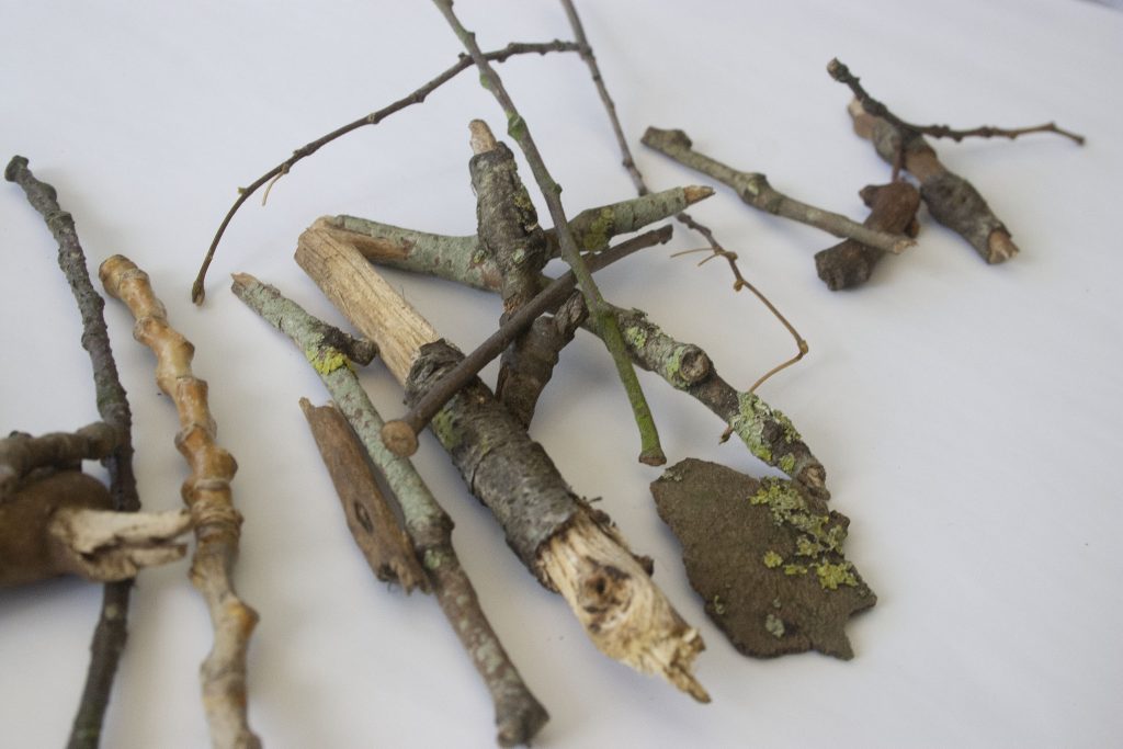
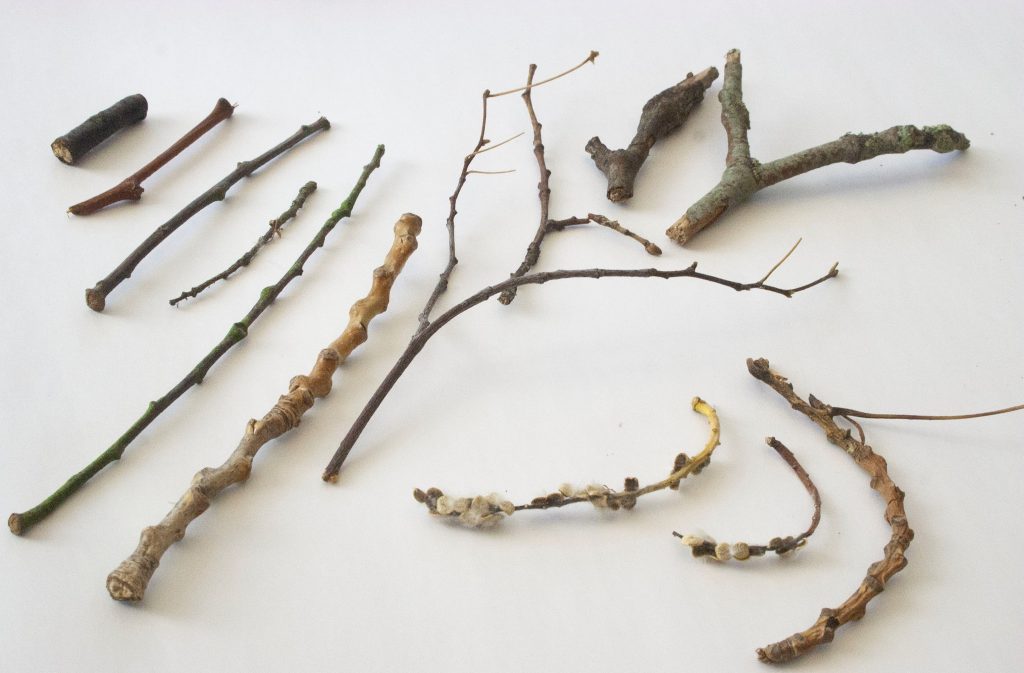
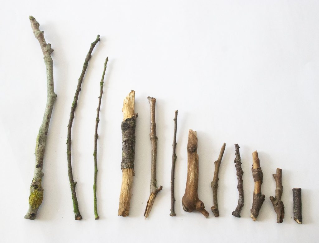
Having my objects collected, I then had the job of photographing them in several arrangements.
Twigs
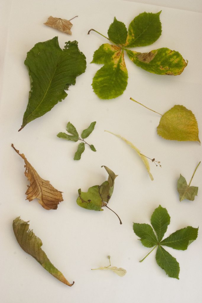
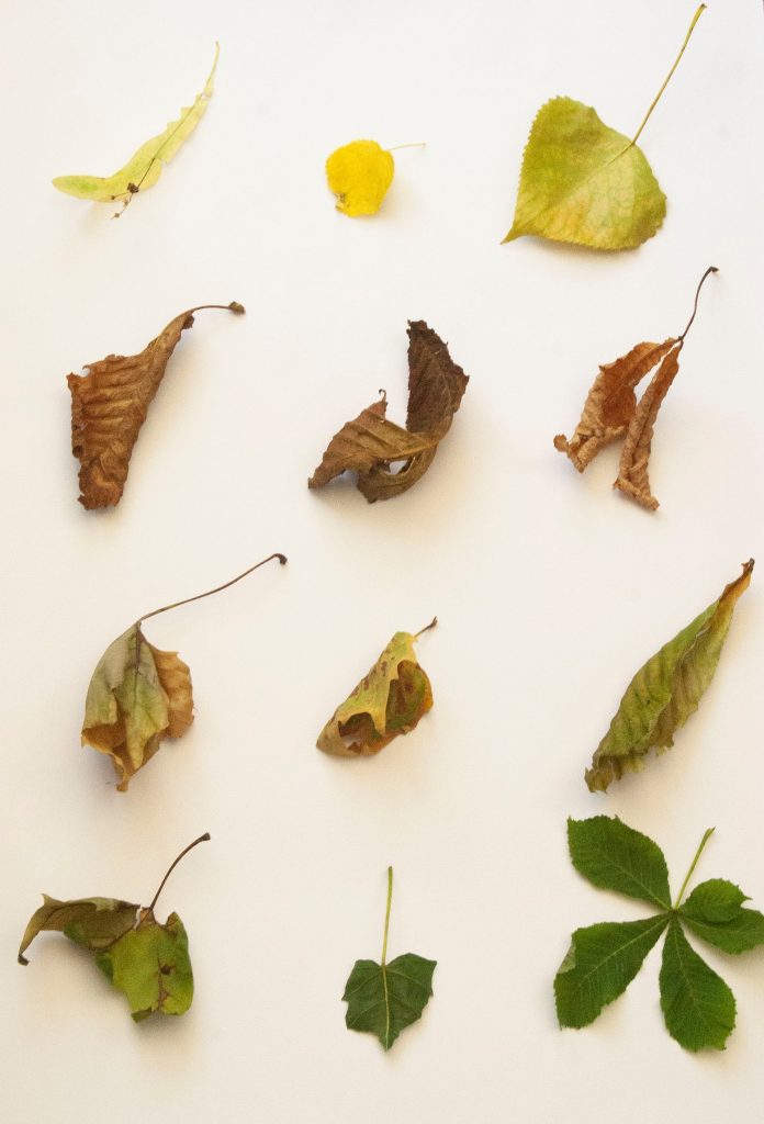
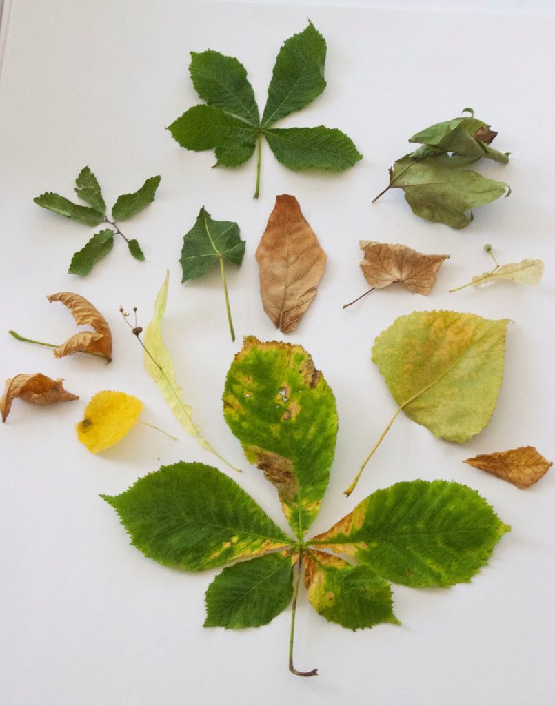
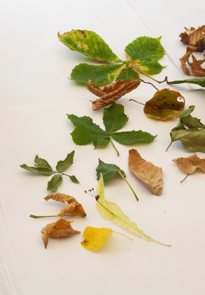
Leaves
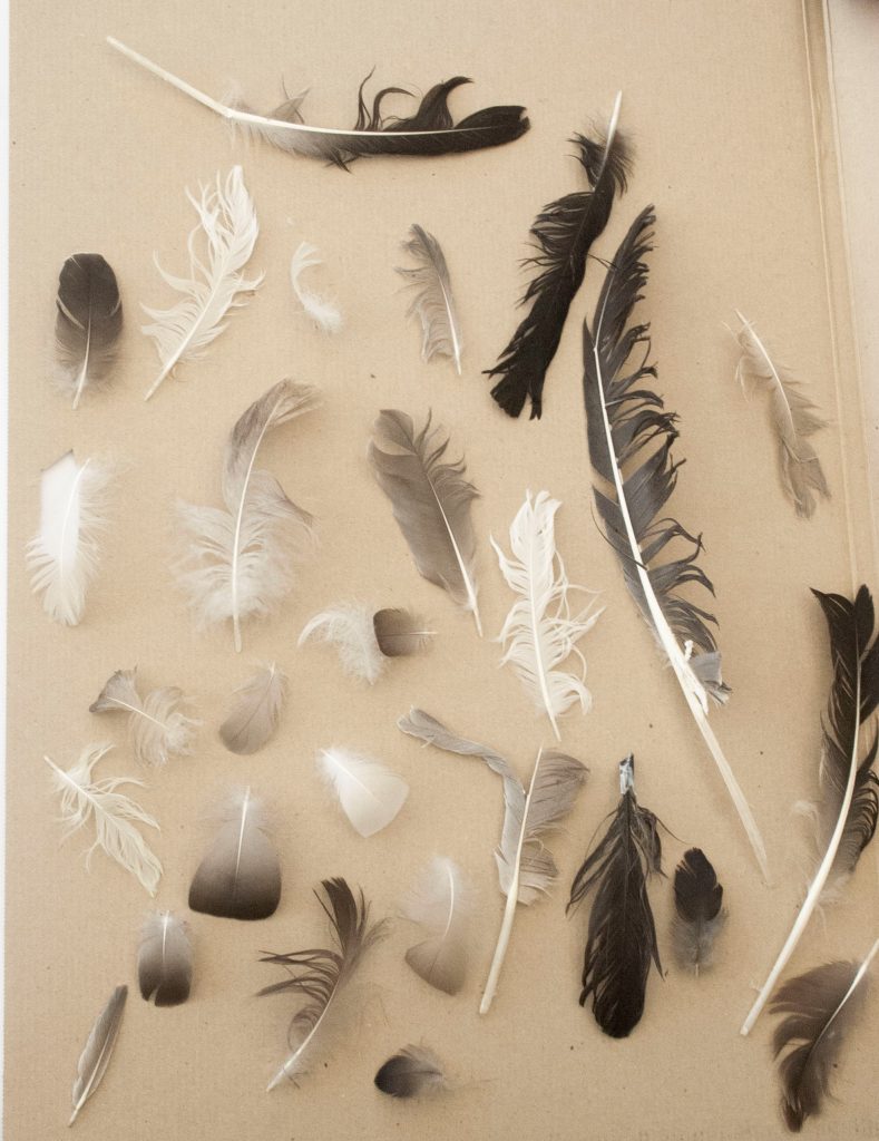
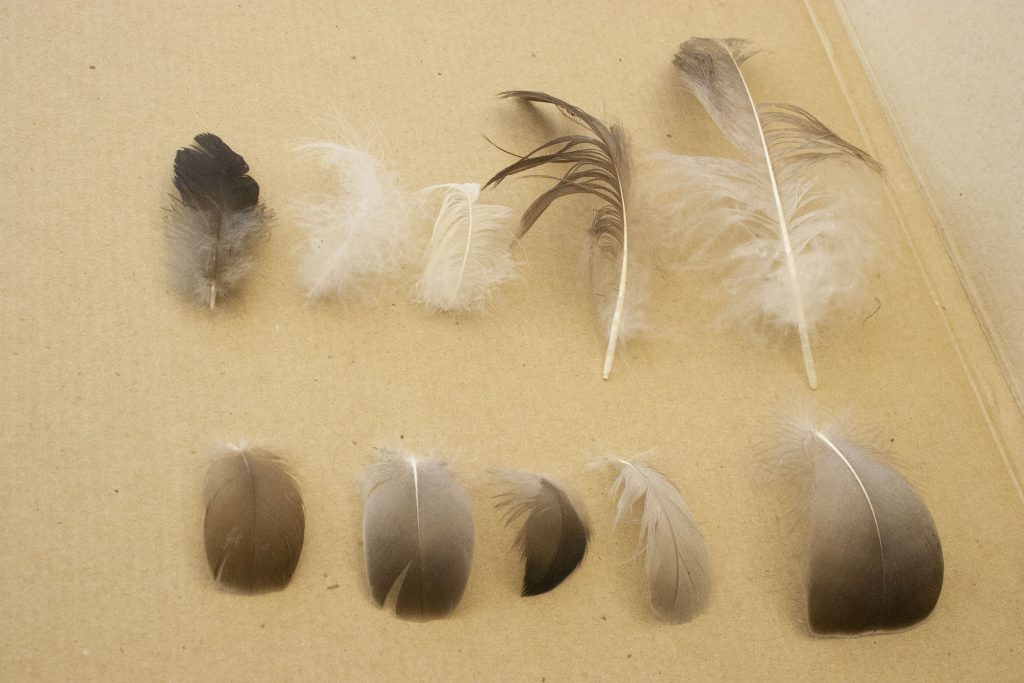
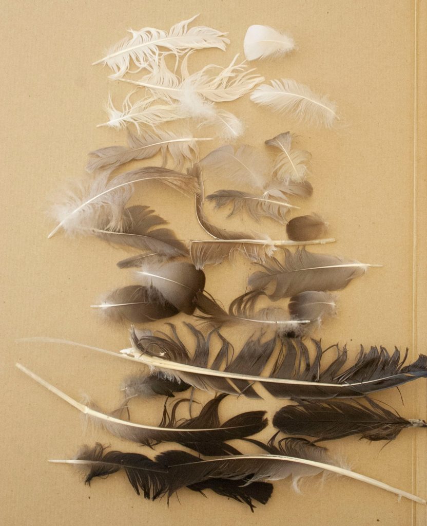
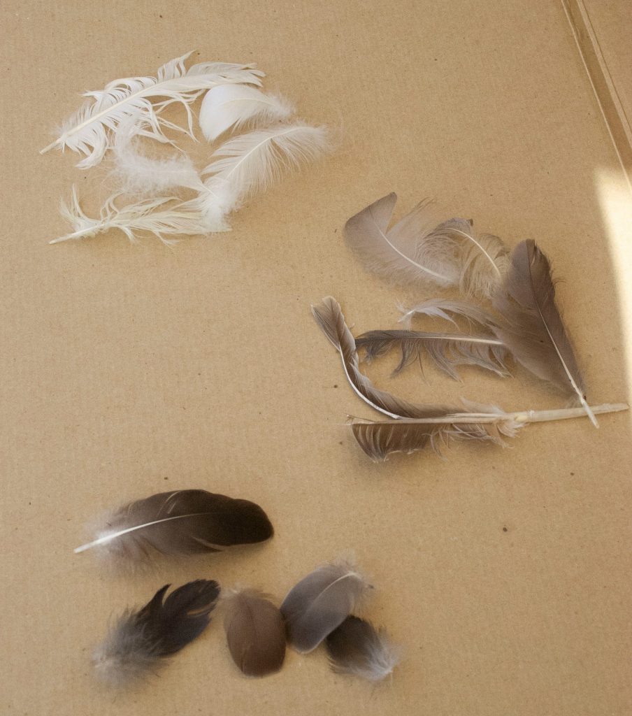
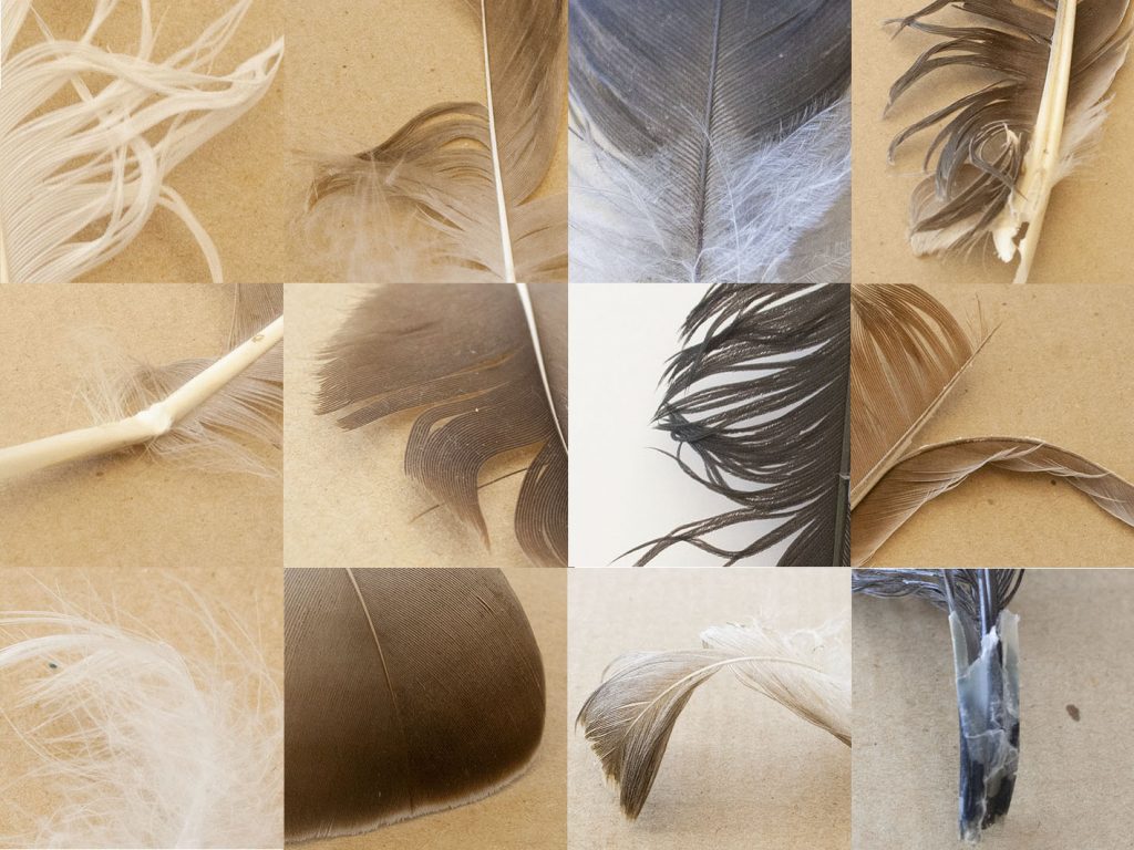
Feathers
Task 2: Re-direct the attentional focus
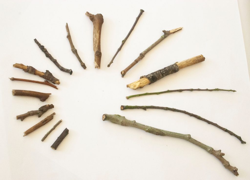
I then took separate photos of the individual objects from a group. I needed to select an interesting aspect of the object to focus on. For example, with the twigs (below), I picked out the following elements:
- dark and light contrast, split at centre
- fork in the twig and it is long and thin
- an oval ‘mouth’
- lichen growth
- scratched markings on the surface
- fluffy catkins
- round markings
- fork in the twig, colour is slightly green
- kinks/ knuckles create an interesting twisty shape
- smooth surface, rusty red colour
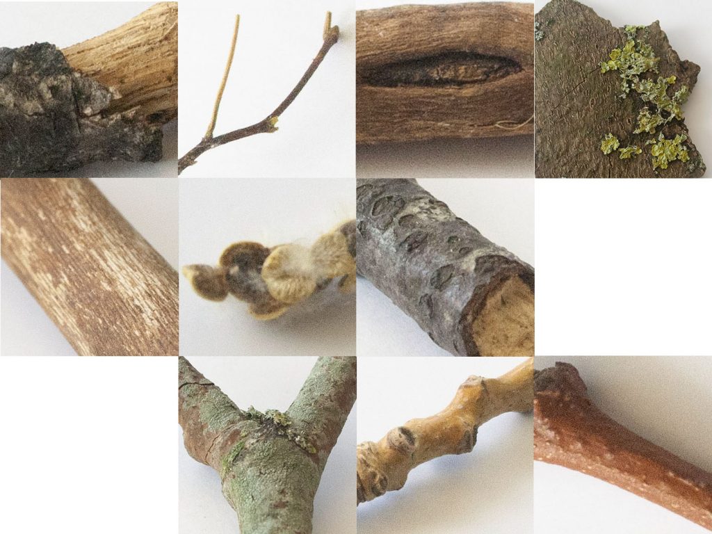
I then needed to create a grid with these photos. In the example below, I made sure to connect the lines from one photo to the next, so that the images would meld together visually.
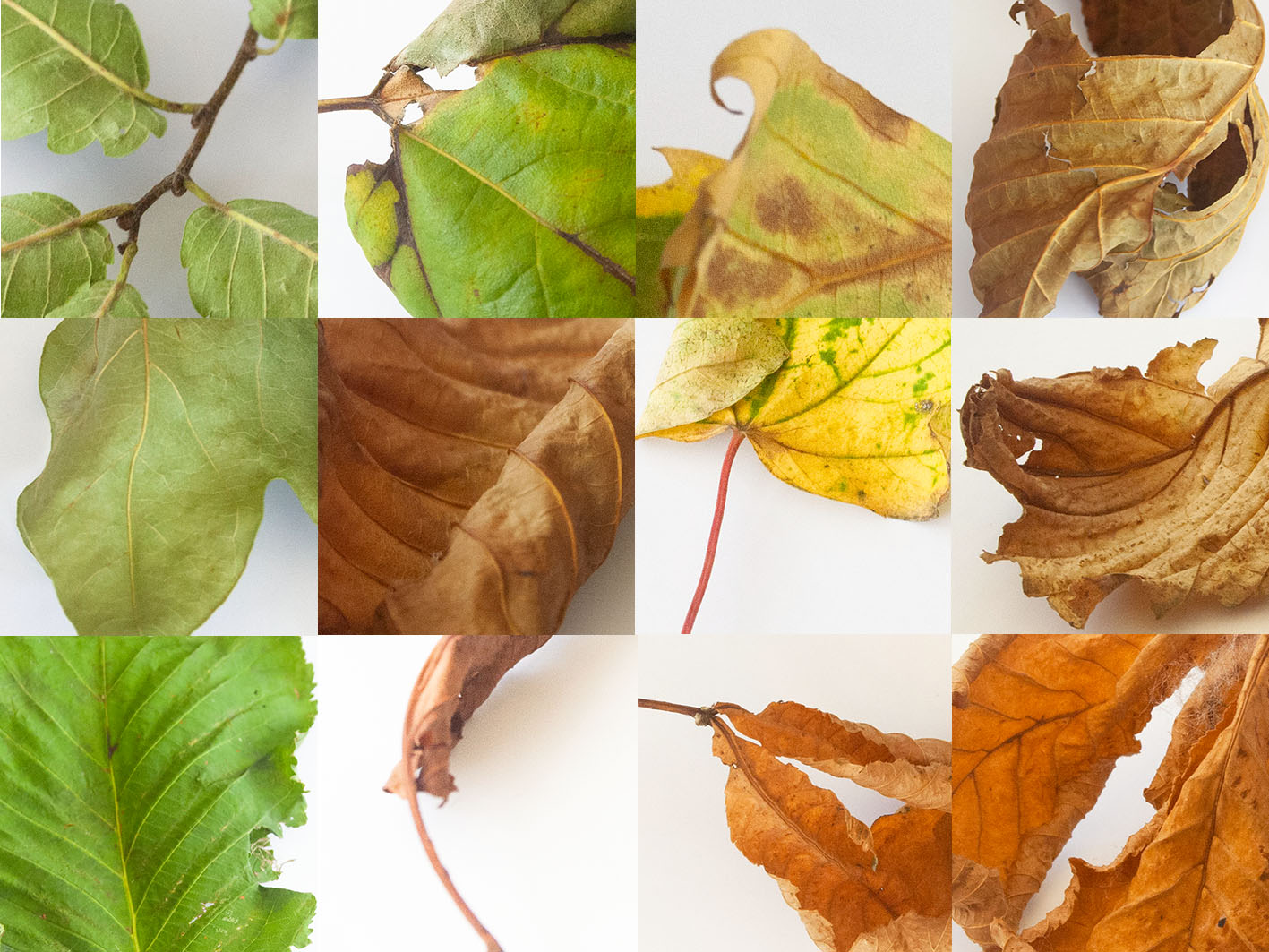
Leaves
I was more drawn to the leaves when selecting a topic to explore further. I then produced 2 grids using some of the same leaf images, and switching others.

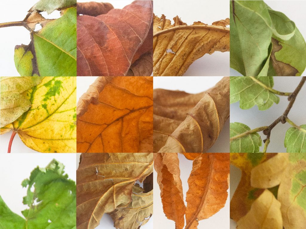
I found this task more challenging than I was expecting. Because all the leaves are quite different, I wasn’t sure how to place them harmoniously.
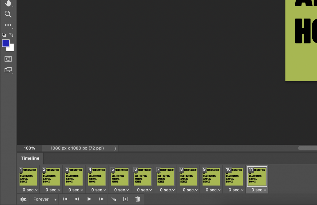
How I made the grid in adobe photoshop:
- place embedded
- resize the image, accept (tick)
- rectangular marquee tool
- select the square
- mask
- unlink the mask from the picture
- v for move tool
- w rows to move it around
- to resize, edit> transform> scale >accept (tick)