Experimental bookbinding

After being introduced to the extended project brief, this was fresh in my mind when approaching this bookbinding workshop.

From the brief-

Create a mini-monograph magazine anthology of concrete
poems (a minimum of x5 poems chosen from a collection
provided for you) with the accompanying 2,000 word
introductory essay consisting of at least 8 printed-pages.

If I were to decided on 16 pages for the magazine/newspaper, this would mean using 4 sheets of paper.

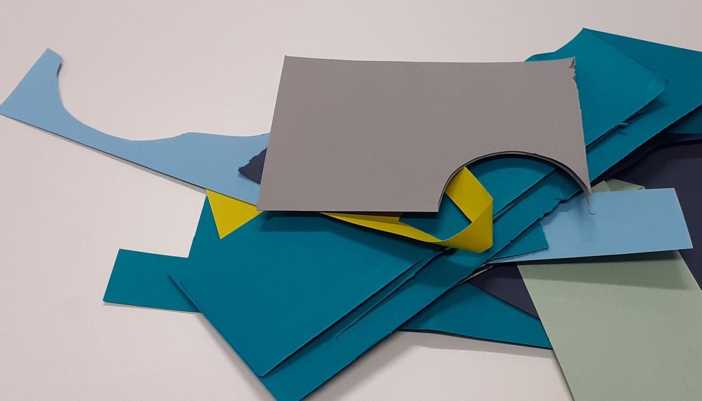
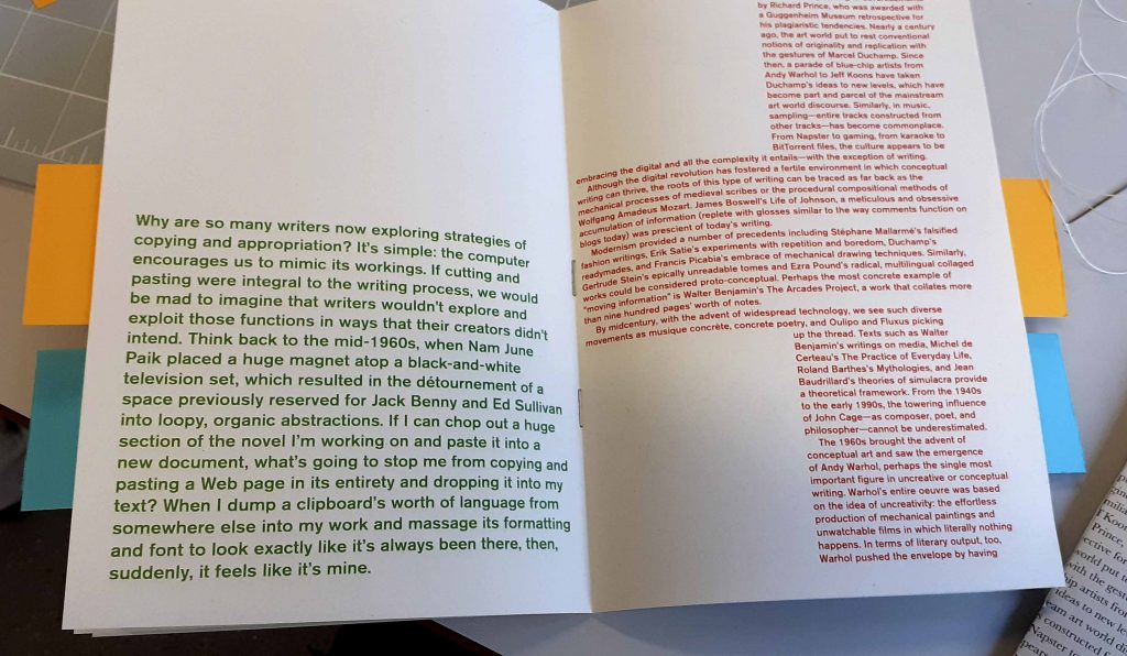
We were given a selection of printed pages, some double-sided and others not. The paragraphs were printed with red, blue, green and black text, in a variety of weights, pt size and placement. We were then challenged to put them together into books, using experimental techniques.

Things to consider in the workshop:

  • The middle page will show double spread as the page is printed
  • Think about how to place the pages together. How will the different colours and textures match across a spread?
  • The cover could be shorter than pages.
  • Staggered pages
  • Cut areas out
  • The thickness of the coloured paper we use for the cover may influence the method want to use for binding.
  • We could use letterpress onto a coloured paper cover for our final magazines. Most papers can be printed on digitally, but the thicker papers might be more appropriate to letter press on instead.
  • We could make pockets for 4 separate pieces.
  • Stitch or staple pieces onto the folds
  • Loose covers
  • Different sizes paper
  • Mini books inside
  • Concertina
  • Shapes and colours of the type, what textures etc to consider

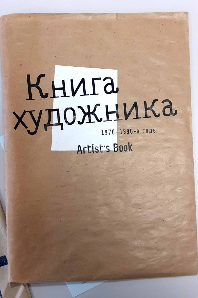
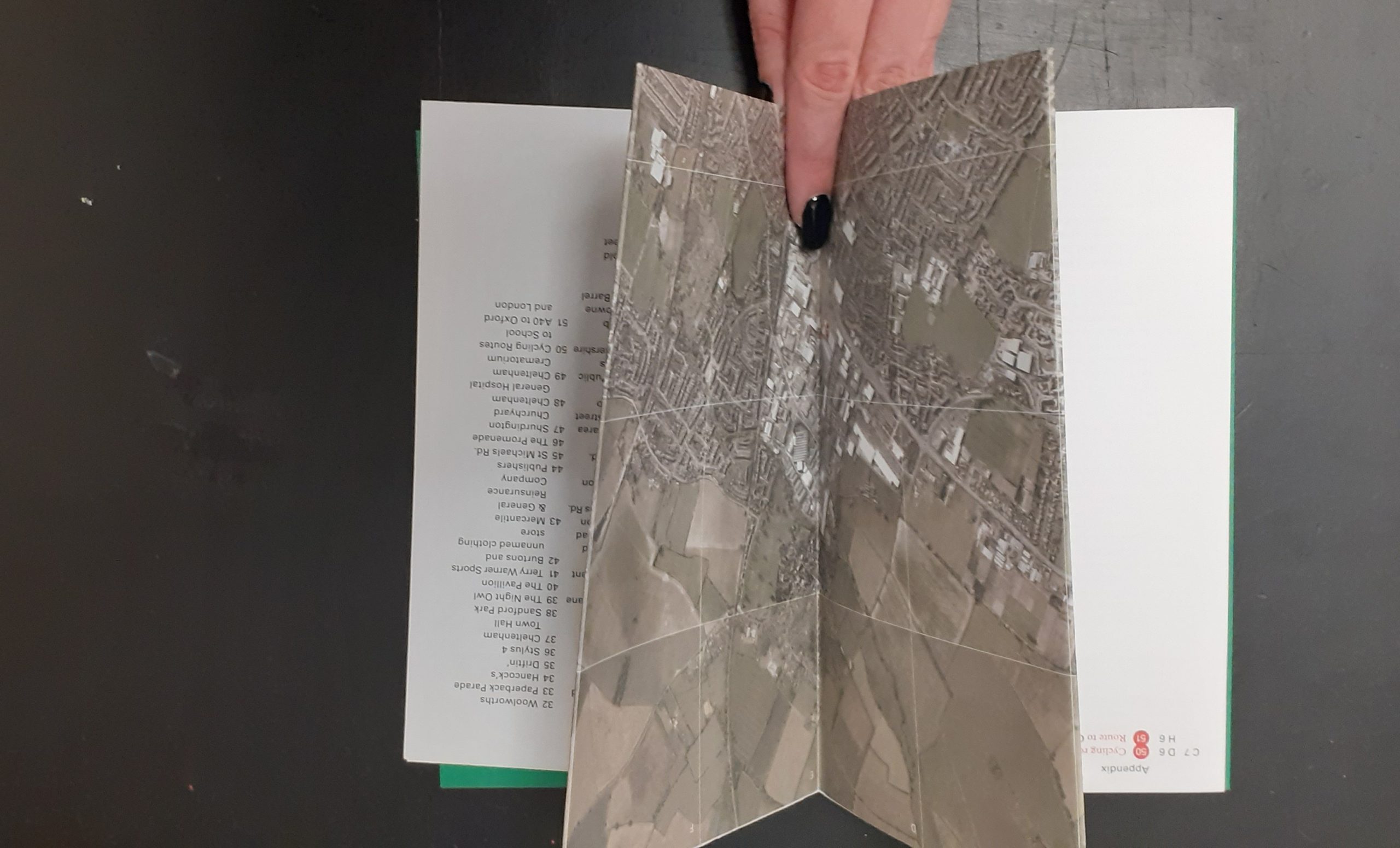
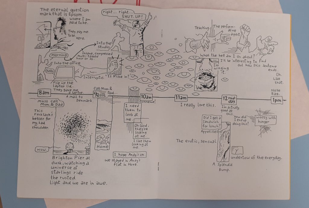
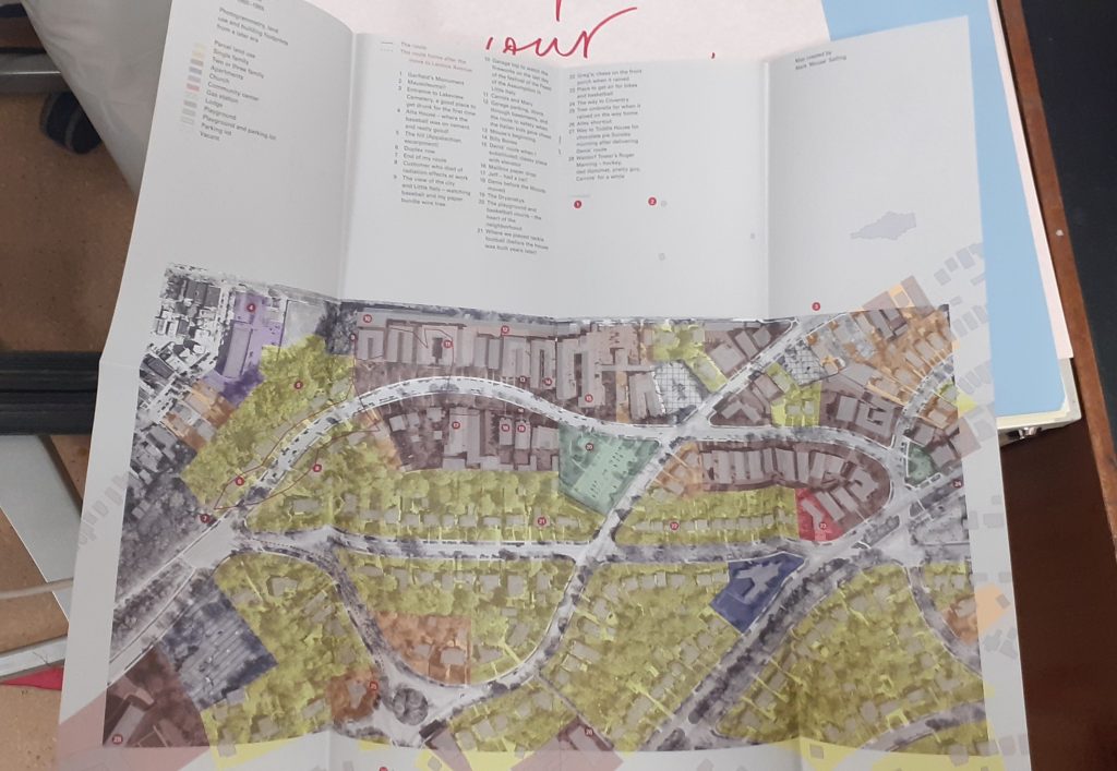
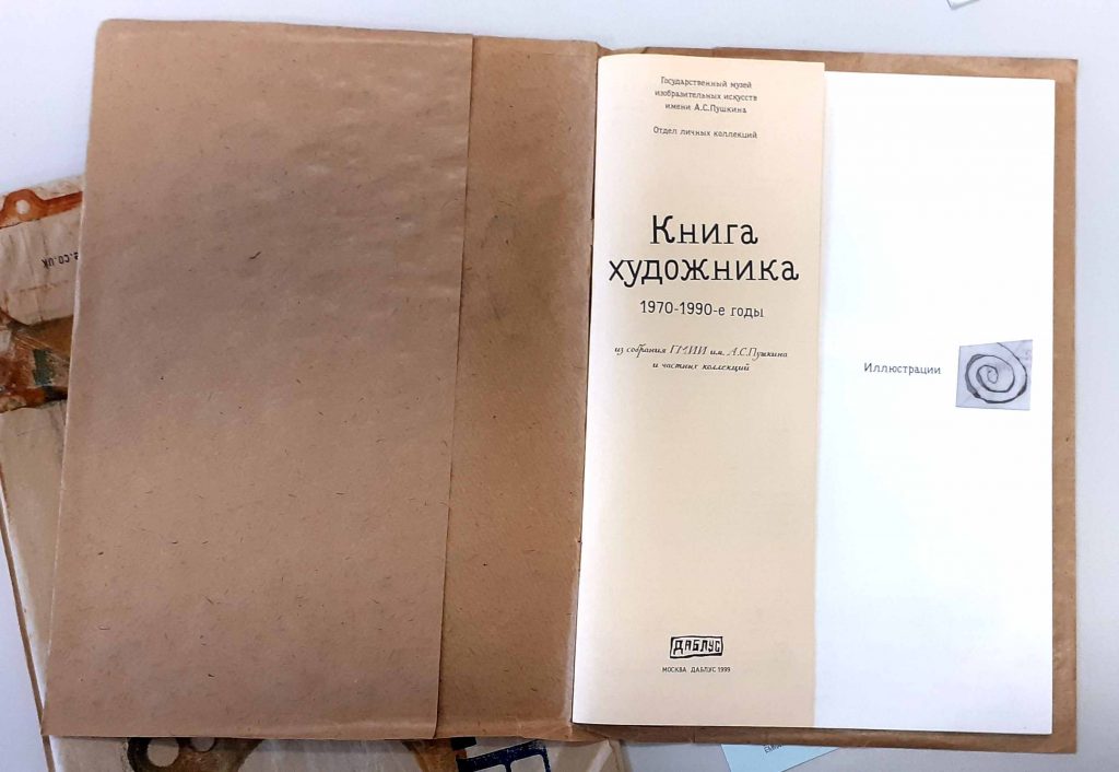
I looked at this book in the workshop. The brown paper cover intrigued me because it is unusual for a book cover.

I really like the peach-coloured narrow pages within the book.

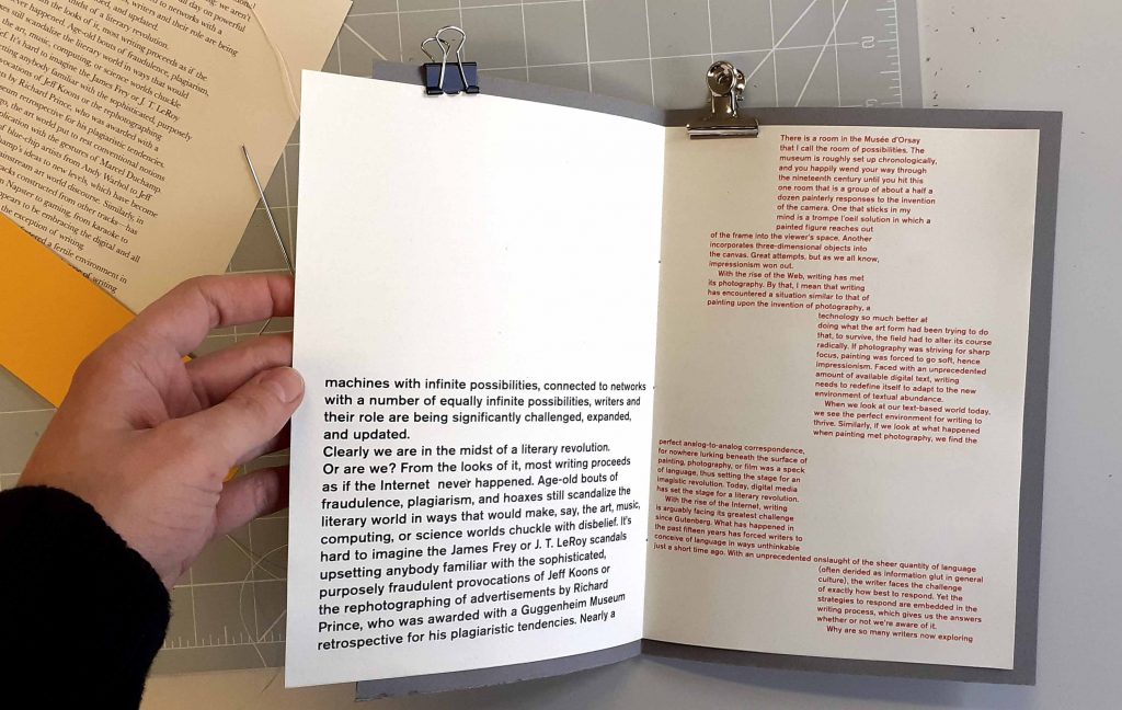
The first book I made was based around the idea of staggering the width of the pages. This is the book as seen from the front. I cut the outside page so that it is narrower all the way around the cover. It wouldn’t be readable, because half of the page is around the back of the book. I have used the grey card as a tougher cover for the book, with the very outside page functioning as a decoration rather than a page to read. The words here might function as a taster as to the theme of the book.

I have cut the edge of grey cover, on the front side, to reveal the contents of the book.

I have left the other page of grey cover at its full width. I cut the edge of the paper within the book, to create the staggered page effect.

The bolder text peeking out from the grey cover is effective, as it is in between the darker tone of the cover.

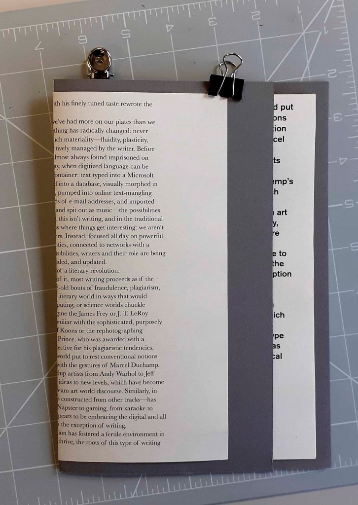
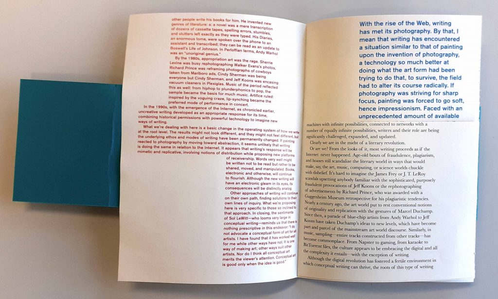
I placed the pages of red text in the second half of the book and pages of black text in the first half.

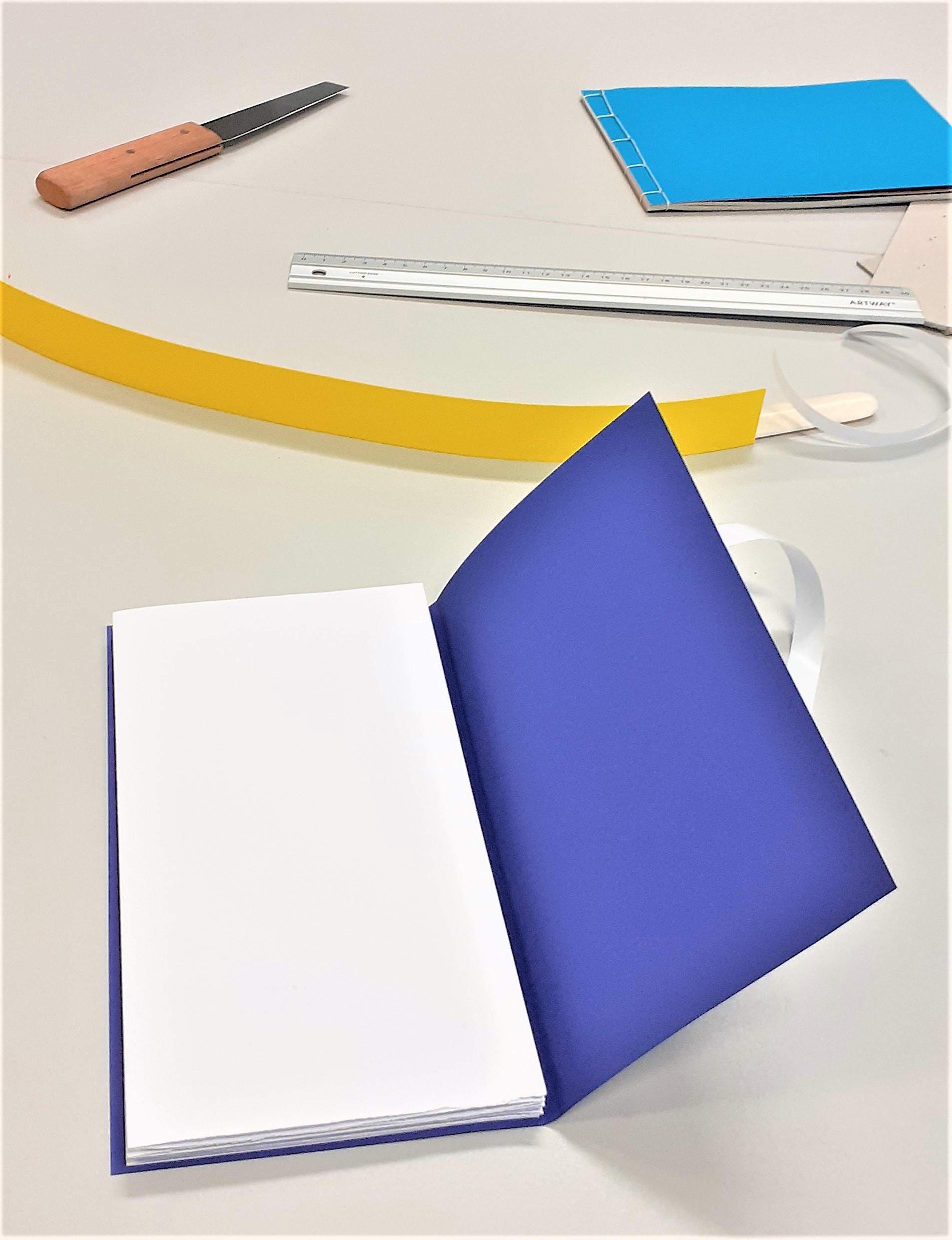
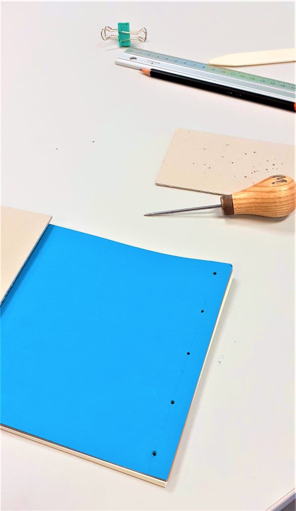
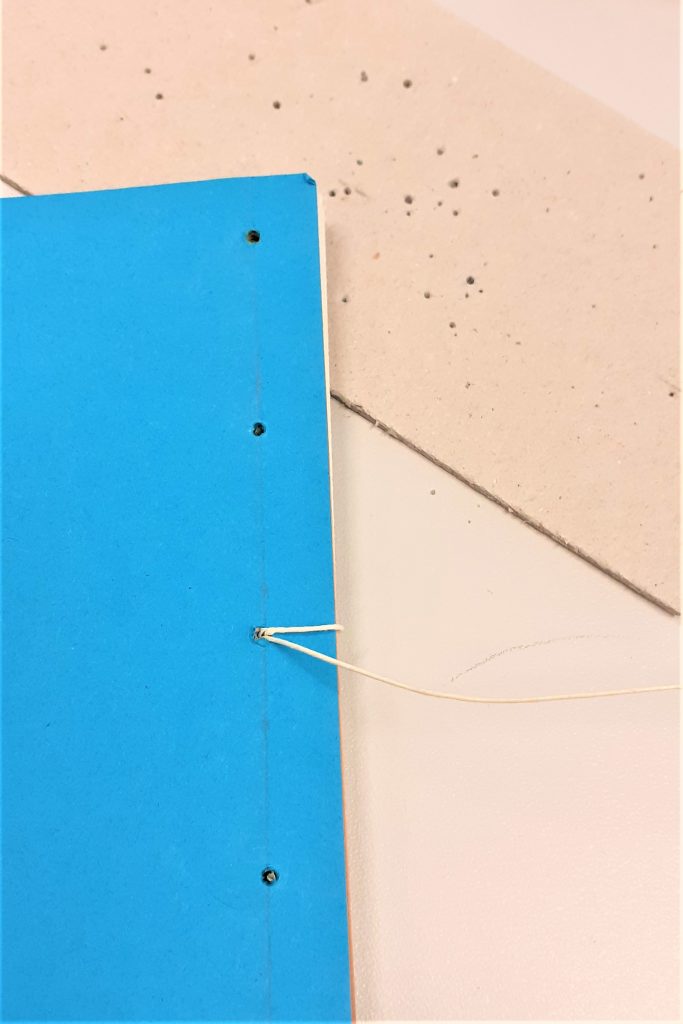
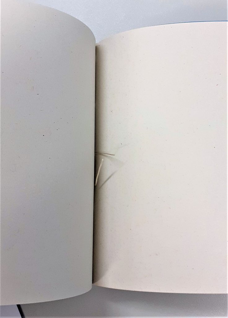
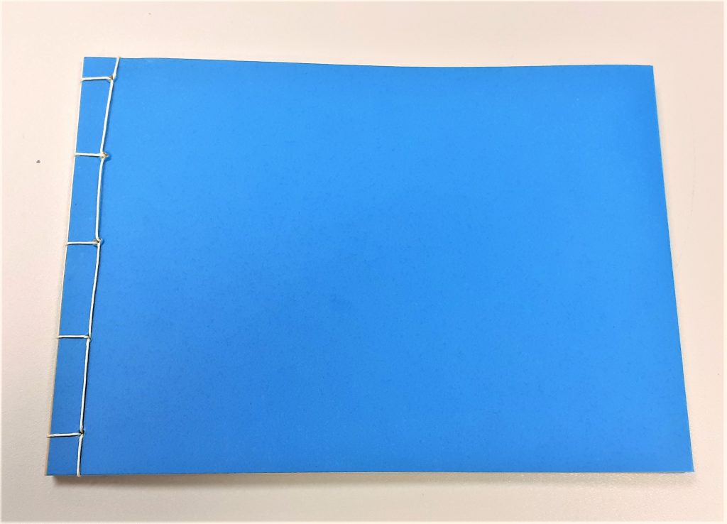
To bind this book, I chose to use a needle and tough thread. I held the sheets of paper together with bulldog clips. After punching 3 holes into the spine, I stitched the pages using the basic bookbinding stitch.

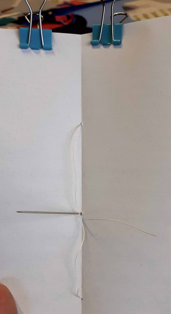
The last stage of stitching the book.

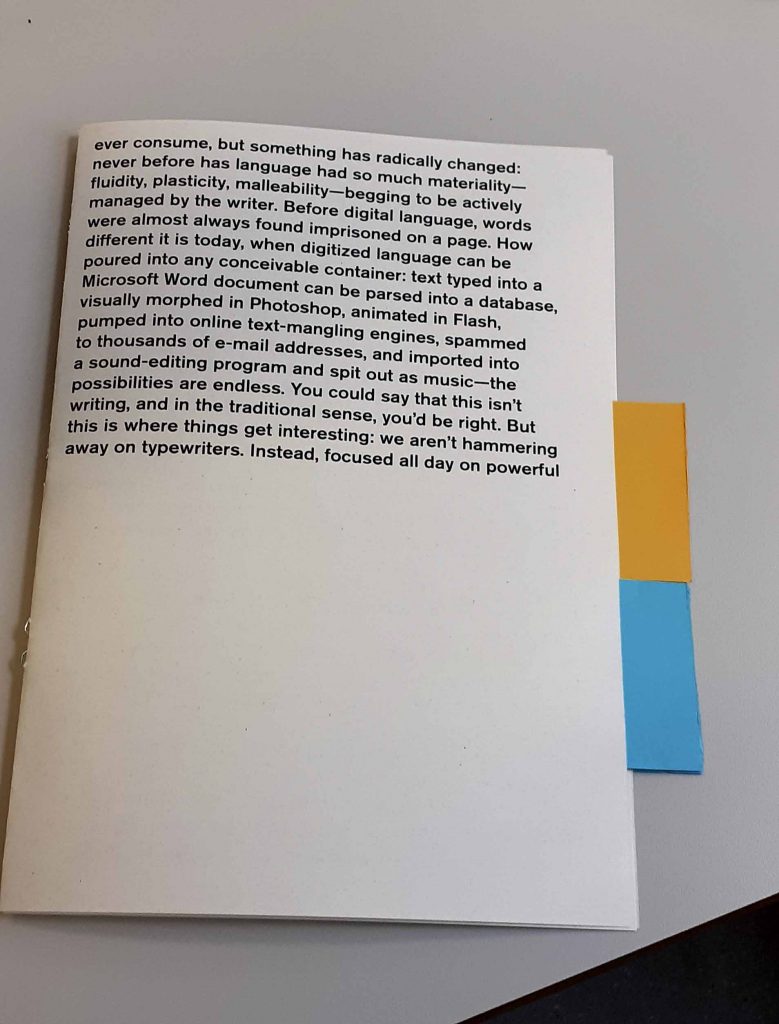
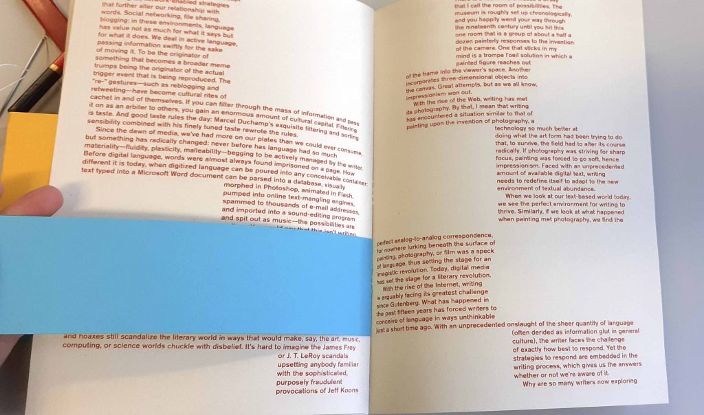
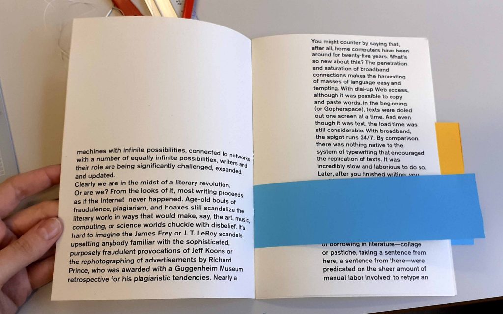
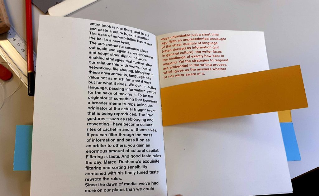
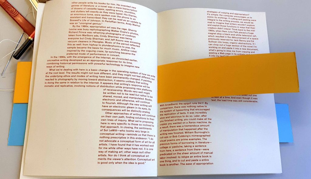
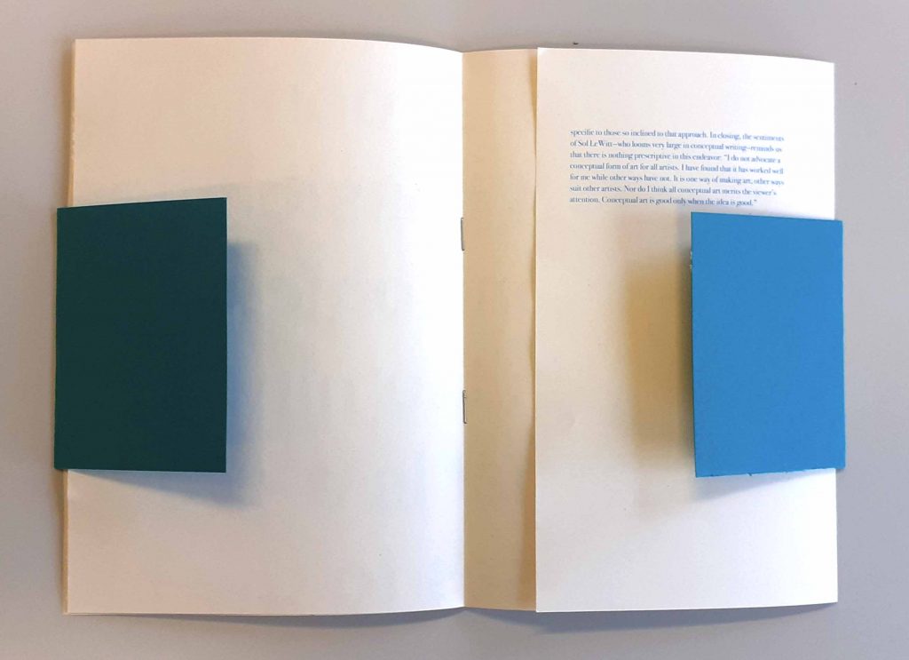
The second book I made. The colours of the book markers complement the black text on the cover.

The markers can be seen at the edge of the book.

Centre of the book. The staples can be seen here at the centre. I used 2 staples to keep it simple. 1 staple for each bookmark.
I aligned the top of the marker with the top of the paragraph on the opposite page.
This is where the marker appeared on the other side of the book.
Orange marker. I like the neatness of attaching markers in this way, as the staples are not visible here.
I aligned the orange marker with the start and end of these paragraphs.

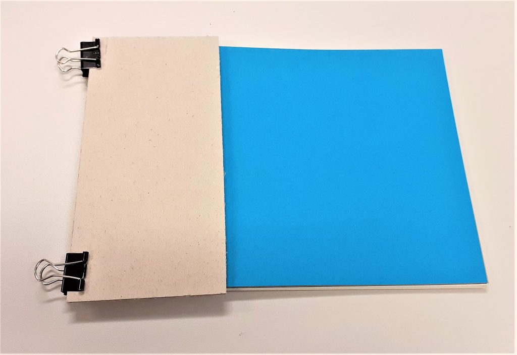
The third book I made:

I used a pair of compasses to draw a semi-circle on the front cover. I then used scissors to cut along this line.

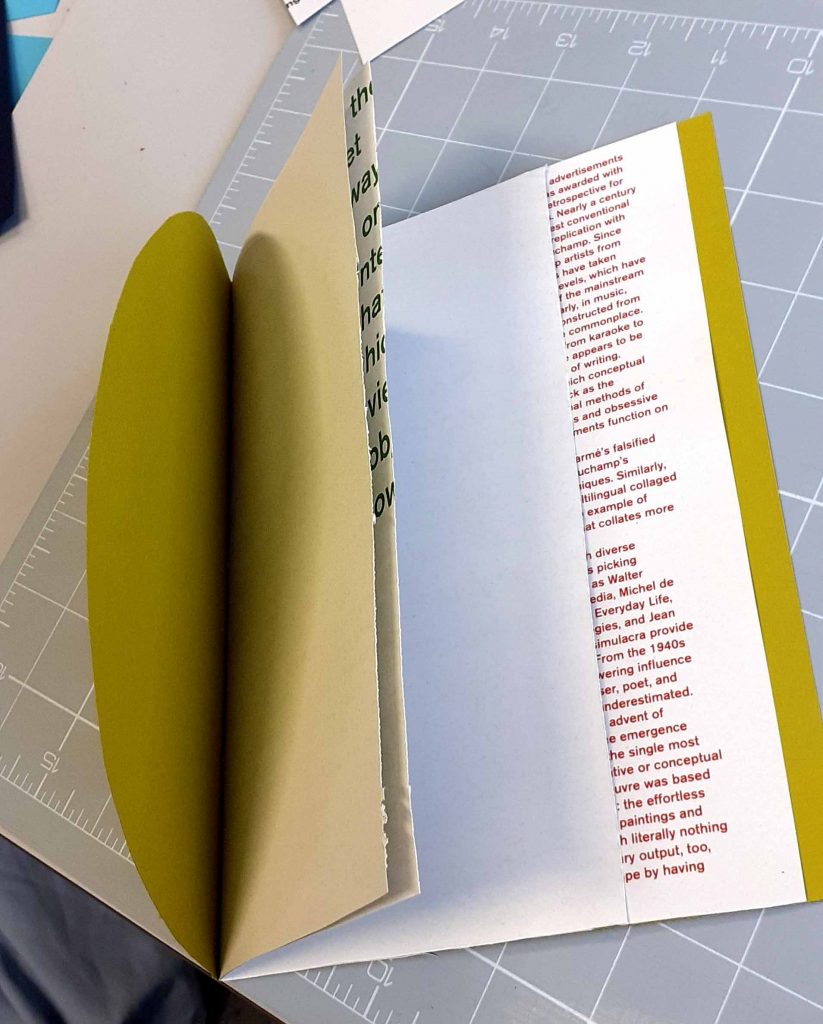
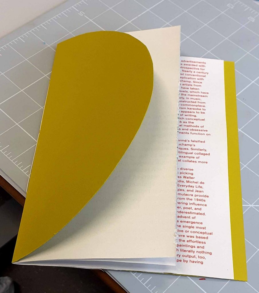
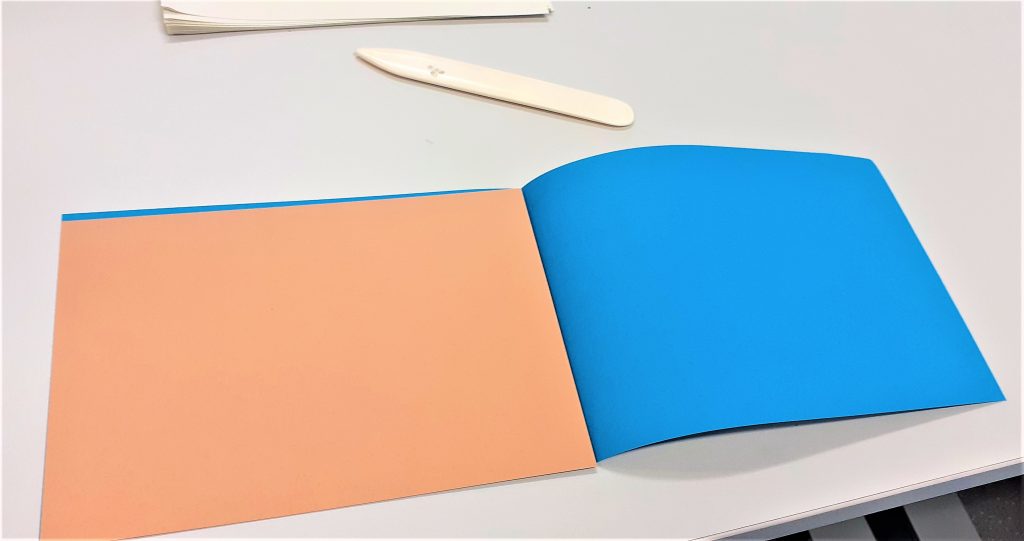
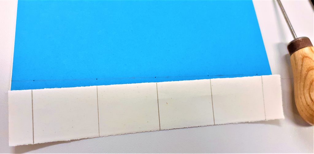
Trimming the last pages of text, allowed the coloured card to be visible from the front when the book is closed.

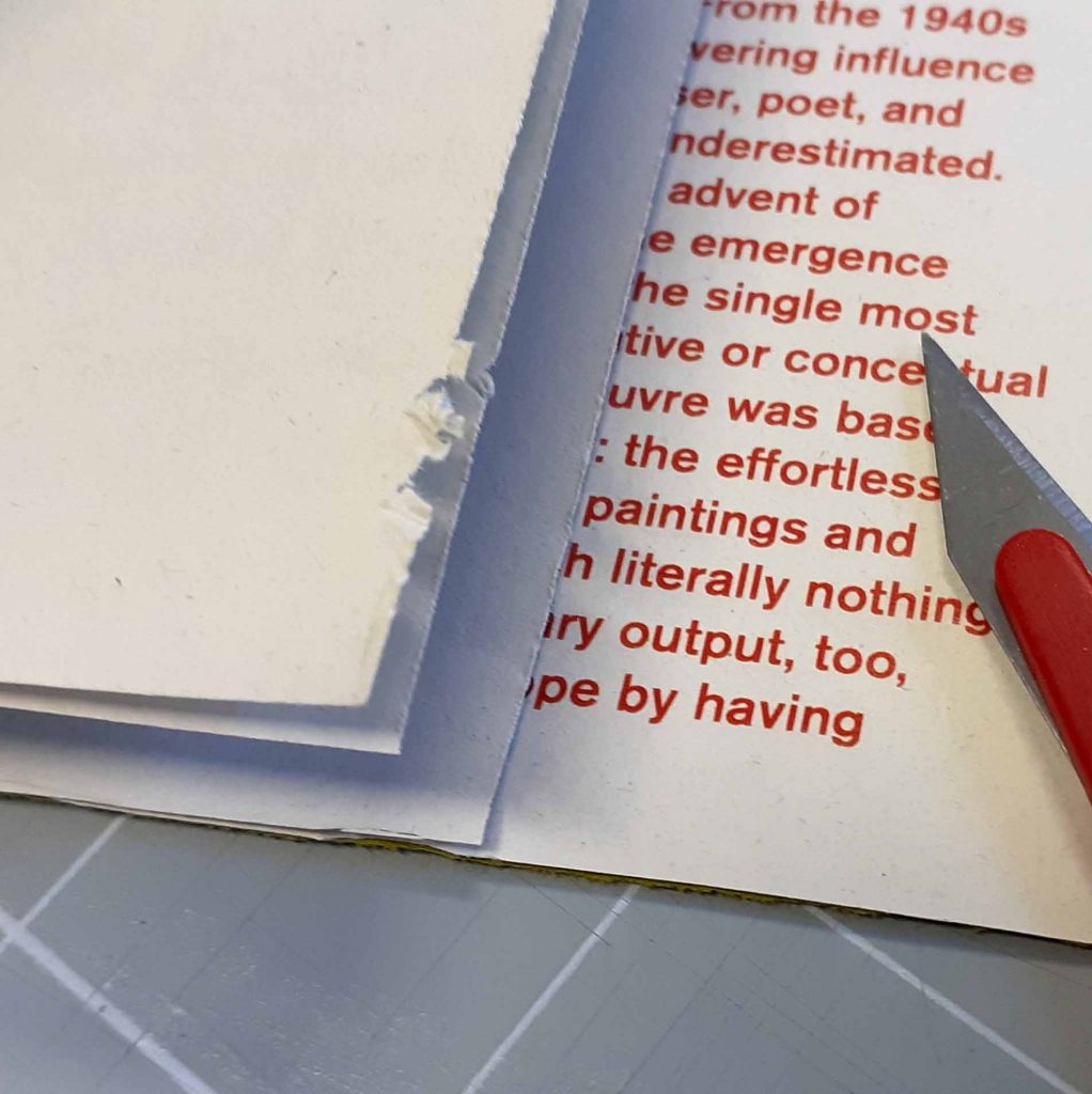
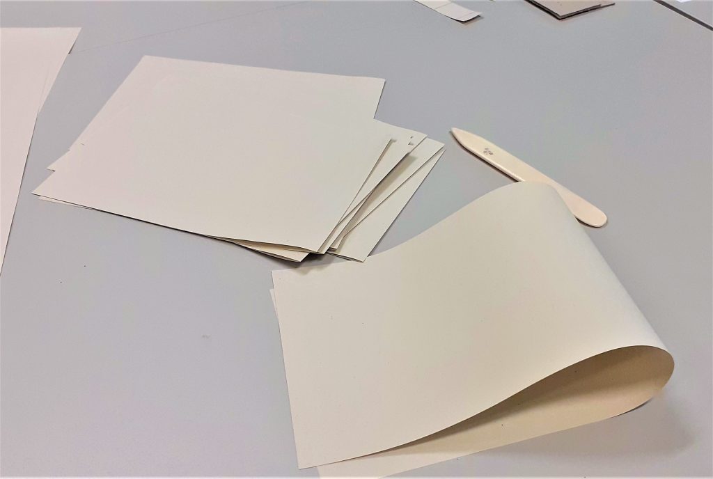
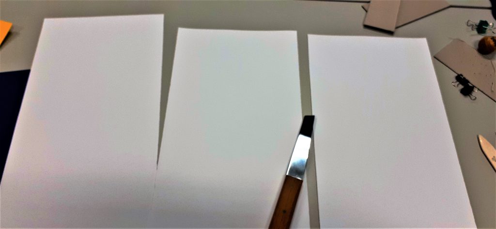
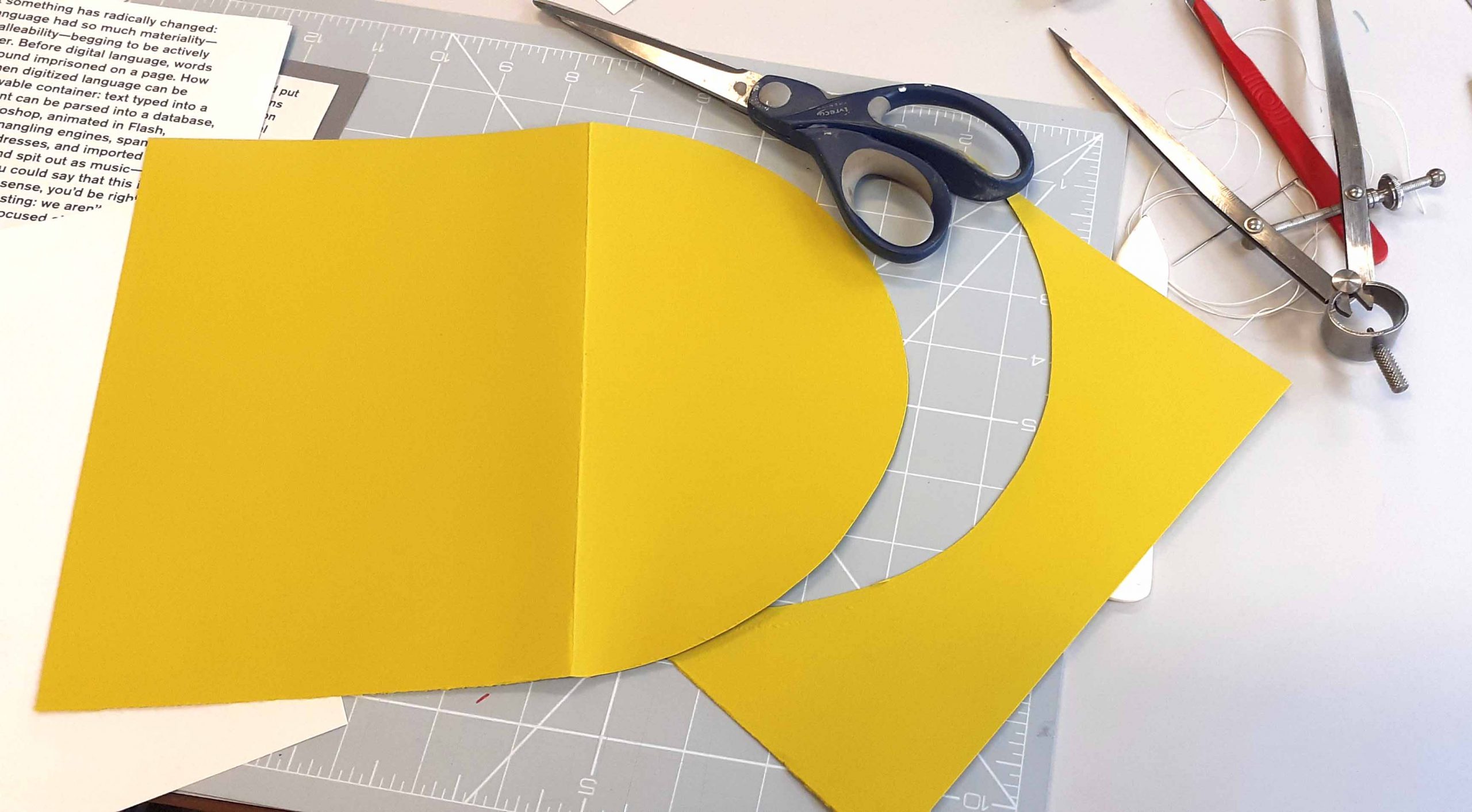
I used a scalpel and ruler to trim the edges of the paper.

However, this snagged at the paper. I thought this might have been due to the angle of me sitting down. I stood up to redo the cut, but this had the same effect. I then figured out that pressing on the scalpel harder and using a swifter motion, was enough to make a clean cut.

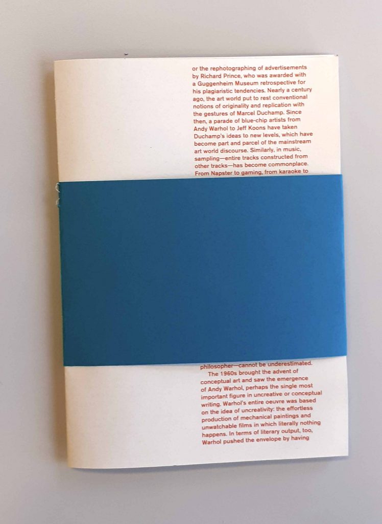
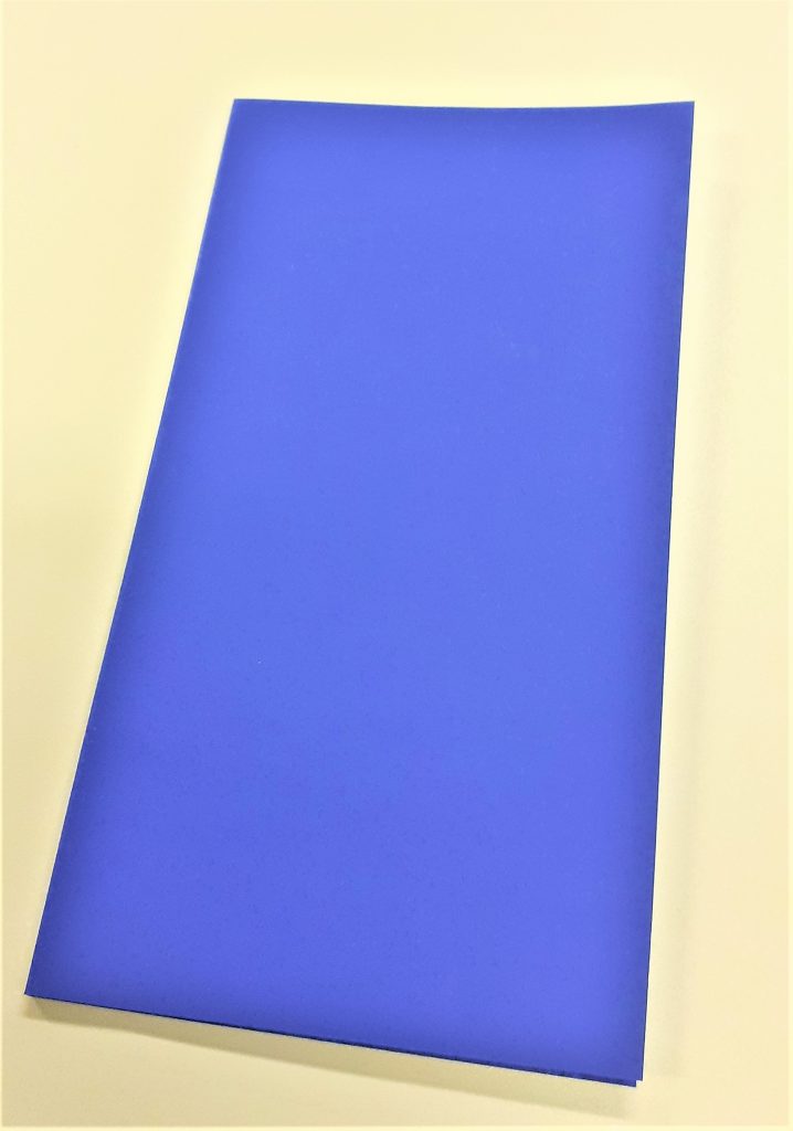
For the fourth book of the workshop, I made a smaller cover with blue card that acted like a belly band.

I feel that the colours work well together (red text and turquoise-blue cover)

The cover wraps around the pages and so the pages fit within the folds. (see below)

The blue text can still be read, with the band folded in.

Centre staples. The page on the right folds in from the edge of the page. I used double-sided tape to attach it.
I placed this half page within the book to allow the information to be read alone of as part of the page behind it.

I can see the potential of binding my own book. It allows more creativity and imagination, also inspiring the content as much as the content could inspire the format.

Map formats

I researched the physical formats for map making by looking at maps in the flesh.

I remembered the collection Ruth showed us in our bookbinding workshop about maps. I visited the collection in the Richard Hamilton Building this week and took a few photos of some interesting aspects.

I didn’t photograph one map where the designer included graffiti and dog poo on their map of an area. It is the designer’s choice what they include in the map and what they want to direct the reader to.

This map opens out lengthways and shows us 2 sides of a street. The centre of the map represents the road itself. They have used words to tell us information such as who lives in the building and events that have happened. The map was not in English, so I could not understand exactly what it was telling me, but even so, I could guess a lot from the way it is visually expressed. As the reader, it feels like you are walking down the road.

Another map that caught my attention is one made up purely of photos. The designer has taken a series of photos at one location and pieces the images together to create a picture of the place. This reminded me of David Hockney’s approach, but the photos here are made to look seamless. This technique means that we are given more information than could be captured in a single photo of a place.

Stephen Willats

Amongst the collection of maps, I found this booklet by Stephen Willats, whose work I have looked at previously. The Tower Mosaic Book maps together the residents of the building. Because of the boldness, the map is easy to read.

The quotes on the left page above, have distinctive voices, without needing to change the typeface.
He presents different objects from the building. As a viewer, I wonder about the choice of objects. I can see they are the people’s possessions because they are everyday objects.

Michael C. Nicholson

Nicholson maps his day in this booklet. The horizontal line represents the hours in the day and the silhouettes signify different activities. The way they are positioned remind me of a clock face and therefore the viewer sees a clock even before reading the text.

The horizontal line continues across the booklet. This helps the work to look cohesive and part of the same narrative.

Where You Are is a book of 16 maps created by writers, artists and thinkers.’ 

A Book of Experimental Maps Designed to Get You Lost | WIRED

‘We’re constantly mapping our lives, even if we don’t realize it. The emails we send, the restaurants we Google, the buses we take, the status updates we post —all of this is a way to track where we’ve been, what we’ve done and what’s important to us. ‘

‘(These maps) won’t actually get you anywhere—but they sure are fun to look at.’ 14 Fascinating Maps of Places Hiding In Plain Sight (gizmodo.com)

I looked at this collection and include some of the maps here:

Denis Wood

front cover

Tao Lin

front cover

Tao Lin maps outer space in answer to the question ‘Where are you?’

Leanne Shapton

front cover

Tablescapes is about the literal space around you in your day to day living. A desk is multi-functional. It’s a table you sometimes work at, sometimes eat at and use to store objects you may need to use in the near future.

Peter Turchi

front cover

This designer thinks about different paths he could have taken in his life. The flow chart style reminds me of the quizzes found in magazines when I was a child.
He uses road signs that are recognisable to the viewer.

Geoff Dyer

This map folds out to show the designer’s home town. He has marked areas that have personal significance to him. I like the depth of detail in this map and the way it is possible to get lost amongst it.

Joe Dunthorne

Ghost Pots relates to his experience as a writer.

Here, the designer uses illustrations to draw a map of an imaginary place. ‘A literary landscape.’

Valeria Luiselli

Swings of Harlem marks the swings the author remembers from childhood.

The map folds into the front cover. Her map was unique in the way that she made a large folded map separate to the rest of the work. There is a booklet that comes with the map to add context to the images.

In the booklet, she shares her memories and thoughts about each swing. She includes photos from her personal collection. This gives the map an authentic feeling.

Bookbinding Workshop 2

In today’s bookbinding workshop, I made 2 kinds of book:

Stab-binding and a zig-zag/ concertina style book.

I also learned the foiling method of adding text to a book cover using a hot tool and coloured pieces of foil.

The first book we made in the workshop, used the stab-binding method. The folds of the pages were on the outside edge of the page. The advantage of these doubled-up pages, is that it makes it less likely for ink to seep through when you are writing on the page. The first task was to fold the pages, using the bone folder. We used 15 sheets in total.

Using a thicker piece of card to re-enforce the cover means that the book may last longer. Here I folded the cover (blue) and ensured the (brown) card would fit nicely inside.

I assembled the pages together with the cover and used 2 bulldog clips to hold everything together. Using card between the clips and the cover means that I prevent marking the cover. I clamped the outside edge of the book, leaving the side free that would become the spine.

I measured 1cm from the edge of the cover. I marked 5 points on the cover where the holes needed to be placed. Using 5 holes makes the book hold together more strongly than if I made only 4 holes.

Making the holes was the most physically demanding part of the process. Using the awl, I pressed and twisted into the paper where I had made the pencil markings. I made sure to keep the awl straight. The number of pages and thickness of the card is what made the action tough. It was easier to make the holes whilst standing up. I placed card underneath the book to help hold it in place and prevent me marking the table. I made sure the awl was about 3mm through the other side. This meant the hole was big enough. Another way to check is to hold the book up to the light and see if I can see through to the other side.

Using the needle and a strong thread, I began to stitch the book together. I started from the inside of the book and pushed the needle through the centre hole.

I found this stitching process easier than the previous books I have stitched. I think this is because the stab-binding stitching pattern works in right-angles. The main difference is that with this method, I needed to hook the thread around the outside of the cover.

I also needed to make sure I was pulling the thread tightly after each stitch.

I did not need to tie a knot because the stab-binding holds the thread in place. The thread begins and ends at roughly the centre of the book.

The result: I felt that the line of stitching looked wonky. This is probably due to where I placed the holes.

My next book was a zig-zag style book. My first thought when our lecturer Ruth showed us this kind of book, was how great this method would be for a photobook. This is because the book opens out to a long line of paper where the reader has the option of viewing every page together, or turning one page at a time.

I began the process by cutting a large sheet of paper into 3 separate sheets. This makes up the pages of the book. I used the paper knife for this task.

After folding the paper into 4 pages per each piece of paper, I began working on the cover.

For the cover, I needed to fold the paper twice to create a flat spine. I worked out the width I wanted the spine to be by holding my pages together and measuring the thickness of the pages. I left a gap with this measurement at the edge of the card and folded up to this point. I turned the paper around and did the same in reverse.

I then attached my pages together using double-sided sticky tape. I then used the tape to attach the pages to the cover. This part of the process involved some decision making. I needed to think about how I wanted the book to be read. I had the option of attaching the pages to the back cover or the front cover. I needed to weigh up the procs and cons of each method.

zig-zag book.
Attaching the pages to the front cover means that the reader will open the pages out to the right.

Using the foiling technique, I added the title to the book cover. I first practiced on a scrap piece of paper. It was important to use a template to trace the words, as this gave me a guide and ensured the word would look neater that working free-hand.

I needed to work slowly, to allow the heat to pass through the paper and the foil. I made sure the tool was switched to the lowest heat. A higher heat would have melted the foil and the result would not be effective. I considered health and safety during this process. I made sure the tool was not touching the table or any object while it was hot. I especially made sure the hot end of the tool would not touch the cable.

I added my initials to the back cover of the book. I had sketched the letters onto paper first, before using them as a template.