Digital Workshop- Mapping

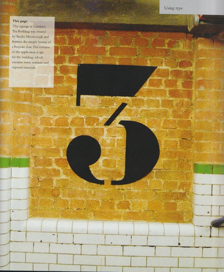
Workshop: ‘Topographics’
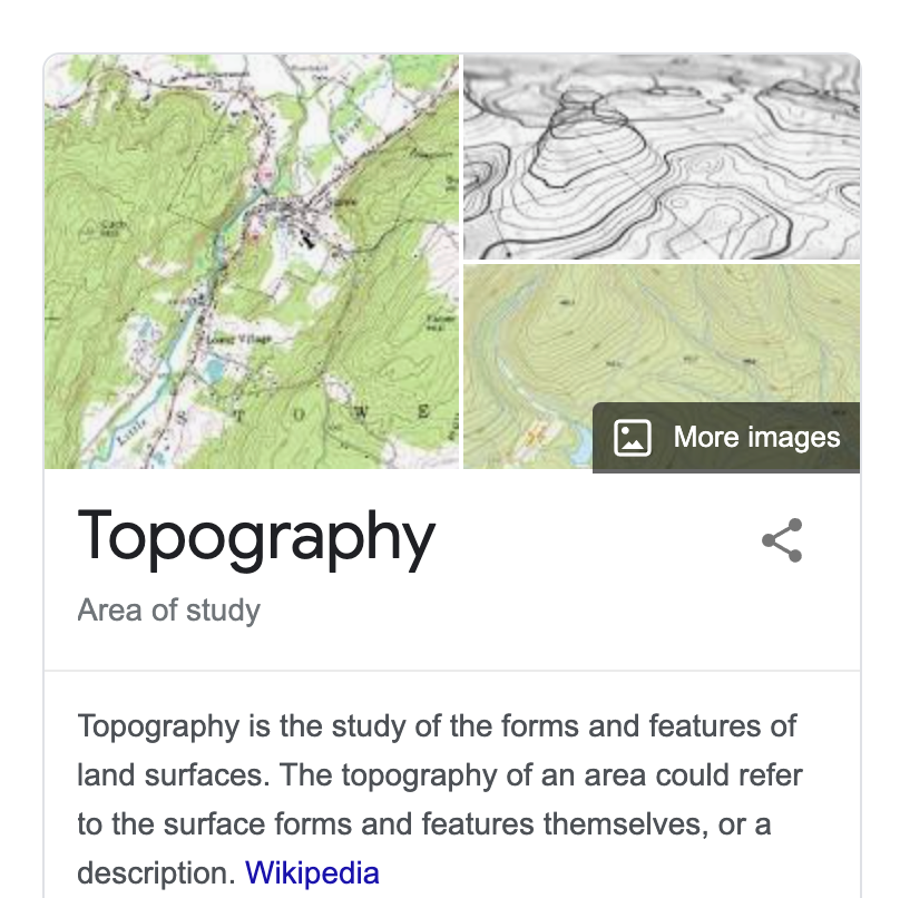
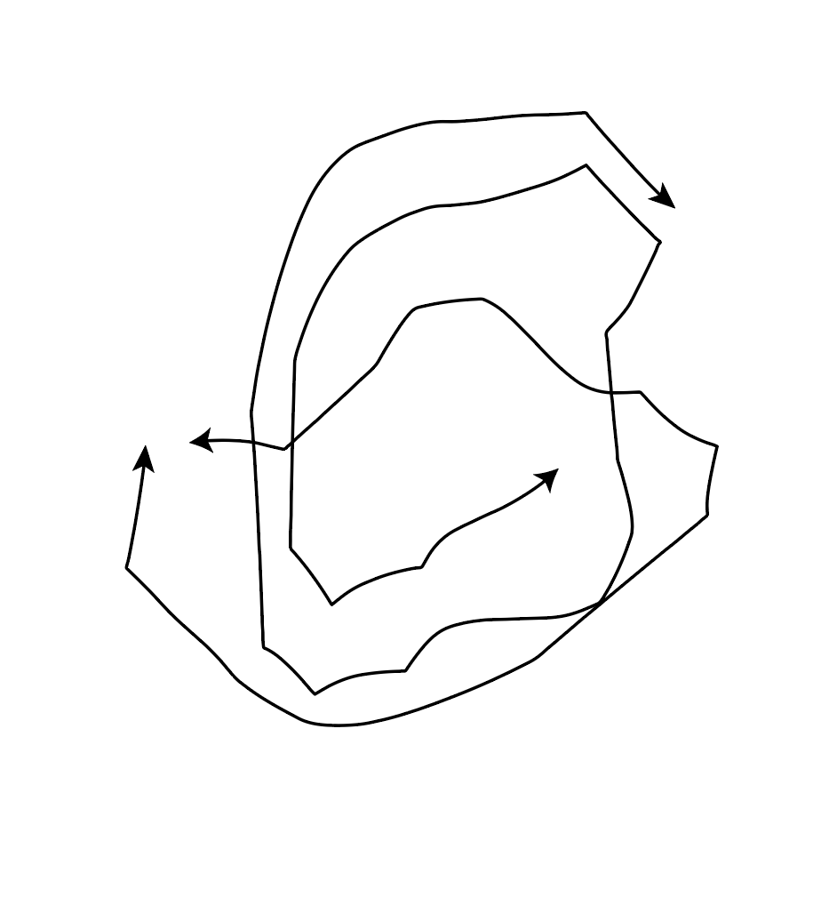
From Idea Generation by Neil Leonard
What is a map?

It is an image. But not just an image. A map is an informative graphic. Something you need to interpret. How can we map something? How could we map our thoughts? How about a physical landscape?

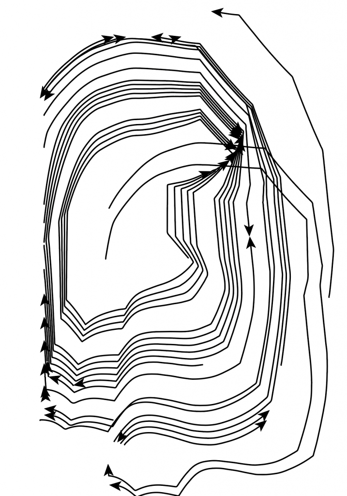
A straight line says nothing, but adding an arrowhead to one end says something. It is suddenly a map. Something to read. It indicates something to us.

An image that isn’t a map, is abstract.

Opening this image of a map of Oxford in adobe illustrator, allowed me to explore different manipulations and ways of drawing a map.

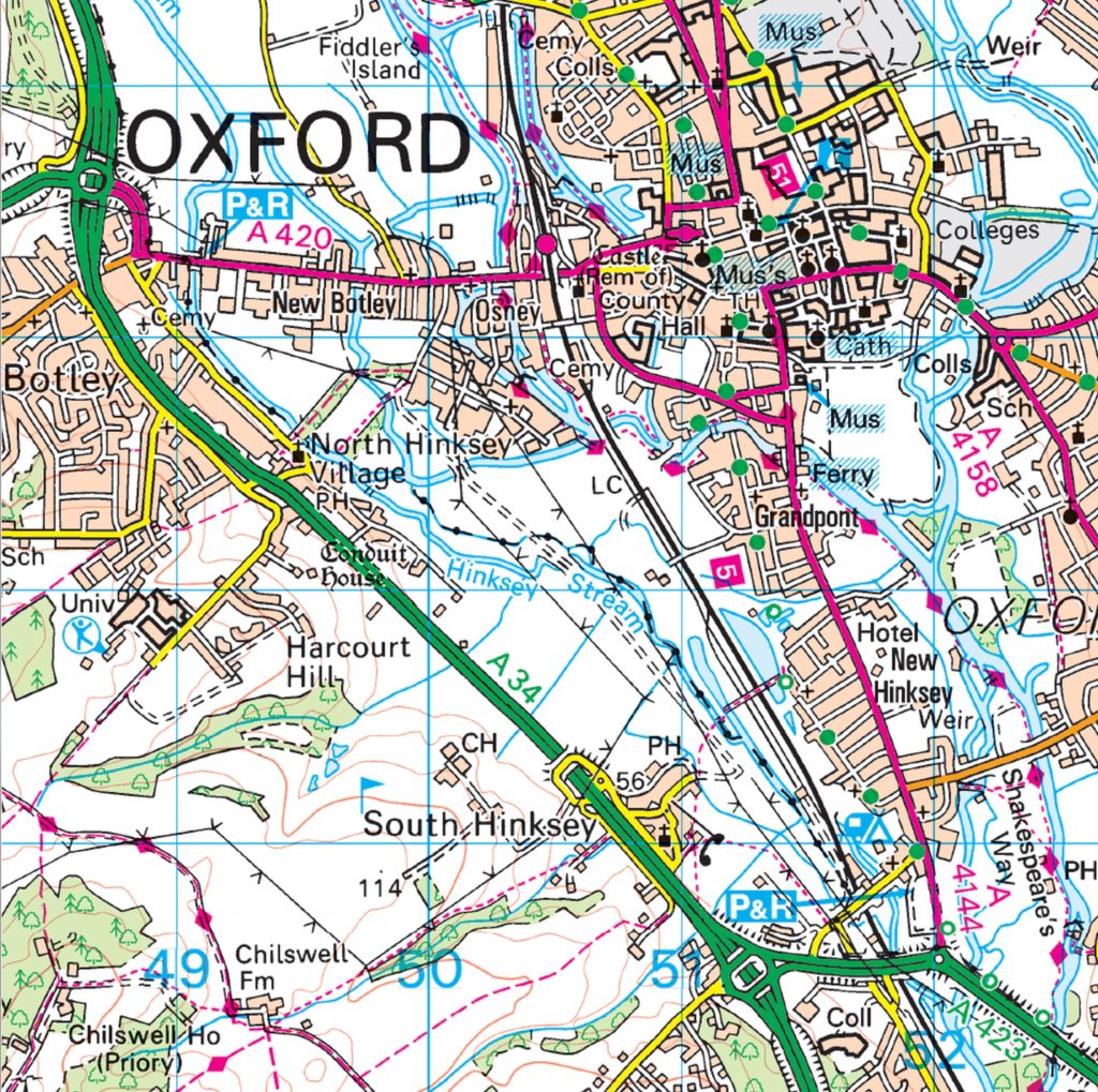
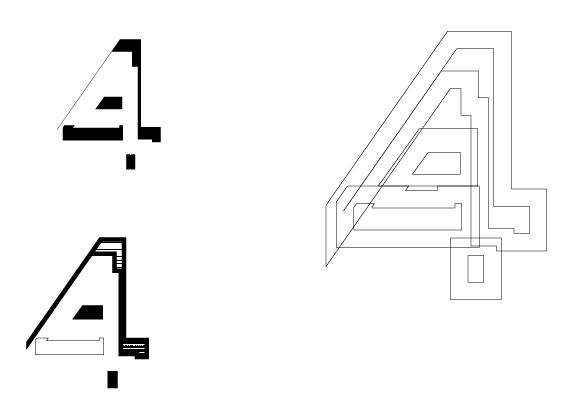
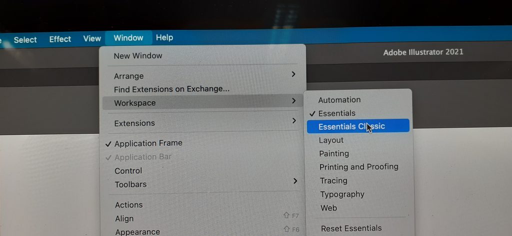
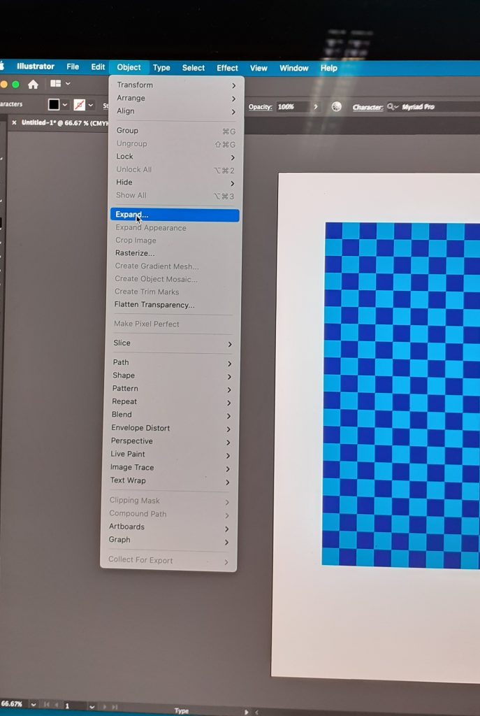
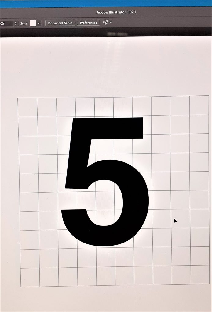
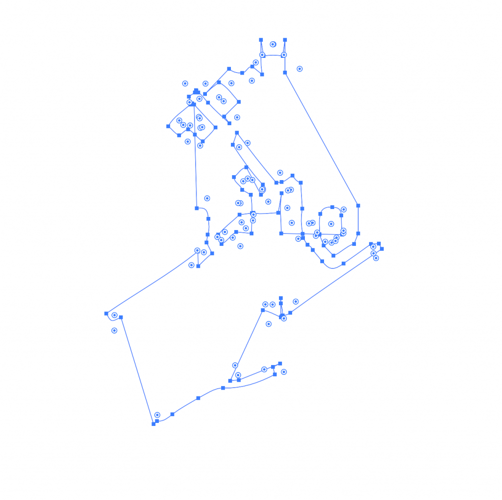
I began by pulling different areas from the map. To do this, I first selected Image trace> 16 colours. This turned the map into a vector image instead of an image made from pixels. All the lines appeared smooth when I zoomed into the image.

Expand completes the action of turning it into a vector. This also allowed me to move the different pieces separately.

Command + shift + G ungroups the image.

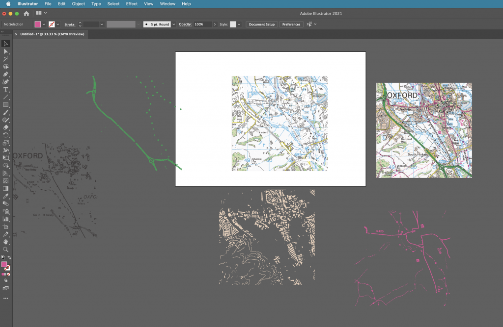
To be able to grab all the areas of 1 colour, I needed to select:

Select > same> fill colour

I could then click and drag to take out these separate pieces of colour.

I then played with the other image options:

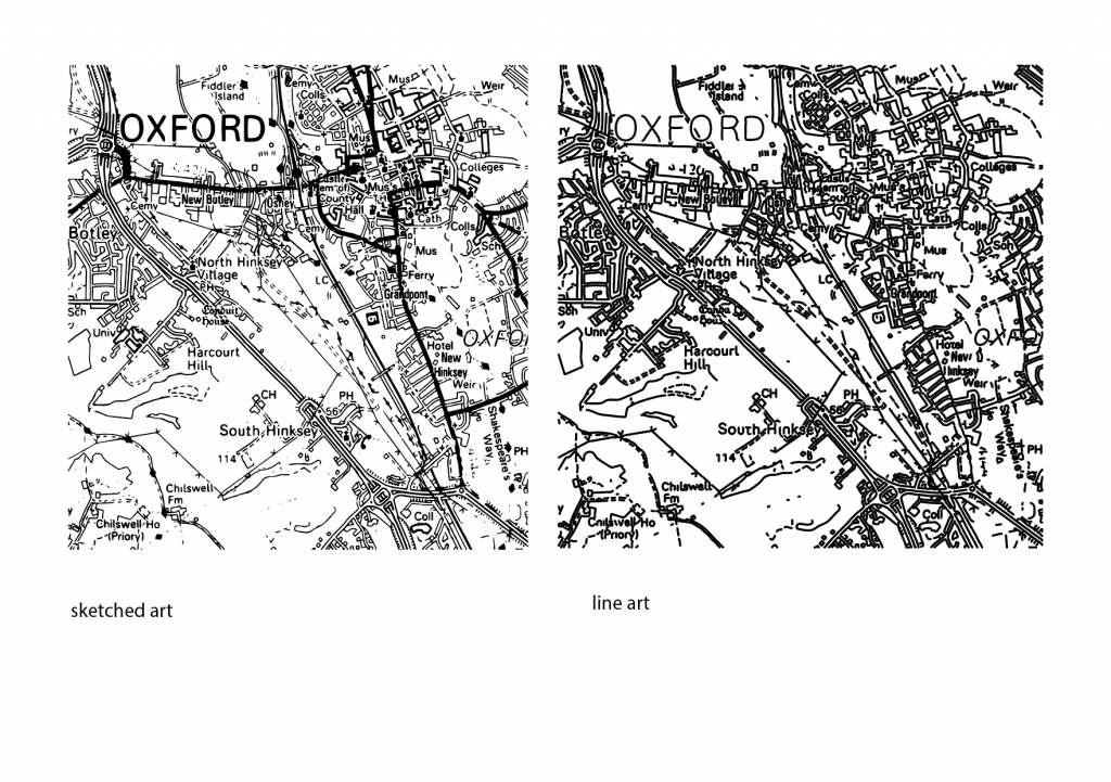
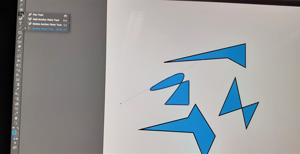
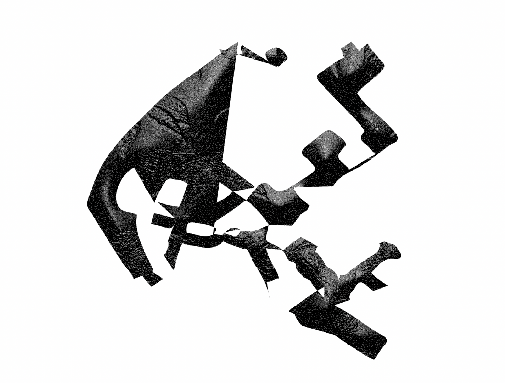
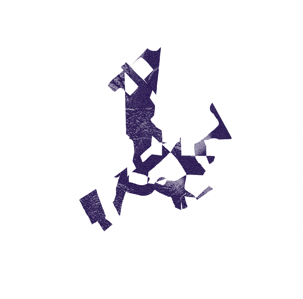
Converting the image into line art gave me new options for experimentation. I clicked and drag on small areas of the image to separate the lines, lifting areas out of the map. The gaps in the map below left are areas I had taken out of the image:

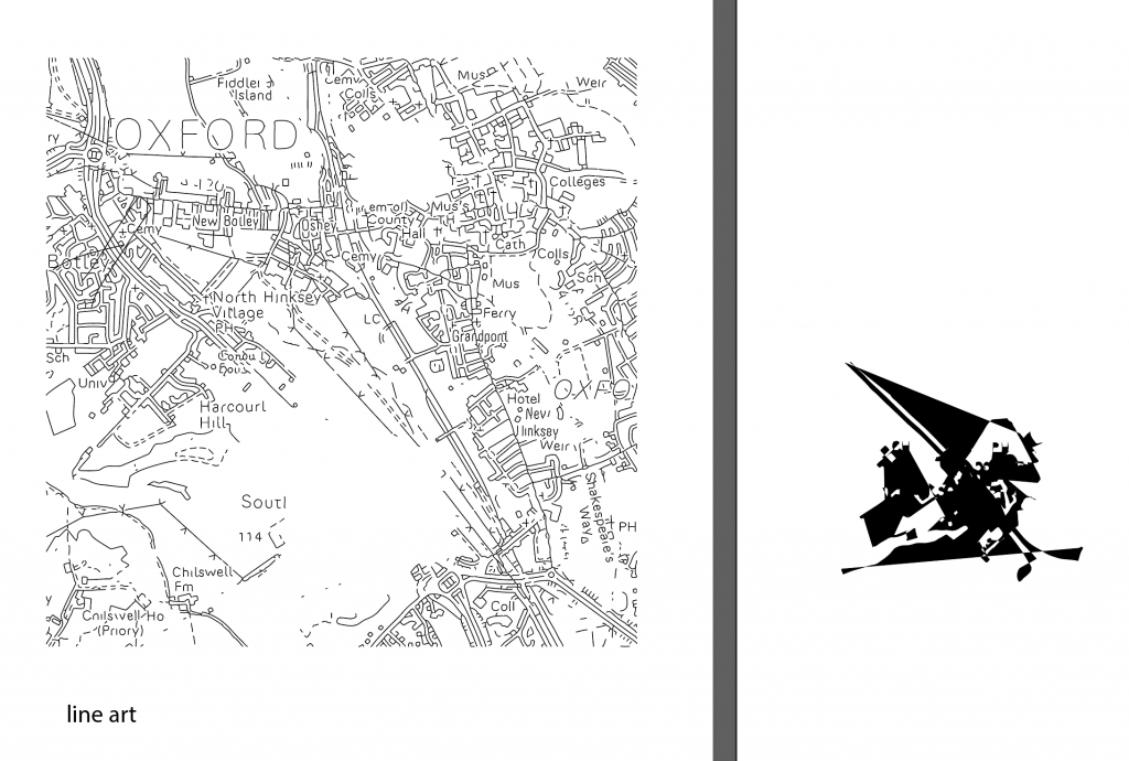
The shape on the right was created from taking the small area from the map. I pressed Command + J to join the lines together. I then clicked the small arrow beside the stroke and fill colour squares. This inverted the colour and filled my shape with black instead of the black outline.

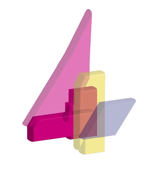
I then copied and pasted the shape into adobe photoshop. This allowed me to work on it further and turn the image into a bitmap. I needed to make sure the pieces were in a formation I liked before pasting it into photoshop. This is because it is very difficult to rearrange the pieces once the shape is pasted into photoshop.

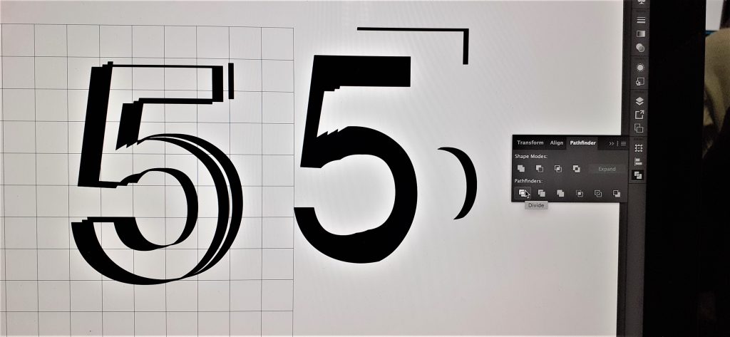
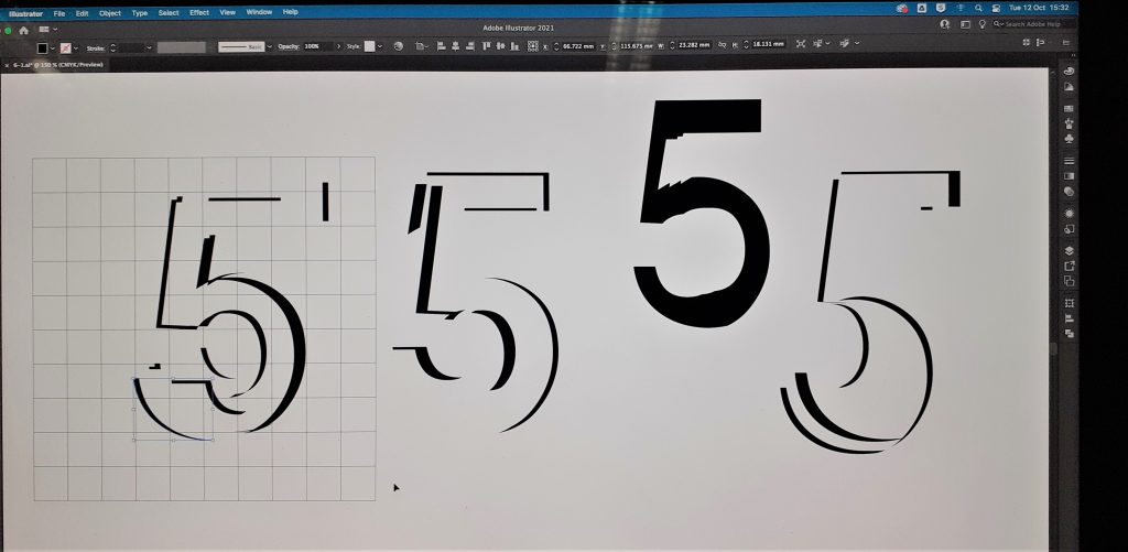
pathfinder> divide takes the shape apart.

pathfinder> unite sticks the shapes together like glue.

pathfinder> group allows you to move the shapes around together but they do not become the same object.

My first step was to bevel/emboss the shape. I selected Layer> layer style> bevel & emboss, as shown in the screenshot below:

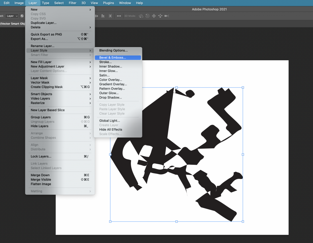
This allowed me to play with the height and texture of the shape. I chose the leaf pattern as I liked the rough texture it produced.

The image needs to be in greyscale before you can bitmap it. I bitmapped the image and chose ‘diffusion dither’ to create the grainy filter. I saved the image as a TIFF file.

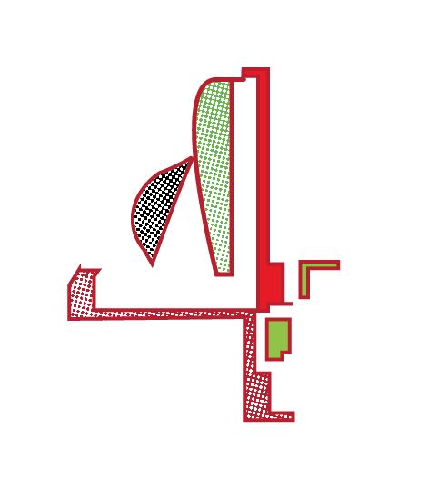
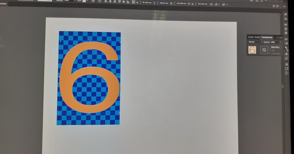
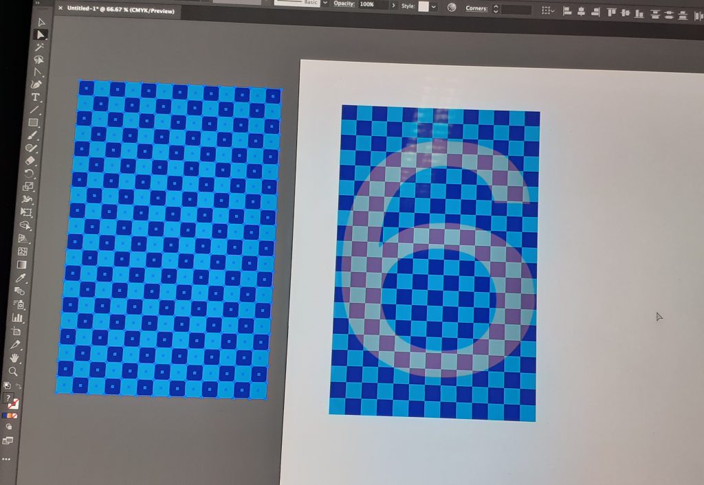
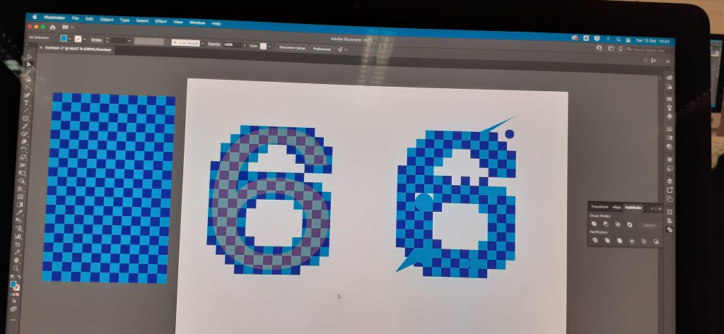
Back into Illustrator, I took another shape from within the line art of the Oxford map. I used this for my outline. I repeated the previous process of joining the lines and filling the shape with colour. This time, I removed the fill and the outline, so the shape was transparent. I selected ‘draw inside’ and Command+ shift+ p, to place an image inside the shape. (this is the shortcut within illustrator, in InDesign, we would use command+shift+D)

In this case, I wanted to place my bitmapped image inside this new shape. I selected the TIFF file and clicked to place it inside. Because this image is a bitmap, I was able to change the colour of it. I also tried rotating and enlarging the image from within the shape.

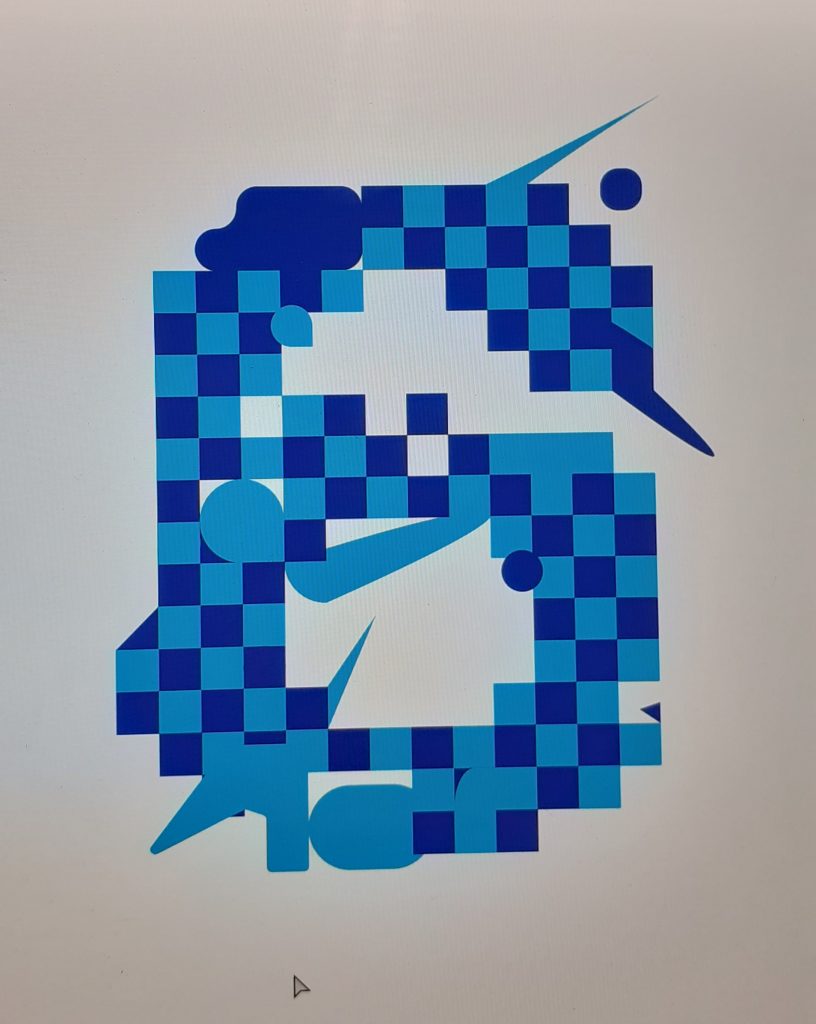
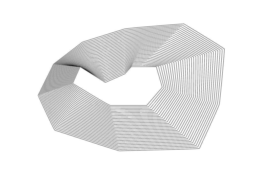
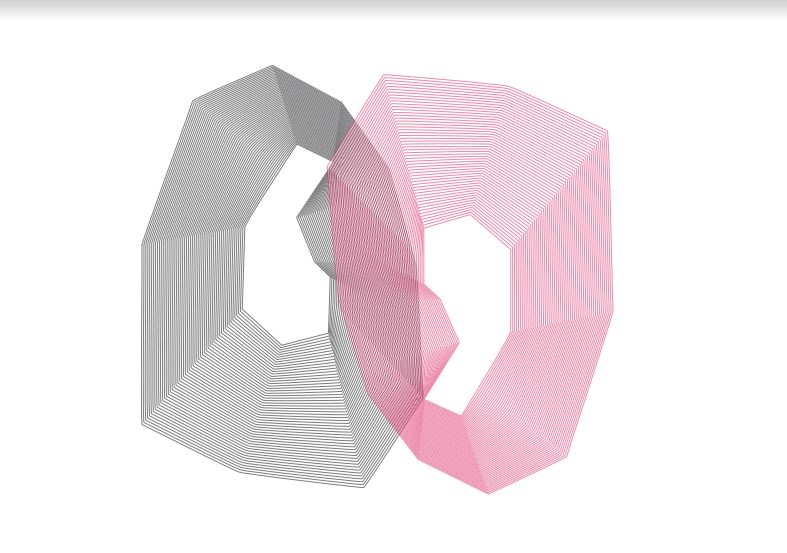
Another technique for image producing. I drew a shape using the pen tool on Illustrator. I then drew another shape within this shape. I selected object> blend> make. I needed to change the stroke colour to black, to be able to see another shape appear between the 2 I had drawn. By then selecting object> blend>blend options>specified stops and increasing the number, I could create multiple identical lines within my image as shown here:

The image looks quite 3D and could be describing a gradient.

I duplicated the shape by holding down ‘option’, clicking and dragging. I changed the colour of this second shape and rotated it so that it was upside down. I placed the shape so that they intersect. I increased the transparency so that it is possible to see through the lines to the other shape:

I printed the image of the shape that had multiple lines. I used this print to scan onto the computer. Instead of doing a simple scan of the drawing, I wanted to make it interesting.

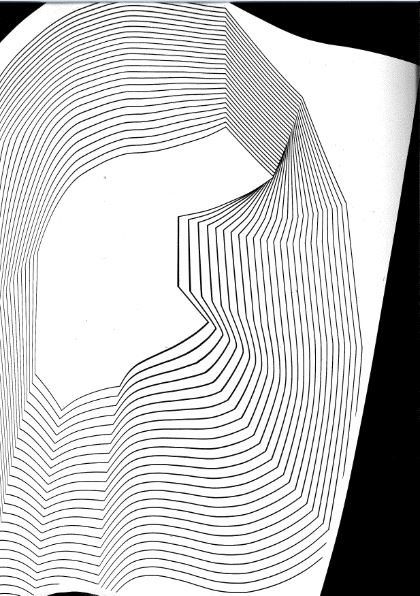
I moved the image around on the scanning bed as the scanner moved across it. This created a wavy image where the lines moved in different directions. From this scan, (I saved it as a TIFF file) I could manipulate the image further in Illustrator.

This image was made from the scan.

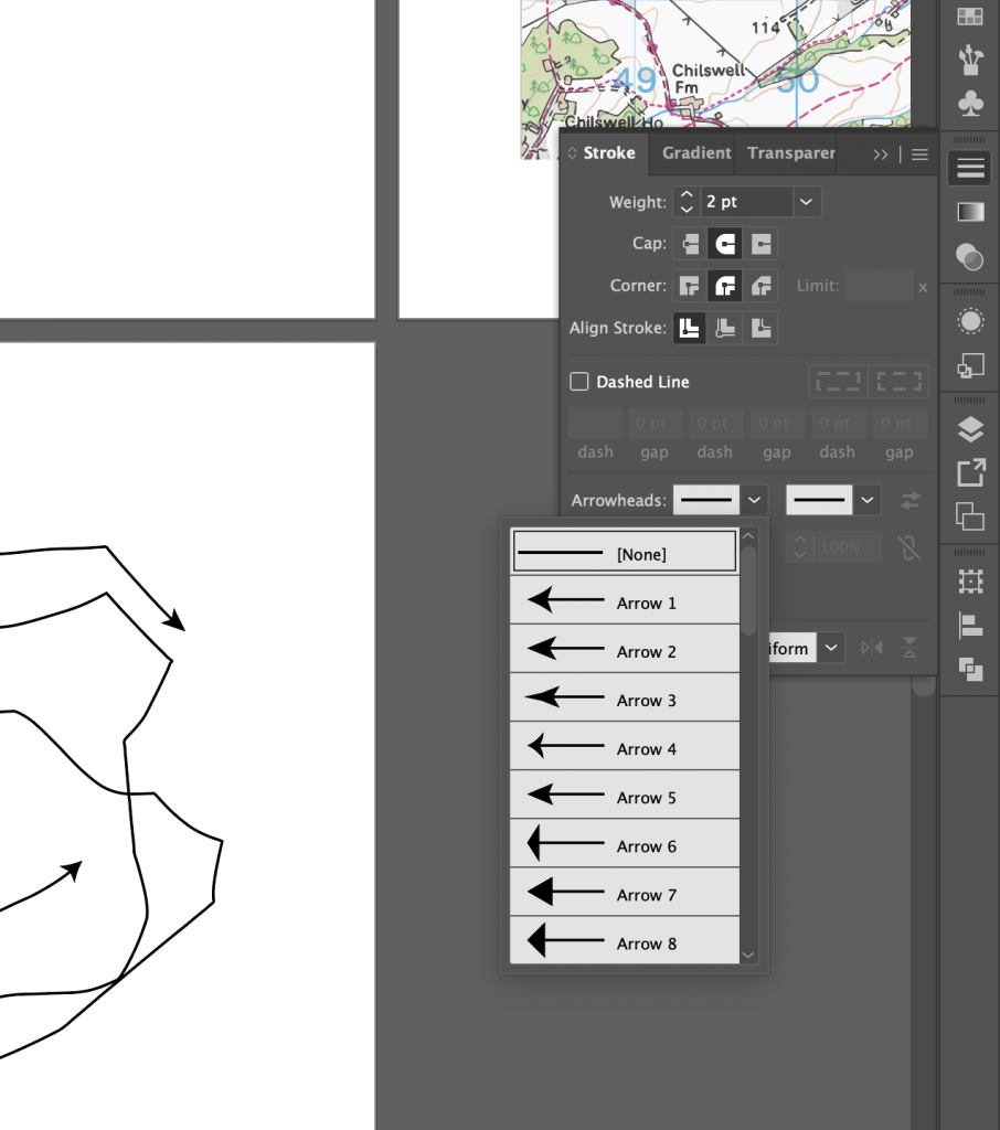
I remove lines from my scan by grouping the image, so that it was a vector image. I added arrowheads using the arrowhead tools on the right hand side of the page. To create the above effect, I selected object> blend> make. By selecting blend options, again I could alter the number of linen repetitions.
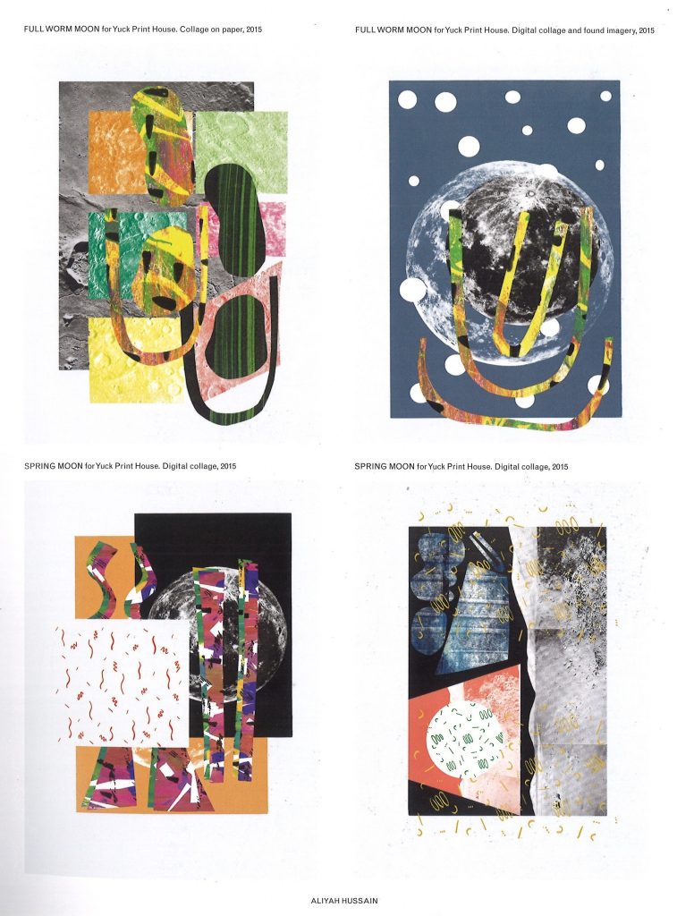
arrowhead options

Aliyah Hussain

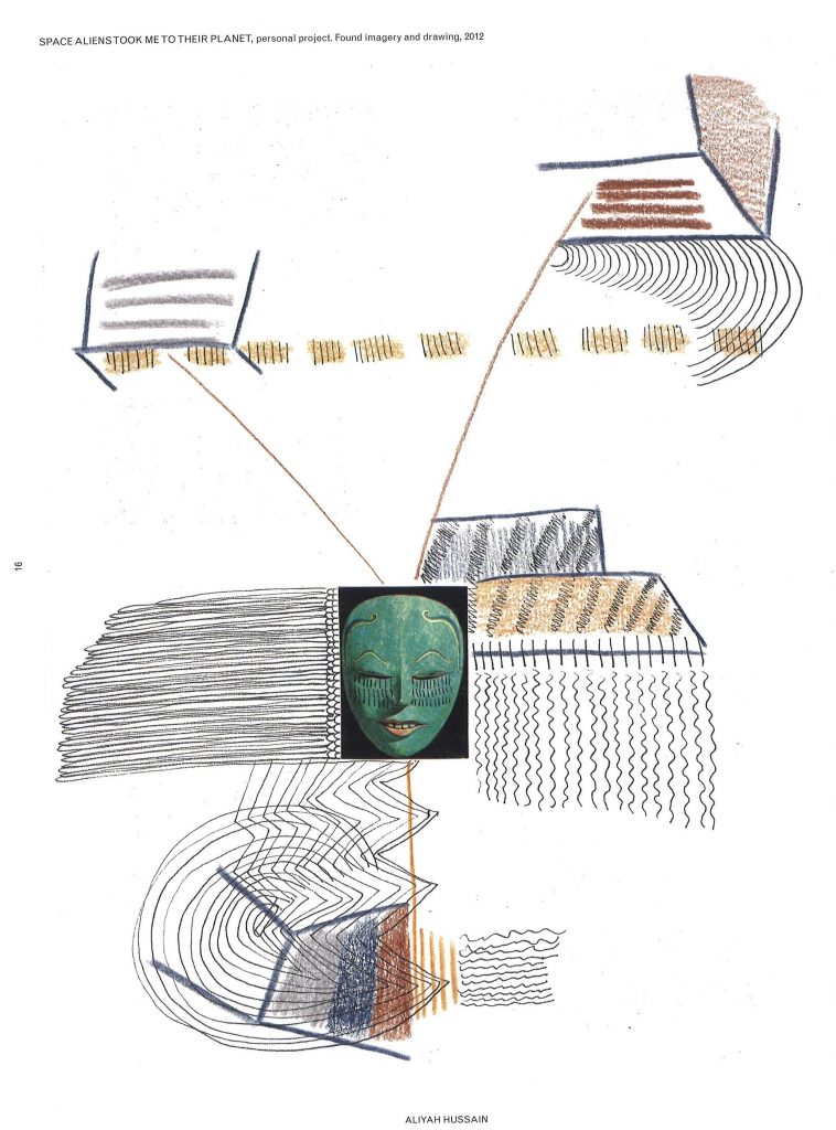
Aliyah Hussain is a UK based design whos work is multi disciplinary.

Her work is focused on collage but also incorporates screen-printing techniques, painting, photography and performance.

Her work unites futuristic utopian elements with a retro and hand-made aesthetic. Her use of line is bold and directional. In the above piece, I can see the pressure she has used on the pencil. The lines coming from the centre mask image implies to me a kind of mind map, where the ideas are directly linked to the face in the middle. Who might this face be representing? Is it a signifier of a collection of people in general?

There are areas of business and action, combined with white space where the eye can rest. I like the hand-made feeling that this has been jotted down in a notebook to record something important that the artist needed to remember. It has that rushed and urgent sense to it that we might find in a journal.

Number design

This week, I am re-visiting the ‘Number’ brief. Since I struggled with this task last week, I decided to give it another go and try to understand Adobe Illustrator a bit better, as well as how I could go about designing numbers.

Figure and ground

‘Look at the Rubin vase (example 1) where the figure– ground relationship relies upon a visual confusion so that the eye sees either faces or a vase.’

In this image, we can view the white area as negative space, therefore seeing the 2 faces. Or we can choose to read the image as a white vase, where the black area becomes the negative space. The figure is the object in a given space, and the ground is the background space around the object.

Numbers are everywhere in the world around us and they are instantly recognisable to us. Since they are so easily recognised, we can playfully customise them away from a basic number form, and they will still be readable- we have a lot of room to experiment. This is what we did in the Number workshop.

Number Designs

I looked at the way designers have approached numbers. These designs are suitable for use in posters, as the numbers have eye catching styles, shape and composition. They are functional, as they can convey information, and also are interesting designs.

From The graphic design idea book by Steven Heller & Gail Anderson:

Non-Format

Non-Format are a pair of designers who are known for bespoke typography and interesting image making.

The designers were asked to create their version of the number 25. The colours they were given for this task were red and grey. I like the way they have played with the rotation, it reminds me of the staircase images by MC Escher. I like the 3D effect because the number looks tactile and I can envision it as an object in the room.

Image from: non-format.com/slanted-25

I also came across this design by Non-Format, which is styled quite differently to the 3D number. This figure is two-dimensional, but this does not make it flat looking. It looks as though they’ve designed this number using a grid. They have sometimes chosen to group the squares of the grid together and in other places, it’s easier to see the individual squares of the grid. The Zigzag lines that form the edge of the 2, add a sense of movement, it is as if we can see the shape vibrating. They have used smaller chequered patterns within a single grid square, they have used stripes, circles, triangles and dots. The figure itself is cohesive as one piece, because all the smaller elements within the 2, such as the different patterns and different colours, are presented in similar sizes to each other.

Leonardo Sonnoli

This looks to be a poster design, using the numbers three and two. I like the boldness and simplicity. The thin lines are important, as they balance out the boldness and add a sense of delicacy. The designs are quite elegant, and I would expect this to be a poster for an art event or for a sophisticated audience. I associate these numbers with the Art Deco style. The numbers themselves are black and white but the colour comes from the background. The number 2 is not joined up in a way we would expect, but instead it’s our eyes that join the top and bottom half to form one object because we are familiar with the figure of the two.

This poster does not contain numbers, but it interested me when I was thinking about number design. I like the overlapping of colours, particularly in the top third of the image where it looks as though the colours are mixing in layers before our eyes. Because these figures are chunky, and they are placed so closely together, my eyes naturally wanted to read the negative space as part of the design.

Dan Chamberlain

I was immediately drawn to the refreshing colour palette. This design looks fun and energetic. The two links that make up the eight do not need to be connected for us to read the pattern as an eight. This is helped by the fact that the figure of eight appears next to a seven. (Our mind makes the association that we are looking at numbers.) I like the outline of the 7 and I was inspired by the fact that I do not need to fill the figure with a colour.

Here I liked the use of half tones with negative shapes. It is interesting to see where they intersect at the centre stop. Using yellow and blue was a good choice because it helps the outline to stand out.

I was drawn to the boldness of this figure of 5. I like the way that certain areas are cutaway around the outside of the shape. It makes it look imperfect and accidental. This helps to include some negative space in what would otherwise be a bulky shape. The bottom half of the 5, to me resembles the bottom of the J. There may be some significance in this or not. Where the colours intersect at the centre, there is the murky dark colour. This shows that the blue and orange are transparent, and resembles the effects created by screen printing for example.

Because of this transparency, the 5 appears airy and light if it was to be physically lifted. It makes me think of jelly, this makes it a fun design to look at. I like the way the angles are not visible, but we can still see the shape is 3D because of the angle the designer has drawn it at. The use of orange and blue is very strong and works well because they are opposite to each other on the colour wheel.

From The graphic design idea book by Steven Heller & Gail Anderson:

Studio Myerscough
from the book: The Fundamentals of Typography (3rd edition) by Gavin Ambrose, Paul Harris and Sallyanne Theodosiou

This number 3 has been applied to the side of a building, it may have been painted on. I like the disjointed quality of the figure. It helps to break up the chunky parts of the design. She has used curved and angled shapes and the results is bold yet stylish. I like how the end of the three looks like a quotation mark or, or a backwards comma. This might suggest a relationship to a literary theme.

Adolphe Mouron Cassandre

This is a typeface for numbers and letters from 1929 (the Art Deco period). I like the combination of block shapes and half tones to make up each figure. Each number is unique and yet clearly belongs to the same family of numbers. The half tone, or stripy areas sometimes stand in for positive space, sometimes stand in for negative space, and other times are connecting and representing both.

My designs- using Adobe Illustrator

After experimenting with the numbers 2 and 5, I moved on to see what potential there was in a 4. I pushed myself to learn new skills on Illustrator and to practice the skills I have recently learnt.

From my second time on Illustrator, I learnt a few basic principles:

  • The white arrow is the Direct Selection Tool. It can be used to round the corners of a rectangle and to stretch the rectangle.
  • Add Anchor points just adds anchor points.
  • Anchor Point tool just moves anchor points that are already there.
  • The Pen Tool draws lines.
  • Shift+command+[] to move an object in front or behind
Drawing several 4’s on top of each other, then dividing them. I made these fours from the resulting pieces.
Here I played with the opacity/transparency option to have the different colours showing through. For the 4 on the right, I used the bevel tool to round the shape and add a 3D effect to it. I liked the chunky appearance that I created by increasing the stroke of the shape. Both of the larger 4s were made from the starting point of the small 4 on the bottom left.
The bottom left and right 4 were both made from the top left 4. I really like this outlined pattern on the right but found it difficult to achieve. I used the pathfinder tool to divide and ungroup. I expanded the outline and played with removing the fills until I had the outline effect I was aiming for. The bottom left 4 was fun to make. I was inspired by Mouron Cassandre’s Art Deco typeface. I removed the fill in some areas and added my bitmap image to some spaces to create the striped effect. To do this I needed to select the shape, select draw inside and then file> place, to place my bitmap image into the space.
This fun jelly-like 4 was inspired by Dan Chamberlain’s 5. I selected different colours for each piece to help each section stand out. The darker pink piece had a higher opacity, because I wanted to see some variation.
Here I layered block colours with a dotted bitmap image.
I was inspired by the fun feeling of Dan Chamberlain’s design. I rounded the shapes using the direct selection tool. I then changed the colour of the bitmap image by selecting the bitmap and choosing from the colour swatches. I increased the stroke so that the outline of each shape would stand out.

Intro to Adobe Illustrator

This week in our digital workshop, we were introduced to Adobe Illustrator.

My understanding of the program, before we even opened it up, is that this is a very useful tool for illustrators. This immediately grabbed my interest as drawing was my first love even before I knew what graphic design was.

However, in this workshop I struggled. Maybe I was just tired? I felt confused at every step. However, seeing my classmates work, I am convinced that Illustrator has lots of creative potential!

Our first step in Illustrator is the same as in InDesign. Make sure ‘Essentials Classic’ is switched on to make life easier:

We were introduced to the idea of vectors. A vectographic image is not restricted to a particular size. (It could be printed the size of a bus without effecting the quality of the image.) It uses a series of anchor points. Whereas a JPEG image is made up of a mosaic of pixels.

We began by drawing squares using the rectangle tool. Holding down shift kept the proportions from changing, which was familiar from InDesign.

Selecting the direct selection tool and anchor option allowed me to stretch the shape and distort the rectangle into different shapes. I could add and delete anchor points.

We drew a chequer board pattern. To create this, I drew a square 10×10. I used the black arrow to to click on the square, pressed the option key and dragged to duplicate it. Pressing Command + D doubled it up. I then could add and remove fill and make the outline pale.

To make it a vector, I needed to click Object> Expand.

Object> Lock, locks the shapes.

Today we were using Illustrator to re-design a number. We were using numbers because they are a widely recognised shape which indicates a sign. I chose the letter 6 and typed it on the page using the Type tool.

I enlarged the 6 and placed it over the chequer board pattern. If I wanted to keep the enlarged 6 with the same proportions, I could have held down the shift key while making it bigger. In this instance, I wanted to distort the 6 slightly to give it a wider shape.

I changed the colour of the 6 to orange so that it would stand out against the background. I then had the option of choosing the opacity. Using transparency tool in the window on the right, I decreased the opacity so that I could see the outline of the 6 and the squares through it.

I locked the squares in as part of the grid.

I added and removed sections of my ‘6’. I rounded edges as well.

I then added in areas of colour to help shape the number. I used orange again, as the opposite to blue and create contrast.

We then tried a different method of designing numbers. For this exercise I chose a ‘5’. I began by creating a second grid and placing the 5 on top. I made this letter into a vector and enlarged it in size to cover most of the grid.

This method involved placing several 5’s on top of each other but slightly unaligned.

With the pathfinder tool, I could group the shapes together and ungroup them. To do this I selected Pathfinder>divide> (ungroup) = shift+ command+ G (see the window on the right in the above image)

Un grouping the letters gave me broken up pieces. I made numbers from the pieces.

After this workshop, I felt that I needed a lot more practice in Illustrator! I followed the steps we were told to do, but I didn’t always understand why I was clicking what I was clicking.