Campaign Research/ group work extended project

Today’s lecture started with a talk about the final presentation to the client. I found this interesting because I never knew how an idea is presented to a client.

21st March lecture notes:
  • The PDF for the client contains the final design and content leading up to the design.
  • We need to convince the client by showing off.
  • Putting our work into context helps to explain the idea a bit better.
  • We need to be confident that we can explain our idea behind the concept because the client will ask ‘why have you done that?’ (Have it clearly in mind).
  • We can also present images that help to support the idea.
  • The presentation needs to help validate the idea and put it into context.
  • ‘A PowerPoint slide deck is a collection of slides that are in the same presentation. You’ll hear “slide deck” used somewhat interchangeably with “presentation.”‘
from https://business.tutsplus.com/tutorials/what-is-a-powerpoint-slide-deck–cms-31129
  • We can present more than one animation and more than one poster if the idea is better expressed as a set of 4 ideas, do it.
  • Make a list of deliverables then write a script. Tweak list and items so it makes sense.
  • Communication skills so viewer can grasp the concept of your work.
  • Don’t just rely on big impactful visuals- the idea behind it is very important.

Presentation layout

  1. Start with the brief
  2. Aim of the concept- explain the idea supported by images or key words.
  3. Then show off the design through a series of deliverables.

(template on moodle for the basic layout. Make use of a grid for the slides)

  • Cover page: Title (tagline or different title), name of the client and your name.
  • Next slide: explain the brief, give a bit of background.
  • Aim what are the objectives of the work? (short paragraphs)
  • Concepts– what are the ideas behind your visuals? (short paragraph)
  • Slide of images to support/ give background. Why you have approached the problem.
  • Concept board– You came up with the idea because it reminded you of something, for example.
  • Place your poster on an outdoor wall, into context.
  • 1 slide with one poster on its own.
  • Mock up of instagram post. Put your post in it or twitter or facebook etc
  • Screenshots of animation on one page then play the animation to the client.
  • Then brand attack- photoshopped image or sketch. Can explain with a caption.
  • At the end = summarise
  • Tagline = explain it.
  • One page = colours.
  • Another page = type for headlines, body copy etc
  • Show your illustration
  • Summarise all the elements of your design to the client. at the end of the presentation
  • End – Thankyou

500 words of my contribution to the group. made sure we have breaks, make sure we are in agreement or not. That we get everyone’s opinion. What were my responsibilities? How did we communicate etc.

Blog- include case studies e.g. from the books, sustainable graphic design, cause and effect, design for sustainable change. Write a few posts about the case studies. If I see anything related to the extended project – blog about it.

Reading materials on moodle about individual evaluation- answer questionnaire on moodle before writing evaluation.

Submission into shared drive folder.

Feedback/ group discussion

In the second half of the lecture, we were given feedback on our initial ideas and poster work. Our group meeting was more difficult than it normally is, because we had one group member absent. This meant we couldn’t get her opinion on the direction we are going. To make up for this we need to arrange another meeting. It would be better to communicate this way rather than writing a message which is one-sided.

I started the session by printing the posters we had worked on so far (my 4 posters and 2 from 1 other group member). It was frustrating that not everyone had contributed to the poster work, as it meant we were held up on a step behind. Printing the posters on A3 size meant that we could see the designs with a fresh perspective.

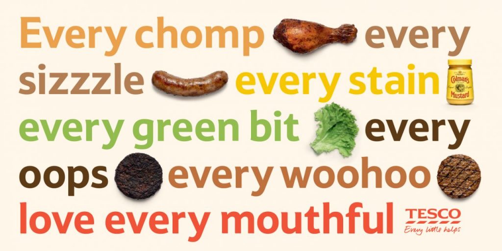
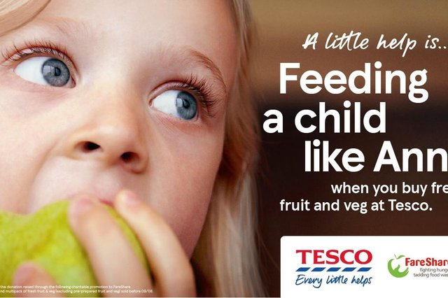
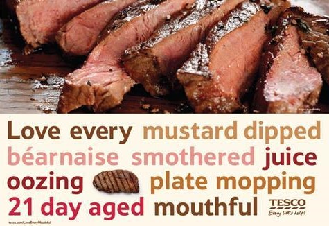
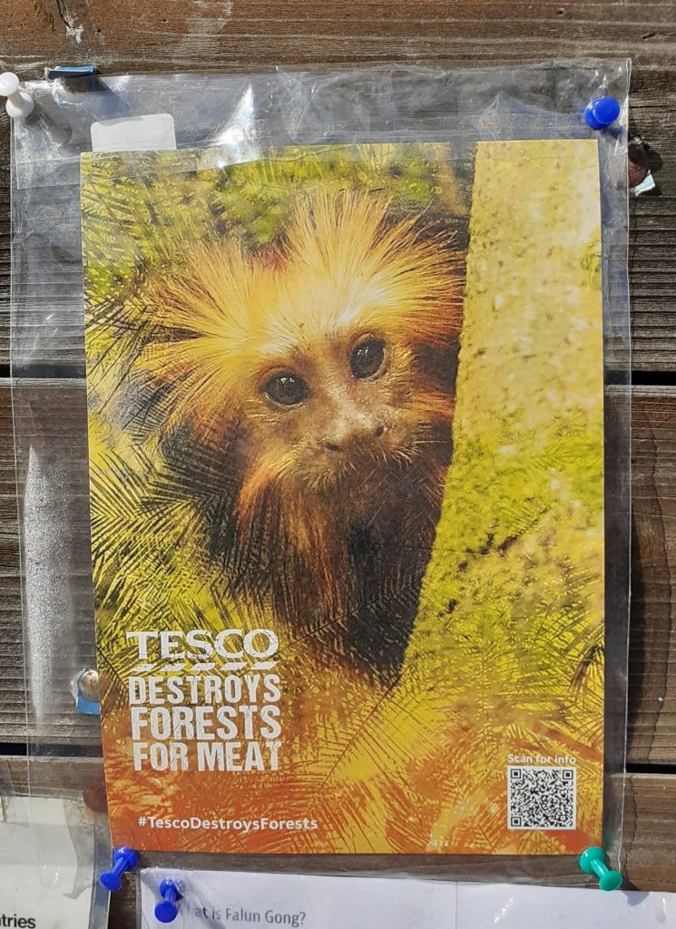
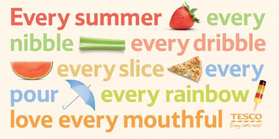
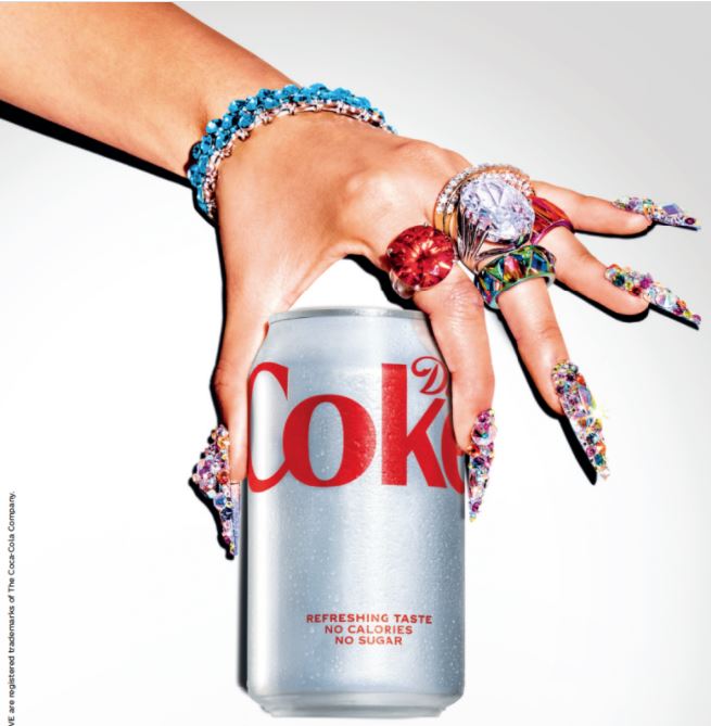
3 of my posters were based around the simple composition, using a plain white space for the background. I have seen this used both in Tesco campaigns and other posters, such as the Diet Coke poster below the Tesco campaign.

https://www.tescoplc.com/news/2020/tesco-aldi-price-match/

The ‘Love What You Love’ Coke campaign uses a white background which brings the focus to the hand covered in gems. This is helped by the brightly lighting used.

When considering colour, we used Adobe Colour Palette to search for subjects and see what results come up.

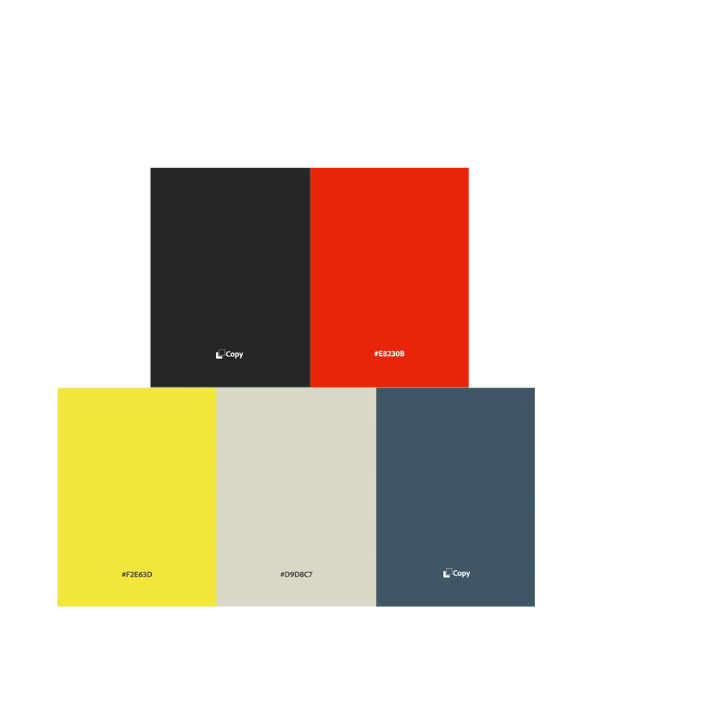
This was the first colour palette we considered:

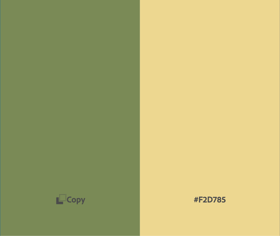
We also considered green, to reference the forests and impact on nature.

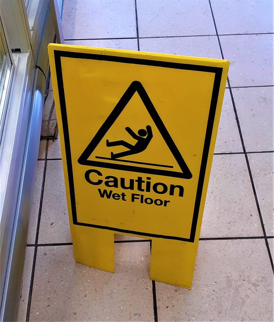
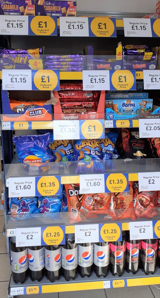
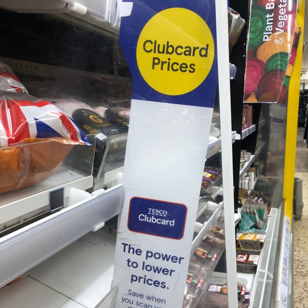
I saw this sign in the supermarket and noticed the impact of yellow and black to warn people of potential danger. Yellow can be sunny and energetic, or used like this to express caution. I felt that this eye-catching quality could make a good colour for our campaign design.

I looked at the book Less Is More by Victor Cheung. This book is a collection of projects, which use limited colour in a simplified way. The 2 designs below are from this book.

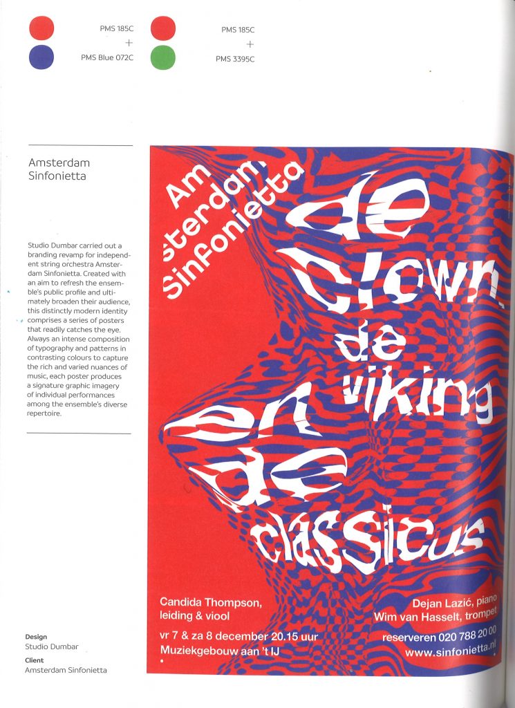
The high impact of red and green is also an appealing choice. It is normally used for a Christmas theme, but here in this image, I saw how these complementary colours can express both nature and danger in one design.

Red and blue also have a strong impact, and are coincidentally the colours of the Tesco brand.

Black and white can also create a strong image in a design and give a serious/sombre tone to the message. I like the idea of using black and white within the design, even if it’s not for the whole poster:

from Sustainable Graphic Design by Pete Claver Fine

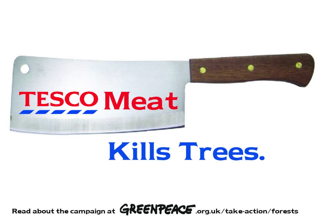
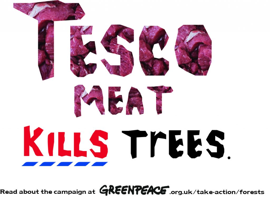
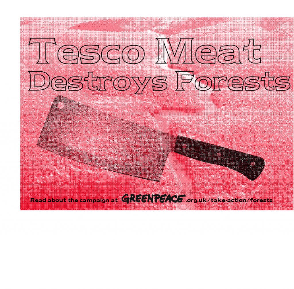
The posters I shared with the group:

1)

I felt that this poster was maybe too simple, there being no image of trees. I could change this by having the image of trees within the blue text. I could also have used bespoke type instead of the Tesco-style font.

2)

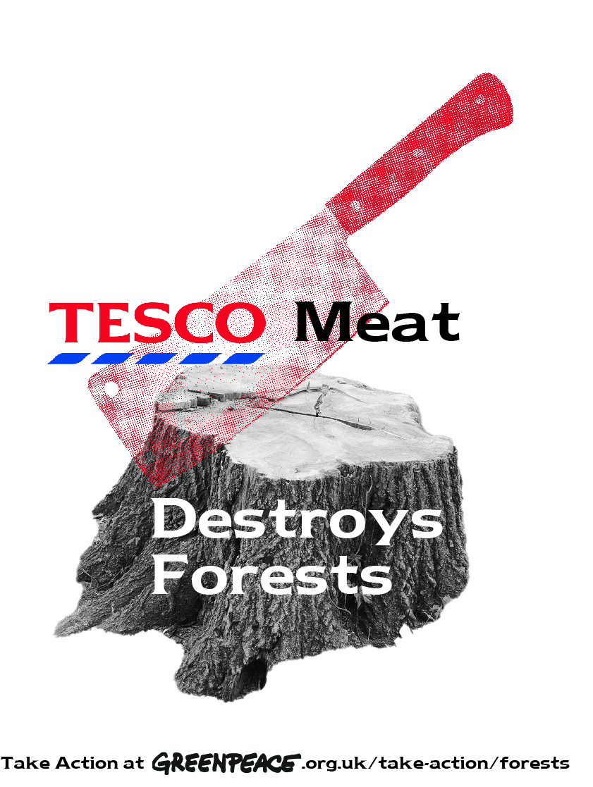
I placed the image of raw meet within the ‘Tesco meat’ type. I felt it has a good shock factor. I drew these letters with the mouse on Illustrator, which is what gives it a ragged look. I didn’t realise that the ‘r’ in trees is lower-case. This was not intentional.

I would next time, change the line ‘Read about the campaign…’ to a different sans serif font.

3)

The simplicity of the poster works well. The bitmapped effect was good.

4)

I could keep the river red and make the forest green or greyscale. (My classmate didn’t notice at first that the background image was of the Amazon). Another option is to remove the trees all together and just keep the river.

The text doesn’t work so well, it could be black instead. I could choose to use the bespoke type as well.

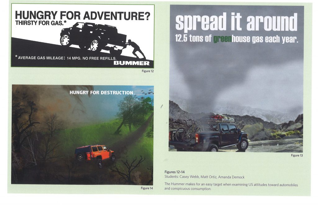
These designs, from students explore the effect of motor vehicles on the planet. The illustration (bottom, left) expresses the message clearly and the tagline supports the image. The simplicity of the right-hand image makes it easy for the viewer to take in.

from Sustainable Graphic Design by Pete Claver Fine

Guerilla Marketing

Guerilla marketing strategies are designed to work as a brand attack. Usually they subvert the meaning of a brand, hijacking the brand negatively. They are destructive to a brand because they point out that the brand is doing something bad.

Greenpeace use guerilla marketing in most of their campaigns because this strategy is so effective.

Guerilla marketing is performative. Often the action is performed in a significant place, such as a company’s HQ. The strategies aim to involve people. By taking place on the street, the consumer is engaged. The activists dress up, use props, banners or a combination of these. The street space is used in inventive ways to get the message across and amplify the message.

Direct interaction triggers emotion with the customers. The action can be entertaining, interruptive, and usually both. A buzz is created around the topic.

The term ‘guerilla marketing’ was first introduced in 1984. The word comes from guerilla warfare, where people were strategic and inventive.

guerrilla warfare, also spelled guerilla warfare, type of warfare fought by irregulars in fast-moving, small-scale actions against orthodox military and police forces and, on occasion, against rival insurgent forces, either independently or in conjunction with a larger political-military strategy. The word guerrilla (the diminutive of Spanish guerra, “war”) stems from the duke of Wellington’s campaigns during the Peninsular War (1808–14)

Regardless of terminology, the importance of guerrilla warfare has varied considerably throughout history. Traditionally, it has been a weapon of protest employed to rectify real or imagined wrongs levied on a people either by a ruling government or by a foreign invader.

https://www.britannica.com/topic/guerrilla-warfare

Physical interaction has greater power over consumer. Making the message clear to the viewer. These strategies are also used in advertising as well!

Axe Body Spray guerilla marketing strategy

The stickers subvert the original meaning of the exit sign, which is of a man running from a fire. Adding the sticker of the women running towards the man creates a playful and creative image. The familiar image adds the urgency we associate with the sign in normal use. The new image implies the women are attracted to the smell of the body spray. The use of stickers make use of the public environment around us to get the message to the audience. The unexpected appearance of the stickers makes people take notice of them.

King Kong 3D
Jeep campaign across Copenhagen demonstrates the car’s durability. This strategy is simple and cheap but effective.

John West Greenpeace campaign

A big tuna tin installation was made to point out unsustainable fishing and civil rights abuses/ child labour. Sculptures of the endangered animals that are caught as well as tuna.e.g. turtle in a net, gives the audience a visual and physical representation of the wildlife. This brings the issue to life more than photographs or words would.

Greenpeace activists showed a video on the surface of this opened tin sculpture. The video showed interviews. An activist also chained herself to the tuna tin model in front of the John West facility.

They made a tin shaped as a turtle to visually represent what the consumer is really paying for when they purchased from John West tuna. In addition to this, they also printed labels and placed them on shelves in supermarket in place of where people would normally find tuna tins. This also ensures the message gets to the right audience. The tags they left on the shelves acted as a kit to educate people. This helped to make the message word of mouth and meant that people who were in a rush could pick up the information and take it away with them, where it could essentially travel between more people between homes for example.

Nestle’s KitKat Greenpeace campaign

Nestle’s KitKat were attacked by Greenpeace for using palm oil from destroyed forests. The symbol of the Orangutan was given focus, as the forests affected are home to these animals.

The KitKat logo was subverted using the word ‘Killer’. The orangutan image was used in a big banner that Greenpeace activists used to cover the Nestle HQ building in Amsterdam, wrapping the building in the way a KitKat is wrapped.

They worked on the tagline ‘Have a break’, changing it to ‘Give me a break’.

This campaign went worldwide and different guerilla strategies took place across the globe.

Sainsbury’s ‘Live well for less’ > ‘Couldn’t care less’:

Greenpeace campaign where activists hung this sign at the front of the supermarket. It wasn’t noticed at first because of its close resemblance to the shop’s tagline ‘Every little helps’

Pigs suffer for Lidl- in Germany Lasst Scheweine Leiden! Stickers placed on packaging ‘with animal suffering’ and leaflets using graphic from Lidl.

Greenpeace’s Stuttgart Group protests against discounter supermarket Lidl’s cheap meat policy in Stuttgart. The activists cover the store’s windows with images of factory farmed pigs and display banners reading “Pigs suffer for Lidl”

I then looked at a poster and animation about the same Greenpeace campaign.

I really liked both of these designs. The questions asked in the GIF involve the consumer in the issue. I found myself nodding in response.

Designed by Bogdan Tanase-Marinescu https://www.jovoto.com/projects/cheap-meat/ideas/64979
Designed by Elod Zoltan Szasz. The play-on-words is catchy and surprising. I first didn’t notice the human because of the way the person has been placed alongside the pigs.

This Austrian group have set up physical models of pigs and placed them in on different flooring to demonstrate the conditions factory pigs live in. (below)

Campaign by the association against animal factories (VGT)

Brand attack Greenpeace brief

How can we attack Tesco brand?

As a group, we searched for images of famous Tesco campaigns.

Some are ‘Food Love Stories’, ‘Love Every mouthful’, ‘Aldi price match’, ‘Prices that take you back’.

Designed by Wieden+Kennedy London

I went into the Tesco store in Headington, Oxford. This image was in the fruit and veg section.

This is the first thing I was faced with when entering the shop: the shelf of snack foods and large yellow price tags. The prices are bold.

Clubcard price banner beside the meal deal fridge.

Since I went to a small Tesco store, there was not many banners in the shop.

Our idea for guerilla marketing is based around the clubcard prices. We had the initial idea of placing banners where banners would usually be found. These banners could tell the viewer some statistics. Instead of the price they are paying in terms of currency, we can talk about the impact the meat products are having on wildlife, farm animals, forests, indigenous communities and the planet as a whole.

We could place these in the meat section. The designs could be stuck onto the packaging as stickers, or on the shelves where we would normally see the prices.

Group work- Project 4

I walked past this poster on the way to campus this morning. The cute monkey image drew me into the poster. I followed the QR code to this webpage:

https://www.greenpeace.org.uk/take-action/forests/#:~:text=Forests%20are%20our%20life%20support,to%20burn%20them%20for%20profit.

Action pack. These posters focus on the animal affected by Tesco’s actions.

We met as a group to discuss the first task of the brief- the poster. Out of the 4 group members, only half of us could be on campus. We worked around this by setting up a zoom meeting and this worked just as well.

The main focus if thus meeting was the Project 4 brief.

The aims of the brief:

  • Write 3 options for the tagline.
  • Choose one of the headlines and put together a poster using this headline and an image. Use 2 colours, 1 for the text and 1 for the image. Could also use greyscale, bitmap or filters.
  • For the 2nd poster, choose more than 1 image and create a photo montage. (Mixing bit and pieces of photos to make a new composition, similar to a collage) An example could be Dada or Constructivist compositions.
  • The 3rd poster asks us to use illustration skills. We could use silhouettes, icons, or work with size/scale in a surrealist way. Can use metaphor, such as with (the global warming postyer). Can use up to 5 colours, for example, 1 colour for the background.

Meeting notes:

Colours

We decided that red should be used in our campaign, since this relates to danger AND the Tesco brand at the same time.

The other colours we considered were black, white, blue and green. Green relates to the nature that is being destroyed. White backgrounds are used often for Tesco posters.

A combination of red, pink and white could symbolise danger and meat.

Taglines

Tesco must go (rhyme), Tesco Kills Trees, Tell Tesco Trees Matter, Don’t Eat Tesco Meat, Tesco Meat Kills Trees

After sharing our ideas with our lecturer, she suggested:

Focus on the animals, not the meat or dairy (Be Wary Tesco Dairy)

Typeface

The typeface used by Tesco is an altered version of Newtext Bold and a humanist sans serif typeface. We want to use this in the poster. We could also include a destroyed text effect.

On the other hand, the poster doesn’t need to reflect the Tesco brand. This method of subverting the brand could be reserved for the guerilla strategy.

Guerilla Marketing Strategy

Clubcard tags. Where the price is placed:

Tesco clubcard. The group shared image in a shared drive.

We could use the yellow icon. ‘The power to lower prices’ could be subverted to ‘The power to stop deforestation’. This could put a positive spin on the poster and ask consumers to do something good. The prices on the right could state the facts we want to get across to the consumer.

Tesco Clubcard campaign, 2020 by MediaCom

Every little helps> Every little consequence/ suffering.

Prices that take you back

‘Tesco Finest’ > not the finest way of producing meat.

(Whatever you’re buying, the forest pays the price) Knock-on-effect damage (medicine comes from rainforest, effect on indigenous communities, animal habitat loss). These facts could be displayed as in the poster below. For example ‘Every tree killed, Every living forest…’

Tesco Love Every Mouthful campaign
Posters

1 poster focusing on meat, 1 for dairy?

Poster 1: Red and white. Maybe using a white background and tagline written in ‘meat font’.

Poster 2: A Tesco in the forest

Poster 3: The tree and meat

The shape of the meat could reflect a geographical structure. For example, the shape of the Amazon.

Our plan for the week is to design at least 1 poster each. We will then meet up and discuss which we feel are more effective.