Language & Type (part 1)

History of Typography
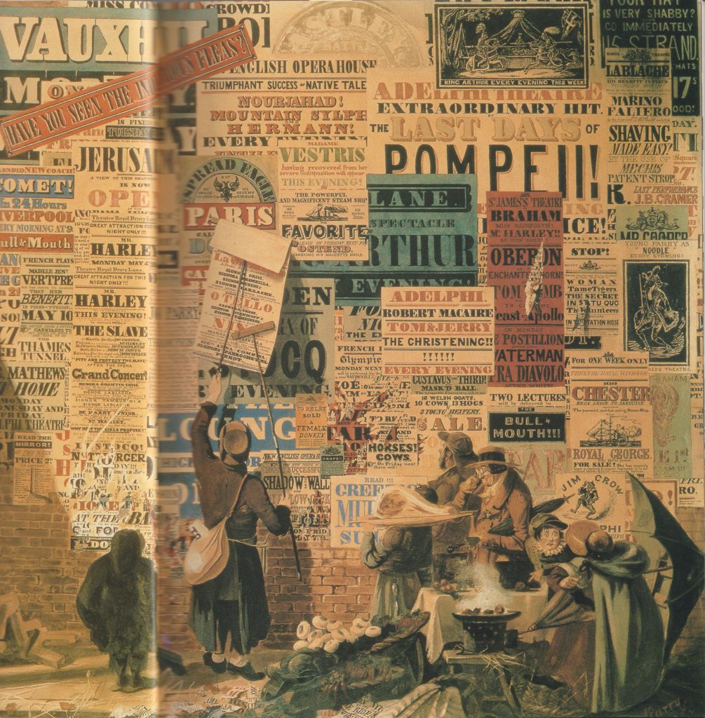
In the 19th century there was a reduction in price of printing material. This enabled people to read, which allowed a democracy. (You can’t have a modern democracy if people can’t read). This reduction in price, lead to several things:

A rise in advertising- they saw posters competing in public. A visual noise shown in the painting by John Orlando Pary of a London street scene:
Both artists and writers saw this and were inspired. They turned to each other’s craft to enhance their work. Artists used words within their work, such as the collages by Picasso and Braque. Symbolist poetry came from writers reading the newspaper and seeing a contrast in the words about a variety of subjects.
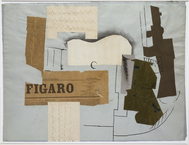
Bottle of Vieux Marc, Glass, Guitar, and Newspaper – collage by Picasso https://www.weinerelementary.org/picasso-and-collage.html
Modernsim & Post-Modernism

“From the end of the 19th century, modernism was shaped by the industrialisation and urbanisation of western society. It marked a departure from the rural and provincial towards cosmopolitan, rejecting or overthrowing traditional values and styles as functionality and progress became key concerns as part of an attempt to move beyond the external physical representation of reality as depicted by cubism and the bauhaus.”

Around the 1st World War, the western world was politically heated. Dadaism and the Constructivists came out of this time. Dadaists opposed the traditional beliefs of a pro-war society.
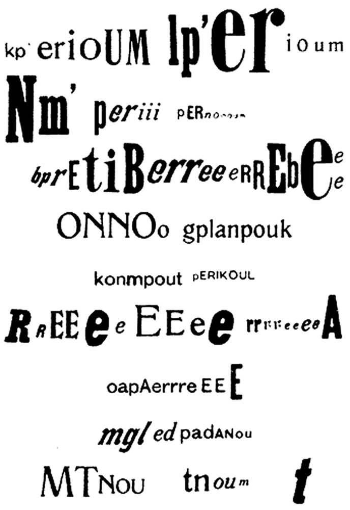
The optophonetic of Dadaist poet Raoul Hausmann, presented by Cecile Bargues http://www.diptyqueparis-memento.com/en/dada-optophonetic/
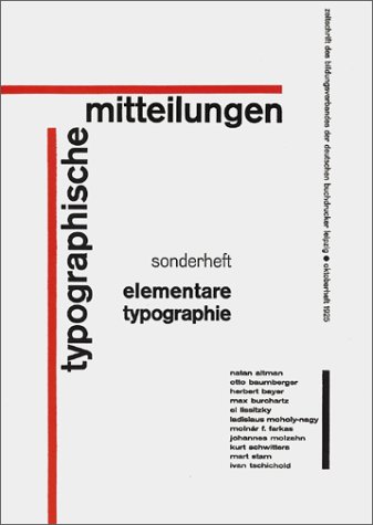
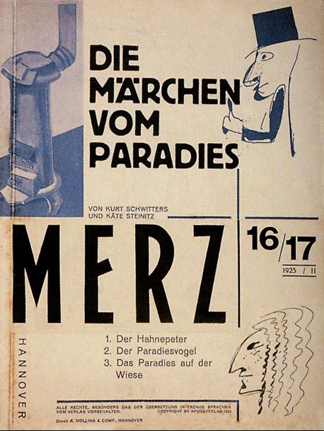
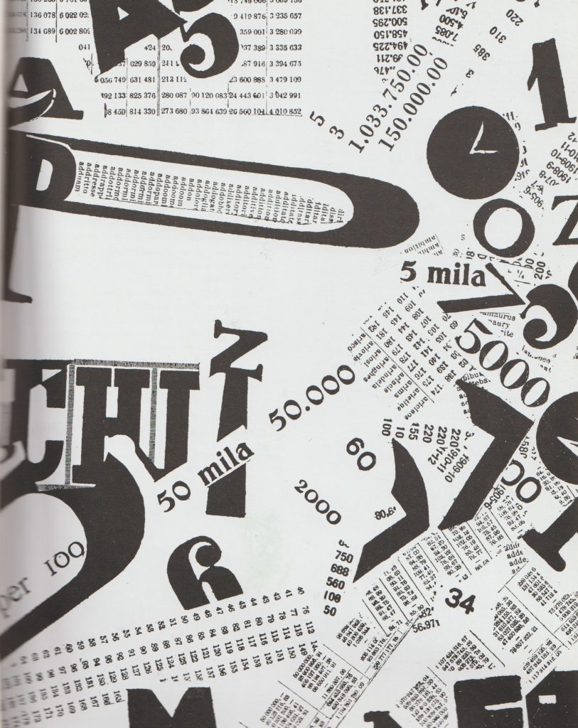
Cover of Merz, Kurt Schwitters, 1925

During the communist revolution, the art movements within this were the Futurists in Italy and the Vorticists in Britain. Their work represented the breaking up of the old world.
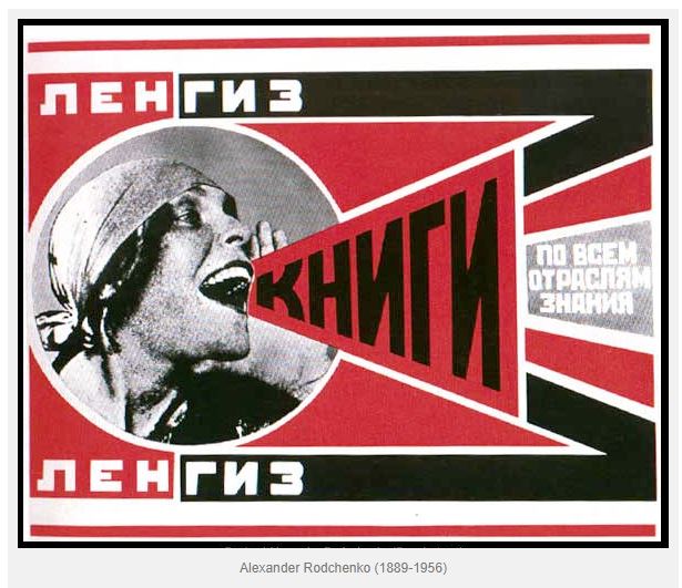
https://visualartsdepartment.wordpress.com/modernism/

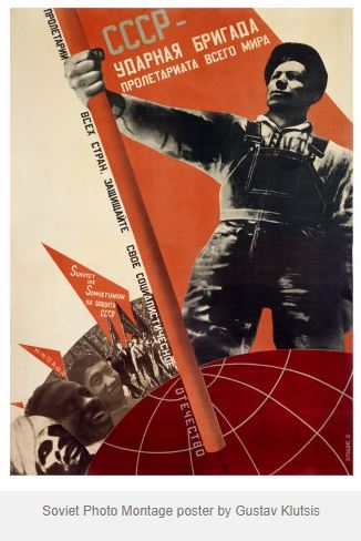
“Constructivism began as a Soviet youth movement. The Russian Revolution of 1917 involved many Russian artists, who combined political propaganda and commercial advertising in support of the new communist revolution.”
Blast
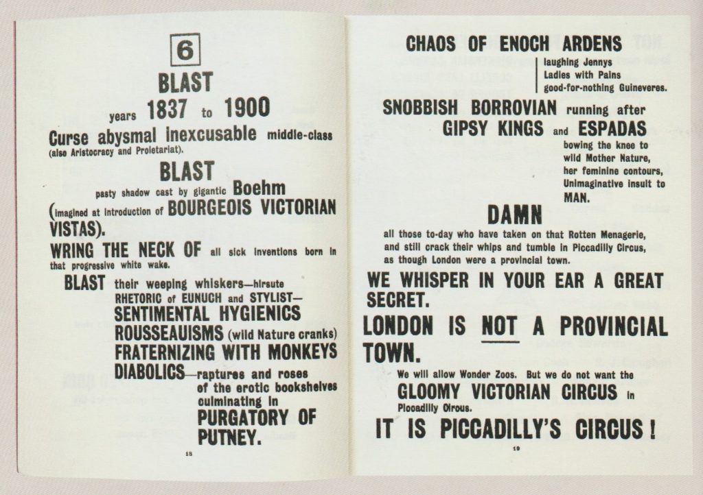
“Bless all English eyes” BLAST manifesto by the Vorticists. The harsh typography states a list of things the Vorticists were against (‘Blast’) and what they supported (‘Blessed’).

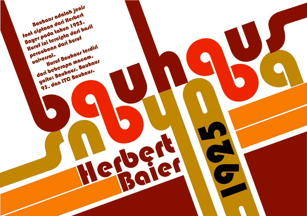
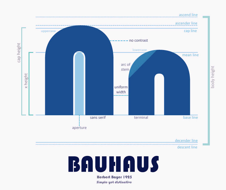
In the 1920’s, rules were written by Modernists and new typefaces were invented. This occurred at the rise of Fascism. Herbert Bayer was a designer who came up with the ‘Universal’ typeface, that he planned to be used by everyone, in a way of re-writing tradition. By changing what the world looks like, people are introduced to the new as it surrounds them in everyday life. This typeface at the time was extremely new and surprising.
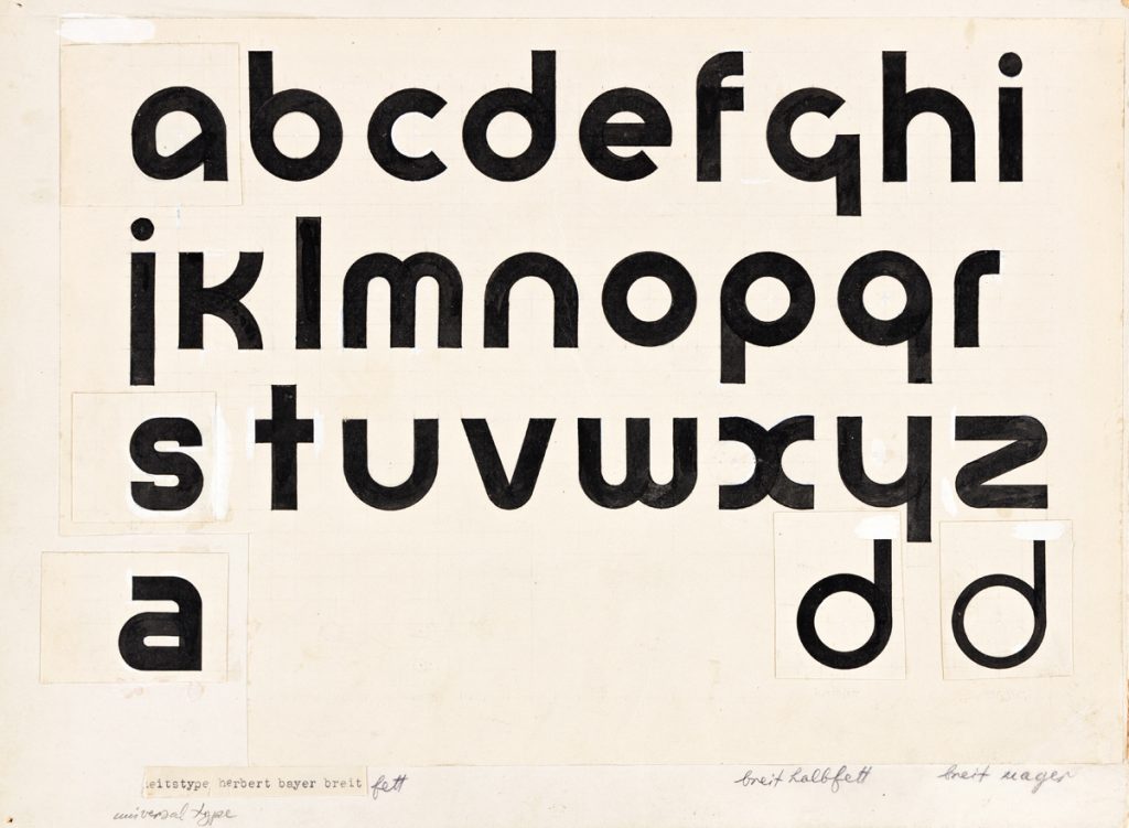
Universal, 1925, Herbert Bayer

“Bayer’s Universal typeface was developed at the Bauhaus and is a reduction of Roman forms to simple geometric shapes. The circular form features heavily, and you can see how each character is closely based on the others.”The Fundamentals of Creative Design by Gavin Ambrose and Paul Harris
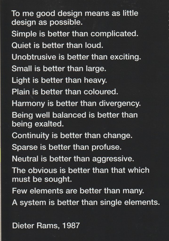
Radio design by Dieter Rams. His work was described as ‘quiet simplicity’. He was a pioneer of the Modernist movement and worked for Braun.

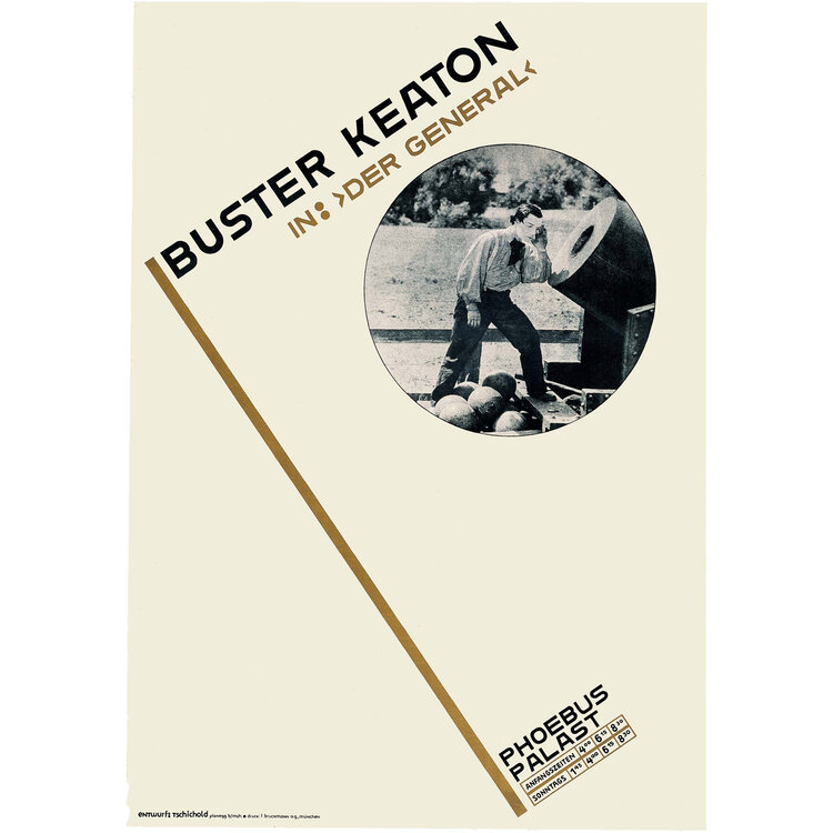
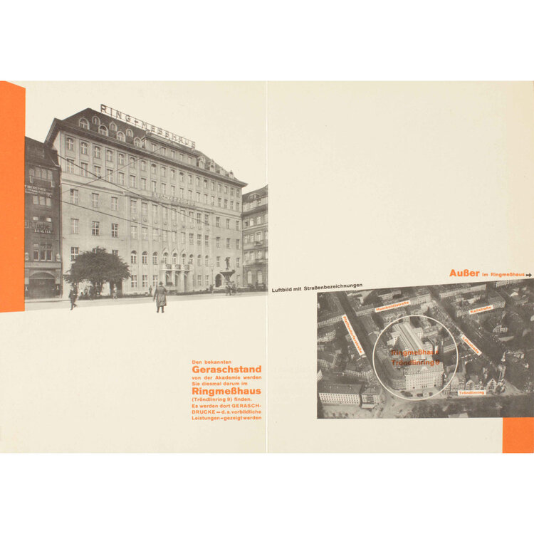
Jan Tschichold

Poster, Buster Keaton in “Der General”, 1927
Internal spread from brochure Merken Sie sich bitte: Die Reklamemesse, 1927

“New Typography uses white space to create visual intervals in an asymmetrical layout. An underlying grid unifies the page. Personal expression is rejected in favor of order and clarity. The predominant graphic design style in the world by the 1970s, the Swiss style is recognizable by its strong reliance on typography, usually sans serif type in flush left alignment.”

Late Modernism occurred in the economic boom in the 1950’s. Wim Crouwel’s posters from 1960’s-1980’s have a similar appearance to design now:
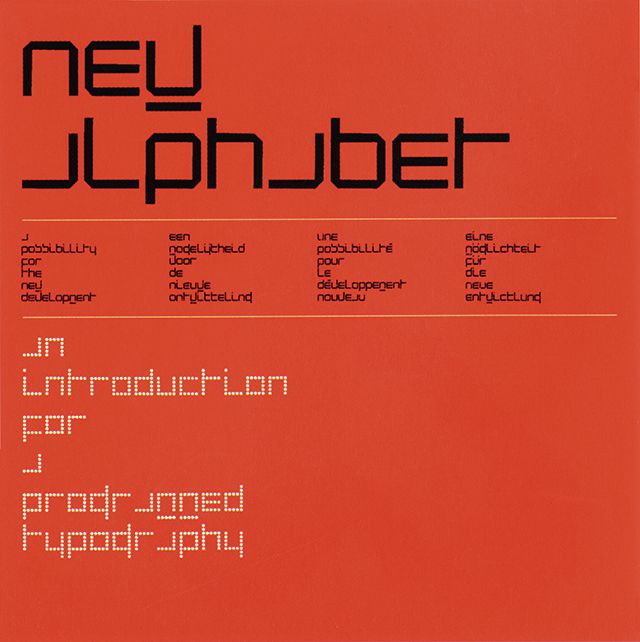
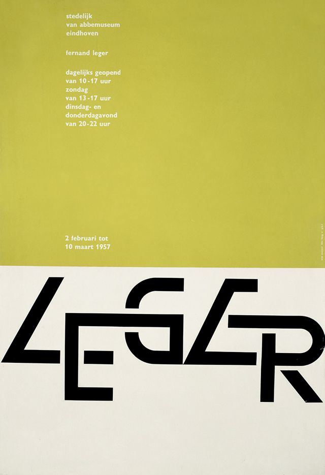
1967s New Alphabet Typeface. https://speckyboy.com/icons-graphic-design-wim-crouwel/
Wim Crouwel Leger Poster, 1957.

Matt Willey- contemporary designer
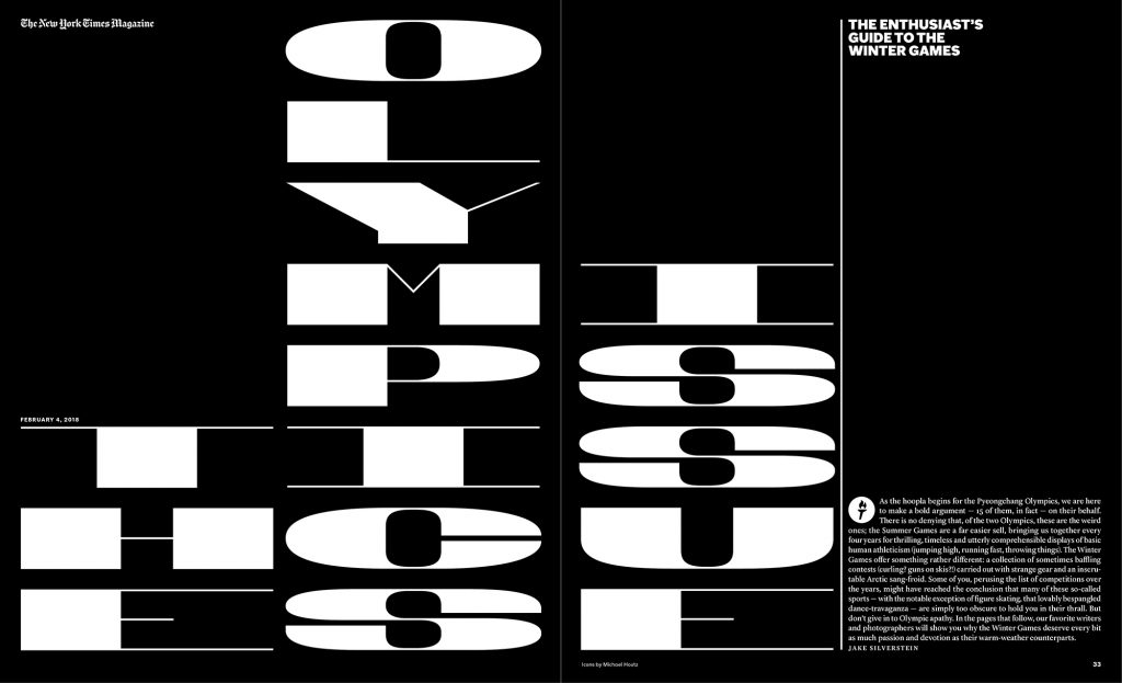
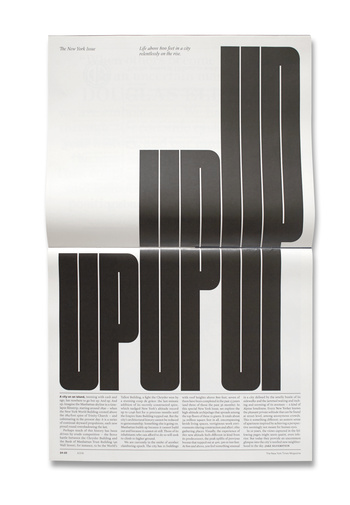
The New York Times magazine
NYT Olympics
Post-Modernism

“Post-Modernism developed following the Second World War and questions the very notion that there is a reliable reality through deconstructing authority and the established order of things by engaging the idea of fragmentation, incoherence and the plain ridiculous.

Post-Modernism returned to earlier ideas of adornment and decoration, celebrating expression and personal intuition in favour of formula and structure.”

Fuse magazine, founded by Neville Brody and John Wozencroft

An example of Post-Modernism, the designers expressed their imagination across the pages. Sometimes readability was compromised, as form reigned over function. The magazine was produced at the time when computer technology allowed designers to experiment with new tools.
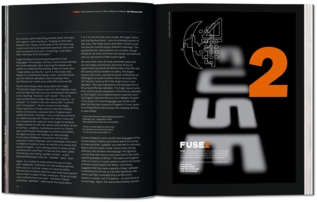
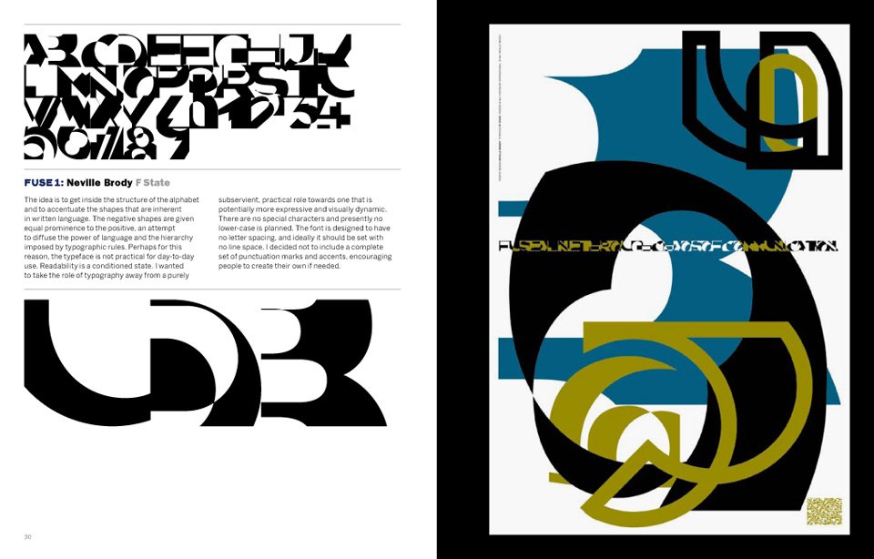
Fuse 2, Runes: Edition Poster design by Neville Brody, 1991 https://www.amazon.co.uk/FUSE-1-20-TASCHEN/dp/3836525011
https://thefontfontyeahs.wordpress.com/2012/09/19/fuse-1-20/

Automation is a phrase that is used to describe the transition from the old skilled job (for example, of typography) to the present digital age where the digital design tools are available to anyone.
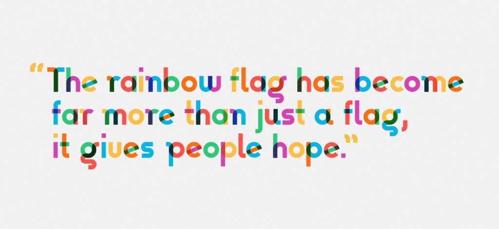
Gilbert, Type with Pride https://www.typewithpride.com/

“On 31 March, 2017, Gilbert Baker the creator of the iconic Rainbow Flag sadly passed away. Mr. Baker was both an LGBTQ activist and artist, and was known for helping friends create banners for protests and marches. To honor the memory of Gilbert Baker, NewFest and NYC Pride partnered with Fontself to create a free font inspired by the design language of the iconic Rainbow Flag, the font was named ‘Gilbert’ after Mr. Baker.” This is one of the world’s first coloured fonts.

“The colour combinations are blended on letters to represent the ‘open and fluid communities’ that make up LGBTQ.” (from The Fundamentals of Typography 3rd edition)

Postmodern design:
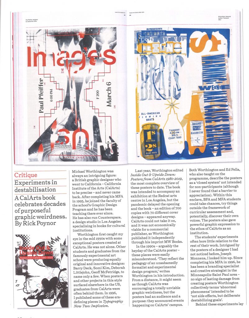
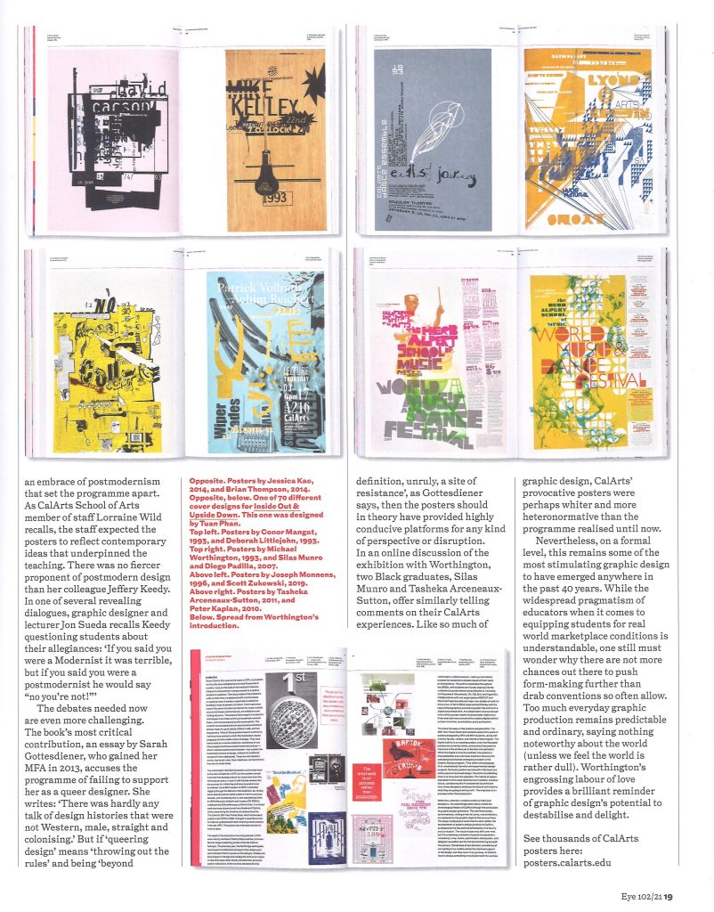
Eye Magazine, Issue 102

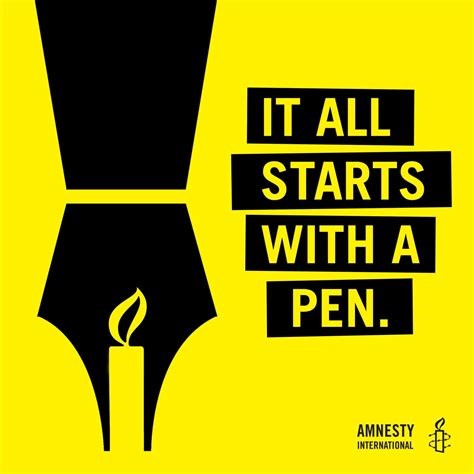
Write for Rights Campaign

https://www.amnesty.org/en/who-we-are/

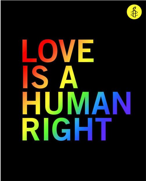
The global movement, Amnesty International have a focus on protecting human rights. UNESCO identify human rights as an important issue of sustainability. By allowing people to exist and thrive, communities can build over time.

I liked the simplicity of this message by Amnesty. The rainbow colour pattern tells us that the message relates to LGBTQ+ rights without needing to tell us with text. This relies on the audience understanding the connotations of the rainbow as used in recent times to symbolise the LGBTQ+ community by convention. This results in a simple and concise image with more impact than over-cluttering the page.


Write for Rights is a yearly campaign and because of this, I found a variety of designs relating to this cause. I chose this campaign because it represents taking action for people who cannot take action for themselves. It is about achieving justice for people who have been wronged in a variety of ways. If I am fortunate enough to be able to read and write, I can use that skill for good.

Writing has the power to change the world – and Amnesty International is proud to include all in their efforts to do so. For the past 15 years, the organization’s global letter writing campaign has inspired millions of written letters to support those whose basic human rights are being attacked. 

http://deweydivas.blogspot.com/2017/11/write-for-rights.html

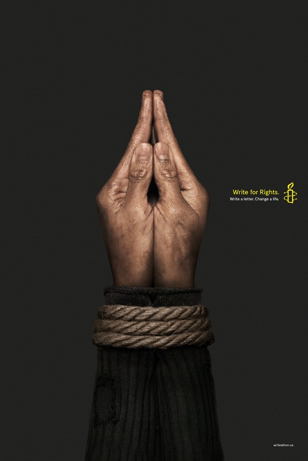
The simplicity is effective in this image , the contrast between dark and light, to me, signifies hope. The hands are reaching up as in prayer, asking for help. The dark background helps to highlight the hands and adds to the strength of the message. The size of the text is small, suggesting a whisper. The campaign is talking about people who cannot speak up for themselves. This makes the small text relevant and symbolic.

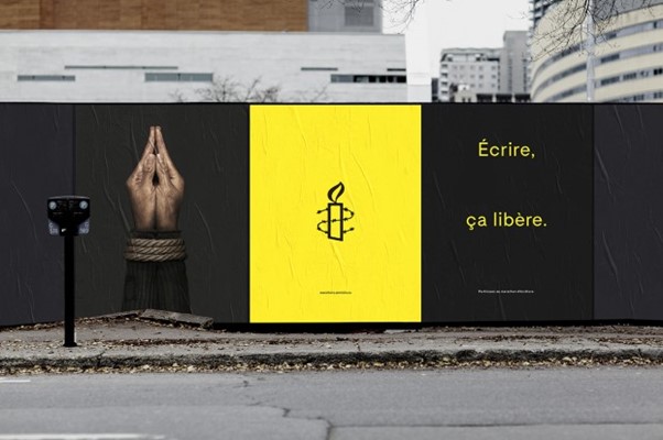
“The stark image shows a pair of bound hands that is meant to mimic the shape of a pen or pencil, and the ads read: “Write for Rights. Write a letter. Change a life.” in English and “Écrire, ça libère. Participer au marathon d’écriture.” in French.

The print campaign ran in top Quebec news publications, including: Le DevoirJournal de Montréal and Journal de Québec. A web banner version was deployed on LaPresse.ca, in addition to wild postings in Montréal. And a 30-second French radio spot aired in the regions of Montréal, Québec City, Ottawa, Sherbrooke and Trois-Rivières in early December.”

(below) The spacing of the text expresses the message clearly, to an audience who would be walking or driving past. The full-stop punctuation mark suggests a finality and an answer to the problem presented. The CTA here is the word ‘write’.

The image surprises the viewer. At a glance, it appears to be a fountain pen. When doing a double-take, the viewer sees that the photo is of a pair of hands. This element of surprise makes the poster memorable.

https://strategyonline.ca/2018/12/17/amnesty-international-asks-quebecers-to-write-for-rights/

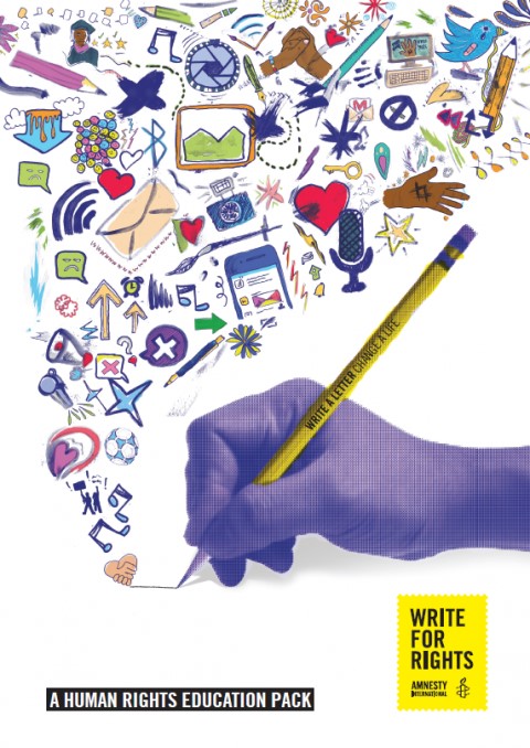
“This education pack contains five activities on human rights for young people. It can be used as an introduction to human rights, to global solidarity, to campaigning and activism, and to the wider work of Amnesty International. The activities provide a broad perspective on these issues and others.


They are useful in opening young people’s minds to global concerns and involving them in actions which can have a real impact on people’s lives.”

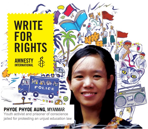
This design from 2015, has been designed with young students in mind. The doodle-style illustrations reflect the imagination of the target audience. This design focuses on the positive impact of letter-writing, compared to the Canadian poster which emphasizes the suffering.

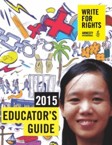
The Amnesty logo and name of the campaign are presented within a yellow box with edges that resemble a postage stamp. The above poster has been cropped for the cover of the ‘education guide’ booklet.

“Dear Educators,

Amnesty International USA invites you and your students to join Write for Rights, our global human rights letter-writing project focusing on 12 specific cases of human rights abuses around the world. Write for Rights frees prisoners of conscience, protects human rights defenders, and spreads hope.

Amnesty International USA has created an Educator’s Guide, focusing on 5 cases including girls forced into marriage in Burkina Faso; a journalist imprisoned in Uzbekistan; and Albert Woodfox, subjected to over 40 years of solitary confinement in Louisiana. By learning about these 5 cases and writing letters to help end these abuses, students will gain an introduction to human rights and effective letter-writing skills, and the knowledge that their words have the power to make a difference around the world. We invite you and your students to participate from now through December.”

https://www.adsoftheworld.com/media/integrated/amnesty_international_write_for_rights

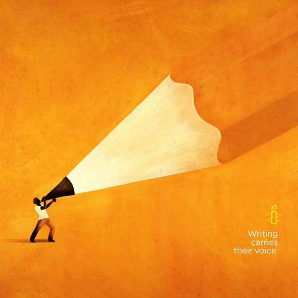
“This vision was made possible by the valuable collaboration between Cossette and Owen Gent, a world-renowned illustrator based in the UK whose aesthetic is similar to painting. His drawings are luminous, vibrant and emotionally charged.

Integrated advertisement created by Cossette, Canada for Amnesty International, within the category: Public Interest, NGO.”