Week 3
The Brief
Introduction
It is important to note that modern typographic design and modern
(‘concrete’) poetry evolved together in a synthetic relationship
that turned out to be a key development in design practice
during the Twentieth Century. Painters and writers, both looking
for new ways to transform their respective practices, would find
dynamic aspects in each others disciplines that would lead to new
innovative strategies that they could turn to.
During this period, writers became became aware of typography’s
authority over the shape of meaning; It can make light of
seriousness and visa versa by way of formal innovation; forcing
confrontation; reductive spacial designation and facilitating
contradiction. Indeed, there is no end to the ongoing cultural
innovation produced and provoked by a typographic designers
handling of type and language.
Task: The Shipping Forcast
The Shipping Forecast is a BBC Radio broadcast of weather
reports and forecasts for the seas around the coasts of the British
Isles. It is produced by the Met Office and broadcast by BBC
Radio 4 four times per day.
Using a combination of digital and/ or hand-crafted techniques,
typographically arrange the words to enhance their meaning.
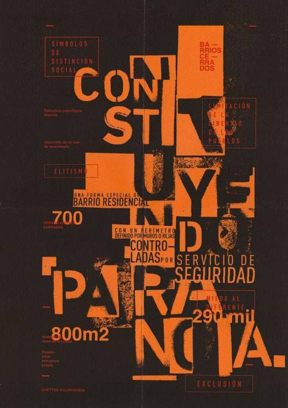
I looked at some graphic design inspiration before working on my own design for the shipping forecast text.
Ian Miller
The California-based graphic designer’s posters and menus for boutique hotels draw on gig posters and book covers from the 1960s and 70s.
When you stumble across Ian Miller’s portfolio on Instagram, you’d be forgiven for thinking that you’d discovered a rather well-curated archive of vintage poster designs. In reality, the majority of these posters are commissions. Alongside a few personal projects, Ian regularly creates flyers, posters, menus and merchandise for a range of boutique hotels and their affiliated bars and restaurants.


erasing text randomly

Limited use of colour.
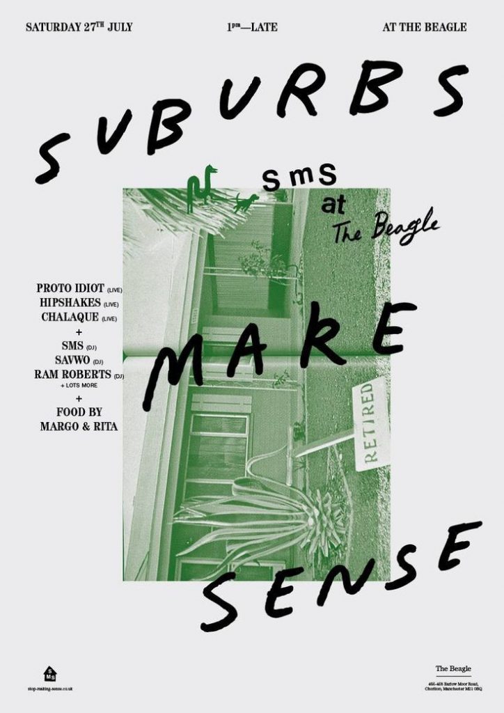
Bold and handwritten text, combined with a digital typeface. Diagonal type.


image within a shape.
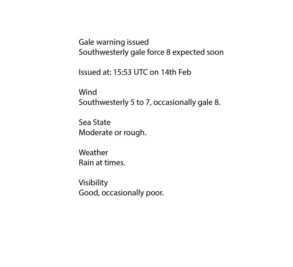
I was assigned The Irish Sea. For Tuesday, this was the shipping forecast:
I pasted the data in a text box on adobe Illustrator. I then separated the text and grouped words according to what I thought sounded and looked the nicest. I repeated some phrases and increased some of the font size. This resulted in a scattered set of words I could then use in a composition:

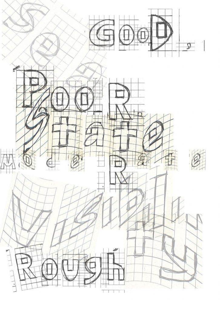
Using grid paper as a guide, I sketched the letters for the words I wanted to stand out the most.
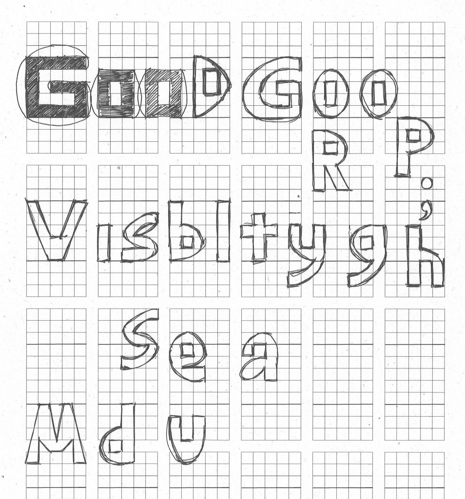
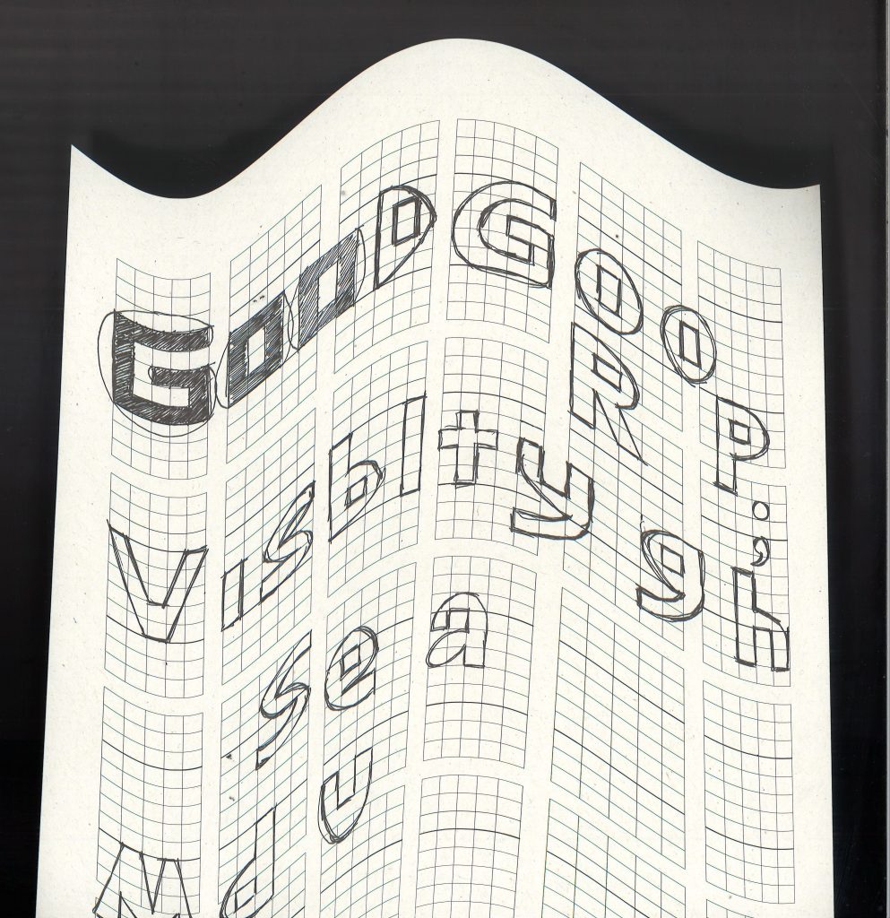
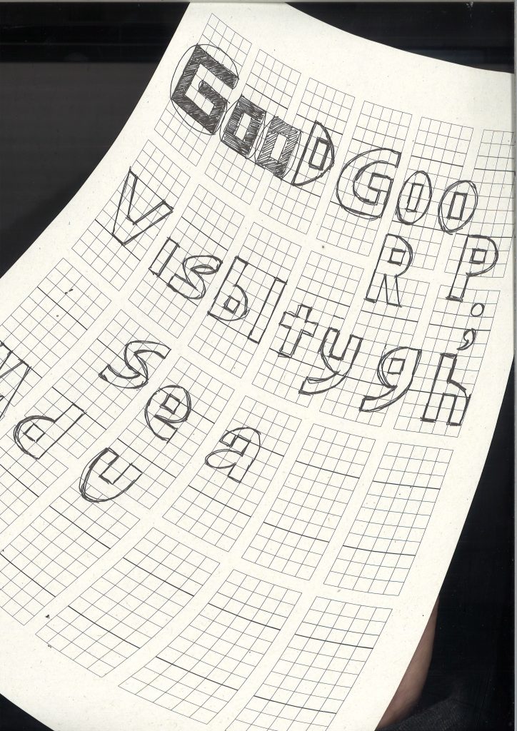
I scanned the page in several ways. 1) above, a simple scan 2) below, moving the paper up and down on the scanning bed. 3) sweeping the paper diagonally across the scanning bed. Techniques 2 and 3 created warped lettering.
I placed the page into Illustrator and cropped each letter out of the page separately. I worked gradually to build all the words to the phrases I had chosen to stand out.

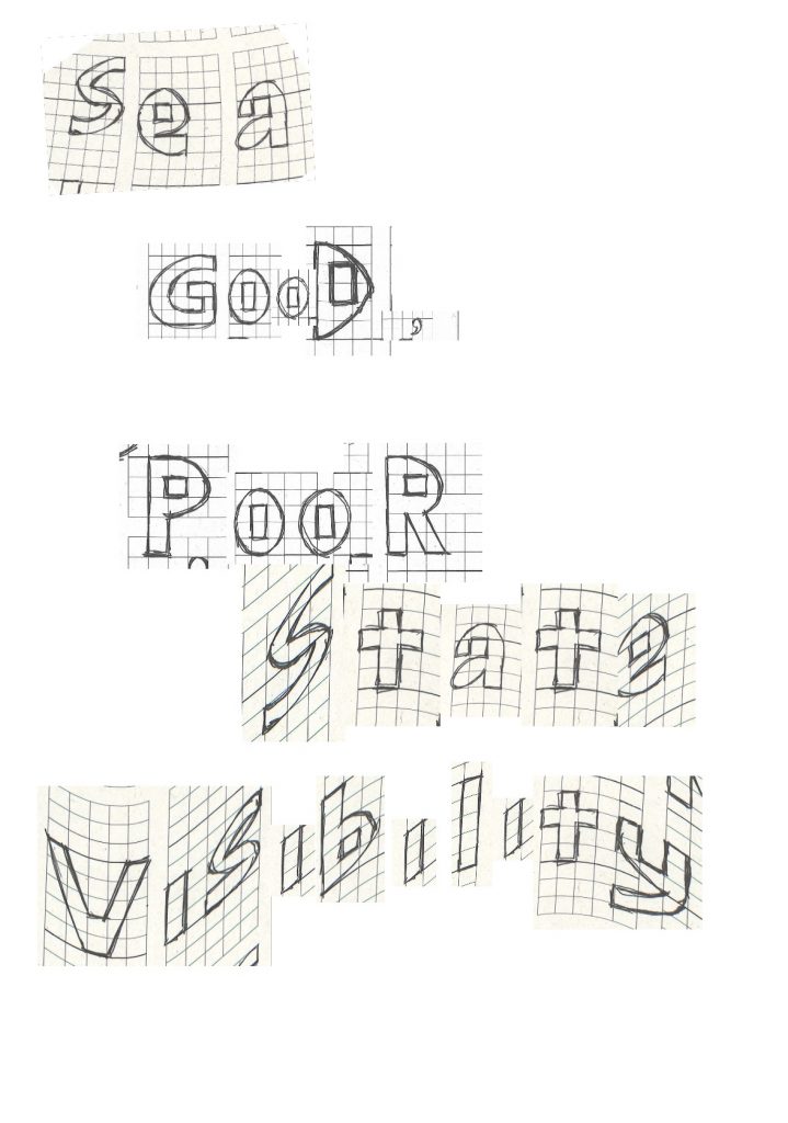

Using a combination of letters from the straight and wavy scans gives the composition a wavy look. This ties in with the theme of windy weather and a choppy sea.
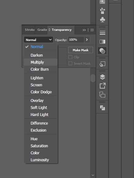


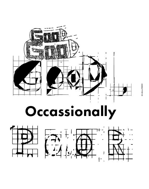

I zoomed into the scan of the graph paper drawings. I then bitmapped this image in photoshop.
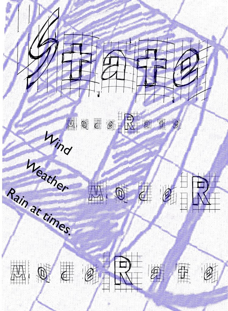
For the type, I used a combination of the graph paper drawings and the type tool on Illustrator. I changed the colour of the bitmap to purple, to allow the words in the foreground to stand out.
Wednesday 16th Feb
I wasn’t fully satisfied with the experiments from yesterday’s workshop. I thought there would be another way of working that’s more effective and less intricate/ time-consuming than drawing and cropping individual letters.
I re-thought the brief.
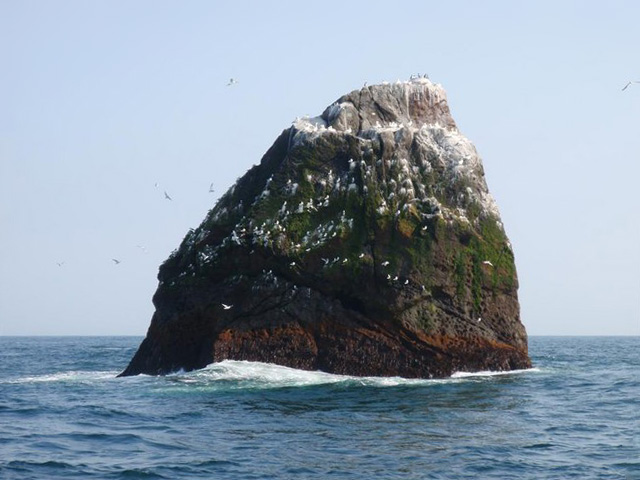
Accessing a different shipping forecast page, I mis-read that the Rockall 977 rock is in the Irish Sea. I therefore, chose this image of the rock for a background texture:
The second element I thought of, was using the outline of the Irish Sea within the design.
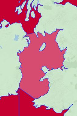

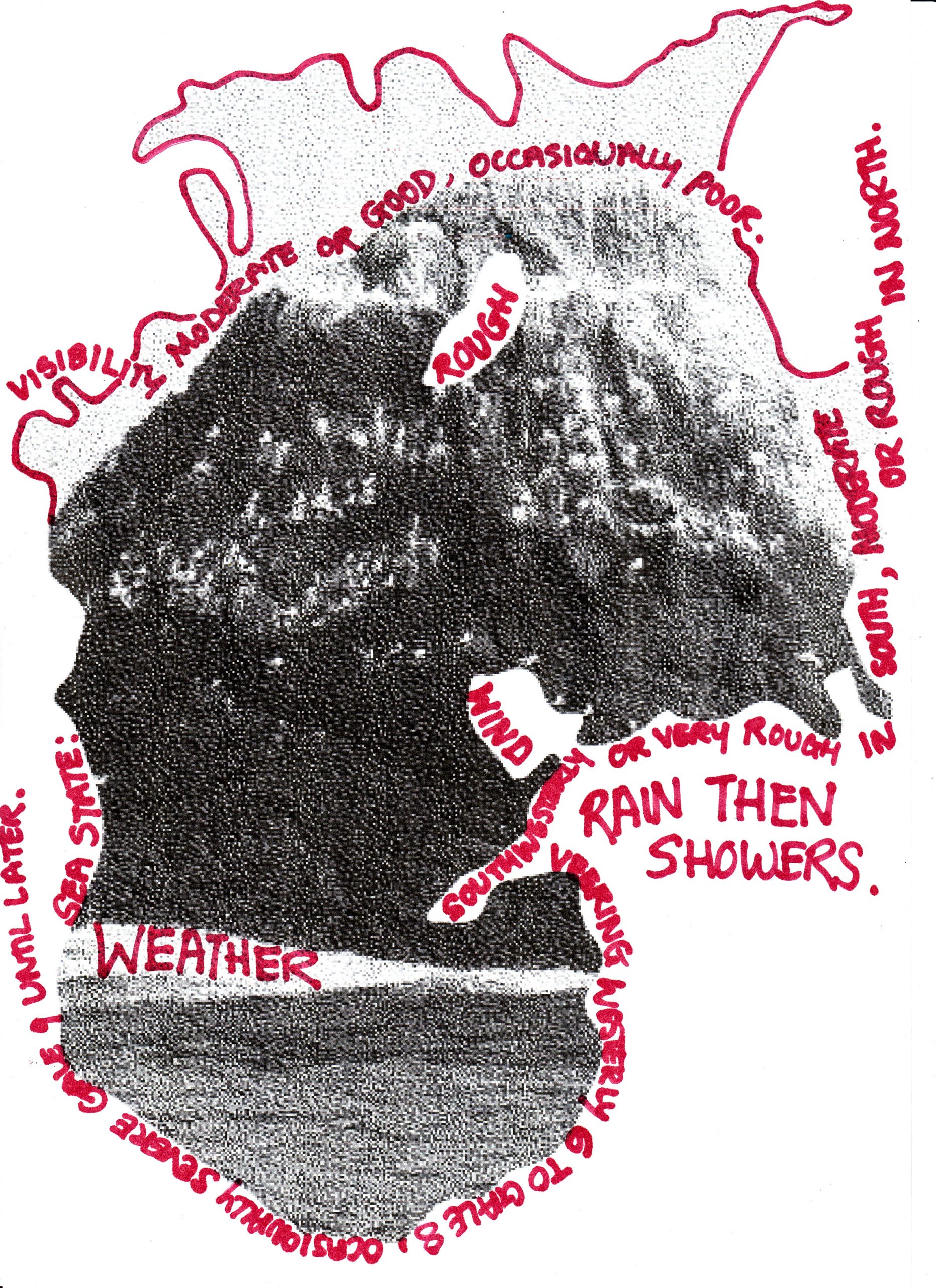
I cut this area out of the map by opening it in photoshop and using the quick selection tool. I then bitmapped the photo of the rock and placed it within the map outline by selecting both pictures on illustrator and creating a clipping mask. (below)
I added type to the image and created boxes around some of the type to make it readable.

I then printed the image and chose to add handwritten type instead of digital type. (below). I used a red permanent marker pen to write across the page. I followed the curves of the rock photo. Writing some words bigger, helped to give some hierarchy.

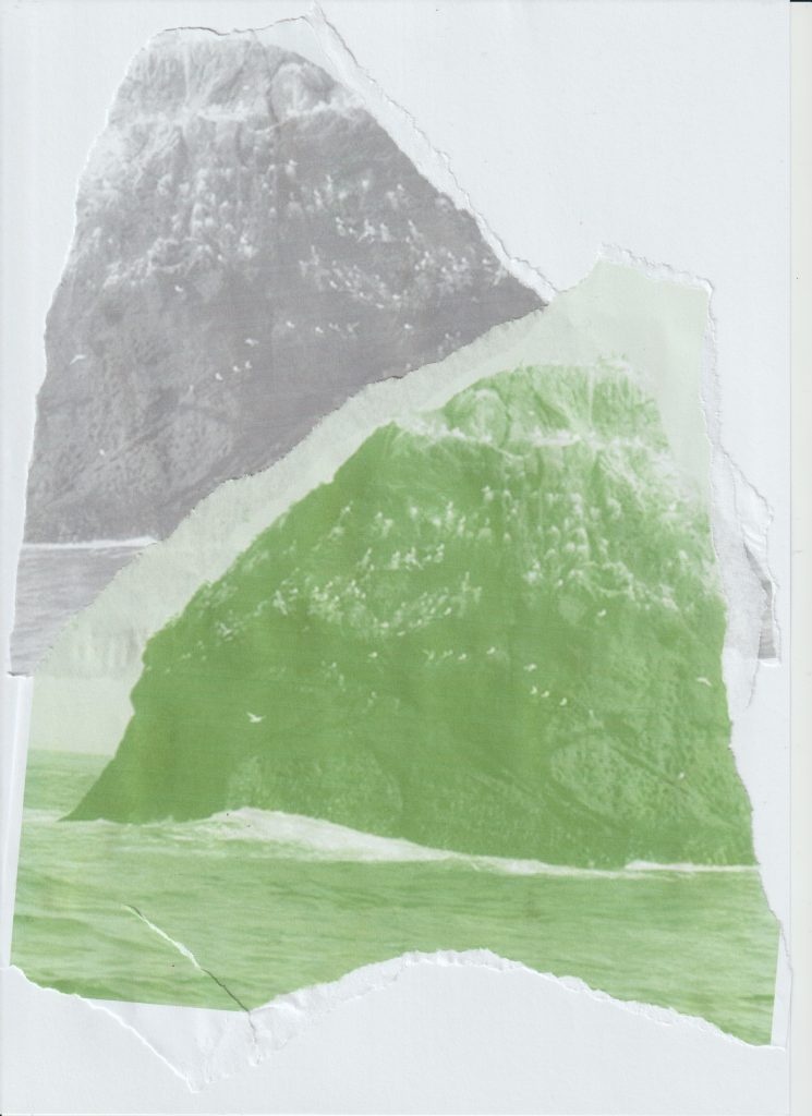
I then opened the Rockall 977 photo in microsoft word and changed the colour to green, then another version in grey which I had flipped to a mirror image. I then printed the photos, tore the paper and stuck them onto a different piece of paper.

I wrote onto the page with 2 different pens/styles.
I chose to use the marker pen for the word ‘rough’, as the pen was starting to run out of ink and gave a rough texture. The fine liner handwriting adds a different texture again.
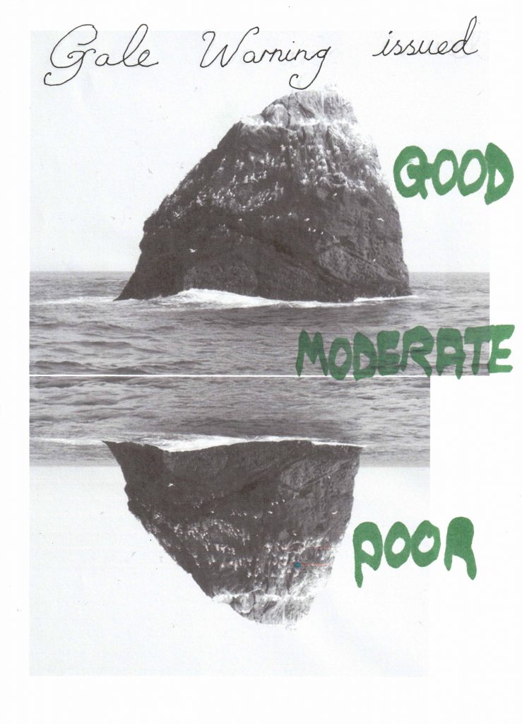
Opening the same photo in microsoft word, I copied and flipped the image upside down to give a mirror image. I printed this page to add handwritten words. The greyscale photo means that a coloured marker works well with the design.
I wrote the sentence at the top, to give the picture a kind-of-title.
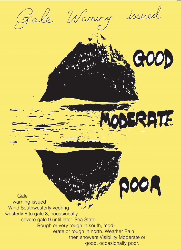
I picked out the words ‘good’, ‘moderate’ and ‘poor’ from the text and wrote them on the right side. This gives the image some order and meaning to follow. I opened the scanned image in illustrator. I then transformed the image into an Image Trace vector. I used yellow for the background, as yellow is sometimes used for warning signs or instructional signs. The type at the bottom of the page balances the amount of white space in the design.

I transformed the image into an image trace vector image. This time I coloured the image orange. I drew rectangles around some phrases to pick them out of the composition. Using diagonal type adds energy to the picture.
