Design Process: Context, Communication & Audience

At the start of this new module, new semester and new year, we are beginning to think about the design process from start to finish.

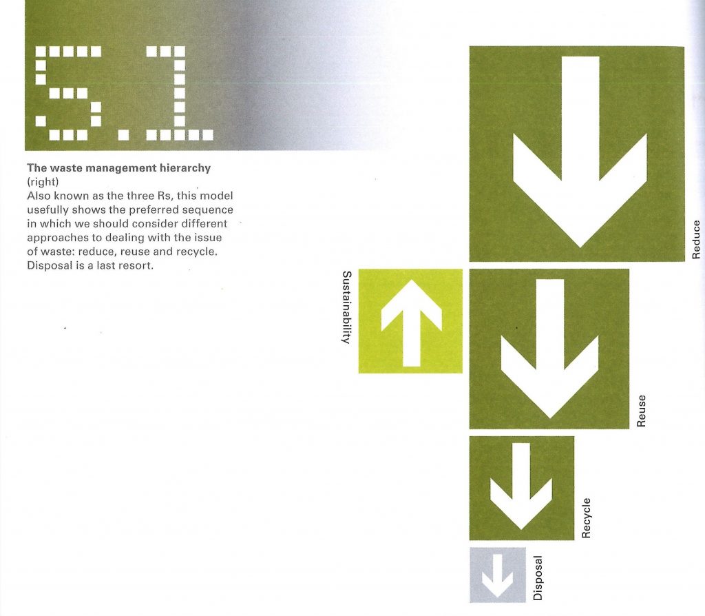
Before arriving at the finished product and after being presented with the brief, a designer follows a set of steps. These 7 Stages are: Define, research, ideate, prototype, select, implement, learn.

Stage 1 is to Define

  • Establish what is the problem. Who is the target audience? We need to ask many questions, in order to understand the brief. The designer’s job is to interpret the brief. ‘What, where, when, who, why?’
  • Who is the client? What design solution is the client thinking of? ie. print, web, video. Where? location, web etc. Why does the client think a design solution is required? How will you implement these ideas?
  • Define the context: Where will the design be? physical location or online? The context can be the starting point and suggest materials.
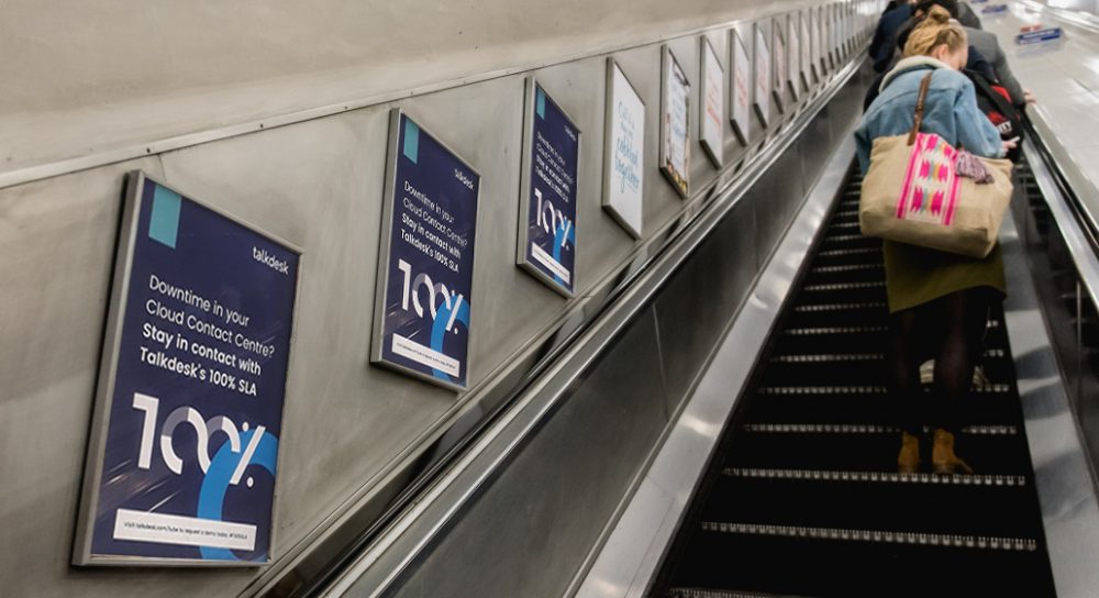
Talkdesk advert, London underground
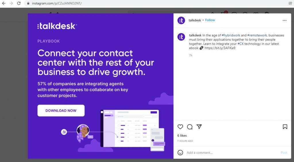
Talkdesk ad, online
  • Understand the competition. What are they doing? (the USP). It could be that you don’t have one and need to bring one.
  • Define the audience.
  • CTA call to action: clear, concise message. prompting an immediate action. e.g. sign the petition: buy now, subscribe now.
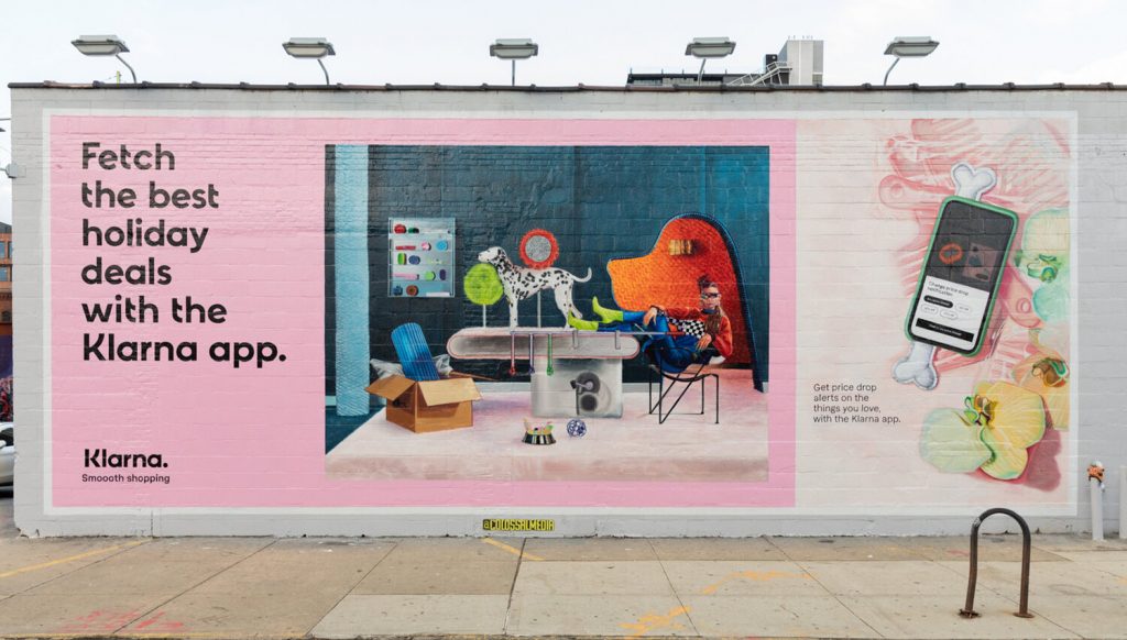
The CTA of this billboard ad, is to use the Klarna app.
  • Provocative imagery may be used to shock, entertain, provoke with purpose.
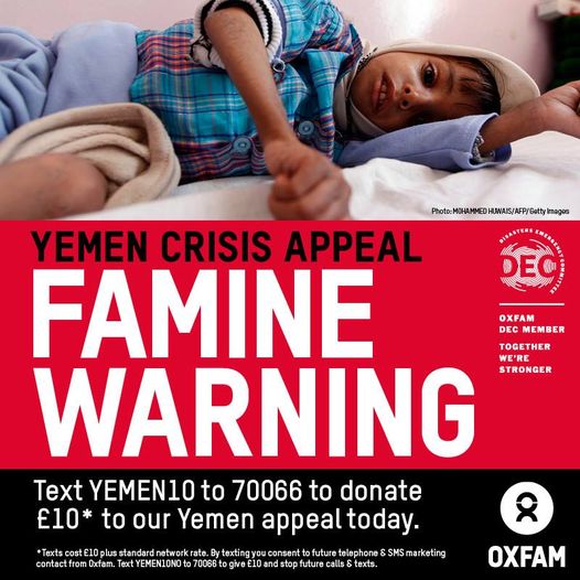
The use of upsetting imagery grabs the viewer’s attention.

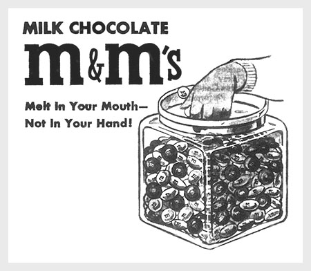
Unique Selling Point (USP) examples:

M&M’s

“Melts in your mouth, not in your hand.”
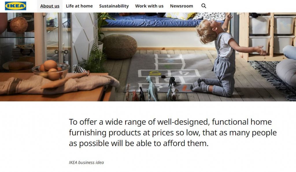
IKEA

“To create a better everyday life for the many people.”
DeBeers

“A diamond is forever.”

Stage 2 Research and investigation.

Who are the Audience?

‘It is vital to remember that everything you design will be seen by other people: designers are visual communicators and do not work in a vacuum. Therefore, it is part of your job to discover everything you can about the intended viewer. Before designing, think about the people who will be looking at your design work. What is the target market? What do you know about them? What can you/should you find out about them? Can you imagine how they might interpret a particular visual message? Think about the age of the viewer, their geographic and cultural influences, and the level of their education and experience. The more you discover about your audience, the better informed your work will be, increasing its potential effectiveness.’

  • Define gender, interests, lifestyle, experiences, education, where they are from, age. The more you know the better. What are their needs? what things are appealing to them?
  • How might you get this information? (Surveys, tests, questionnaires.)
  • What can you offer to them? a vision, a product, a promise. (USP).
  • Understand if there is something missing that you wouldn’t know about.

The success of visual communication depends on the ability to reach a targeted audience and elicit a desired response. Sometimes the response is an
immediate call to action and a clear, concise message with
little open to interpretation. Most often, visual imagery is
used to evoke an emotional state that will put the viewer
in the appropriately receptive frame of mind to receive the
message targeted at them.

In visual communication, the concept of visual rhetoric usually describes the visual tone of voice chosen for a given communication task.
Waste Age: What can design do?

Thursday 3rd Feb

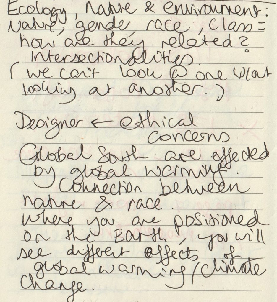
Lecture notes:

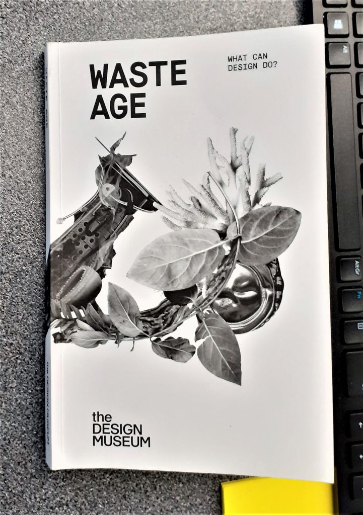
We then read as a group: Waste age: What can design do? This is the catalogue for the exhibition we went to see at The Design Museum, in last October.

(below) Waste Age banner from the Design Museum shop webpage. The designer has interspersed images of plastic waste with leaves. The effect is subtle and elegant.

https://designmuseumshop.com/collections/waste-age-what-can-design-do

The copy of the catalogue, our lecturer brought to class.

Photos I took at the exhibition: (Read the original blog here.)

Posters outside the museum
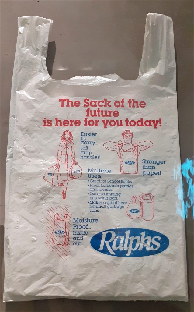
(above) I was shocked and surprised to see this vintage bag in the exhibition. Printed on the bag is a list of the pro’s for using plastic carrier bags. ‘Great for school books’, ‘Ideal for beach parties and picnics.’ While these selling points might be true, I wonder if people at the time questioned the environmental impact of plastic.

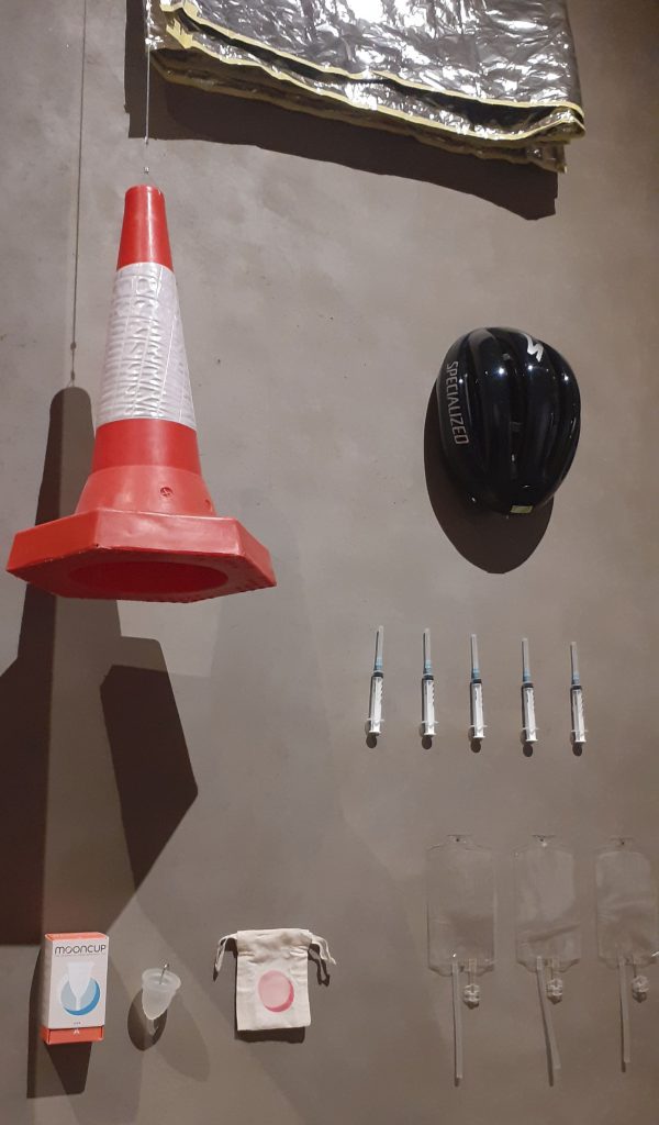
There were several displays like this one at the start of the exhibition. These displays demonstrate the multiple uses of plastic in the present day. The shocking point was that I have never been aware of the amount of everyday objects we interact with that are currently made of plastic.

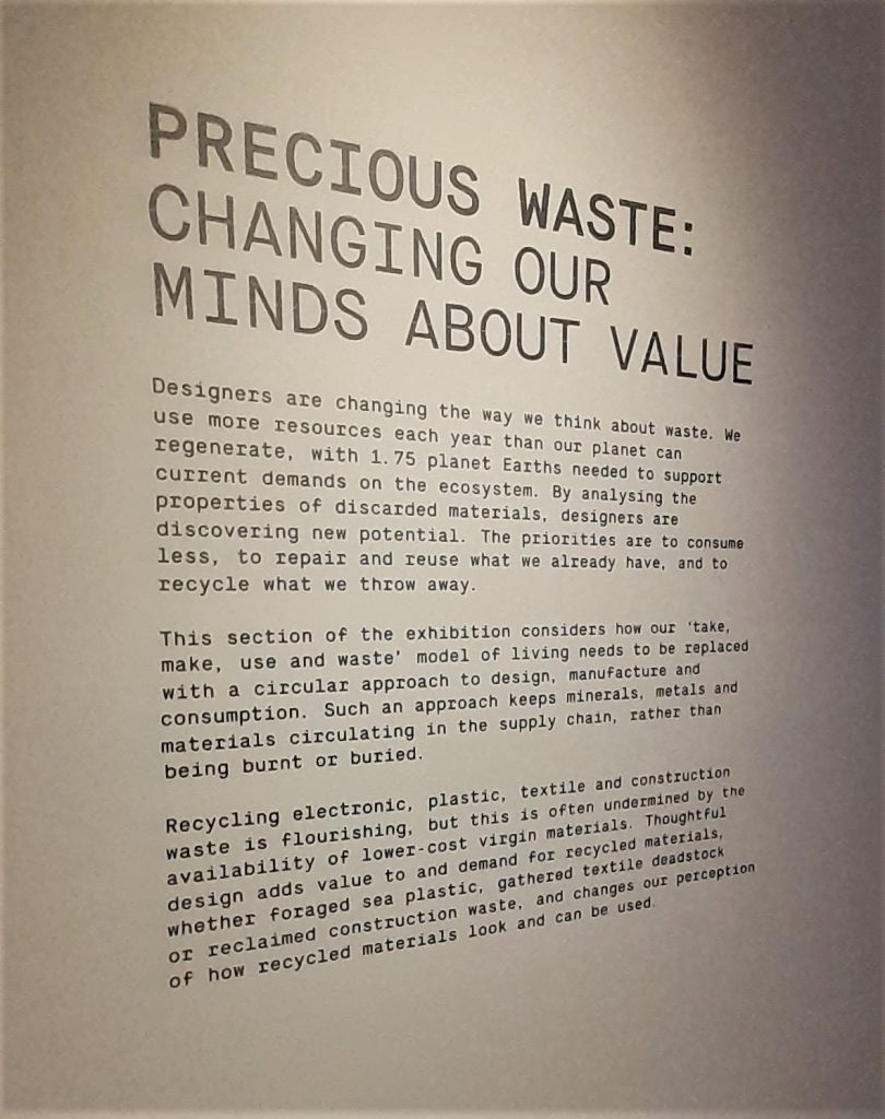
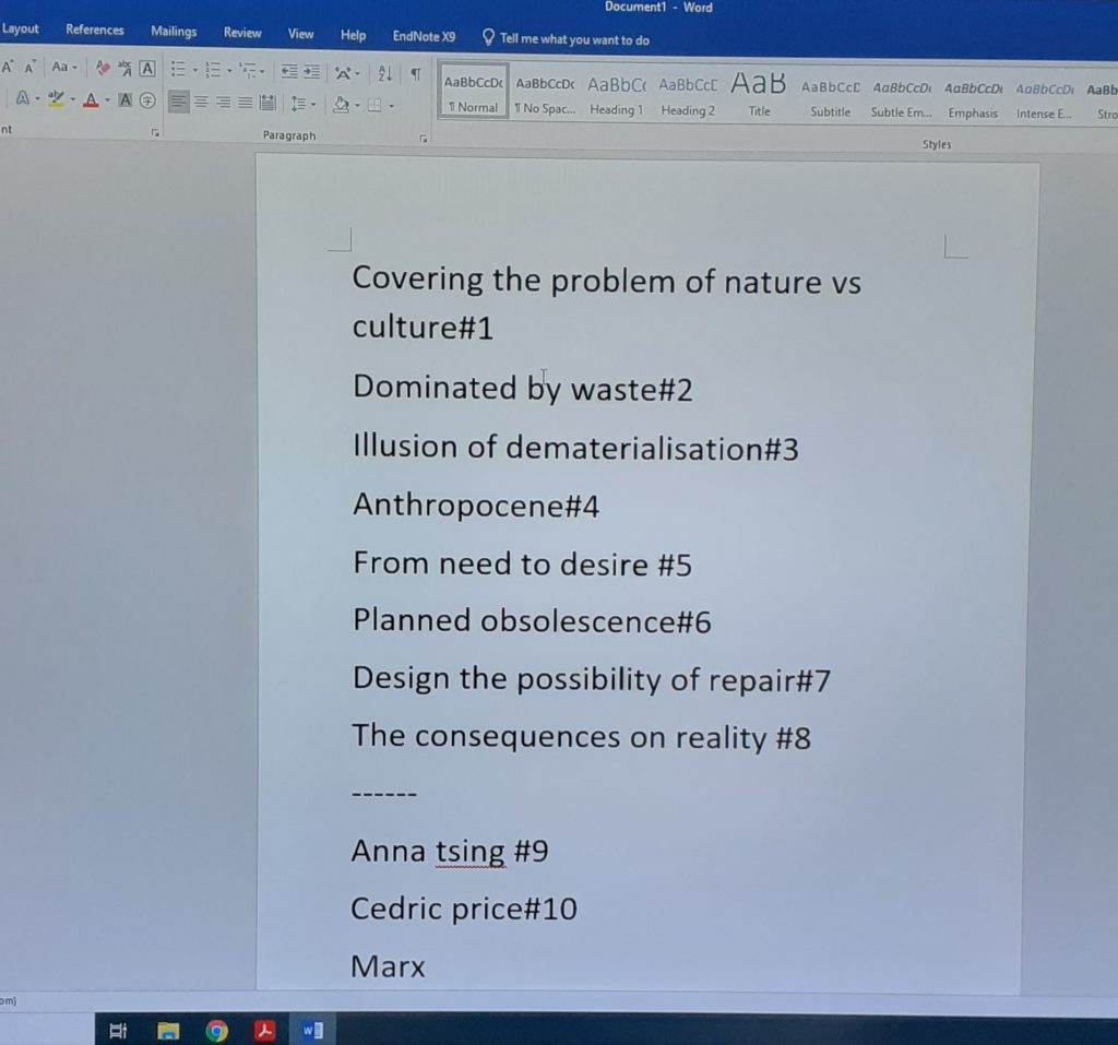
Paragraph #1 Covering the problem of nature vs culture

This paragraph talks about the blurred lines between nature and culture. We are introduced to the problem of waste.

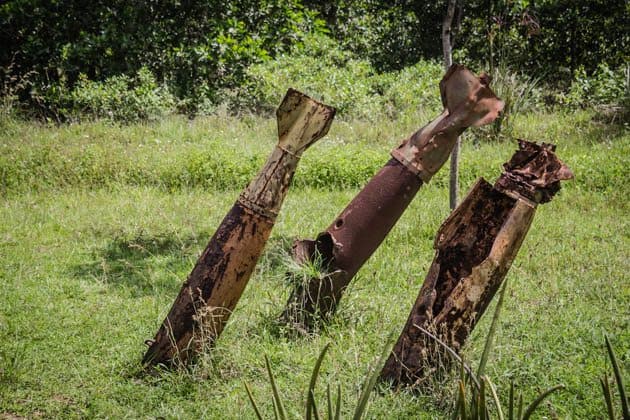
Bombs in the DMZ Vietnam War https://www.divergenttravelers.com/immersion-vietnam-war/

Paragraph #2 Dominated by waste

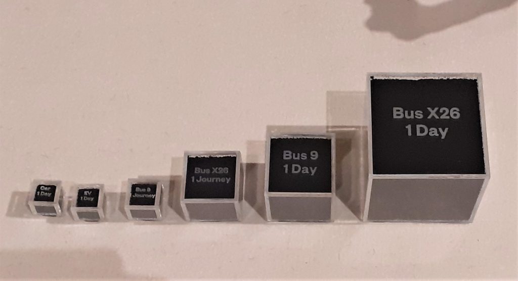
This paragraph introduces us to the idea of our current culture of waste. The fact that waste is not just around us, but in our digestive tract as well for example. This made me think of the microplastics presented at the exhibition. The display showed the particles of car/bus tyres in our atmosphere. (‘The Tyre Collective’)

photo taken at the exhibition shows us pollution from vehicle tyres being in contact with the road surface.
https://www.dawn.com/news/1505436

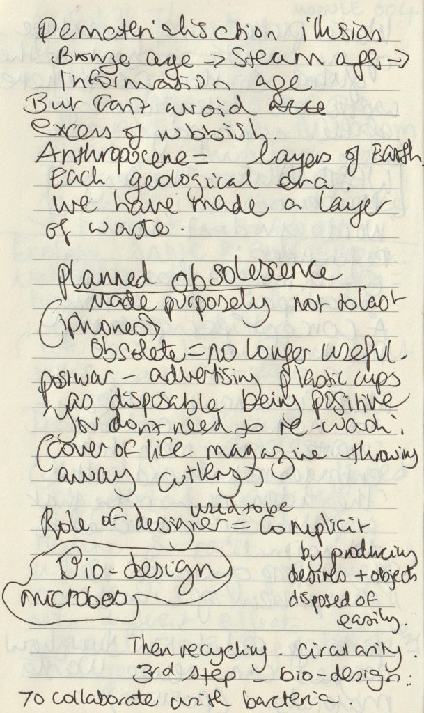
#3 Illusion of dematerialisation

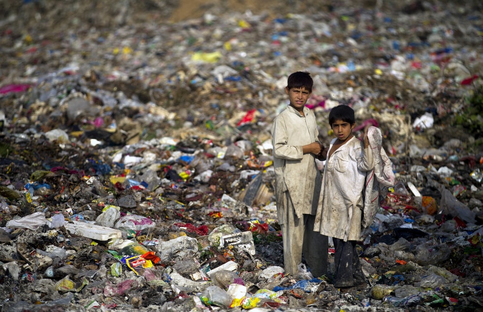
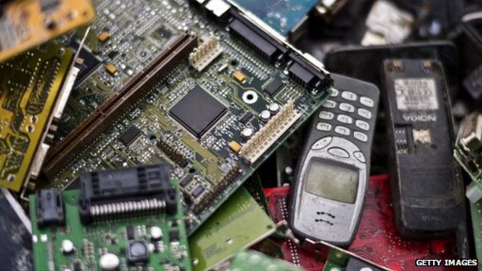
Here we are made aware of the sheer amount of rubbish created by humans. The 500 billion tonnes of plastic bags consumed per year and how easy it is to ignore this fact.

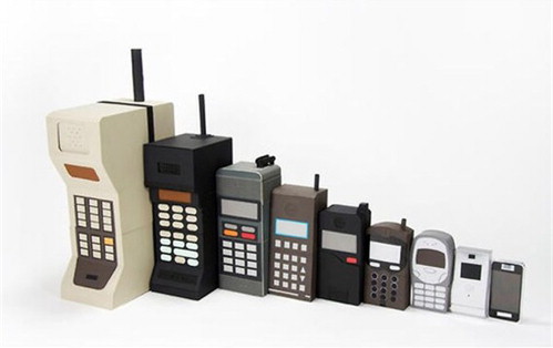
The image below illustrates the change in phone designs over the years. As technology looks lighter and more elegant we could be fooled into thinking that we are producing less waste than before. The opposite has been proven to be true.

https://www.sciencedirect.com/topics/computer-science/dematerialization

#4 Anthropocene

‘Anthropocene’ refers to the new layer of earth we are contributing to as humans.

https://www.chemistryworld.com/features/marking-the-anthropocene/4012969.article

#5 From need to desire

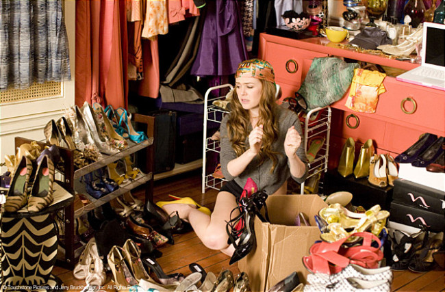
The capitalist culture created a shift from consumers buying just what they needed, to desire objects they have no need for. This allowed companies to make big money, but has had a detrimental effect on our Earth.

(A scene from the movie ‘Shopperholic’) http://www.koreaherald.com/view.php?ud=20140407001361

#6 Planned obsolescence

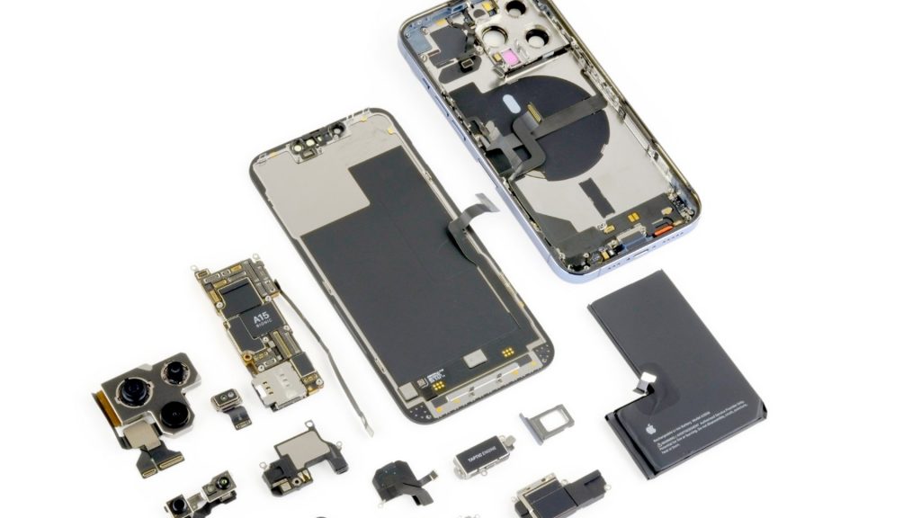
The role of the designer has been to make products look desirable to the consumer. The iPhone has been particularly criticised for its low repairability. Products that break earlier, mean more sales.

https://www.bbc.co.uk/news/technology-32353659
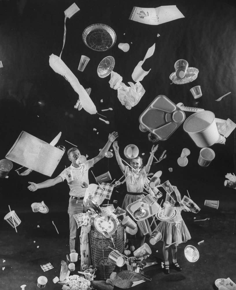
Three children tossing paper cups, plates, aluminum foil pans, lunch trays, straws and napkins through the air illustrating the usefulness of disposable dishes. https://thedieline.com/blog/2020/3/10/the-history-of-plastic-the-invention-of-throwaway-living?

#7 Design the possibility of repair

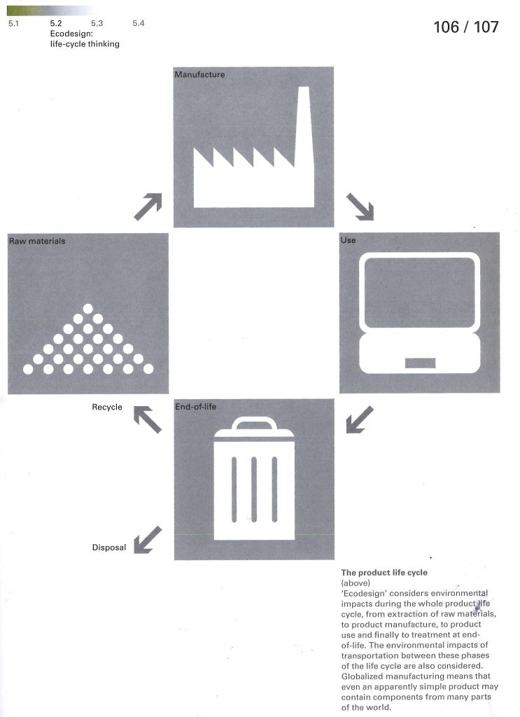
The designer has a role within the product cycle. They can focus on designing repairable products. (below) The iPhone 13 Pro is less repairable than its predecessors.

https://techunwrapped.com/why-the-iphone-13-pro-is-less-repairable-than-its-predecessors/

The article then goes on to suggest practical solutions.

  • Electronics can be designed with modular parts
  • Stop fusing plastics and metals together, this will be more can be recycled
  • adapt and re-use good buildings instead of demolishing and replacing
  • reducing carbon-heavy steel and concrete

#8 The consequences on reality

Consumers need to demand these sustainable products/ methods. The designer could blindly follow what they are told to do by their paymasters, but then nothing would change.

The metaphor of fungus is mentioned here. An organism that survives and thrives.

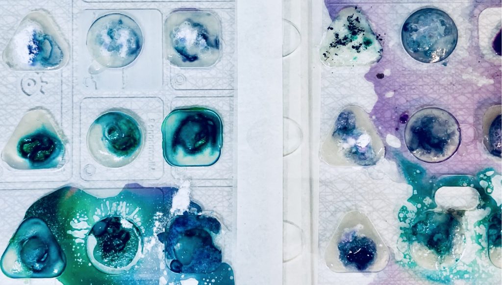
The article mentions Bio-design, which is a new phrase for me. We then watched a short student-made video about the possibilities of bio design in the future, including the dyeing of fabrics in a sustainable way. We have only just begun to explore the possibilities of bacteria.

https://www.dh.umu.se/en/stories/?id=45080

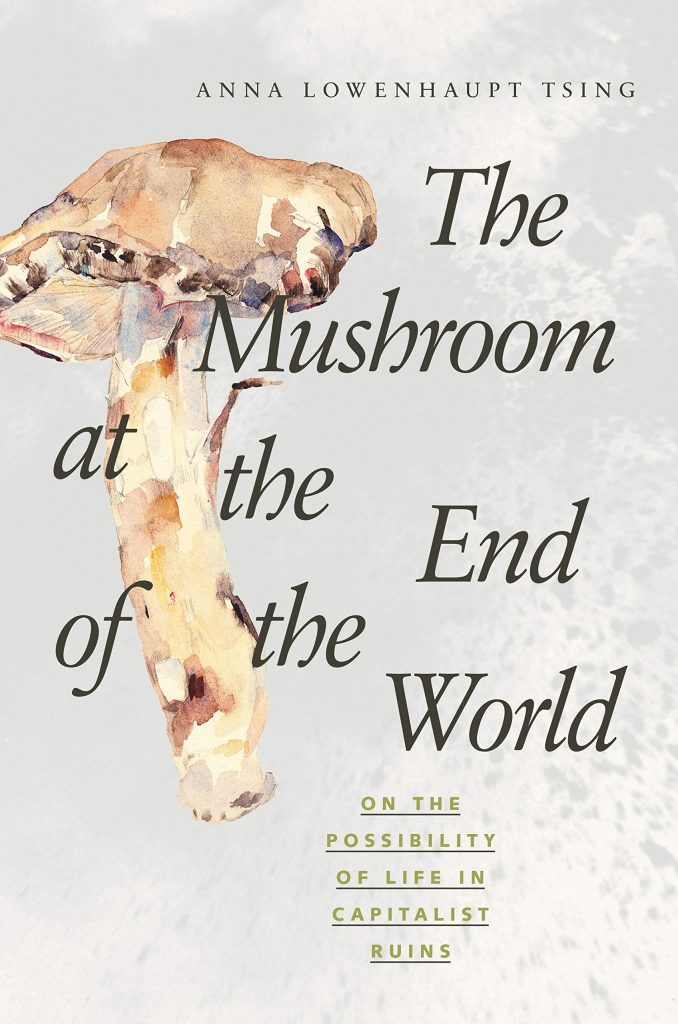
Anna Tsing is mentioned within the catalogue. Her book (left) explores the story of the Matsutake mushroom. Amazon.com says about the book- ‘In all its contradictions, matsutake offers insights into areas far beyond just mushrooms and addresses a crucial question: what manages to live in the ruins we have made?’ 

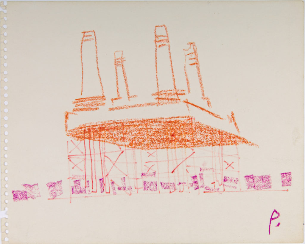
Within the article, we also see mention of the famous architect, Cedric Price.

https://drawingmatter.org/cedric-price-2/

‘Price’s architectural style came from his belief that buildings should serve the needs of the people, and be radically transformed or demolished if they no longer served their purpose. A life-long socialist, Price was deeply skeptical of political institutions and their tendency to use grand, monumental buildings as a means of consolidating power. Instead, Price proposed building temporary and mutable structures which would be open and accessible to all.’

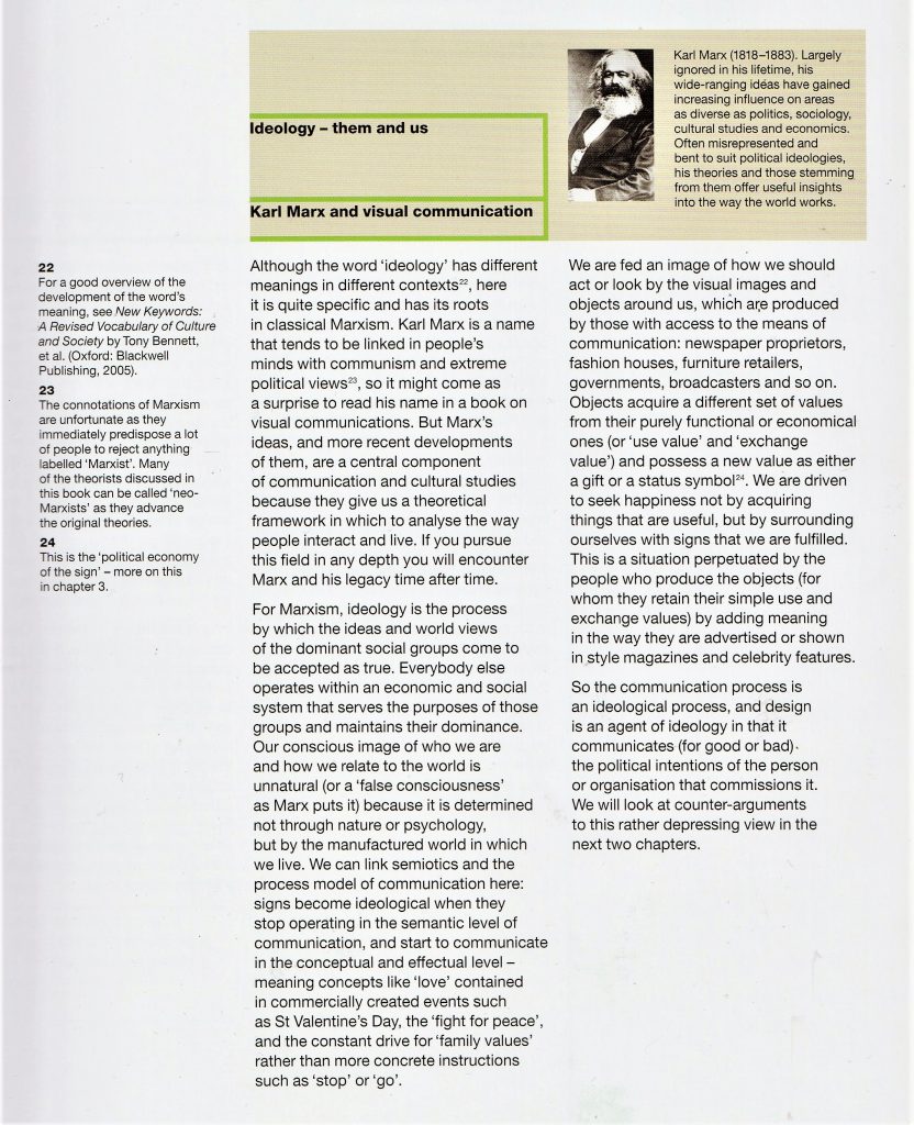
Karl Marx is also mentioned within the text.

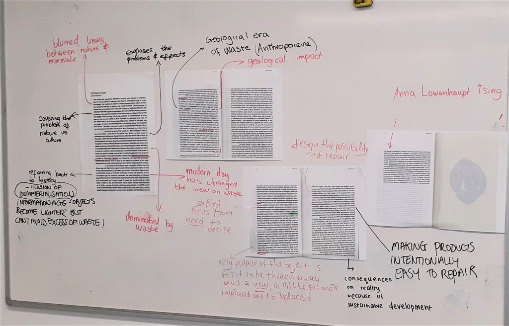
The board from today’s lecture. We annotated the text as a group. This was particularly helpful, as it allowed us to see each other’s interpretations.

We condensed down the topics within each paragraph. It was helpful to write them as short phrases. This exercise helped me to understand what I had read, and I will be using this method when looking at articles in my future research.

Un-creative writing: further experimentation

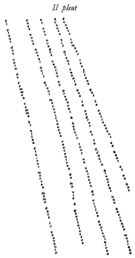
Il Pleut, Guillaume Apollinaire, 1918
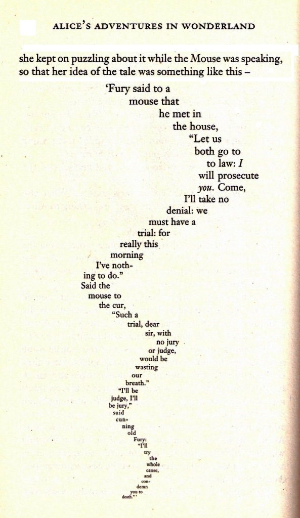
Lewis Carrol, Mouse’s Tale, 1865

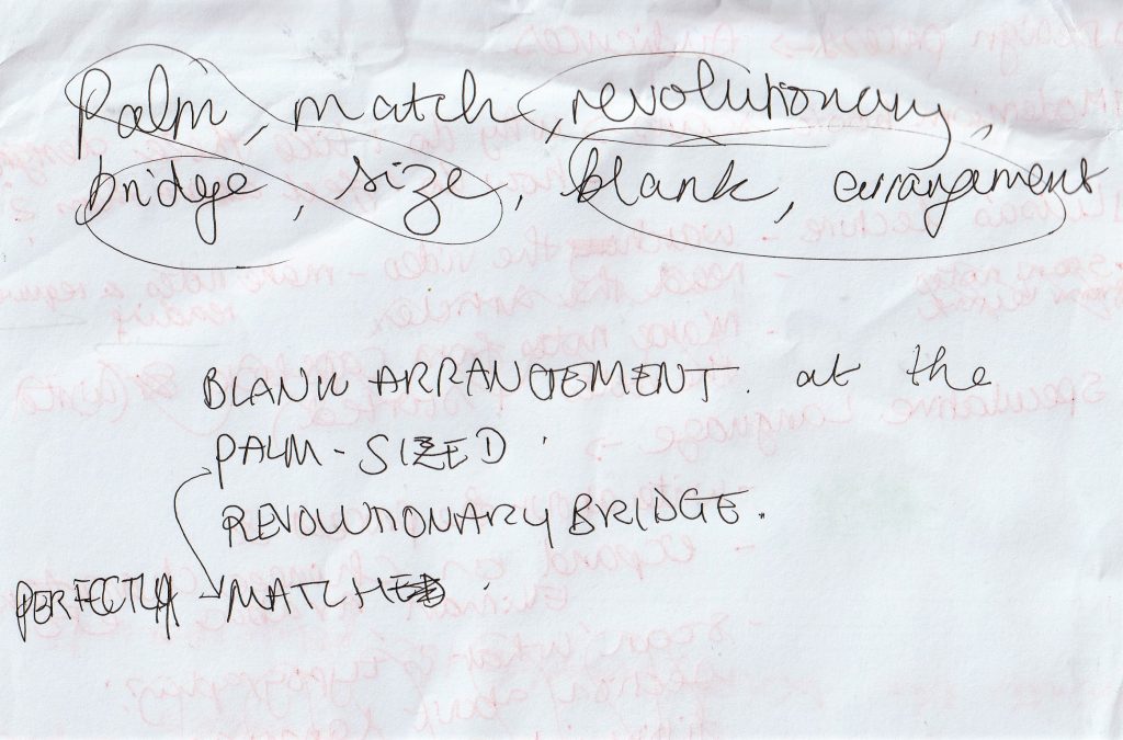
Using the text I came up with from the random word generator, I played around further with the tools I’ve learned so far.

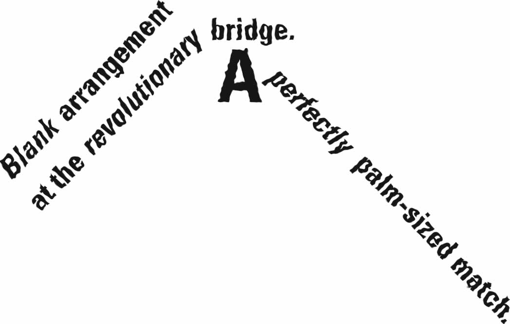
The reason I like this collection of words, is the double meanings.

‘Palm’ could be a palm tree or the palm of a hand.

‘Match’ could mean a pairing of 2 objects or people, football match, or a matchstick used to start a fire.

This is found often in poetry.

I typed the words using the type tool in adobe illustrator. I then turned them into vector images and experimented from there.

Below are the first 4 examples. I included italic font in the second image, to place emphasis on the adjectives ‘Blank’, ‘revolutionary’ and ‘perfectly’. I liked the effect this had of almost breaking down the text. I feel it made it easier to understand.

In the fourth experiment, I formed the words into a bridge shaped structure to illustrate the word ‘bridge’. I enlarged the ‘A’, as I felt this letter also has a bridge-like structure.

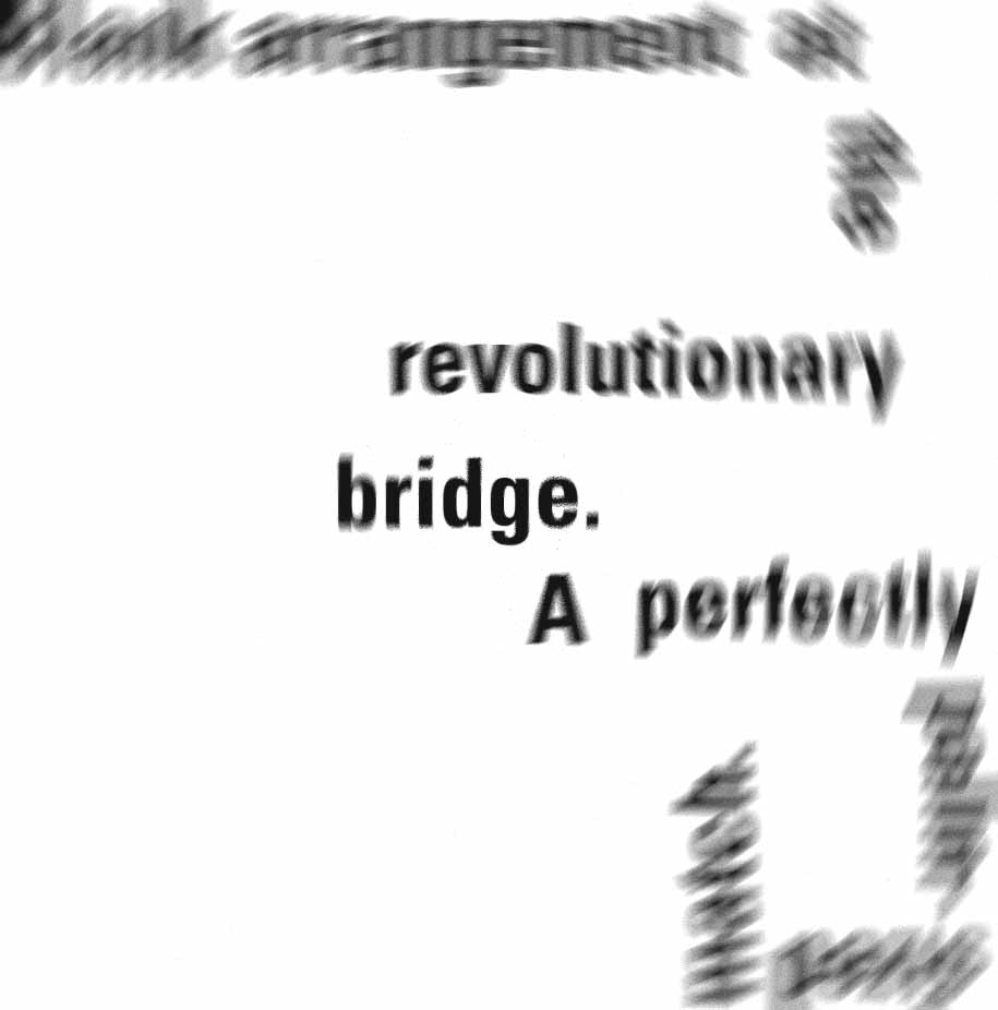
Placing these images into adobe photoshop, I was able to add these effects:

‘Radial blur’
‘Ripple’

I then went back into adobe illustrator and experimented with the words again.

  1. Large to small and cluttered to neat. I feel this suggests a large blank space and a small match.

2) Disorder to calm, like a wave crashing on the shore or something disrupting the flow.

3) Use of serif font (Bodoni) sets the middle sentence apart from the rest of the text and suggests something more formal.

4) Image trace> line art> increase stroke> outline>invert fill. I then went back into the image with the pen tool and added lines to help the words be more legible. I arranged the words in a way that feels more free and perhaps palm-leaf-like.

When there are words with a double, or triple meaning, the way they are presented/ arranged can help suggest to the reader which meaning you want to get across.

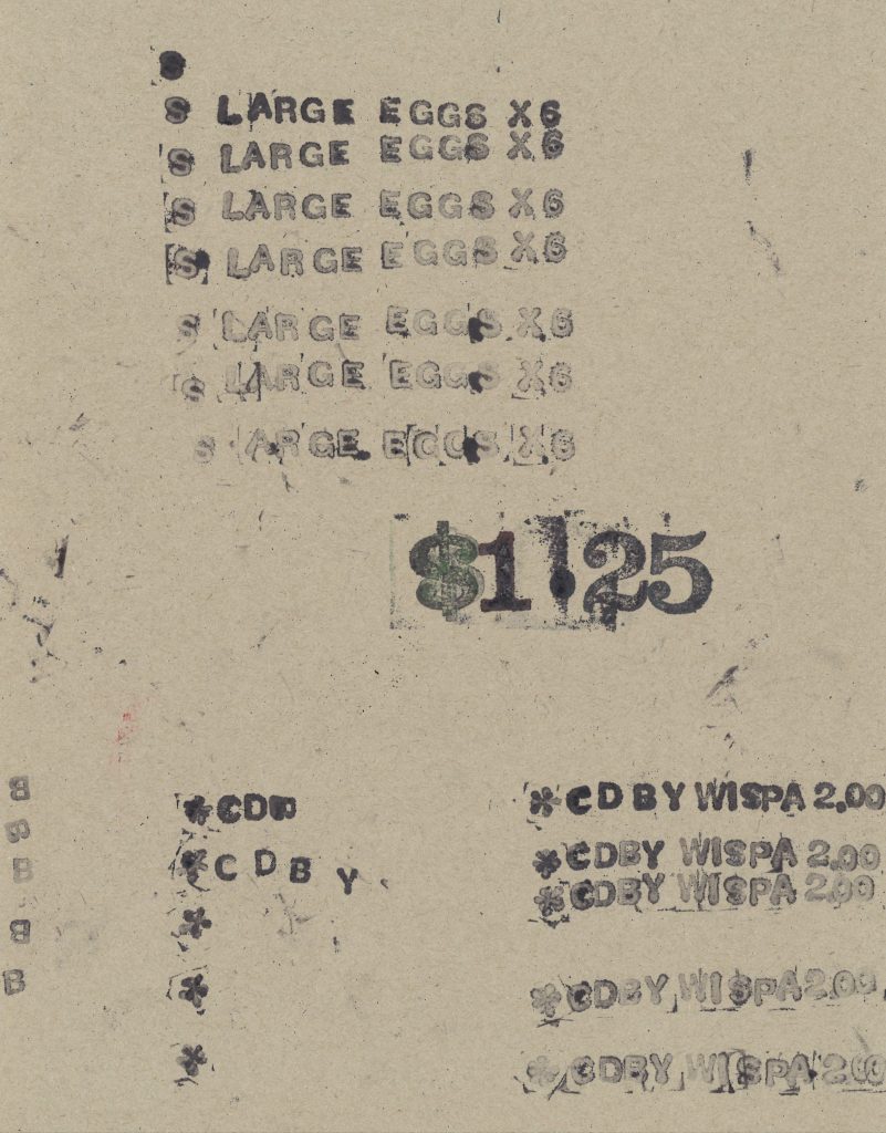
Letter stamps

Text from the receipt in previous post