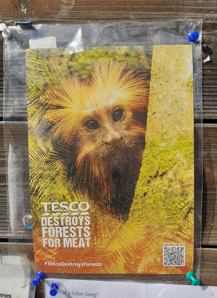
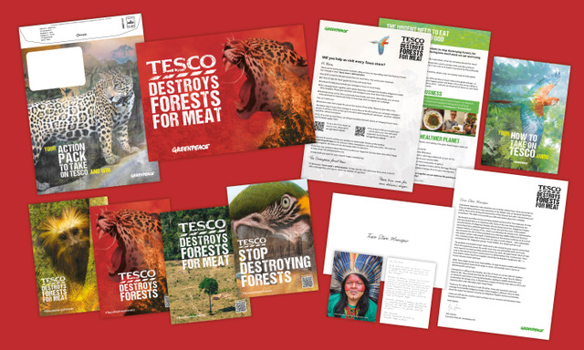
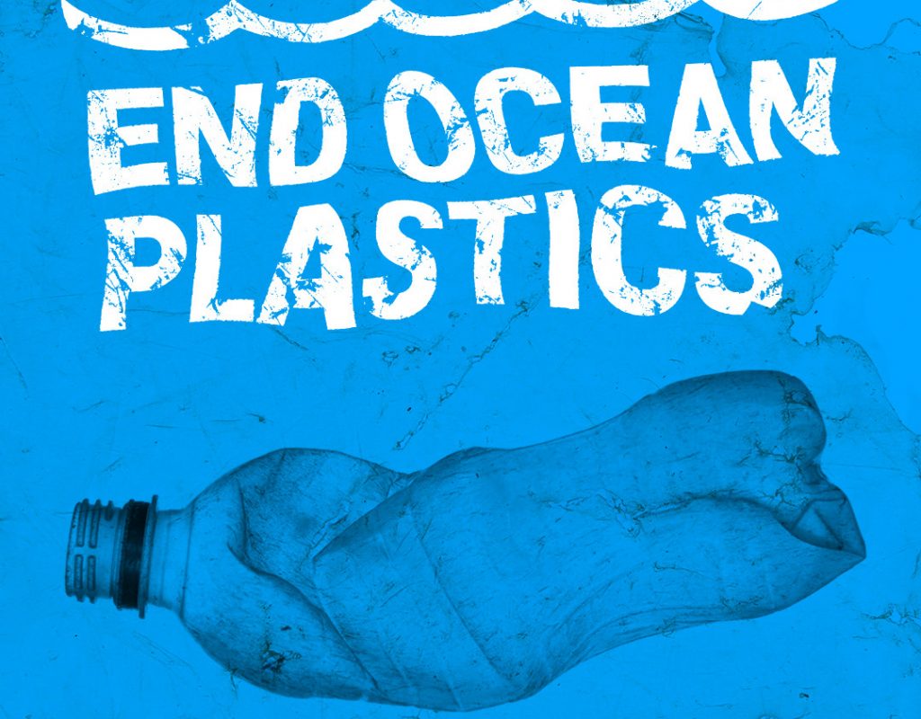
Action pack. These posters focus on the animal affected by Tesco’s actions.
We met as a group to discuss the first task of the brief- the poster. Out of the 4 group members, only half of us could be on campus. We worked around this by setting up a zoom meeting and this worked just as well.
The main focus if thus meeting was the Project 4 brief.
The aims of the brief:
Write 3 options for the tagline.
Choose one of the headlines and put together a poster using this headline and an image. Use 2 colours, 1 for the text and 1 for the image. Could also use greyscale, bitmap or filters.
For the 2nd poster, choose more than 1 image and create a photo montage. (Mixing bit and pieces of photos to make a new composition, similar to a collage) An example could be Dada or Constructivist compositions.
The 3rd poster asks us to use illustration skills. We could use silhouettes, icons, or work with size/scale in a surrealist way. Can use metaphor, such as with (the global warming postyer). Can use up to 5 colours, for example, 1 colour for the background.
Meeting notes:
Colours
We decided that red should be used in our campaign, since this relates to danger AND the Tesco brand at the same time.
The other colours we considered were black, white, blue and green. Green relates to the nature that is being destroyed. White backgrounds are used often for Tesco posters.
A combination of red, pink and white could symbolise danger and meat.
Taglines
Tesco must go (rhyme), Tesco Kills Trees, Tell Tesco Trees Matter, Don’t Eat Tesco Meat, Tesco Meat Kills Trees
After sharing our ideas with our lecturer, she suggested:
Focus on the animals, not the meat or dairy (Be Wary Tesco Dairy)
Typeface
The typeface used by Tesco is an altered version of Newtext Bold and a humanist sans serif typeface. We want to use this in the poster. We could also include a destroyed text effect.
On the other hand, the poster doesn’t need to reflect the Tesco brand. This method of subverting the brand could be reserved for the guerilla strategy.
Guerilla Marketing Strategy
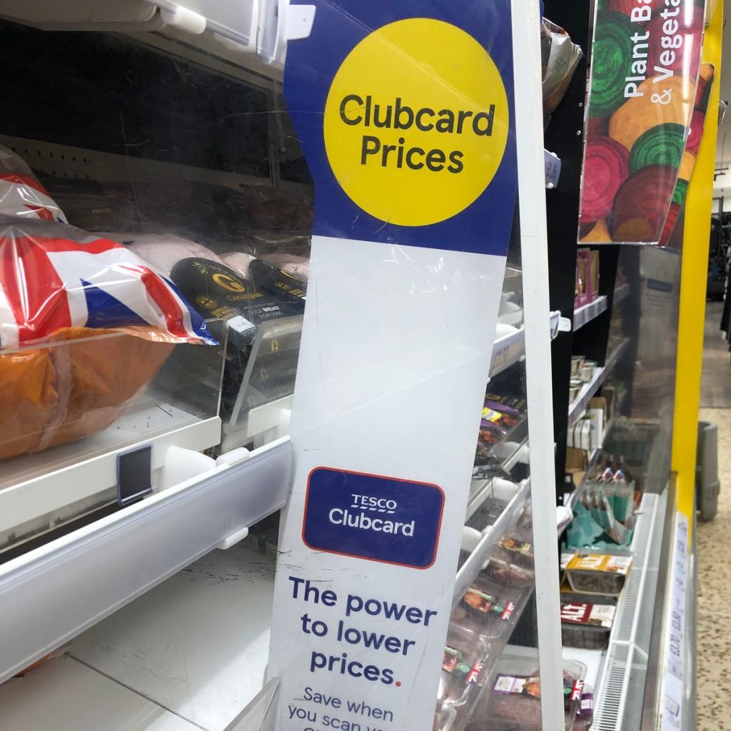
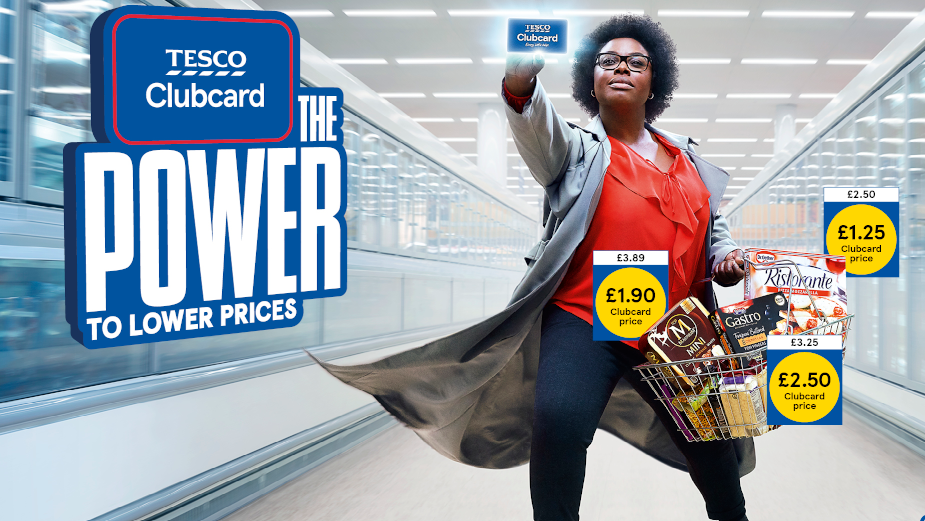
Clubcard tags. Where the price is placed:
Tesco clubcard. The group shared image in a shared drive.
We could use the yellow icon. ‘The power to lower prices’ could be subverted to ‘The power to stop deforestation’. This could put a positive spin on the poster and ask consumers to do something good. The prices on the right could state the facts we want to get across to the consumer.
Tesco Clubcard campaign, 2020 by MediaCom
Every little helps> Every little consequence/ suffering.
Prices that take you back
‘Tesco Finest’ > not the finest way of producing meat.
(Whatever you’re buying, the forest pays the price) Knock-on-effect damage (medicine comes from rainforest, effect on indigenous communities, animal habitat loss). These facts could be displayed as in the poster below. For example ‘Every tree killed, Every living forest…’
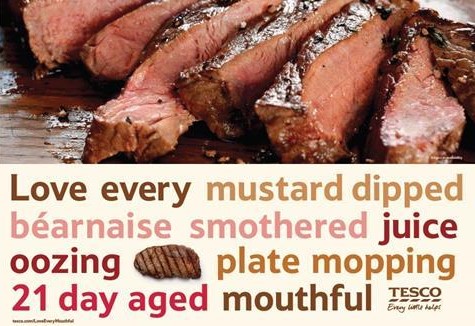
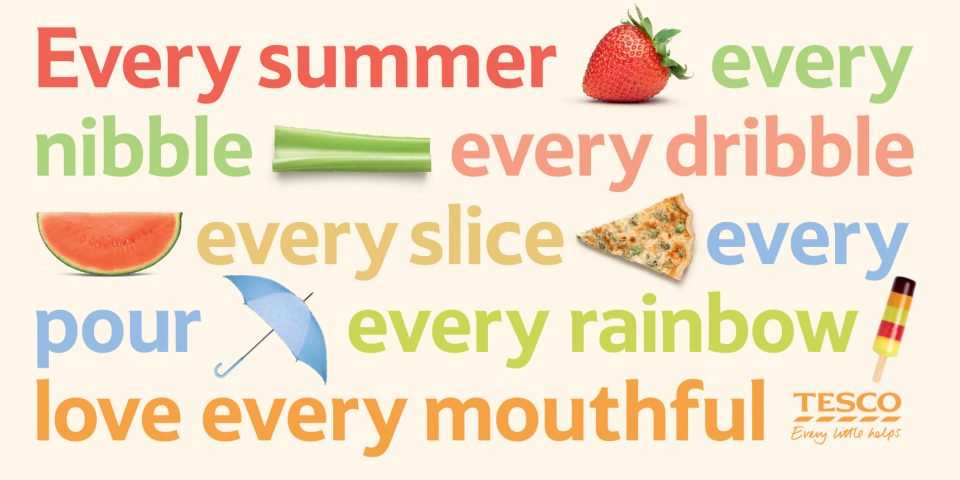
Tesco Love Every Mouthful campaign
Posters
1 poster focusing on meat, 1 for dairy?
Poster 1: Red and white. Maybe using a white background and tagline written in ‘meat font’.
Poster 2: A Tesco in the forest
Poster 3: The tree and meat
The shape of the meat could reflect a geographical structure. For example, the shape of the Amazon.
Our plan for the week is to design at least 1 poster each. We will then meet up and discuss which we feel are more effective.
In week 7, we are starting to work on the Greenpeace- Tesco campaign. To prepare for this, we have been introduced to some principles we need to understand. Firstly, the brand toolkit.
We then looked at posters in detail. Such as how the elements of a poster should work together to achieve straight-forward communication. This was followed by a digital workshop, allowing us to practice poster design.
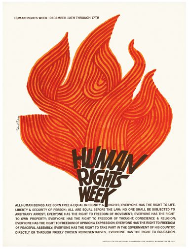
poster by Saul Bass
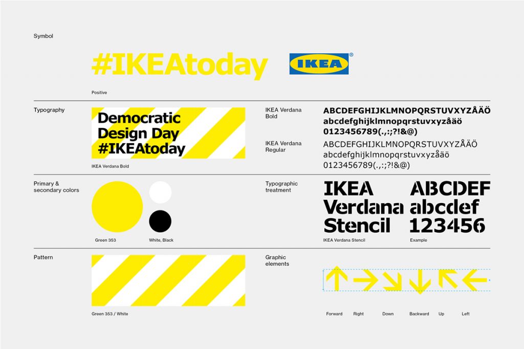
Brand toolkit
These are the basic elements of the campaign. When used consistently, these core visual components (such as headline and slogan), help us to identify a brand.
They make the brand recognisable, for example IKEA:
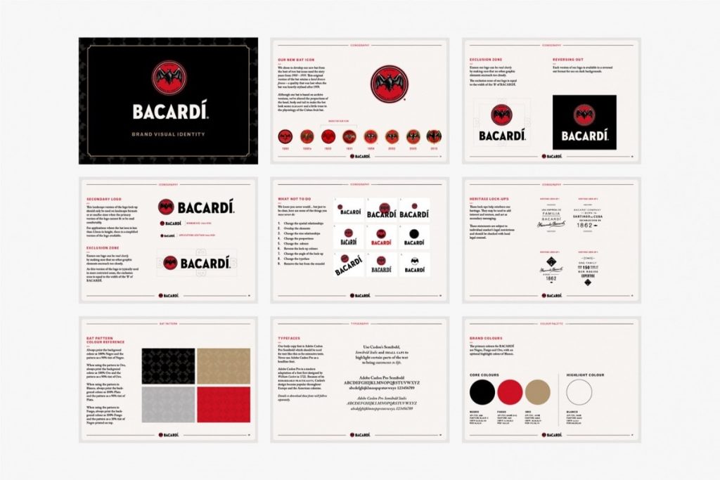
Bacardi brand toolkit
Brand guidelines– this is a document that defines the usage of the typeface, graphic elements, font, textures, headline font, body copy, type for tagline, colour palette and illustration style of a campaign or brand. This contains the essence of the brand. (see below)
For our Greenpeace brief, we need to think about the main colour(s) and secondary colours.
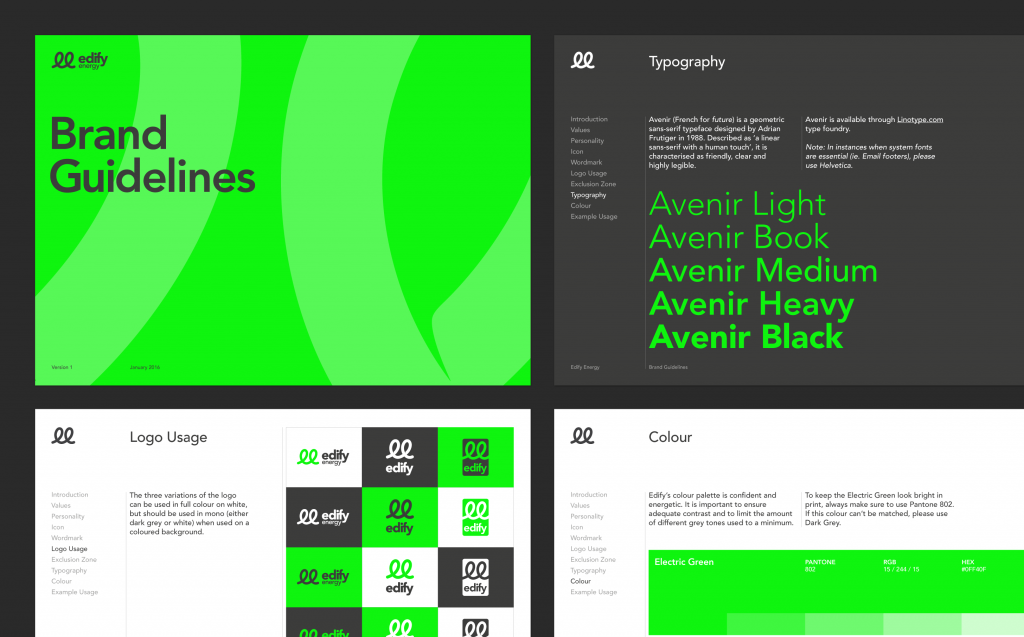
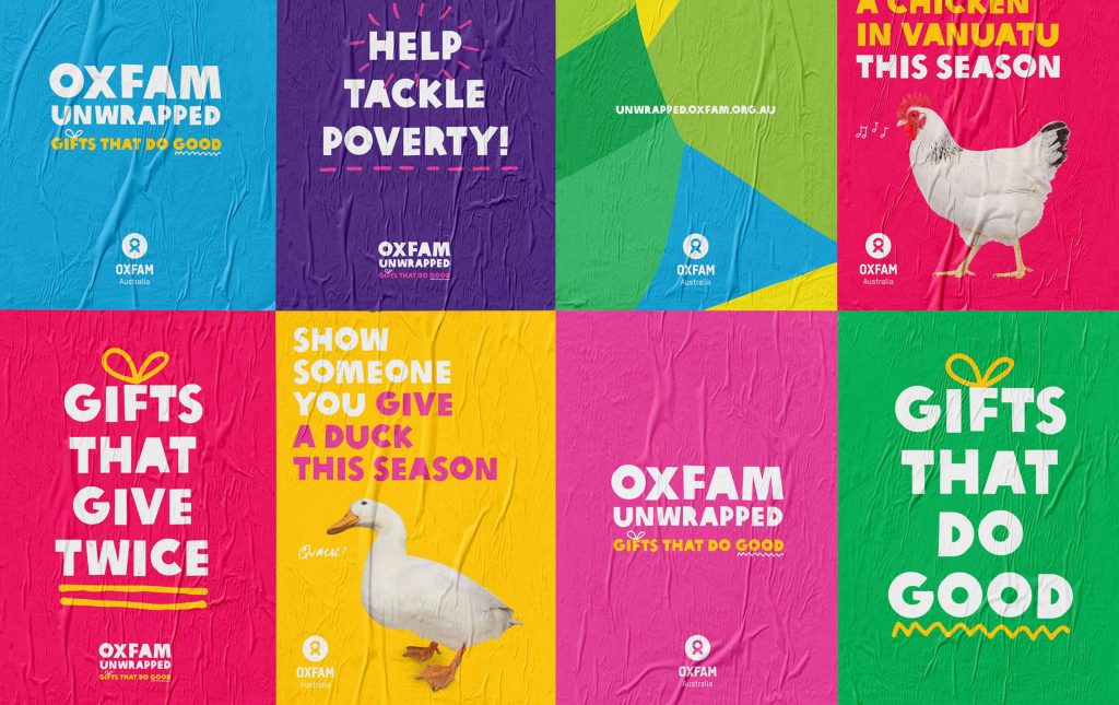
When looking at the brand guidelines of Oxfam, we can see that they have used the same positioning of the logo, same secondary typeface and choice of primary and secondary extended palette.
Oxfam’s brand guidelines
There can also be a variety within these typefaces, for example some might be more expressive/impactful and some more formal/informative. This means there the type will suit the purpose of the particular brief.
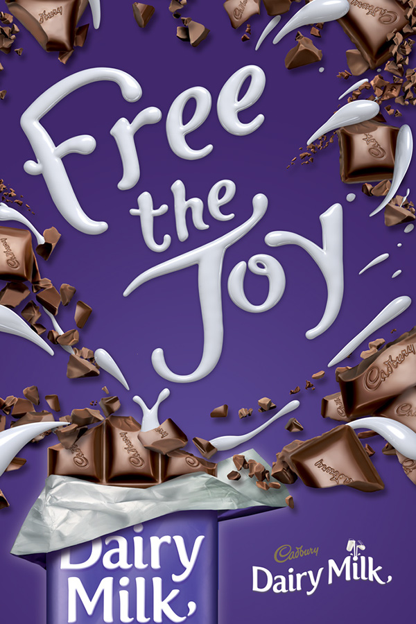
A display typeface is used in large settings. It is expressive and unsuitable for use as a body copy for example. The body copy is used for smaller, extended texts.
This Cadbury poster uses display type to express joy. This type would not be readable as a body copy typeface.
So for the campaign we are working on, we could consider 3 typefaces:
Primary typeface- big, bold heading
Subheading- Intro for the body copy
Body copy
The tagline should be unique. This will appear on our poster. It could put pressure on Tesco to change their supplier, by relating Tesco to deforestation. It needs to be attention-grabbing. Some examples are:
Posters
A poster needs to attract the attention of the passerby.
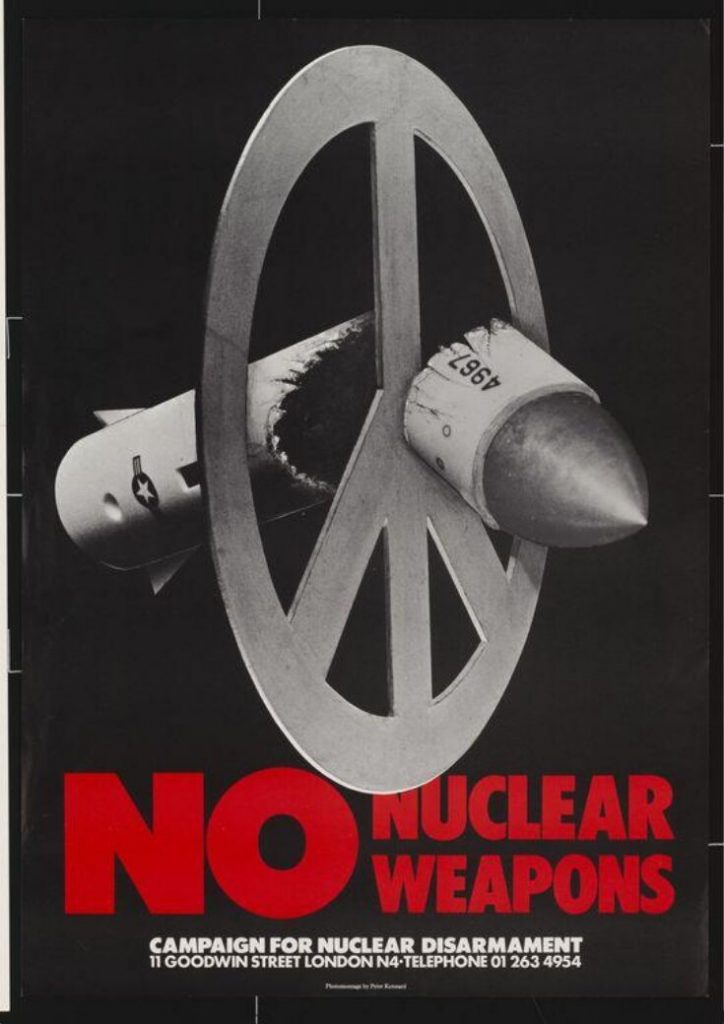
No Nuclear Weapons, 1980, Peter Kennard
Using a big headline and image presented as a metaphor, the message is immediately clear to the viewer.
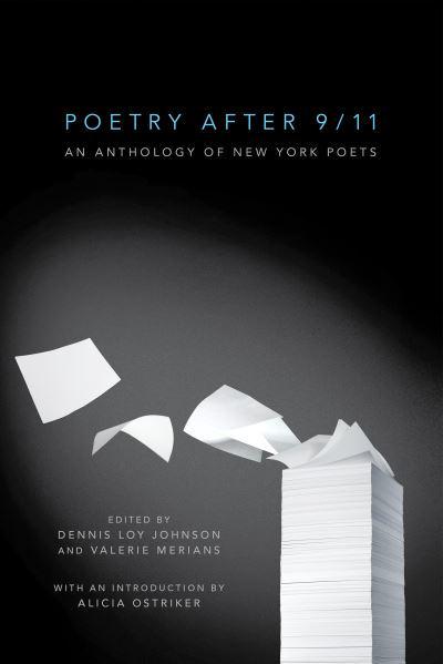
Poetry after 9/11, 2011, Christopher Brian King
This book cover design is another example of the use of metaphor used effectively. This image combines both elements of written poetry and the shape of the tower that was destroyed. The designer has used a spotlight to halo this image against the dark background.
The aim of the poster is to provoke, to make the viewer react or question something.
The poster needs to not only convey a message, but also to make the viewer act on the message. Emotional trigger and propaganda are therefore useful techniques to apply to a poster.
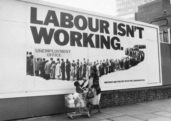
An example of this is the poster below, from 1978. The Labour isn’t working poster was designed by Saatchi and Saatchi. At the time, the Torie party was campaigning to win elections, which this poster helped them to do when Margaret Thatcher became Prime Minister in 1979. This poster tapped into the public’s frustration with the widespread unemployment across the UK.
The poster is simple, bold and punchy.
Image Making
Creating an image to express the meaning of the campaign, is a skill we need to consider when starting the Greenpeace brief. This means thinking about the marriage of type and image. The central focus of the poster is the image.
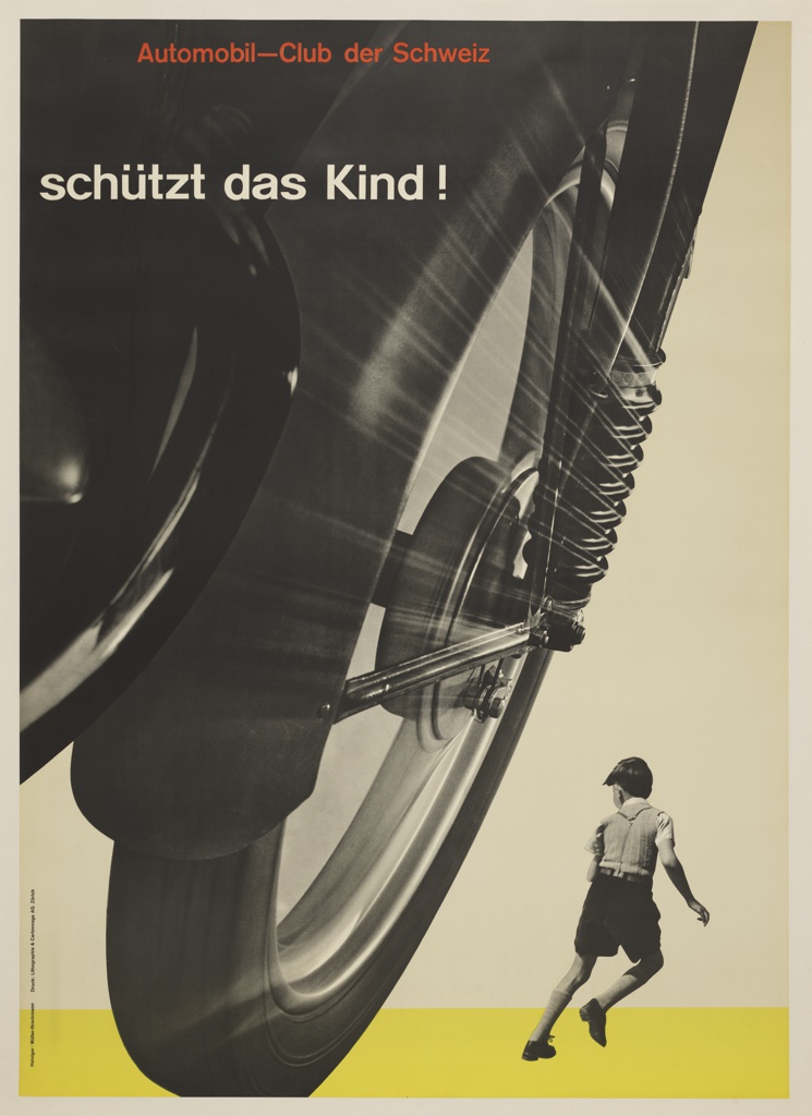
The poster below Schutzt das Kind! (Protect the child!) by Josef Muller-Brockmann was designed in 1953. This poster plays with scale and the size of the wheel is used to dwarf the child. This creates tension and gives the idea of danger approaching. The point of view is also important to create this effect.
(right) This poster by Muller-Brockmann, gives us the perspective of the pedestrian. This helps the viewer empathise with them.
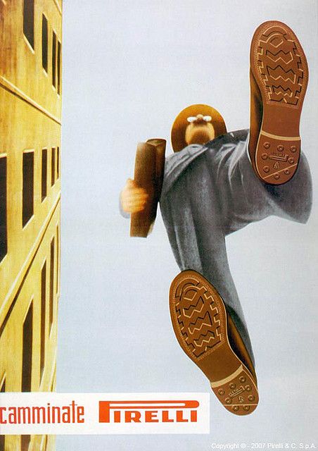
Camminate Pirelli, 1948
Designed by Ermanno Scopinich
This poster also plays with perspective. The ad is for rubber shoe soles by Pirelli. Due to perspective, these soles have the most detail in the whole image, as they are closer to the viewer.
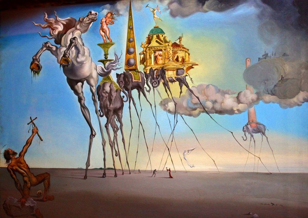
Another approach to poster design can be surrealism. Designers were inspired by the paintings by Salvador Dali and Rene Magritte. Surrealism and humour work well because they make you smile and stop to look at the poster. Designers also borrowed from Pop Art.
Surrealist painting by Salvador Dali
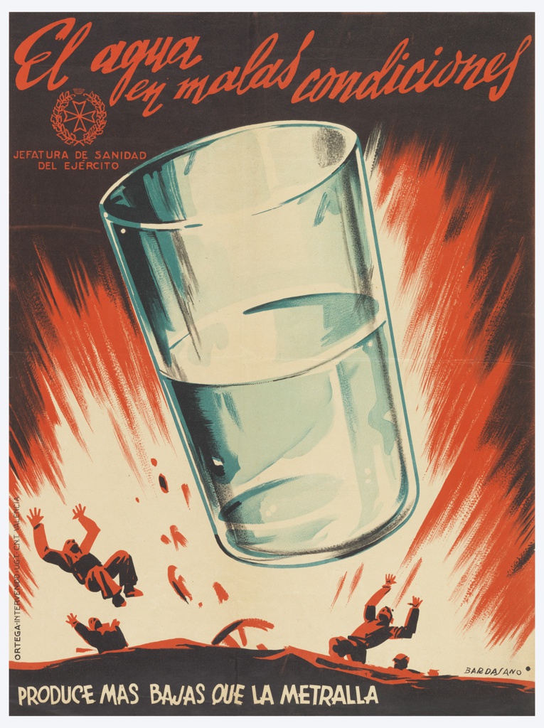
One example of this is this poster for the Spanish Civil War (1937) by Jose Bardasano :
This poster warns the viewer about the danger that can be found in water. Bardasano has combined the image of the glass with the impact of a bomb. He has played with size and made an image that is surreal and impossible.
Size can be created by changing perspective, or it is created artificially such as in the poster above and below. Both ways are effective.
Storytelling-
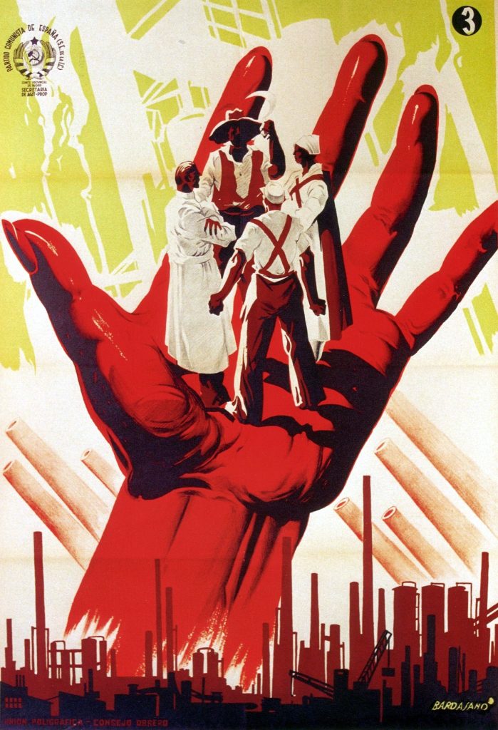
Scale is also used to tell a story by layering images to create a small biography of events:
Jose Bardasano. Communist Propaganda. 1937
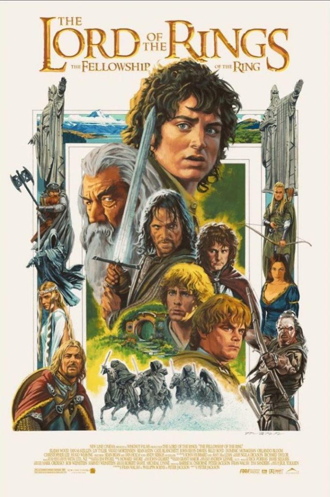
The Lord of the Rings posters often use this technique of scale and layering to show us the different characters and scenes which take place within the films.
An object is only big or small in comparison to its surroundings. In the poster below, Frodo, the main character, is shown as most important by making him larger than the other characters, despite the fact that he is physically one of the smallest characters in the story.
The Lord Of The Rings: The Fellowship Of The Ring by Paul Mann
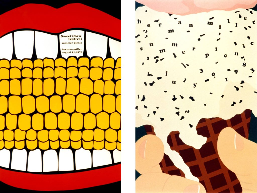
Zooming into details can also be attention-grabbing, because we try to figure out what the object is we are looking at. In the posters below, Steve Frykholm has designed these to advertise the company summer picnic. By zooming in this much, the image becomes quite surreal.
Steve Frykholm, Herman Miller Furniture Company Summer Picnic poster
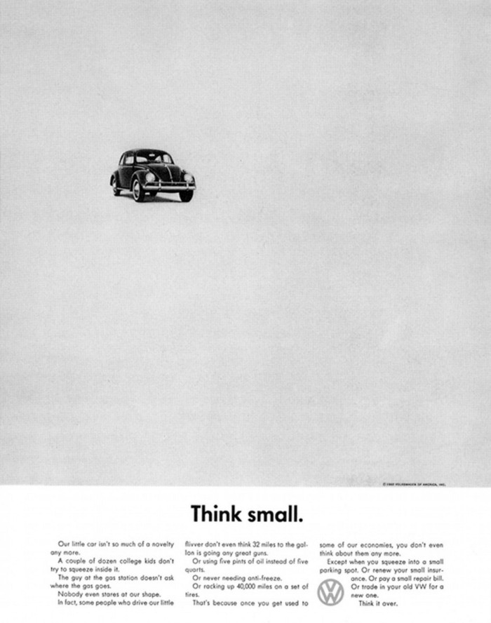
Helmut Krone, Think small, Volkswagen Beetle (1959)
Leaving a lot of blank space around the object, makes it look smaller.
Other posters at the time were doing the opposite, which made the Think small poster unique and attention grabbing for the period.
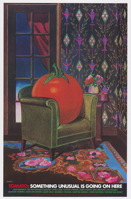
Tomato: Something Unusual is Going on Here (1978).
Milton Glaser designed this poster for the record label Tomato. The surrealism makes it attention grabbing, because we wouldn’t expect the tomato to be seated in a living room space and to be larger than life.
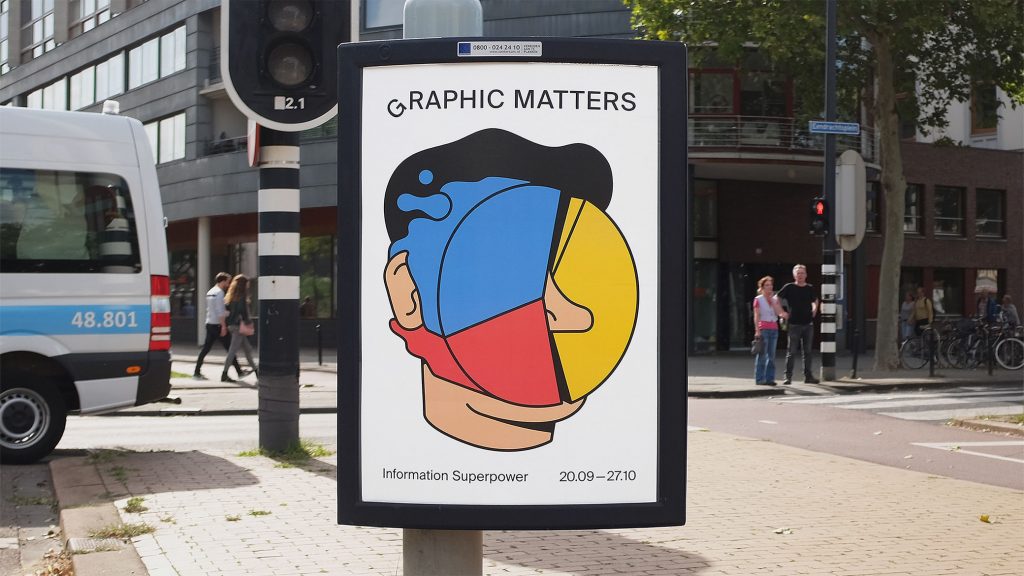
American designer Milton Glaser is most famous for designing the iconic I (heart) NY sign.Rob en Robin, Graphic Matters (2019)
This series of designs by Rob en Robin considers how information design influences our life. For example, in the photo above, the pie chart is presented as an actual pie that’s be smashed in someone’s face. The result is simple-looking, humourous and uses metaphor.
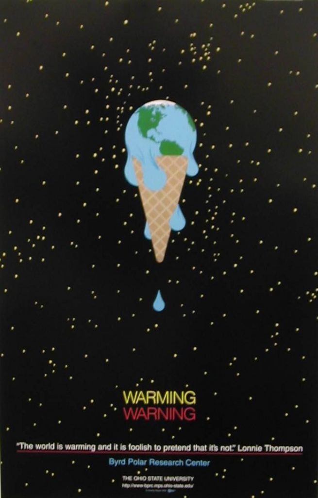
Charley Harper, Warming Warming
This design also uses metaphor. This time the subject is global warming. The designer has taken 2 elements and combined them into 1 image. This creates an easily remembered image out of an abstract concept.
Visual Rhetoric
Although visual rhetoric also involves typography and other texts, it concentrates mainly on the use of images or visual texts. Using images is central to visual rhetoric because these visuals help in either forming the case an image alone wants to convey, or arguing the point that a writer formulates
https://en.wikipedia.org/wiki/Visual_rhetoric
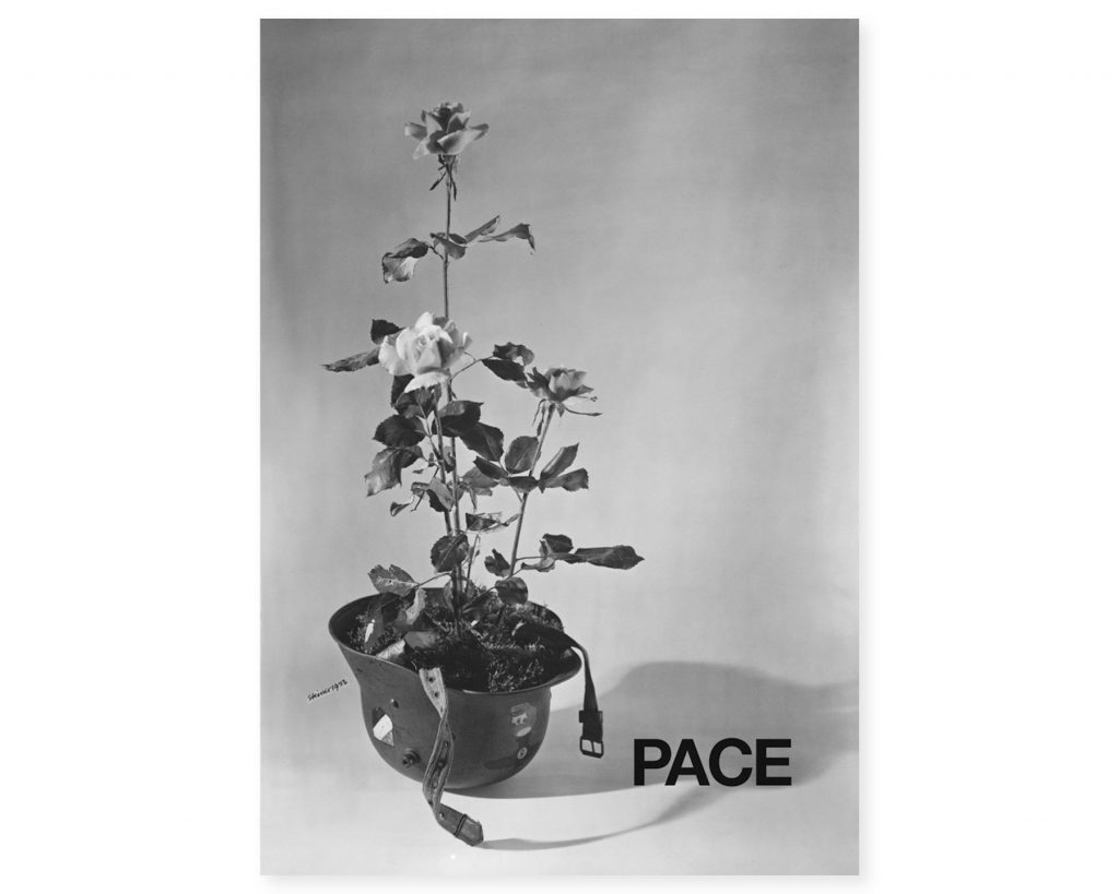
Albe Steiner, Peace poster. We immediately see the anti-war message behind this poster because the designer has combined the white roses (peace) with the soldier’s helmet (war)
The above poster is visually strong and is simplifying a complicated topic. Representation techniques include photography, photomontage, collage and illustration. The focus should be on simplicity, when wanting to convey a clear message.
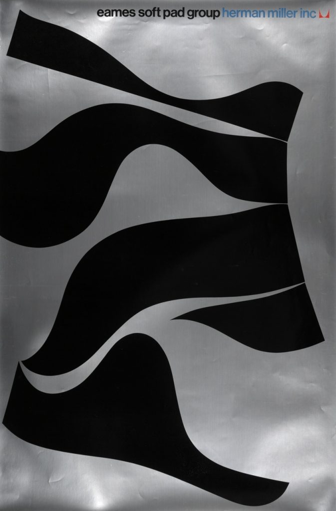
John Massey- Eames, Soft Pad Group (1970)
Using the profile of the chair to make something new and eye-catching: working with the silhouettes makes an abstract composition.
This is an interesting way to illustrate the flexible materials used for the chairs.
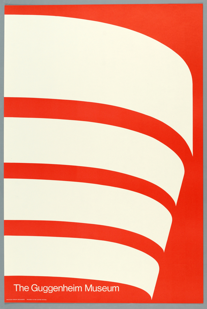
Malcolm Grecer, The Guggenheim museum
Albert Exergian, TV poster series. He takes the most recognisable and basic elements of a film or TV show and presents them in bold, simple posters. The poster above uses 4 colours and no texture to illustrate a coffee cup as seen from above. The coffee shop unites the characters across the series of F.R.I.E.N.D.S. and is therefore effective in making this image recognisable to the audience.
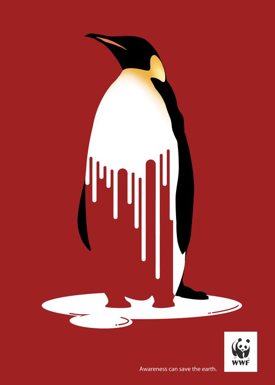
WWF- melting penguin, Fulvio Vignapiano
The use of red as a warning sign and the penguin melting, pieces together the habitat which is melting and the animal which suffers as a result of this catastrophe.
This poster is making the image into an icon form.
Combining 2 elements:
Some tips when designing posters:
Use a reduced colour palette
abstract graphic forms
represent complexity with reductive imagery
present an object as schematic icons
Don’t divide the poster into blocks of colour or texture, as this may blend too much with the posters placed around it- you want yours to stand out.
If the poster looks too separated, the viewer’s eye will wander around and the poster is no longer functional if the viewer doesn’t read it
Less is more, or else the poster looks too cluttered.
An example is the Japanese flag. This holds the viewer’s eye because the eye doesn’t escape the centre.
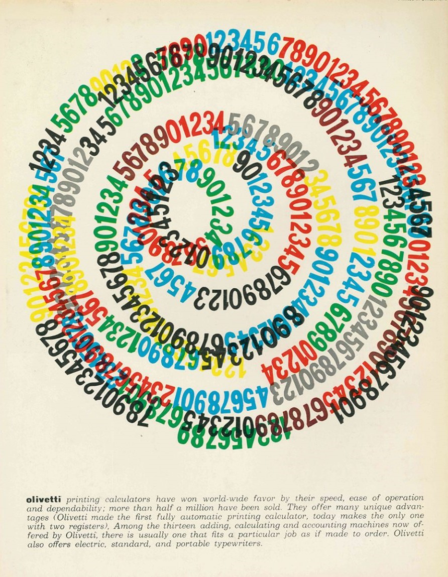
Another example of the focus being at the centre is this poster by Giovanni Pintori.
The way the numbers spiral around the centre pulls the viewer into the poster.
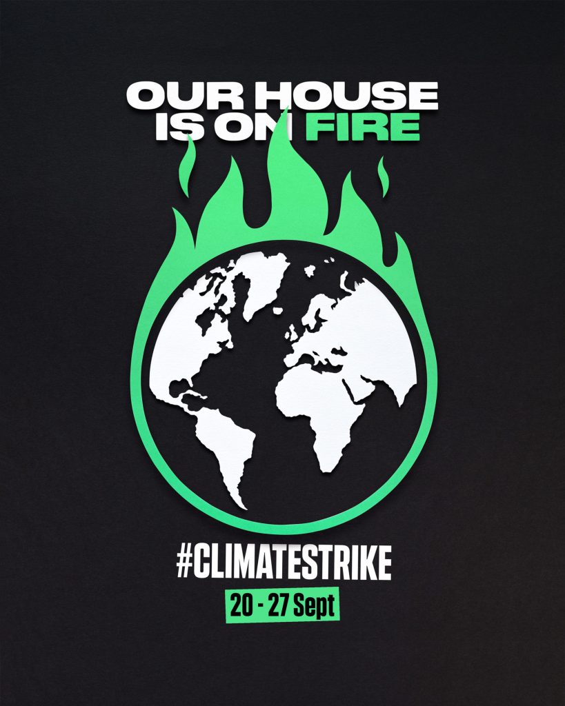
Our House is on fire, Owen Gildersleeve:
Taking inspiration from one of Greta Thunburg’s most powerful statements, “I want you to act as if the house was on fire, because it is.”
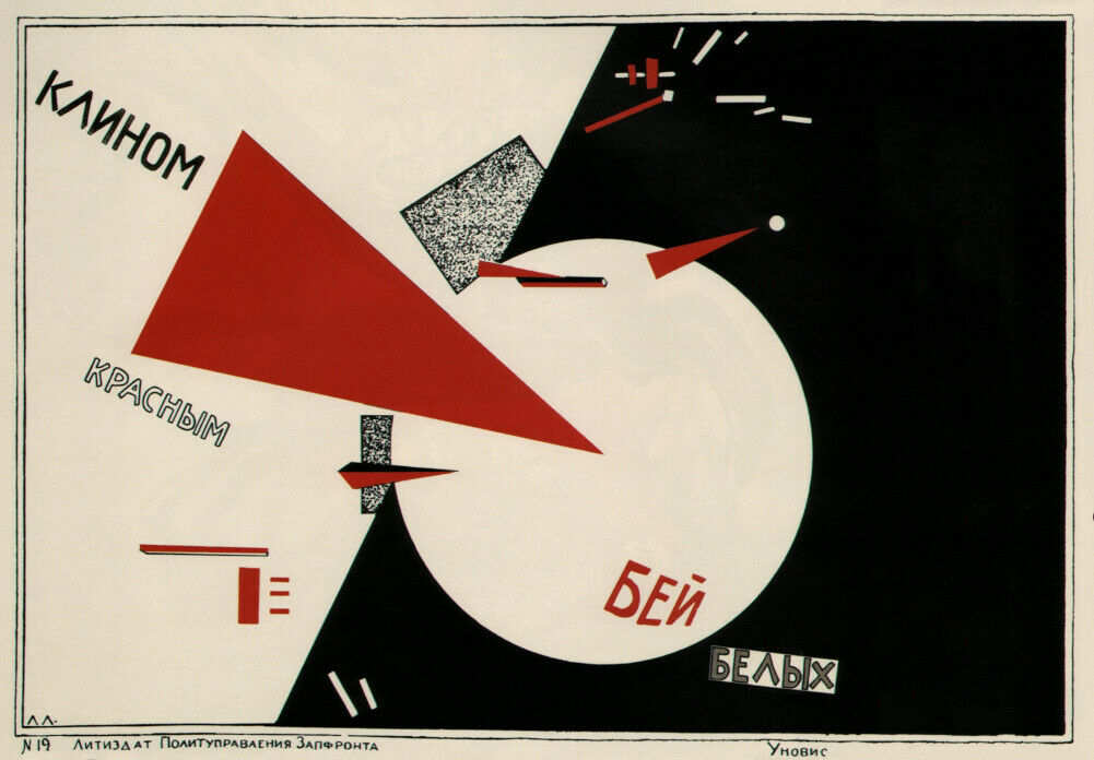
The above poster uses high contrast colours and symmetry. This creates a clear point of focus. However, sometimes the central focus can be quite dull. In order to break it up, it is possible to offset the symmetry. A good example of this is in the poster below by El Lissitzky (1920). This Soviet poster uses symbolism, hitting the white area with the red triangle represents the Russian Revolution. He works with shapes to break up the composition.
El Lissitzky, soviet poster (1920)
Diagonal movement
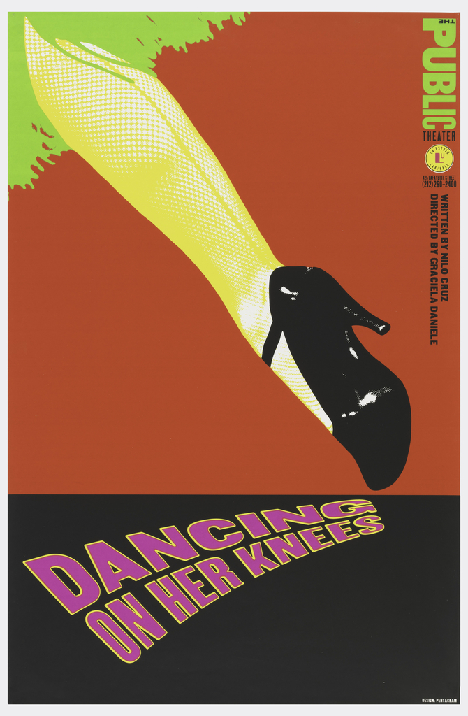
Our vision requires constant change. Eyes wonder around. Strong lines could make the viewer look where you want them to, like pointing to something. This can be seen in the Dancing on her Knees poster by Paula Scher.
Paula Scher is one of the most influential graphic designers in the world. Described as the “master conjurer of the instantly familiar,” Scher straddles the line between pop culture and fine art in her work.
https://www.pentagram.com/about/paula-scher
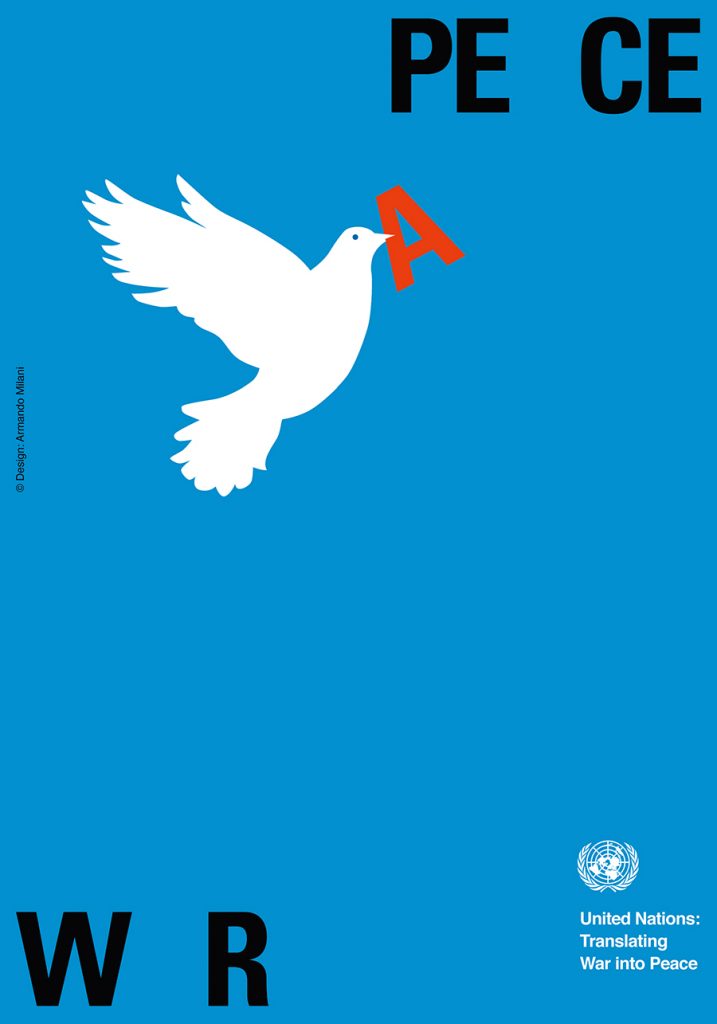
Armando Milani- translating war into peace. The diagonal movement gives the image energy. Milani has chosen the metaphor of the dove to signify peace. The dove is bringing the ‘A’ from ‘war’ to ‘peace’.
From the beginning of the 21st century he started to focus more and more on social communication, dedicating himself to the illustration of posters aimed to direct the attention of the public on social themes with an international impact. In 2003 he dedicated to the United Nations a poster for the world peace, that has already become a world classic.
This week, we began to think about the final presentation. We looked at some videos for inspiration on presenting and thought a bit further about what the presentation could contain.
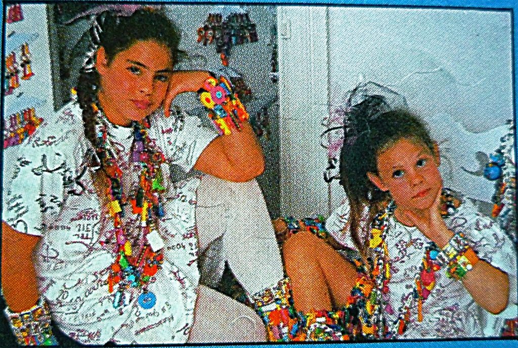
I wondered what image could be controversial concerning the environment. Luisa explained that this might be an image from the 1980’s, where designs had no concern for the environment:
Including different images within the presentation may be useful because they help the audience with being able to compare and contrast with other images.
We considered how we could involve the audience: printing and distributing information or sending the presentation to classmates phones, for example.
The number of slides are not important.
A difficult task for me was to decide on the image. This means being selective and decisive, which is not one of my strong points. I began by collecting a series of images which are each problematic, though in different ways.
I searched the internet using these queries:
Offensive childrens books
Racial stereotyping in media
Controversial illustrations
Controversial artworks
Racism in art
Racism in adverts
Class distinction
Class biases in advertising
Cultural bias in advertising
Racial bias in media/the arts
which provided me with a few results which I saved.
I then took a trip to Brookes library to search for books about race, the media, advertising, culture and any other relevant topic.
I came across a few books that were helpful:
I decided to focus on advertising, for no reason other than I needed to narrow down my options. These images are all from advertising:
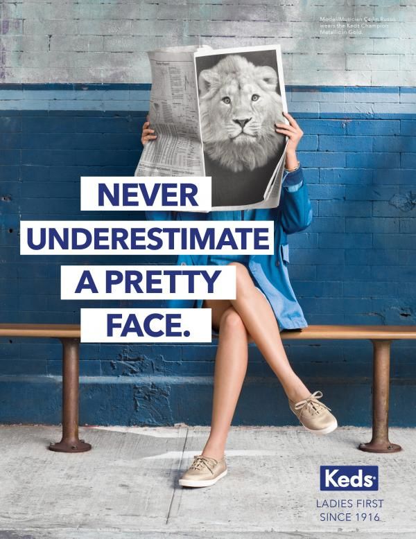
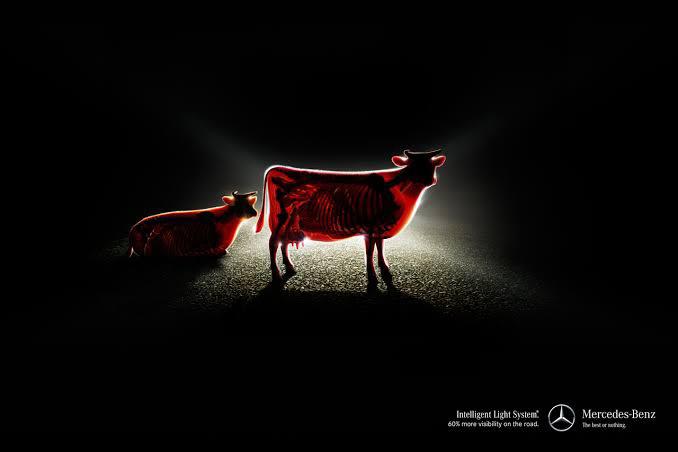
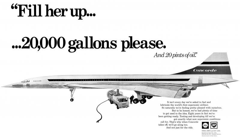
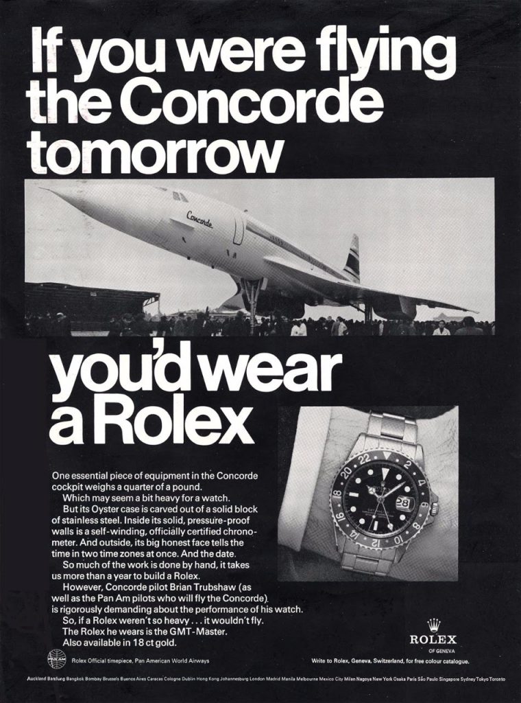
race issuesgender issues: why does a woman need the face/head of a male lion to be considered powerful?environmental issues: are the brightest lights necessary? The image feels like machine vs nature. Environmental issues: the ad is boasting about the amount of fuel it needs.
Environmental and class issues: the ad encourages people to strive to achieve material wealth, regardless of impact on the environment.
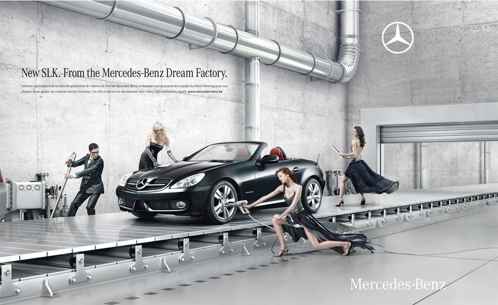
Gender and race and class issues: the beautiful white people, mostly women, are posed beside the car to promote the car by association. Their dress associates them with the wealthier classes. They also present beauty standards that are unrealistic for anyone to achieve. They are also treated as objects just to promote the car.
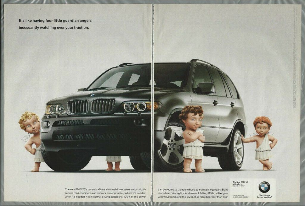
The ad below has a similar image to the Mercedes-Benz ad. It makes light of religious beliefs, by presenting caricatures of angels.
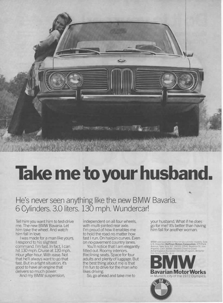
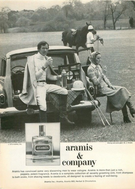
gender issuesclass, gender and race issues
I then looked at 3 videos on youtube of TV adverts from the last century:
To help me decide, I asked myself the question: ‘What can I talk about for 7 minutes?’
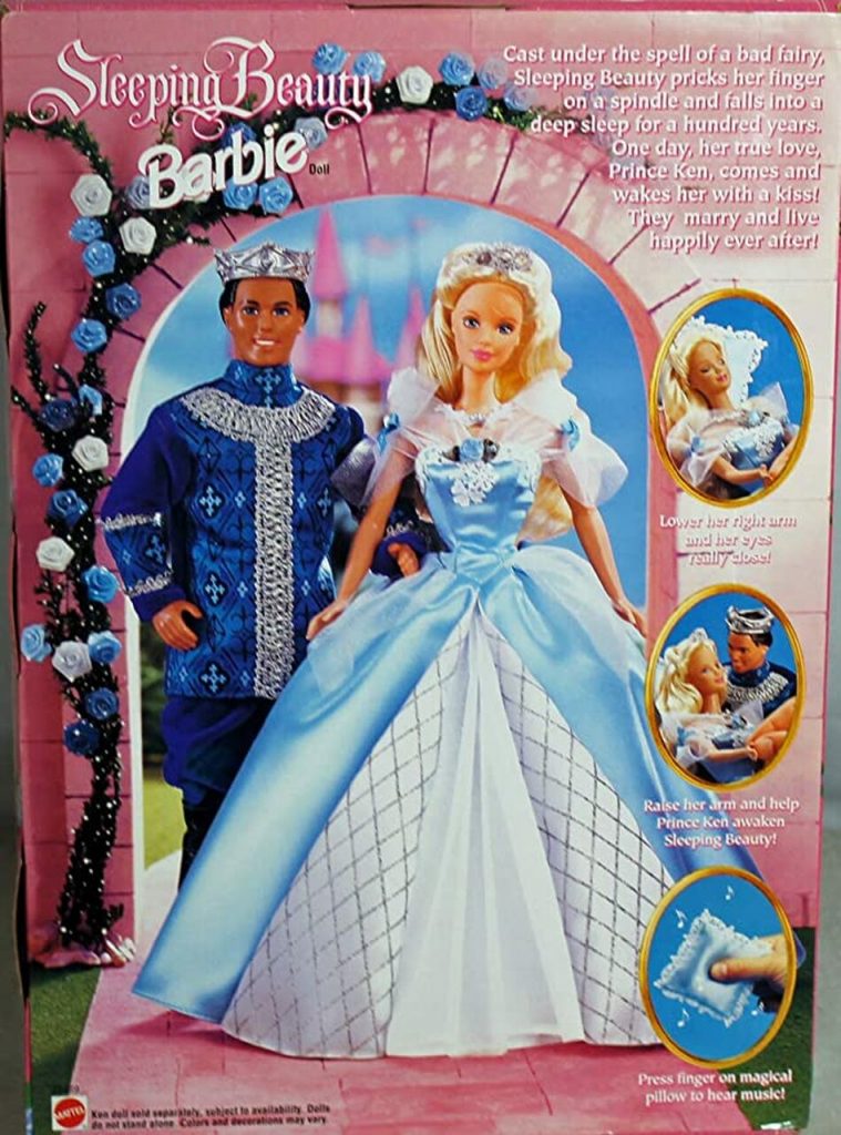
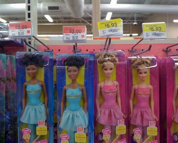
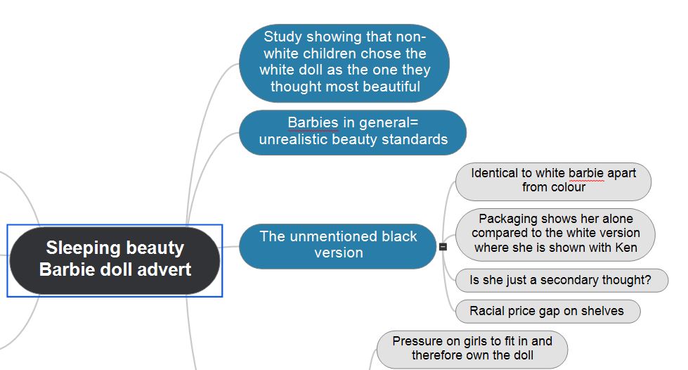
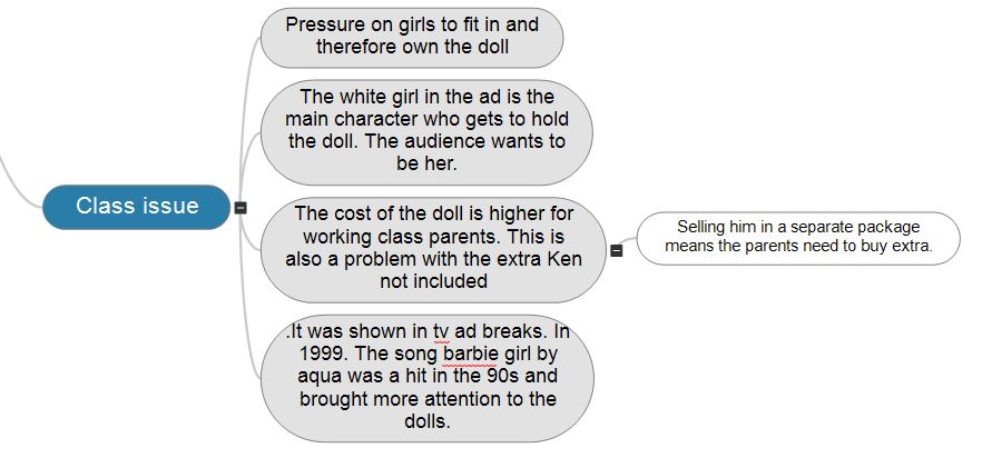
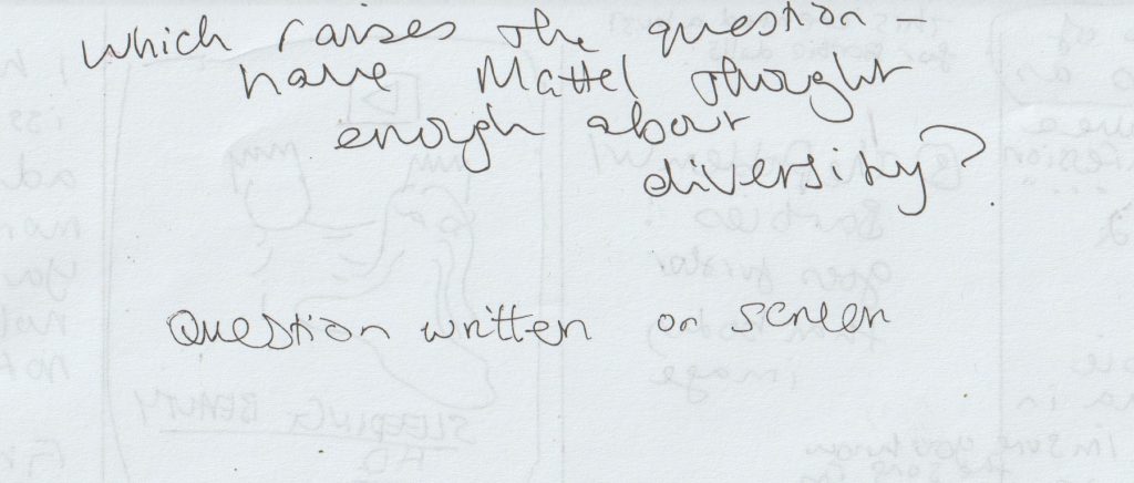
I decided this was the Barbie advert, for a few reasons:
I have personal associations to this product, as was a child at the time it was out and can remember very similar adverts. Personal anecdotes work well when giving a talk.
This ad brings up questions from all the categories we have discussed over this semester.
I felt strongly about all 3 adverts, but perhaps mostly about the Barbie ad because it is aimed at children.
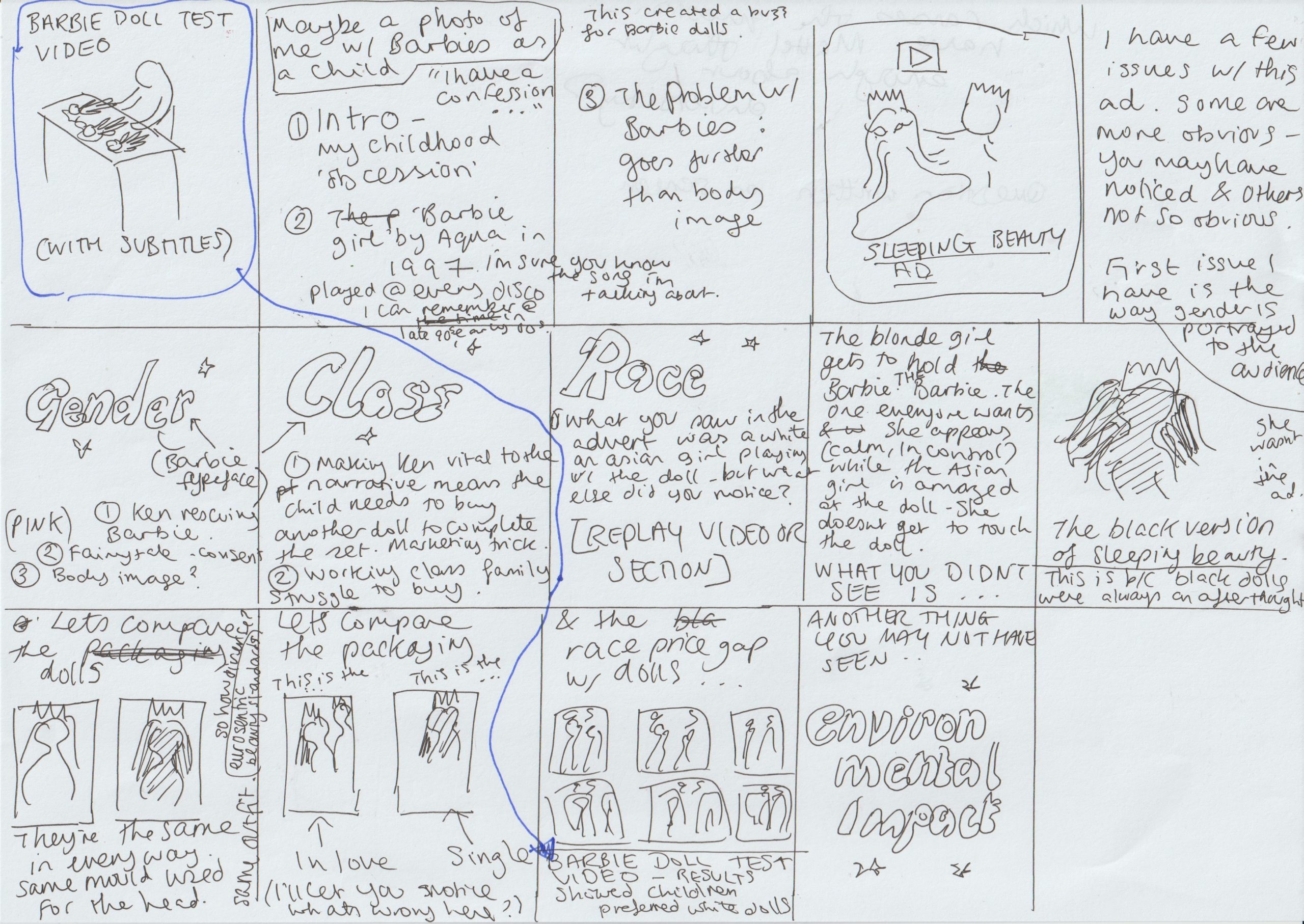
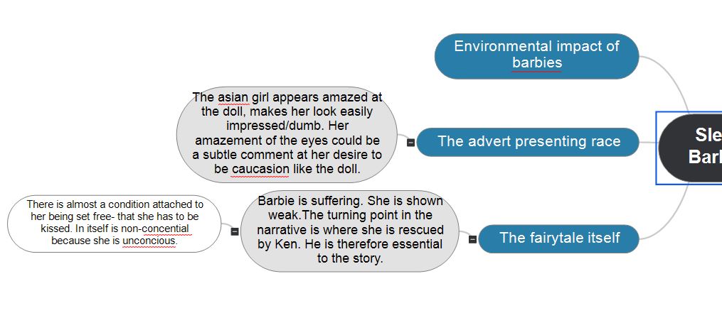
I began making notes and collecting images about this image, the subject and the product itself.
I then made a digital mind map of these ideas:
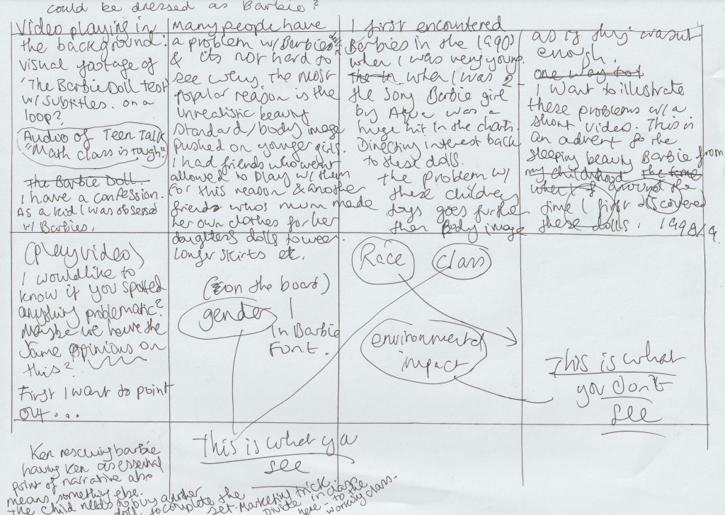
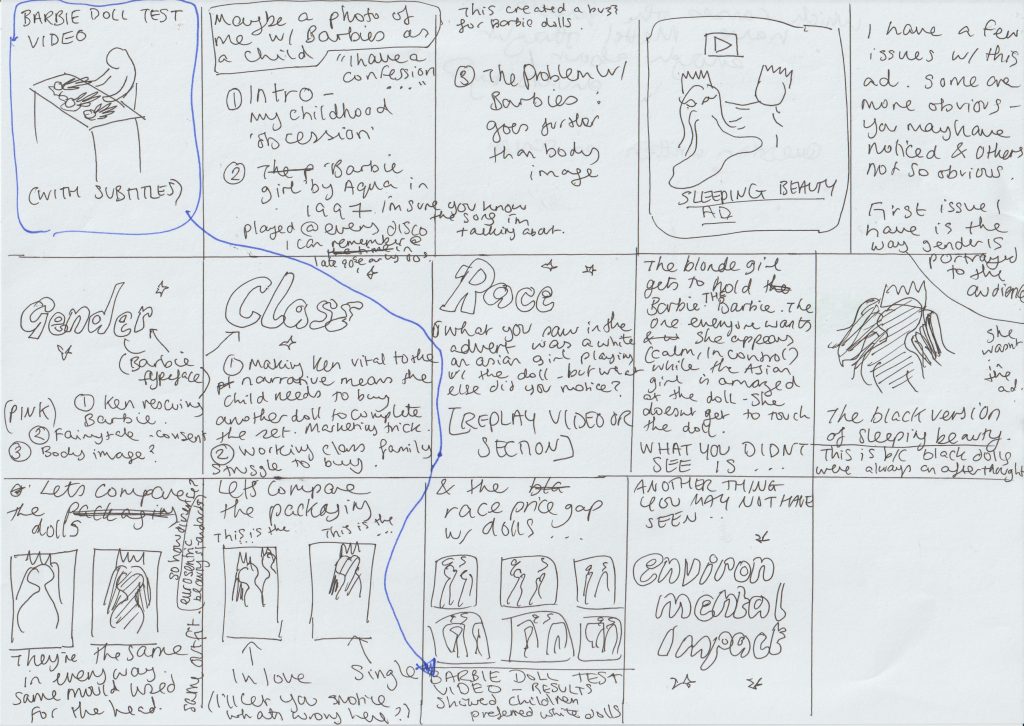
I started to write a drawing board for the presentation, starting with just words.
How to present?
Looking at a few examples of people’s presenting styles is good inspiration because people have different styles and approaching that are effective for different reasons.
Irma Boom video-
Book designer, based in Netherlands
How she presents
She is filming her desk and presenting her books using the live camera
Her tone is performative, personal “Can you imagine?”
Metahaven-
Utopian design. (Art and design combined)
They work together to question each other. A way we could do this in our presentation: displaying the question on the screen or getting a classmate to participate with questions
Their presentation becomes more personal and opinionated.
They are reading the book with the audience.
We could make the journey apparent that lead us to choose an image.
Can be speculative- an alternative to what the ad could be.
What about white working class? (Novara Media)-
Humourous tone
How to show your artifact? Zooming in and out, photomontage
Presenting the object as it was seen originally e.g. in a shop.
How to shift from a to b. Using a sound or a rhythm.
Voice over or a sound played over if its relevant.
Poll if the public agree with your point?
Words pop up on the screen
Presents a problem, explains, then conclusion (narrative curve)
We use cookies on our website to give you the most relevant experience by remembering your preferences and repeat visits. By clicking “Accept All”, you consent to the use of ALL the cookies. However, you may visit "Cookie Settings" to provide a controlled consent.
This website uses cookies to improve your experience while you navigate through the website. Out of these, the cookies that are categorized as necessary are stored on your browser as they are essential for the working of basic functionalities of the website. We also use third-party cookies that help us analyze and understand how you use this website. These cookies will be stored in your browser only with your consent. You also have the option to opt-out of these cookies. But opting out of some of these cookies may affect your browsing experience.
Necessary cookies are absolutely essential for the website to function properly. These cookies ensure basic functionalities and security features of the website, anonymously.
Cookie
Duration
Description
cookielawinfo-checkbox-analytics
11 months
This cookie is set by GDPR Cookie Consent plugin. The cookie is used to store the user consent for the cookies in the category "Analytics".
cookielawinfo-checkbox-functional
11 months
The cookie is set by GDPR cookie consent to record the user consent for the cookies in the category "Functional".
cookielawinfo-checkbox-necessary
11 months
This cookie is set by GDPR Cookie Consent plugin. The cookies is used to store the user consent for the cookies in the category "Necessary".
cookielawinfo-checkbox-others
11 months
This cookie is set by GDPR Cookie Consent plugin. The cookie is used to store the user consent for the cookies in the category "Other.
cookielawinfo-checkbox-performance
11 months
This cookie is set by GDPR Cookie Consent plugin. The cookie is used to store the user consent for the cookies in the category "Performance".
viewed_cookie_policy
11 months
The cookie is set by the GDPR Cookie Consent plugin and is used to store whether or not user has consented to the use of cookies. It does not store any personal data.
Functional cookies help to perform certain functionalities like sharing the content of the website on social media platforms, collect feedbacks, and other third-party features.
Performance cookies are used to understand and analyze the key performance indexes of the website which helps in delivering a better user experience for the visitors.
Analytical cookies are used to understand how visitors interact with the website. These cookies help provide information on metrics the number of visitors, bounce rate, traffic source, etc.
Advertisement cookies are used to provide visitors with relevant ads and marketing campaigns. These cookies track visitors across websites and collect information to provide customized ads.