Woodblock letterpress workshop

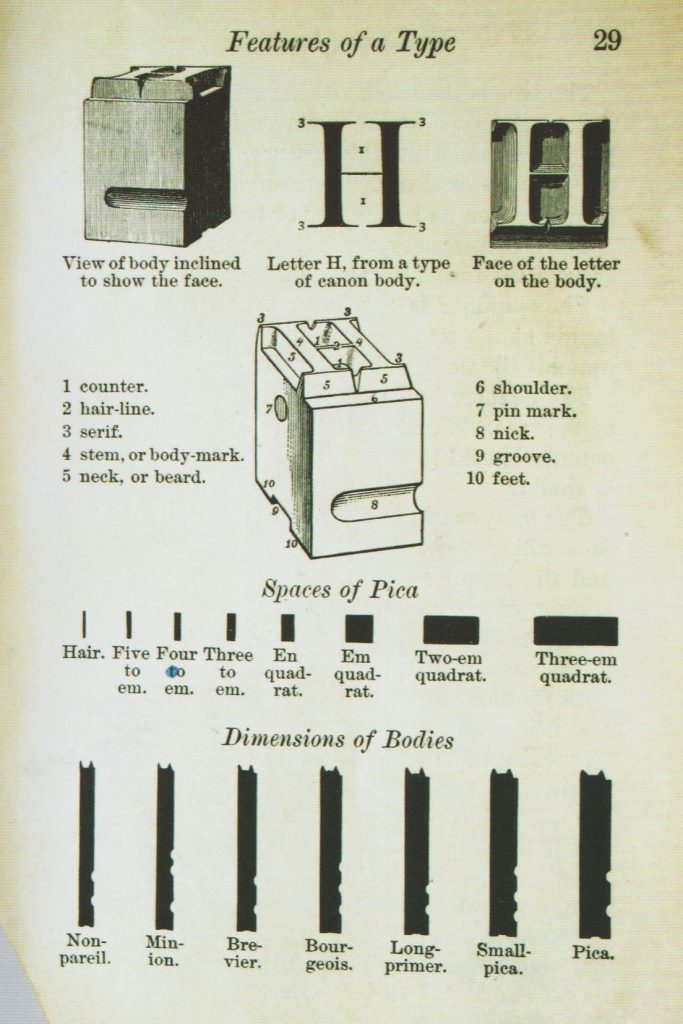
Page from a book by Theodore Low De Vinne, describing the physical nature of typography, circa 1900.

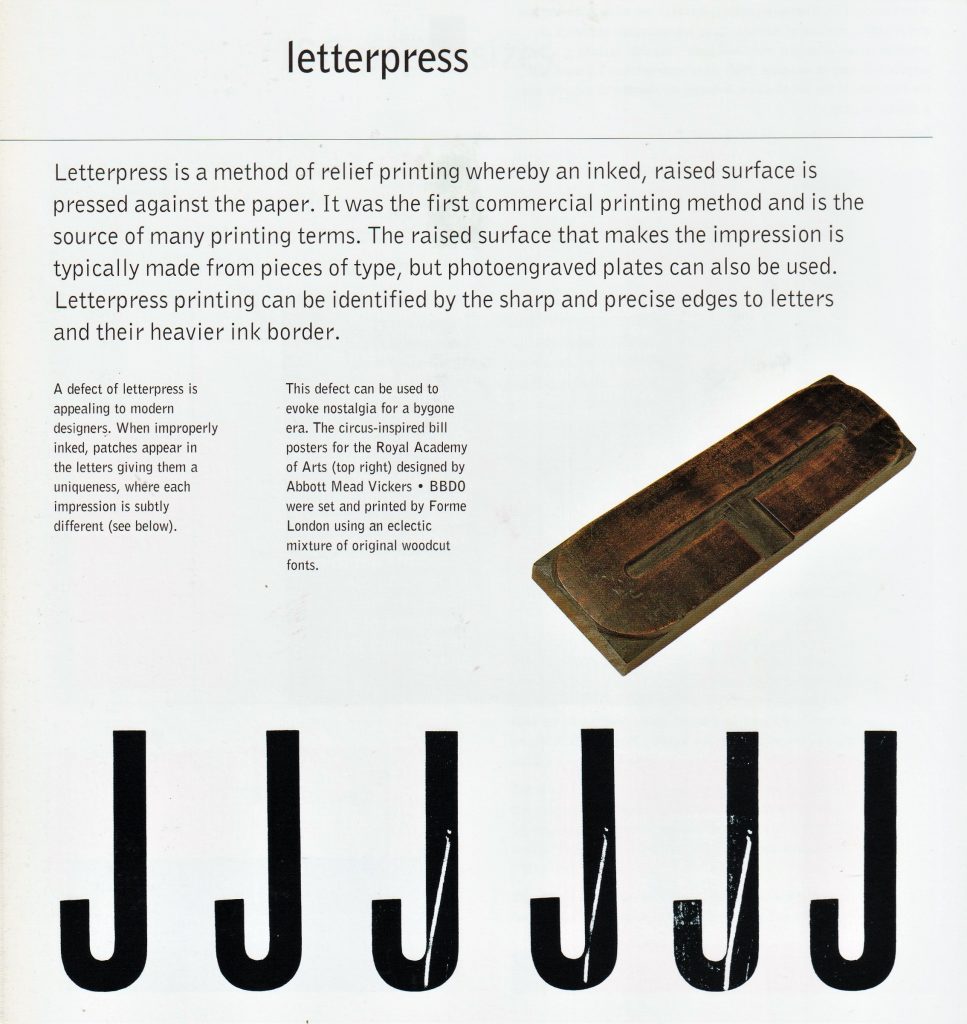
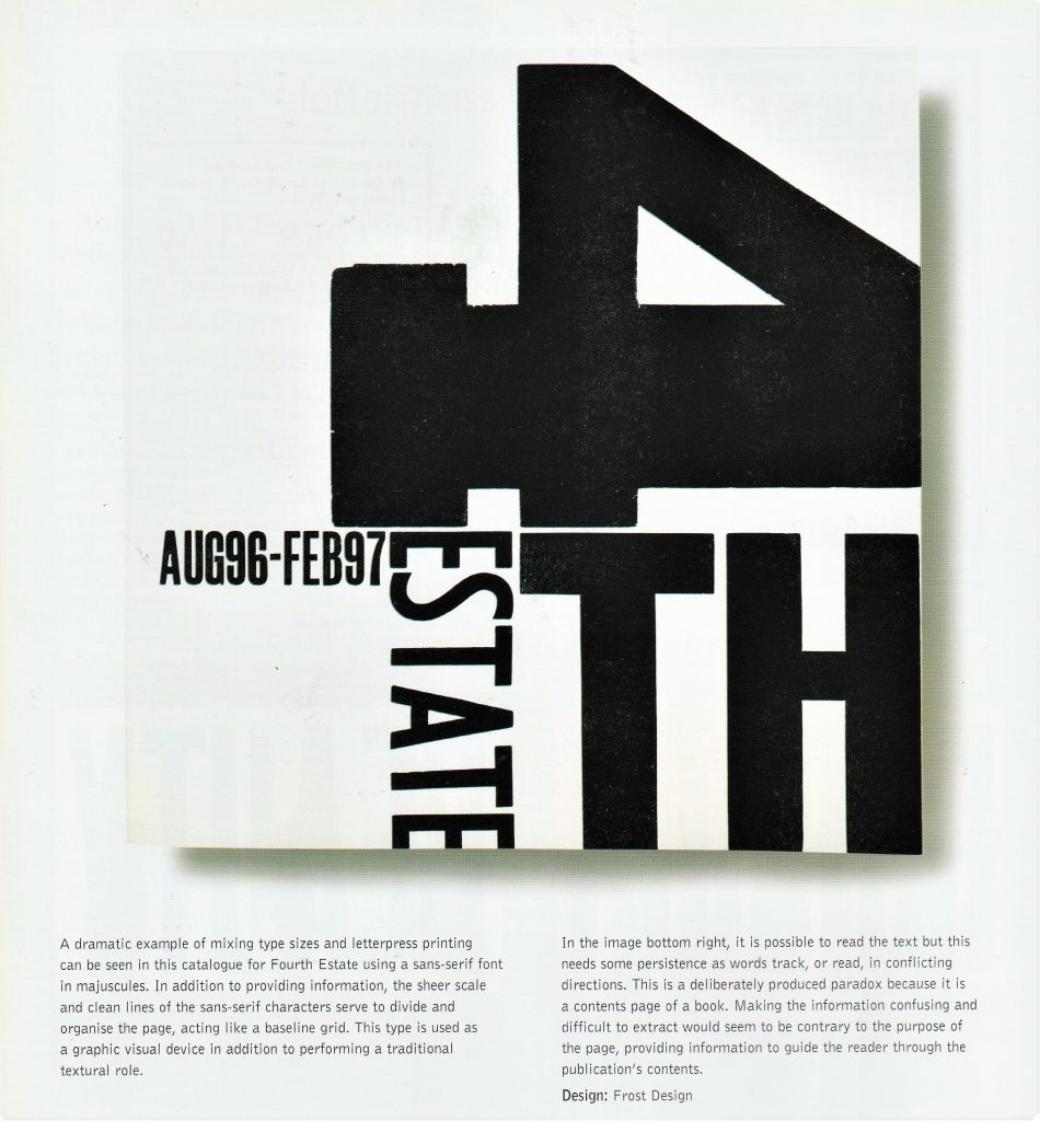
(below) ‘Nineteenth-century advertising typography, in stark contrast to book design, featured all the display types at a printer’s disposal.’ Type & Typography by Phil Baines & Andrew Haslam
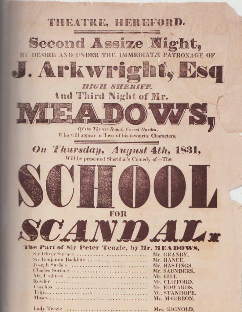
Hereford printer’s work from 1831.
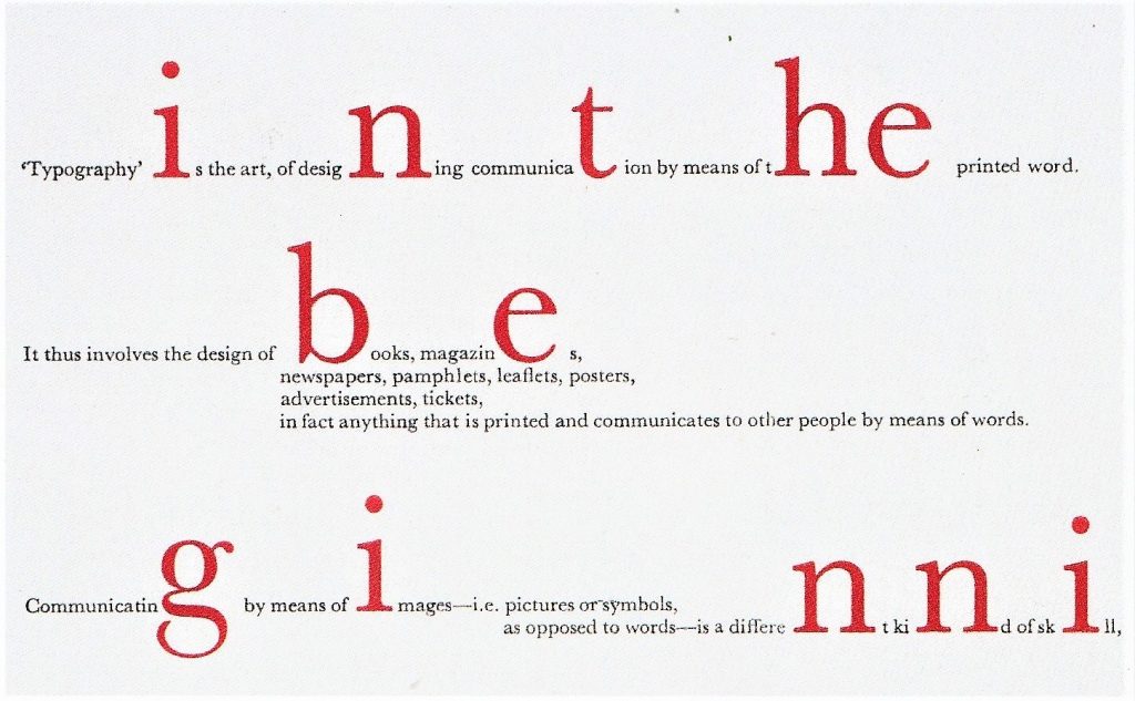
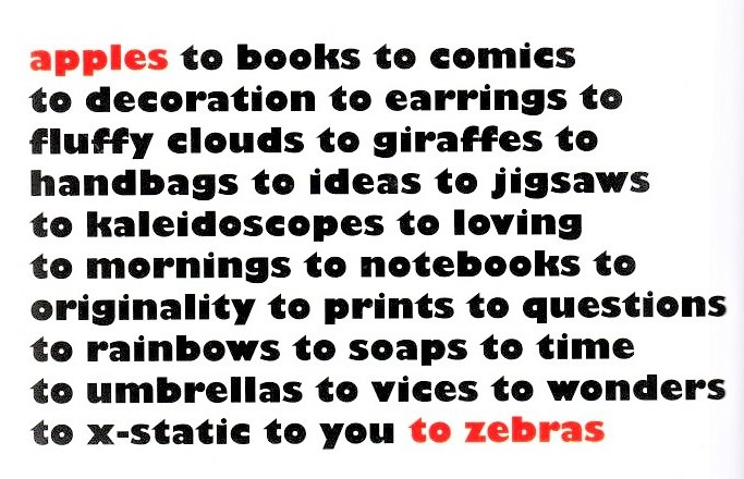
Apples to Zebras is a shop that sell a variety of items. The Design Shop added texture by choosing the right words. The selective choice of red ink acts as bookmarks at the start and finish of the text. The impression given is that the items are held within the ‘apples’ and ‘zebras’.
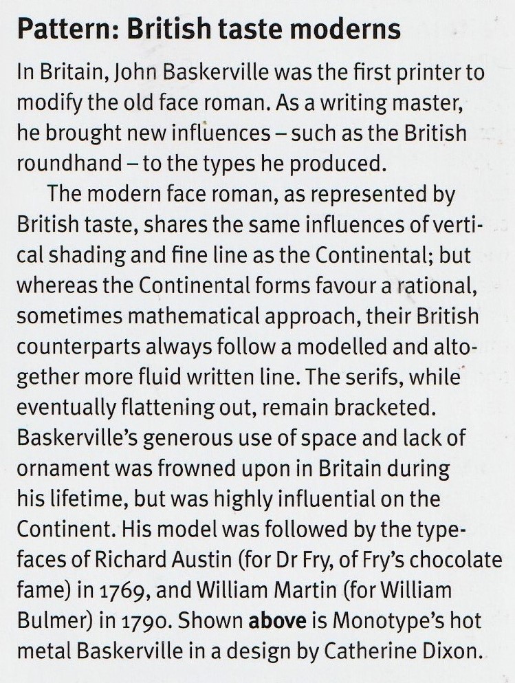
Monotype’s hot metal Baskerville in a design by Catherine Dixon.
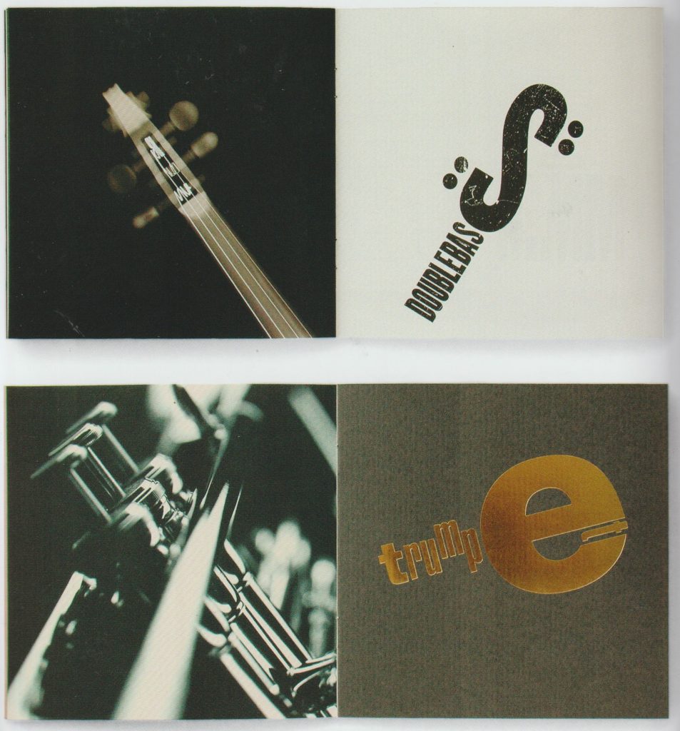
‘Yearling Jazz & Classics direct mailer created for Arjo Wiggins by Thomas Manss & Co. design studio. The qualities of the paper are articulated through a series of specialist printing techniques. Here they have used letterpress and a bronze foil. Typographical elements are used in images to mimic details of musical instruments.’ The Fundamentals of Typography 3rd edition, Bloomsbury

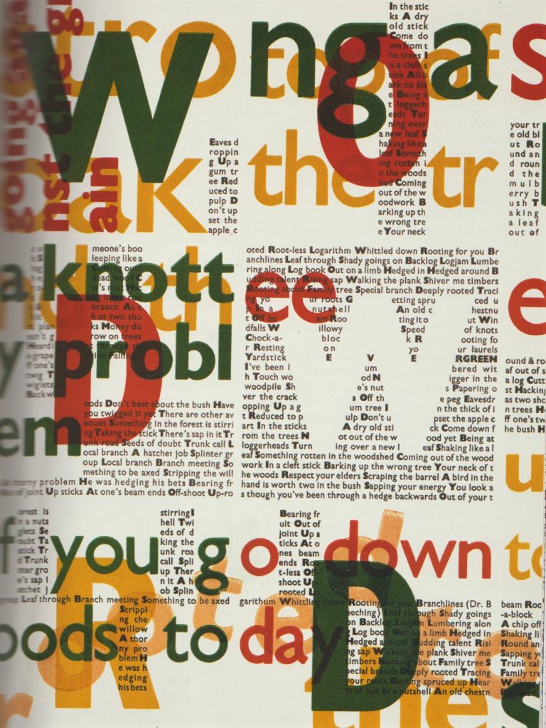
‘In this poster by English designer Phil Baines, printed using letterpress type, the relationships and patterns that typography creates are laid bare. It is easy to see how the grid- central to most graphic design- is a natural outcome of modular typography.’ What is Graphic Design? RotoVision
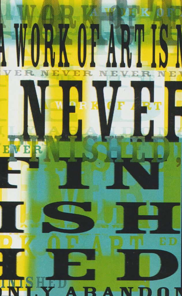
Cards to promote an art club, Rabia Gupta

By placing the text in a chaotic way, the designer is able to express the company’s taste in art.
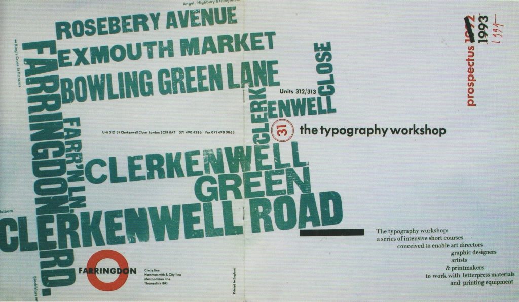
Prospectus for the Typography Workshop, Alan Kitching, printed letterpress, London, 1992. ‘Vibrant information that describes not only the location of the studio, but also the reason for going there in the first place.’ What is Typography?, David Jury

The letterpress workshop in week 1 introduced us to the printing press.

The aim of the workshop was to work with woodblock type to explore composition and the potential of uncreative writing. We were instructed to reflect the meanings of the phrases in these prints.
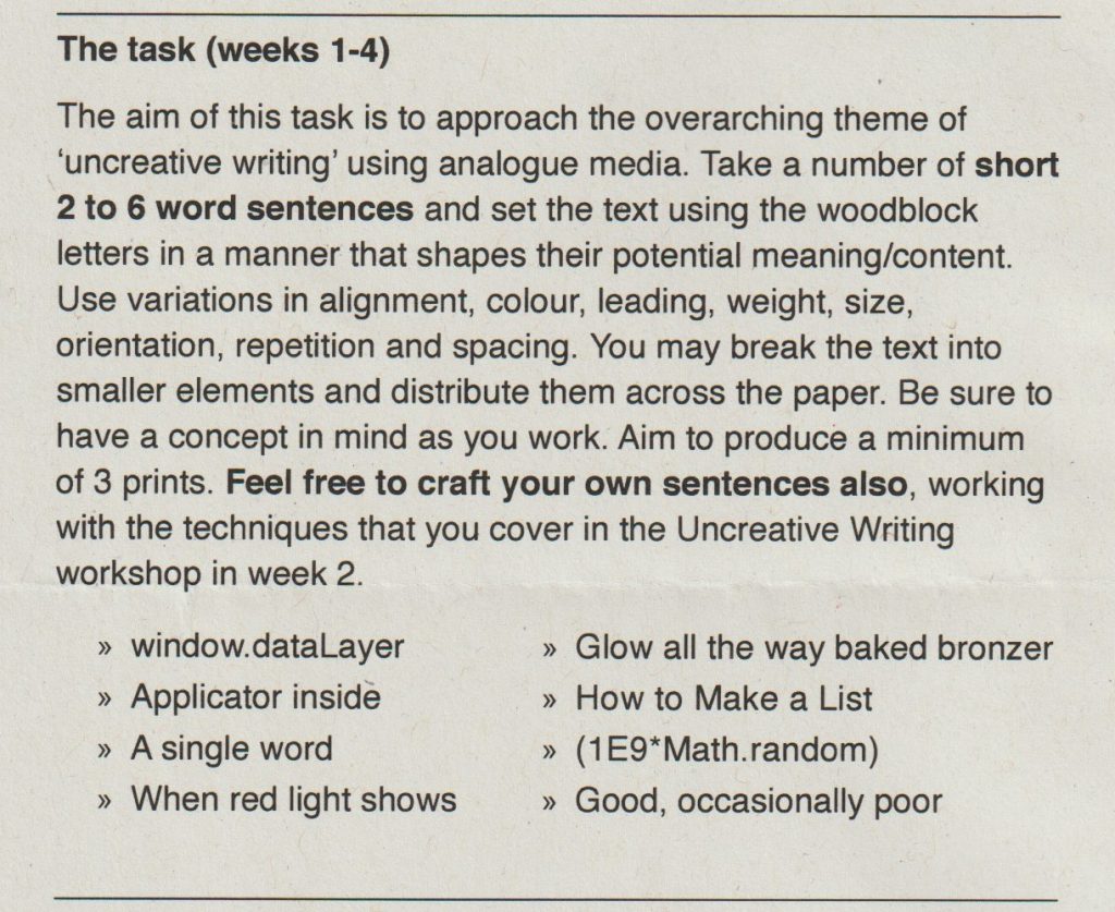
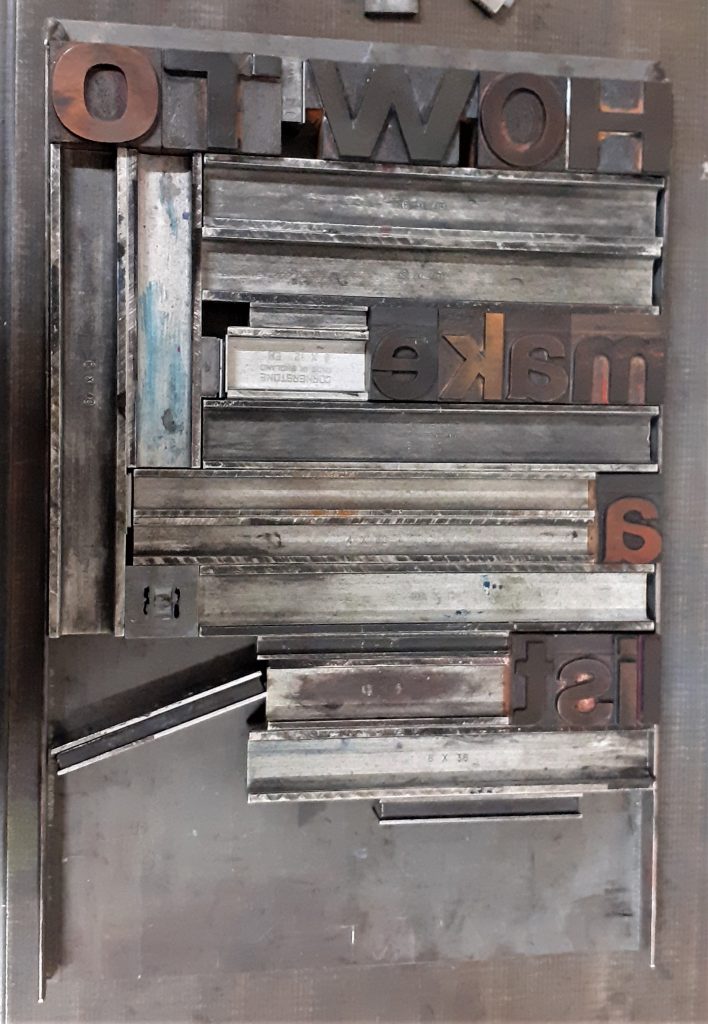
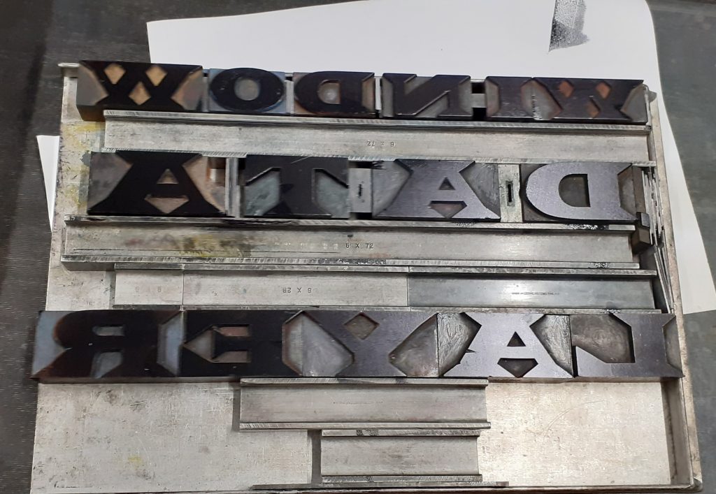
I loaded the tray with the wooden letter blocks and filled them with the metal furniture to secure the pieces.

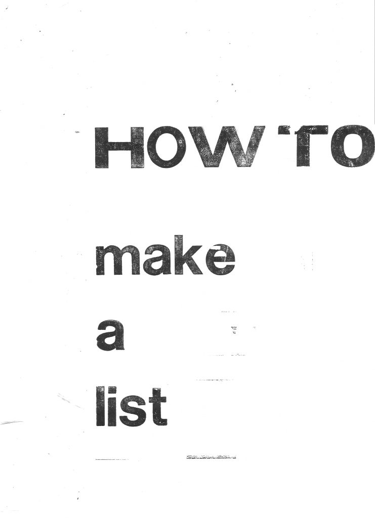
I selected the phrase ‘How to Make a List’ from the workshop brief. This first made me think of the typical list format that you might use for a shopping list. Vertically aligned left down the page. I selected the letter blocks from a sans-serif font. I chose the ‘How to’ in larger, capital letters to suggest an instructing voice.

I placed the metal furniture to place gaps between the words. The spacing highlights the separate words. I used magnets to hold the metal in place so that it would not slip when printing.

I then applied the ink onto edges of the metal. I placed the paper onto the letters and press the paper down to transfer the ink. I paid attention to the individual letters and to the horizontal lines. When I lifted the paper off, I had created parallel lines. These lines suggest to me, the lines found on note paper.
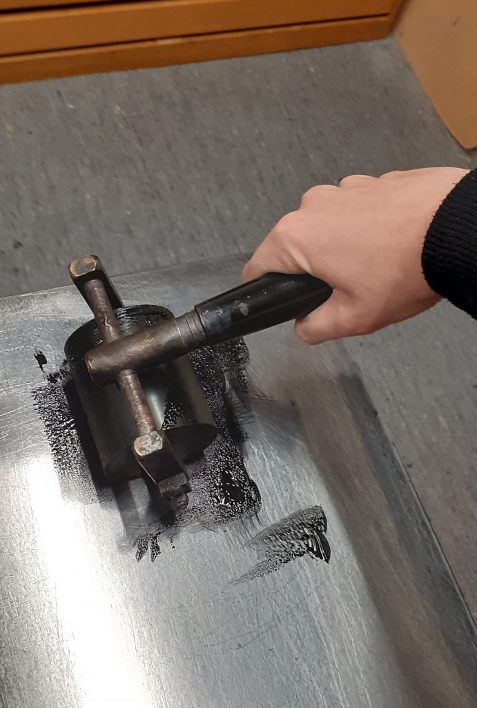
I used the roller to evenly spread the printing ink on the flat surface. Since the ink is oil based, I needed to use white spirit to remove the ink when cleaning up the roller. Applying ink too thickly onto the letters could result in imperfect edges.
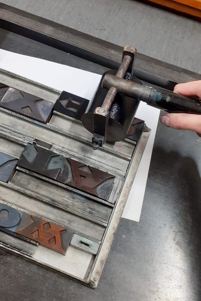
applying ink to the woodblock letters
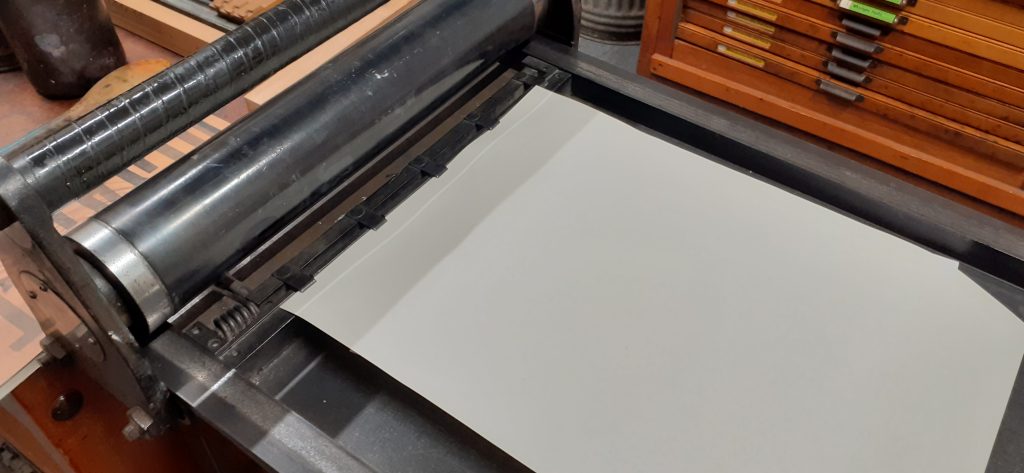
The letterpress. Using the foot pedal lifts up the 4 metal points. I placed the paper under these points to hold it into place, releasing the pedal.

I printed the first print by hand (without using the press).
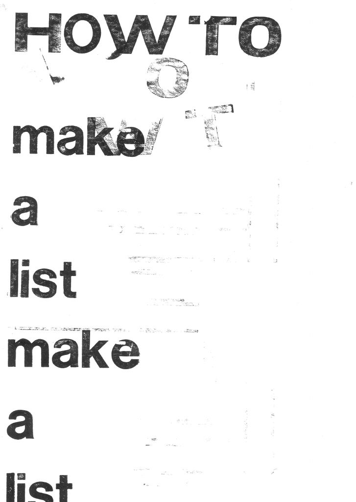
I used repetition with the left alignment to exaggerate the classic list format. There is also a hint of sarcasm to the message by repeating the words. ‘How to make a list: make a list.’ I accidently printed the extra letters at the top of the page. They look faded and although this was accidental, I like the effect. The letters spell ‘WOT’, which when sounded out, sounds like ‘What?’ The paler markings appear to be from a second voice.
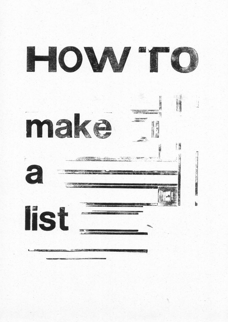
I used the lines of the metal furniture. The square was accidental and I don’t think it adds anything to the composition.

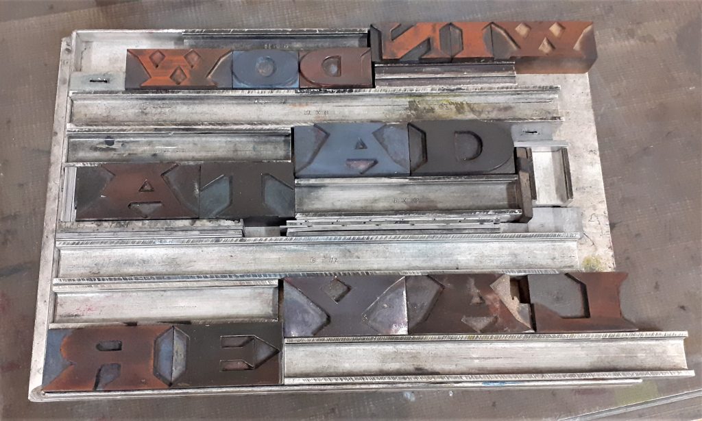
I used the printing press to print these letters:
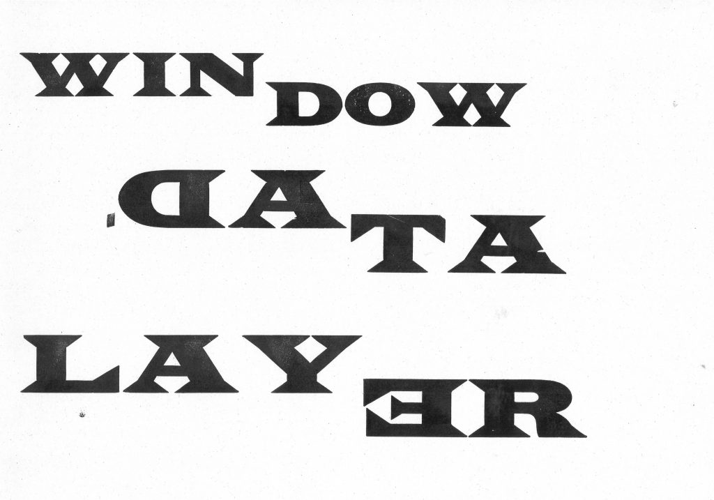
On my first attempt with these letters, I accidently placed 2 of the letters backwards.

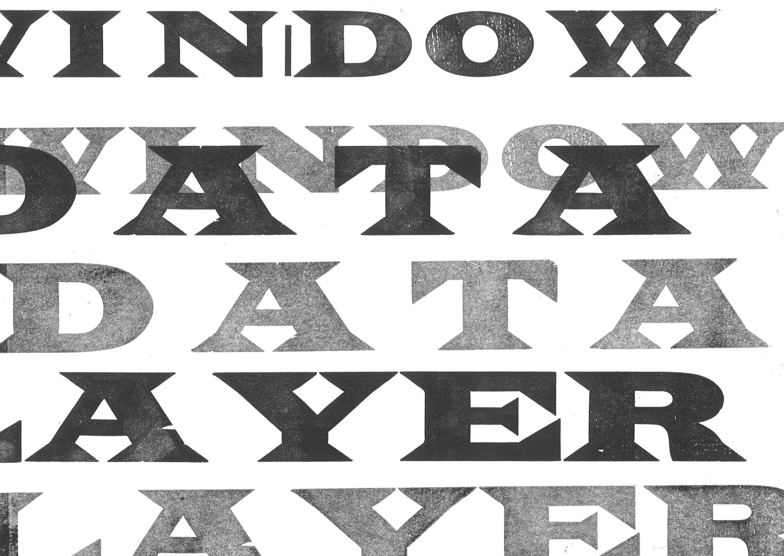
I broke the words into 2’s, as I noticed the words are similar in length. I wanted to highlight the fact that some words are made up of smaller words. For example in this print, ‘(Lay)er’, ‘(Win)dow’, ‘Da(ta)’. I used the same typeface across the print to make the words blend visually and therefore layer effectively.
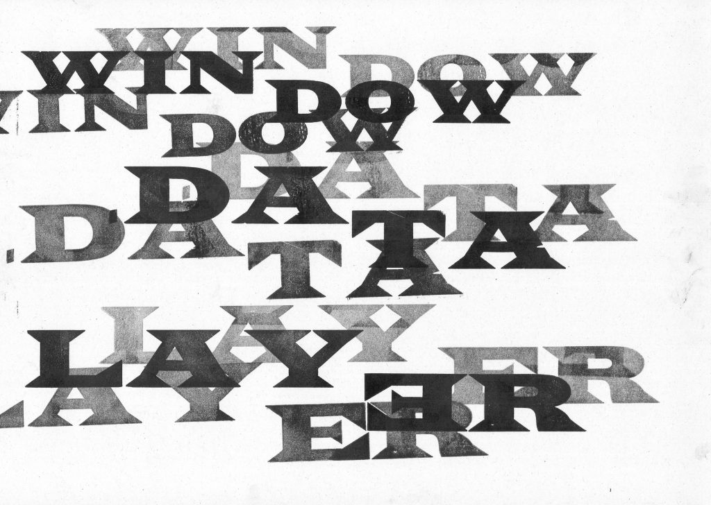
Because of the word ‘layer’, I chose to layer the text.

By making several prints from one ink application, I was able to achieve different weights, some more transparent than others. This gives the letters shadow and depth across the print.

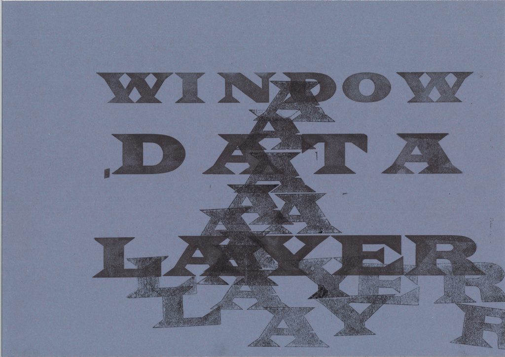
I printed these letters onto A4 paper. I placed the text so the words are running off the edge of the page. This creates a disorientating effect.
I experimented on sugar paper and used repetition to create texture, using the letter ‘A’.

I noticed the ‘A’ in ‘Layer’ and ‘Data’ and connected them visually across the page. The words become slightly hidden, particularly ‘Layer’ which helps to illustrate the meaning of the word ‘layer’.
Visualising Sustainability

Design plays a fundamental role in sustainability because it is the design that determines which resources are employed and how they are used.

Sustain: an ability to sustain over time, endure. for example, over a number of years. Sustainable development: without impacting too much on future generations. For example, preserving the environment.

In business, a sustainable business plan is (not just about the environment) but can be about making sure the business is using their resources economically.

What Is Sustainability?
The most common definition of sustainability comes from the 1987 Brundtland Commission report for the United Nations. It defines the concept as “meeting the needs of the present without compromising the ability of future generations to meet their own needs.”

https://www.investopedia.com/terms/s/sustainability.asp

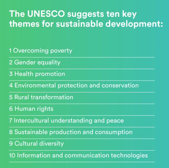
How are human rights sustainable?

Human rights create conditions essential for sustainable development. The 2030 Agenda recognizes that inclusive and participative economies, and societies in which government is accountable, achieve better outcomes for all people, leaving no one behind. 

Civil, cultural, economic, political and social rights and the right to development build on each other and advance together. 

https://www.ohchr.org/EN/AboutUs/ManagementPlan/Pages/sustainable-development.aspx

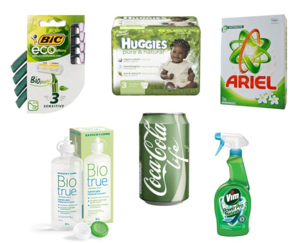
https://scadmanor.com/greenwashing-the-brain/

“Don’t be misled by pretty pictures or use of earth-friendly colors on product labels. MacDonalds or Coca-Cola might have green color on their logo, that doesn’t make them eco-friendly!” https://easyecotips.com/learn-how-to-avoid-greenwashing/

https://cuesonline.org/2021/10/28/green-or-greenwashing/

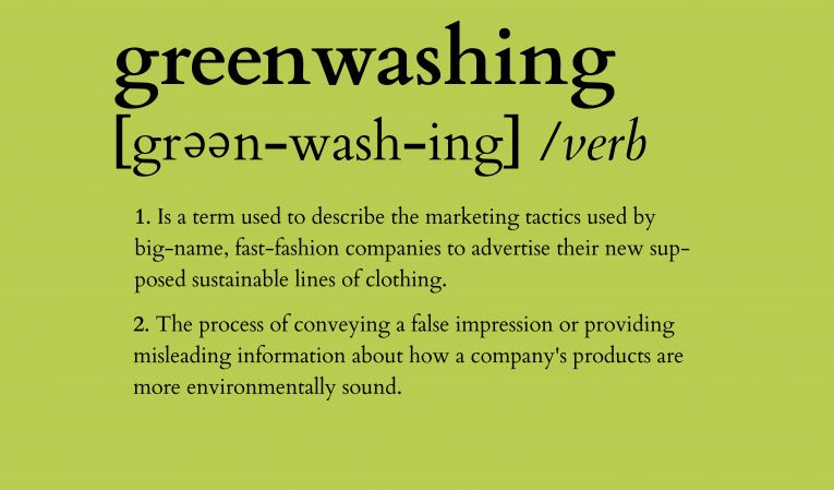
In everyday life there is an element of greenwashing. There is a gap between the things we know and what we do. For example, we know that reusable alternatives are the greener option but need to put the knowledge into action.

Campaigns & Case Studies

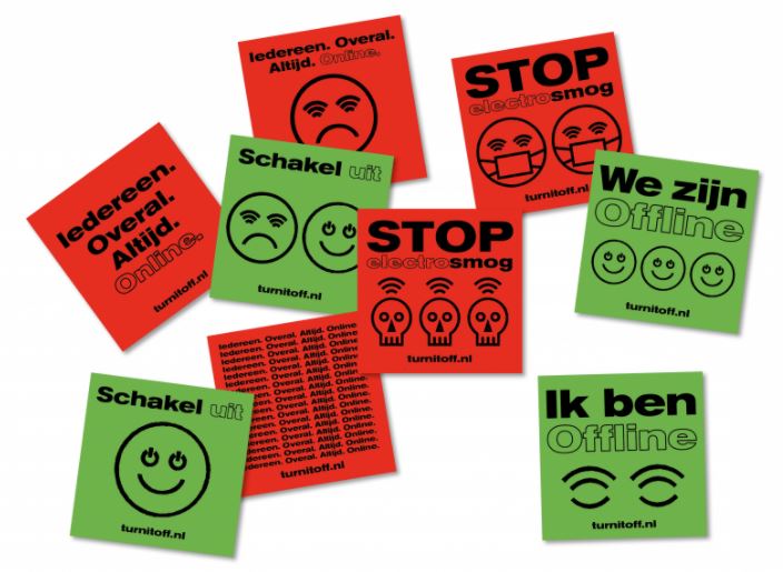
Turn it off!

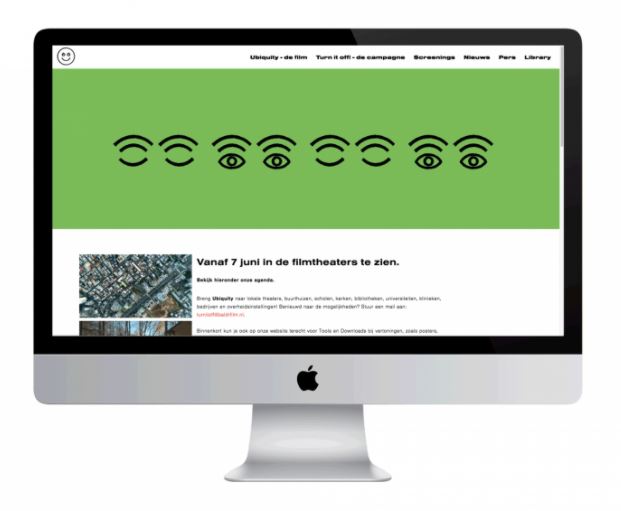
Campaign supporting Ubiquity, documentary by Bregtje van der Haak

Using the language of the online world – emoticons – we designed a simple, but bold visual language, which draws attention to the downside of staying connected all the time.

De Designpolitie
https://www.designpolitie.nl/projects/turn-it-off/

The use of green and red immediately suggest traffic lights and the action of stop and go/ on and off. The strength of the colour carries the message, so the designer is able to use black lights and keep the design simple. The emoticon graphics suggest the original faces made from type.

These will be familiar to people from a certain generation, which suggests to be that this could be the target audience. The bold typeface presents a clear message to the viewer. ‘Schakel Uit’ being Dutch for ‘Turn Off’ in the above designs, is paired with the green. Off which is often a negative word, is contrasted with the positive green.

The banner below is hard to miss due to its clarity and bold simplicity:

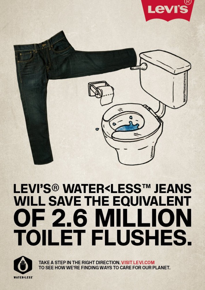
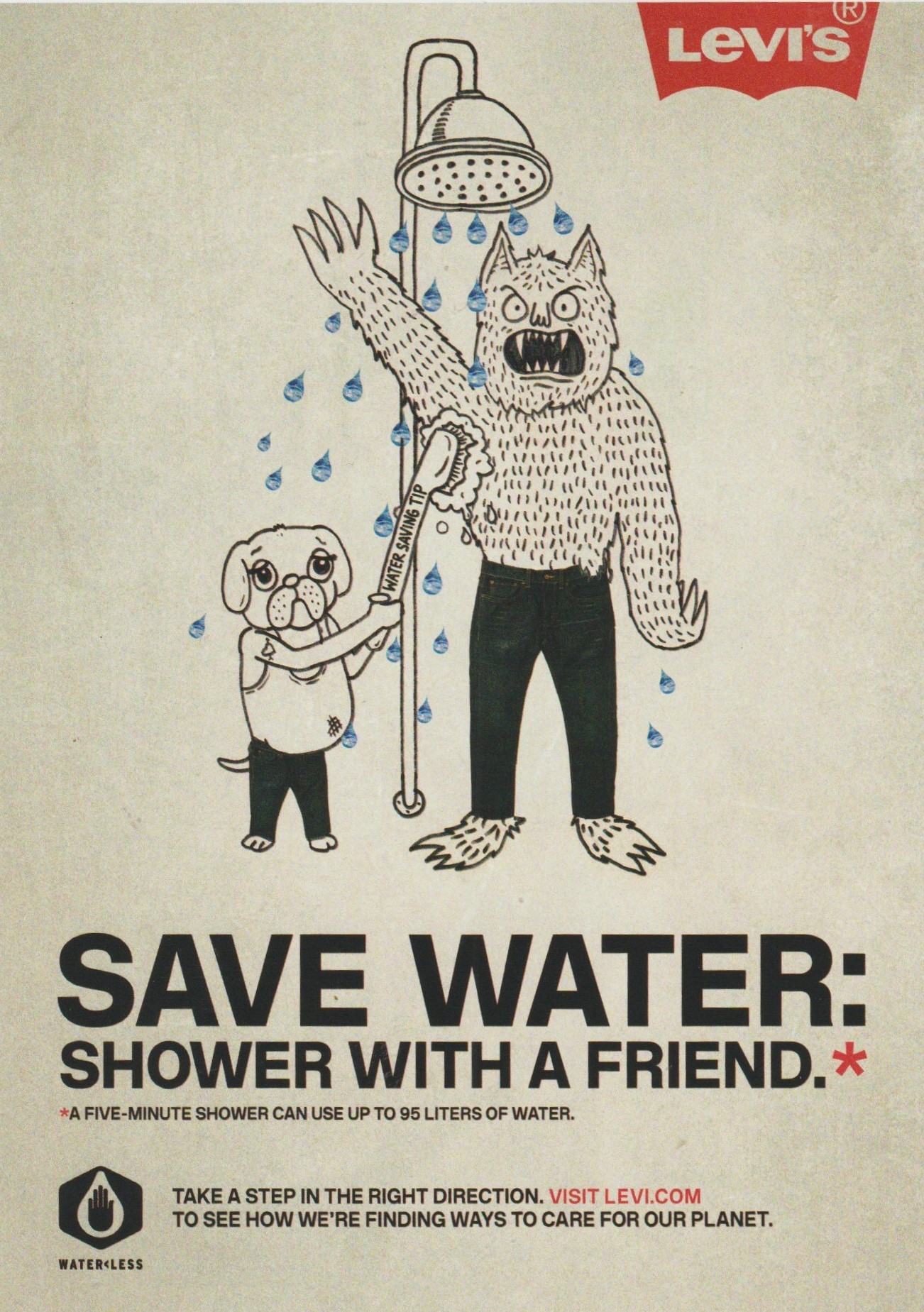
LEVI’S WATER> LESS

MY00 Agency, Johnny Lighthands, USA & U.K.

Levi’s developed a sustainable range of jeans to decrease their huge carbon footprint. They wanted to bring their message to people through educational posters and comic strips. They achieved this by using illustrations of water-conserving creatures drawn by Illustrator Johnny Lighthands.

Lighthands’ hand-drawn style gives the campaign a light-hearted touch while getting the message across. The style is rememberable and the characters are lovable. Levi jeans have a reputation for being traditionally well-made and ‘cool’. These drawings challenge the serious reputation of Levi’s. The off-white colour of the ground in these posters suggest natural materials.
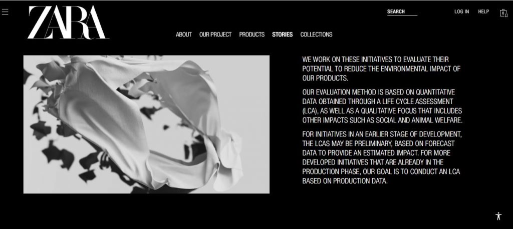
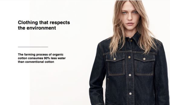
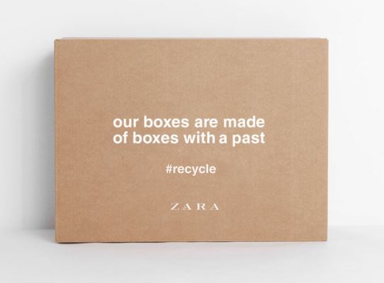
Zara- Join Life

I really like the lack of colour in Zara’s graphic design for their Join Life campaign. It looks neat and stylish while also giving the impression of minimal wastage.

https://www.zara.com/uk/en/sustainability-innovation-mkt4823.html?v1=1965796
An image from the campaign for Zara’s eco-conscious Join Life collection.
https://www.carmenbusquets.com/journal/post/fast-fashion-amp-sustainability-will-zara-owners-pledges-mean-real-action
https://www.forbes.com/sites/patrickmoorhead/2021/04/21/amazon-delivers-on-its-sustainability-commitments-and-then-some/?sh=12d5229a299d

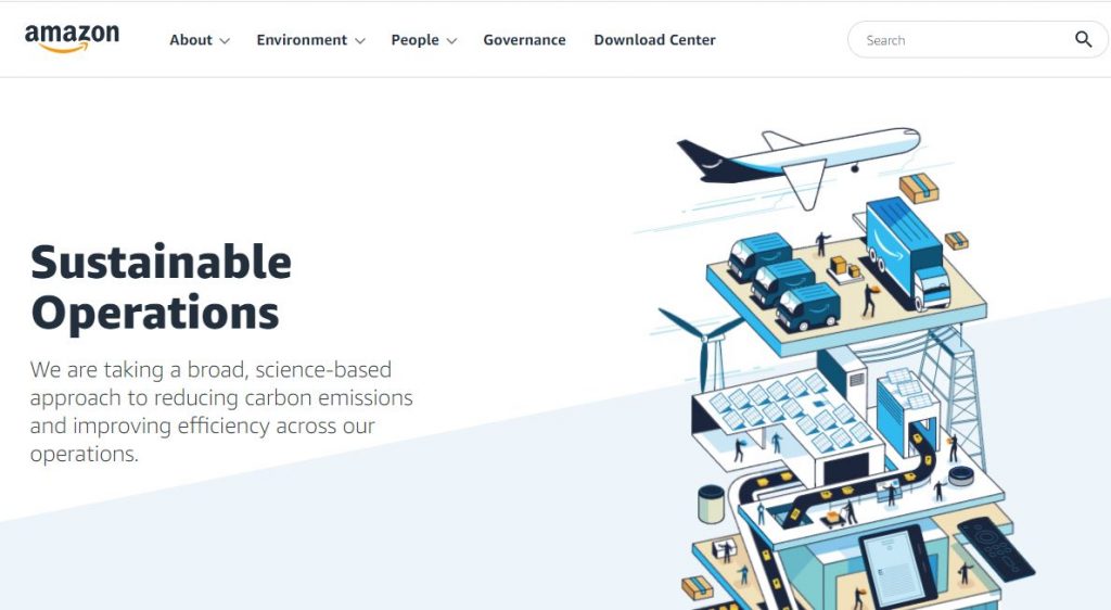
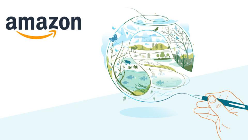
The cheerful animations on Amazon’s website are light and joyful. The illustration encapsulates the entire process of the items shifting through Amazon’s process. It is interesting as an animation because of the moving parts featured in the image.

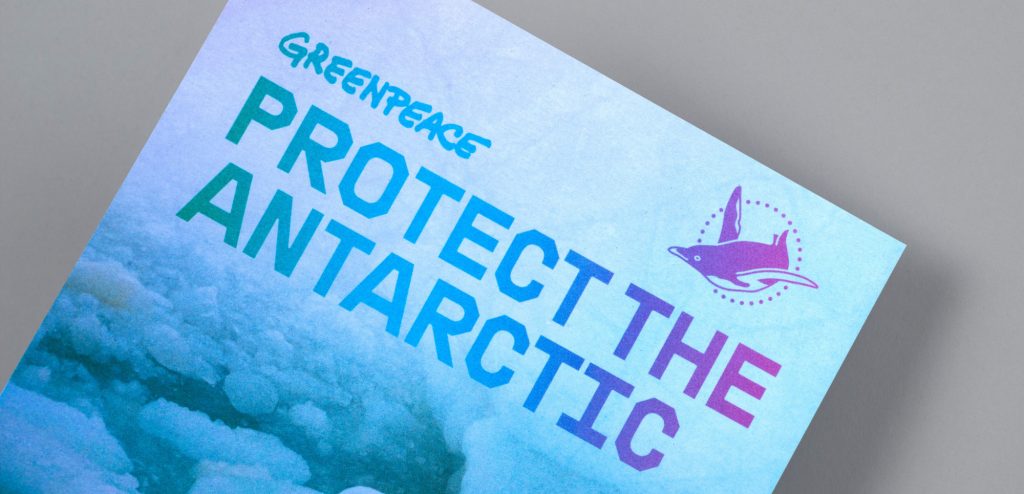
Greenpeace –Protect the Antarctic, The Lovers

‘A global movement to protect the Antarctic’

The agency, The Lovers, decided on colours and simple graphic design, inspired by the landscape and light of the Antarctic. They chose the penguin symbol to represent the wildlife affected by climate change. Their message was translated into many languages to reach a wider audience. This is important because the issue affects every person on the planet and is affected by every country.

The chosen typeface was inspired by naval/maritime fonts.

Language & Type (part 1)

History of Typography

In the 19th century there was a reduction in price of printing material. This enabled people to read, which allowed a democracy. (You can’t have a modern democracy if people can’t read). This reduction in price, lead to several things:

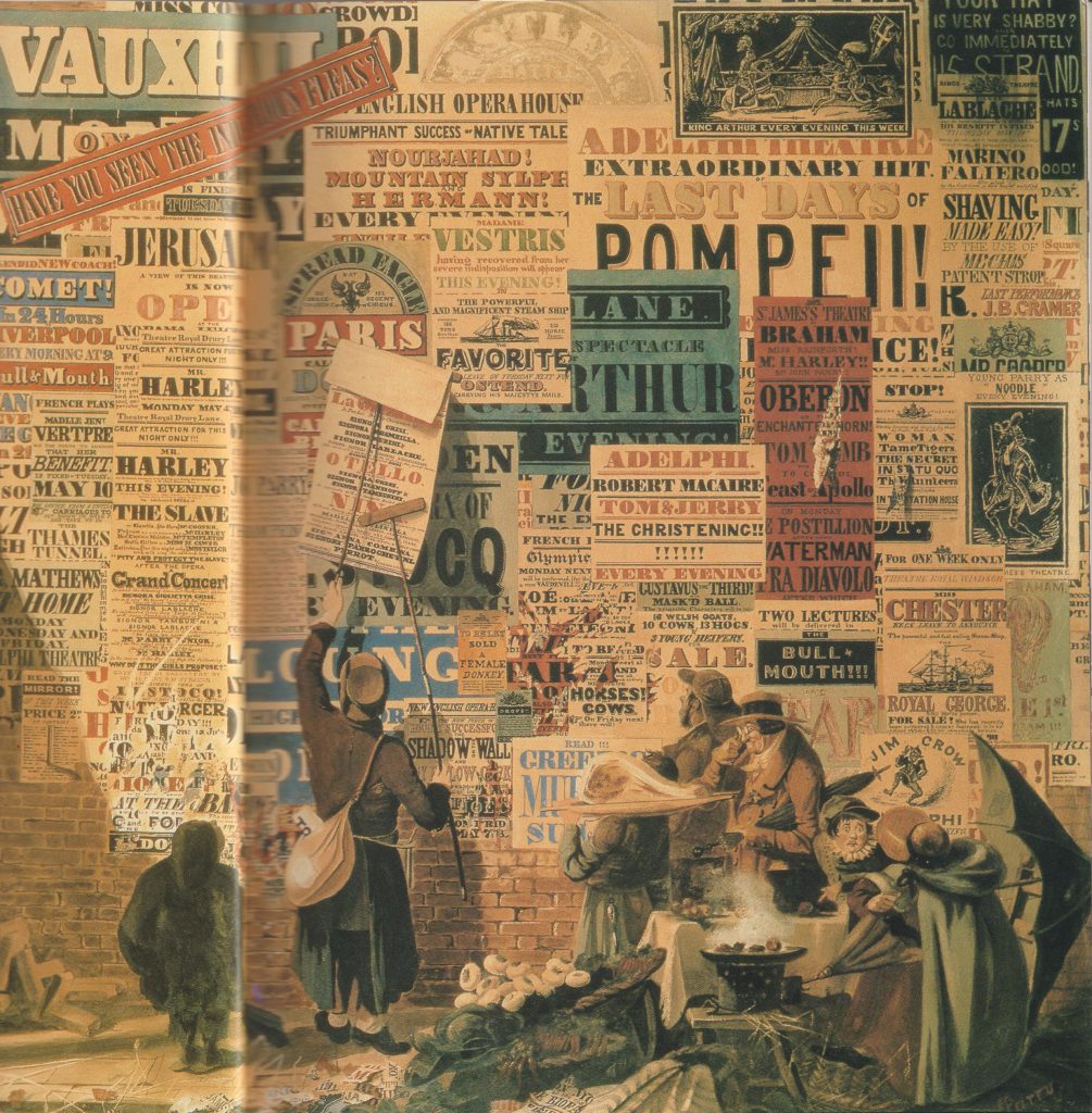
A rise in advertising- they saw posters competing in public. A visual noise shown in the painting by John Orlando Pary of a London street scene:

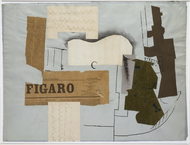
Both artists and writers saw this and were inspired. They turned to each other’s craft to enhance their work. Artists used words within their work, such as the collages by Picasso and Braque. Symbolist poetry came from writers reading the newspaper and seeing a contrast in the words about a variety of subjects.

Bottle of Vieux Marc, Glass, Guitar, and Newspaper – collage by Picasso https://www.weinerelementary.org/picasso-and-collage.html
Modernsim & Post-Modernism

“From the end of the 19th century, modernism was shaped by the industrialisation and urbanisation of western society. It marked a departure from the rural and provincial towards cosmopolitan, rejecting or overthrowing traditional values and styles as functionality and progress became key concerns as part of an attempt to move beyond the external physical representation of reality as depicted by cubism and the bauhaus.”

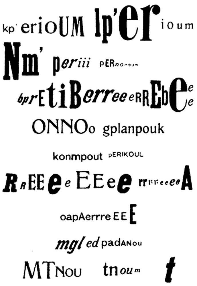
Around the 1st World War, the western world was politically heated. Dadaism and the Constructivists came out of this time. Dadaists opposed the traditional beliefs of a pro-war society.

The optophonetic of Dadaist poet Raoul Hausmann, presented by Cecile Bargues http://www.diptyqueparis-memento.com/en/dada-optophonetic/
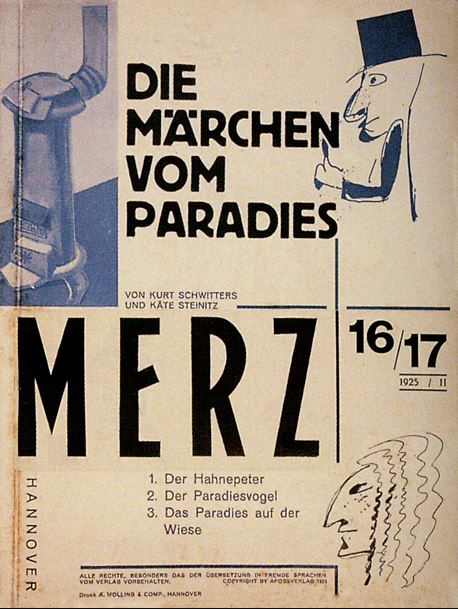
Cover of Merz, Kurt Schwitters, 1925

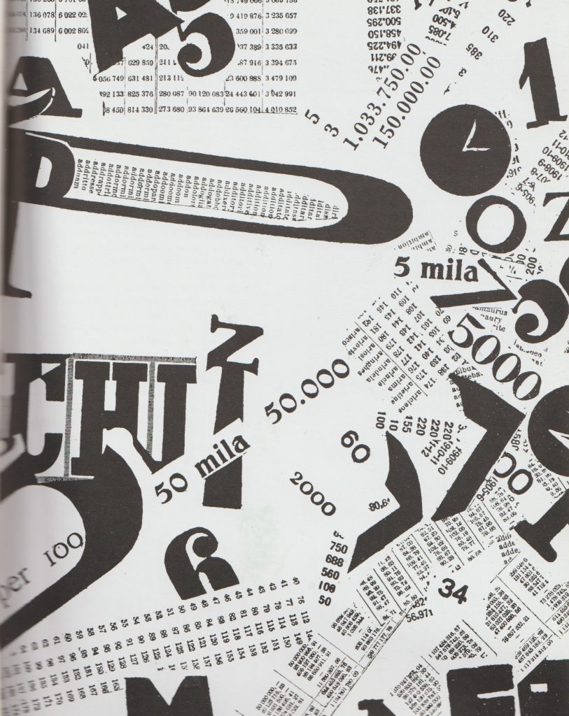
During the communist revolution, the art movements within this were the Futurists in Italy and the Vorticists in Britain. Their work represented the breaking up of the old world.

https://visualartsdepartment.wordpress.com/modernism/

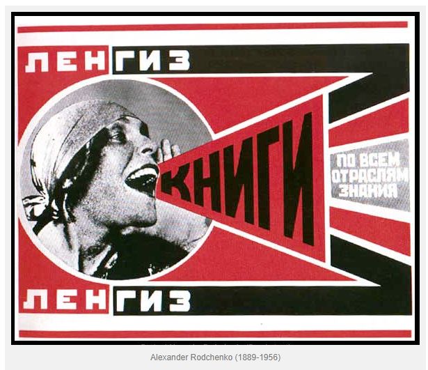
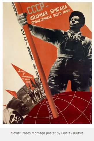
“Constructivism began as a Soviet youth movement. The Russian Revolution of 1917 involved many Russian artists, who combined political propaganda and commercial advertising in support of the new communist revolution.”

Blast

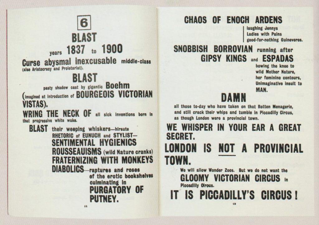
“Bless all English eyes” BLAST manifesto by the Vorticists. The harsh typography states a list of things the Vorticists were against (‘Blast’) and what they supported (‘Blessed’).

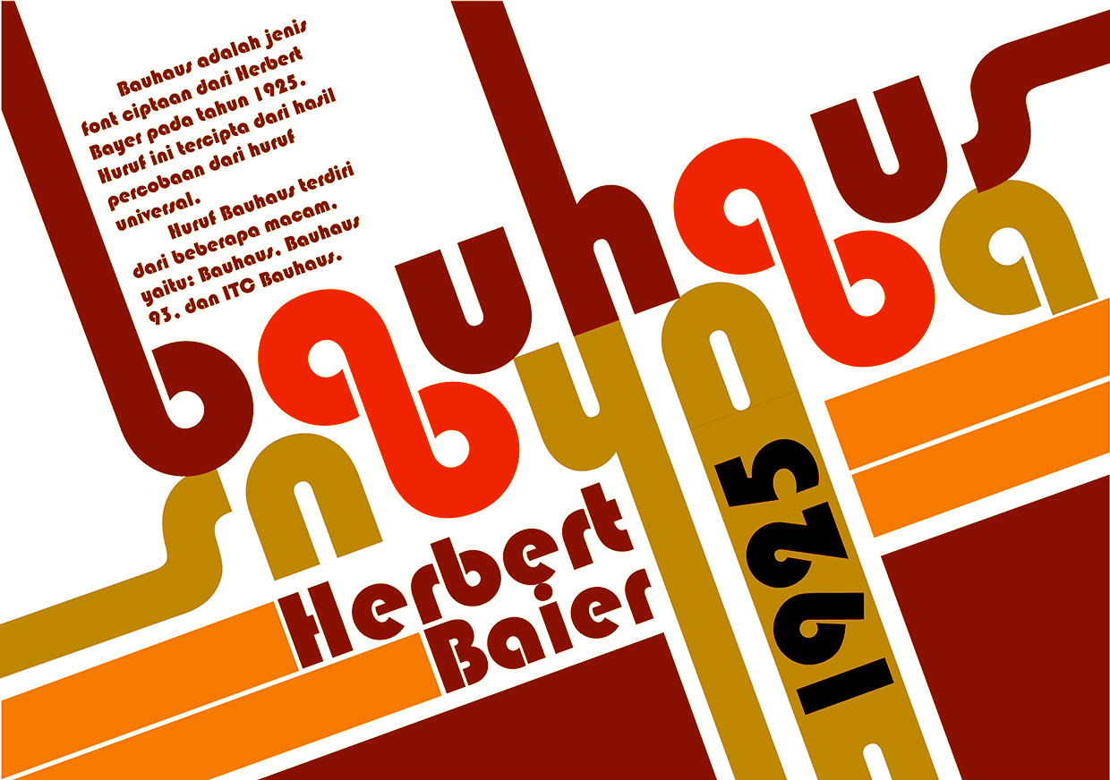
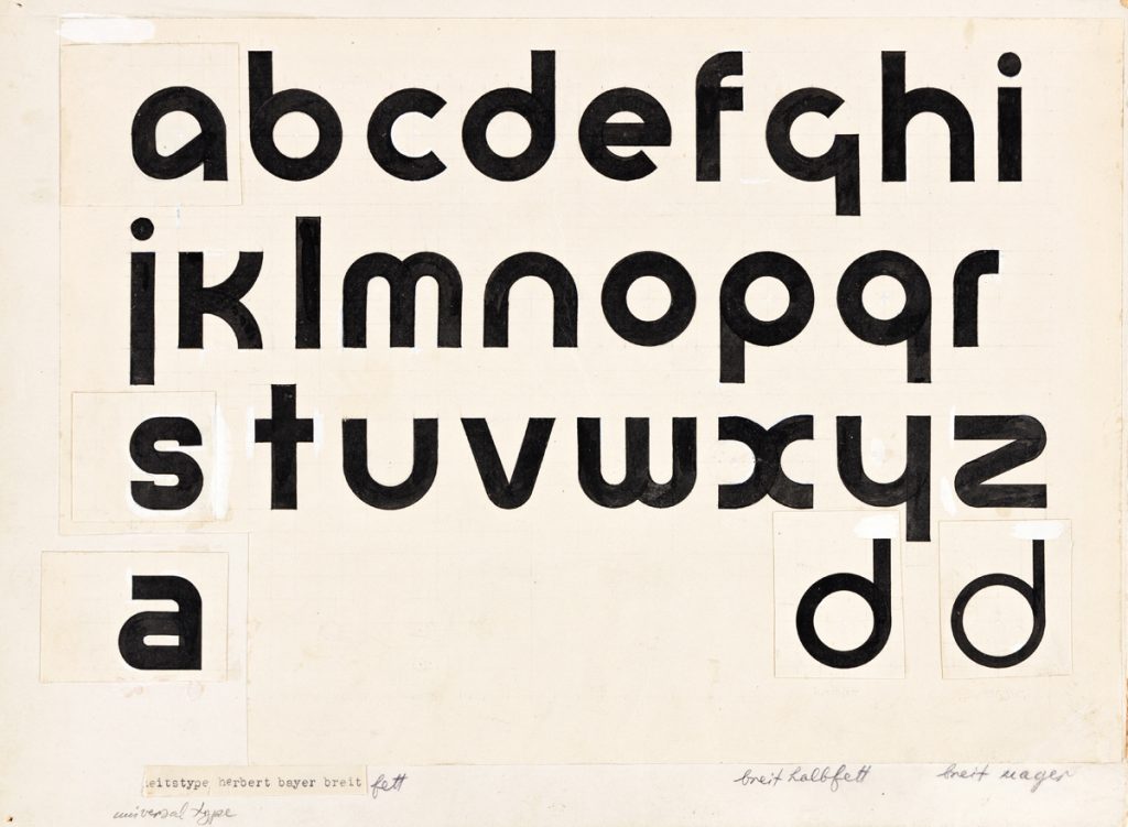
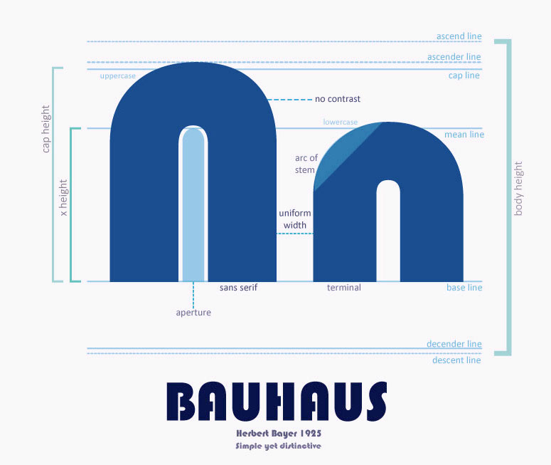
In the 1920’s, rules were written by Modernists and new typefaces were invented. This occurred at the rise of Fascism. Herbert Bayer was a designer who came up with the ‘Universal’ typeface, that he planned to be used by everyone, in a way of re-writing tradition. By changing what the world looks like, people are introduced to the new as it surrounds them in everyday life. This typeface at the time was extremely new and surprising.

Universal, 1925, Herbert Bayer

“Bayer’s Universal typeface was developed at the Bauhaus and is a reduction of Roman forms to simple geometric shapes. The circular form features heavily, and you can see how each character is closely based on the others.”The Fundamentals of Creative Design by Gavin Ambrose and Paul Harris

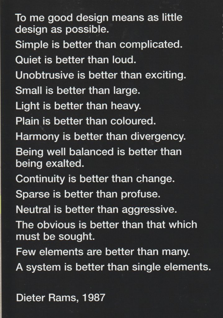
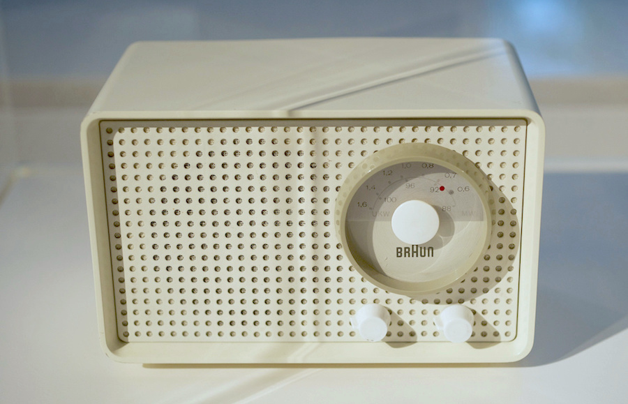
Radio design by Dieter Rams. His work was described as ‘quiet simplicity’. He was a pioneer of the Modernist movement and worked for Braun.

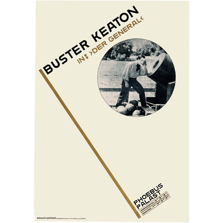
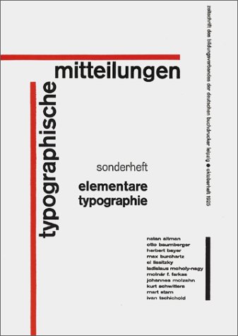
Jan Tschichold

Poster, Buster Keaton in “Der General”, 1927
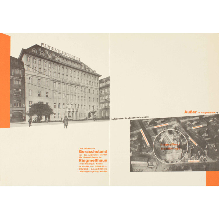
Internal spread from brochure Merken Sie sich bitte: Die Reklamemesse, 1927

“New Typography uses white space to create visual intervals in an asymmetrical layout. An underlying grid unifies the page. Personal expression is rejected in favor of order and clarity. The predominant graphic design style in the world by the 1970s, the Swiss style is recognizable by its strong reliance on typography, usually sans serif type in flush left alignment.”

Late Modernism occurred in the economic boom in the 1950’s. Wim Crouwel’s posters from 1960’s-1980’s have a similar appearance to design now:

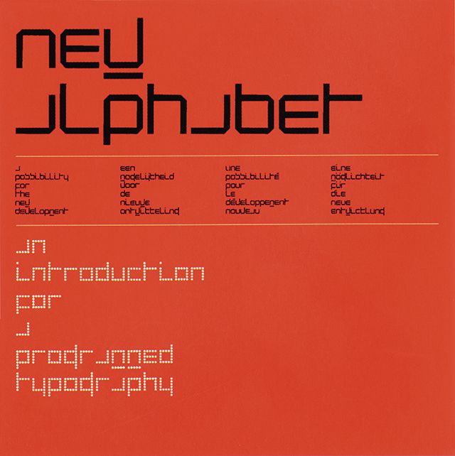
1967s New Alphabet Typeface. https://speckyboy.com/icons-graphic-design-wim-crouwel/
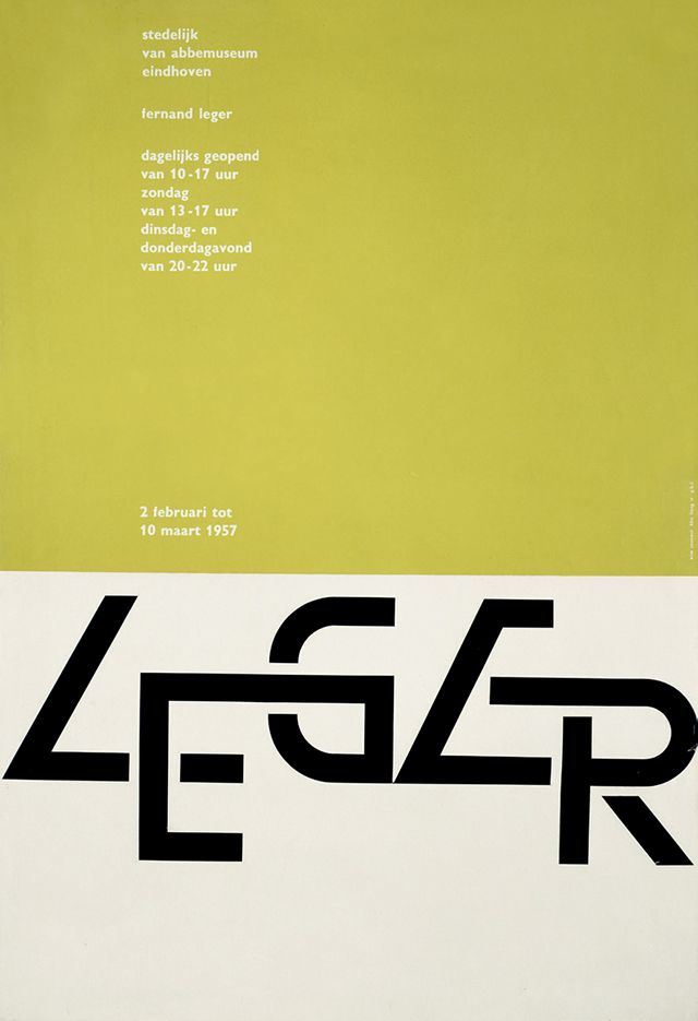
Wim Crouwel Leger Poster, 1957.

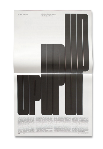
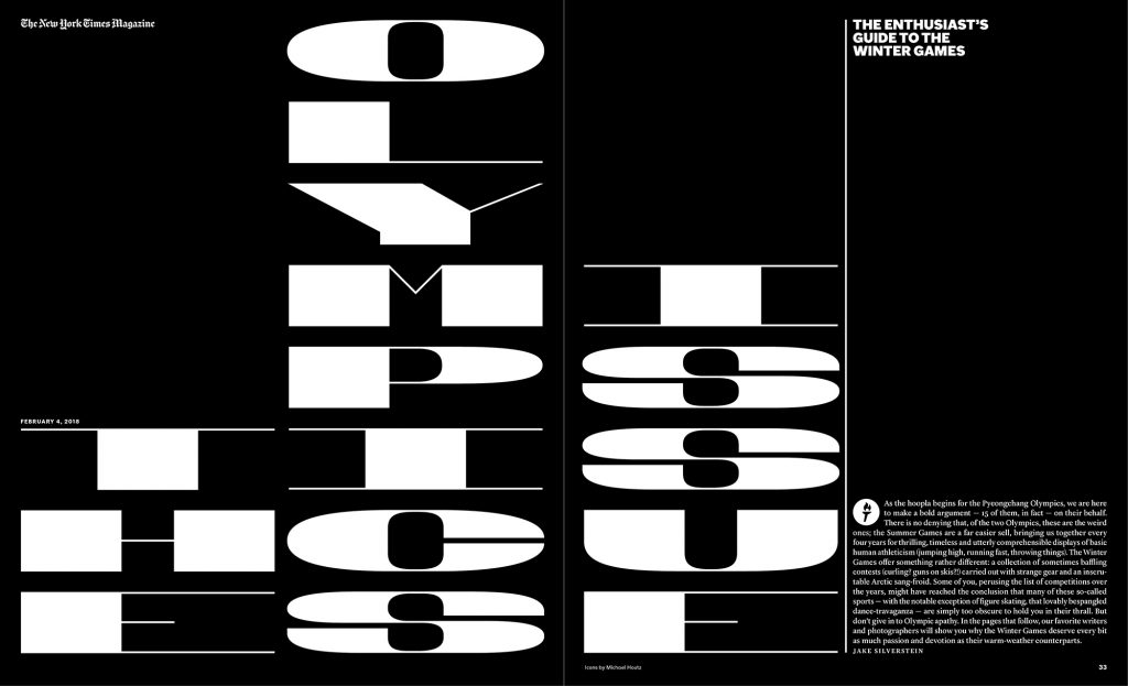
Matt Willey- contemporary designer

The New York Times magazine
NYT Olympics
Post-Modernism

“Post-Modernism developed following the Second World War and questions the very notion that there is a reliable reality through deconstructing authority and the established order of things by engaging the idea of fragmentation, incoherence and the plain ridiculous.

Post-Modernism returned to earlier ideas of adornment and decoration, celebrating expression and personal intuition in favour of formula and structure.”

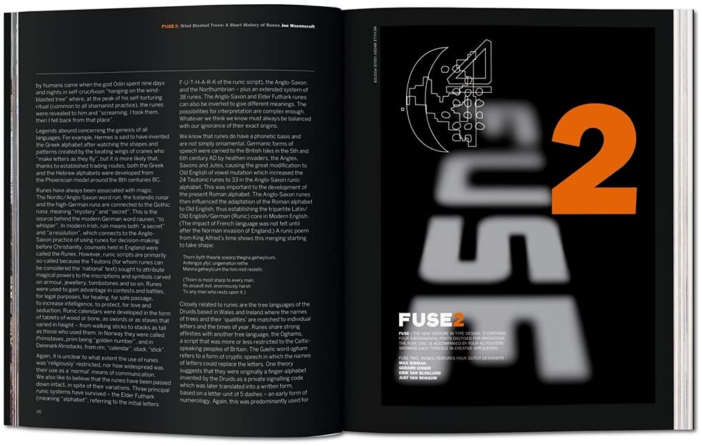
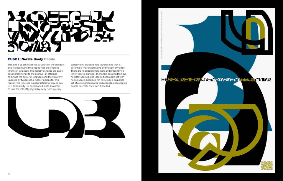
Fuse magazine, founded by Neville Brody and John Wozencroft

An example of Post-Modernism, the designers expressed their imagination across the pages. Sometimes readability was compromised, as form reigned over function. The magazine was produced at the time when computer technology allowed designers to experiment with new tools.

Fuse 2, Runes: Edition Poster design by Neville Brody, 1991 https://www.amazon.co.uk/FUSE-1-20-TASCHEN/dp/3836525011
https://thefontfontyeahs.wordpress.com/2012/09/19/fuse-1-20/

Automation is a phrase that is used to describe the transition from the old skilled job (for example, of typography) to the present digital age where the digital design tools are available to anyone.

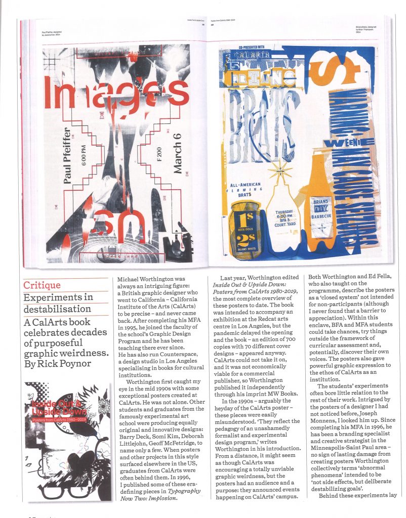
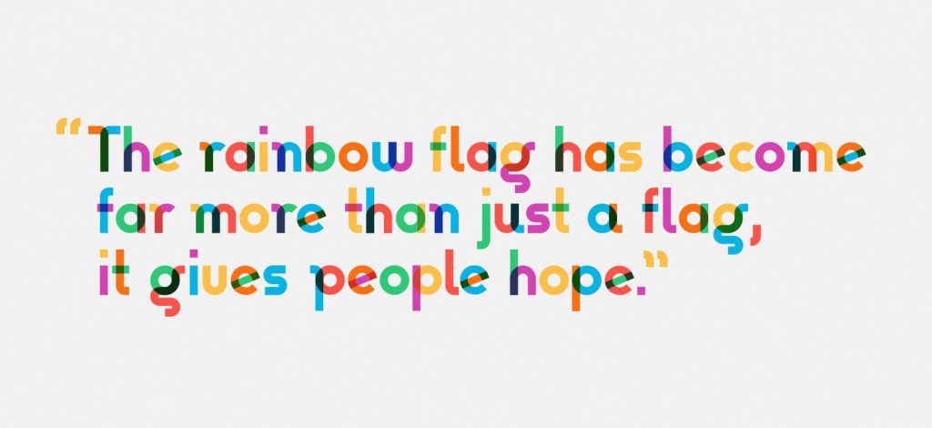
Gilbert, Type with Pride https://www.typewithpride.com/

“On 31 March, 2017, Gilbert Baker the creator of the iconic Rainbow Flag sadly passed away. Mr. Baker was both an LGBTQ activist and artist, and was known for helping friends create banners for protests and marches. To honor the memory of Gilbert Baker, NewFest and NYC Pride partnered with Fontself to create a free font inspired by the design language of the iconic Rainbow Flag, the font was named ‘Gilbert’ after Mr. Baker.” This is one of the world’s first coloured fonts.

“The colour combinations are blended on letters to represent the ‘open and fluid communities’ that make up LGBTQ.” (from The Fundamentals of Typography 3rd edition)

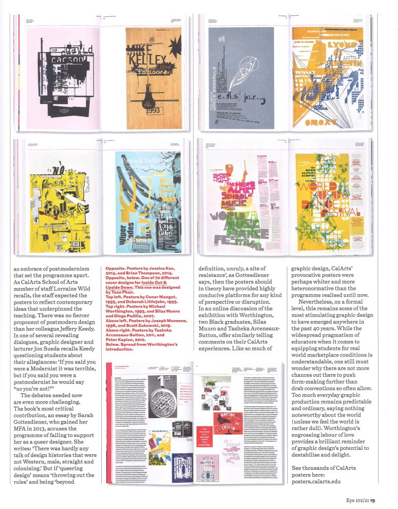
Postmodern design:

Eye Magazine, Issue 102