(Design Practice Integrated Projects 1)
From the brief:
typology n. typologies, pl.
The study or systematic classification of types that have characteristics
or traits in common.
This project requires you to explore typological classification of a
collection to constructing meaning. It is designed to highlight the role of
collecting, archiving and taxonomy as fundamental features of research
and analysis.
Naturalis
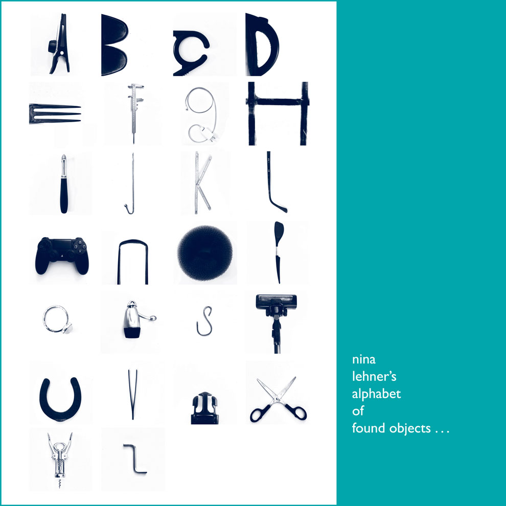
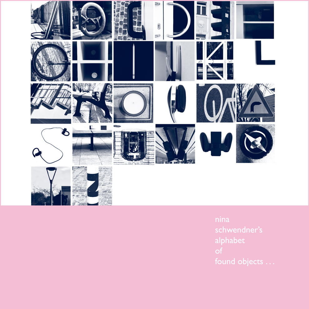
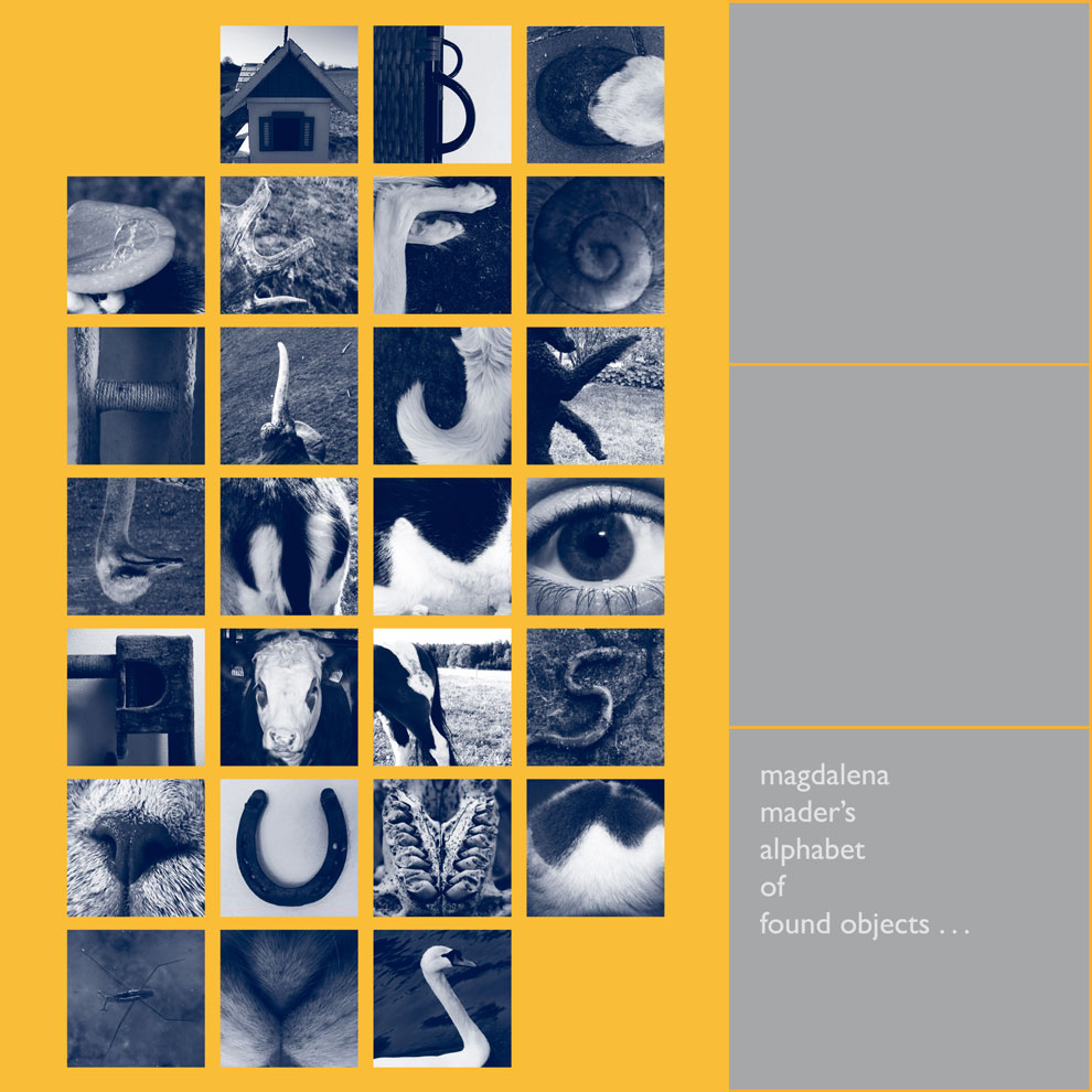
To kick off the summer project, we are asked to collect together a minimum of 12 objects from nature. (These objects would need to be connected by either their form or functions.)
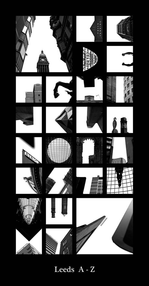
I began to take notice of collections I could see in the visual world around me, with a theme of nature. For example, when walking around the city centre.
Secondary Research
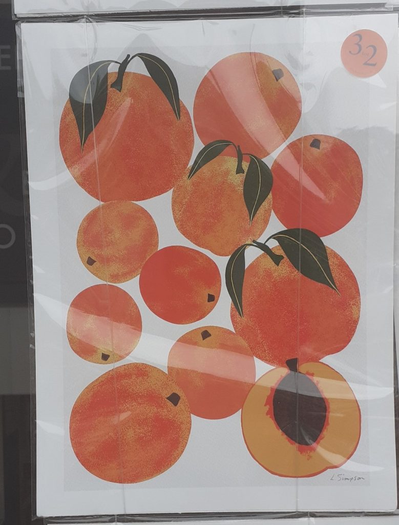
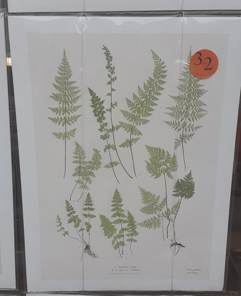
One example, is the prints I saw in the Blackwell’s shop window.
And inside the shop…
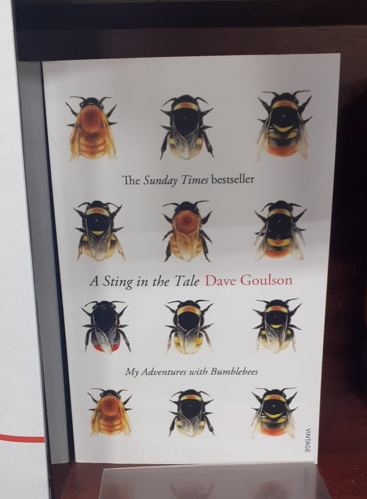
(Below) from the book display in the Bodleian Library book shop.
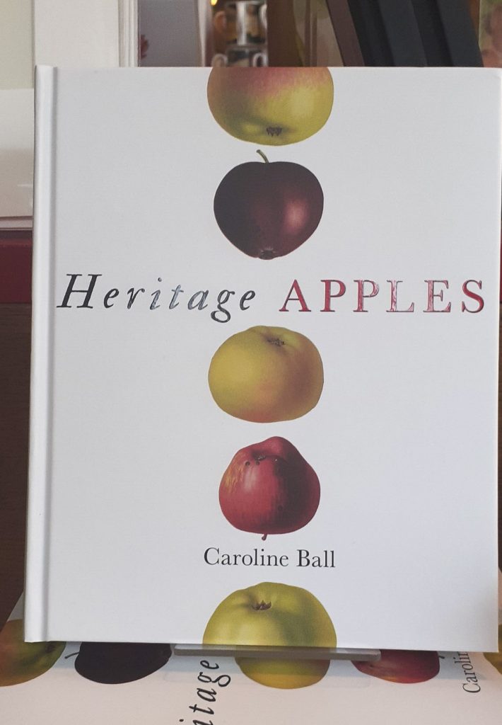
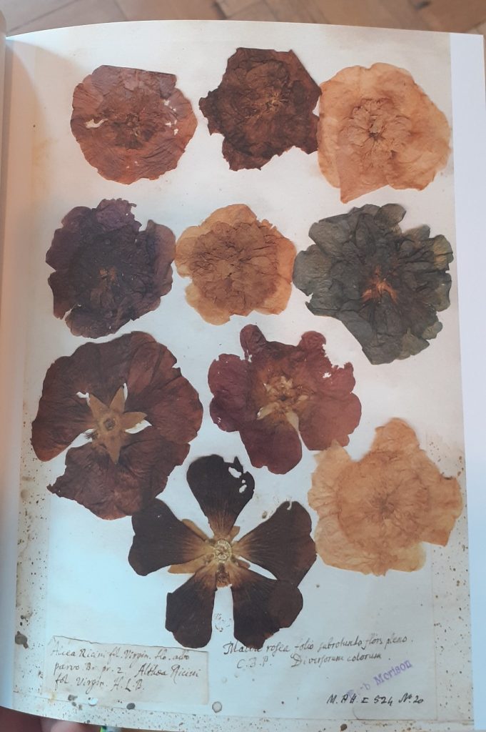
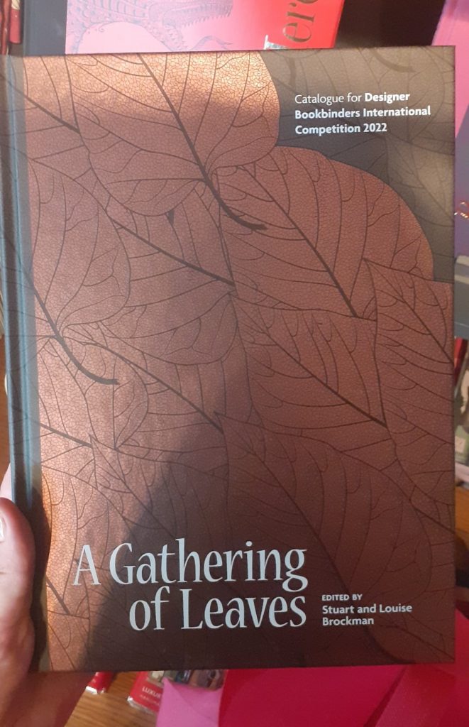
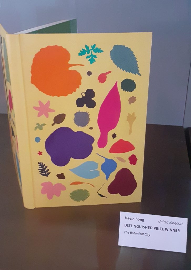
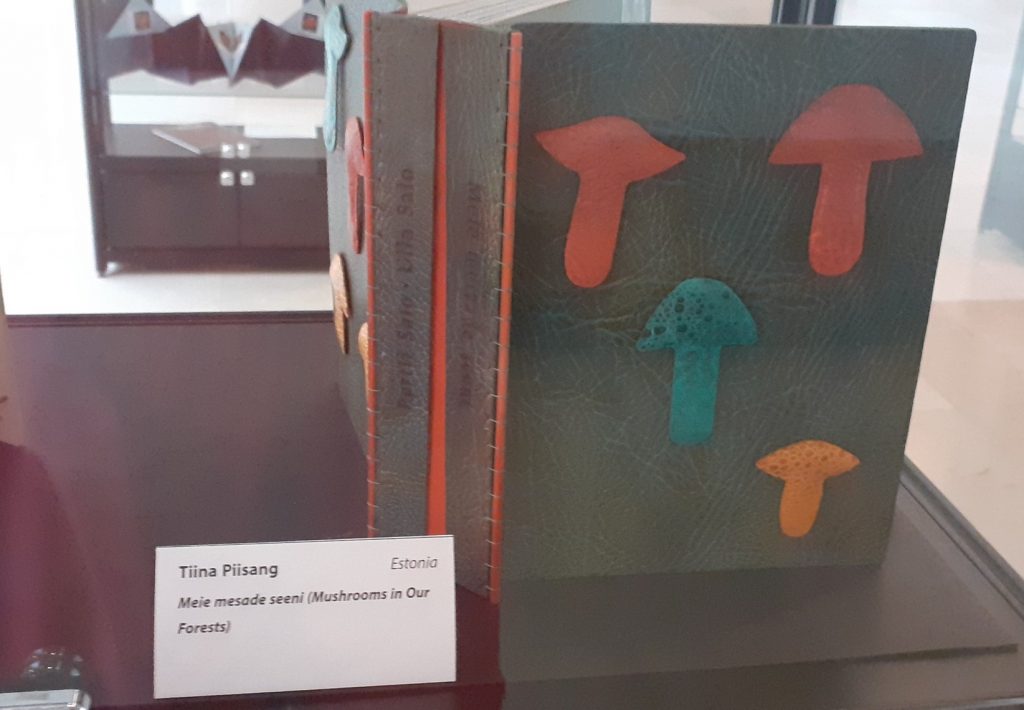
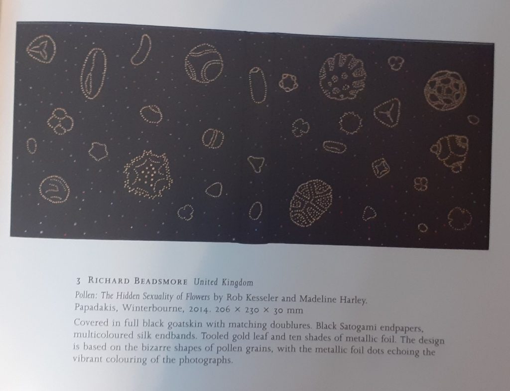
(Below) From the Designer Bookbinders International Competition 2022 exhibition at the Weston Library, Oxford.
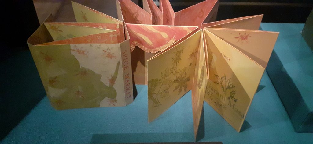
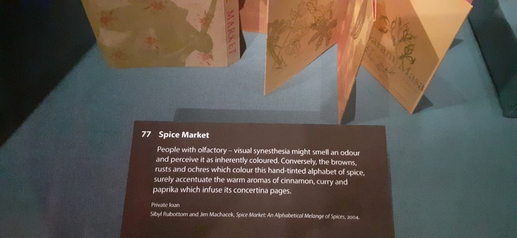
(Below) I really liked this book from the Sensational Books exhibition at the Weston Library, Oxford. The book presents different spices, each illustrated in different colours. The colour and texture of the paper chosen, reflects the warmth of the spices.
Contextual References
I looked at Artists who have explored collecting within their work.
Example 1: Susan Hiller
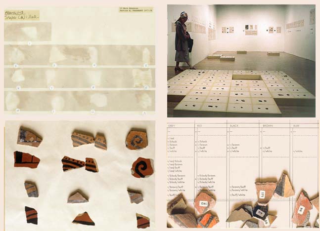
I deal with fragments of everyday life, and I’m suggesting that a fragmentary view is all we’ve got.
[b434d1] Hiller cited in Ann Gallagher (ed.), Susan Hiller, exhibition catalogue, Tate Britain, London 2011, p.87.
The artist Susan Hiller created her art installation Fragments in the 1970’s. The piece is made of many broken pieces of pottery. The pottery was originally made by native Americans and traditionally painted by women, as is the case in many cultures across the globe and historically.
Immediately, we can recognise a contrast between the asymmetrical and uneven pottery pieces with the tidy way they are organised. Also the contrast of the artificial white surroundings, that highlight the earthly and organic quality of these pieces that were made by human hands.
Fragments is as much about how the pieces are arranged than about the pieces themselves. It seems like a collaboration between the original crafters of the pottery and the artist who has been drawn to these pieces. Heller has approached the artwork almost in the way an archaeologist would handle fragments from an excavation site. This shows us the consideration she has for the history of the objects.
Example 2: Penelope Umbrico
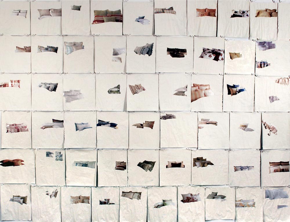
The artwork (above) has also been created by the artist going through the process of building and presenting a collection. One difference is that each object of this collection (a photograph image of pillows), appears to follow no pattern or categorisation. Each magazine page is roughly the same size, since she sourced the images from the same magazine. The difference is where the pillows appear to float on the white space. I like that this is unexpected and different on every square. It leads us to imagine what would have been on the rest of the page, now covered with white paint. Her process was more about selecting and erasing to highlight one object to the audience. The colours and sizes of the objects vary but she shows this no importance, since they are placed at random.
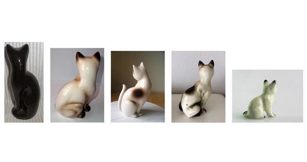
With this piece, Umbrico is again being selective with her objects. She hasn’t chosen every ceramic cat for sale on ebay, but instead is only showing us the cats that are facing away from the camera and therefore the viewer. Like with the pillows artiswork, she is also using found images, as these photos have been taken by the sellers who are selling the ornaments. She is focusing on this choice of the seller to present their object this way. SHe is making a comment on how we add life to inanimate objects with out own sentimentality/imaghination/emotions.

Universal Remotes is another installtion using found images from ebay. However, in this colection, the remote controls are grouped into smaller collections within the larger collection of the artwork itself. This adds another layer/dimension which for me makes it more interesting to view.
We can almost see the different personalities of the ebay sellers, because of the way they have chosen to display the same object in many ways and also the background they have chosen to use varies from square to square.
Example 3: Damien Hirst
I love how different forms of display affect what the eye sees. It’s bound up in my interest in the Victorian obsession with nature, or really the dominance of man over the natural world. Those Victorian natural history displays are so stupidly self-confident, it’s nature seen through the eyes of man, beautifully ordered according to aesthetics. They’re meant to be about the natural world but they’re more like zoos — fake places or facades of reality.
Damien Hirst, https://www.christies.com/features/Damien_Hirst_as_Collector-5683-1.aspx
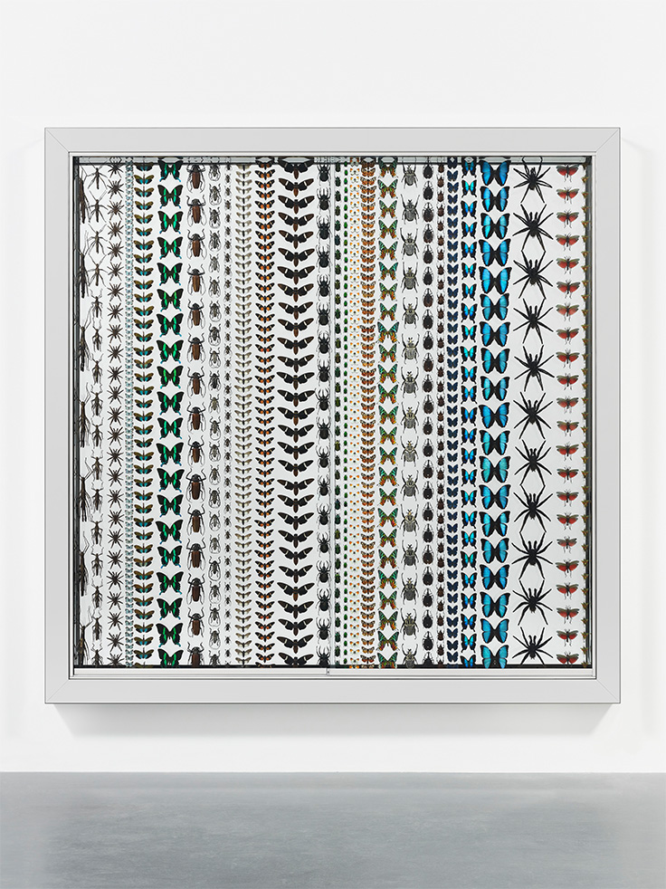
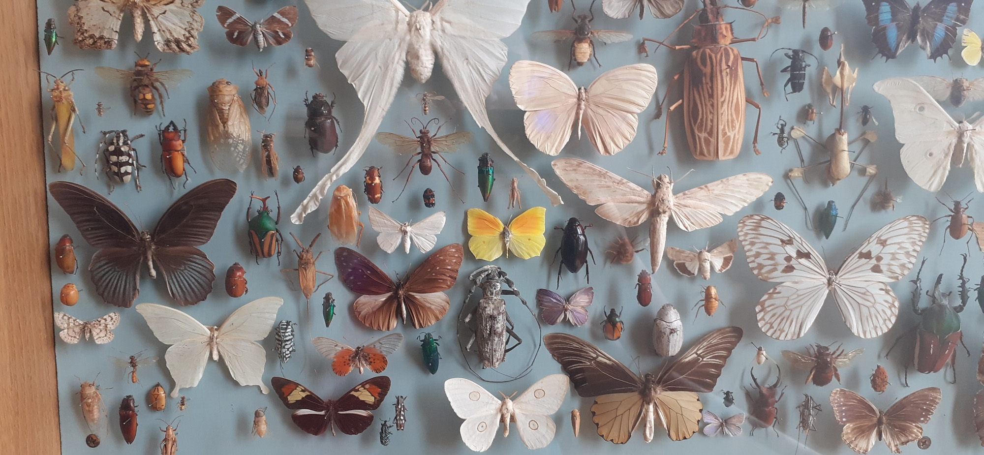
Last Kingdom is a collection of insects, like most of the work Hirst is known for, preserved in an installation. I would describe this piece as decorative, it almost reminds me of a wallpaper pattern design. Unlike the previous works we’ve looked at, these insects are divided by species and placed in an orderly way with equal spaces between the objects. He has considered colour and size in this collection.
Example 4: Peter Blake
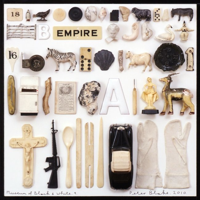
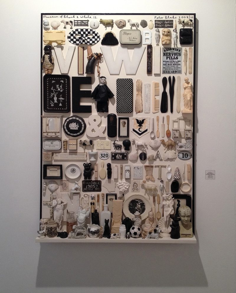
This artwork tells the story of the 20th century by using a variety of objects found from this era. This piece was inspired by the artist Mark Dion.
Dion, an American conceptual artist, is known for his literal archeological digs and museum-like presentations of his finds.
Matthew Rose, 2016
Placing the rows in size order makes the art work pleasant to view. The neatness is museum-like, but the randomness of the objects’ function makes it different to a museum where more logic is applied to the placement.
The name of the piece refers to the selection of black and white objects only in this collection. Other than colour, these objects have no other obvious theme in common collectively. The viewer would need to have previous knowledge of history to know that these objects could be from the same century, for example.
I really like this artwork, I feel that the muted colour palette helps me to focus on the shapes themselves. (Bright colours could be distracting). I also like the familiarity of the objects. They might not be an exact artifact I have owned, but they are pieces of the culture I am familiar with.
Trip to the Natural History Museum, Oxford
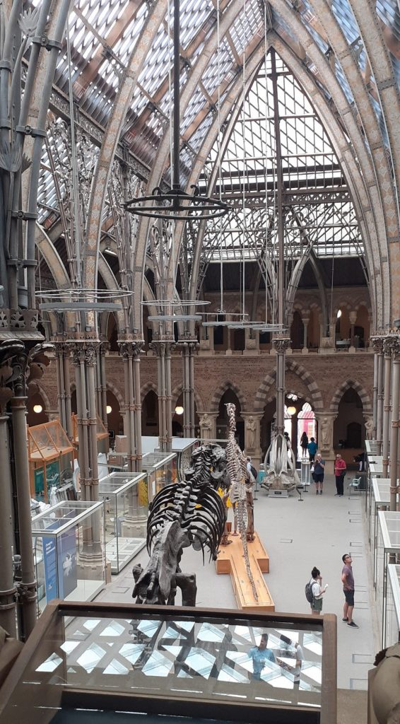
This week I returned to my favourite Oxford museum, to observe the nature of collecting and displaying artefacts. I wanted to gain some inspiration for how I could categorise objects and arrange them as a collection.
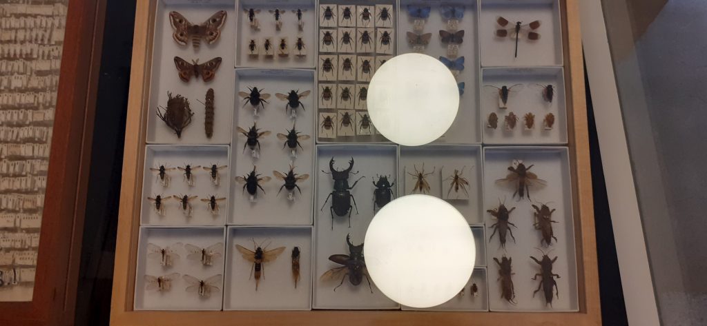
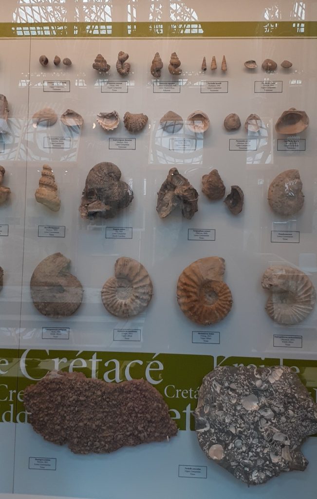

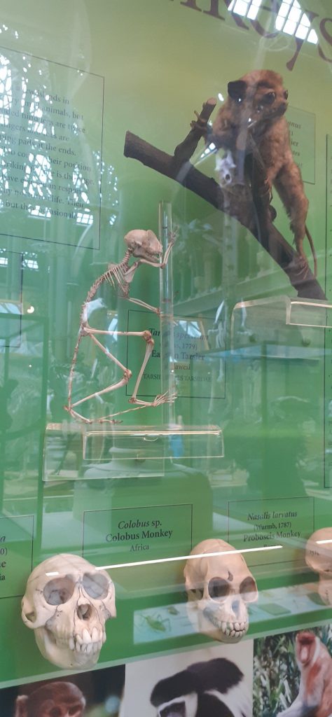
Part of the primate display. Skulls grouped together. Head (bottom) to body (top). Diagonal arrangement leads the eye across the display.
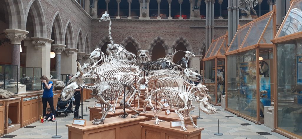
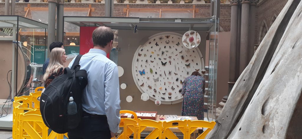
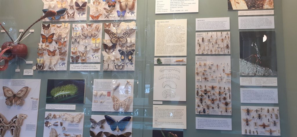
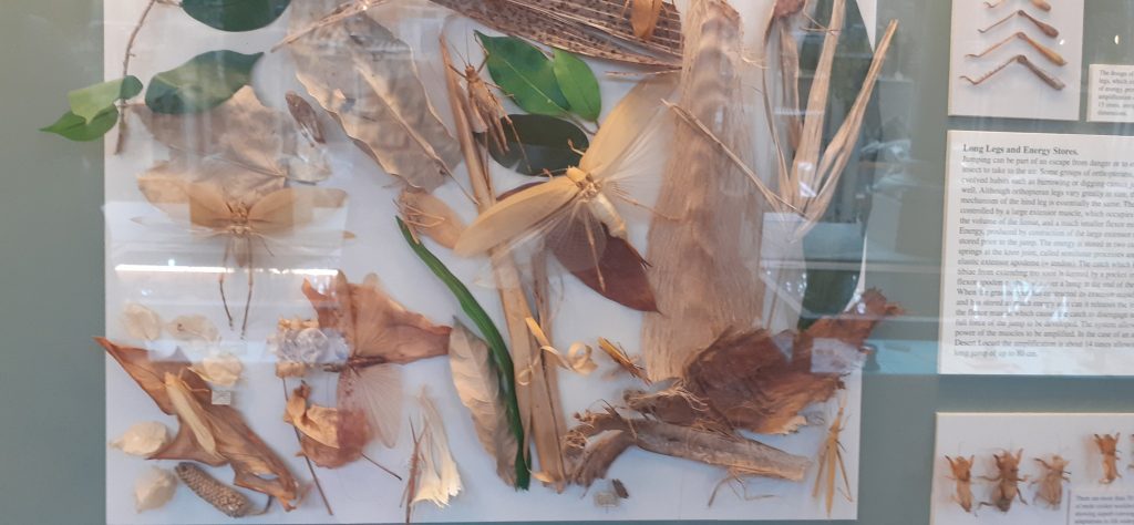
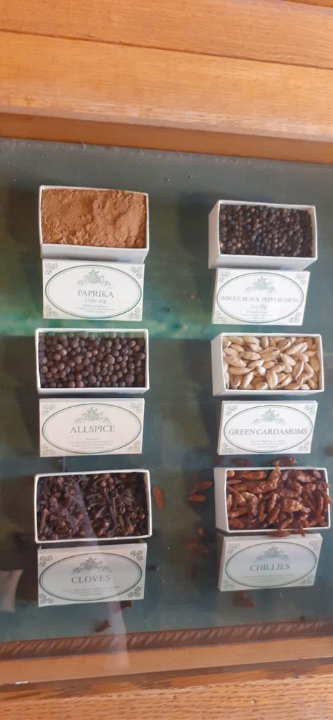
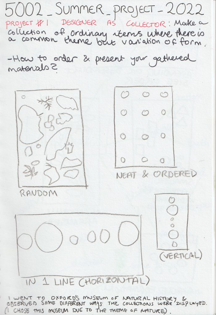
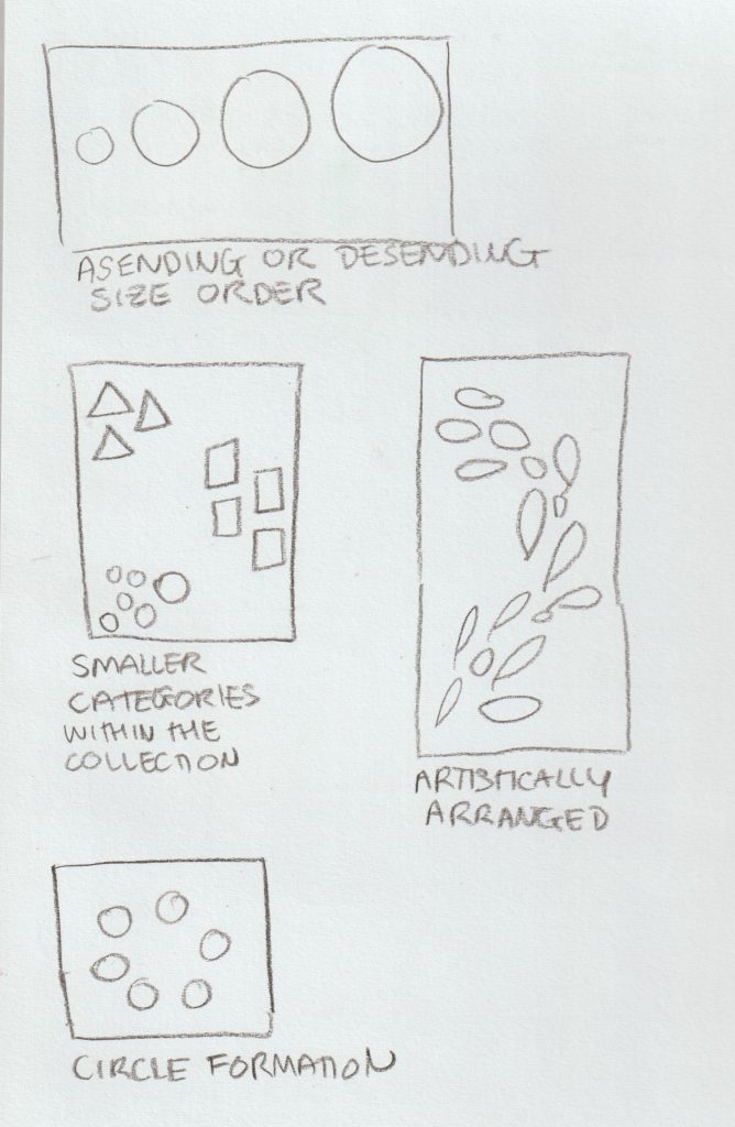
From the museum trip, I reflected on the arrangement of the objects and recorded these observations in my sketchbook:
Then…
To decide on the objects I wanted to collect, I drew up a mind-map to consider what would make an interesting collection:
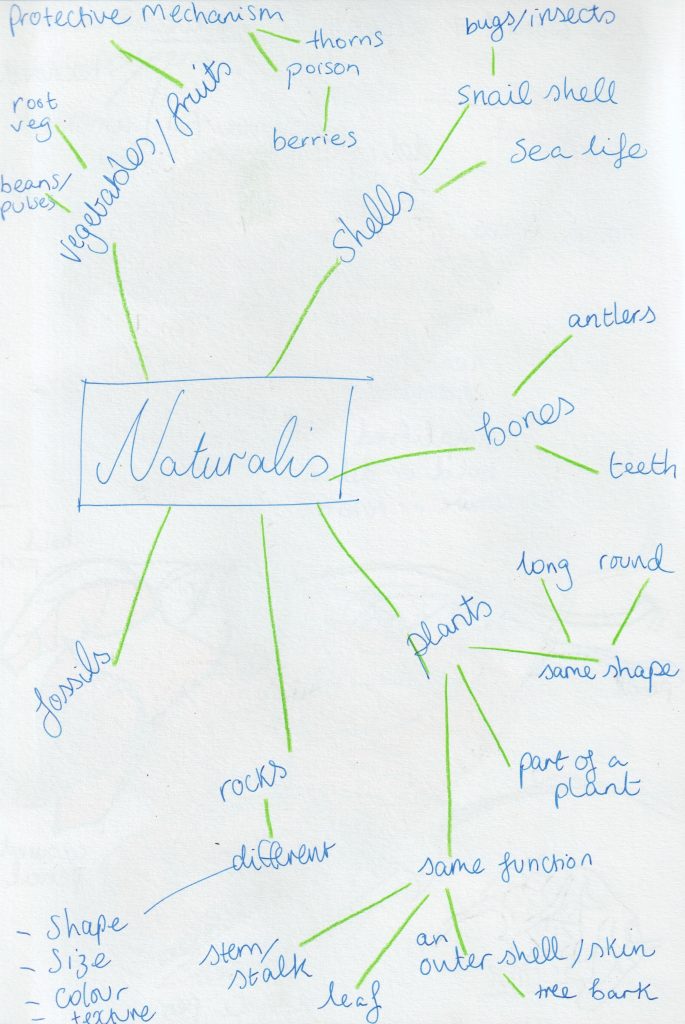
From this list, I narrowed down my options and went to Christchurch Meadow to collect from nature. I chose this area because of the variety of trees and wildlife I knew I could find here.
It was then time to arrange and rearrange these objects…
Definitions I learnt today:
heterogeneity
/ˌhɛt(ə)rə(ʊ)dʒɪˈniːɪti/
noun
- the quality or state of being diverse in character or content.”the genetic heterogeneity of human populations”
disparate
/ˈdɪsp(ə)rət/
adjective
- essentially different in kind; not able to be compared.”they inhabit disparate worlds of thought”
