Project #1 Designer as Collector

(Design Practice Integrated Projects 1)

From the brief:

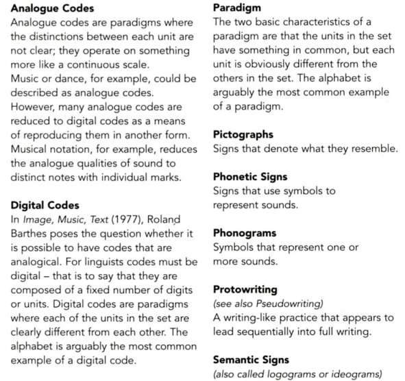
typology n. typologies, pl.
The study or systematic classification of types that have characteristics
or traits in common.

This project requires you to explore typological classification of a
collection to constructing meaning. It is designed to highlight the role of
collecting, archiving and taxonomy as fundamental features of research
and analysis.


Naturalis

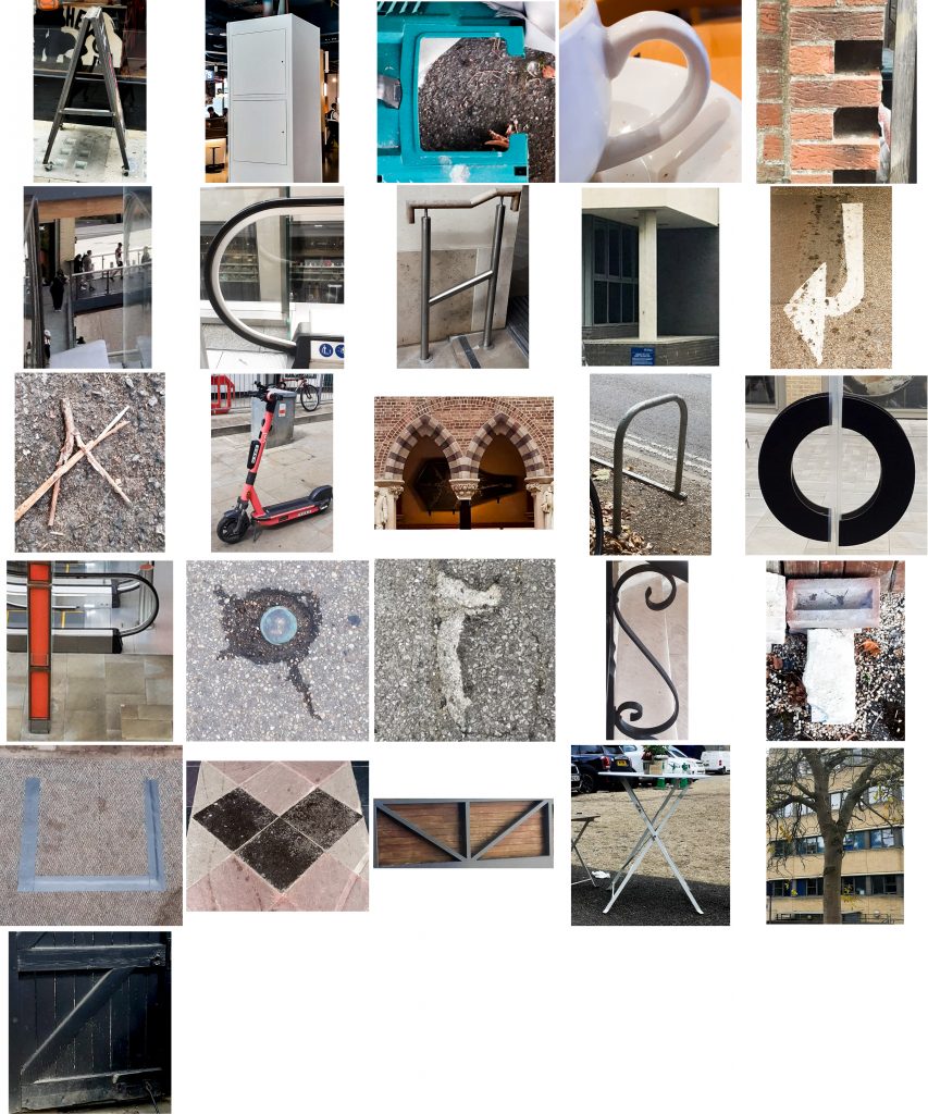
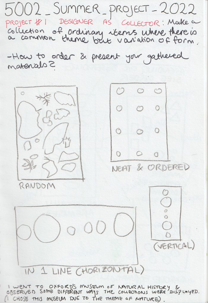
To kick off the summer project, we are asked to collect together a minimum of 12 objects from nature. (These objects would need to be connected by either their form or functions.)

I began to take notice of collections I could see in the visual world around me, with a theme of nature. For example, when walking around the city centre.

Secondary Research

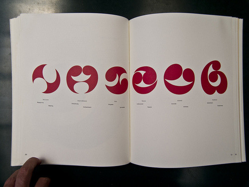
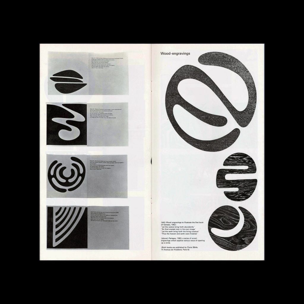
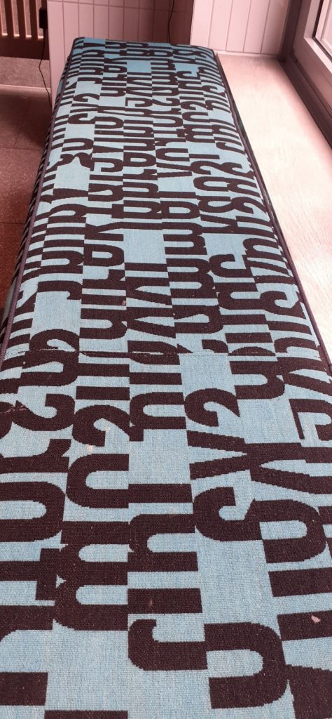
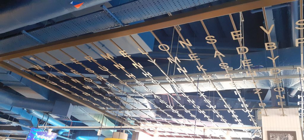
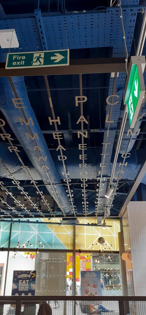
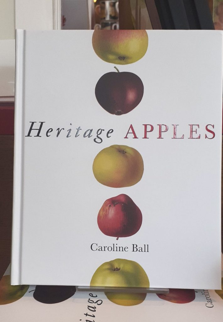
One example, is the prints I saw in the Blackwell’s shop window.

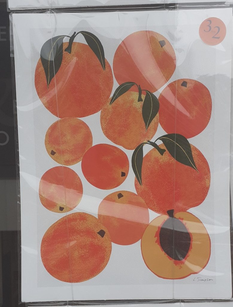
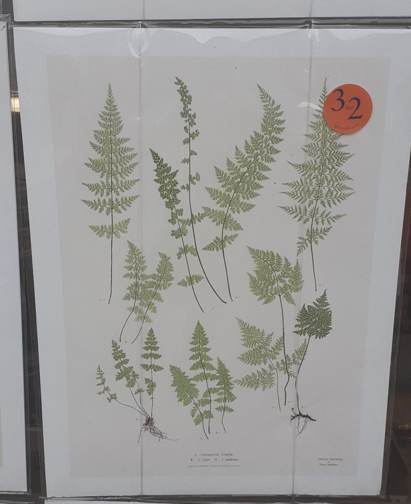
And inside the shop…

Book cover from a book in Blackwell’s book shop in Oxford. The bees are placed in an evenly spaced, straight lined grid. This gives a sense of symmetry and order. Each bee is slightly different. This variation makes the design more interesting to the viewer.

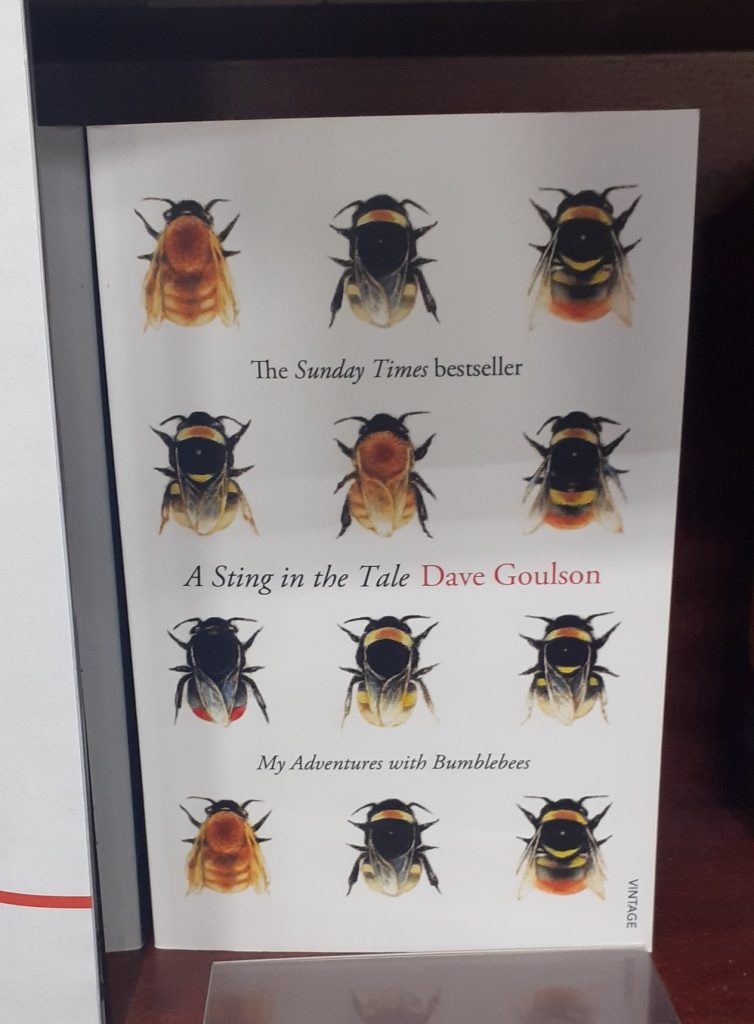
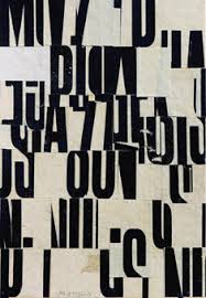
(Below) from the book display in the Bodleian Library book shop.

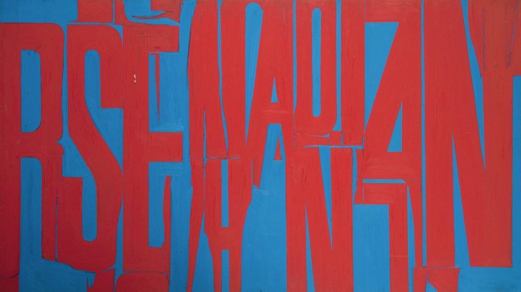
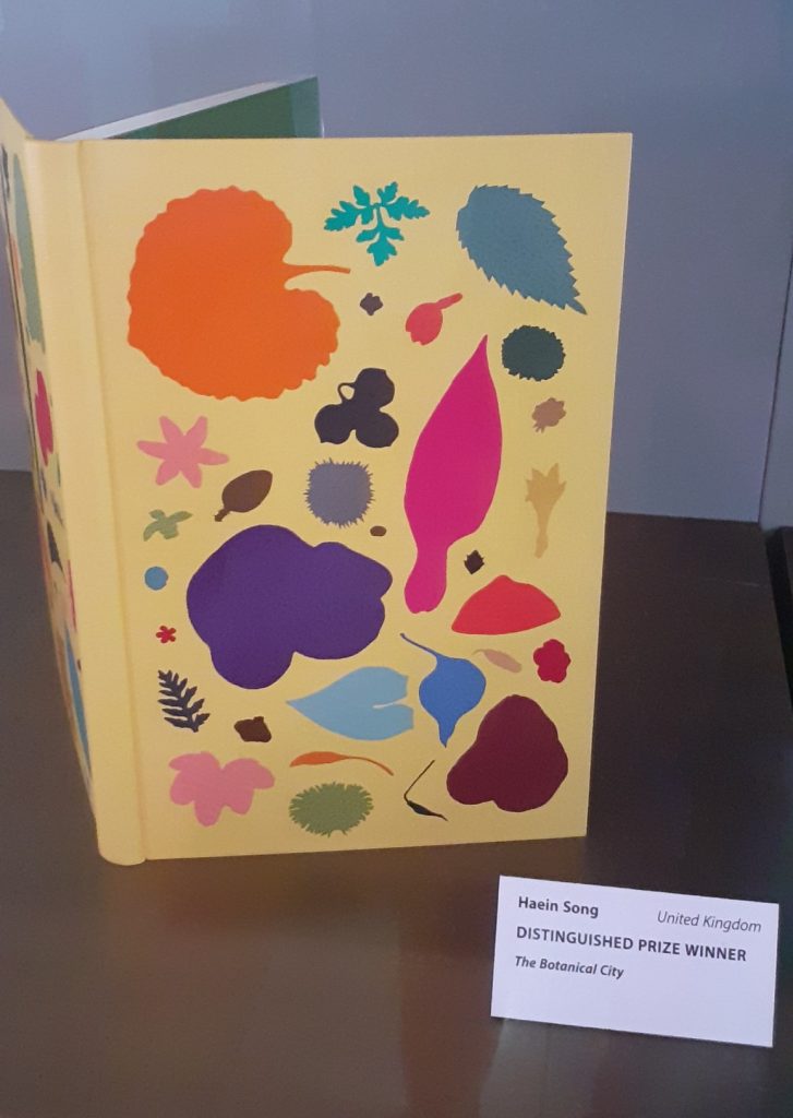
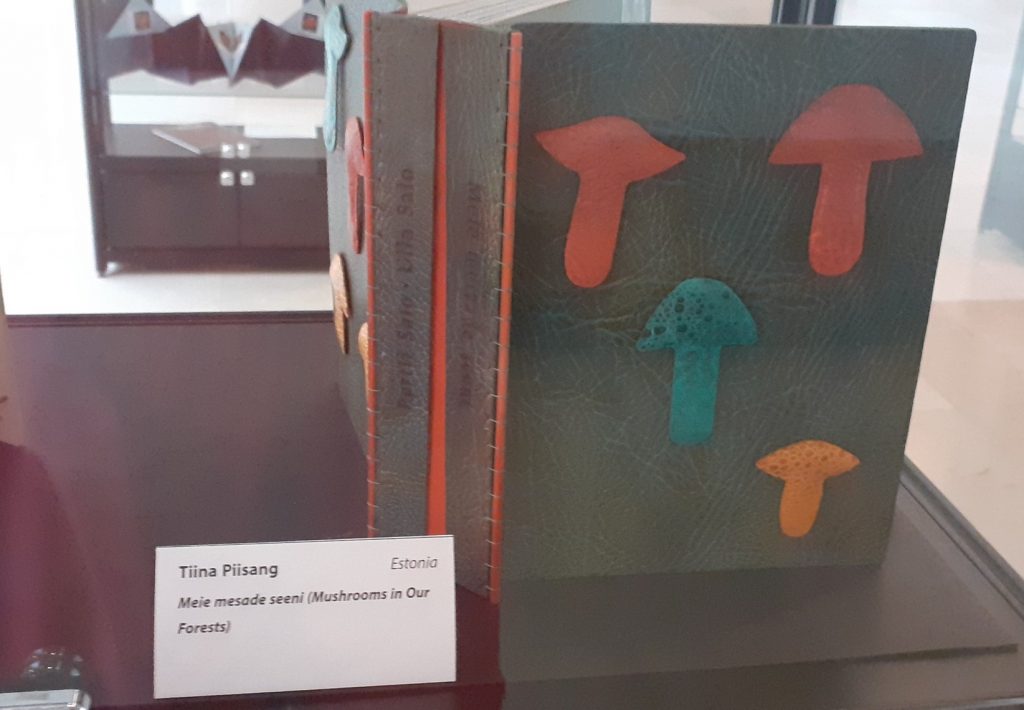
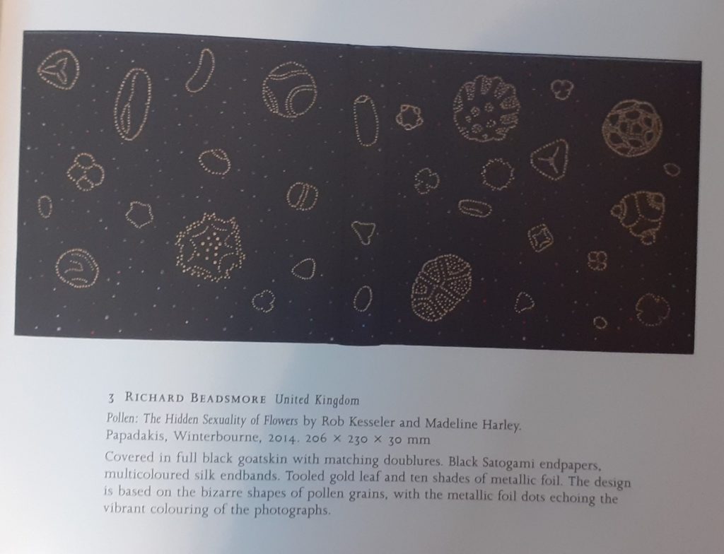
(Below) From the Designer Bookbinders International Competition 2022 exhibition at the Weston Library, Oxford.

Even numbers of objects don’t usually work well in groups, but these mushrooms work as a composition, because 2 are the same colour.
Design based on pollen grains. The dark background works well to show off the details of the objects in the foreground. I am reminded of constellations.

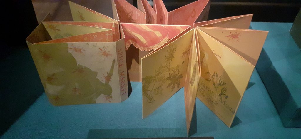
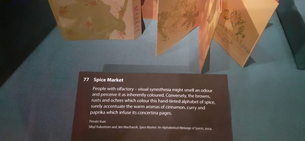
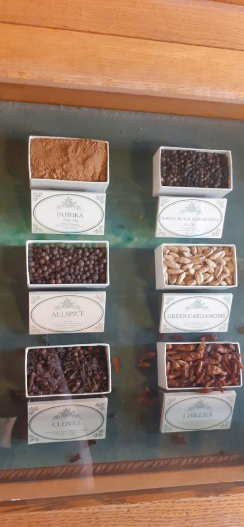
(Below) I really liked this book from the Sensational Books exhibition at the Weston Library, Oxford. The book presents different spices, each illustrated in different colours. The colour and texture of the paper chosen, reflects the warmth of the spices.

Contextual References

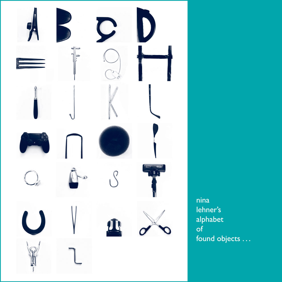
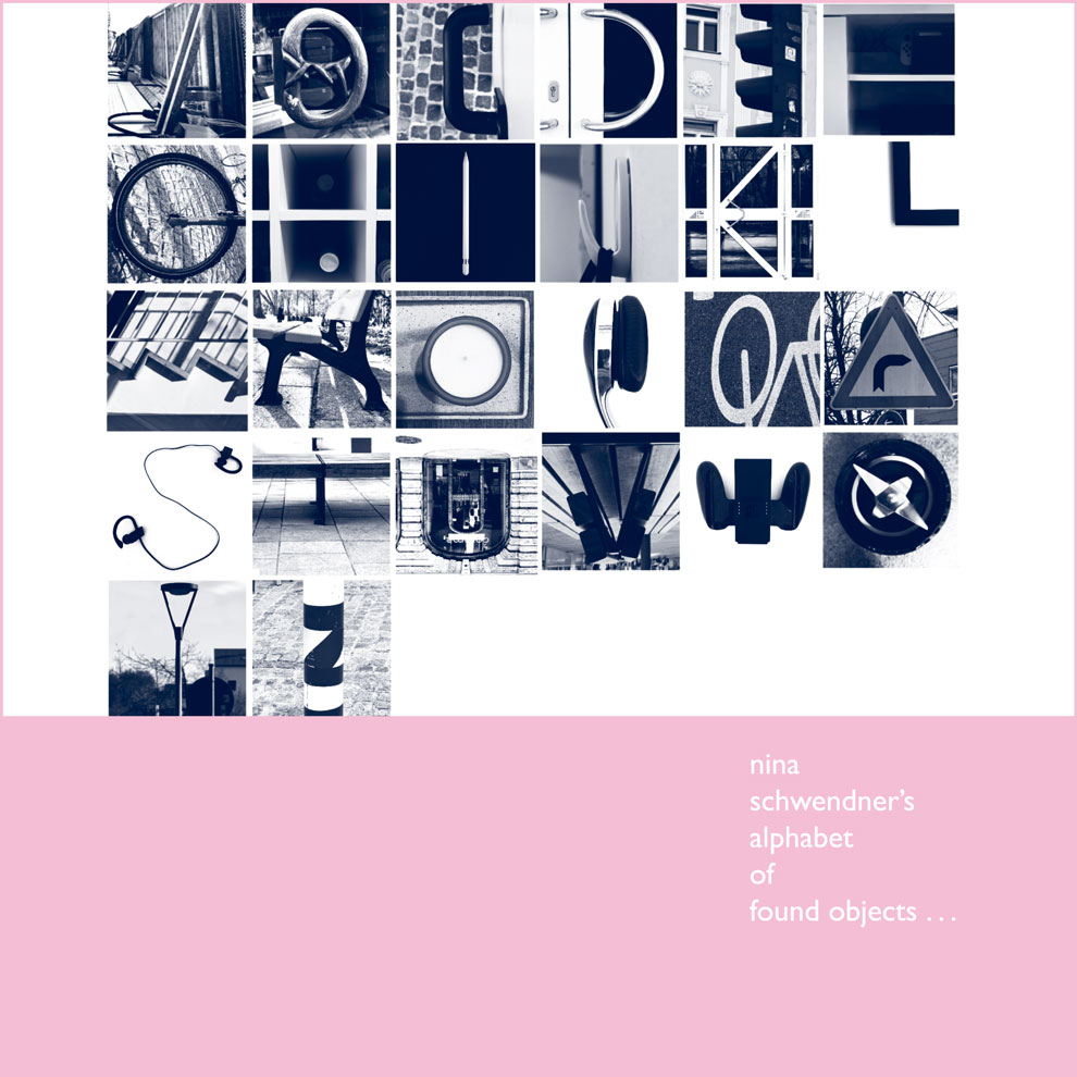
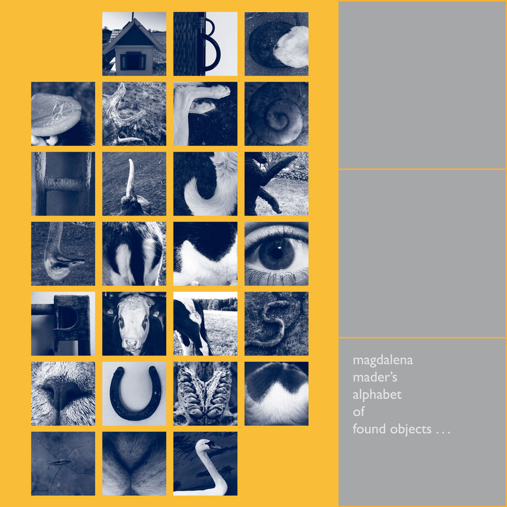
I looked at Artists who have explored collecting within their work.

Example 1: Susan Hiller

Susan Hiller’s Fragments

I deal with fragments of everyday life, and I’m suggesting that a fragmentary view is all we’ve got.

[b434d1] Hiller cited in Ann Gallagher (ed.), Susan Hiller, exhibition catalogue, Tate Britain, London 2011, p.87.

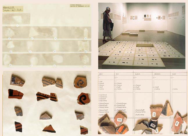
The artist Susan Hiller created her art installation Fragments in the 1970’s. The piece is made of many broken pieces of pottery. The pottery was originally made by native Americans and traditionally painted by women, as is the case in many cultures across the globe and historically.

Immediately, we can recognise a contrast between the asymmetrical and uneven pottery pieces with the tidy way they are organised. Also the contrast of the artificial white surroundings, that highlight the earthly and organic quality of these pieces that were made by human hands.

Fragments is as much about how the pieces are arranged than about the pieces themselves. It seems like a collaboration between the original crafters of the pottery and the artist who has been drawn to these pieces. Heller has approached the artwork almost in the way an archaeologist would handle fragments from an excavation site. This shows us the consideration she has for the history of the objects.

Example 2: Penelope Umbrico

Penelope Umbrico’s Bed/Pillows/Paint

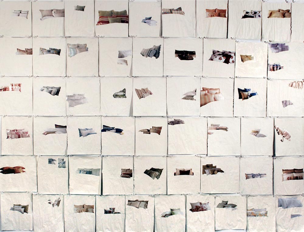
The artwork (above) has also been created by the artist going through the process of building and presenting a collection. One difference is that each object of this collection (a photograph image of pillows), appears to follow no pattern or categorisation. Each magazine page is roughly the same size, since she sourced the images from the same magazine. The difference is where the pillows appear to float on the white space. I like that this is unexpected and different on every square. It leads us to imagine what would have been on the rest of the page, now covered with white paint. Her process was more about selecting and erasing to highlight one object to the audience. The colours and sizes of the objects vary but she shows this no importance, since they are placed at random.

A section of Umbrico’s Backwards facing cats (eBay)

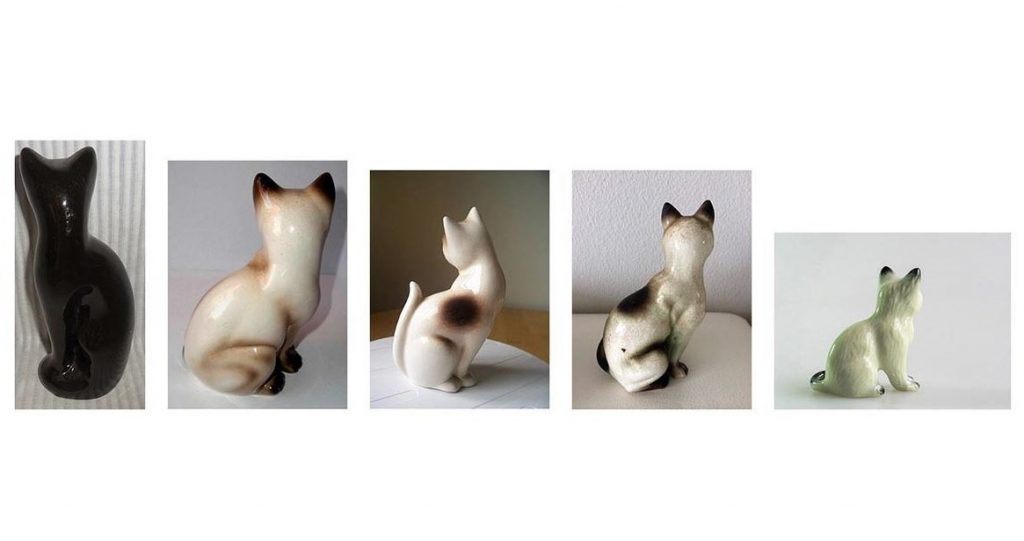
With this piece, Umbrico is again being selective with her objects. She hasn’t chosen every ceramic cat for sale on ebay, but instead is only showing us the cats that are facing away from the camera and therefore the viewer. Like with the pillows artiswork, she is also using found images, as these photos have been taken by the sellers who are selling the ornaments. She is focusing on this choice of the seller to present their object this way. SHe is making a comment on how we add life to inanimate objects with out own sentimentality/imaghination/emotions.

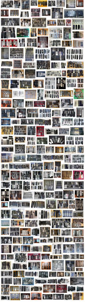
Universal Remotes is another installtion using found images from ebay. However, in this colection, the remote controls are grouped into smaller collections within the larger collection of the artwork itself. This adds another layer/dimension which for me makes it more interesting to view.

We can almost see the different personalities of the ebay sellers, because of the way they have chosen to display the same object in many ways and also the background they have chosen to use varies from square to square.

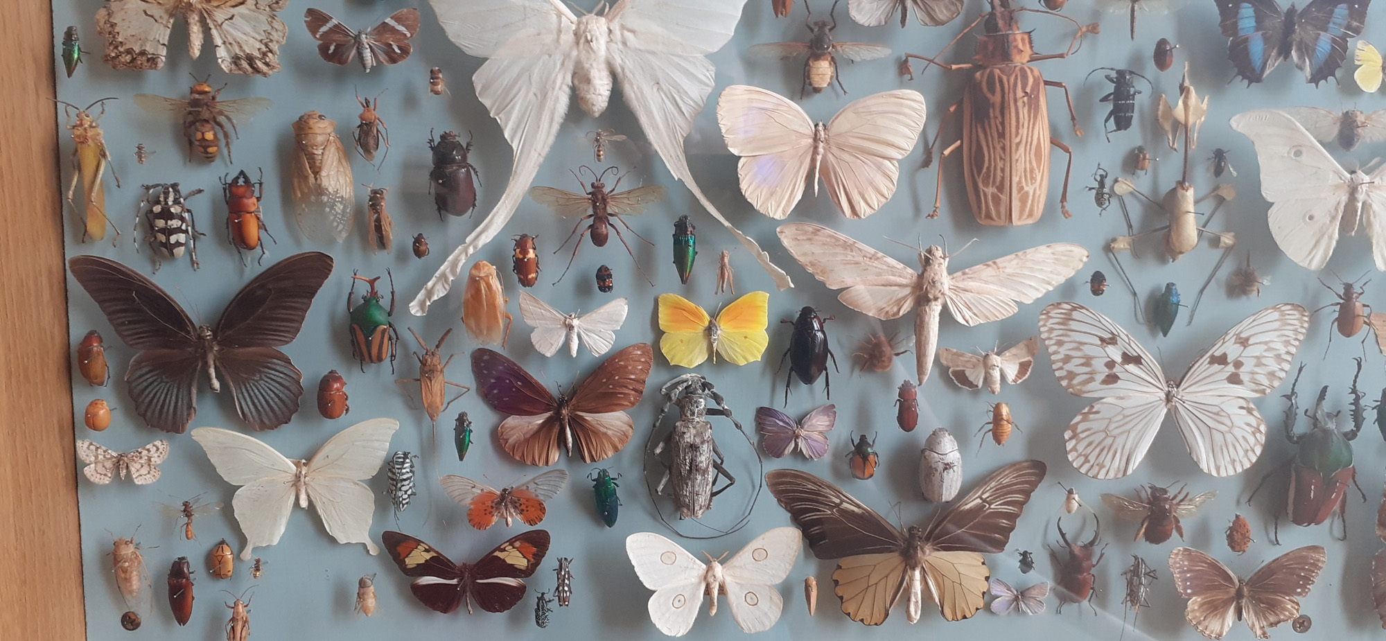
Example 3: Damien Hirst

I love how different forms of display affect what the eye sees. It’s bound up in my interest in the Victorian obsession with nature, or really the dominance of man over the natural world. Those Victorian natural history displays are so stupidly self-confident, it’s nature seen through the eyes of man, beautifully ordered according to aesthetics. They’re meant to be about the natural world but they’re more like zoos — fake places or facades of reality.

Damien Hirst, https://www.christies.com/features/Damien_Hirst_as_Collector-5683-1.aspx
Damien Hirst, Last Kingdom, 2012

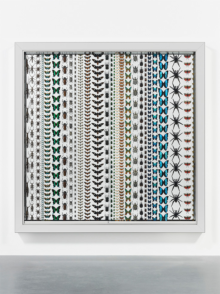
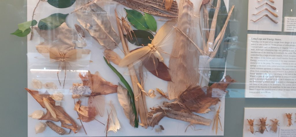
Last Kingdom is a collection of insects, like most of the work Hirst is known for, preserved in an installation. I would describe this piece as decorative, it almost reminds me of a wallpaper pattern design. Unlike the previous works we’ve looked at, these insects are divided by species and placed in an orderly way with equal spaces between the objects. He has considered colour and size in this collection.

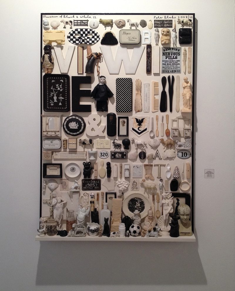
Example 4: Peter Blake

Peter Blake, Museum of Black & White

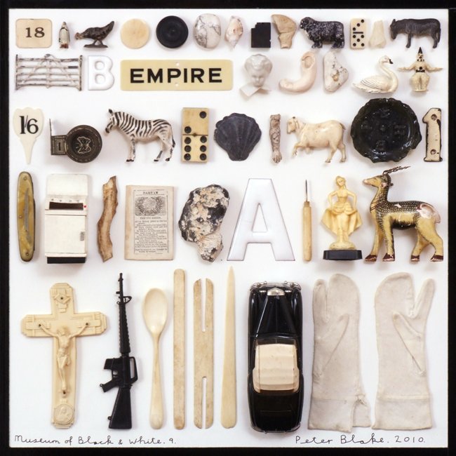
This artwork tells the story of the 20th century by using a variety of objects found from this era. This piece was inspired by the artist Mark Dion.

Dion, an American conceptual artist, is known for his literal archeological digs and museum-like presentations of his finds. 

Matthew Rose, 2016

Placing the rows in size order makes the art work pleasant to view. The neatness is museum-like, but the randomness of the objects’ function makes it different to a museum where more logic is applied to the placement.

The name of the piece refers to the selection of black and white objects only in this collection. Other than colour, these objects have no other obvious theme in common collectively. The viewer would need to have previous knowledge of history to know that these objects could be from the same century, for example.

I really like this artwork, I feel that the muted colour palette helps me to focus on the shapes themselves. (Bright colours could be distracting). I also like the familiarity of the objects. They might not be an exact artifact I have owned, but they are pieces of the culture I am familiar with.

https://www.theartblog.org/2016/11/peter-blakes-archeology-at-galerie-claude-bernard-paris/

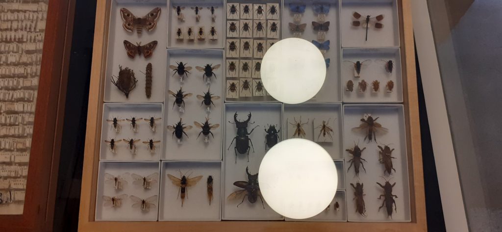
Trip to the Natural History Museum, Oxford

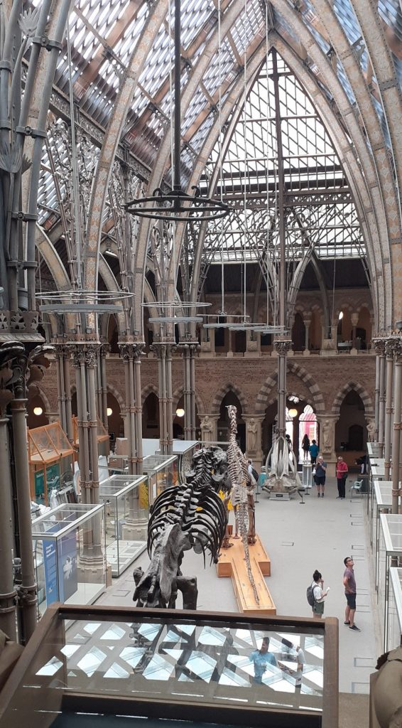
This week I returned to my favourite Oxford museum, to observe the nature of collecting and displaying artefacts. I wanted to gain some inspiration for how I could categorise objects and arrange them as a collection.

Insects grouped by insect family. Smaller boxes slot into the larger frame neatly.
Shells arranged from smaller (top) to larger (bottom)
Artistic arrangement of insects. The smaller bugs are used to fill in gaps. The result is beautiful and slightly chaotic.

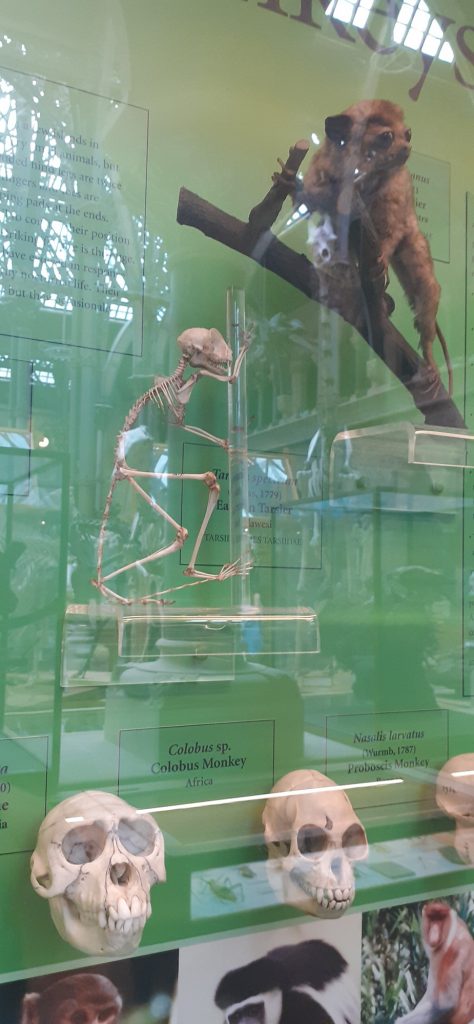
Part of the primate display. Skulls grouped together. Head (bottom) to body (top). Diagonal arrangement leads the eye across the display.

Skeletons arranged in order of size from smaller (front) to larger (back). Symmetrical placement, creating a kind-of mirror image.
The objects are placed as they would likely be found, to reflect the natural world.
Spices grouped and separated into boxes.

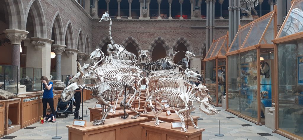
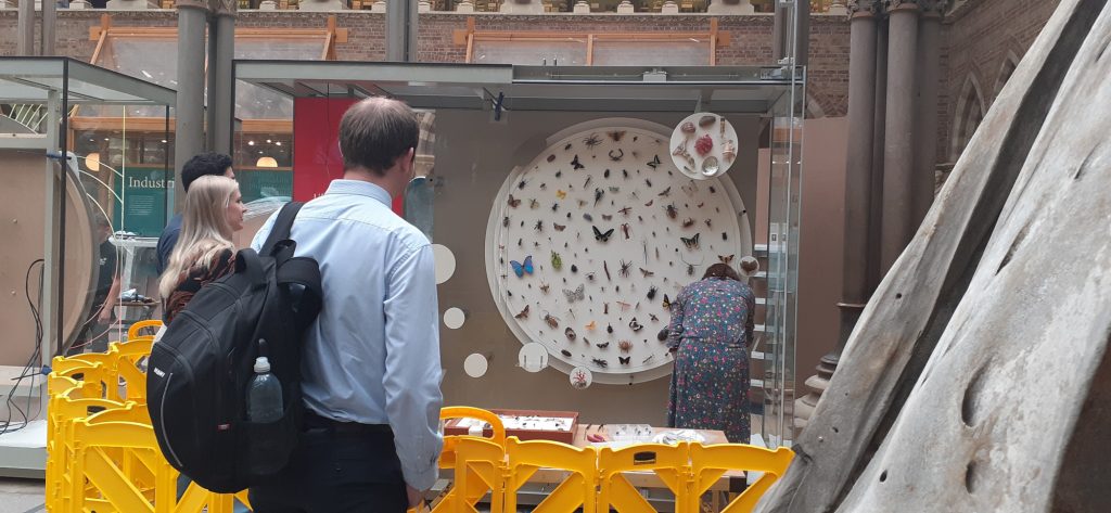
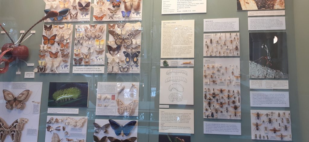
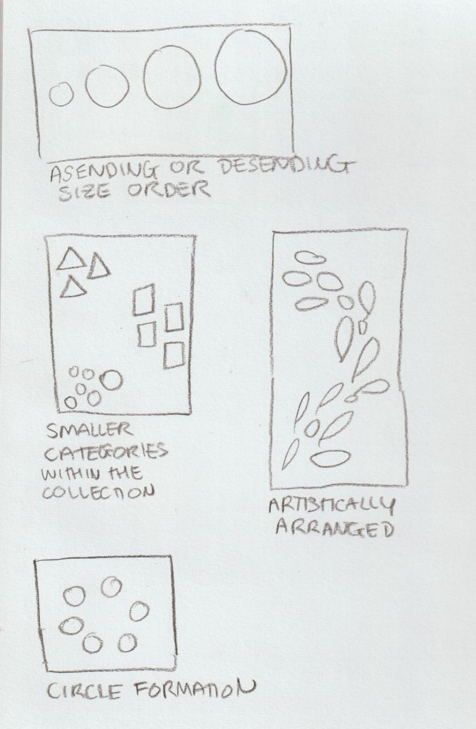
From the museum trip, I reflected on the arrangement of the objects and recorded these observations in my sketchbook:

Then…

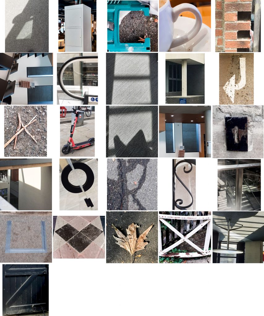
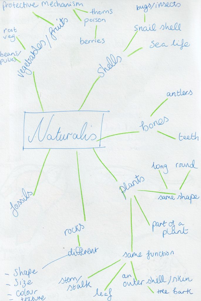
To decide on the objects I wanted to collect, I drew up a mind-map to consider what would make an interesting collection:

From this list, I narrowed down my options and went to Christchurch Meadow to collect from nature. I chose this area because of the variety of trees and wildlife I knew I could find here.

It was then time to arrange and rearrange these objects…


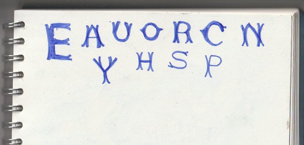
Definitions I learnt today:

heterogeneity

/ˌhɛt(ə)rə(ʊ)dʒɪˈniːɪti/

noun

  1. the quality or state of being diverse in character or content.”the genetic heterogeneity of human populations”

disparate

/ˈdɪsp(ə)rət/

adjective

  1. essentially different in kind; not able to be compared.”they inhabit disparate worlds of thought”

Left to Right by David Crow

I read a section of the book Left to Right by David Crow. This is a book about visual culture. David Crow was a graphic designer and Pro Vice chancellor of UAL, up until his death in June this year.

The book looks at the shift from the written word to image in our everyday experience/ mass media. It also introduces us to the politics of language, for example how the rise of literacy played a part in the subjugation of women and feminine thinking.

Book cover for Left to Right by David Crow
  • Language has evolved from culturally specific roots i.e. the Japanese character for picture, combines the symbol for ‘threads’ and ‘to draw together’ > this is a reference to textile production. This demonstrates the relationship between language and technology.
  • In Chinese script, this is still the case, for e.g. Male = Strength + Paddyfield. This reflects the history of the culture which the script originates from.
Chinese characters.
  • Television= ‘The single most potent technological innovation since the printing press’. Television changed the way we generate language and consume information. Reading was a more solitary activity- the television allows us to receive information in groups, e.g. a family gathered around a TV. This invention produces a way of reading images unlike what books could provide.
Young boys watch television at Sun Village Orphanage Home.

Shifting from Left to Right side of the brain

When we read, our brains have to translate the words from symbols into an image, this is a longer process than seeing the image immediately on a screen for example.

The development of screen-based media has increased image-based use of language. The shift away from the alphabet-based language has left language makers, such as designers, artists, authors and schools, needing to re-assess how they communicate to a new generation who are used to this new way of reading/ taking in information.

Television Broadcast, 1972.

The written word has been the primary tool in communication for a long time. It has the advantage of being able to get across specific details in an unrivalled way.

…However, pictorial communication has other advantages.

  1. To speak across language barriers
  2. It’s cheaper to share across the world
  3. It’s quicker to share across the world

e.g. images on warning signs can be affective where language might fail to keep people safe.

1990’s

Technology in the early 1990’s allowed designers to design typefaces digitally and this meant a boom in design houses whose main focus was on designing and distributing typefaces- increasing the interest in post-modern theory.

These designers were experimental with the software, coming up with a new conceptual framework. Art schools and graphic design courses were beginning to look at semiotics and linguistics. The designer was looking to create a new relationship with the keyboard. This was a turning point. From this period, it seems that our visual landscape is being pushed towards the image.

Glossary of terms

From Left to Right, David Crow

The Origins of Writing

Ice age wall drawings are described by Adrian Frutiger as ‘an early attempt to visualise language’. It is thought that these drawings were only a part of the communication between people. They are the part that remain as a record of these ancient peoples. The body was used as a reference very often. These pictorial signs can be described as ‘protowriting’.

Ice age wall painting, thought to be a bisexual symbol.

Writing originally was needed to make a record of the exchange of goods.

Ice age painting on a clay wall, drawn with fingers, subject: oxen

Connecting writing with sound

A rebus communicates more detail than simply pictographic script. It represents sound associated with an icon. E.g. the image of a bee to indicate the Roman letter ‘B’.

James Francois Champollion discovered hieroglyphics were a mixture of semantic and phonetic signs.

Utopian Ideals

17th century philosopher Gottfried Wilhelm Von Leibruz imagined a writing system using images to describe human communication. The idea was that it would avoid the use of the alphabet and therefore, would be able to span across all languages. (Similar to how music is understood universally).

Sound and thought cannot be divided.

Saussure & Andrew Robinson, The Story of Writing

The meaning of a pictogram is likely to change from reader to reader, due to the individual’s cultural background. Pictograms are too open to interpret specific details. They lack sound and therefore, precision.

Isotype Institute

Otto Neurath was a Viennese philosopher and sound scientist. He came up with another pictorial writing system. His intention was that it would be:

  1. visually appealing and
  2. easily accessible.

This is because he needed it to be understood by a wide range of people across Austrian society. It became popular and was used to present public information.

  • In 1936, this language was renamed ‘International System of Typographic Picture Education’ or ISOTYPE.
  • In Oxford, Otto and Marie Neurath founded the Isotype Institute. The aim: ‘International promotion of visual education.’
  • Symbols of people, places, objects and actions were used in educational material.
  • They produced films, leaflets, posters etc for the Ministry of Information during the Second World War.
  • This pictorial language was intended to remove hierarchies and create ‘greater human happiness.’
from Only an Ocean Between, 1943

Personally, I find that these charts make the statistics easier to understand. One example is the charts made on the structure of the British government. They are able to simplify a system I find too complicated to understand when someone explains it verbally to me. (example below)

https://alphaomegatranslations.com/business-translation/translation-and-universal-icons/
  • Isotype= alternative to written and verbal communication. It focused on out commonality rather than our differences, being an international language.
  • The First World War highlighted the political nature of language.
The Shelly Camp, For Better Days!‘, Yarom Vardimon (1981). It was the main election poster for the Shelly Camp, a political party in Isreal.
  • Neurath was inspired by ancient picture writing systems, this inspired him to use few words in his system. He found words to be more immediate and forceful than words.
  • Their work grew from what they saw as a genuine social need to reconstruct Vienna after the war’s destruction of the city.
Political poster, 1936
(More Men! More Weapons! More Munitions!)

The Politics of Writing

The appearance of writing is linked with the appearance of hierarchical societies- even ancient scripts were used for propaganda. (Having authority over a group of people).

The Principles of Isotype Symbols

  • Neurath’s communication system was rooted in linguistics.
  • Images were intentionally mechanical for easy and quick reproduction.
  • The symbols were created by cutting the shapes from coloured paper.
  • They were then developed into letterpress blocks. This allowed them to be printed in different colours and sizes.
  • Isotype symbols are simple, geometric, with a machine aesthetic, echoing the industrial design/ architecture of the time.
  • He was in contact with the Bauhaus and friends with graphic design’s leading figures of the time- El Lissitzky and Jan Tschichold.
  • He was focusing on designing for the future.
Isotype Society Archive- Signs for the 5 groups of men.

Neurath had the intention of timeless design, but some have dated. For example, his symbol of a car is old-fashioned now (below). He knew they might date and acknowledged this. They have mostly stood up well against the test of time.

‘Numbers of motor vehicles in the world’ (USA and rest of the world). Even if one cannot read German, the subject reveals itself through the ‘speaking signs’ of the automobiles, each of which represents 2.5 million vehicles.

Neurath found that a sense of perspective in these images was unimportant. He instead decided on silhouette drawings.

Isometric projection= objects in foreground and background appear to be the same size.

Isotype & Colour

Specific colours were assigned to specific objects, for example men painted darker than women. The colour and tone are applied strategically, similar to Egyptian wall paintings.

Isotype used 7 colours: white, blue, green, yellow, red, brown & black.

Some colours were also sometimes mixed e.g. the red and yellow to create orange.

Assigned meanings:

Red > metal industries

Blue > textiles

Green > wood

(The system could be adapted for situations where only 2 colours are available.)

https://hyphenpress.co.uk/journal/article/copyright_in_isotype_work

Isotype & Linguistics

https://hyphenpress.co.uk/subjects/Hyphen%20news

Isotype is designed as a ‘digital language’, as in the alphabet we use. This means there is a fixed number of signs in the Isotype language system.

It is designed to be read from right to left and top to bottom. For example, the symbol that has a bell on the left and symbol for porter on the right, indicates the bell is used to call for a waiter. Changing the right-hand symbol would change the message to bell to call for ________.

Neurath acknowledged the value of using age-old symbols, such as the sickle to represent agriculture, since even though not used as an instrument today, these symbols are deep in the collective consciousness.

The arbitrary nature of language can sometimes fail in helping people comprehend a meaning, for example, the word ‘man’ bears no resemblance to a man. The Isotype symbol of a man however, resembles a man visually, making it practical/ successful as a symbol.

The picture language was not intended to replace written language, since symbols aren’t the most effective way of expressing emotions, feelings, giving orders etc.

Blissymbolics/ Semantography/ The Visual Language of C.K.Bliss

https://www.blissymbolics.org/

Also beginning in Vienna, Karl Kasiel Blitz (Bliss) was dissatisfied with the language used for science- he felt the language was a barrier for understanding. He experienced the problem of language during his childhood on the Russian border.

He was more drawn to/ comfortable with the blueprint images found in his father’s work as an electrician, e.g. symbols for bulbs, batteries, switches etc. He felt these were more logical compared to the alphabet.

Bliss came across Chinese script while in Shanghai- he was fascinated by its complexity. He later came up with ‘Semantography’, which was his version of an international language of symbols. This language combined 100 symbol elements.

The Book to the Film ‘Mr. Symbol Man’

The tourist industry boom around 1965 made his work relevant. (People found blissymbols useful because it bridged language barriers). However, he was often not credited with this work when research pages were written on pictorial symbols.

The 1970’s saw his work used in communication for children with speech and physical impairment, by the Canadian teacher Shirley McNaughton. This was documented in the film Mr Symbol Man.

In 1975, Blitz was nominated for a Nobel Peace Prize as a result of his work. This work being for ‘Services to the community’ (children with learning difficulties).

An excerpt from Bliss’ book, Semantography: A Logical Writing for an illogical World

Neurath and Bliss were motivated by personal experience. Bliss, by his experience of WWII. He saw language being used to control people, this is why he wanted to create an alternative.

Election poster with drawing of eagle, the state’s symbol, on a swastika, before a large crowd of mostly young people and students (fraternity-uniforms), in posture of the Hitler-salute, (1933)

Words serve as a useful tool for making a political statement, since they can express specific details and do not require drawing skill:

Questions New York Moscow Part II: What is the Line Between Us?, Douglas Davis, 1976 (During the Cold War).

Bliss’ aim was for effective communication. He had the ‘original desire to design something that would improve people’s lives.’

Using simple shapes makes the symbols easy and quick to draw.

Blissymbolics consist of:

  • Basic geometric shapes: circle, square etc
  • Additional shapes: heart, house, chair
  • Arrows and pointers (in 4 directions)
  • Arabic numerals
  • Standard punctuation marks

Guidelines published by BCI- The Fundamental Rules of Bissymbolics: The marks are arranged on a matrix square with earthline, midline and skyline.

Blissymbolics/ Linguistics

Similarity between Isotype and Blissymbolics:

  • Improving human experience and breaking down linguistic barriers.

Difference:

  • Bliss claims his system as a language, whereas Neurath saw his system to work alongside text.

The mixed reaction to Blissymbolics was due to its ambitious claim to be its own language. Blissymbolics requires readers to learn the symbols prior. The system is a mixture of iconic signs, ideographic signs and arbitrary signs. The size of the sign is also significant.

Larger circle = sun

smaller circle = mouth

It is inflexible as a language. Any changes have to be approved by the BCI – not allowing the language to develop organically as would be the case with most languages. But the logic behind the symbolism has been called ‘charming’, ‘admirable’ and ‘interesting’ by critics. It is easier to appreciate this system as a set of symbols and ideographic pictures.

example:

Cool= slang + ice

Adrian Frutiger

Typographer and designer for international corporations, Adrian Frutiger designed Univers, the widely used corporate typeface:

Univers poster by Rokaya Shenasa
Type, Sign, Symbol by Adrian Frutiger (1980)

In his work, he needed to consider international communication issues. He designed pictograms to accompany his typefaces. His work with exploring the Indian script of Devanagari, allowed him to explore cultural context as well as letterforms.

Frutiger’s pictorial script is symbolic and needs to be learnt, unlike Isotype signs, which are more intuitive since they represent the object visually. Frutiger’s symbols are more abstract and based around ‘life, love and death’.

The reader needs to understand the basic code of the symbols, so they can understand the meanings based on the sign’s scale and position. Some metaphor is also used.

Graphismes by Frutiger, Monotype House, 1964

These symbols have been described as beautifully balanced symbolic marks, reminiscent of 20th century artists, the likes of Miro, Klee and Picasso. I have to agree. Using scissors and paper as tools enabled the artist to create shapes that flow, since the artist is not able to control the line very well.

These shapes are signs because each is distinct yet they are similar enough to be visibly connected. His experience in type design gave his symbols ‘economy of form’.

Frutiger also developed sequential drawings to be read as a narrative. For example, those depicting growth and birth in the natural world. These drawings reflect the way images are shown as a sequence on screen. These signs are more iconic- the scale changes to represent the growth of the plant.

Central to Frutiger’s work is technology and its relationship to human issues – the various ways we receive information. Putting people first, improving communication in a world where the expectation/ tendency is to subordinate man to technical progress.

Project #5 Create a found type collection

In the art world, words are often used as image, for their visual quality. Project #5 is almost the opposite thing: taking images and using them to create letterforms. (In a way that is functional and experimental.) This sounded like a fun project. It would require me to be observant and see the world afresh. I thought I would be seeing letterforms everywhere! It wasn’t as easy as this. I discovered that some shapes are more common to find than others.

When out on my quest for letters, I took more notice of all the letterforms around me. I looked at the typography of shop signs, as well as my mission for objects that look like letters. While in the Westgate Shopping Centre, I came across this interesting fabric used for the benches. I liked that I could recognise the shapes as parts of letters, even though no letter is complete.

This textile design reminded me of the paintings by William Klein and prompted me to have a look at letterforms within art.

William Klein, Letterist painting for murals (1963-64)

Known mainly for his street photography, William Klein also explored letterforms within his paintings. Here you can see they are purely used for their aesthetic value.

Cecil Touchon’s collages make use of letterforms. He describes his work as visual poetry. Or ‘poetry for the eyes’. This movement of visual poetry came from the concrete poetry movement. He likes to explore the boundary between art and poetry.

In the same location, above my head instead, I came across this installation.

When showing the photo to my housemate, he saw different words within the grid than I could see at first glance. The choice of layout invites the viewer to a kind of game of piecing words together, as in a wordsearch puzzle.

Secondary Research

The Alphabet of Found Objects

I immediately found inspiration in the title of this project, The Alphabet of Found Objects. The 2 words ‘found’ and ‘objects’. We explored objects in year 1 of our course. But I didn’t consider an object functioning as a letterform. This would mean a function that comes purely from the object’s shape. Maybe from a particular angle, since the shapes are 3-dimensional.

This project consists of students’ work for entry onto a design course in Germany. Nina Lehner has separately photographed the objects/letters against a white background. Keeping the same background makes the letters more uniform and look like they are part of a set. (Below)

I can see a deliberate staging of her objects. Her obvious manipulation of the objects takes away from the ‘found element’, which is my interpretation of the brief. I wanted to include objects I had really found and hadn’t touched at all – though her method does create letters which are easy to read.

Some of her obejcts are shot alone, surrounded by white space, but other letters are only a section of another object. This inconsistency is less satifying for me. I would prefer to use the same rule, or lack of rules for every letter. But this is only if I was being very critical.

(above) I prefer the alphabet by Nina Schwendner, as it tells more of a story. We can image the artist journeying amongst these placing in her quest for letters. I find myself wondering which she came across first and last. The monochromatic filter adds more mystery, but also helps the images read better as letters.

Having the letters united by a theme is satisfying to view. In this case, Mader has explored parts of animals. Flipping the image of the swan’s head works in this context, but I want to take the approach of less editing, more finding things as I find them.
Peter Defty

Photographer Peter Defty has produced a series of photos he calls city sky alphabets/ alphatecture. Each alphabet uses photos he took in different cities across the world. If you were familiar with a city, you could probably make the connection without the caption he has placed underneath each alphabet. However, its not necessarily obvious immediately that the photos are even from the same country or city.

He carves the letters from the sky, shooting mostly upwards. The buildings and other architectural features block in the sections of pale sky. His use of negative space is imaginative and not something I would have thought of.

Jason Ramirez

This collection contains colour, unlike the previous examples I’ve looked at. This might help with the visibility of the letters, since some of the lines are very fine and might be harder to see in a black and white image.

Ramirez has created this series of letterforms from various found cracks in the pavement. The letters looks spidery and natural, despite being found amongst the man-made world. I like their randomness, each shape is completely unique and you are unlikely to find another crack in the pavement that is identical to those he has found.

Naturally occuring cracks in the pavement
Irina V. Wang

I think the reason Irina’s work is effective, is because she has been selective. She hasn’t taken photos of just any shape that might slightly resemble a letterform, these shapes all look unmistakable. These shapes look as though they were naturally occuring in vegetables and she had the luck to find them.

https://irinavw.xyz/bits

Primary Research

I started looking at type more, in general. For example, while at the museum, I noticed some handwritten type on the wall. I copied this into my sketchbook so I would focus more on the letter structure. Drawing allows me to study the letter structure more closely. I noticed double lines , almost as if the designer had written a letter, then came back and sketched over it. I found the double lines interesting.


The Task:

‘Create a found type collection by shooting objects, shapes, lighting.’

‘Each image much be unique in subject matter and framing’

From the Project #5 brief

But there could be many categories within this brief. From looking at secondary research/ contextual references, I considered the possible themes:

found objects, built environment, architecture, indoors, outdoors, pavement/road, vegetables, animals, people, natural forms, things of one material/colour

Looking at the contextual references from project #4 and project #5 gave me a basis on what to look out for when I was out and about. I thought of negative space, of shadows, of broken lines.

I like the idea of the world around me/ chance determining the type instead of me curating the letters. Giving a creative project restrictions, usually helps with creativity.

Peter Defty has consistently used this white space as the letter itself, but I feel this would not need to be the case. I wanted to experiment with creating an alphabet from both negative and positive space and seeing if it would still work as a collection.

I began by focusing on letterforms I could see on the pavement and road (material: concrete), but was unable to find any more letters after the first few. (below- A, B, C, D, E, F, J, r, I) That was when I realised this task was not going to be as easy as I had anticipated. I was also surprised with the variety of markings I found when looking on one surface type.

As I began to struggle with the search, I wondered what shapes I was missing while looking down at the floor and started to look around me as well.

(below) The ‘J’ on the left was my original ‘J’. When looking around, I noticed a an outdoor tap in the shape of a ‘J’. Slightly rotating the image helps it read as a ‘J’.

I explored ‘2D’ & ‘3D’ letterforms.

Another example of uppercase and lowercase letters is the two ‘h’s’ below. The lowercase ‘h’ (left) is the side profile of a chair in my garden, the (right) capital ‘H’ is a handrail. The ‘H’ on the right would make more sense in an alphabet of other uppercase letters. I also don’t think I chose the best angle for the chair ‘h’, since it is not an obvious ‘h’ in this photo.

I liked the way the pattern of light helped to form this ‘P’ in the centre. (above)

The ‘P’ on the right works because the 2 objects appear to intersect from the angle I was stood. In reality the objects were set at a distance from each other (the red navigation board and hand rail of the escalator).

A collection of A’s (below). Again, I was able to use lighting to draw the letter ‘A’. In hindsight, I would have created a shadow type collection.

I took this photo because of seeing the ‘T’ form of the metal railing. But on later inspection, I could see other letterforms within the same photo (below).

‘I’

What I first saw as an ‘S’ on the side of this building could be broken down further into…

I took this photo when noticing the door handle could become a disjointed ‘O’. However, I then saw if I tilted the image slightly, it could be read as a ‘Q’ (below).

This aerial view from the upper platform of the Westgate Shopping Centre, contained several shapes within the architecture that I could pick out. Here I have highlighted them in different colours. ‘n, H, F, C’.

When researching type, I came across this poster design for Elektra records by Seymour Chwast. I liked the variety of unusual and playful objects featuring as letters. The designer chose objects which could express movement, since the company were moving locations. The colours are exciting and give the caption a lot of character. Within the letters, the designer has used a variety of stripes and shapes as well as angles. The angle of the ‘L’ in particular helps add movement and energy to the composition.

Having found that my found images were pretty random, I then needed to narrow down and define my collection into an alphabet that worked coherently. I then enhanced each photo so that they could be read more clearly.

This was the first collection I decided on:

2nd version of my alphabet:

I changed some letters around to alternatives, to see how the collection worked as a whole. I prefer this 2nd version, since some of the letters look more refined and impactful. For example, this ‘Y’ fits in better because it is made from geometric shapes as well as shadows, which makes it more similar to the other letters. The ‘Y’ from the first version was a tree form and so it stood out. I have chosen to include as many shadow letters as I could.

Reflections-

How was Project #5?

More challenging than I expected. I found it difficult to mould the project around my ideas. Instead, I was having to adapt to the shapes I saw around me and therefore change from my original ideas.

I could have collected small objects together purposefully to create type from, but I wanted to be inspired by the myriad objects in the world around me. the randomness of the world felt like a more useful creative area to pull from. I’m not displeased with my collection!

What did I learn?

To create a great found type collection, it could take years to collect together the perfect letterforms. Being restricted by a time limit, I could have been bolder and more decisive with my choices. For example, focusing on more of a narrow theme/category, for example ‘natural objects’ or ‘metal objects’.

Having a deadline means I sometimes needed to select the best letter in terms of legibility, I couldn’t then afford to focus too much on the material or theme of the individual image if it compromised the object’s readability.

What did I enjoy?

I enjoyed becoming more familiar with letterforms and exploring the topic of type from a new angle. (Phyiscal objects translating into text).

What materials/ techniques did I use?

I used my phone camera to take every photo. I then used photoshop to enhance the images, crop them or rotate them. I used Illustrator to place the photos on a grid (for example the pavement letters).