Literature Review Reflection

Time for reflection…

It’s week 4 of first year Graphic Design. The first written assignment has been submitted.

The writing of the literature review was not the hardest part for me. The struggle was sourcing the sources. I can’t help feeling I need to learn from this experience, or I’m destined to go through the same problems next time. 

What was the problem?

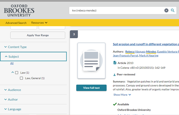
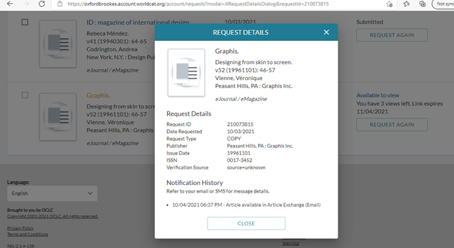
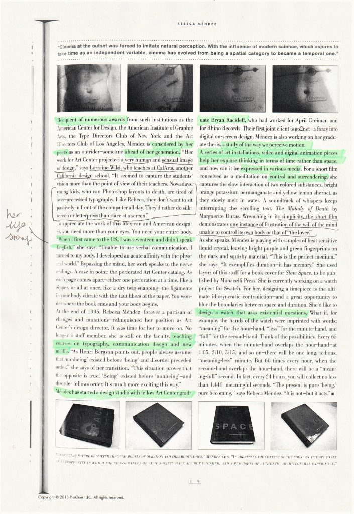
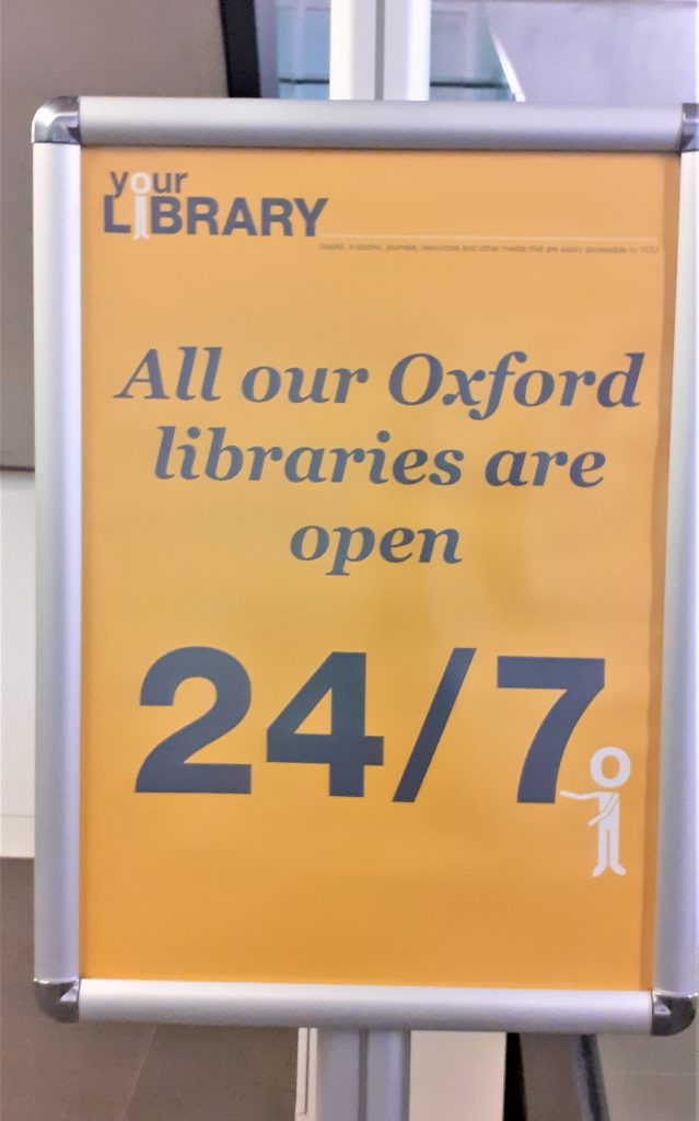
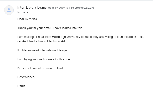
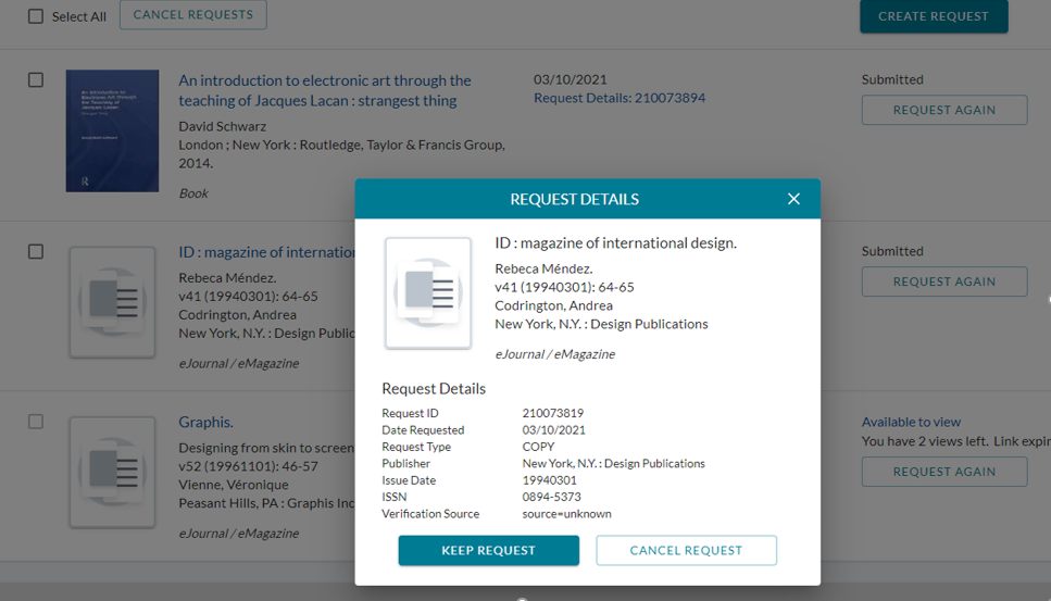
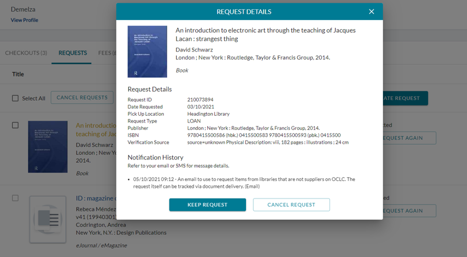
The library had 2 useful sources: 1 eJournal article entitled Rebeca Méndez by ID (The magazine of International Design) and a book called An introduction to electronic art through the teaching of Jacques Lacan: strangest thing by David Schwarz.

I ordered them as soon as I could (3rd October, 11 days before the assignment was due) only the library did not yet have them available. I returned to the library, I asked at the help desk where I was told that a physical book could take around 5 weeks to arrive. As for the eJournal, the librarian could not understand why it was not sent the same day as the other eJournal I had access to days before and had ordered on the same day.I then emailed Interlibrary loans. The reply I got was:

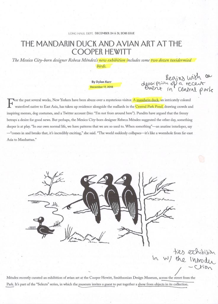
I emailed again the next day and still had no result. I was disappointed, because these sources were ideal for the assignment. They came from an academic, reliable source. At the last minute, I was forced to replace these sources with 2 from the internet. The positive/ useful thing was that I gained new knowledge about Rebeca Méndez through these 2 sources.

Because of this, I ended up with 9 sources where only 1 was a book, 4 were journals and 4 were online sources.

The eJournal I requested.
The book I requested.

What could I have done differently?

  • I have gone to the Bodleian library or tried the City Council library.
  • Possibly I could have emailed Interlibrary loans earlier. However, from speaking with my lecturer Luisa, I discovered that some books are quick to come through Interlibrary loans, and other books will take longer.
  • I could have asked the librarian Chris Fowler for help. I did email her only a day after we had been assigned the literature review. However, hearing no reply, I assumed she was busy and left it at that.

What did I do well?

  • I found it helpful to have used my notebook when getting down initial ideas.
  • I printed out every article which helped me to absorb the information and made it easy for me to refer to the article later on during the writing process. Highlighting certain areas also helped me to find the key points quickly.
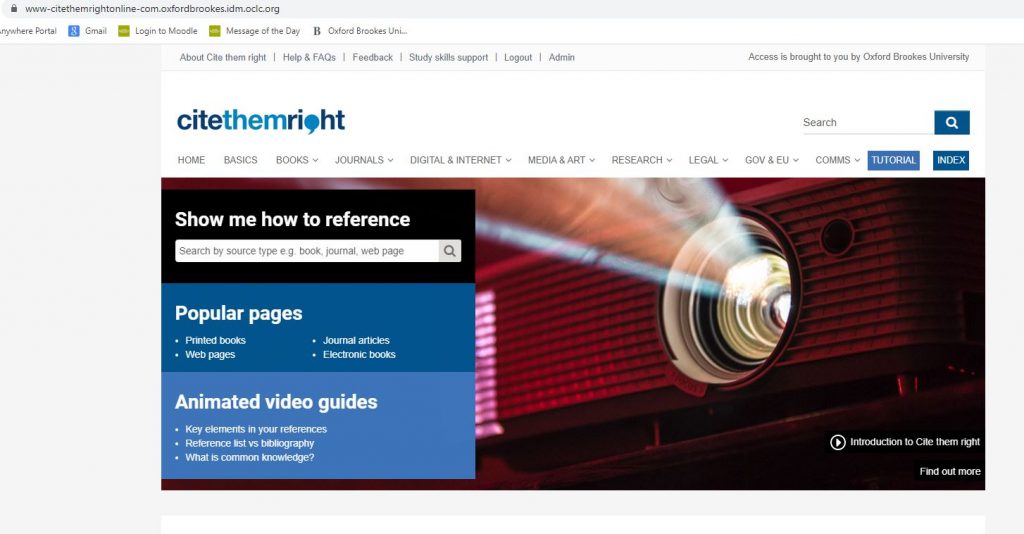
  • I used Cite Them Right for referencing the articles.(I got to the site through the Brookes library web page.
Cite Them Right was very easy to use and gave me templates for correct Harvard Referencing.
Printed and annotated article from The New Yorker.
Practicing at the Boundaries article. Printed and annotated.
Notebook notes on article by the Daily Bruin.

In today’s lecture, we discussed why it may have been difficult to locate sources on our given designer. The main reason was that the designers we each looked at were female and mostly did not speak English.

Luisa explained how requesting a book at Brookes library is helping to add to the library’s collection. If a book exists out there, it is possible to ask for our library to buy the book for us.

My classmate brought up the fact that it is not always easy to tell the difference between an academic and non-academic article. I had to agree with this.

I discovered that an academic source is longer, has foot notes, is usually not open to everyone. You may need an academic affiliation to access the article. Academic articles are backed by research. They are also checked by an academic and approved before publication. It is possible to view a digital copy these days, but usually an academic journal will be in print.

Book sourced from Brookes library with reference to Rebeca Mendez.
Page from How Posters Work by Ellie Lupton.

Writing & Research Skills

Literature Review

In week 2, our lecturer Luisa assigned each of us a female designer to research. The designer I was given was Rebeca Méndez. She is a contemporary graphic designer and fine artist. Méndez was born in New Mexico in 1962. Within her art, she focuses on environmental subjects, systems, cycles natural and human phenomena. She expresses her concepts through film, photography and installation.

Never Happened Again, Glaciers 2 – artworks: rebeca mendez (rebecamendezstudio.com)
Life is Magnanimous: Rebeca Méndez and I – Alfalfa Studio

When searching for research material, my first instinct was to go to the Brookes library. ‘Library search’ on the Brookes website searches for journals, ejournals, ebooks, books in print and collections. I typed ‘Rebeca Mendez’ into the search bar.

All the results were for Law books.

I then searched in other places and kept a record of where I had searched.

Search History:

Library search no luck

Oxford Reference no luck

Bridgeman education no luck

Oxford art online no luck

I sourced 2 ejournal articles and was able to request them from the library.
I printed the article and used pens to highlight and annotate.

In week 3’s lecture, we were asked to write the first 100 words of our assignment.

We then shared some of what we wrote and received feedback. It was helpful to hear Luisa’s feedback for my classmate’s work, as I found myself making the same mistakes as them.

For example, a few tips she gave us to think about:

  • “One interesting aspect of the book…” instead of “It’s interesting.”
  • “The author recounts…” instead of “the author says.”
  • Avoid long quotations
  • “The article places emphasis on…”
  • Focus on the core aspects of the interview.

Within this week’s lecture, we began by watching Ways of Seeing. This is a documentary from the 1970’s with John Berger. We watched part 4 and made notes.

John Berger / Ways of Seeing , Episode 4 (1972) – YouTube

This is a BBC documentary, aimed at the wider general public in Britain. Berger delivers the documentary in a didactic style.

WAYS OF SEEING MINT BERGER JOHN PENGUIN BOOKS LTD PAPERBACK SOFTBACK 9780141035796 | eBay

The series was made into a book, which has interesting design features.

Our lecturer Luisa then asked us to describe in 50 words what the documentary is about:

(my response)

John Berger talks to us about the images we see around us everyday. He uses the phrase ‘publicity’ to talk about images used in advertising, and in the media around us. He makes comparisons between these images and the oil paintings of the past. He explains that the images used in publicity do not relate to our lives, but to an imaginary future that we are encouraged to strive for.

She then asked us what we thought of the format of the video:

He talks to us in a didactic style, like he is revealing something we have not considered before. He is filmed against a blue backdrop throughout the video. The simple background keeps the audience focused on his words. We are shown snapshots throughout that relate to the subject he is talking about. It is effective in helping us make a visual connection by seeing these examples. By showing us the scenes of factory workers, we are forced to see the reality of our lives in direct comparison to the scenes of glamour we are being fed by publicity.

The purpose of this exercise, as well as teaching us design history/theory, was for us to practice our writing skills. We need to learn to write in 2 ways: analytical and fun/interesting. This writing exercise helped me to prepare for the literature review next week. Giving us a word limit of roughly 50 words, encouraged me to think about writing in a concise way.

We then looked at artwork by Dora Maar:

Luisa asked us to write 100 words in response to the image.

The image first reminded me of the hand washed up on the beach at the beginning of the film Jaws (1975). I felt that I was not very imaginative in this exercise. I wrote in the first style I thought of, which is to analyse a piece of artwork. This meant my writing sounded very essay-like. I asked myself ‘How can I tell more of a story within my writing?’

001 Journals

Oxford Brookes library basement, Headington Campus

Brookes University have a collection of journals available to browse. They can be found on the basement floor of the library. In this space, the range of journals are displayed on shelves. This enables me to view the covers all together. From business to architecture, politics, to the arts. I decided to pick up 2 magazines that first drew me in. This may be due to the visual language of the covers, or the appeal of the subject.

Shelves of journals, Brookes library
Journal 1 Crafts

I was first drawn to the magazine ‘Crafts’. The image used on the cover is soft-looking. I did not immediately recognise it as a textile image, seeing it as a landscape first, but I quickly recognised it as a textile material, due to the name of the magazine. The white text against the dark green of the background is very effective. The typeface used for ‘Crafts’ relates nicely to the subject matter, since crafts are seen as a traditional art form. I generally like clear in titles. Here, the title speaks for itself and means that no extra text is needed to explain the contents. This means that the image can be busy instead. I was drawn to a craft magazine, as I have always worked with traditional techniques.

Crafts, issue no. 289

I looked at an article in this magazine, titled ‘The Commission’. Being a calm subject matter, an active design layout was not necessary. For example, the use of symmetry in the double page spread creates visual balance. (Both pages contain 3 columns of text with a small photo of the author of the text). Turquoise of the sub-headings (authors names) ties in with the turquoise of the fabric in the left image. The use of a strong image at the centre acts as the visual draw and unifies the composition.

The design of this double page spread expresses the subject matter well by using an image of artists working. Crafts are very hands on, so it is helpful to have a visual representation of the physical process. The figure’s arms in the left photo, are reaching to the bottom-left of the photo, this points to the start of the text.

The image dominating the right page, being larger than the left image, shows its importance and directs viewer to the left-hand page where the narrative begins. Bright colours first draw our attention then leading lines lead us to the left page. The fence in the image act as Leading lines, drawing the eyes left towards the heading and sub-heading/introduction to the article.

Journal 2 Printmaking Today
Printmaking Today, Issue 119

I like the straight-forward title of both magazines. They tell me what the content is about without even having to open the journal. Printmaking Today as a title, tells me that the journal is about printmaking and that it is about contemporary work.

The artwork on the cover grabbed my attention. The leading lines drew me into the image as the use of white on black is quite bold. The winding shapes and title colour are fun and energetic, but the muted tones calm it down. If a cover image is too strong or garish this often puts me off. If the cover is shouting at me, I assume the content within will be the same.

Looking at the double-page spread as a whole, the 3 images are placed in an interesting way. The 2 outer images sit on the bottom line of the layout, and the centre image has been placed at the top of the page. This gives the layout energy, creating movement. The text zigzags around the images, breaking up the text into readable chunks. The colour and line used in the illustrations drew me to this article. Particularly the strong greens in the first image.

I like the lino print at the end of the piece. It emphasises the message of the article, which is about connecting people in the LGBTQ+ community. The way the portraits interlink illustrates this.