Screen-printing – week 5

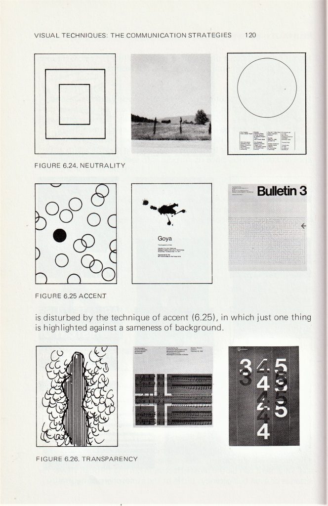
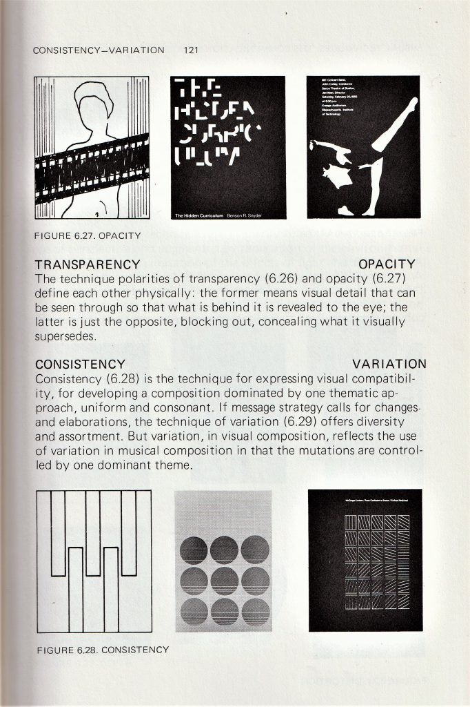
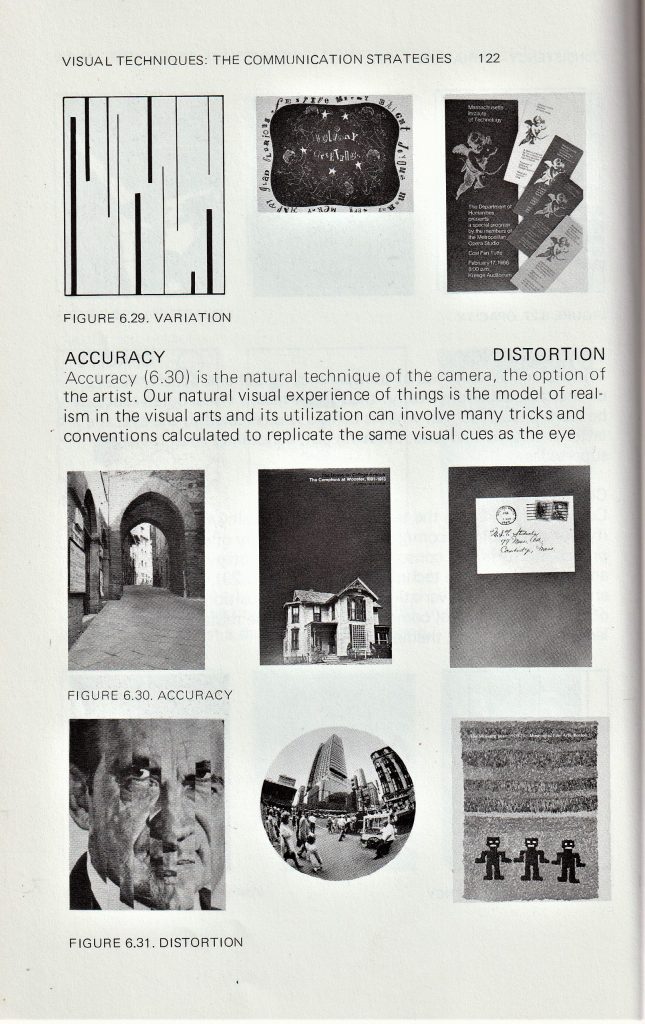
In A Primer of Visual Literacy by Donis A. Dondis, I was interested in the section about visual communication. The author explains that these visual techniques can be used to convey different messages. For instance, ‘fragmentation’ can be used to express excitement in a design. I found that I used more than 1 of these techniques within the same print. I considered these principles when composing my screen-prints in terms of how I can create a design that makes sense when the elements, or layers, are seen together.

A Primer of Visual Literacy by Donis A. Dondis

I chose to use blue for the third layer, as I used it for the first layer. I like the way this helps the top layer to tie in with the background.

I used transparency within this print, as I wanted the effect of the first print to show through the third layer. I mixed in binder with the blue paint to make it transparent.

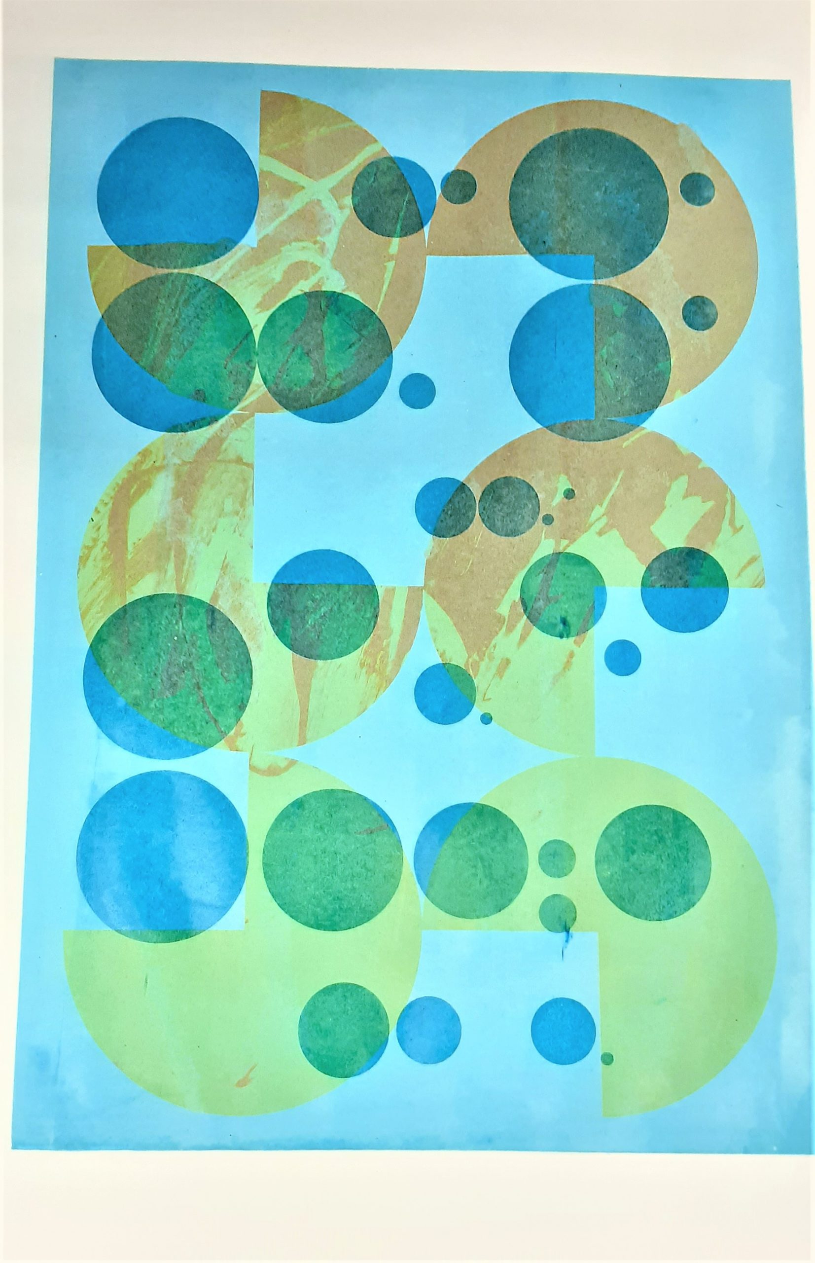
I have combined circles set in a random formation, with the pattern of ¾ circles which are organised sequentially.

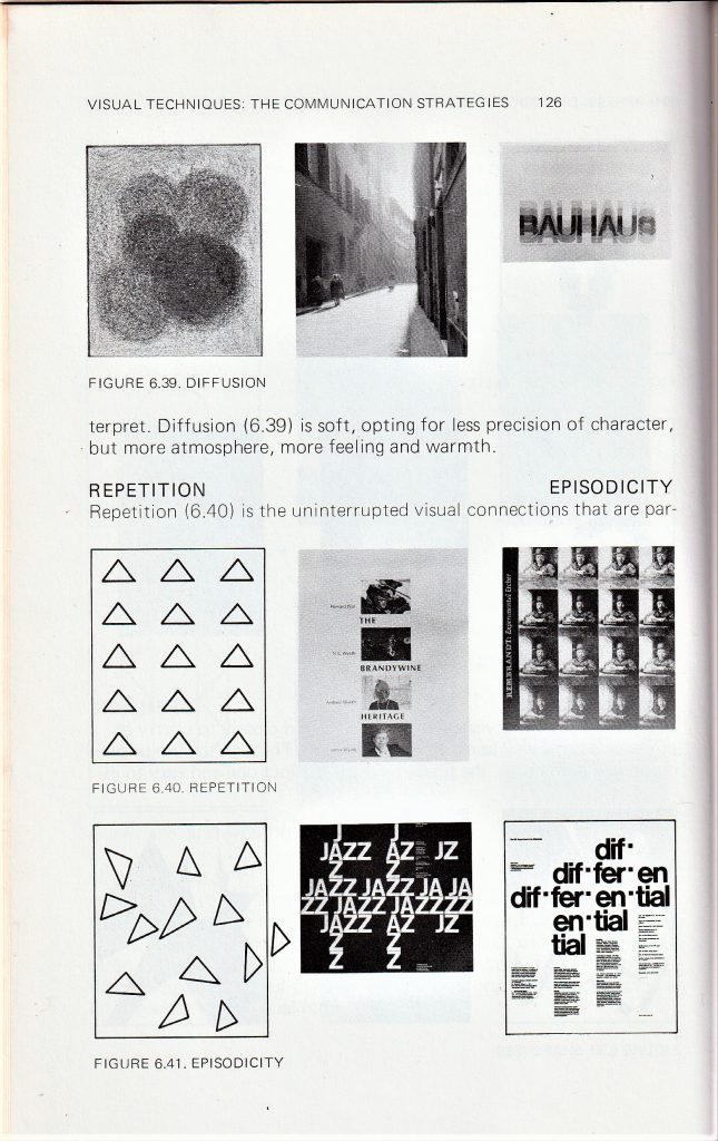
Repetition is the cohesive force that holds a diverse composition together

Donis A. Dondis

I feel there is enough going on within this print for it to be interesting to the viewer: The orange splatters, the way the colours combine through the layers and the variety of shapes. I therefore decided this print is finished.

I have created balance in this print using asymmetry. The design is asymmetrical because there are 2 areas of blue on the left hand side of the page, balanced out by the blue shape on the right-side. There is a sense of regularity in the way the grey shapes form a predictable pattern that we can follow.

The way the layers overlap and the halftone in blue, make the design slightly more complex.

There is some flatness in this print because of the similar values used for layers 2 and 3. This is easier to see in the photo I have converted into greyscale.

Greyscale copy of my print.

The opacity of the grey shapes gives the design a sharpness that was not intentional. This makes the shapes distinct and easy to interpret but means there is overall less warmth and atmosphere to the image. For this reason I would like to add a fourth layer to see how I can soften this design, or perhaps add some finer detail.

This print was stuck to another piece of paper in the drying rack. This meant that when I lifted the paper off, a small area was torn away. My plan is to cover this area.

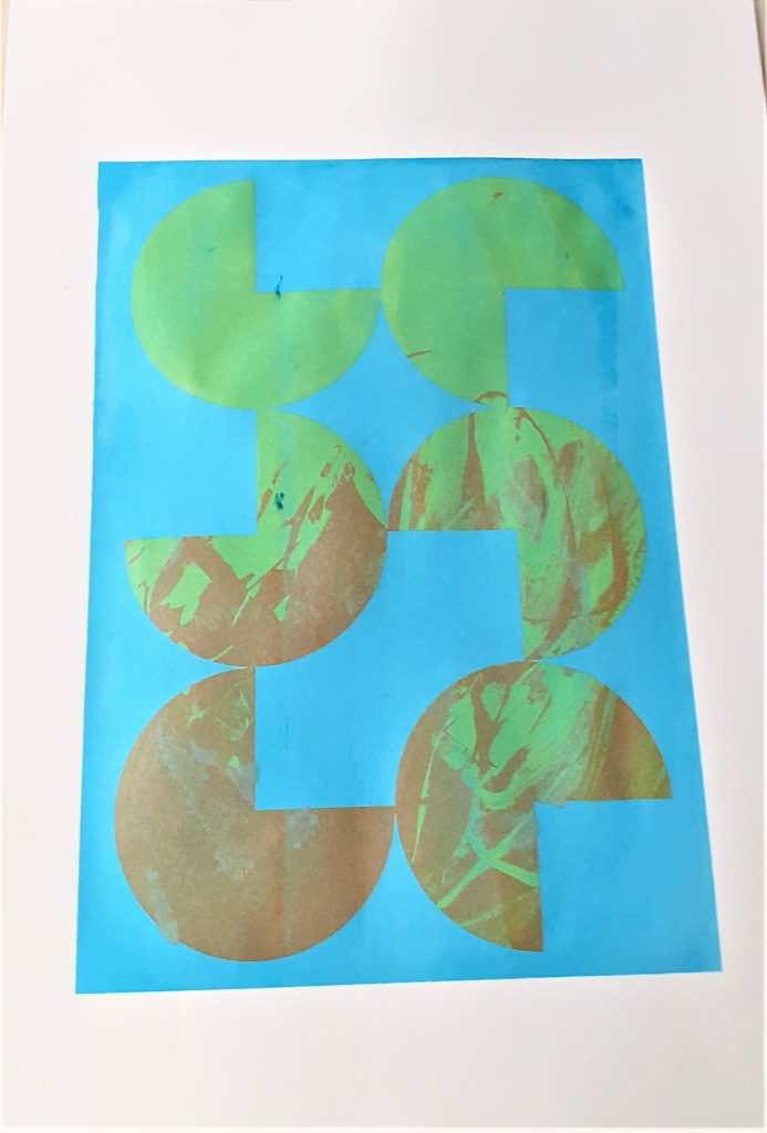
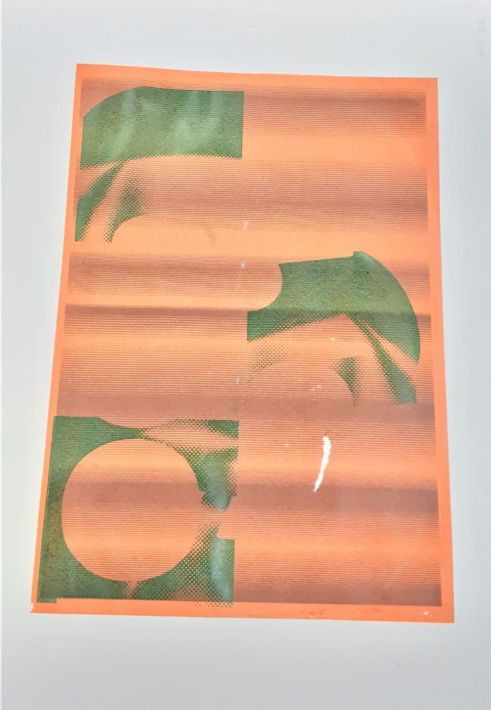
I used a green as I felt this may cool down the orange of the second layer. This green came out brighter than I expected. For the 4th layer, I want to repeat the pattern used in the 3rd layer but rotate it in some way. I think a darker colour will work well.

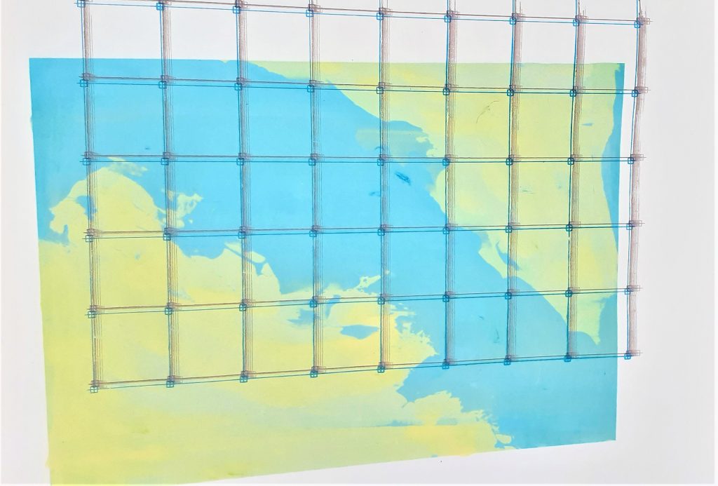
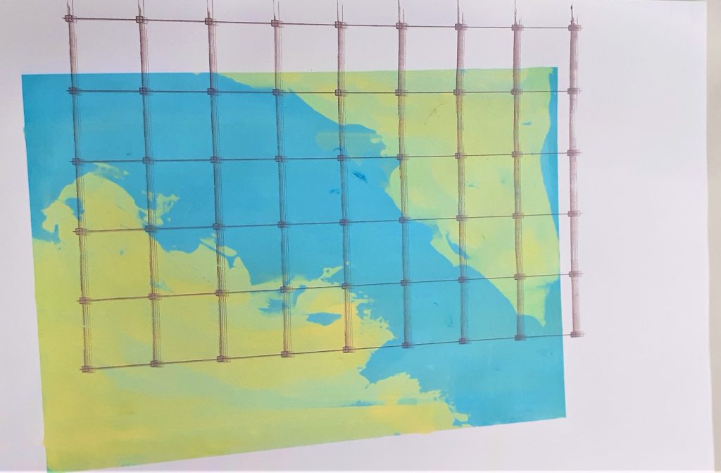
The second layer creates a sense of distortion. This was accidental but was improved by the third layer where I used a deep blue to anchor the grid in place. Placing the grid lines off the side of the first print, creates an illusion of depth. The colours all work harmoniously, as I have chosen that are close to each other in the colour wheel.

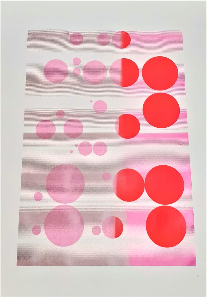
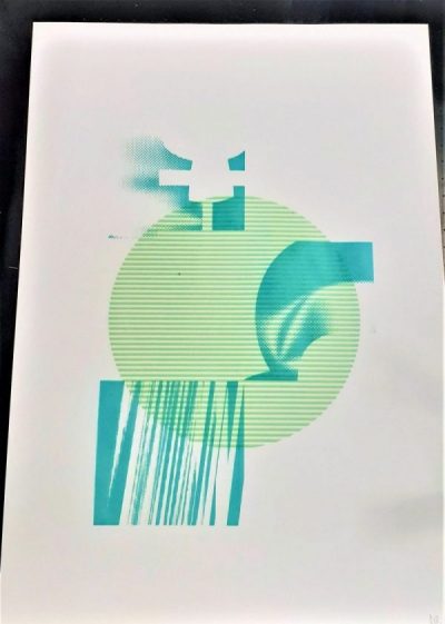
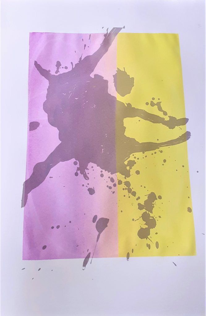
I have suggested motion in this image using close lines and using the change of colour halfway through the print on both layers. This activeness is also created by the asymmetrical pattern of circles in the design.

The variation of hue, transparency, and value, gives the print a sense of depth.

I found it interesting how the second layer is visible against the pink circles and is not visible on the red circles. This gave the print an implied texture on the left side.

The right side is bright, and this shows a juxtaposition against the calmer colour combination on the left.

I decided this print was finished, as it does not look to be lacking in any element.

Screen-printing Workshop 2

Our second screen-printing workshop was focused on building another layer onto our previous prints. The first prints would become backgrounds and the second layer would need to add something to the composition. For this step, I needed to consider colour, line, pattern and balance. (known as the formal elements of art)

I looked at A Primer for Visual Literacy by Donis A. Dondis, to help me learn tips for composing my prints. Some key quotes from this book:

Line

“Line can take many different forms to express many different moods. It can be very loose and undisciplined, as in the sketch as illustrated, to take advantage of the spontaneity of expression. It can be very delicate and undulating or bold and course, even in the hands of the same artist.” “Line really exists in nature. But line does appear in the environment: the crack in the sidewalk, telephone wires against the sky, bare branches in winter, a cable bridge. The visual element of line is used mostly to express the juxtaposition of two tones. Light is utilized most often to describe juxtaposition, and in this, it’s an artificial device.”

Shape

“Line describes shape. In the parlance of the visual arts, line articulates the complexity of shape. There are three basic shapes, square, circle, and equilateral triangle. Each of the basic shapes has its own unique character and characteristics and each is attached a great deal of meaning, some through association, some through our victory, and some through our own psychological and physiological perceptions. Sky has associations to it dullness, honesty, straightness, and workmanlike meaning; the triangle, action, conflict, tension; the circle, endless nurse, warmth, protection.”

Colour

“Since perception of colour is the single most strongly emotional part of the visual process, it has great force and can be utilised to express and reinforce visual information to great advantage. Colour not only has universally shared meaning of their experience, but it also has separate worth information leaked through Sim. In addition to the highly negotiable colour meaning, each of us has our own personal and subjective colour preferences. We choose our own colour statements and settings.” “Colour has three dimensions which can be defined and measured. Here is of the colour itself of which there are more than a hundred stop the second dimension of colour saturation, which is the relative purity of the colour from the cuter grey. The third, and last dimension of colour is achromatic. It is the relative brightness, from light to dark, of value or tonal gradations.”

Whilst including detail in the second layer, I wanted to reserve using the finest details for the top layer.

I started with this print from my last session. Securing it to the table using the suction switch. I like the simplicity of this print and combined with the colour, it resembles the Earth.

I didn’t want to take away from Earthly aspect of the image. Therefore, I used rounded shapes as my second layer to blend into this theme.

The use of green for the second layer meant that this layer was harmonious with the background. Choosing a darker green meant that the shapes stood out against the circle.

I found the orange ink to be fairly transparent. This meant it worked well as a flat layer, since it blended in visually. The grey lines of the background became brown when mixed with the colour of the second layer. I am not sure why there are white speckles across the page. I assume the markings were on the screen. I like the overall warmth of the image.

I chose blue ink for the second layer.

I thought the blue would blend with the pink and create a purple image. This was not the case, as the blue paint sat on top and looked purely blue. Using a purple paint for the final layer may help to unify the colour in the image.

Adding binder to the blue would have helped to create the effect I had in mind.

For my second layer, I used 2 colours. There was not a perfect merge in the middle, but I was happy with the effect I achieved. I wanted my second layer to be translucent, as I wanted the grey of the background to be tinged different colours. Knowing that yellow is a transparent colour, I didn’t add any binder to the paint. I did, however, mix binder with the purple paint, to make sure I could see the design clearly through it.

The theme of this print was always going to be about the Earth. I was hesitant to add a second layer, as I was happy with how the first layer turned out and I didn’t want to obscure the delicate brushstrokes. I chose to use the grid pattern, as I felt it fit with the theme of mapping. I chose grey, so that the lines would not be too harsh.

When printing, I did not use the vice, but instead worked with a classmate. Human error meant that the screen was jolted, this left blurred lines. To correct this, I plan to add another grid print, although in a darker colour, for example dark blue. This will help to define the print and anchor the design.

I used a paintbrush for creating this effect on the second layer.

The blue of the background mixes with the yellow to create a greenish hue. The orange appears more brown. I have learnt that mixing complementary colours dulls down or neutralizes the colour. It cancels out the vibrancy, which might be used intentionally in future prints.