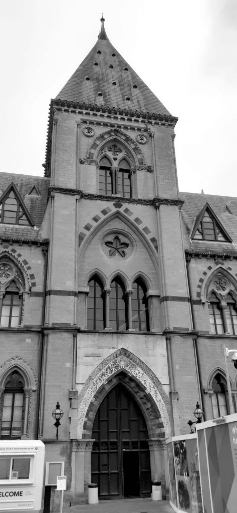
Today I visited the Natural History Museum, Oxford.
(left) The building from the outside.
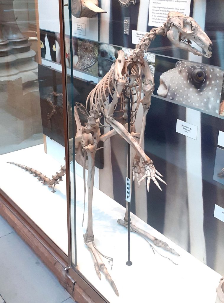
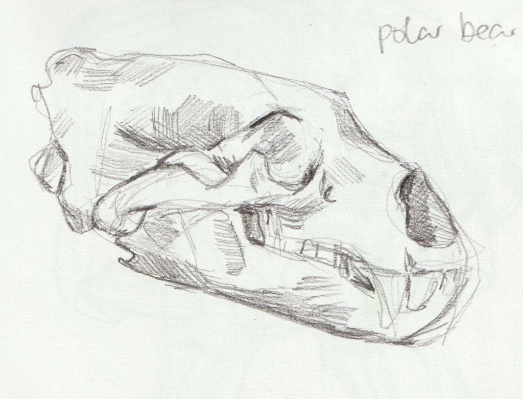
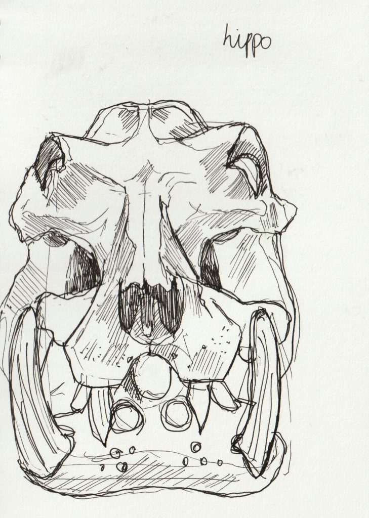
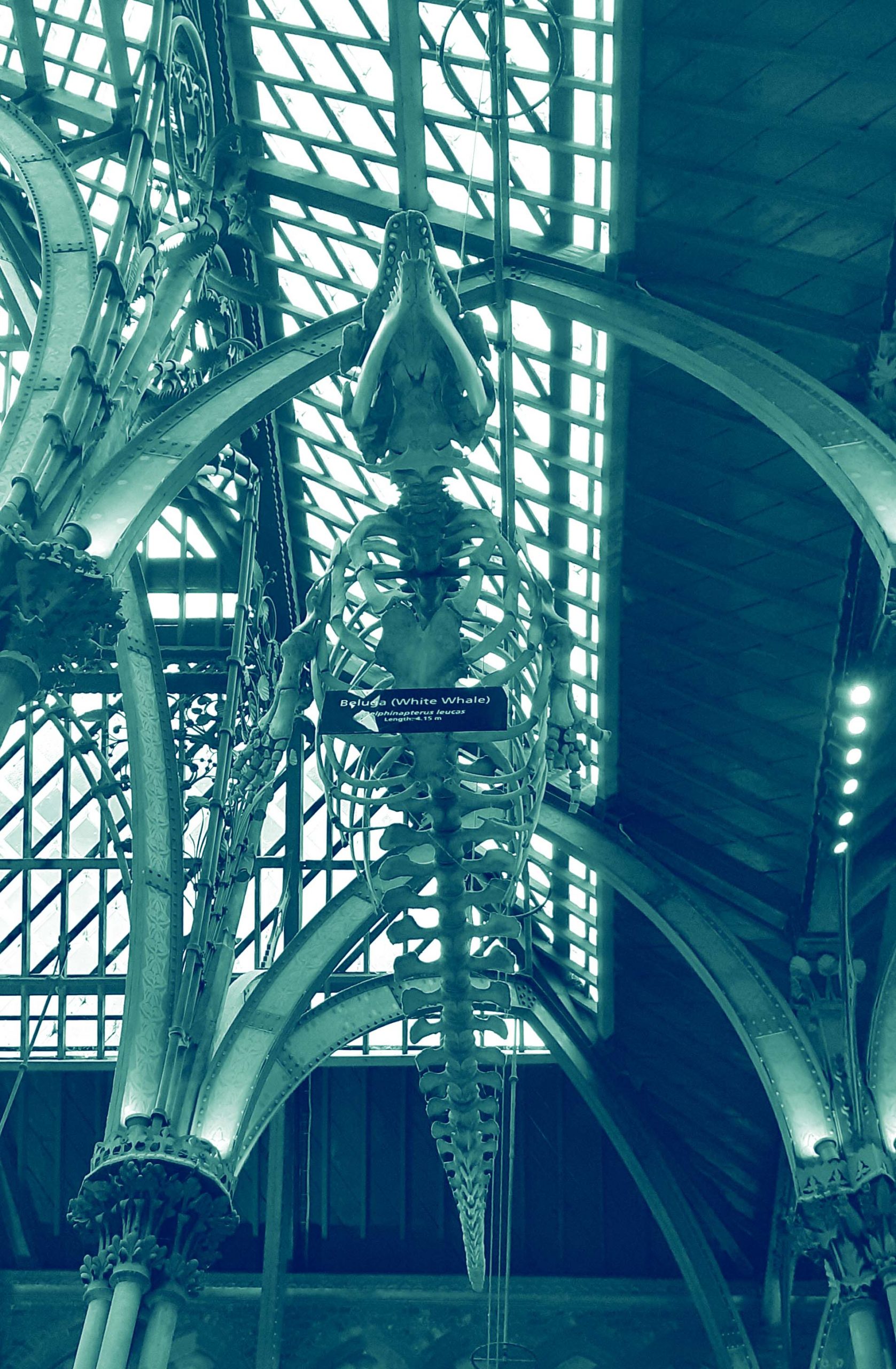
I sketched the skeletons, which was surprisingly relaxing.
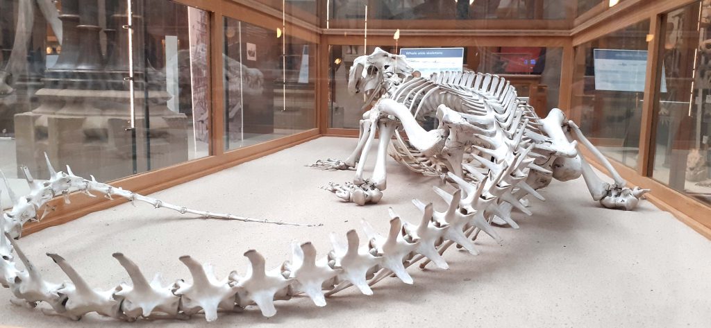
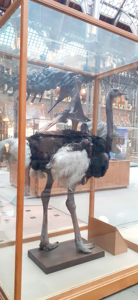
Ostrich 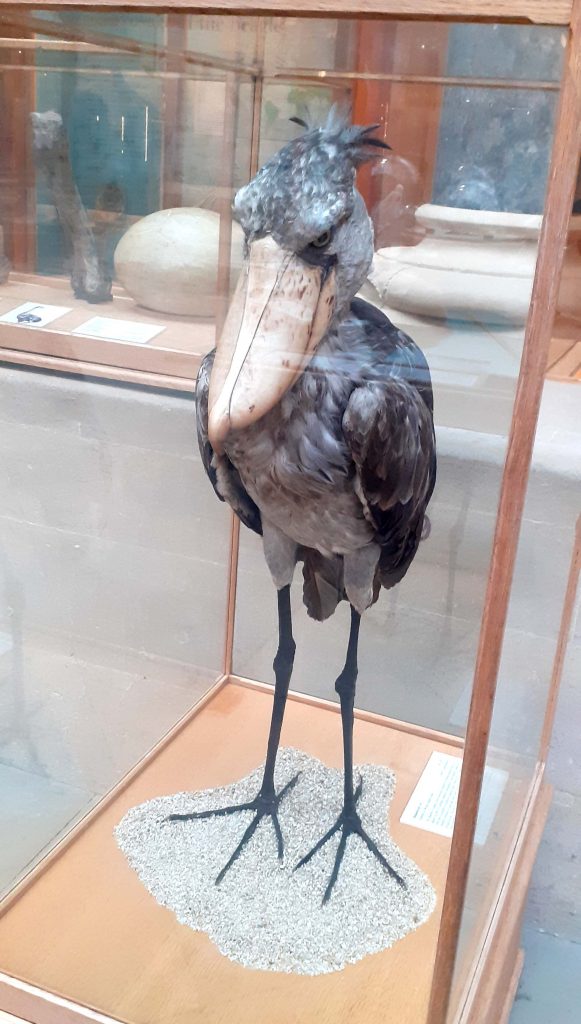
Stork
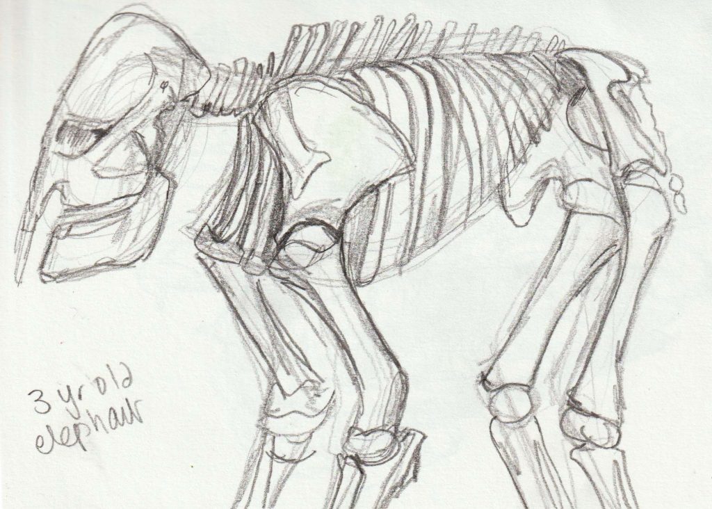
Today I visited the Natural History Museum, Oxford.
(left) The building from the outside.
I sketched the skeletons, which was surprisingly relaxing.

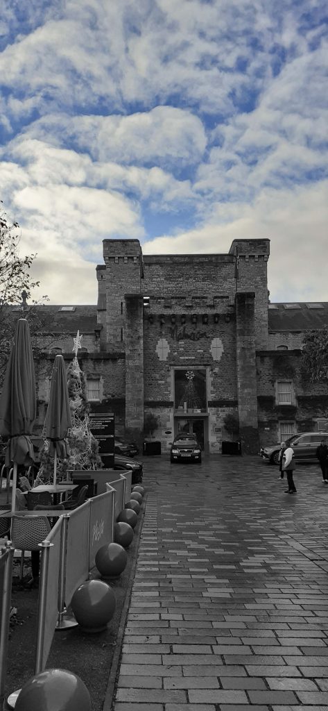
One nice way to spend a Sunday: strolling around town and visiting an exhibition. After a year of living in Oxford, I had never seen the castle. I thought there were maybe a few ruins but I didn’t expect to see the full building (below left) in all its ancient glory.


Why have I just discovered the castle? I was on my way to the OVADA art gallery. My only visit to the gallery previously was to see it empty between exhibitions. This time the building was full of art, how good this was to see.
The fact that it was so hard to find, only made it more of an adventure.
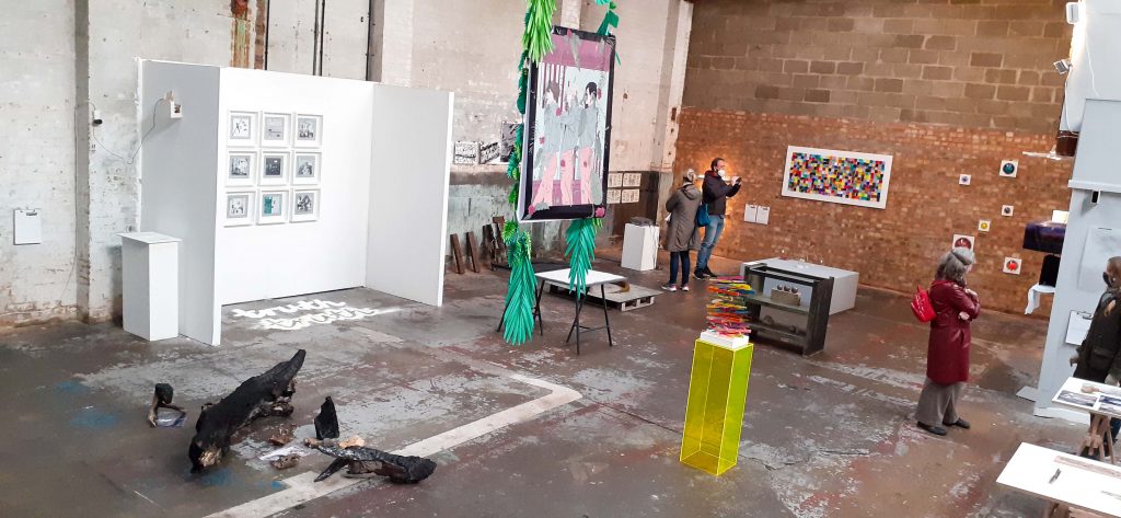
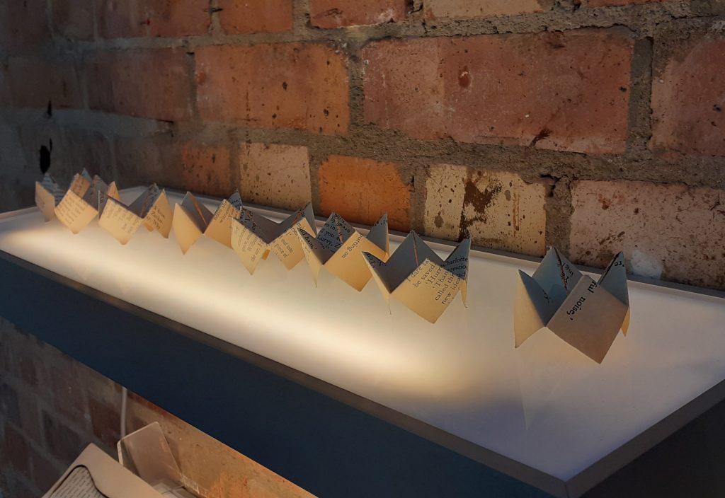
I caught the end of the 3-day exhibition, Dream Factory. This exhibition presented work by BROOKES MFA students. While I may not be able to credit each artist individually, here is a list of the artists involved (below right).

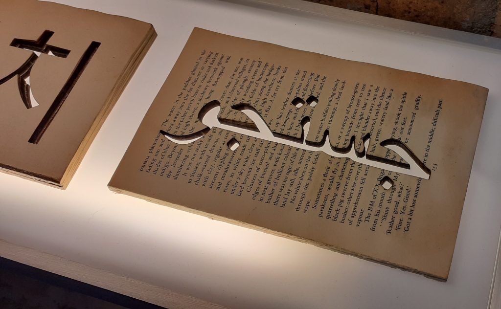
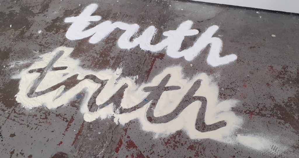
(below image) The OVADA warehouse is a unique space. It’s interesting to see the work in these surroundings. It gives a totally different feel to art that’s presented in a plain white gallery space. Sometimes the art blended into the roughness of the warehouse and with other pieces there was a bold contrast that I really liked.
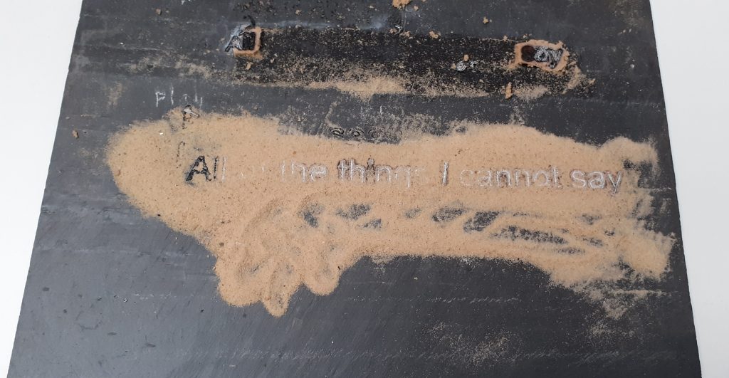
I loved the way the type moved across the page, just long enough to grasp.
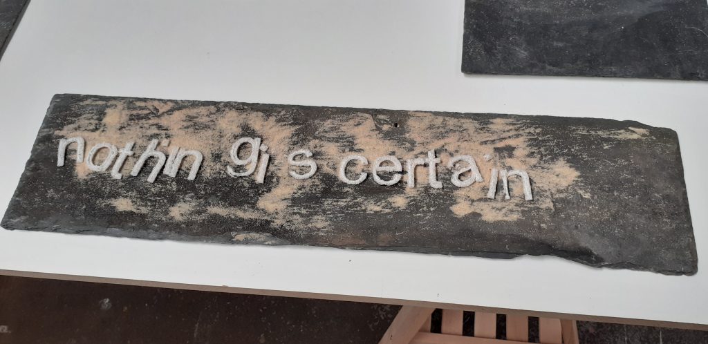
I felt these slates represent us. ‘The blank slate’ being the possibilities of everything we could be. Deborah has used sand to represent the things that happen to us. The shifting things we have no control over. The life changes we all face, but more recently the covid pandemic.
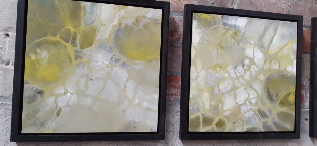
I found Yolande’s paintings amazingly light and delicate. This impressed me because I can see the patience and gentleness needed to paint them, which is the opposite to how I approach drawings. The way the light shines through the cellular structures is so beautiful to me.
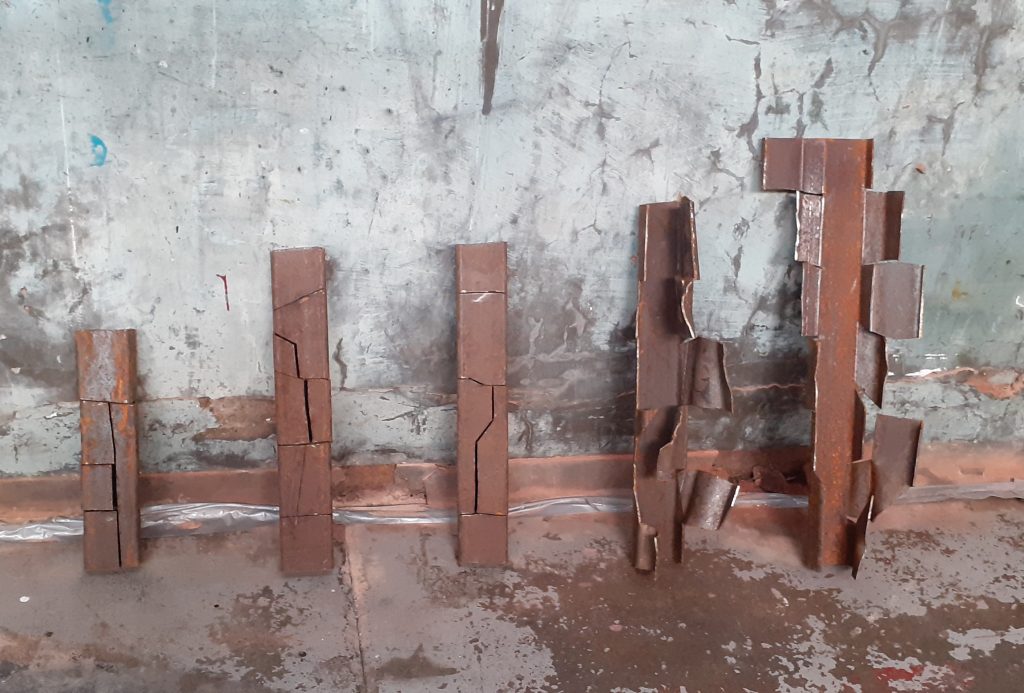
(above) Don’t they look so at home in OVADA? Emmett is inspired by the weathering of forms over time. I was drawn to the strength of the material and the colour of rust which is one of my favourite colours. I saw this piece as a representation of a person growing from a small child into an adult and the effect of that journey emotionally and mentally.
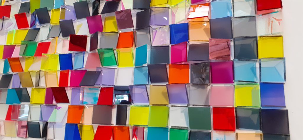
Lastly, these colourful squares were beautiful. The artist used a combination of reflective, iridescent, transparent and matt surfaces within the work. I loved how each tile was tilted at a different angle, creating chaos. I wanted to be in a room full of them.
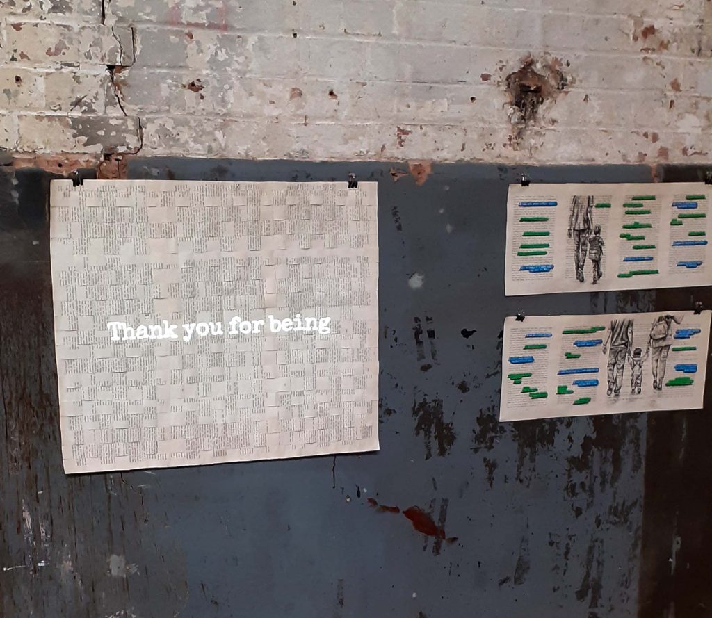
I didn’t photograph every artwork, but the rest were equally impressive. Every work felt like it belonged, even though they came from different minds.

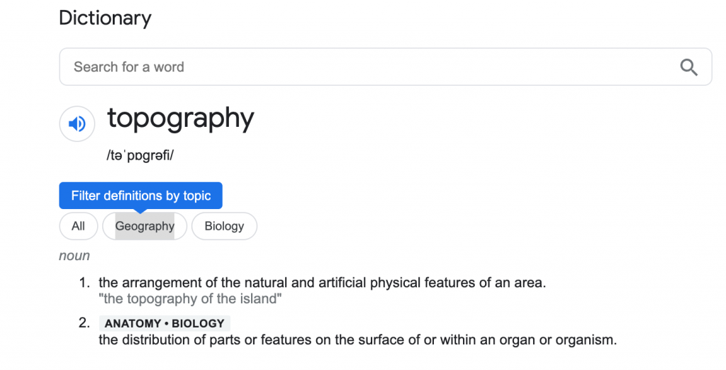
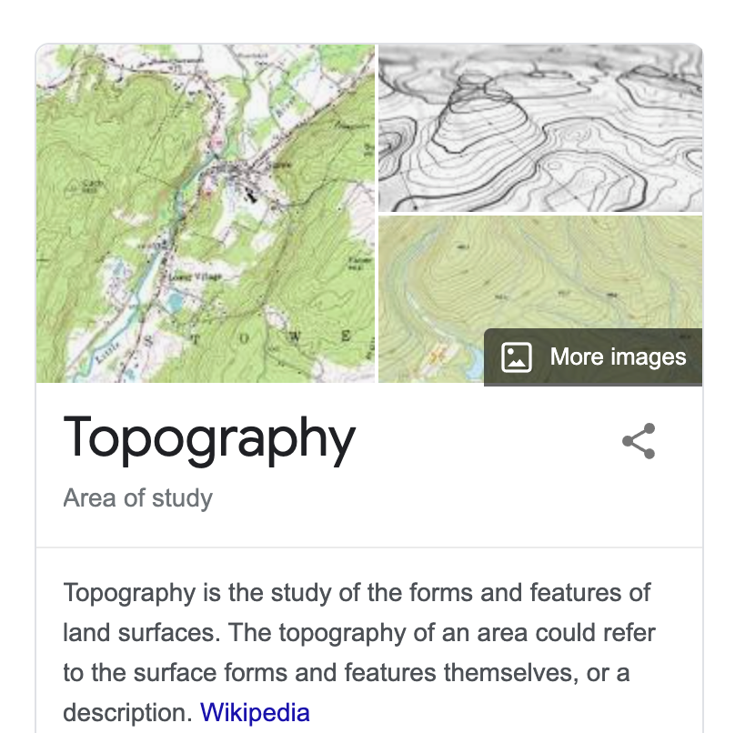
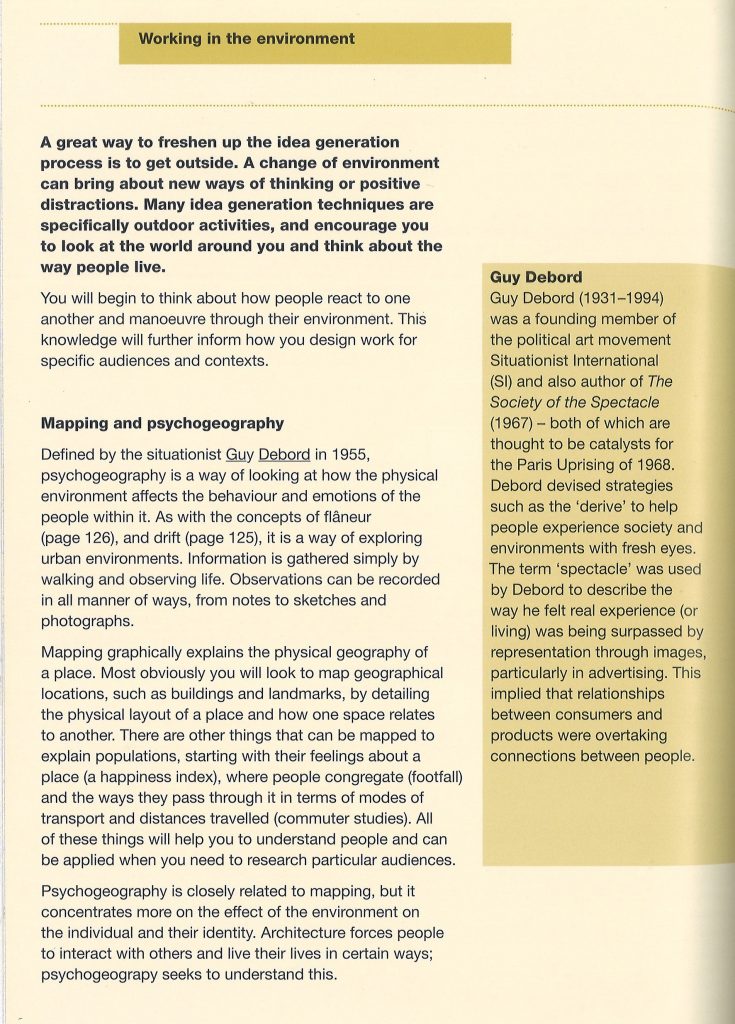
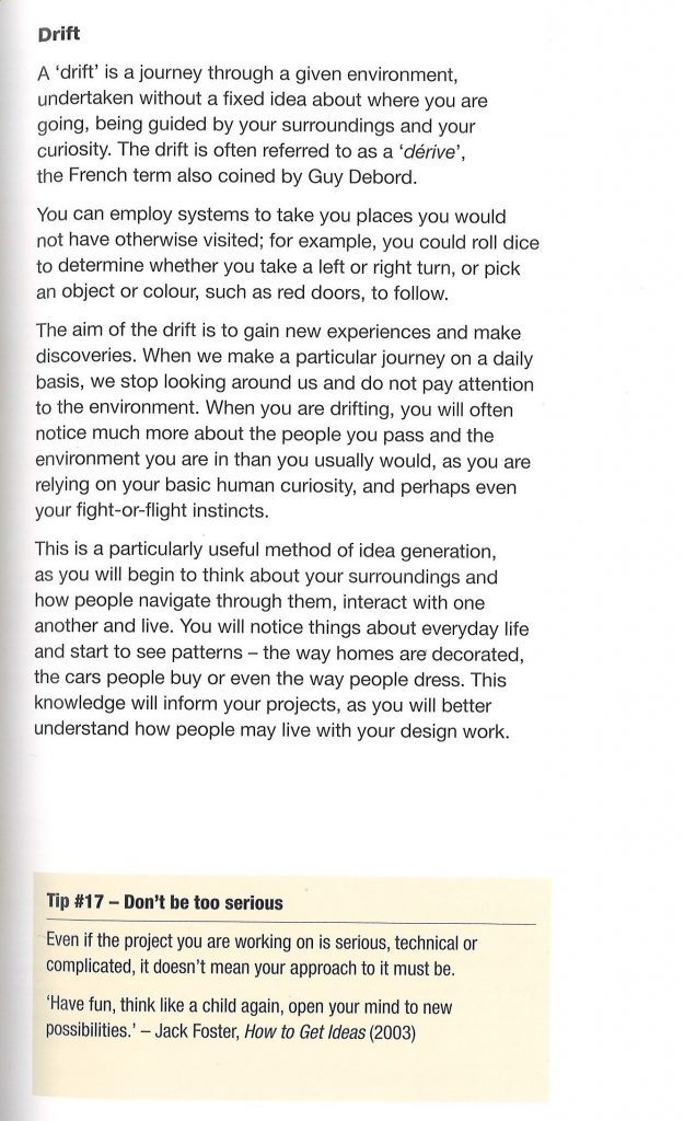
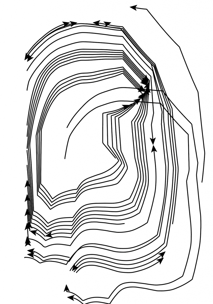
It is an image. But not just an image. A map is an informative graphic. Something you need to interpret. How can we map something? How could we map our thoughts? How about a physical landscape?
A straight line says nothing, but adding an arrowhead to one end says something. It is suddenly a map. Something to read. It indicates something to us.
An image that isn’t a map, is abstract.
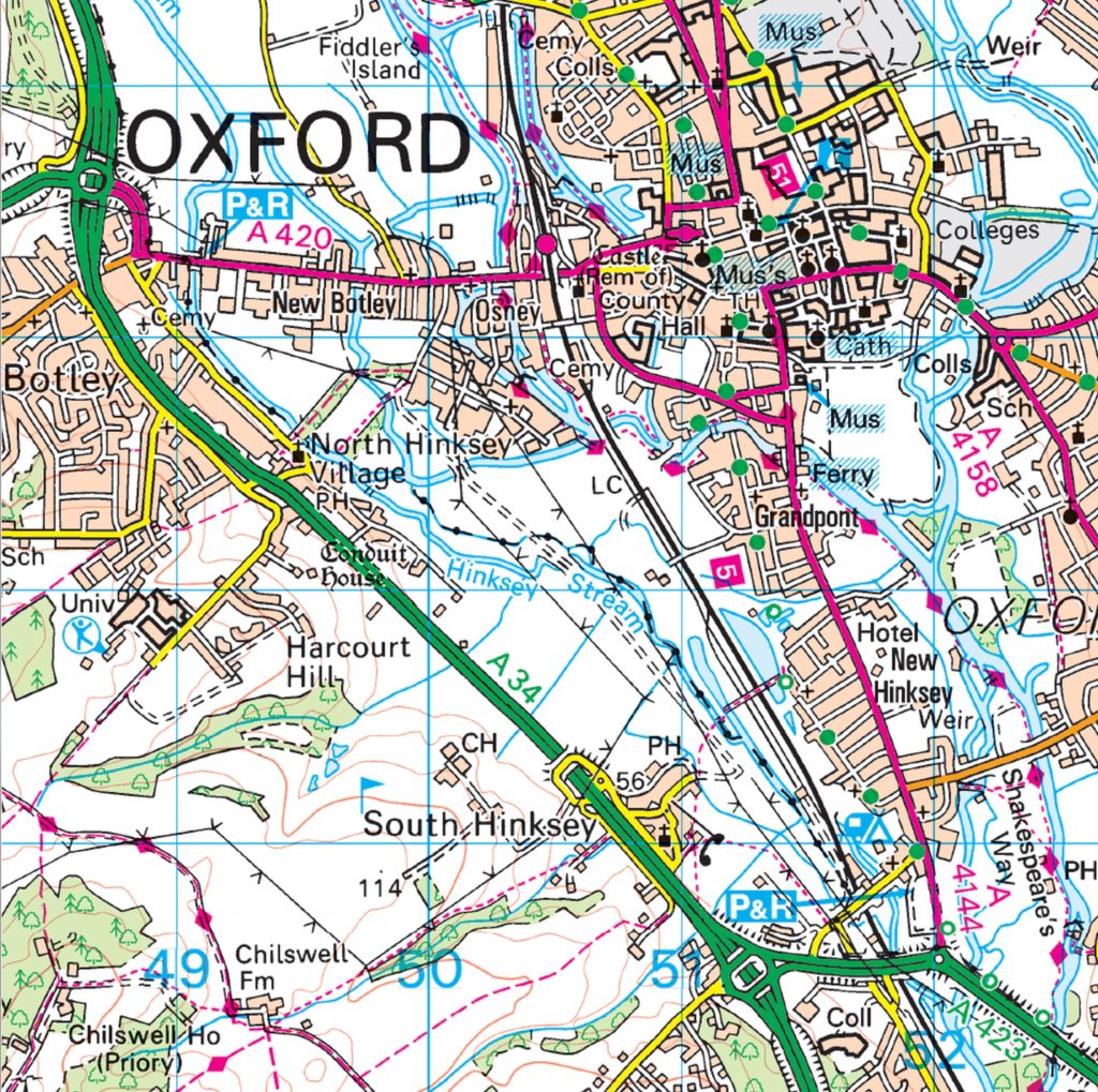
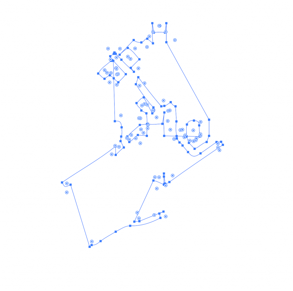
I began by pulling different areas from the map. To do this, I first selected Image trace> 16 colours. This turned the map into a vector image instead of an image made from pixels. All the lines appeared smooth when I zoomed into the image.
Expand completes the action of turning it into a vector. This also allowed me to move the different pieces separately.
Command + shift + G ungroups the image.
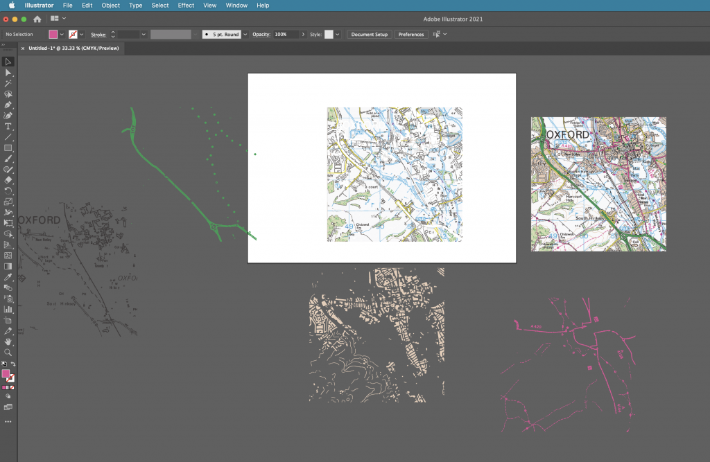
To be able to grab all the areas of 1 colour, I needed to select:
Select > same> fill colour
I could then click and drag to take out these separate pieces of colour.
I then played with the other image options:
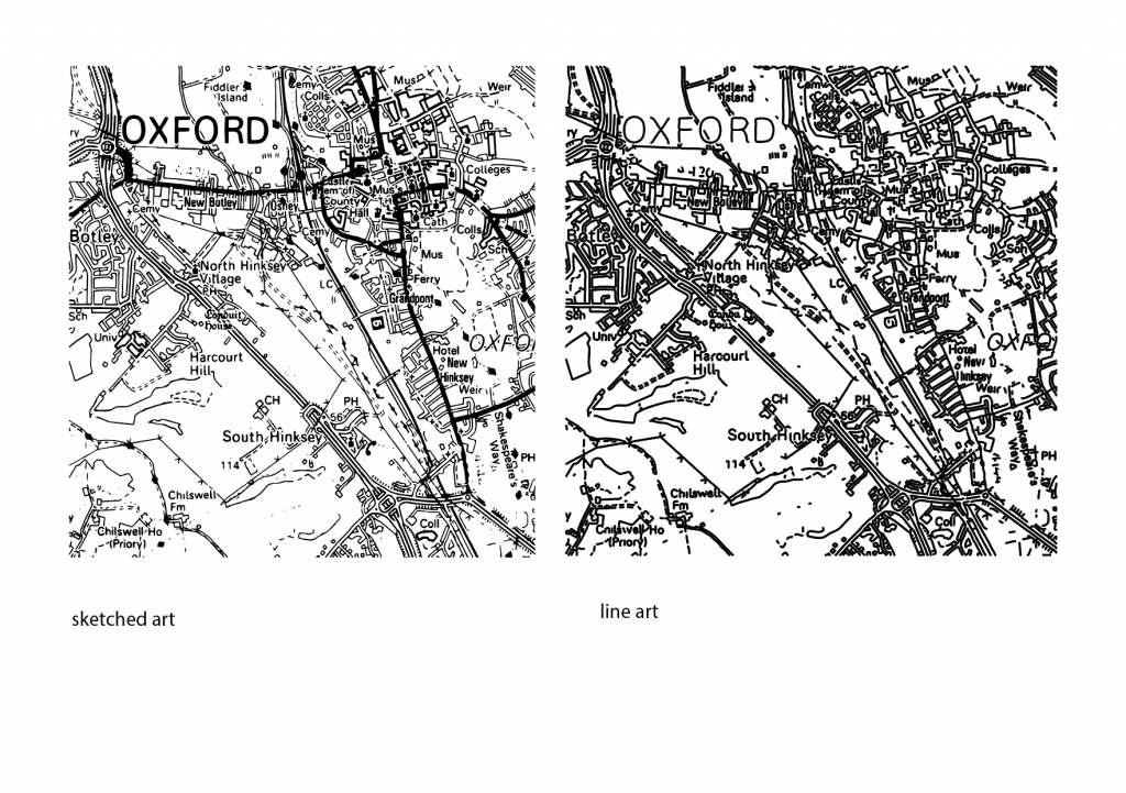
Converting the image into line art gave me new options for experimentation. I clicked and drag on small areas of the image to separate the lines, lifting areas out of the map. The gaps in the map below left are areas I had taken out of the image:
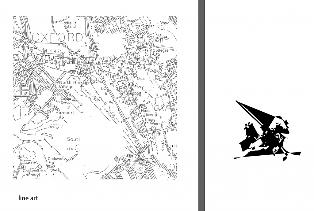
The shape on the right was created from taking the small area from the map. I pressed Command + J to join the lines together. I then clicked the small arrow beside the stroke and fill colour squares. This inverted the colour and filled my shape with black instead of the black outline.
I then copied and pasted the shape into adobe photoshop. This allowed me to work on it further and turn the image into a bitmap. I needed to make sure the pieces were in a formation I liked before pasting it into photoshop. This is because it is very difficult to rearrange the pieces once the shape is pasted into photoshop.
pathfinder> divide takes the shape apart.
pathfinder> unite sticks the shapes together like glue.
pathfinder> group allows you to move the shapes around together but they do not become the same object.
My first step was to bevel/emboss the shape. I selected Layer> layer style> bevel & emboss, as shown in the screenshot below:
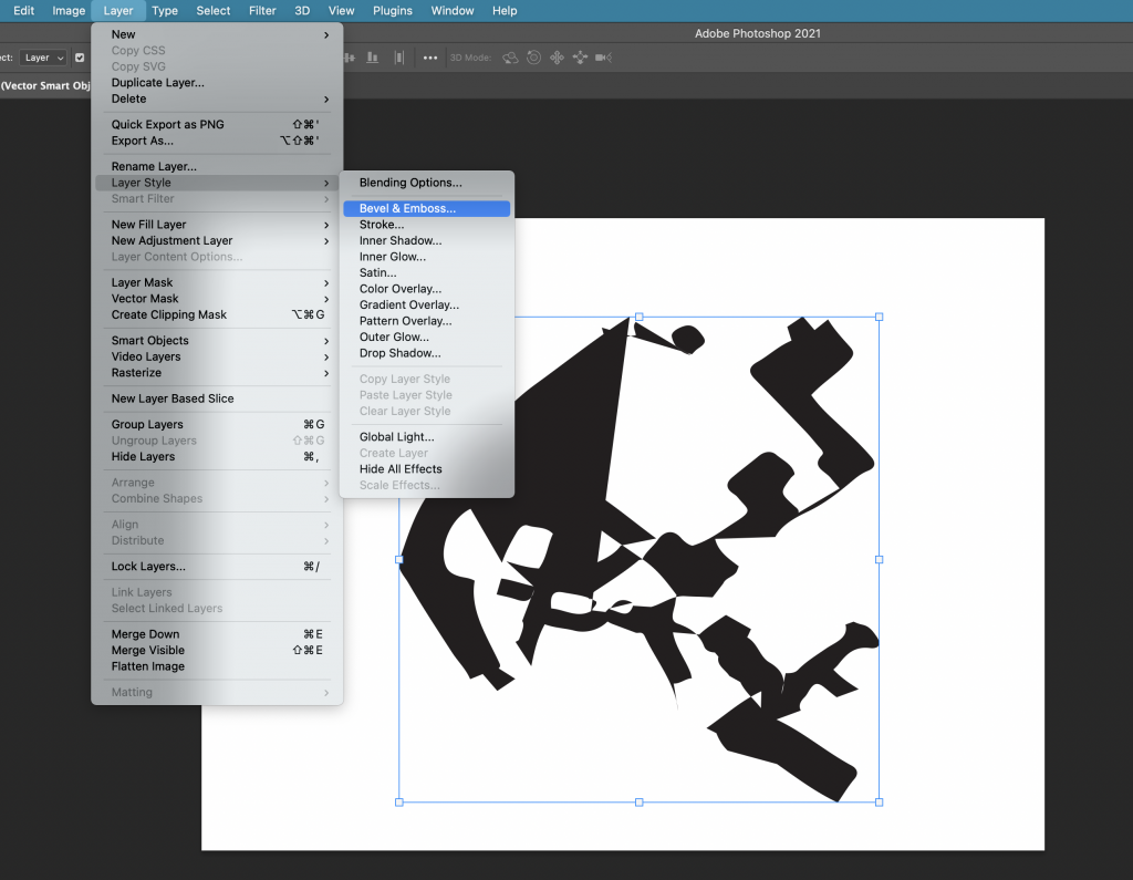
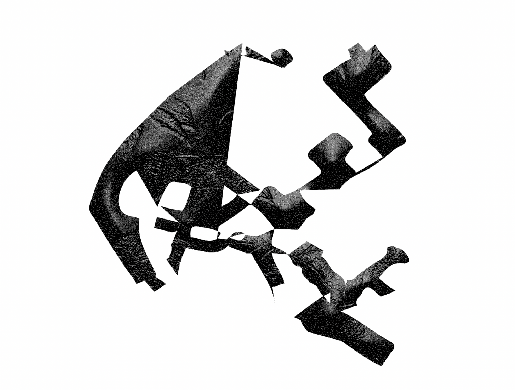
This allowed me to play with the height and texture of the shape. I chose the leaf pattern as I liked the rough texture it produced.
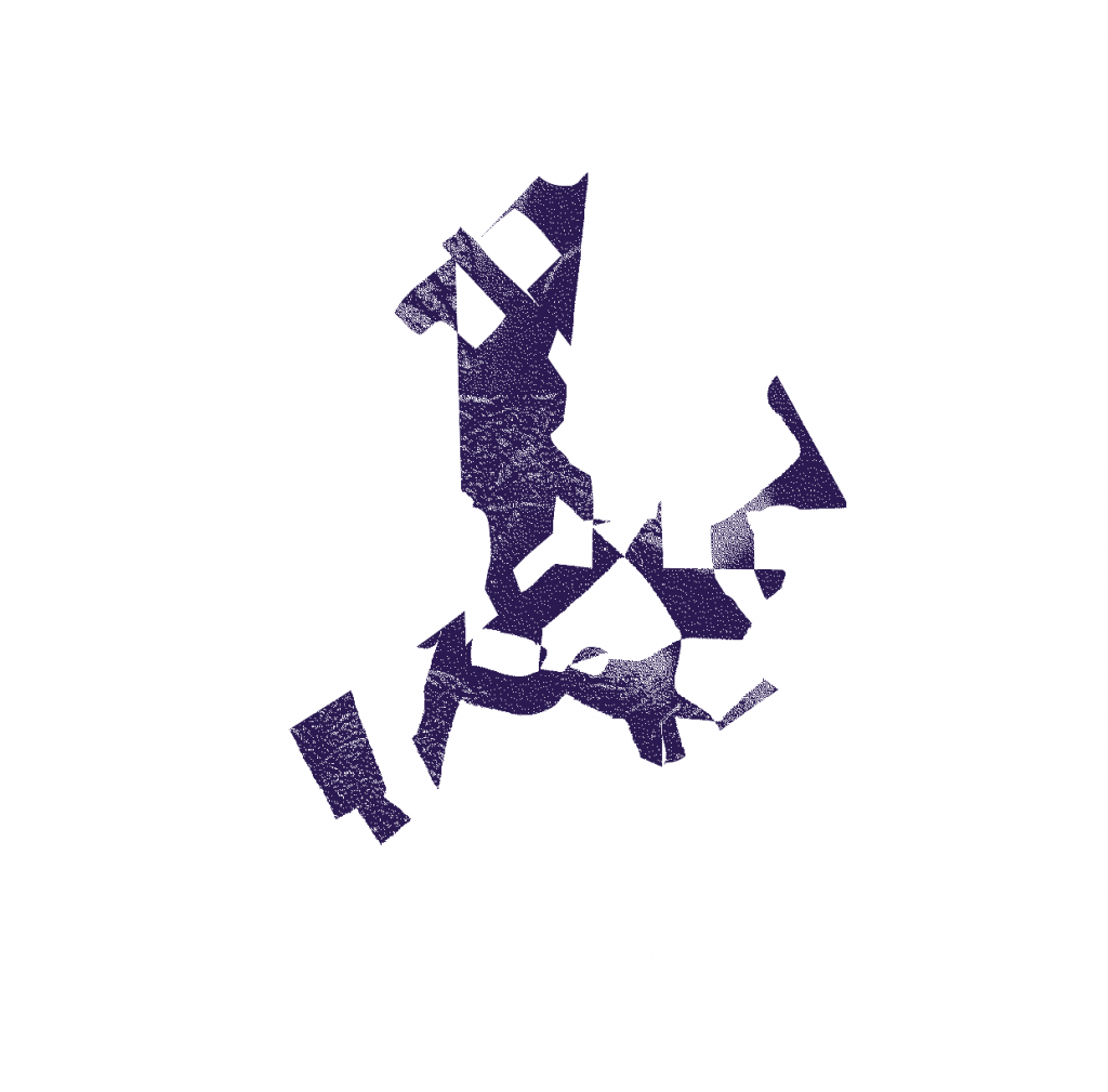
The image needs to be in greyscale before you can bitmap it. I bitmapped the image and chose ‘diffusion dither’ to create the grainy filter. I saved the image as a TIFF file.
Back into Illustrator, I took another shape from within the line art of the Oxford map. I used this for my outline. I repeated the previous process of joining the lines and filling the shape with colour. This time, I removed the fill and the outline, so the shape was transparent. I selected ‘draw inside’ and Command+ shift+ p, to place an image inside the shape. (this is the shortcut within illustrator, in InDesign, we would use command+shift+D)
In this case, I wanted to place my bitmapped image inside this new shape. I selected the TIFF file and clicked to place it inside. Because this image is a bitmap, I was able to change the colour of it. I also tried rotating and enlarging the image from within the shape.
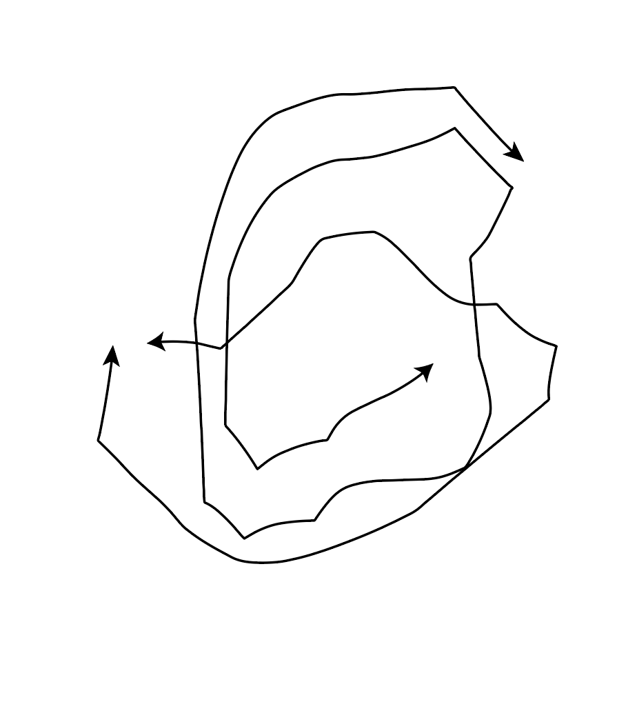
Another technique for image producing. I drew a shape using the pen tool on Illustrator. I then drew another shape within this shape. I selected object> blend> make. I needed to change the stroke colour to black, to be able to see another shape appear between the 2 I had drawn. By then selecting object> blend>blend options>specified stops and increasing the number, I could create multiple identical lines within my image as shown here:
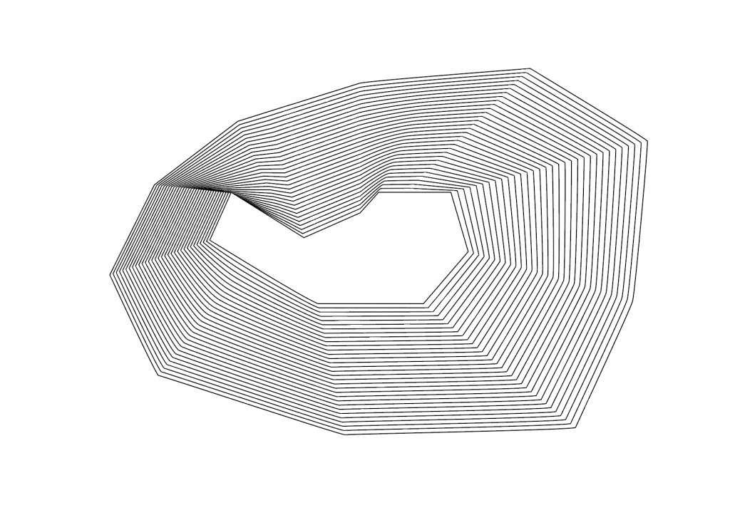
I duplicated the shape by holding down ‘option’, clicking and dragging. I changed the colour of this second shape and rotated it so that it was upside down. I placed the shape so that they intersect. I increased the transparency so that it is possible to see through the lines to the other shape:
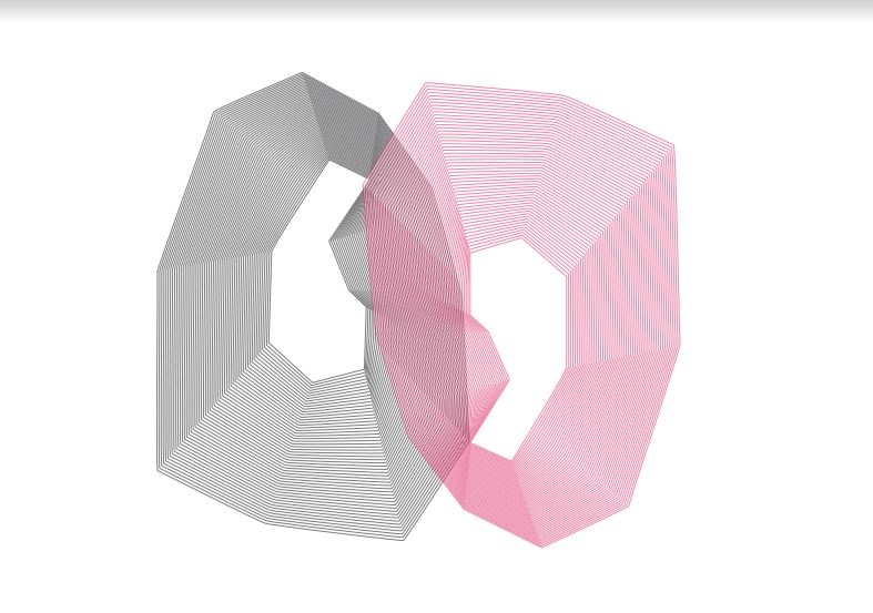
I printed the image of the shape that had multiple lines. I used this print to scan onto the computer. Instead of doing a simple scan of the drawing, I wanted to make it interesting.
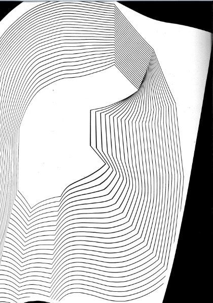
I moved the image around on the scanning bed as the scanner moved across it. This created a wavy image where the lines moved in different directions. From this scan, (I saved it as a TIFF file) I could manipulate the image further in Illustrator.
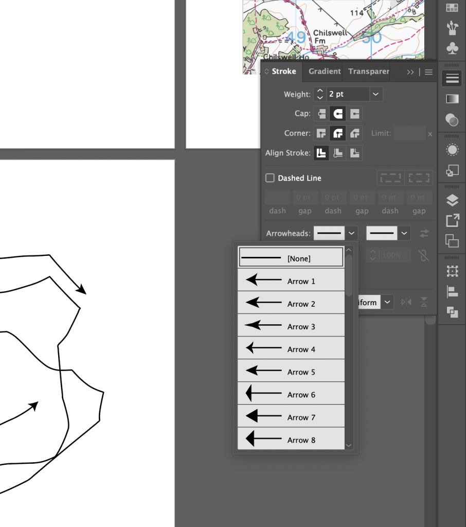
I remove lines from my scan by grouping the image, so that it was a vector image. I added arrowheads using the arrowhead tools on the right hand side of the page. To create the above effect, I selected object> blend> make. By selecting blend options, again I could alter the number of linen repetitions.
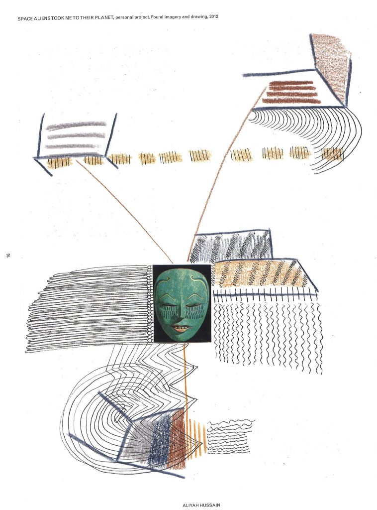
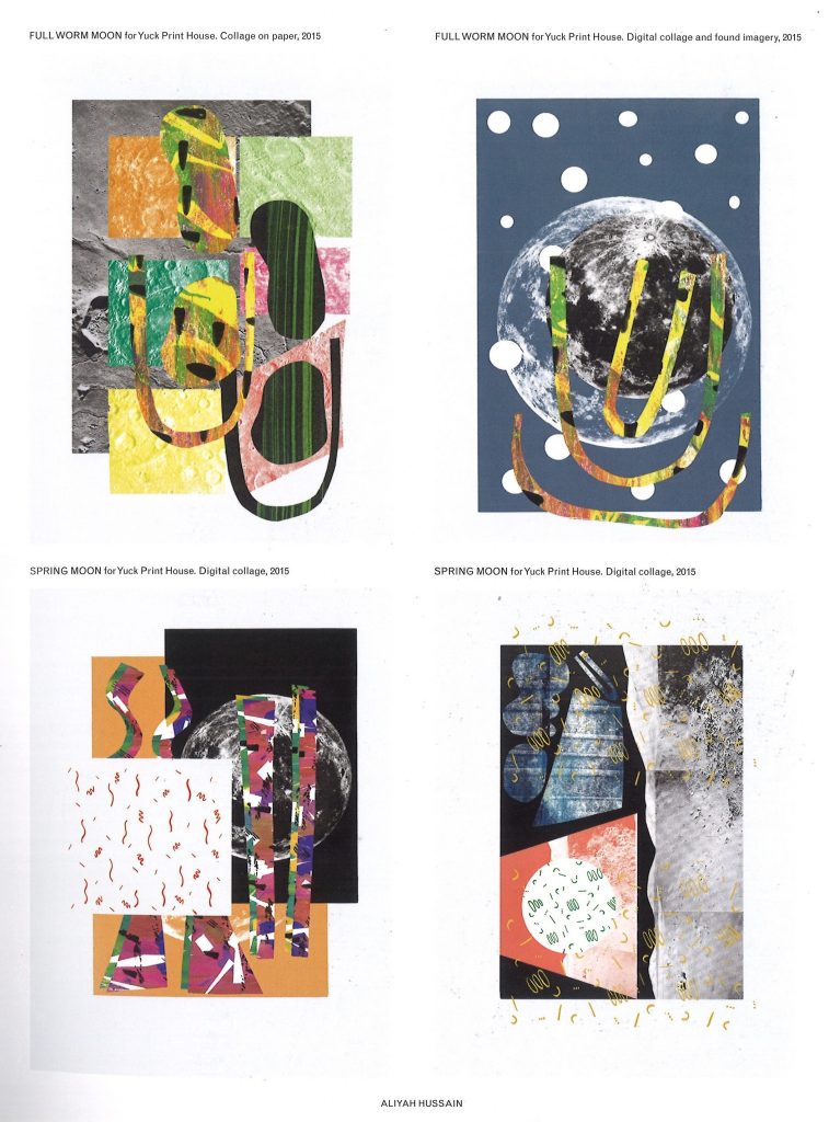
Aliyah Hussain is a UK based design whos work is multi disciplinary.
Her work is focused on collage but also incorporates screen-printing techniques, painting, photography and performance.
Her work unites futuristic utopian elements with a retro and hand-made aesthetic. Her use of line is bold and directional. In the above piece, I can see the pressure she has used on the pencil. The lines coming from the centre mask image implies to me a kind of mind map, where the ideas are directly linked to the face in the middle. Who might this face be representing? Is it a signifier of a collection of people in general?
There are areas of business and action, combined with white space where the eye can rest. I like the hand-made feeling that this has been jotted down in a notebook to record something important that the artist needed to remember. It has that rushed and urgent sense to it that we might find in a journal.