In terms of design, modularity is a principle that helps manage content- it’s repeatable because its made from 1 module.
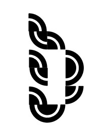
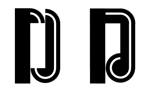
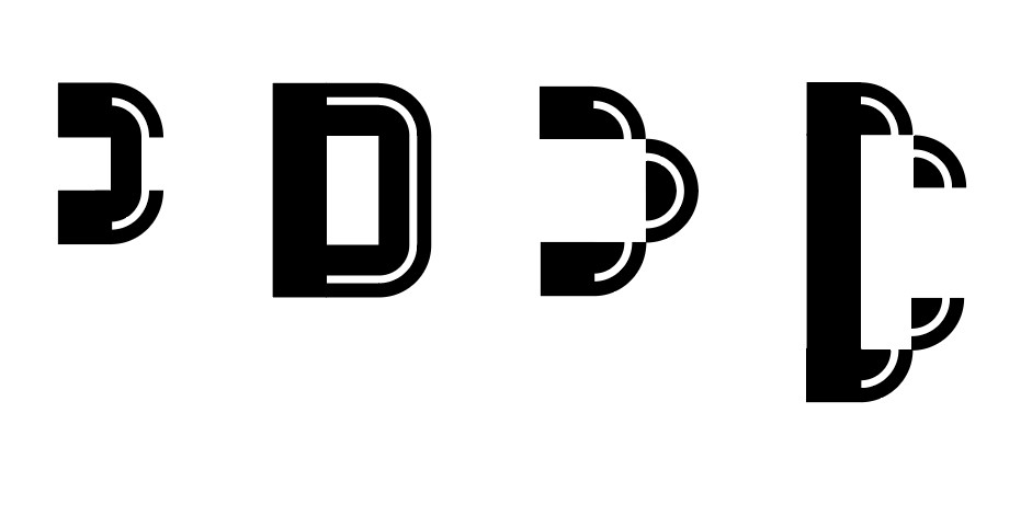
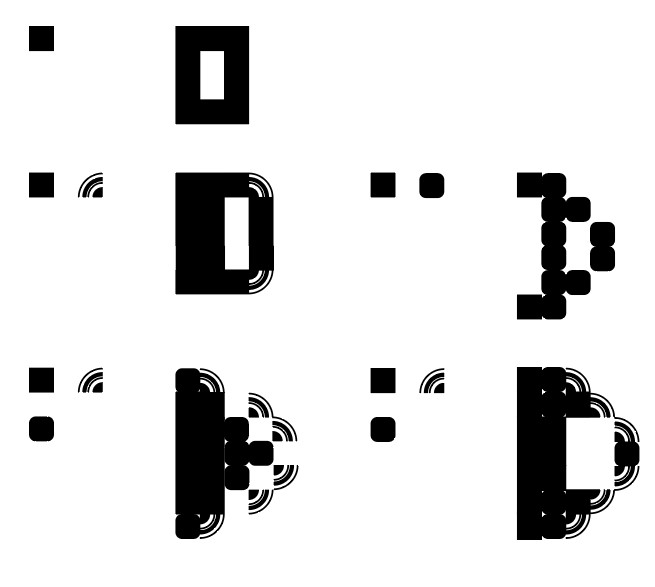
In the modular & matrix writing workshops of module 5002, I learnt to work with the restrictions of using a limited selection of shapes to compose letterforms. It was more challenging than I thought it would be. I found myself accidently breaking the rules. Because I was using paper, scissors and glue, it was possible to break rules. In today’s digital workshop, this wasn’t possible.
In today’s lecture we began by looking at examples of modules we are used to seeing in the world around us.
In pixellated photos, every cell is a module.
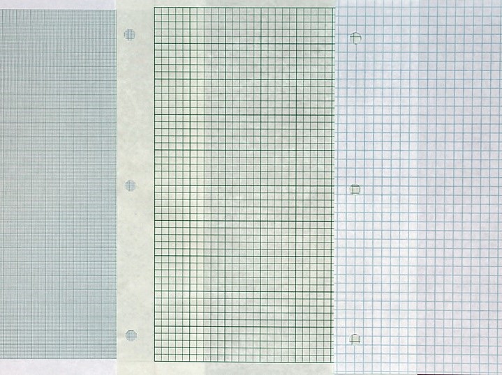
Graph paper consists of equally spaced lines, therefore squares.
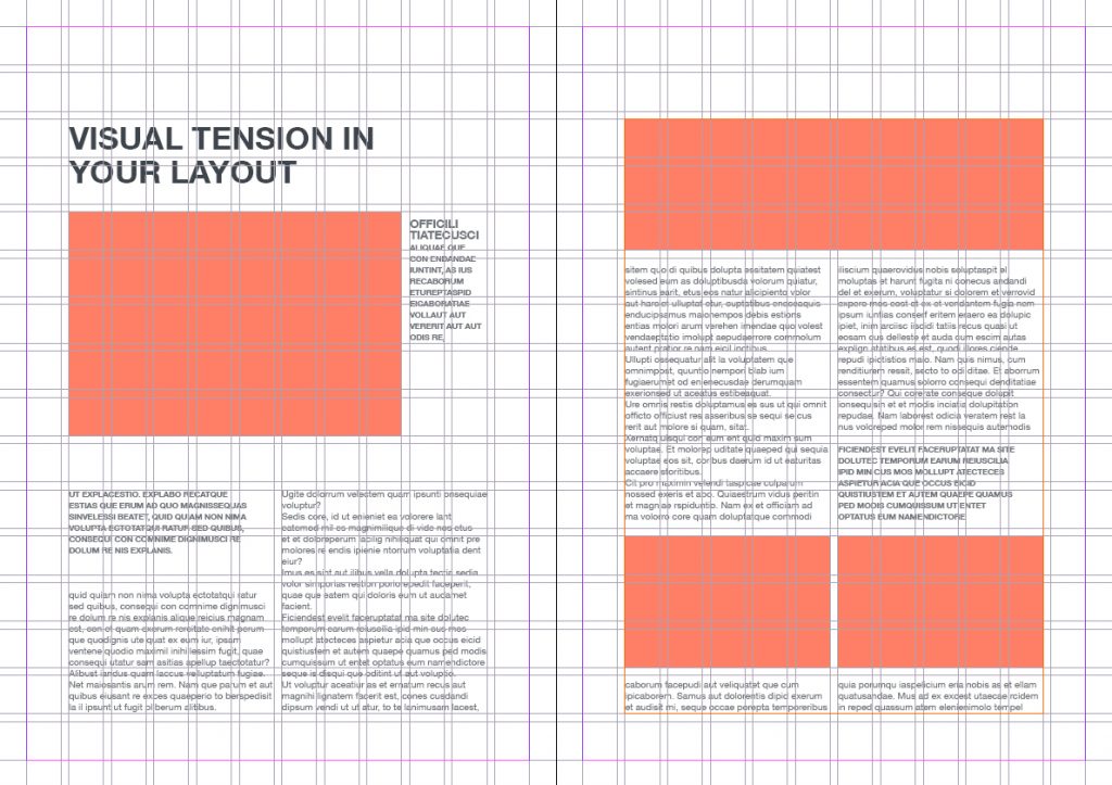
In book design, the use of the grid makes an editorial layout an examples of modules.
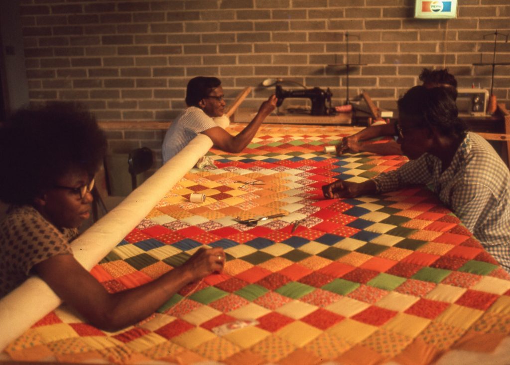
Quilting Bees- popular in mid-late 19th century, mainly women, building a quilt together, creating a sense of community. Everyone expressing themselves via these individual squares. The pathwork designs are modular.
Grid paperFull Frame Abstract Background – Pixelated Squares in Shades of Green and Blue in Digitally Generated Full Frame BackgroundEditorial gridFreedom Quilting Bee
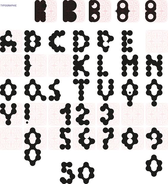
Modular Typography
Using a modular structure helps with decision making, as it gives some guidance to the designer, by providing limitations. Grids can start the creative process of the work, then you can focus on shapes, colour etc afterwards. It is 1 useful approach for designing logotype.
Arim Hofmann
Swiss designer, Arim Hofmann wrote a book about graphic design guidelines, called Graphic Design Manual, Principles and Practice. It was published in 1965 and outlined rules such as structure, form and line.
In his work, he demonstrated how many variations could be created with the single same modular, just changing positions.
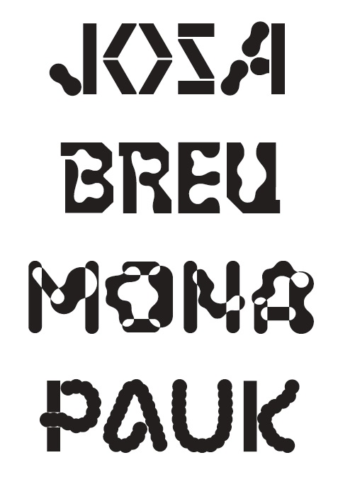
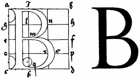
The examples below are of typography that used a modular grid to compose. This is seen in the way the letterforms ‘fit’ together in the (left) example. The letterforms on the right combine wider horizontal strokes and thinner vertical strokes. This would indicate a grid that has narrow vertical columns and wider horizontal grid lines.
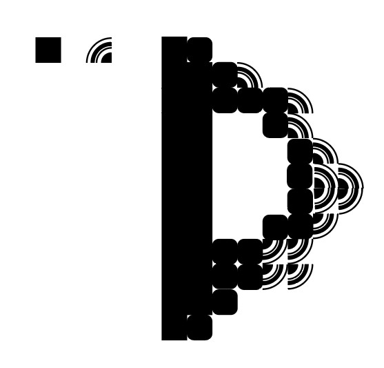
Karl Nawrot
Nawrot’s type design took inspiration from architecture, including in the way he worked on the designs. This was to use physical materials to build a structure, which he then drew letterforms (below, left).
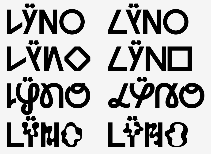
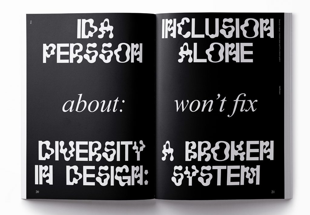
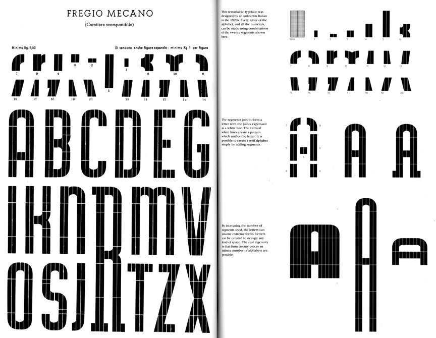
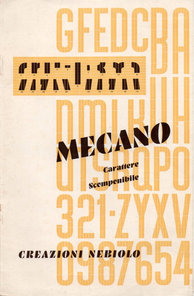
Another method of his experimental typography was to create 150 different stamps and apply these to the same grid.
In this issue of the student magazine, Item, the students were working with the theme of ‘strip’. Here, Moro and Demtroder have used Nawrot’s typeface Lÿno (co-designed with Radim Pesko.)
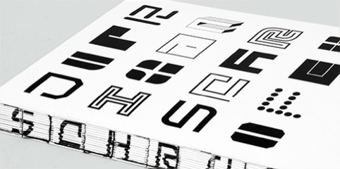
Dutch graphic designer, Schrofer’s dot matrices and sqaure grid system were progressive at the time and influence the way we approach type deisgn today.
Juriaan Schrofer (1926-90) The book, designed by Spin brings together a series of commercial and experimental projects from Schrofer
‘Writer Frederike Huygen, who provides an essay for the new book, describes Schrofer as ‘a computer-designer before the computer’.
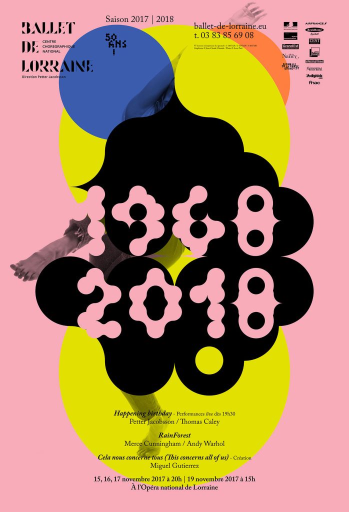
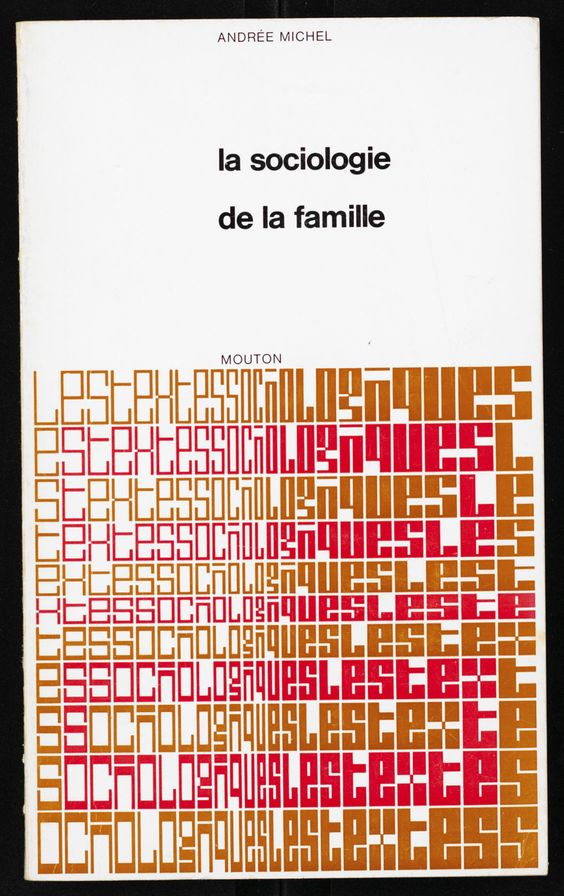
Schrofer designed the book covers for Les Textes Sociologiques in 1970. Typeforms are used in an illustrative way. The underlying grid creates a gradient pattern across the type.
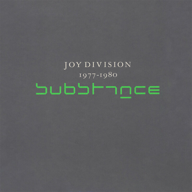
Wim Crouwel
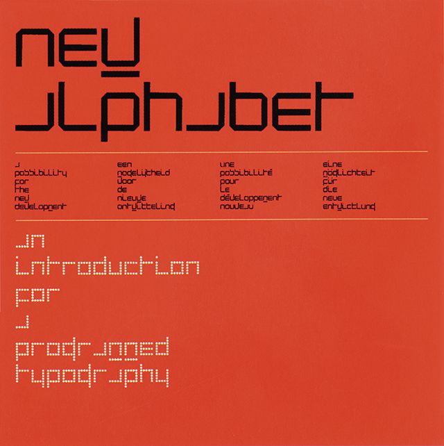
Crouwel’s typeface New Alphabet was used by Peter Saville for Joy Division’s album cover:
When New Alphabet was first used, it was found illegible/ inaccessible for people. This modular typeface was adapting to the first digital screens, giving it its geomtric appearance.
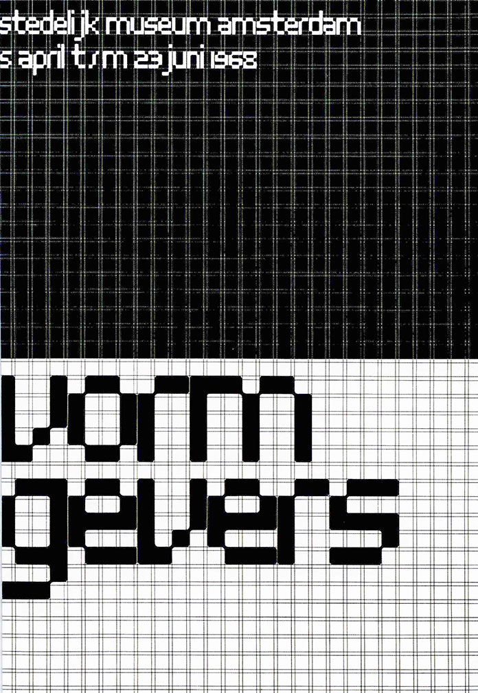
Architype Stedelijk was the typeface he used in his well-known poster for the Stedelijk Museum in Amsterdam. Interestingly, he kept the grid visible in the poster:
I like the Architype Stedelijk ‘a’.
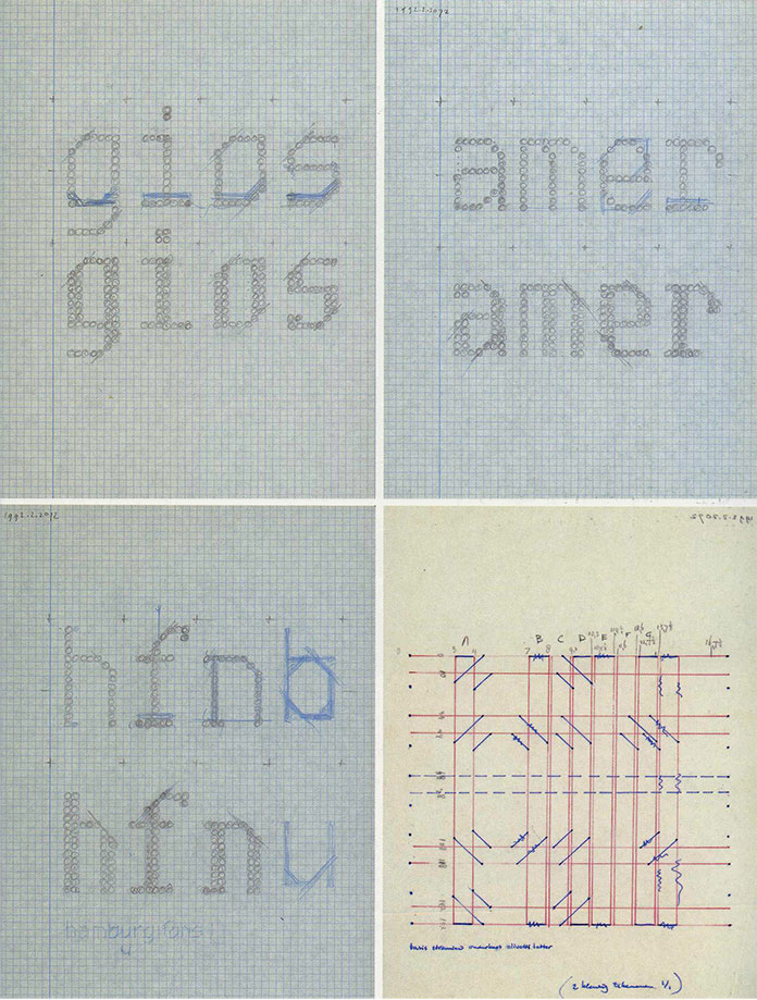
Crouwel’s sketches, using grid paper to plan his letterforms.
The title for this poster has a uniform appearance, from its use of an underlying modular grid. There is a satisfaction to the neatness and logic of it.
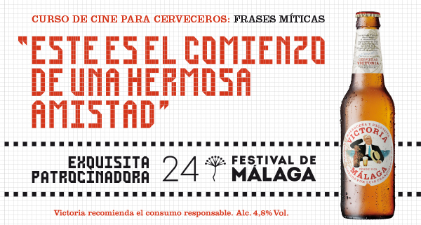
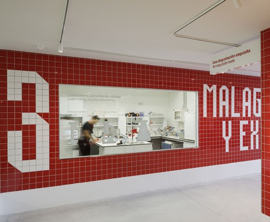
Mario Eskercezi Studio
Typeface/ identity for the Victoria Brewery in Malaga. Since there a lot of tiles in the city, the designer took the environment as inspiration when designing the modular typeface for the beer advertisement. The grid pattern is also used in the background of the poster which provides a ground for the type to sit on.
The type could then be used within the environmental design, since it could be easily made up of equally sized tiles.
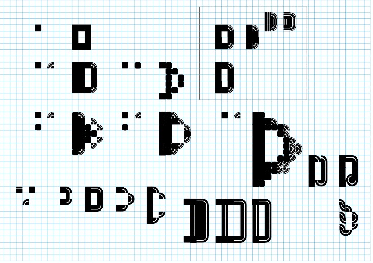
By designing our own grid, this will determine the design of a unique type. A possibility is to make our own grid- rounded. However, for today’s workshop, we were provided with a grid designed by our tutor. Below is the grid I was working with. The designs in the square were worked on by my tutor, I kept these for a reference to look at.
Illustrator Workshop
I ensured snap to point and smart guides were on. This helped when working with the grid. But even so, I still found that the shapes didn’t always fit exactly into the grid squares.
Effect> distort and transform makes shape imperfect to use in modular. (I didn’t use this effect today but I would like to try it in future practice).
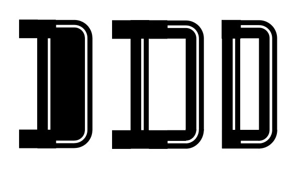
Results from this workshop:
Using 3 different shapes.
Using 1 shape to create a curvy, twisted letterform.
3 different shapes.
The 3 shapes I used to design the letterforms below:
This professional practice module asks us to consider ‘What is my professional identity?’ I’m beginning to think about my future as a creative practitioner, this means continuing to reflect on what I like and what I see myself doing from day to day. What do I want to communicate about myself? We make these choices everyday, by the way we talk, what brands we wear/use and our lifestyle. These all communicate our ‘self-design’.
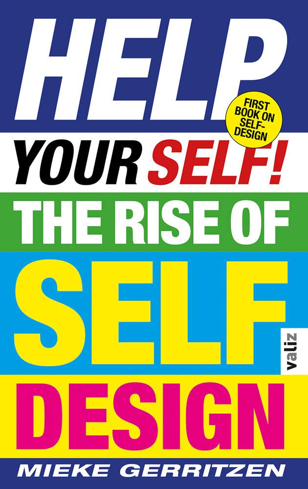
First I need to have an understanding of who I am and how I could place myself in society. The 2 books (below) helped me to think about this topic.
Help Yourself: The Rise of Self Design by Mieke Gerritzen
From Help Yourself: The RIse of Self Design by Mieke Gerritzen
This book made me think, right from the first page. The tone of the introduction is speculative with thought-provoking facts sprinkled in. I love the playful design throughout the book and sense of humour. I found it easy to read, mainly due to the use of the underlying grid, colour combinatons and variety of display types which reflect ads found in a newspaper.
The cover of this book immediately reminds me of ‘The Media’. The type makes me think of newspaper headlines designed to grab the reader’s attention. Along with the circular ‘First book on self-design’ message that imitates a sticker, it appears as a parody of this tabloid style.
Cover design
In this book, Gerritzen references the increase of self-help articles in today’s world. He mentions the pressure we are all under (from the media) to lead the perfect life. He explains in his introduction that everything else in our culture is designed ‘from spoons to entire cities’. He suggests that self-design could be a new form of creativity.
Science tells us who we are. But who we want to be, is a matter of culture.
Bas Heijne
Another section of Gerritzen’s introduction made me consider. People in the public eye, politicians/leaders (his example being Barak Obama) have a precisely designed image. They need to portray this image to get across a certain message to the public. I already knew this. But I never considered that the ordinary person is doing the same thing. Are we all just as influential?
Especially with the use of social media, it has become even easier to produce a public image that doesn’t need to even mirror reality if you don’t want it to!
Does this mean we are all in some way, designers?
From Help Yourself: The RIse of Self Design by Mieke GerritzenFrom Help Yourself: The RIse of Self Design by Mieke Gerritzen
Becoming an Artwork by Boris Groys
Our image belongs to others, to the society in which we live.
Boris Groys
Our body is a thing in the world. Our experience of our bodies is subjective because we cant see ourselves from outside our selves. Where the inner world might be spirirt or energy, the part that others can access through their gaze is the image of you. Pure contemplation vs. worldy desires as explored/ illustrated in the story of Narcissus gazing at his reflection in the lake. He compared Narcissus’ reflection to an early form of a ‘seflie’.
‘We are unable to like ourselves unless we assume that we are liked by the society in which we live.’
The body allows us to be identified by others but it also hides our secret world within. Our thoughts and feelings are inaccessible to others. They can only see what we chose to reveal.
When our society was driven by religious beliefs and motives, there was a focus on the spirit within us being ‘pure’ or ‘unpure’ because God and the devil were beieved to have the power to see within our souls. Now that these beliefs do not pay a huge part in society, we have become as a collective, more concerned with what we and others look like on the outside. Society values public image.
Humans are ready to risk their lives and even to sacrifice them for recognition and admiration by society. The history of wars and revolutions certify that.
Boris Groys
How can I present my identity?
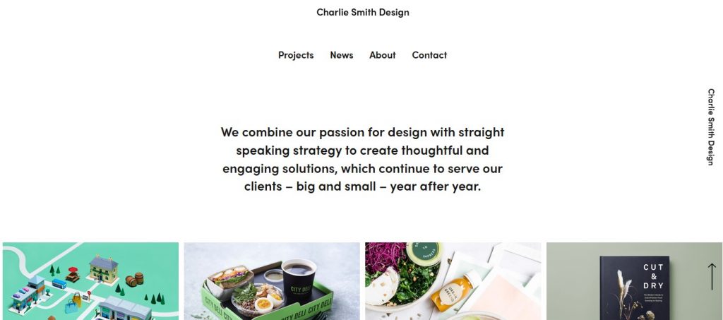
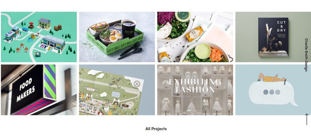
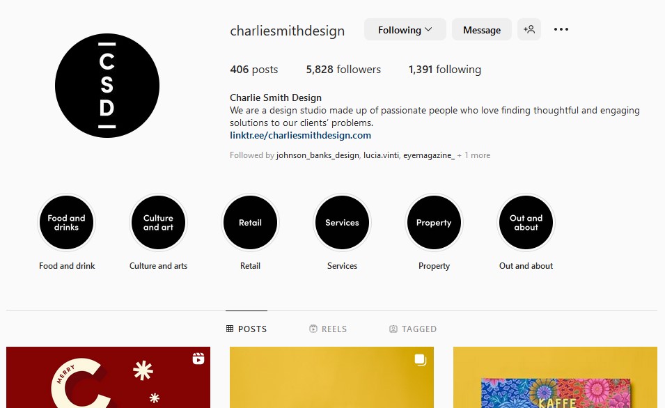
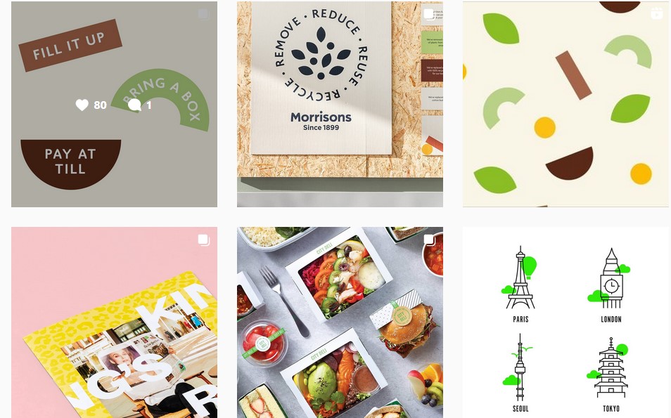
Typeface, illustration and other elements can be used to express my individual identity as a designer. I looked at several design studios as part of my research for a presentation next week. The presentation will be to present 3 case studies. One of the groups I felt inspired by was Charlie Smith Design.
I looked at the way they present themself on their website and Instagram page.
(Helping to frame what I like could help me to frame myself in future.)
Charlie Smith Design website
The use of black type on a white background presents a clean and professional look, emphasised by the central alignment of the site menu and description of the company. Their work has been photographed in a well-lit setting, using different, appropriate colours for the background. This gives a harmonious sense to the work.
Their Instagram page feels light and joyful due to the work they have selected to post on the page.
What to consider – when presenting myself
Style (shown in portfolio)
USP/ what I offer/ different from others
Ambitions/ achievements
Skills
Education
Experience
Showing-off – being confident ‘I want this job, I’m going to be really good at this’
Examples of past work
What inspires you- your passions- Your values for e.g. if working for charities is important to you
It’s OK to be honest ‘I want to do this better’ ‘I want to learn this’ ‘I’m in love with printing materials’
The Logo
Logo = A unique identifying symbol > labelling something
An early example of this is the maker’s marks on pottery.
Brand = Putting a mark on something to indicate ownership
Medieval soldiers were branded to indicate who they were owned by.
Design as art by Bruno Munari. These illustrations show us how the human face can be represented in a huge variation of ways. Everyone can have their unique way of expressing themself.
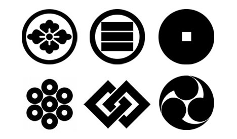
A Mon is a Japanese emblem using simplified shapes from plants or animals. They are used to identify the different families. The Mitsubushi logo is the fusion of the 2 family crests, one being organic and one being geometric. These shapes merged together create something unique.
Examples of Japanese mon. They were always monochromatic, meaning that they could appear in any colour and still have the same meaning, unlike in the European coat of arms for example where colour was a very important signifier.
Modernist logo
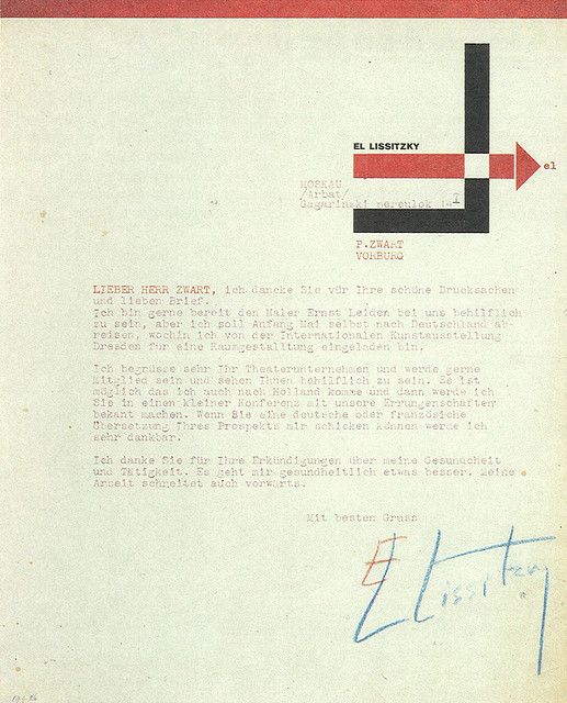
Bauhaus logo by Oskar Schlemmer, 1922. This symbol uses geometric structures, very reflective of the modernism made famous by the Bauhaus movement. Their use of sharp and defined shapes can also be seen (below) in El Lissitzky’s letterhead design (1924).
This letterhead symbol was Lissizky’s personal mark.
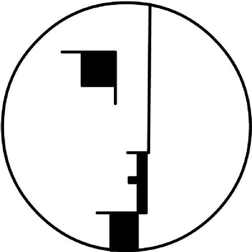
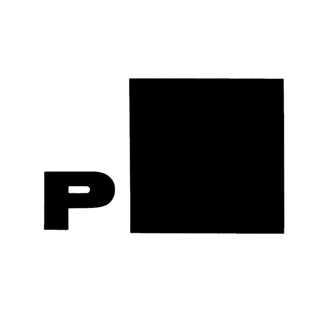
Another personal mark from the Bauhaus era is by Piet Zwart. He used a black square to define himself, since he felt thisn symbol represented what he was about. This was used as his signature.
Piet Zwart
The Monogram = Symbols that use just the initials. This could be 1 letter or a combination of letters.
Monograms from the Holy Roman Empire were used by leaders/monarchs. They were put in seals to be used for important communication materials.
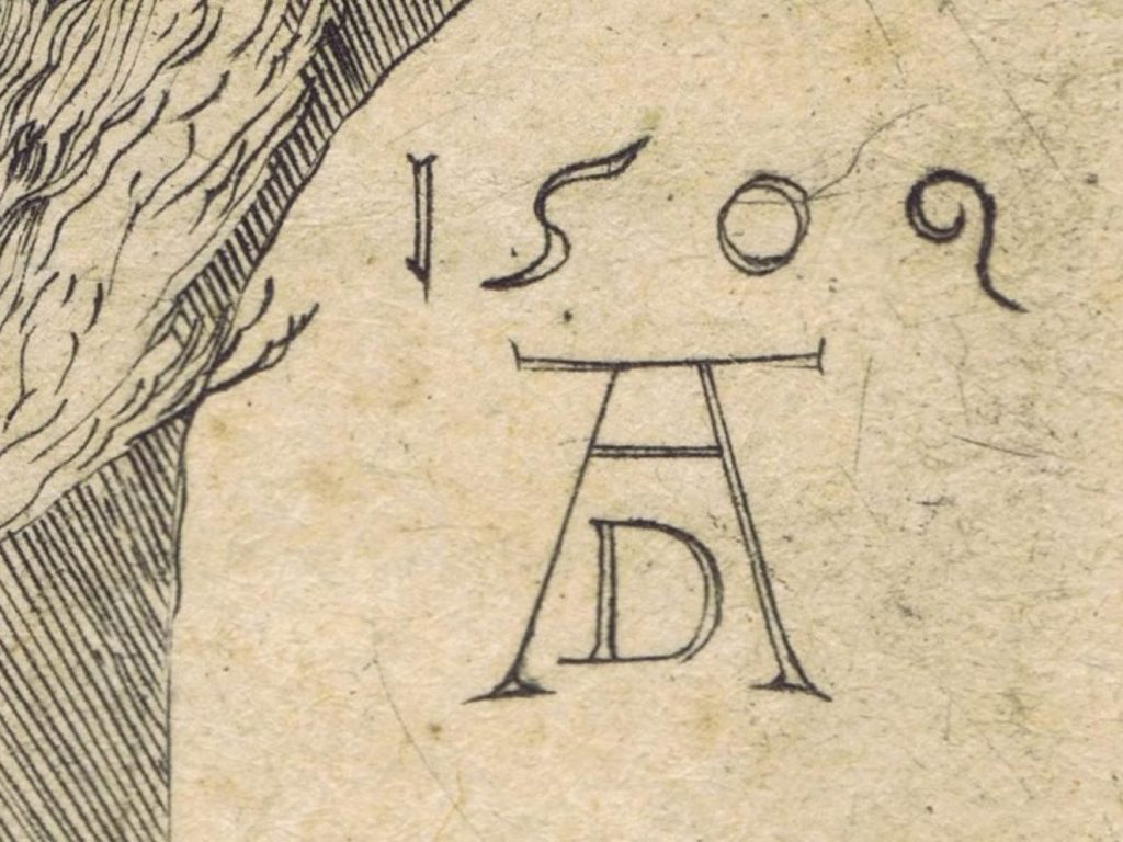
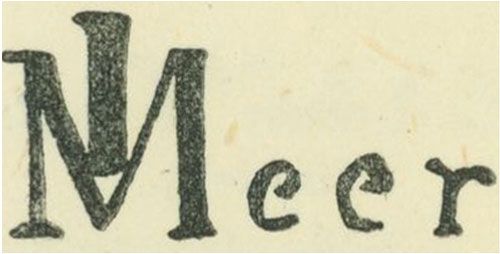
Albrecht Durer monogram. This was the first time a monogram was used by an artist.
Johannes Vermeer. This example shows the artist’s clever combination of letters.
A publication that documents symbols and logotypes designed by the company Pentagram across their existance as a design firm.
Above, centre: This design plays with negative space.
Above, right: an example of texture, shape and rotation.
The gestalt principles means that our mind will complete a shape.
When designing a monogram, the initials can be rotated, multiplied, juxtaposed, placed within a shape, etc.
It’s important that the mongram physically reflects the subject it is designed for. For example, the Wouter Boer logo by SPIN is a design for an architecture firm. This monogram gives the impression of stability with its use of right angles and square grid.
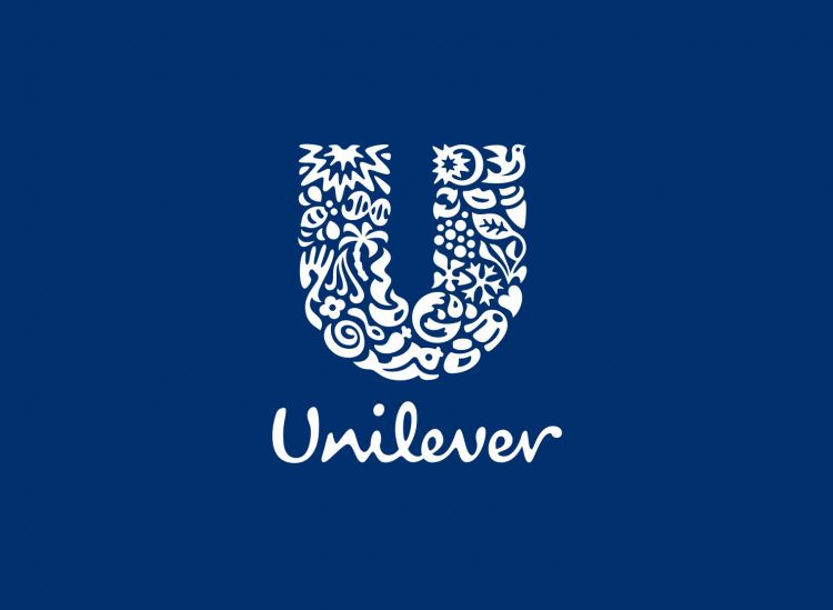
The Unilever monogram by Moving Brands shows the initial created using a collection of organic shapes.
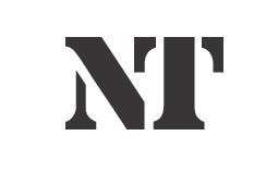
The National Theatre monogram, Ian Dennis, from the 1970’s, gives our brains something interesting to piece together visually (getalt). The serif font gives the symbol a smart style.
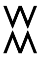
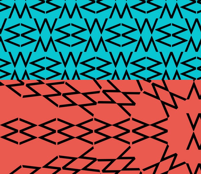
Brand marque for sonic branding company, Cord – 2013Monogram designed for Winter Marsh. Here the designer has played with the initials ‘M’ and ‘W’ that are a mirror reflection of the other. We can also create a pattern or a moving graphic from a monogram.
Geometric Logo
Considering the example of Piet Zwart’s signature, we thought about how a geometric shape can be used within a logo. For example a square or circle. We could consider what is inside the shape. A line or texture maybe, that might be used to represent yourself.
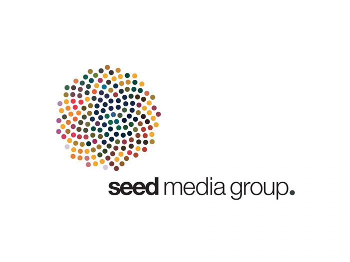
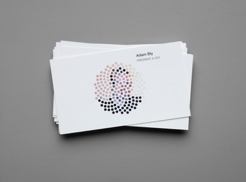
The Seed Media Group logo by Sagmeister. The symbol is composed of circles which suggests seeds. The image of the staff on each business card is then illustrated through the changing colour of the dots in the logo.
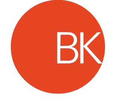
Logotype for BK Italia by Massimo Vignelli
Logotype by Michael Evamey
I found this book on logotypes very interesting and easy to digest. I’ve included exerpts from the book here:
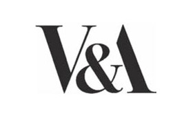
‘Verbal and visual unite in logotypes. The art is in the concept of a logotype; in the crystallization of a visual idea. This can emerge from extended, educated experimentation with type and letterforms until something – a solution – appears. It can arrive as the result of a chance observation – a misspelt word, a slip of the tongue or a fortuitous reflection. Occasionally, the idea drops into the mind when least expected. There is a eureka moment. For Alan Fletcher (1931–2006), searching for the perfect way to marry an ampersand with an ‘A’ in the V&A monogram, it came during his morning shower.’
Giving character to characters: Typefaces have a Jekyll and Hyde effect on words, and today the range of personalities available is greater than at any time in the past.
Brands are very much more than logos, but logos are what people grow attached to; they offer a focal point for all the feelings, good and bad, about a brand.
‘Everyone can see when a painting or a building or a logotype is aesthetically pleasing, but it’s the job of painters, architects and type designers to figure out why it is. I look at a lot of logotypes and I see missed opportunities. I’ll look at one and see a loop or a different ending, or a ligature that would have made it distinctive.
‘The arrow in the FedEx logo – people love having that pointed out to them. That kind of feature makes every client and every customer happy. And that’s what you’re always reaching for: that special element where the penny drops. ‘Something every designer should do is learn how to achieve expression through type. How do you make a word like “fizzy” look fizzy? It’s not about typing out the name in Helvetica and applying a “fizzy” filter to it. It’s about thinking of an idea and drawing it.
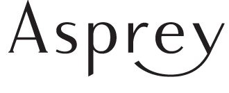
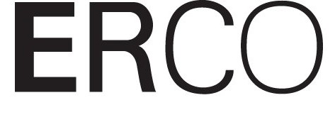
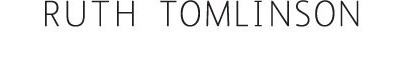
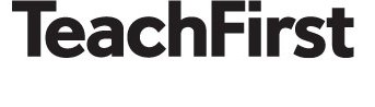
Asprey Luxury goods brand, UK Designed by Pentagram (Angus Hyland), 2002 For the company that has enjoyed royal patronage since 1862, a logotype with stately letterspacing and a final flourish to mark its split from Garrard in 2002.Erco Architectural lighting manufacturer, Germany Designed by Otl Aicher, 1974 A font whose letters are composed of thick strokes is said to be ‘bold’; one whose letters have fine strokes is termed ‘light’. Erco, a company that illuminates architectural environments, has for almost 40 years been graced by a logotype that gets lighter with every letter.Ruth Tomlinson Bespoke jeweller, UK Designed by Felt Branding (Scott Manning, Tom Rogers), 2009 Jeweller to the A-list, Ruth Tomlinson raised her profile with an elegant, restrained identity that complements the intricate, handcrafted nature of her creations.Teach First Educational charity, UK Designed by Spencer du Bois (John Spencer), 2010 Calm, solidity and understated confidence for a highly regarded independent charity.Spiritualized Rock band, UK Designed by Farrow, 1997 Created to coincide with the release of the third Spiritualized album, Ladies and Gentlemen We Are Floating in Space, Farrow’s utilitarian Helvetica identity perfectly complemented its packaging for the CD, which parodied packaging for prescription medicine.
Workshop 1 Part A – Monogram
Exploration and variation is the creative journey. This must be done first before making something you like. Today’s workshops are starting off this process of exploring different kinds of marks on paper. This is always worth exploring even if these marks are not used eventually. They could just as likely become a unique symbol for a brand identity.
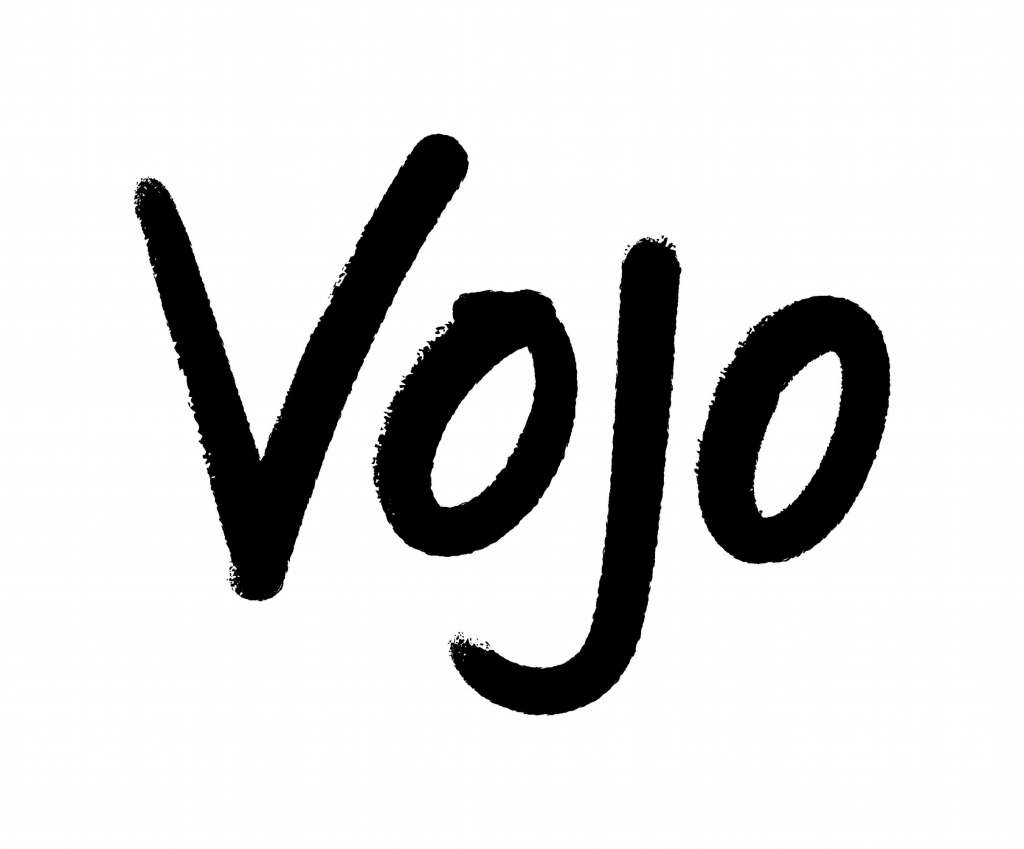
The Vojo logo by Johnson Banks uses a handwritten style. The mark is softened to look like a crayon marking. This gives the logo a more friendly impression.
I then considered how I could use the texture of the mark in a monogram design.
From the brief:
‘The aim of this workshop is to start exploring the idea of “designing yourself”.
‘Working in pairs choose from the tools provided and make a series of graphic interventions/sketches of your own initials, then exchange tools with the other student and repeat the process.
Exploring multiple graphic solutions, attempt to create a minimum of 6 monograms with the initials of your name.’
The process
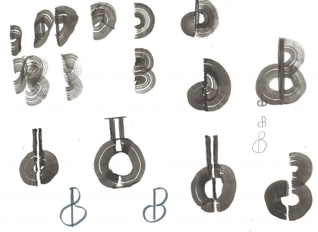
I began by using black ink and a paintbrush to create these markings (below). The less ink I used, the more texture was created.
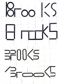
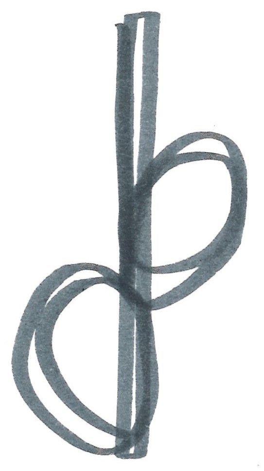
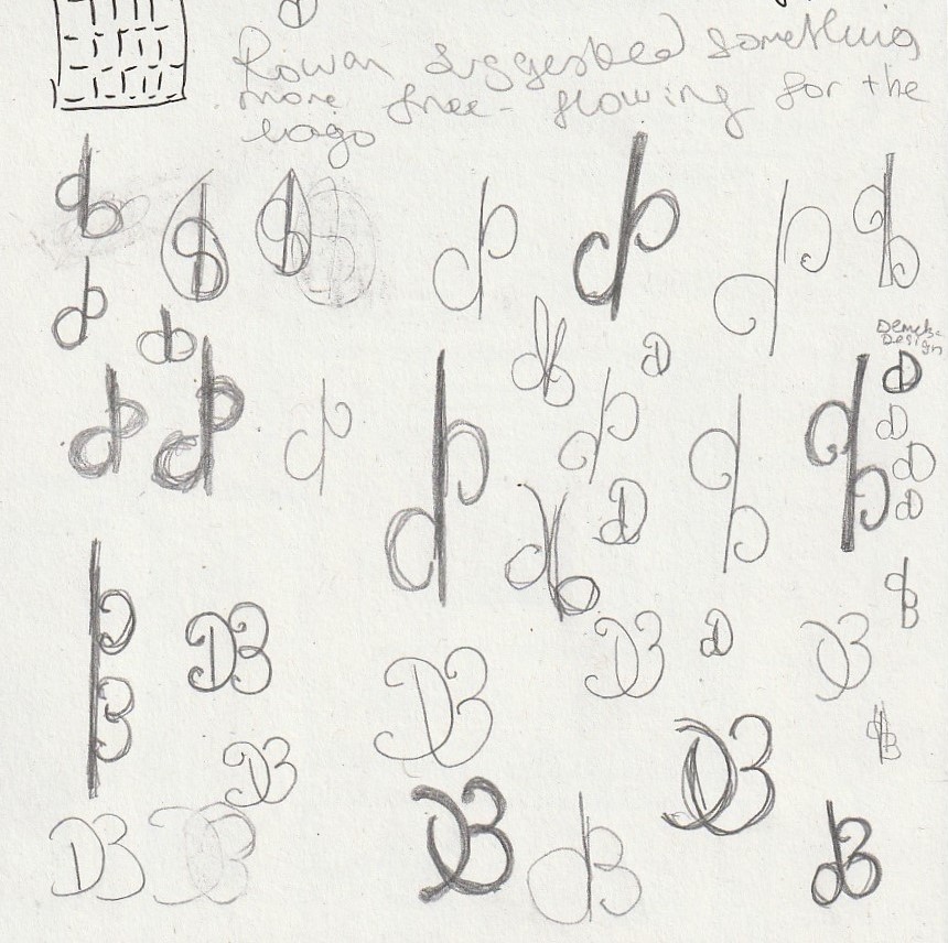
I experimented with uppercase and lowercase letters as well as with ‘DB’ for Demelza Brooks and DD for Demelza Design. I felt that these letters were fun to work with.
It was helpful working in a pair because I could both have helpful input about my own ideas and be thinking in terms of a different pair of initials.
I used felt pen as well as pencil. I found that changing the drawing material had the biggest impact on the drawing and whether I liked the idea or not. The material also changed what I drew.
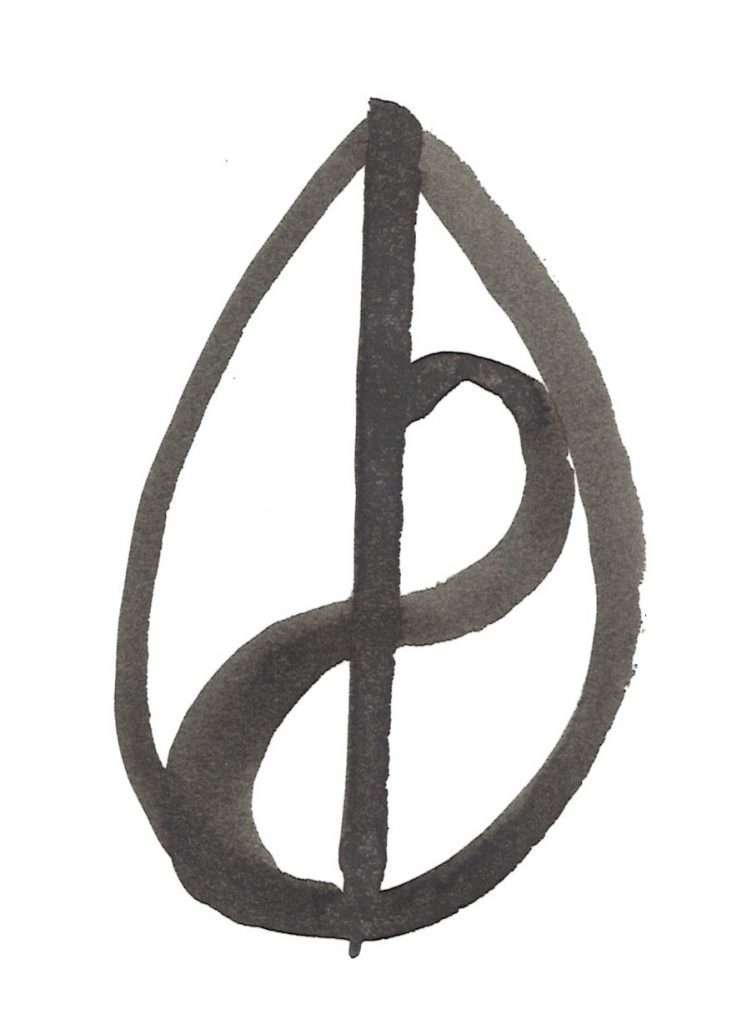
Lowercase ‘d’ and ‘b’. I played on the mirror image of the initials.
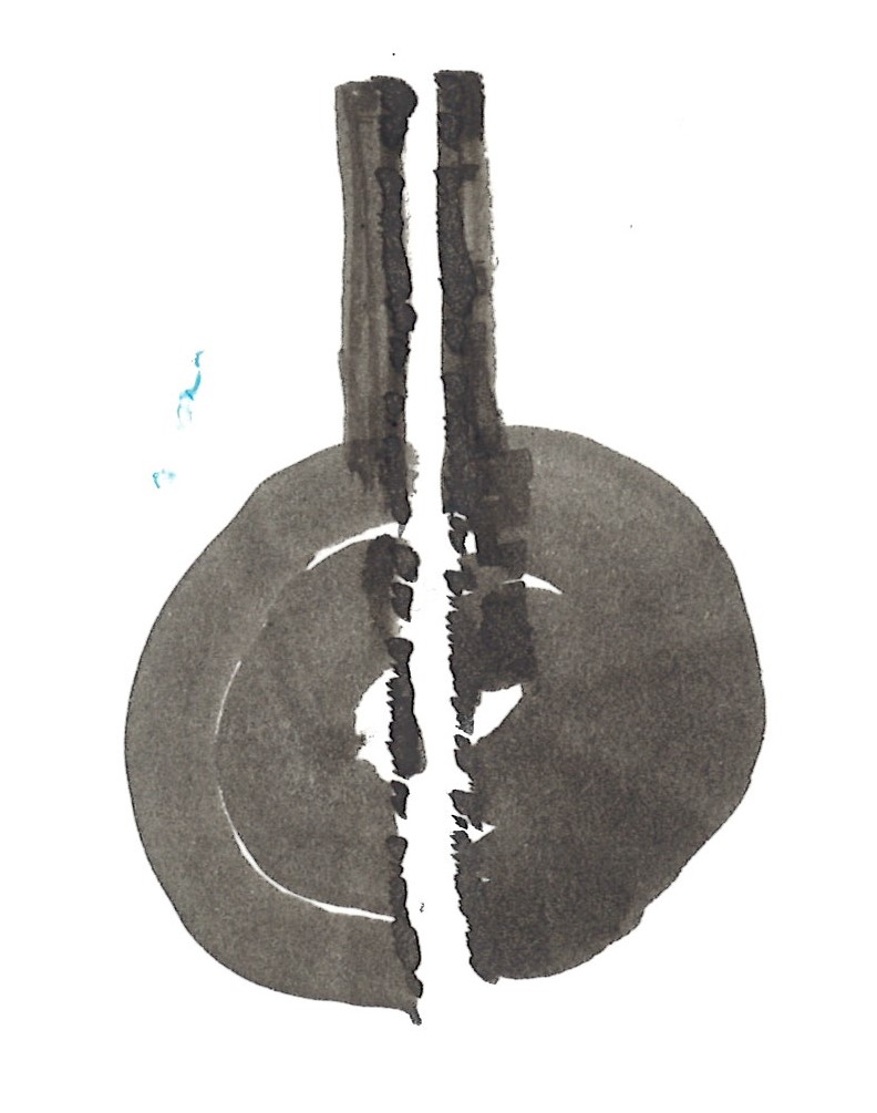
The thought behind these markings was to have a lowercase ‘d’ on the left and uppercase ‘B’ on the right. The gap at the centre would be in place of the d’s ascender. However, it didn’t really work because the counter of the ‘d’ looked more like a ‘C’. I do however like the texture of the brushstrokes.
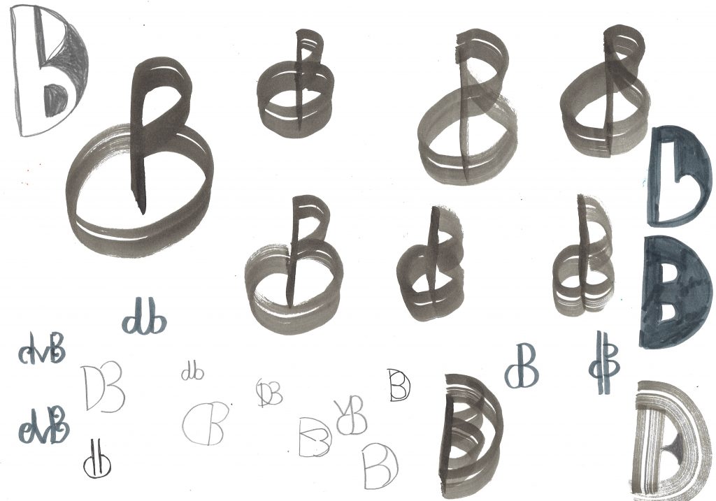
I used the same idea as above, but using a central straight line to become the d’s ascender. I’m still not sure that it doesn’t appear as a ‘c’ again.
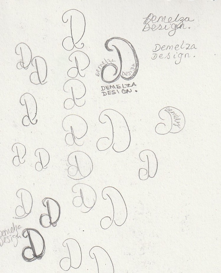
I flipped the d so that the shape would appear more like an uppercase ‘D’ instead. This did help the design.
I considered placing one initial inside the other. In both cases, placing the b inside the d.
Workshop 1 Part B – Logo Shapes
The second part of today’s workshop focused on the use of shapes in a logo.
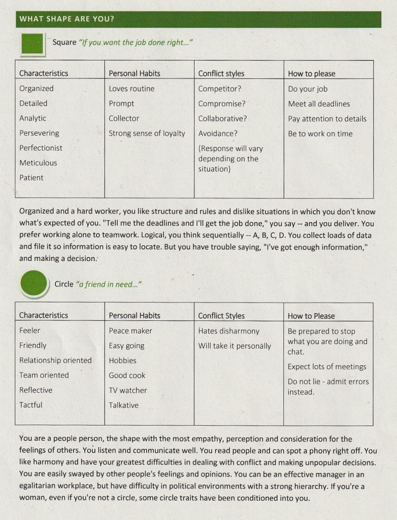
We were asked to consider what shape we felt represented our own identity the most. I really wasn’t sure which shape I felt like. None jumped out to me, but I can see elements of both the square and circle in my personality (see below).
I’m organised, loyal, detailed and patient but I’m also a sensitive person. I feel emotions quite deeply and can be quite talkative.
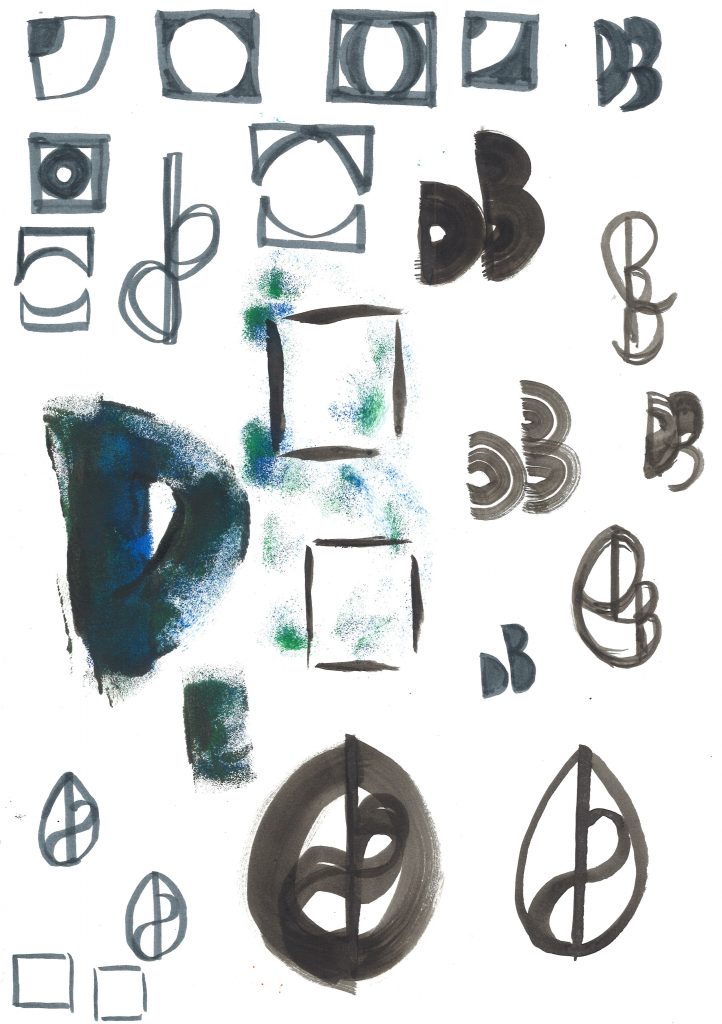
I therefore wondered how I might be able to combine both shapes into 1 symbol. I explored this using ink and pen again:
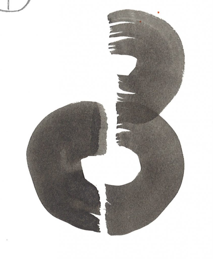
I thought of this shape as a compromise of both shapes. The square is imperfect and diconnected at the corners. Using ink and paintbrush gave the square a softer more organic feeling, in line with how I approach life. The sponge markings were accidental but I like their addition to the marks.
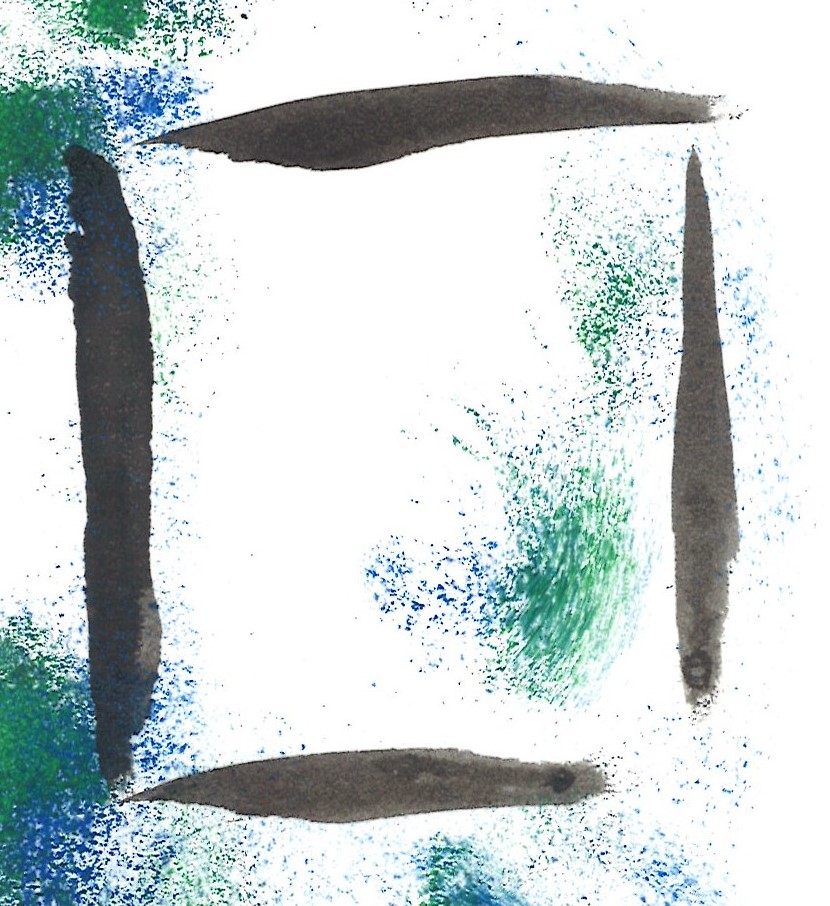
I considered a teardrop shape as another shape that could represent my identity. (Because of my emotional side and a sense of easy going flow). The bottom left shows the d and the top right shows a b. The straight line could also indicate my organised tendencies.
Another flowy shape, I used a felt pen to draw a symbol reminiscent of 2 leaves growing on a stem or maybe 2 musical notes. I purposely used a double line to create a sense of flowing movement and an organic quality.
From Logotype by Michael Evamy:
‘Sometimes a logotype needs its own space: a frame or area in which to make its presence felt. The variables here are shape, proportion and the position of words and characters within the space. Geometric shapes allude loosely to badges and labels, but carriers and frames can take any form, from abstract to allegorical to literal.’
After the workshop, I continued to doodle in my own time:
I asked a creative friend of mine, who has known me a few years, what she felt my professional identity would be. her reply was ‘something flowy.’ She felt that an accurate mark for me would be something like a painbrush or pen line.
I feel that sometimes those around us can point out these impressions better than we can see them in ourself.
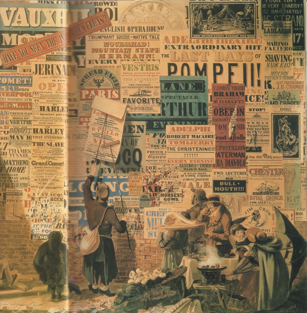
In the 19th century there was a reduction in price of printing material. This enabled people to read, which allowed a democracy. (You can’t have a modern democracy if people can’t read). This reduction in price, lead to several things:
A rise in advertising- they saw posters competing in public. A visual noise shown in the painting by John Orlando Pary of a London street scene:
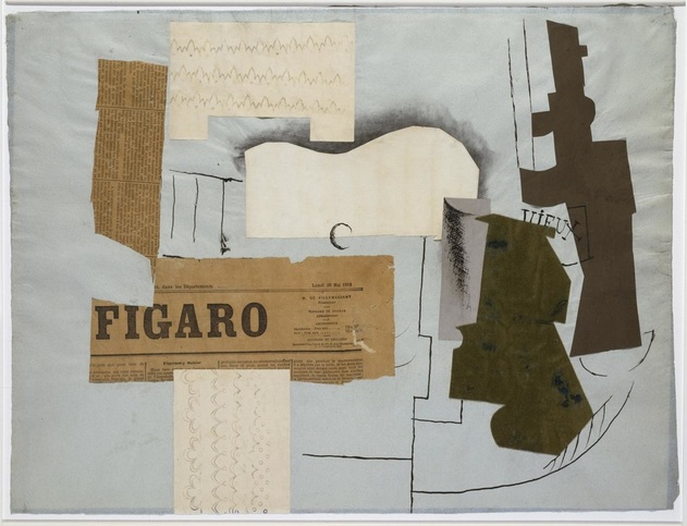
Both artists and writers saw this and were inspired. They turned to each other’s craft to enhance their work. Artists used words within their work, such as the collages by Picasso and Braque. Symbolist poetry came from writers reading the newspaper and seeing a contrast in the words about a variety of subjects.
Bottle of Vieux Marc, Glass, Guitar, and Newspaper – collage by Picasso https://www.weinerelementary.org/picasso-and-collage.html
Modernsim& Post-Modernism
“From the end of the 19th century, modernism was shaped by the industrialisation and urbanisation of western society. It marked a departure from the rural and provincial towards cosmopolitan, rejecting or overthrowing traditional values and styles as functionality and progress became key concerns as part of an attempt to move beyond the external physical representation of reality as depicted by cubism and the bauhaus.”
Around the 1st World War, the western world was politically heated. Dadaism and the Constructivists came out of this time. Dadaists opposed the traditional beliefs of a pro-war society.
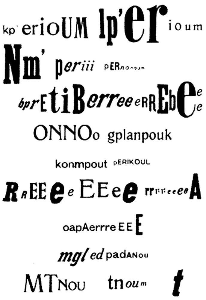
The optophonetic of Dadaist poet Raoul Hausmann, presented by Cecile Bargues http://www.diptyqueparis-memento.com/en/dada-optophonetic/
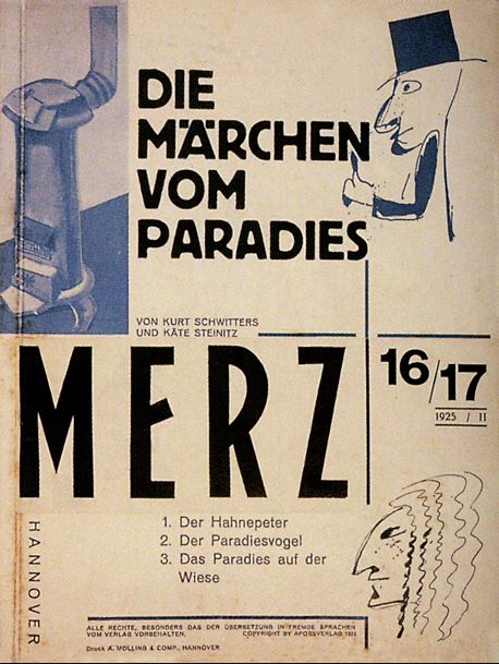
Cover of Merz, Kurt Schwitters, 1925
During the communist revolution, the art movements within this were the Futurists in Italy and the Vorticists in Britain. Their work represented the breaking up of the old world.
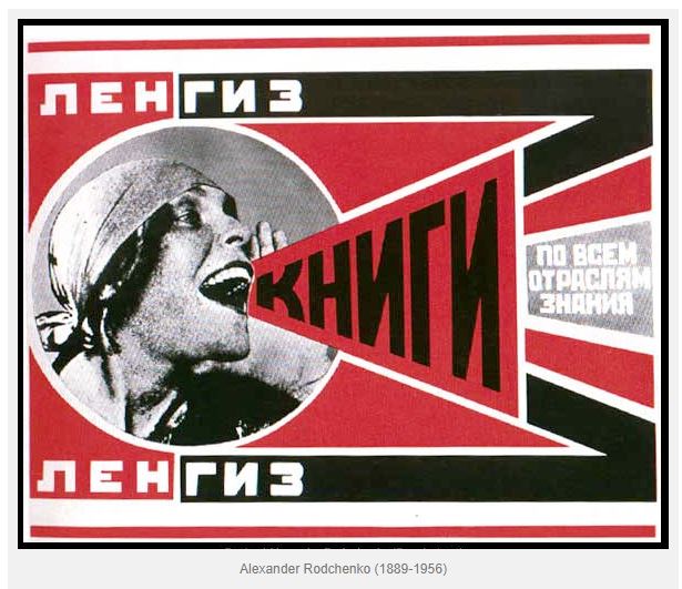
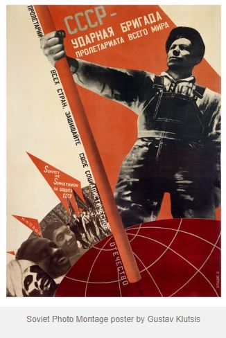
“Constructivism began as a Soviet youth movement. The Russian Revolution of 1917 involved many Russian artists, who combined political propaganda and commercial advertising in support of the new communist revolution.”
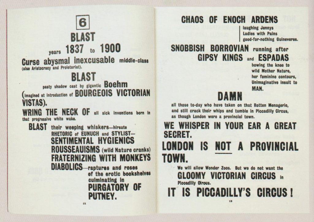
Blast
“Bless all English eyes” BLAST manifesto by the Vorticists. The harsh typography states a list of things the Vorticists were against (‘Blast’) and what they supported (‘Blessed’).
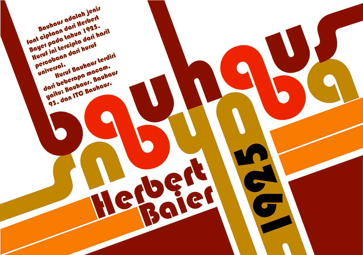
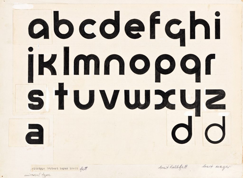
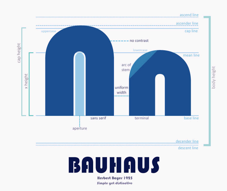
In the 1920’s, rules were written by Modernists and new typefaces were invented. This occurred at the rise of Fascism. Herbert Bayer was a designer who came up with the ‘Universal’ typeface, that he planned to be used by everyone, in a way of re-writing tradition. By changing what the world looks like, people are introduced to the new as it surrounds them in everyday life. This typeface at the time was extremely new and surprising.
Universal, 1925, Herbert Bayer
“Bayer’s Universal typeface was developed at the Bauhaus and is a reduction of Roman forms to simple geometric shapes. The circular form features heavily, and you can see how each character is closely based on the others.” – The Fundamentals of Creative Design by Gavin Ambrose and Paul Harris
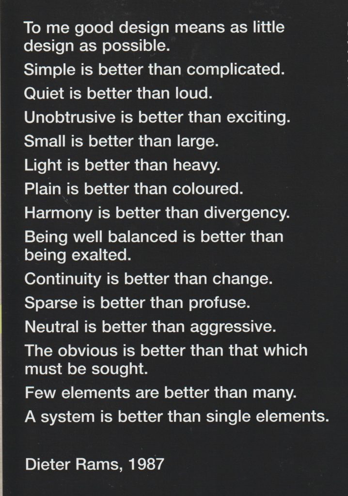
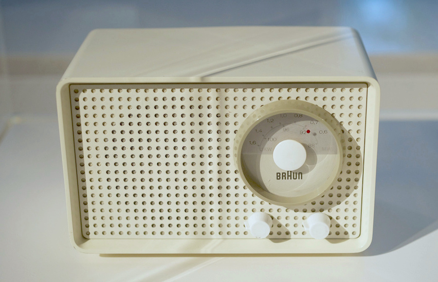
Radio design by Dieter Rams. His work was described as ‘quiet simplicity’. He was a pioneer of the Modernist movement and worked for Braun.
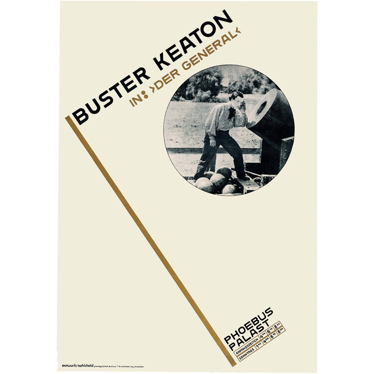
Jan Tschichold
Poster, Buster Keaton in “Der General”, 1927Internal spread from brochure MerkenSie sich bitte: Die Reklamemesse, 1927
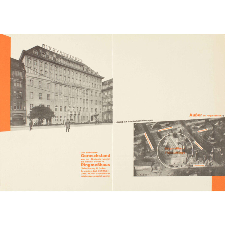
“New Typography uses white space to create visual intervals in an asymmetrical layout. An underlying grid unifies the page. Personal expression is rejected in favor of order and clarity. The predominant graphic design style in the world by the 1970s, the Swiss style is recognizable by its strong reliance on typography, usually sans serif type in flush left alignment.”
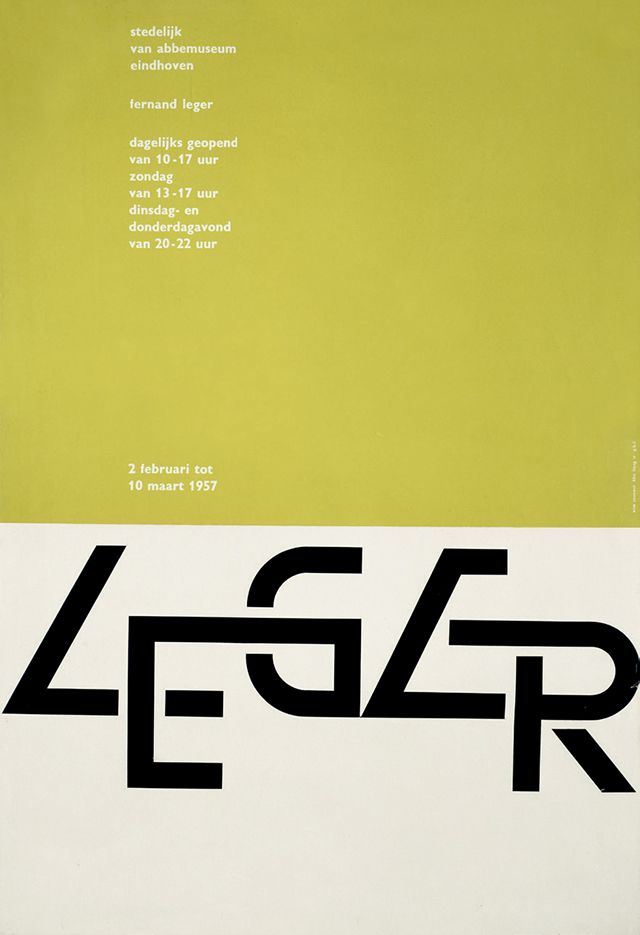
Late Modernism occurred in the economic boom in the 1950’s. Wim Crouwel’s posters from 1960’s-1980’s have a similar appearance to design now:
1967s New Alphabet Typeface. https://speckyboy.com/icons-graphic-design-wim-crouwel/Wim Crouwel Leger Poster, 1957.
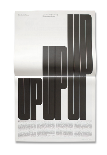
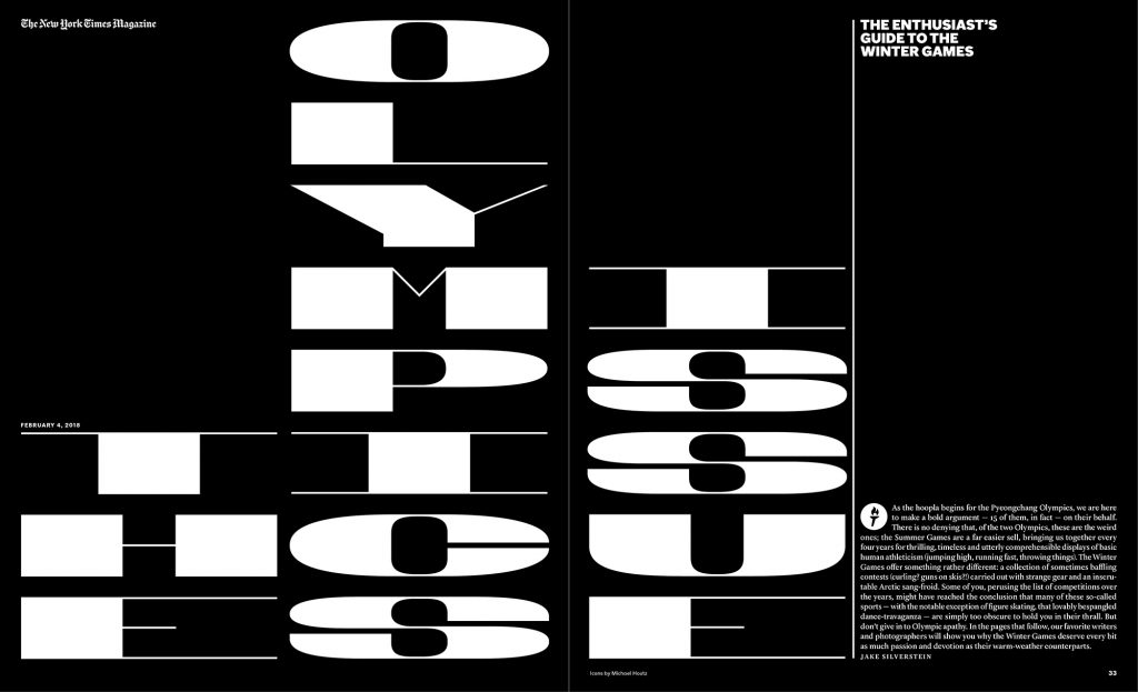
Matt Willey- contemporary designer
The New York Times magazine
NYT Olympics
Post-Modernism
“Post-Modernism developed following the Second World War and questions the very notion that there is a reliable reality through deconstructing authority and the established order of things by engaging the idea of fragmentation, incoherence and the plain ridiculous.
Post-Modernism returned to earlier ideas of adornment and decoration, celebrating expression and personal intuition in favour of formula and structure.”
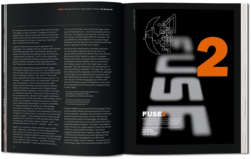
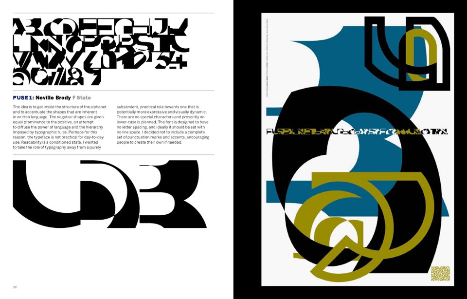
Fuse magazine, founded by Neville Brody and John Wozencroft
An example of Post-Modernism, the designers expressed their imagination across the pages. Sometimes readability was compromised, as form reigned over function. The magazine was produced at the time when computer technology allowed designers to experiment with new tools.
Automation is a phrase that is used to describe the transition from the old skilled job (for example, of typography) to the present digital age where the digital design tools are available to anyone.
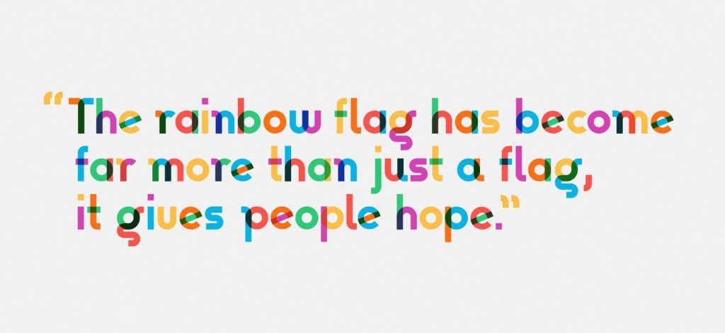
Gilbert, Type with Pride https://www.typewithpride.com/
“On 31 March, 2017, Gilbert Baker the creator of the iconic Rainbow Flag sadly passed away. Mr. Baker was both an LGBTQ activist and artist, and was known for helping friends create banners for protests and marches. To honor the memory of Gilbert Baker, NewFest and NYC Pride partnered with Fontself to create a free font inspired by the design language of the iconic Rainbow Flag, the font was named ‘Gilbert’ after Mr. Baker.” This is one of the world’s first coloured fonts.
“The colour combinations are blended on letters to represent the ‘open and fluid communities’ that make up LGBTQ.” (from The Fundamentals of Typography 3rd edition)
Postmodern design:
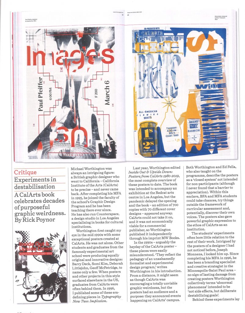
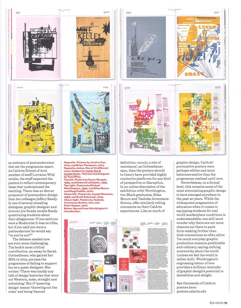
Eye Magazine, Issue 102
We use cookies on our website to give you the most relevant experience by remembering your preferences and repeat visits. By clicking “Accept All”, you consent to the use of ALL the cookies. However, you may visit "Cookie Settings" to provide a controlled consent.
This website uses cookies to improve your experience while you navigate through the website. Out of these, the cookies that are categorized as necessary are stored on your browser as they are essential for the working of basic functionalities of the website. We also use third-party cookies that help us analyze and understand how you use this website. These cookies will be stored in your browser only with your consent. You also have the option to opt-out of these cookies. But opting out of some of these cookies may affect your browsing experience.
Necessary cookies are absolutely essential for the website to function properly. These cookies ensure basic functionalities and security features of the website, anonymously.
Cookie
Duration
Description
cookielawinfo-checkbox-analytics
11 months
This cookie is set by GDPR Cookie Consent plugin. The cookie is used to store the user consent for the cookies in the category "Analytics".
cookielawinfo-checkbox-functional
11 months
The cookie is set by GDPR cookie consent to record the user consent for the cookies in the category "Functional".
cookielawinfo-checkbox-necessary
11 months
This cookie is set by GDPR Cookie Consent plugin. The cookies is used to store the user consent for the cookies in the category "Necessary".
cookielawinfo-checkbox-others
11 months
This cookie is set by GDPR Cookie Consent plugin. The cookie is used to store the user consent for the cookies in the category "Other.
cookielawinfo-checkbox-performance
11 months
This cookie is set by GDPR Cookie Consent plugin. The cookie is used to store the user consent for the cookies in the category "Performance".
viewed_cookie_policy
11 months
The cookie is set by the GDPR Cookie Consent plugin and is used to store whether or not user has consented to the use of cookies. It does not store any personal data.
Functional cookies help to perform certain functionalities like sharing the content of the website on social media platforms, collect feedbacks, and other third-party features.
Performance cookies are used to understand and analyze the key performance indexes of the website which helps in delivering a better user experience for the visitors.
Analytical cookies are used to understand how visitors interact with the website. These cookies help provide information on metrics the number of visitors, bounce rate, traffic source, etc.
Advertisement cookies are used to provide visitors with relevant ads and marketing campaigns. These cookies track visitors across websites and collect information to provide customized ads.