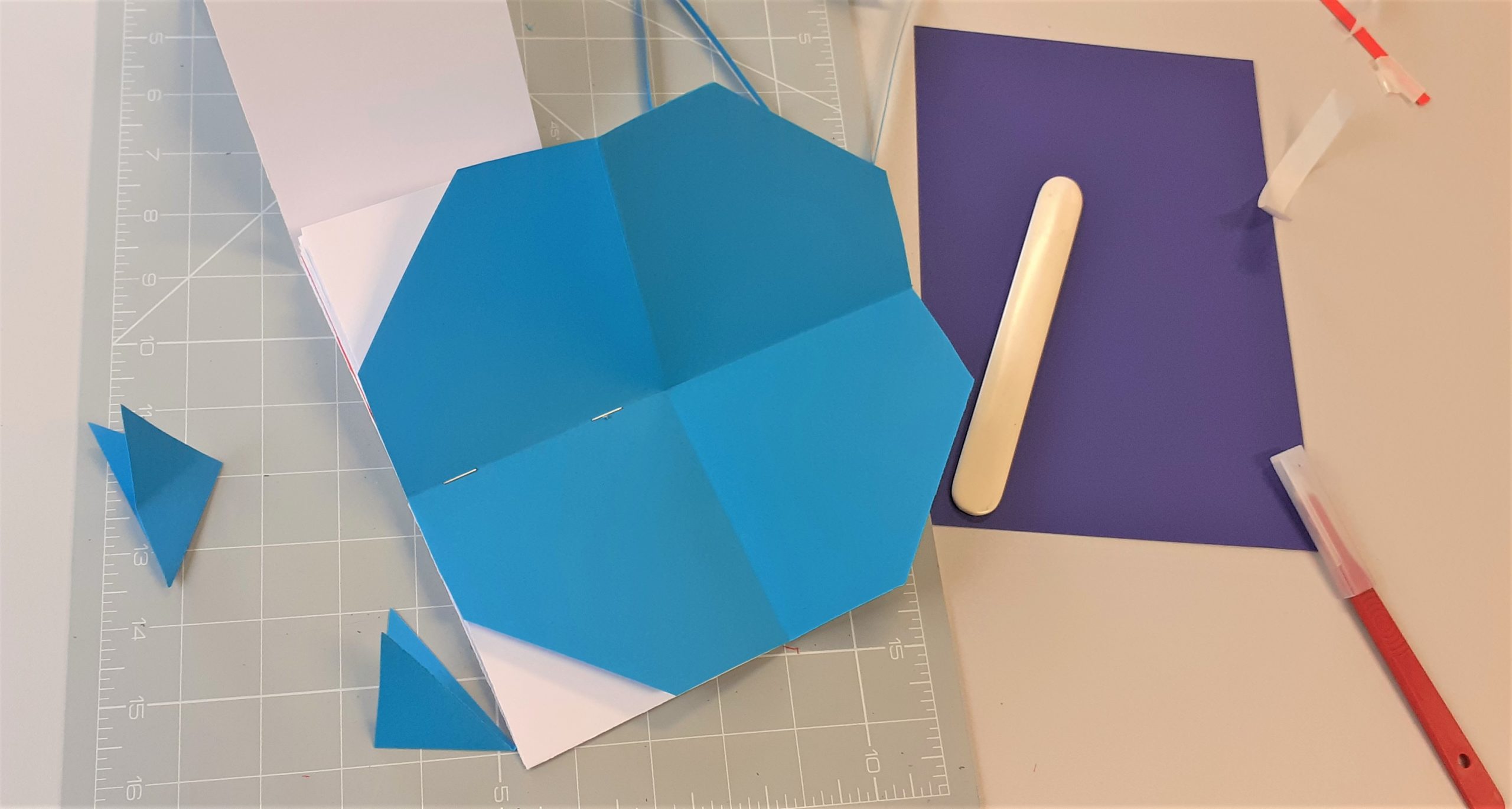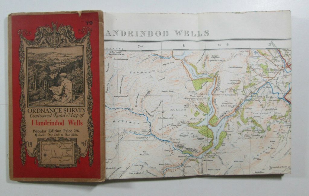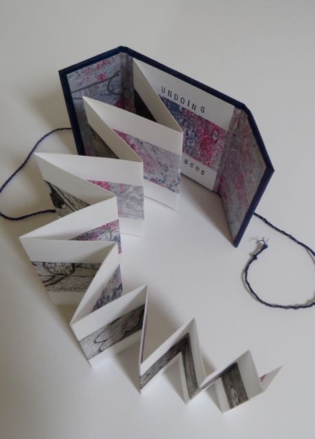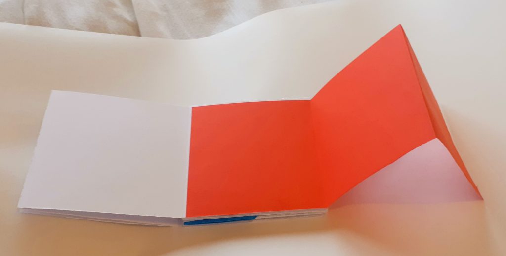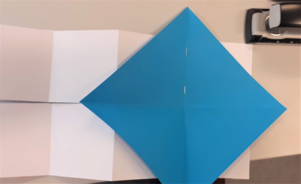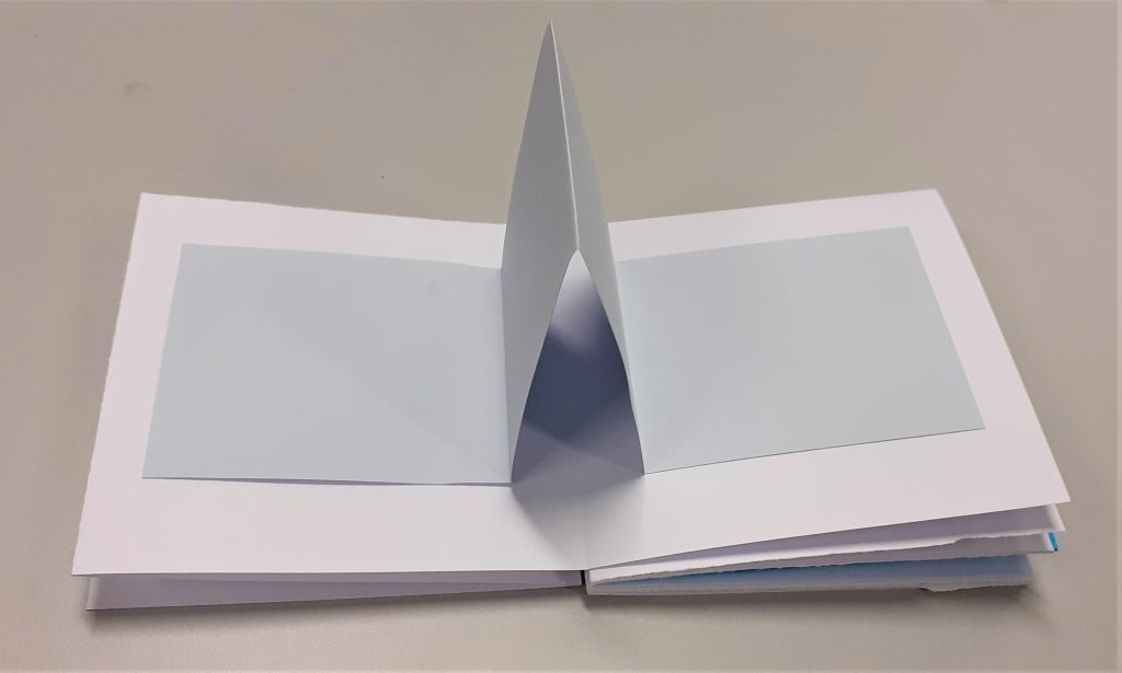
I researched the physical formats for map making by looking at maps in the flesh.
I remembered the collection Ruth showed us in our bookbinding workshop about maps. I visited the collection in the Richard Hamilton Building this week and took a few photos of some interesting aspects.
I didn’t photograph one map where the designer included graffiti and dog poo on their map of an area. It is the designer’s choice what they include in the map and what they want to direct the reader to.
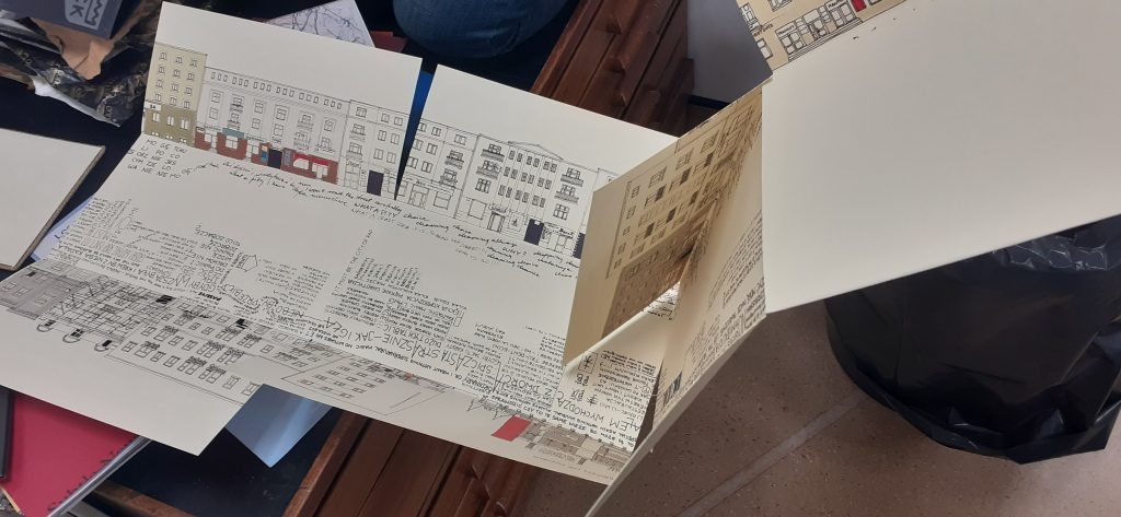
This map opens out lengthways and shows us 2 sides of a street. The centre of the map represents the road itself. They have used words to tell us information such as who lives in the building and events that have happened. The map was not in English, so I could not understand exactly what it was telling me, but even so, I could guess a lot from the way it is visually expressed. As the reader, it feels like you are walking down the road.
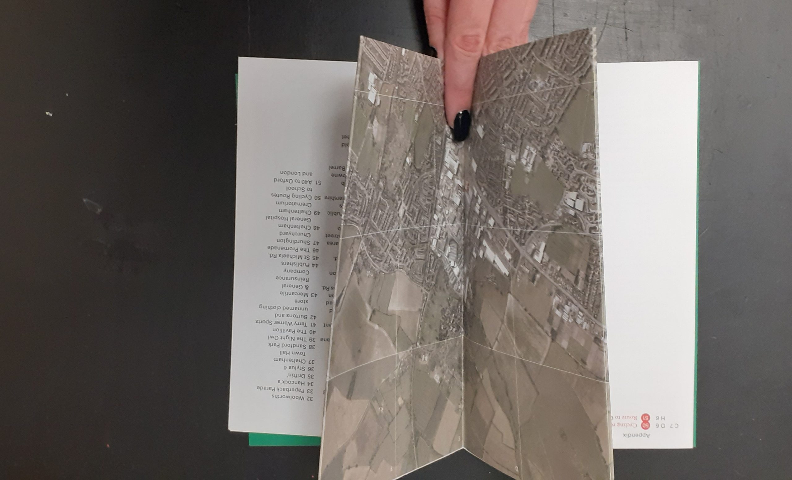
Another map that caught my attention is one made up purely of photos. The designer has taken a series of photos at one location and pieces the images together to create a picture of the place. This reminded me of David Hockney’s approach, but the photos here are made to look seamless. This technique means that we are given more information than could be captured in a single photo of a place.
Stephen Willats
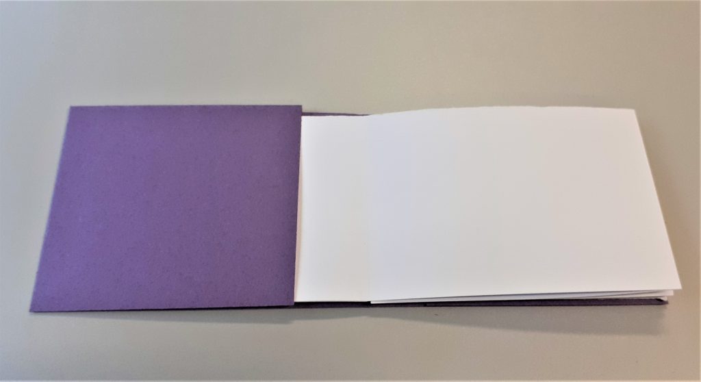
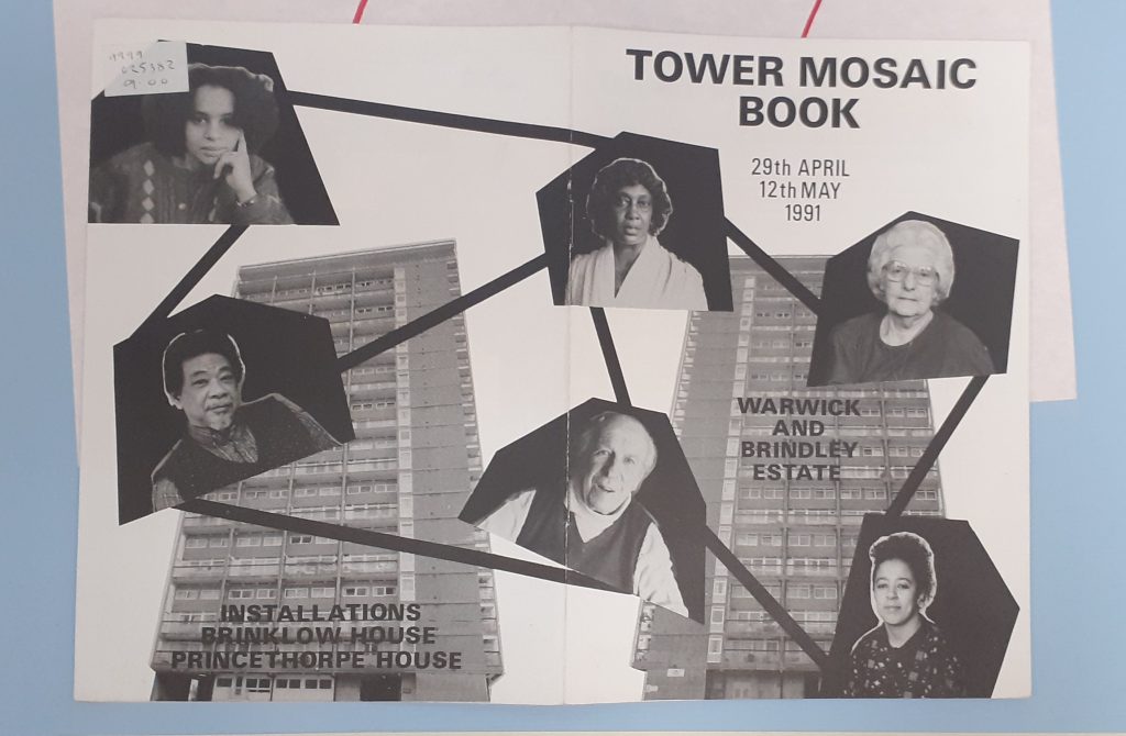
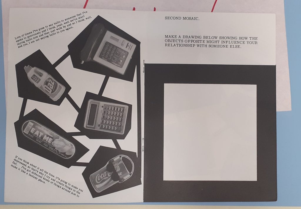
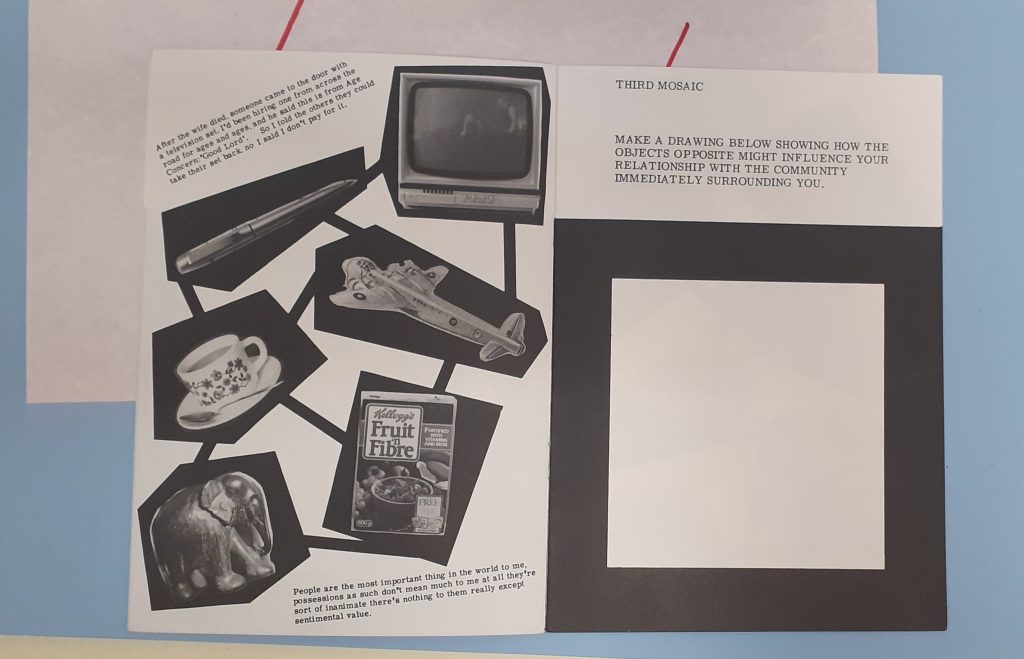
Amongst the collection of maps, I found this booklet by Stephen Willats, whose work I have looked at previously. The Tower Mosaic Book maps together the residents of the building. Because of the boldness, the map is easy to read.
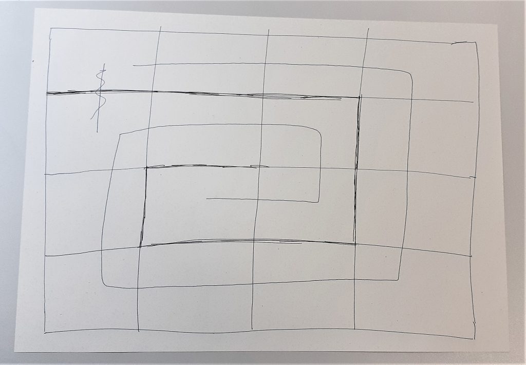
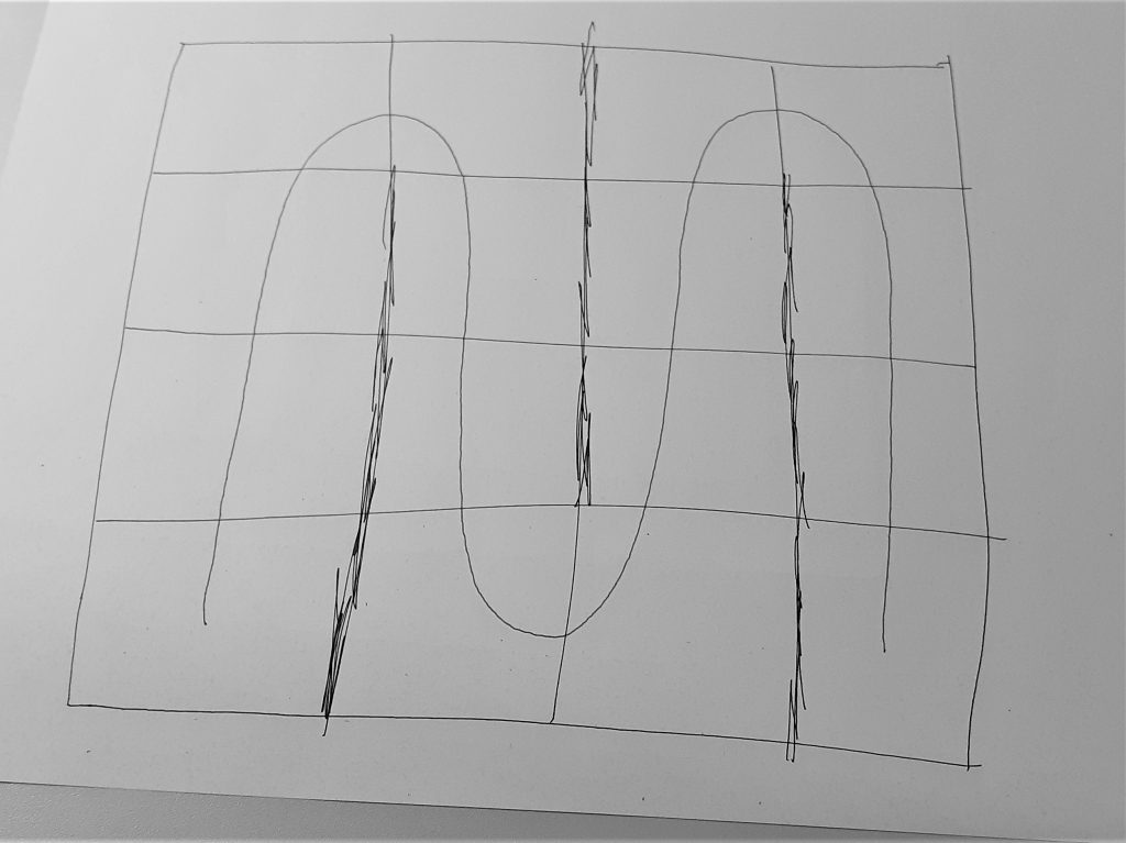
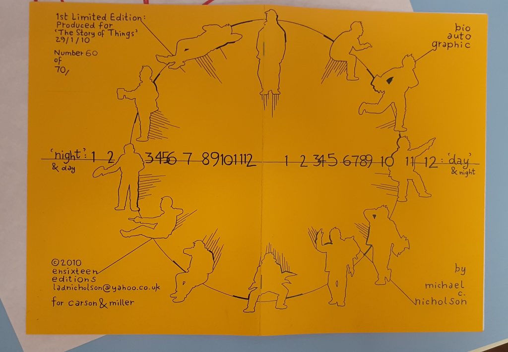
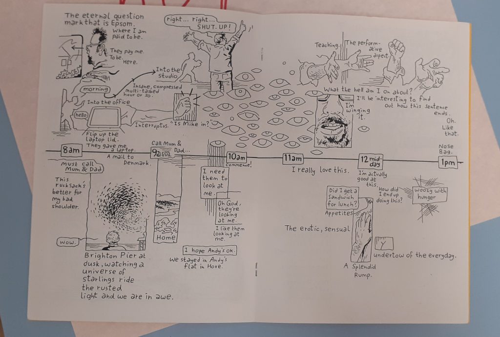
Michael C. Nicholson
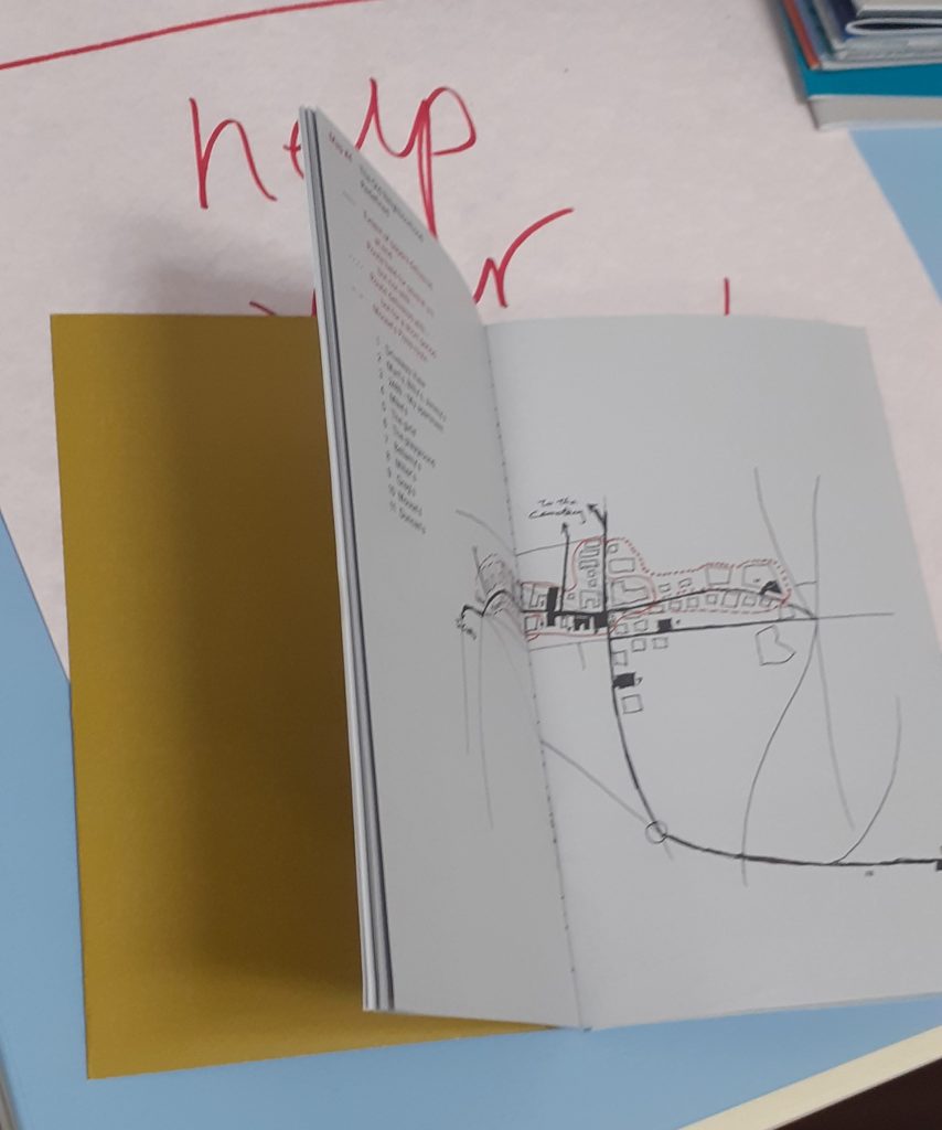
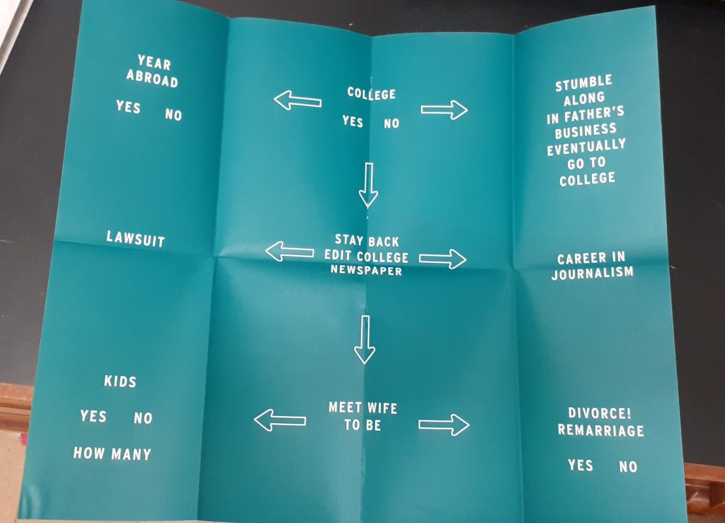
Nicholson maps his day in this booklet. The horizontal line represents the hours in the day and the silhouettes signify different activities. The way they are positioned remind me of a clock face and therefore the viewer sees a clock even before reading the text.
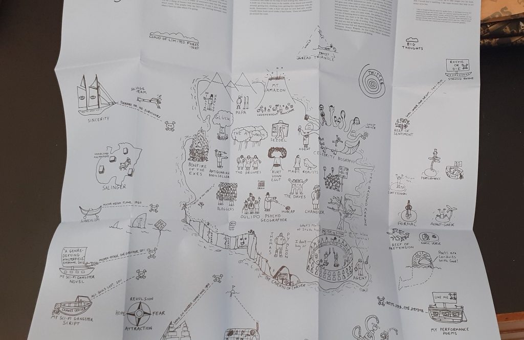
‘Where You Are is a book of 16 maps created by writers, artists and thinkers.’
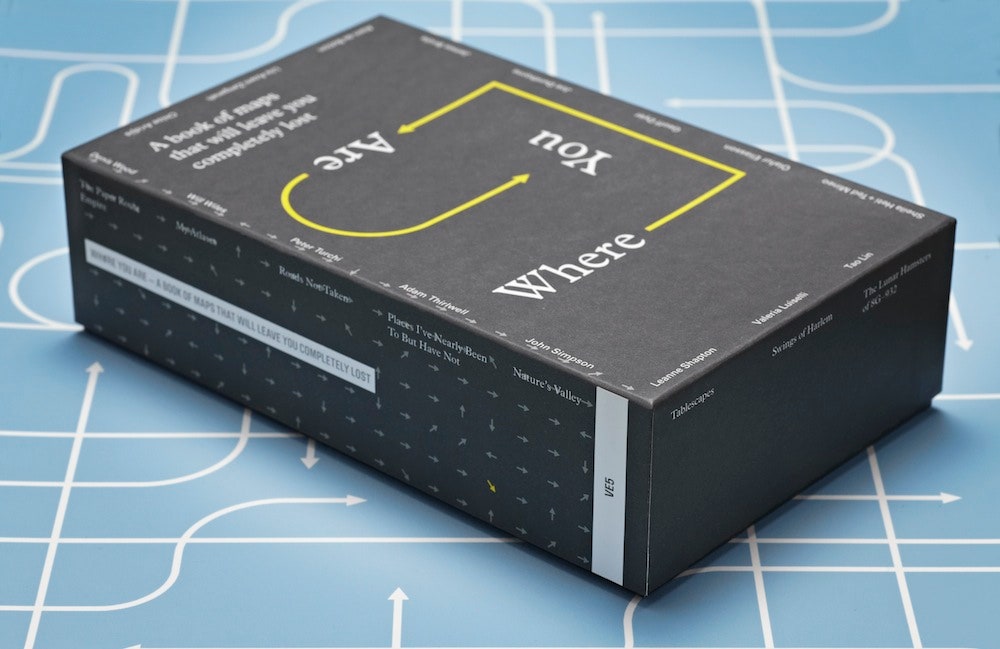
‘We’re constantly mapping our lives, even if we don’t realize it. The emails we send, the restaurants we Google, the buses we take, the status updates we post —all of this is a way to track where we’ve been, what we’ve done and what’s important to us. ‘
‘(These maps) won’t actually get you anywhere—but they sure are fun to look at.’ 14 Fascinating Maps of Places Hiding In Plain Sight (gizmodo.com)
I looked at this collection and include some of the maps here:
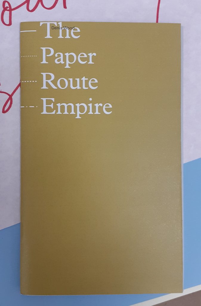
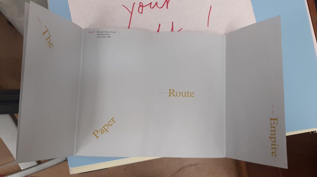
Denis Wood
front cover
Tao Lin
front cover
Leanne Shapton
front cover
Peter Turchi
front cover
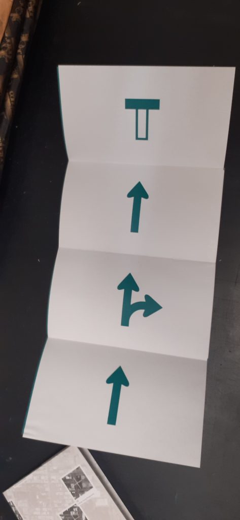
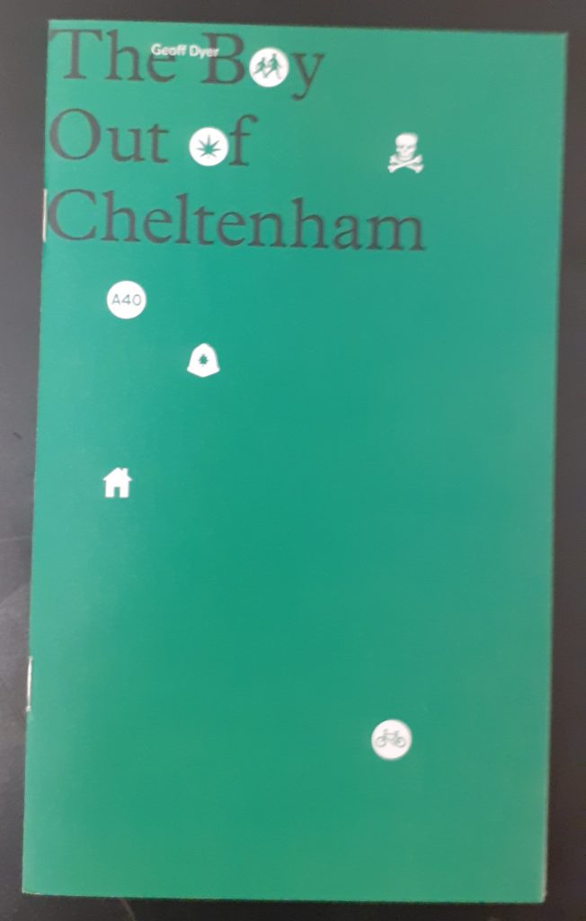
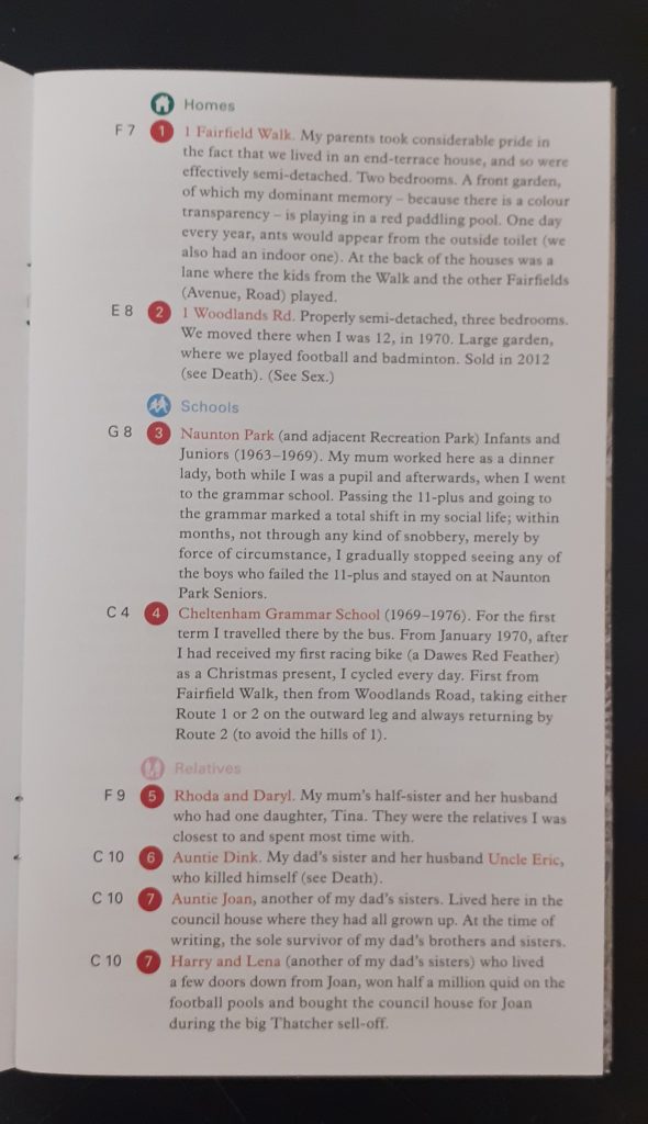
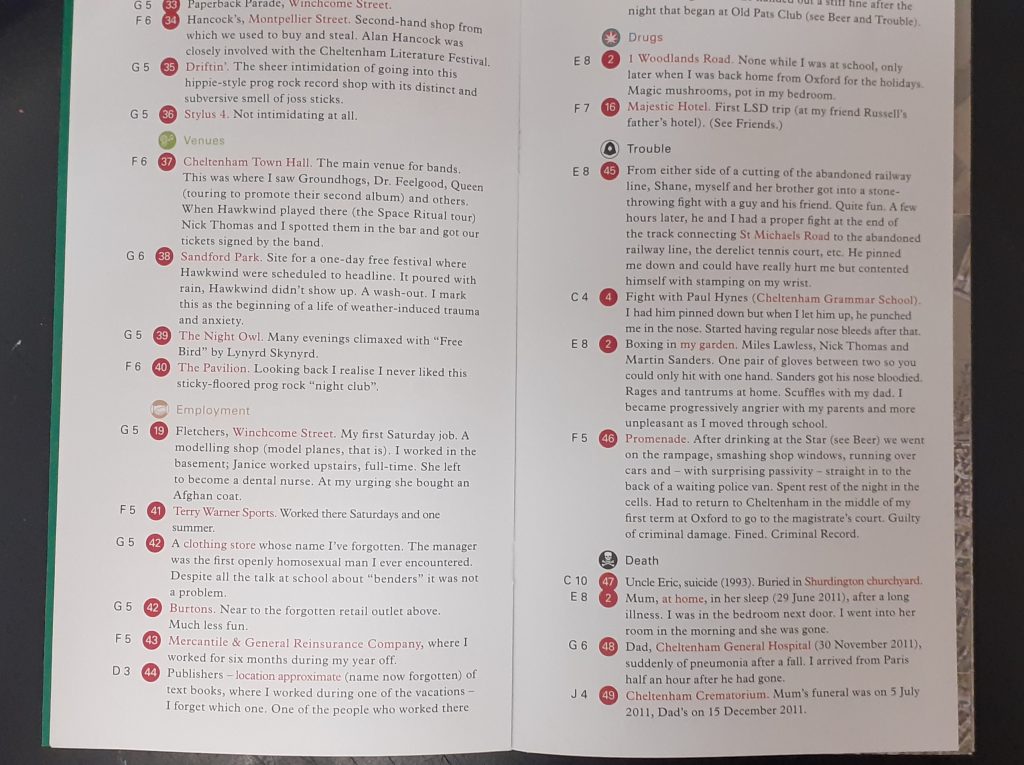
Geoff Dyer
Joe Dunthorne
Ghost Pots relates to his experience as a writer.
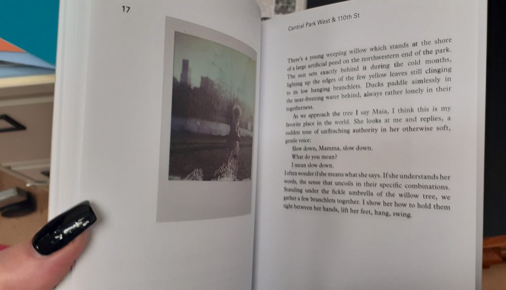
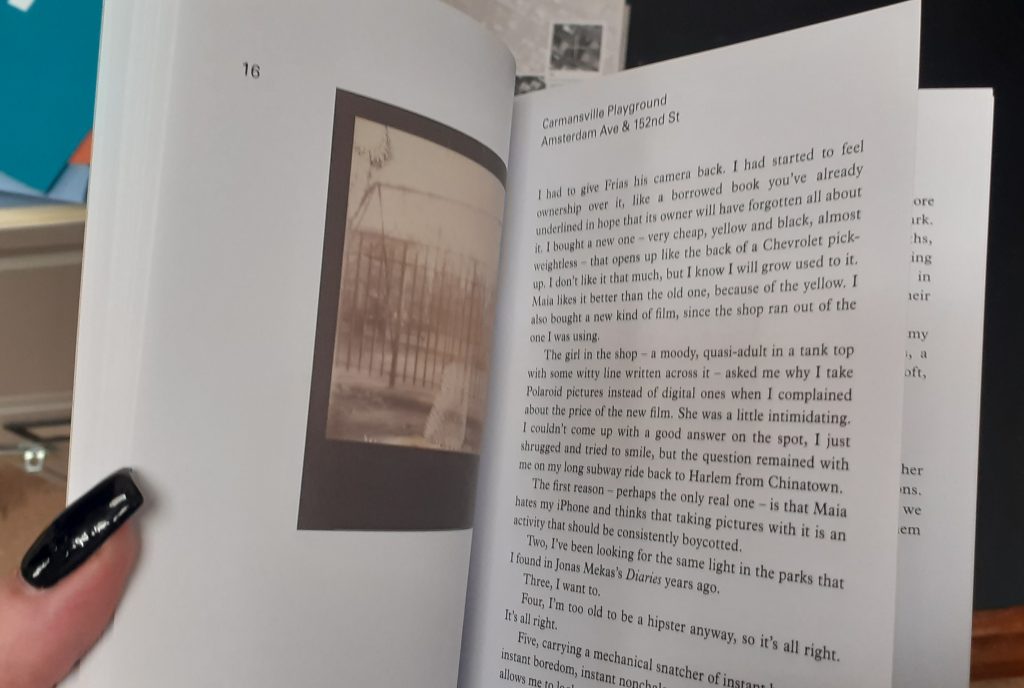
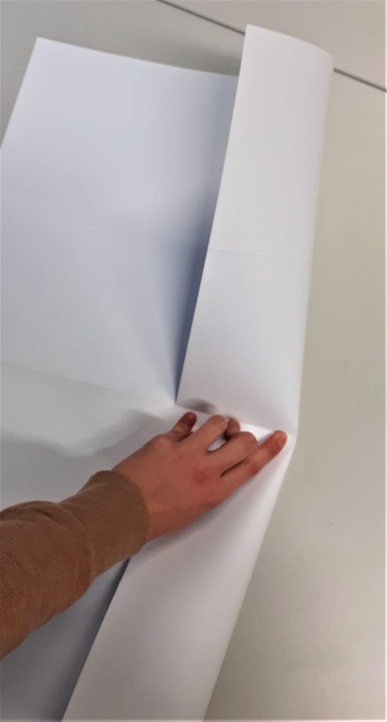
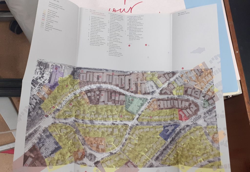
Valeria Luiselli
Swings of Harlem marks the swings the author remembers from childhood.
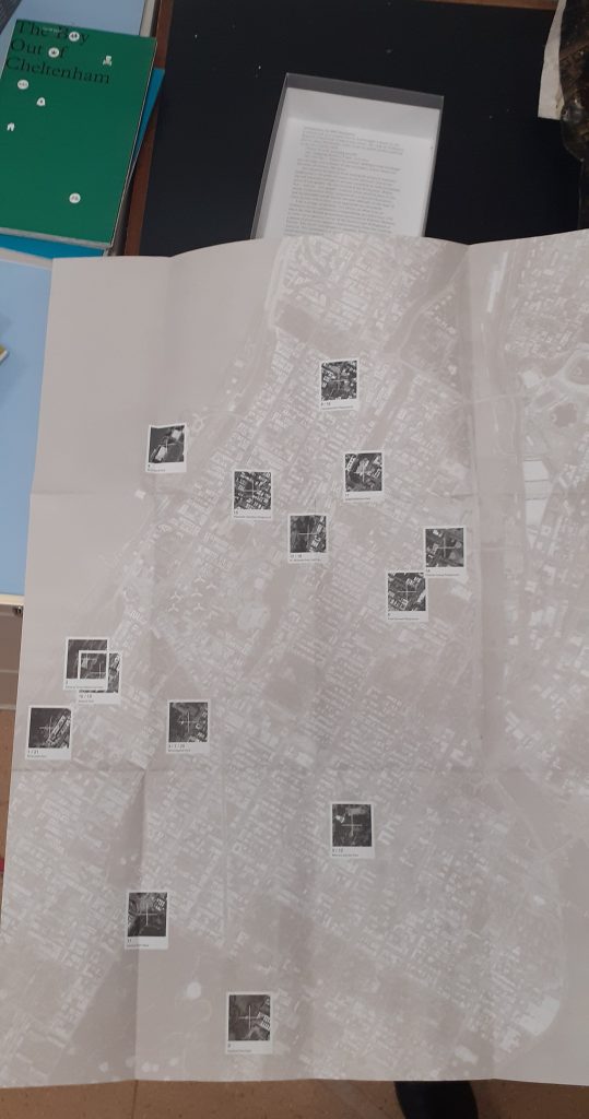
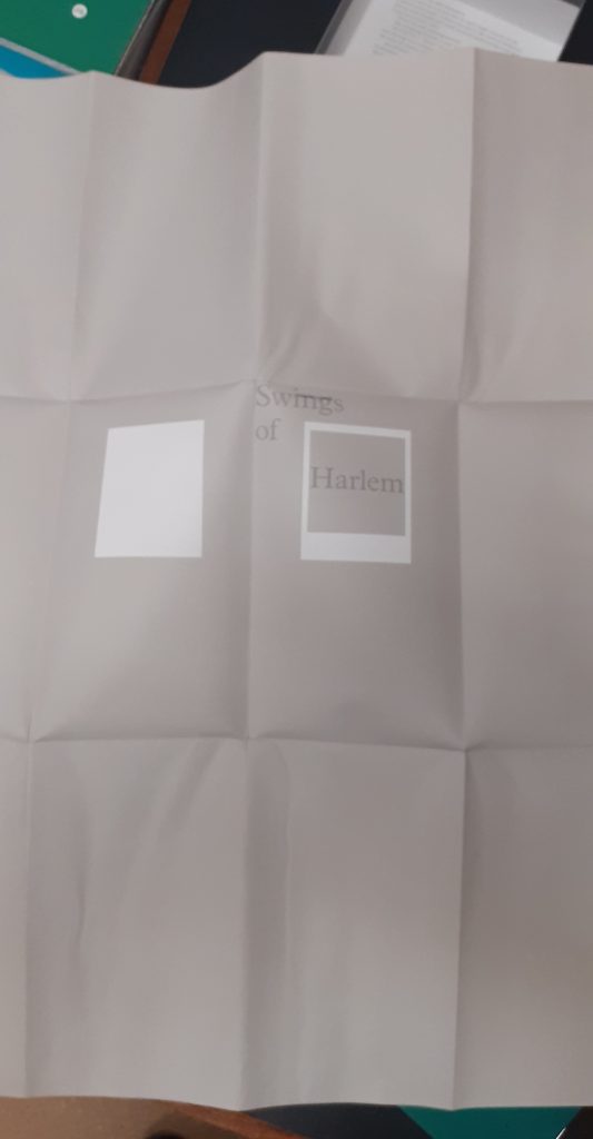
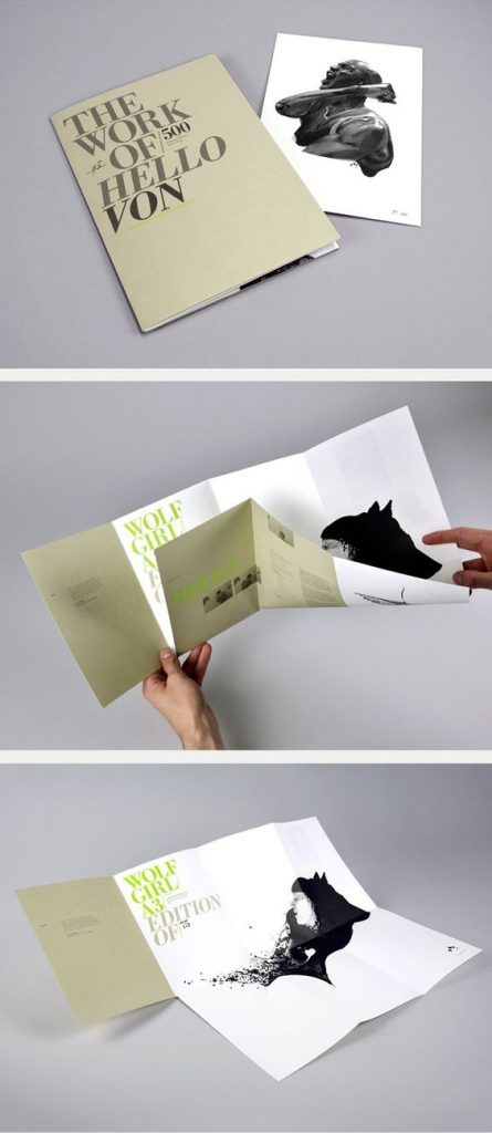
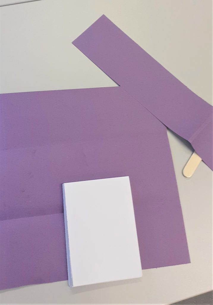
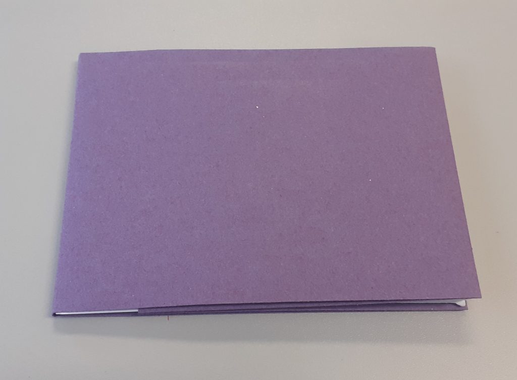
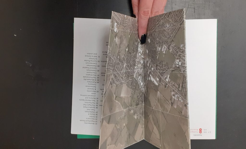
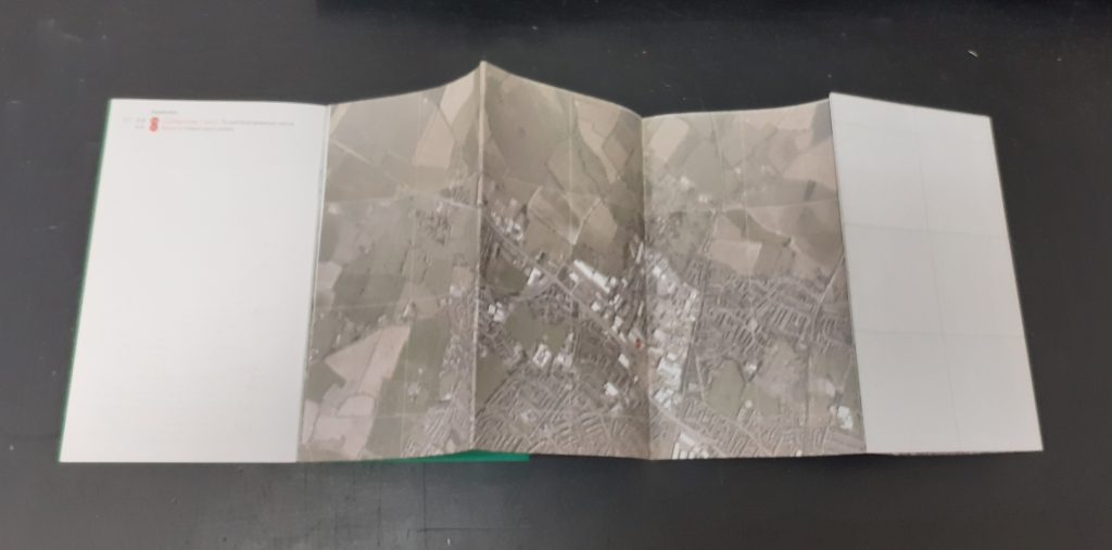
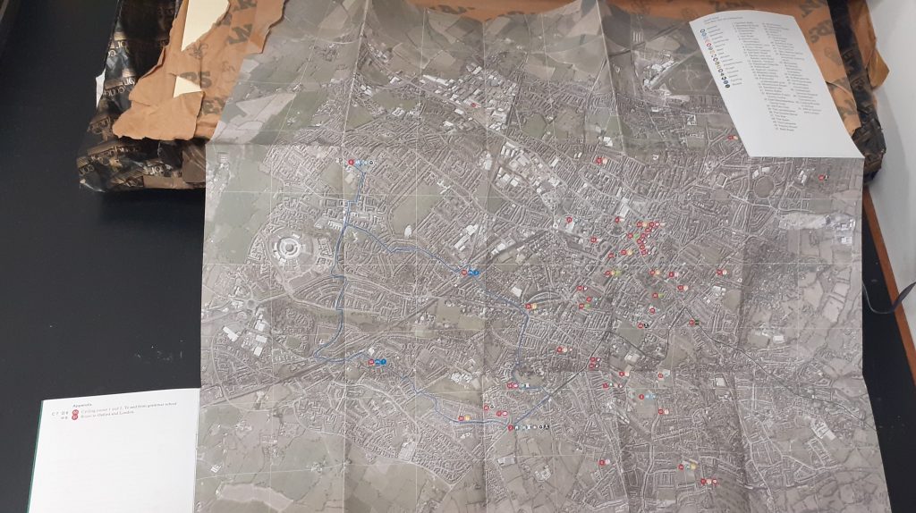
The map folds into the front cover. Her map was unique in the way that she made a large folded map separate to the rest of the work. There is a booklet that comes with the map to add context to the images.