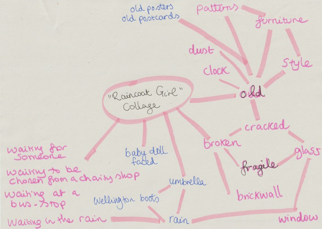
When faced with the task of collage-making, my mind was buzzing with ideas. The problem was, I had too many ideas. I decided it was time for a mind map.
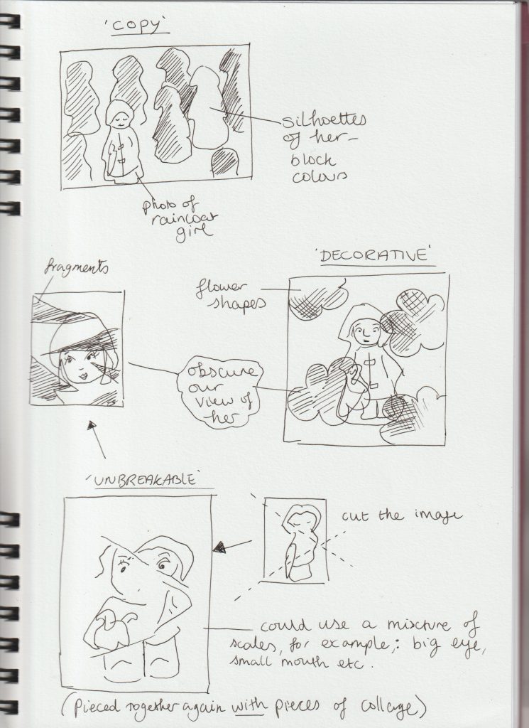
After looking at Jelle Martens collages, I thought about using shapes within my own collages. I thought about obscuring my object ‘The Raincoat Girl’. I drew quick sketches to get my ideas down onto paper:
From my artist research, I found I prefer the more simple collage designs. I didn’t want to over-complicate my collages and have them look visually noisy.
I used some magazine images but found it easier to source images from the internet and use my own photos.
Printing photos from my computer also meant I had the option of editing my pictures to suit the artwork and contribute to the message I wanted to create. I could also resize the images and therefore use more creativity. Magazine images can be restrictive but also trigger new ideas due to the spontaneous process of flicking through unknown pages.
All collages are A4 sized.
For this collage, I used images from magazines and my printed out photo of The Raincoat Girl. I tore the paper at the edges to create some texture.
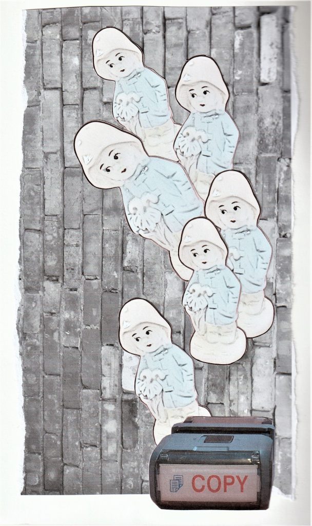
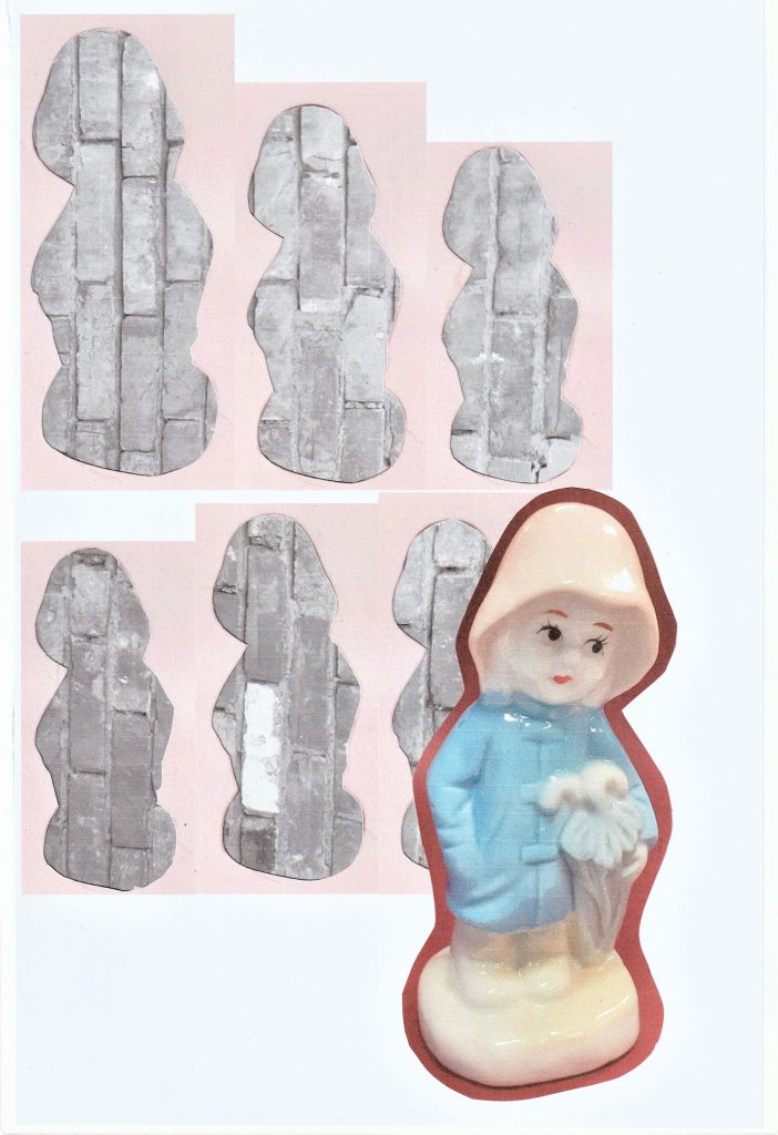
For this collage, I used a photo I took of a brick wall and converted into black and white. I edited the image of my object to make her look more 2D. My concept for this image was mass production of objects.
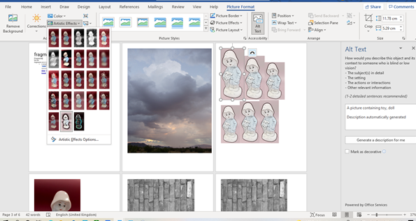
I used Microsoft Word to edit the photos. For the image of the repeated figure, I clicked ‘Picture Format’ > ‘Artistic Effects’.
I used the outlines of the figures in the previous collage, to give the impression of a mass of face-less figures. The Raincoat Girl stands apart from the others, facing in the opposite direction.
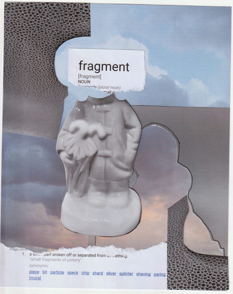
I wanted to use words within a couple of my collages. I wanted to see if words would strengthen the message, compared to a collage where I use no words.
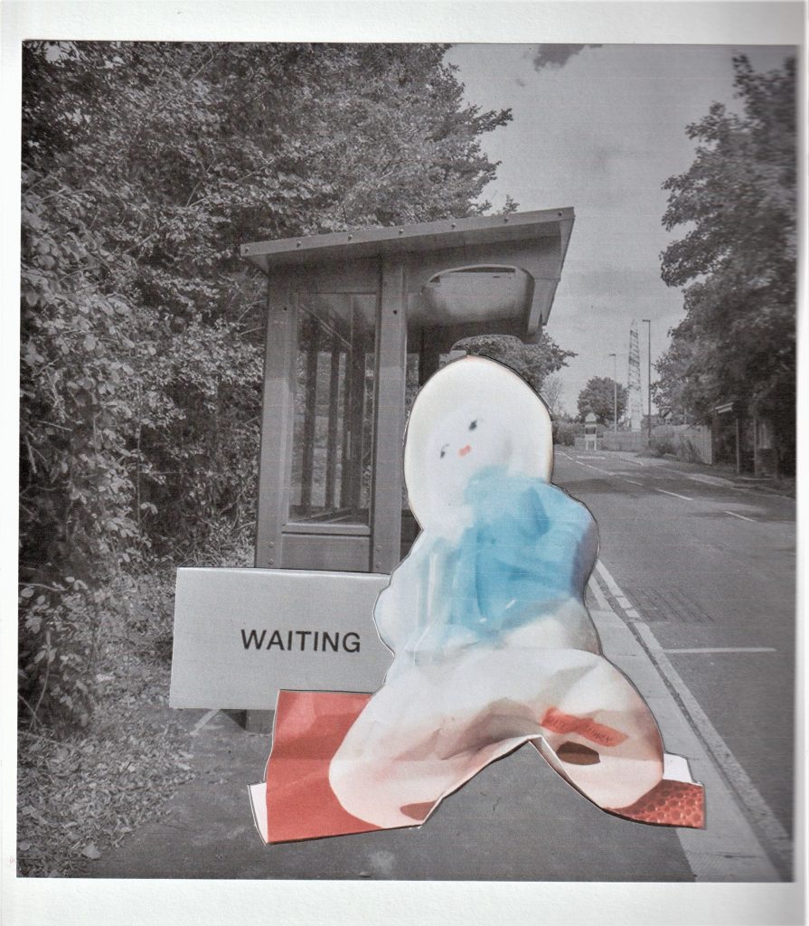
For this collage based on waiting, I used the photo of the 3D collage I made in the previous week. The squashed effect makes her look deflated and bored. I used a photo from the internet of the bus stop. I edited the bus stop image to give it a softer feel and less colour. The red in this collage symbolises the anger that boils under the surface when you have to wait.
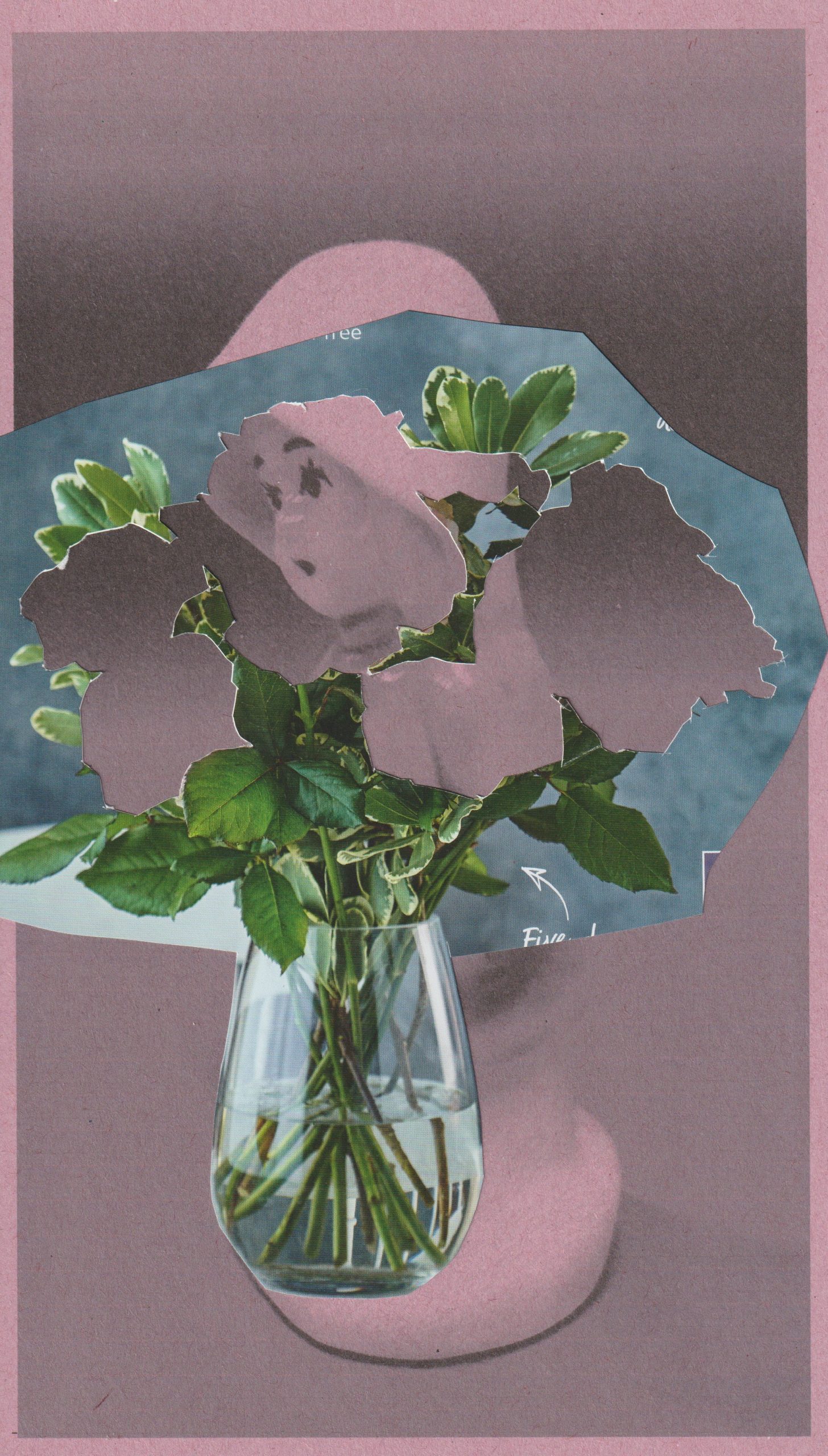
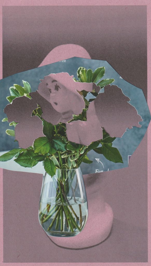
For the collage below, I experimented with printing onto sugar paper. I placed pink sugar paper in my printer and printed the black and white photo onto it. I think the sugar paper created a softer looking image. This was what I wanted for the subject of flowers, as petals are soft. In this collage, The Raincoat Girl echoes a flower.
Inspired by John Stezaker, I wanted to dry interesting layering within a collage. In this image, the flowers symbolise the nature of being decorative. This relates to my object, which was manufactured to function as a decoration only.
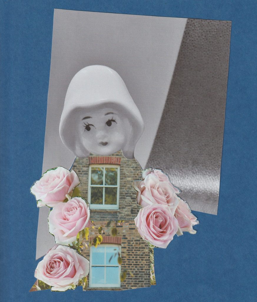
In my final collage of the day, I used blue card as a backdrop and magazine images in the foreground. The glossiness of the magazine paper complimented the mat quality of the blue card. I wanted to play with the idea of optical illusion. An image that can be viewed in more than 1 way.
Placing the window in place of her heart, symbolises her emotional openness. The brick walls are her emotional boundaries. On the other-hand, we could be looking at a house who has a personality. The feeling of arriving home and feeling like you are being hugged by your house.
This week, I have been given the challenge of making a series of collages based around The Raincoat Girl. I needed to first find inspiration. I looked at collage work by both artists and designers, from past to contemporary. This opened my mind to the infinite possibilities of cutting and pasting.
I’ve been wanting to read this book for a while and now I had the perfect excuse.
Cut That Out by Ryan Doyle
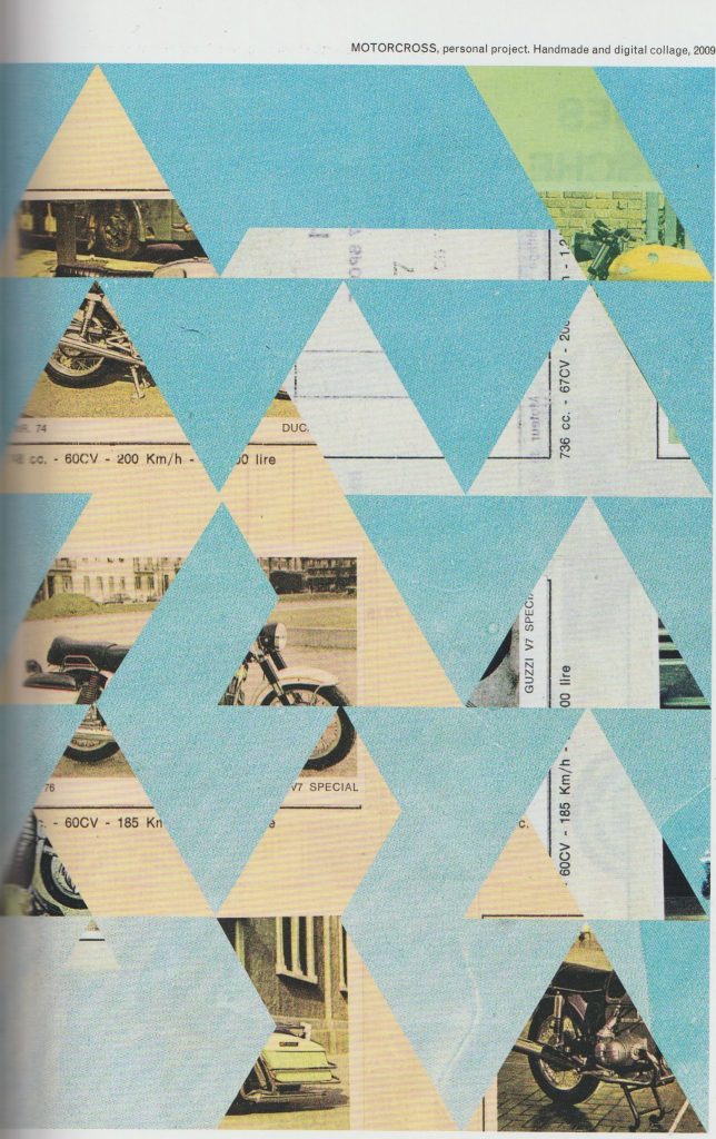
Jelle Martens
I looked at the artist Jelle Martens. He uses a mixture of traditional collage techniques and digital skills within his work. He is a fan of Collage with squares arranged according to the laws of chance, which is a series of work by Dadaist Jean Arp. In that series, Arp used cut-up pieces of paper, thrown into the air, he then glued them where they landed.
Martens takes images from a variety of sources. For instance, he used images from his father’s scrapbooks in the collage entitled Motocross.
I was drawn to the use of geometric shapes within his work. In Motocross, the background images are obscured from view. As the viewer, we see glimpses of photos and text. These act as visual clues. This ambiguity, I feel makes the work interesting. We can almost piece together our own stories of what is going on behind the triangular shapes in the foreground.
Another of Marten’s methods is to cut up several images into geometric shapes and re-arrange them into new compositions:
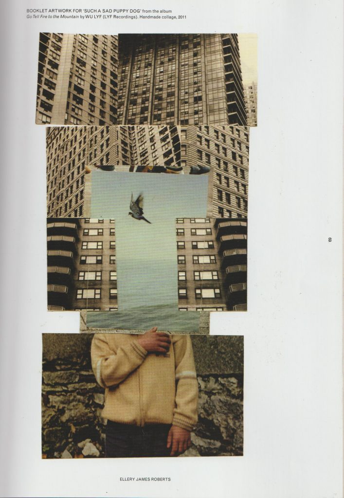
Another contemporary artist I looked at, is Ellery James Roberts. I particularly like his collage Booklet artwork for such sad puppy dog from the album go tell fire to the mountains by Wu life. I like the way he has combined three separate scenes and merged them to create one picture. The boy and the bird are surrounded by geometric, ugly looking grey skyscrapers. But within this environment, the boy finds freedom or sense of peace, symbolised by the third bird in flight at the centre of the collage.
The thing I love about collage is that artists create an image that is readable but at the same time impossible. Collage allows us to use realistic images and merge them to create something surreal. This piece is arranged into thirds foreground section, midsection, and the backgrounds. This collage looks neat and tidy but also interesting and imaginative.
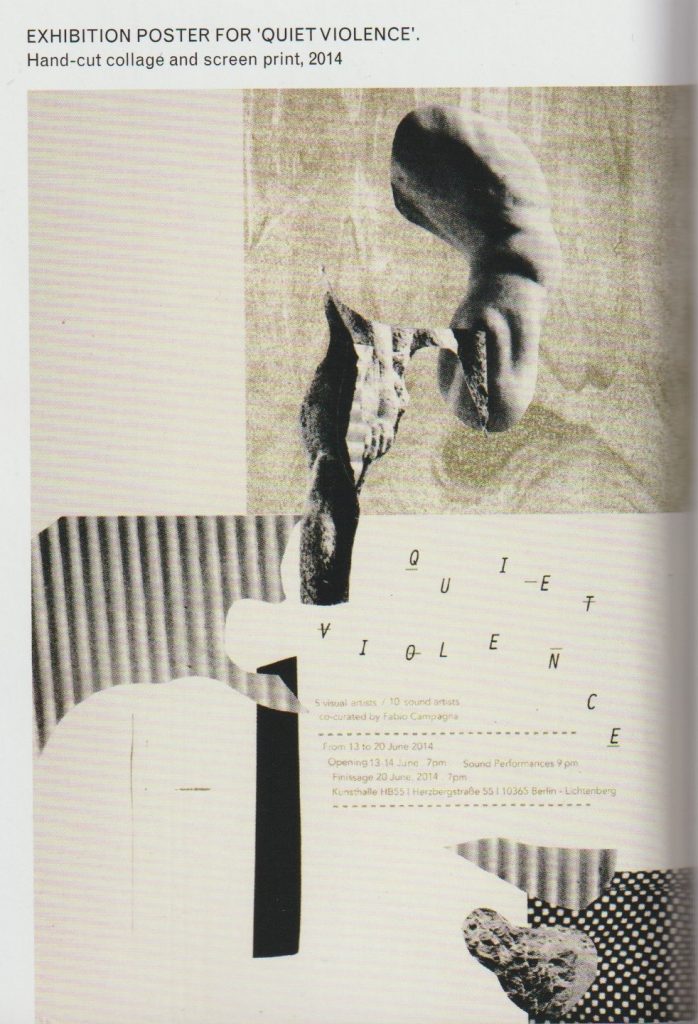
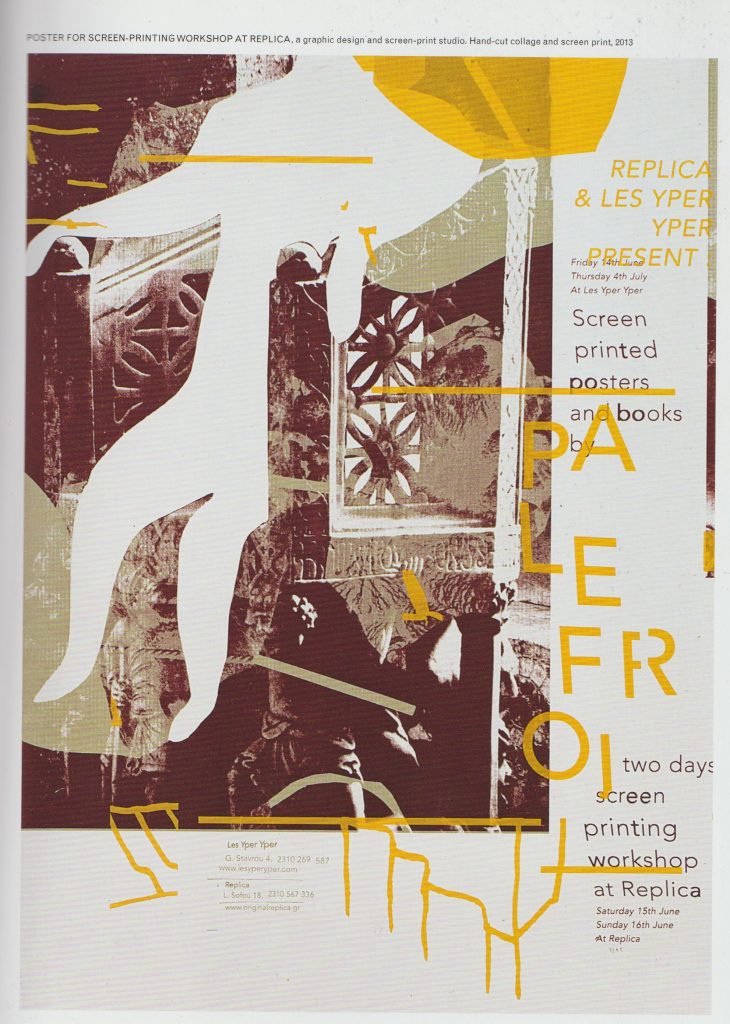
Damien Tran
Damien Tran is a designer and printmaker based in Berlin. He combines collage with screen printing in his designs. He uses his own photographs within his work.
Images from Cut That Out by Ryan Doyle
I really like the collage pieces cut from around an image. The shapes are ambiguous and left to interpretation while creating a path for the eye to follow across the piece. I like text in the composition, used as a visual element. His limited use of colour makes his work easy to read and his use of white space is pleasing. In his Exhibition poster for Quiet Violence, there is a clear background and foreground. I like the variety of implied textures. Each collage piece is something abstract, he may have cut one piece out from a magazine, a pattern from somebody’s dress.
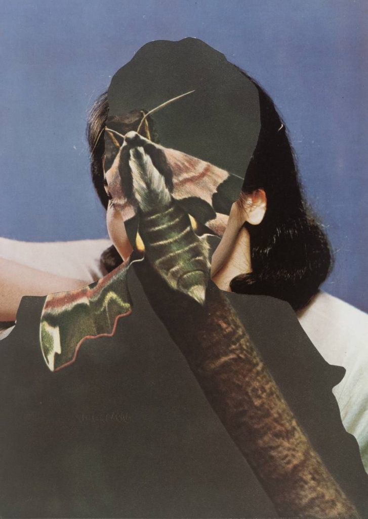
John Stezaker
I looked at work by contemporary artist, John Stezaker. He uses old imagery in his collages, such as photos of film stars from a past era. This makes his work look like it was made in the early 20th century. He creates depth by layering collage pieces. Some pieces almost seem like optical illusions, where they can be viewed in several ways. He uses silhouettes and outlines. For example, in the piece Untitled, we see a moth, a woman, and a man simultaneously. By layering them in such a way, he creates a different meaning. Each element, being within each other, combines them together. Characteristics of a moth are within a man, characteristics of both are within a woman. Is this all taking place within the mind of the woman? These compositions lead the viewer to ask questions.
Untitled 1989 John Stezaker born 1949 Purchased 2007 http://www.tate.org.uk/art/work/T12344
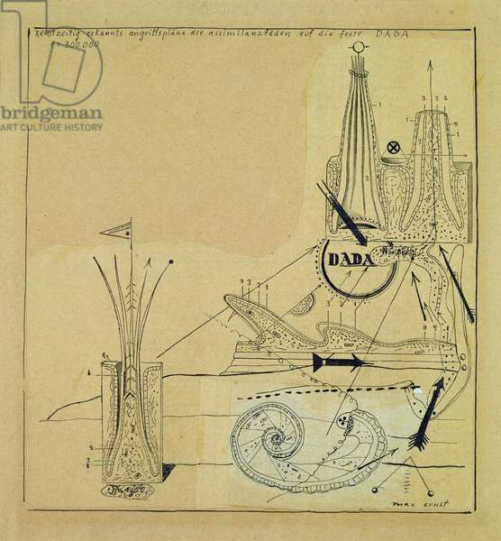
The conditions that gave rise to dadaism were a protest against the war. The Dadaists were the group of artists who revolutionised collage making in their artwork. This was in the time when photographs were just starting to be published in print. Hannah Höch worked for a newspaper company and had access to these images first hand. The movement began in 1920 in Berlin. Three artists present were Max Ernst, John Heartfield and Hannah Höch. The artists had a variety of motives. Some wanted to re-establish a sense of community in the aftermath of the war, some were activists and others wanted to develop their career. They each collaborated on exhibitions and publications. Dada was stage on the way to Surrealism.
Max Ernst combined images from medical books, catalogues for industrial equipment and botanical biological course books. His work invokes a sense of timelessness and a dreamlike quality.
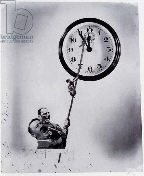
This is different to the photomontage style of John heart field. John Heartfield was interested in getting across a political message within his collages. He was interested in creating a message that could communicate through mass media. His work was used to critique the abuse of power, which he felt passionate about. Both artists were not content to show images of the raw cut and paste style, for example, used by the Dadaist Kurt Schwitters. They used fragments of collage to create whole looking images, which are neat and believable. Ernst was interested in the world of the psyche, Heartfield, the political environment around him, and Hannah Höch liked to overlay elements of both within her work.
Höch used images from mass media, transforming them into images that conveyed personal meanings. She explored issues of gender roles, such as the image of the “new woman”. (This image created an expectation of women and was directly linked to consumerism and social agendas.)
I like Hannah Höch’s use of repetition and re-assemblage in this piece. By repeating elements of the baby doll face, she creates a visual rhythm across the picture that is almost pattern like. The shapes are flowing and organic each face or fragments moves into the next.
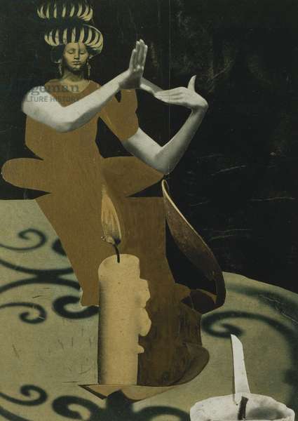
She has taken images from a variety of sources and piece them together into this figure of the priestess. She has played with scale, placing an ordinary candle side beside the figure of the women. This has dwarfed the women or enlarged the candle by its relative scale. This gives a playful feeling. The use of shadows and lights are what make this image convincing. We have a light source, and we have shadows, therefore it is believable. I like the abstract and flat form of the woman’s dress. It contrasts with the realistically formed arms.
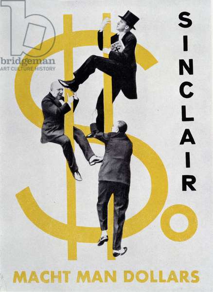
Heartfield has used something similar within his collage, where he combines a 2D dollar sign with realistically formed figures. The result is surprising and amusing.
As nouns the difference between assemblage and collage is that assemblage is a collection of things which have been gathered together or assembled while collage is a picture made by sticking other pictures onto a surface. As a verb collage is to make into a collage.
I have always thought of collage as a 2D craft- Working on a flat piece of card or paper.
When researching collage artists, I discovered the artists’ ability to use paper in a different way. Today’s workshop encouraged me to think of paper as a 3D material. How could I get it to stand up? How could I layer the paper or break it apart?
I used last week’s photos and my labels, to inspire the way I treated the paper. For example, the photo that mentions ‘old’, guided me to tear up the paper and give it an aged look. This helps to communicate a message to the viewer.
Collage Artists
Craven uses different methods of manipulating paper. I was interested by the way he uses paper folding to alter the compositions. Using one image for the collage means that the result looks harmonious. The edges blend softly.
This folding method means that areas are hidden and are missing from the picture. This takes away visual clues and makes it slightly confusing for the viewer. For example, hiding the person’s facial expression means that we don’t know how the person is feeling. Instead, the viewer needs to make guesses, such as about the identity of the person. The image is then up to interpretation.
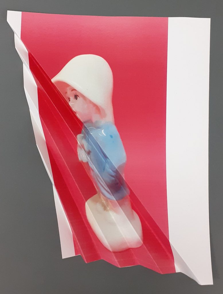
Inspired by the technique of paper folding, I took one photo of The Raincoat Girl figurine, and folded the paper diagonally. I left one side of the paper flat and folded the other half into a fan. This method distorted the shape of the figure. The image looked different depending on the angle I then viewed it from. The choice of photo was effective because the background is bold compared to the object. This highlighted the figure’s outline.
Phillipe Jusforgues
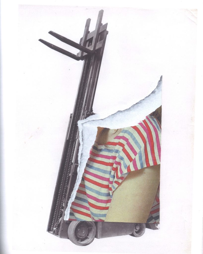
By tearing out a section of the collage, the artist brings the image forward into the 3D world. In this case, he draws more attention to the image of the girl by having the section raised off of the surface. The use of a coloured image against a black and white image, also helps to separate the two subjects of human and machine.
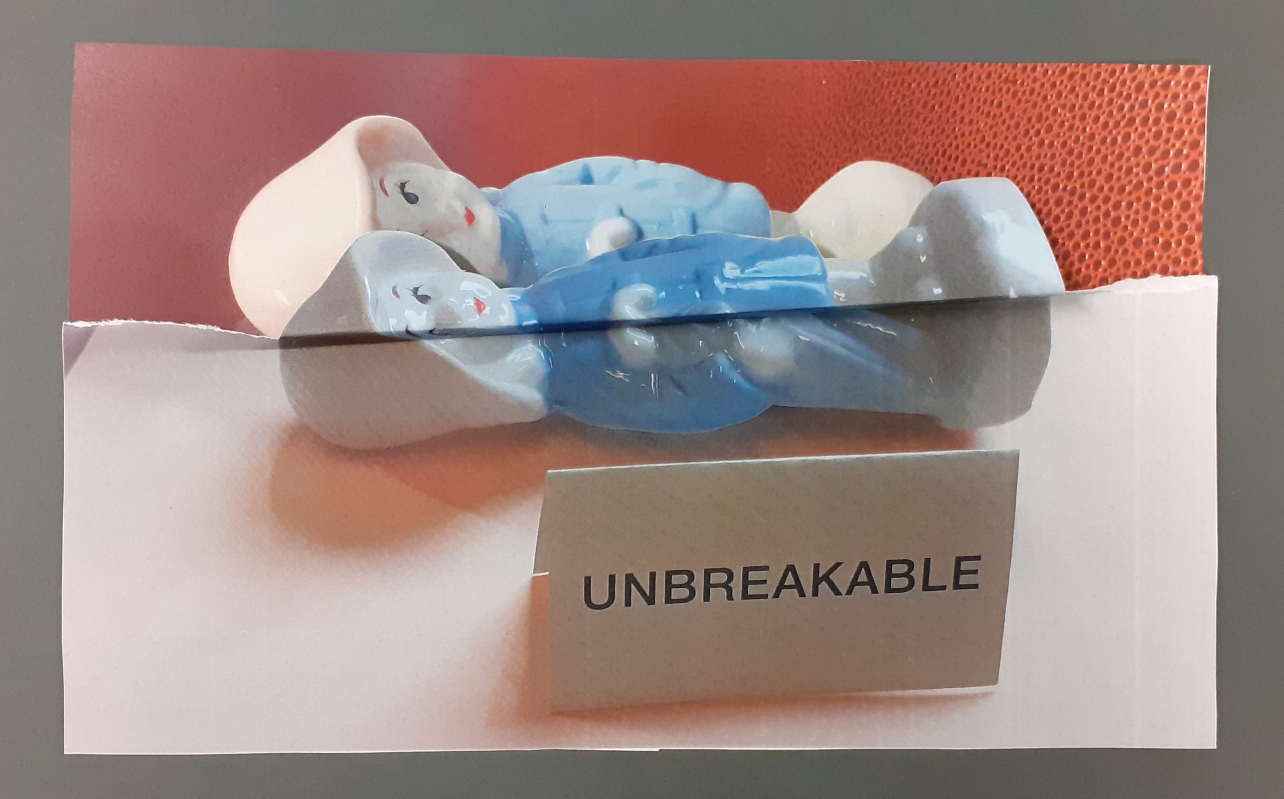
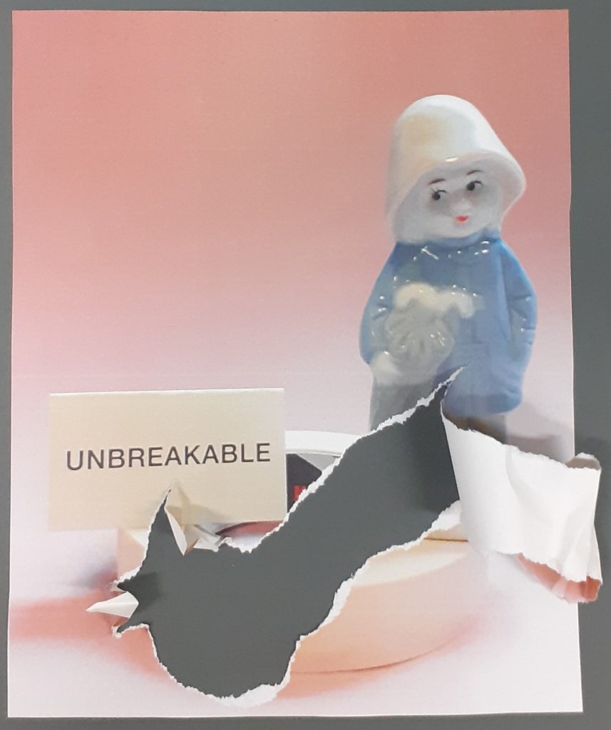
I was inspired by the idea of having part of the image come forwards away from the background. The concept for this collage came from the word ‘unbreakable’ and the angle of the figure laying down. I wanted to create a visual break in the image. I chose to do this by doubling up the figure and having half of her slightly mis-aligned and therefore break away from the original girl.
I used a scalpel and cutting mat to carefully cut around the edge of the figure in the lower image. I tore the remaining paper off, to give the ripped effect seen on the left and right of the picture. I used a photo with a dark background to help the outline of the figure show up. I stuck the 2 photos together, allowing a gap for the upper figure to lift off slightly. I then folded this part forward and then made another fold backwards, to ensure the figure was lifted slightly.
Vanessa Lamounier de Assis creates paper models of semi- abstracted body parts. Her art talks about sexuality, consumer culture and beauty standards. Her pieces stand alone and have a solid look to them, despite being made from a light-weight material. She combines separate images within a single collage to create new meanings.
Phillipe Jusforgues and Vanessa Lamounier de Assis use tearing when manipulating paper for their collage. I took this idea further by allowing a section of paper to curl outwards. The tear creates an emotional impact because it disrupts the peaceful balance of the original photograph. The rough edge of the torn paper is in contrast to the pastel colours in the original photo, as pastel colours give a sense of calm within an image.
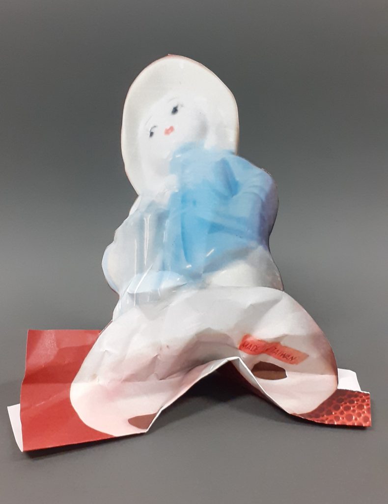
I was interested in playing with paper to create a solid-looking structure. This photo of the raincoat girl has a statuesque quality. For this reason, I wanted to emphasise this impression using paper. I cut around the figure, leaving the background attached at the bottom of the page, for added weight and therefore stability.
I folded the base of the paper figure, but it was not standing up. I then scrunched the paper to add more weight to it. This helped. I bent the bottom section upwards and pinched the upper half of the sculpture. This method brings the subject to life by creating an imitation of a statue or ornament. But made from paper, it looks more delicate.
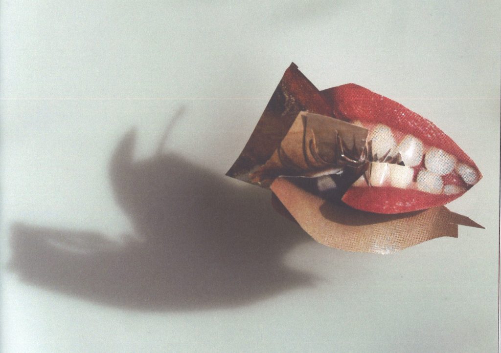
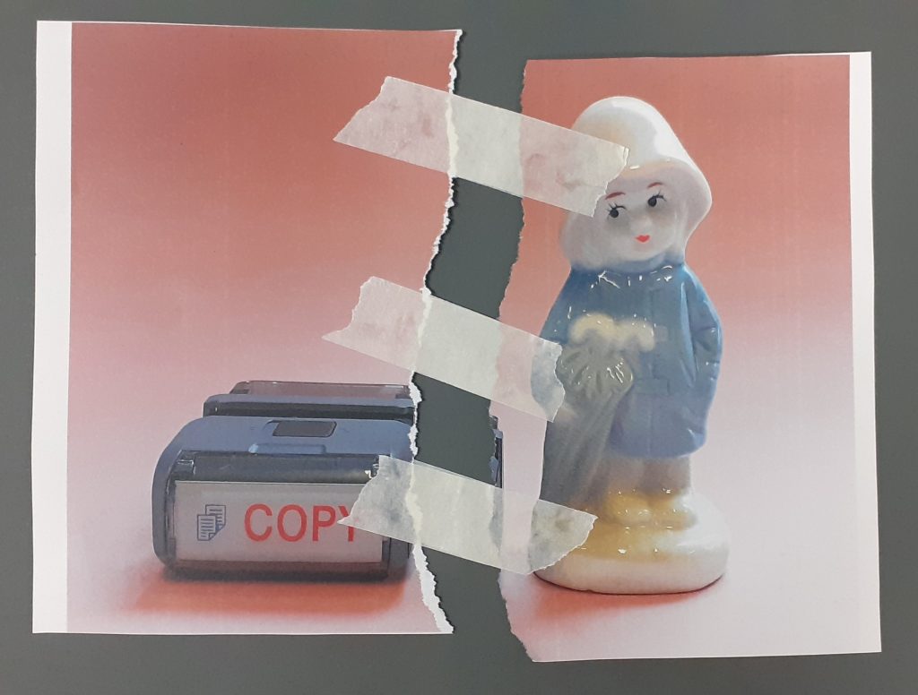
Another collage technique used by artists such as Bobby Neel Adams, is to tear or cut and image in half and piece is back with a separate image, therefore creating imaginary faces and scenarios. For this piece, I reassembled the paper using masking tape. The result is harsh looking and signifies repairing a broken object.
Andrew Lundwell
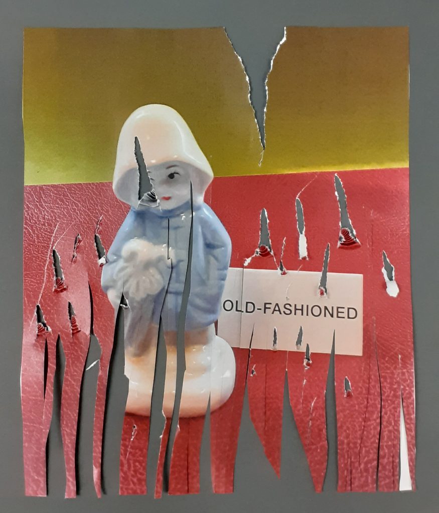
Lundwell’s use of tearing paper gives this composition an organic appearance. This is suitable for the natural themes within the photographs.
I wanted to create a worn, old look to this picture, to reference the phrase ‘old-fashioned’. I avoided making the words unreadable, because the word is a part of the meaning of the composition. I used scissors to drag and cut through the paper. Obscuring her face has the effect of making her appear damaged or affected. It has more of an emotional impact that if I had damaged only the background and avoided the figurine.
Artists’ work (unless stated otherwise) from The Age of Collage – Contemporary Collage in Modern Art by Silke Krohn
We use cookies on our website to give you the most relevant experience by remembering your preferences and repeat visits. By clicking “Accept All”, you consent to the use of ALL the cookies. However, you may visit "Cookie Settings" to provide a controlled consent.
This website uses cookies to improve your experience while you navigate through the website. Out of these, the cookies that are categorized as necessary are stored on your browser as they are essential for the working of basic functionalities of the website. We also use third-party cookies that help us analyze and understand how you use this website. These cookies will be stored in your browser only with your consent. You also have the option to opt-out of these cookies. But opting out of some of these cookies may affect your browsing experience.
Necessary cookies are absolutely essential for the website to function properly. These cookies ensure basic functionalities and security features of the website, anonymously.
Cookie
Duration
Description
cookielawinfo-checkbox-analytics
11 months
This cookie is set by GDPR Cookie Consent plugin. The cookie is used to store the user consent for the cookies in the category "Analytics".
cookielawinfo-checkbox-functional
11 months
The cookie is set by GDPR cookie consent to record the user consent for the cookies in the category "Functional".
cookielawinfo-checkbox-necessary
11 months
This cookie is set by GDPR Cookie Consent plugin. The cookies is used to store the user consent for the cookies in the category "Necessary".
cookielawinfo-checkbox-others
11 months
This cookie is set by GDPR Cookie Consent plugin. The cookie is used to store the user consent for the cookies in the category "Other.
cookielawinfo-checkbox-performance
11 months
This cookie is set by GDPR Cookie Consent plugin. The cookie is used to store the user consent for the cookies in the category "Performance".
viewed_cookie_policy
11 months
The cookie is set by the GDPR Cookie Consent plugin and is used to store whether or not user has consented to the use of cookies. It does not store any personal data.
Functional cookies help to perform certain functionalities like sharing the content of the website on social media platforms, collect feedbacks, and other third-party features.
Performance cookies are used to understand and analyze the key performance indexes of the website which helps in delivering a better user experience for the visitors.
Analytical cookies are used to understand how visitors interact with the website. These cookies help provide information on metrics the number of visitors, bounce rate, traffic source, etc.
Advertisement cookies are used to provide visitors with relevant ads and marketing campaigns. These cookies track visitors across websites and collect information to provide customized ads.