
I printed the photos of the raincoat girl with labels. I wanted to see how I could use different effects to influence the message of the picture. I printed these images at 75% of the original image size.
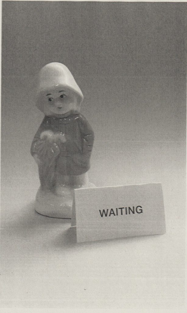
I selected black-and-white for printing, and I really like the effect this has on the composition. Printing in black-and-white allows me to see the different tones within this image, that I couldn’t see in the colour version. Waiting is something that we usually do not like to do. Therefore, printing this image in black-and-white emphasises the boredom and passing of time that we associate with waiting.
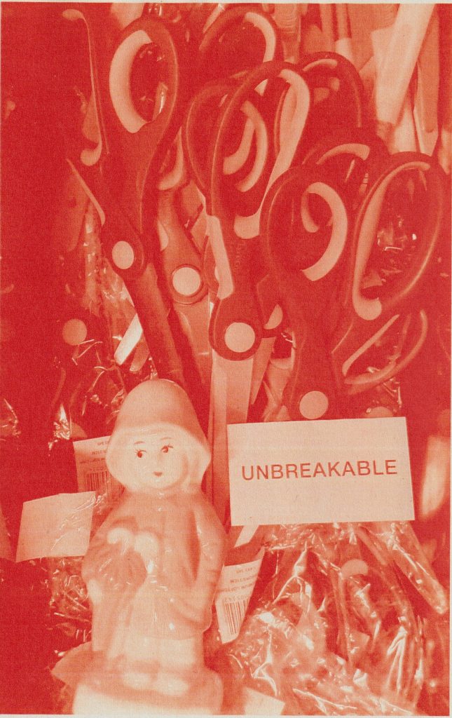
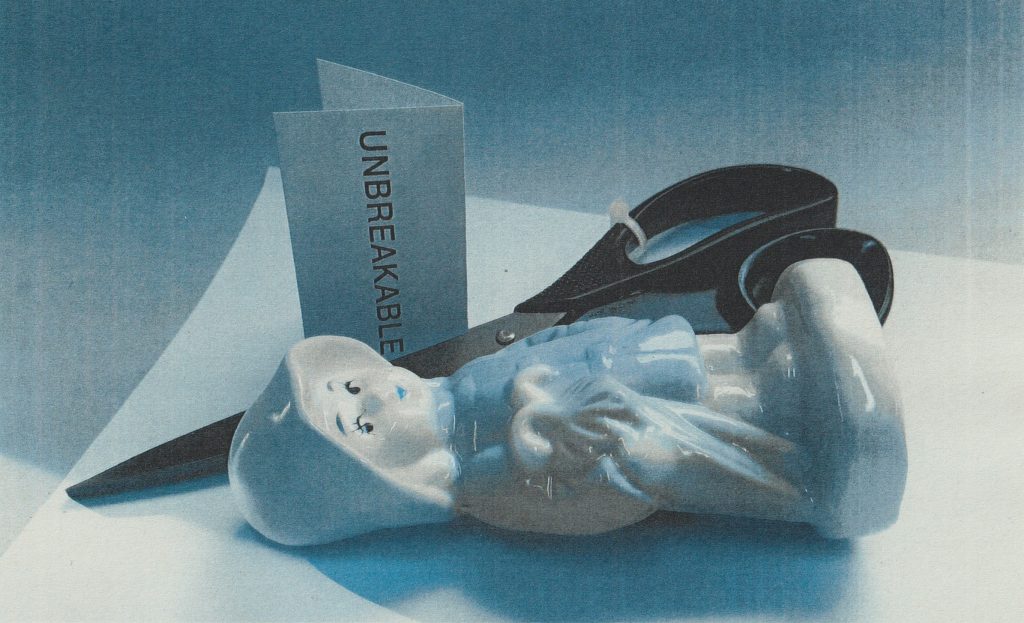
I then chose to print one of the photos in red. I chose the ‘unbreakable’ image because of the use of scissors in the picture. When looking at colour theory, I learned that red has associations with danger and blood. Therefore I felt it appropriate to use red with the subject of something being ‘unbreakable’.
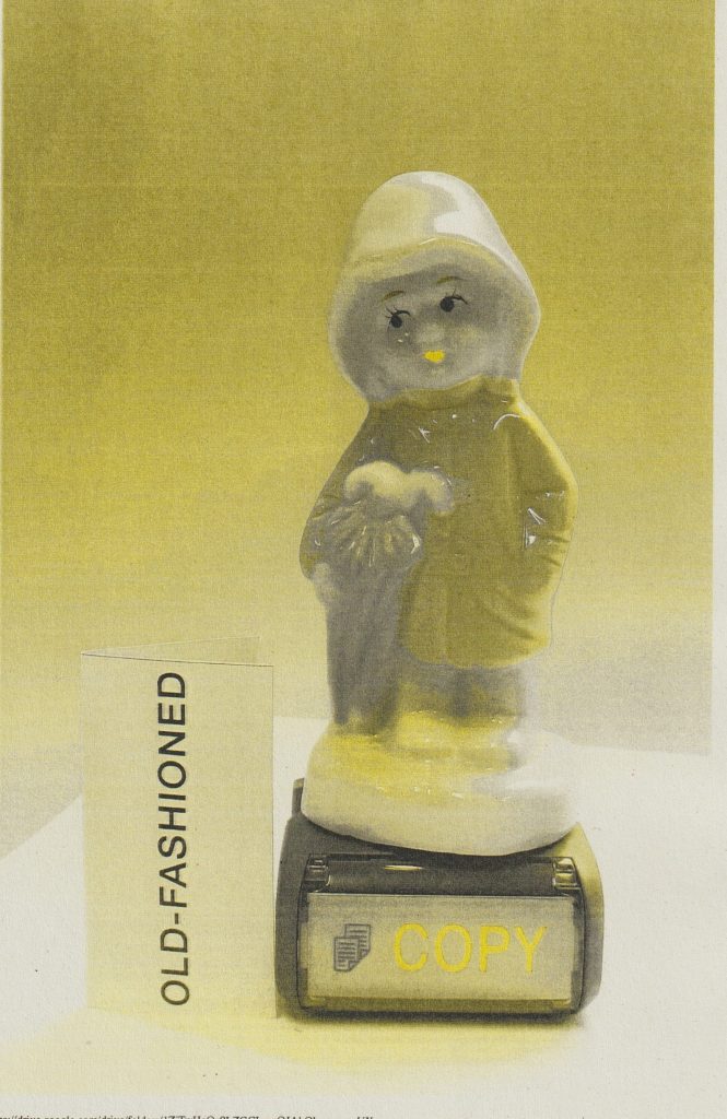
For this next image, I used an effect called duotone. This is where the image prints in black and another colour. In this case I chose yellow and black. According to colour theory, which I read about in the book Colour by Ambrose/Harris, yellow is a bright and happy colour. The book also says that yellow is versatile and can represent many emotional states. “Greeny yellows have a stronger connection to illness and nausea.” I think this is the case within my image, since the use of black and yellow in my prints, combine to create a greenish tone.
I wanted to try the duotone effect using a different colour in place of the yellow. For this image, I used blue and black. Colour theory suggests that blue is calming, however the use of black in this print, combines with the blue and creates a darker navy blue. “Darker blues, such as navy, are considered conservative and uniform.” I like the depth created with black and blue this photo. It is appropriate for the image, because of the strong shadow in the foreground.
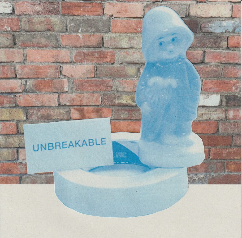
I used blue when printing this image, but this time I chose to omit the black. This gave the photo a cooler and lighter feel. “Pale blue suggests more youthful and serene qualities.” I feel that blue in this case gives The Raincoat Girl a youthful look. I wanted to combine the ‘unbreakable’ image with the image of bricks, to emphasise the word unbreakable. I took this photo of bricks while in town. I like the warmth of the bricks in contrast to the pale figurine. Because of the paleness of the blue print, the background was useful in framing the subject.
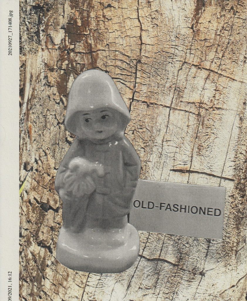
I had the idea of combining my figurine with different backgrounds, to see how this could add to the message. I need to be careful so as not to overcomplicate the image and therefore the message. For the old-fashioned figurine, I used a photo I took of a dead tree. The tree is clearly aged, and this ties in with the theme old-fashioned, but in a literal way. I kept the text on the left-hand side, as it relates to a JPEG file. This is a contemporary theme, so I felt it made a nice contrast with the rest of the subject.
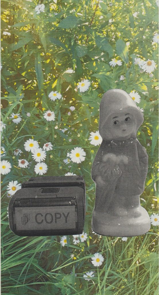
I photographed some flowers in the park. People say that no two flowers are alike. In this piece I played with that idea, by combining the flowers with a copy stamp. The viewer considers the fact that this figurine is a copy, due to its being mass produced. The figurine also has a story of its own, and therefore is more than just a copy.