Geometric graphic design
From the brief ‘Form & Space’:
‘Composition refers to the visual structure and organisation of elements within a design. Designers organise images and text – each with their own shapes, sizes, colours and textures. Through the control and placement of simple geometric forms this workshop explores the dynamics of composition: the relationship between positive and negative space, variations in scale and the space between the shapes – the basics in visual language, a designer’s ‘design vocabulary’.’
Paul Rand
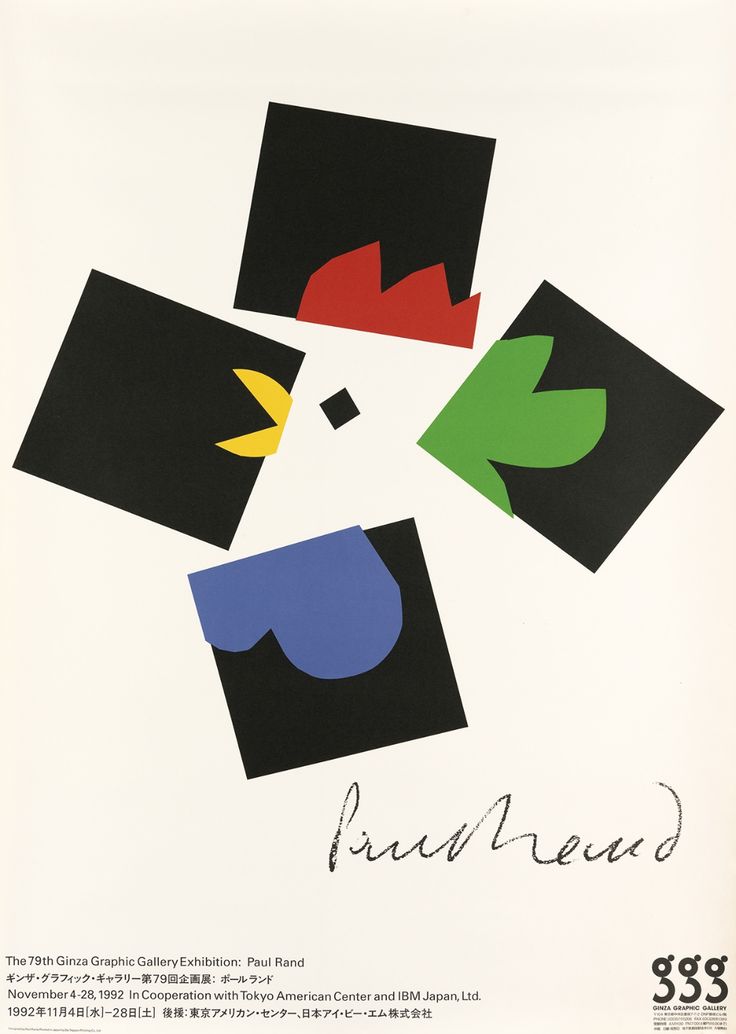
Exploring form & space, I looked at the designer Paul Rand. I looked at the book Paul Rand: A Designer’s Art (1985). I was surprised at the modern look of his designs, since the book spanned his career from the 1940’s to the publication of the book.
Rand was known for his typography and designs for advertising. Influenced by Modern art, particularly the Bauhaus movement. He was one of the world’s leading graphic designers. He learnt design by looking at the work of others such as Cassandre. His poster designs have been called timeless. He approached ad design in a radically different way that had not been done before: Ads used to be very text heavy, and if they did include images, they all looked very cluttered. Rand minimized the text to only what was necessary to breathe space into the design. He saw image and text as a continuum to be used together. Graphics and type act as one unit to convey the message of the ad and inject some art and beauty into the design. He and his wife published children’s books and he was also an accomplished painter, painting the book covers.
Information sourced from: Celebrating The Life Of The Greatest Graphic Designer-Paul Rand – YouTube
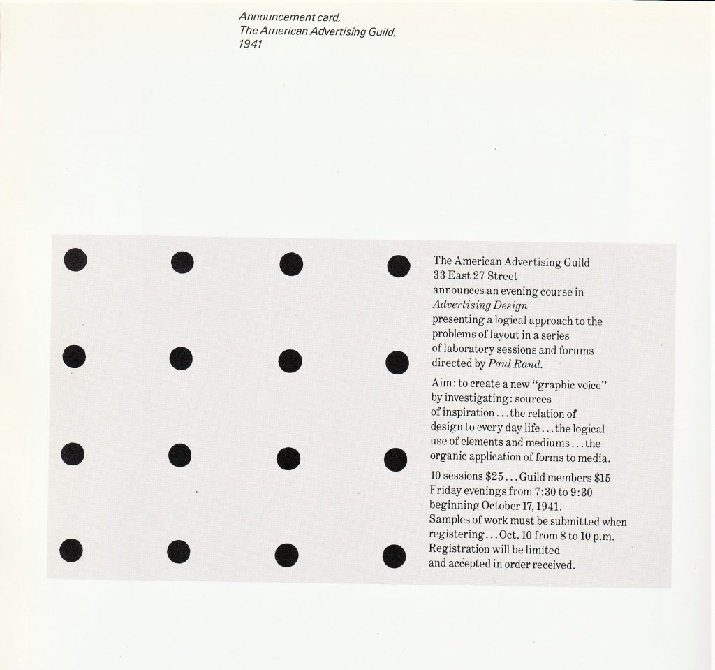
For this announcement card, Rand has used symmetry and order by the even-sized circles he has placed across the page. This simple design is eye-catching while also portraying a sense of order and efficiency. Since the card was probably small, the design is suitable with its lack of detail. A detailed design would be difficult to see on a small scale.
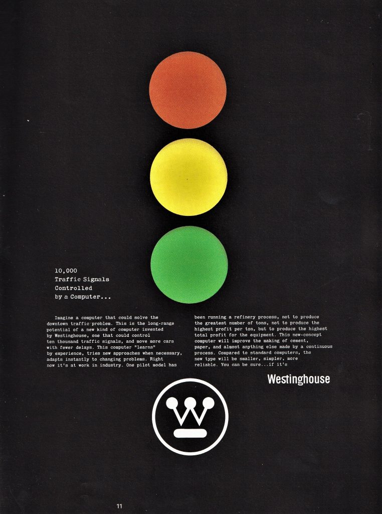
This is a magazine advertisement from 1961. The page is informing the viewer about a traffic light system being set up using the new technology of the time. The black background allows the colours at the centre to stand out in comparison. This is the effect actual traffic lights have on a dark night. The central placement of the column of circles makes the composition symmetrical and therefore balanced.
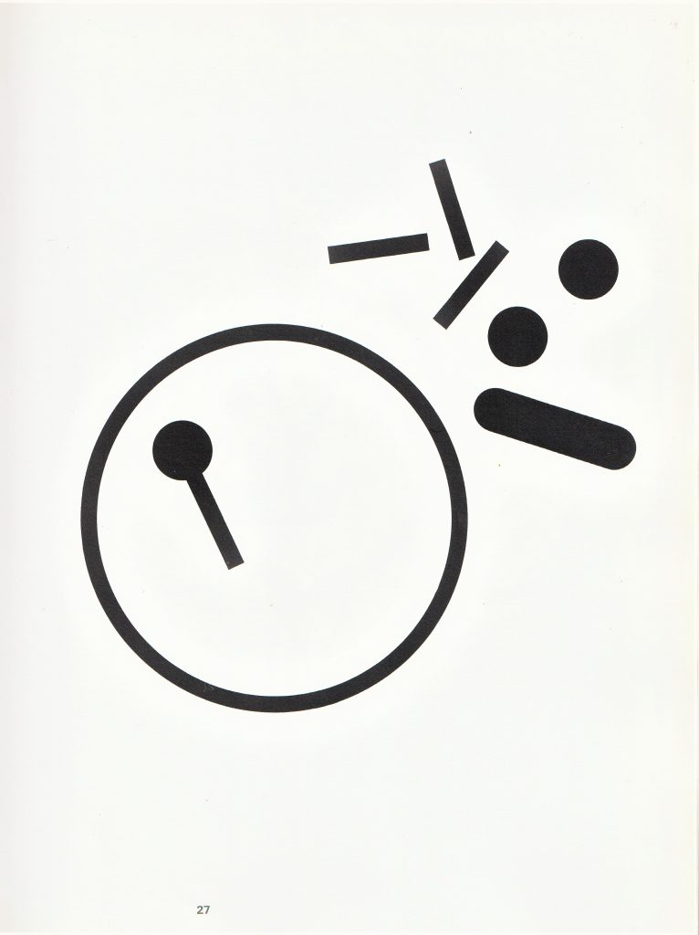
For this newspaper advertisement, Rand has taken apart the logo for Westinghouse Electric Corporation, and scattered the pieces in the upper right corner of the page. The scattered pieces follow no pattern and they appear chaotic. If the logo was familiar to you, you would be piecing it together in your mind. In this way, the viewer would be engaging with the design.
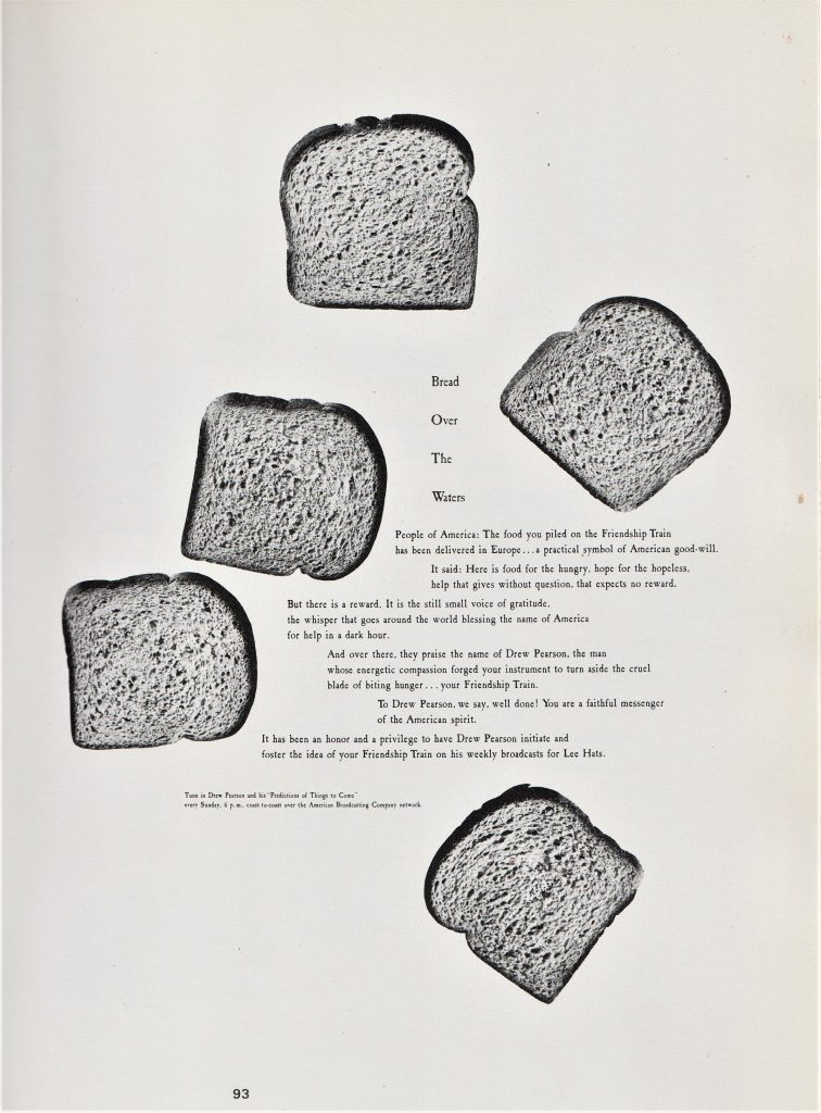
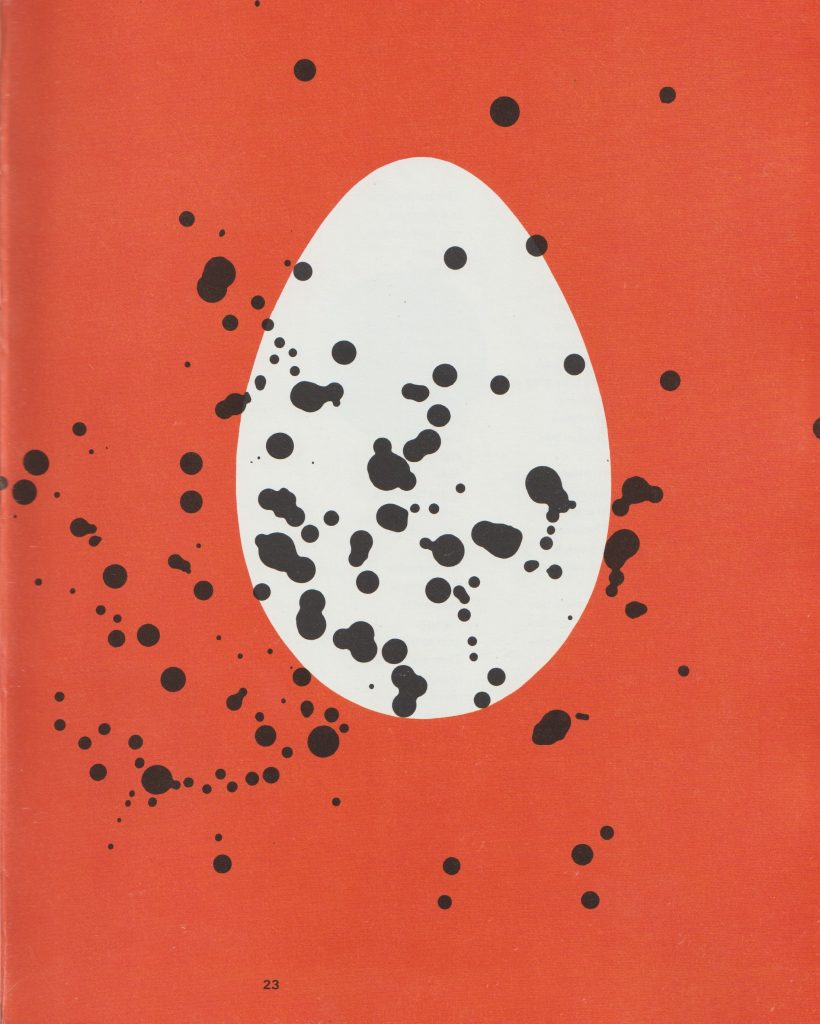
In this poster, Rand again uses chaos within the design. This time he is placing identical pieces of bread at different rotations across the poster. This has created a sense of movement throughout.
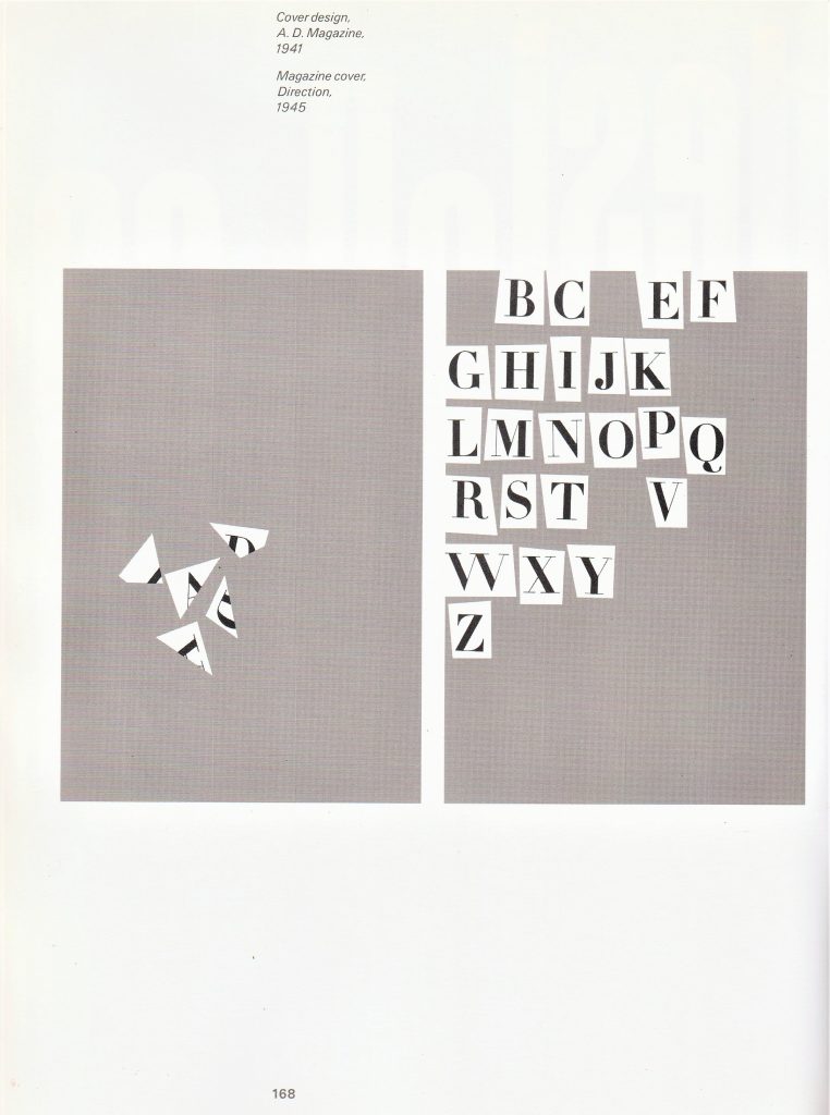
For this magazine cover, the letters have been scattered and cut up. Because the alphabet is placed in order, we are able to see which letters are missing. This is a way of engaging the viewer into the design, almost like showing the viewer a puzzle. The background is quite noisy and helps the white ground behind the letters to show clearly.
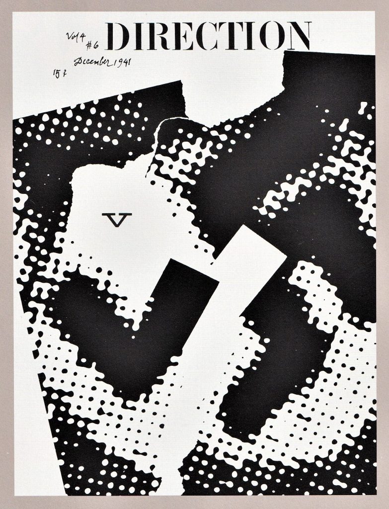
Magazine cover for Direction in 1941
Here, Rand uses visual noise to distort what we are seeing. It is not possible for me to see what the image is of. This confusion makes the clear ‘v’ stand out even more clearly. There is a shape below the ‘v’, that looks like a distorted ‘v’. it emphasizes the ‘v’ above it, creating repetition. I like the areas of negative space and the clean rectangle shape that appears to be cut from the design.