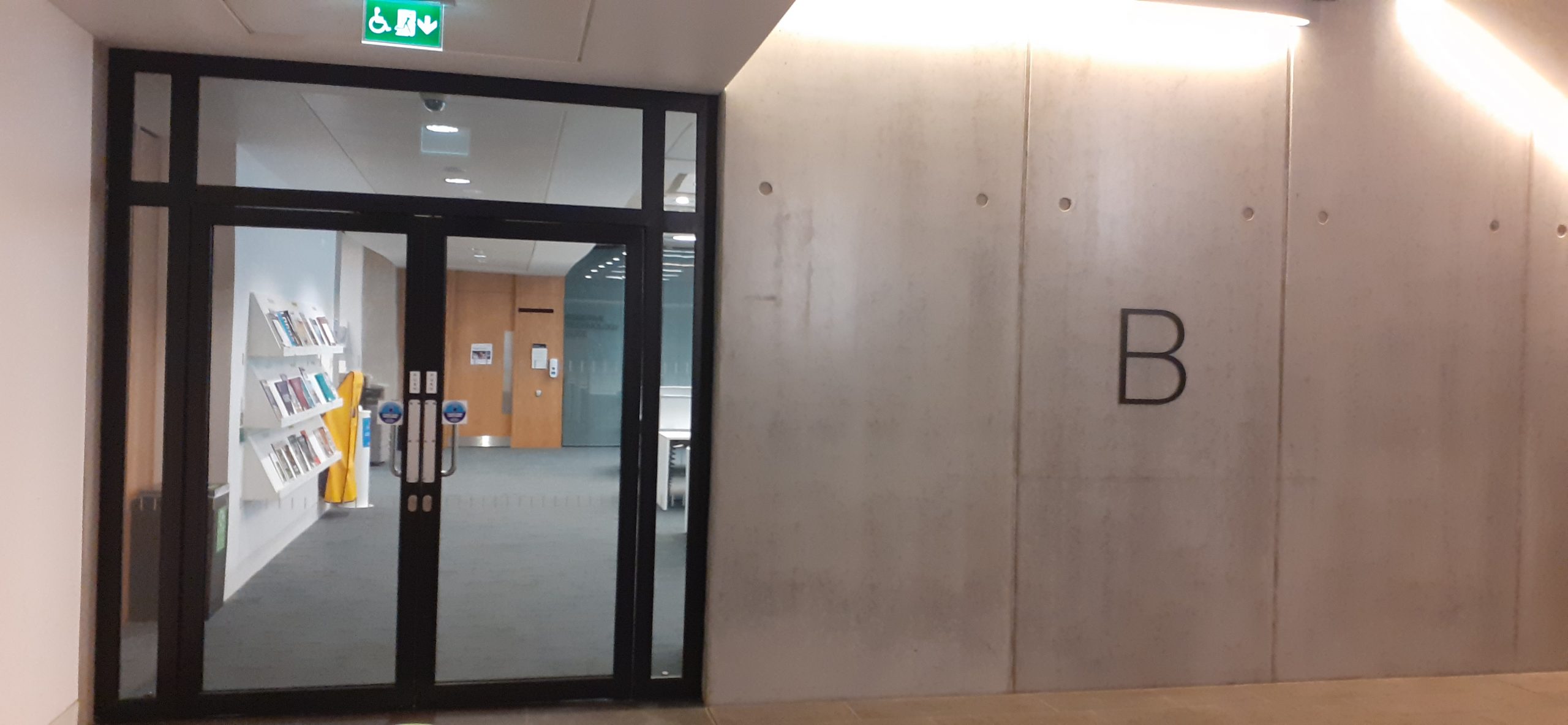
Brookes University have a collection of journals available to browse. They can be found on the basement floor of the library. In this space, the range of journals are displayed on shelves. This enables me to view the covers all together. From business to architecture, politics, to the arts. I decided to pick up 2 magazines that first drew me in. This may be due to the visual language of the covers, or the appeal of the subject.
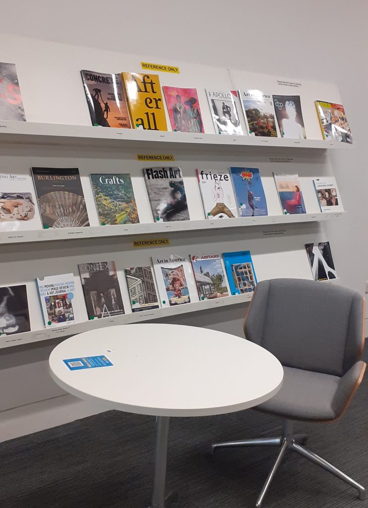
Journal 1 Crafts
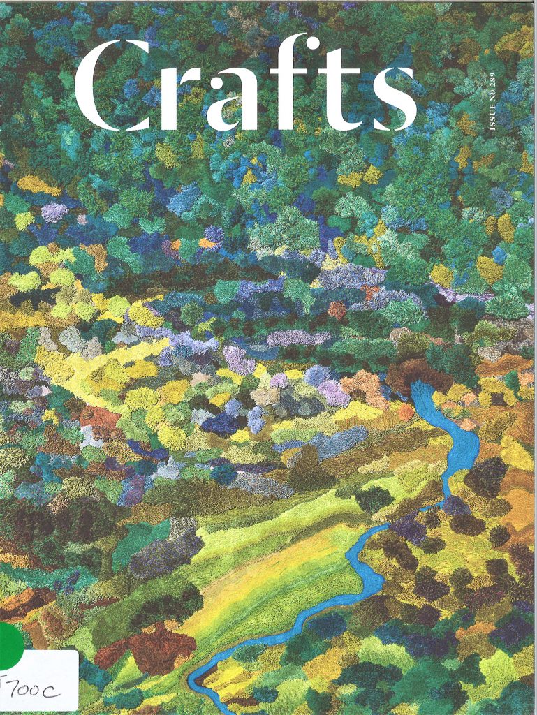
I was first drawn to the magazine ‘Crafts’. The image used on the cover is soft-looking. I did not immediately recognise it as a textile image, seeing it as a landscape first, but I quickly recognised it as a textile material, due to the name of the magazine. The white text against the dark green of the background is very effective. The typeface used for ‘Crafts’ relates nicely to the subject matter, since crafts are seen as a traditional art form. I generally like clear in titles. Here, the title speaks for itself and means that no extra text is needed to explain the contents. This means that the image can be busy instead. I was drawn to a craft magazine, as I have always worked with traditional techniques.
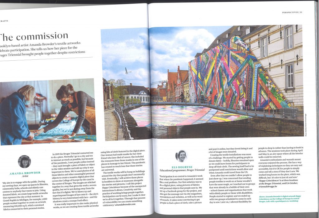
I looked at an article in this magazine, titled ‘The Commission’. Being a calm subject matter, an active design layout was not necessary. For example, the use of symmetry in the double page spread creates visual balance. (Both pages contain 3 columns of text with a small photo of the author of the text). Turquoise of the sub-headings (authors names) ties in with the turquoise of the fabric in the left image. The use of a strong image at the centre acts as the visual draw and unifies the composition.
The design of this double page spread expresses the subject matter well by using an image of artists working. Crafts are very hands on, so it is helpful to have a visual representation of the physical process. The figure’s arms in the left photo, are reaching to the bottom-left of the photo, this points to the start of the text.
The image dominating the right page, being larger than the left image, shows its importance and directs viewer to the left-hand page where the narrative begins. Bright colours first draw our attention then leading lines lead us to the left page. The fence in the image act as Leading lines, drawing the eyes left towards the heading and sub-heading/introduction to the article.
Journal 2 Printmaking Today
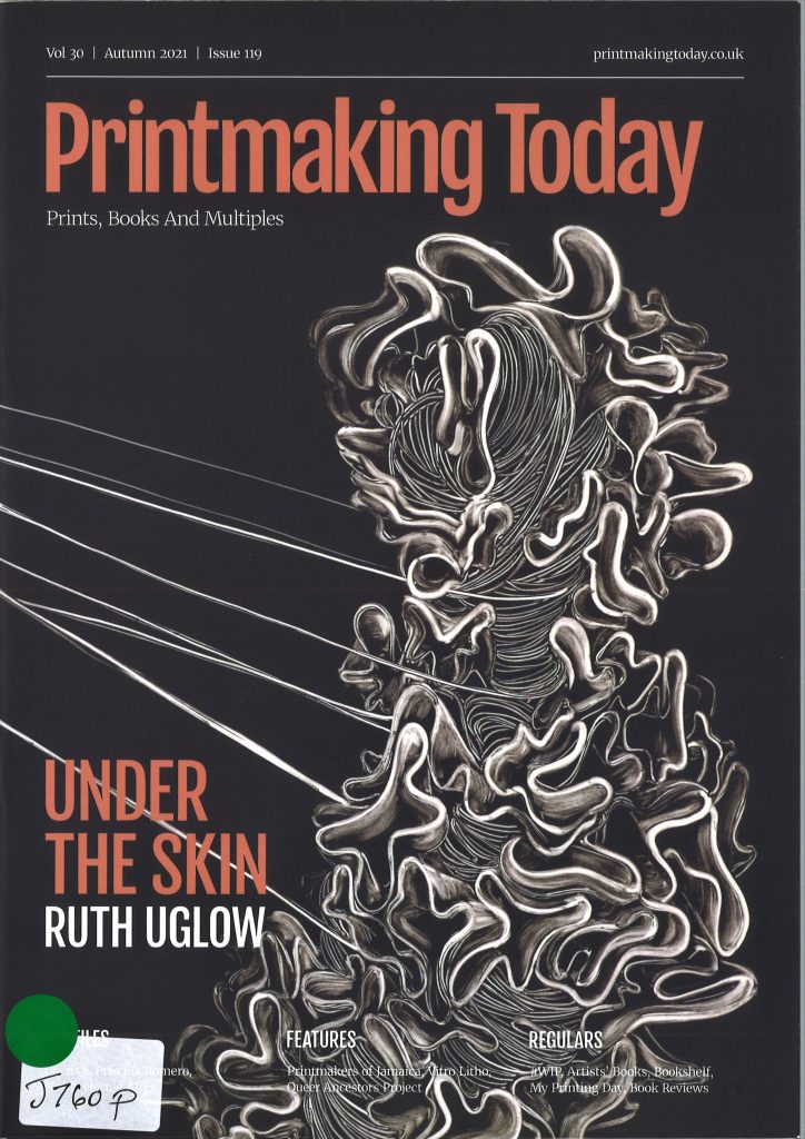
I like the straight-forward title of both magazines. They tell me what the content is about without even having to open the journal. Printmaking Today as a title, tells me that the journal is about printmaking and that it is about contemporary work.
The artwork on the cover grabbed my attention. The leading lines drew me into the image as the use of white on black is quite bold. The winding shapes and title colour are fun and energetic, but the muted tones calm it down. If a cover image is too strong or garish this often puts me off. If the cover is shouting at me, I assume the content within will be the same.
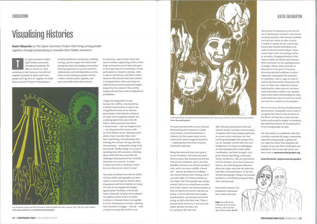
Looking at the double-page spread as a whole, the 3 images are placed in an interesting way. The 2 outer images sit on the bottom line of the layout, and the centre image has been placed at the top of the page. This gives the layout energy, creating movement. The text zigzags around the images, breaking up the text into readable chunks. The colour and line used in the illustrations drew me to this article. Particularly the strong greens in the first image.
I like the lino print at the end of the piece. It emphasises the message of the article, which is about connecting people in the LGBTQ+ community. The way the portraits interlink illustrates this.