Contextual Research:
This week’s discussion was about the designer’s portfolio/ online website.
We asked ourselves: What is their purpose?
- For promotion
- showcasing skills and capabilities
- A way to point people to your blog, social media or shop
- to get hired and find work
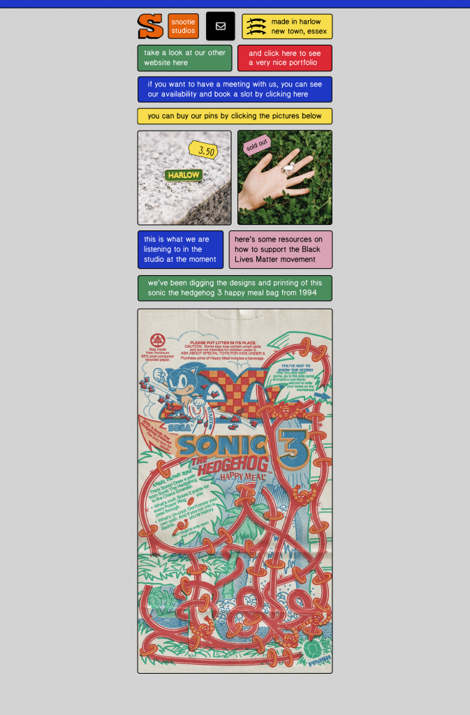
There is no set standard when it comes to a designer’s website. Avoid trends. Below is Snootie Studios website. The use of a grid makes the information easy to understand and navigate:
Your website is your presense, its the first point of contact people will have for you. We need to consider navigation- keeping it simple, nice and clean.
…And like a shop window, the content is changing constantly.
Make sure you present it in a clear way, use large images and make sure there’s not too much graphic noise around the work.
– Hannah Caughlin, Graphic Design Consultant, Represent
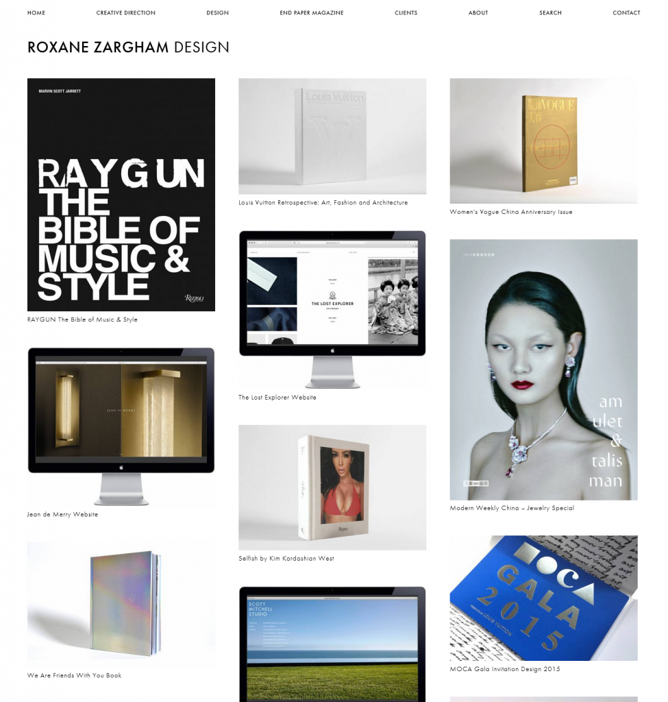
Roxane Zargham’s web portfolio is an example of a very clean layout. The absence of background colour/ unnecessary information helps the viewer navigate the work in this portfolio. Her work has also been photographed in a studio using a white background. Treating each piece in the same way unites the separate projects as being part of the same design identity.
She uses the rule of thirds to divide the work into 3 columns. This gives a sense of balance to the overall page layout:
You don’t need to follow rules- be enthusiastic finding your voice what works for your unique personality.
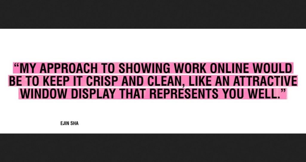
Bravery and personality are maybe the two most important things I’m looking for in a portfolio.
Erik Kessels, It’s Nice That
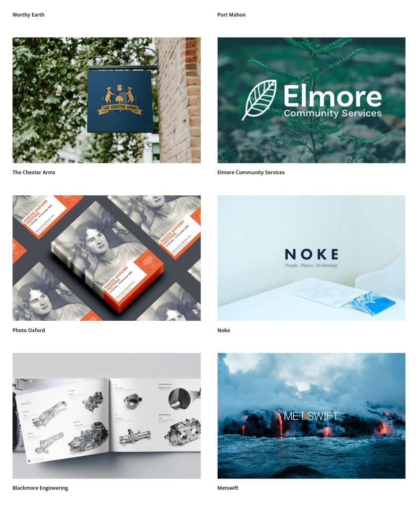
Be selective- it needs to represent what you want to achieve, what you want to work with. This could mean working on a self initiated project. (You want to show you have experimented with different things- analogue, digital.) For example, on the website portfolio of Bounce (a graphic design studio in Oxford), they have included a variety of projects together. I like that I can view the scope of their work on one page:
It’s important to write a description, since work needs to tell a story. Where to start? Puting the work I want to showcase into 1 folder, allows me to be organised. If I write 200 words for each project, then I have this information ready for when I want to post the work to my website for example.
Art direction and image production (creating the content for your website) can be the most time-consuming part of putting together an online portfolio. (We will be exploring this in a photography workshop next week). We spoke about the things to consider when photographing work.
Photographing work
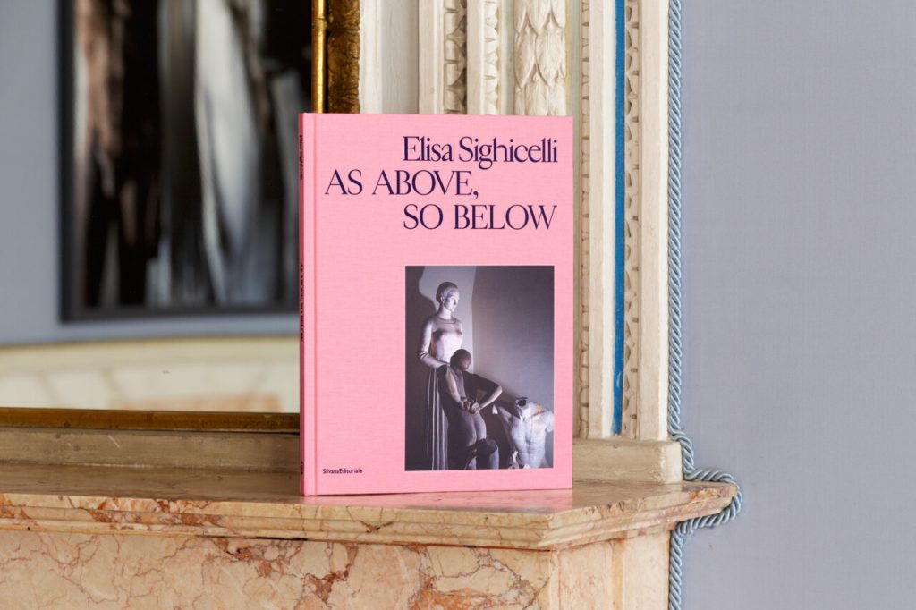
One possibility is to frame the work in a real life context. An example of this is this project from Tomo tomo Studio. They have decided to photograph the book in an old building, isince the subject reflects an antique theme. The work also constrasts with the blue in the background. It is a nice idea to contrast the colours of the work and its background, since this allows the work to stand out.
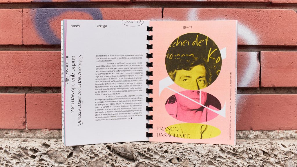
(Below) Another example of an interesting setting, is this fanzine that has been photographed in an urban landscape. Since the zine is about the city, it is appropriate to capture it outdoors against the brick wall backdrop. This is an alternative to photographing the work indoors and artificially lit. Both are appropraite for different works.
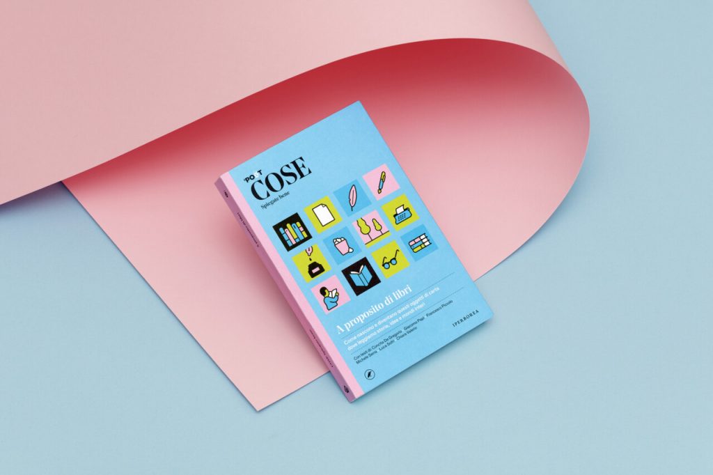
Coloured paper has been placed in background and creates a sense of harmony in the overall image. The colour has been dictated by the work itself:
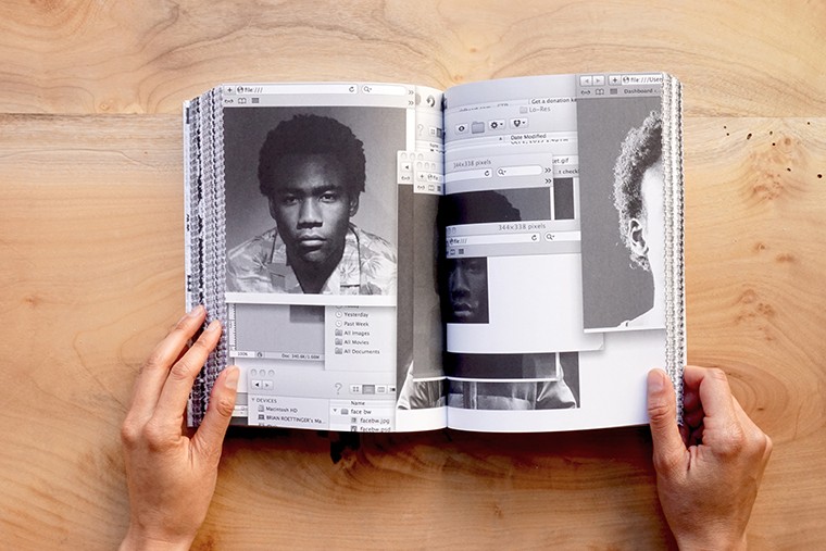
Including a wooden background places the book in a real world setting, allowing the viewer to picture the physicality of the book and to imagine it infront of them. Including the hands gives us a sense of the scale. (below)
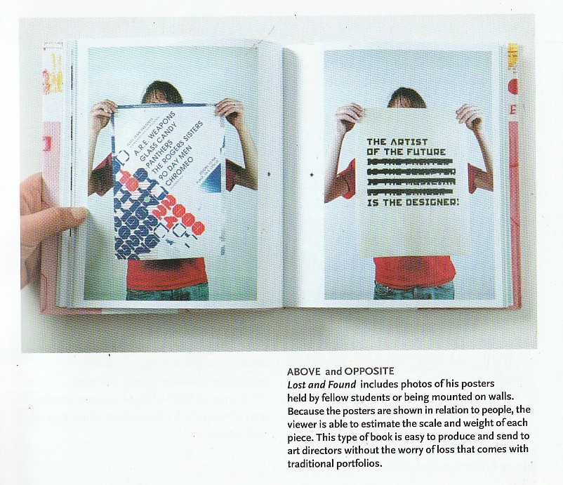
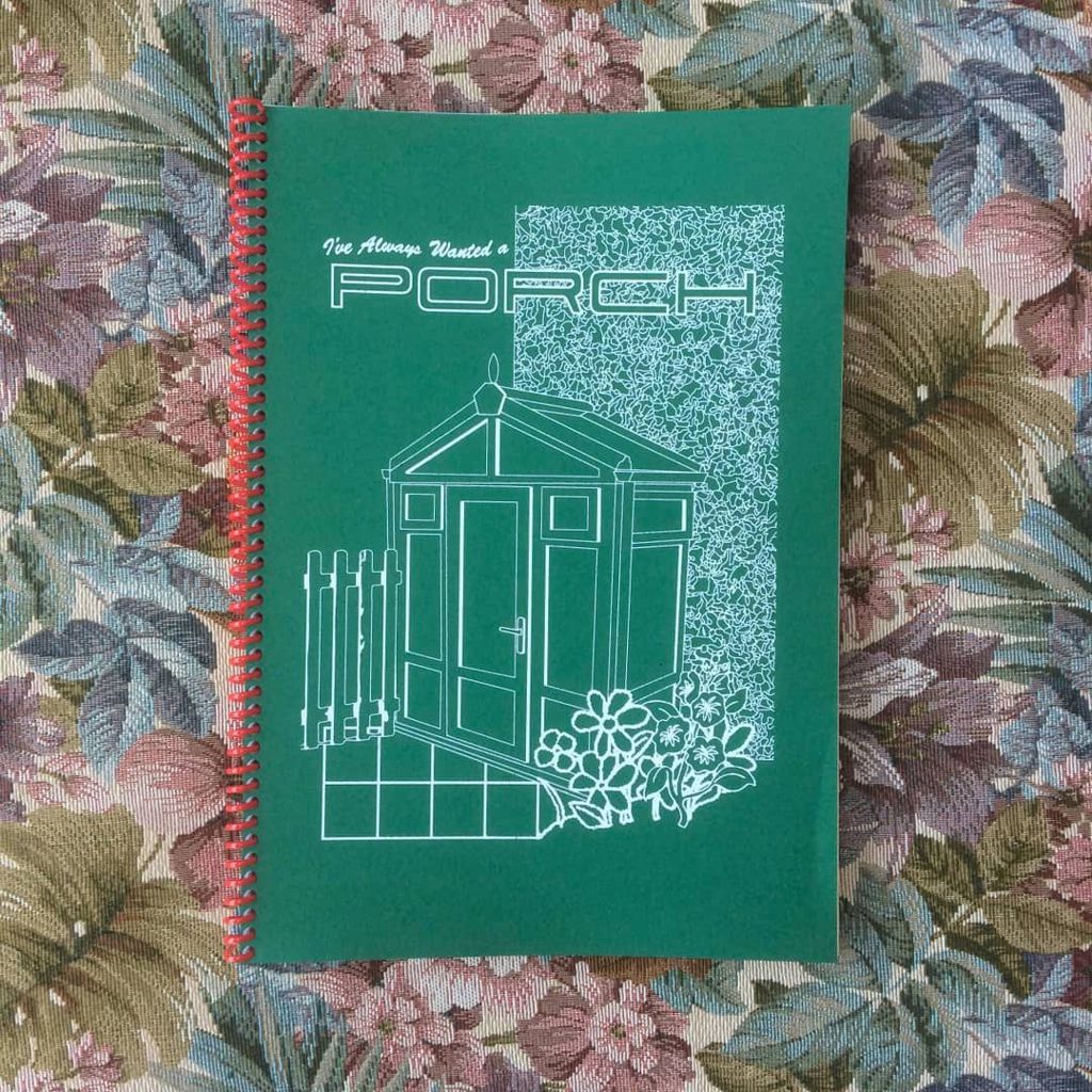
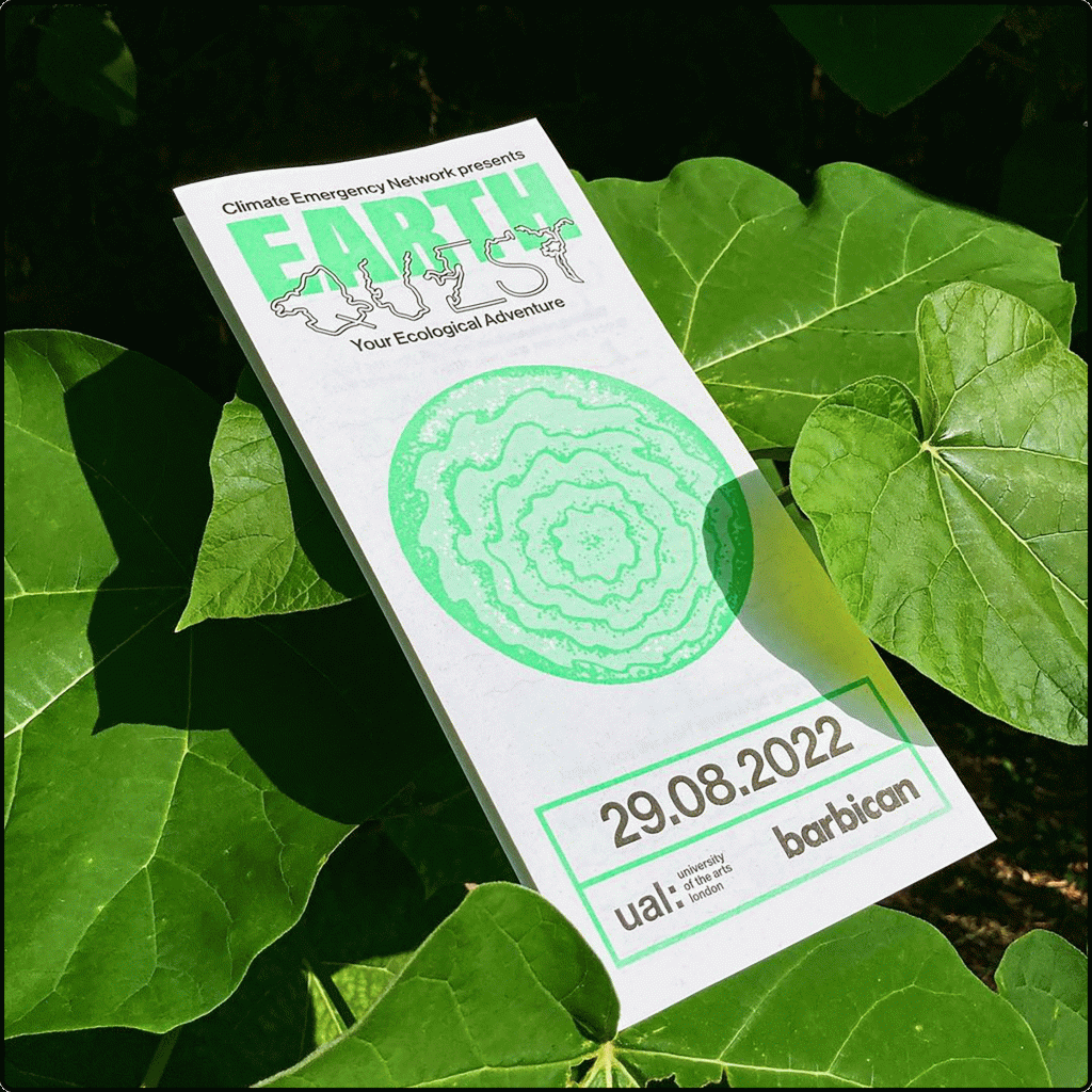
We can also use props and other materials alongside the work. For example, if the project is about music, we could place cables in background. We could include props that feature within the work, and place them next to the work also.
Thinking creatively, we can use any material to add interesting background effect. For example, using coloured acetate in the background to filter the light through.
P.O.V.
We can play with different points of view when photographing our work. Choosing a different angle presents interesting aspects of the work and can even create surreal, abstract imagery of an everyday object. For a book that has complicated folding, we can use photography to show the complexity of the book binding.
Suspending the book with fishing wire and photographing it can be a fun way to display the work.
Details can be zoomed in on. Where there might be reflective materials for example, we can photograph the way the light catches the foil on a book cover. The tactile/print quality of the work can be showcased with photography. Use of shadows can emphasise the physicality of the piece.
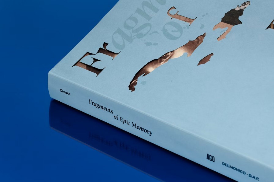
Above: This photo focuses on the details of the spine and cover.
Below: Showcasing the cover of the book, using light and shadow to emphasise the page.
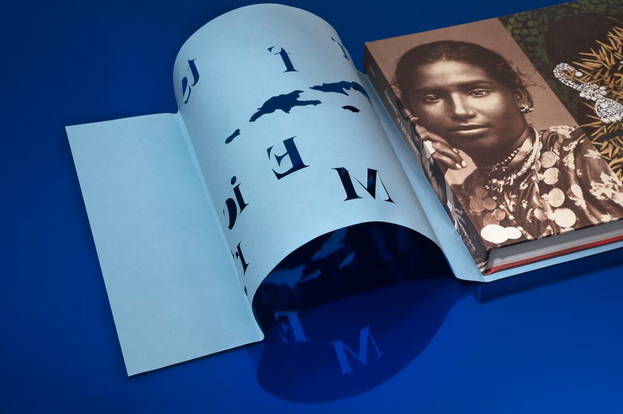
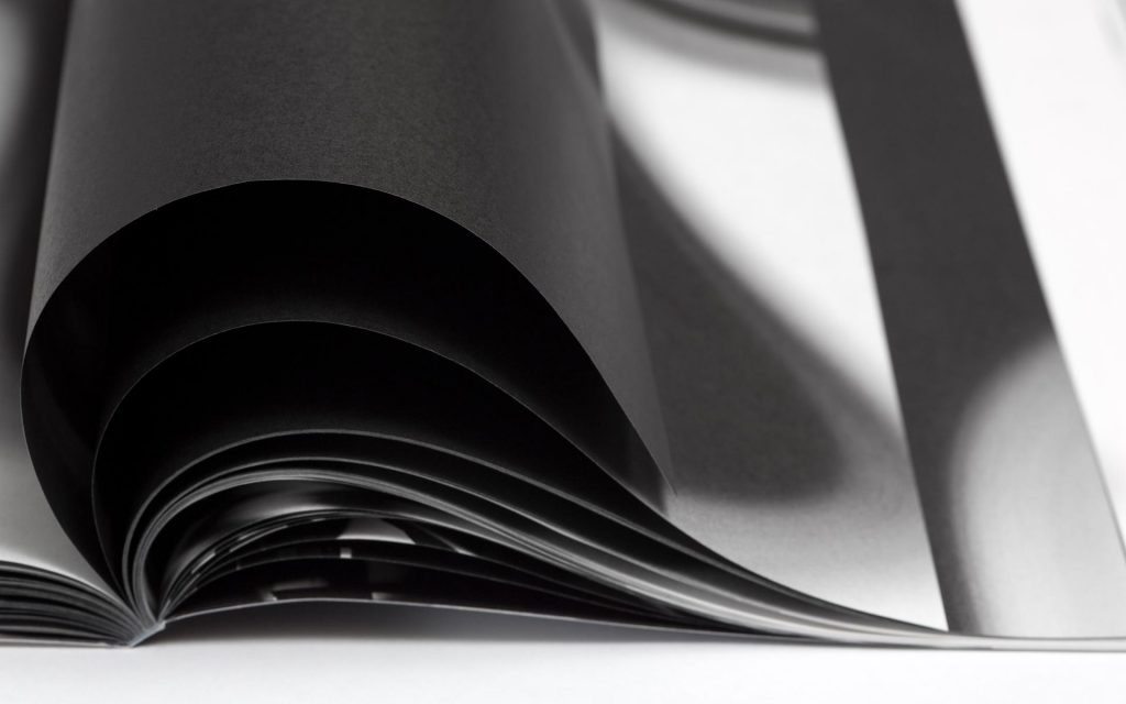
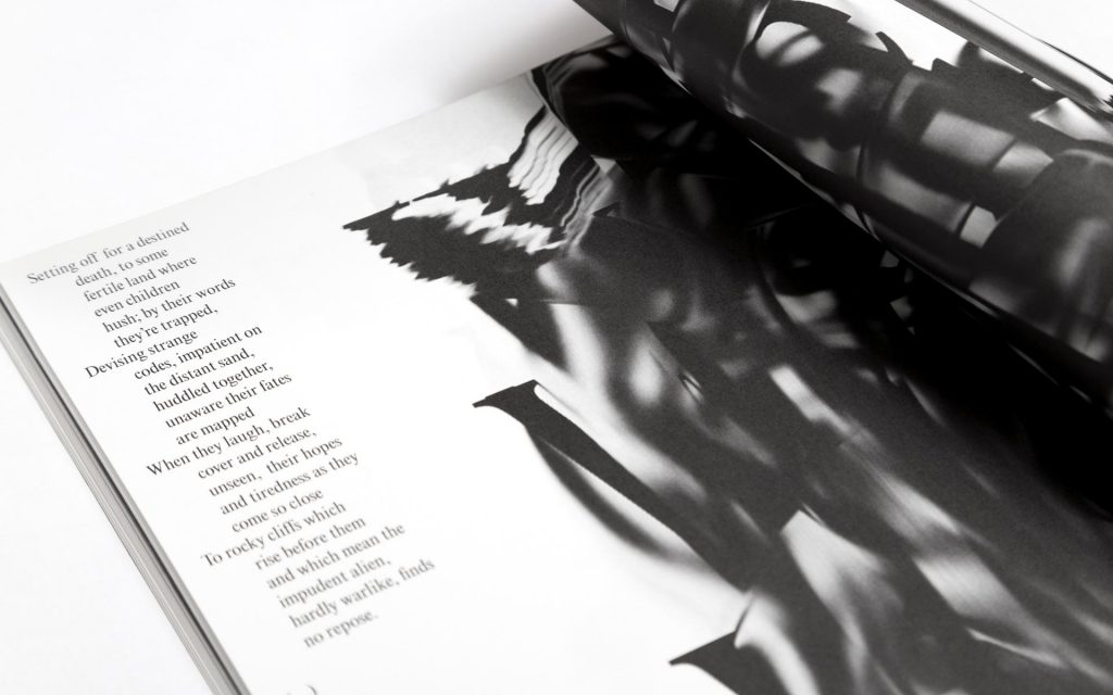
We could even take a video of the work to show the handling of it. Stop motion can be a fun way to display the work.
An abundance of identities
Listening to the Design Matters podcast, this episode features Dario Calmese. The discussion is based around the fact that ‘we all have multiple identities’ and that choosing 1 career path may be limiting ourselves. Calmese is described on his website as ‘sitting at the nexus of art, fashion and academia, Dario is an artist, urbanist, director and brand consultant currently based in New York City.’ His curiosity was encrouaged by his parents and he was able to explore many different skills from a young age.
‘Each medium allows for a certain type of communication’
‘Fascinated by what is possible’
About identity:
Identity isn’t necessarily who you are but the things you hold. You are the vessel that holds these identitys. identity is something that comes from the outside, people are telling you how you are seen vs you defining it for yourself.
Dario Calmese
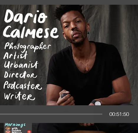
Further Logotype
I looked at the book Logo by Michael Evamy. I was more drawn to the painterly textures within the logos in the book:
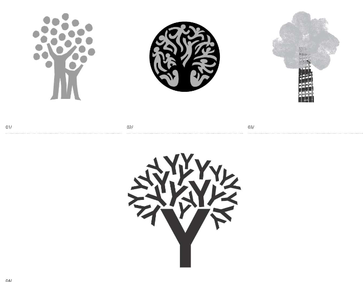
I was inspired by these textures when refining my logotype:
