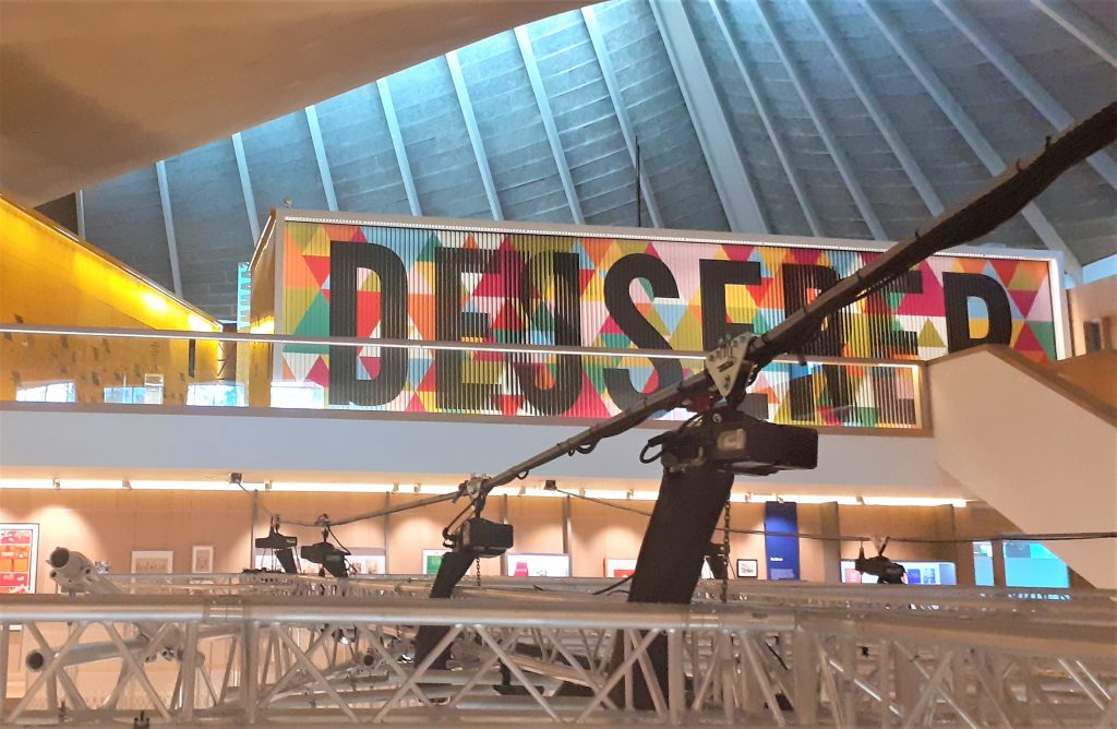
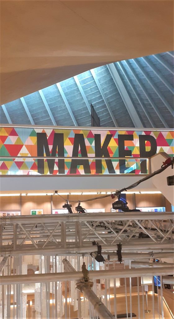
The name of the exhibition is displayed on a large board. The letters are written on slats which rotate to display the next word. I first thought this was a digital screen, but seeing it closer up I saw that the words were printed on a material like plywood.
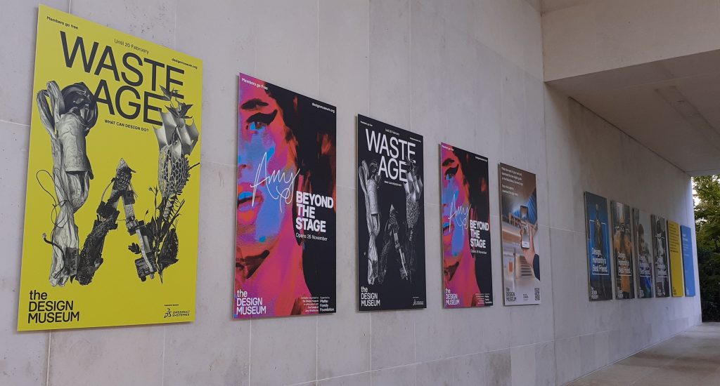
The soft lighting and wood interior within the design museum creates a friendly warmth throughout the building. After the rush of London, I felt relaxed.
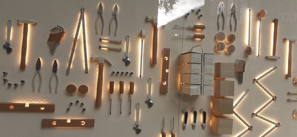
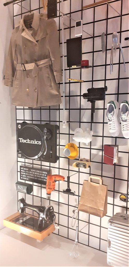
The first objects I came across on the top floor of the museum.
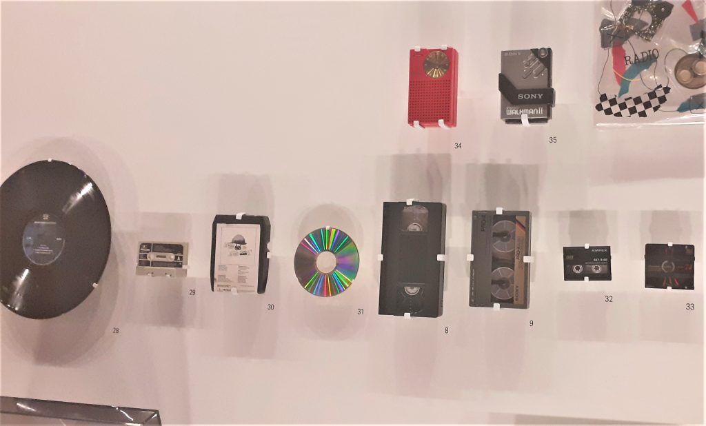
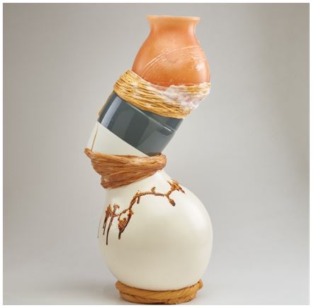
I was surprised at the arrangement of objects and the assortment on display. The objects were placed quite closely together which felt slightly disconcerting because there appeared to be no connection between each object. My first thought is that these objects have come from many different people and places. Perhaps there was no other way to introduce this exhibition that shows us such a wide variety of design.
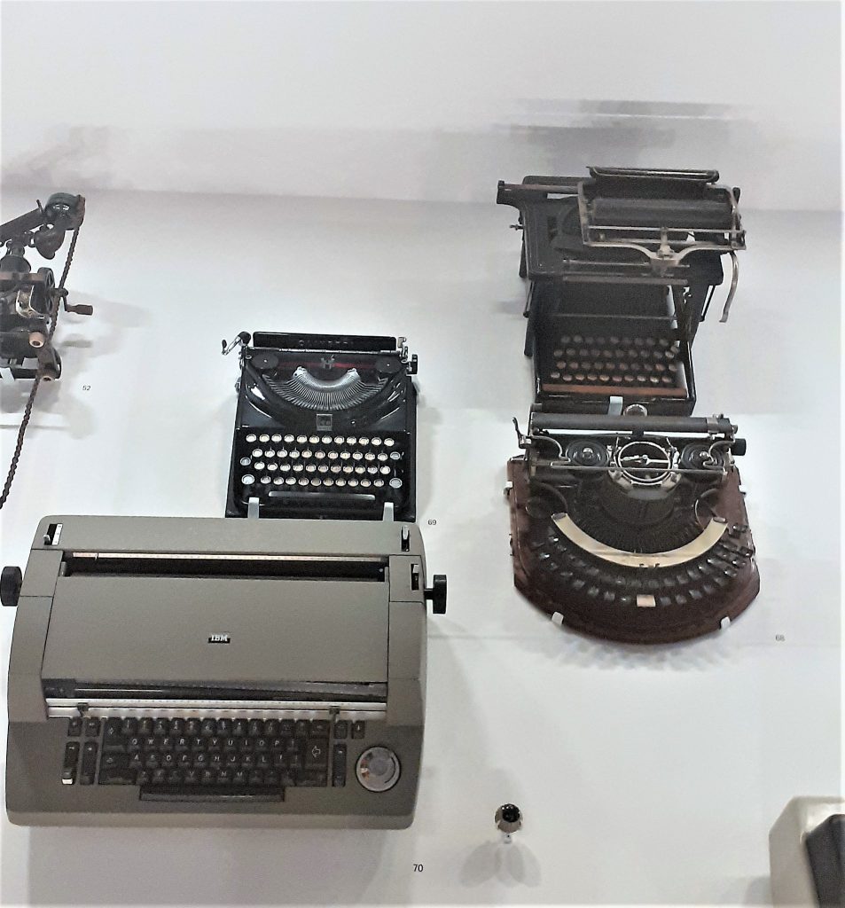
The typewriters hanging on the wall was an interesting sight. I have never seen a typewriter displayed from a wall in this way. The way they were shown as a collection was satisfying to see. I found them beautiful. As a child, I was always drawn to my mum’s blue typewriter and wanted one myself. Seeing these typewriters brought that feeling back.
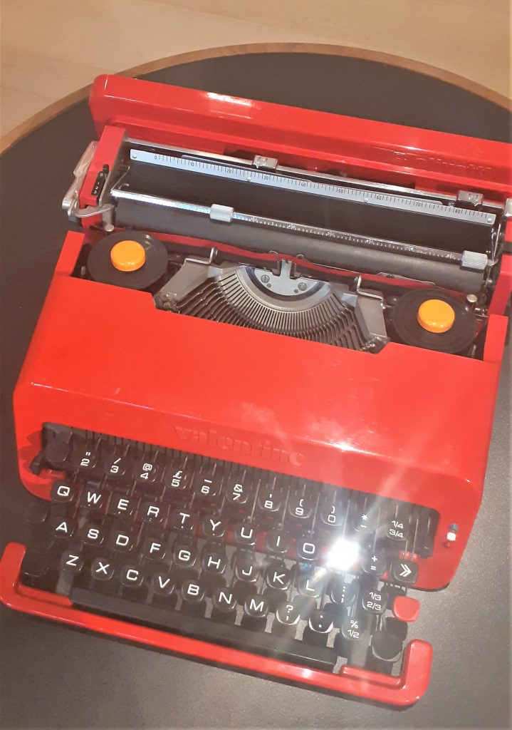
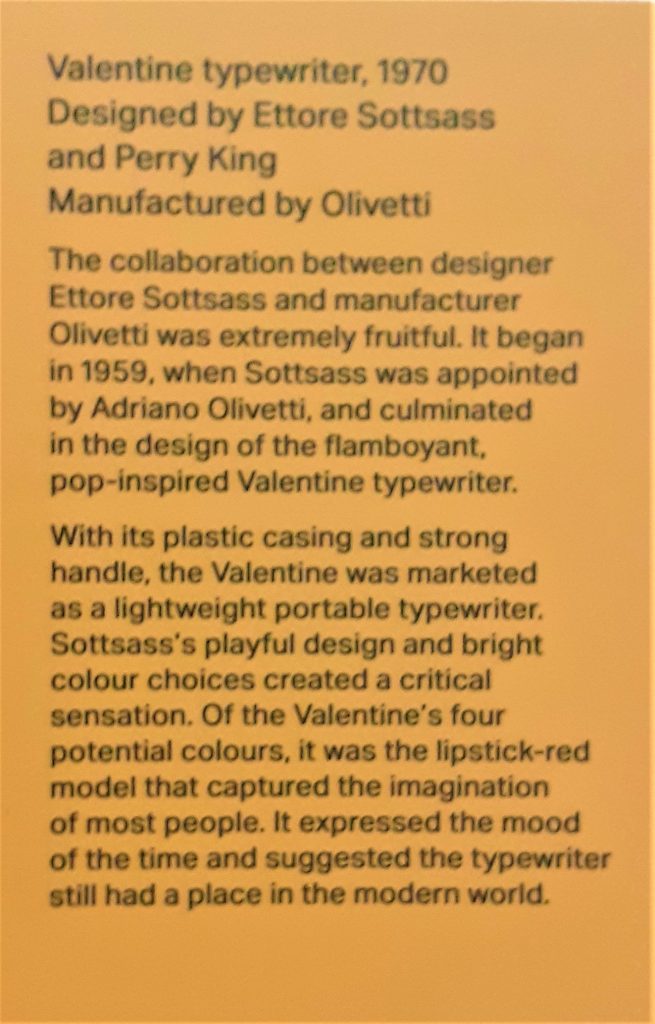
Valentine typewriter, 1970. Designed by Ettore Sottsass and Perry King.
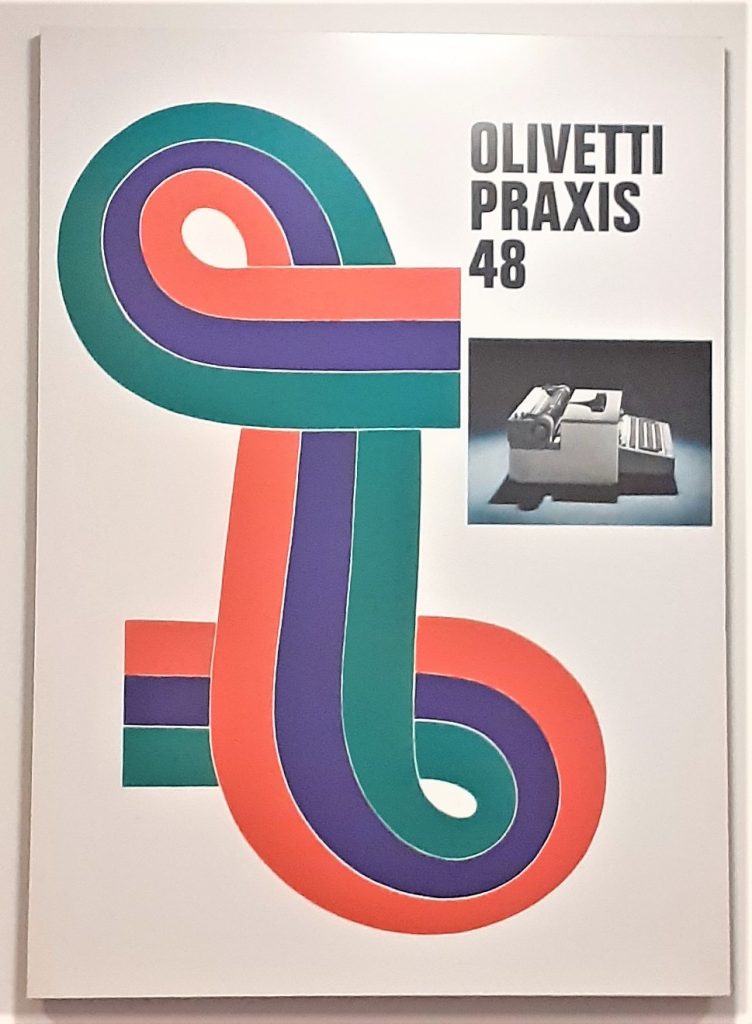
Olivetti Praxis 48 typewriter poster, 1967, Designed by Giovanni Pintori.
It was really nice to see the poster behind the physical object of the typewriter. In my head I could put the 2 together and imagine the time they came from.
Olivetti Lettera 32 typewriter poster, 1968-69. Designed by Walter Ballmer.
Here the designer has played with scale to created a surprising image where the egg is as large as the typewriter. Seeing the typewriter at this angle is another unusual element to this poster.
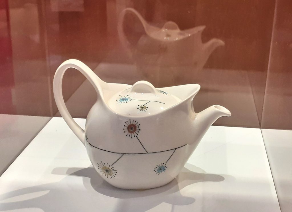
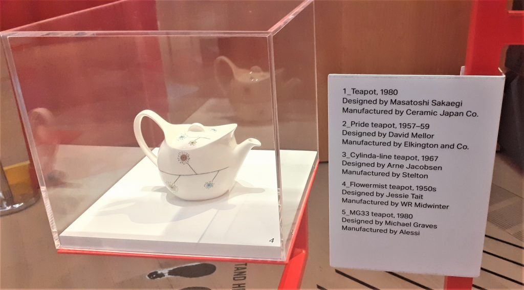
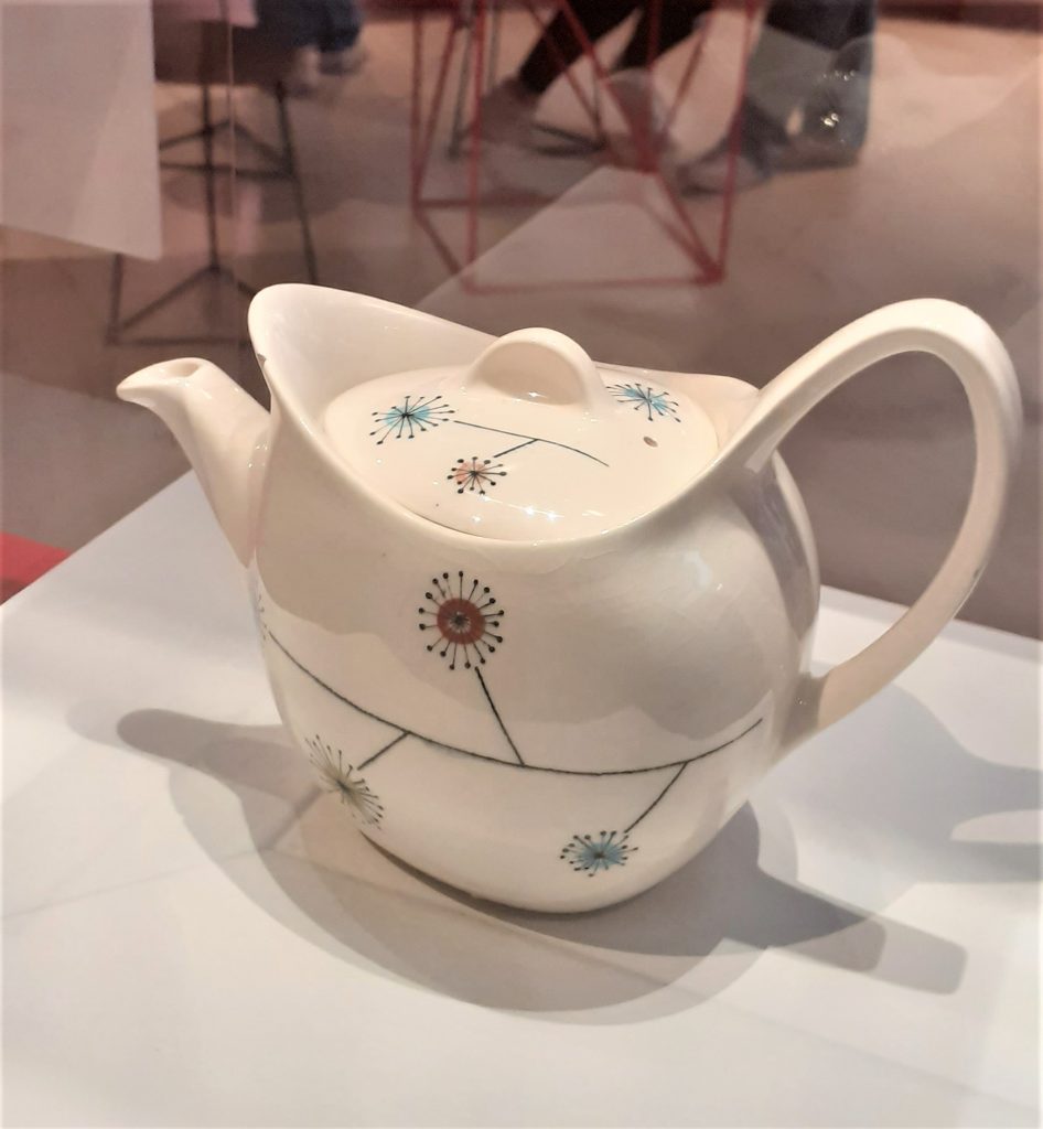
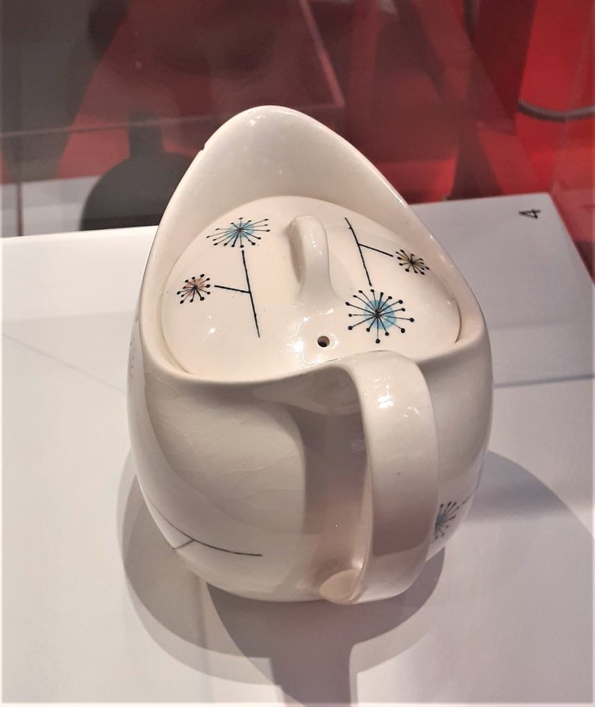
One classmate made the point that the older technology was new to our parent’s generation.Flowermist teapot, 1950’s, designed by Jessie Tait.
I loved this unique teapot as soon as I saw it. This is the kind of item I would be tempted to buy. It is delicate, pretty and functional. The way the teapot was displayed allowed me to view it from all angles. The light directed onto it acted as a spotlight, drawing me to the object. The shadow created on the side of the pot highlighted the shape of the design.
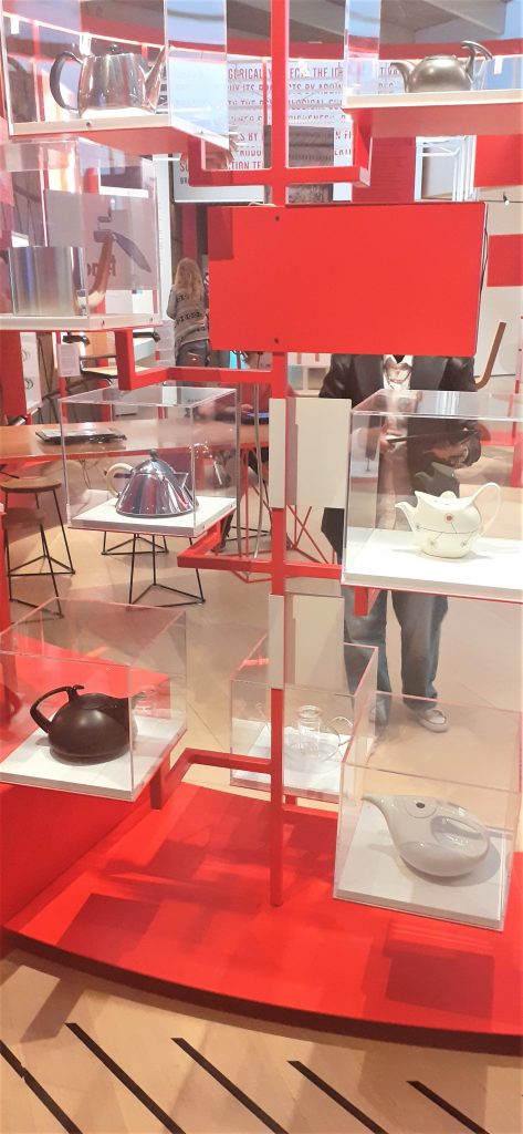
The way the teapots are displayed together is interesting. The frame they sit on is asymmetrical. It reminded me of a teapot tree out of a fantasy story. They appear to be floating due to the transparent cases.
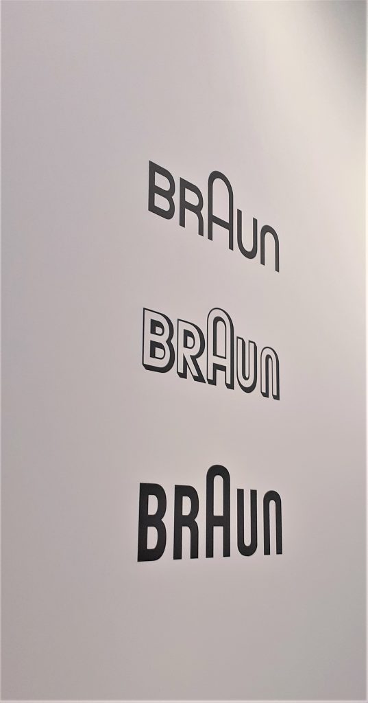
Logos on the wall of the exhibition, showing us how the design has changed over the years.
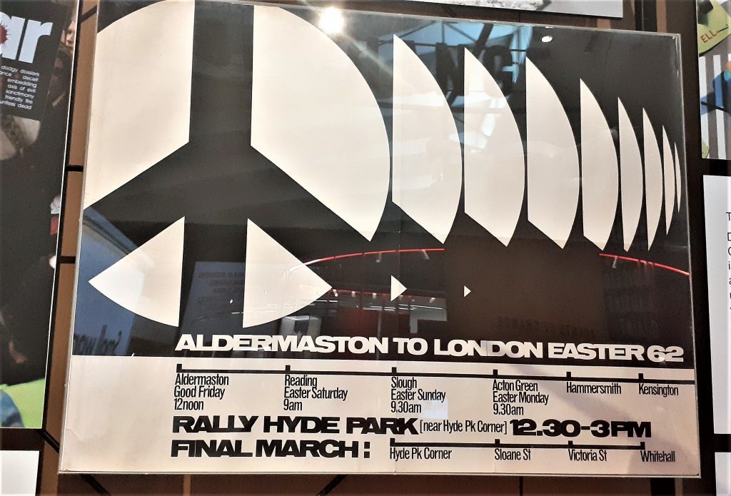
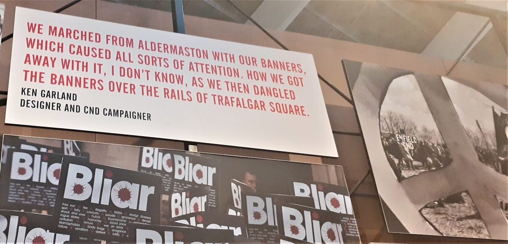
Seeing my hometown of Reading on the poster made this historical object feel more real to me. I could imagine the people marching in the street, rather than if the poster had been about somewhere I do not know.
I really like the use of repetition in this poster and the black and white design. The lack of colour helps the shapes to stand out. The line at the bottom of the poster gives us a visual representation of the route of the march.
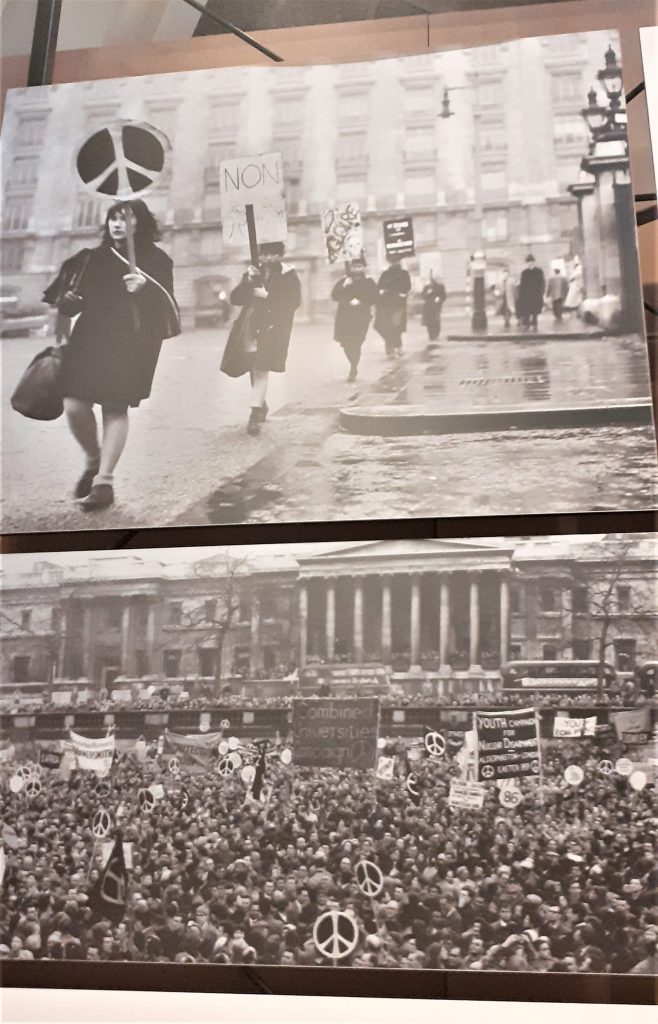
Displaying photos of the protests next to the poster gives us context for the object.
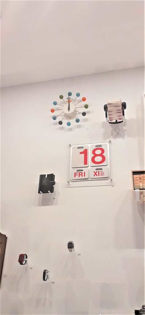
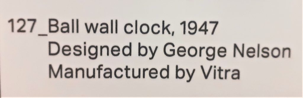
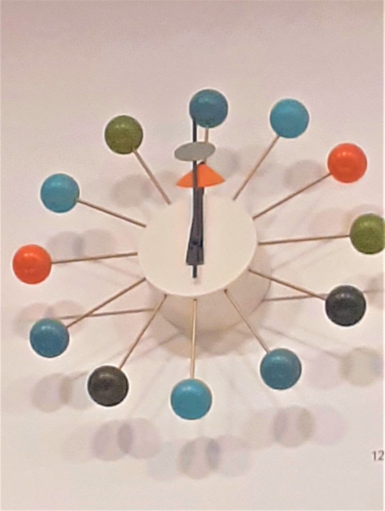
Wall of time. This wall displayed clocks, watches, a filafax, and other objects to organise a person and mark time. In the top right-hand side, I saw the Ball Wall Clock. This object immediately intrigued me.
I first felt awestruck. Then joyfully impressed. I could not relate this design to anything I have seen before. I guessed that the object was old. I have always struggled to read clock faces and numbers in general. I usually dislike any clock that does not have numbers on it. I like I would struggle to use this clock if it were mine. But the cheerful quality of the design overrides this for me.
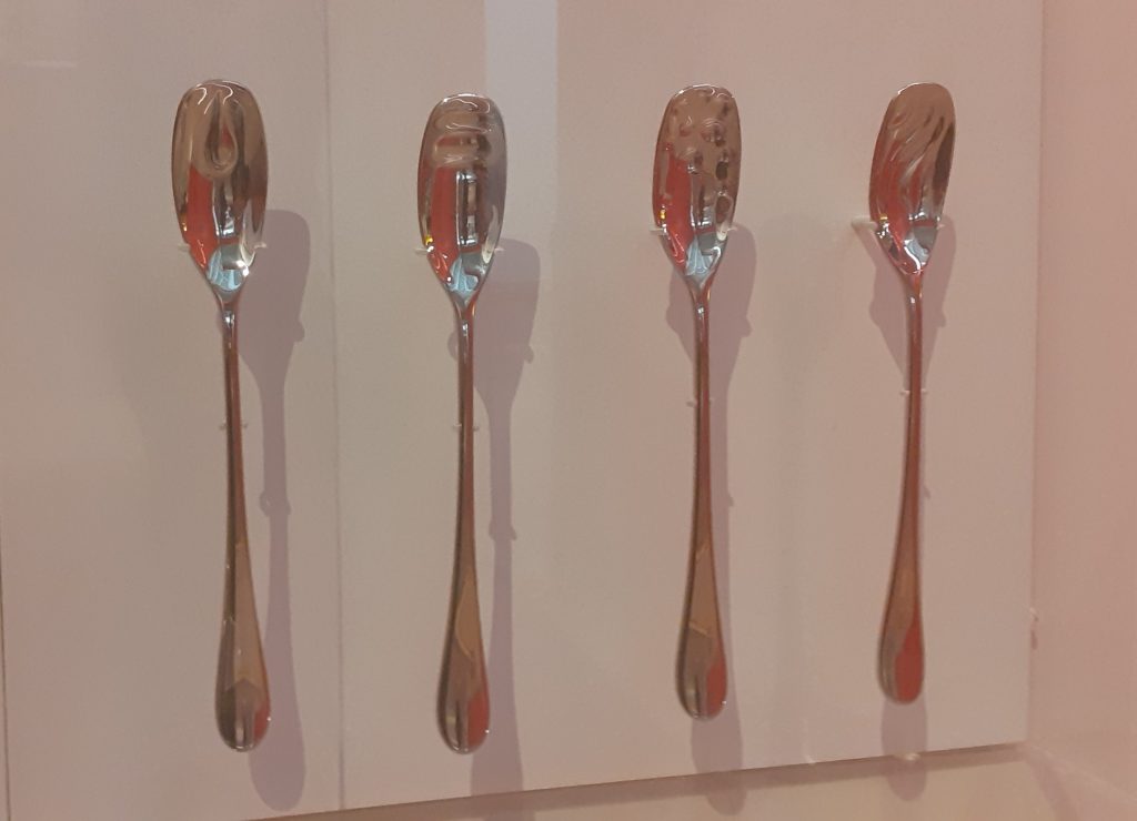
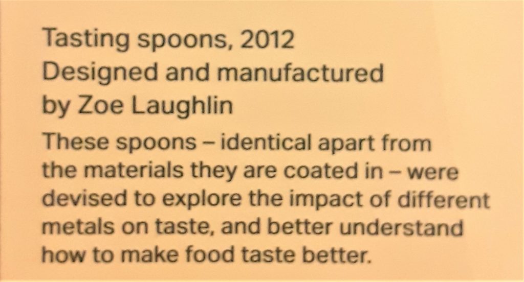
The story behind these tasting spoons interested me. At first they appear to be identical. The design looks the same in all four spoons, except they function slightly differently because they give a person a slightly different experience depending on the material used.
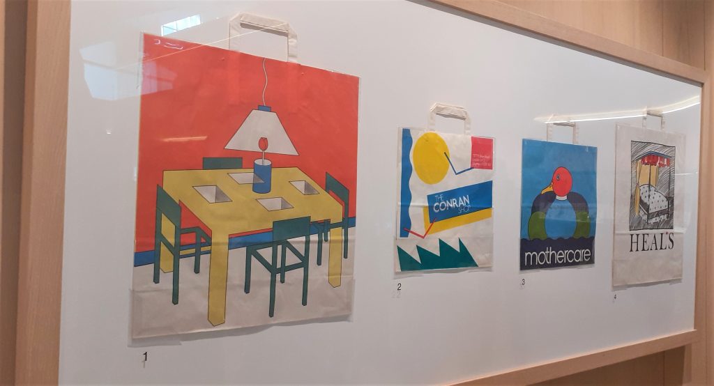
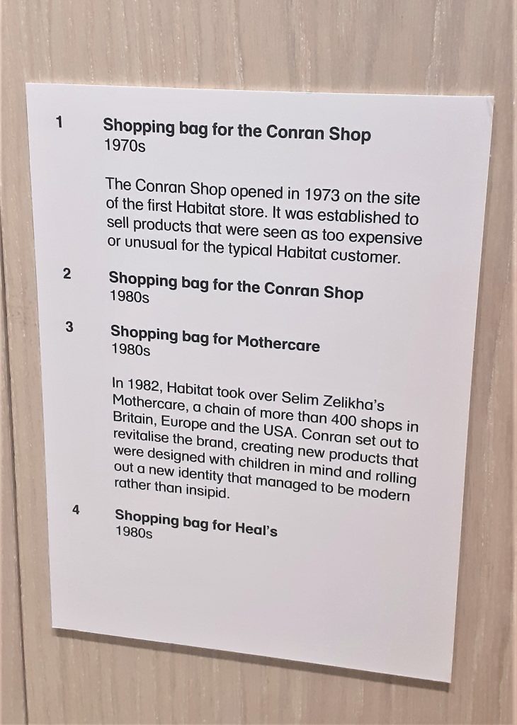
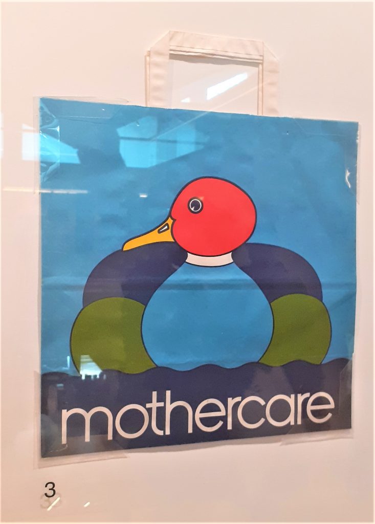
Shopping bag for Mothercare, 1980’s.
I was surprised to see the thickness of the plastic bag. The colours are bold and bright. Plastic bags are no longer made in this way. Because of the thickness of the material, I imagine that this bag is durable. The simplicity of this design is very effective and the red of the duck’s head is eye-catching.
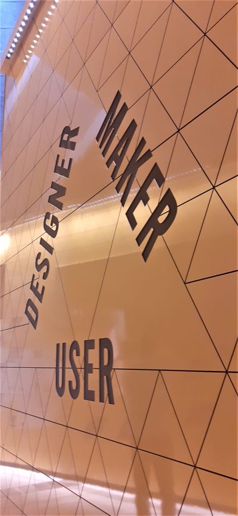
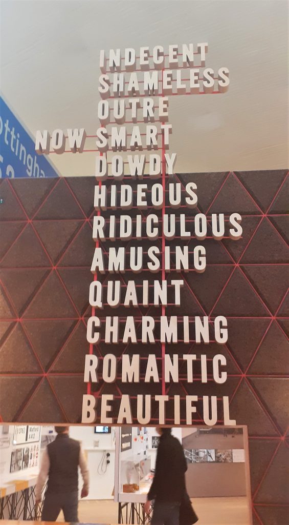
The list of words at the centre of the exhibition could describe design or objects.
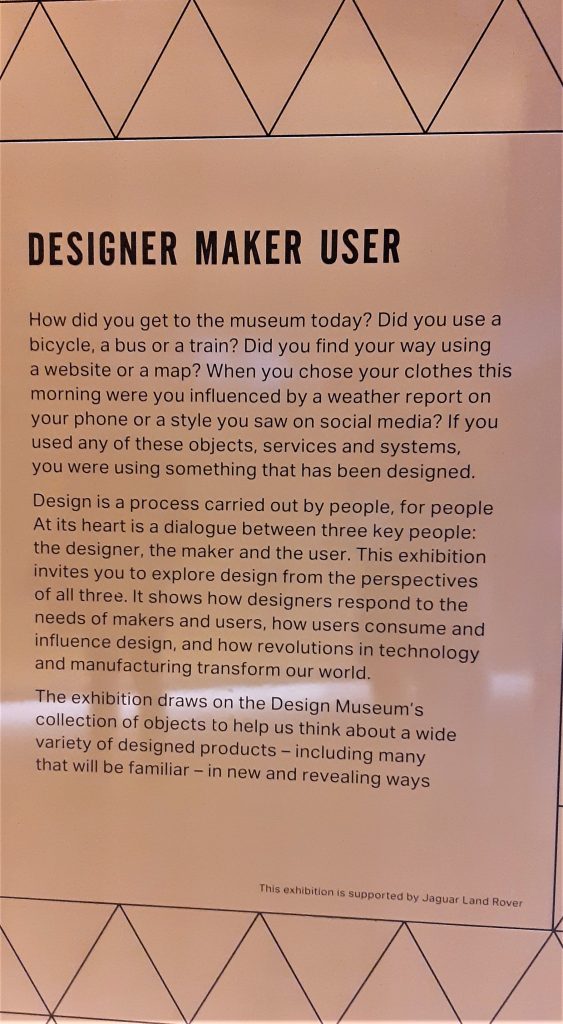
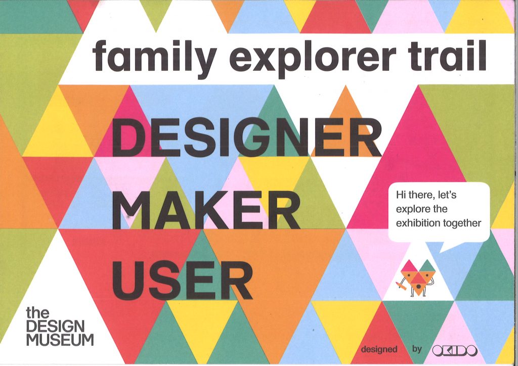
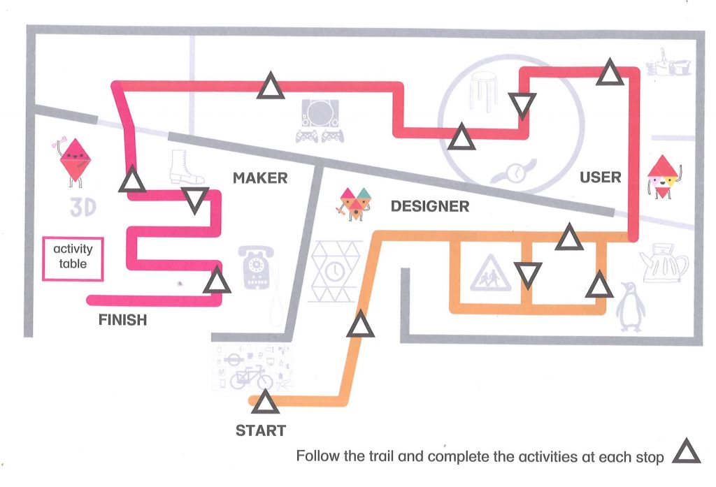
I picked up this pamphlet for families at the exhibition:
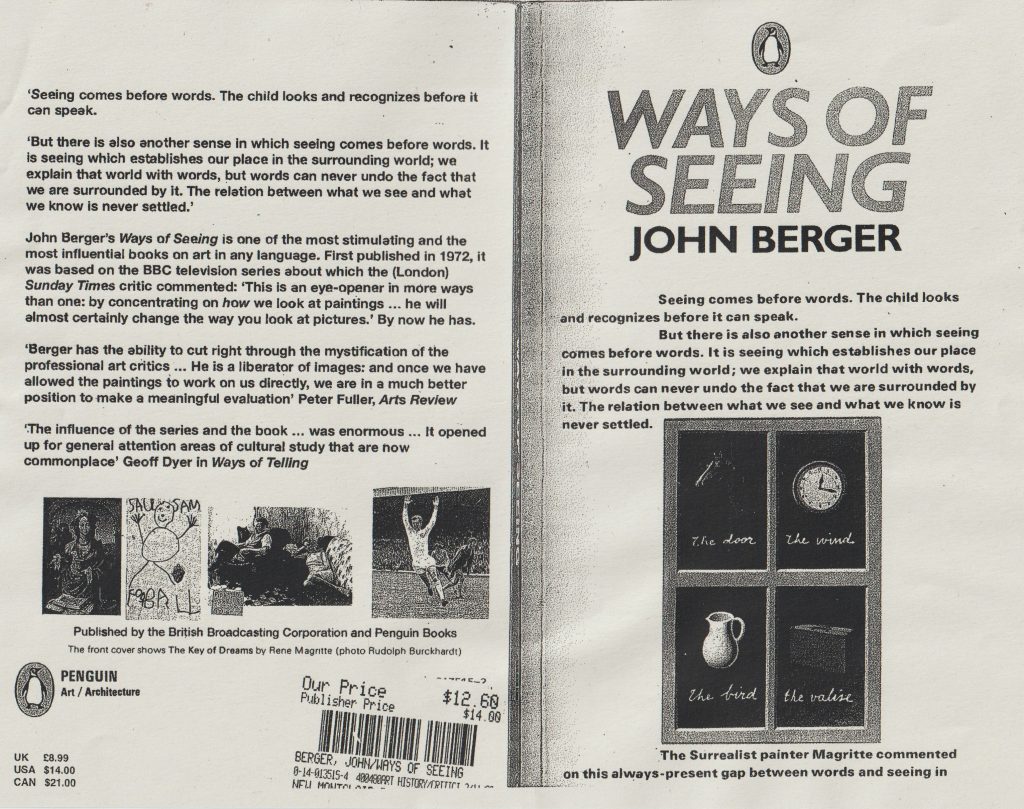
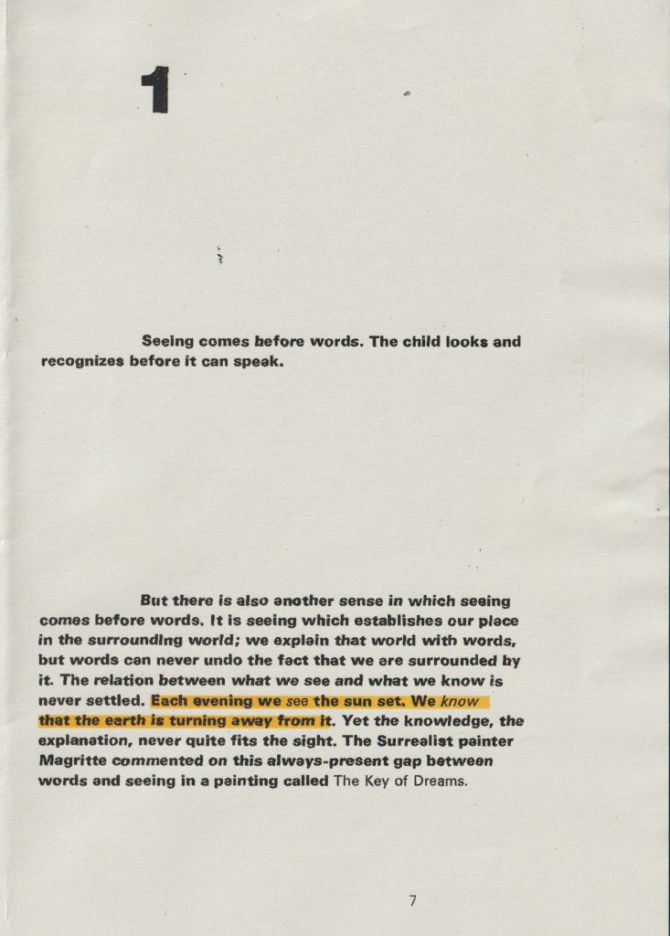
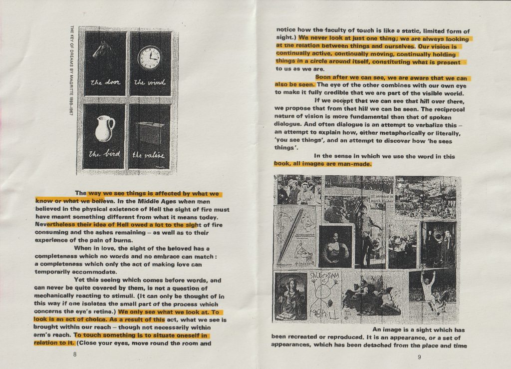
We began this week’s lecture, by reading the beginning of the book Ways of Seeing by John Berger. I have read the book earlier in the week but found it far more helpful to read it as a group. Our lecturer Luisa pushed us to find the meaning in each sentence. This was not an easy task as there was a lot of information squashed into the first few pages. Luisa drew our attention to the fact that the text of the first chapter begins on the front cover. I have never seen this in a book design.
back and front cover of Ways of Seeing
I made notes throughout the process of analysing the book:
I went away and watched the rest of the series on YouTube.com. (parts 1,2 &3)
Each episode expresses a different point.
Episode 1
In the series- questioning the tradition of European painting (1400-1900) not focusing on the paintings themselves but the way we see them.
A large part of seeing depends upon habit and convention.
All the paintings of the tradition used the convention of perspective, which is unique to European art. Perspective centres everything on the eye of the beholder. Appearances travel into the eye. Perspective makes the eye the centre of the visible world, but the human eye can only be in one place at a time, it takes its visible world with it as it walks.
The invention of the camera has changed not only what we see, but how we see it. The painting on the wall, like the human eye, can only be in one place at one time. The camera reproduces it, making it available in any size and anywhere, for any purpose.
Venus and mars used to be a unique image, which it was only possible to see in the room where it was actually hanging. Now its image, or a detail of it can be seen in a million different places at the same time. As you look at the images now, your wallpaper is around them, your window is opposite them, your carpet is below them. At this same moment, they are on many screens, surrounded by different colours, different objects and different sounds. You are seeing them in the context of your own life. They are surrounded not by gilt frames, but by the familiarity of the room you are in and the people around you.
The paintings are part of the history of the building it is in. for example, the church or chapel.
Now the images come to you, you do not go to them. It is the image of the painting which travels now.
The faces of paintings become messages. Pieces of information to be used, even used to persuade us to help purchase more originals, which these very reproductions have in many ways replaced.
A reproduction does not have the same feeling of authenticity as the original artwork
The pages of a book and a screen is never still. The lines are slightly moving. With a genuine original painting, there is a moment of stillness you have with the painting in a museum that cannot be replicated.
Words you notice consciously. Music is subtler. It can work almost without you noticing it. However, music changes the meaning of a painting when it is played over the top. Words around it and music played over it changes the meaning of a painting.
When paintings are reproduced, they have to hold their own against all the other information jostling around them to appear on the same page or the same screen.
The meaning of an image can be changed according to what you see beside it or what comes after it.
When you turn from one channel to another on television, this affects the next image you see on your screen. It alters the impact of an image in different ways.
It means: reproductions of works of art can be used by anybody for their own purposes.
Images can be used like words, we can talk with them. Reproduction should make it easier to connect our experience of art directly with other experiences.
Reproductions make the paintings easily accessible, however the context they appear in can oppose this. The example Berger gives is the old paintings reproduced in an art book. The language used in the book, which surrounds the image, can inhibit the accessibility. Because of the use of difficult language. (mystification)
Children connect images directly with their own experience.
On television programmes, we receive images and meanings which have been arranged. Be skeptical of what a programme arranges for us to see.
Episode 2
‘Men dream of women, women dream of themselves being dreamt of.’ There is a focus on what women look like. They are looked at by men. How they look or how they should look. Behind every glance is a judgement. A woman is always accompanied by an image of herself
The video switches between footage of working women in a lab, models, classical paintings of women and old and young women, plain and glamourous women.
‘From earliest childhood she is taught and persuaded to survey herself continually. She has to survey everything she is and everything she does because how she appears to others and particularly how she appears to men is of crucial importance for it is normally thought of as the success of her life.’
In the average European oil painting, there were portraits of women as well as men but in one category, they were an ever occurring subject. That category was the nude. In the nudes of European painting, we can discover some of the criteria and conventions of which women were judged. We can see how women were seen.
What is a nude?
Different views on what a nude is: 1) to be without clothes- a form of art 2)to be naked is to be one’s self. To be nude is to be seen naked by others and yet not recognized for one’s self. A nude has to be seen as an object in order to be a nude.
In the bible- Adam and Eve. The woman is blamed and punished by being made subservient to the man. In relation to the woman, the man becomes the agent of God. Moment of shame. It is the spectator’s looking which shames them (covering up with a leaf or hand)
The nude implies an awareness of being seen by the spectator.
Men looking at naked women and judging them is a theme in European art. They even call the women Vanity, thus repeating the story of Adam and Eve where the woman is blamed/shamed.
‘We are not discounting the role seeing plays in sexuality but there is a different between being seen as one’s self naked or seeing another in that way, and a body being put on display. To be naked is to be without disguise. To be on display is to have the surface of one’s own skin, the hairs of ones own body, turned into a disguise, a disguise which cannot be discarded.’
It is possible to tell when the artist has actually seen the woman he has painted. There are not many examples if this in European art.
Most of the nudes in oil paintings have been lined up and painted for the pleasure of the male spectator owner who will assess and judge them as sights. Their nudity is another form of dress . they are condemned to never being naked.
‘The painting is made to appeal to the sexuality of the male spectator, it has nothing to do with her sexuality. The convention of not painting the hair on a woman’s body helps towards the same end. Hair is associated with sexual power and passion. The women’s sexual passion needs to be minimized so that the spectator may feel he has the monopoly of such passion. The expressions on the women’s faces are responding with calculated charm to the man who she knows is looking at her although she doesn’t know him. The woman’s attention is directed at the spectator owner of the painting. Women are seldom shown dancing, they have to be shown languid, exhibiting a minimum energy. They are there to feed an appetite, not to have any of their own.’
Absurdity! The only images we were seeing of women were them silent, mute.
How men see women, or how they saw them in the past and how this influences how women see themselves today.
Berger asks women from the general public their thoughts about these paintings:
‘Paintings idealized and therefore unreal in any connection I might have of an image of myself. They don’t mean human beings to me.’
‘I compare myself to photographs more than paintings.’
‘Manet painting- the women aware of being humiliated.’
‘Women are always dressing as a part, to show the kind of character they want to be.’
‘Concept of availability = passivity. Opposite of action.’
‘Women’s sense of identity is based on what others think of them. But a man’s identity is based on his interaction with the world.’
Episode 3
The beginning of the video shows footage of apples and fish at a market are interspersed with fish and apples in oil paintings. Playing over the top of the video is the sound from a modern day marketplace. Berger shows us people buying from the market. The exchange of money for these fresh products.
‘We buy, we consume, ours to give away, or more often, to keep.’
The focus of the footage is not on the people’s faces or their identity, but on the act of handling goods, valuing them and buying them. Jewellery. Buying valuable objects.
The most valuable object of all has become the oil painting. Oil paintings depict things. Buying the painting is almost like buying the object within the painting. Paintings often show treasures, but paintings have become treasures themselves
A love of art= a sublime human experience
What are these paintings? They are objects which can be bought and owned. Unique objects. A patron cannot be surrounded by music or poems as he can by pictures. They show him sights and many subjects. The only thing the paintings have in common : oil paints.
The scenes that are depicted show wealth. Implicit in the wealth of European cultures, was the destruction of other cultures. But the Europeans believed their civilization was more advanced than any other.
Paintings have symbolised wealth and power for centuries in different cultures, but they showed an order , European paintings showed a different kind of wealth. Their paintings glorified the ability to buy and furnish and to own.
The paintings show the owner’s social status. Exaggerated claims. It is their clothes, not faces that dazzle. Oil paint allowed the subjects to be painted and look tangible. Privileged minority. Making a record of themselves.
A painting gave the owner the pleasure of seeing themselves as the owner of their land.
‘The sight of it, makes us want to possess it.’ Publicity has taken the place of oil paintings in this way. (paintings were a place to show off our possessions)
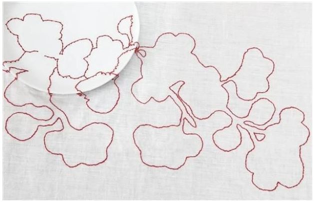
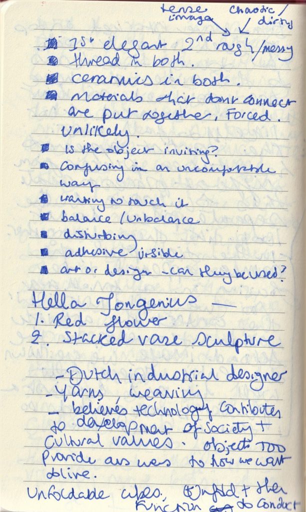
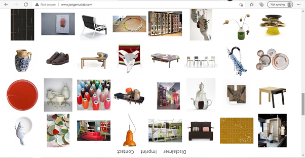
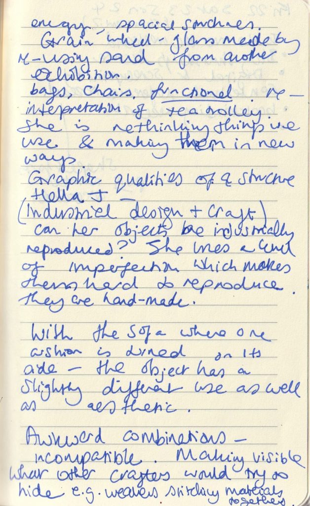
Hella Jongerius
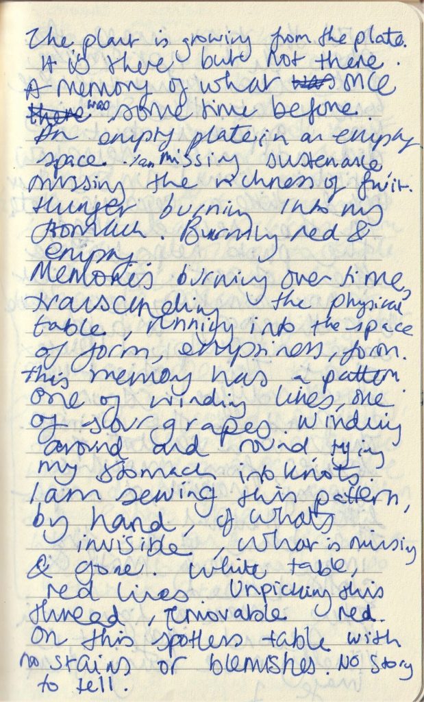
In class, we were shown 2 images and ask to write 100 words on each. I felt there was a connection between the 2 images, but did not guess that they were made by the same designer, Hella Jongerius. For the first image, I decided to write a creative response to the image. Luisa has told us that writing creatively and telling a story is part of a graphic designer’s skills. This piece was called Red Flower. When I first saw the image, I did not notice the plate until my classmate pointed it out. Then I saw the plate and the table as a setting for the artwork. I could not see how the stitches were attached to the plate. Only now, can I see the holes made in the plate to thread the thread through. (I could have got closer to the screen in the classroom and I may have been able to see the holes in the ceramic plate.)
It was really interesting to hear my classmate’s views on the same images. I agreed with their points.
I quickly searched the designer and mainly looked at her other artworks. This helped me gain an understanding of the pieces we were shown and how they link.
At the end of the lecture, Luisa introduced us to the next brief, which is the presentation based on our chosen object. She explained that InDesign is a good programme to use for making presentation slides. I have only ever used Microsoft powerpoint, so this will be a new task for me. It was good to have an idea of what our aim is for the trip on Monday. This will help me to prepare, for example, I can take a sheet of questions written down to act as pointers to guide me. Going to London might be busy and hectic, so having these questions or bullet points can help me stay focused.
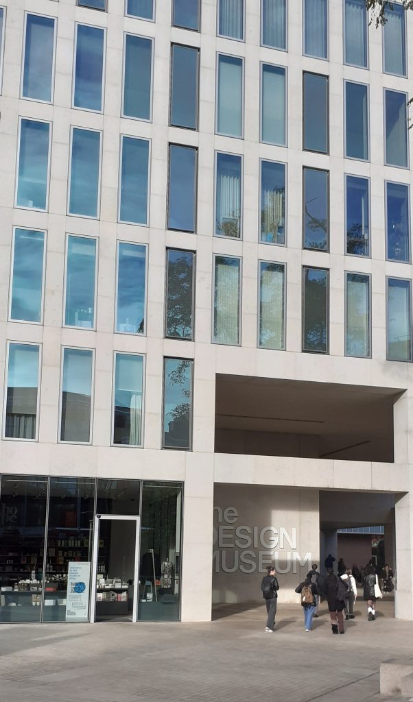
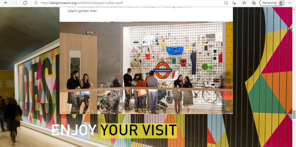
Looking at The Design Museum website helped us to get an idea of what to expect on our visit.
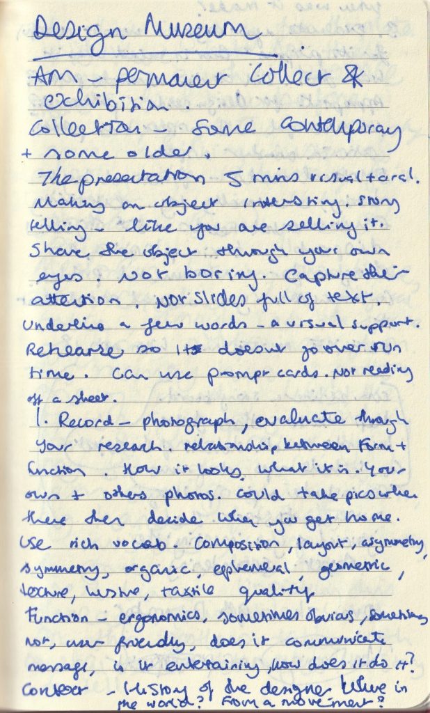
DESIGN MUSEUM POINTERS
Relationship between form and function
How it looks, what it is, your photos and other’s photos
Function- ergonomics, sometimes obvious, sometimes not, user friendly, does it communicate a message, is it entertaining? How does it do it?
Context- history of the designer- where in the world? From a movement? When was it made?
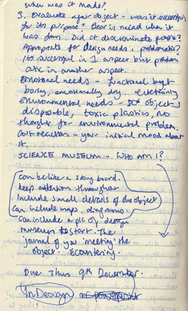
Was it successful for its purpose? Bear in mind when it was made. Did it discriminate people? Appropriate for design needs? Problematic? It may be successful in 1 aspect but problematic in another aspect.
Emotional needs- functional but boring, emotionally dry, entertaining, environmental needs- 80s object may be disposable, toxic plastics, no thought for environmental problem.
Gut reaction – what is your initial mood about the object?
The presentation runs for 5 minutes. You will need to make it interesting and tell a story about your object, could be the story of you encountering the object. Take photos of the building.
We use cookies on our website to give you the most relevant experience by remembering your preferences and repeat visits. By clicking “Accept All”, you consent to the use of ALL the cookies. However, you may visit "Cookie Settings" to provide a controlled consent.
This website uses cookies to improve your experience while you navigate through the website. Out of these, the cookies that are categorized as necessary are stored on your browser as they are essential for the working of basic functionalities of the website. We also use third-party cookies that help us analyze and understand how you use this website. These cookies will be stored in your browser only with your consent. You also have the option to opt-out of these cookies. But opting out of some of these cookies may affect your browsing experience.
Necessary cookies are absolutely essential for the website to function properly. These cookies ensure basic functionalities and security features of the website, anonymously.
Cookie
Duration
Description
cookielawinfo-checkbox-analytics
11 months
This cookie is set by GDPR Cookie Consent plugin. The cookie is used to store the user consent for the cookies in the category "Analytics".
cookielawinfo-checkbox-functional
11 months
The cookie is set by GDPR cookie consent to record the user consent for the cookies in the category "Functional".
cookielawinfo-checkbox-necessary
11 months
This cookie is set by GDPR Cookie Consent plugin. The cookies is used to store the user consent for the cookies in the category "Necessary".
cookielawinfo-checkbox-others
11 months
This cookie is set by GDPR Cookie Consent plugin. The cookie is used to store the user consent for the cookies in the category "Other.
cookielawinfo-checkbox-performance
11 months
This cookie is set by GDPR Cookie Consent plugin. The cookie is used to store the user consent for the cookies in the category "Performance".
viewed_cookie_policy
11 months
The cookie is set by the GDPR Cookie Consent plugin and is used to store whether or not user has consented to the use of cookies. It does not store any personal data.
Functional cookies help to perform certain functionalities like sharing the content of the website on social media platforms, collect feedbacks, and other third-party features.
Performance cookies are used to understand and analyze the key performance indexes of the website which helps in delivering a better user experience for the visitors.
Analytical cookies are used to understand how visitors interact with the website. These cookies help provide information on metrics the number of visitors, bounce rate, traffic source, etc.
Advertisement cookies are used to provide visitors with relevant ads and marketing campaigns. These cookies track visitors across websites and collect information to provide customized ads.