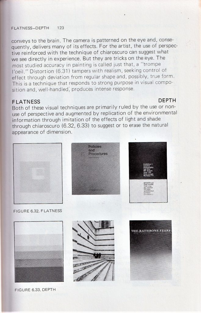
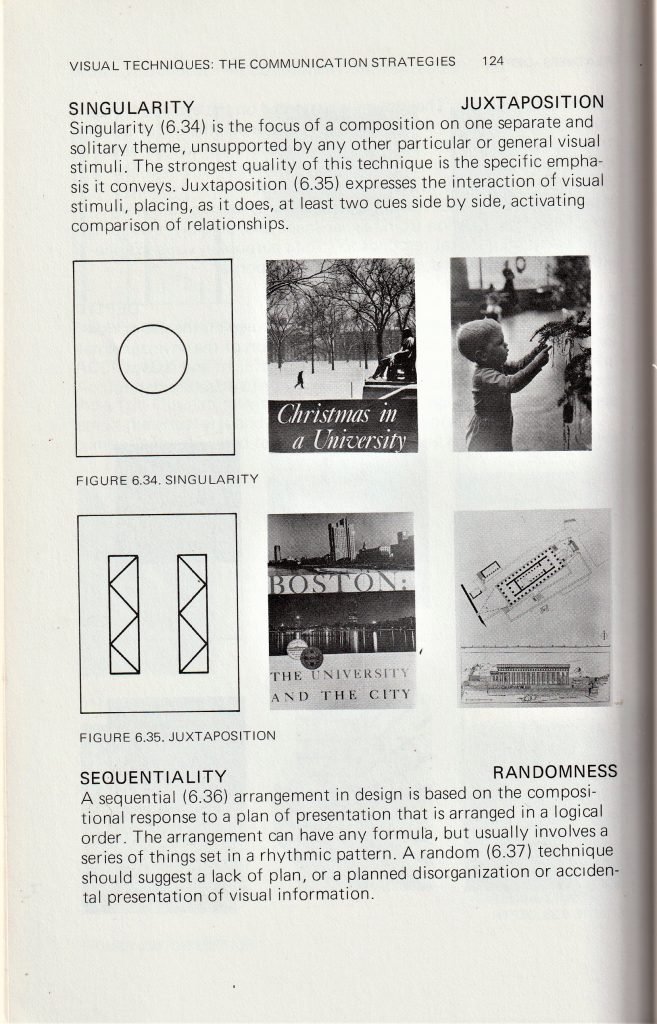
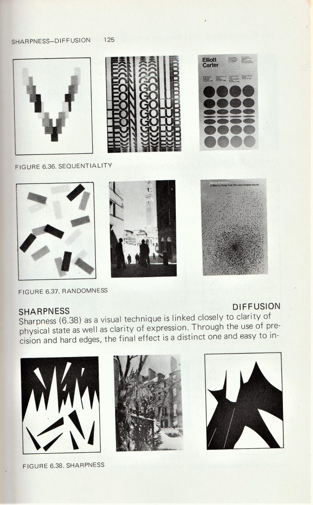
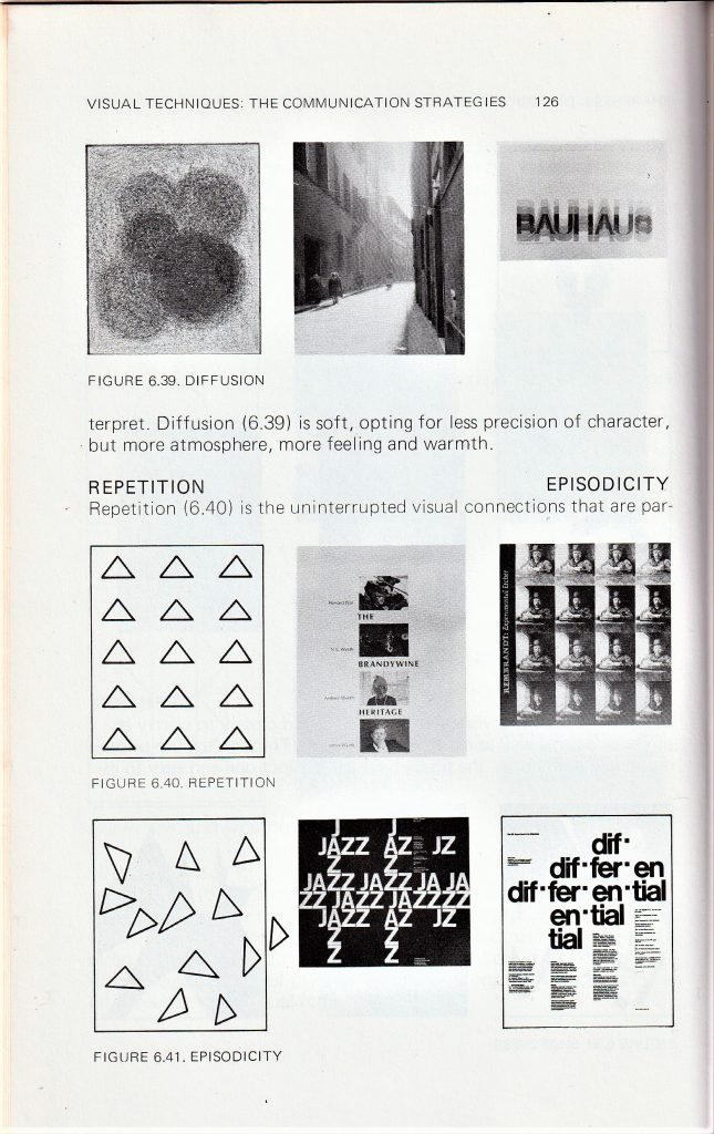
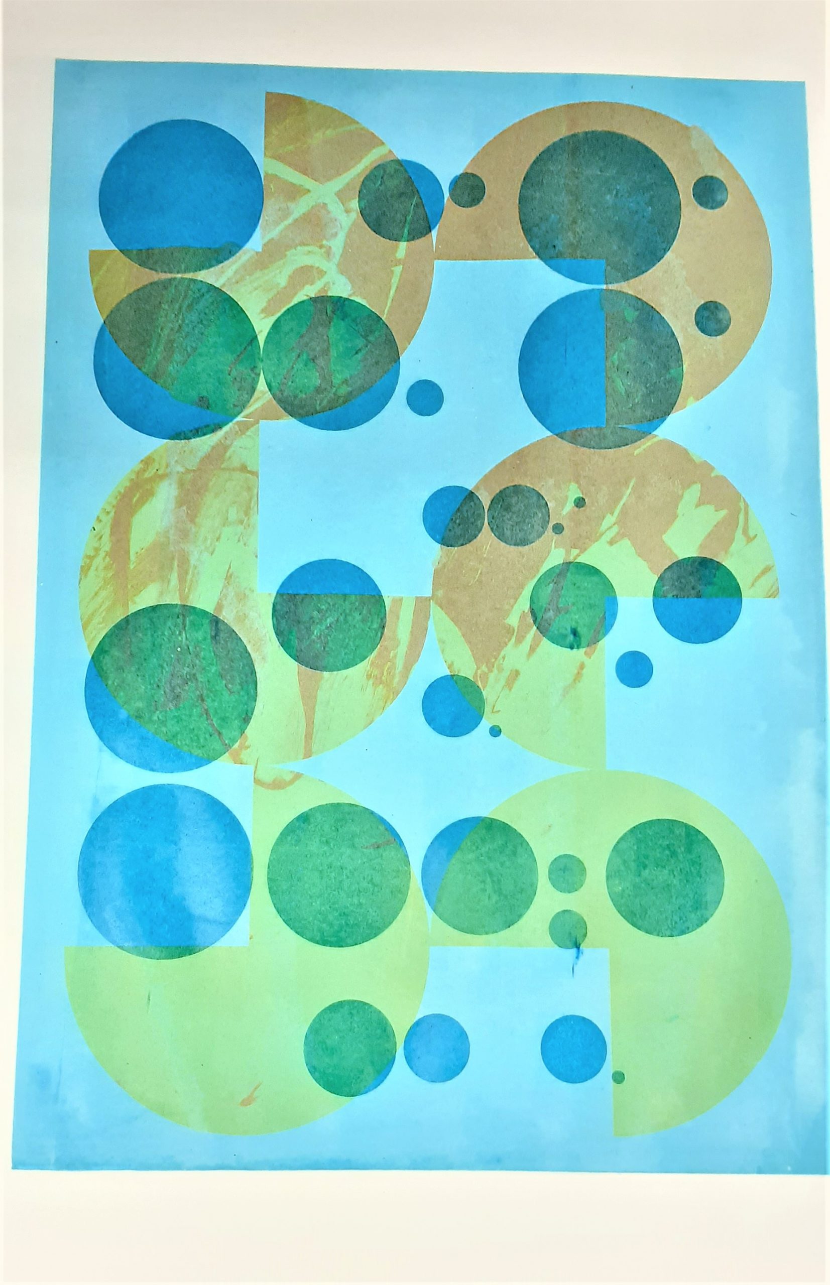
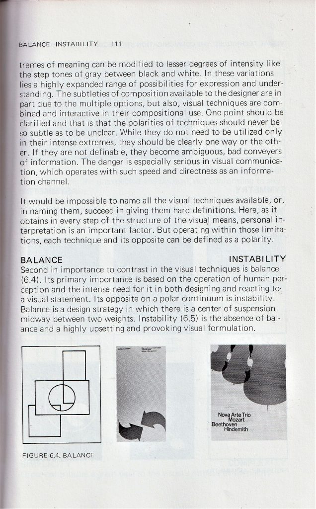
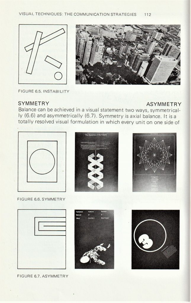
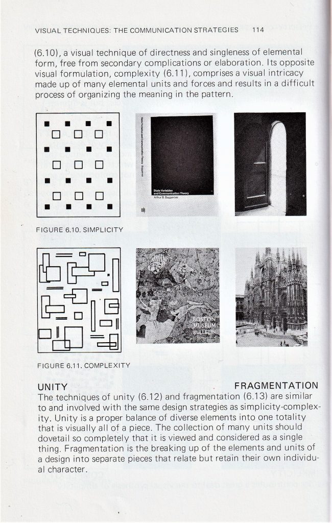
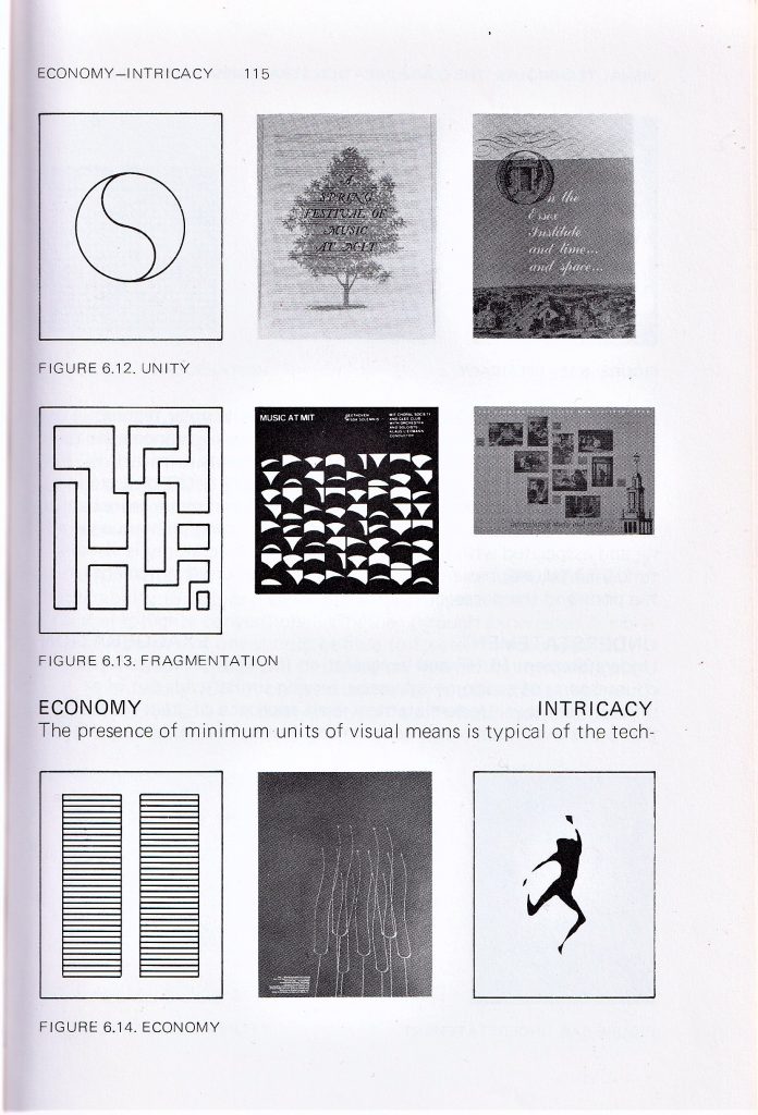
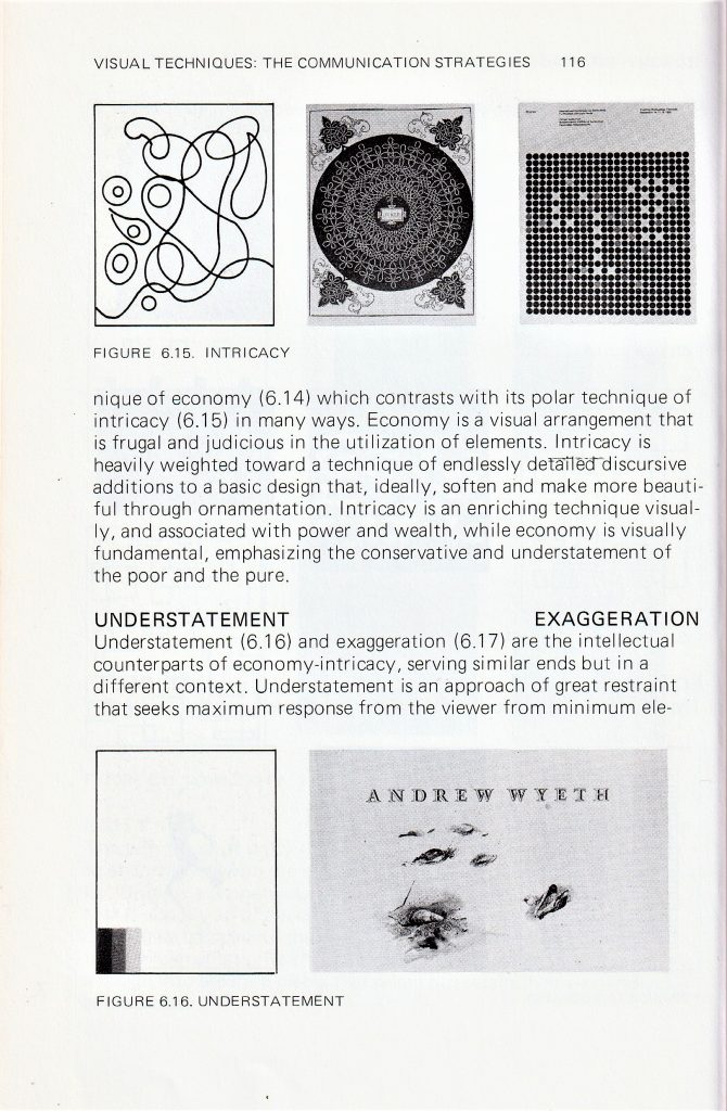
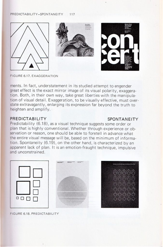
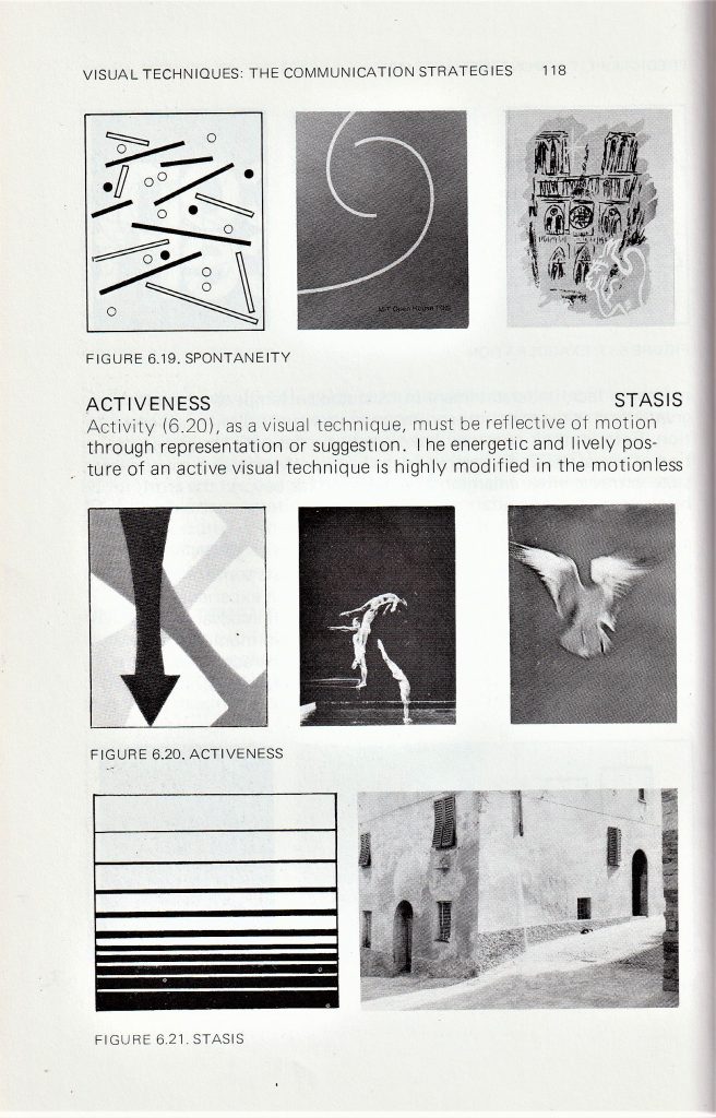
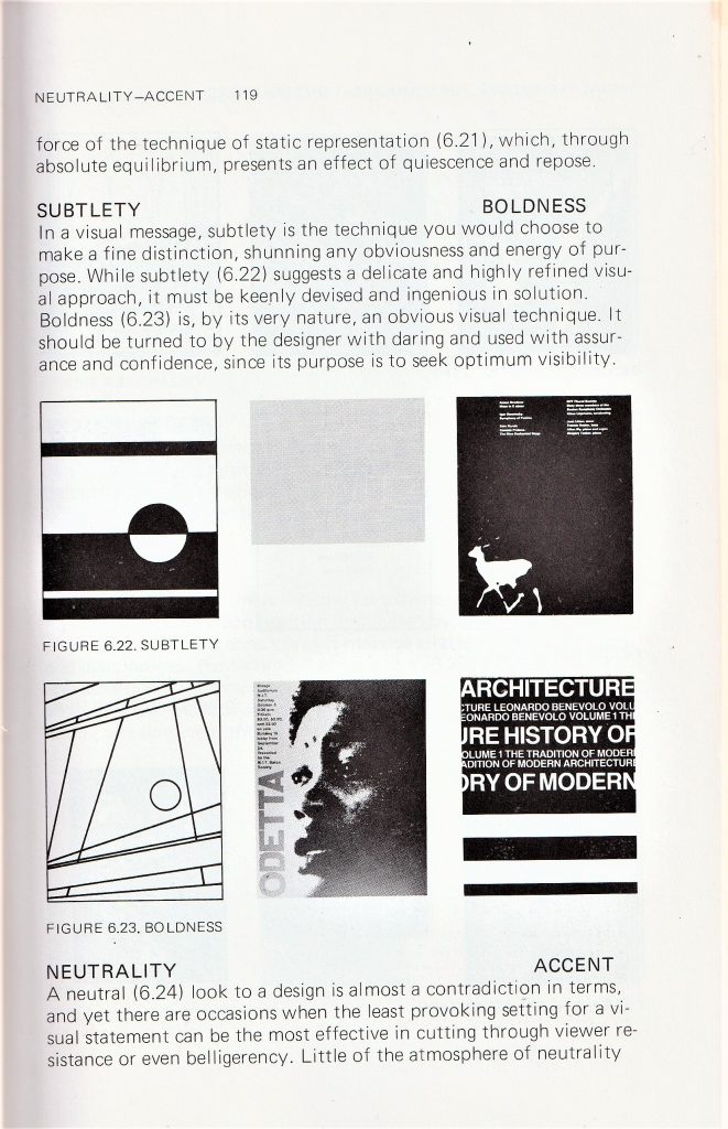
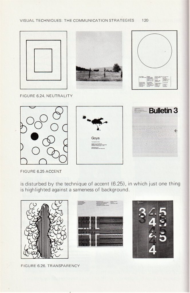
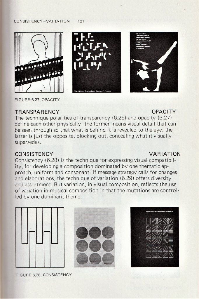
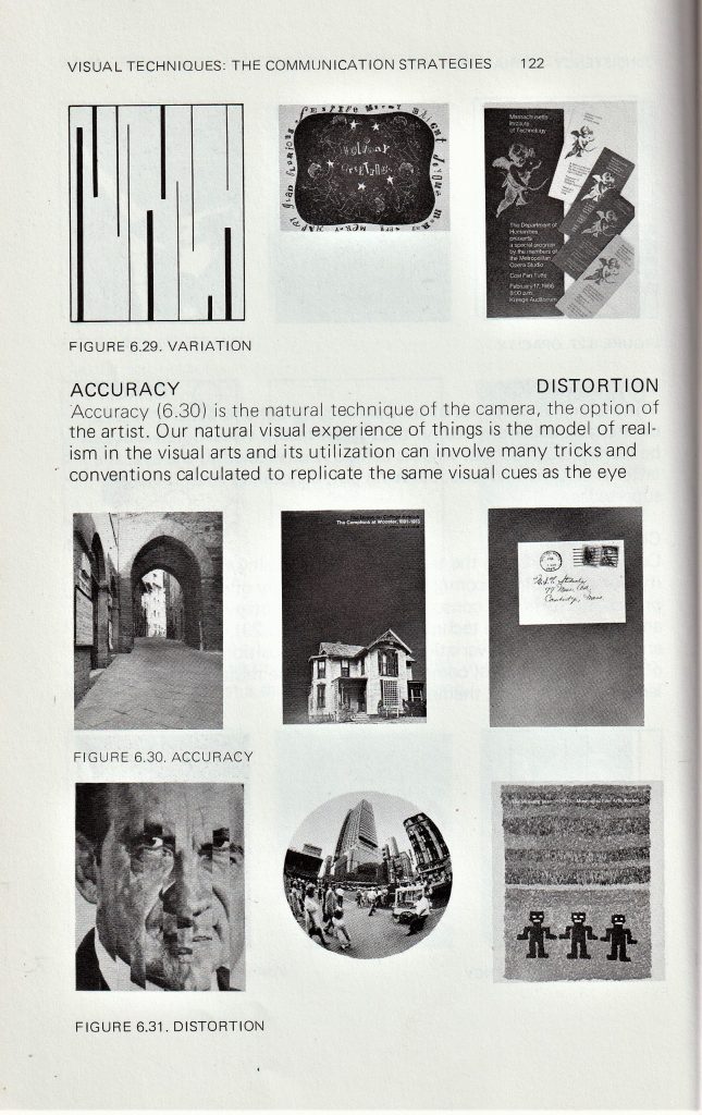
In A Primer of Visual Literacy by Donis A. Dondis, I was interested in the section about visual communication. The author explains that these visual techniques can be used to convey different messages. For instance, ‘fragmentation’ can be used to express excitement in a design. I found that I used more than 1 of these techniques within the same print. I considered these principles when composing my screen-prints in terms of how I can create a design that makes sense when the elements, or layers, are seen together.

I chose to use blue for the third layer, as I used it for the first layer. I like the way this helps the top layer to tie in with the background.
I used transparency within this print, as I wanted the effect of the first print to show through the third layer. I mixed in binder with the blue paint to make it transparent.
I have combined circles set in a random formation, with the pattern of ¾ circles which are organised sequentially.
Repetition is the cohesive force that holds a diverse composition together
Donis A. Dondis
I feel there is enough going on within this print for it to be interesting to the viewer: The orange splatters, the way the colours combine through the layers and the variety of shapes. I therefore decided this print is finished.
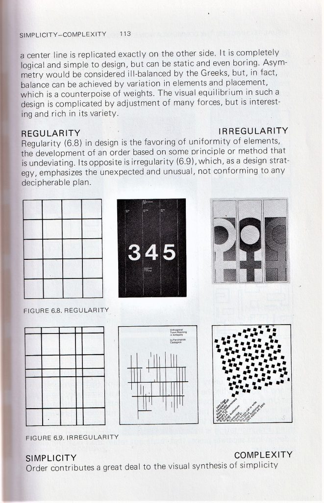
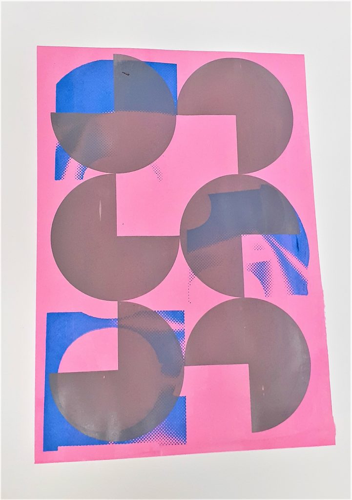
I have created balance in this print using asymmetry. The design is asymmetrical because there are 2 areas of blue on the left hand side of the page, balanced out by the blue shape on the right-side. There is a sense of regularity in the way the grey shapes form a predictable pattern that we can follow.
The way the layers overlap and the halftone in blue, make the design slightly more complex.
There is some flatness in this print because of the similar values used for layers 2 and 3. This is easier to see in the photo I have converted into greyscale.
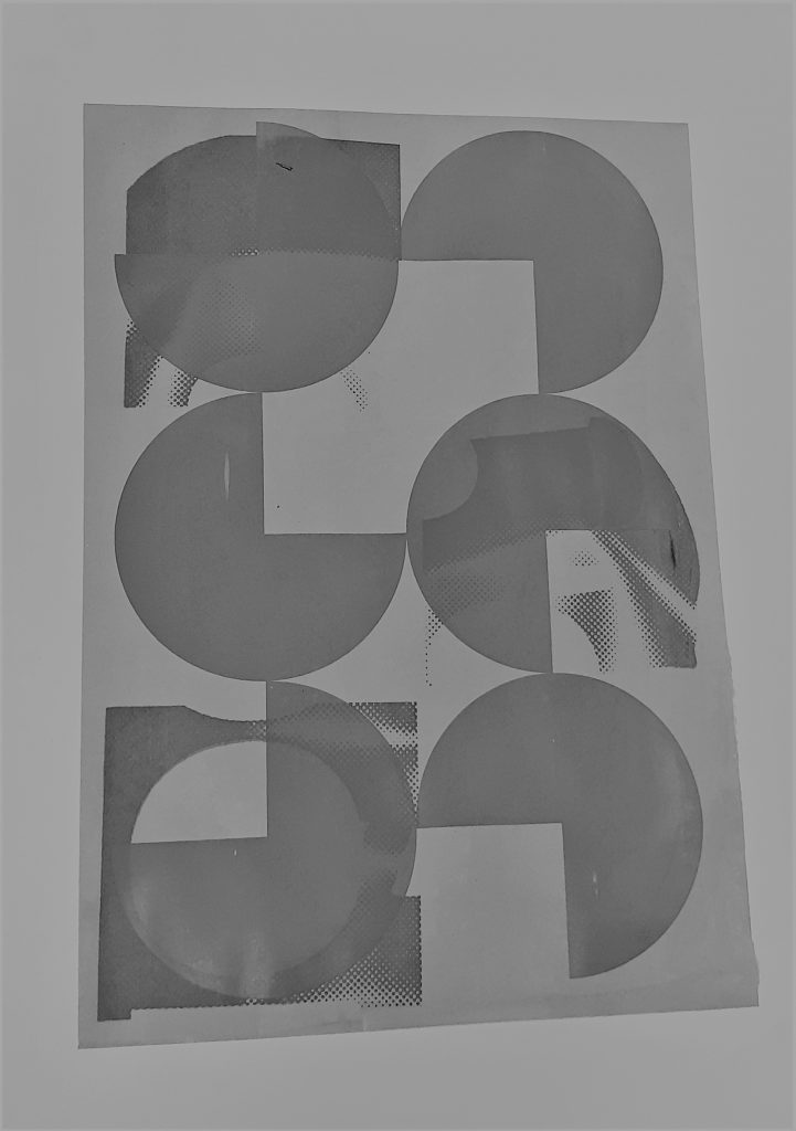
The opacity of the grey shapes gives the design a sharpness that was not intentional. This makes the shapes distinct and easy to interpret but means there is overall less warmth and atmosphere to the image. For this reason I would like to add a fourth layer to see how I can soften this design, or perhaps add some finer detail.
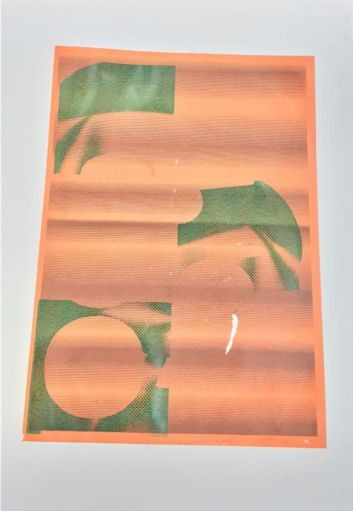
This print was stuck to another piece of paper in the drying rack. This meant that when I lifted the paper off, a small area was torn away. My plan is to cover this area.
I used a green as I felt this may cool down the orange of the second layer. This green came out brighter than I expected. For the 4th layer, I want to repeat the pattern used in the 3rd layer but rotate it in some way. I think a darker colour will work well.
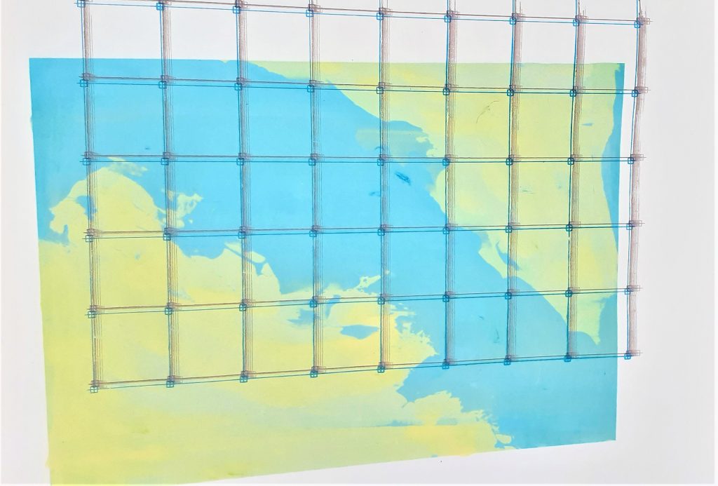
The second layer creates a sense of distortion. This was accidental but was improved by the third layer where I used a deep blue to anchor the grid in place. Placing the grid lines off the side of the first print, creates an illusion of depth. The colours all work harmoniously, as I have chosen that are close to each other in the colour wheel.
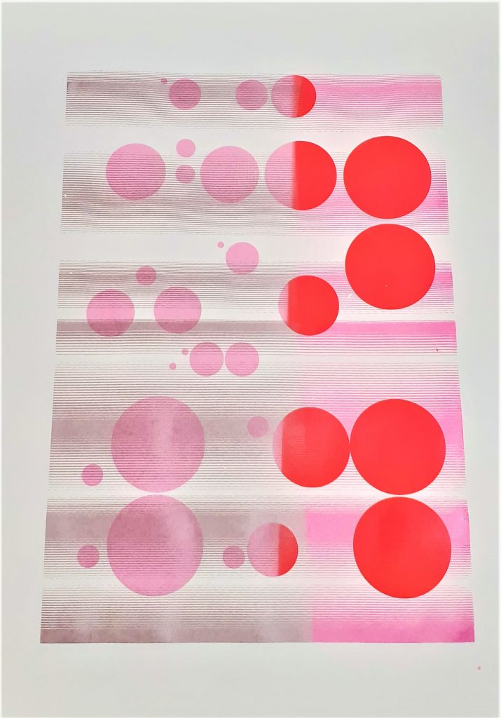
I have suggested motion in this image using close lines and using the change of colour halfway through the print on both layers. This activeness is also created by the asymmetrical pattern of circles in the design.
The variation of hue, transparency, and value, gives the print a sense of depth.
I found it interesting how the second layer is visible against the pink circles and is not visible on the red circles. This gave the print an implied texture on the left side.
The right side is bright, and this shows a juxtaposition against the calmer colour combination on the left.
I decided this print was finished, as it does not look to be lacking in any element.
