You should as a creative person constantly experience as much as you can so that when a brief comes you’ve got some inspiration already. The whole world gives you stuff to call on. Immerse yourself in the world of culture- both high and low.
Liam Gibson, art director
Happy New Year blog readers!
We are now reaching the end of January and it has occured to me that I can’t not record my creative activites and inspirations from this month. I will be reflecting and collecting my ideas in this blog post.
Ideas and inspirations are likely to float away if I don’t make an effort to catch and record them. This is a lesson I learnt during semester 1 of this academic year.
I’ve began a physical folder of collected printed material. It’s being filled with anything I like the look of. This might be the technique, material, colour or typography. Why didn’t I do this before? I didn’t know I came across so much printed material in my every day life, but this has been disproven. It’s filling quickly!
Printmaking
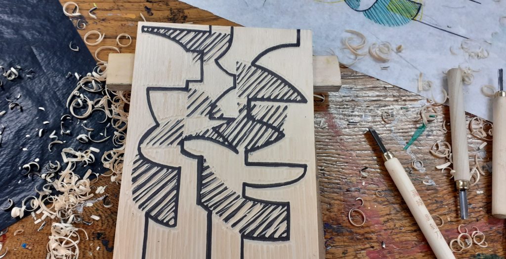
This month, I’ve been excited to start a printmaking course at City of Oxford College. I’ve decided to create a separate blog post for the coursework progession. Expect to see this in February.
Embroidery
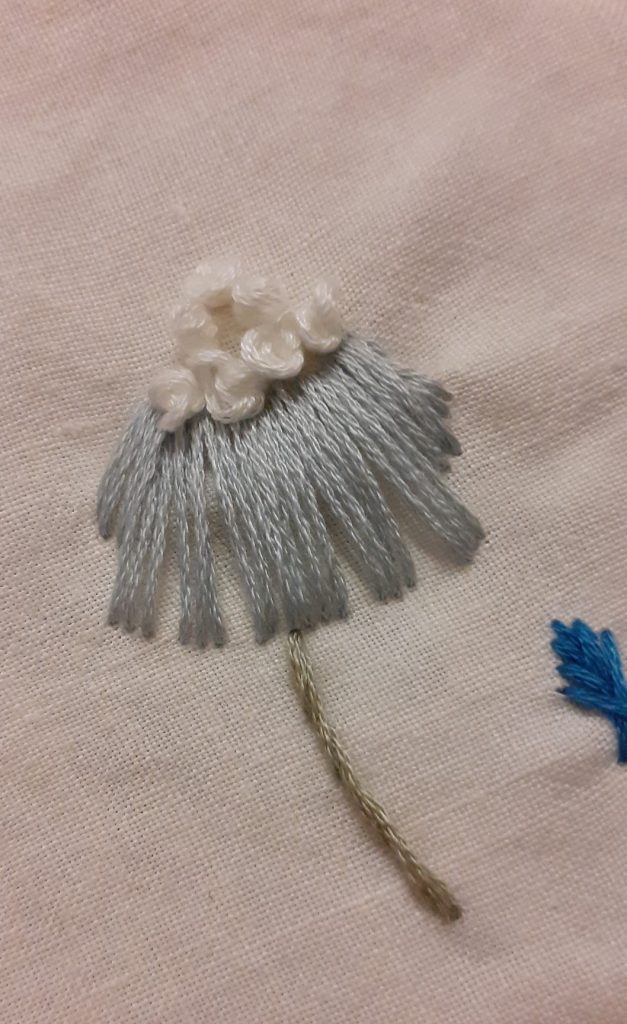
I’ve picked up another hobby and with some regret- it’s an all consuming activity! Hours go by in a soothing hypnotism.
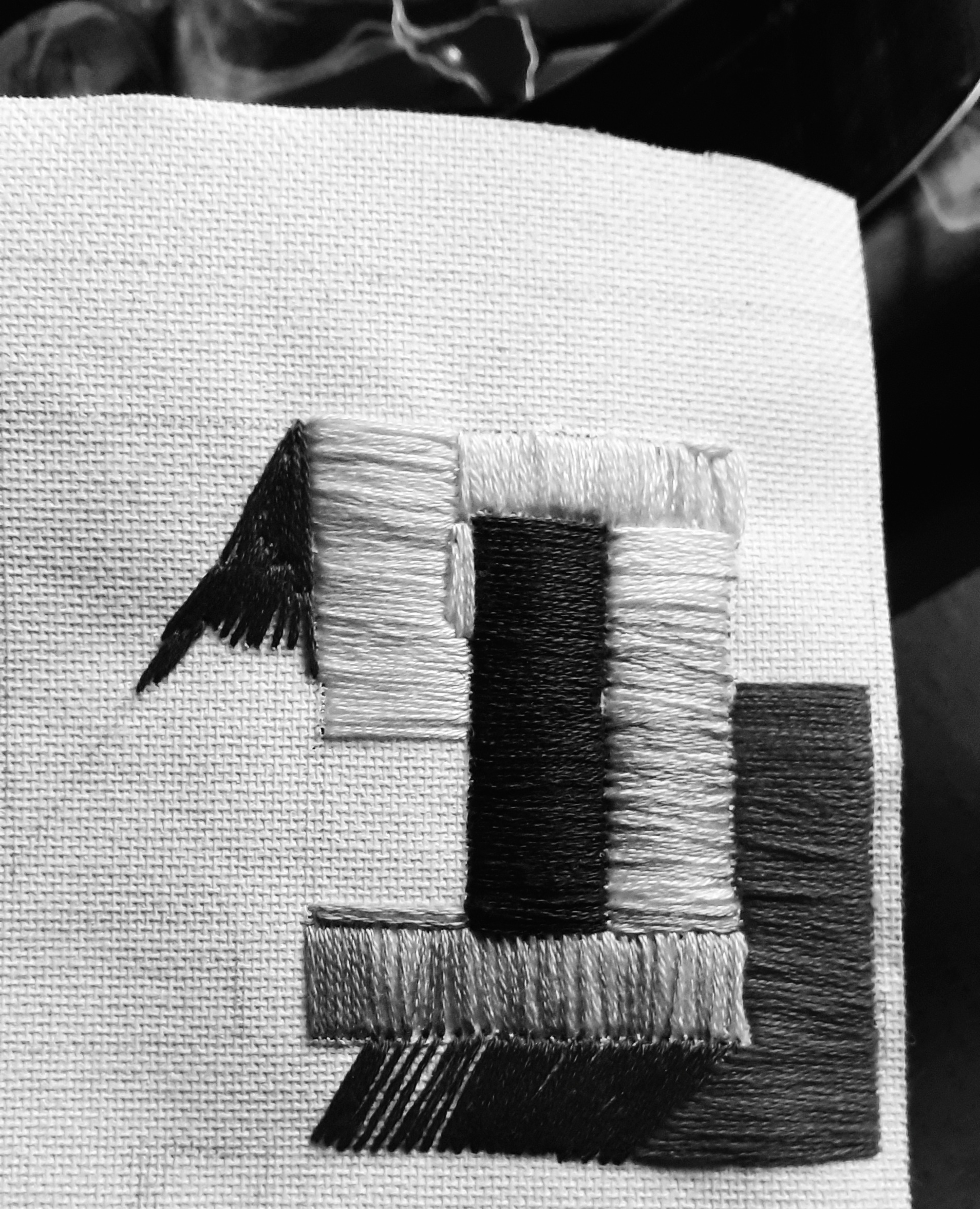
In my first project, I used satin stitch on a canvas paper. This stitch is used to fill in solid areas of colour. It isn’t a stitch I was confident in beforehand. With practice, I found the number of threads used in a single stitch made the greatest difference:
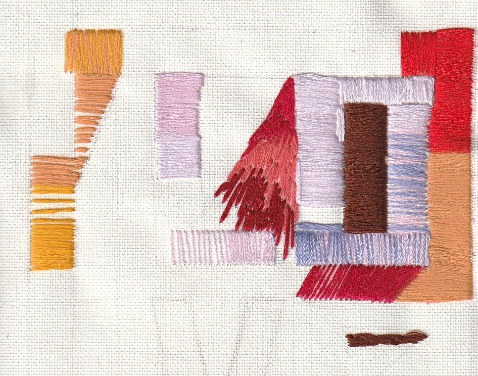
I am experimenting with different ways to fill in the areas, between solid single colours and varying the colours in an area. Also varying the direction of the stitch shows me what difference this makes to the overall piece.
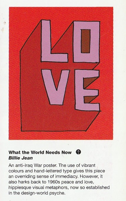
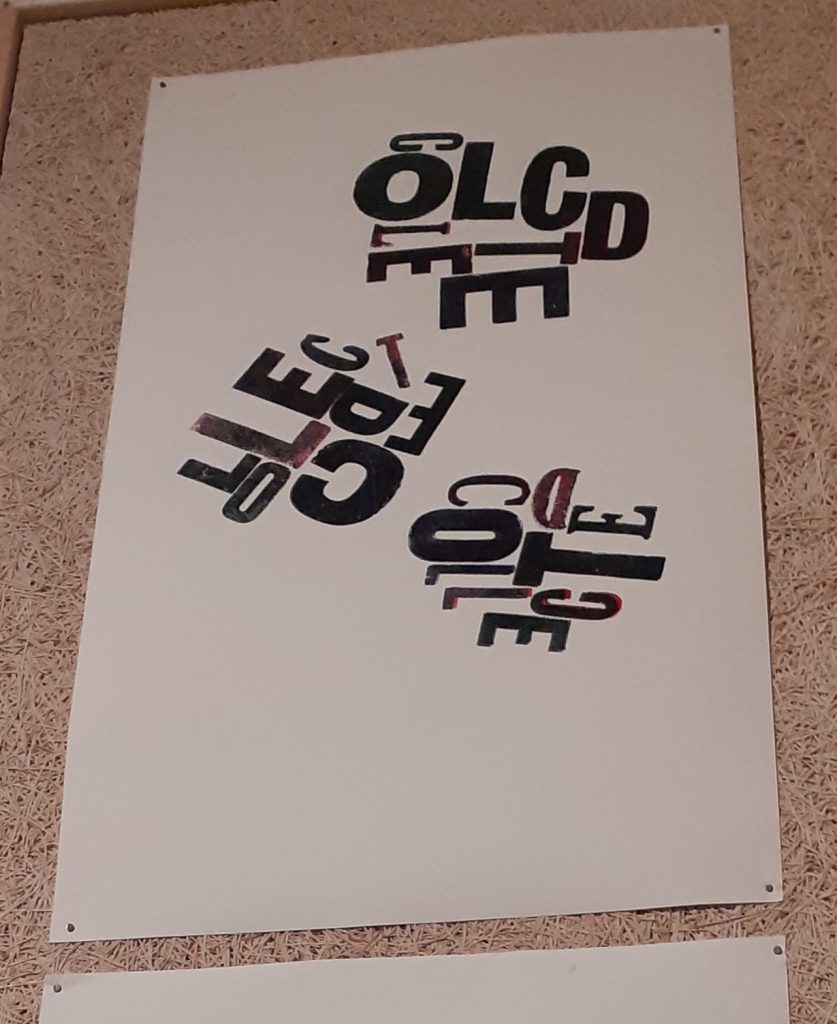
I was inspired by the hand-lettered type used for posters by Sam Piyasena. I based this embroidery piece on What the World Needs Now. I used another designer’s design because I’m only at an emboirdery level of a beginner and therefore needed to practice the stitches before working on my own designs.
Further practice, following instructions from this youtube video.
This traditional practice allowed me to explore the various types of stitch (I can’t remember their names.)
Sketchbook Update
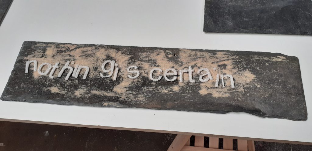
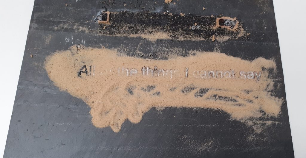
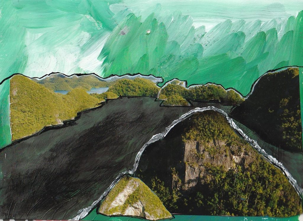
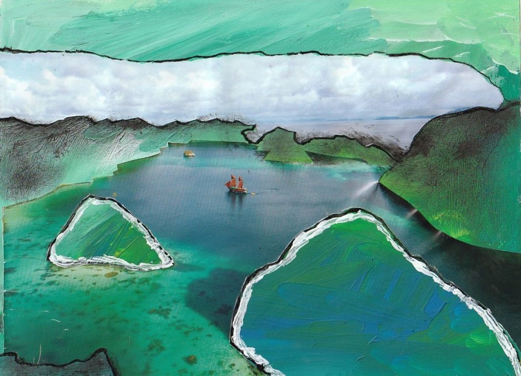
Recently, I’ve been mainly using my sketchbook to experiment with mixed media.
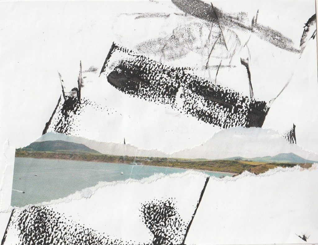
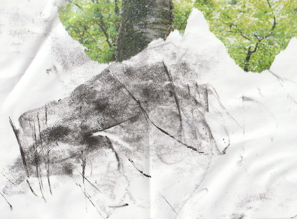
1 – Mark – making from printing ink and cut – out collage pieces
Below, I used scraps of paper from a printmaking session where I had placed the inky brayer down and accidently made these markings. I liked the textures so much that I thought it a shame to throw them away. In my sketchbook, I combined these marks with images from a magazine.
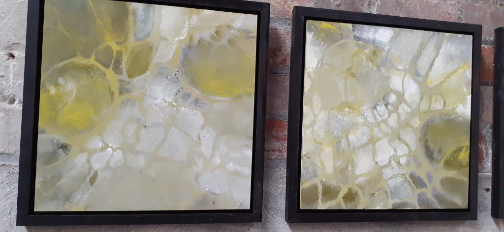
2 – Acrylic paint and cut-out collage pieces from magazine
3 – Exploring the concept of home
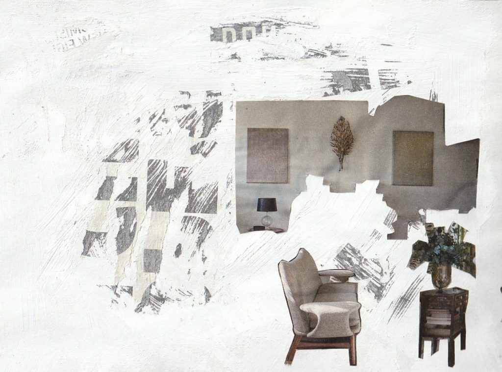
What makes a home? Is it simply the space you occupy.
Furniture pieces dissasembled and reassembled. I used white acrylic paint to represent spaceand the newsprint transfer technique. I used thicker paint for this piece.
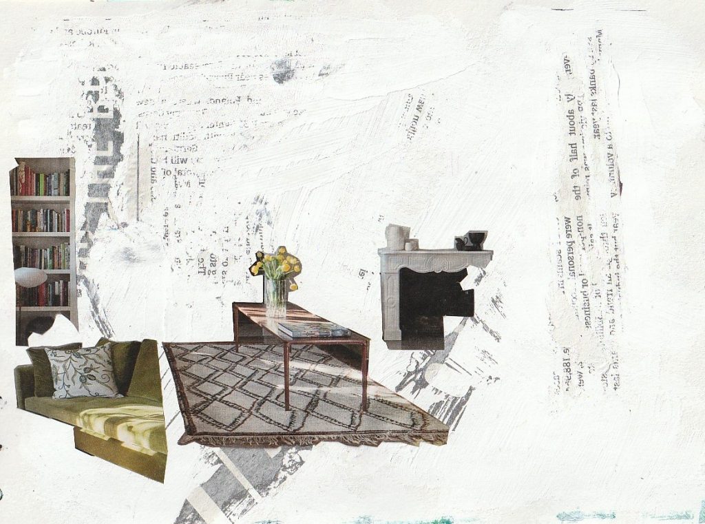
4 – Trying this technique again with a thinner coat of the same paint
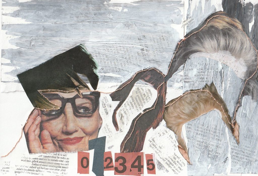
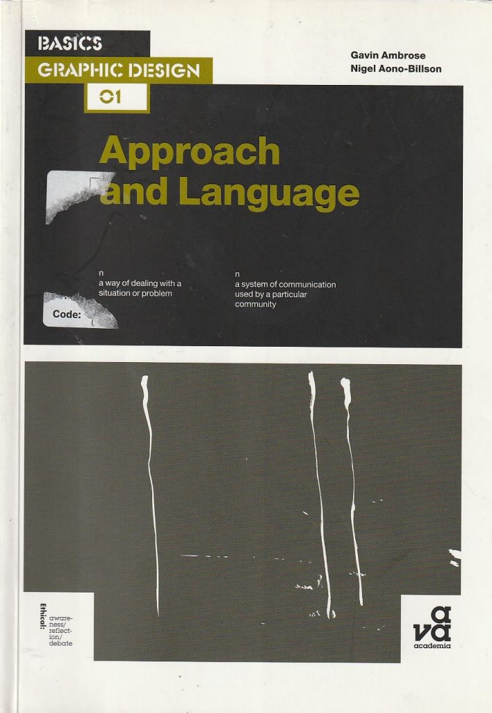
A thinner coat of paint transferred the newsprint more effectively. The aim of this piece came from a set project in the book Approach and Language, Ambrose/ Aono-Billson. The purpose was to create an image based on a set word-pair. This pair being ‘Hair-Suite’. When considering this brief, I looked at the different definitions of ‘suite’. A musical suite is a collection of musical pieces written to be played in succession. I followed this idea.
I used stitiching, collage and paint to illustrate a woman considering different hairstyles or reflecting on the various hairstyles she has had or will have.
Life Drawing @ Thursday Night Life
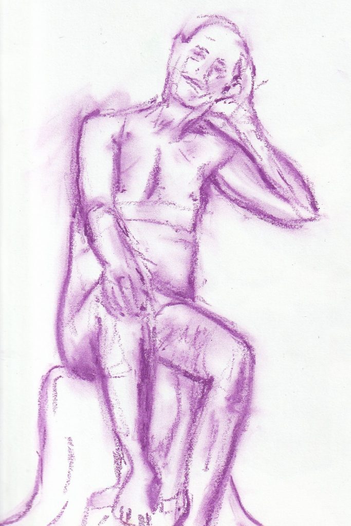
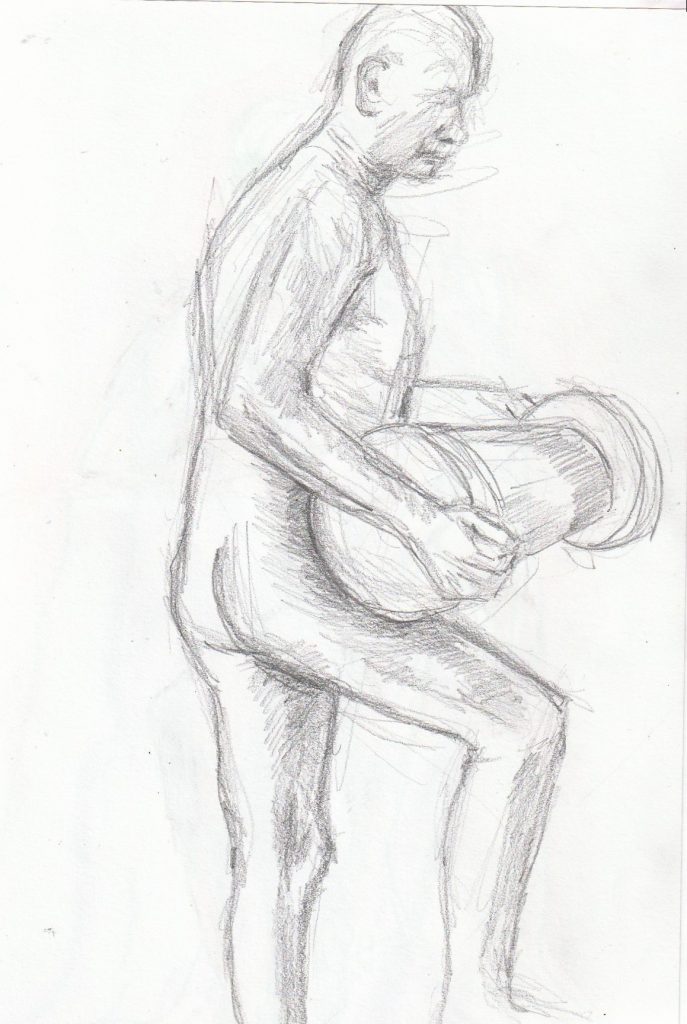
It was a pleasure to join the sketchers at Magadalen rd studios for the weekly drawing session. The studio had a warm and friendly atmosphere; providing boards, easels, advice and biscuits! I would highly recommend this group to anyone. I again used a mixture of materials to depict the model (who was impressively still). This is my usual method of switching up drawing tool constantly. I now wonder if this is a way of me avoiding dedication to one tool and stitcking with the challenges of that material. I usually like to see my drawings in different colours and textures out of curiosity.
Creative Writing
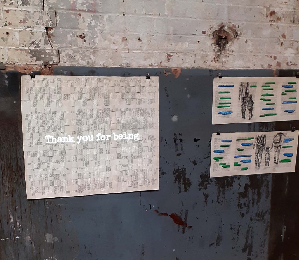
Hidden Spire is a creative collective based at Arts at the Old Fire Station in Oxford. For the first writing session, we took inspiration from the poet Marechera. I prefer appreciating and analysing literature than writing itself. This is only because I don’t feel talented or confident in my own writing. I was impressed to hear the prose poetry written by my fellow group members. Their individual voices came across and each with a different message to share, despite being given the same brief. Being part of a group discussion is something I greatly enjoy.
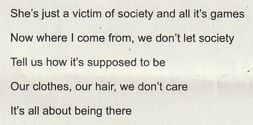
We looked at segments of Marechera’s work (below). I noticed that he expresses a state of day-dreaming which suddenly collides with the reality around him. This conflict seems painful for him. I like the clear imagery and honesty in his writing.
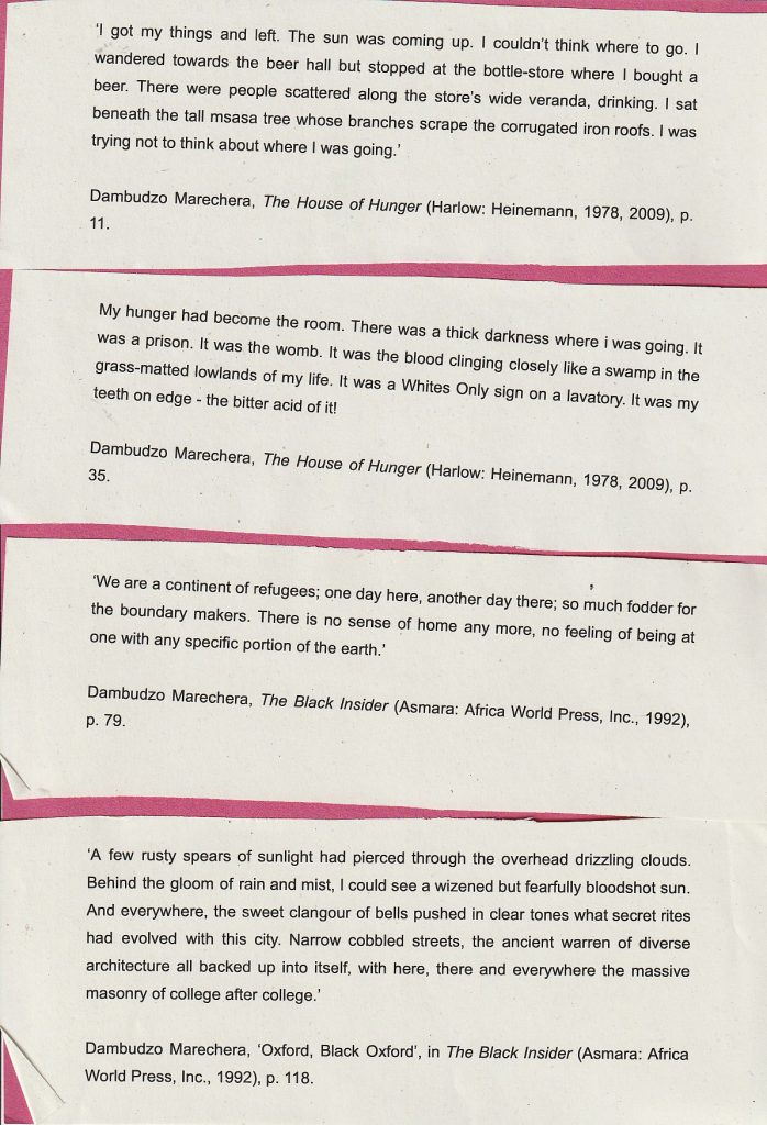
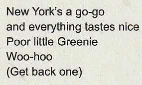
70’s song lyrics (David Bowie and Prince) helped to inspire us and get our minds into the era when Marechera would have been writing.
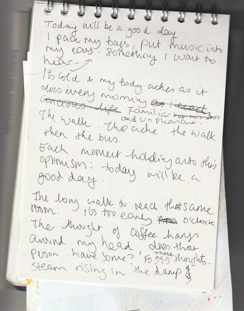
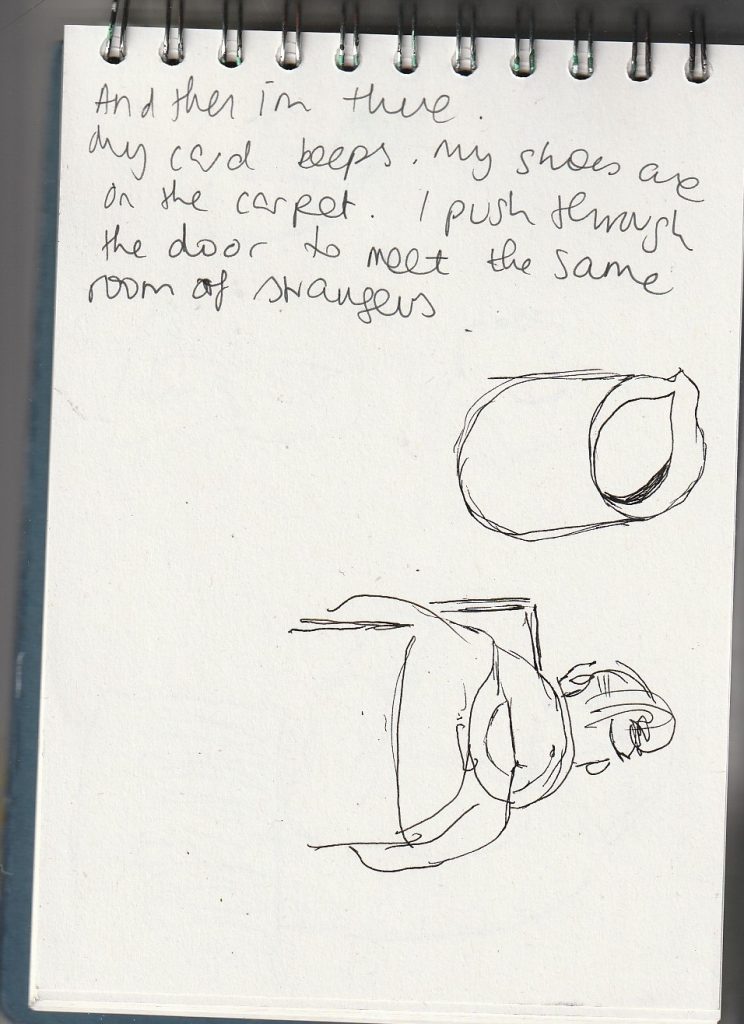
For encouragement, we were told to ‘write anything’. This helped me let go of self-critism. (Below) pages from my sketchbook.
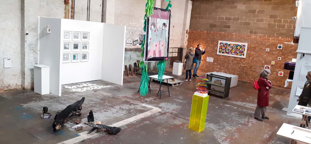
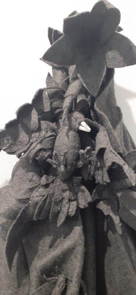
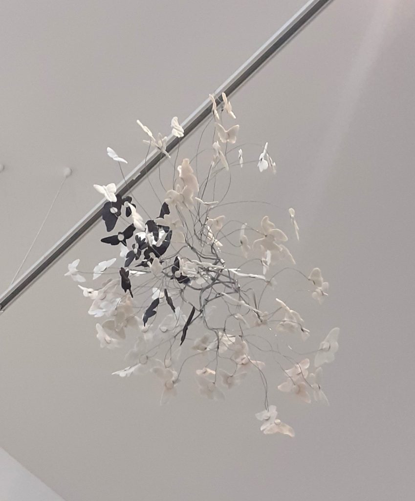
Human Animals
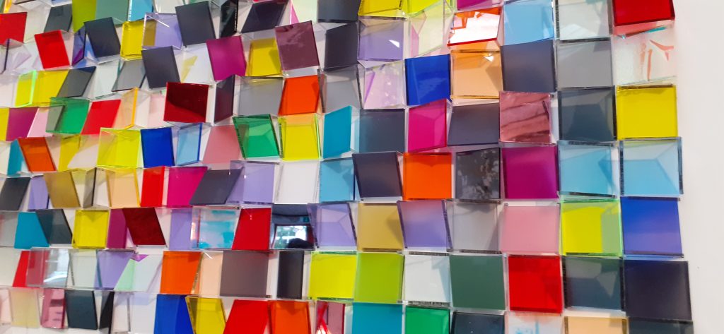
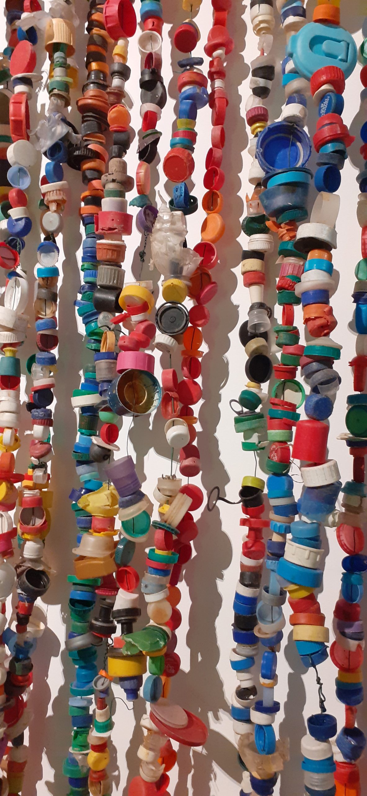
Donna Mann’s exhibition at the Old Fire Station gallery captured my attention. Can you guess why? …Mixed media.
This show expressed our interconnectedness with all of life. I liked the element of things being hidden and things being revealed across the space. I felt that I was seeing the expression of life within its smaller details, such as the moth. My eyes made connections across the various elements of life that were placed beside one another.
The carbon of the stars became life on earth. Mann’s installation traces an exploration of healing, friendship and transformation.
Carbon love.
From dark matter to light.
Arts at the Old Fire Station
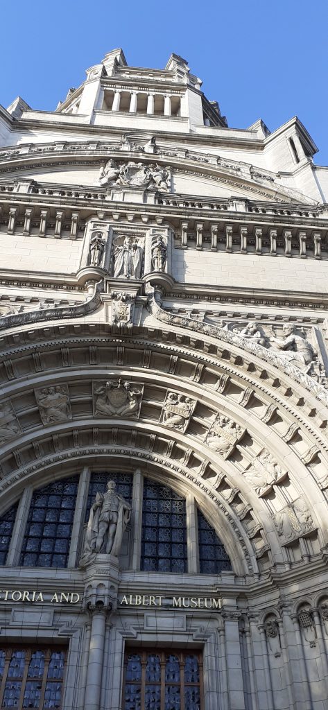
Victoria & Albert Museum
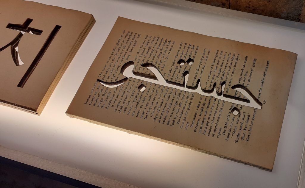
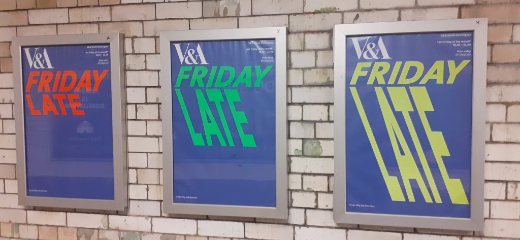
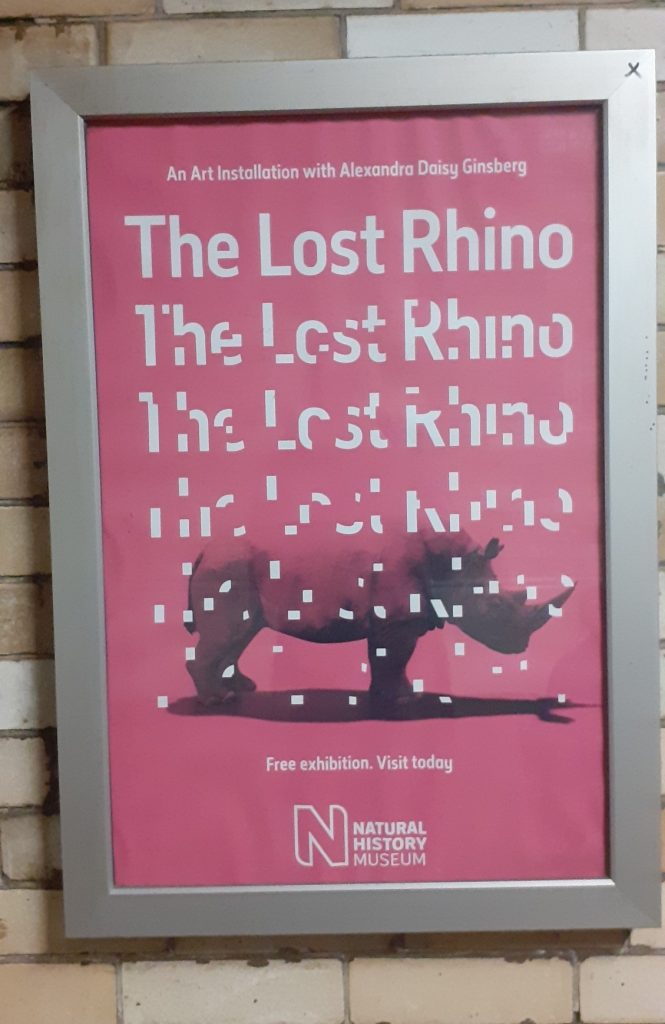
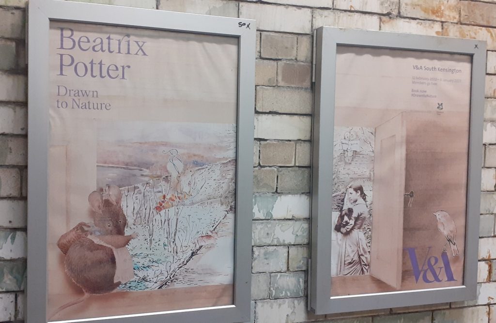
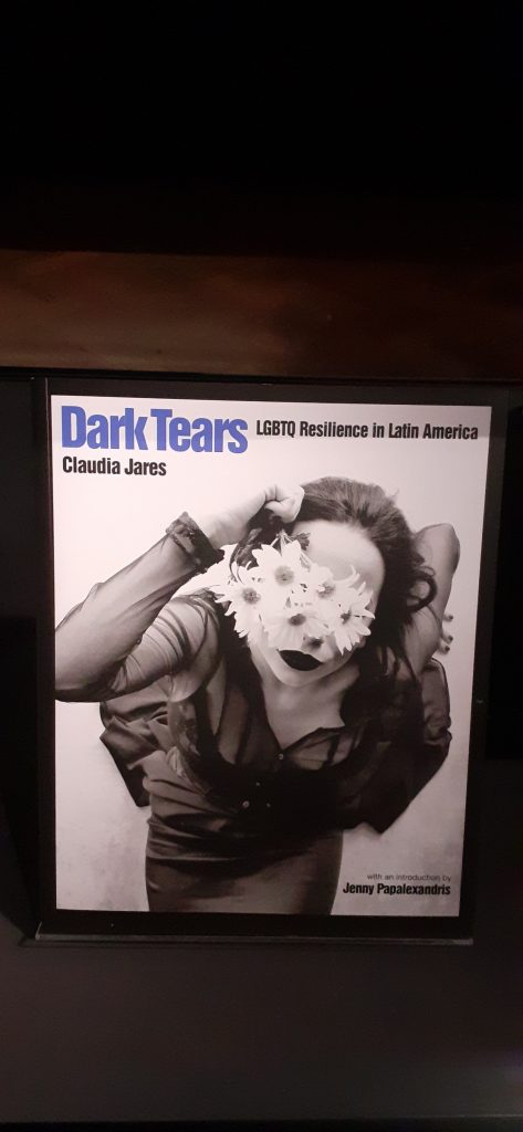
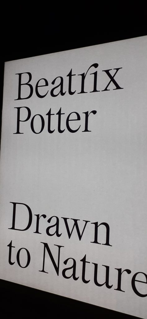
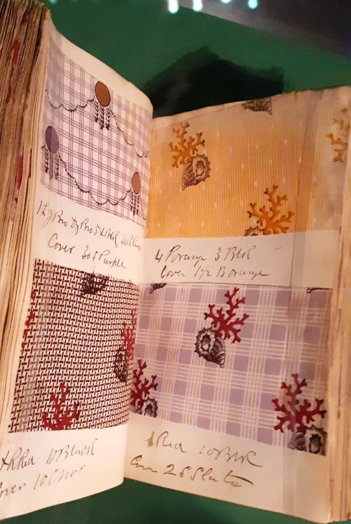
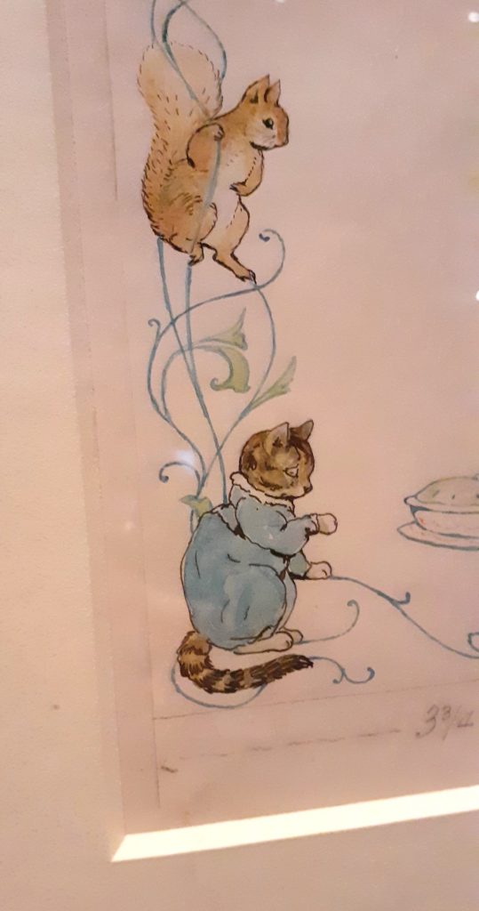
I took a trip to London and headed for the V&A for the Beatrix Potter exhibition. I took photos of the posters along the walls in the tunnel betweeen the underground and the museum. These are the designs that most appealed to me:
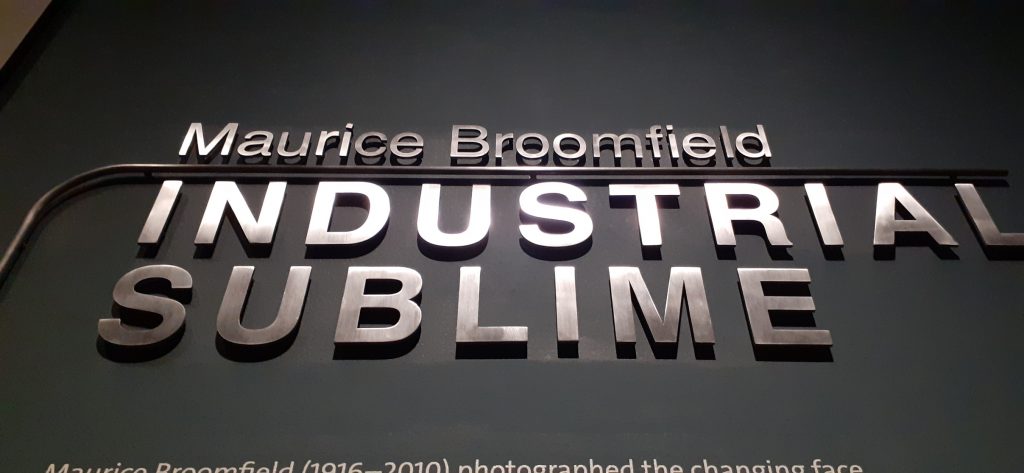
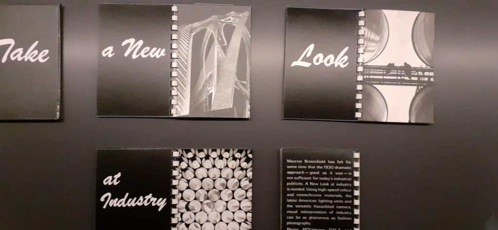
The V&A has a photography section which I visited first. From having completed the Exhibition Visual System module last semester, I took notice of the design of the exhibition. For example, the metal type used for the title of the exhibition (below). This was a perfect choice, since the exhibition focuses on industrial photography.
Photos from the Beatrix Potter exhibition:
Graphic Design Reading Material
Reading novels is an automatic activity for me. (If you’re wondering, I finished The Buddha of Suburbia this month and have moved on to Mary Shelley’s Frankenstein)
But this month, I have intentionally made more time to read a small selection of the many graphic design books I have laying around. Reading them carefully instead of dipping in at random allows me a greater understanding of the subject and helps me pick up ideas I would have otherwise missed. Reading about specific designers, their work and methods gave me the most satisfaction.
Wolfgang Weingart
The radical father of the New Wave movement, Weingart taught his students to move beyond the rational swiss typography of the time. ‘Weingart reacted to existing standards by pushing typography to the limits of legibility and beyond.’
Crystal Goblet Analyogy
The essay The Crystal Goblet by Beatrice Warde is an articulate piece of writing describing good design. Warde illustrates this idea using the metaphor of a wine glass. She suggests that we use a wine glass to be able to see and therefore appreciate the appearance of the wine as part of its enjoyment. An opaque cup would hide the appearance. Good design highlights the message and content. A well chosen type means we wouldn’t notice the choice of type. An ill chosen type would stick out awkwardly.
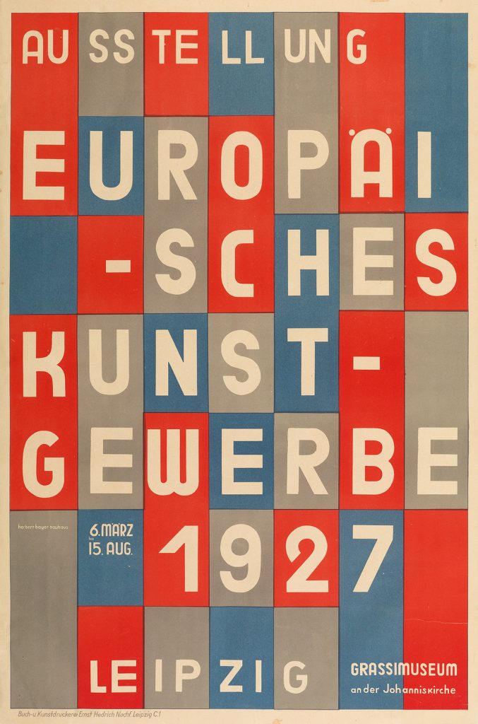
Poster, Ausstellung Europäisches Kunstgewerbe (Exhibition of European Applied Arts), 1927; Herbert Bayer; Lithograph;
I really like this bold and obvious use of the modular grid.
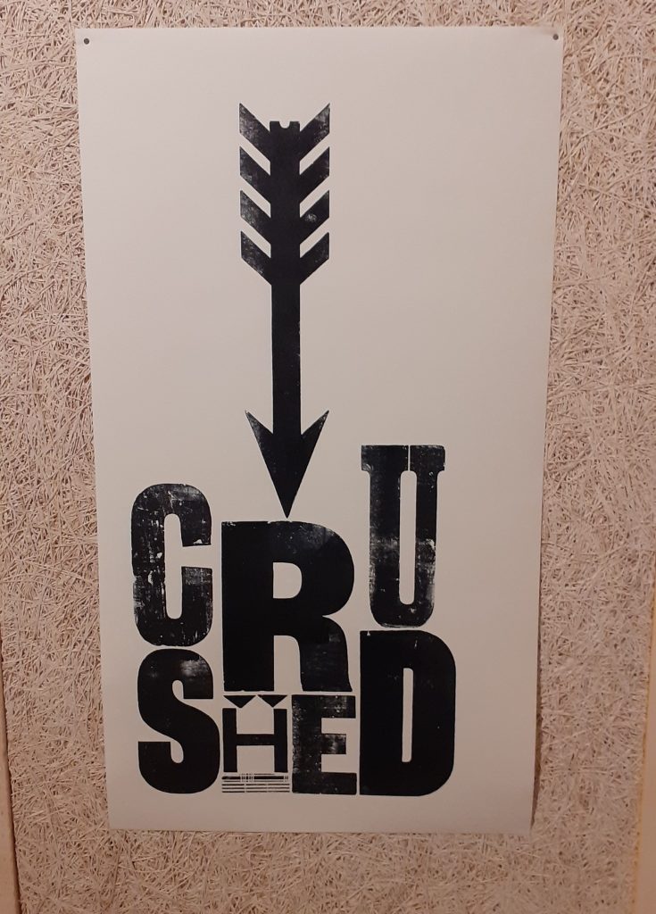
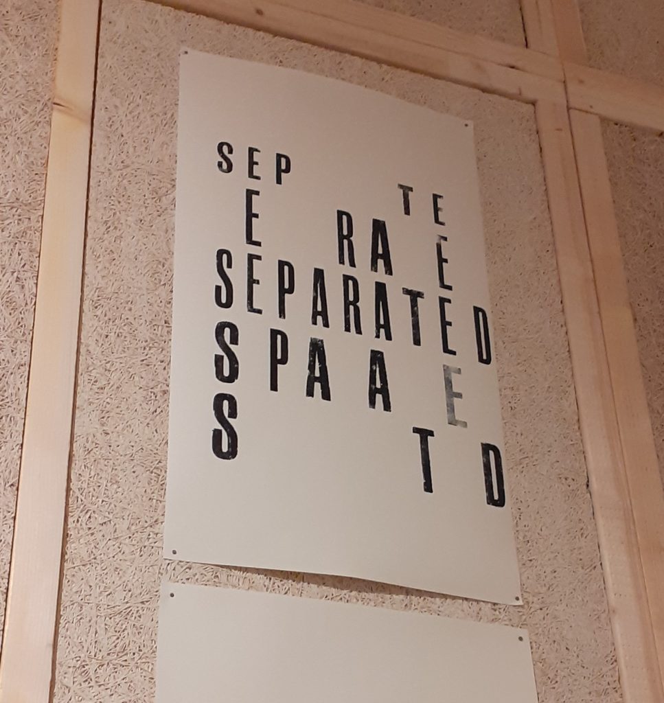
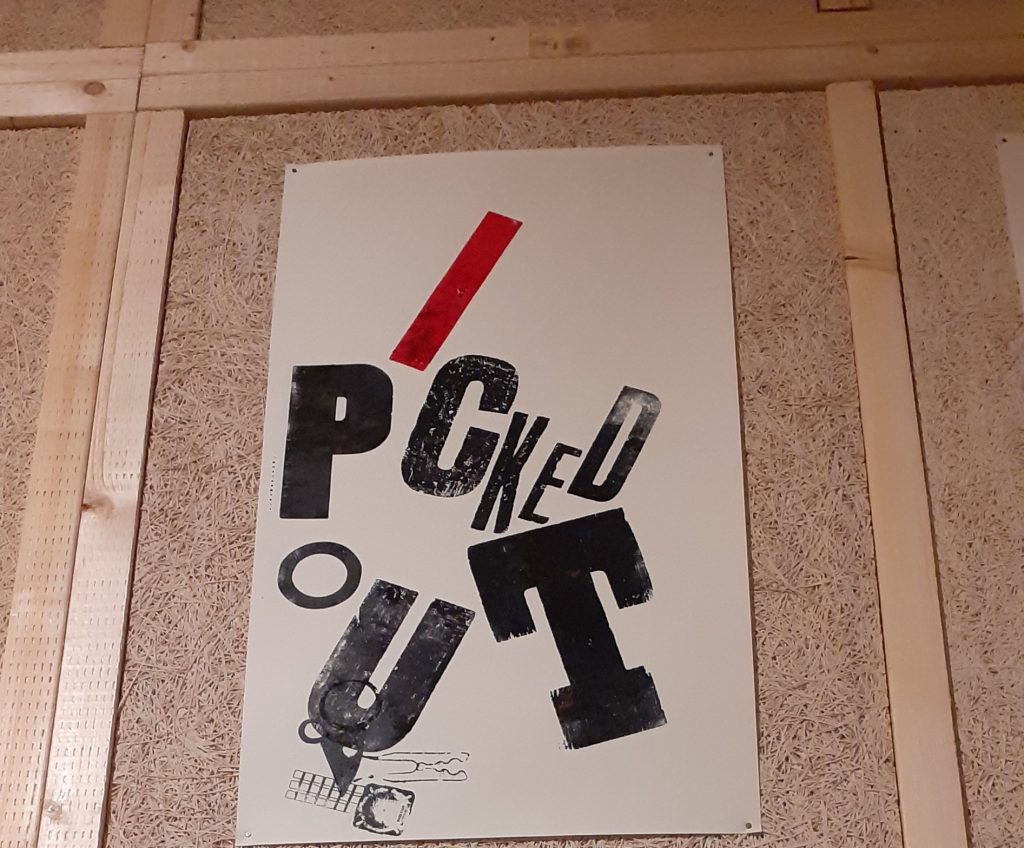
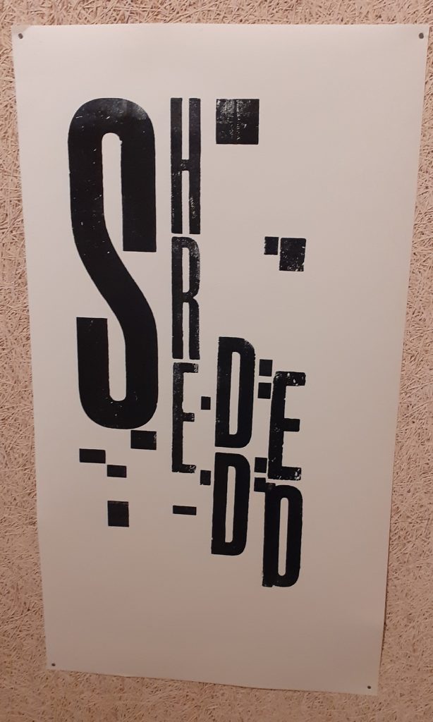
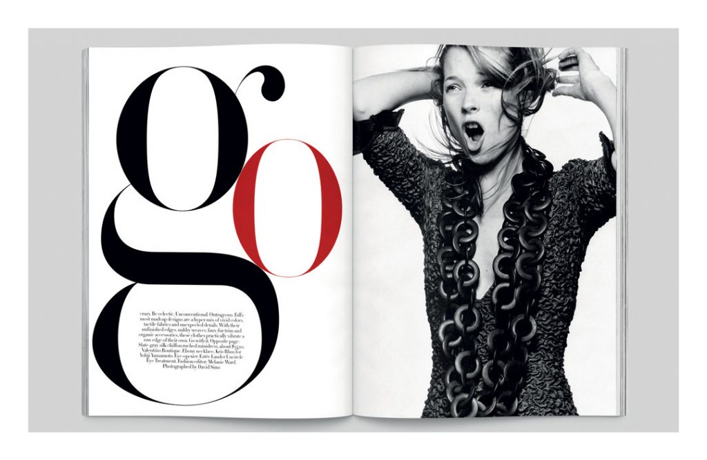
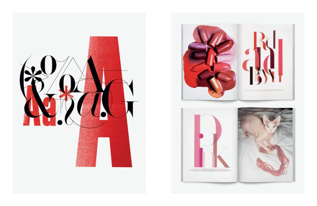
Fabien Baron
Editorial design in different publications. I really like his use of type and the way it merges into being illustration as well as the heading. Images from this page.
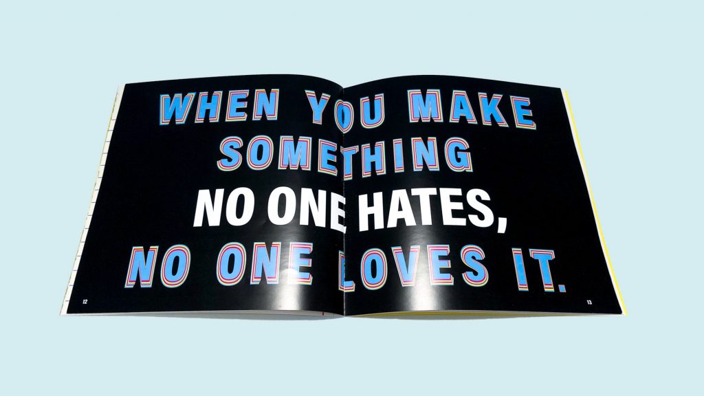
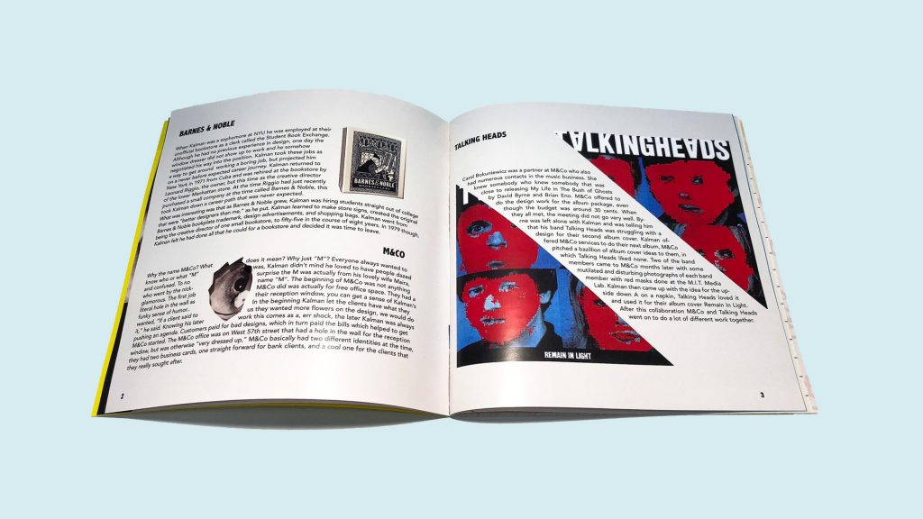
Rachel Anderson
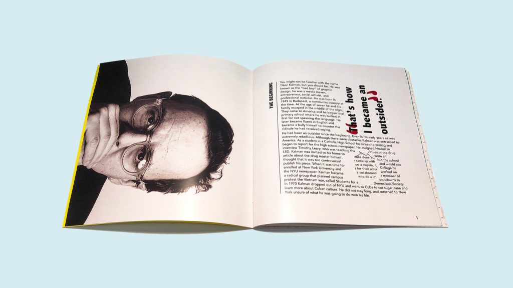
Rachel Anderson is a young designer based in Florida. I like her designs based on the work of Tibor Kalman. The design was inspired by his work.
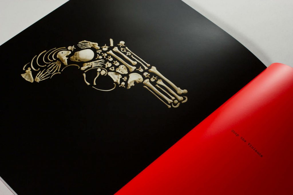
Thirst/ Rick Valicenti
Rick Valicenti’s design combines the weapon and the effect of violence in these powerful images using skulls.