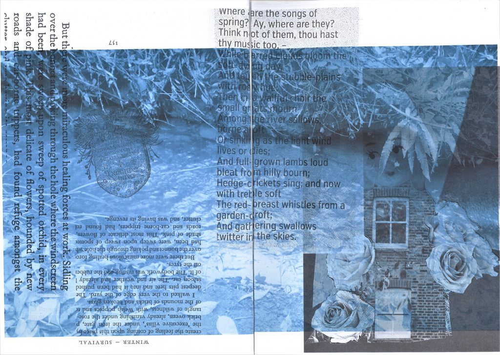
I used different images, combining photos of my figure with photos I had taken around Oxford. This allowed me to express different elements of the narrative. For example, printing the brick wall image over the image of the figure’s face expresses a stubborn or trapped state.
Black and white is suitable for a zine generally because it cuts down printing costs, but I also feel it helped to create the mood I wanted in this story. The zine begins sad and the greyscale helped me to show this.
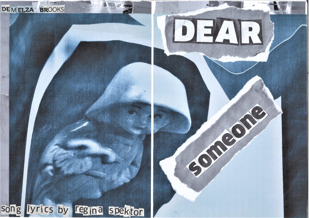
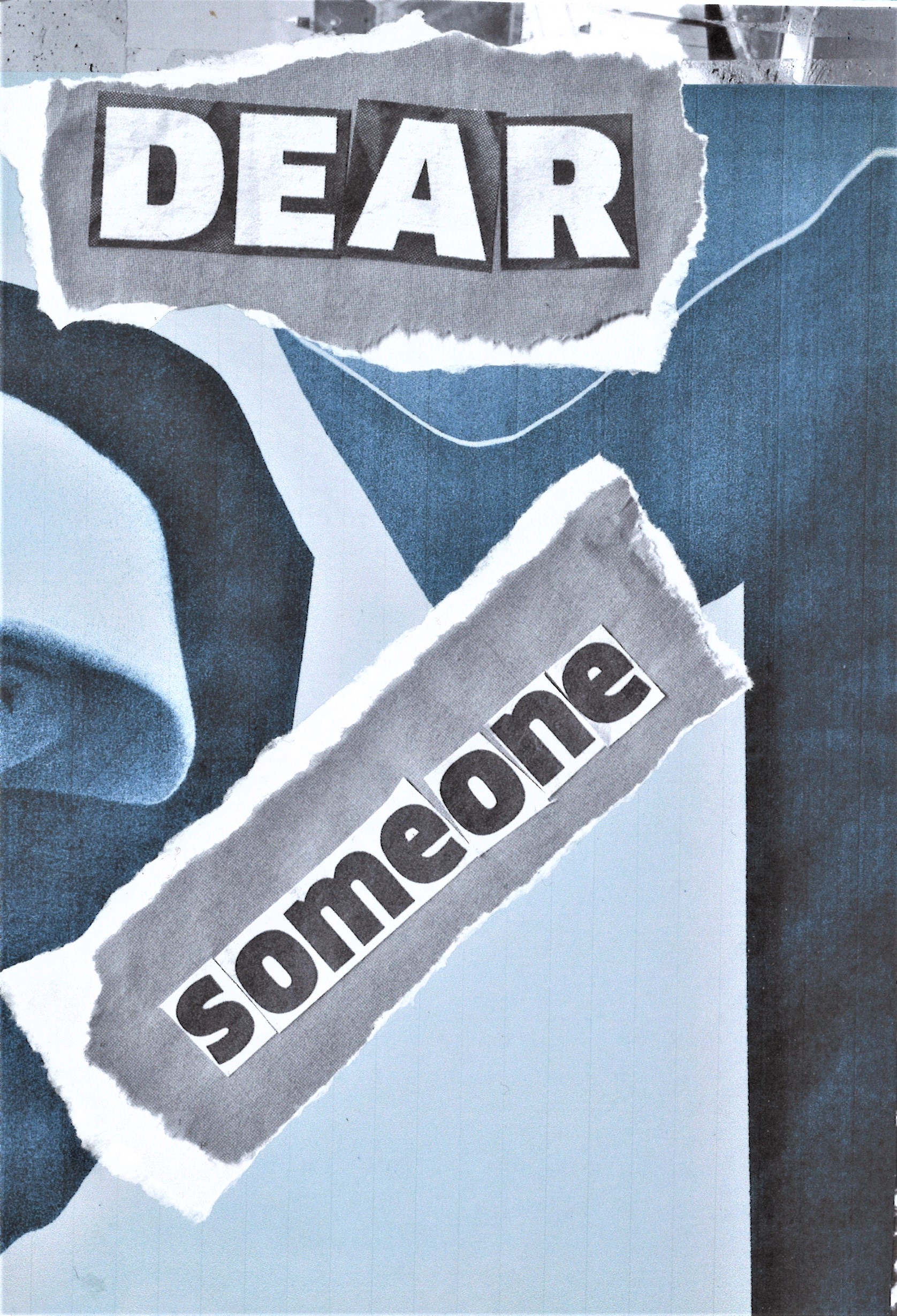
I pulled inspiration from a variety of sources, such as the song lyrics, personal experience and zines I have seen in the past.
Looking at graphic design books was also helpful in informing my ideas. Books such as The graphic design idea book : inspiration from 50 masters, Fanzines by Teal Triggs, The fundamentals of creative design by Ambrose/Harris, Behind the zines self publishing culture, and Visible Signs : an introduction to semiotics in the visual arts . Buying 2 zines from etsy.com was useful because I could see how another artist would approach zine-making.
Looking at photos of zines on the internet was important because it allowed me to see how a physical zine can be constructed. I didn’t take every idea on board but absorbing these ideas allowed me to be creative and apply my own methods to zine making. For example, I looked at the posterzines by people of print and although I liked the way all the information is compact on the one sheet of paper, I did not want to go down this route with my zine. Since my zine is about a story of change, I wanted it to physically read like a book, with pages that could be turned and a narrative that could be slowly revealed to the audience.
I considered the bookbinding methods we were introduced to in Ruth’s workshops for module 002. These methods informed the direction of the physical format of the zine.
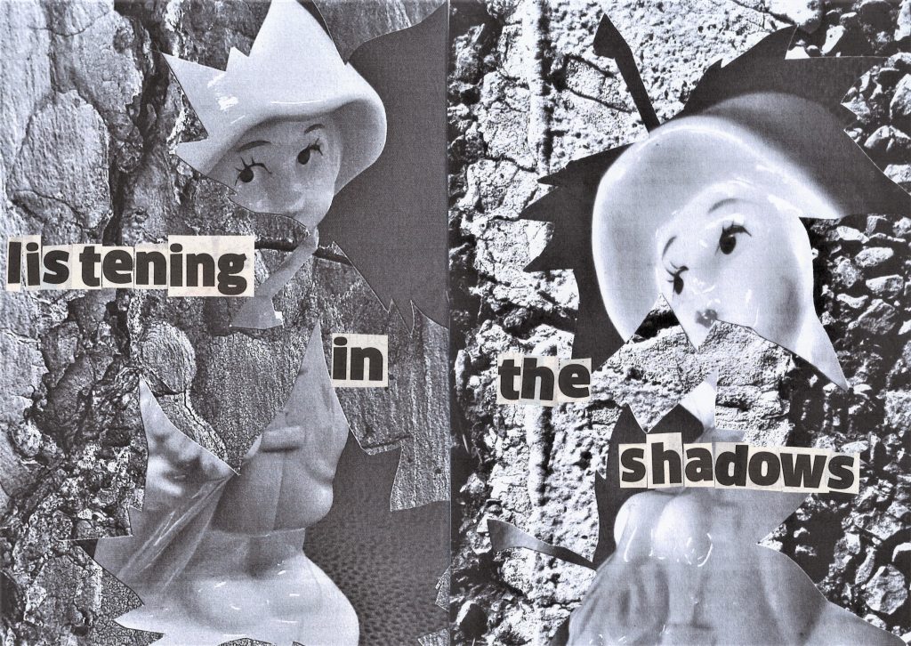
The use of cut-out text reflected the theme of the zine. My zine is about breaking and fixing. Both emotionally, physically, and metaphorically. The way I glued the words together, forming them from separate found letters, helps to represent this narrative.
I used exclusively collage for my zine. (I did not use drawing or digitally produced images). I stuck with analogue methods for this extended project as I wanted the zine to feel handmade and personal. The cut and paste method I used for the images gives the same impression as the repairing theme mentioned above.
Once I got into the making of the zine, I took it in my own direction. I was still reading and looking at research material throughout but I felt like I needed to tell my story in my own way. There was a point in the process where I did not feel the need for outside input anymore. This was after I made the draft zine. My research period was more near the beginning of the project.
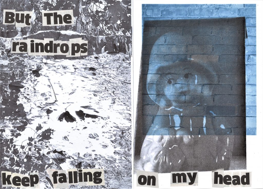
I have avoided copying any one design, but have been influenced by elements such as the distortion used by Sofia Clausse in her zine about ‘the windy city’. The distortion in her zine was a reference to the windy weather. In my zine, the distortion represents change and mental health.
I struggled with knowing how long to spend on each area. For example, I did a lot of experimentation because I felt I needed to explore my object and how to present it on paper. This was not much of a problem in this semester but did lead me to feeling overwhelmed. If I had set time limits for each task, it might have helped me keep on top of the module overall.
