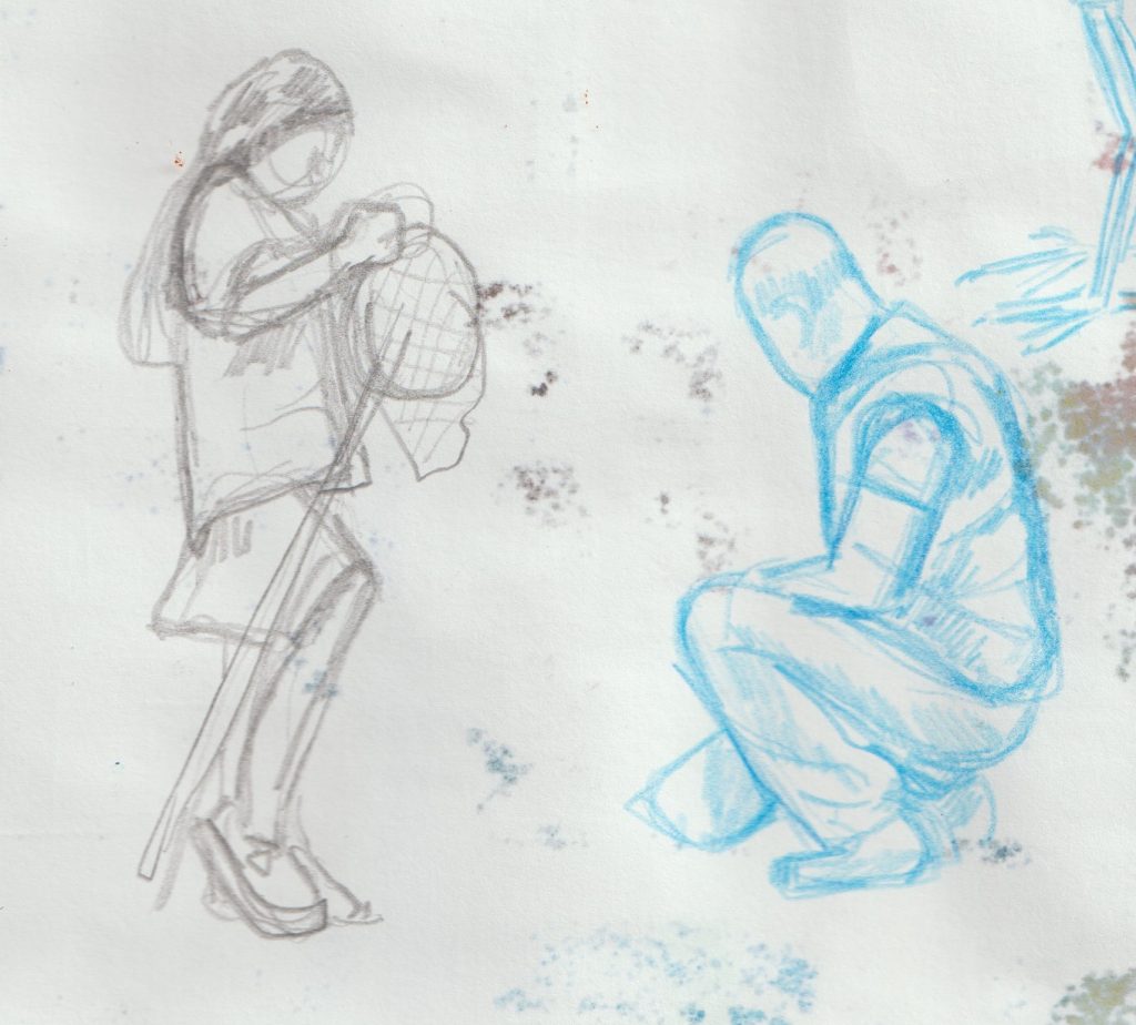
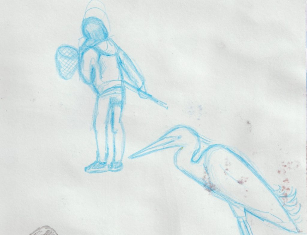
Sketchbook 23/06/22
I have heard gouache described as ‘the love child of watercolour and acrylic paint.’
I had to try it out, given its rise in popularity. Its reputation is as a versatile material, used by illustrators in particular.
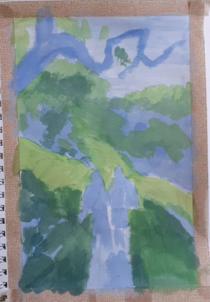
For my first gouache painting, I chose a scene from my recent retreat to Wales. (My first time in Wales seemed to match my first time using this medium.) The reference photo was taken by another member of the group.
I taped off a page of my sketchbook with washi tape and go to work.
I didn’t sketch the picture first, which I regretted because of the figures. The figure on the right ended up looking quite still, if I had drawn the legs first, they may have looked more in motion.
I discovered I needed to use a lot of white paint throughout. I waited for some layers to dry but didn’t do this towards the end. This could be why the final layers appear slightly muddy. Though the other property of gouache is that it comes back to life when re-wet.
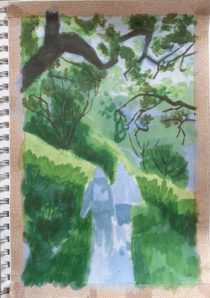
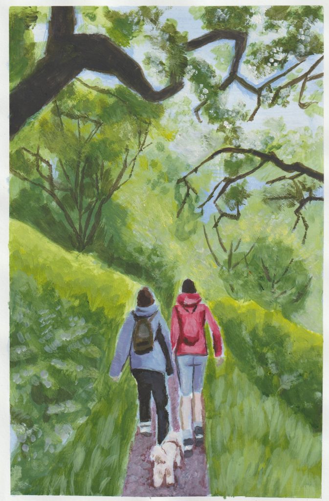
Overall, it was a good practice and I find I enjoy gouache a lot. I didn’t achieve perfect details (i.e. the grass and hedges) but this was OK for me. This way, the scene appears more windswept and in motion. The transparency of the details was due to the white paint being mixed with water at that stage.
Having not drawn the figures in this painting, I then decided to practice drawing the figures that might appear in future gouache paintings:
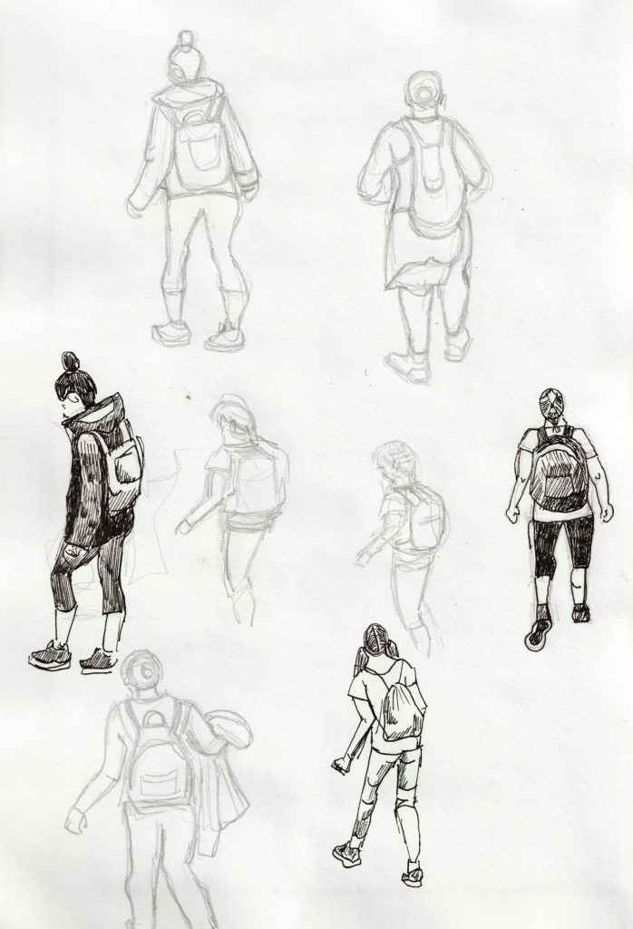
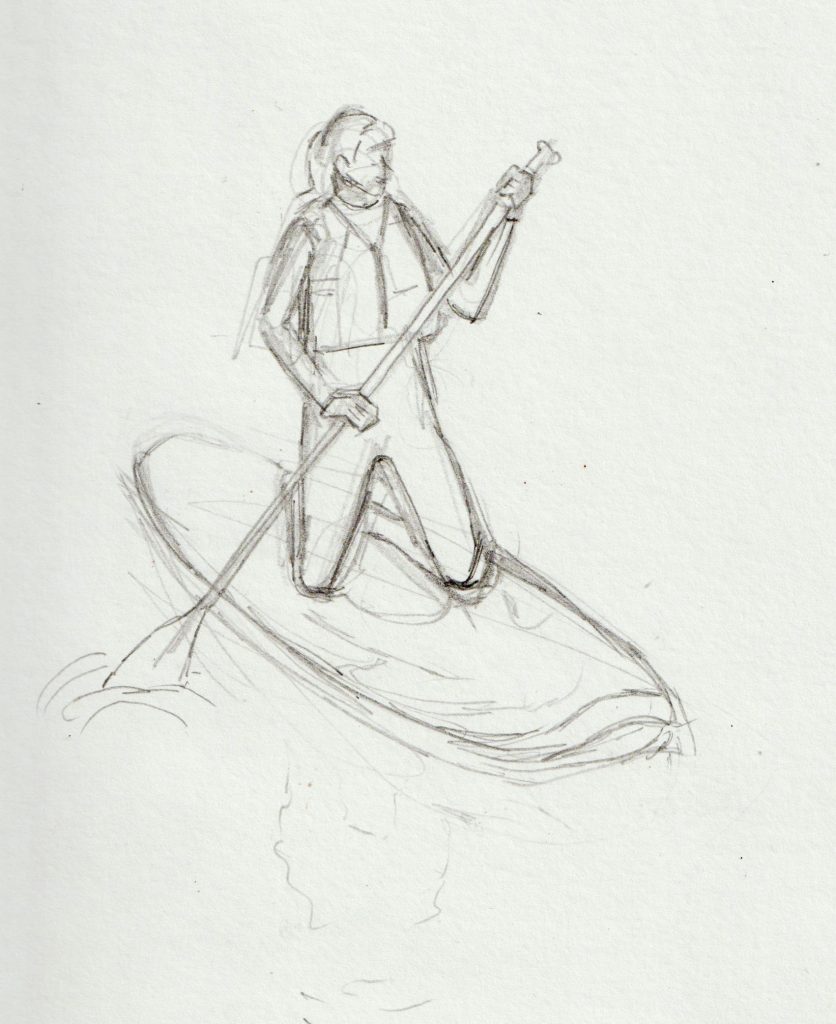
Pen & ink drawing of Reading
What drew me to paint a very ordinary scene in Reading, was the colour of the cranes. They were red, white and blue, which to me was unusual.
I took up a double-page spread in my sketchbook, to capture the scene.
I began by sketching the image with a regular HB pencil. (below)
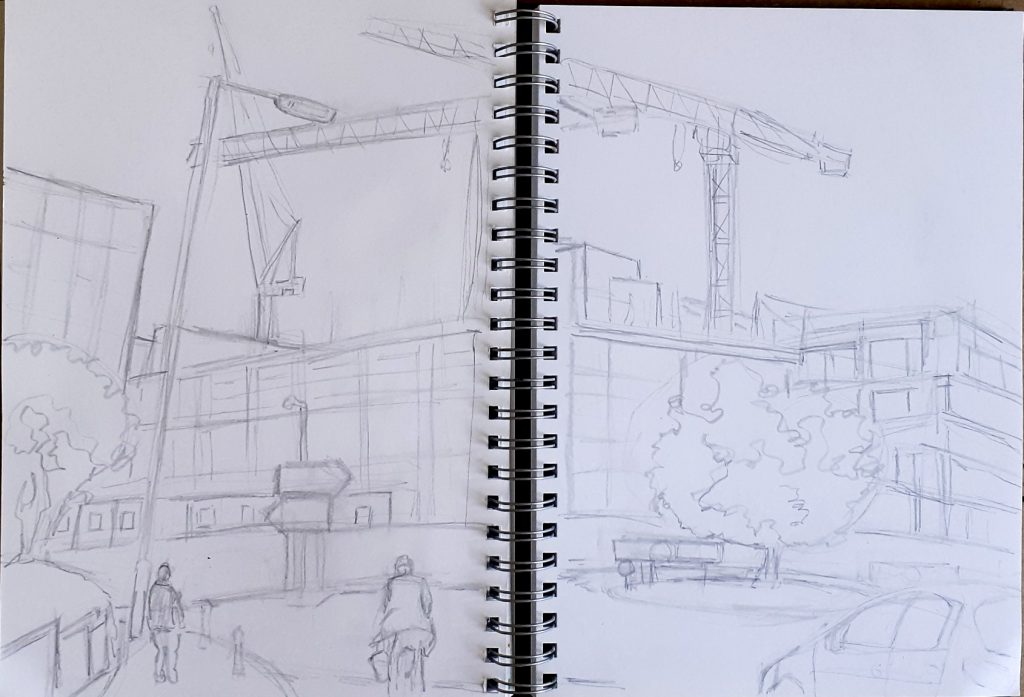
I then wanted to flood the scene with colour. I’m not too confident with ink paintings. I tend to use India ink as a drawing material, with the pen nib and pure ink. For this study, I wanted to use ink in a similar way to watercolour, which I am far more used to.
I mixed the ink with water to add the darkest areas in purple. I chose violet because this tends to be the colour of shadows.
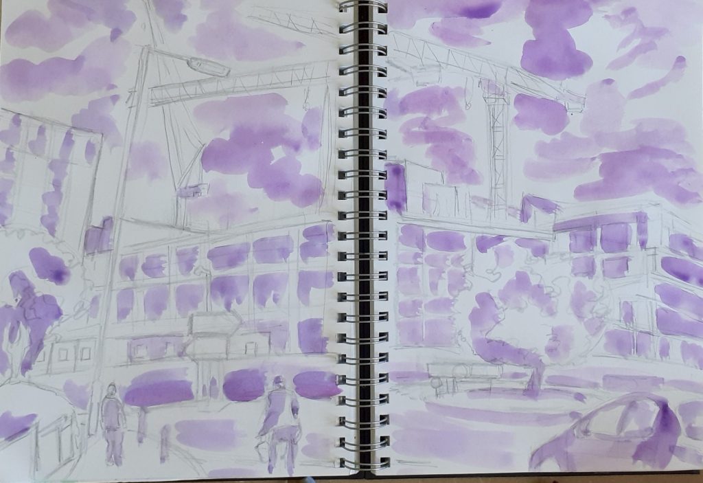
The ink was more vibrant than watercolour, and actually, didn’t behave in the same way. I found that with inks I was able to distinguish individual layers, which was a nice discovery.
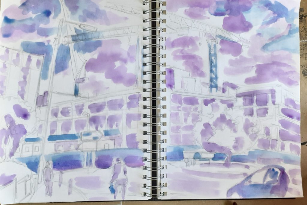
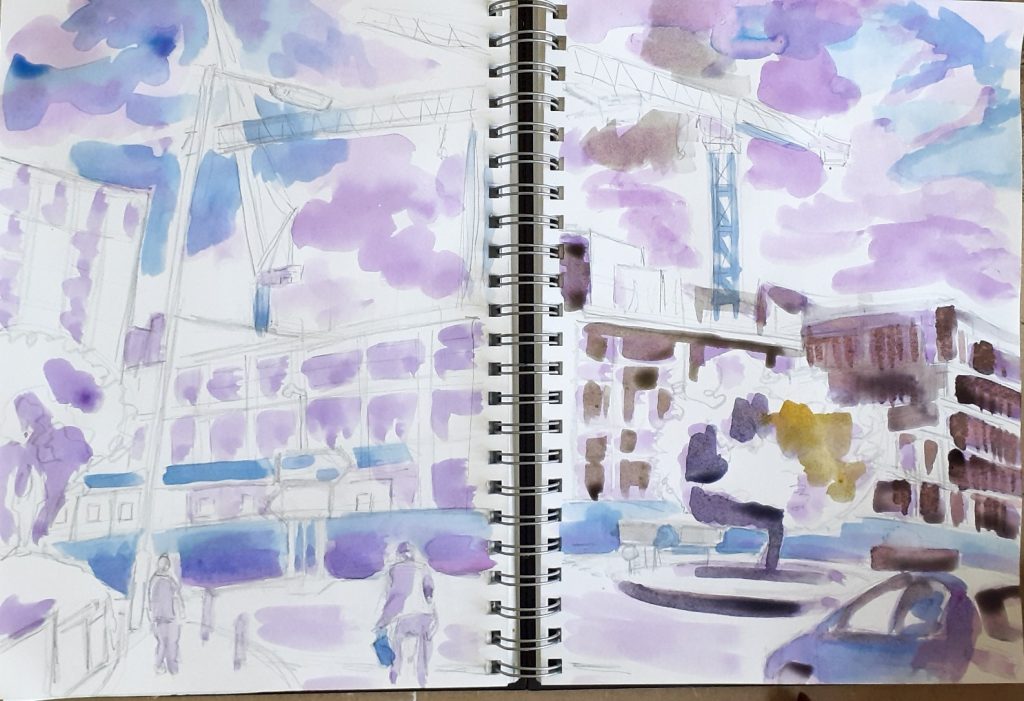
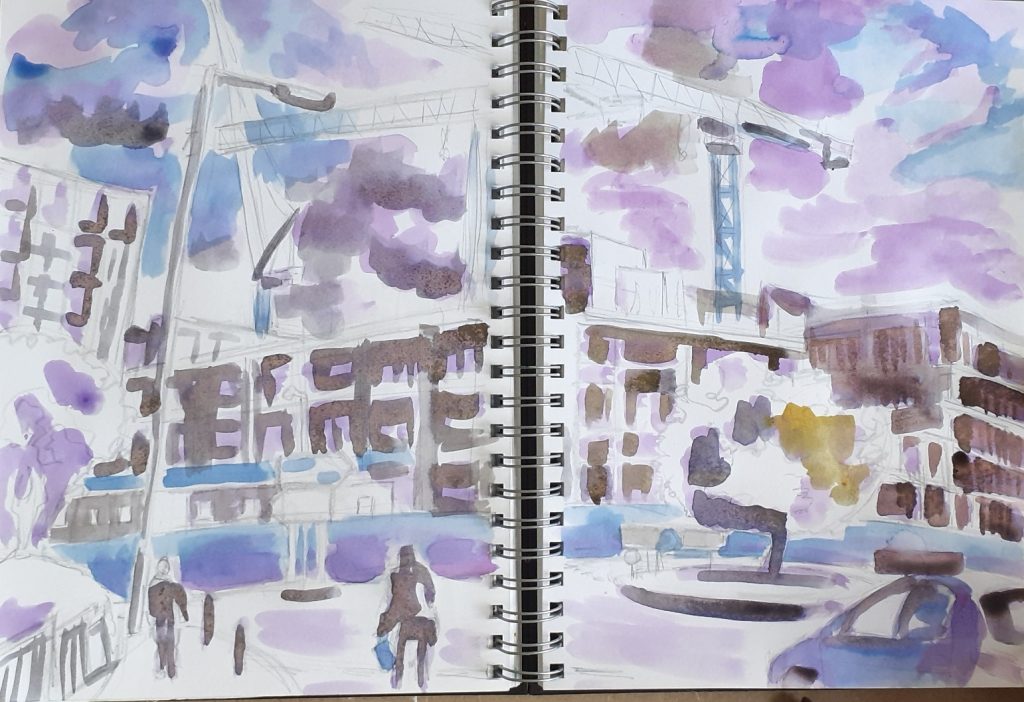
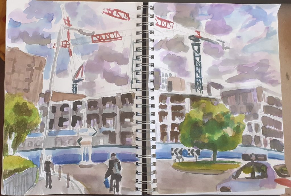
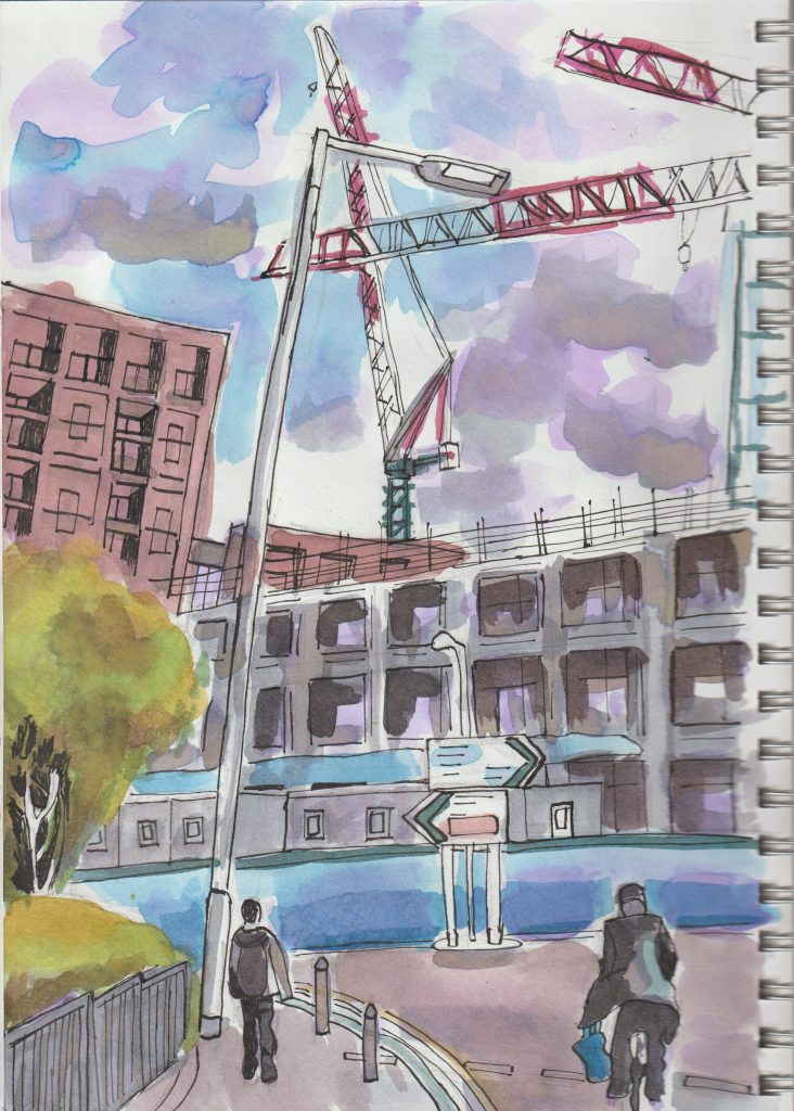
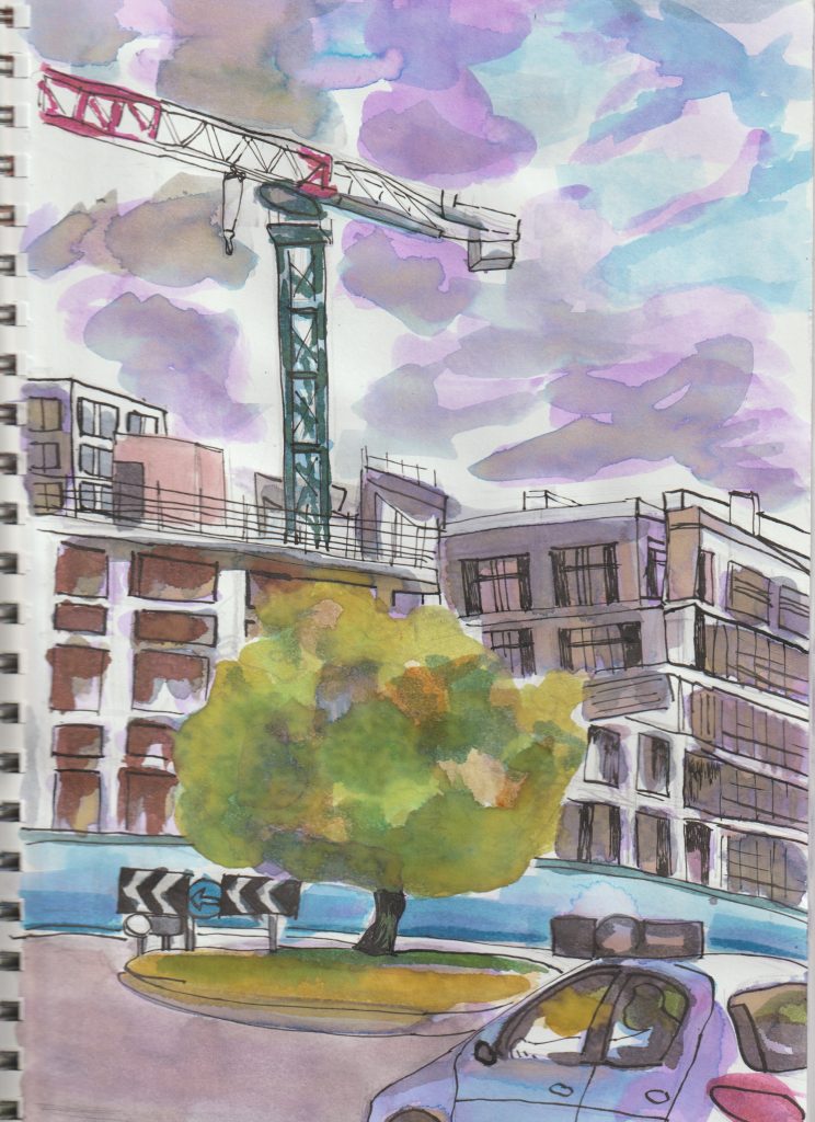
I chose to leave the trees as they were, allowing the natural ink merging to represent nature’s disorder. This makes a nice contrast with the man-made world where sharp lines mark distinction.
Crabbing in Southsea
Another trip I took this year, was to Southsea in Portsmouth. The weather wasn’t perfect, and on one of the duller days, we went to the boating lake. I was surprised to find children fishing for crabs in the lake. I assumed all lakes must be freshwater, but it turns out this one is slightly salty.
