Today’s lecture started with a talk about the final presentation to the client. I found this interesting because I never knew how an idea is presented to a client.
21st March lecture notes:
- The PDF for the client contains the final design and content leading up to the design.
- We need to convince the client by showing off.
- Putting our work into context helps to explain the idea a bit better.
- We need to be confident that we can explain our idea behind the concept because the client will ask ‘why have you done that?’ (Have it clearly in mind).
- We can also present images that help to support the idea.
- The presentation needs to help validate the idea and put it into context.
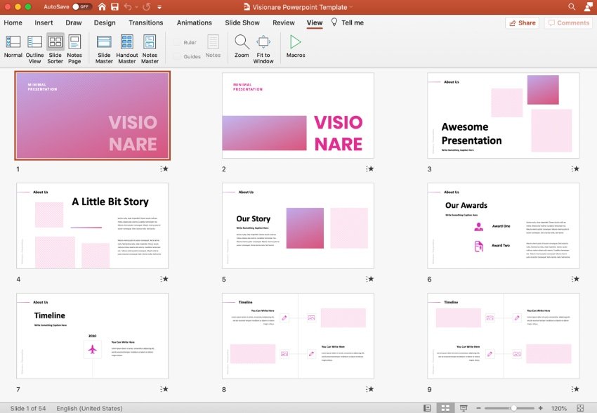
- ‘A PowerPoint slide deck is a collection of slides that are in the same presentation. You’ll hear “slide deck” used somewhat interchangeably with “presentation.”‘
- We can present more than one animation and more than one poster if the idea is better expressed as a set of 4 ideas, do it.
- Make a list of deliverables then write a script. Tweak list and items so it makes sense.
- Communication skills so viewer can grasp the concept of your work.
- Don’t just rely on big impactful visuals- the idea behind it is very important.
Presentation layout
- Start with the brief
- Aim of the concept- explain the idea supported by images or key words.
- Then show off the design through a series of deliverables.
(template on moodle for the basic layout. Make use of a grid for the slides)
- Cover page: Title (tagline or different title), name of the client and your name.
- Next slide: explain the brief, give a bit of background.
- Aim what are the objectives of the work? (short paragraphs)
- Concepts– what are the ideas behind your visuals? (short paragraph)
- Slide of images to support/ give background. Why you have approached the problem.
- Concept board– You came up with the idea because it reminded you of something, for example.
- Place your poster on an outdoor wall, into context.
- 1 slide with one poster on its own.
- Mock up of instagram post. Put your post in it or twitter or facebook etc
- Screenshots of animation on one page then play the animation to the client.
- Then brand attack- photoshopped image or sketch. Can explain with a caption.
- At the end = summarise
- Tagline = explain it.
- One page = colours.
- Another page = type for headlines, body copy etc
- Show your illustration
- Summarise all the elements of your design to the client. at the end of the presentation
- End – Thankyou
500 words of my contribution to the group. made sure we have breaks, make sure we are in agreement or not. That we get everyone’s opinion. What were my responsibilities? How did we communicate etc.
Blog- include case studies e.g. from the books, sustainable graphic design, cause and effect, design for sustainable change. Write a few posts about the case studies. If I see anything related to the extended project – blog about it.
Reading materials on moodle about individual evaluation- answer questionnaire on moodle before writing evaluation.
Submission into shared drive folder.
Feedback/ group discussion
In the second half of the lecture, we were given feedback on our initial ideas and poster work. Our group meeting was more difficult than it normally is, because we had one group member absent. This meant we couldn’t get her opinion on the direction we are going. To make up for this we need to arrange another meeting. It would be better to communicate this way rather than writing a message which is one-sided.
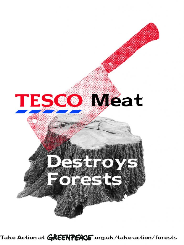
I started the session by printing the posters we had worked on so far (my 4 posters and 2 from 1 other group member). It was frustrating that not everyone had contributed to the poster work, as it meant we were held up on a step behind. Printing the posters on A3 size meant that we could see the designs with a fresh perspective.
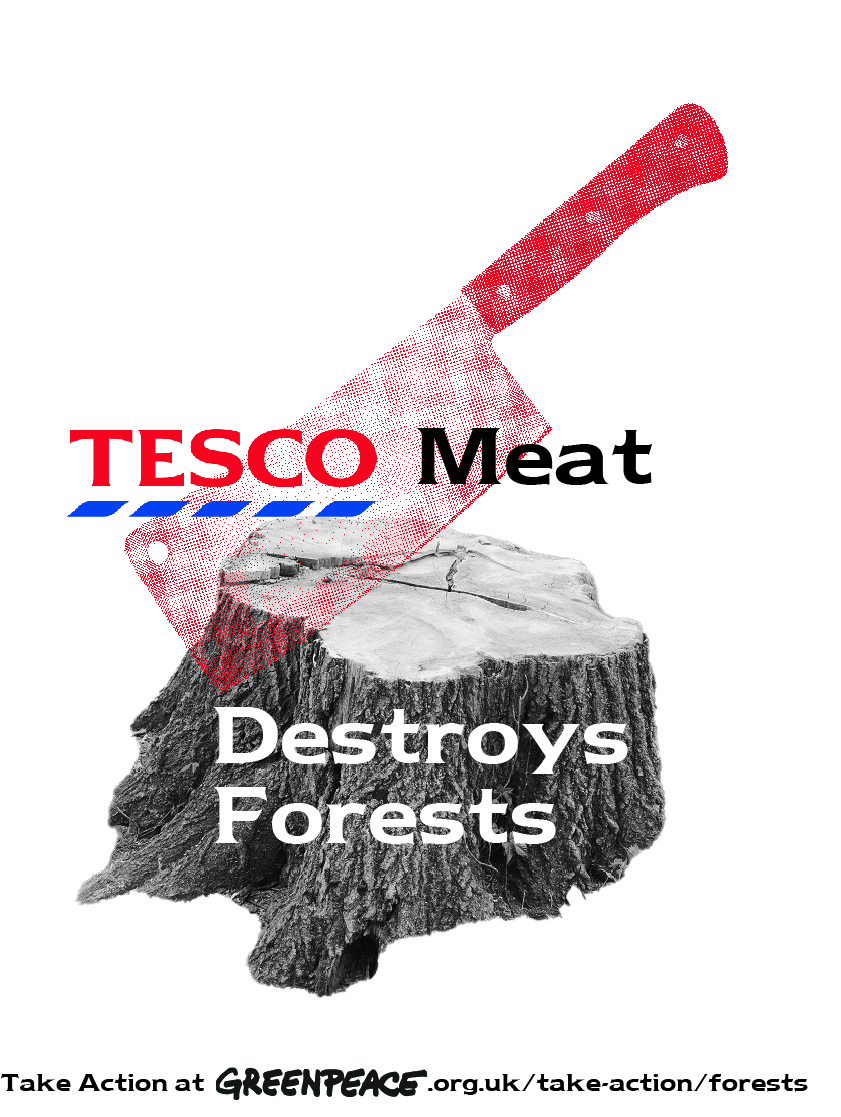
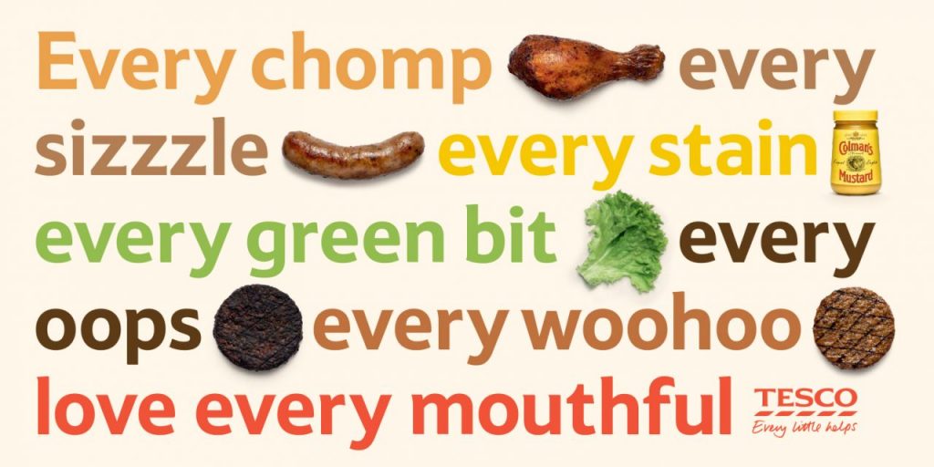
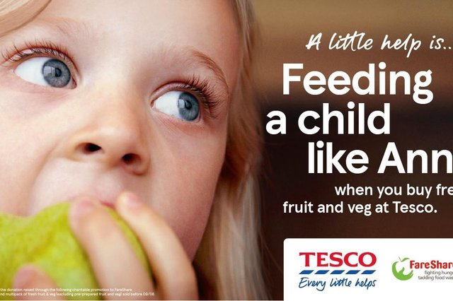
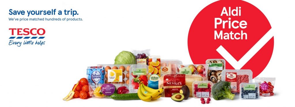
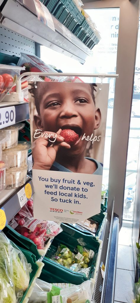
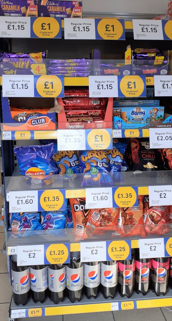
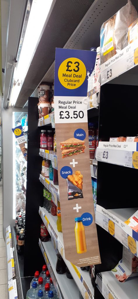
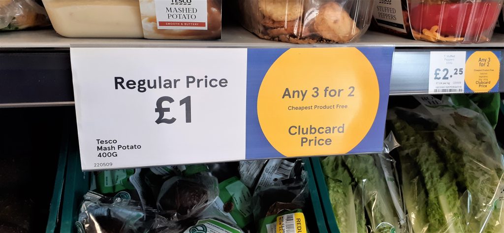
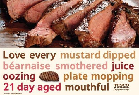
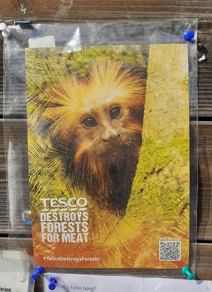
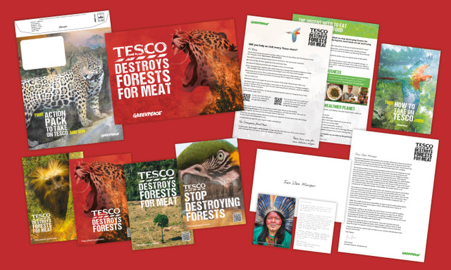
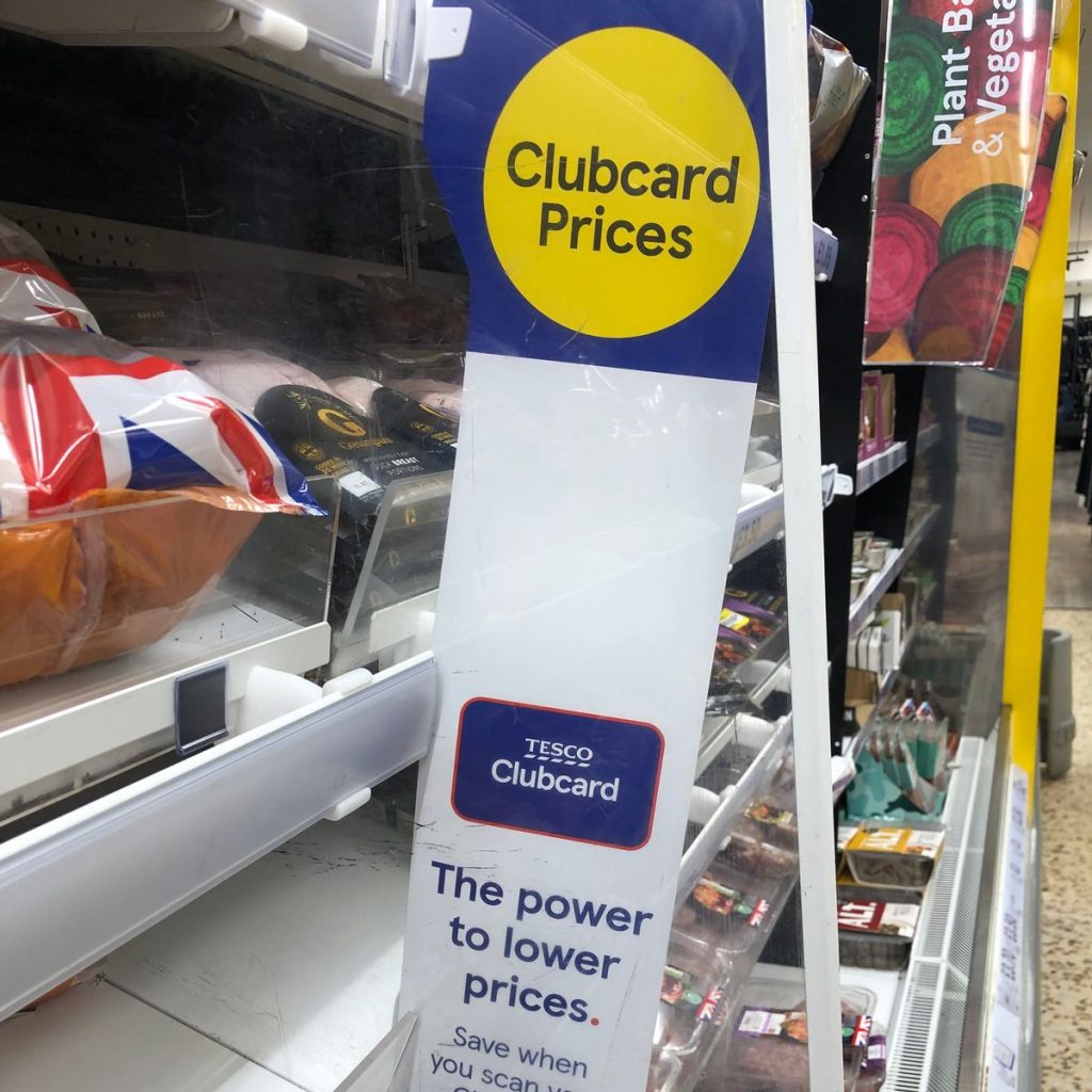
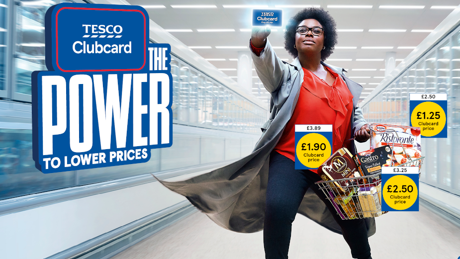
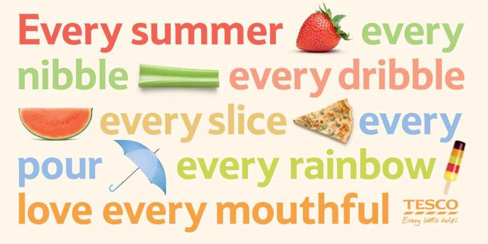
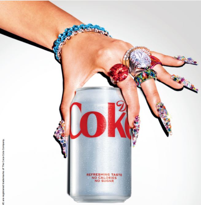
3 of my posters were based around the simple composition, using a plain white space for the background. I have seen this used both in Tesco campaigns and other posters, such as the Diet Coke poster below the Tesco campaign.

The ‘Love What You Love’ Coke campaign uses a white background which brings the focus to the hand covered in gems. This is helped by the brightly lighting used.
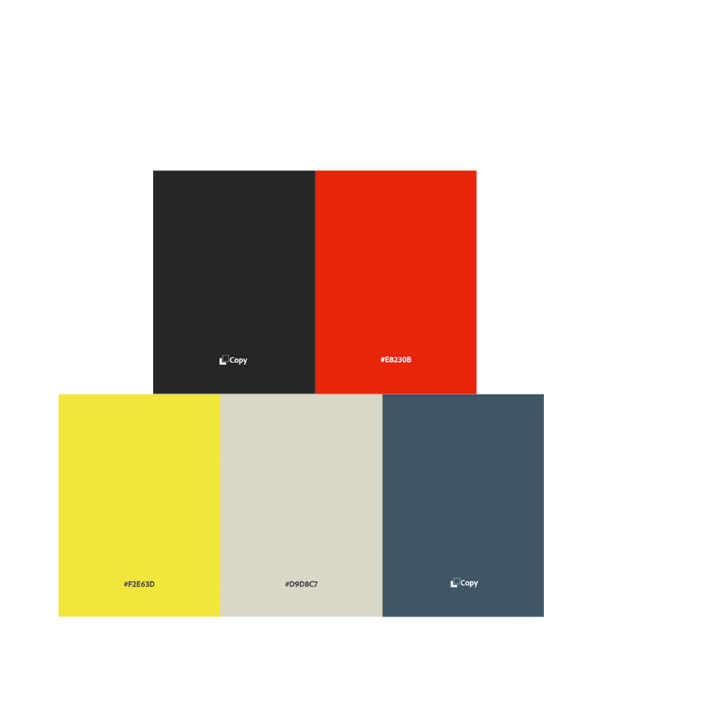
When considering colour, we used Adobe Colour Palette to search for subjects and see what results come up.
This was the first colour palette we considered:
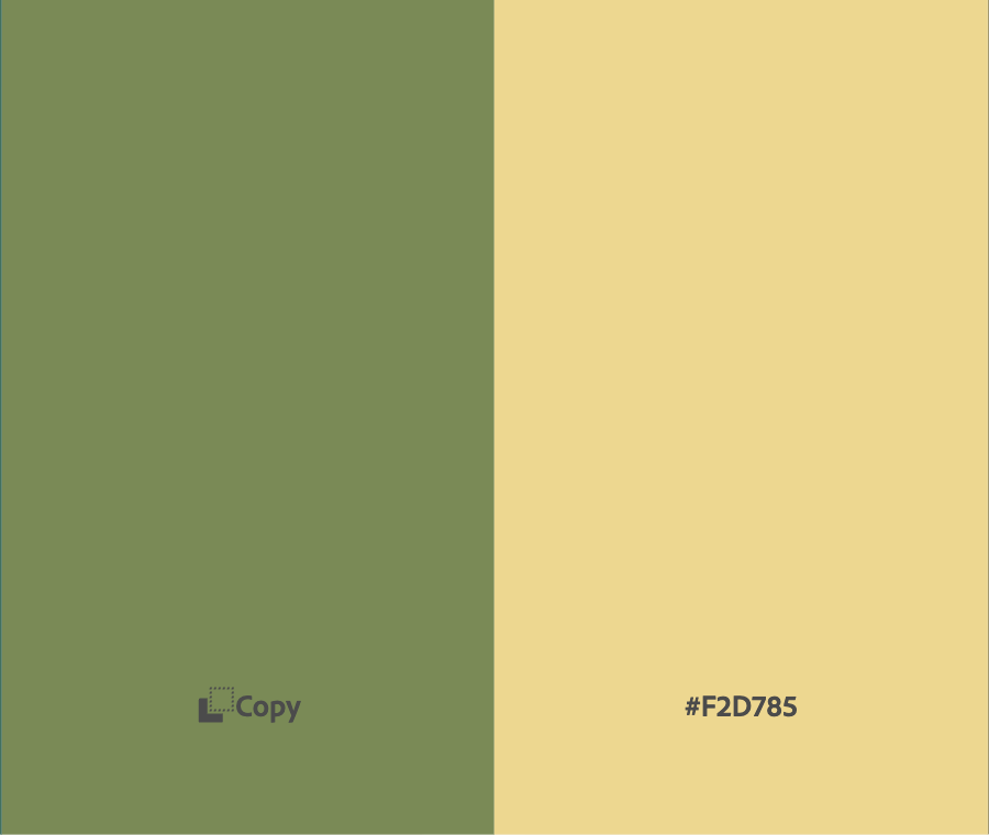
We also considered green, to reference the forests and impact on nature.
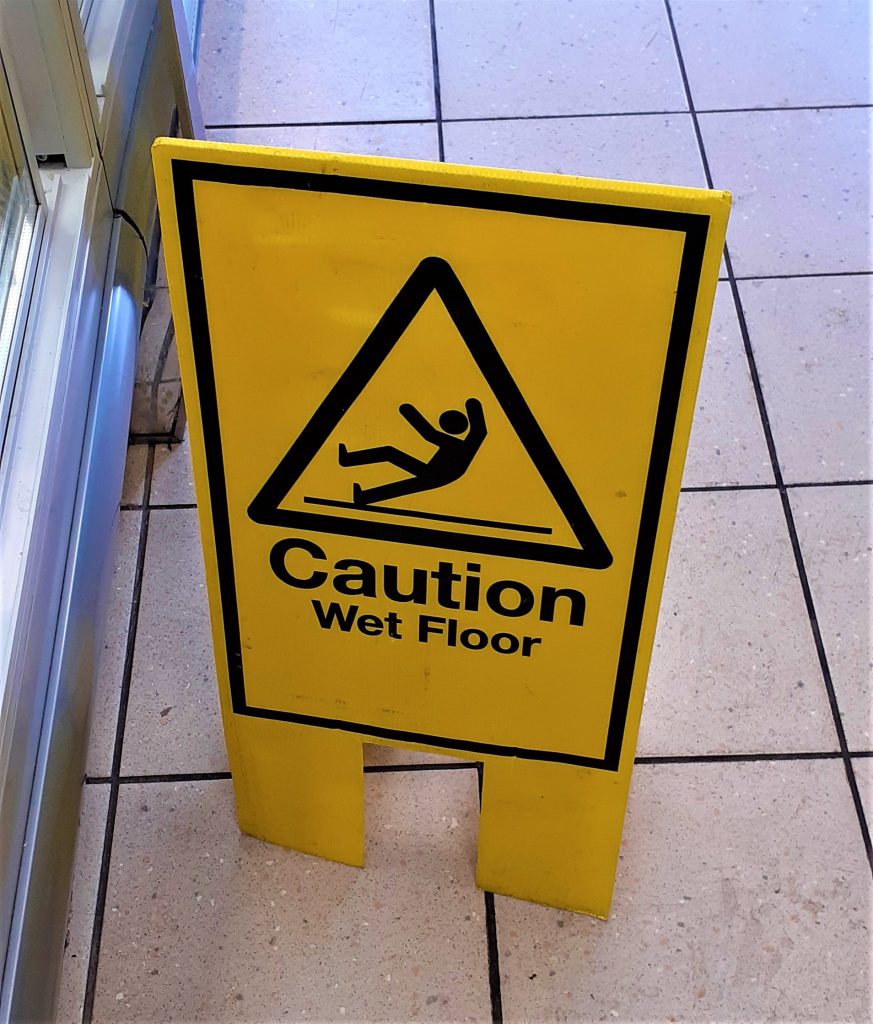
I saw this sign in the supermarket and noticed the impact of yellow and black to warn people of potential danger. Yellow can be sunny and energetic, or used like this to express caution. I felt that this eye-catching quality could make a good colour for our campaign design.
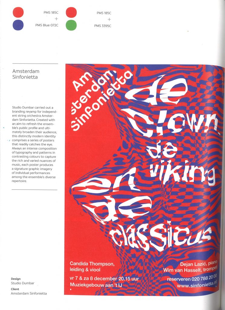
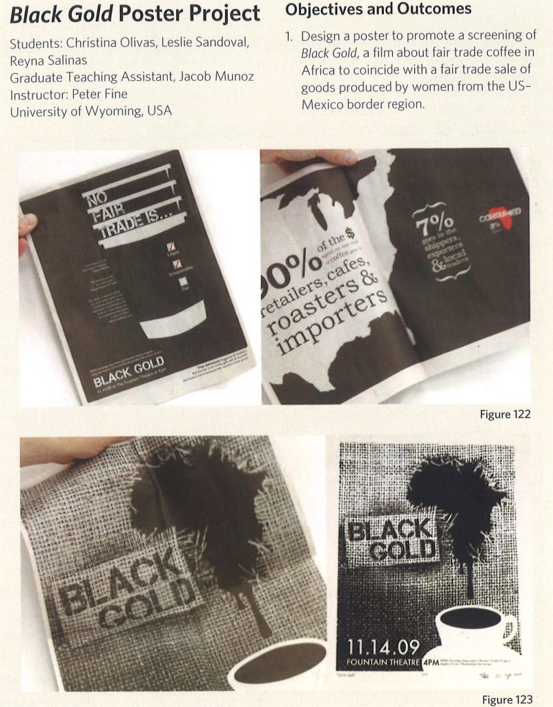
I looked at the book Less Is More by Victor Cheung. This book is a collection of projects, which use limited colour in a simplified way. The 2 designs below are from this book.
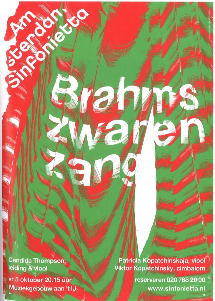
The high impact of red and green is also an appealing choice. It is normally used for a Christmas theme, but here in this image, I saw how these complementary colours can express both nature and danger in one design.
Black and white can also create a strong image in a design and give a serious/sombre tone to the message. I like the idea of using black and white within the design, even if it’s not for the whole poster:
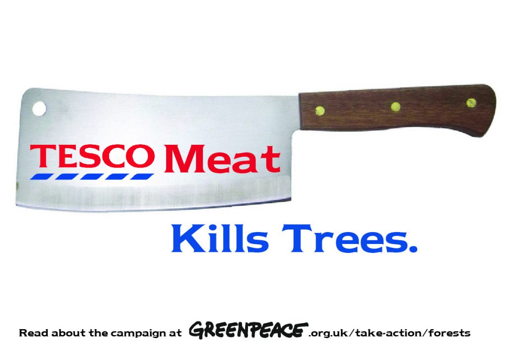
The posters I shared with the group:
1)
I felt that this poster was maybe too simple, there being no image of trees. I could change this by having the image of trees within the blue text. I could also have used bespoke type instead of the Tesco-style font.
2)
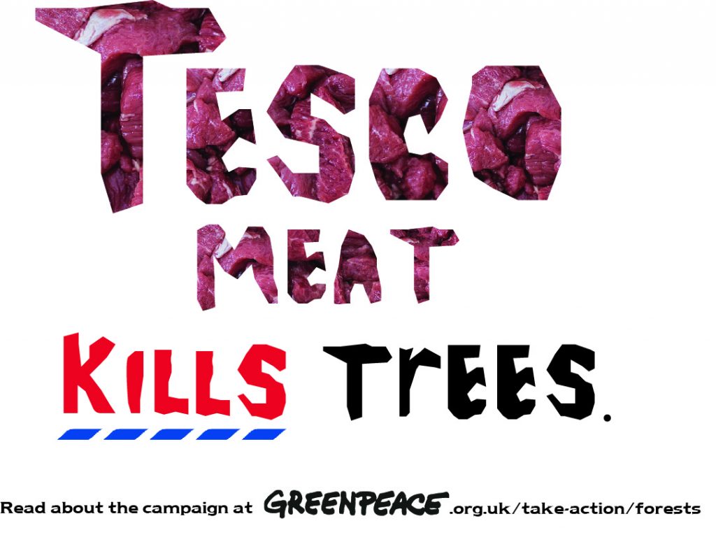
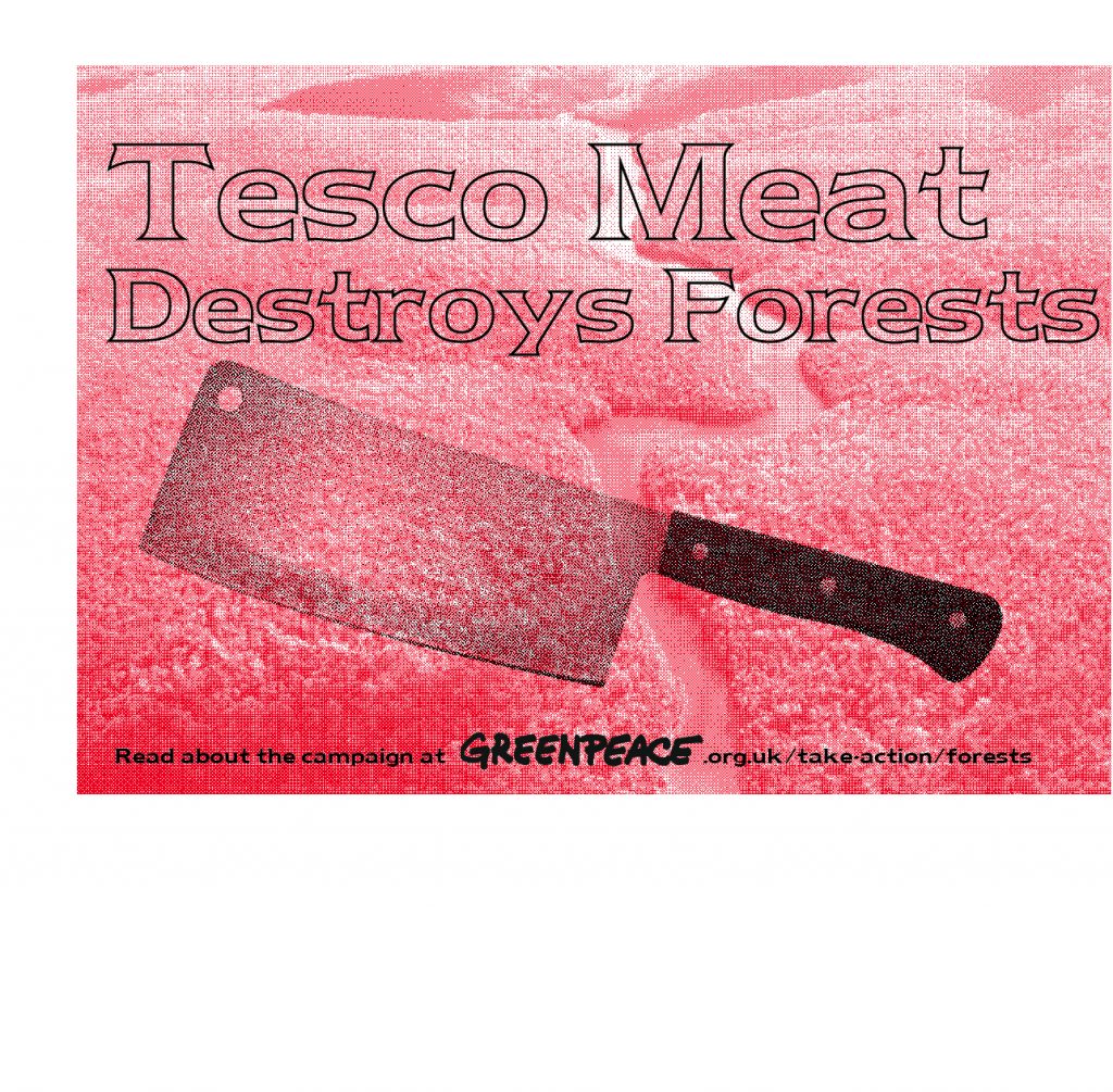
I placed the image of raw meet within the ‘Tesco meat’ type. I felt it has a good shock factor. I drew these letters with the mouse on Illustrator, which is what gives it a ragged look. I didn’t realise that the ‘r’ in trees is lower-case. This was not intentional.
I would next time, change the line ‘Read about the campaign…’ to a different sans serif font.
3)
The simplicity of the poster works well. The bitmapped effect was good.
4)
I could keep the river red and make the forest green or greyscale. (My classmate didn’t notice at first that the background image was of the Amazon). Another option is to remove the trees all together and just keep the river.
The text doesn’t work so well, it could be black instead. I could choose to use the bespoke type as well.
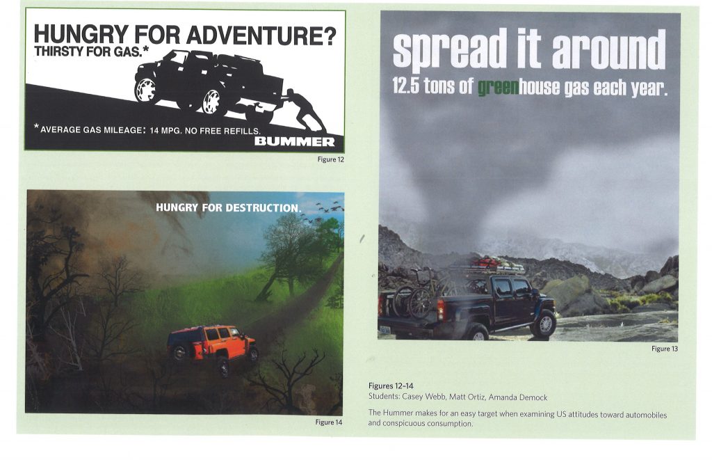
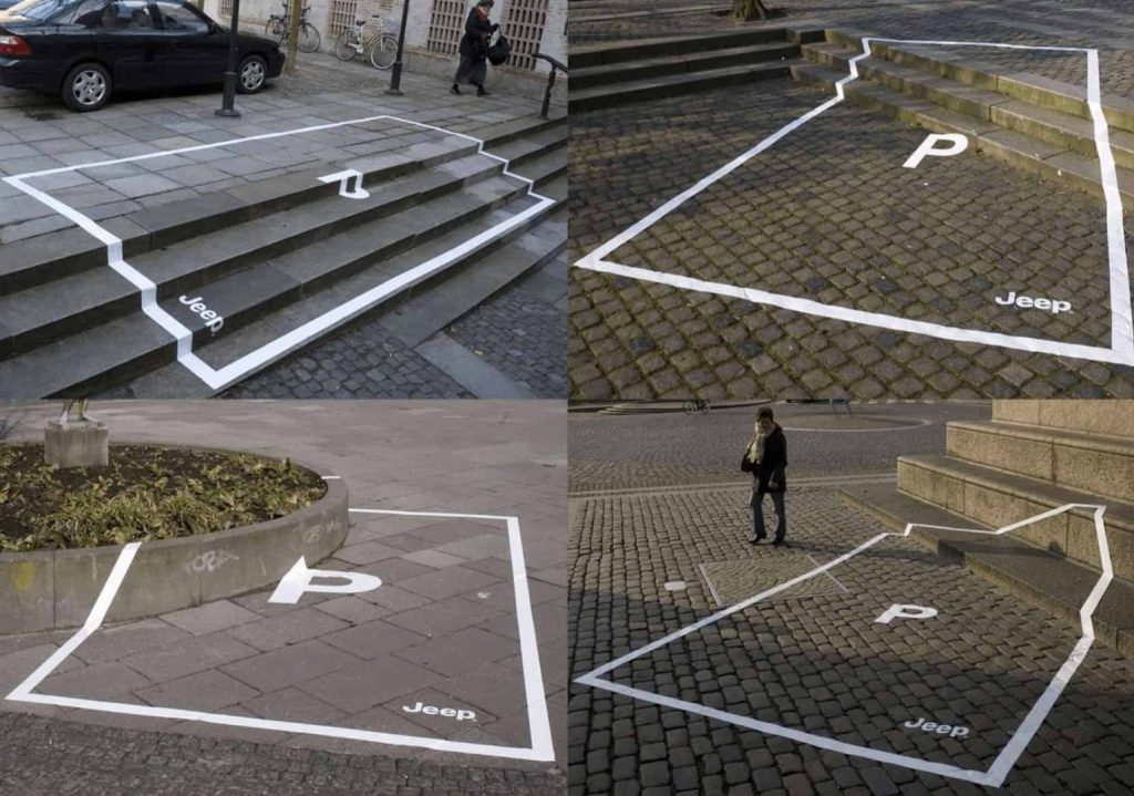
These designs, from students explore the effect of motor vehicles on the planet. The illustration (bottom, left) expresses the message clearly and the tagline supports the image. The simplicity of the right-hand image makes it easy for the viewer to take in.
