From the brief:
Task 1: Strategies for employing handwriting
We all develop knowledge of how letters and words are formed at a
very early age. However the way we execute the individual strokes will
change over time and under changing conditions. In this task you are
asked to deliberatively exploit these practical implications by conducting
research into ways that the appearance of writing can be strategically
effected using different media. Write out your sentences using as many
different media as you can, exploring ways that you can strategically
alter the form of the writing: e.g. use your left hand; attach the media to a
long stick; write as small as you can, then scan and blow up the result.
Letters
I used this method from the un-creative writing brief:
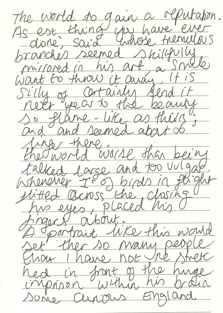
Option 2: Cut ups—
Take a piece of text (newspaper/magazine article, a page from a
novel, a poem etc). Cut the page up along the lines of a 4 column
grid. Arrange the pieces randomly and read across the pieces.
Type out and arange the sentences that you find interesting.
I cut out the first page from The Picture of Dorian Gray novel. After cutting it into four and aligning the text, I created new sentences.
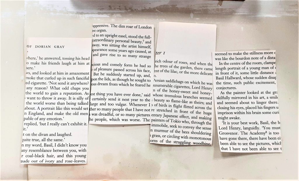
I wrote down these new sentences in my notebook as a block of text:
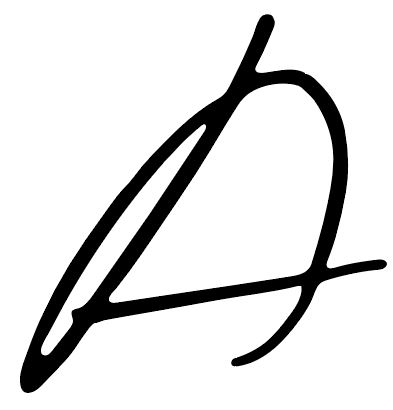
Looking at the page, I liked the appearance of the handwriting. I wanted to see how each letter would read individually. To do this, I cropped this ‘A’ from the page:
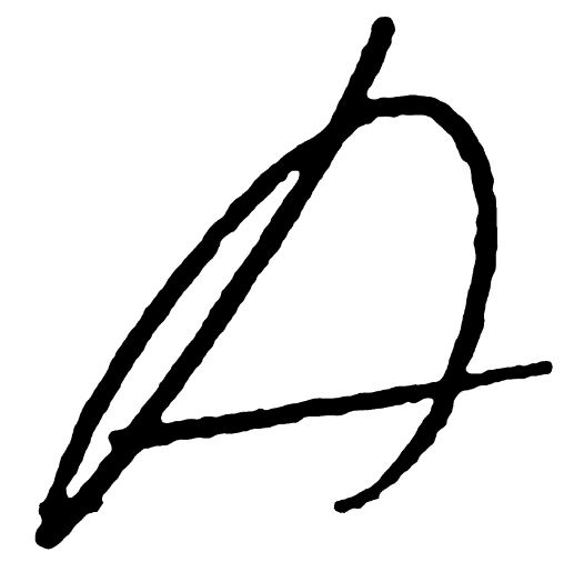
I turned the image into a vector and this was the result.
I used the smooth tool in adobe illustrator to smooth out the outline.
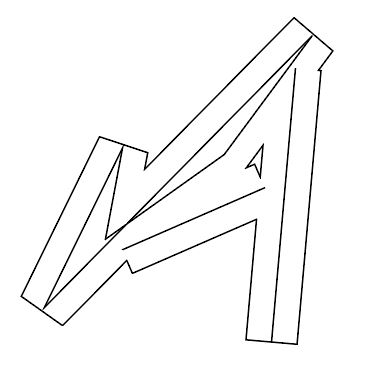
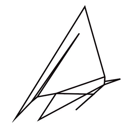
I found that rotating the shape could also produce a legible letter form.
By selecting Image trace, I could transform the vector into an outlined image.
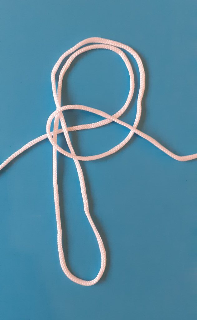
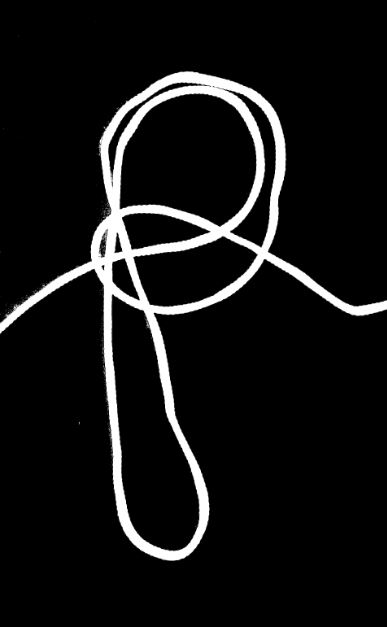
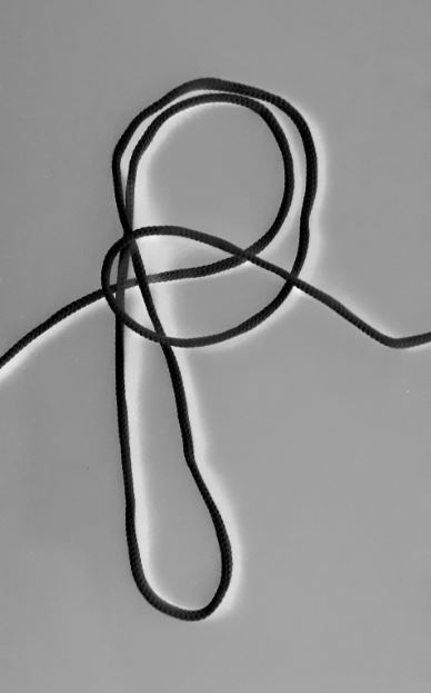
I used a piece of string to form the letter ‘P’. I photographed this letter, then edited the photo in photoshop:
Words
Task 2: Stenciling and cutouts
Stenciling is based fundamentally on the interplay between ‘figure’
and ‘ground’, or ‘positive’ and ‘negative’ space. Using thick paper
and/or card, create a collection of visual research pieces that explore
how acts of writing and typographic composition can be made to
emerge from material using cutting tools (scissors and scalpel). Both
of these tools will afford different cutting effects; for example a scalpel
will offer the potential for more targeted, precision cutting but can
be difficult to control, whereas scissors offer more control, albeit on
a continuous line. Think about how these affective qualities might
inform the outcome, and how positive and negative space – cutting
letters ‘into’ or ‘out of’ space – can be manipulated.
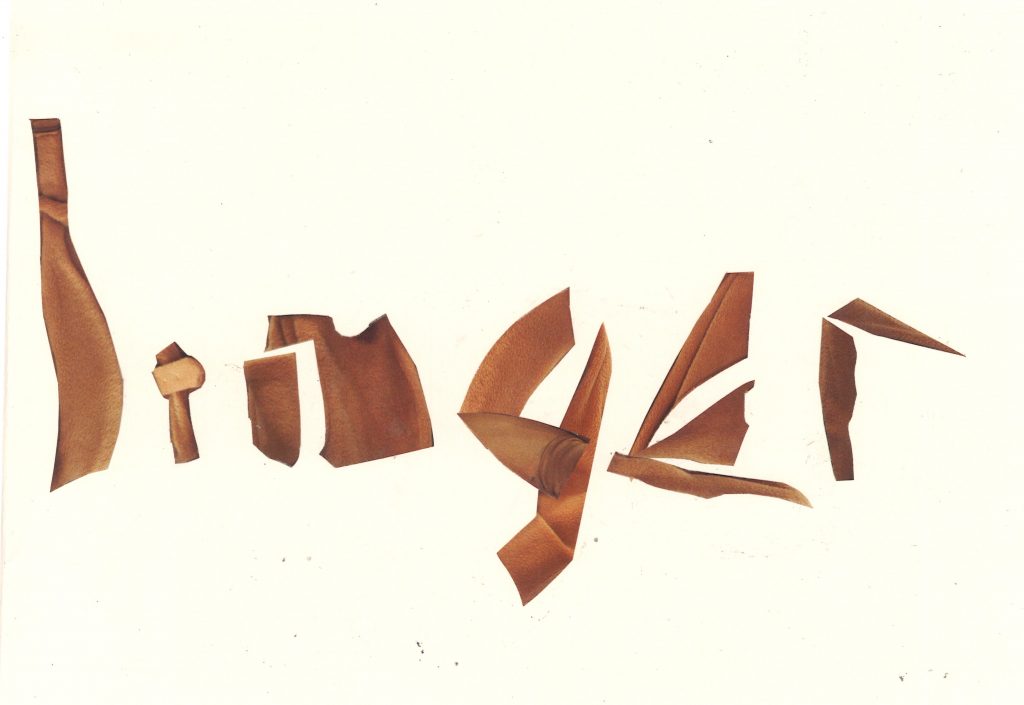
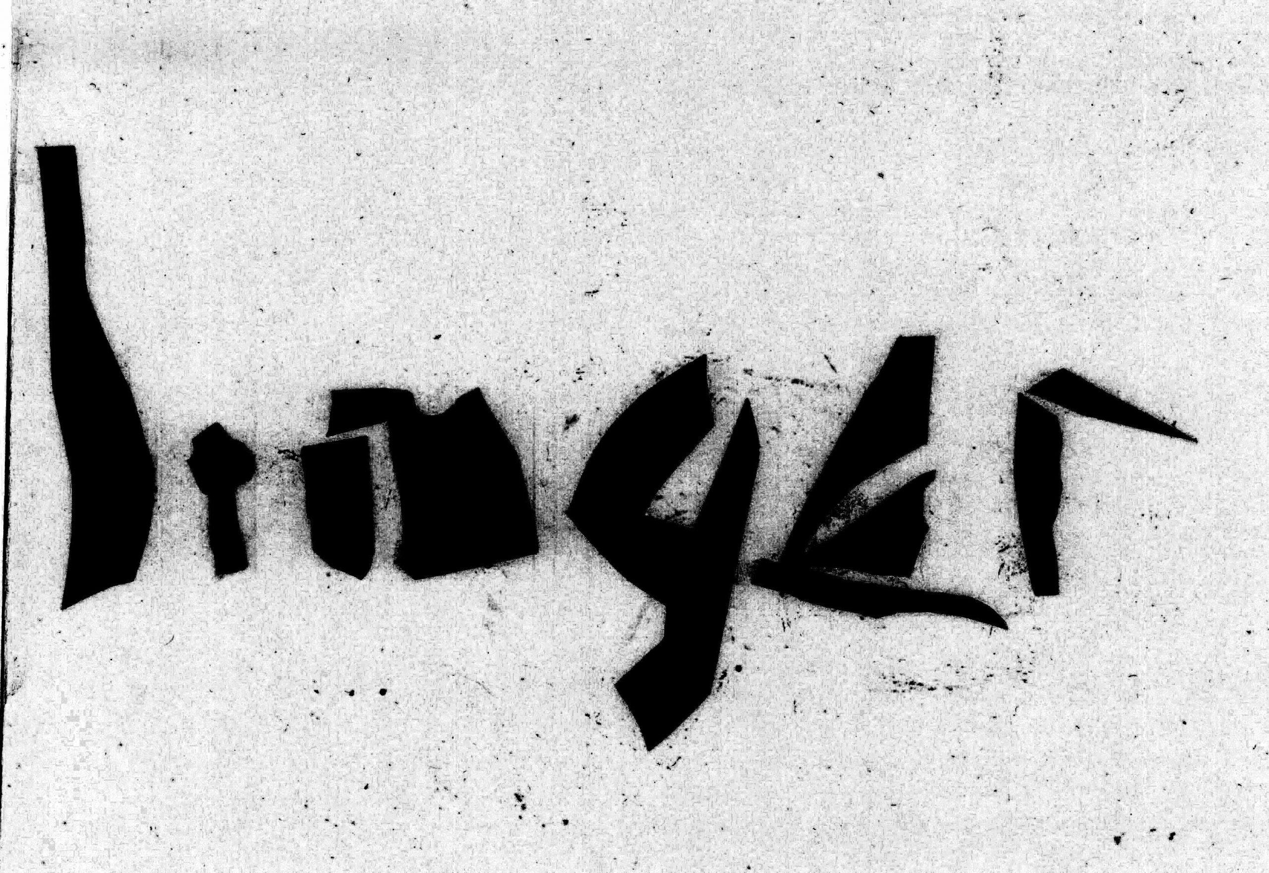
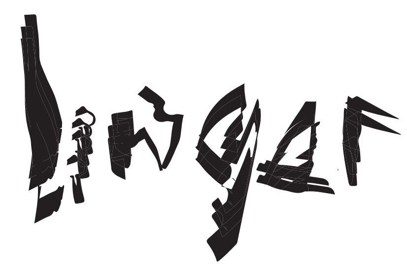
Using scissors, I cut around these shapes in a magazine. The image was of a lady’s brown jacket. I followed the shapes and curves in the image. With the pieces, I moved them around to make out the word ‘Linger’. I found the word amongst my previous Un-creative writing exercises.
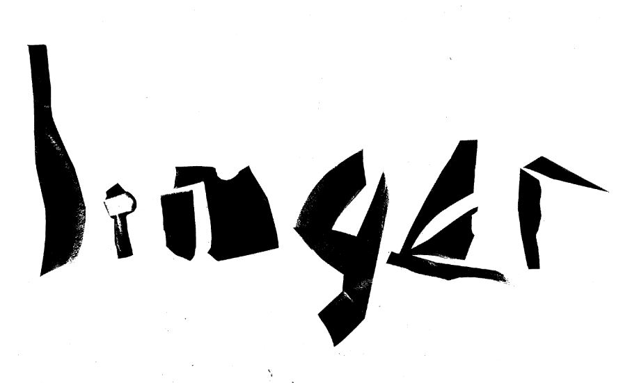
I then scanned the image and opened it in photoshop to edit. I adjusted the levels so that I ended up with solid shapes with no texture for each letter. This allowed me to see the shape of the letters better than with the original collaged letters.
Playing with the image on adobe illustrator, I multiplied the individual letters:
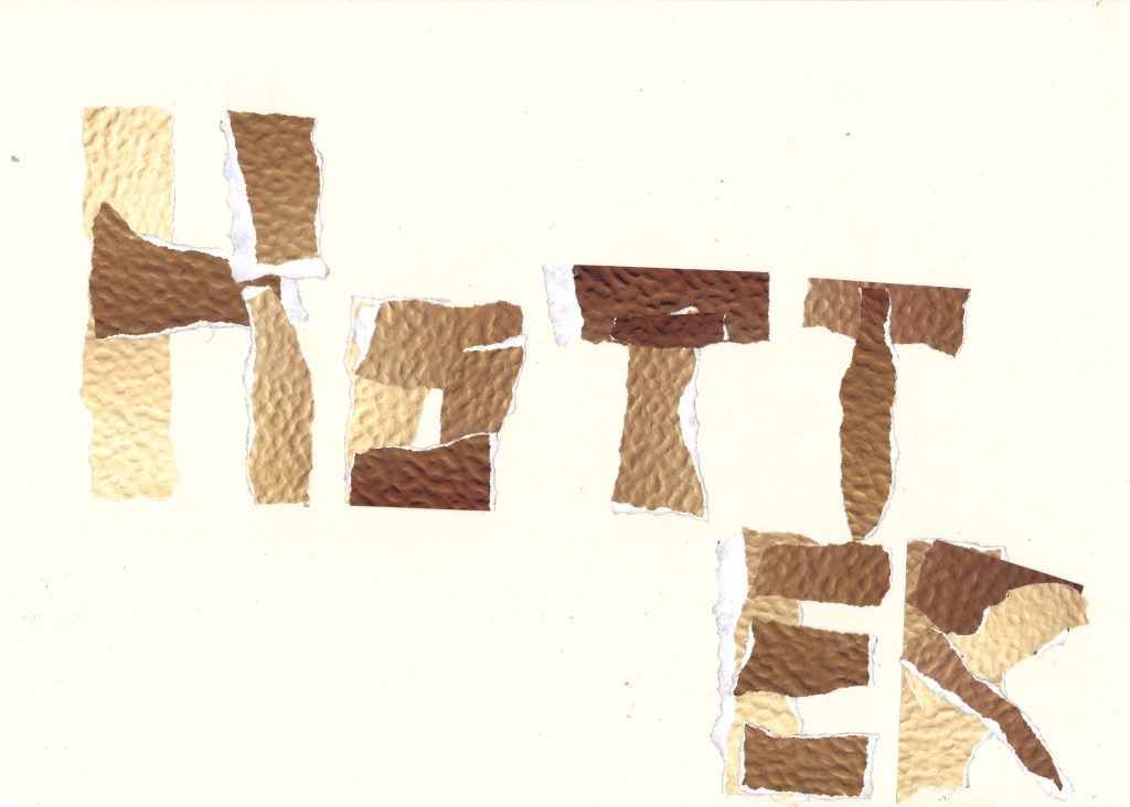
I experimented with tearing paper. I was inspired by Braulio Amado’s rough analogue style. I first tore up the paper from a magazine, then arranged them to form the word ‘Hotter’. I chose this word because of the mostly straight lines of the letter forms. I was also inspired by the colour and texture of the magazine image.
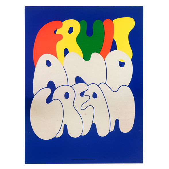
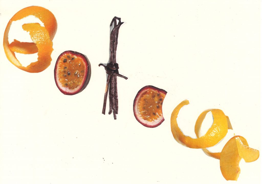
I picked out the word ‘Colour’ from the list of sentences suggested to us by our lecturer. I then used a page about fruit to spell the word:
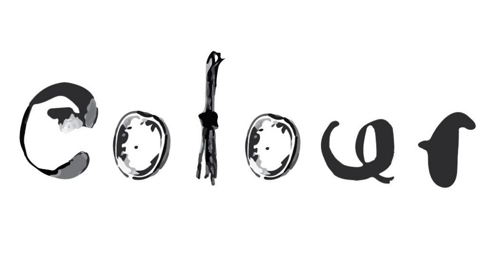
I edited the word in adobe illustrator. By transforming the word into a vector, I could remove areas that were not helping the design. For example, the ‘L’ looks less like an ‘L’ in the above collaged type. Removing some of the detail, improved this letter.
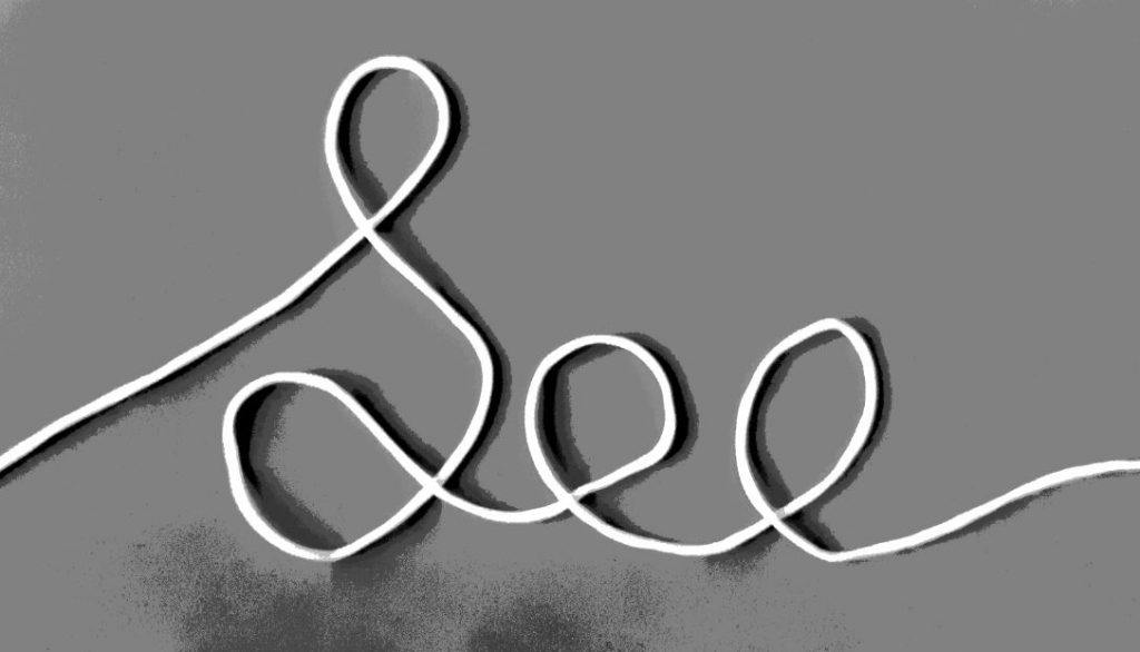
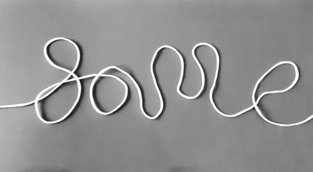
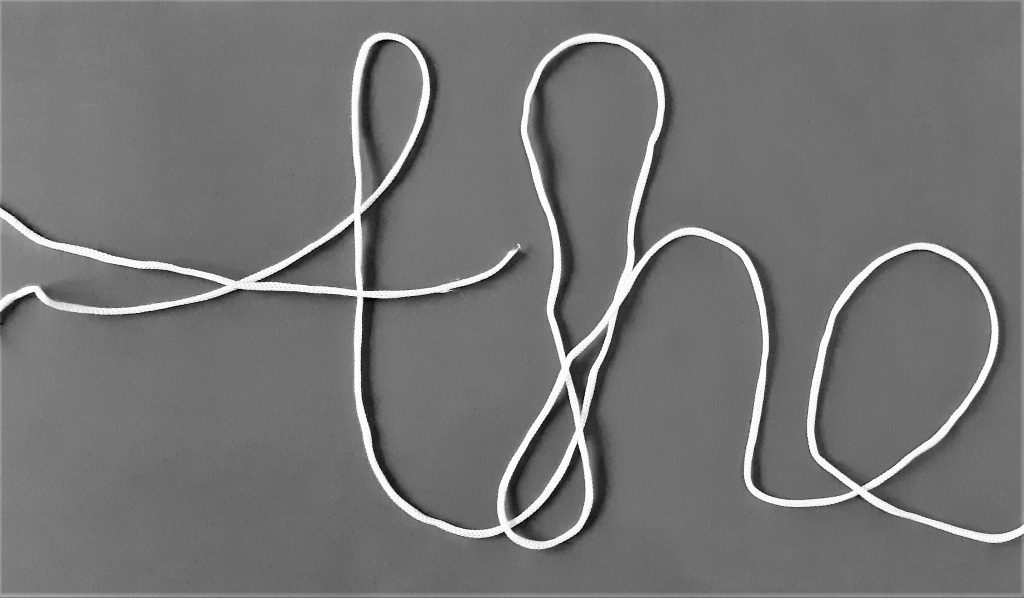
handwritten string type.
I formed words using string and photographed them. I adjusted the levels in photoshop to make the form of the string stand out by emboldening the shadows.
Cut-out type.
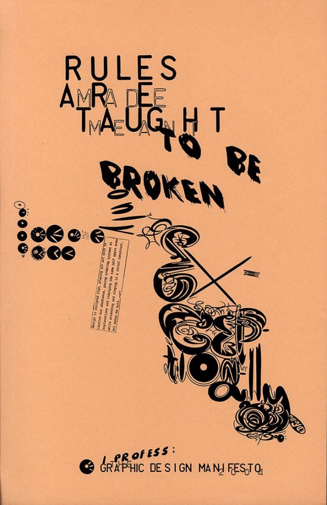
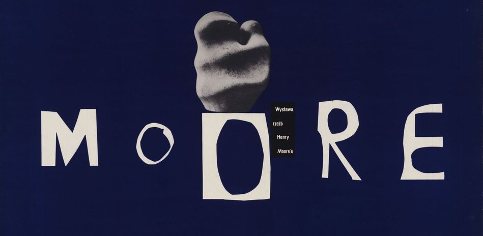
I was inspired by the Moore poster by Henryk Tomaszewski, to cut words from paper.
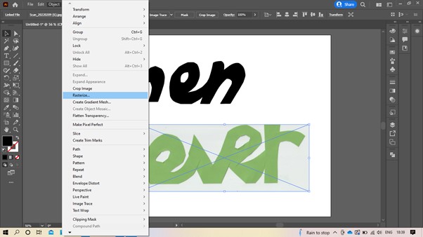
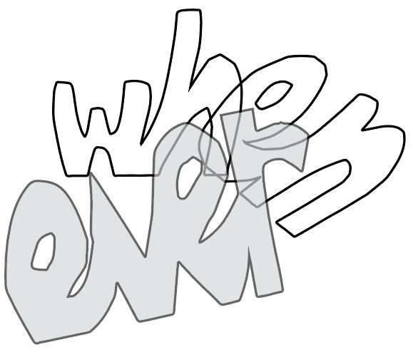
I used a pair of scissors to cut the word ‘Whenever’ out of green card. The thickness of the card meant that the letters held together well. I didn’t use any guide or pencil markings. I simply cut the letters out free-hand:
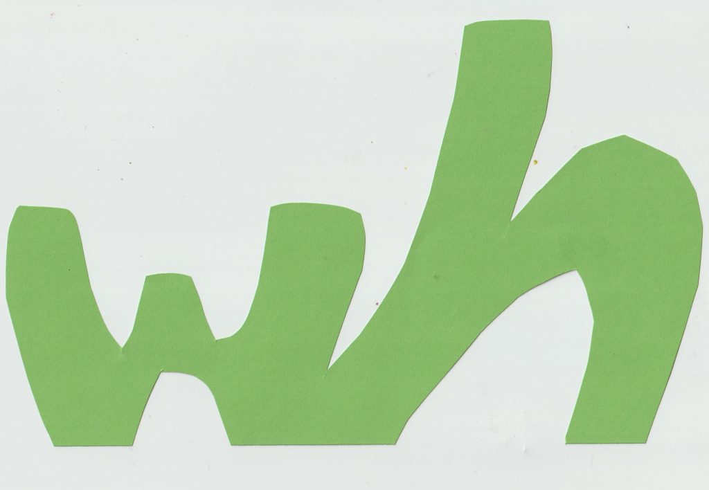
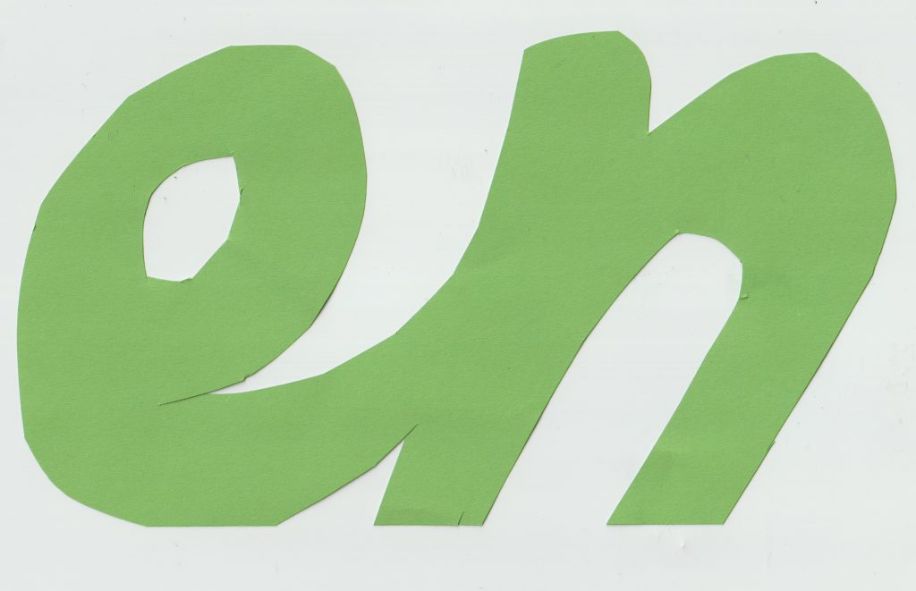
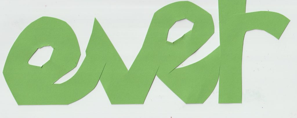
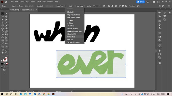
I scanned the letters onto the computer and opened the image in illustrator. I transformed it into a vector and selected image trace and then silhouette.
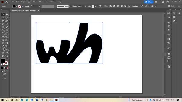
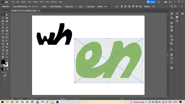
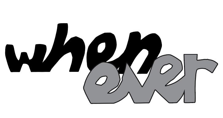
I kept the shape of the cut -out letters and re-arranged them digitally. I coloured ‘when’ black and ‘ever’ grey to show the separate words within the word:
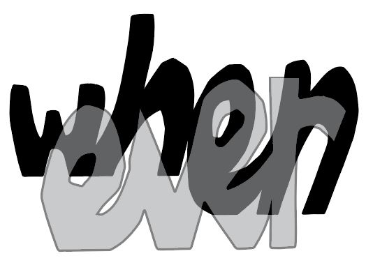
(below) I stretched the letters vertically. I decreased the opacity of ‘ever’, so that both words could be read together with a layered effect.
(below) I increased the stroke of the letters to allow the separate letters to be picked out visually.
Sentences
In week 3, our lecturer suggested the following sentences to be used in our workshops. I sometimes used these sentences, sometimes just took words from them and other times used my own sentences:
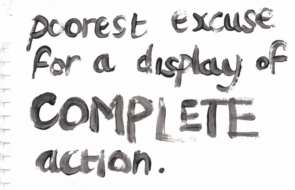
I picked a sentence from the group to create this handmade type:
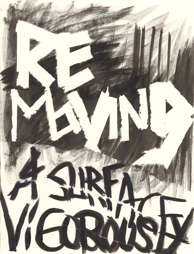
The sentence lends itself to this workshop, because it creates the imagery of different textures. I used masking tape to spell the word ‘removing’. I then added ink and pulled off the tape once the ink had dried. I then wrote the rest of the sentence with a brush and black ink. I also tore the bottom of the page and stuck it back on to create more texture. These spontaneous markings would be harder to create digitally.
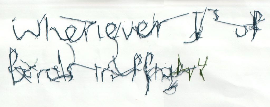
I took this sentence from the Un-creative writing cut-up exercise:
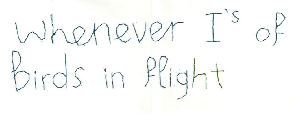
I used a needle and thread to stitch the words into white card.
I then scanned the back of the page to reveal the stitching behind the page. I then flipped the image in photoshop. I liked the strangeness of this unintentional effect.
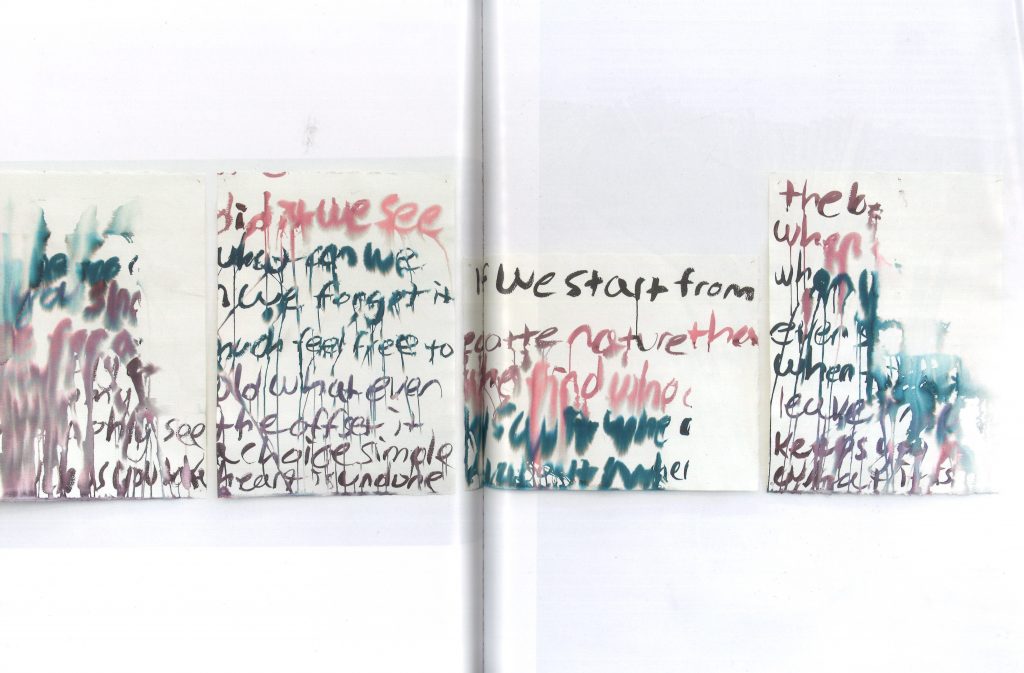
I used a nail polish and brush to write these sentences:
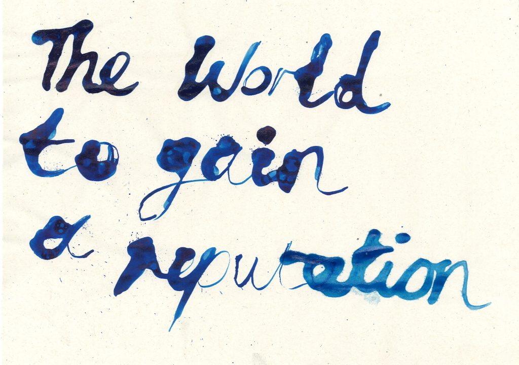
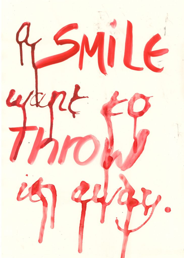
I also used ink and pipette for this experiment. The difference is, this ink was more watery and therefore dripped more easily. I took advantage of this and purposely tipped the page.