Project #3 Looking & Recording

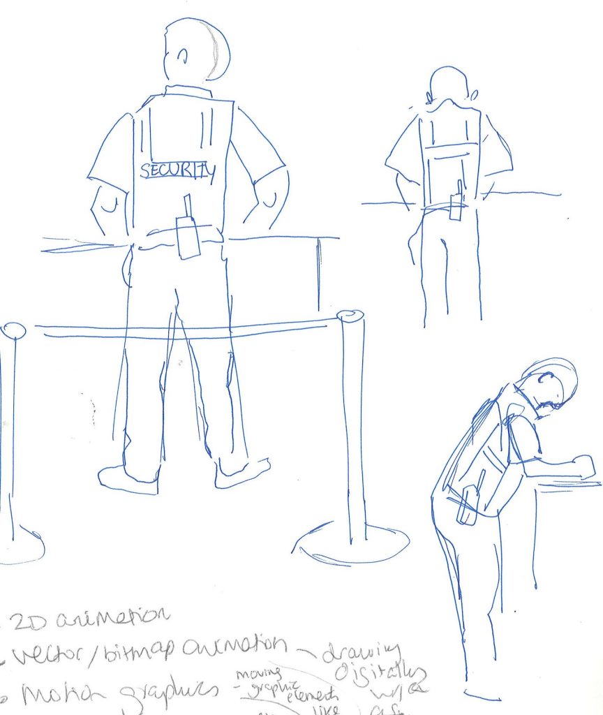
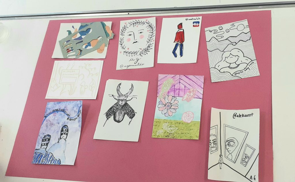
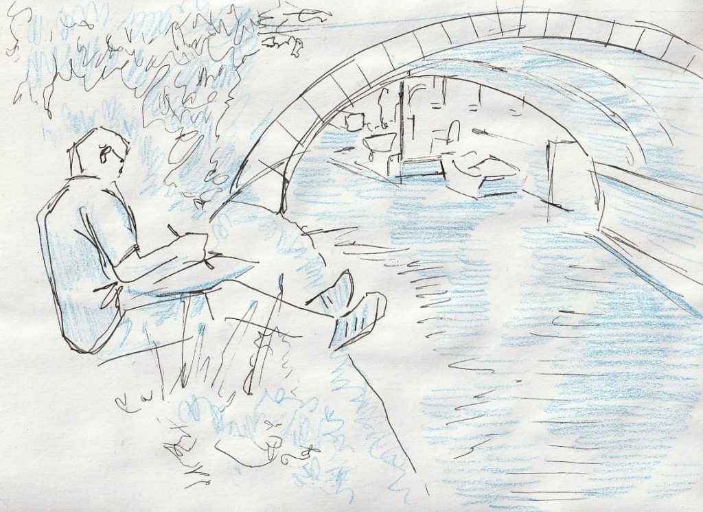
This part of the summer project asks us to use our sketchbooks to look and record our found objects. This is a process I am familiar with. I regularly use my sketchbook when at home or out and about to record the world around me. This month I joined the Oxford Urban Sketchers group and took part in drawing sessions at Osney Lock and Folly Bridge. (The Urban Sketchers are a drawing organisation who gather in cities all over the world).

I used black coloured pencil and watercolours to record the many colours and textures of the river, boats and other details. I used black pencil because I feel comfortable with it and I like the bold markings as well as the soft texture it produces.

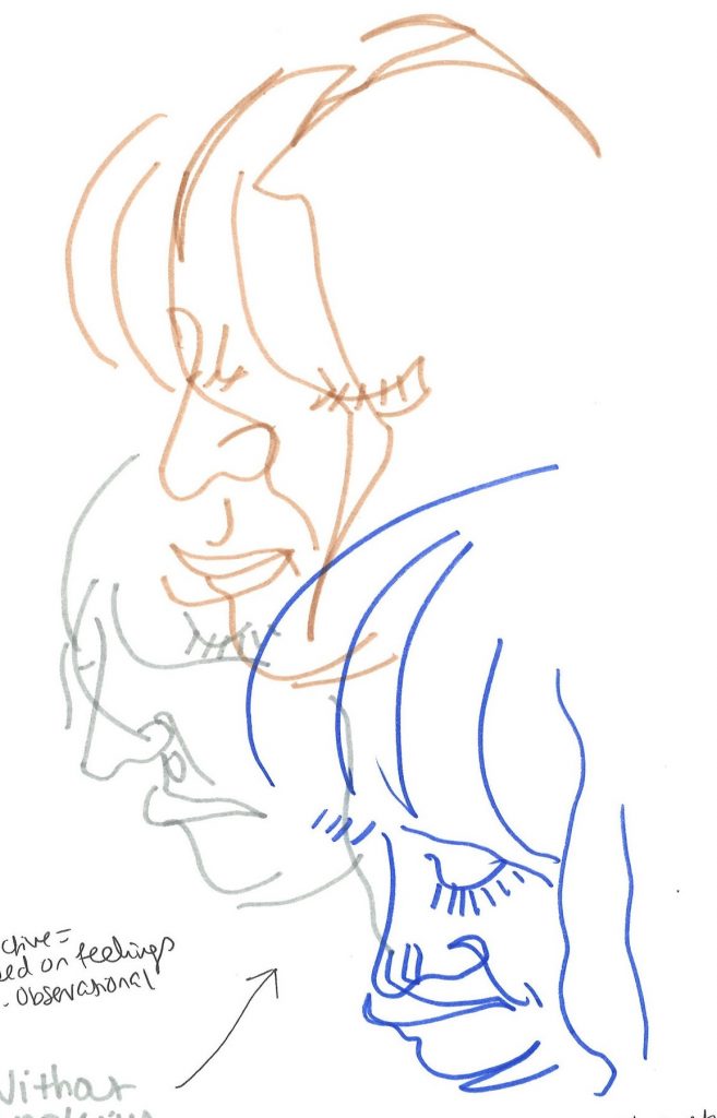
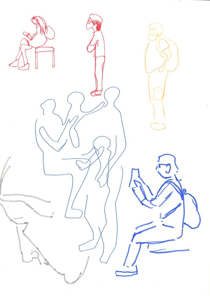
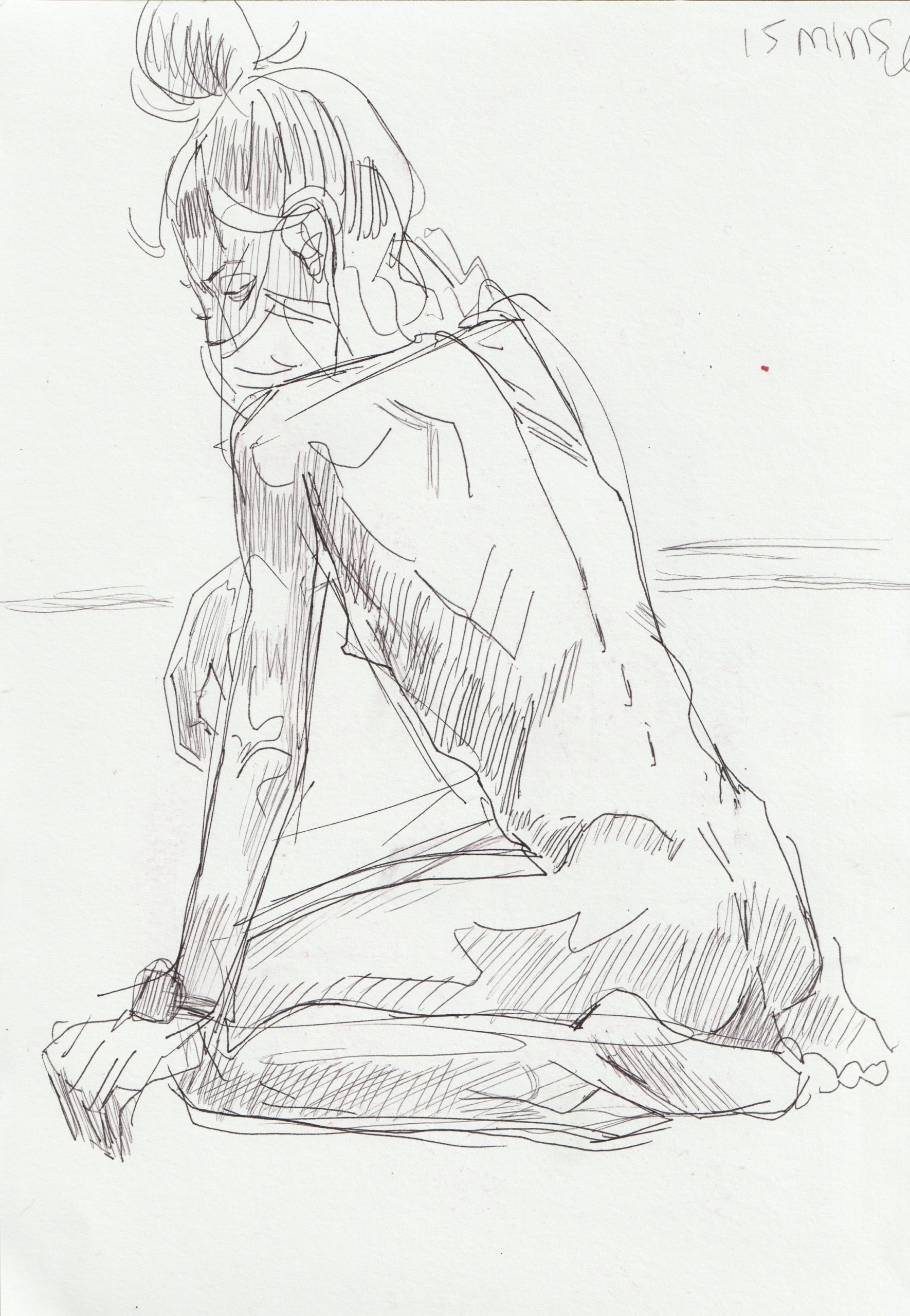
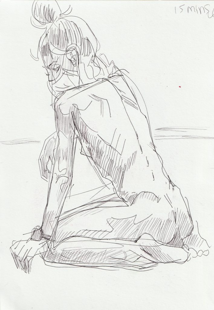
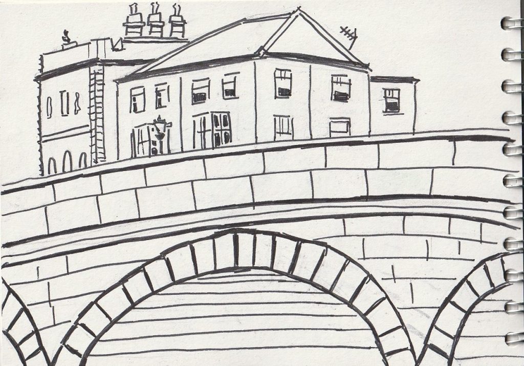
When drawing at Folly Bridge, I used 3 different approaches to what I saw. My process is usually intuitive and I don’t have a plan when I set out to sketch. For example, for the first drawing of the day, I used a black fine tipped marker. This was for 2 reasons.

  1. The sun was so bright that it made it difficult to see the scene and the drawing. Using pen allowed me to see clearly what I was drawing, as I also needed to wear sunglasses due to the brightness.
  2. The pattern of the bricks inspired me to go bold. Along with the geometric lines, I knew a pen would help to bring out the patterns.

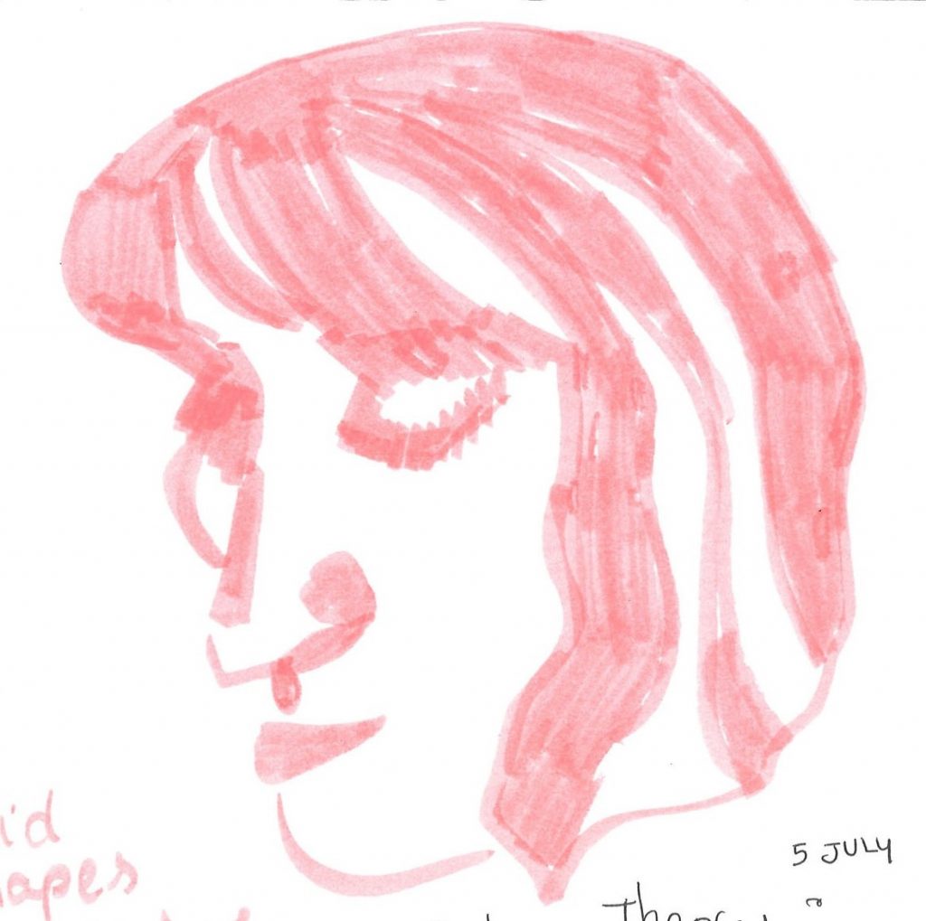
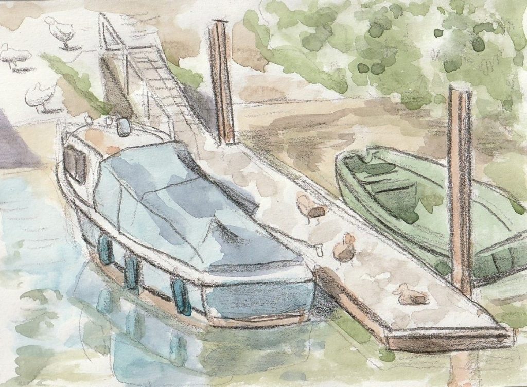
I then moved onto this scene of boats moored on the bank. They looked happy and tranquil. I chose watercolour to pick out the variety of colours: the blue of the boats, the green of the bushes and river and the brown of the wooden decking.

After laying down the colours, I went back over the drawing with a blue coloured pencil. This allowed me to define the shapes and highlight the blue of the boats.
For my final drawing of the day, I captured a fellow sketcher at the river. I used a fine liner pen and blue pencil to sketch the scene. I found the man looked very peaceful and also I had moved to a shadier spot this time. The coolness of this position inspired me to use blue and the calmness of the scene inspired me to be gentle with my materials.

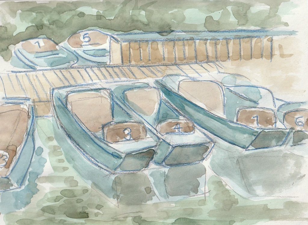
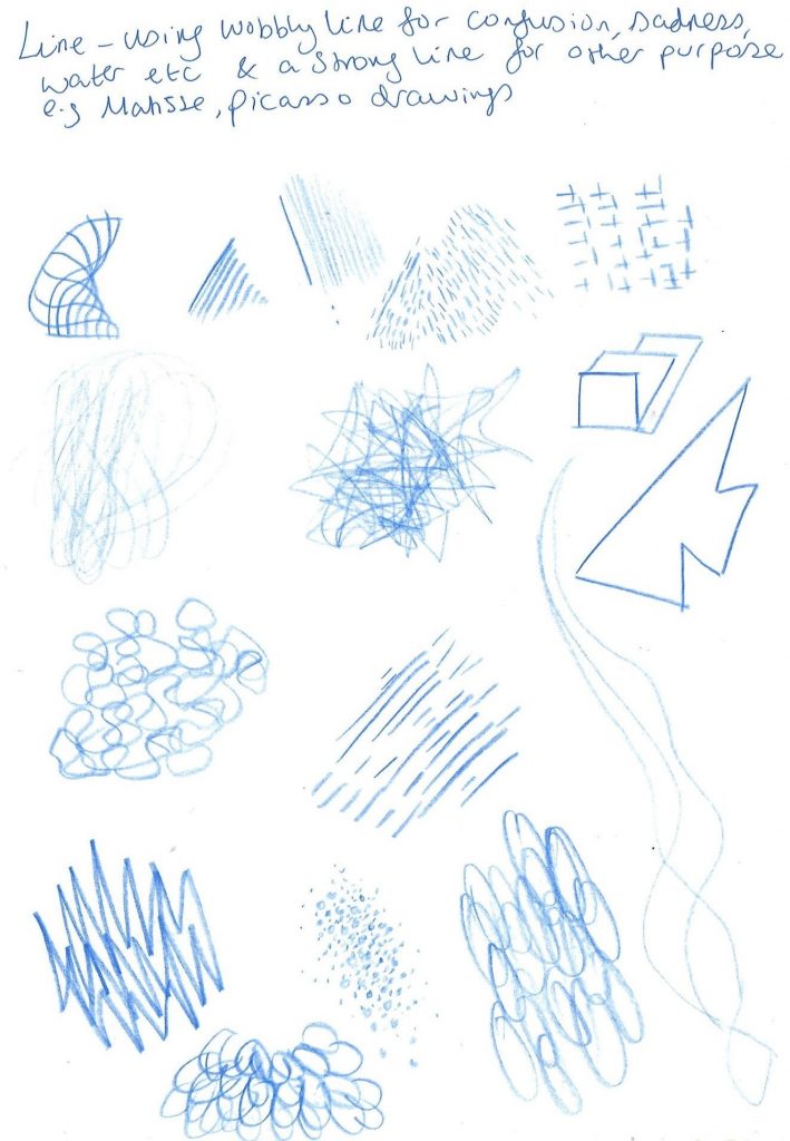
As you can see, I always let the subject inspire what materials and methods I use for the picture. This is usually the mood combined with the texture I want to capture. For a watery scene, I will usually reach for watercolour paints.

Applying drawing to the theme of nature:

At the Botanical Gardens in Oxford, I tried some observational sketching. I chose a brown pencil to reflect the earthly theme and create soft markings to reflect the soft texture of the plants. This is page 1 and 2 from a double page spread in one of my sketchbooks. I focused on capturing the variety of plant species in the rock garden. I was amazed by the many colours, textures and shapes of these plants that share the same habitat.
line drawing of lilies in my sketchbook

When approaching the drawings for the summer project, I looked at artwork mostly by illustrators, to learn from their process of looking and recording.

Secondary Research

Helen Hancocks

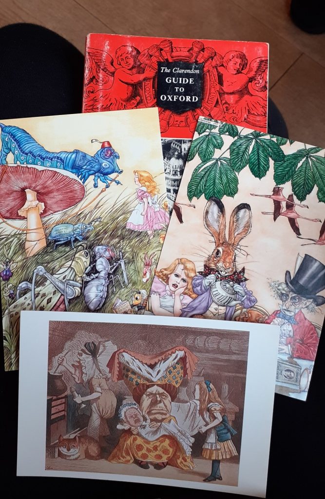
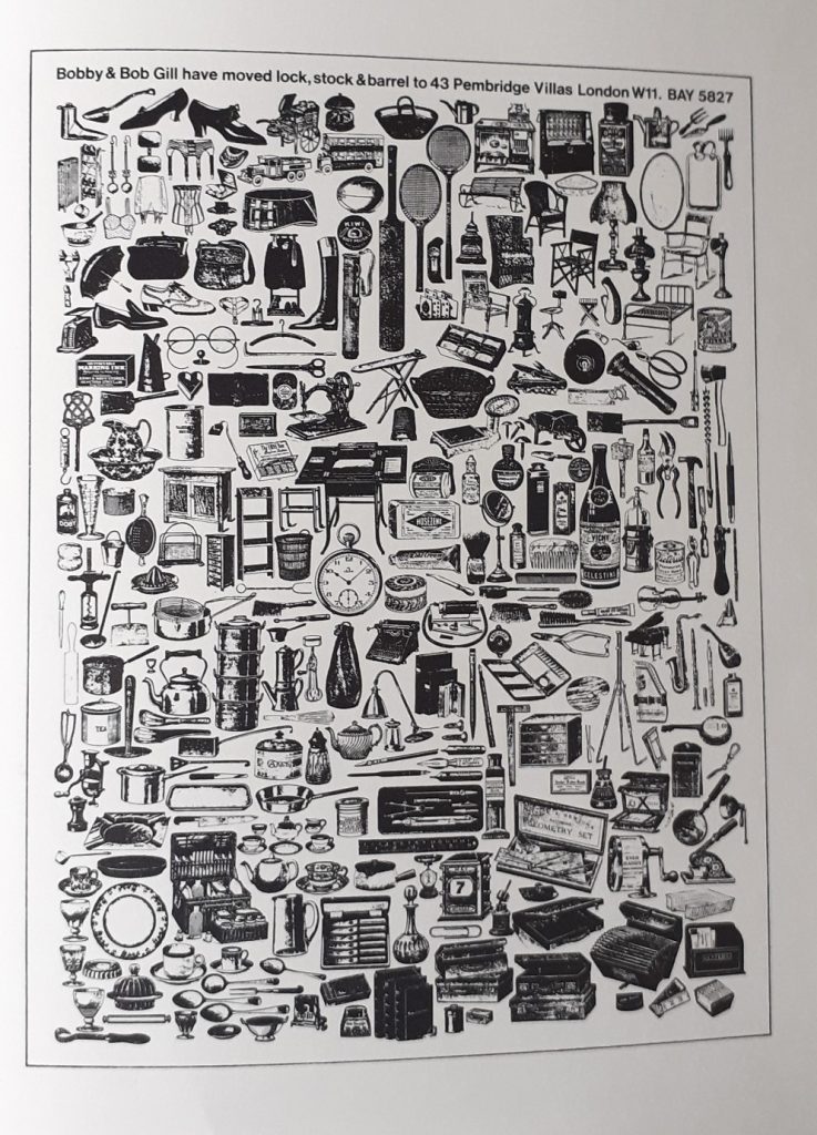
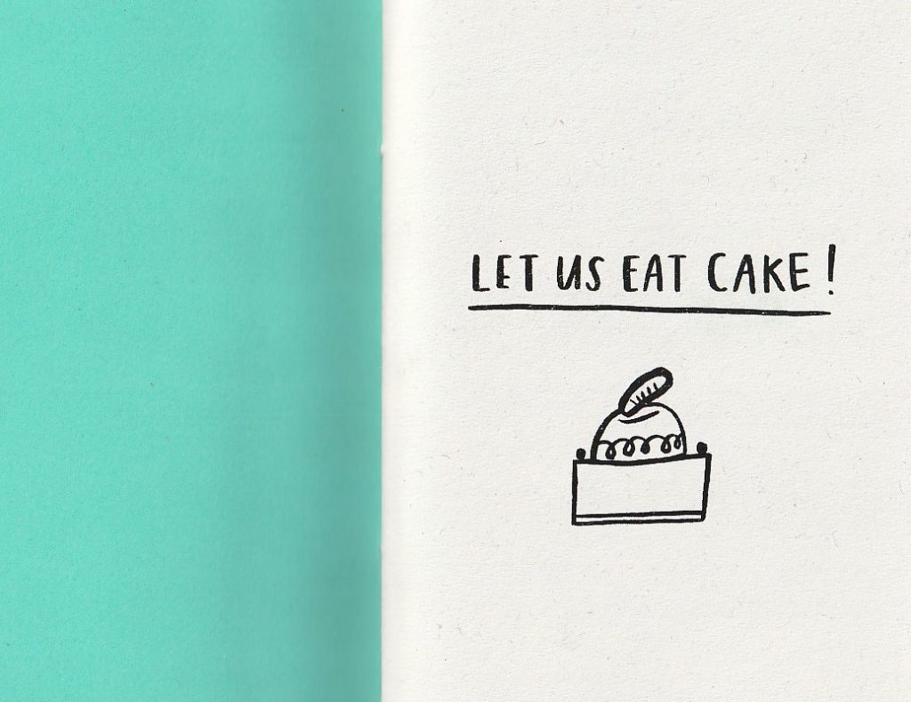
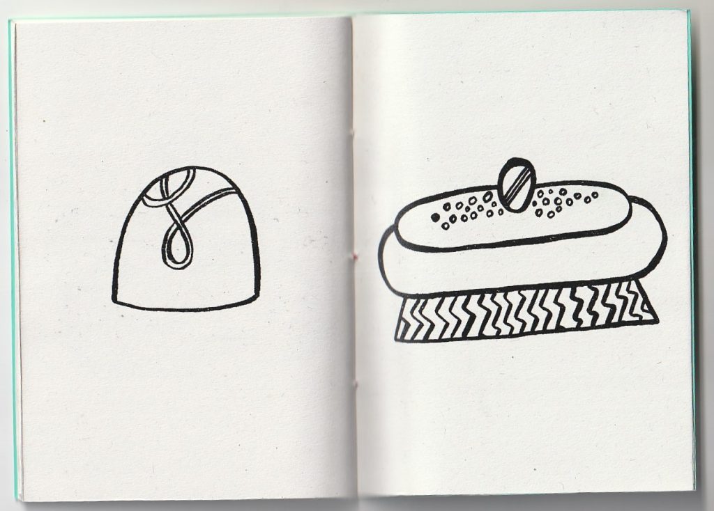
When at the Illustrator fayre at King’s Cross in London this summer, I had to pick up this zine by the illustrstor Helen Hancocks.

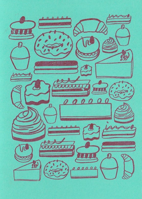
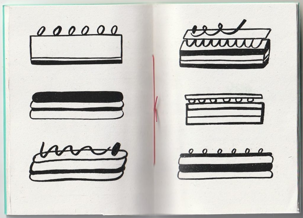
The zine has no narrative or text, simply drawings of cakes and sugary food items! The simplicity of the zine designs makes it bold and rememberable. The lack of colour makes the images easy to view and the booklet cheaper to produce. The only colour is on the front cover (see images).

Her line is bold and confident, which is the appeal. The pen flows across the page and the result is imperfect but full of character. The illustrations are sometimes 2-dimensional (see the eclair drawings below).

Let Us Eat Cake, (Zine title page)
(Zine front cover)
(Zine spread) Hancocks includes areas of block colour to create some depth and solidity.
(Zine spread) Here, she leaves negative areas where the viewer can imagine colours.
Ryn Frank

Looking at this particular set of drawings by Ryn Frank, I get a sense of the artist’s personality. She has been quite loose and playful with her line. For example, the cup at the top, centre, doesn’t have perfect proportions, if this drawing was used as a design drawing for a real cup, that cup when made would not stand on the table. But this inaccuracy doesn’t make the illustration ‘bad’. This is something I learned at UAL. Adding a personal touch to an illustration will make the viewer enjoy it more and make your work also stand out amongst others.

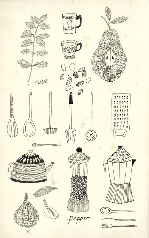
Here she has used the same thickness of line, filling areas in with patterns or block colour to add interest. The patterns she has used are varied from stripes to circles, whichever is appropriate to the object. She also uses negative space to give the eye a place to rest and break up the business of the patterns. Her drawings have a 2D element to them, but this doesn’t hinder us understanding what the drawing is of.

Charlotte Trounce
Insects drawn from collections at the Natural History Museum and Pitt Rivers Museum

Illustrator Charlotte Trounce produced a series of over 100 illustrations to promote the national art pass, for the magazine it’s nice that. She used the same black brush pen for all the drawings. It gives her work an expressive line, and in some drawings she used just one line to record the object.

Trounce added some areas of colour, but not too many as she didn’t want to ‘overpower the line work’.

Again, I like the loose quality of her style. The imperfections make the work really likable for me. The boldness of this medium shows confidence and clarity.
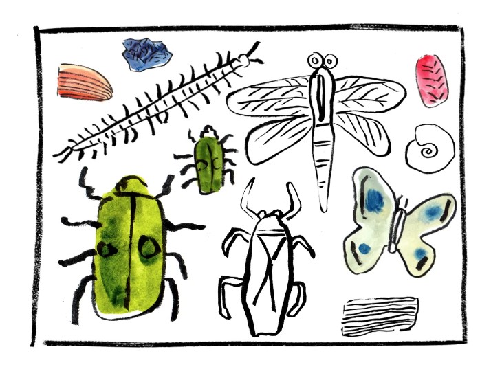
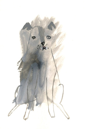
Rebecca Green
Rebecca Green, Mushroom Collector
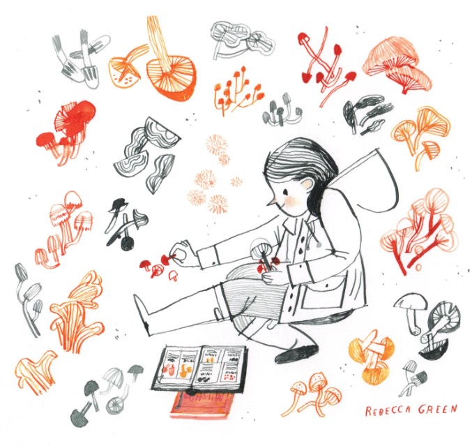
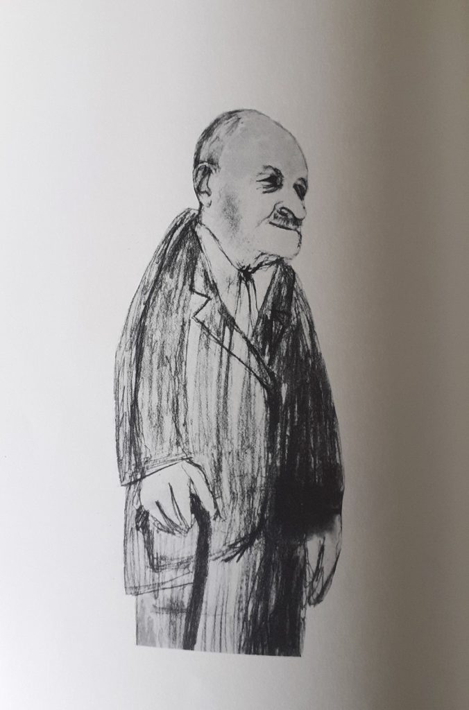
An example of ink illustration
Faye Moorhouse
Faye Moorhouse, Forty Faces

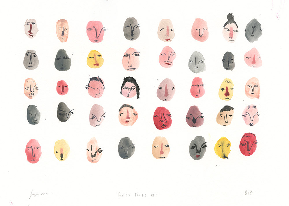
Gouache and ink illustrations. The faces sit in rows of even numbers. This ordered way they are laid out, balances with the fact that Moorhouse paints what she calls ‘wonky’ drawings of her subjects. The colour is laid out first, allowed to dry, then the faces are added on top. Adding the details afterwards, means the line remains clear to read.

Nina Chakrabarti
Nina Chakrabarti

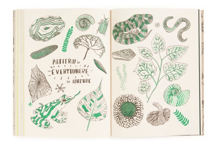
The use of green with the black and white drawings is an effective choice. Limiting the colour keeps us interested as an audience. Green in particular is an appropriate choice for the subject of nature. In this case, it helps us to guess the subject before we have read the line of text ‘Pattern is everywhere in nature’.

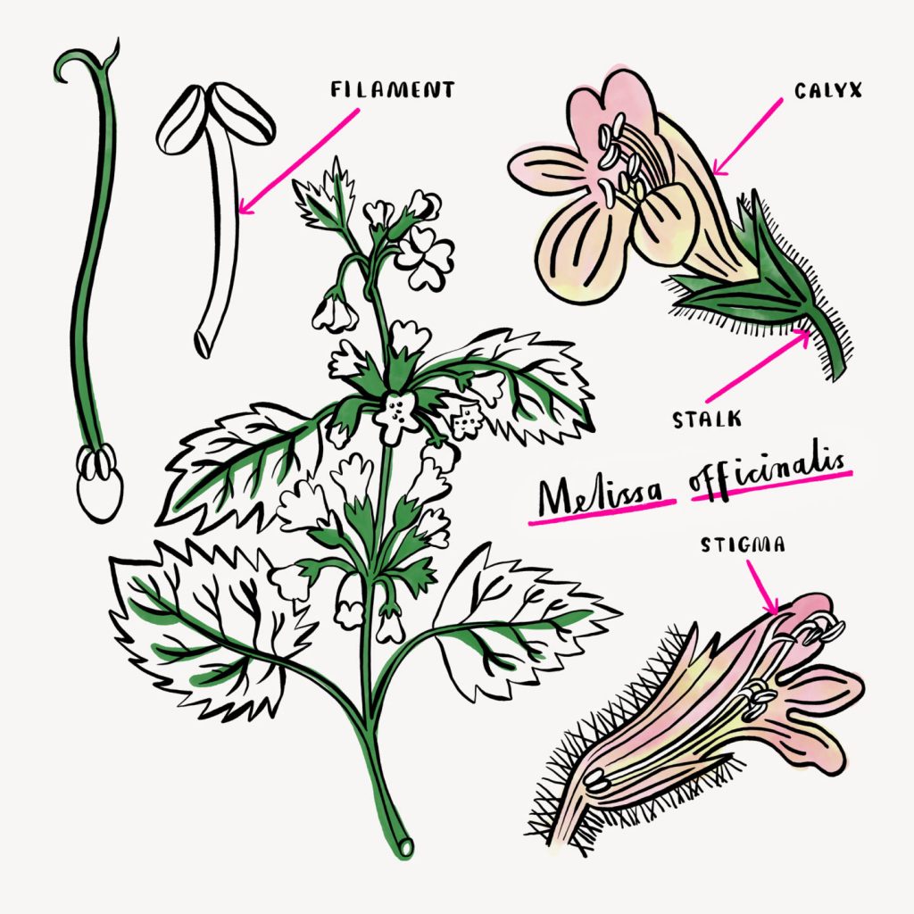
In her botanical illustration (below), she has used a thicker line, which I find unusual for the purpose, since botanical illustrations typically use a fine line to depict the tiny details of a plant. The labels are clear and therefore helpful. She has been selective with her application of colour, only adding what is necessary.

Botanical Illustrations for Albion

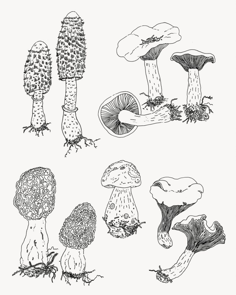
The illustration below for a London grocers is more how I would imagine botanical illustration. The time and the careful way Chakrabarti has drawn every detail of these mushrooms, is apparent. This illustration is more accurate that the previous work I have looked at in this post.

Any colour added would obscure the fine linework in this piece.

Food Illustrations for Melrose and Morgan
Koosje Koene

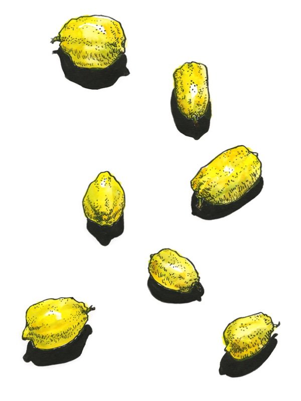
Koene uses mainly watercolour paint with a brush pen. Her sketches are vibrant, like this painting of lemons. The black shadows and bright yellow make the lemons look solid on the page. I like her use of mark-making to express the texture of the skin.

Koosje Koene

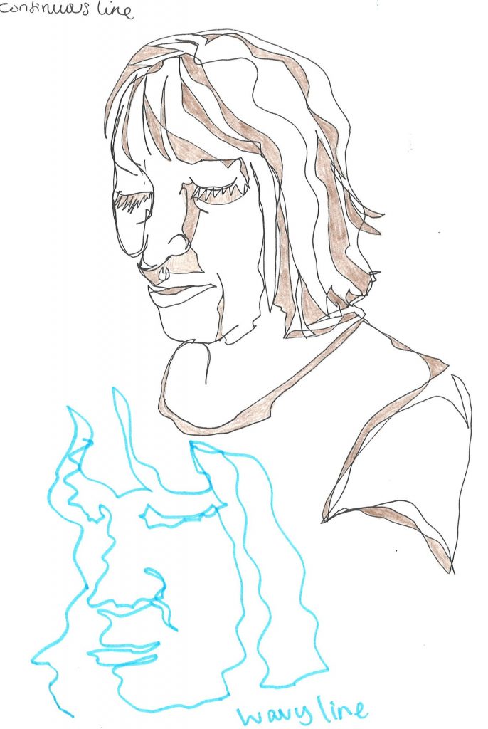
A continuous line drawing is used for this apple core sketch. This helps to sculpt out the shape of the fruit and the dips and curves. A broken line wouldn’t have had the same impact.

Primary Research

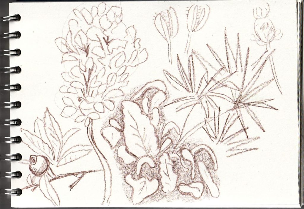
It was now time to turn to my sketchbook.

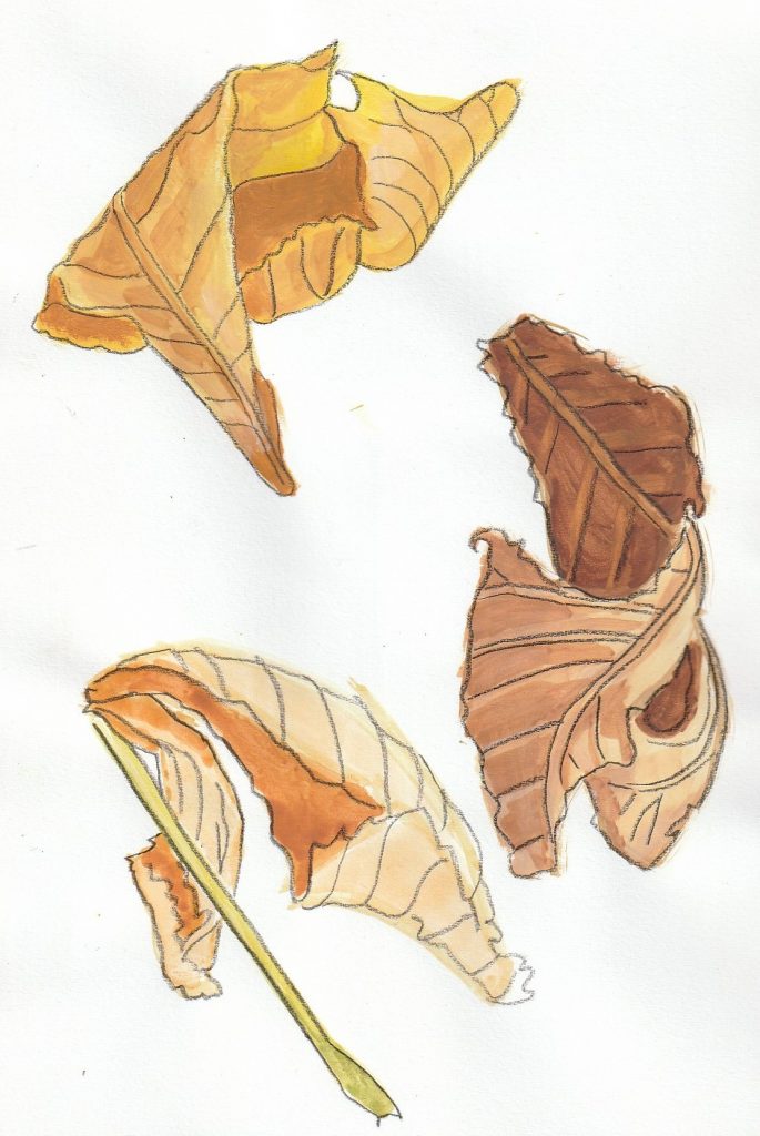
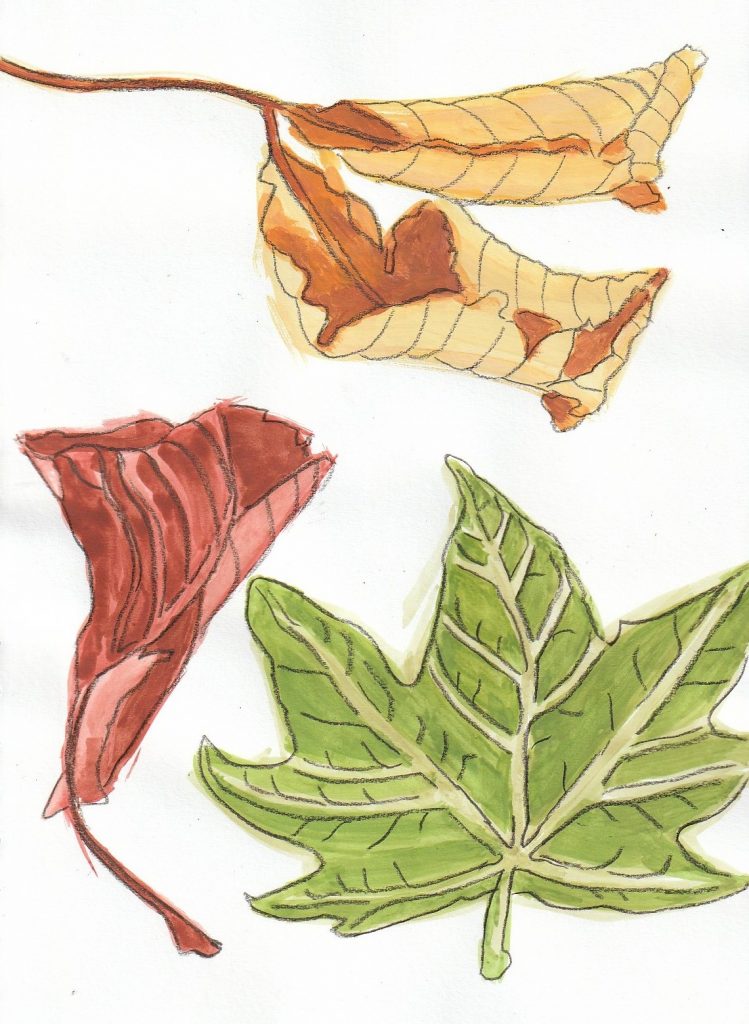
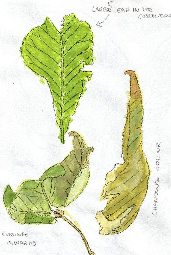
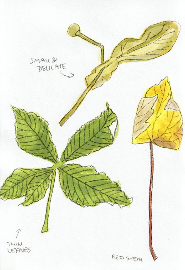
Taking photos of the leaves was a good way of recording the different colours, textures and shapes accuratley, but the process of taking photos didn’t allow me to absorb the subject visually. Photos are useful to keep as reference, but taking the photos takes a number of seconds. Drawing, on the other hand, requires the illustrator to explore the subject for a longer amount of time.

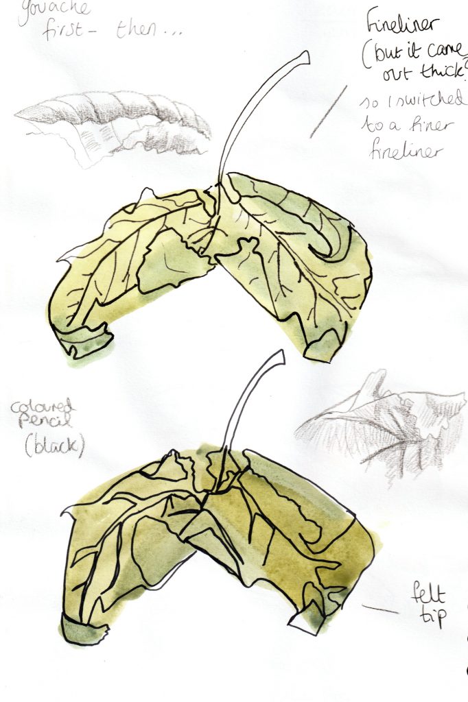
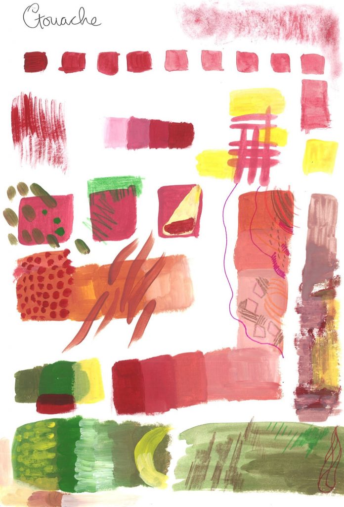
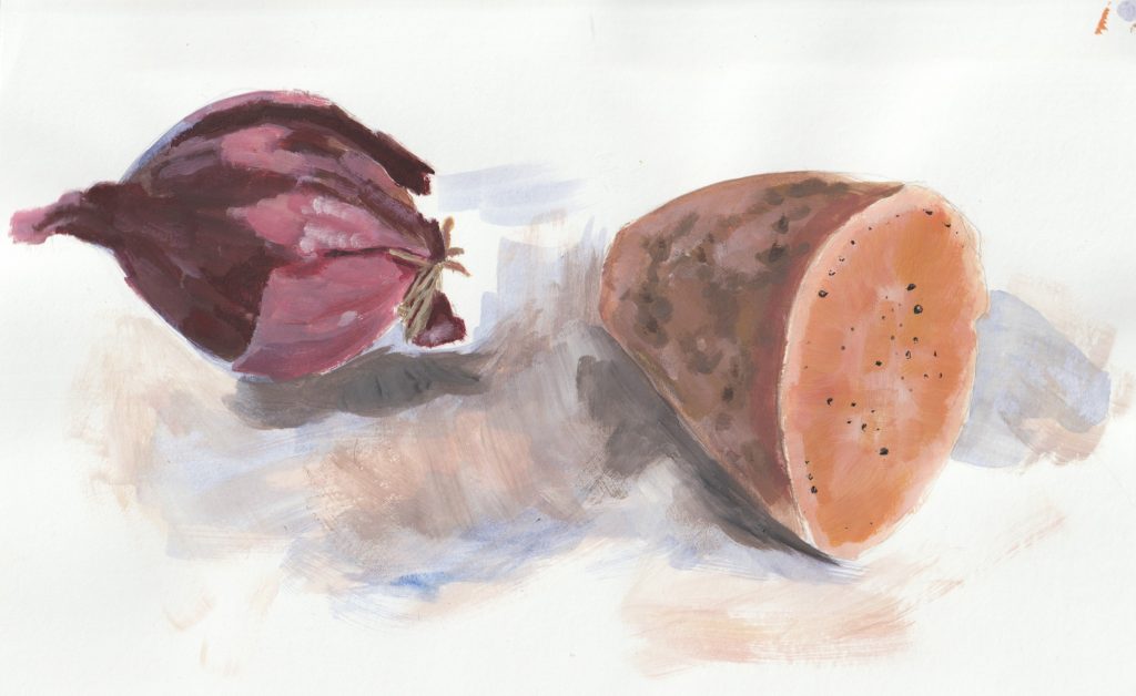
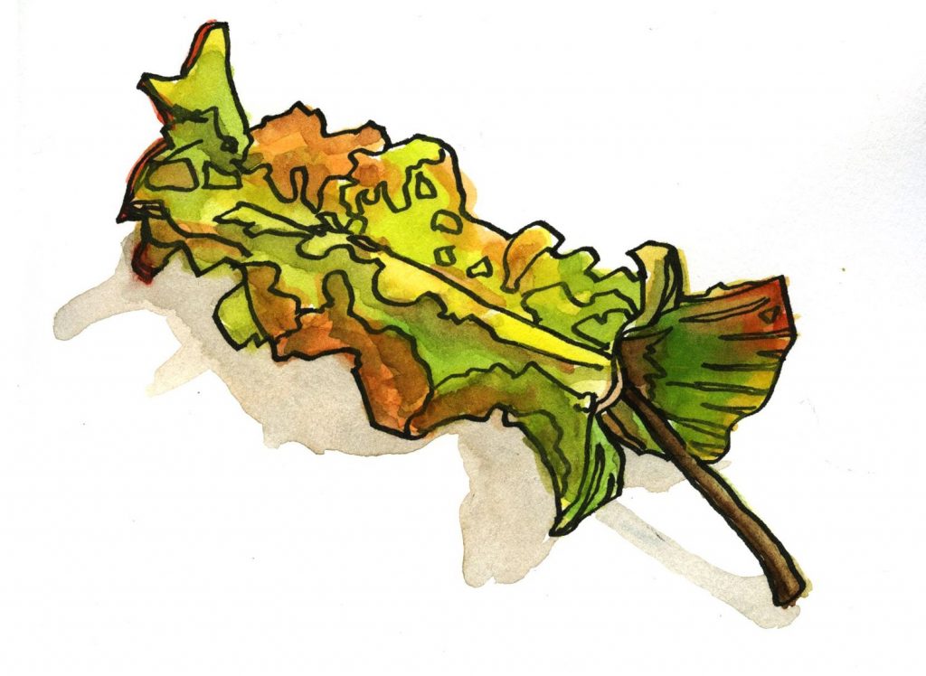
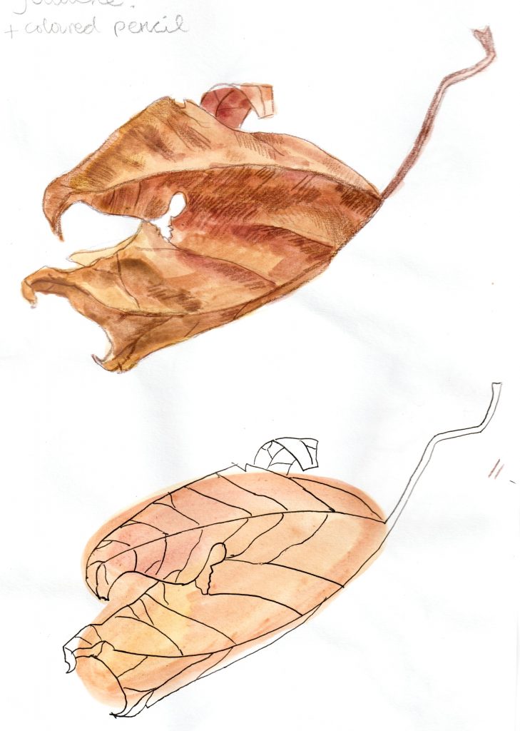
Gouache and coloured pencil (below, top). Brown pencil creates a softer mark against the watercolour layer. This medium allows a variety of texture to be expressed.

Gouache and pen (below, bottom). Painting a blob of colour onto the page, allowing it dry then drawing an outline drawing on top with a black fineliner pen.

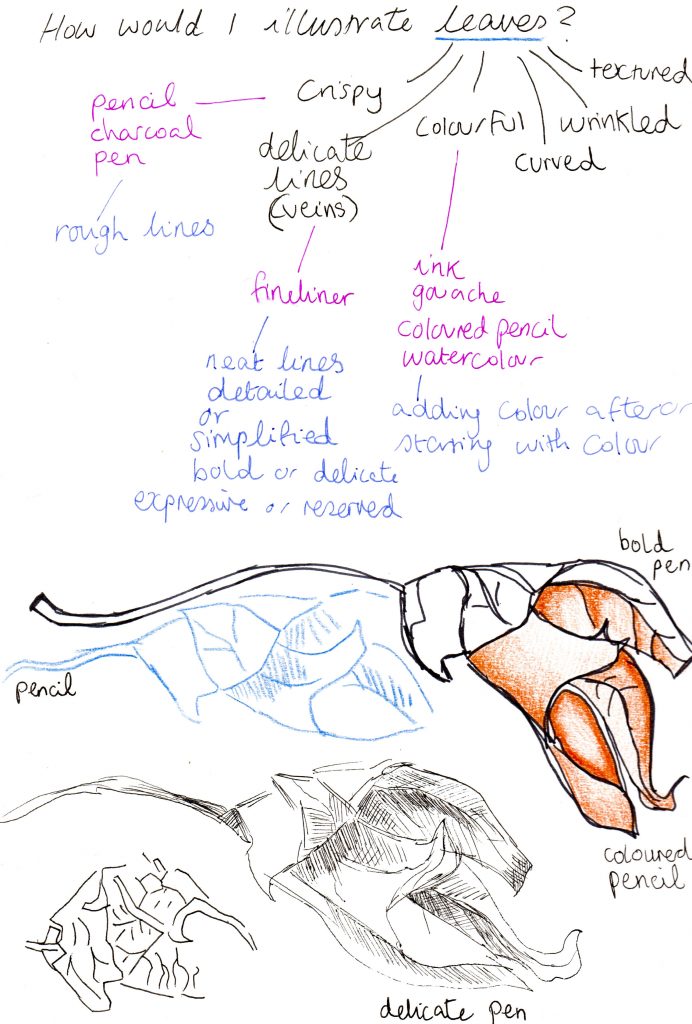
(above) I was inspired by Charlotte Trounce’s brush pen markings. I don’t own a brush pen, so I used the next best thing, a pot of black India ink and a regular paintbrush.

12 leaves

Step 1- painting colour onto the sketchbook page with gouache

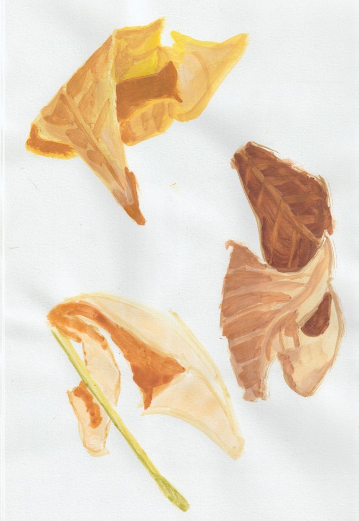
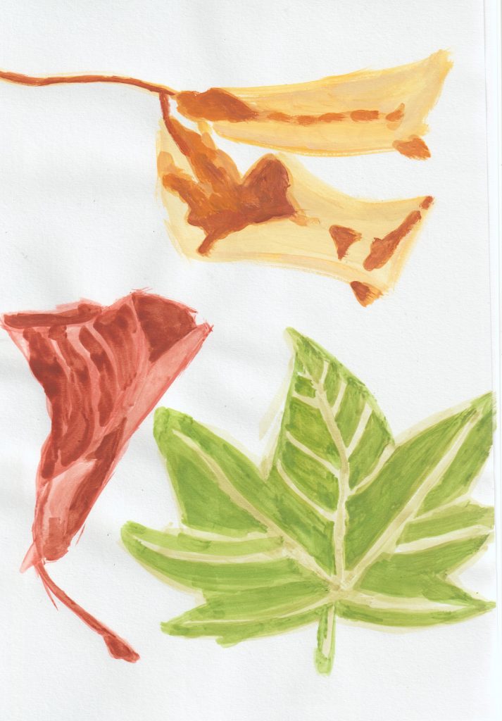
Step 2- Adding line to the leaves. I added outlines and details with a black pencil.

I went to UAL summer school!

& studied Illustration at Chelsea College of Arts.

Before this year, I had never heard of summer schools- universities opening over the summer to run short courses. So instead of a holiday, I wanted to learn something I’m interested in. I chose to sign up for the Illustration short course with UAL (University of Arts London) and spent a week of July at Chelsea College of Arts, located in Pimlico and opposite the Tate. It was an adventure for me and my first time navigating London’s underground alone.

Chelsea College campus in Pimlico
UAL have accommodation in Finsbury Park, where I stayed, which is easy to commute from.

What made me want to sign up?

I wanted to grasp the basics of what an illustrator’s job involves, and even if illustrators are still needed in today’s world. The in-person course appealed to me more than the online option.

How was it?

My interest was captured and held for the entire week’s classes. It was exactly as described, a taster or introduction where our wonderful tutor Alessandra, ran through the many aspects of illustration. Alessandra has a nurturing and thorough approach which helped the course to flow. I had all my questions answered over the course of the week.

The MFA show was also open at Chelsea College campus at the time of my visit. The great thing about staying in London, there is so much art to see.

The classes ran from 10am-4pm, giving us plenty to time to explore London after class. I took this photo when visiting the Cartoon Museum, which has free entry for people with an Art Pass.

Is illustration still needed in today’s world?

Yes!

It is a competitive industry, but I noticed that every one of my classmates had a unique approach to their image making, so I can see a space for everyone in terms of style.

We focused on analogue techniques, experimenting with a variety of materials. I learnt that many illustrators will paint or draw by hand, before scanning and editing their work to prepare it for

Mark-making practice from day 1. We tried a variety of mono-printing techniques to create interesting textures. These textures were then used to create a character of our choice.

Alessandra emphasised throughout the week, the need to follow your own personal passions and interests, focusing on what inspires you and why.

What have I taken from the course?

I feel free to ‘colour outside the lines’, to form a character from a figure drawing. To create a mood around a subject. Being mindful of the overall impact of a drawing or painting.

In my previous art education, I have been taught to accurately draw exactly what I see. This is good practice of course, but it can be restrictive. Illustration is about expressing the subject using imagination and the artist’s individual flavour. In the past, accurate drawing was vital because photography wasn’t available. The job of the illustrator was to inform the viewer. The images below compare the change in the role of the illustrator:

  1. Victorian illustration of Whitechapel, London
  2. Contemporary illustration of a house in London

Both illustrate the same subject but with a different purpose and about 150 years apart:

1.     From Thomas Miller’s Picturesque Sketches of London, Past and Present 1849
  2. London Victorian Home by Heavens to Besty/ Nancy Ellis

(above, 2.) “Heavens to Betsy Illustrations offer a different approach to a more traditional portrait. They are all about telling a story and capturing a moment in time, with the most everyday subjects often being the ones to treasure the most. Each illustration is drawn by hand in pencil, using your chosen photograph as reference. Once the drawing is complete, the illustration is worked on digitally to create the Heavens to Betsy signature style. If you have opted for colour, this is created with a carefully selected array of hand painted backgrounds and textures, that are customised specifically to your order. Every detail and colour is applied separately and shaded by hand, which gives the unique and hand made quality to each artwork.”

Coursework in my sketchbook

exploring line/ a variety of mark-making
exploring shape

Contextual reference:

This illustration by Satu Kettunen demonstrates the effect of line and texture in illustration. Simplifying an image can be very effective.

Drawing exercises

On day 1 of the course, we were instructed to draw a classmate, using experimental techniques. These exercises are intended to loosen up and connect your hand and brain. I often use some of these techniques when approaching a new subject or a subject that’s difficult to draw.

Colour theory

I began by experimenting with gouache. I have only recently began working with gouache, so this was a nice exercise for me.

On this sketchbook page (below), I experimented with

  • adding gradually more water to the paint to see the various transparencies
  • painting ‘dry brush’, which creates texture by adding no water
  • increasing the amount of white paint used with red
  • layering the strokes
  • using a pencil over the dry paint
  • using a pen over the dry paint
  • colour mixing

We were then asked to consider the emotional effect of colour. This is because colour, as well as line/texture, create the overall mood of an illustration. A successful illustration will draw on the correct colour associations to express the required message.

Everyone has a different perception of colour and what they might associate each colour with. For example, I used bright blue to express childhood, because in my childhood I saw a lot of bright-coloured plastic, such as bucket and spades, super-soakers and other toys. This wouldn’t be the case for someone who grew up in times before the plastic boom.

Editorial illustration by Bijou Karman.

The colour palette in this image and the afros on the women, instantly says ‘1970’s’ to me. This would be the case for anyone familiar with that era. Even if you didn’t know about the 1970’s, the colours are still warm and earthly which have a calming effect on the viewer. This is emphasised by the curved lines used.

Colour associations are not universal, but the people of your target audience will likely makes the intended association. For example, in our culture, bright colours are used for expressing happiness. Generally yellow has the effect of joy and energy when used in interior design. The walls of a workplace have been painted yellow for this reason.

Our task was to come up with a limited colour palette that would express the topics suggested by our tutor. Alessandra specified that we were to choose the colours we personally would think of when we thought of these topics, rather than guessing what the colours ‘should be’. I used gouache for this exercise:

We then jotted down some words we associated with that topic. (above, right)

(left) ‘spring’, ‘forest’, ‘solitude’.

We were then asked to complete an illustration based on one of these topics and using the limited colour palette we came up with.

(left, bottom) thumbnail sketches on my chosen topic, ‘childhood’.

I used gouache and coloured pencils for the details. I chose the colours because of my memory of sky and grass as a child. I thought of blowing bubbles since this is an activity from my childhood that gave me a sense of wonder and is an activity only children tend to do.

Editorial illustration

Contextual references:


Eye magazine cover
Teen Breathe magazine, editorial layout

The focus for this day was on editorial illustration (image-making to accompany a magazine article for example). We were asked to illustrate an article in groups of 3. Our group was given an article about The Pussyhat. I enjoyed the teamwork and collecting our ideas together. The task:

  1. read the article and highlight key words
  2. mind-map as a group
  3. sketch some thumbnails (right)
  4. complete a main illustration and a spot illustration
  5. I wanted to focus on the way the pussyhat movement brought together generations of women. I then flipped the stereotype of the older lady doing the knitting and wanted to show that she has handed the skill to the younger generation.
  6. I limited the colour palette to keep it simple. Pink was going to be in the palette because of the topic. I added patterns to the illustration to make it more interesting.
thumbnail sketches
my gouache and pencil illustration (top) The background is painted grey, but this was not picked up in the scanner. The thumbnail sketch/ colour plan (bottom).

The spot illustration is the smaller image you will see on a magazine spread. This is a supporting image and will usually feature an element of the main illustration. (2 examples below)

Contextual references:

  1. The record has been taken from the left page and used for the spot illustration above the text on the right page)
  2. Leg of the chair taken for the spot illustration
1. Editorial Design from Kathryn Tayar, “The Menace of Mechanical Music” Editorial Design, CC BY-NC-ND 4.0
2. Editorial Design from Vicente Puig, “Stool 60” Infographic Editorial Design, CC BY-NC-ND 4.0

My concept for the spot illustration was of the hand holding the knitting needles. I felt that the pink thread and nails would symbolise women and the position of the hand expresses somebody standing up in protest.

Sketching at The Tate Britain

Henry Moore artwork at the Tate

Situated opposite the Tate gallery, it made sense for us to walk across the road from Chelsea College of Arts and incorporate this visit into our coursework.

The aim of this exercise was to record whatever caught our interest. This was going to be different for each individual. Our tutor suggested using pens/ materials other than an erasable graphite pencil. This would encourage boldness in our drawings. She also advised us to be mindful of each page spread as a whole and how the page interacts with the page next to it. The subject could be the artwork on display, the building itself, or the people walking around. There was no limits.

On the first page I recorded the architecture of the Tate as well as the tiled floor pattern, the outline of a Henry Moore sculpture and the shape of the letters on the information plaque. Each object is united by the use of outlines instead of tones.
2 security guards at the entrance of the gallery

We then applied these drawings to a group zine about our visit to the Tate. We looked at examples of zines for inspiration:

Up My Street, concertina zine by Louise Lockhart
Collection of zines we looked at for inspiration

Book cover illustration:

We used collage to come up with an illustration for a book of our choice. I chose Little House on the Prairie (above, 3rd from left)

Day 5

On the final day of the course, we produced a stop animation video. As a group we voted on the theme city. My only contribution was the bare/winter tree on the right (below). The rest of the work was from the rest of the class.

City Romance

For our final task of the day and the course, we were asked to consider what we’ve noticed about our own individual style and approach to illustration. I found my own work to be generally quite calm and peaceful. We then came up with a business card design in the form of a postcard.

These were our designs placed together on the table:

my own postcard design, A5 ish. I used India ink, gouache and coloured pencil.
I began work on this painting in class, and finished it later. I approached this painting by not worrying as much about accuracy. For example, I exaggerated the incline of the hill to give the cyclist more of a challenge. I removed unnecessary detail and considered the effect of colour. I used gouache and ink. I simplified the background to help the figure stand out and to indicate its distance from the viewer.
a sketch from the classroom when I had arrived early one morning.

Life-drawing & sketchbook update 02/07/22

Alice’s Day

Today is Alice’s Day. Well that’s something I never knew existed, despite always loving the books and having lived in Oxford for 2 years. (During the pandemic admittedly).

To mark the occasion, I found myself at a series of lectures in St Frideswide Church, Botley. I couldn’t resists a small purchase of a book about the Oxford Colleges (published 1963) and 3 postcards, all for £1. (above, left)

The book stall (below) was run by the Lewis Carroll Society. The photo doesn’t show it very well, but there were many different versions of Alice in Wonderland all with a different illustrated cover.

So what does my sketchbook look like this week?

I continued to play about with gouache, using this photo from the retreat first of all. (see initial sketch in previous post) I don’t know what was happening with the face. This was the best I could achieve, believe it or not. This was down to the fact that the sketchbook is A4, so imagine how small the face is in reality. I had a tiny brush but it was still a very awkward process.

Another gouache study:

I set up a still-life in my room with a red onion and sweet potato, halved. Could you tell that’s what I was going for?

At this stage, I don’t really see a reason to go back to acrylics. Obviously there is the environmental issue to consider, acrylics are plastic. I can achieve similar results with gouache and actually I enjoy the process more. The only difference I might miss is the slight glossy texture of acrylic paint.

Next, I want to demonstrate a fact: sketchbooks are not necessarily for finished pieces. Mistakes will be made and that’s all part of the joy. I sketched the other reader of the house:

Fine liner pen. Because her legs are so bright white, I struggled to make out the outlines, thus the strange phantom leg in the above drawing.

Life drawing

This week, I enjoyed a session of life drawing held at the Castle pub in Oxford.

It was a new venue for me and I was pleasantly surprised. The only life drawing I have taken part in, has been online. I went to college during the pandemic and so we were unable to have models come onto campus. Now that the world is opening up again, it was the perfect time to give this a go.

5 minute sketches
15-20 sketches
This was a 30 minute pose, but I found I couldn’t draw for 30 minutes, so instead did 2 sketches in the same time-frame. This is one of them, I used a black pencil for this sketch.

Book recommendation

(Could this be a new blog feature?)

I would like to mention a book I’ve been reading this week.

After reading an article about the death of Bob Gill (1931-2021), I was curious to learn about his work. I was lucky that the Brookes library had this book available. Published in 1981, Forget all the rules you ever learned about Graphic Design, feels as fresh as when it was new (I imagine!).

The man was clever, that much is obvious from these pages. It showed me the essence of graphic design: ideas.

And looking at a problem ‘outside of the box’ to use a much-disliked phrase.

Gill was skilled in both design and illustration and I enjoy his work in both. At the top of each page, we are treated with a summary of the design.

1)What was the brief?

2)What was Gill’s solution?

He even goes as far as to critique his own work.

3) What would he have done differently? – This really helps me be a better critic of my own work.

I would recommend the book if you have about £200 to spare (the average second-hand price of the book), or certainly borrow it from a library…

Design for a card announcing a couple moving house. (We don’t move a house, we move belongings!) He used a 1930’s catalogue for the images.