In the art world, words are often used as image, for their visual quality. Project #5 is almost the opposite thing: taking images and using them to create letterforms. (In a way that is functional and experimental.) This sounded like a fun project. It would require me to be observant and see the world afresh. I thought I would be seeing letterforms everywhere! It wasn’t as easy as this. I discovered that some shapes are more common to find than others.
When out on my quest for letters, I took more notice of all the letterforms around me. I looked at the typography of shop signs, as well as my mission for objects that look like letters. While in the Westgate Shopping Centre, I came across this interesting fabric used for the benches. I liked that I could recognise the shapes as parts of letters, even though no letter is complete.
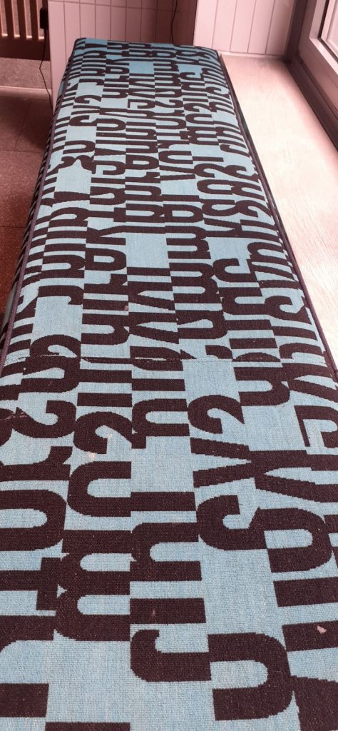
This textile design reminded me of the paintings by William Klein and prompted me to have a look at letterforms within art.
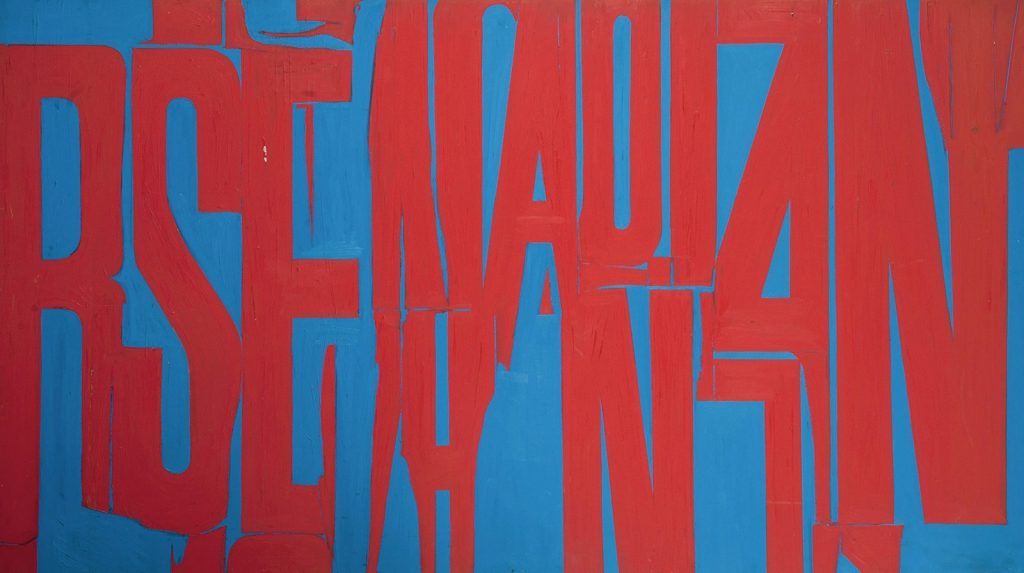
Known mainly for his street photography, William Klein also explored letterforms within his paintings. Here you can see they are purely used for their aesthetic value.
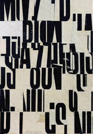
Cecil Touchon’s collages make use of letterforms. He describes his work as visual poetry. Or ‘poetry for the eyes’. This movement of visual poetry came from the concrete poetry movement. He likes to explore the boundary between art and poetry.
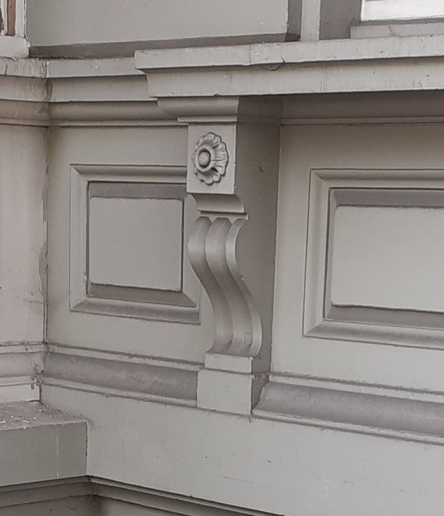
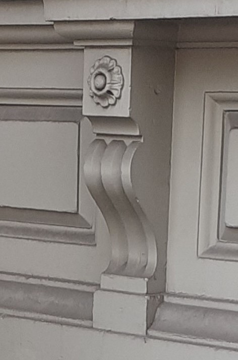
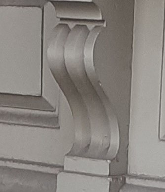
In the same location, above my head instead, I came across this installation.
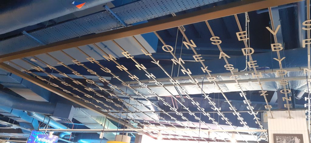
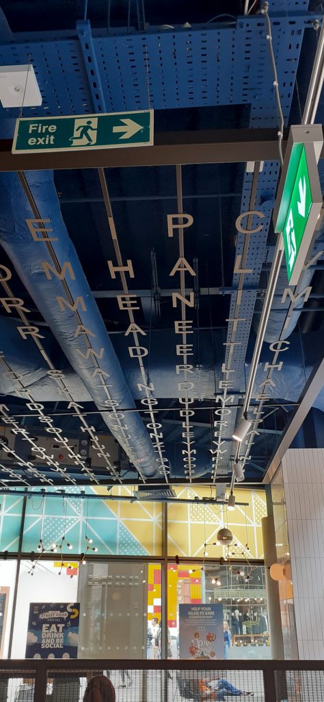
When showing the photo to my housemate, he saw different words within the grid than I could see at first glance. The choice of layout invites the viewer to a kind of game of piecing words together, as in a wordsearch puzzle.
Secondary Research
The Alphabet of Found Objects
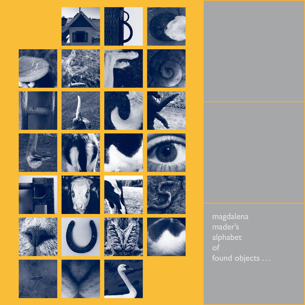
I immediately found inspiration in the title of this project, The Alphabet of Found Objects. The 2 words ‘found’ and ‘objects’. We explored objects in year 1 of our course. But I didn’t consider an object functioning as a letterform. This would mean a function that comes purely from the object’s shape. Maybe from a particular angle, since the shapes are 3-dimensional.
This project consists of students’ work for entry onto a design course in Germany. Nina Lehner has separately photographed the objects/letters against a white background. Keeping the same background makes the letters more uniform and look like they are part of a set. (Below)
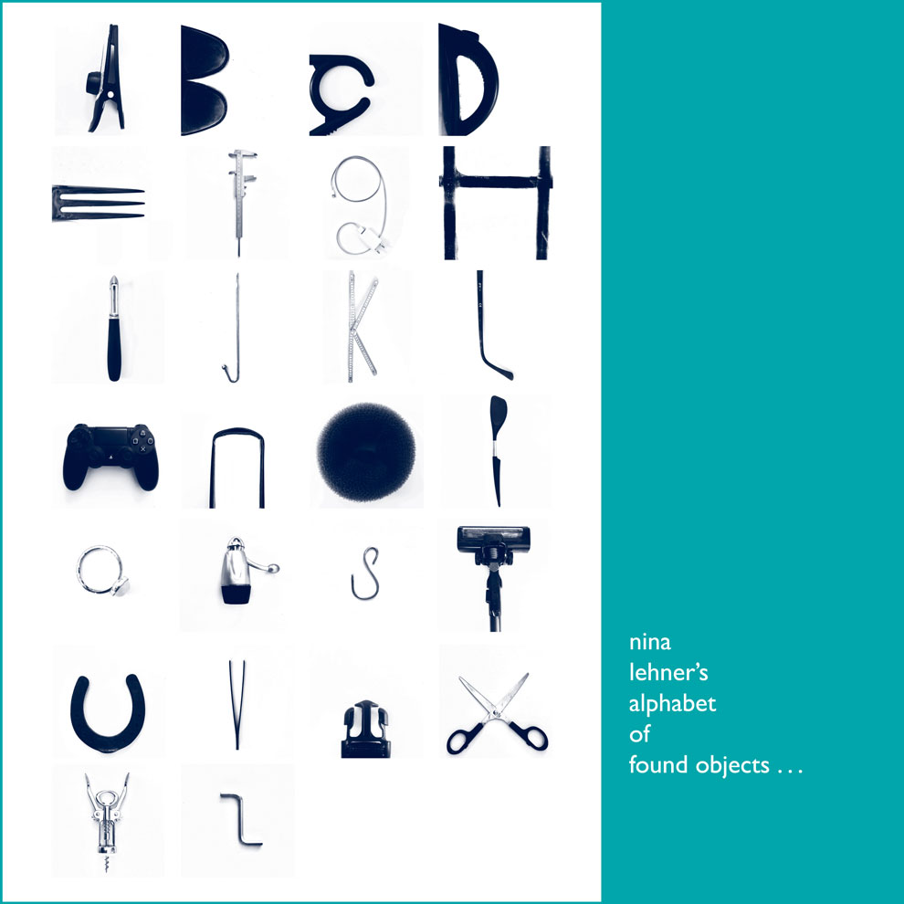
I can see a deliberate staging of her objects. Her obvious manipulation of the objects takes away from the ‘found element’, which is my interpretation of the brief. I wanted to include objects I had really found and hadn’t touched at all – though her method does create letters which are easy to read.
Some of her obejcts are shot alone, surrounded by white space, but other letters are only a section of another object. This inconsistency is less satifying for me. I would prefer to use the same rule, or lack of rules for every letter. But this is only if I was being very critical.
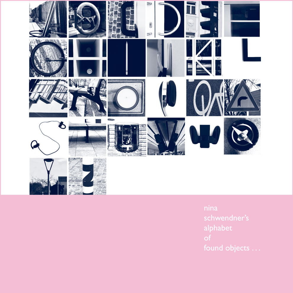
(above) I prefer the alphabet by Nina Schwendner, as it tells more of a story. We can image the artist journeying amongst these placing in her quest for letters. I find myself wondering which she came across first and last. The monochromatic filter adds more mystery, but also helps the images read better as letters.
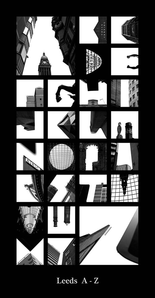
Peter Defty
Photographer Peter Defty has produced a series of photos he calls city sky alphabets/ alphatecture. Each alphabet uses photos he took in different cities across the world. If you were familiar with a city, you could probably make the connection without the caption he has placed underneath each alphabet. However, its not necessarily obvious immediately that the photos are even from the same country or city.
He carves the letters from the sky, shooting mostly upwards. The buildings and other architectural features block in the sections of pale sky. His use of negative space is imaginative and not something I would have thought of.
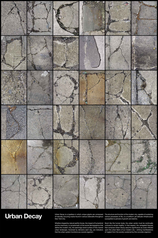
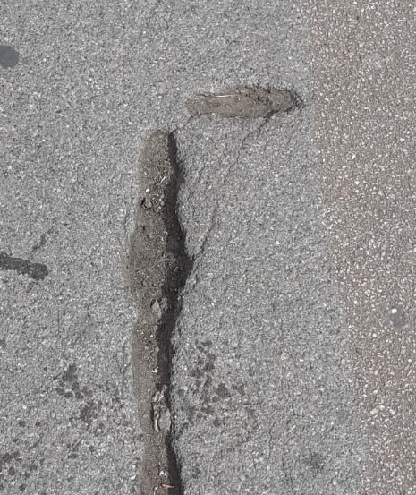
Jason Ramirez
This collection contains colour, unlike the previous examples I’ve looked at. This might help with the visibility of the letters, since some of the lines are very fine and might be harder to see in a black and white image.
Ramirez has created this series of letterforms from various found cracks in the pavement. The letters looks spidery and natural, despite being found amongst the man-made world. I like their randomness, each shape is completely unique and you are unlikely to find another crack in the pavement that is identical to those he has found.
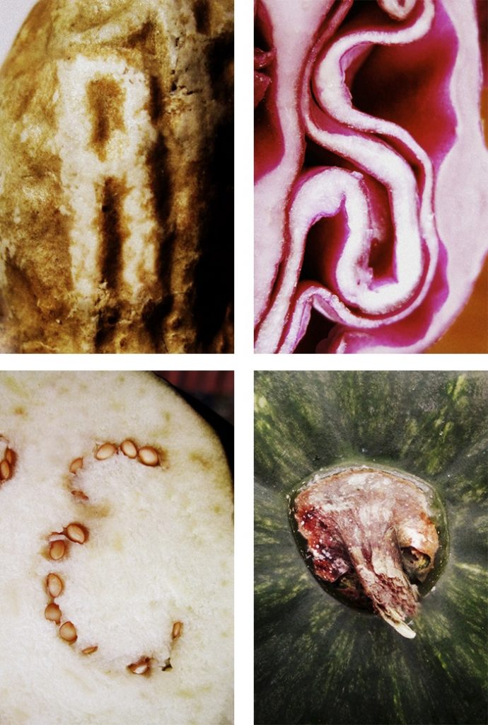
Irina V. Wang
I think the reason Irina’s work is effective, is because she has been selective. She hasn’t taken photos of just any shape that might slightly resemble a letterform, these shapes all look unmistakable. These shapes look as though they were naturally occuring in vegetables and she had the luck to find them.
Primary Research
I started looking at type more, in general. For example, while at the museum, I noticed some handwritten type on the wall. I copied this into my sketchbook so I would focus more on the letter structure. Drawing allows me to study the letter structure more closely. I noticed double lines , almost as if the designer had written a letter, then came back and sketched over it. I found the double lines interesting.
The Task:
‘Create a found type collection by shooting objects, shapes, lighting.’
‘Each image much be unique in subject matter and framing’
From the Project #5 brief
But there could be many categories within this brief. From looking at secondary research/ contextual references, I considered the possible themes:
found objects, built environment, architecture, indoors, outdoors, pavement/road, vegetables, animals, people, natural forms, things of one material/colour
Looking at the contextual references from project #4 and project #5 gave me a basis on what to look out for when I was out and about. I thought of negative space, of shadows, of broken lines.
I like the idea of the world around me/ chance determining the type instead of me curating the letters. Giving a creative project restrictions, usually helps with creativity.
Peter Defty has consistently used this white space as the letter itself, but I feel this would not need to be the case. I wanted to experiment with creating an alphabet from both negative and positive space and seeing if it would still work as a collection.
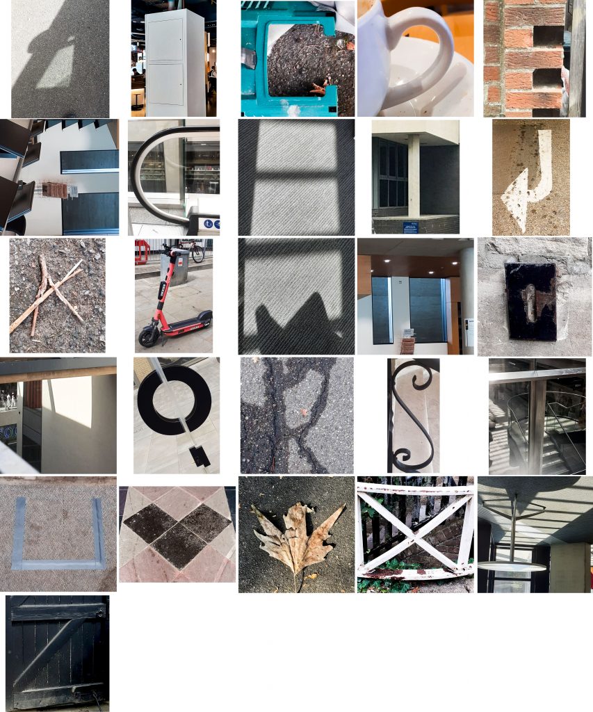
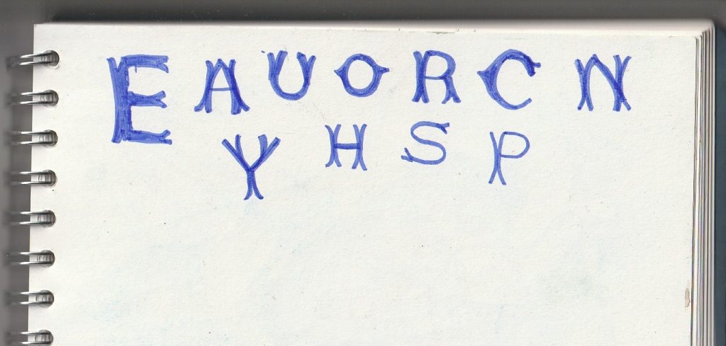
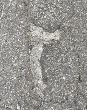
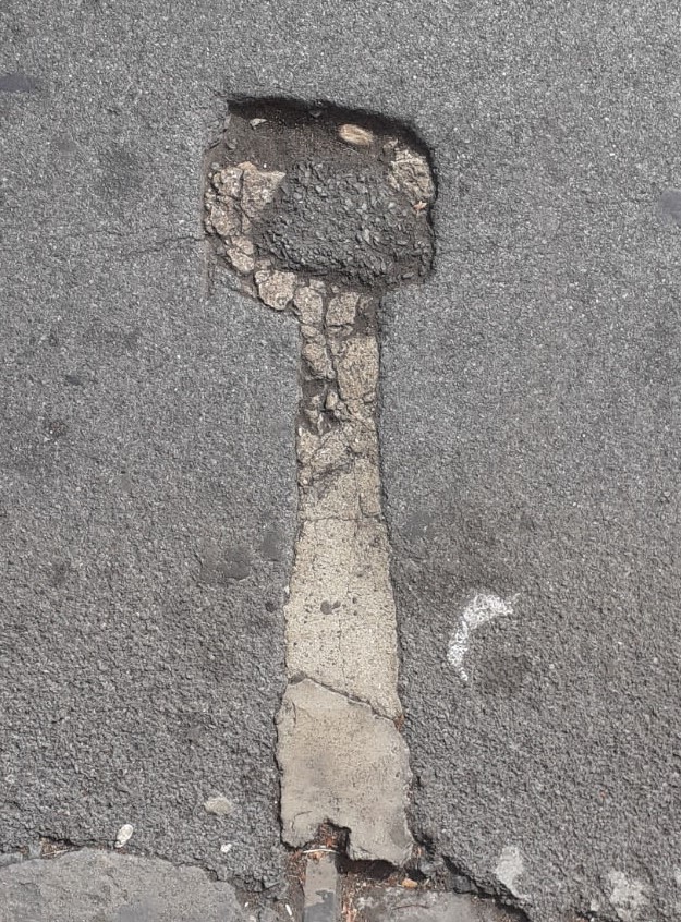
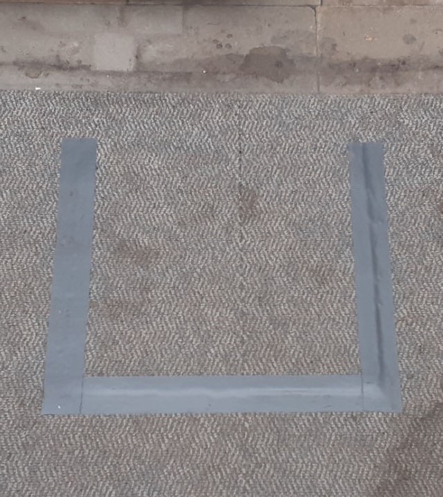
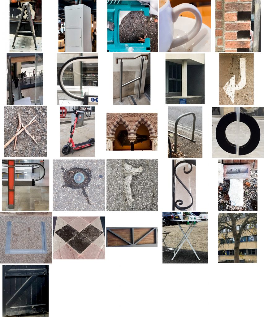
I began by focusing on letterforms I could see on the pavement and road (material: concrete), but was unable to find any more letters after the first few. (below- A, B, C, D, E, F, J, r, I) That was when I realised this task was not going to be as easy as I had anticipated. I was also surprised with the variety of markings I found when looking on one surface type.
As I began to struggle with the search, I wondered what shapes I was missing while looking down at the floor and started to look around me as well.
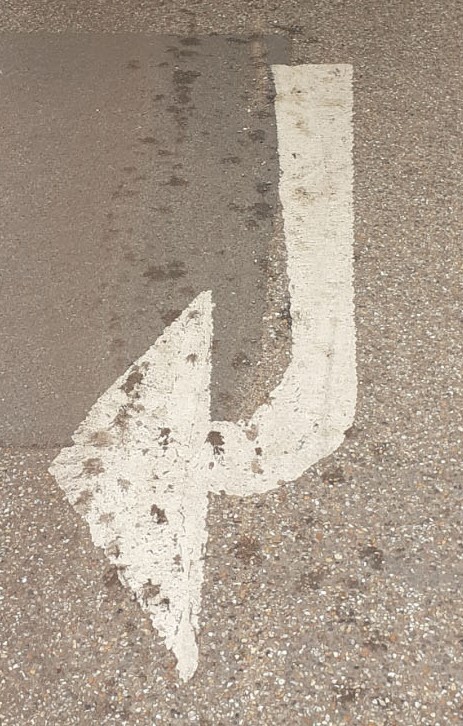
(below) The ‘J’ on the left was my original ‘J’. When looking around, I noticed a an outdoor tap in the shape of a ‘J’. Slightly rotating the image helps it read as a ‘J’.
I explored ‘2D’ & ‘3D’ letterforms.
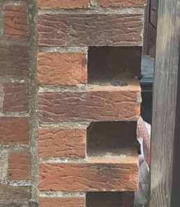
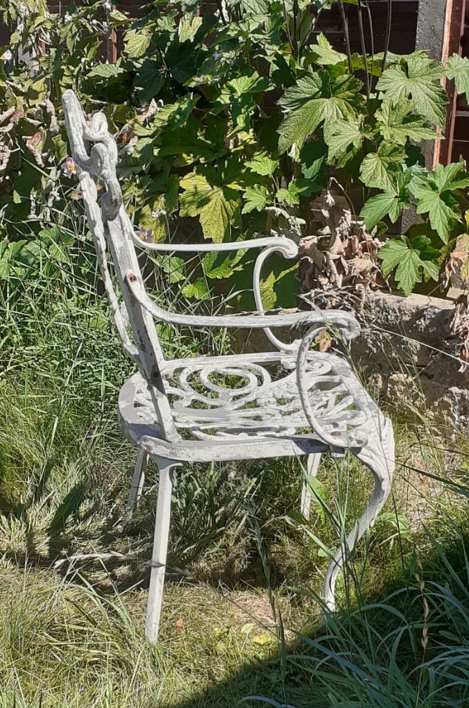
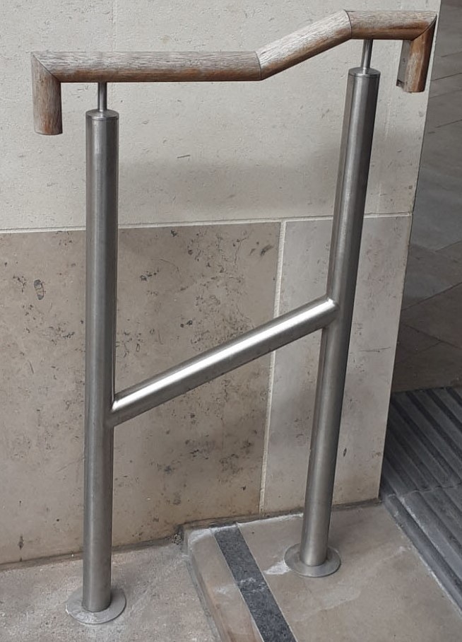
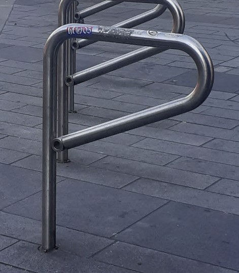
Another example of uppercase and lowercase letters is the two ‘h’s’ below. The lowercase ‘h’ (left) is the side profile of a chair in my garden, the (right) capital ‘H’ is a handrail. The ‘H’ on the right would make more sense in an alphabet of other uppercase letters. I also don’t think I chose the best angle for the chair ‘h’, since it is not an obvious ‘h’ in this photo.
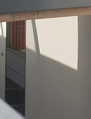
I liked the way the pattern of light helped to form this ‘P’ in the centre. (above)
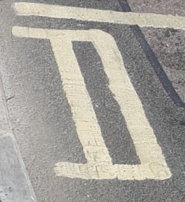
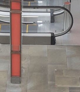
The ‘P’ on the right works because the 2 objects appear to intersect from the angle I was stood. In reality the objects were set at a distance from each other (the red navigation board and hand rail of the escalator).
A collection of A’s (below). Again, I was able to use lighting to draw the letter ‘A’. In hindsight, I would have created a shadow type collection.
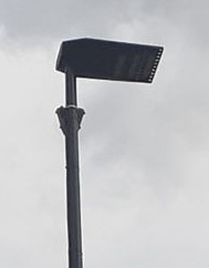
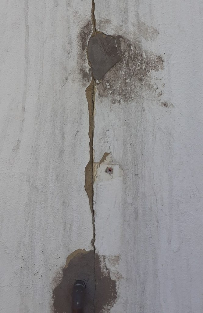
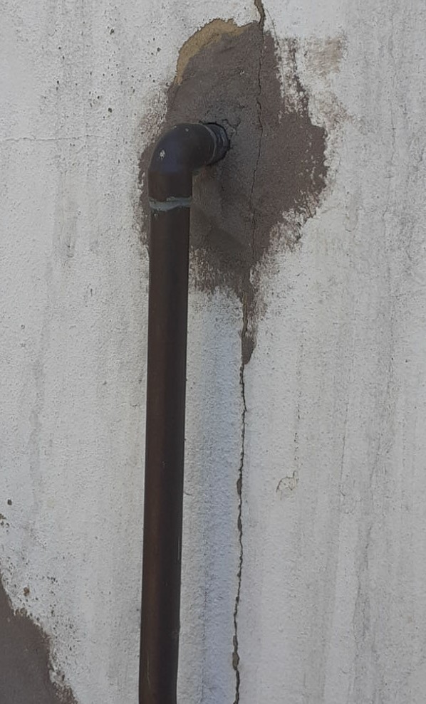
I took this photo because of seeing the ‘T’ form of the metal railing. But on later inspection, I could see other letterforms within the same photo (below).
‘I’
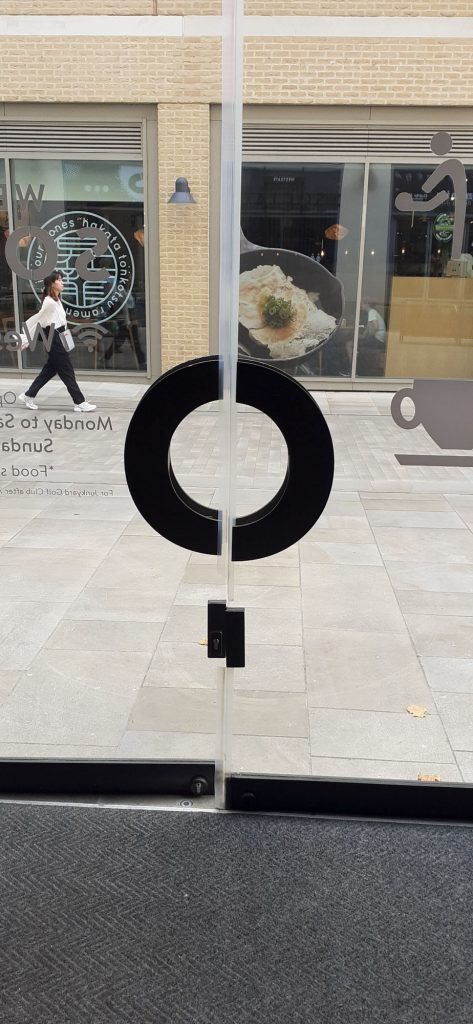
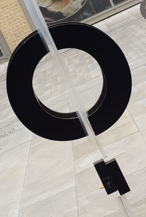
I took this photo when noticing the door handle could become a disjointed ‘O’. However, I then saw if I tilted the image slightly, it could be read as a ‘Q’ (below).
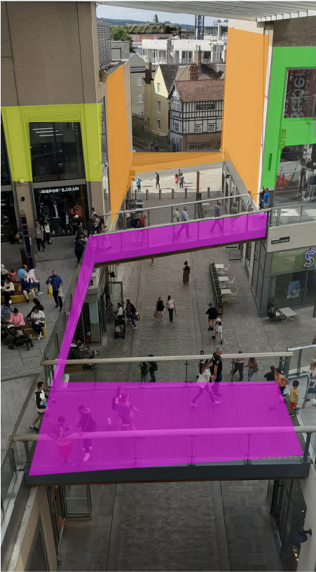
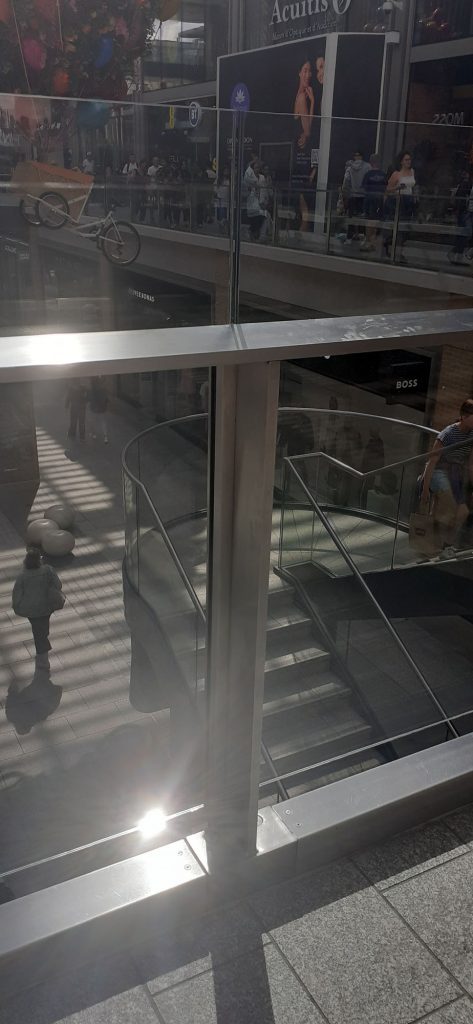
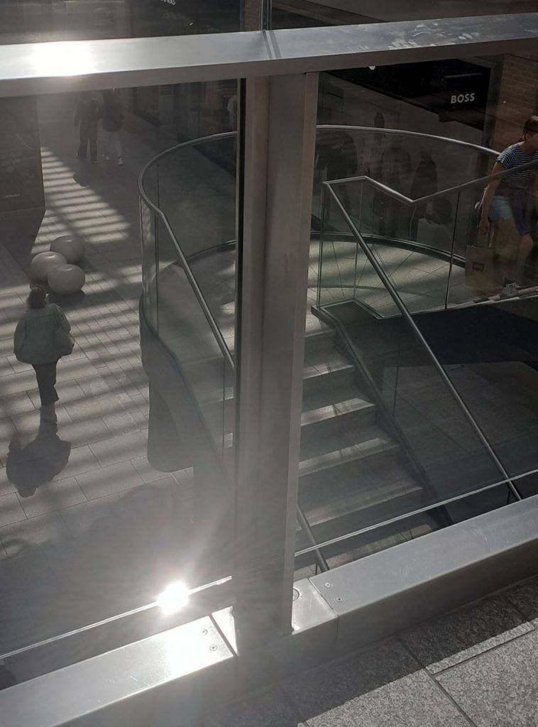
This aerial view from the upper platform of the Westgate Shopping Centre, contained several shapes within the architecture that I could pick out. Here I have highlighted them in different colours. ‘n, H, F, C’.
Having found that my found images were pretty random, I then needed to narrow down and define my collection into an alphabet that worked coherently. I then enhanced each photo so that they could be read more clearly.
This was the first collection I decided on:
2nd version of my alphabet:

Reflections-
How was Project #5?
More challenging than I expected. I found it difficult to mould the project around my ideas. Instead, I was having to adapt to the shapes I saw around me and therefore change from my original ideas.
I could have collected small objects together purposefully to create type from, but I wanted to be inspired by the myriad objects in the world around me. the randomness of the world felt like a more useful creative area to pull from. I’m not displeased with my collection!
What did I learn?
To create a great found type collection, it could take years to collect together the perfect letterforms. Being restricted by a time limit, I could have been bolder and more decisive with my choices. For example, focusing on more of a narrow theme/category, for example ‘natural objects’ or ‘metal objects’.
Having a deadline means I sometimes needed to select the best letter in terms of legibility, I couldn’t then afford to focus too much on the material or theme of the individual image if it compromised the object’s readability.
What did I enjoy?
I enjoyed becoming more familiar with letterforms and exploring the topic of type from a new angle. (Phyiscal objects translating into text).
What materials/ techniques did I use?
I used my phone camera to take every photo. I then used photoshop to enhance the images, crop them or rotate them. I used Illustrator to place the photos on a grid (for example the pavement letters).