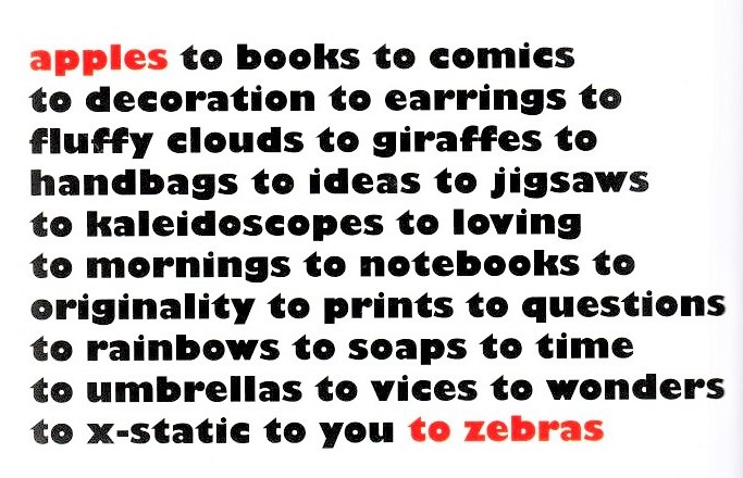
‘Nothing beats the smell of ink on paper.’
Anthony Burrill
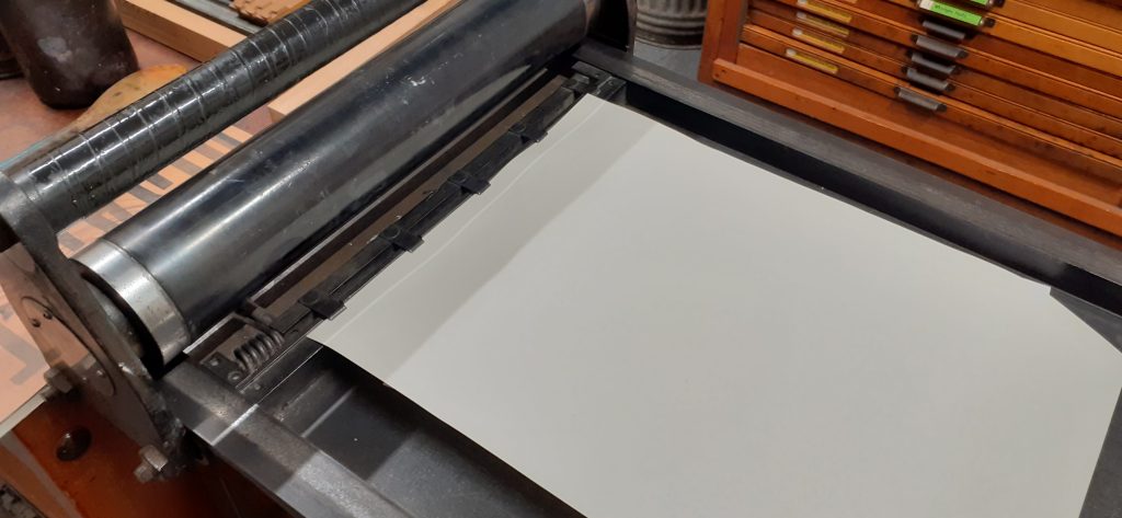
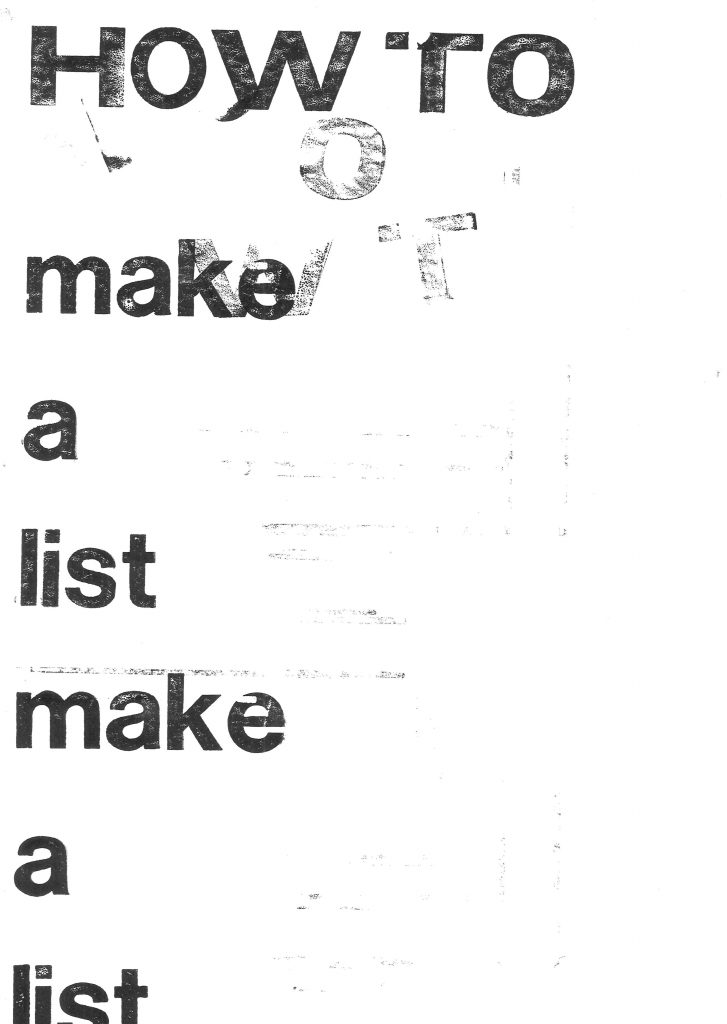
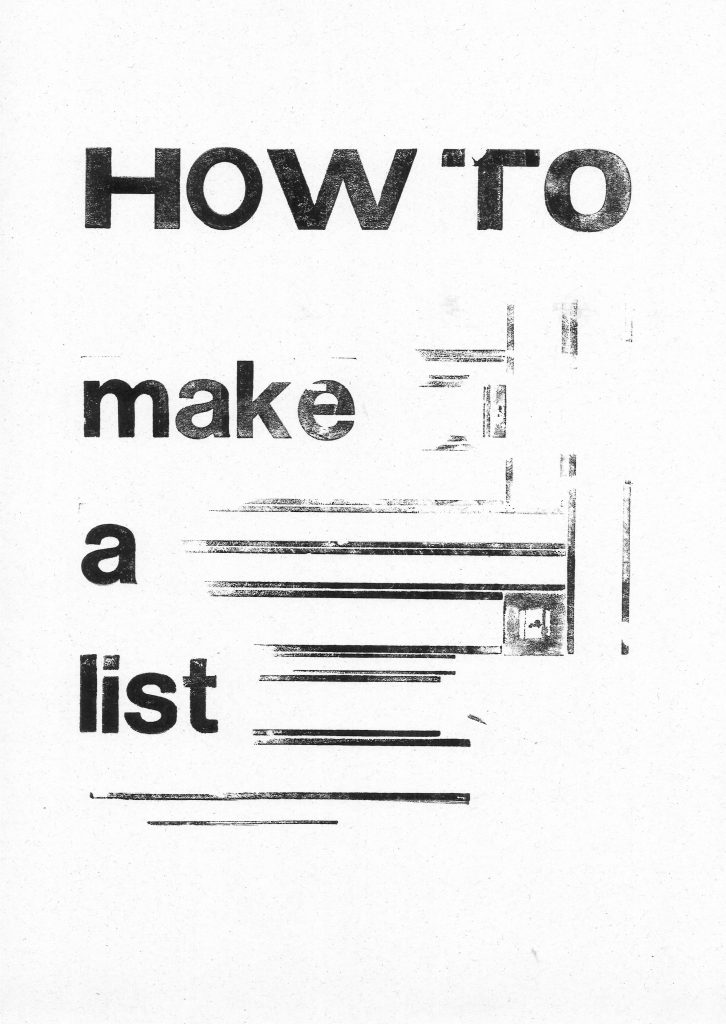
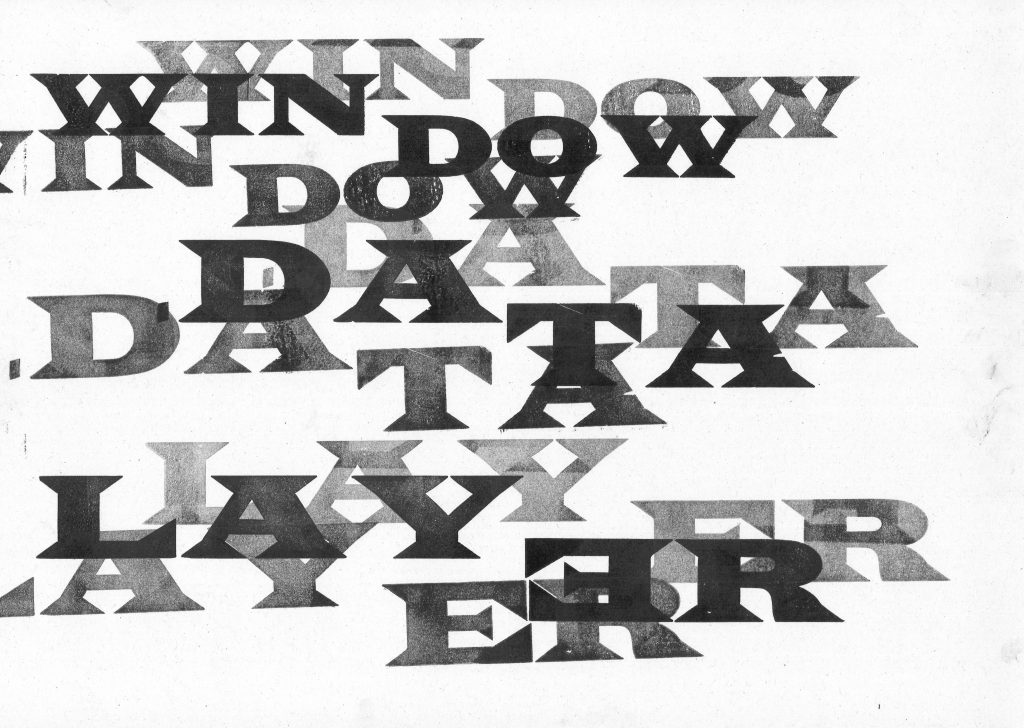
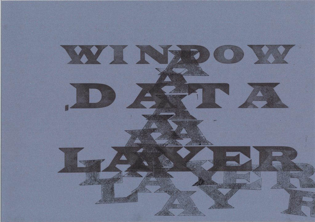
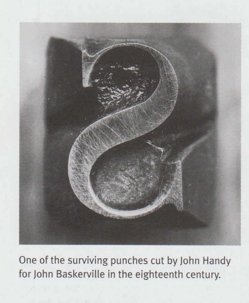
In week 1, we had the opportunity to explore with wooden letter press. In week 3, we moved onto the metal version. These letters are smaller and it was a fiddly process.
Being introduced to this process, I was interested in researching designers who are using letterpress in the present day, as well as traditional uses of letterpress.
With this first example, Plunkett and Bell have used wooden letters to print these large posters:
Mary Plunkett & Clare Bell
‘On the occasion of the Object Matters: Making 1916 conference, a special limited edition poster was designed by Clare Bell (lecturer at the Dublin Institute of Technology) and Mary Plunkett (designer-in-residence at the National College of Art and Design) and printed by them with Sean Sills at Distillers Press, the letterpress studio at the National College of Art and Design.
Created with technologies in use in 1916– wood-block type and letterpress – the poster uses the visual vernacular of the time to suggest the era without veering into pastiche. Bell and Plunkett had to make do when they ran out of type and had to ad-lib, making letters such as an upper-case ‘I’ created from two pieces of lead rule set upright.
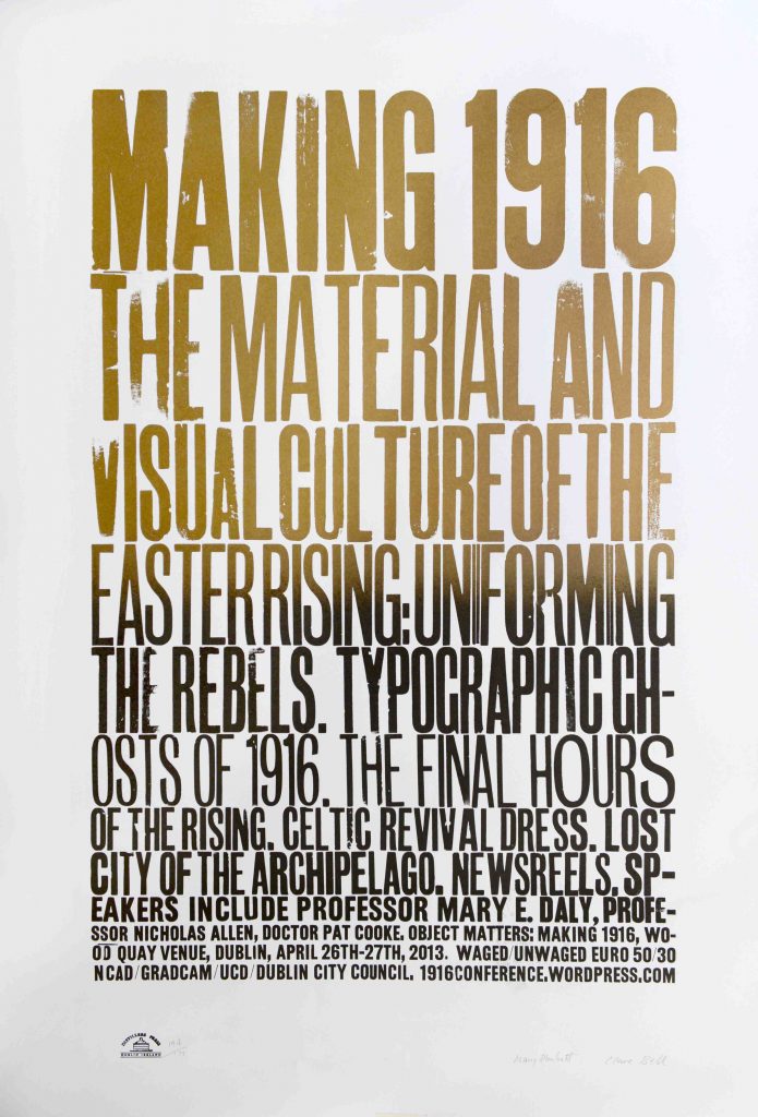
The poster is printed on two different stocks – newsprint to generally advertise the conference, and 155gsm Mellotex for the limited edition. The newsprint version is in black ink and printed off-centre, emphasising the immediacy of the message via the conditions of its production. The edition is in black and gold split duct, the movement from full gold in the header ‘Making 1916’ to black in the final lines suggestive of the shift from ordinariness to ceremony and in part a nod to the Irish lettering artist and stone carver Michael Biggs, who created the celebrated lettering on Dublin’s Garden of Remembrance. The poster proudly bears the marks of its making – the impression of the type and the grain of the wood-block is evident. Advertising and celebrating a conference on the spaces, objects and architecture of the 1916 Rising, the design and materiality of the poster communicates the importance of addressing the material culture of the past not in a reverie of imitation but in fresh, creative ways.’
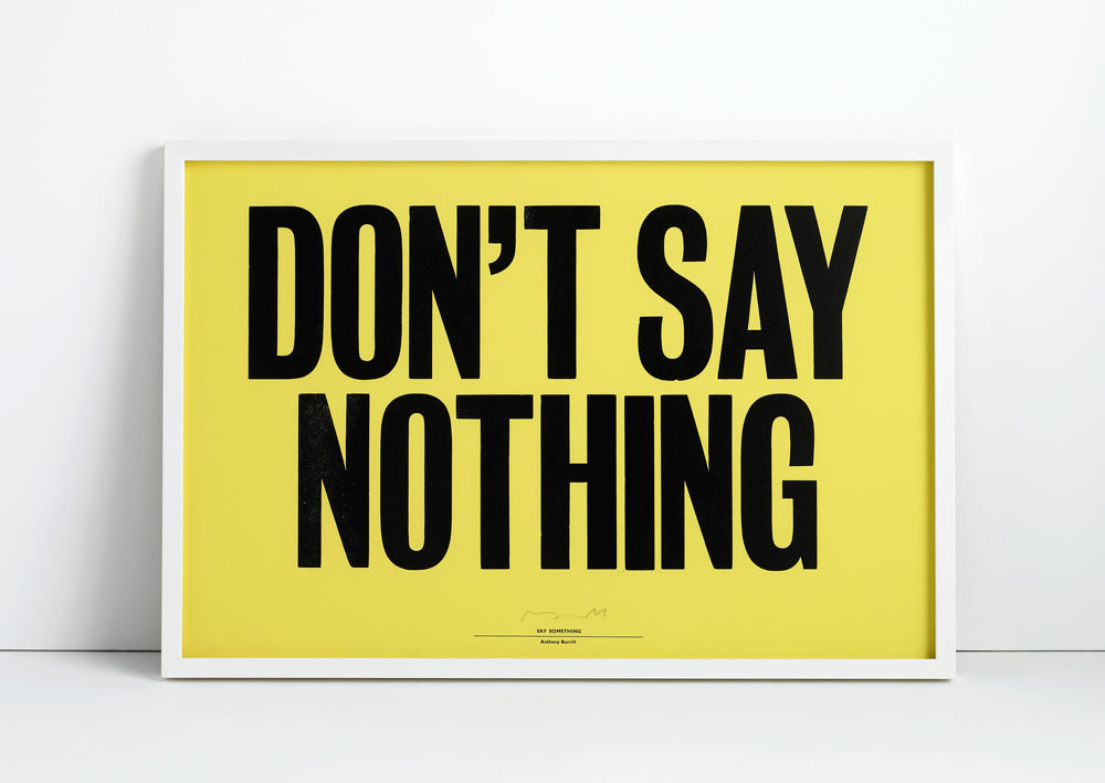
Anthony Burrill
British graphic designer Anthony Burrill, is famous for his bold posters that use letterpress type to make bold statements.
Lots of the material I’ve collected is now over 20 years old, it’s got an interesting quality, there’s a pre-digital feel to the material. It’s from a time when things were still made by hand, I like the individuality of it.
Anthony Burrill, Make it Now
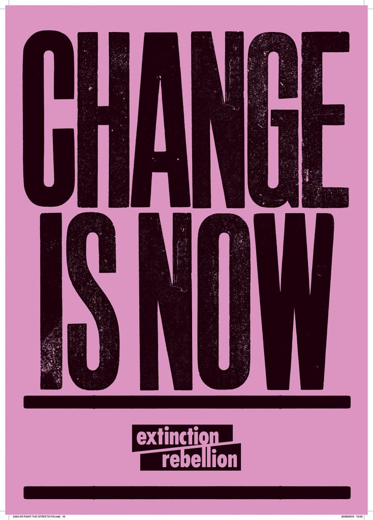
Burrill’s poster for Extinction Rebellion:
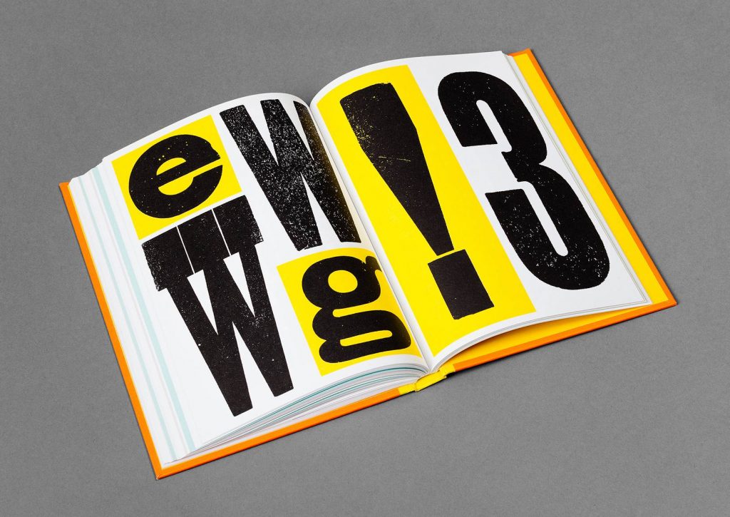
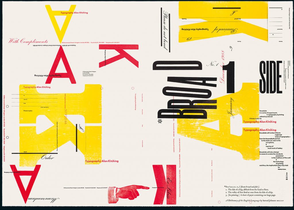
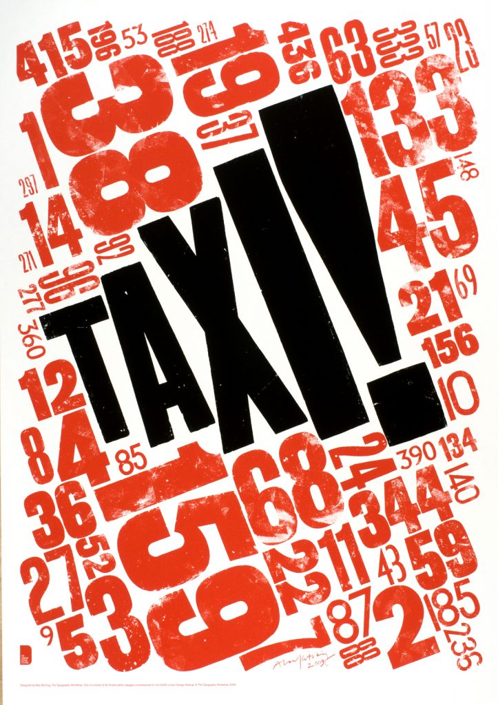
Alan Kitching
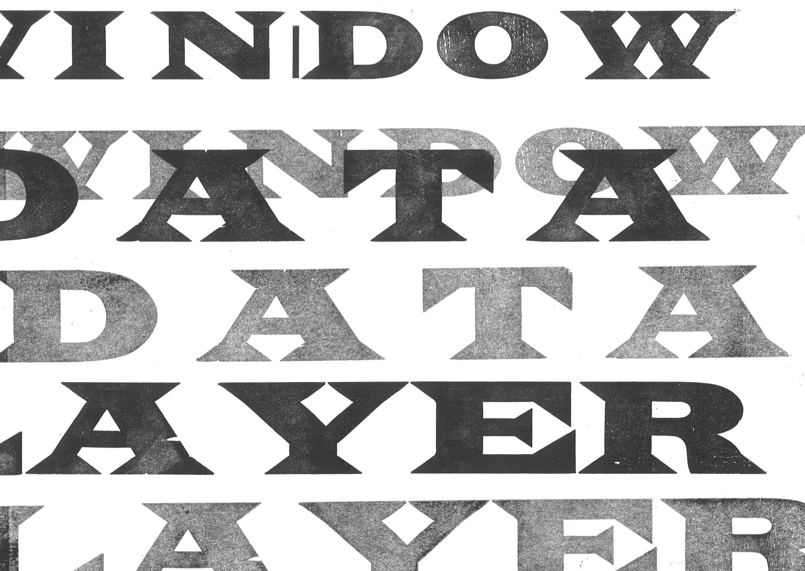
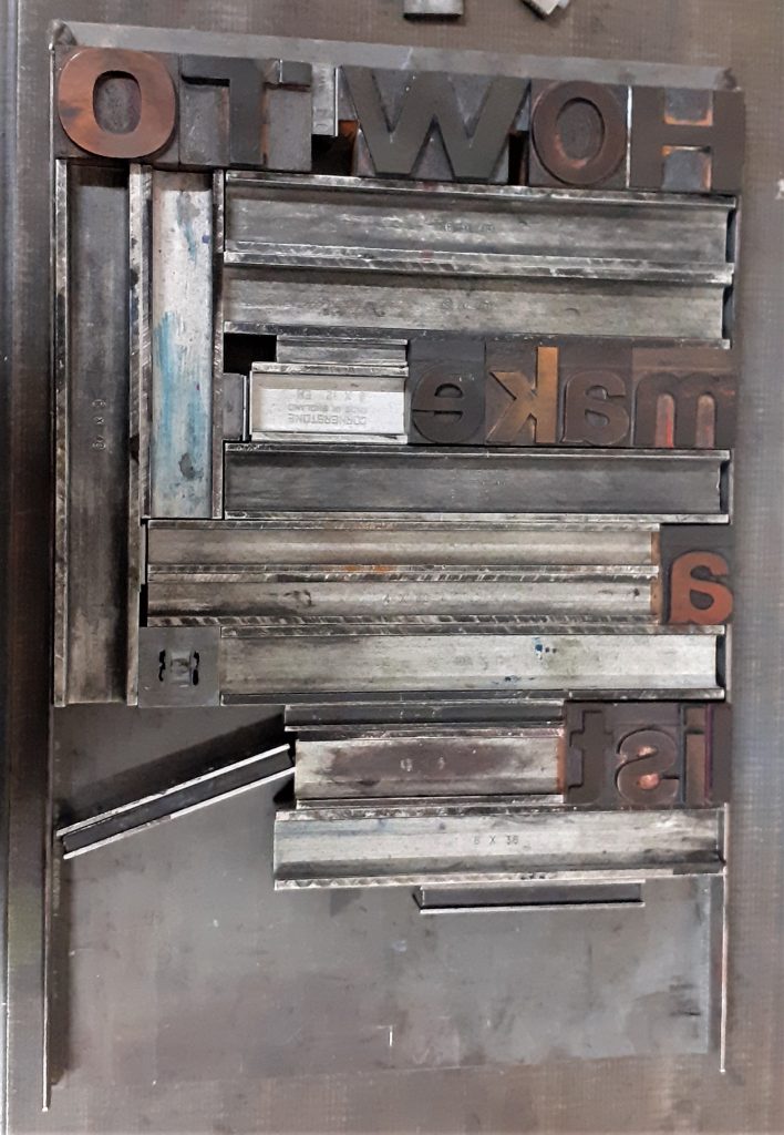
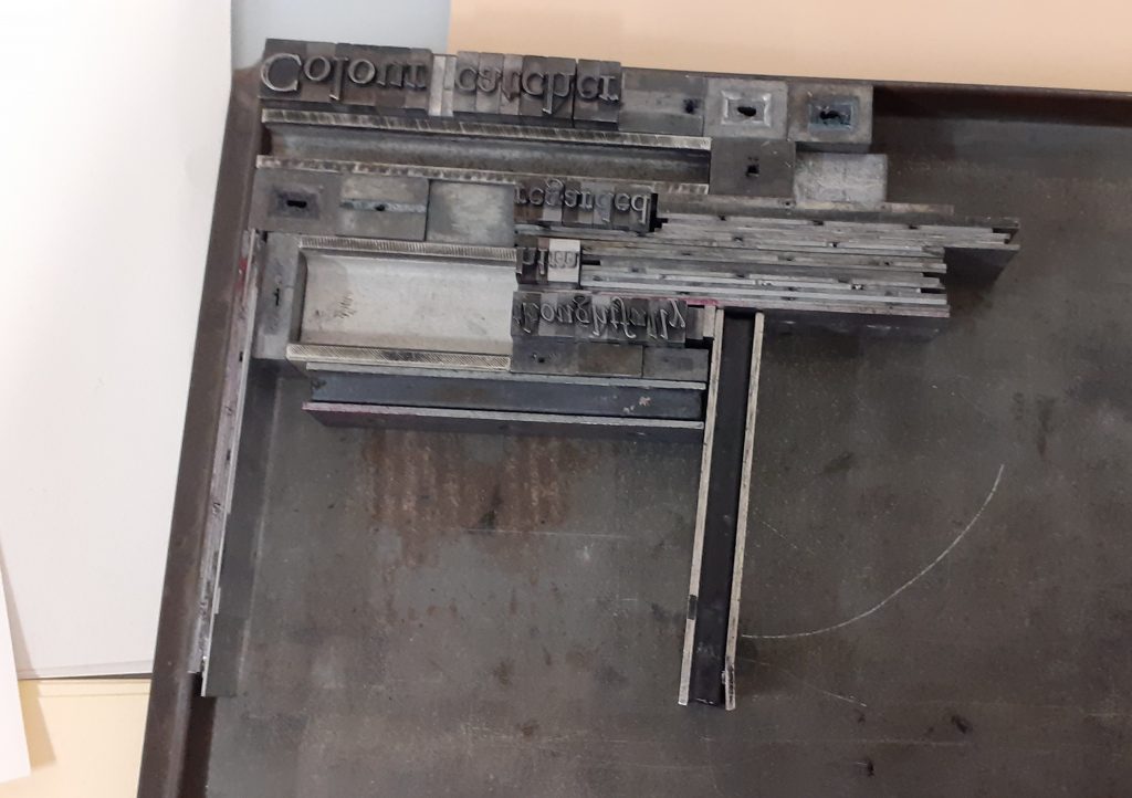
Metal letterpress
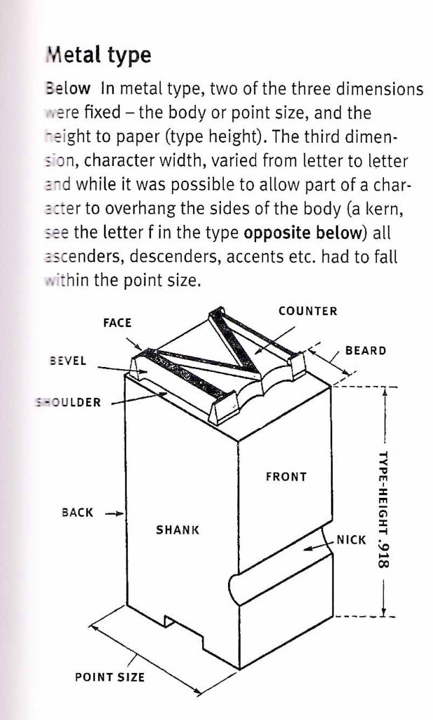
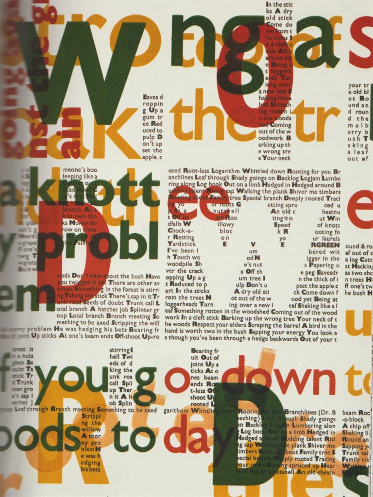
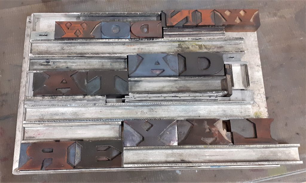
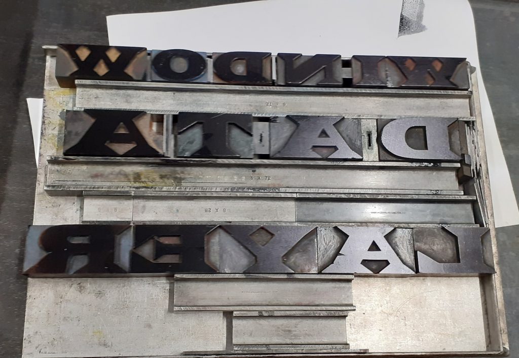
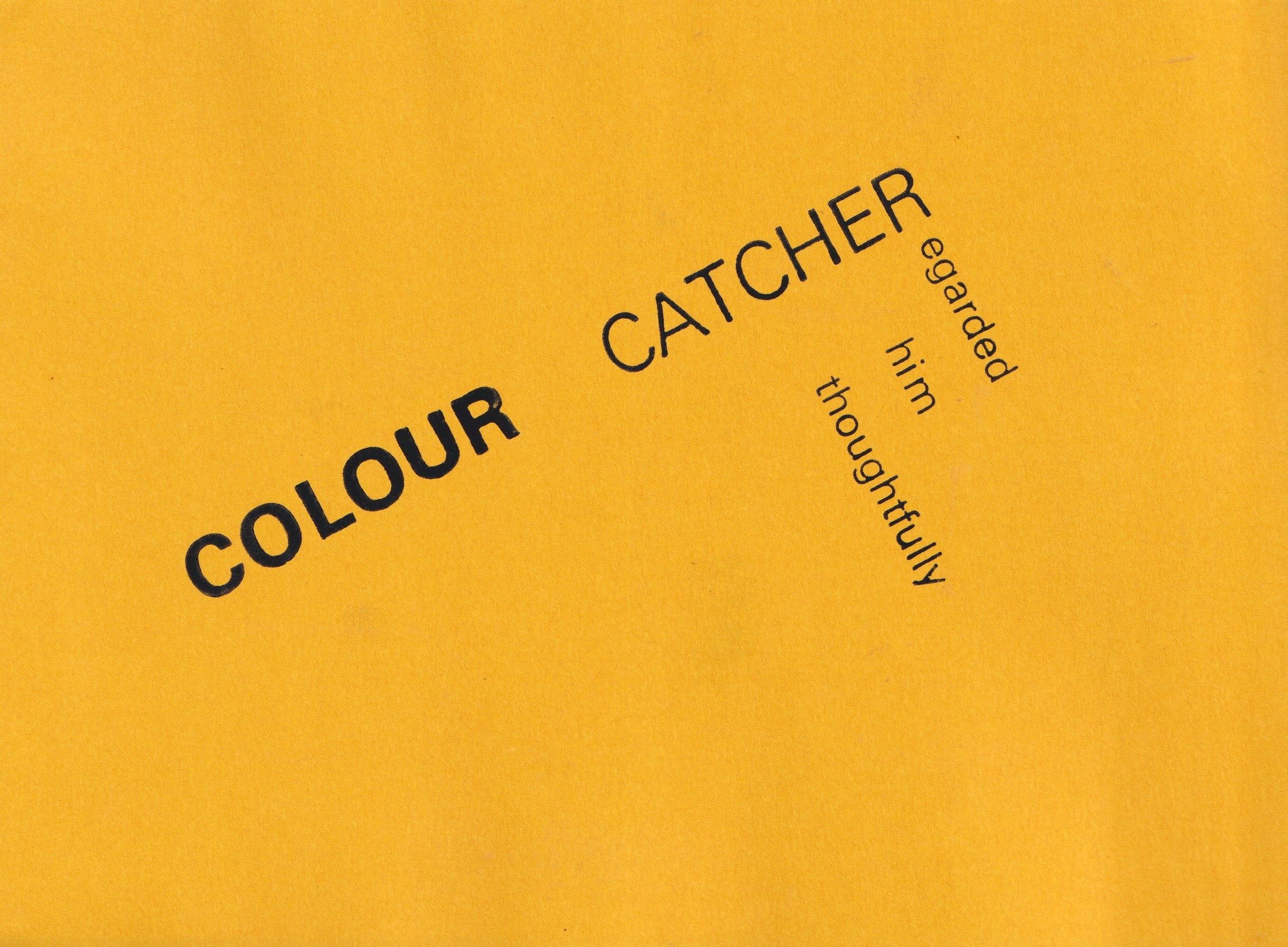
Week 3- moving onto metal letterpress, we were given the task of using these phrases to practice the letterpress technique:
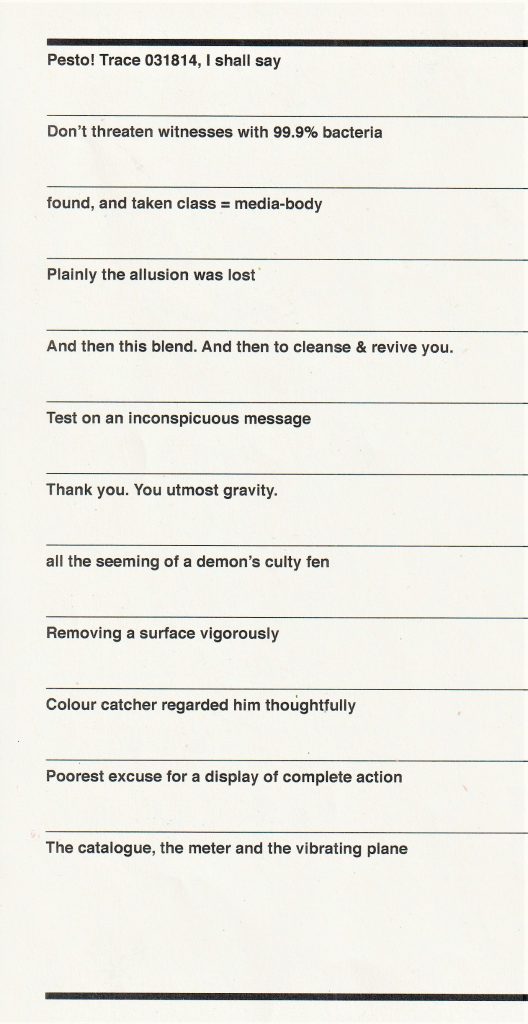
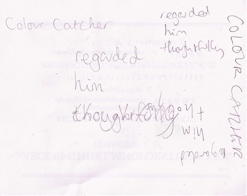
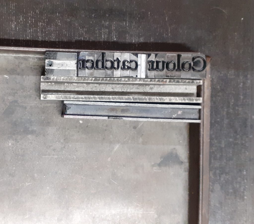
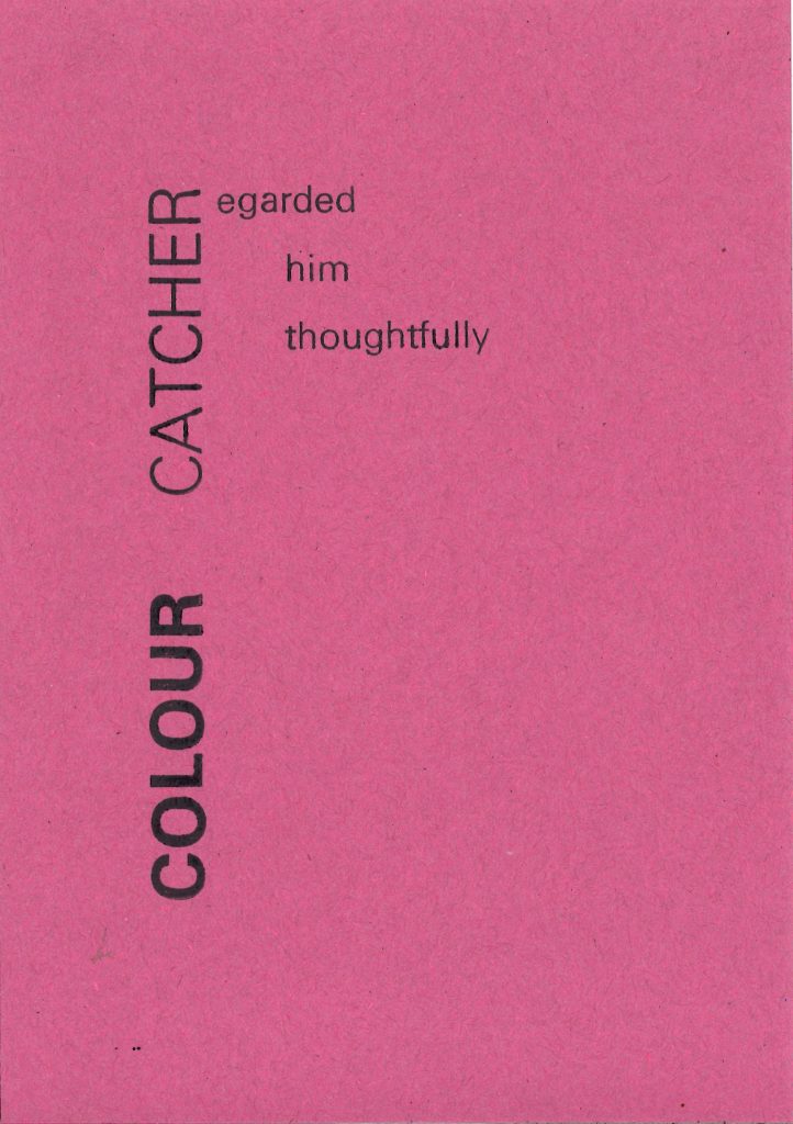
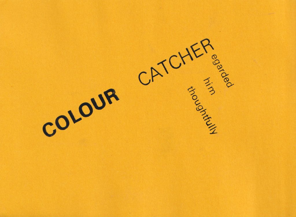
The first step was to decide on a sentence to depict using letterpress type. I chose Colour catcher regarded him thoughtfully, because The words are descriptive and conjure various movements and energy.
I needed to think about how I could express this meaning using the layout of the letters. I used a scrap piece of paper to sketch layout ideas:
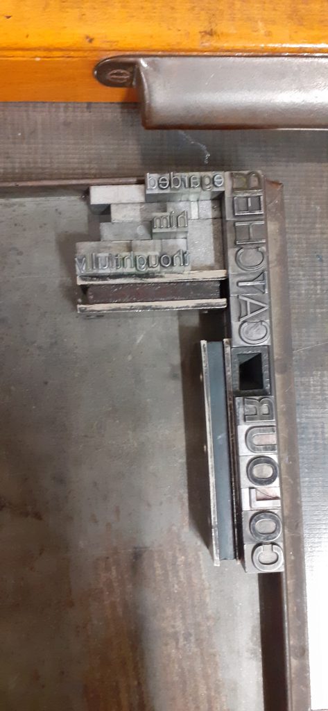
Bembo
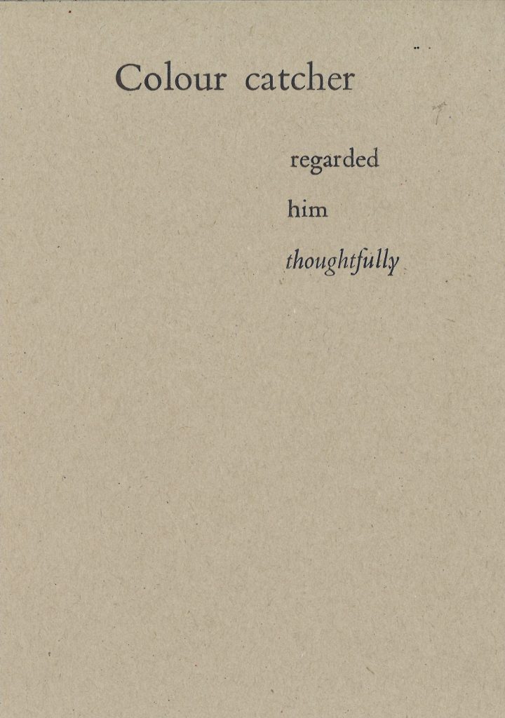
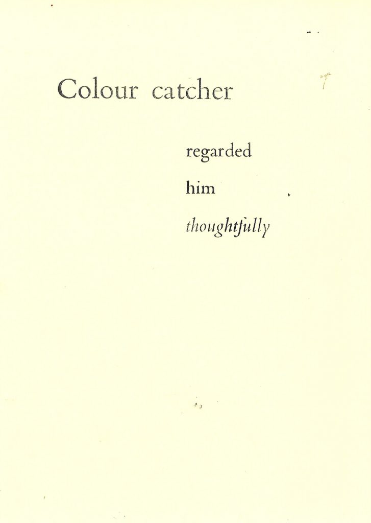
For the first print, I chose a serif font because I wanted to give the sense of the text within a novel. In this way, the text might read as in a piece of literature.
I chose the Bembo typeface for this first print. I used the larger point size for the top line to emphasise the character of the ‘Colour catcher’, by separating it from the rest of the text. I used Italic Bembo type for the word ‘thoughtfully’, to slow down the reader on this word and express the meaning of thoughtfulness.
I aligned the letters so the lines are ranged to the left. This was a confusing process because I needed to align them in a mirror image of where the letters will be printed on the paper.
Letterspacing the addition of space between the letters of words to increase the line-length to a required width or to improve the appearance of a line.
Typeface the raised surface carrying the image of a type character cast in metal. Also used to refer to a complete set of characters forming a family in a particular design or style.
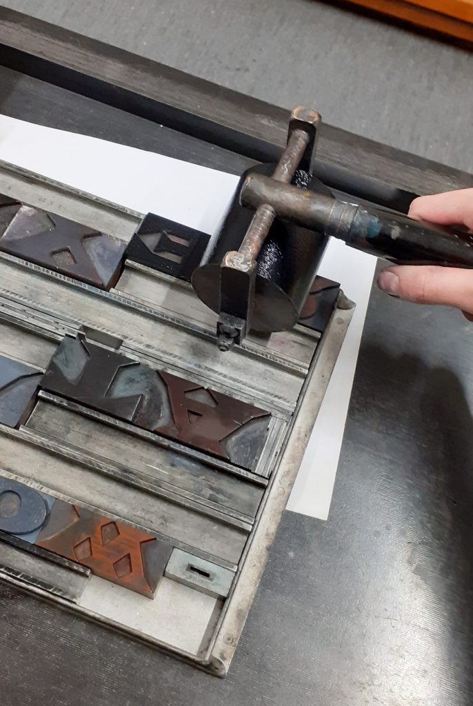
I needed to use metal ‘furniture’ and ‘leading’, to hold the type in place. Furniture is the name for the chunkier pieces and leading is the thinner pieces of metal.
Additionally, I used magnets to secure the pieces on the metal printing tray. I laid the letters in a block formation for the same reason.
The first attempt was unsuccessful because I had accidently placed the lines of text in the wrong order. I then corrected this and printed the corrected type on the same grey piece of card. The result is a symmetrical, mirror-like sentence, which although not making sense to read, does look interesting visually:
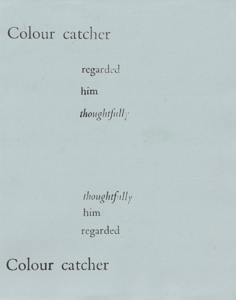
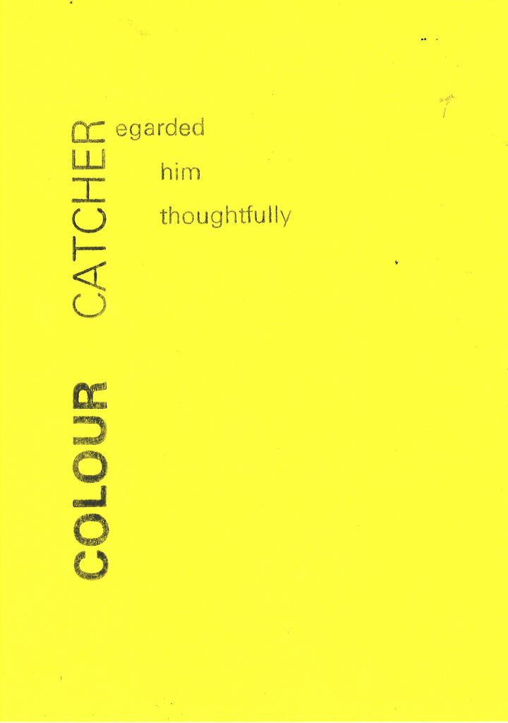
After correcting the mistake, I was able to print the sentence as it was originally intended:
Choosing to rotate part of the phrase meant that I would need to put the paper through the press in 2 separate goes. I removed the second part of the phrase and printed just the ‘Colour catcher’ onto a page. I then turned the printing tray so it sat at an angle. When I returned the paper to the press, I was able to print the words at a slight diagonal. This might imply that the narrative is taking a turn. I chose the bright green paper to create a stronger energy, compared to the subdued traditional brown paper from previous prints.
Univers
I wanted to try the other typeface available, which is a sans-serif font called Univers. I chose the 36 point letters for the start of the sentence. I chose a bolder letter for ‘Colour’ and the thinner version for ‘catcher’, to suggest many colours, or a bright colour quality and to make ‘catcher’ secondary.
I used the smaller, 24pt Univers type for the rest of the sentence to create more of a hierarchy.
I used 2 different orientations to play with the ‘R’ being a shared letter.
I stepped the words so that the first letter of ‘him’ and ‘thoughtfully’ were roughly in line. They needed to be far enough from the word ‘Catcher’ that there would be space to read the words clearly.
I used less ink for this print below. I like the texture created by using less ink. This is seen particularly in the word ‘Colour’.
(below) I rotated the paper to create diagonal leading lines across the page.
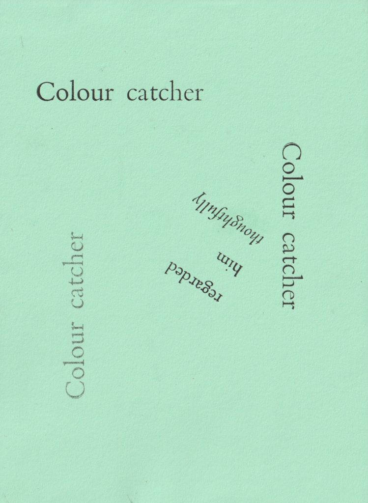
For this print, I repeated the first line around the page. I like the spiral effect this has. By scattering the words around, I have created a print that feels dynamic and playful.