Literature Review
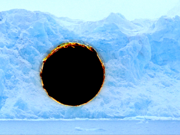
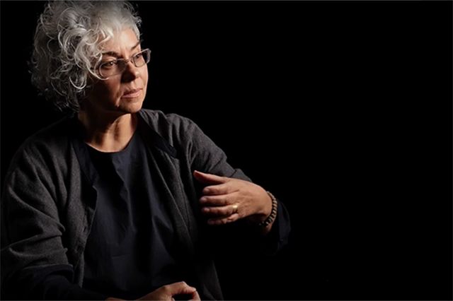
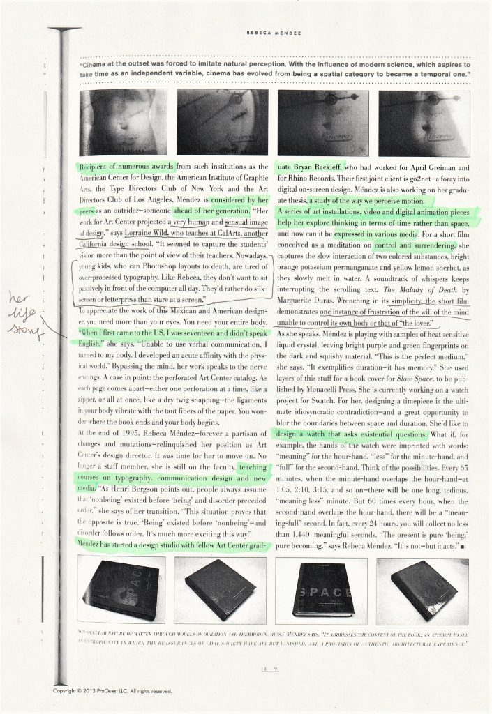
In week 2, our lecturer Luisa assigned each of us a female designer to research. The designer I was given was Rebeca Méndez. She is a contemporary graphic designer and fine artist. Méndez was born in New Mexico in 1962. Within her art, she focuses on environmental subjects, systems, cycles natural and human phenomena. She expresses her concepts through film, photography and installation.
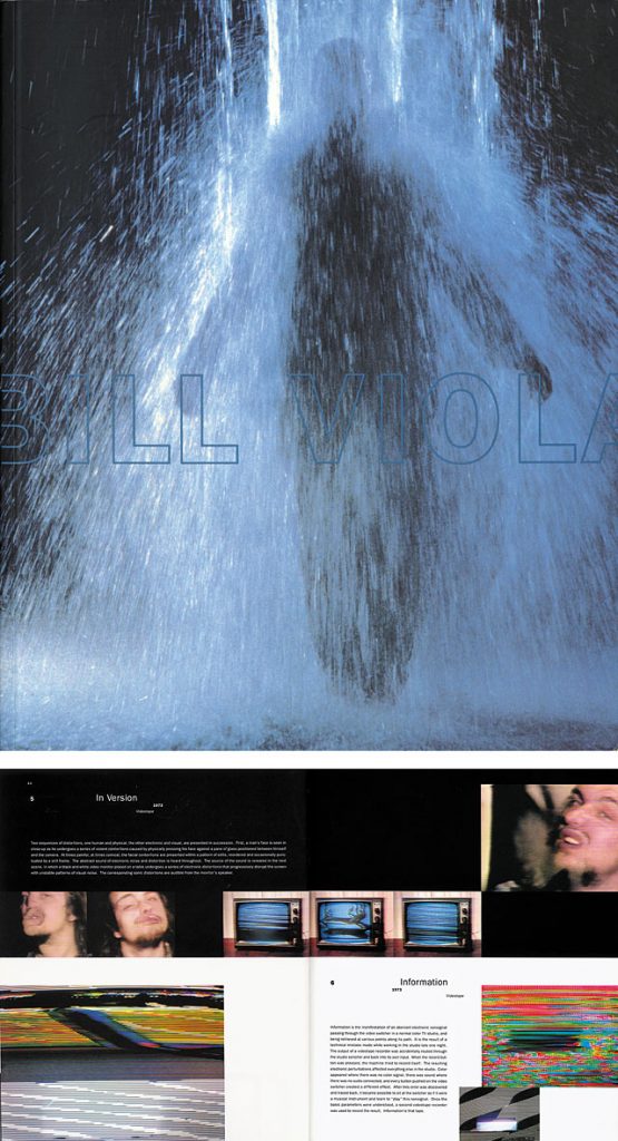
When searching for research material, my first instinct was to go to the Brookes library. ‘Library search’ on the Brookes website searches for journals, ejournals, ebooks, books in print and collections. I typed ‘Rebeca Mendez’ into the search bar.
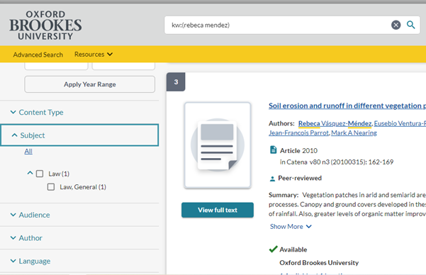
All the results were for Law books.
I then searched in other places and kept a record of where I had searched.
Search History:
Library search no luck
Oxford Reference no luck
Bridgeman education no luck
Oxford art online no luck
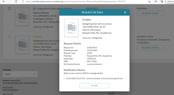
In week 3’s lecture, we were asked to write the first 100 words of our assignment.
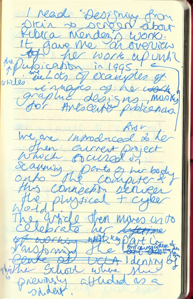
We then shared some of what we wrote and received feedback. It was helpful to hear Luisa’s feedback for my classmate’s work, as I found myself making the same mistakes as them.
For example, a few tips she gave us to think about:
- “One interesting aspect of the book…” instead of “It’s interesting.”
- “The author recounts…” instead of “the author says.”
- Avoid long quotations
- “The article places emphasis on…”
- Focus on the core aspects of the interview.
Within this week’s lecture, we began by watching Ways of Seeing. This is a documentary from the 1970’s with John Berger. We watched part 4 and made notes.
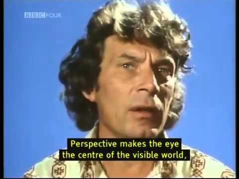
John Berger / Ways of Seeing , Episode 4 (1972) – YouTube
This is a BBC documentary, aimed at the wider general public in Britain. Berger delivers the documentary in a didactic style.
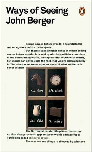
WAYS OF SEEING MINT BERGER JOHN PENGUIN BOOKS LTD PAPERBACK SOFTBACK 9780141035796 | eBay
The series was made into a book, which has interesting design features.
Our lecturer Luisa then asked us to describe in 50 words what the documentary is about:
(my response)
John Berger talks to us about the images we see around us everyday. He uses the phrase ‘publicity’ to talk about images used in advertising, and in the media around us. He makes comparisons between these images and the oil paintings of the past. He explains that the images used in publicity do not relate to our lives, but to an imaginary future that we are encouraged to strive for.
She then asked us what we thought of the format of the video:
He talks to us in a didactic style, like he is revealing something we have not considered before. He is filmed against a blue backdrop throughout the video. The simple background keeps the audience focused on his words. We are shown snapshots throughout that relate to the subject he is talking about. It is effective in helping us make a visual connection by seeing these examples. By showing us the scenes of factory workers, we are forced to see the reality of our lives in direct comparison to the scenes of glamour we are being fed by publicity.
The purpose of this exercise, as well as teaching us design history/theory, was for us to practice our writing skills. We need to learn to write in 2 ways: analytical and fun/interesting. This writing exercise helped me to prepare for the literature review next week. Giving us a word limit of roughly 50 words, encouraged me to think about writing in a concise way.
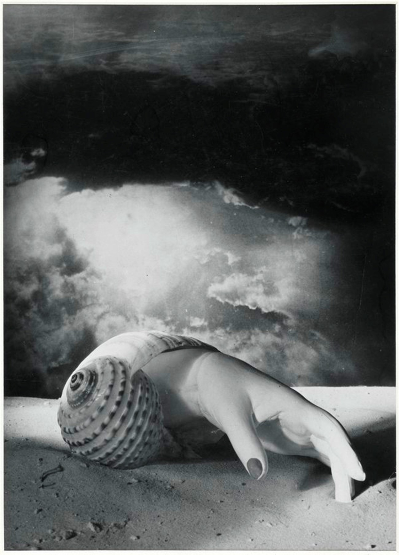
We then looked at artwork by Dora Maar:
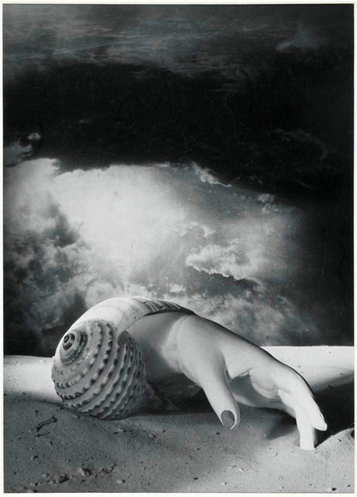
Dora Maar – Exhibition at Tate Modern | Tate
The image first reminded me of the hand washed up on the beach at the beginning of the film Jaws (1975). I felt that I was not very imaginative in this exercise. I wrote in the first style I thought of, which is to analyse a piece of artwork. This meant my writing sounded very essay-like. I asked myself ‘How can I tell more of a story within my writing?’
