London Design Museum- Waste Age: What can design do?

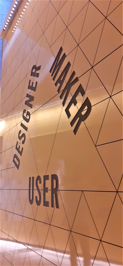
First a bit of London…

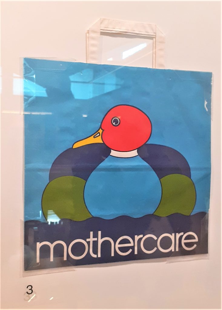
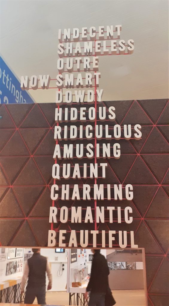
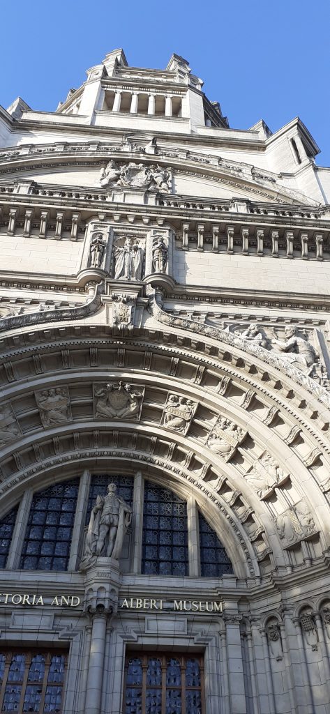
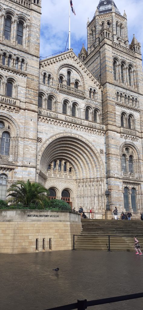
Looking at Gothic architecture in Kensington. These elaborate buildings are based in the same area of London. The architecture makes me want to explore the inside of the buildings.

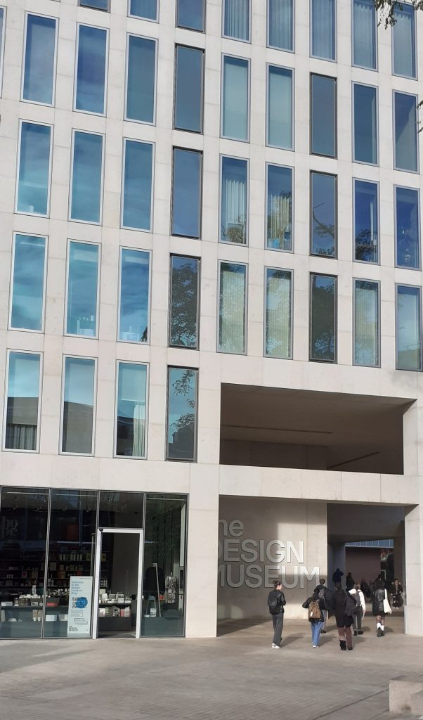
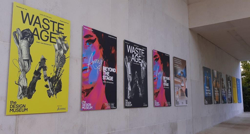
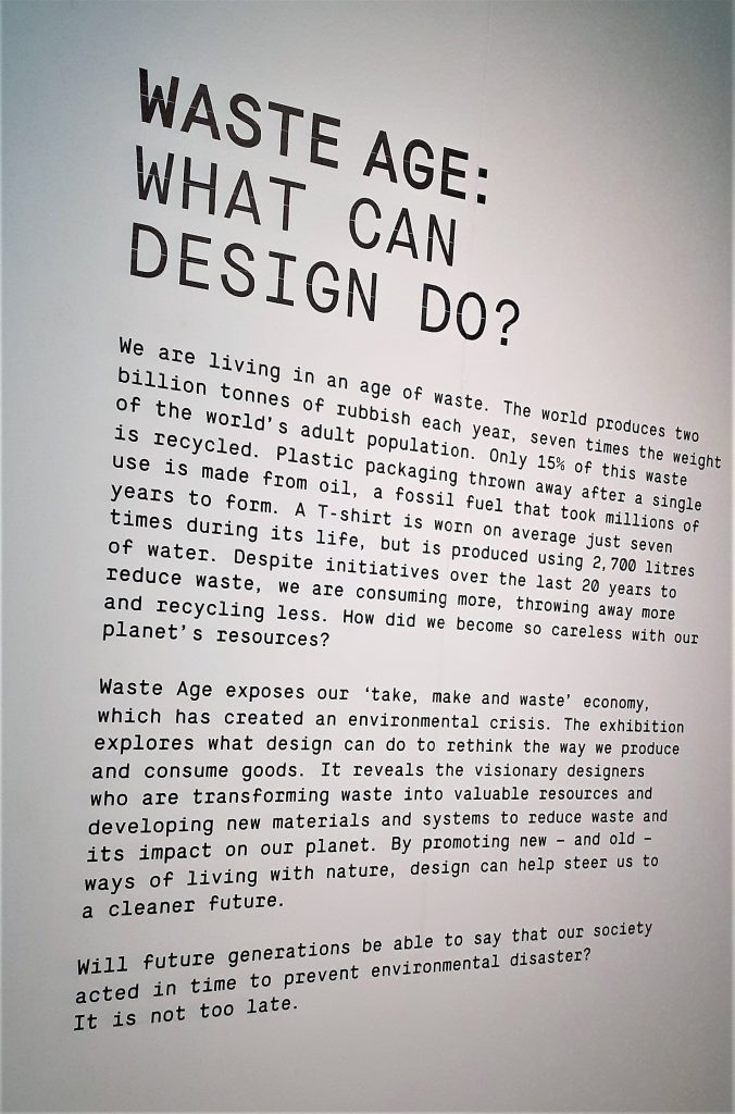
Downstairs in the design museum, I found the exhibition Waste Age: What can design do? At first, I was not sure what connection the exhibition would make between the climate crisis and design. I was not disappointed.

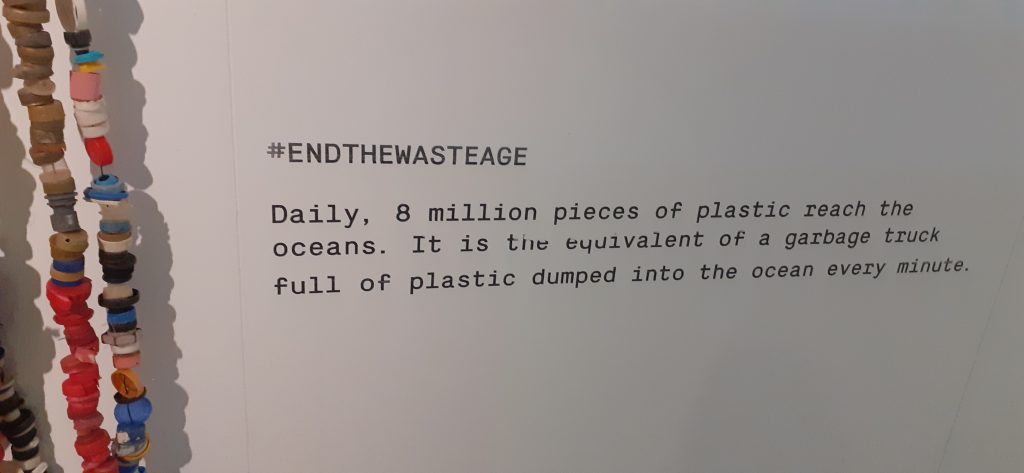
It was an emotional experience, but equally insightful. This exhibition forced me to think about the origins of the objects we see around us everyday and what happens to them after they are thrown away.

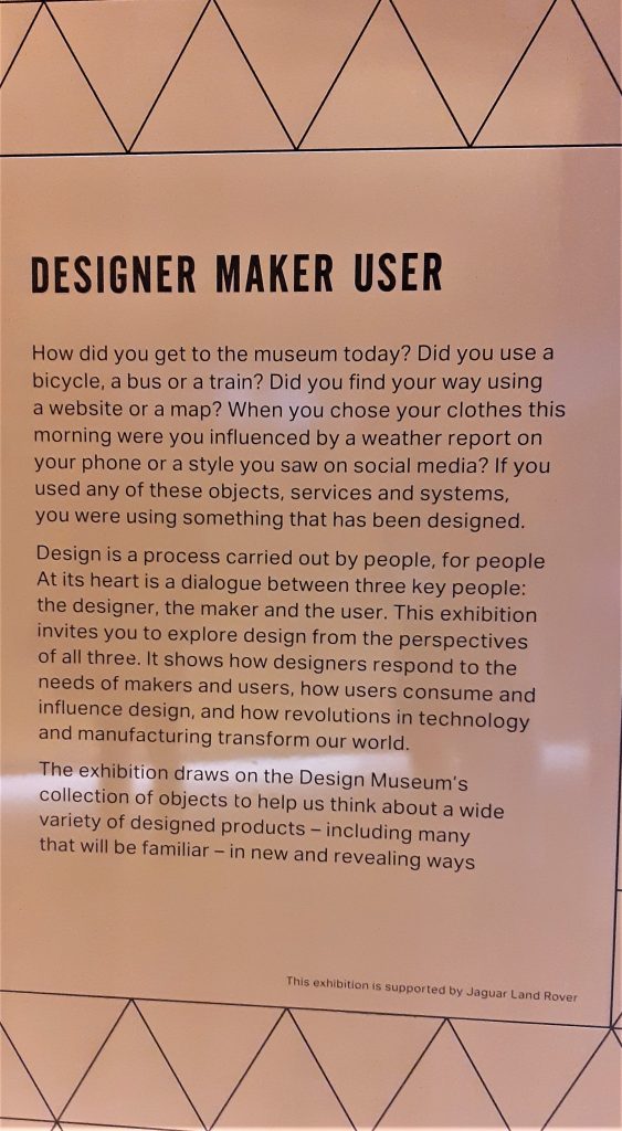
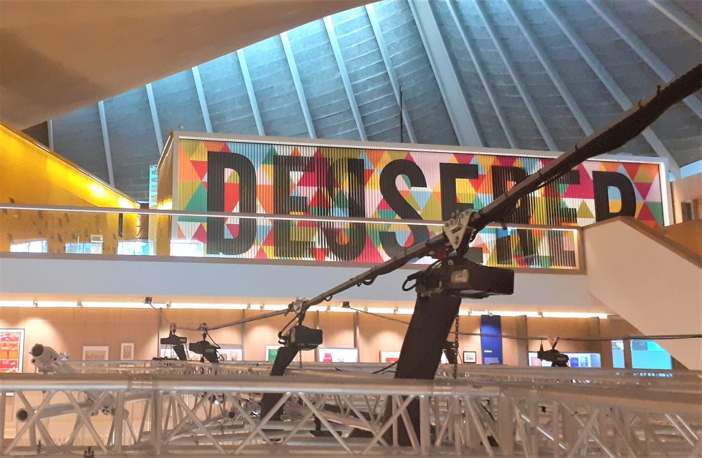
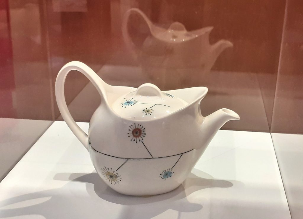
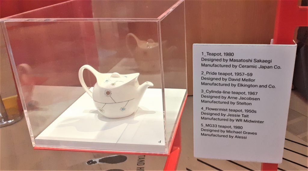
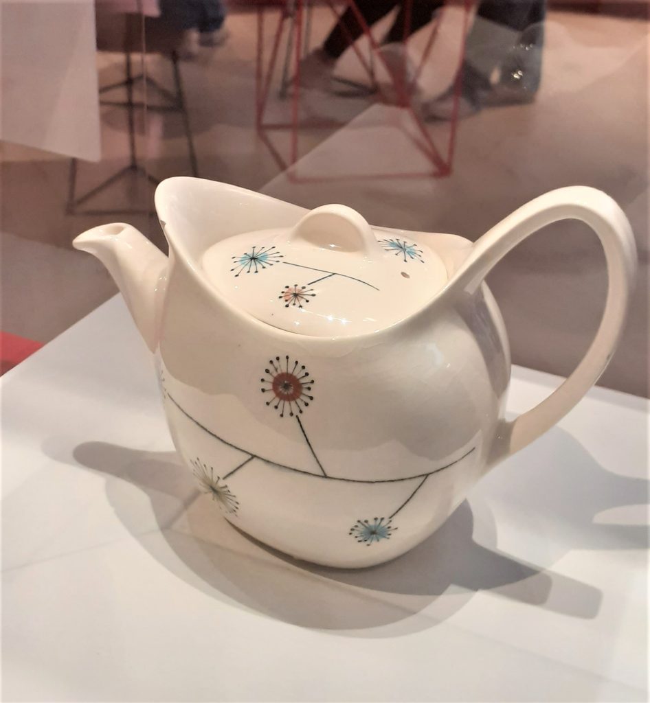
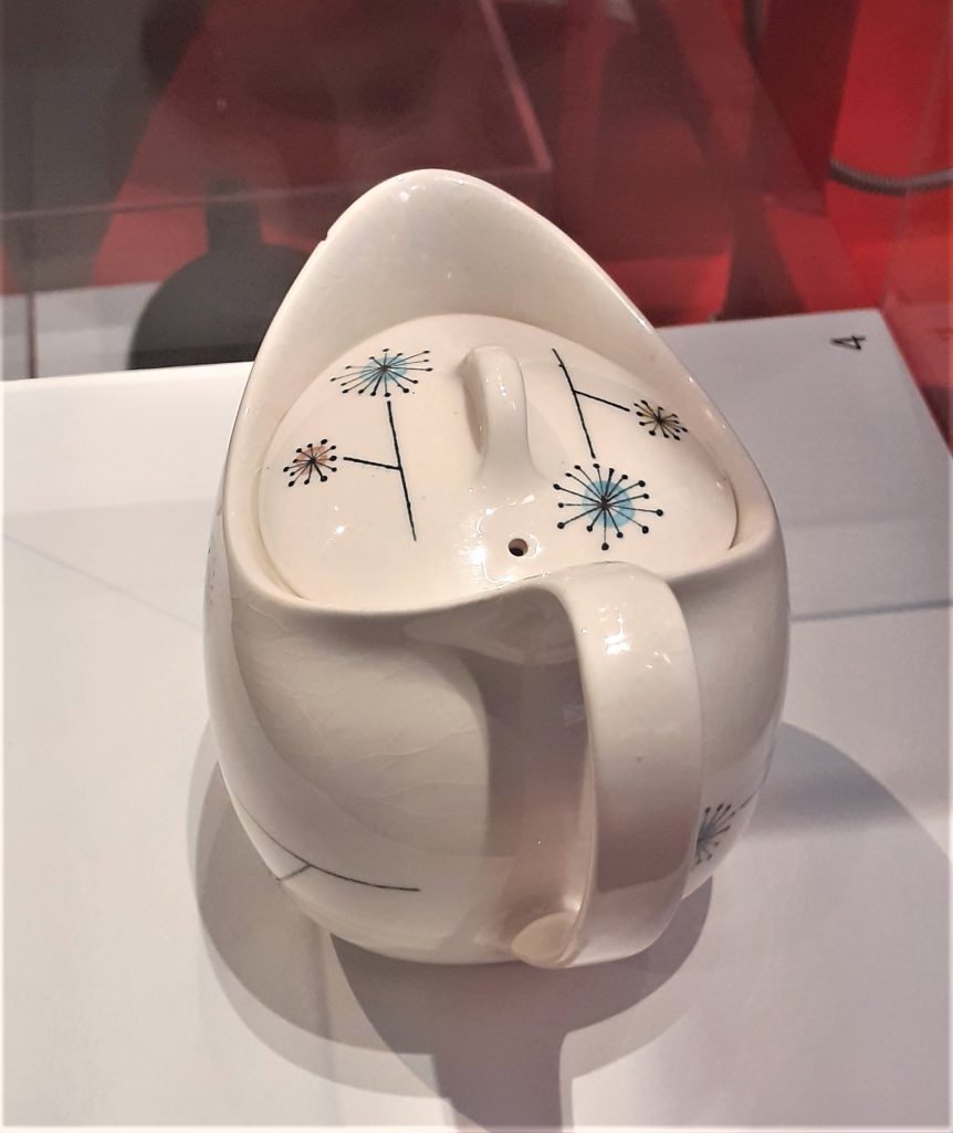
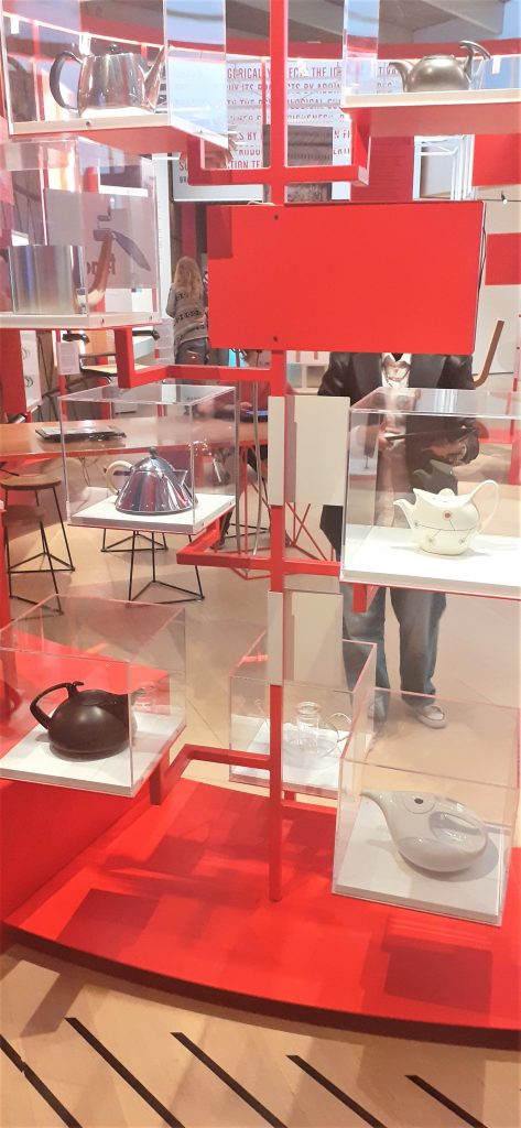
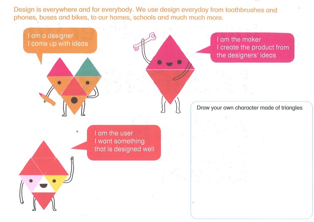
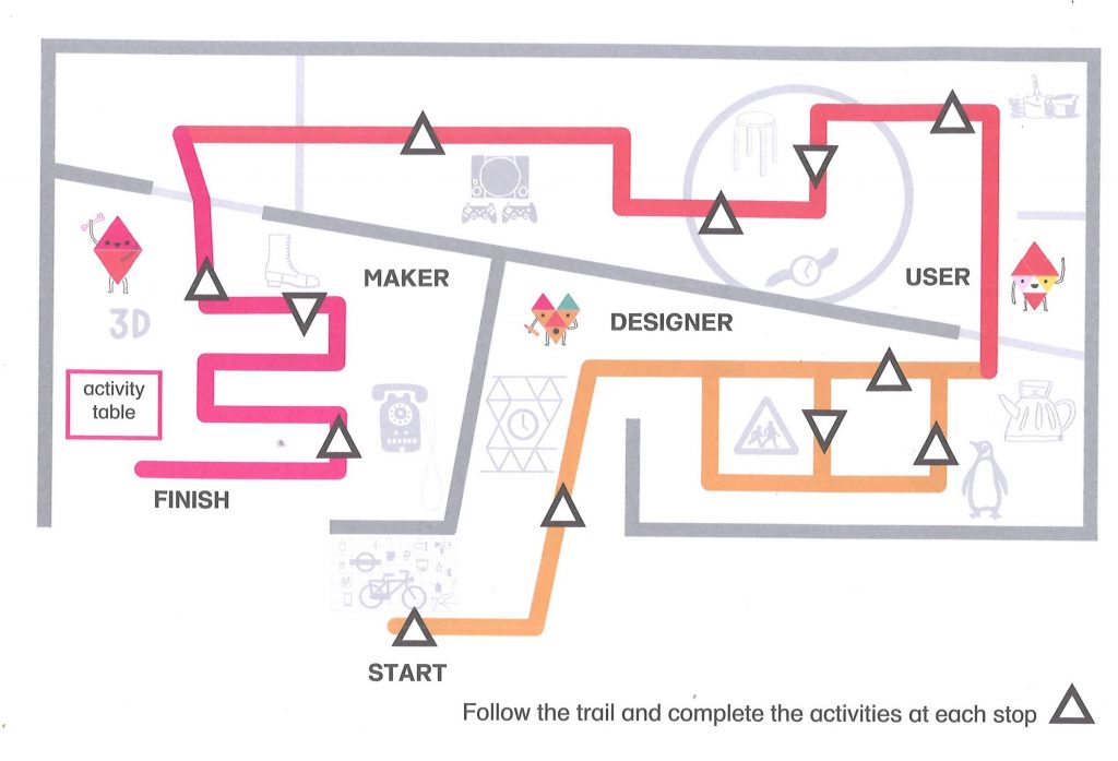
I was happy that I had seen Designer Maker User before Waste Age because I first was focusing on the designs rather than the affect of the materials on the planet. If I had seen Waste Age first, these ideas would have influenced the way I looked at the objects upstairs.

Everyday objects were placed on a plinth in the centre of the room, upon entering the exhibition.

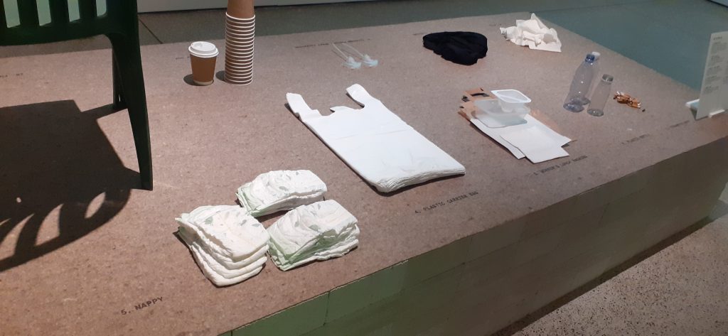
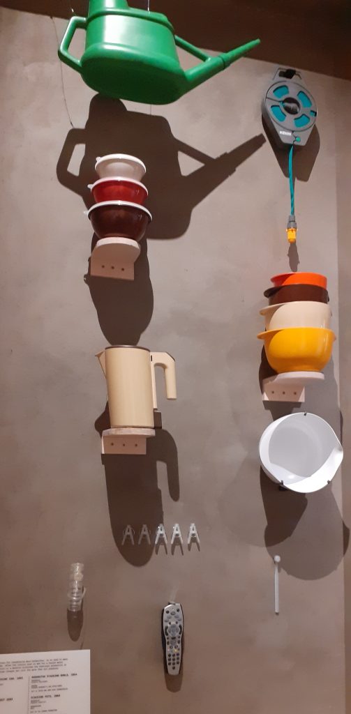
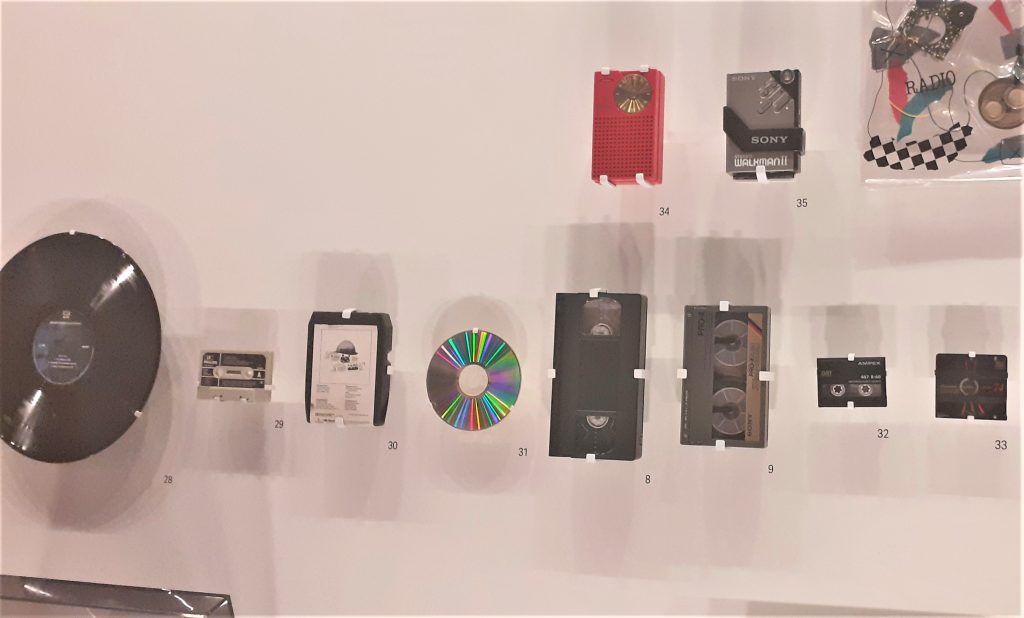
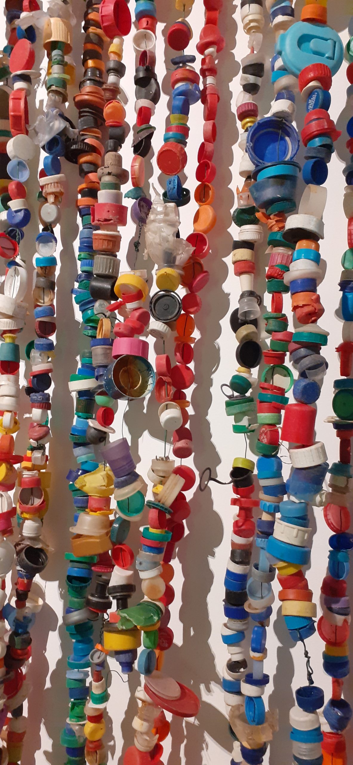
It was overwhelming to be surrounding by so many familiar objects that are made of plastic.

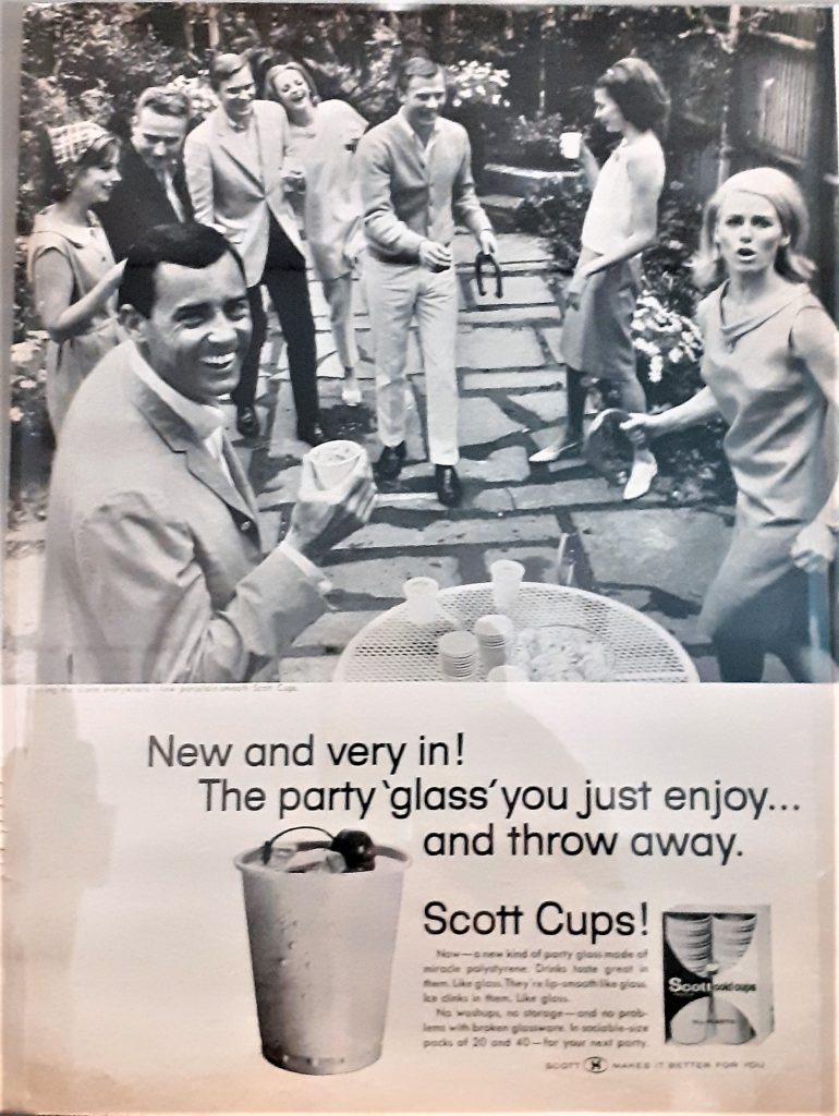
This poster was originally in a magazine, advertising polystyrene cups. It was shocking to see that their disposable quality was their selling point.

Textile woven from industrial waste. (above and below)

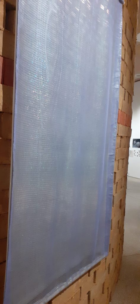
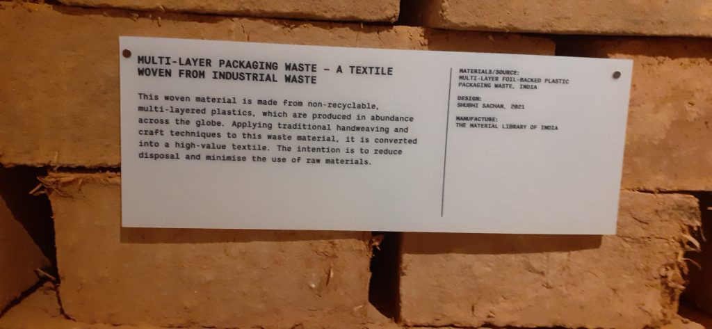
One section of the exhibition displayed many objects made from recycled materials. Also on display were designs which aim to lower our impact on the planet. The exhibition is about re-thinking how we design, then make and use objects. A video showed us interviews with people in the design industry, discussing changes we could make. One person commented on the fact that human’s behaviour goes against nature. Where other animals do not leave behind waste that can’t be broken down or re-used, we do.

My first response when seeing so many objects made from recycling materials, is ‘why isn’t this done everywhere, since we know it is possible?’

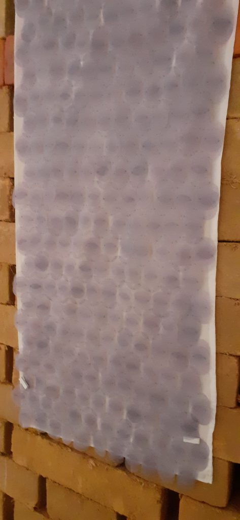
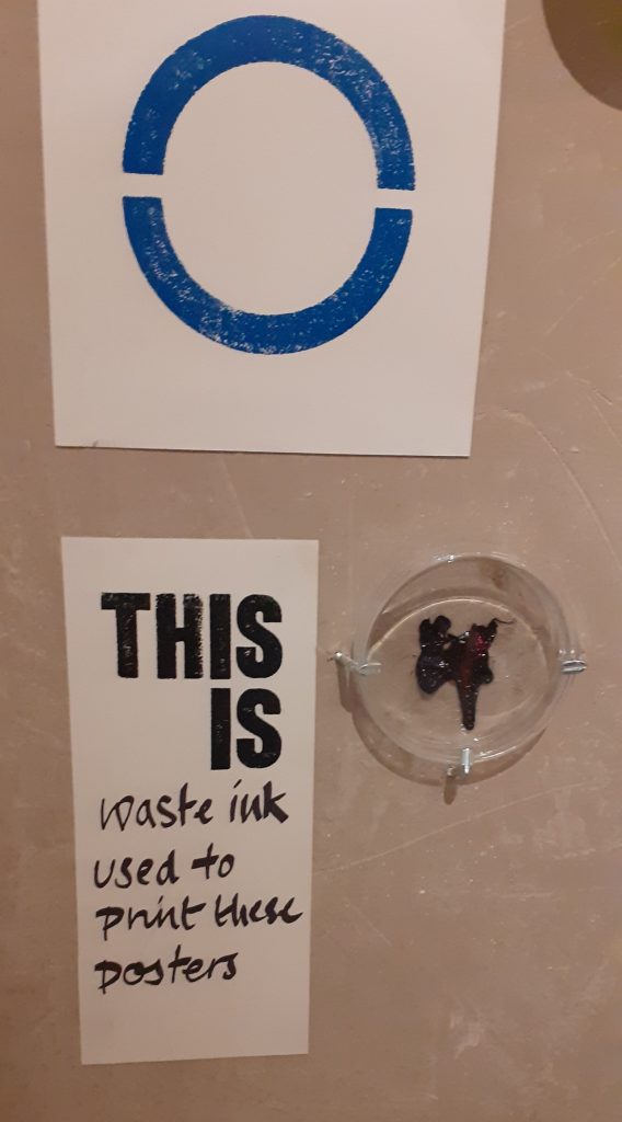
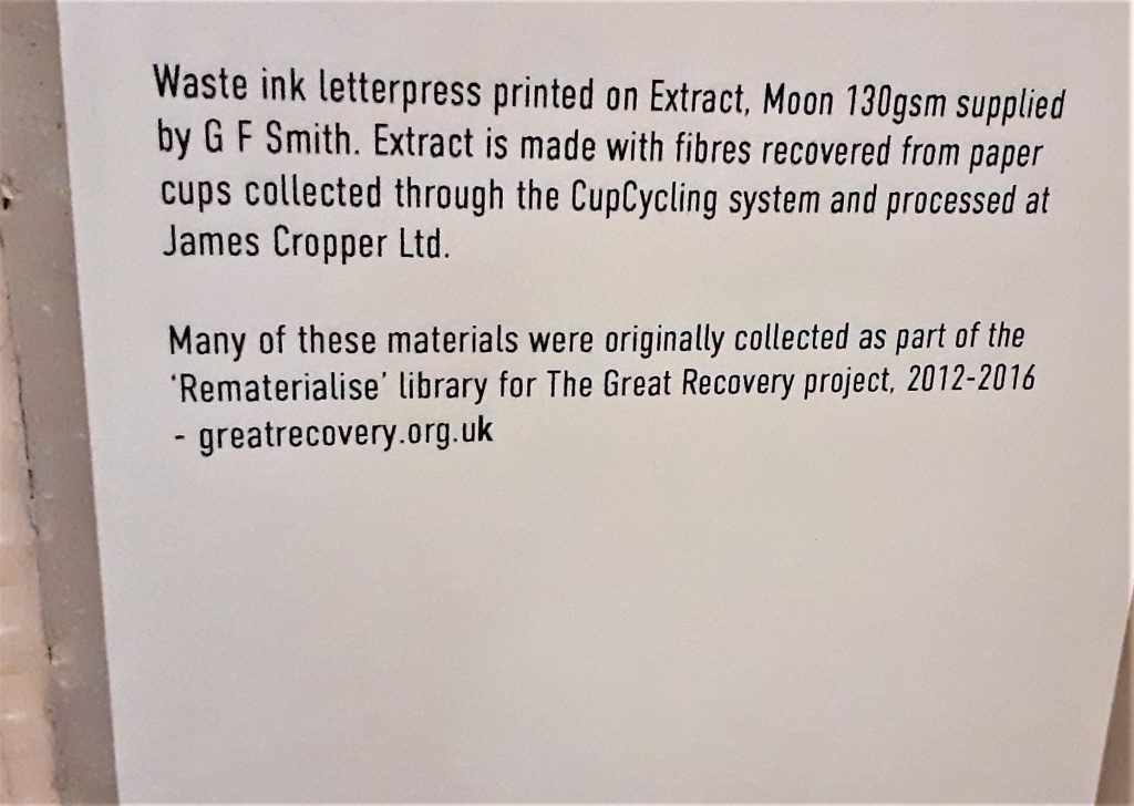
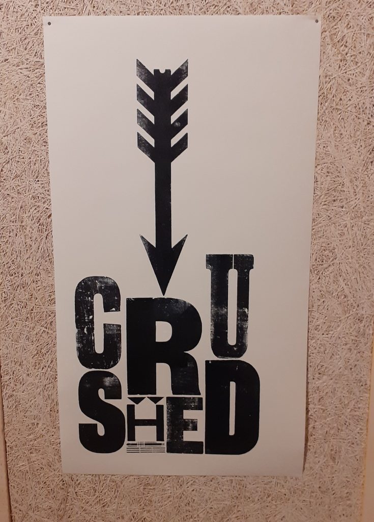
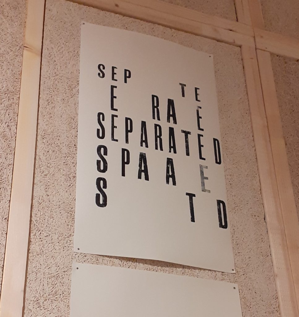
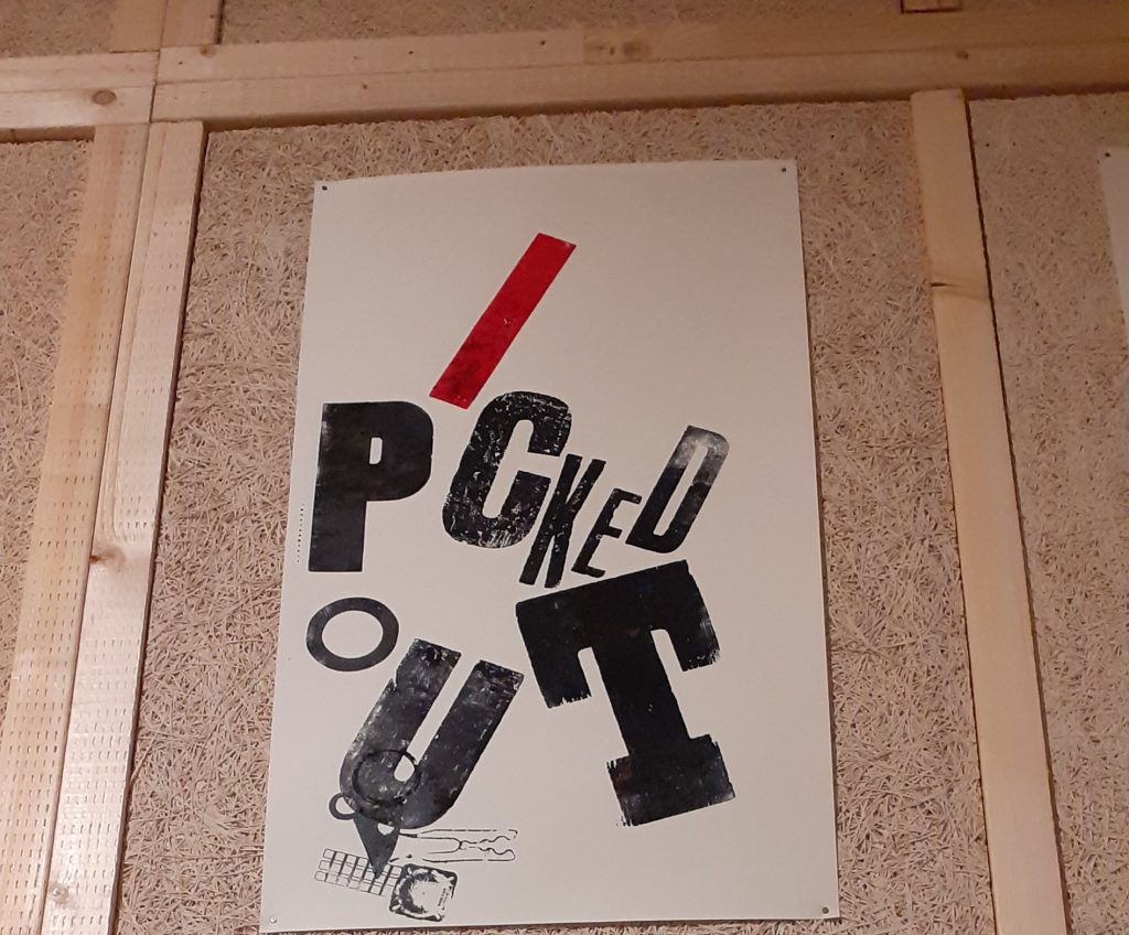
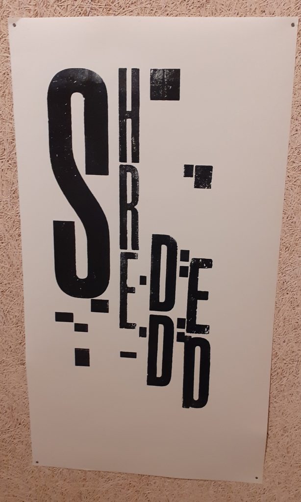
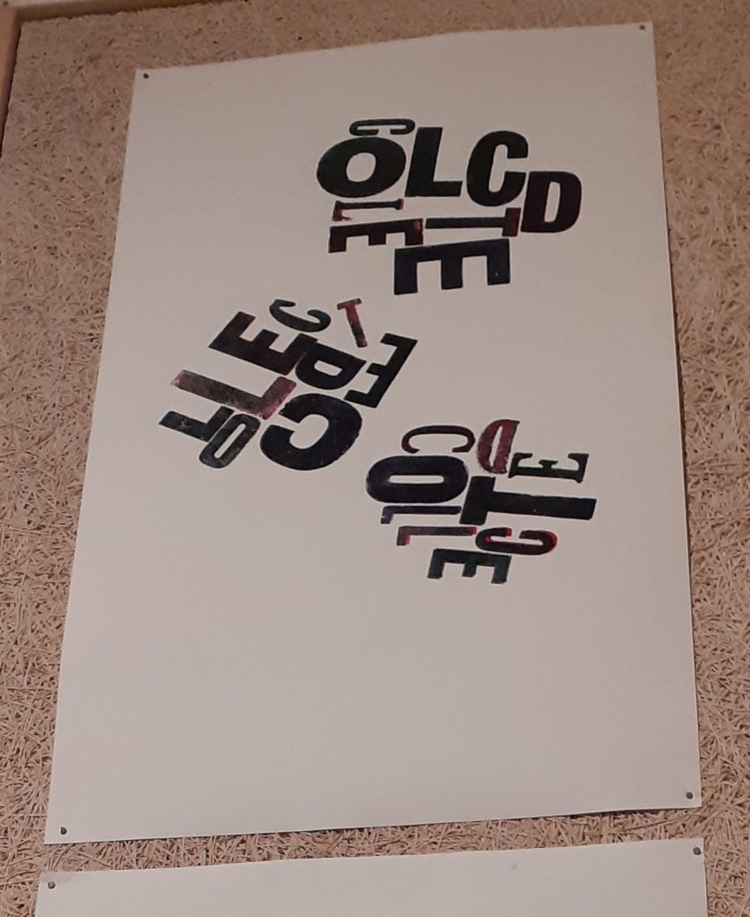
These prints are made using waste ink. I really like the designs. They are clever and eye-catching. The words visually get across the meaning by the way they are laid out on the page.

One thought I was left with after the exhibition:

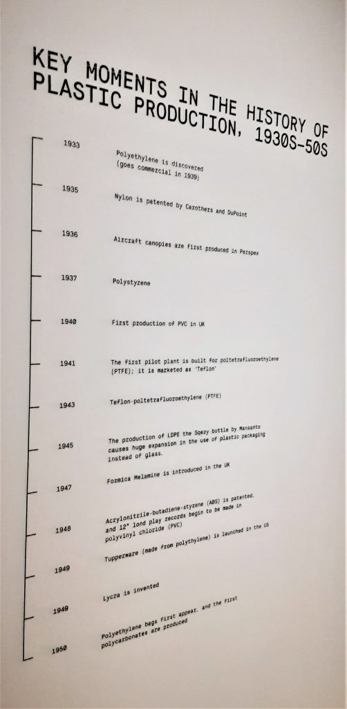
Plastic has only come into use during my mum’s lifetime. In such as short period we have done so much harm. But people are working on the solutions every day. For the short amount of time plastics have been in use, an even shorter amount of time has been spent researching technologies and designs to help us undo the mess we are in. We may need to go back to some of the old ways. People turned to throw-away design solutions for convenience. During the Covid-19 pandemic, public health and hygiene has been the reason for creating even more waste. We have something to overcome which is a mental attitude of how we approach the problem. It is the responsibility of designers and users. But we also need data. The data to figure out which is worse: throwing away a plastic cup or producing recycled cups which takes energy to manufacture.

London Design Museum- Designer Maker User

Objects in a shop display, Kensington.
The exterior of The Design Museum.
Posters for exhibitions at the design museum.

Designer Maker User.

The name of the exhibition is displayed on a large board. The letters are written on slats which rotate to display the next word. I first thought this was a digital screen, but seeing it closer up I saw that the words were printed on a material like plywood.

The soft lighting and wood interior within the design museum creates a friendly warmth throughout the building. After the rush of London, I felt relaxed.

The first objects I came across on the top floor of the museum.

Shoes. guitar. Sewing machine. Suitcase. Walkman. Bottle opener. Bike lock. Mug. Typewriter. Jeans. Slinky. Skateboard. Flip-flops. Camera. Violin. Gameboy. Bible.

I was surprised at the arrangement of objects and the assortment on display. The objects were placed quite closely together which felt slightly disconcerting because there appeared to be no connection between each object. My first thought is that these objects have come from many different people and places. Perhaps there was no other way to introduce this exhibition that shows us such a wide variety of design.

The typewriters hanging on the wall was an interesting sight. I have never seen a typewriter displayed from a wall in this way. The way they were shown as a collection was satisfying to see. I found them beautiful. As a child, I was always drawn to my mum’s blue typewriter and wanted one myself. Seeing these typewriters brought that feeling back.
Valentine typewriter, 1970. Designed by Ettore Sottsass and Perry King.

Olivetti Praxis 48 typewriter poster, 1967, Designed by Giovanni Pintori.

It was really nice to see the poster behind the physical object of the typewriter. In my head I could put the 2 together and imagine the time they came from.

Olivetti Lettera 32 typewriter poster, 1968-69. Designed by Walter Ballmer.

Here the designer has played with scale to created a surprising image where the egg is as large as the typewriter. Seeing the typewriter at this angle is another unusual element to this poster.

One classmate made the point that the older technology was new to our parent’s generation.
Flowermist teapot, 1950’s, designed by Jessie Tait.

I loved this unique teapot as soon as I saw it. This is the kind of item I would be tempted to buy. It is delicate, pretty and functional. The way the teapot was displayed allowed me to view it from all angles. The light directed onto it acted as a spotlight, drawing me to the object. The shadow created on the side of the pot highlighted the shape of the design.

The way the teapots are displayed together is interesting. The frame they sit on is asymmetrical. It reminded me of a teapot tree out of a fantasy story. They appear to be floating due to the transparent cases.
Logos on the wall of the exhibition, showing us how the design has changed over the years.
Seeing my hometown of Reading on the poster made this historical object feel more real to me. I could imagine the people marching in the street, rather than if the poster had been about somewhere I do not know.

I really like the use of repetition in this poster and the black and white design. The lack of colour helps the shapes to stand out. The line at the bottom of the poster gives us a visual representation of the route of the march.

Displaying photos of the protests next to the poster gives us context for the object.

Wall of time. This wall displayed clocks, watches, a filafax, and other objects to organise a person and mark time. In the top right-hand side, I saw the Ball Wall Clock. This object immediately intrigued me.

I first felt awestruck. Then joyfully impressed. I could not relate this design to anything I have seen before. I guessed that the object was old. I have always struggled to read clock faces and numbers in general. I usually dislike any clock that does not have numbers on it. I like I would struggle to use this clock if it were mine. But the cheerful quality of the design overrides this for me.

The story behind these tasting spoons interested me. At first they appear to be identical. The design looks the same in all four spoons, except they function slightly differently because they give a person a slightly different experience depending on the material used.

Shopping bag for Mothercare, 1980’s.

I was surprised to see the thickness of the plastic bag. The colours are bold and bright. Plastic bags are no longer made in this way. Because of the thickness of the material, I imagine that this bag is durable. The simplicity of this design is very effective and the red of the duck’s head is eye-catching.

The list of words at the centre of the exhibition could describe design or objects.

I picked up this pamphlet for families at the exhibition:

I really like these illustrations.
Map of the exhibition.