A letter is a mark or glyph (symbol) used in an alphabetic writing system to indicate a sound.
Introduction
Unlike other writing systems from around the world, the English
alphabet (also known as the Latin-script alphabet) is a system
that consists primarily of a kit of parts that both directly informs the
shapes of sound (vowels and consonants) and signifies symbolic
values: for example, A, B, C, can have ‘symbolic’ meaning (think
of the phase ‘alphabetical order’), while a, b, c, (ah, bu, cu,) rather
instructs on how sound needs to be shaped to form a word.
Speculative, or ‘a-semic’ typography is a strategy that can be
applied to the study of writing systems to enable us to scrutinise
both the concept of writing itself, and typographic systems,
through formal speculation and experimentation; By developing a
‘speculative’ system of meaningful symbols or ‘parts’ – i.e. ones that are
not ‘semic’, meaning they are not [currently] readable – we can bring
the function of these graphic systems to the forefront of our attention.
We will also explore the subtle intersections of graphic information
that exist across all human artifacts, where ordinary manufactured
objects can often be found to exhibit residual typographic value
and relevant qualities.
https://medium.com/fgd1-the-archive/found-font-1995-present-2328b96459fe
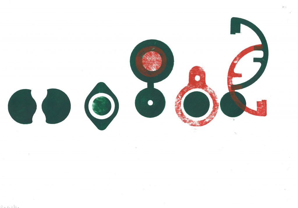
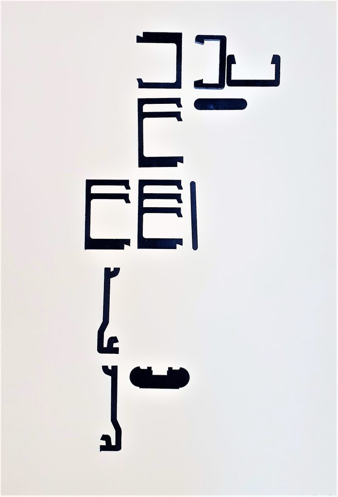
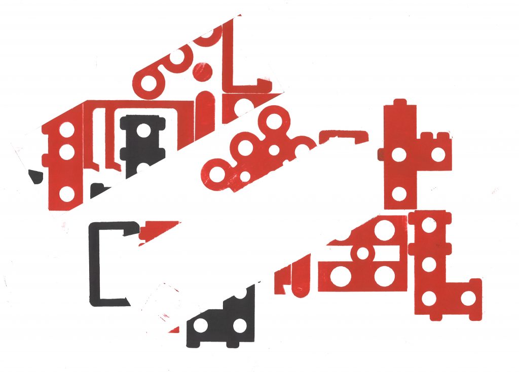
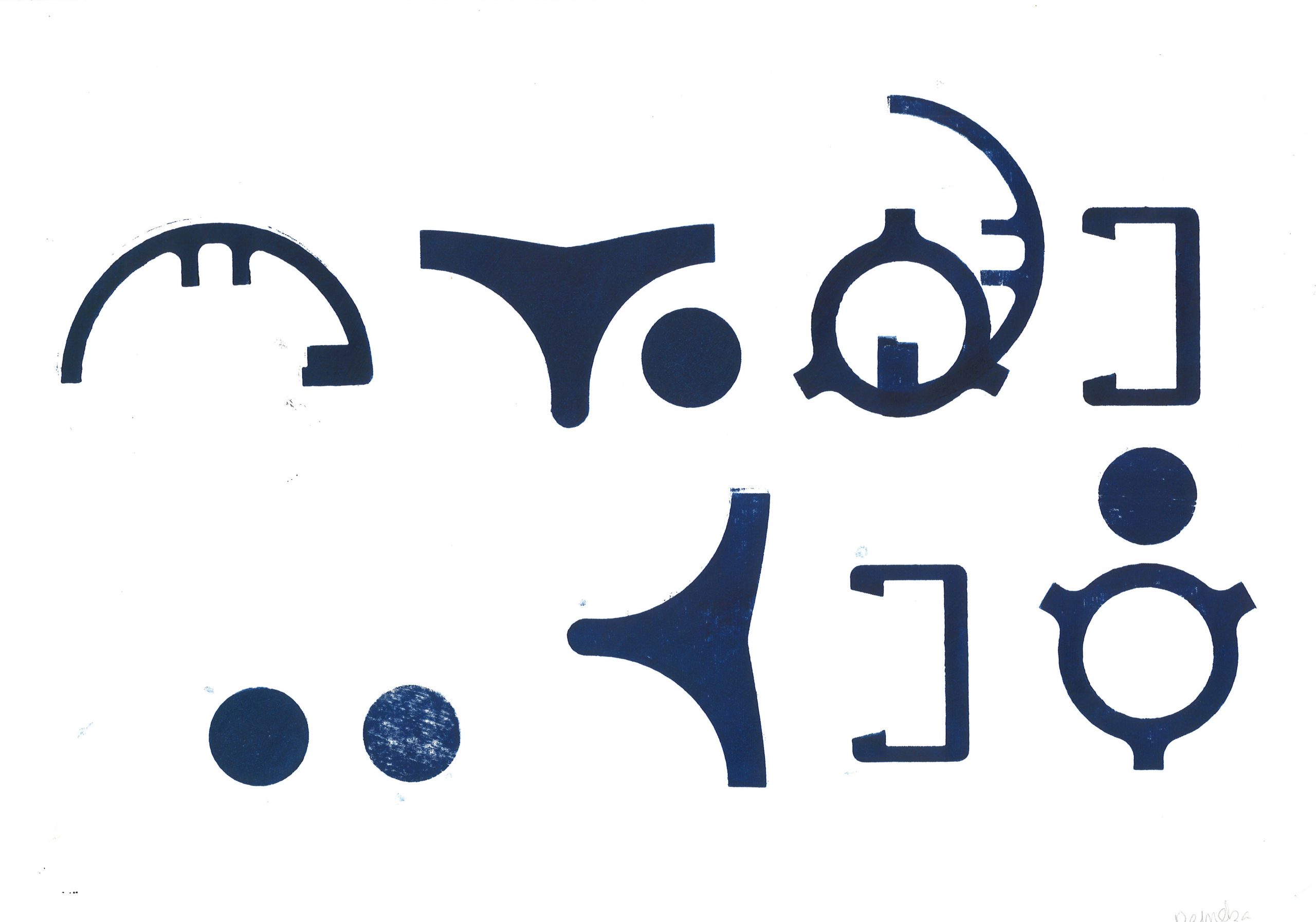
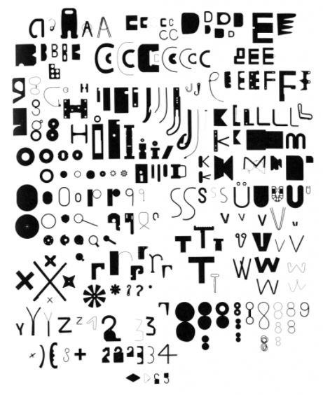
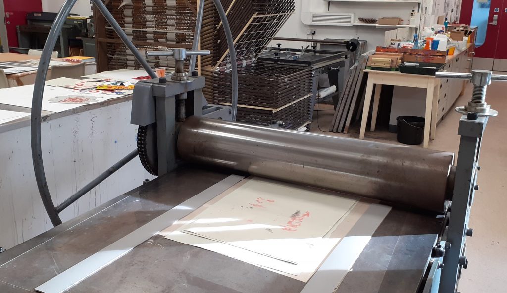
Week 1—2: Monoprinting
In these sessions you will be provided with a ‘kit of parts’ that have
been produced from various sources found within and from a variety
of manufactured items. You are asked to produce several prints with
these, forming a number of ‘sentences’. You must think about how
the use of repetition, accent glyphs and spacing can suggest or
appear to instruct a reader of variations and changes in the potential
sounds or meanings that may be ‘read’ from the type forms.
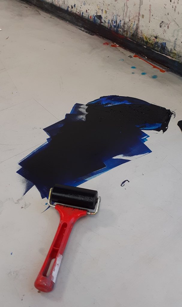
I used the roller to spread the printing ink across the surface of the table. I made sure to spread the ink evenly, to result in an even print.
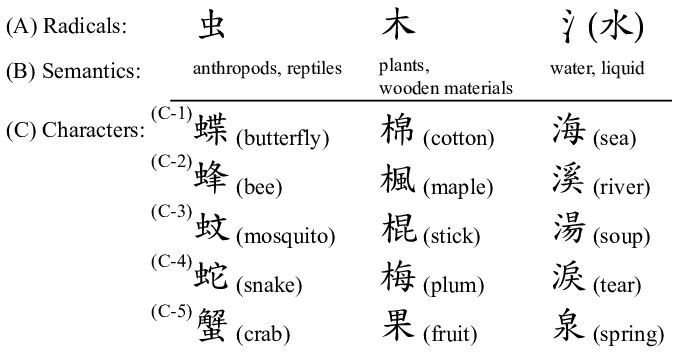
When approaching the task of forming a new language, it helped me to think of Chinese characters. I considered the direction of written language on the page. Chinese characters are read from top to bottom of the page. They have been formed with consideration to the physical form of objects. (Whereas English is written by spelling out the sounds in words.)
Chinese radicals are the part of a character that appear in multiple words. Depending on the other part of the character, we can read the meaning of the word.
I thought about using repeat shapes across my ‘sentence’ to unify the shapes as a language.
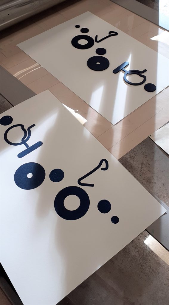
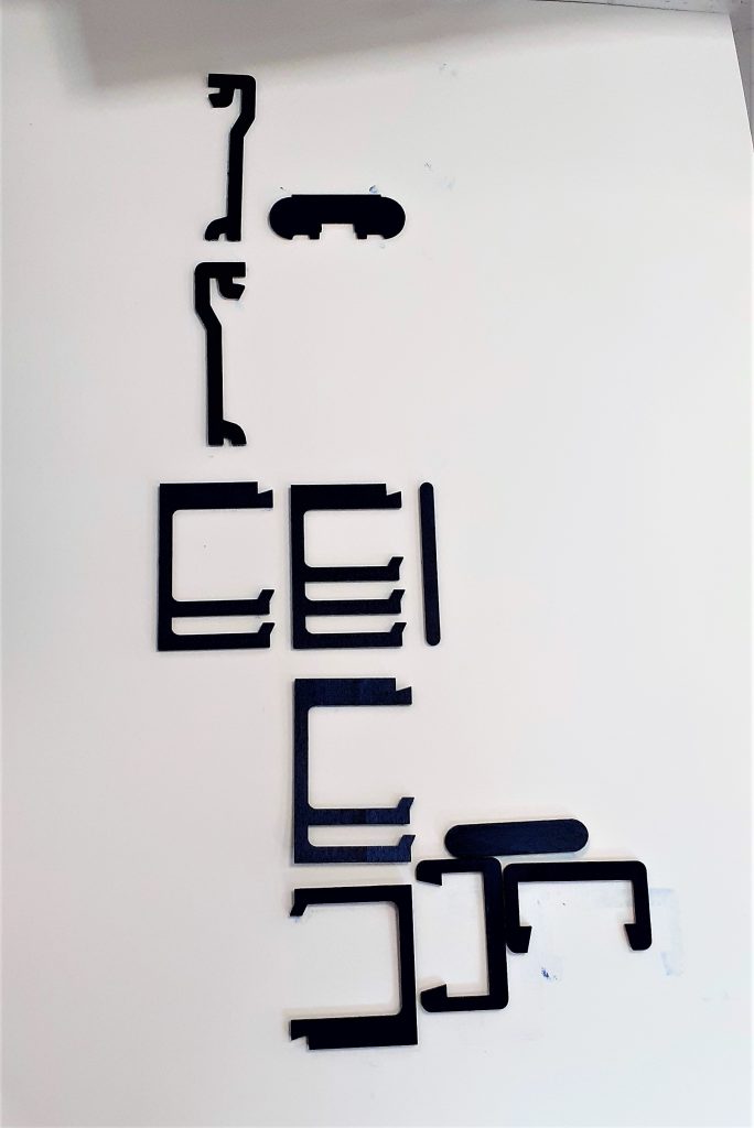
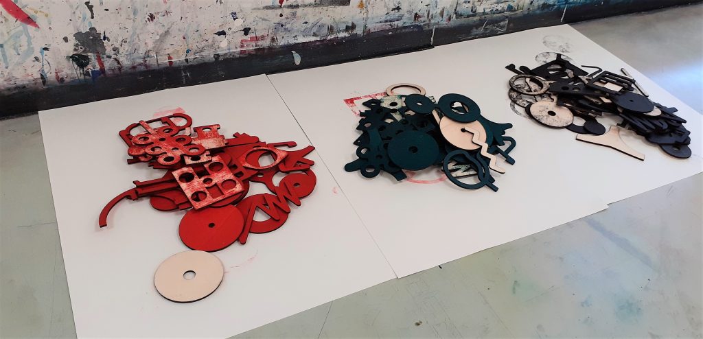
The results of the workshop: