(From the brief)
We live at a time of rapidly increasing automation. Today, information
is almost completely reliant on digital networked media formats and
platforms for its production, publication, preservation and relevance.
All information ends up on screen, one way or another. Yet despite
the abundance of digital formats and processes, graphic designers
are continually rediscovering and redefining the fundamental qualities
and affordances of analogue processes.
Designers who explore the use of handmade type in their designs:
Niklaus Troxler
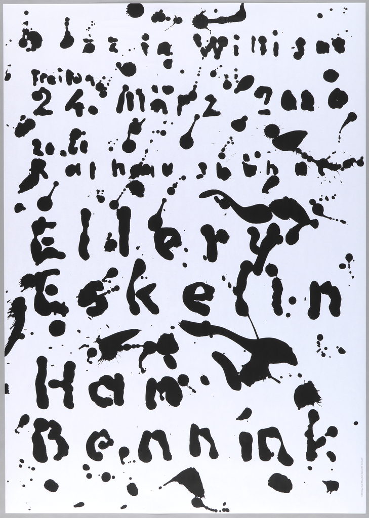
Niklaus Troxler is a Swiss graphic designer. This design is inspired by his love of jazz music. This is a poster for a jazz festival and is a silkscreen print. The random markings and splashes express the freedom of jazz music and its random pattern. The bubbly markings imply softness and a happy spontaneity.
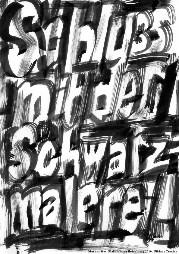
Mut zur Wut: Schluss mit der Schwarzmalerei (‘Enough of that doom and gloom’) poster
This poster by Troxler also uses handmade type. He has used ink to create expressive text. This time, the expression is more harsh than the jazz poster. The pale letters seem to emerge from a dark background.
badbadbadbad.com
Braulio Amado is a Portuguese graphic designer and illustrator living in New York. He produces playful, often colourful posters using a lot of analogue techniques such as paints, pencils and collage.
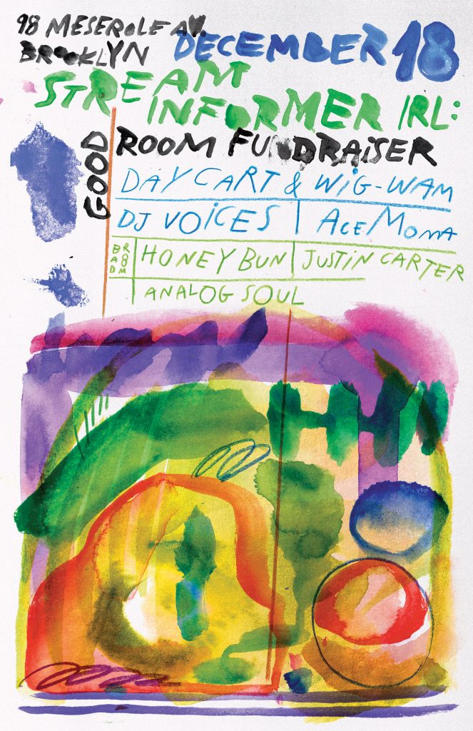
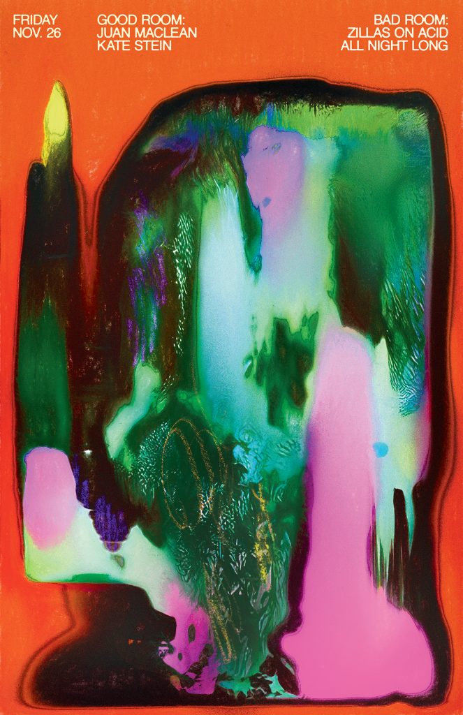
I like the way Amado combines random splashes of merging colour with a fine, capital typeface.
The text is placed at the top of the poster in neat lines that make the information easy to read.
Alan Fletcher
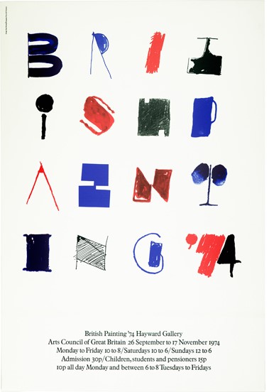
‘Poster: British Painting exhibition at the Hayward Gallery
Arts Council of Great Britain1974
The Arts Council commissioned a poster to announce an exhibition of British painting in London’s Hayward Gallery. By using the title as the feature of the poster, and drawing the conventional letters as abstract ad illustrative symbols, the lettering was appropriately converted into pictures. The image was also used as the cover for the catalog.’
I like the combination of chunky and fine markings. The finer lines look as though they have been drawn by pen and the thicker lines could be brushstrokes.
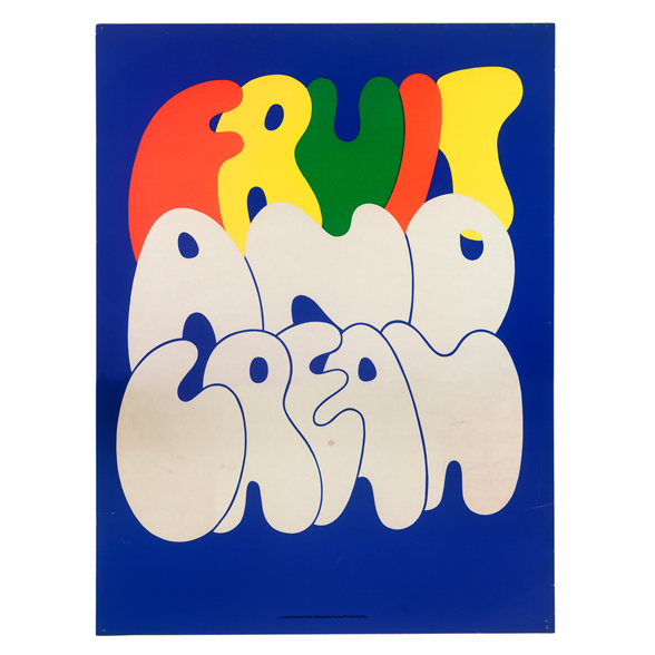
‘Decorative posters: Fruit & Cream, Snacks & Breakfast and Cheese & Biscuits
Lyon’s Tea Shop1968
These posters were designed as an inexpensive way of enlivening the dreary interiors of the Lyon’s chain of teashops.
Inspired by the decorative lettering of the Lyon’s sign, Fletcher created a series of brightly coloured typographic posters dealing with the theme of food. Not only did they stimulate the appetite, they also offered culinary suggestions.
The typographic sources of the posters are various. While some, such as ‘Cheese & Biscuits’ suggest that Fletcher had been rifling through nineteenth-century type catalogues, others, such as ‘Fruit & Cream’, derive from the designer’s own handwriting.’
Ed Fella
Beautiful posters by Ed Fella. ‘He spent 30 years as a commercial artist in Detroit. During that time he experimented with typography and gave lectures to students at the Cranbrook Academy of Art.’
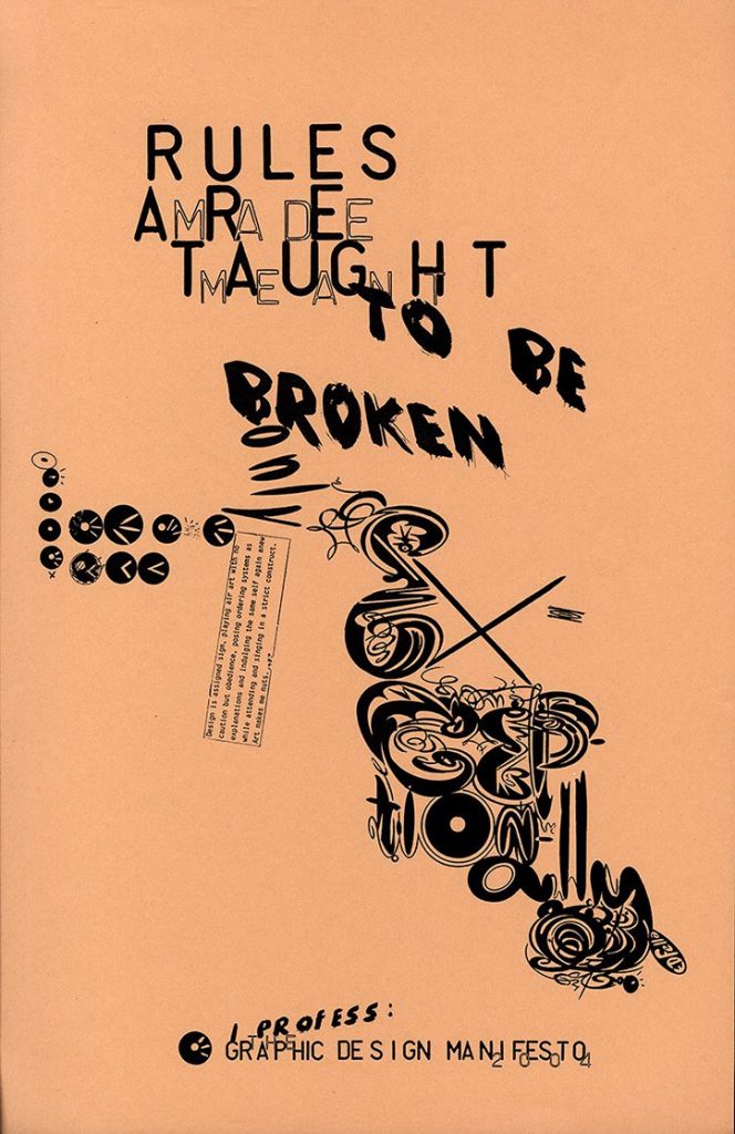
‘Edward Fella’s whimsical and extremely detailed typography has had an important influence on contemporary graphic design. His signature deconstructive style, featuring colourful hand-drawn font, broke every rule in the hand-book. Fun, mad and eclectic, it is no wonder that It’s Nice That love him.’
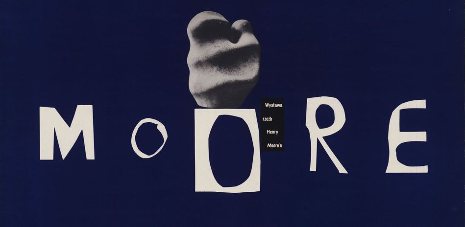
This poster makes use of cut-out lettering. The designer has cut the title from paper, which reflects the art of Henry Moore, whose exhibition the poster is advertising.
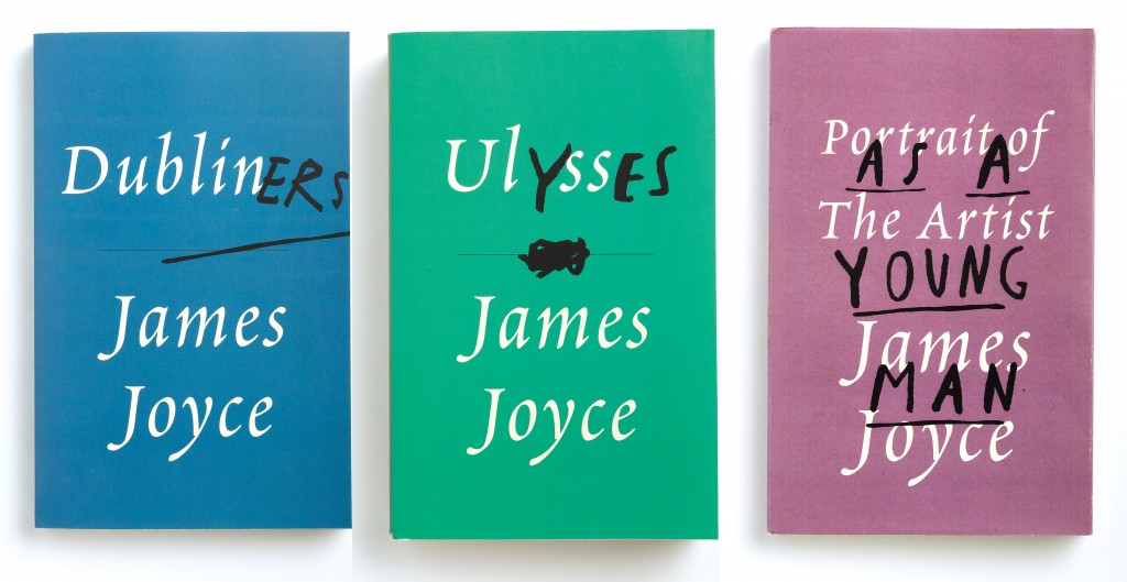
The combination of a classic-looking serif typeface, with the handwriting gives an interesting contrast. The handmade lettering look as though they have been scrawled onto the cover with a black marker. This gives the impression of someone breaking the rules and therefore adds a mischievous personality. I imagine the characters in these books must be rebellious in some way.